I say, the year’s first Tentacle Tuesday is a big responsibility! That’s why I’d like to start with some slimy or furry, squirming or pitter-pattering, whimsical or gnarled, skittish or spine-chilling, drooly woolly creepy crawlies with toupees and bloodshot eyes. After all, the 2020s decade is sadly guaranteed to be full of ’em… but of a significantly less cute variety than the lot that I’m featuring today.
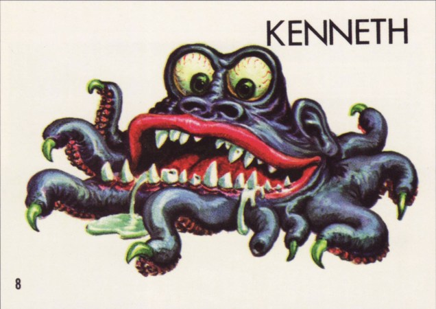
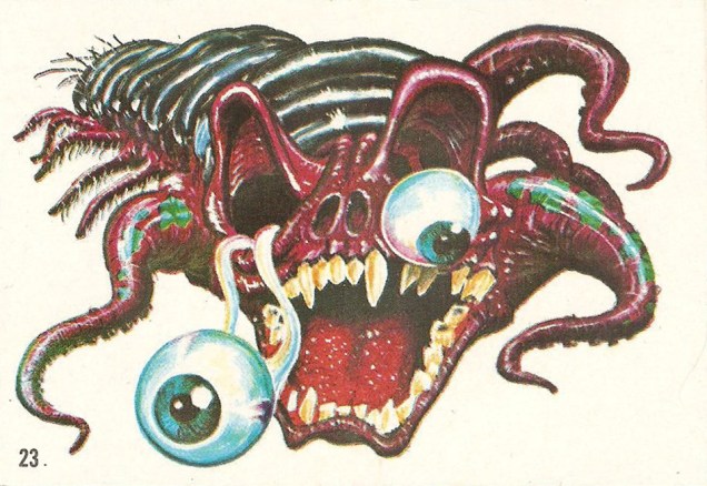
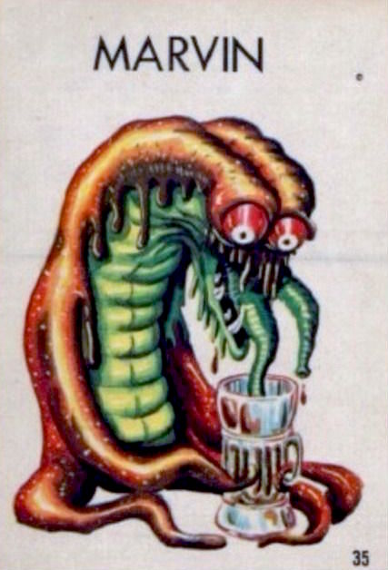
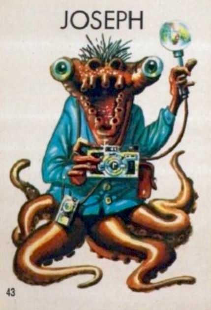
Topps‘ Ugly Stickers have a lot going for them: excellently drawn, tongue-in-cheek monsters in various states of putrefaction. If there’s one commonality between them, it’s that most of them showcase teeth any dentist would be thrilled to drill through. Many of them have far more appendages that a regular creature needs… and a lot of these appendages are distinctly tentacular, which is of course where we come in! And they’re all cute as a button.
David Saunders, Norman Saunders’ son, explains in the latter’s biography (Illustrated, 2009):
«In 1965 Topps released Ugly Stickers. This set was initially based on the grotesque drawings of Basil Wolverton, but when he demanded copyright control, he was paid off for his first twelve images and then fired. The rest of the creatures in the set were designed by Norman Saunders and Wally Wood.
The creatures that appear on the display box, the wax wrapper, and the giant twelve-piece puzzle were all designed by Saunders. He also painted all 44 Ugly Stickers. These were so popular they were reissued in four later versions and even spawned a line of rubbery toys called Teacher’s Pets.»
So what’s the break-down? Out of the original 44 stickers, Wolverton designed 10. The rest were the handiwork of Wally Wood and Norman Saunders. The total set numbers 164. Not all cards were repeated in the re-runs, which is why the numbers don’t compute, for those of you who multiplied 44 cards by 4 versions and obtained 176, not 164; there were 4 groups of 40 cards + 4 non-repeated cards.

In some print runs, the creatures did not have names, doubtlessly leaving that part to the reader’s imagination. Most cards, however, do have names, with genders shamelessly swapped, making guys into gals and back into guys again. Take a peek at the full list of name changes over at this very instructive website, Bubble Gum Cards.

Does s/he look like a Jacqueline to you? Or maybe an Edward? I vote for the former; such an elegant name for a bug-eyed, displeased brain-thing, Just look at the flair with which she wears that pink tuft of fur underneath.


Joseph and Evelyn (or Stanley and Renée, or…) were previously used by my co-admin RG in his Hallowe’en Countdown III, Day 24 post, but they distinctly have tentacles, so I believe it’s worth running them again.

As a little bonus, here’s a lady from Topps’ 1966 Ugly Name Stickers series who asked to be included. Her name was… Donald, Sylvia, Angelo, Phyllis, Barney, or Rosemary. “Barney” is really pushing it!


~ ds

I love these designs. Is there any information about how they were done? They look like mixed media, a combination between watercolors and gouache.
LikeLike
Hi Jon! In an attempt to answer your question, I dug into Norman Saunders’ biography, but it’s frustratingly vague as to his methods. It’s evident he was at ease with all the main techniques, painting his larger pieces in oils, but the Topps pieces, generally small, were most likely acrylics with some gouache or watercolour. In some cases, airbrush even comes into it. I’d say you’re pretty much on the money with your guess.
I’ll be featuring some of Mr. Saunders’ spookier Wacky Packages in the course of my upcoming Hallowe’en Countdown, by the way!
LikeLike