« I think people will believe anything about someone they haven’t seen for a while. » — Gabriel Kaplan
I’ve been meaning to do a Welcome Back, Kotter post for several years. But when I thought about it, I understood that hitching it to the show’s fiftieth anniversary made considerably more sense than, say, its forty-seventh. And while I adore William Johnston‘s sextet of tie-in novels, it would be quite a stretch for a comics blog to cover. Far closer to the mark lies Arnold Drake‘s trio of WBK storybooks, illustrated by Mel Crawford and Jack Sparling. But in the end, I bided my time and managed to get in touch with the scribe first assigned the Kotter Komic assignment, Elliot S! Maggin. And boy, am I glad I did. And so, fifty years to the day of the airing of its pilot episode*, let’s talk Kotter!
WOT: First, a bit of context: correct me if I’m wrong, but in the early stages of your career writing comics, you always worked alongside editor Julius Schwartz. Then, in late ’75 or early ’76, something changed, and you began writing for other editors’ titles. What’s the story?
ES!M: Well, Julie was kind of proprietary about me for most of the time I was working with him.
WOT: A sideways sort of compliment.
ES!M: I guess. At some point, Dorothy Woolfolk was editing the Lois Lane book, and… he introduced me to her. She just came into his office for some reason. She said: « Oh, you know, you should write some stuff for me! » And he said « No, he’s very busy, go away! » And he chased her out of the office. And I’m thinking, « Oh, okay. That’s how we’re doing it. »
So I didn’t really go about… I didn’t really make friends with many of the other editors. I tried to make friends with Joe Orlando. You know, I’d have lunch with him once in a while, I guess.

ES!M: But around the time Kotter came out…
You know, people used to hang out outside of Julie’s office door, listening to us plot, because it was so loud. We would yell and scream at each other constantly. He was this Jewish boy from the Bronx, and I was this Jewish boy from Brooklyn, and once I got comfortable working with a guy thirty-five years older than me, we’d just fight all the time. And every once in a while, we’d get serious.
WOT: Serious fighting, or serious work?
ES!M: Yeah, yeah! The fighting was work.
WOT: Sometimes that line is dreadfully thin.
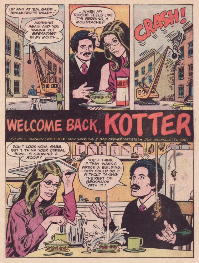
ES!M: I guess at that point, he got mad at me, and I didn’t get work for a couple of weeks. I went to Joe, and I said: « What ya got? », and he said he’s doing this Welcome Back, Kotter book, and I said « Great! I watch that show, that’s fun. » So I wrote the first issue, and that was fine.

.

.

ES!M: They called me down in Carmine‘s office, to watch episodes of the show. It had been on maybe six weeks at that point. Episodes I had already seen, but I liked hanging out in Carmine’s office, because it was big, and he had a lot of toys around. So they set up this video tape… thing, and I watched the shows again, and I wrote the second issue.

ES!M: I was living in an apartment complex on Long Island, and there were all these kids around… little kids. And I would work at home, mostly. So they would hang around with me, whenever they realized I was home. They would… shoot me through the window or… something. At some point, whenever I’d write a gag, I would…
WOT: … run it past them?
ES!M: Yeah! And they’d laugh, and run off and play some more. And I figured, as long as they laughed, it was okay. Because they were hearing the voice of Barbarino, or whoever. At some point Travolta would say, « Uh? », or « Duh », or « What d’you think? », something dull, that he delivered in a funny way. And the kids related what I wrote to what Travolta did on screen, so they were getting it. And at some point I realized that Joe [editor Orlando] didn’t watch the show.
WOT: Oops.
ES!M: And he would then object to my Barbarino bits, or Horshack bits, or whatever. So I told him « You’ve got to watch the show, you’ll get it! » But you know, after maybe… how many issues did I write, three, four?
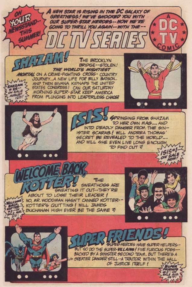
WOT: Just two, I’m afraid. You wrote the first couple, then Tony Isabella did one, then Mark Evanier…
ES!M: I’m sure he (Evanier) watched the show — he watched everything.
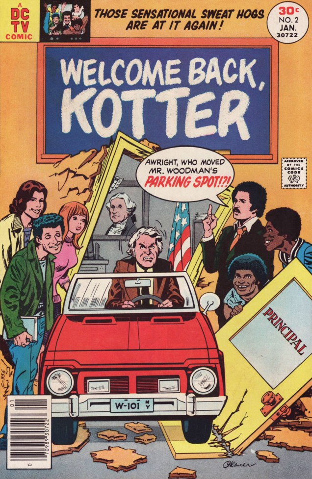
WOT: He was even the show’s story editor for part of its second season. So… then Bob Toomey wrote four issues, Scott Edelman two, and there was a leftover story by Evanier that saw print in the WBK Collector’s Edition in 1978.
ES!M: But Joe did not. I mean, he didn’t have time, and he was madly in love with his wife, and he didn’t watch television at all (laughs). He wasn’t paying attention to the source material.
WOT: That happens. But it seems a pretty unfortunate blind spot for a book’s editor.
ES!M: I wrote two issues, and at some point, Joe said: « You can’t write! ». He said « No, you can’t write! »
A blanket condemnation of everything I’d ever done.
WOT: Oooh.
ES!M: By that time, I’d made up with Julie, and I was writing more Superman stuff. After that, wherever any of my fights with Julie got serious, I’d go down the street to Marvel, and do something there. Then I would make up with Julie, and they’d never see me again… until I had another fight with Julie.
That was my experience writing Kotter.

WOT: In closing, how are you keeping busy these days?
ES!M: I just wrote a book called Lexcorp. A novel. Which you should probably plug.

WOT: Done!
ES!M: It’s a first-person story that Lex Luthor tells. And he identifies himself as an unreliable narrator, like… Huckleberry Finn. But it does tell the story of how he saves the world. Stuff like that.
I’m working on another book, working on a time travel story. And my ex-wife asked me to write an autobiography so my grandchildren know who I am.
I have all these people I know with Pulitzer Prizes; and at some point in the autobiography, I wrote: « I have about a dozen Pulitzers floating around through my life, and none of them are mine. This book is available for consideration. »
WOT: Mr. Maggin, thank you so much for taking the time to share these stories with us!
-RG
*the pilot episode, for some reason, was aired third, on September 23, 1975, while the show premiered on the 9th of September with ‘The Great Debate‘ (featuring a wonderfully smarmy James Woods).