« So, you see the little snot on the right side, move it two inches to the left and add a little bit of green gleam to it. » — Mark Newgarden, doing some art direction
If this one looks sharper than you’d expect, it’s because it’s shot from a larger version of the Wacky card that Norman Saunders (re)painted for Topps’ Wacky Posters series, circa 1973.
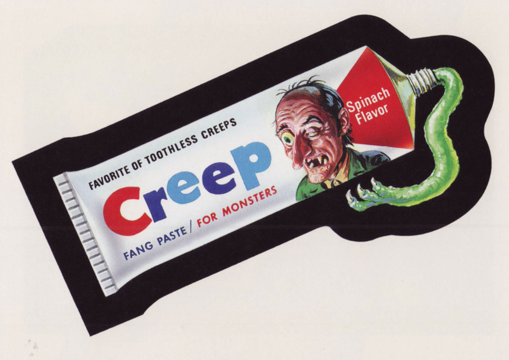
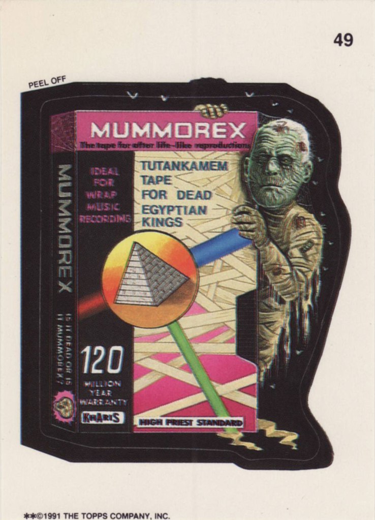
Ladies and gentlemen, Drew Friedman! « In 1991, I was creating many concept sketches and pencil drawings for the TOPPS company, including for their latest set of the hugely popular sticker series “Wacky Packages”. Mark Newgarden was the editor and art director for the 1991 series, and the writers for the card fronts included Newgarden, Jay Lynch, Jordan Bochanis, John Mariano and myself. I drew about 22 tight pencil images which would (with one exception) be painted by the illustrator Patrick Pigott. » If you enjoy being privy to an artist’s creative process, by all means do yourself a favour and feast your peepers on this gallery of Friedman’s roughs, finishes, used and unused pieces. In this (mummy) case, it’s Friedman pencils, finished art by Tomas Bunk.
From the 6th Series (1974, Topps). Most likely painted by Norm Saunders.
From the 8th Series (1974, Topps)… though mine’s a 1980’s reprint. Painted by Norm Saunders.
From the lucky 13th Series (1975, Topps). Another fine Saunders vintage. Topps would find Mr. Saunders most difficult to replace.
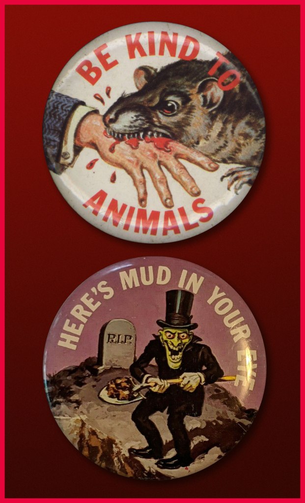
« … a radical series of crappy jokes & trashy art mopped out of the Bowery’s least washed lavatories. Fueled on bologna sandwiches, black coffee & cheap cigarettes, these are the ugly buttons that scream ‘America‘ to an America that has forgotten itself. » — a tasty bit of hype from Goblinko
Fabled pulp illustrator Norman Saunders (a definite favourite around these parts) is legitimately appreciated for his body of work, but I do believe he isn’t sufficiently lauded for his humorous work. After all, he could hold his own against the likes of Basil Wolverton and Wally Wood, and how many of his peers could lay claim to such a lofty achievement?
A passage from his son David’s definitive monograph, the simply and fittingly titled Norman Saunders:
Ugly Buttons came out in 1967 to exploit the popular trend of protest buttons with witty sayings. The macabre humor of Ugly Buttons reflects their Halloween release date as well as the morbid comedy of popular TV shows like The Addams Family and The Munsters. Norm Saunders created half [ eleven, actually ] of the twenty-four images in this set, while Wally Wood created the other half.
A sample of the original packaging…
I’m sorry… but that bat is just so adorable…
You can see why these are perfect Hallowe’en fodder!
Macabre, and with a tidy moral to boot! At a nickel apiece, an undeniably excellent value.
Well, perhaps not *strictly* altogether moral.
The final Saunders button, shot from the original art. This looker was entitled Peek-a-Boo.
One of the original boxes, which held 24 packs. Featured buttons Here’s Looking at You and I’m a Cool Ghoul were designed by Wally Wood.
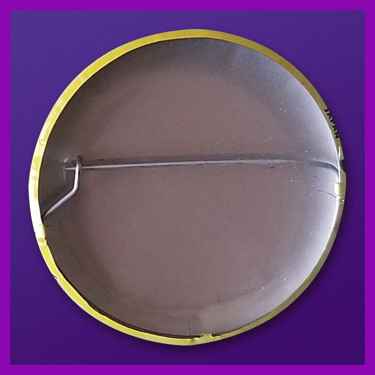
Collectors find this set very difficult to complete. Although the series was a popular success in 1967, the buttons appear to have rarely survived. This is perhaps attributable to the design of the tin back pin, which was made in Japan with a hair-trigger clasp that instantly popped open and fell off.
Here’s one of the underperforming bad boys in question. To be fair, this one’s still holding together, which surely has earned it some kind of goodwill, a half-century hence. Those old enough (enough, enough!) will recall when ‘Made in Japan’ was an indicator of shoddy goods. All that’s been turned on its head since, interestingly. The Japanese people have admirably overcome much adversity, that’s evident.
By the way, I don’t know just how sanctioned these reissues are, but the cool cats at Goblinko have made these lovely buttons available once more, presumably sturdier and certainly at a perfectly reasonable price (forty times the original, I’ll grant you… but you do get to pick).
« Then — when O’Flaherty turned on the light, his blood crystallized! »
This is Unknown World no. 1 (June 1952, Fawcett); cover painted by the rightly fabled Norman Saunders.
Its classic cover aside, this Fawcett one-shot is barely worth reading, save for the utterly bizarre Footprints on the Ceiling.
Synopsis:
The gangsters O’Flaherty and Flitcher train a revived dead dog to be a trick dog on stage. But they have to fight off hordes of skeletal zombies coming after them to bring the dog where it belongs – in the province of the dead.
Who came up with that scenario? (it’s not merely a rhetorical question: no one seems to officially know). Might its loopiness have in some small way inspired Bob Burden’s gonzo Flaming Carrot epic The Dead Dog Leaped Up and Flew Around the Room? It’s not such a stretch, given that Burden is no stranger to Golden Age comics, having been a-dealing in such goods, with a marked (and healthy) predilection for the oddball. Obviously.
Diving right into the splashy fray, here’s the immortal tale’s opening, from Flaming Carrot Comics no. 12 (May 1986, Renegade Press).
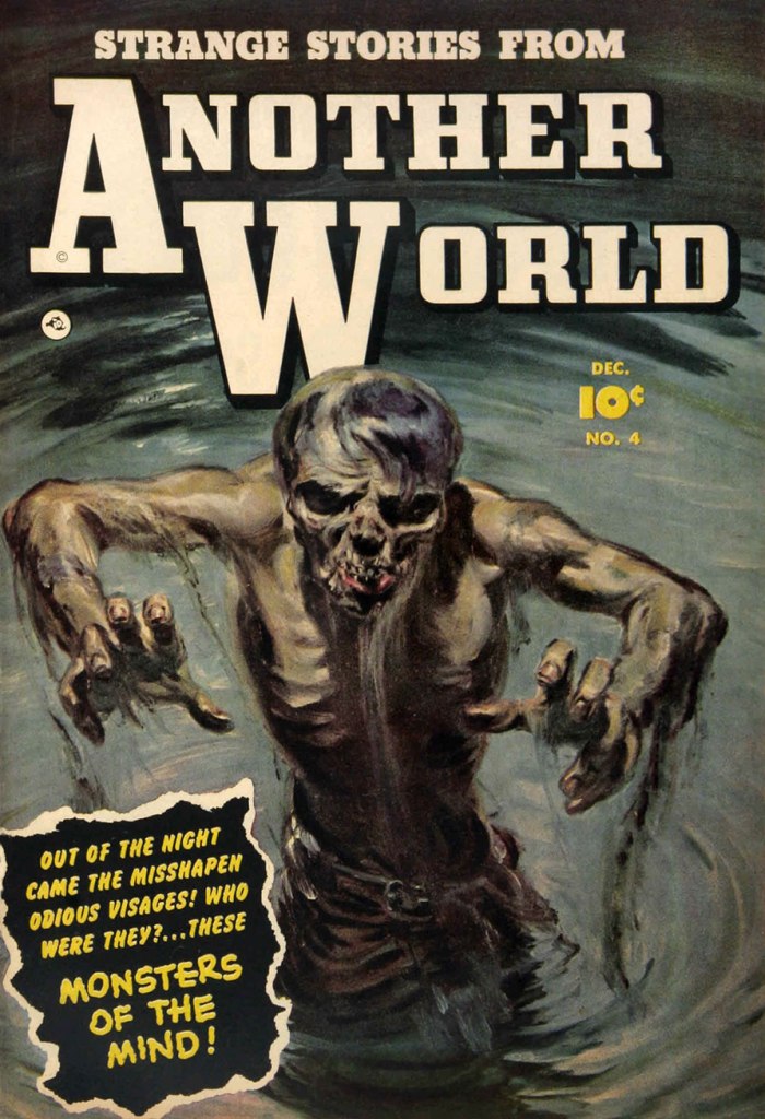
And here’s a bonus one from Mr. Saunders which, thanks to its decidedly muted palette, looks more like a pulp cover than a comic book. This is Strange Stories From Another World no. 4 (Dec. 1952, Fawcett), and you can read it here!
And after all these dead dogs, what do you say we enjoy the sight of a curious and healthy live one?
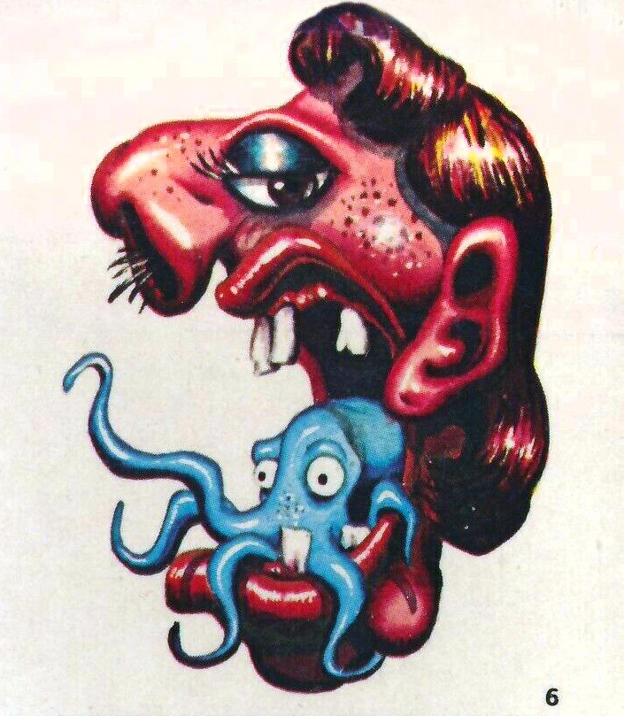
I say, the year’s first Tentacle Tuesday is a big responsibility! That’s why I’d like to start with some slimy or furry, squirming or pitter-pattering, whimsical or gnarled, skittish or spine-chilling, drooly woolly creepy crawlies with toupees and bloodshot eyes. After all, the 2020s decade is sadly guaranteed to be full of ’em… but of a significantly less cute variety than the lot that I’m featuring today.
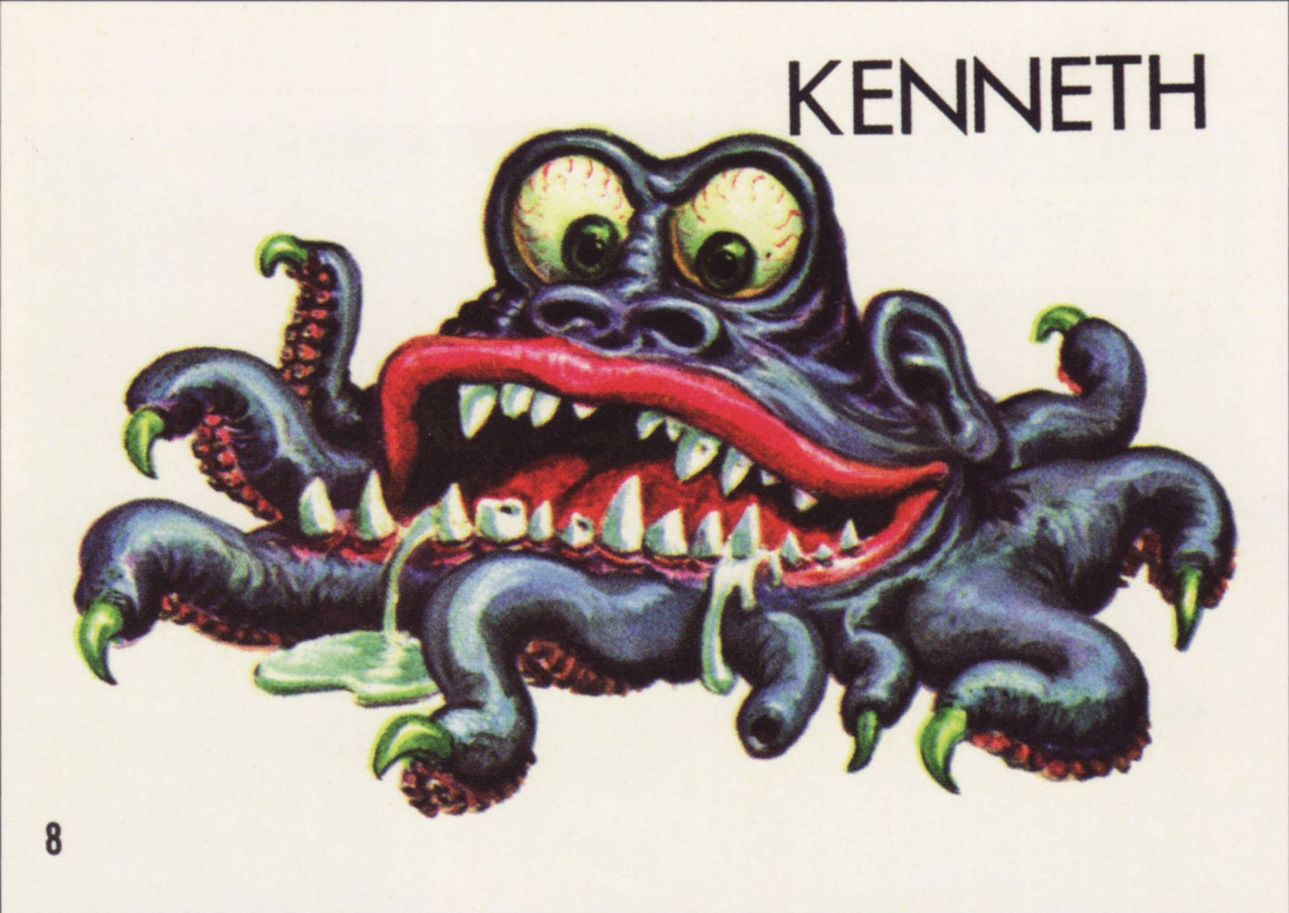
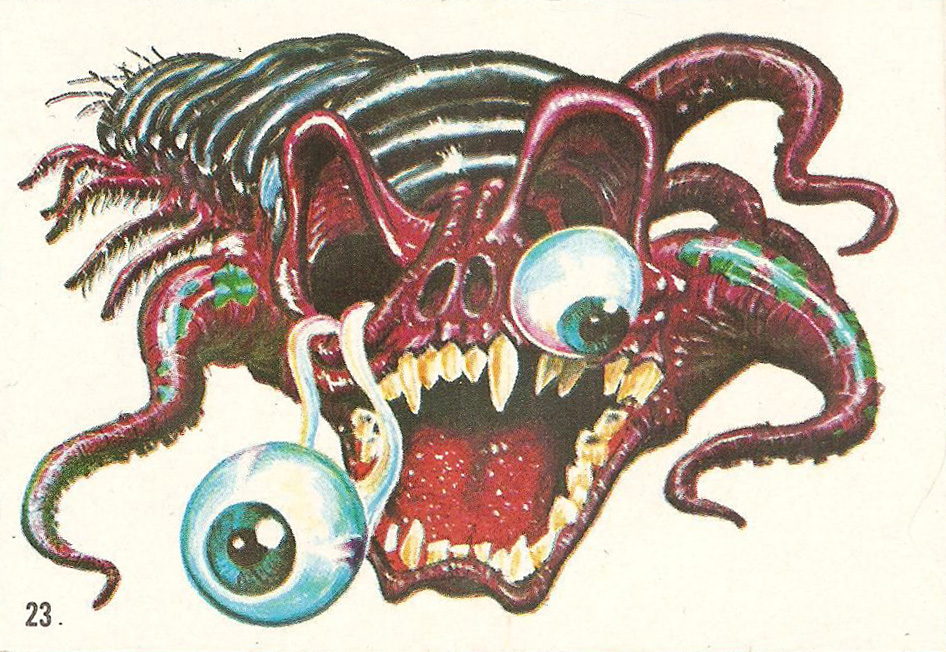
Topps‘ Ugly Stickers have a lot going for them: excellently drawn, tongue-in-cheek monsters in various states of putrefaction. If there’s one commonality between them, it’s that most of them showcase teeth any dentist would be thrilled to drill through. Many of them have far more appendages that a regular creature needs… and a lot of these appendages are distinctly tentacular, which is of course where we come in! And they’re all cute as a button.
David Saunders, Norman Saunders’ son, explains in the latter’s biography (Illustrated, 2009):
«In 1965 Topps released Ugly Stickers. This set was initially based on the grotesque drawings of Basil Wolverton, but when he demanded copyright control, he was paid off for his first twelve images and then fired. The rest of the creatures in the set were designed by Norman Saunders and Wally Wood.
The creatures that appear on the display box, the wax wrapper, and the giant twelve-piece puzzle were all designed by Saunders. He also painted all 44 Ugly Stickers. These were so popular they were reissued in four later versions and even spawned a line of rubbery toys called Teacher’s Pets.»
So what’s the break-down? Out of the original 44 stickers, Wolverton designed 10. The rest were the handiwork of WallyWood and Norman Saunders. The total set numbers 164. Not all cards were repeated in the re-runs, which is why the numbers don’t compute, for those of you who multiplied 44 cards by 4 versions and obtained 176, not 164; there were 4 groups of 40 cards + 4 non-repeated cards.
A page from Monster Mash: The Creepy, Kooky Monster Craze In America, 1957-1972 (Two Morrows Publishing, 2015), which you can read here.
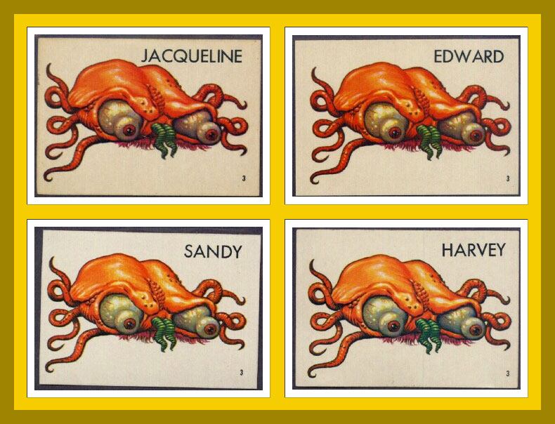
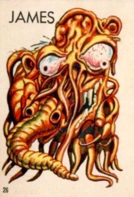
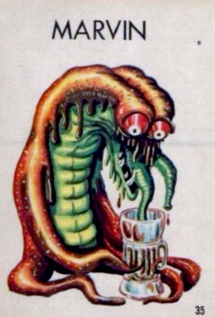
In some print runs, the creatures did not have names, doubtlessly leaving that part to the reader’s imagination. Most cards, however, do have names, with genders shamelessly swapped, making guys into gals and back into guys again. Take a peek at the full list of name changes over at this very instructive website, Bubble Gum Cards.
Does s/he look like a Jacqueline to you? Or maybe an Edward? I vote for the former; such an elegant name for a bug-eyed, displeased brain-thing, Just look at the flair with which she wears that pink tuft of fur underneath.
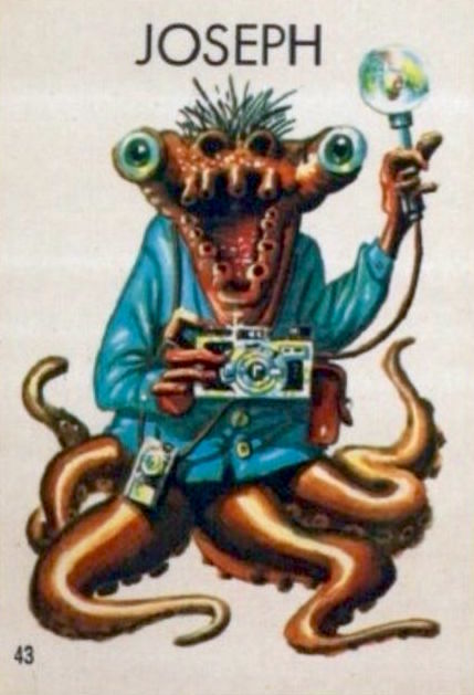
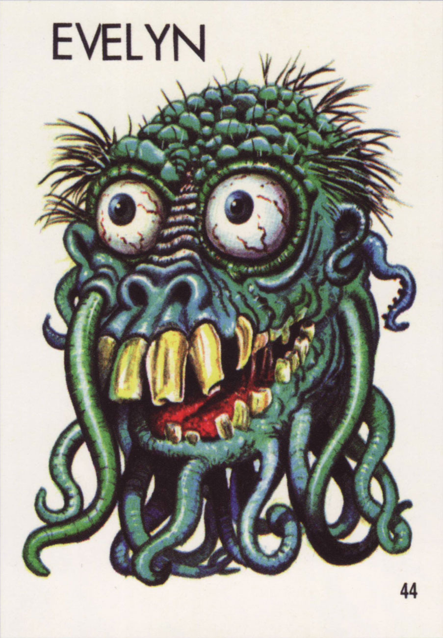
Joseph and Evelyn (or Stanley and Renée, or…) were previously used by my co-admin RG in his Hallowe’en Countdown III, Day 24 post, but they distinctly have tentacles, so I believe it’s worth running them again.
As a little bonus, here’s a lady from Topps’ 1966 Ugly Name Stickers series who asked to be included. Her name was… Donald, Sylvia, Angelo, Phyllis, Barney, or Rosemary. “Barney” is really pushing it!
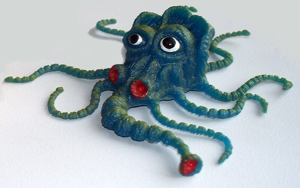
A little friendly critter from the Teacher’s Pets series (probably…. these things are veiled in a shroud of mystery), which was a rubbery spin-off from Ugly Stickers.
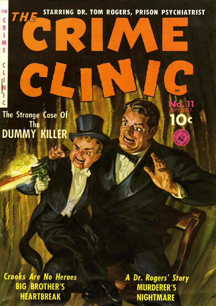
« Now, Carlos — put that gun away! »
« Why, Fernando, I thought I’d start the show with a bang! »
That guy in the audience with the irritating donkey laugh is finally getting his. This unforgettable cover is the work of the peerless Norman Saunders, whose long and prolific career blazed its way through pulps, comic books, slicks, men’s adventure magazines, paperbacks, trading cards… you name it!
This is Ziff-Davis’ The Crime Clinic no. 11 (actually its second issue, September-October 1951). And for once, the inside story kind of matches the cover mayhem.
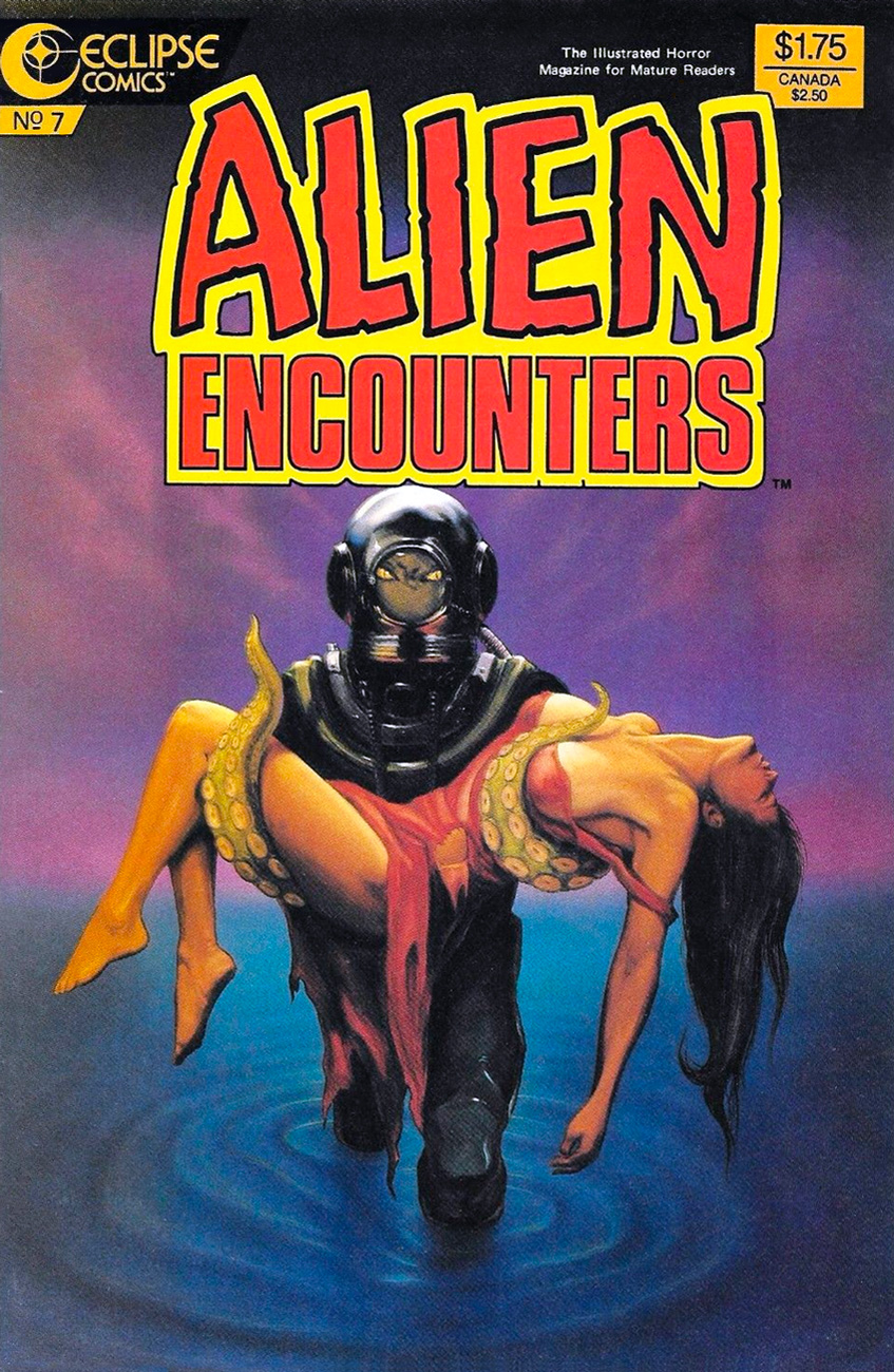
You’ve likely noticed it already, but people getting attacked by tentacles tend to be dressed in red. Now, red will not make a bull enraged (as a matter of fact, bulls are colour-blind to red – there, you learned something new today), but what effect would it have on an octopus? None at all, as it turns out, as red light does not reach ocean depths. One might want to wear red to become near-impossible to spot at a depth of a hundred metres or more, but that doesn’t explain why tentacles would persistently seek out red targets. Crap, there goes my theory.
Nevermind; we can still feast our eyes on some fetching mam’zelles and monsieurs clad in red, theories be damned.
Music aficionados will notice that this cover is a tribute to something quite outside the comic field, namely this album art:
Cover of 10cc’s Deceptive Bendsalbum, designed by Hipgnosis, 1977. Where are the tentacles?! The girl’s dress is also somewhat more demure (though not by much).
After Alien Encounters, we naturally move on to Alien Worlds. Admire the, err, tentacles on this cover:
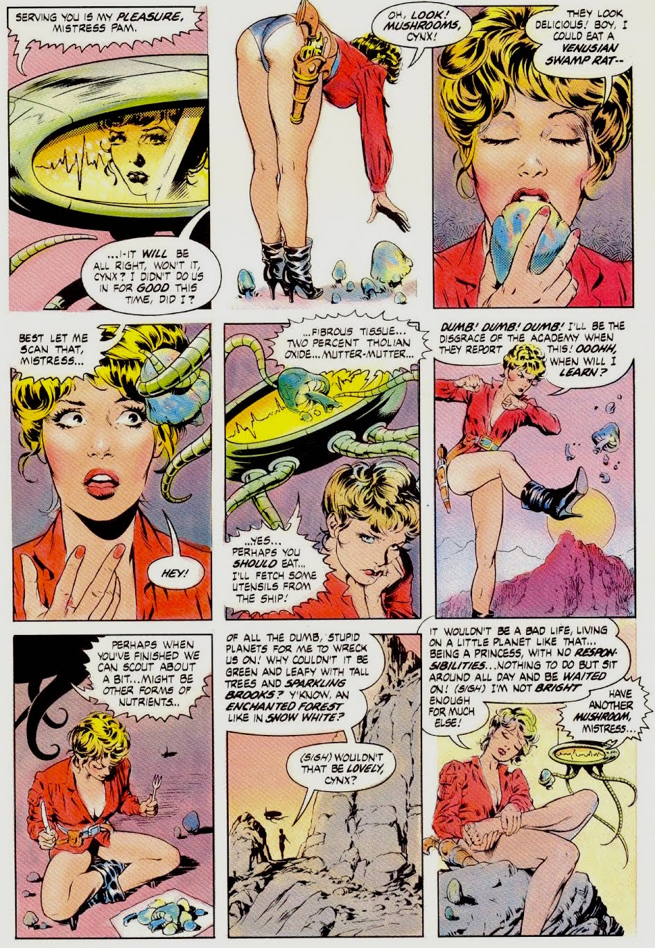
“If he had been watching his mistress as usual, if he had been at the controls instead of giving himself a lube job, the accident might have been prevented.” Moral of the story: no lube jobs at the wheel! That tentacled thing behind Princess Pam is actually Cynx, her guardian. The science-fiction comic anthology Alien Worlds, first published by Pacific Comics and then by Eclipse after Pacific went bankrupt, was edited by Bruce Jones, who wrote the bulk of the stories, and April Campbell. This is Alien Worlds no. 4 (Pacific Comics, September 1983), cover by Dave Stevens, with colours by Joe Chiodo.
Mushrooms *and* tentacles *and* some pretty gams? Sensory overload! At first glance, the story (scripted and pencilled by Bruce Jones, inked by Dave Stevens, coloured by Joe Chiodo and lettered by Carrie McCarthy) is nothing but gratuitous cheesecake – a pretty, half-naked girl wandering around with her robotic servant – but it’s actually surprisingly touching. Check it out here. Fittingly, mushrooms save the day.
It’s not just women who like to sport flashy red outfits, by the way. The men’s costumes might cover considerably more skin, but the vermilion remains!
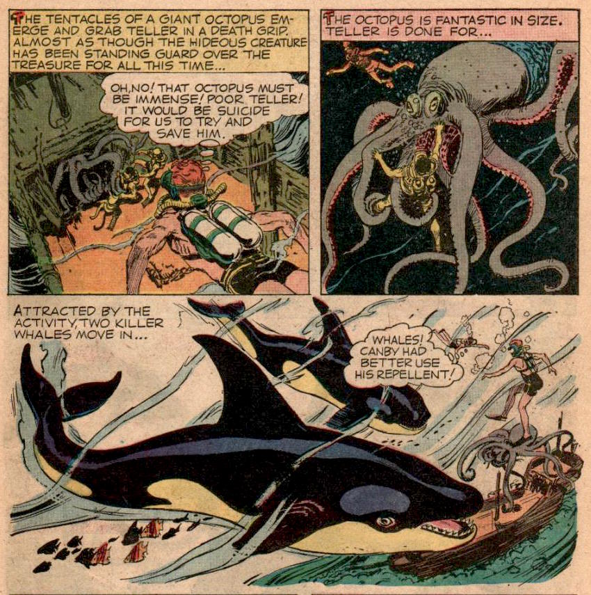
« The tentacles of a giant octopus emerge and grab him in a death grip. Almost as though the hideous creature has been standing guard over the treasure for all this time… » Of course it has! Any self-respecting octopus takes his job seriously. The Frogmen no. 2 (May-July 1962); the cover is by Vic Prezio, and the sumptuous inside art is by George Evans.
There’s (also) an epic battle between a killer whale and the octopus in this issue (witness the aforementioned George Evans art).
Of course he wants you, silly – who can resist a man in red swimming trunks? Nor octopus nor man. I retract my comment about men being more covered up. Do they have to tell their families, though?
One more for the road and I’ll conclude this vernissage…
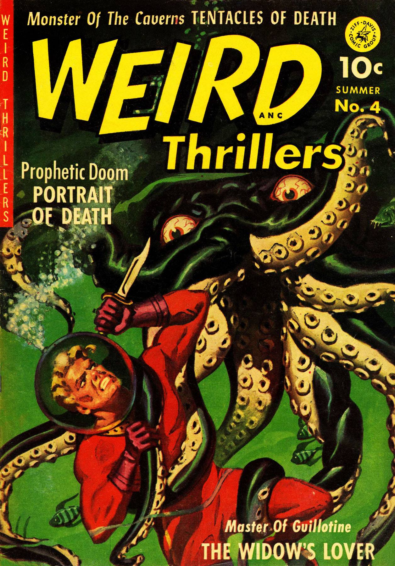
“The bolts of current are merely absorbed by the rubber flesh of the octeel, which is part octopus and part electric eel!” Oh, for the love of puns. Weird Thrillers no. 4 (summer 1952, published by Ziff-Davis), with painted cover by Norman Saunders.
You’ll no doubt want to see what an electric octopus looks like, so here you go:
“Tentacles of Death”? Sign me up, please! The gruesome cover story is drawn by George Tuska.
Let’s commence Tentacle Tuesday on a ticklish note (tentacles are itchy, you know, especially when they’re crawling up one’s leg) with Rip Off Comics no. 23, “the rip-snorting science fiction issue!”
Typical: the good-looking gal has to defend herself and her goofy-looking idiot of a partner from tentacles, claws, fangs, and other typical dangers of deep space. Rip Off Comics no. 23 (summer 1989), cover by Hal S. Robins, with colours by Guy Colwell. Look closely at the tiny drawings hiding inside “Rip Off”, and you’ll see Fat Freddy’s cat bouncing around merrily! Actually, you’ll see pretty much the whole cast of Furry Freak Brothers, and then some.
If a tentacle creeps out from the pages of a book you’re reading to gently prod you, you know you’ve made the right choice of reading material.
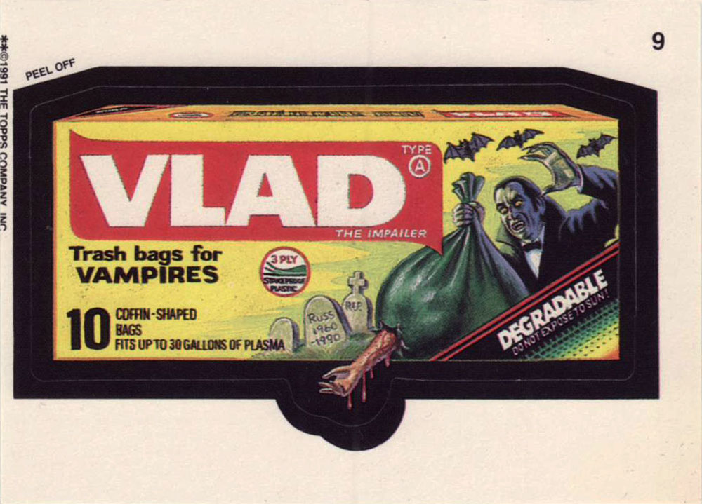
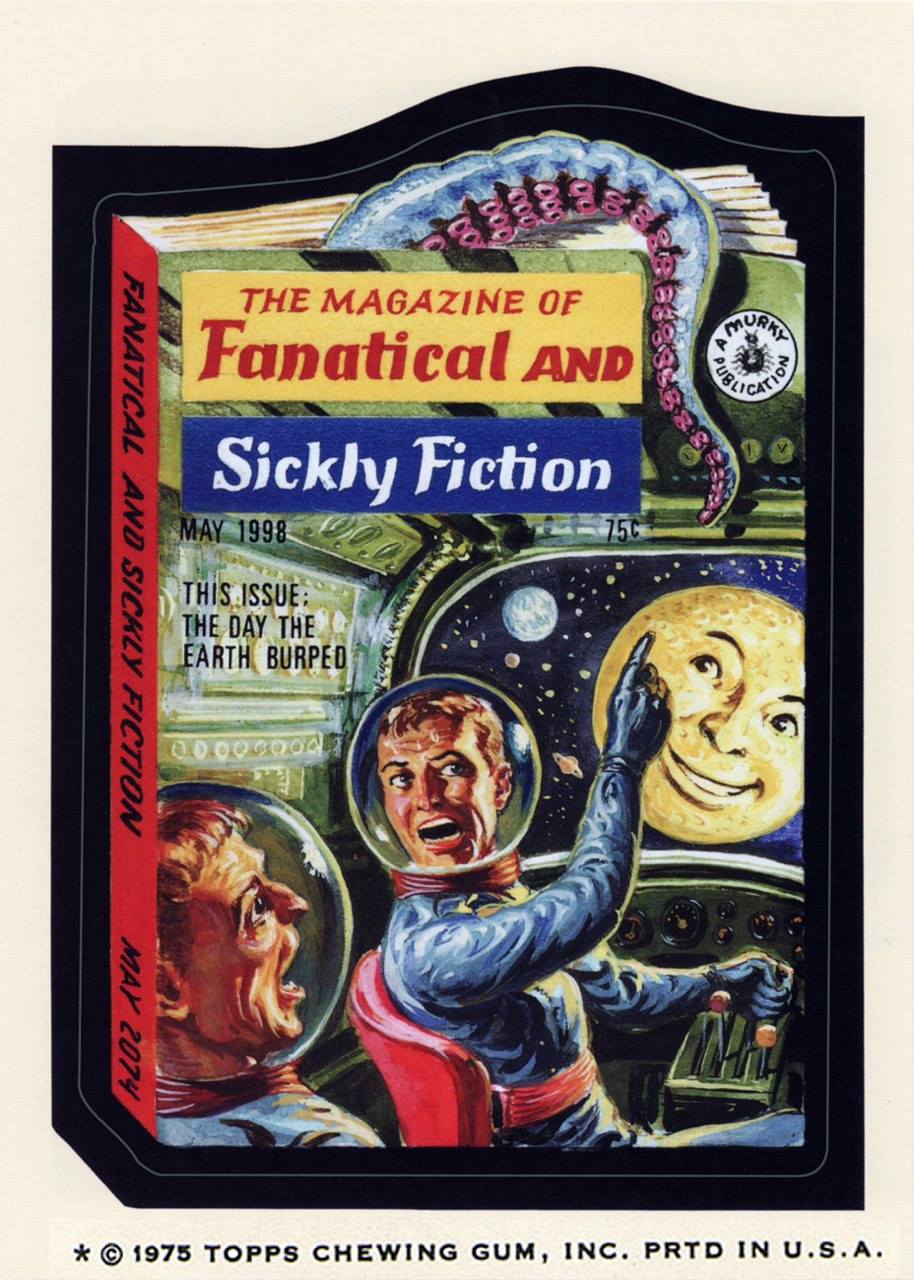
This Wacky Packages card (from the 14th series, released in April/June 1975) is painted by Norman Saunders from a concept by Jay Lynch (which looks like this). Given that the moon is grinning at them, I think these two are high on something (I’m willing to accept tentacles in space, but I draw the line at anthropomorphized satellites).
Sometimes tentacles masquerade as waves, but we know better! Dunno why some sea god would want a cyborg chunk of metal, though.
Rom no. 1, July 2016 (IDW), a variant cover from something called « Retailer Incentive ». Art by the ever-decorative and undeniably stylish P. Craig Russell, who unfortunately seems to mostly have squandered his talents on operatic and fairy tale adaptations (not counting a few marvelous short stories). Some people’s thing, no doubt, but not mine!
Rom the Spaceknight was a toy created by three men (Scott Dankman, Richard C. Levy and Bryan L. McCoy) in 1979. His creators called him COBOL (a programming language), but he was renamed into ROM (« read only memory ») by the executives of Parker Brothers, the company that bought rights to the this « beeping, thinking toy » (which Time predicted would « end up among the dust balls under the playroom sofa »). As part of a promotional effort, Parker Brothers promptly licensed him to Marvel. Rom the toy was a commercial failure, but Rom the comic book went on to last 75 issues, beeping its last bleep in 1986 (not counting the comic’s revival by IDW in 2016).
The comic may have passed from Marvel’s hands into IDW’s, but the description still seems to have been written by a hyper-ventilating lummox flinging spit everywhere as he croaks: “WE’VE BEEN INVADED AND ONLY A SPACE KNIGHT CAN SAVE US! Now the ongoing tale of ROM begins in earnest! Christos Gage, Chris Ryall, and David Messina kick off the wildest new series of the year as Rom’s war with the DIRE WRAITHS hits close to home in ‘Earthfall, part 1!’ ‘The long-beloved and even longer absent space hero returns at long last! First, we brought back MICRONAUTS! And Now… ROM! As if Rom’s return wasn’t enough, wait’ll you see how this one ends!” Brr.
So far, the tentacles featured have been rather on the tame side. Let’s have something properly terrifying…
Lance Lewis (Space Detective) and his girlfriend Marna may be in a tight spot… but I’m sorry, I’m having trouble imagining the terror of being overcome by these teeny-tiny octopuses. They’re just too dang cute, clinging to Marna’s legs like puppies begging for food. Startling Comics no. 53, 1948, the last issue of this series. Cover by Alex Schomburg (1905-1998), a prolific Puerto Rican artist (this is signed as Xela).
Oh well, terror petered out today. I guess this Tentacle Tuesday is not going to scare anybody witless. There’s always next time!
Greetings. Today’s theme: purple tentacles! (No, that’s not a euphemism.)
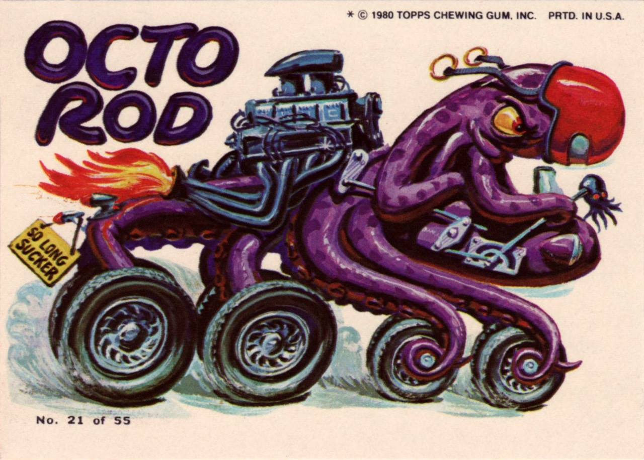
First up on our list is this beauty of an octopus, the Octo Rod.
This intrepid purple fella is part of Topps’ 1980 series, Weird Wheels, which had 55 cards in all. The credit for the gorgeous artwork is split between Norman Saunders and Gary Hallgren; nobody’s quite sure which artist worked on which card, and whether Saunders actually painted the images himself, or just retouched paintings by somebody else.
Sadly, Weird Wheels just didn’t sell all that well, so you can still purchase them for fairly cheap today. You can see the whole set here (and please do feast your eyes on them, they’re quite stunning).)
Octo Rod is no. 21, 1980. The art is by Gary Hallgren, at least according to David Saunders, Norman Saunders’ son.
Speaking of David Saunders and his dad, here’s a quote from “Norman Saunders” (a book written by David in 2009):
« In 1980, at the age of 73, with failing eyesight, cataracts, and advanced emphysema, Norman Saunders defied doctor’s orders and went back to work on one last card set. Weird Wheels are painted with full control of his creative powers, but with a morbid humor that reflects his attitude towards mortality. When reprimanded by his son for risking his life on low paying work, the artist said, ‘It’s fun! I gotta keep working! What the hell else am I gonna do?!‘ »
Saunders passed away in 1989, at 82, after a remarkably prolific and varied career.
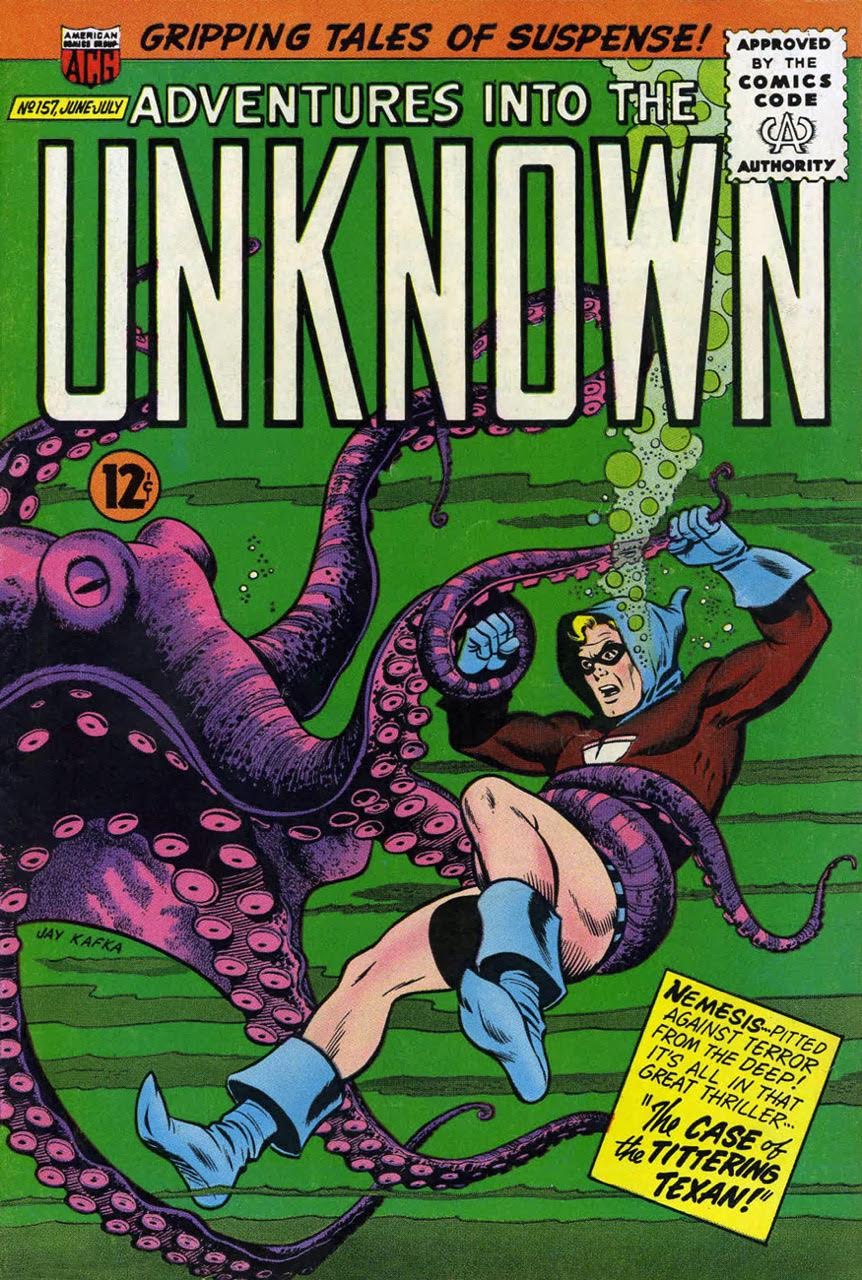
Moving on, here’s a thrilling scene of purple tentacles vs Nemesis:
This is ACG’s Adventures Into the Unknown no. 157 (June-July 1965). The cover is by Kurt Schaffenberger (who signed as Jay Kafka here). “Case of the Tittering Texan” sounded intriguing – I figured that the Texan was being tickled by a tentacle – but no, he’s just a stuttering, crazy, power-hungry villain in a cowboy hat and spurs. Same old, same old…
I would also like to mention that Nemesis *is* wearing pants (well, shorts, at any rate), but his costume is still gosh-darned stupid. You try wearing a hood under water and see how far it gets you. I’m normally a fan of ACG‘s Adventures, but Nemesis is by no means a favourite character of mine.
Further developing the theme of violaceous violence, here’s another:
« Giant squid, giant water rats! Are we in New York, or are we on Mars? Down here, it’s hard to tell! »Ghostly Haunts no. 31, April 1973, cover by Jack Abel.
“Sewer Patrol”, the cover story, is also illustrated by Abel, with an excellent script by Nicola Cuti – it’s a story about people who dump their pets (and still-alive food) when they don’t want them anymore… and where and how these pets end up. (The answer to that, of course, is “mutated, gigantic and in the sewers.”)