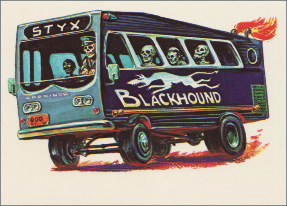
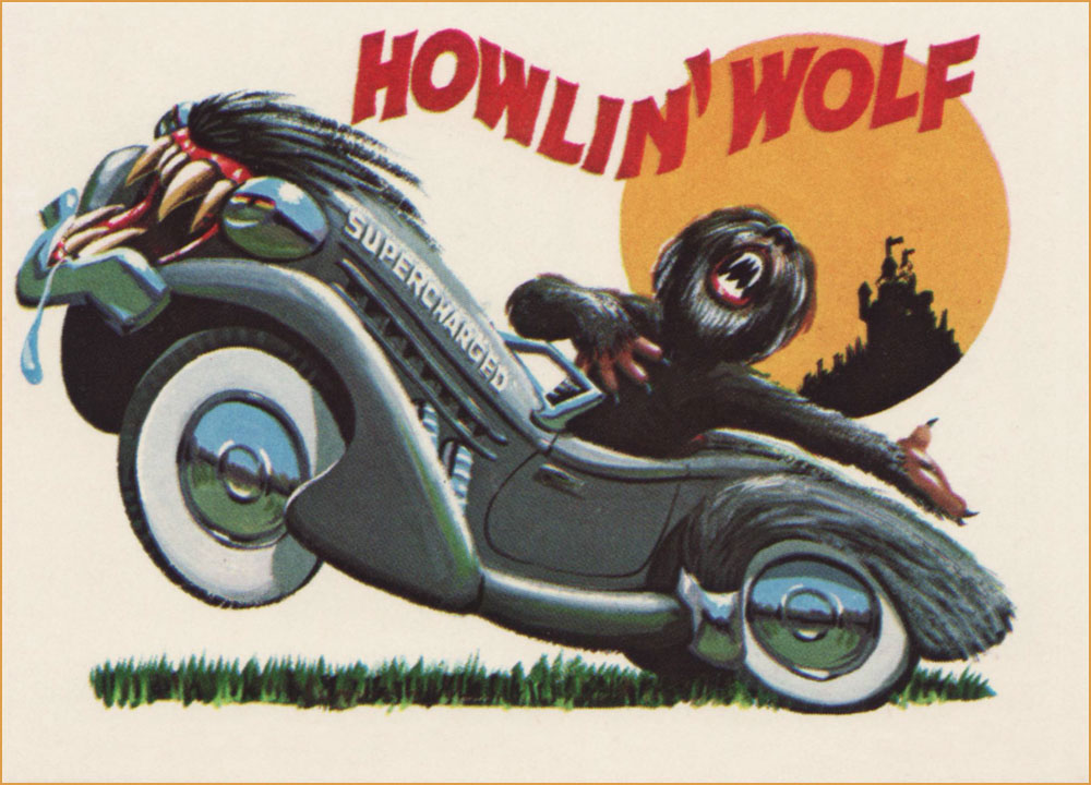
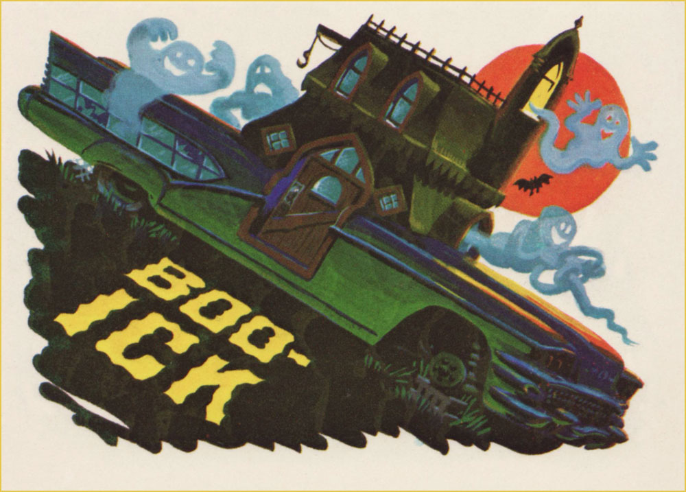
« There is never enough horsepower… just not enough traction. » — Carroll Shelby
While my co-admin ds has already touched upon the circumstances of Topps’ Weird Wheels in her Purple Tentacle Tuesday post, she was of course thematically constrained there… while I’m free to drill down deeper into the set’s considerable riches. I won’t recount the set’s history, as that haunted ground has long ago been exhaustively explored and trod upon by the mighty Kurt Kuersteiner, monster gum card historian and also owner, operator and distinguished curator of the Jack T. Chick Museum of Fine Art. Peruse at your peril his fine account of what went down when Weird Wheels came down.
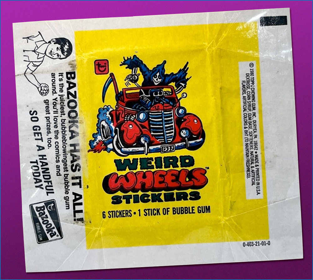
No one can claim this didn’t constitute an attractive package!
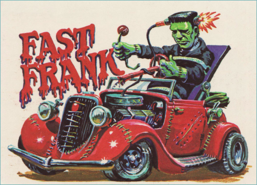
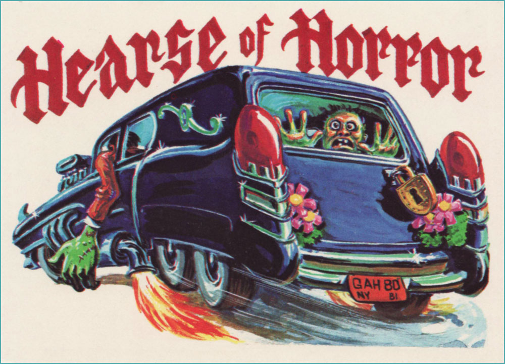
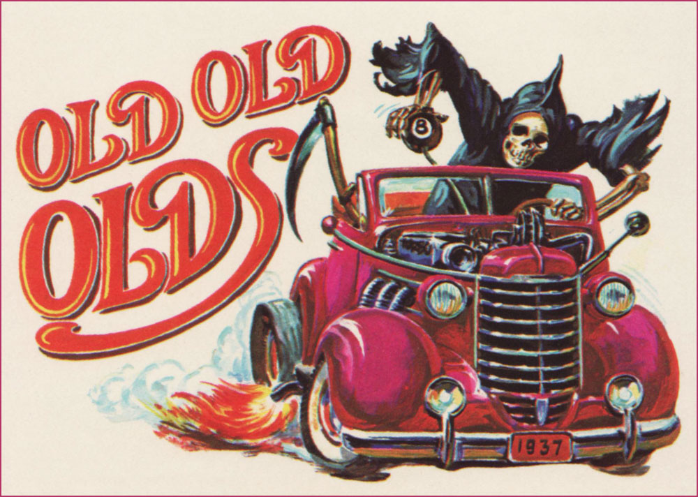
And now, on to the cards… my favourites, anyway. From what’s known, the art duties were shared by Norman Saunders and Gary Hallgren.
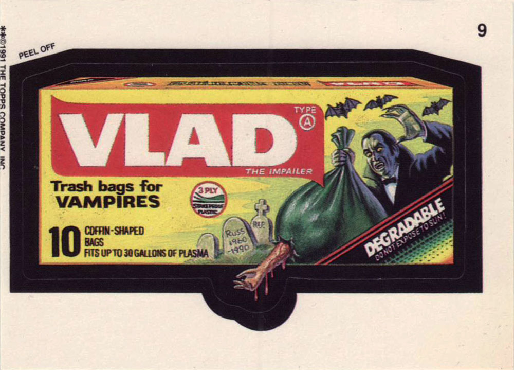
Card no. 1. Note the belfry engine.Card no. 4.Card no. 9.Card no. 17.Card no. 18. Held together, of course, by surgical stitching.Card no. 22.Card no. 23. This one, without question, was painted by Gary Hallgren… note the licence plate.Card no. 26.Card no. 27.Card no. 45. Here’s the ideal soundtrack for this scene.Card no. 54. I love that this heap isn’t going anywhere: it’s on bricks.
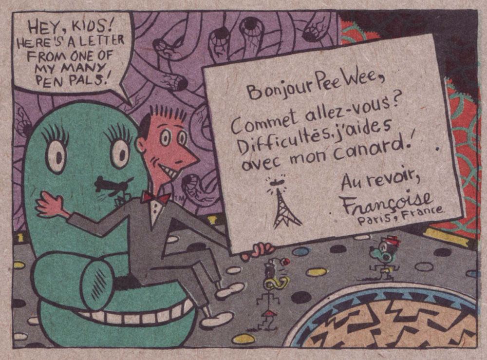
Today, Paul Reubens (born Paul Rubenfeld on Aug. 27, 1952) celebrates (in the coolest style, to be sure) his seventieth birthday. What’s he got to do with comics? Well, he obviously reads them, and his alter-ego, Pee-wee Herman, once met legendary small-scale comics hero Bazooka Joe.
This momentous occasion took place on the back of card no. 18 (of 33) from Topps’ delirious Pee-wee’s Playhouse set (1988). Introductions were arranged by that dapper bon vivant, Mark Newgarden.
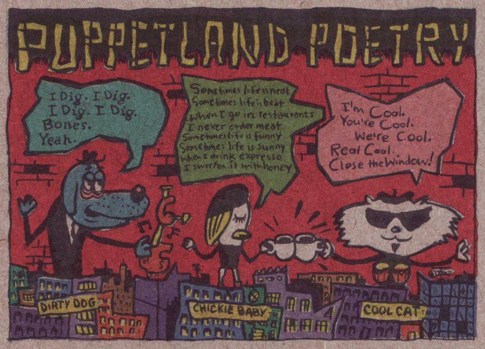
This is happily one of those rare occasions when the word ‘Fun’ is accurately evoked. While Mr. Reubens wasn’t directly involved with the conception and concoction of this splendid ‘Pak’, he signed off on every aspect of it — no generic licenced product, this.While the front of the cards bore the standard, time-tested ‘photographs with captions’ images, the backs is where the anarchic action was. Here are a few samples. Note the unbleached cardboard, which adds a certain primitive je ne sais quoi.“Remember — you are an ARTIST!”The Puppetland Band, those adorable beatniks, were always favourites.Cartoonists Mark Newgarden and Kazimieras ‘Kaz‘ Prapuolenis write in!
Funny, I would have expected Françoise Mouly‘s french to be better than this. Perhaps that’s why she moved to NYC. A sheet of stickers… featuring, front and centre, Roger from Monsterland (‘Look’ was the secret word that week).Temporary (sorry) tattoos. It was just to difficult to pick just one sheet, so here are two. The “Pee-wee Copter”, front and back.If you think you recognized the distinctive stylings of messrs. Charles Burns on the front and those of J.D. King* on the back… kudos on your discerning eye, keen one.
At one time, during Pee-wee’s heyday, I dated for a few months this girl from a, to put it mildly, conservative family. Her little brother was expressly forbidden from watching Pee-wee’s Playhouse, for fear that ‘it might turn him gay’. Live and learn… do check out this smart list of The Best 25 Pee-wee’s Playhouse Moments.
Happy birthday Paul, and a great weekend to you, Pee-wee!
Bonus time: in a case of ‘biting the hand that feeds’, Topps issued this snarky entry as part of its 1991 Wacky Packages series. Concept, writing and layout by Mark Newgarden, painted art by John Pound.
– RG
*a grateful tip of the hat to Mark Newgarden for the inside dope!
« So, you see the little snot on the right side, move it two inches to the left and add a little bit of green gleam to it. » — Mark Newgarden, doing some art direction
If this one looks sharper than you’d expect, it’s because it’s shot from a larger version of the Wacky card that Norman Saunders (re)painted for Topps’ Wacky Posters series, circa 1973.
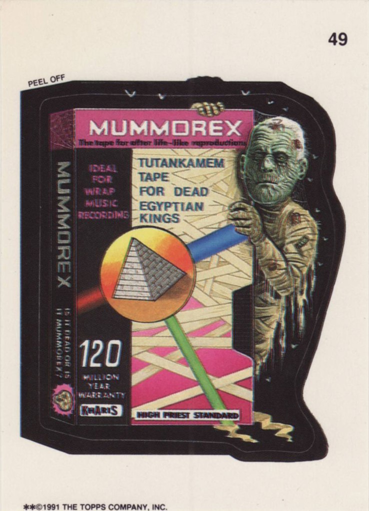
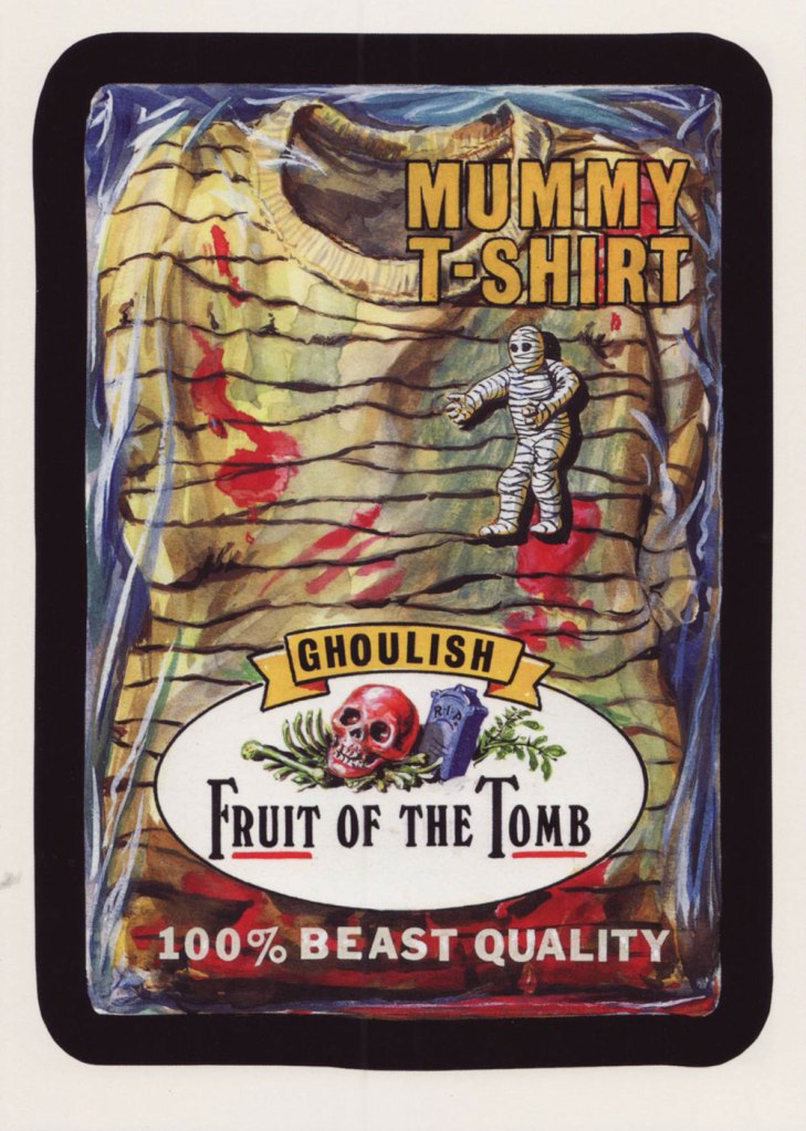
Ladies and gentlemen, Drew Friedman! « In 1991, I was creating many concept sketches and pencil drawings for the TOPPS company, including for their latest set of the hugely popular sticker series “Wacky Packages”. Mark Newgarden was the editor and art director for the 1991 series, and the writers for the card fronts included Newgarden, Jay Lynch, Jordan Bochanis, John Mariano and myself. I drew about 22 tight pencil images which would (with one exception) be painted by the illustrator Patrick Pigott. » If you enjoy being privy to an artist’s creative process, by all means do yourself a favour and feast your peepers on this gallery of Friedman’s roughs, finishes, used and unused pieces. In this (mummy) case, it’s Friedman pencils, finished art by Tomas Bunk.
From the 6th Series (1974, Topps). Most likely painted by Norm Saunders.
From the 8th Series (1974, Topps)… though mine’s a 1980’s reprint. Painted by Norm Saunders.
From the lucky 13th Series (1975, Topps). Another fine Saunders vintage. Topps would find Mr. Saunders most difficult to replace.
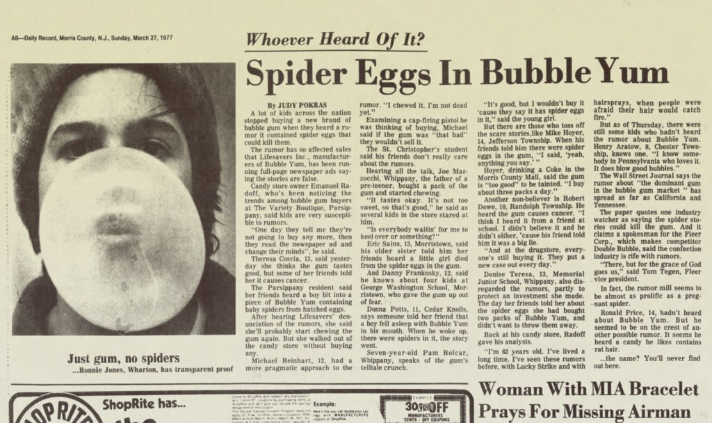
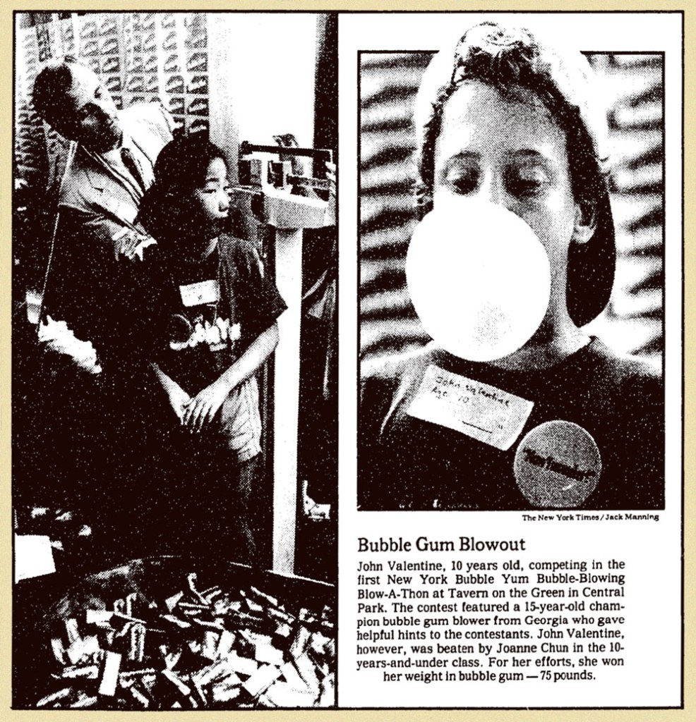
« A kid one time fell asleep chewing Bubble Yum, and he woke up with his mouth full of spider eggs. » — Some nameless rumour-monger
The other day, a neighbour was asking me whether it was a safe for his Golden Retriever puppy to eat the worms it was digging up (I was impressed), the guy presuming that said worms were quite filthy and rife with germs. I replied that no, it’s probably all the rooting through the trash and gobbling up whatever it finds that’s giving the pup gastric distress. Worms, in fact, are considered a delicacy in many a culture, including some European ones. Not that I’ve indulged: just like The Kinks’ Apeman, I’m a strict vegetarian.
This brought to mind those 1970s rumours of earthworms serving as filler in McDonald’s burgers (never mind that worms are a far costlier ingredient than is beef). Which led in turn to the equally-outlandish notion that the secret of Bubble Yum’s softness (introduced in 1975 by Life Savers, it was the first soft bubble gum ever concocted) lay in its containing spider eggs. Again, steady procurement would have proved quite a daunting challenge.
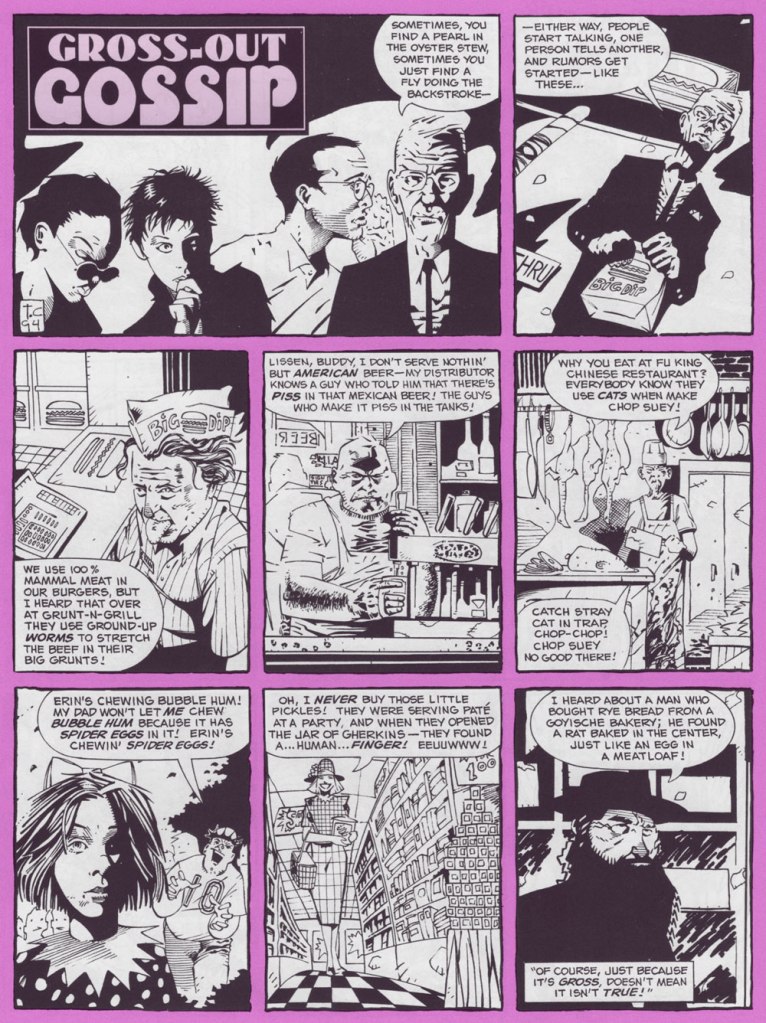
Art by Tomm Coker, from The Big Book of Urban Legends (1994, Paradox Press/DC); edited by Bronwyn Carlton Taggart and featuring the most inconstant levels of skill and talent you’re ever likely to encounter in a professional comics publication: a couple dozen or so versatile cartoonists, and over a hundred superhero hacks and/or photo tracers utterly out of their depth, a reminder of just how shallow the talent pool is. This isn’t one of the good pieces, but it’s nowhere near the bottom.
A trade ad from 1977, the year of Bubble Yum’s national (and international, as this Canadian can attest) rollout.
But the bubble was about to burst (or at least deflate somewhat), as reported by The New York Times (March 29, 1977):
The Great Spider Egg Mystery remains unsolved but it may yet have several happy endings. The mystery concerns Bubble Yum, a popular new bubble gum that has, in a year, overtaken such symbols of earlier childhoods as Dubble Bubble and Bazooka. A few weeks ago came toil and trouble: the unexplained spread of lurid rumors among children in the New York area that, gasp!, Bubble Yum contained spider eggs (or, according to haughtier youthful accounts, caused cancer). Stores which had up to then been unable to stock enough to meet demand suddenly saw sales plummet. Last week, the manufacturer, Life Savers, Inc., took out full‐page ads in 30 area newspapers to combat the rumors.
This is not the first time the bubble gum business has been beset by evil rumor. When Jimmy Carter was a boy, youngsters in Sumter County, Georgia, were scared off by reports that bubble gum was made with snake oil —until they were reassured by an ad in the Americus Times‐Recorder. Nor is bubble gum normally regarded as the stuff of moral lessons. Its history, since it was invented by Walter Diemer in 1928, is marked by such milestones as packaging it with baseball cards (1933) or making it squeakless (1953).
But there is something more significant, and appealing, in the open way in which Life Savers has chosen to deal with its problem. We hope the spider egg rumors are expunged as successfully now as the snake oil rumors were then. And there will be a happier ending still if the subject is properly understood to be not bubble gum but canard. No consumer is too young to learn the malign effects of rumor or to understand that there will always be someone, not always in youthful innocence, eager to raise the cry—whether about Communists in government, environment, energy or bubble gum—of “spider eggs.”
From Morris County, NJ’s Daily Record, March 27, 1977 edition.
Susan M. Smith wrote, in her 1989 thesis, Consumer Rumors and Corporate Communications:
Whether the rumor is isolated or widespread, the company must select media that reach the rumor’s community of interest, and particularly, its influential leaders. The importance of this is shown by what happened after a rumor episode in New York City for the Life Saver’s Company. The company conducted an all-out attack to combat a rumor in 1977 that the company’s innovative, new soft chewing gum. Bubble Yum, contained spider eggs. It sought publicity, inserted full-page newspaper ads, and sent letters with a copy of the ad to the city’s PTA groups, school principals, and retail outlets.
The campaign successfully stopped the rumor, but Bubble Yum’s New York sales did not recover for many years. It turns out that even though the company had blanketed the city with its rumor denial, it never spoke directly to product users, the school-age children, to bolster confidence in the product. The selection of inappropriate media makes the refutation message miss the rumour’s public allowing the rumor to continue to spread or delaying recovery from the rumor.
Speaking of advertising: Marvel’s knockoff of Scholastic’s Dynamite, Pizzazz (1977-79), which included lots of ads, featured this piece in its 6th issue (March 1978, Marvel). This gives you a sense of Bubble Yum’s success, as the product was, in its field, what’s termed a disruptive innovation. Chewing gum no longer had to be hard.
Inevitably, the imitators came! Smooooth N’ Juicy, Hubba Bubba, Bubblicious, the oddball Freshen Up, and so on. Marvel switched its advertising allegiance to Topps. This is from Pizzazz no. 11 (Aug. 1978, Marvel). The art looks to me to be the work of Mad magazine veteran Jack Rickard (1922-1983).
A few issues later, (Pizzazz no. 14, Nov. 1978, Marvel), in a brazen display of corrupt insincerity, came this so-called Consumer Guide (note that only Topps products are pictured). Really, is Bubble Yum “the hardest, toughest gum our testers had to chew“? Surely anyone who’s ever tried to chew something from the Bazooka family knows better. My jaw aches just from the memory.
The company continued efforts to restore its reputation in the New York market, where the rumours had caused the most harm. A piece from The New York Times‘ Tuesday, July 22, 1980 edition.
This ad ran in Adventure Comics no. 487 (Nov. 1981, DC) and several other titles in the following months.
Now that’s better: in 1982, they turned to the incomparable Jack Davis to illustrate one of their print ads. Given his prodigious speed, he couldn’t have spent more than an hour on this specific piece, but it works far better than its predecessors. Incidentally, the ‘Super Yum’ thing (replacing Soft ‘n Juicy) appears to have been a move to block a competitor from using the appellation.
But I suppose all this controversy merely seems quaint now, what with all today’s heavy weaponizing of misinformation. Besides, the bubblegum market has been rather moribund in the past few decades, since apparently Nobody Likes to Chew Gum Anymore.
For a bit of sugar high nostalgia, I’ll leave you with a pair of vintage Bubble Yum ads: 1976’s brand introduction, featuring The Flavor Fiend;
And 1988’s spot co-starring a young Leonardo DeCaprio, which shows us he was clearly born with that insufferable smugness, or at least had honed it to perfection by his teens.
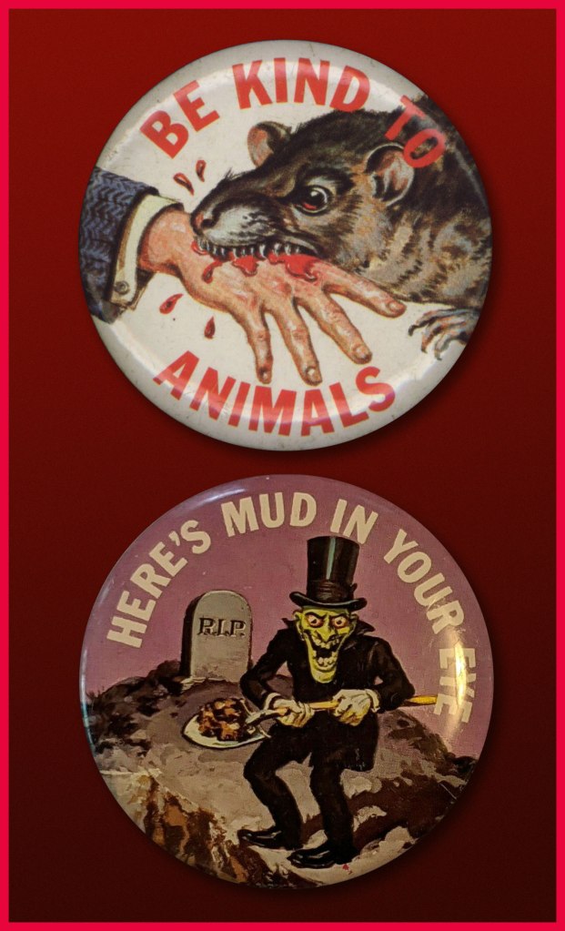
« … a radical series of crappy jokes & trashy art mopped out of the Bowery’s least washed lavatories. Fueled on bologna sandwiches, black coffee & cheap cigarettes, these are the ugly buttons that scream ‘America‘ to an America that has forgotten itself. » — a tasty bit of hype from Goblinko
Fabled pulp illustrator Norman Saunders (a definite favourite around these parts) is legitimately appreciated for his body of work, but I do believe he isn’t sufficiently lauded for his humorous work. After all, he could hold his own against the likes of Basil Wolverton and Wally Wood, and how many of his peers could lay claim to such a lofty achievement?
A passage from his son David’s definitive monograph, the simply and fittingly titled Norman Saunders:
Ugly Buttons came out in 1967 to exploit the popular trend of protest buttons with witty sayings. The macabre humor of Ugly Buttons reflects their Halloween release date as well as the morbid comedy of popular TV shows like The Addams Family and The Munsters. Norm Saunders created half [ eleven, actually ] of the twenty-four images in this set, while Wally Wood created the other half.
A sample of the original packaging…
I’m sorry… but that bat is just so adorable…
You can see why these are perfect Hallowe’en fodder!
Macabre, and with a tidy moral to boot! At a nickel apiece, an undeniably excellent value.
Well, perhaps not *strictly* altogether moral.
The final Saunders button, shot from the original art. This looker was entitled Peek-a-Boo.
One of the original boxes, which held 24 packs. Featured buttons Here’s Looking at You and I’m a Cool Ghoul were designed by Wally Wood.
Collectors find this set very difficult to complete. Although the series was a popular success in 1967, the buttons appear to have rarely survived. This is perhaps attributable to the design of the tin back pin, which was made in Japan with a hair-trigger clasp that instantly popped open and fell off.
Here’s one of the underperforming bad boys in question. To be fair, this one’s still holding together, which surely has earned it some kind of goodwill, a half-century hence. Those old enough (enough, enough!) will recall when ‘Made in Japan’ was an indicator of shoddy goods. All that’s been turned on its head since, interestingly. The Japanese people have admirably overcome much adversity, that’s evident.
By the way, I don’t know just how sanctioned these reissues are, but the cool cats at Goblinko have made these lovely buttons available once more, presumably sturdier and certainly at a perfectly reasonable price (forty times the original, I’ll grant you… but you do get to pick).
« When the mind is thinking, it is talking to itself. » — Plato
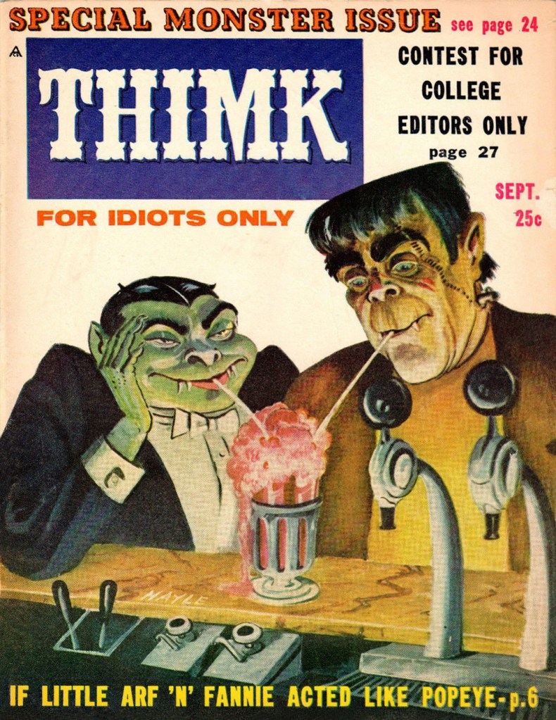
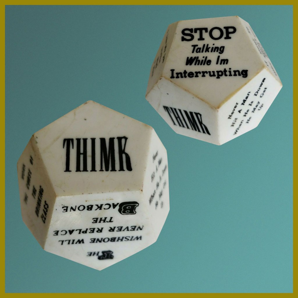
The waning years of the 1950’s marked the beginning of the monster craze, which coincided with Mad Magazine’s ripest period of influence. Here, then, is a publication that sought to capitalize on both occurrences. Alas, chasing fads too eagerly always did land you all-too-promptly in the cultural ditch. Still… Thimk had its moment.
This is Thimk no. 3 (Sept. 1958, Counterpoint). Edited by Alan Whitney, cover by Sam Hayle (1911-1996), who later did a bit of work for Cracked.
This is Thimk no. 4 (Dec. 1958, Counterpoint); cover by Sam Hayle. Elvis finds out first hand how fickle teenyboppers can be, and how a two-year army hitch might as well be an eternity, as far as they’re concerned. Uneasy lies the head that wears a crown!
Thimk was a short-lived (6 issues, 1958-59) would-be Mad, also in the black and white magazine format.
One holiday gleefully bleeds into another… this is Thimk no. 5 (Feb. 1959, Counterpoint). “Free… for 25 cents!”
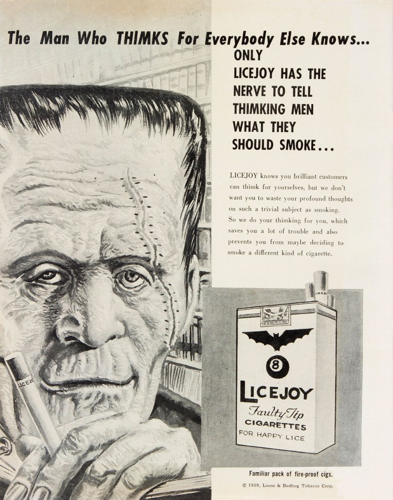
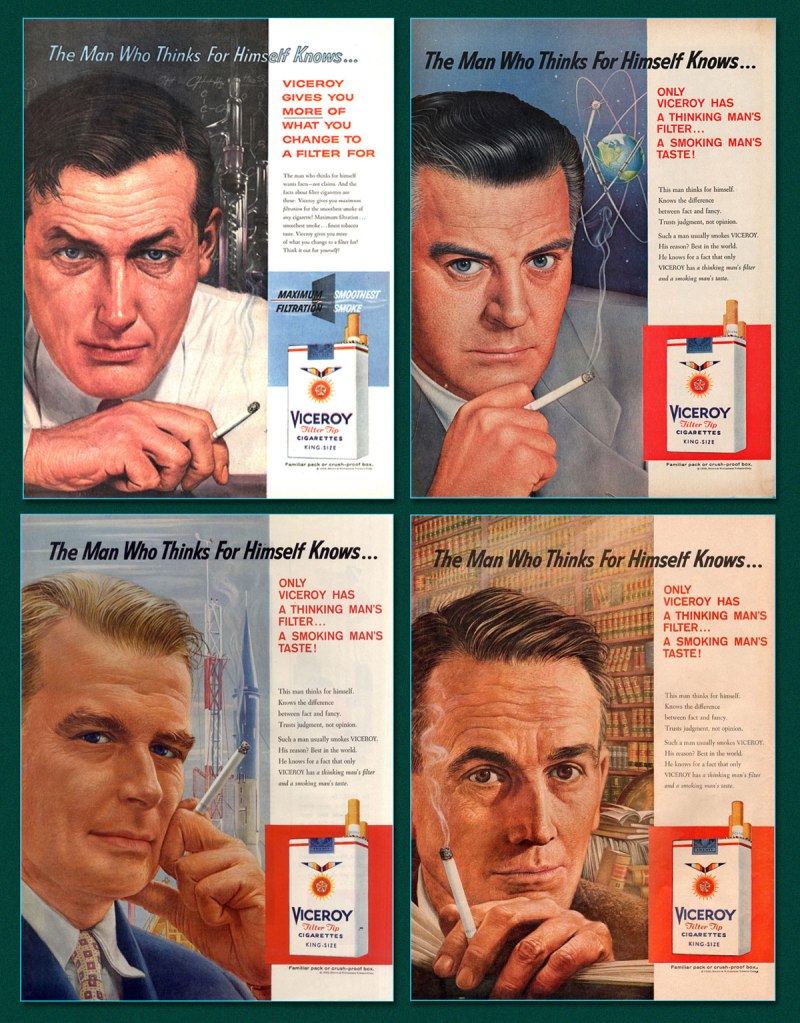
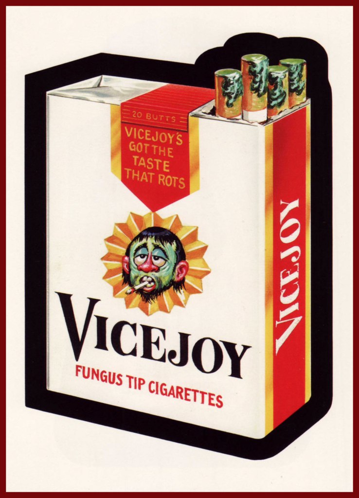
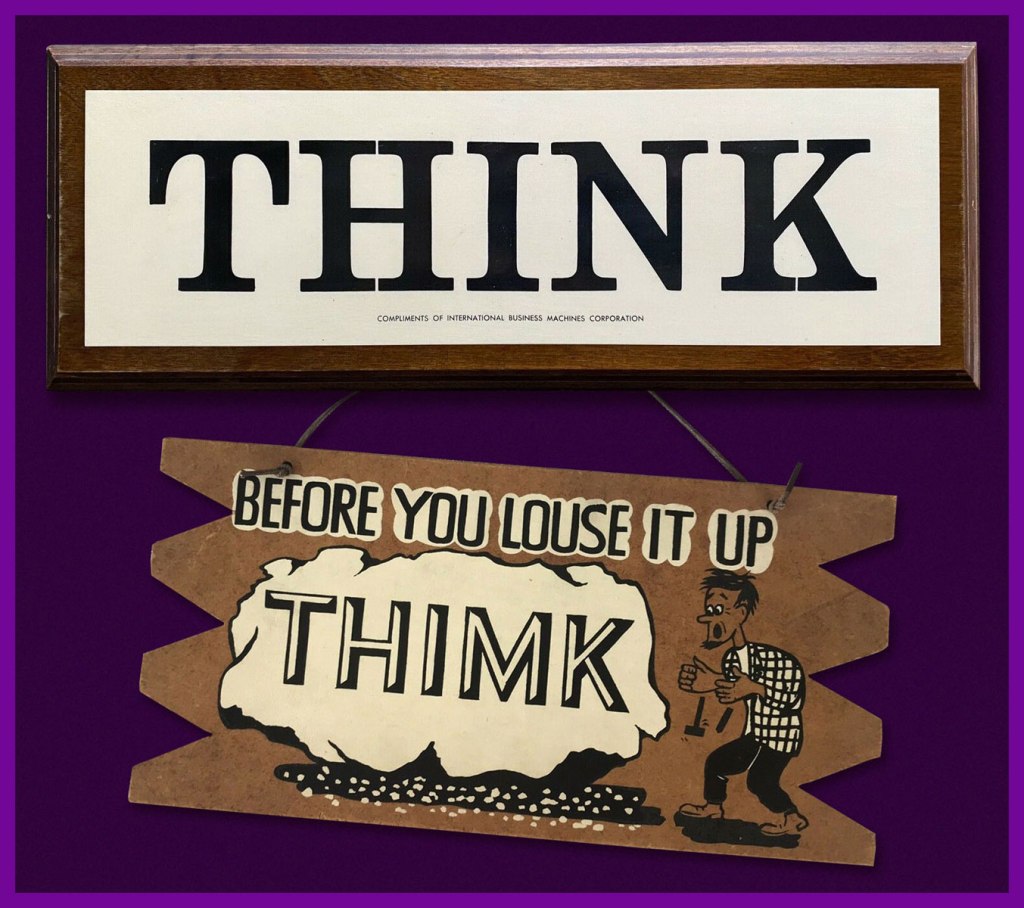
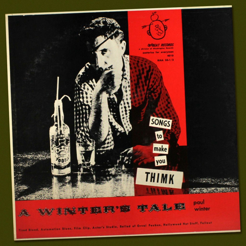
Thimk no. 5‘s back cover… a well-aimed barb at Viceroy Cigarettes.And some samples (there were many, many more!) from the object of parody, Viceroy’s The Man Who Thinks for Himself ad campaign. Lookit all them deep thinkers! (Martin Fry, cancer survivor, bottom left).And it wasn’t to be the last Viceroy parody, either: the brand was also an early Wacky Packages target. This entry hails from Series 1, featuring a rough concept by Art Spiegelman painted by Norman Saunders (1973, Topps). Heads up, Marlon… some… thing is about to cut in for a dance. Is his date dismayed or delighted? Last call: Thimk no. 6 (May 1959, Counterpoint) was the final issue. Cover art, again, by Sam Hayle.From Think to Thimk in one easy step. What began as a ubiquitous IBM slogan soon, inevitably, led to parodic counterpunches.During the late 50s, it spread seemingly everywhere.Legendary Detroit DJ Paul Winter (station WXYZ) got in on the act early (1957). Here’s a sample, Fallout, featuring Charlie Byrd on guitar!And of course, the great Steve Ditko took the slogan to heart (and mind), famously making his own sign. I wonder where it is now.
« Even without the benefit of philosophical reflection, anyone who has spent some time in an enclosed space with an excited bat knows what it is to encounter a fundamentally alien form of life. » (Thomas Nagel, What is it like to be a bat?)
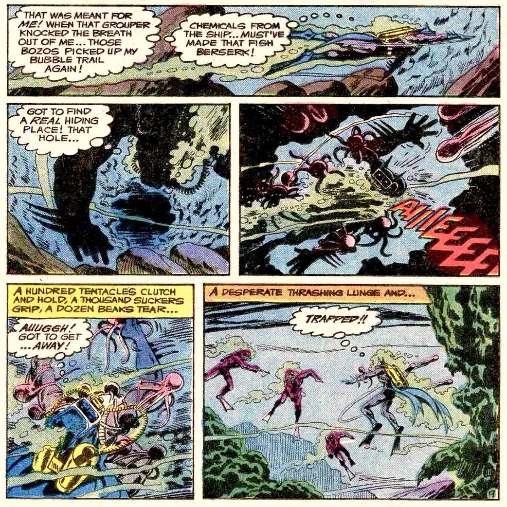
Bats and octopuses, now there’s a combination that doesn’t often occur in nature – while both are admirable, fascinating animals, they’re not linked by lifestyle or environment, and neither is the other’s prey. Batman, on the other hand, has definitely tangled with many tentacled monsters in his time (which proves that he’s not a bat). I’m sure today’s post didn’t unearth *all* the octopuses that Batman has had the pleasure of defeating, especially those of a more modern vintage (with mostly horrible art, which is why I’m not too worried)… but today’s selection, you will have to admit, is quite fair.
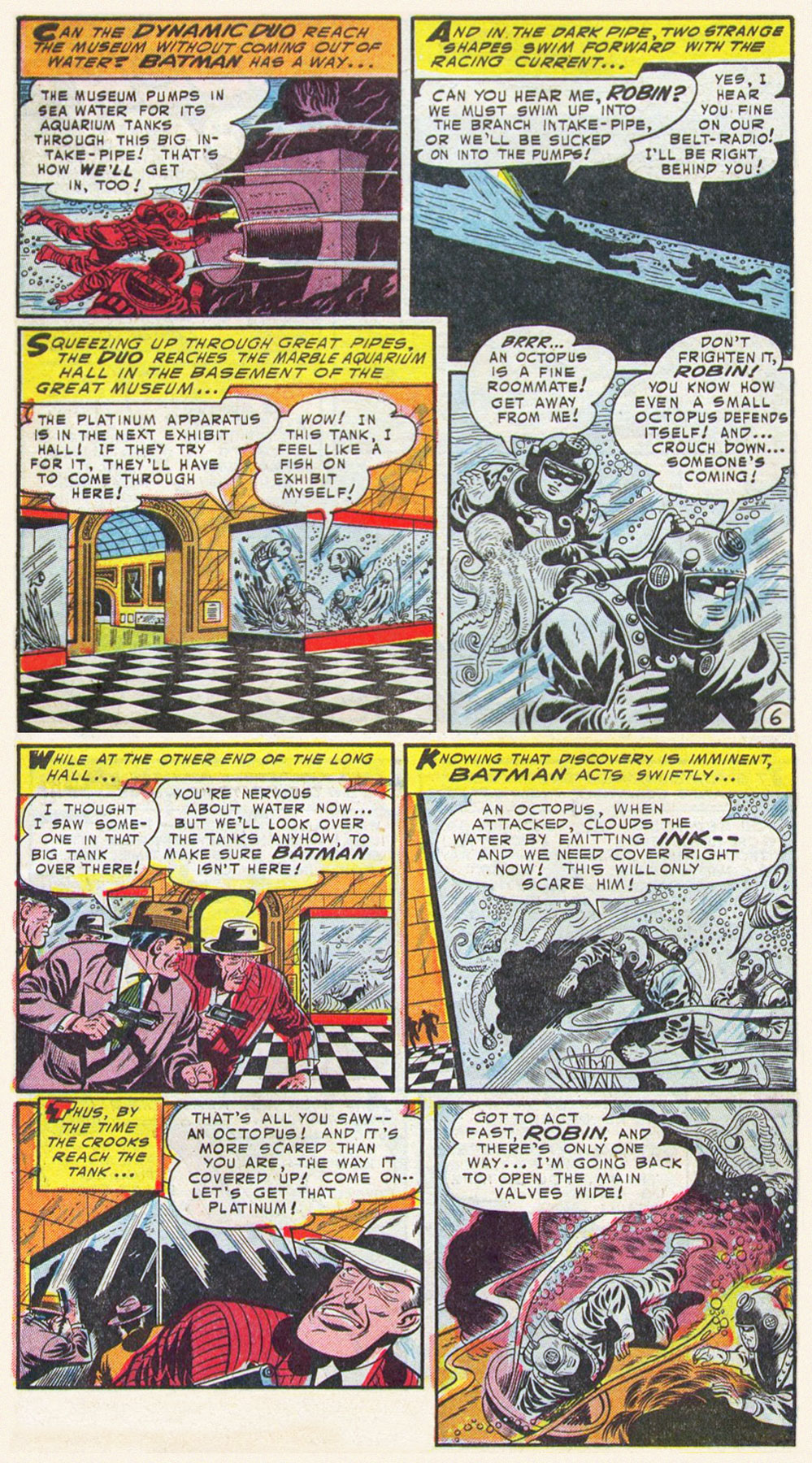
The Voyage of the First Batmarine!, scripted by Edmond Hamiton, pencilled by Dick Sprang and inked by Charles Paris, was published in Batman no. 86 (September 1954).
Bat-Mite Meets Mr. Mxyzptlk(he must be from Poland, with a name like that), scripted by Jerry Coleman, pencilled by Dick Sprang, and inked by Sheldon Moldoff, was published in World’s Finest Comics no. 113 (November 1960):
I totally squee-ed when I saw this panel.
Justice League of America no. 27 (May 1964), with the cover pencilled by Mike Sekowsky and inked by Murphy Anderson:
The inside story, The “I” Who Defeated the Justice League! is scripted by Gardner Fox, pencilled by Mike Sekowsky, and inked by Bernard Sachs:
Batman no. 357 (March 1983). Cover pencilled by Ed Hannnigan and inked by Dick Giordano:
The cover story, Squid, is scripted by Gerry Conway, pencilled by Don Newton, and inked by Alfredo Alcala:
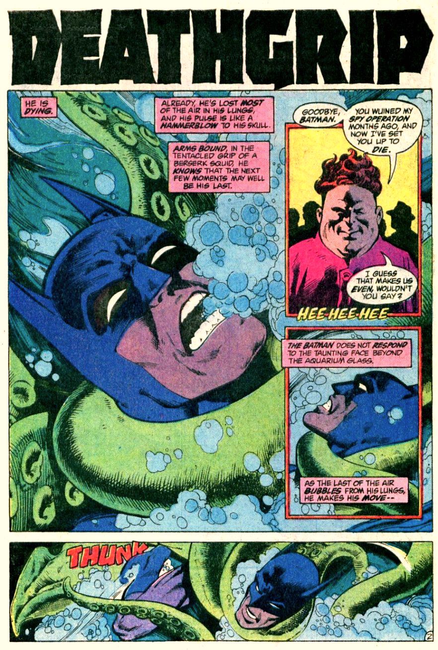
Since they threatened us with the continuation of the story, I followed up, and dug up more tentacles. Deathgrip, scripted by Gerry Conway, pencilled by Don Newton and inked by Dick Giordano, was published (as promised) in Detective Comics no. 524 (March 1983):
Enigma of the Death-Ship!, scripted by Bob Haney and illustrated by Jim Aparo, was published in The Brave and the Bold no. 142 (July-August 1978):
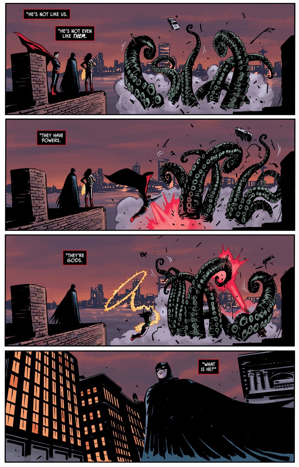
I mentioned modern comics, earlier – I’ve chosen two examples published relatively recently, with passable art.
The pompously titled Leaves of Grass, Part 3: Comedown!, scripted by Alan Grant, pencilled by Dave Taylor and inked Stan Woch, was published in Batman: Shadow of the Bat no. 58 (January 1997):
Knightmares, Part 4, scripted by Tom King and illustrated by Jorge Fornes, was published in Batman no. 66 (May 2019):
To conclude on a more pleasant note…
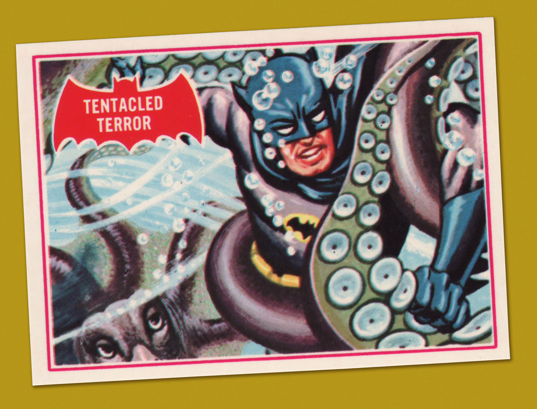
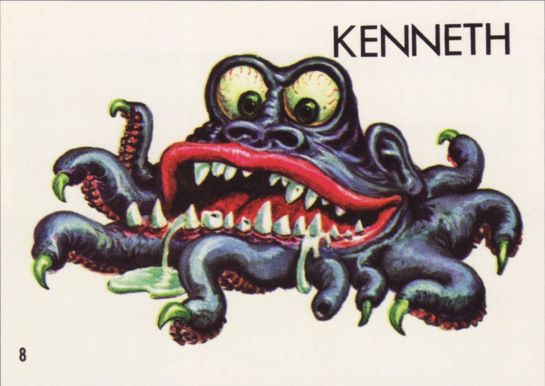
Tentacled Terror, number 8 in Topps‘ 1966 Batman ‘Red Bat’ trading card set, boasting painted artwork by Norman Saunders.
I say, the year’s first Tentacle Tuesday is a big responsibility! That’s why I’d like to start with some slimy or furry, squirming or pitter-pattering, whimsical or gnarled, skittish or spine-chilling, drooly woolly creepy crawlies with toupees and bloodshot eyes. After all, the 2020s decade is sadly guaranteed to be full of ’em… but of a significantly less cute variety than the lot that I’m featuring today.
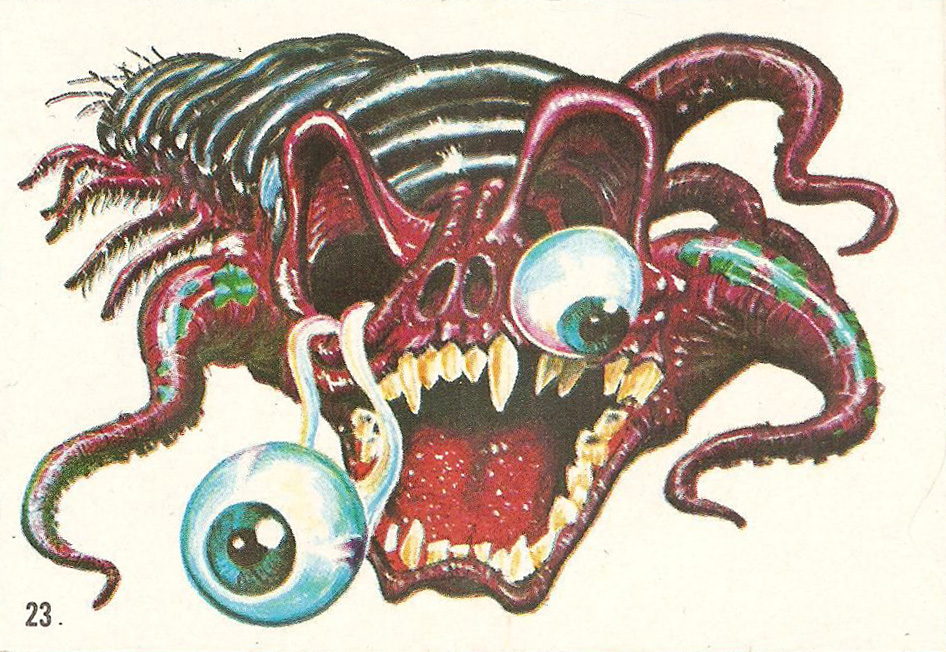
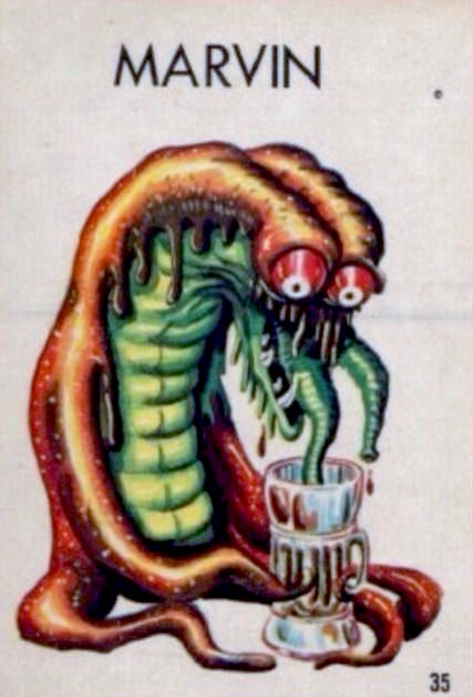
Topps‘ Ugly Stickers have a lot going for them: excellently drawn, tongue-in-cheek monsters in various states of putrefaction. If there’s one commonality between them, it’s that most of them showcase teeth any dentist would be thrilled to drill through. Many of them have far more appendages that a regular creature needs… and a lot of these appendages are distinctly tentacular, which is of course where we come in! And they’re all cute as a button.
David Saunders, Norman Saunders’ son, explains in the latter’s biography (Illustrated, 2009):
«In 1965 Topps released Ugly Stickers. This set was initially based on the grotesque drawings of Basil Wolverton, but when he demanded copyright control, he was paid off for his first twelve images and then fired. The rest of the creatures in the set were designed by Norman Saunders and Wally Wood.
The creatures that appear on the display box, the wax wrapper, and the giant twelve-piece puzzle were all designed by Saunders. He also painted all 44 Ugly Stickers. These were so popular they were reissued in four later versions and even spawned a line of rubbery toys called Teacher’s Pets.»
So what’s the break-down? Out of the original 44 stickers, Wolverton designed 10. The rest were the handiwork of WallyWood and Norman Saunders. The total set numbers 164. Not all cards were repeated in the re-runs, which is why the numbers don’t compute, for those of you who multiplied 44 cards by 4 versions and obtained 176, not 164; there were 4 groups of 40 cards + 4 non-repeated cards.
A page from Monster Mash: The Creepy, Kooky Monster Craze In America, 1957-1972 (Two Morrows Publishing, 2015), which you can read here.
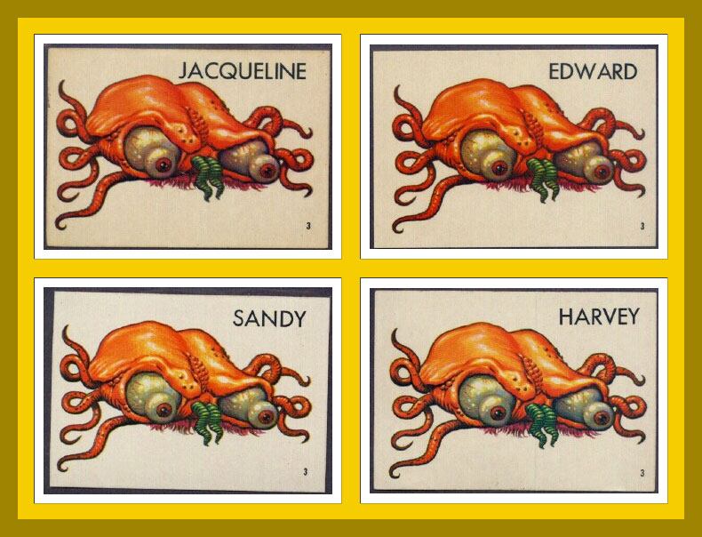
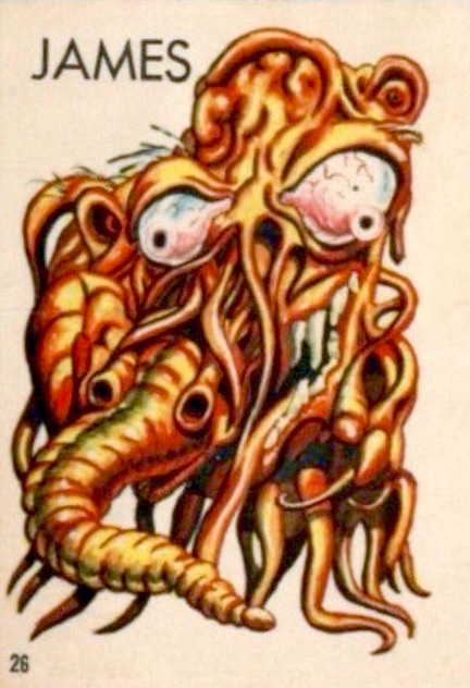
In some print runs, the creatures did not have names, doubtlessly leaving that part to the reader’s imagination. Most cards, however, do have names, with genders shamelessly swapped, making guys into gals and back into guys again. Take a peek at the full list of name changes over at this very instructive website, Bubble Gum Cards.
Does s/he look like a Jacqueline to you? Or maybe an Edward? I vote for the former; such an elegant name for a bug-eyed, displeased brain-thing, Just look at the flair with which she wears that pink tuft of fur underneath.
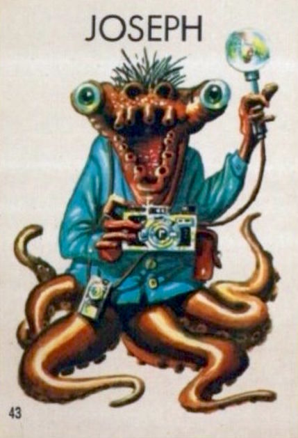
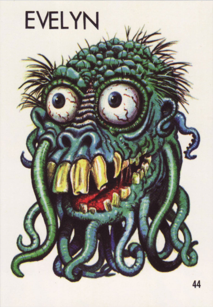
Joseph and Evelyn (or Stanley and Renée, or…) were previously used by my co-admin RG in his Hallowe’en Countdown III, Day 24 post, but they distinctly have tentacles, so I believe it’s worth running them again.
As a little bonus, here’s a lady from Topps’ 1966 Ugly Name Stickers series who asked to be included. Her name was… Donald, Sylvia, Angelo, Phyllis, Barney, or Rosemary. “Barney” is really pushing it!
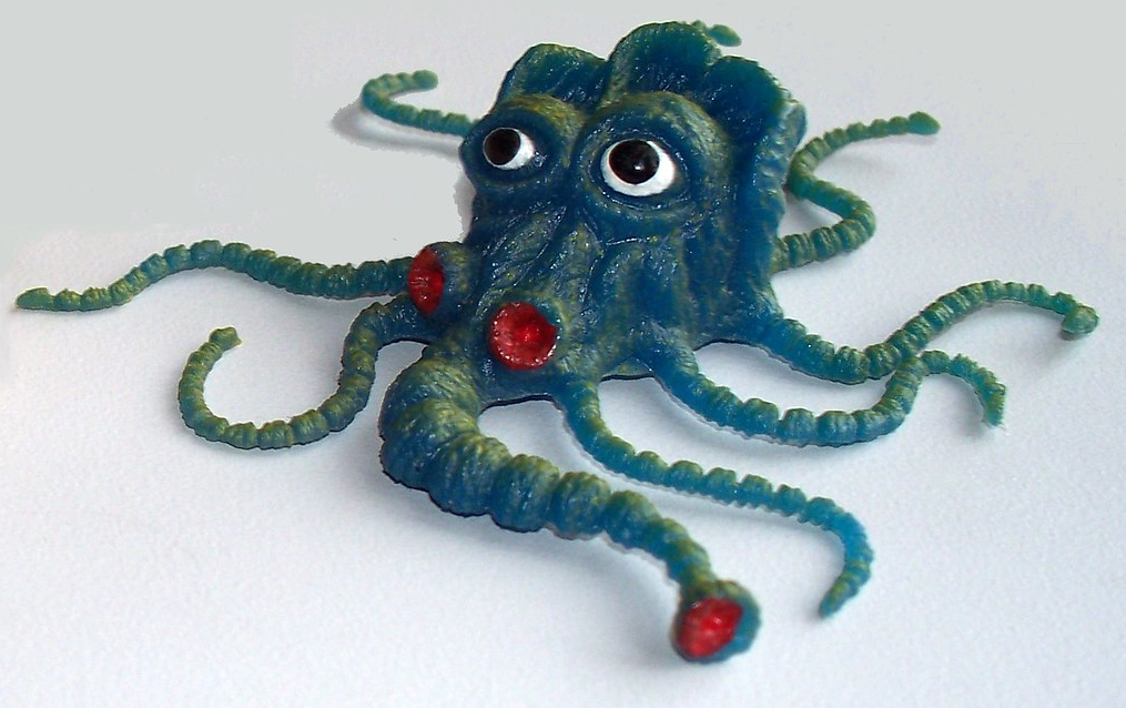
A little friendly critter from the Teacher’s Pets series (probably…. these things are veiled in a shroud of mystery), which was a rubbery spin-off from Ugly Stickers.
« So to this my life has come: there’s meaning in a piece of gum » — Parthenon Huxley, Bazooka Joe
We recently lost another fine cartoonist in Howard Cruse (May 2, 1944 – Nov. 26, 2019), and while he’s most frequently celebrated for his pioneering work in Queer comix and his graphic novel Stuck Rubber Baby, I’m much fonder of his comparatively ‘lightweight’ humorous work. In other words, I’ll take the wacky short stories over the Ponderous Magnum Opus, thank you.
And things don’t get any lighter than Bazooka Joe, now do they?
In 1983, Howard Cruse was engaged by Topps to redesign Bazooka Joe and illustrate a new set of strips, the series’ first true update since co-creator* Wesley Morse‘s passing in 1963. Topps, figuring on more-or-less total turnover of its kiddie audience, had been rotating batches of strips every seven years, drawing on the vast hoard of unpublished strips left by Morse, and now and then hiring freelancers to pad out the lot.
An unpublished Howard Cruse instructional comic, mid-1980s. Cruse recalled: « I always liked this strip because it’s practically the only time I was invited to draw the character at a size large enough to allow some stylistic personality. » I added the colouring, just because.
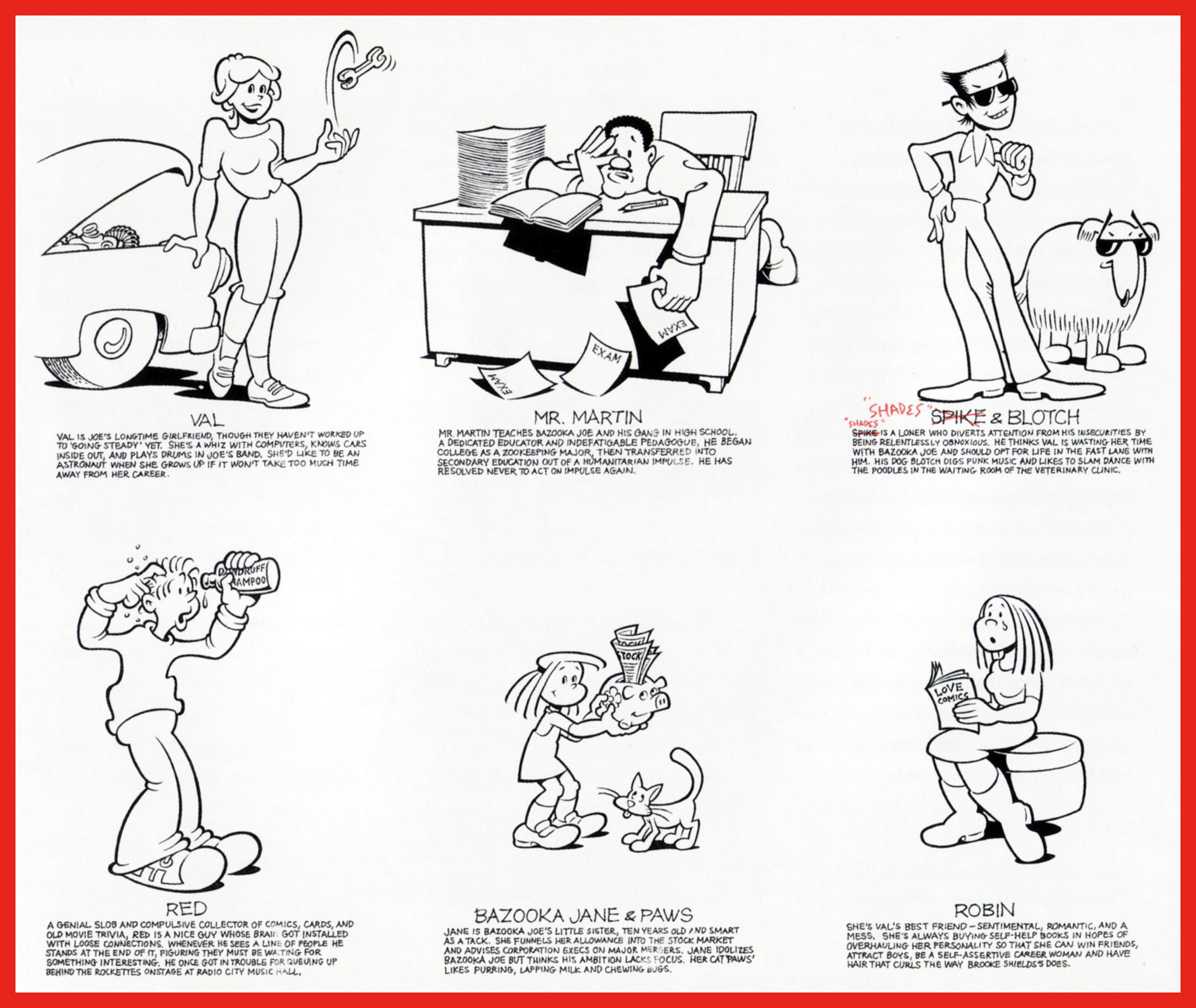
Howard Cruse Bazooka Joe model sheet, prepared for 1983 revamp.
Cruse’s model sheet for the rest of the 1983-vintage cast.
Chameleonic cartoonist R. Sikoryak, who contributed gags to the second Cruise series, posits that « One of the pleasures of the traditional comic strip is the conciseness of words and pictures, and the Bazooka format takes this compression about as far as humanly possible. As with haiku, there is a great power in the constraints that must be respected in obeying a format. »
Samples of the 1983-84 vintage.
Jay Lynch explains: « Despite the brand managers and marketing companies responsible for the various revamps of Bazooka Joe over the years, and their valiant attempts to make the characters and the gags more ‘hip‘, I’ve always thought that the primary appeal of these tiny comics was their overall lameness. Back when I wrote Bazooka Joe, I’d usually start by going through turn-of-the-century joke books and rewriting the ancient quips to turn the 1908 ragtime aficionados into 1990’s heavy-metal enthusiasts… »
Some thoughtful suggestions from Cruse for the 1988 crop.
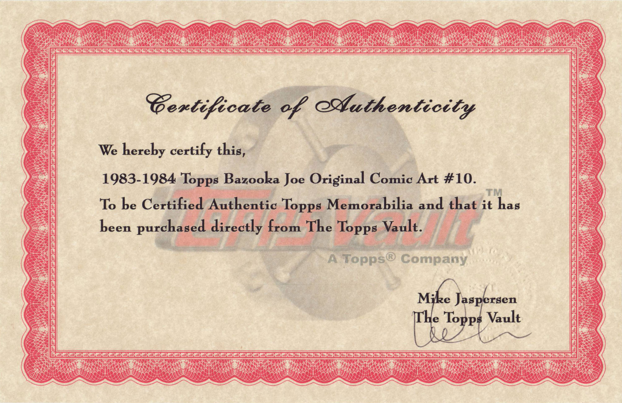
From my personal collection, original artwork supposedly from the 1983-84 batch… but something doesn’t add up. Incidentally, actual size is 3 x 3 5/8 inches.
The accompanying certificate of authenticity raises more questions than it answers. To wit, as Mr. Cruse elucidates: « When I was asked… to reconceive Bazooka Joe as a teenager and provide him with a new ‘gang‘, the only holdover from the earlier tykes… was Mort, the weird sidekick who wore a turtleneck pulled up to his eyes. Len [Brown] and Art Spiegelman… thought the ultra-lengthy turtleneck was a bit – in fact, was literally – over the top, though. So for my first series of strips the sweater’s collar was brought down below Mort’s chin… Apparently this change disturbed some nameless traditionalists at Topps, so when I was hired to draw a second batch of strips in 1988, the turtleneck was restored to its original position… » In that case, if my original is from the ’83-’84 series, why is Mort’s turtleneck in its traditional, and proper place?
Another certificate, this one appearing on the back of Bazooka Jerk (Garbage Pail Kids Giant Series Stickers no. 1, from 1986). Illustrated by Howard Cruse.
Then, in 1990, when the time came for another series, Topps opted to subcontract the work to a marketing company that dismissed Cruise’s work as « too goofy », according to Jay Lynch. Then Lynch, Pete Poplaski and Grass Green took up the gauntlet, which is a fascinating tale in itself… but one for another day.
If such lowly cartoon ephemera hold even the slightest sway over you, you’ll likely be very interested in Topps’ Bazooka Joe and His Gang (2013, Abrams ComicArts, edited by Charles Kochman), which proved an invaluable resource in cobbling together this post.
« Bazooka Joe has become the personification of the lowest form of humor. And this is why he’s one of the most widely known comics characters on the planet. Sure, the jokes were cornball. But that’s their appeal. » — Jay Lynch
-RG
*with Topps executive (and Golden Age comic book artist) Woody Gelman.
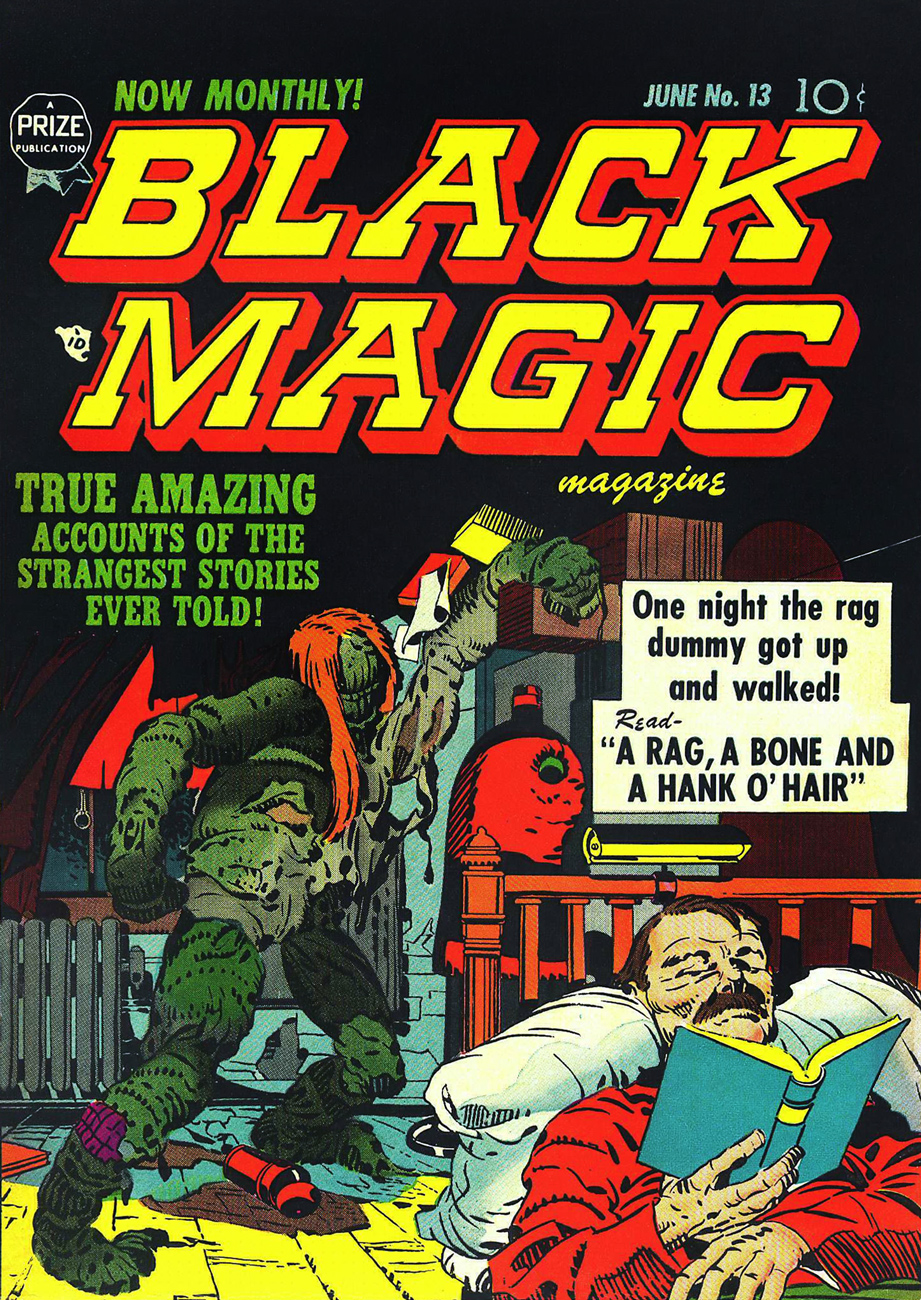
« Somehow, this thing had caught the spark of life! And, anything that lives will fight to stay alive… even if it’s just a Rag-a Bone and a Hank of Hair! »
Ah, Brother Power, the Geek. A notorious flop for DC in 1968… or was it? At the time, it took several months for a book’s initial sales reports to make their way back to the publisher. Axing a title after two measly issues is quite a preemptive and premature strike against it. I suspect a case of toxic in-house politics. From the onset, editorial cold feet had the suits meddling with the project: the character of the animated rag doll was to be called The Freak, which was nixed in favour of the less druggy but more chicken-head-bite-y TheGeek.
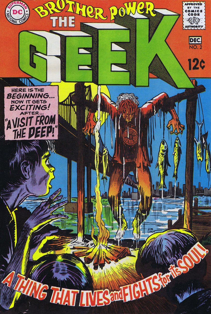
This is Brother Power The Geek no. 2 (Nov.-Dec. 1968, DC); cover by Joe Simon, colours by DC’s peerless production manager Jack Adler, and logo presumably by Gaspar Saladino.
I recall that this particular house ad seared itself into my brain at a very young age, but I had to wonder where exactly I’d first encountered it. As it turns out, it was in a random comic book that happened to land my way in childhood, namely Superman no. 211 (Nov. 1968), featuring You, Too, Can Be a Super-Artist!, written by Frank Robbins (I just found out!) and illustrated by Ross Andru and Mike Esposito.
This is Black Magic no. 13, aka vol. 2 No.7 (June 1952, Prize); cover, of course, by Jack Kirby, with likely inks by Joe Simon. Read it here!
This lovely panorama is from Brother Power The Geek no. 1 (Sept.-Oct. 1968, DC). Written, laid out and inked by Joe Simon, finished pencils by Al Bare.
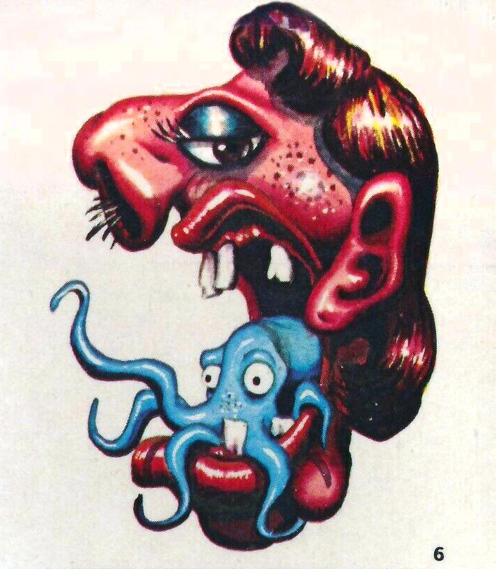
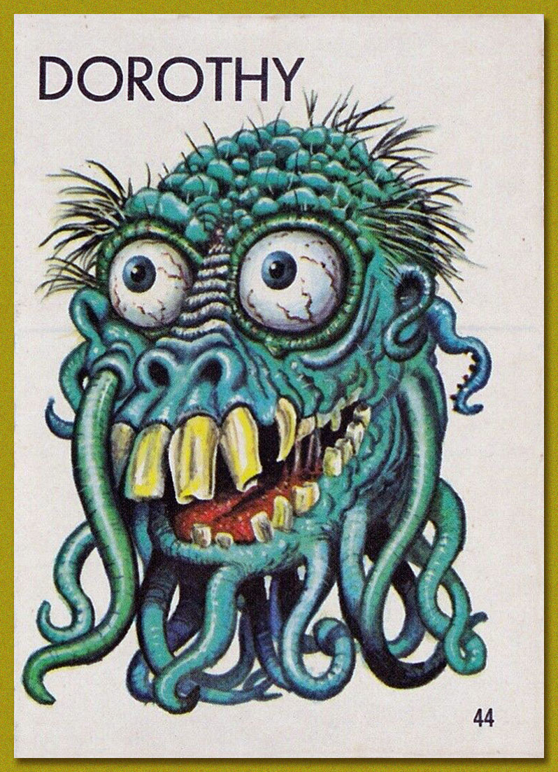
Say, have I seen Brother Power’s fellow detainees somewhere? Why, yes, of course! It’s Tentacle Master Wally Wood‘s Dorothy, Stanley and Doris, introduced to the world by Topps‘ Ugly Stickers back in 1965! Designed by Wood, they were painted by the masterful Norman Saunders.
Brother Power the Geek, despite its commercial failure and infamy, offered a good-natured, unpretentious romp, even if didn’t quite show us « The Real-Life Scene of the Dangers of Hippie-Land! » You can’t always get what you want.
Brother Power was brought back under DC’s Vertigo imprint in 1993, but as with the revival of its fellow Joe Simon creation, Prez, it received a « groovy » and « ironic » hipster treatment. Bah.