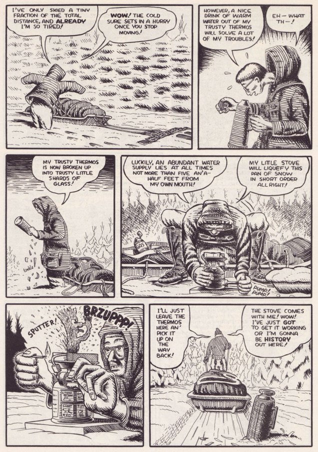
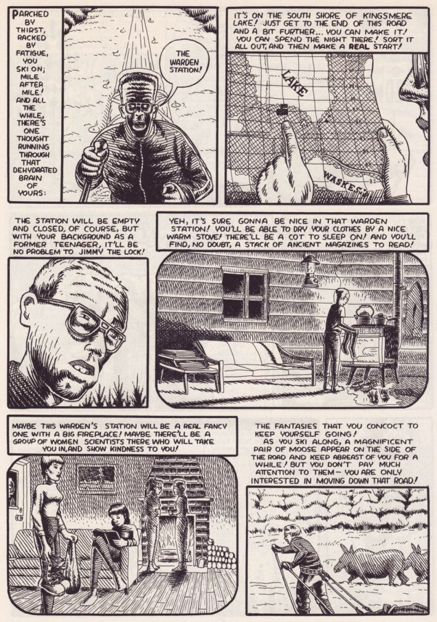
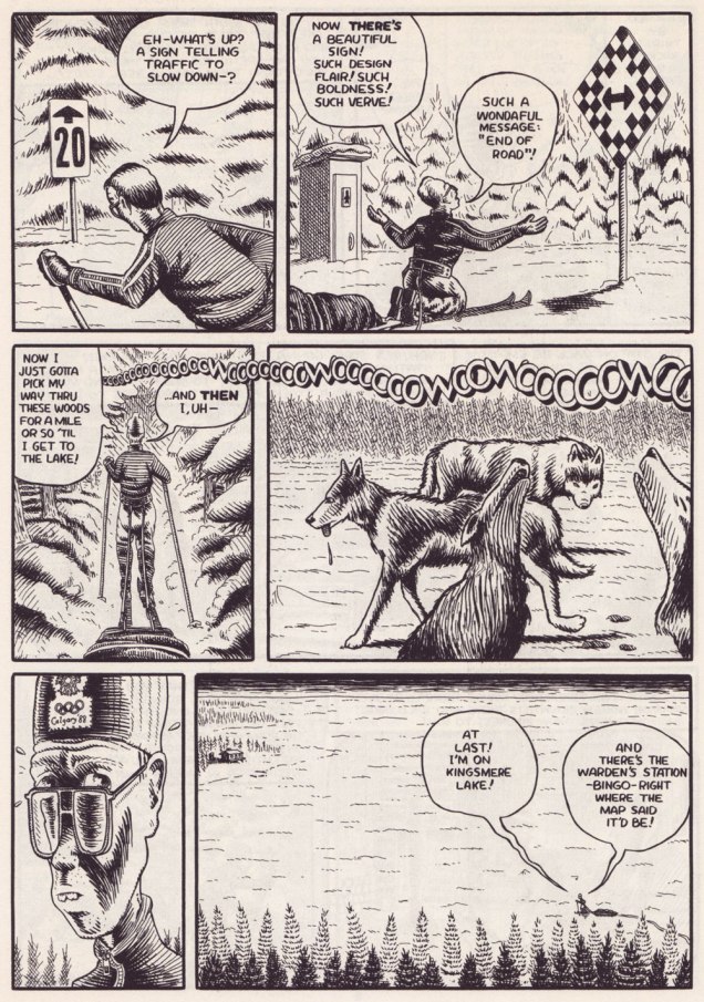
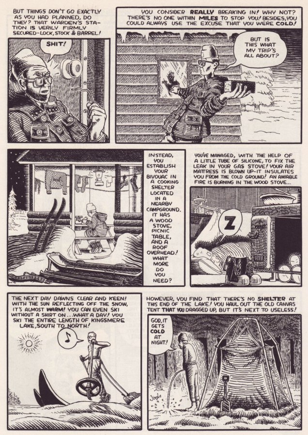
Between Strangers: Ellen Forney’s Lustlab Personals

« Your mysterious mountains I wish to see closer. May I land my kinky machine? » — Jimi Hendrix

I’ve been musing a bit on the old Trojan Horse / Pill in the Hamburger scheme.

Not long ago, I chanced upon this passage from an interview with the lovely Ramona Fradon, wherein she touches upon her mid-70s work for Joe Orlando‘s ‘mystery’ comics at DC.

« Those were all Joe’s productions, and there was nothing he liked better than to get around the Comics Code. The fact that my drawing was comic helped him get away with more than he could with other artists. He was always pushing the envelope. »

To understand what she means, I refer you to this particular story, which I showcased last fall.

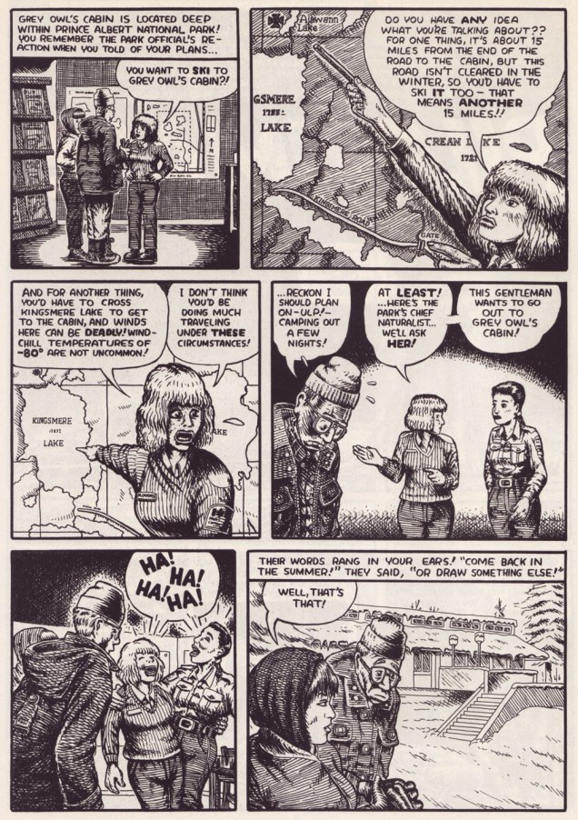
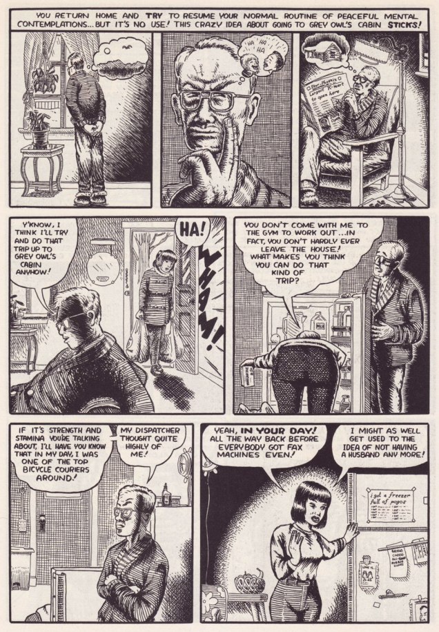
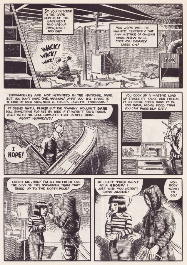
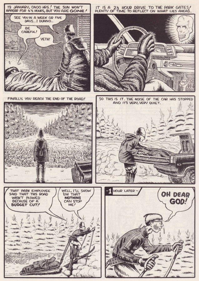
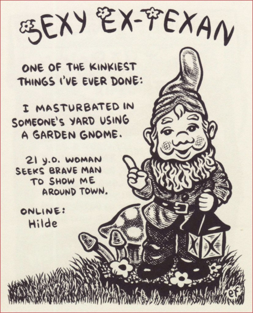
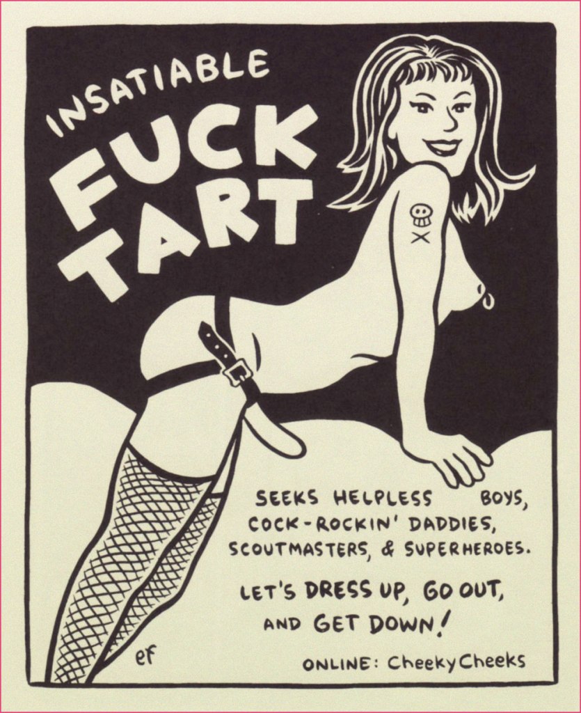
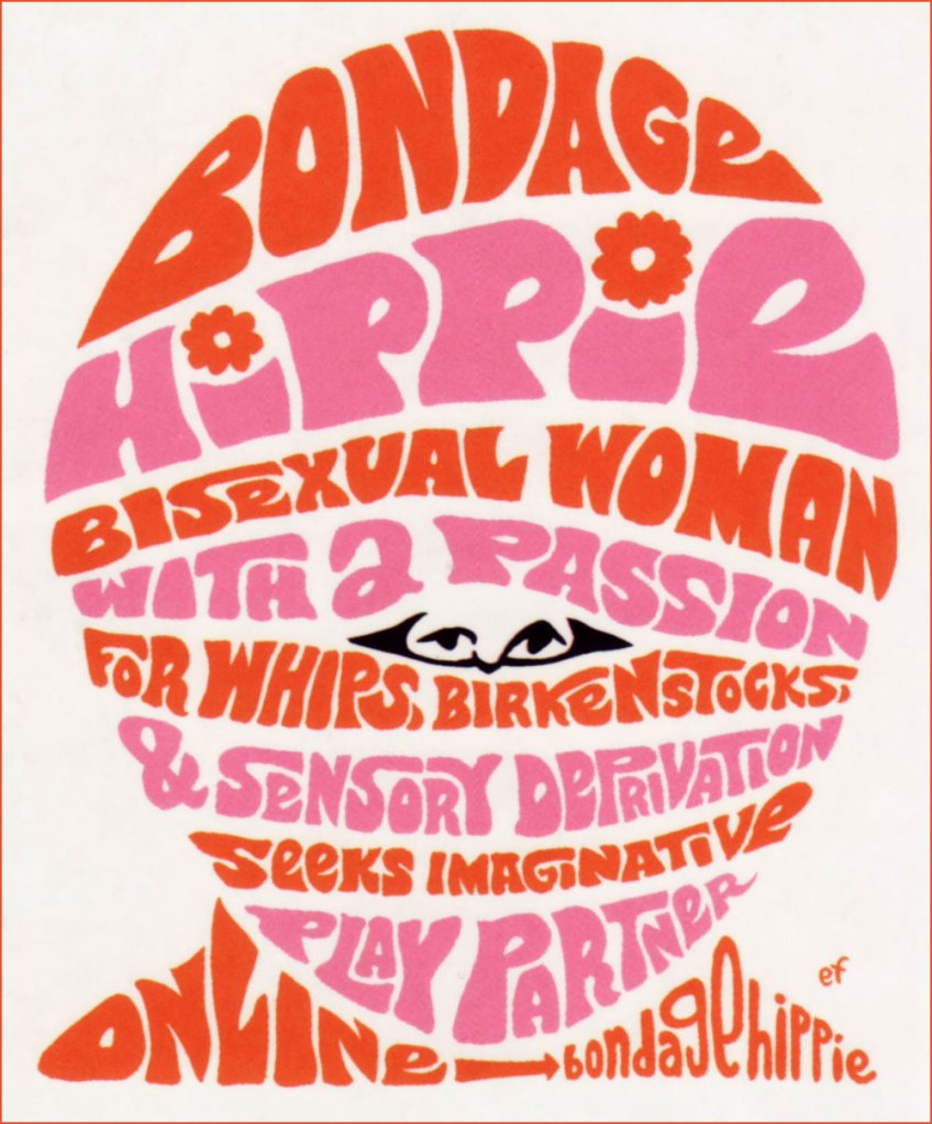
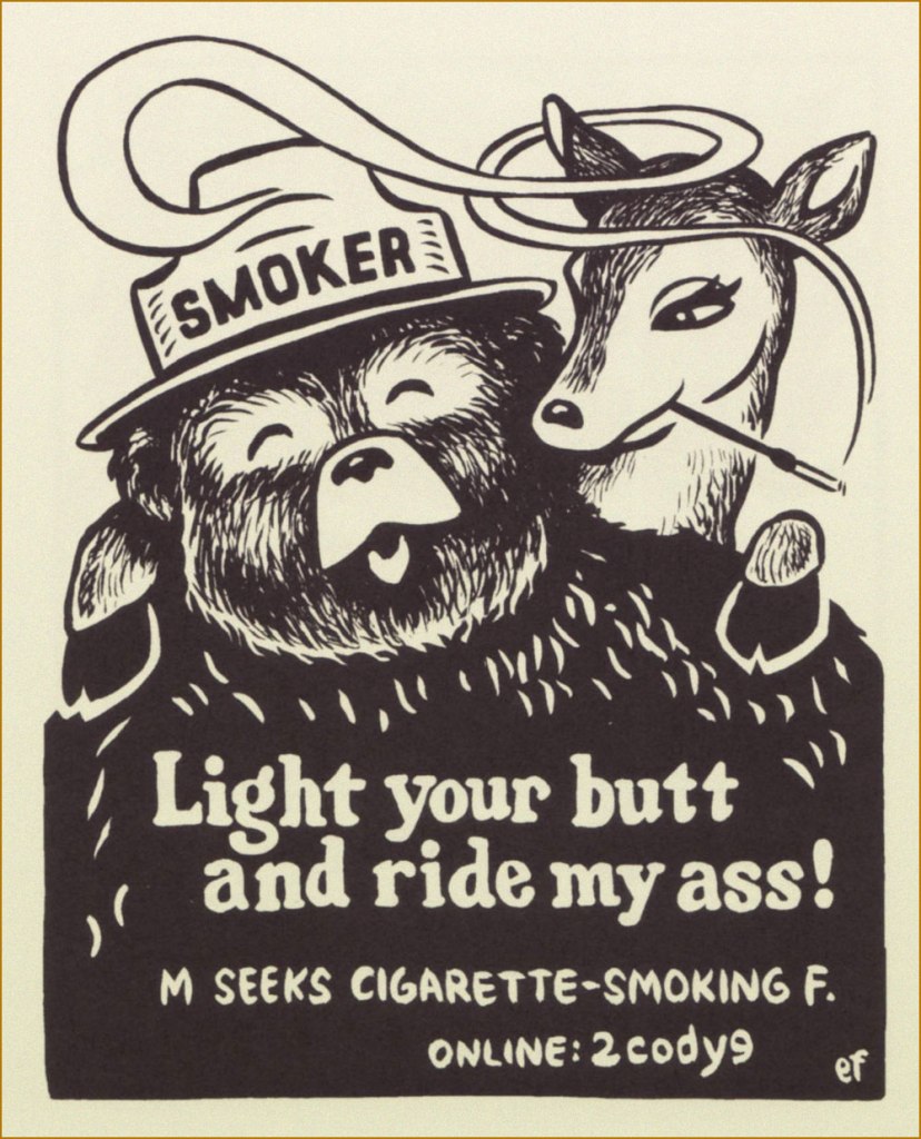
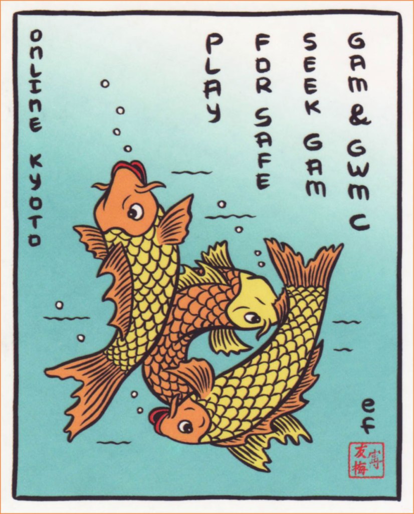
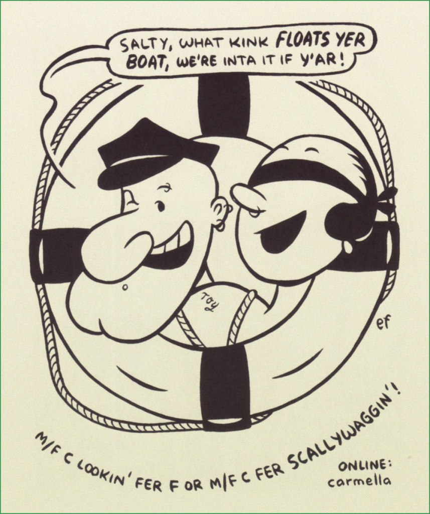
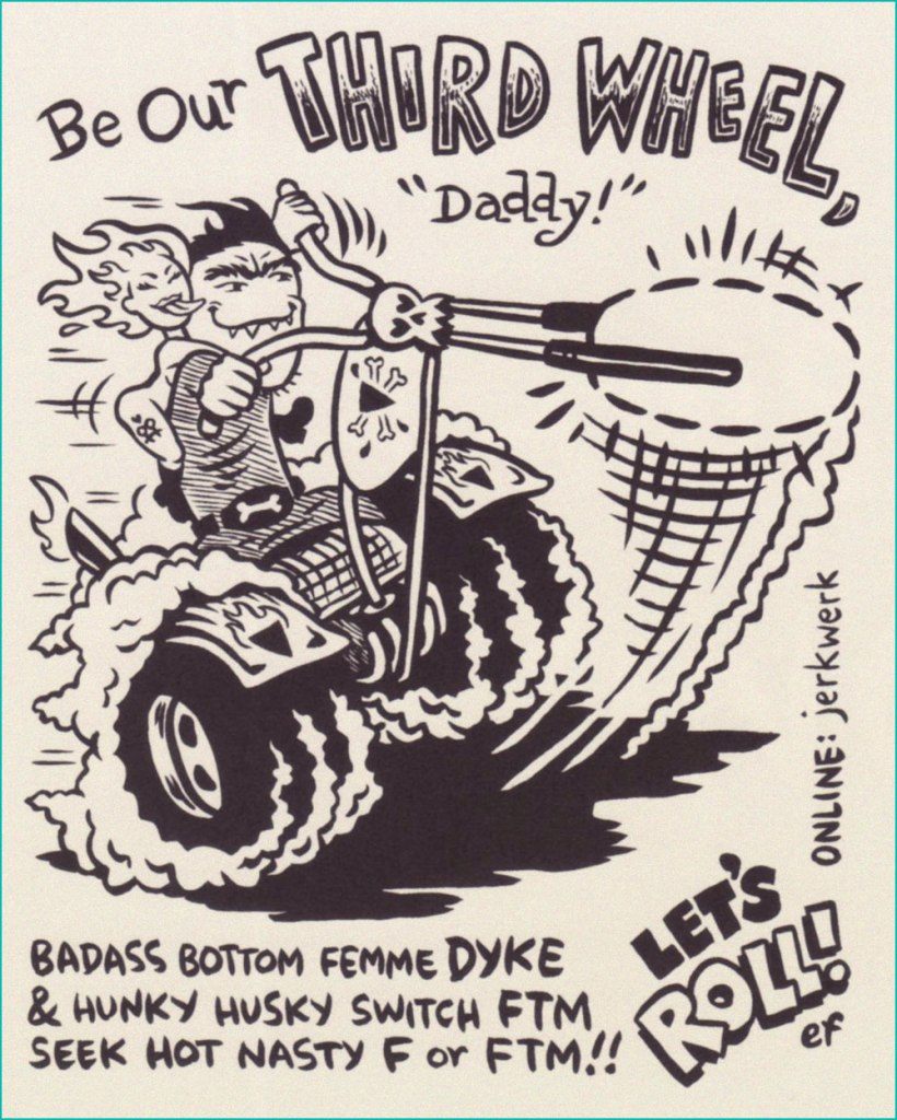
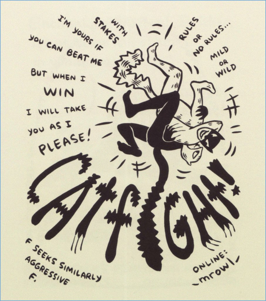
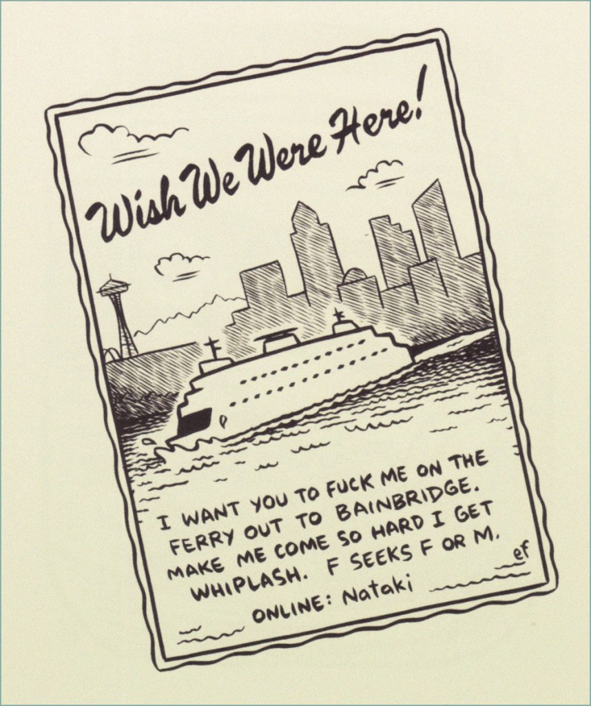
Which brings us to Ellen Forney, who, for a span of four glorious years, illustrated choice excerpts from Seattle alternative paper The Stranger’s personals… oh, never mind. I’ll let Dan Savage and Corianton Hale recount the tale:

« So when we decided to start running a weekly illustrated personal ad — ‘Lustlab Ad of the Week’ — we knew right away what we didn’t want. We didn’t want to sensationalize what was already pretty sensational, thanks. And we didn’t want to hyper-sexualize what was already plenty sexual. We wanted an artist who could take short, pithy personal ads — short, pithy, filthy personal ads — and infuse them with the kind of playfulness that true kinksters bring to their sex lives. We wanted someone that could make someone into whips and chains and hoods look like someone you could take home to meet your parents.

We wanted Ellen Forney. »

Just like Ramona Fradon, Ms. Forney wields a friendly, extremely engaging and accessible style (as you’ll witness). Here, then, is a modest sampling from the four-year frolic of the ‘Lustlab Ad of the Week’, circa 2004-2007. Feel free to browse.

If catfights are your thing, you’re in luck: check out our popular Let’s All Go Down to the Catfights! and its recent sequel, Let’s All Go Down to the Catfights — Again!

The feature’s highlights have been collected, in fine fashion, in a snazzy little hardcover entitled ‘Lust‘. (Feb. 2008, Fantagraphics). While it’s out of print by now, affordable copies appear to still be available. If it floats your boat at all, do not hesitate!

-RG

Michael Dougan, From Houston to Tōno

« I’ve never been to Texas but I’ve heard Willie Nelson Sing. » — Mark Ballard

I’ve just heard of the recent, untimely passing of cartoonist Michael Dougan (1958-2023). Well, perhaps former cartoonist would be more accurate, but if so — he said his piece, made his mark, and moved on — and that’s cool. But can cartooning truly ever be left behind?

Dougan made his début in comics on the back cover of my very favourite issue of Weirdo, no. 17 (Summer 1986, Last Gasp), which also housed my pick for Robert Crumb‘s greatest short-form achievement, The Religious Experience of Philip K. Dick, and a cover among his finest *and* most provocative. See both story and cover here!
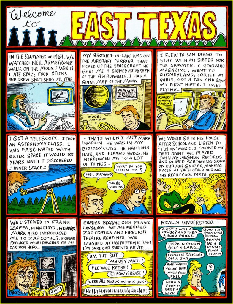
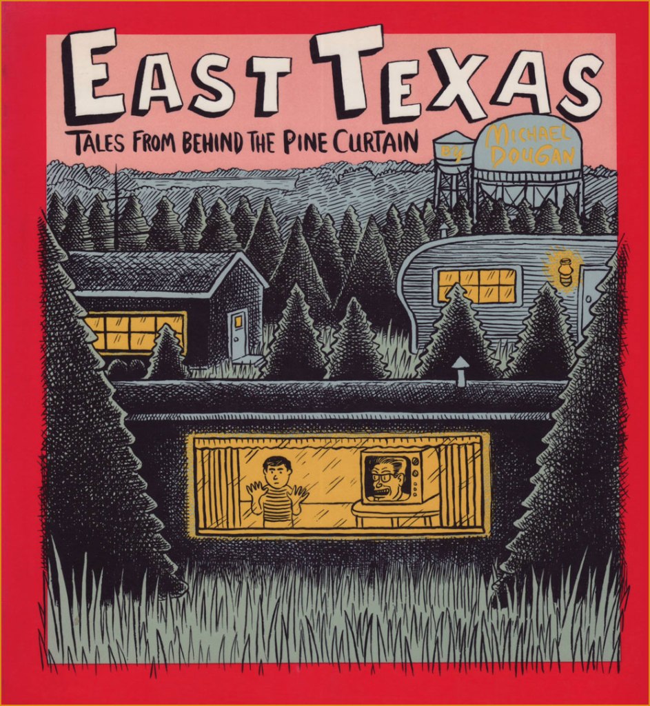
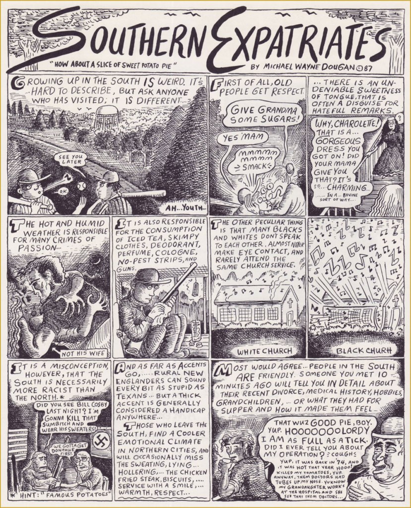
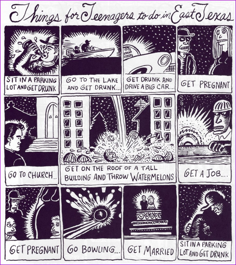
Dougan’s first collection appeared the following year, published by Seattle’s fabled The Real Comet Press. The back cover was festooned with eloquent-upon-eloquent quips from his peers. For instance, Gary Panter wrote: « Dougan’s work is clear and he is not afraid. He is a big storyteller and a good liar. In East Texas the wire fences, orange colored tufts of grass, pine trees, tire tracks, piles of wood, and water towers are the best parts. The stories are about human desperation, a funny kind of desperation, an air-conditioned kind of desperation. »

And here are a few excerpts from its pages:

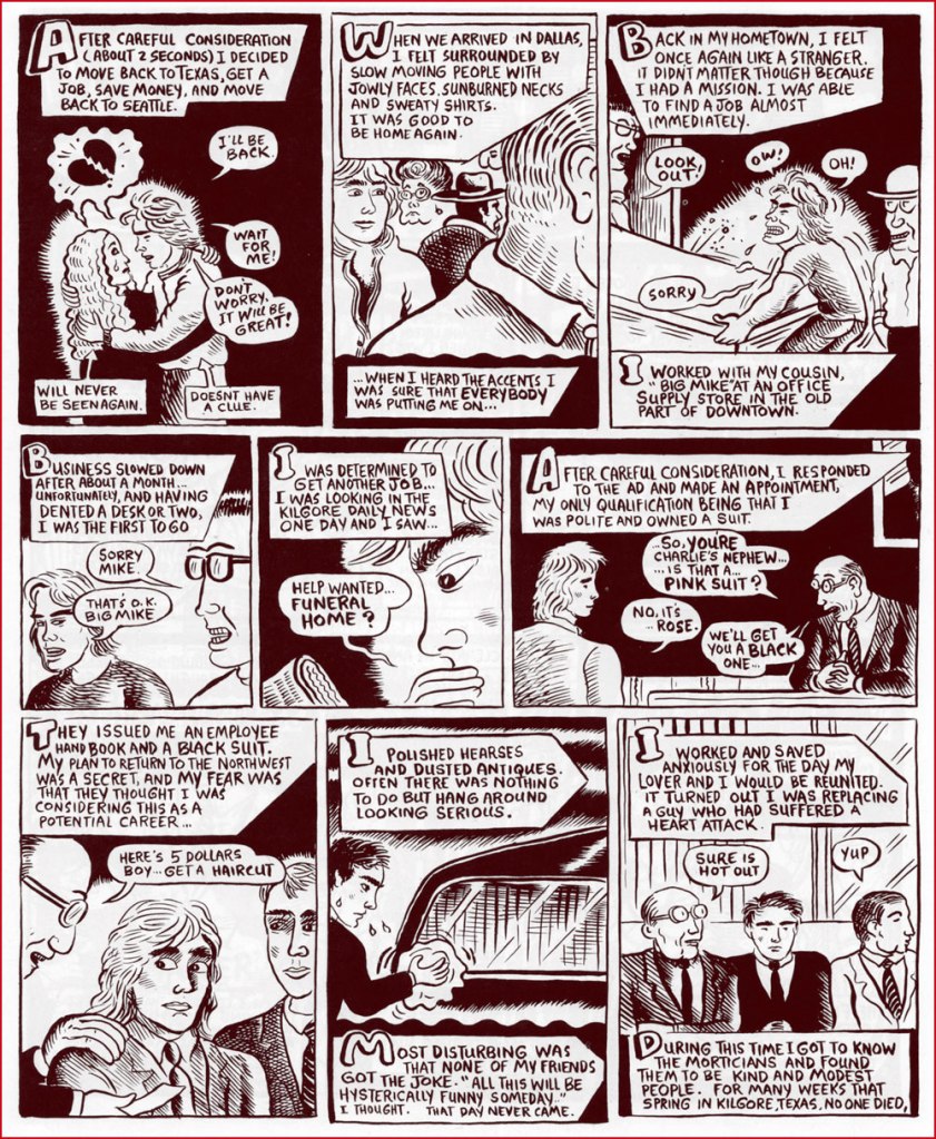
Dougan’s second and final collection, from 1993, was published by Penguin, no less! It featured longer, more ambitious pieces.
Kentucky Fried Funeral would have to be my first pick for Dougan’s masterpiece. Unfortunately, it’s around 20 pages long, so it was unfeasible to present it here. Still, here’s the opening splash.
A detail, perhaps, but worth noting, I think: Dougan preferred handling his own lettering, finding, like many a visual artist, the look and texture of mechanical text too… well, mechanical. Lovely!
In 2017, some twenty years after his last cartoon (that I’m aware of… Double Booked?, in Fantagraphics’ Zero Zero no.17, June, 1997) Michael and his wife moved to Japan and opened a café-restaurant. Read Michael’s own account of the saga.

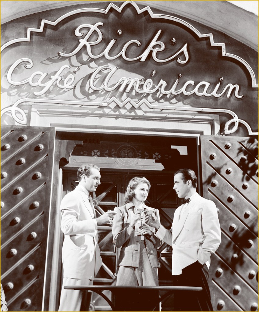
This must be the place.
Of course, Dougan named his place after Bogie’s in Casablanca, but not without adding a couple of typos, for that modern touch.

Creative types often get restless, and Michael found himself a little niche answering people’s mostly, and sometimes incredibly, inane questions on Quora, with a potent mixture of withering sarcasm with a side of snide, all the while providing helpful information — whenever possible. Check out his feed, but let me caution you: it’s a bit of a frazzling rabbit hole (or warren, more accurately).

I’m hoping that, once news of Michael’s passing trickles over to his native land, that The Comics Journal will provide a detailed obituary of this notable artist. Farewell, Mr. Dougan.

Update: I see that TCJ has not let me down. Here’s their first piece in tribute to Michael. And this definitive oral history homage.

Further update: The Seattle Times has just published a moving obituary by his friend, former The Rocket Editor Charles R. Cross.

-RG

Hallowe’en Countdown VI, Day 2

« There is love in me the likes of which you’ve never seen. There is rage in me the likes of which should never escape. If I am not satisfied in the one, I will indulge the other. » ― Mary Shelley, Frankenstein

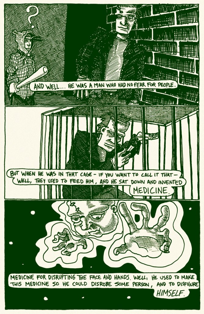
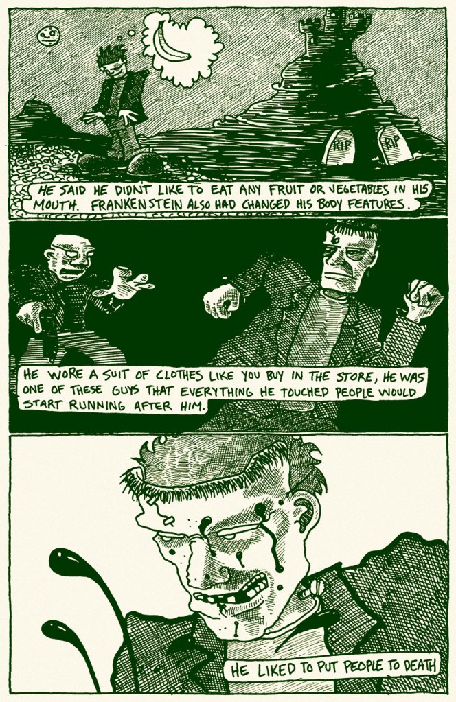
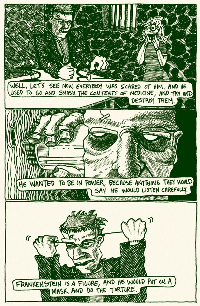
Today’s entry is a most idiosyncratic interpretation of the Modern Prometheus myth. Its essence was collected by that multitalented gentleman, David Greenberger, and saw print in the pages of his eclectic anthology Duplex Planet Illustrated. I asked David to tell us a bit more about the narrator, and he kindly obliged:

« I always had a wonderful time talking with Abe Surgecoff, who was incredibly good natured and would talk about anything, much of it not technically accurate in the real world, but was vivid to him even if it was being created as he spoke it.

He was a resident at the Duplex Nursing Home in Boston and I met him in 1979 when I took a job there as activities director (something I did until 1983 – a job I didn’t continue with – this was mostly a portal for me to have access to and friendships with people who were a couple generations older than me, and an area I became interested in exploring as an artist – hence taking that job.) »

« Frankenstein » originally appeared in Duplex Planet Illustrated no. 13 (July 1995, Fantagraphics).

My thanks to Mr. Greenberger for digging back into the memory banks for this one!

– RG

A Sweet, Refreshing Slice of Watermelon

« To prevent enabling oppression, we demand that black people be twice as good. To prevent verifying stereotypes, we pledge to never eat a slice a watermelon in front of white people.* » — Ta-Nehisi Coates

On a scorching day last week, we were at home digging into a particularly tasty watermelon.

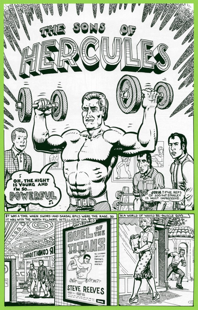
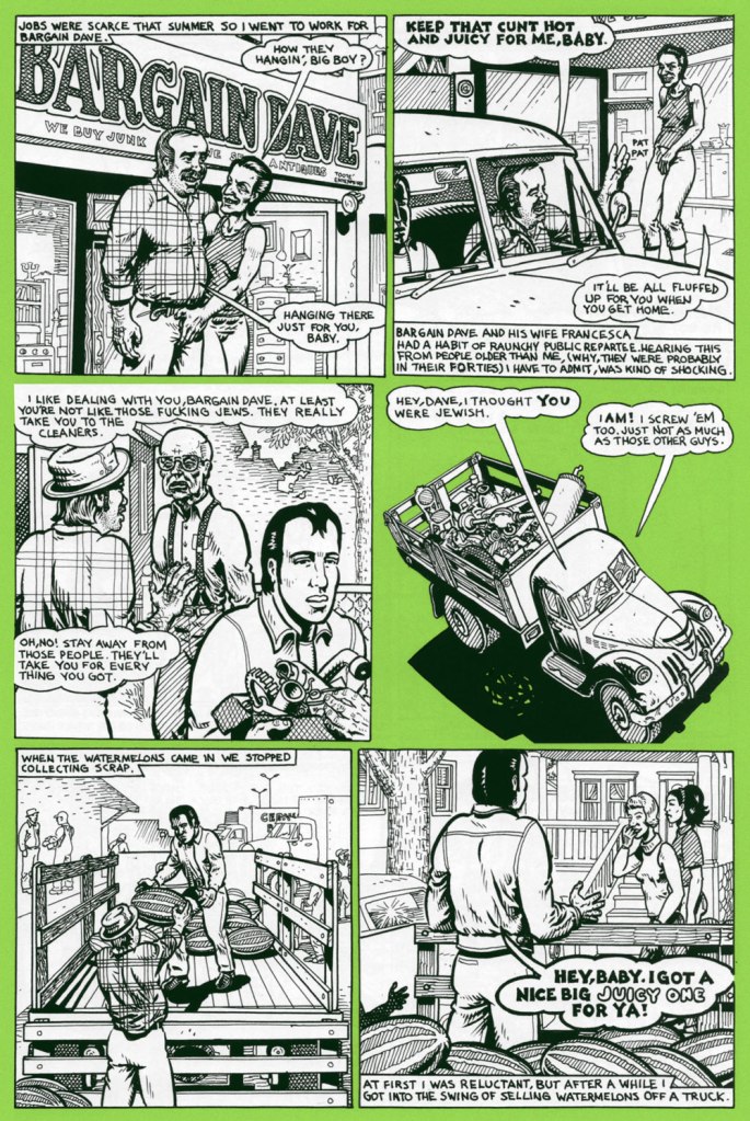
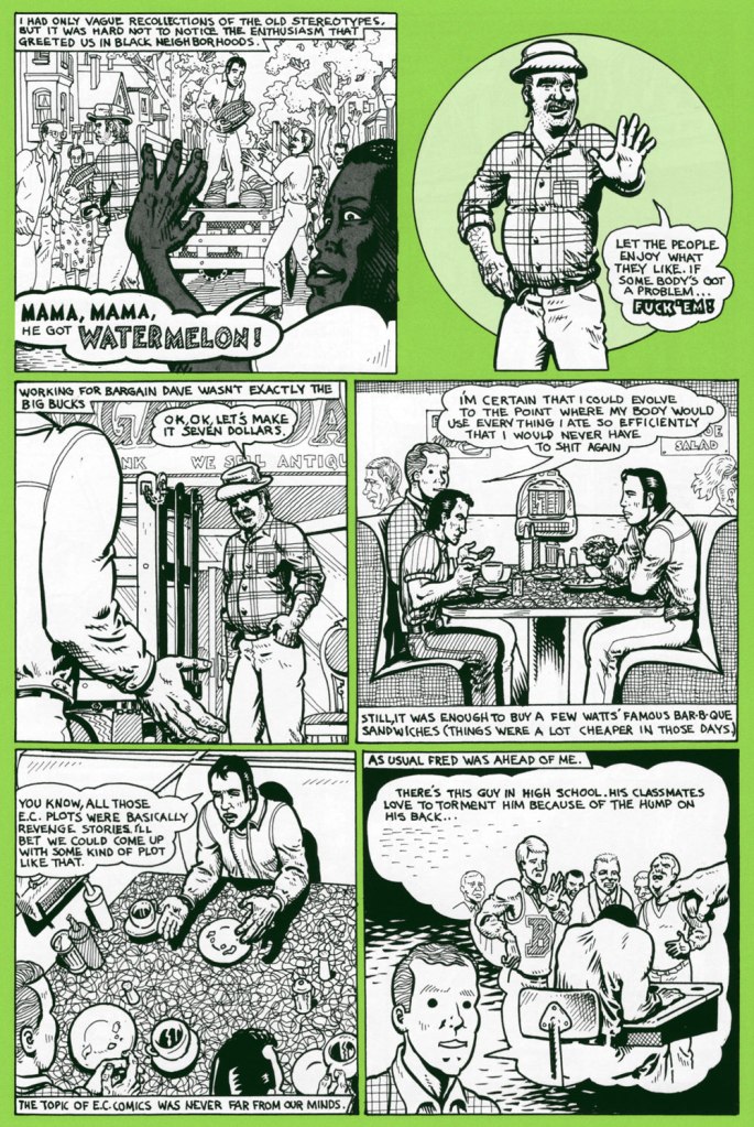
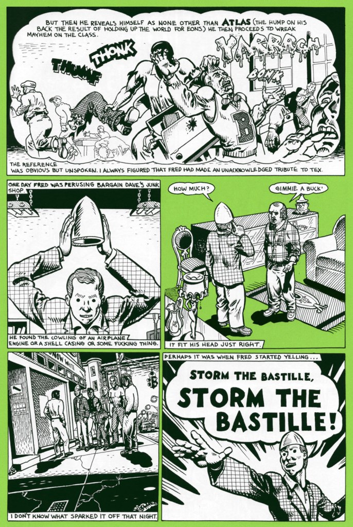
As neither of us grew up in the U.S. of A., the simple act of eating juicy pastèque has not been tainted, as it has for many, by racism and stereotypes. We’ve been allowed to appreciate the watermelon for itself, as a healthy, refreshing, tasty treat. A lightbulb came on as I recalled a relevant sequence in one of Spain Rodriguez‘s ‘Fred Toote’ stories, set in the 1950’s Buffalo of his youth — and so here it is:

Bargain Dave tells it like it is! The Son of Hercules first appeared in Blab! no. 12 (Autumn 2001, Fantagraphics), but the ideal place to find it is in Cruisin’ With the Hound: the Life and Times of Fred Tooté (2012, Fantagraphics), which collects the whole (motor)cycle. I’ve previously featured another tale of Spain’s youthful exploits, Treasured Stories: «Tex’s Bad Dream or ‘The Egg Lady’s Revenge’» (1988).

And that’s not all: a few days later, a friend’s news feed presented me with a most insightful, eye-opening *and* heartbreaking tweet:

« It seems almost silly to say that watermelons have been racialized, but that is exactly what happened in this culture. » Here’s the full article, a fascinating summary of the issue from Dr. David Pilgrim of Ferris State University’s Jim Crow Museum of Racist Memorabilia, written in response to the rather hostile comment of “Judging from the pictures on your website, you seem to be saying to me that black people don’t like watermelons? Sometimes you liberals make me shake my head.
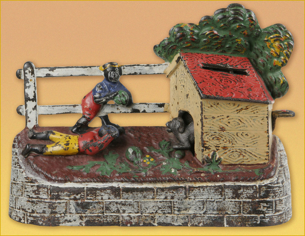
« Boys Stealing Watermelons Bank. Made by Kyser & Rex of Philadelphia, PA. circa 1894. When a lever is pressed and the coin deposited, a dog runs out to keep the boys from their prize. »
Comics pioneer Gustave Verbek (1867-1937), known as Verbeek after he “moved to the United States, where an immigration officer misspelled his name“, tackles a familiar subject in his Upside-Downs strip of Aug. 7, 1904 . Don’t forget to read it upside down for the second half of the story! My warmest thanks to Sunday Press‘ Peter Maresca for providing me with this rare image.
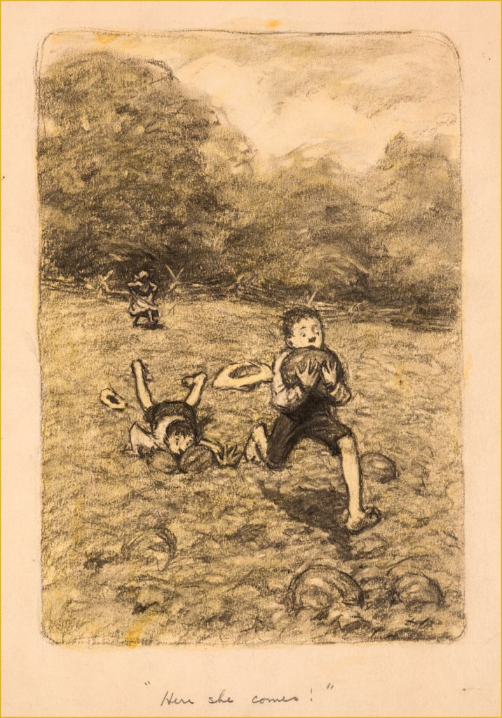
A piece in graphite on manila by James Ellsworth “Worth” Brehm (b. 1883 – d. 1928) illustrating one of Booth Tarkington‘s ‘Penrod’ novels, circa the 1910s. Seems like any and all scamps — of all races — would raid the watermelon patch, given half a chance.
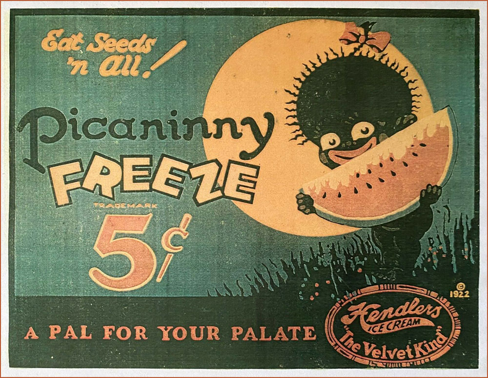
An ice cream advertising sign, circa 1922. If you’ll bear with me, here’s a longish, must-read quote from the indispensable Wicked Words by Hugh Rawson (1989, Crown Publishers, New York):

Pickaninny. A black child. Thus, from a book that was being sold in 1987 in order to raise money for the state of California’s observance of the bicentennial of the United States Constitution. ” If the pickaninnies ran naked it was generally from choice, and when the white boys had to put on shoes and go away to school they were likely to envy the freedom of their colored playmates” (Fred Albert Shannon, essay on slavery, 1934, in The Making of America, W. Clean Skousen, ed., 1985).

Pickaninny arose among slaves in the West Indies, where it was recorded as early as 1653. The original users based the term either on the Portuguese pequenino, little child, or its Spanish equivalent. They employed the term affectionately, of course, and, on the evidence of Captain Frederick Marryat, who was a sensitive recorder of language, applied it to little children generally, regardless of color, e.g. “And den, Mass Easy, you marry wife – hab pickaninny — lib like gentleman” (Mr. Midshipman Easy, 1836).

But no white person can get away with this today. The essential informality of the word makes it seem too condescending, too offensive, to most modern sensibilities. The California Bicentennial Commission, in fact, halted the sale of The Making of America, and issued a formal apology for having authorized it in the first place, after this use of pickaninny was called to their attention (along with other matters, the text also concluding that “slave owners were the worst victims of the system [of slavery].”

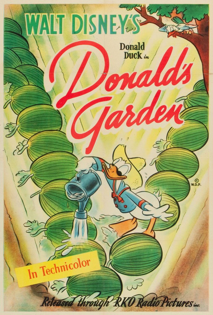
One Sheet poster from Donald’s Garden (RKO, 1942), written by Ralph Wright and directed by Dick Lundy. « During WWII, Americans were expected to help their country in the war effort by participating in “Victory Gardens.” This was a measure to conserve produce domestically so food could be shipped to the troops overseas. » Watch it here!
This is Krazy Krow no. 2 (Fall 1945, Timely). Racist stereotype or not? It’s not always the case, as R.C. Harvey soberly argues in an excellent article on Walt Kelly‘s Pogo, Sometimes a Watermelon Is Just a Watermelon. Here’s a sample: Harvey — « This is ultimately a failure to understand what the watermelon stereotype actually entails. Surely you realize that there’s nothing intrinsically degrading in liking to eat watermelon. Watermelon was one of the props in a general stereotype of the African American as filled with infantile enthusiasm, easily distracted and reduced to paroxysms of delight at the rattling of dice, the smell of fried chicken, or the sight of a watermelon. This is not what’s happening in Kelly’s story at all. But then, Andrae hardly seems to have an idea of his own on this subject at all. Rather, he has a grab bag of received notions, incompletely understood and haphazardly applied. Watermelon equals racism, that is all you know and all you need to know. »
A slice of Mal Eaton’s delightful Rocky Stoneaxe ( Peter Piltdown); undated, but since it bears the Stoneaxe name, it’s post-1953 and saw print in the pages of Boy’s Life Magazine. Eaton’s a local favourite, and my co-admin ds has twice written about his signature creation. First came Mal Eaton’s Peter Piltdown, then Tentacle Tuesday Masters: Mal Eaton — Peter Piltdown Goes Fishing!
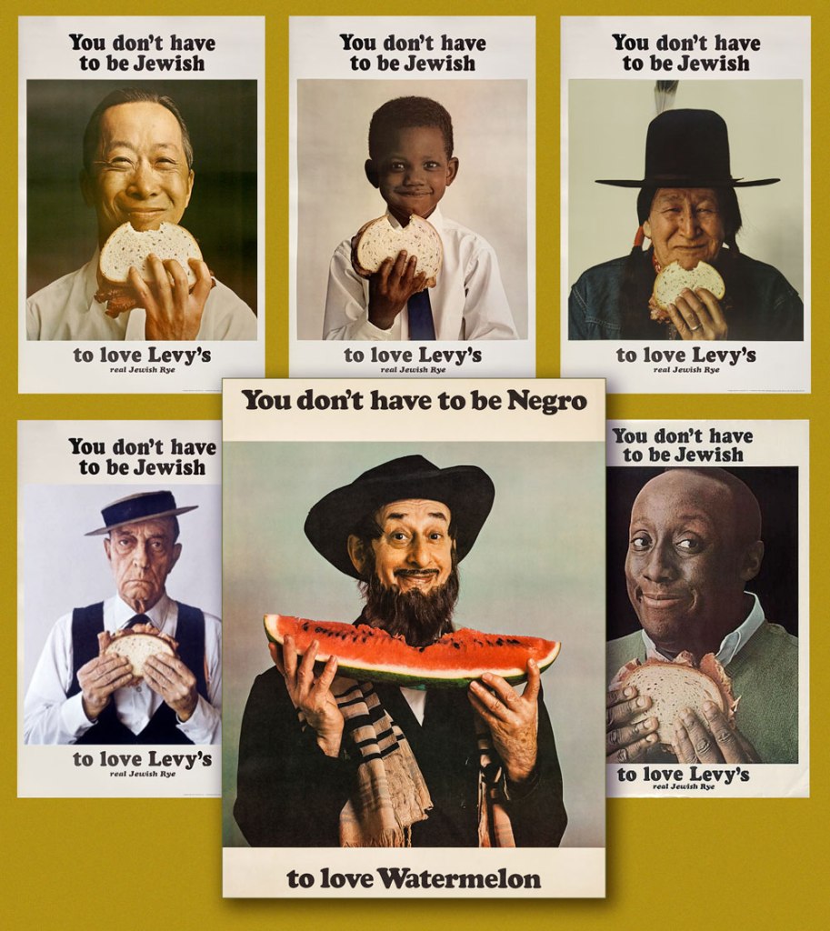
And now for something more progressive: called ‘the most successful Jewish ad campaign of all time’ (*explicitly* Jewish would be my caveat), the truly classic Levy’s rye bread campaign was launched in 1961 and lasted into the 1970s, spawning along the way countless imitations, parodies and ripostes, including, circa 1967, the You Don’t Have to be Negro to Love Watermelon seen here front and centre. Keen readers surely will have spotted the unmistakable deadpan mug of the rightly legendary Buster Keaton, bottom left.
According to a New York Times article, « Malcolm X liked the poster featuring the black child so much that he had himself photographed alongside it. »
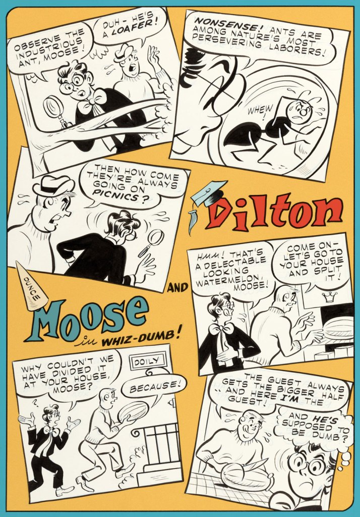
Given the right writer, I’ve always enjoyed the Dilton-Moose pairing more than the Moose-Midge combo. The boy genius and the dunce are genuine friends, while Midge only serves as a vehicle for Moose’s jealousy and as a way to land Reggie in traction. This one appeared in Archie’s Joke Book Magazine no. 46 (May 1960, Archie). Writer unknown, art by Joe Edwards (1921-2207).
A page from Little Audrey and Melvin no. 4 (November 1962, Harvey); kudos to Melvin — I can’t even get a proper boomerang to return to me, let alone a piece of rind used in its stead.
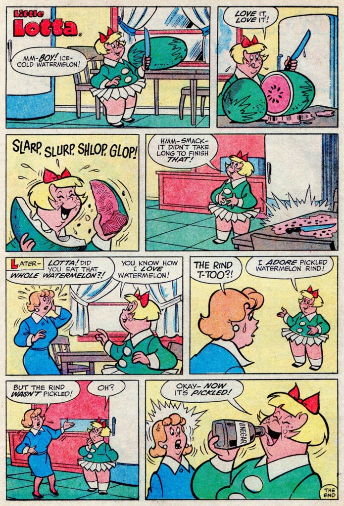
I suppose your stomach acids would have done the trick just as well, Lotta. A page from Little Lotta no. 65 (May 1966, Harvey).
A special watermelon sequence by the Lieber Bros, Stan & Larry, with inks by Mike Esposito (moonlighting as Mikey DeMeo); this is from The Parents of Peter Parker!, published in The Amazing Spider-Man Special no. 5 (Nov. 1968, Marvel).
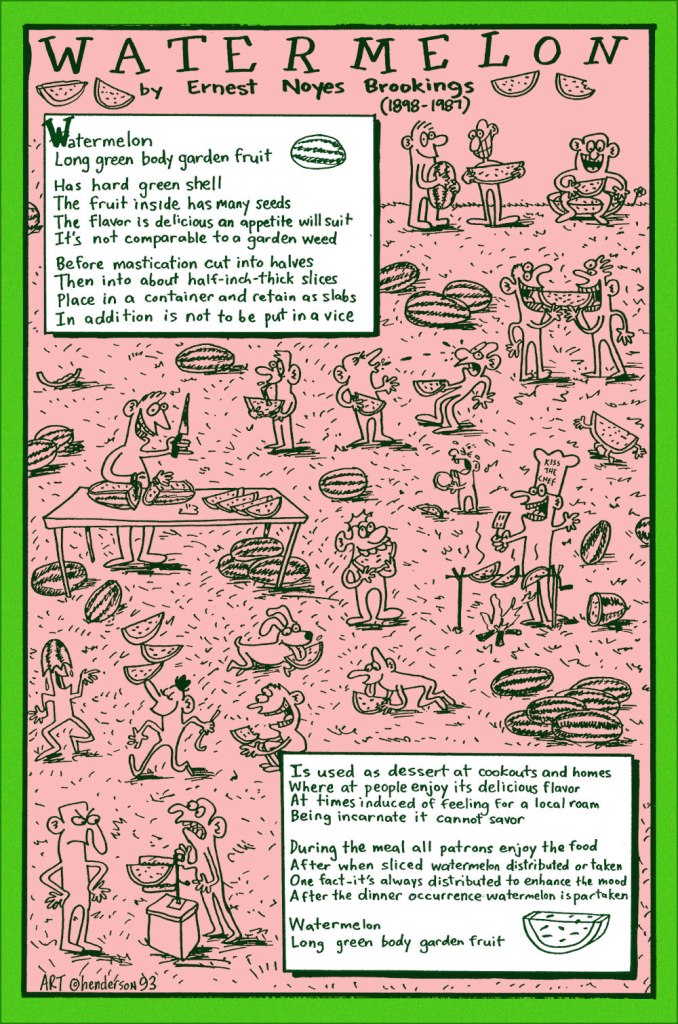
And finally, a collaboration between prankster and cultural scholar Sam Henderson and late-in-life eccentric poet Ernest Noyes Brookings; it appeared in Duplex Planet Illustrated no. 7 (March 1994, Fantagraphics), edited by David Greenberger. And if you’ve enjoyed the visual version, try the 1991 musical adaptation by Maestro Subgum & The Whole!

-RG

*He’s not even slightly exaggerating: the heinous stereotype just won’t die.

For Once, Flowers You *Can* Pick!

« Any claim to fame I might have I owe to diligent swiping right and left and staying sober at the drawing board. »

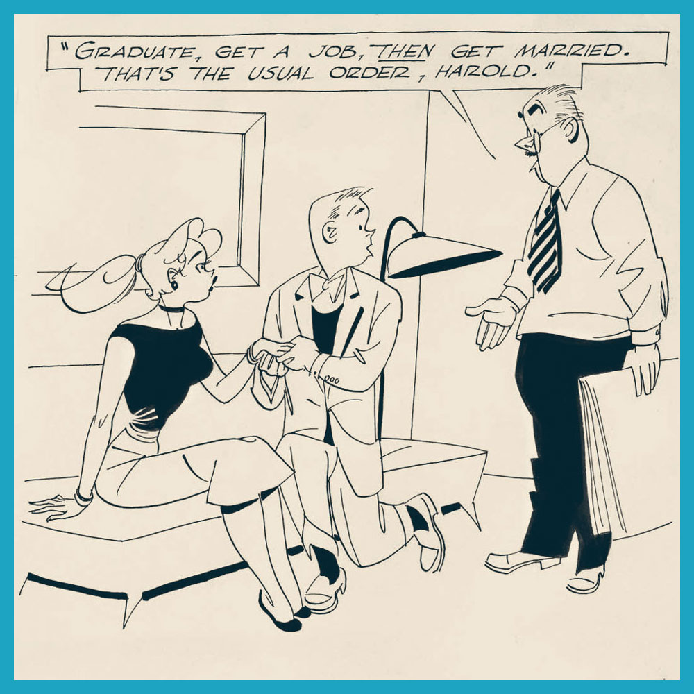
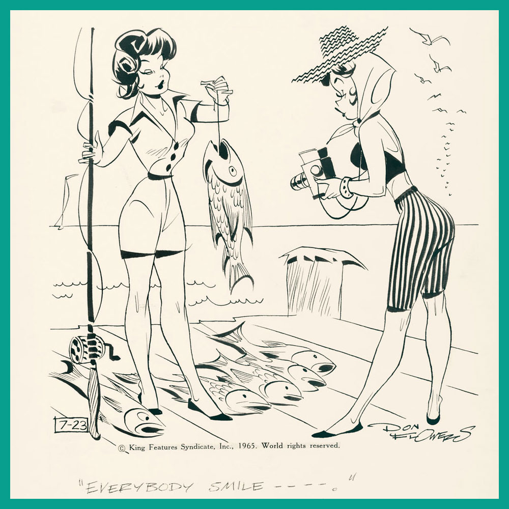
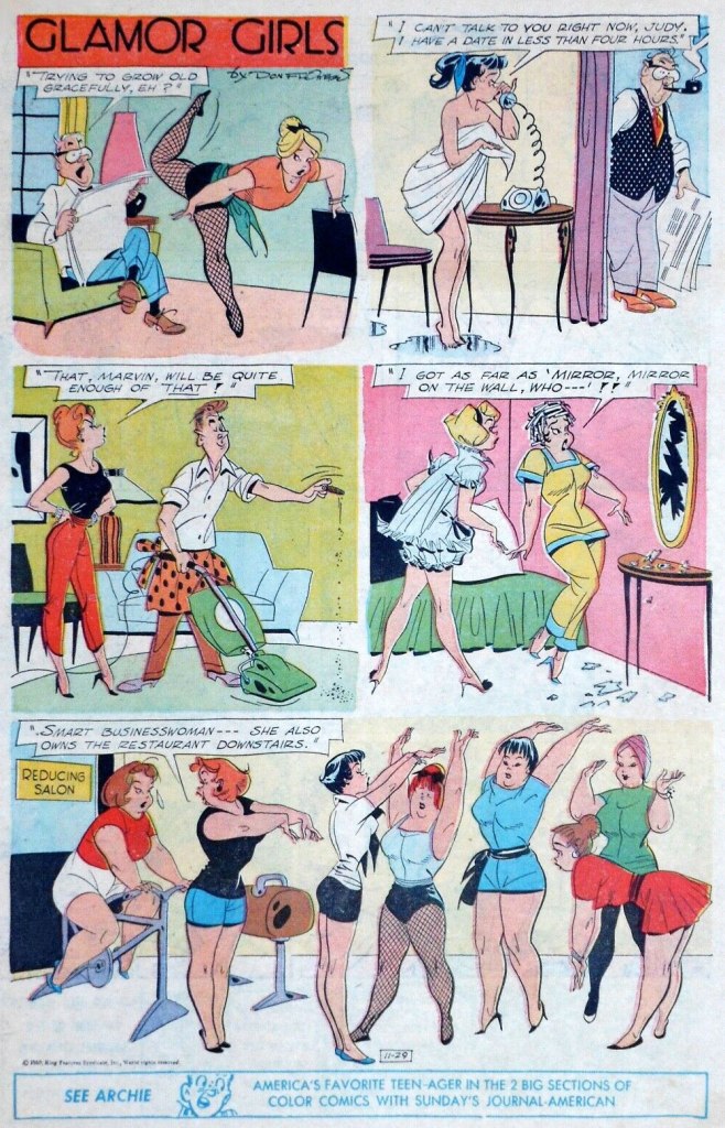
I’ve already talked about cartoonist Don Flowers (1908–1968): see Don Flowers, Sadly Neglected Cartoonist, although I wish I had given it a snappier title. I’ve been slowly ripening (like a pear, that subsequently falls off the tree with a wet, squishy thump) for a follow-up, but biding my time until I finally receive my copy of Glamor Girls of Don Flowers (2006, Fantagraphics). That goal is now (nearly) realized, and since spring seems like the perfect time for this sort of post, shall we strap on our travelling gear and fly back to the beginning of the 1930s?

To recap, Don Flowers created the alliterative Modest Maidens (later renamed into Glamor Girls) for AP Newsfeatures in 1931. The ‘modest’ epithet in the title may seem like a misnomer, or a tongue-in-cheek allusion to the girls’ open-minded mores, but as comic historian-cum-cartoonist Coulton Waugh aptly observed in his The Comics (1947)*, a book acknowledged as the first comprehensive analysis of comic strips*, « sexy they are, and yet, despite every display, somehow they always do remain modest maidens. » This is something one often encounters in cartoon depictions of female pulchritude – the standard male audience seems best attracted to women with a sort of innocent sexuality, borderline unaware of the effect they are producing despite making a calculated effort to produce it. In other words, however disrobed these maidens may be, they are never vulgar or sexually purposeful; they’re not doing, they’re being done to.

The batch of images in my previous post about Flowers focuses more on the usual scenarios – women dating rich guys, alluring dancers in various states of undress, and so on – so today’s array is in a slightly different vein.

An interesting aspect of Flowers strips is that they often feature an interaction between several women with nary a man in sight; and not only that, but they’re not even discussing men.
Even when barefoot, these girls hold their feet as if they were still strapped down in some extravagant heels. On the other hand, high heels deform the foot over time, although nobody wants to be reminded of that in this context.
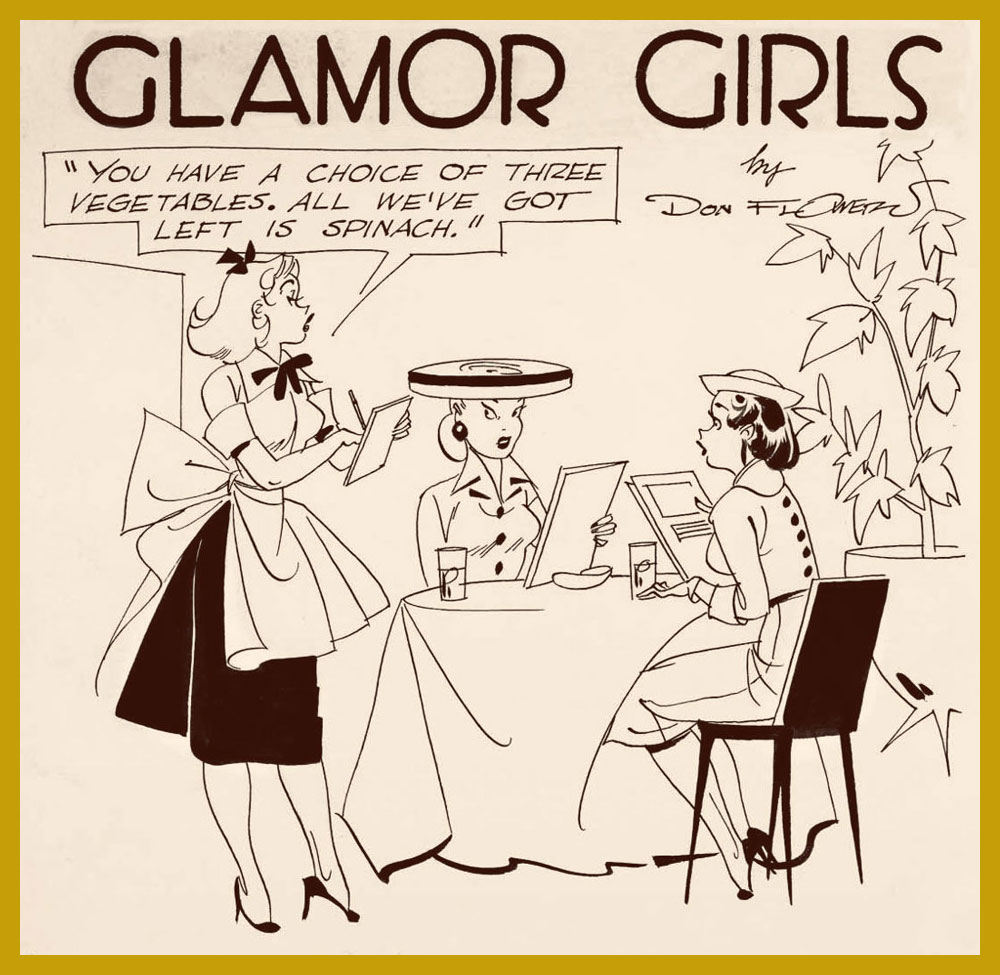
And what’s wrong with spinach, pray tell?
What the full published page of Glamor Girls looked like (November 29th, 1959).

Much has been said about Flowers’, well, flowery line (and ‘by much’, given that his popularity distinctly waned over decades, I mean ‘not really a lot’). It reminds me mostly of Hank Ketcham‘s style, he of Dennis the Menace fame. For example, add a little scruffy kid in the corner of this strip, and see what you think:

In the meantime, Waugh puts Flowers in the clan of Pattersonites, artists who followed the footsteps of illustrator Russell Patterson (1893-1977). « The Flowers girls [are] a long-legged creation. They have a a real rhythm running through them; they are, in this respect, somewhat more relaxed and graceful than the Patterson product, although the pattersonites can claim a vitality and sparkle on their side. » I would say that the Patterson girls have stronger wills, an independent streak that you can see in the slightly insolent look they give the men who ogle them. For comparison’s sake, the following three are by Patterson:

Sometimes self-defense is necessary.

~ ds

*You can read in full here; the first edition from 1947 goes for a lump sump of money these days. There is an affordable reprint from 1991, but it cannot beat the original cover:

Aloha, āhole: Dennis Eichhorn in Hawaii

« In Hawaii they say, “aloha.” That’s a nice one, It means both “hello” and “good-bye”, which just goes to show, if you spend enough time in the sun you don’t know whether you’re coming or going. » — George Carlin

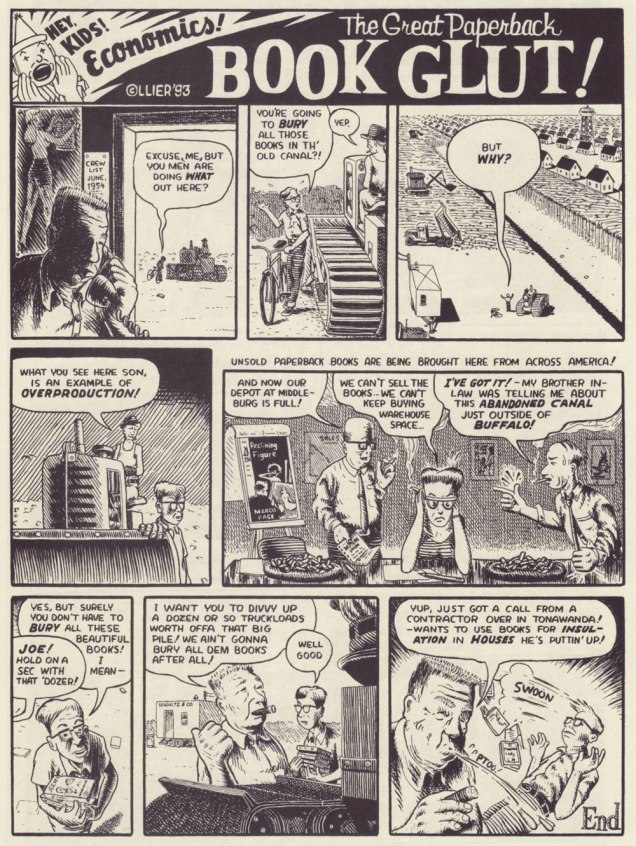
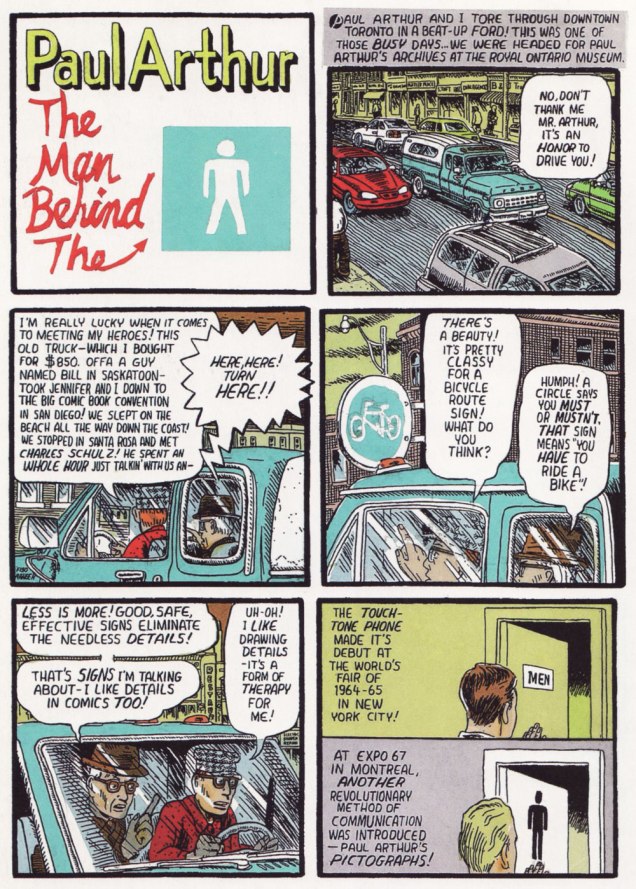
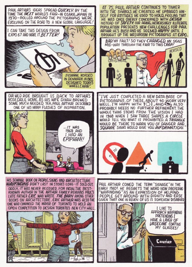
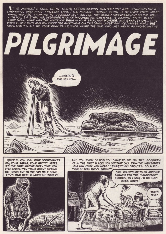
By and large, the notorious 1990s trend of autobiographical (at times navel-gazing) comics was undermined by its practitioners’ dearth of meaningful life experience and insight. Obviously, there’s been plenty of notable exceptions, before and since: on the insight front, for one, Canadian David Collier is an undervalued master of the documentary form.

As for life experience, puissant Dennis P. Eichhorn (1945-2015) put all the pasty, effete cartoonists to shame with his spectacularly turbulent, bold-type life. A gifted writer and storyteller, well-versed in the comics medium, he galvanised the creativity of his many collaborators, a broad yet aptly-selected crew of graphic practitioners, many of whom he’d met in the course of his lengthy writing and editorial stint with Seattle’s fabled The Rocket weekly.

I initially assumed I’d run into trouble in settling on the one story to showcase, but nope… right away, I knew just the ticket… a ticket to the Big Island.

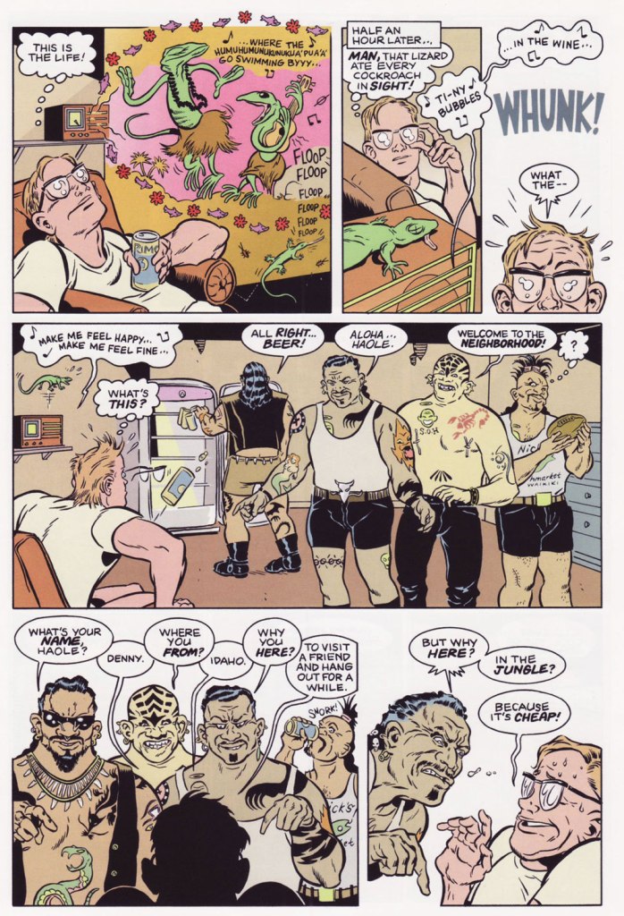
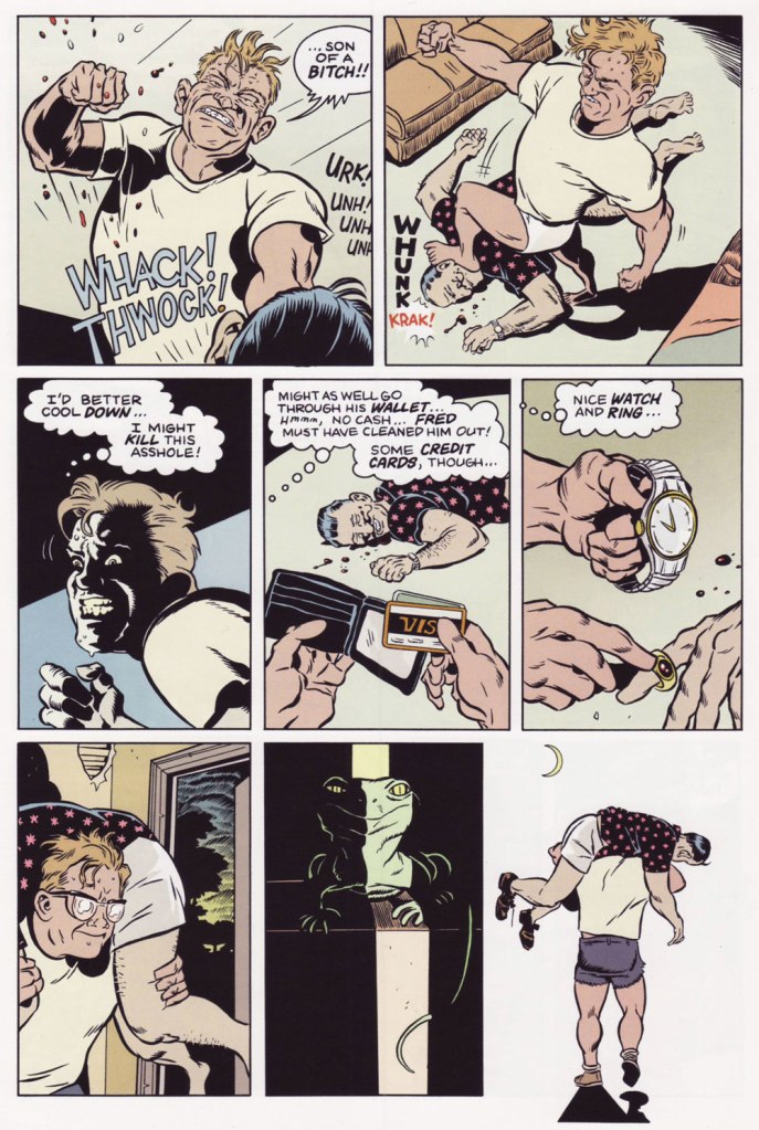
Monkey See, Monkey Do, written by Eichhorn and illustrated by Gene Fama, first saw print in Real Stuff no. 11 (Jan. 1993, Fantagraphics); there, it appeared in black and white, but was coloured, presumably by Fama himself, for Swifty Morales Press’ lovingly-done 2004 Real Stuff anthology.
The issue originally featured a Charles Burns cover coloured by Jim Woodring (another master of autobiography, en passant). Burns presumably wasn’t too keen on the original palette (whose murkiness, to be fair, rather overwhelmed his drawing), so he recoloured it himself for the anthology. This is the all-Burns version. Compare, if you will, to the Woodring rendition.
A candid shot of our fair young author on a visit to Seattle, circa 1992, with Mr. Eichhorn, along with a friendly member of the local ethylic intelligentsia, who successfully lobbied for inclusion in the shot. You decide who’s who.

-RG

p.s. It would be easy to assume that āhole is just a fancy way of saying ‘asshole’, but it isn’t *necessarily* so; to wit:

āholen. An endemic fish (Kuhlia sandvicensis) found in both fresh and salt water. The mature stage is āhole, the young stage āholehole. Because of the meaning of hole, to strip away, this fish was used for magic, as to chase away evil spirits and for love magic. It was also called a “sea pig” (puaʻa kai) and used ceremonially as a substitute for pig. Foreigners were sometimes called āhole because of the light skin of the fish. He āhole ka iʻa, hole ke aloha, āhole is the fish, love is restless [of āhole fish used in love magic]. [ source ]

Santa Clauses Good, Bad, and in Between!

« Talk about cheap – on Christmas Eve, my neighbor shoots off three blanks and tells his kids Santa Claus just committed suicide. » — Milton Berle

We hope this Christmas day finds you healthy and happy, whether you’re spending it quietly with the nearest and dearest, or stranded far from your family. We all do the best we can.

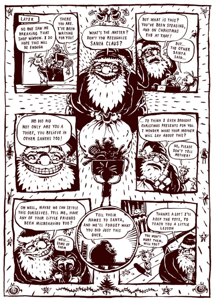
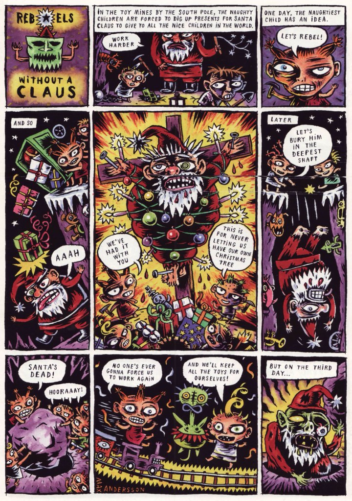
In a slightly different, yet somehow appropriate, vein… the following Christmas story by Max Andersson is a bracing antidote to the usual syrupy cheer of December 25th. As co-admin RG aptly put it*, in Andersson’s world, malevolence is the status quo, and this Jekyll-and-Hyde version of Santa Claus will fluff up the fur of the staunchest anti-Christmas reader.

*Read A Secret, Silken World: Max Andersson’s “Lolita’s Adventures”

Good Claus Bad Claus was published in Zero Zero no. 7 (Jan-Feb 1996, Fantagraphics).

As a bonus, we are including the no less cynical, but quite satisfying, back page of Death & Candy no. 1 (December 1999, Fantagraphics). Santa had it coming!

Ho-ho-ho (down the shaft), merry Christmas to all of our kind readers!

— Daria and Richard

Hallowe’en Countdown V, Day 1

« Dennis the Menace was probably the most realistic comic book ever done. No space aliens ever invaded! » — Gilbert Hernandez

Is it already October? So it is. Well, here we go again with our annual Hallowe’en Countdown. We’ll kick this edition off by featuring that pint-sized bundle of toxic toddler masculinity, Dennis the Menace (I can’t help but think that his French name, Denis la Malice, is a far more accurate description of his sociopathic essence).

Here at WOT?, we’re both (amble over to ds’ earlier DTM spotlight) huge fans of Hank Ketcham’s cartooning finesse… I mean, these are beautiful! But… drawing skill aside, the stuff is hard to take is large doses. To quote one frazzled babysitter to Dennis’ parents: « how can you stand it? »

And Dennis is still around, seemingly unchanged…

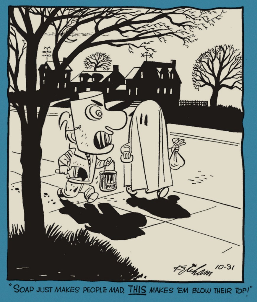
Dennis’ first Hallowe’en, from Oct. 31, 1951, the strip’s inaugural year.
October 30, 1952.
Just put yourself in Dennis’ parents’ shoes, and you get a better sense of the sheer magnitude of his malevolence. His poor folks don’t seem to have done anything to deserve being forever trapped in this relentless cycle of humiliation and injury. October 31, 1952.
The old lady didn’t think it was so silly. October 31, 1953.
This is Dennis the Menace Bonus Magazine Series no. 155 (July, 1976, Fawcett).
And a look inside…
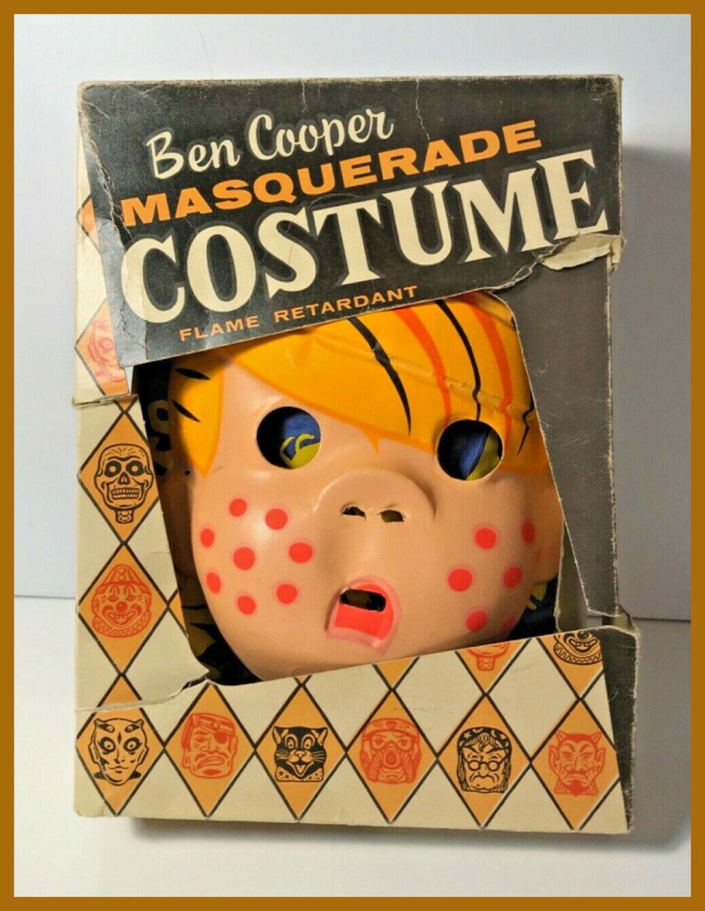
Back in the day, you could *be* Dennis (more or less) for trick or treating, thanks to that fondly-remembered purveyor of cut-rate (but cool in their way) costumes, Ben Cooper, Inc.
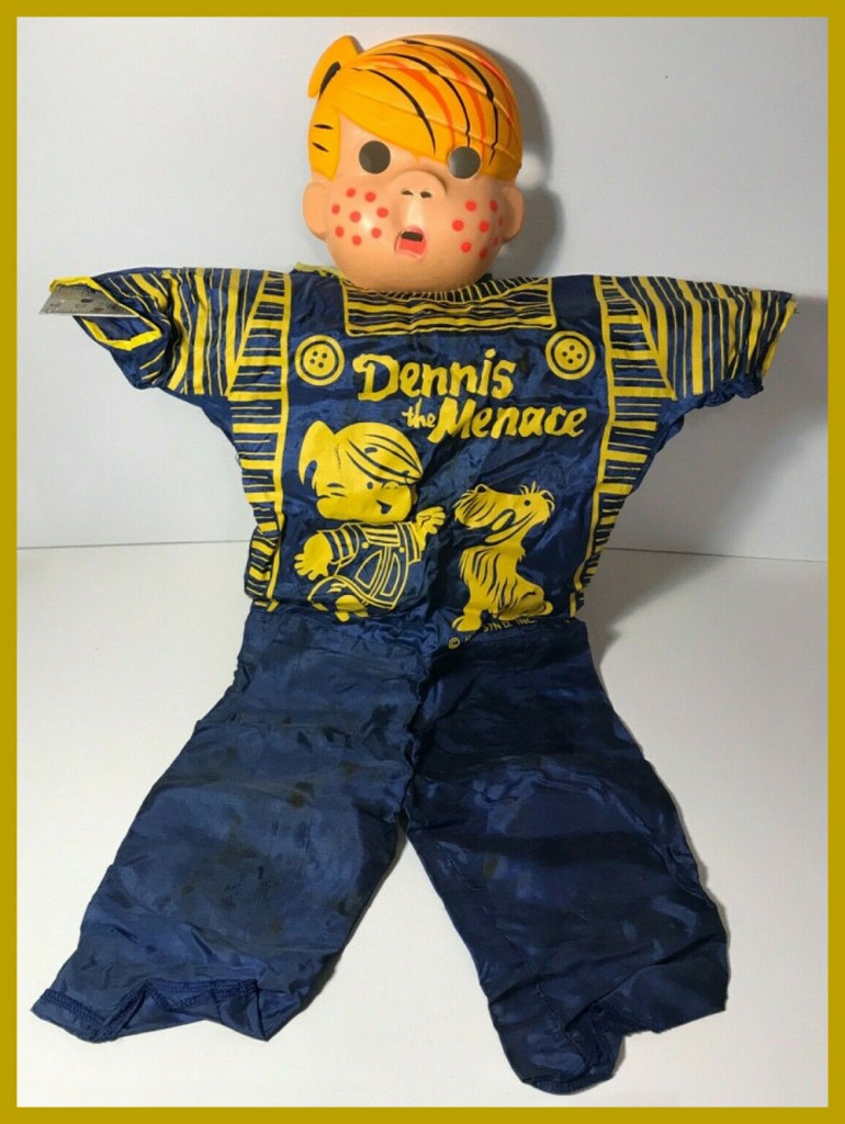
A fuller look at the Dennis ensemble. And do check out this bit of Ben Cooper history!

-RG