« When I was a young writer if you went to a party and told somebody you were a science-fiction writer you would be insulted. They would call you Flash Gordon all evening, or Buck Rogers. » —Ray Bradbury
We’ve talked about newspaper strip Flash Gordon in Tentacle Tuesday: Lurkers in the Newsprint, and now it’s time for its comic book version! Although I normally have very little interest in FG, this is no second-rate Tentacle Tuesday: there is some prime tentacular material to be enjoyed.
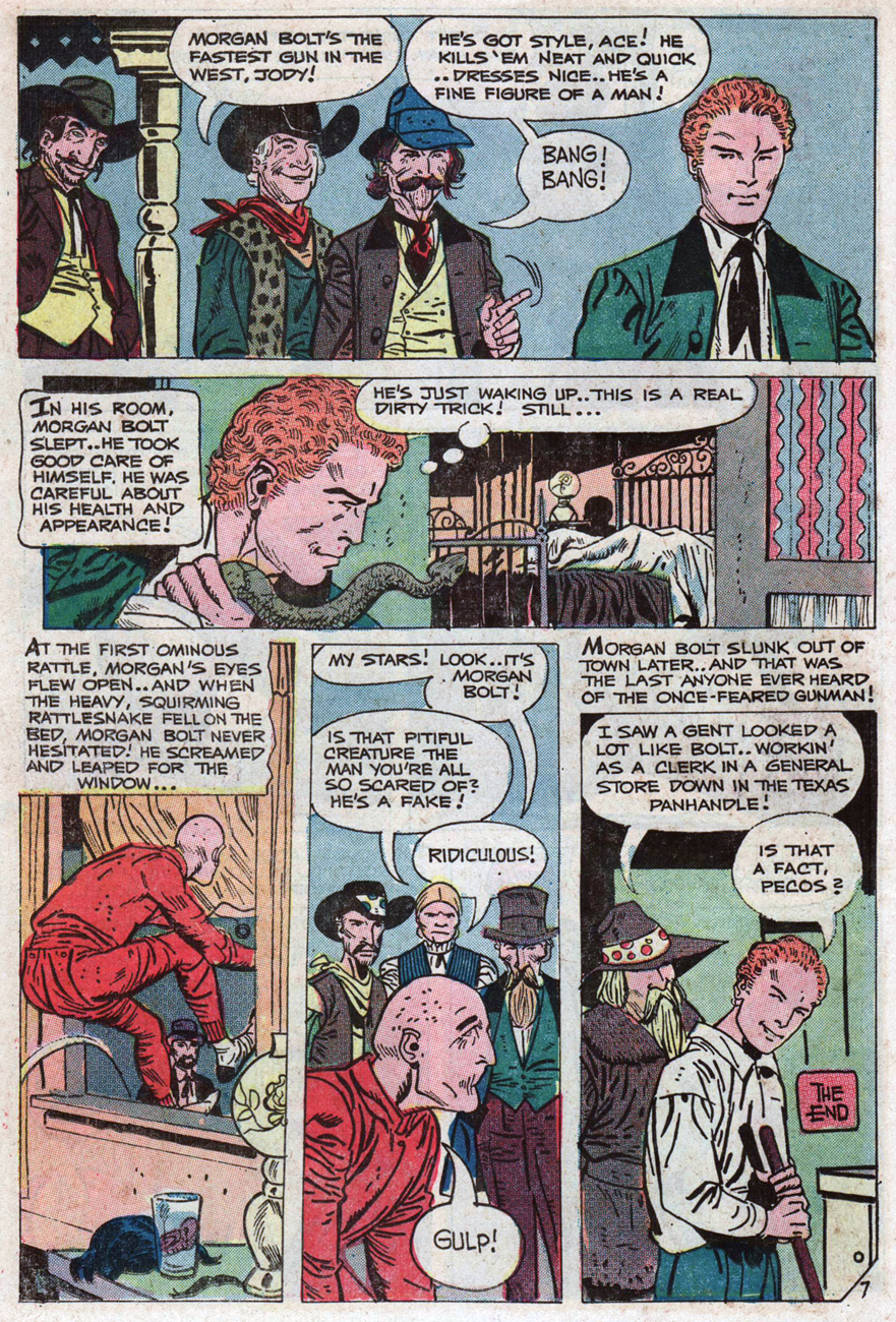
We first concern ourselves with the Flash Gordon Charlton Comics run, which picked up the count where King Comics had left it in 1967. From 1969 until 1970, Charlton published issues 12 to 18, all of which but the first had glorious covers and cover stories by Pat Boyette, an absolute WOT favourite ( you can visit co-admin RG’s Pat Boyette — Hillbilly Makes Good* for a deeper exploration of his career).
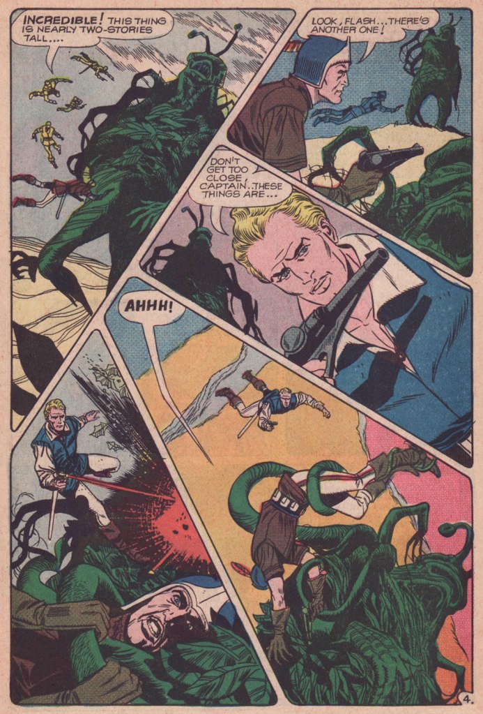
The cover of issue 14 has an octopus shortage (a serious flaw affecting many, many comic book covers!), but the monster o’nine-tentacled-tails the ’emotionless killers’ encounter is a beauty. The following page is also a good example of Boyette’s imaginative page layouts, in which things are kept dynamic, but never engender confusion about who is doing what and to whom.
Page from Rancor and the Seven Shadows of Flash Gordon, scripted by Bill Pearson and illustrated by Pat Boyette, was published in Flash Gordon no. 14 (June 1969).
Then we come to a real bevy of Boyette tentacles a few issues later –
Flash Gordon no. 17 (Charlton, November 1969). Cover by Pat Boyette.
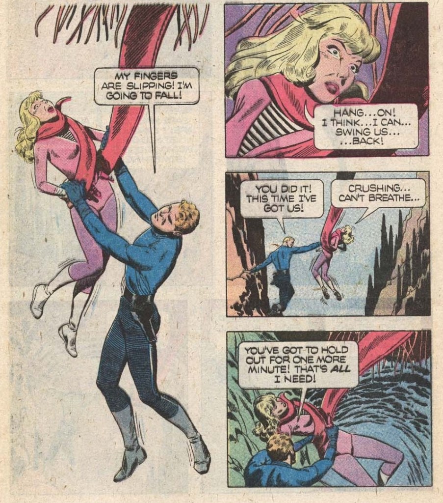
The Creeping Menace, the cover story, is scripted by Joe Gill and illustrated by Pat Boyette. I am including two pages (and a panel) because it’s too difficult to choose between them – all boast the aforementioned dynamic layouts and striking tentacles.
Isn’t this a lovely, stylish panel? I want it on a t-shirt.
The publishing history of comic-book Flash Gordon was an interesting relay race: Gold Key Comics resumed the run with issue 19 (1978), and kept it up until issue 27 (1979); finally, issues 28 to 37 were published under its Whitman imprint between 1980 and 1982. The latter category offers two tentacled covers, and some inside goodies.
Original art (sadly by an unknown artist) for the cover of Flash Gordon no. 29 (Whitman, May 1980).
The cover story The Deadly Depths is scripted by John Warner and illustrated by Carlos Garzón. Oh, this thing is not hostile… just hungry.
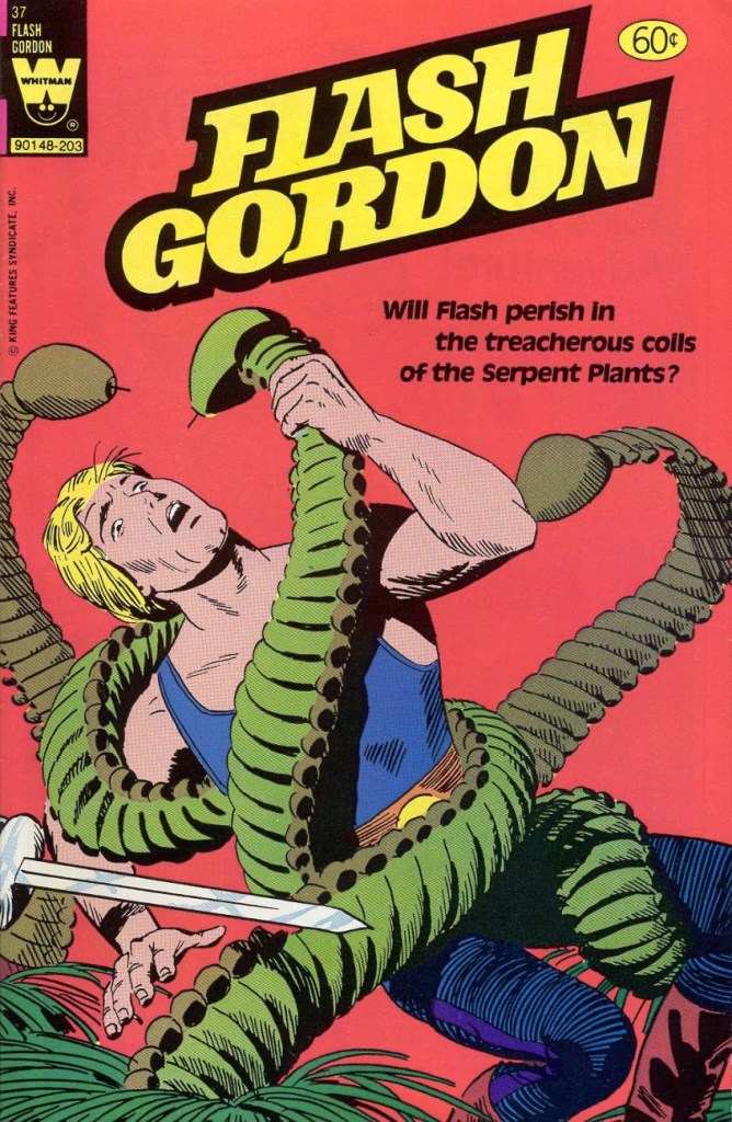
The last Whitman issue also is of some interest, though on the cover Flash looks like he’s fighting caterpillars with an martini olive for a head.
Flash Gordon no. 37 (Whitman, March 1982). Cover by Gene Fawcette.
Cover story My Friend, My Killer! is scripted by George Kashdan and illustrated by Gene Fawcette and features cute serpent plants that look like they’re wearing little hula skirts.
And that concludes our tour of Flash Gordon tentacles in the Silver Age (and with some forays into Bronze).
I wasn’t around in the 70s. (Literally, as in “I hadn’t been born yet”.) So when somebody – in, oh, say 2008 or so – handed me a copy of some ghost comics printed by Charlton Comics (I don’t remember what exactly), that was my first exposure to this publishing company. I wasn’t aware that I wasn’t « supposed » to like this stuff… and by the time some kind soul pointed out that it’s not exactly orthodox to seek out Charlton publications, it was too late to change my mind. Clearly, that’s how monsters with no taste are created.
Charlton Comics had the reputation for inferior printing (as one of my friends put it, « godawful colours and reproduction and paper ») and low quality control. I’d say that when one contemplates the variety of artistic styles and the dizzying panoply of artists published by them, the quality of the printing distinctly becomes a less important consideration. Charlton paid badly, sure, but since when do people decide what they like and what they don’t based on how artists are treated? (Just look around – companies that trample on creators’ rights are doing very well indeed.) It seems like a knee-jerk reaction; I often wonder if people who automatically react with sneers to the very mention of Charlton have actually read any of the comics this company printed. Or perhaps they’re scared by some of the artists’ styles which are just too wild, too squiggly, just not clean enough. (Sloppy line work! Anathema to any comic book lover worth his salt, right?)
Anyway, Charlton’s « loose editorial oversight » meant there was no house style to speak of, and artists with highly idiosyncratic styles could let their eccentricities shine.
You may notice some names are conspicuously absent from today’s post. Tom Sutton, exhibit A of the “chaotic, scratchy art” category, will get a Tentacle Tuesday post all to himself at a later date. Some beloved artists just didn’t draw any tentacles for Charlton (as far as I know!): Warren Sattler, Don Perlin, Sam Glanzman, Don Newton, Rocco Mastroserio, etc. Wayne Howard is already part of a Tentacle Tuesday (see Plant Tentacle Tuesday), as is Enrique Nieto (Tentacle Tuesday: Spunky Skirmishes).
Without further ado, but with lots of tentacles…
First, two beauties from Steve Ditko (if you’d like more Ditko – and who wouldn’t? – visit my co-admin RG’s lovely posts about him: Ditko’s Ghostly Haunts and Happy 90th birthday, Mr. Ditko!), both featuring “70s Ditko green“. (It’s that characteristic green hue that often appears on his covers, a fitting term coined by erudite Professor Fester.)
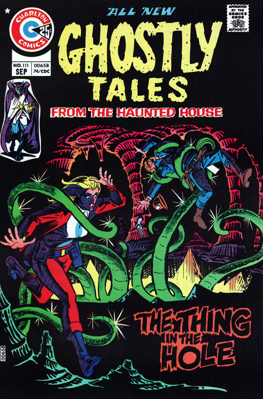
Ghostly Tales no. 111 (September 1974), cover by Steve Ditko. « The Thing in the Hole » is a really cool story, but it’s written and drawn by Tom Sutton, and as such it’s off-limits for now (I’m hoarding material for a different post.)
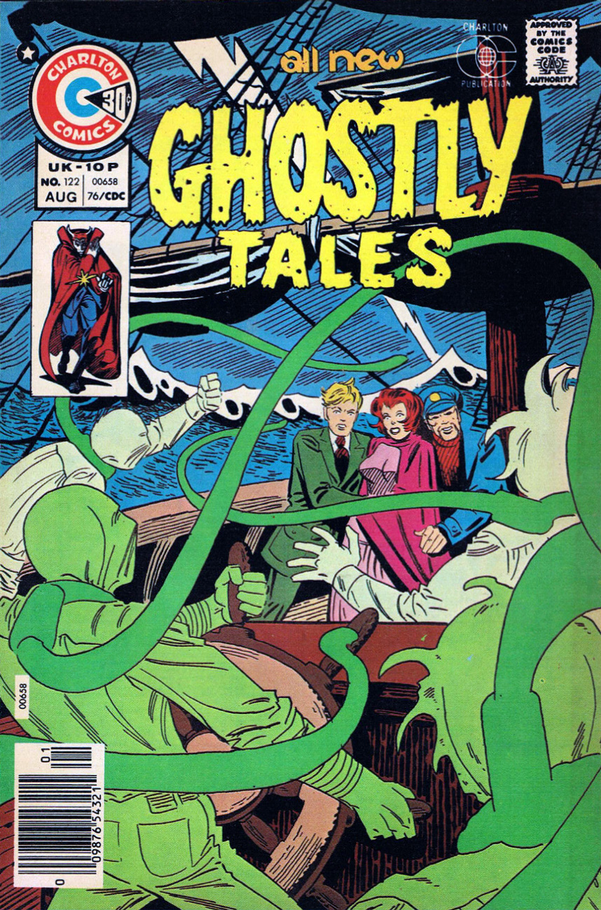
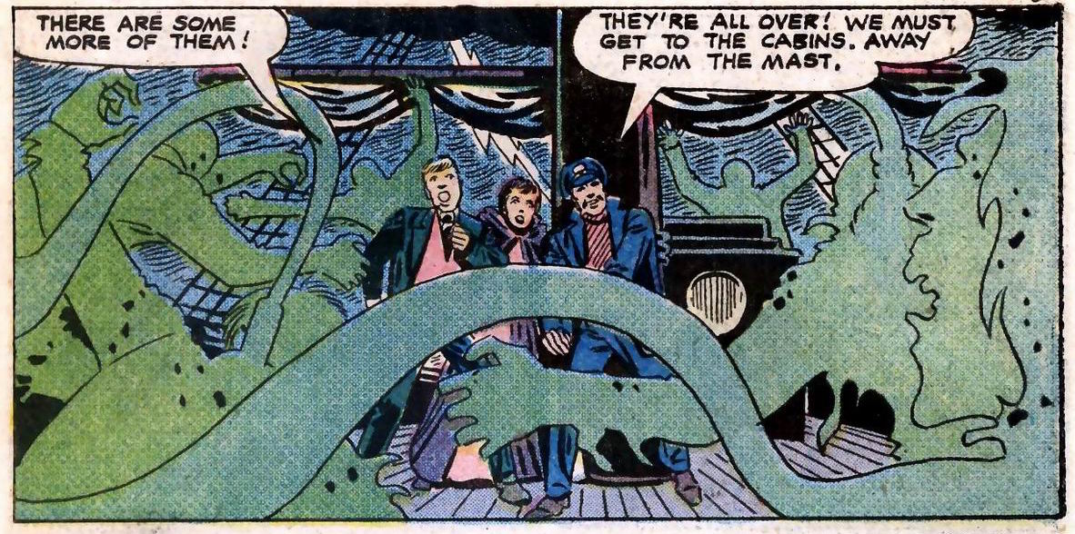
Ghostly Tales no. 122 (August 1976), cover by Steve Ditko.
Do these green noose-appendage-things count as tentacles? Sure they do! Panel from The Crew That Was Hanged!, illustrated by Steve Ditko and written by Joe Gill.
And moving on to other series, other artists:
Haunted no. 8 (October 1972), cover by Jack Abel (1927-1996), perhaps best known as an inker for DC and Marvel.
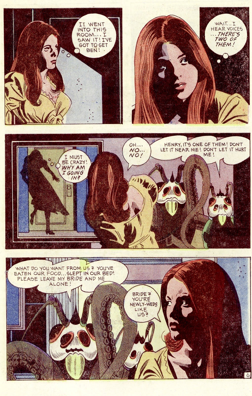
Newly-weds that are half-squid, half-fly, but newly-weds nonetheless. Page by Peter A. Morisi (1928-2003), who went by the nom de plume of PAM (or, since his signature’s M looks like a triple “I”, “PAIII!”). He was a NYC police officer, and moonlighted as a comics artist. I really like his calm, easily recognizable style and the way his characters seem to be frozen in each panel. There’s something quite effective about this stillness, a pleasing contrast between the drama and action of a story and the way people are staring off-panel in quiet contemplation, even when terrified. This story is called “Wrong Turn” and comes from Haunted no. 13, 1973.
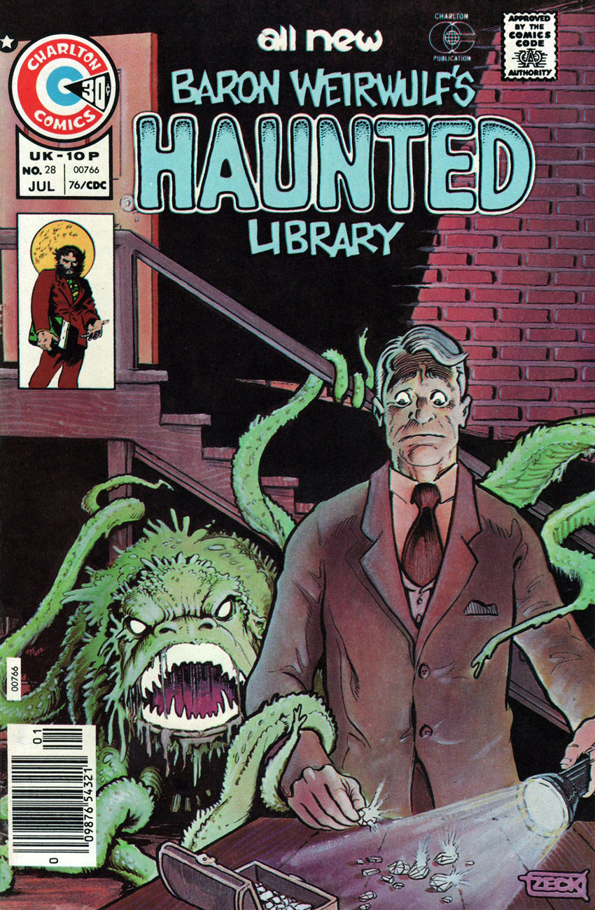
(Baron Weirwulf’s) Haunted (Library) no. 28 (July 1976), cover by Mike Zeck, whose career actually started at Charlton (he later moved on to Marvel to work on Master of Kung Fu, Captain America, etc.).
« The creature’s tendril closed so gently around his leg, he didn’t notice it at first. Then a second grasped his arm! »The Source is the cover story of Haunted no. 28. Is old Thomas Willet mad? Well, he just has unusual taste in pets, that’s all (and, as tradition demands, he will pay dearly for his extravagance). Pencils and inks by Frank Bolle (1924-2020), who worked for Gold Key and Charlton, illustrated horror stories for Warren titles, and also had a hand in several newspaper strips (Winnie Winkle, Apartment 3-G, Stan Drake’s The Heart of Juliet Jones, and Gil Thorp).
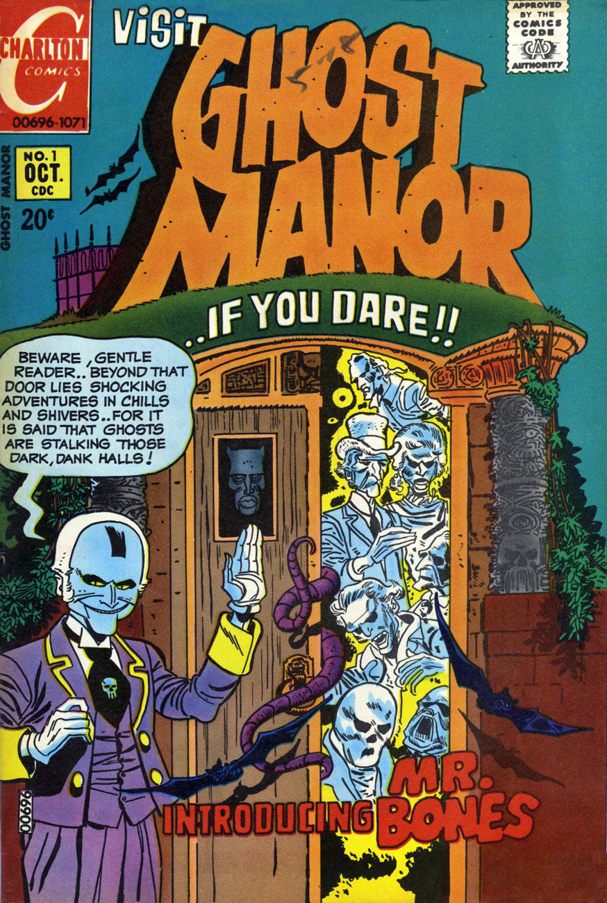
Ghost Manor no. 1 (October 1971), cover by the ever-masterful Pat Boyette (1923-2000), who’s a big favourite at Who’s Out There. Go read a whole story by him: Pat Boyette — Hillbilly Makes Good
We couldn’t find a good enough scan of this issue online, and it’s one of the rare Ghost Manors co-admin RG doesn’t actually own, so here’s a cover photostat (slightly coloured):
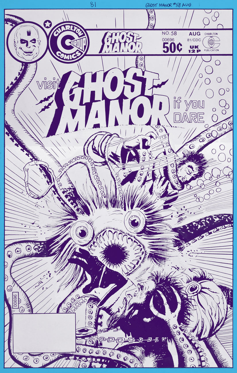
Ghost Manor no. 58 (August 1981), cover by the Recreo Studio.
Ghostly Haunts no. 48 (February 1976), cover by Rich Larson (we’ve seen him before in Haunted House of Lingerie — see Tentacle Tuesday: a Day at the Beach).
Ghostly Haunts no. 52 (October 1976), another cover by Pat Boyette, this time gorgeously painted.
« There’s no room for professional jealousy around the graveyard, chums… life is too short, as they say… but what comes after that short life may stretch into all eternity! »
I could carry on endlessly (or so it would seem) on any number of obscure topics, but it’s healthy, every once in a while, to take a deep breath, empty one’s mind of its flotsam and jetsam, and reach for an old favourite.
I hadn’t yet written anything about Steve Ditko‘s passing, as I figured it would get lost in the mad shuffle of tributes. That base was well-covered. Still, while I’d known all along the day would come, it was hard to imagine a world without that reclusive genius, likely my very first artistic inspiration.
I didn’t see much of Ditko’s 60s Marvel work until the late 70s pocket book reprints (the period equivalent of watching a movie on one’s cellphone), but the Charlton ghost books grabbed me at a tender age. And so…
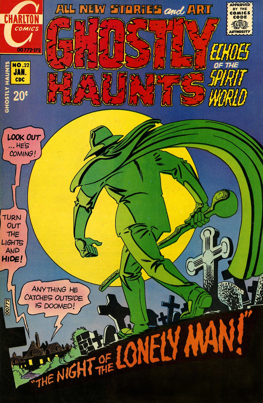
As my candidate for Steve Ditko’s finest cover run, at any company, I submit issues 22-27 and 29-30 (curse you for the interruption, Joe Staton!), from January 1972 to March 1973, final year of Ditko’s peak period, imho.
Ghostly Hauntsno. 22 (Jan. 1972), an excellently-balanced all-around winner, with the whimsical “Wh-Who’s in Th-There?” (w: Joe Gill p: Charles Nicholas i: Vince Alascia), “Witch’s Brew“, a taste of creepy suburbia with a whiff of Rosemary’s Baby brimstone (w: Joe Gill, p/i Pat Boyette) and our headliner, “The Night of the Lonely Man!” by Gill and Ditko. Read the whole pamphlet here, folks.
Ghostly Hauntsno. 23 (Mar. 1972), offers two Gill-Ditko stories: “Treasure of the Tomb” and the cover-featured “Return Visit!“… and I’d be hard-pressed to pick the superior entry. The reader wins. Ah, you cast the deciding vote: read them both here.
Ghostly Talesno. 24 (Apr. 1972), another strong issue, thanks to Gill and Boyette’s “The Other One!” and of course Ditko illustrating “A Man Who Was Here“, Joe Gill’s parable about a Tennessee mountain man displaced, but not entirely, by the construction of a modern superhighway. Read the entire issue here, ladies and gentlemen.
« The butler’s a real monster! » Ghostly Talesno. 25 (June 1972) is where Mr. Ditko demonstrates his unmatched virtuosity in the delicate task of incorporating several elements of a tale without winding up with the dog’s breakfast. Compositional alchemy of the highest order! The cover tale aside, Joe Gill’s wonderfully-titled “What Will Lance Surprise Us with This Time?“, illustrated by Fred Himes, is loads of fun. Read “I’ll Never Leave You!” here.
Roger C. Feeney, Indian Affairs bureaucrat from Washington, DC, appears to have stumbled onto the wrong sacred Hopi cave. Uh-oh, Roger, it appears you’ve been noticed by… something. This is Ghostly Hauntsno. 26 (Aug. 1972). Beyond the classy Ditko cover, it’s just an okay issue.
« Why does it happen each year? Citizens of Trappton don’t know it, but it always begins right here… at an unmarked grave… » Presumably bearing no direct relation to the 1967 Michael Winner- Orson Welles – Oliver Reed film, “I’ll Never Forget What’s-His-Name“, the Gill-Ditko cover story is a classic, the tale of a forgotten man, Bertram Crumm, who merely wanted his existence recognized by the town that spurned him during his lifetime. It’s too bad Charlton only occasionally featured mystery host Dr. Graves in active (rather than narrative) roles, because when they did, the results were pretty gripping. Unusually, Graves guests outside his own book and in Winnie’s, and we find ourselves with a classic on our hands. This is Ghostly Hauntsno. 27 (Nov. 1972). Read the Gill-Ditko story here, but don’t miss the fabulously oddball “The Mine’s All Mine!” by Gill and Stan Asch, featured right here.
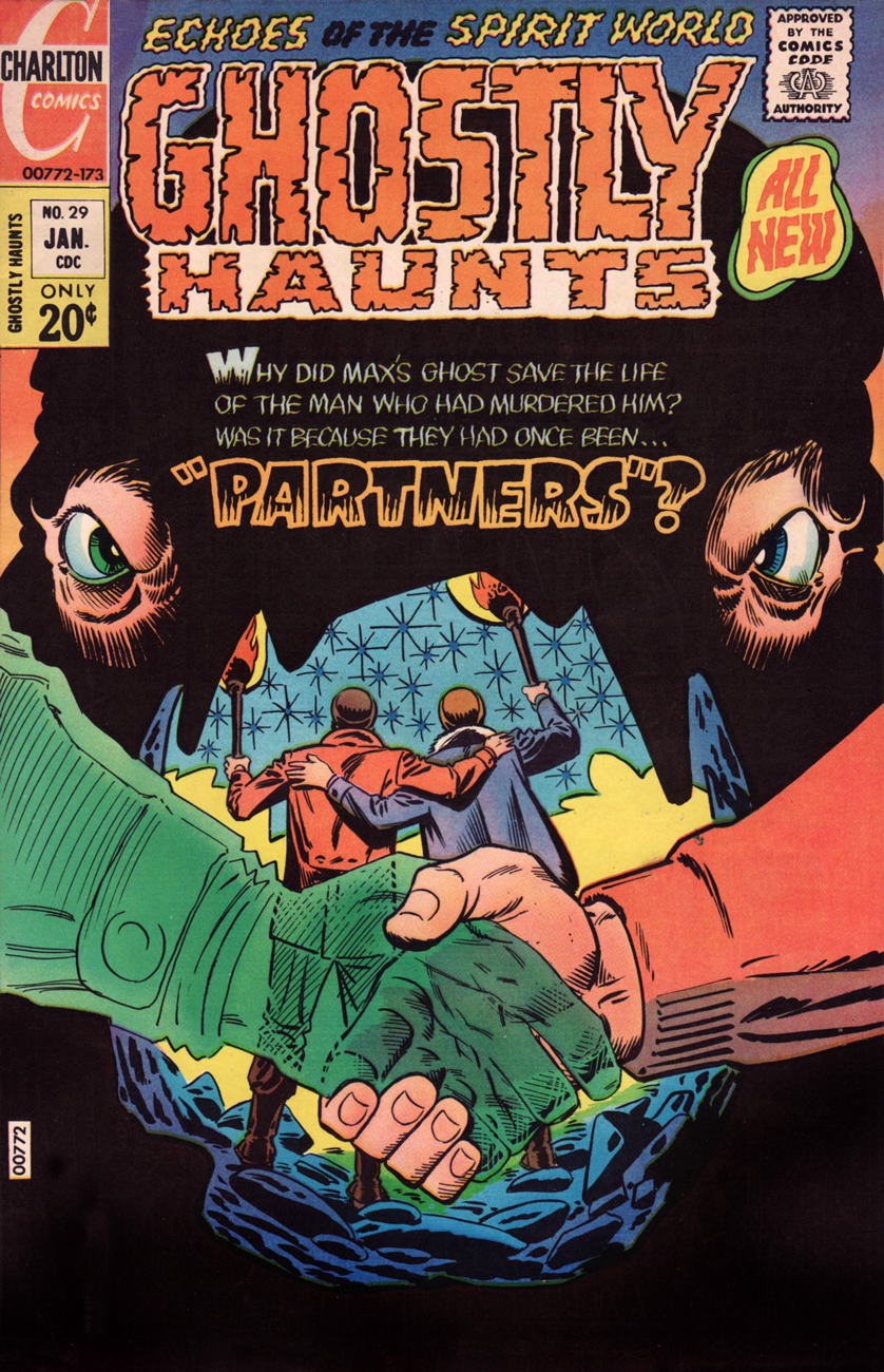
« Maybe I’m going mad! I keep imagining I hear his voice! » Ghostly Hauntsno. 29 (Jan. 1973) features a striking (gold) exercise in fearful symmetry announcing the Joe Gill – Ditko saga of two untrustworthy acolytes in the Canadian North. Check out “Partners!” here.
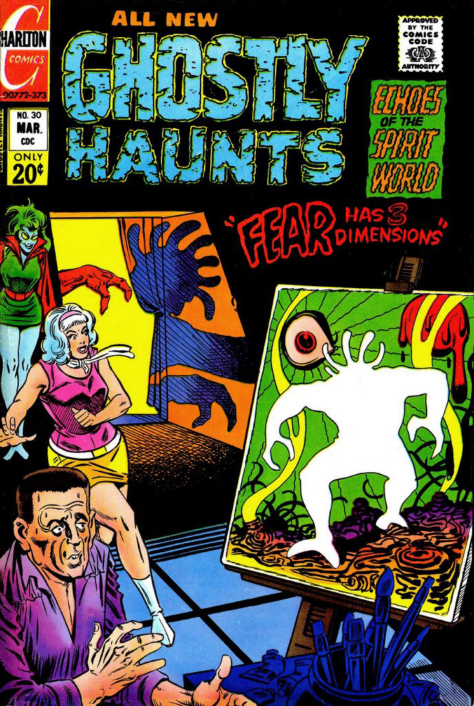
« Ugh! It’s really hideous! Is it a self-portrait of the real you?» We put the finishing touches on our tour of Steve Ditko covers from 1971-72 with Ghostly Hauntsno. 30‘s “Fear Has Three Dimensions” (Mar. 1973). Despite a theme right in Ditko’s wheelhouse, none of his art appears within; the cover feature is handled by Wally Wood disciple Wayne Howard, and the other tales are deftly told by Fred Himes and Warren Sattler.
That just about wraps it up. For further reading on the topic, I recommend you check out Ben Herman’s perspective on some of these very stories, and on Ditko’s spooky Charlton work of the 70s in general.
« That young fella must be the college kid who’s going to work for my paper! Those two prairie wolves will pick him clean… it’ll be an excellent lesson to him, I reckon! » — Max Cogswell, editor-publisher of The Boothill Gazette
Today marks what would have been the ninety-fifth birthday of suave Texan Renaissance man Aaron P. “Pat” Boyette (July 27, 1923 – January 14, 2000). The Golden-voiced Mr. Boyette was in turn actor, radio announcer, cinematic auteur and of course a far-beyond-fine painter and cartoonist. Ah, and if anything could speak more eloquently of his worth as a human being, he was best man at Gus Arriola‘s wedding.
Didn’t I say he was suave?
Now, I could have focussed on any number of his remarkable projects: his 1966-67 run on The Peacemaker (« A man who loves peace so much that he is willing to fight for it! »), his tour-de-force fill-ins on DC’s Blackhawk (issues 242-43, from 1968), his lavishly-detailed work for Warren Magazines (1968-72), his brilliant, but admittedly controversial, run on The Phantom at Charlton (1970-73), his far-better-than-its-source adaptation of Hanna Barbera’s Korg 70,000 B.C., his intense The Tarantula for Atlas-Seaboard (with Michael Fleisher, 1975), his fun revival of Spencer Spook for ACE Comics in the 1980s, or any of his moody work for Charlton’s ghostly anthologies… but I won’t, at least not this time.
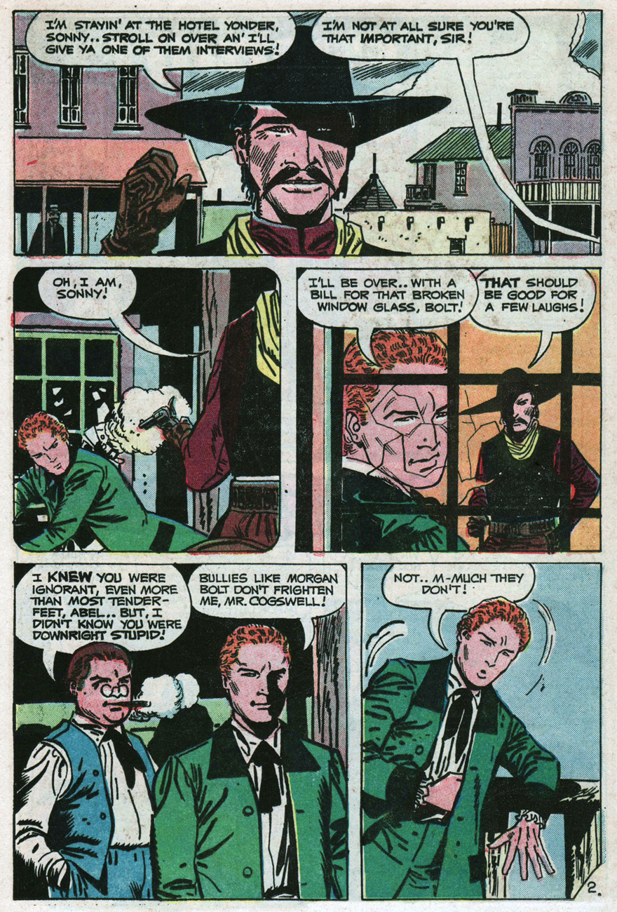
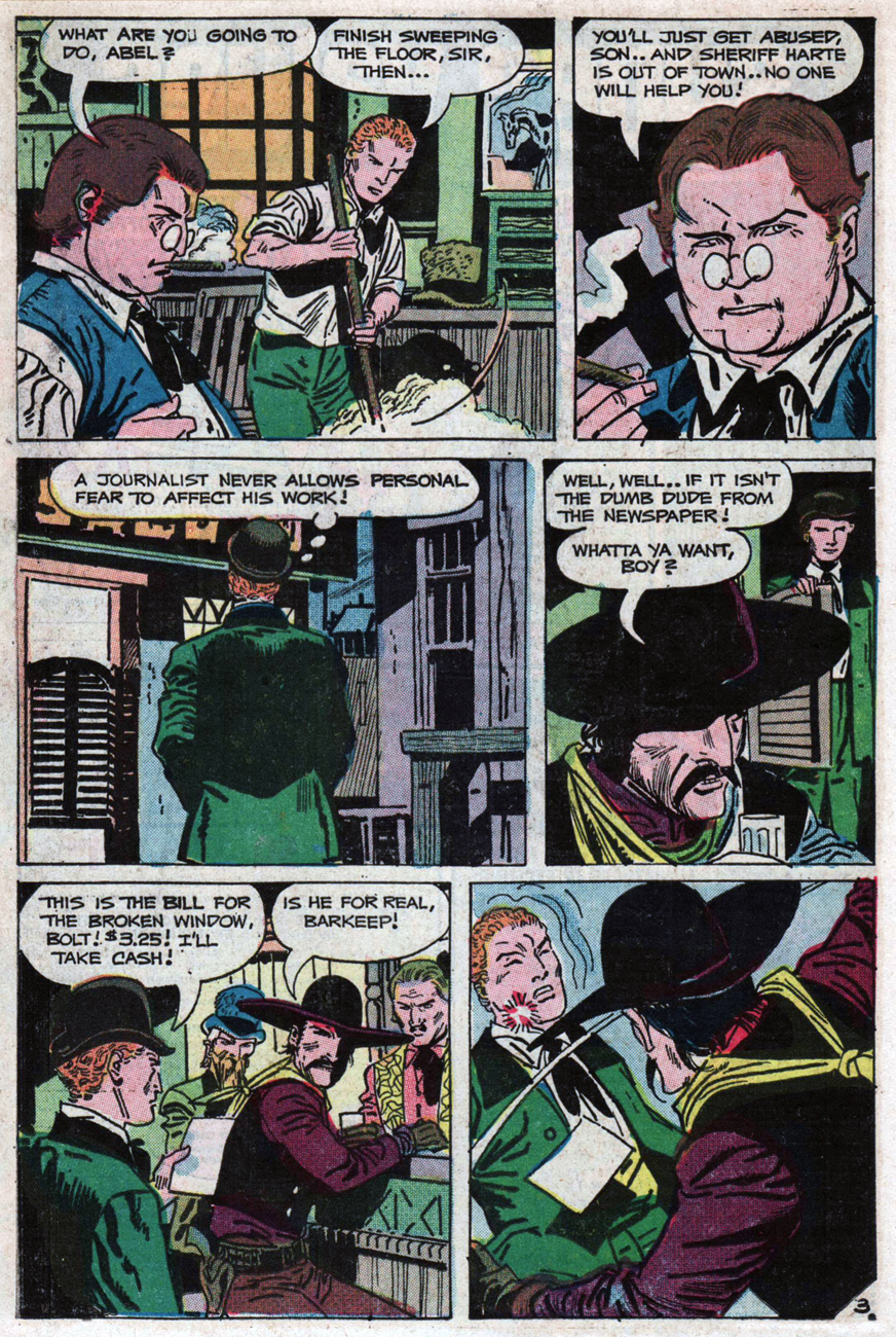
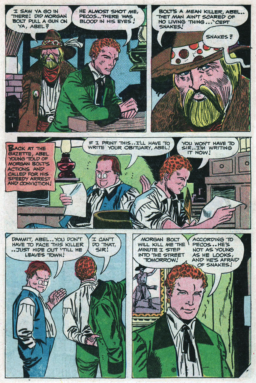
Instead, if you’ll bear with me, we’ll take a gander at a fine, fine backup series he co-created with Joe Gill for the pages of Charlton’s long-running Billy the Kid. Mr. Young of the Boothill Gazette (BTK 88, Dec. 1971, to BTK 110, Dec. 1974). Abel Young, bereft of sharp-shooting or pugilistic skills, is a true hero: a fool, an idealist, a stubborn cuss who acts nobly even when he’s scared spitless. His is a charming strip, full of graceful humour and humanity.
Here, then, is my selection: the series’ thirteenth episode, originally published in Billy the Kid no. 100 (March, 1973, Charlton).
Happy birthday, Mr. Boyette. The world needs more gentlemen of your ilk.
-RG
*so proclaimed the headline of a Boyette profile published in Creepy no. 33 (June 1970, Warren).
Tuesdays sure roll around quickly, but that’s okay – another week, another fresh batch of prehensile, slimy tentacles for our enjoyment. I’ll open Tentacle Tuesday with an “oldie but goodie”. (Speaking of that, I have an irrational pet peeve: comic shop owners who, upon seeing a customer carefully clutching a stack of 70s comics he meticulously unearthed from a grimy comic box stashed in the darkest corner of the store, say, with a slightly condescending grin, “oh, you’ve found some oldies!” The comment is no doubt well-intentioned, but there are nicer ways to start the conversation.)
And a-one
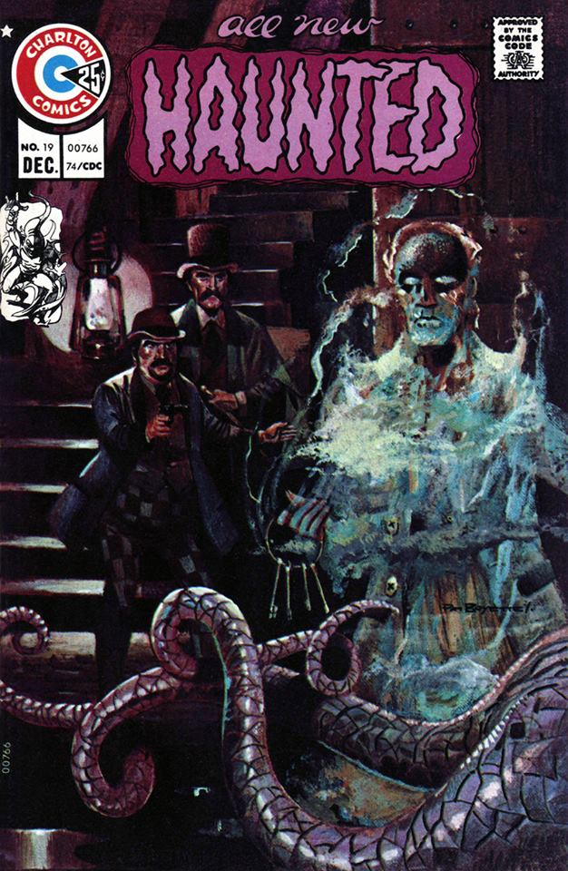
First on the list for today is this painted beauty by Pat Boyette, from Haunted no. 19, December 1974. Just look at those shiny, healthy tentacles – just the kind to gently grab your ankle and drag you into murky waters. Their diaphanous keeper doesn’t exactly inspire confidence, either.
This issue is worth picking up for more than its cover. It remains excellent when one opens its pages: there are three stories, and they’re all worthwhile – the beautiful “The Unholy!” by Pete Morisi (PAM! PAII!) (written by his son, Steve Morisi, and therefore unfortunately not making a lick of sense), the moody “There Ain’t No Hell!” by Sanho Kim and Joe Gill, and, the cherry on the cake (and story on the cover), the quietly-elegant-but-with-tentacles “The Keeper”, illustrated by Boyette (and also written by Joe Gill).
“You bawled me out many a time for not feeding your pets, your lordship… this time, they’ll feast!”
And a-two
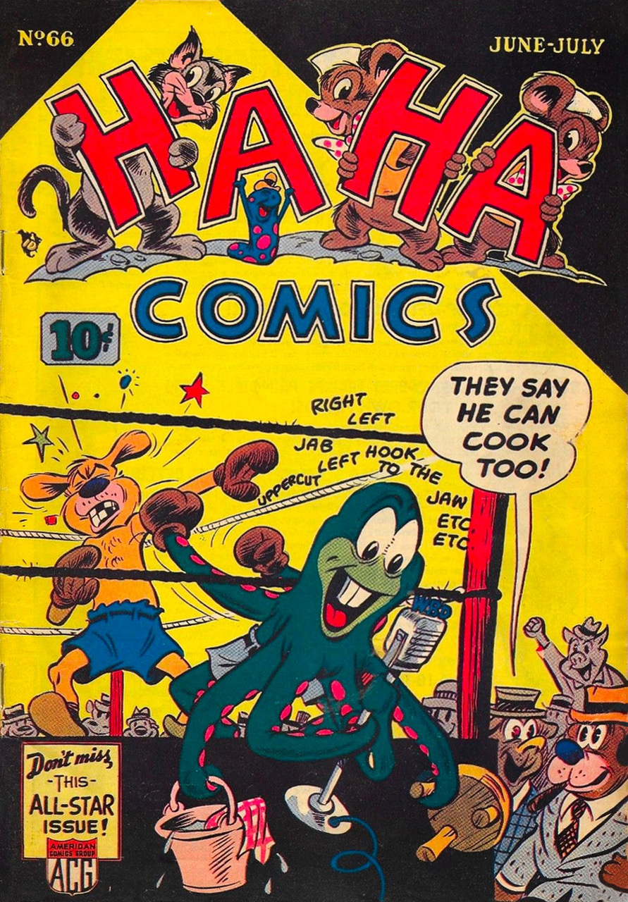
Just like octopuses (who eat small crabs and scallops, as well as snails, fish, turtles, crustaceans, and of course other octopuses), I like a little variety in my diet, so number 2 is humorous rather than scary. How did this octopus manage to figure out which of its tentacles to stick into shorts? Who’s the happy little slug with chickenpox holding up letter “A”? Why does an octopus have beaver teeth?
This is Ha Ha Comics no. 66 (Jun – Jul 1949), published by American Comics Group, or more technically Creston, an imprint of ACG. This seems to be a rather rare issue, unavailable on Comic Book Plus although they have pretty much every other issue of Ha Ha. Thanks to an Ebayer selling this comic, however, I can state with some degree of certainly that this issue features – as advertised – an all-star cast, featuring not only the habitués Izzy and Dizzy (a pair of trouble-prone mice), but also Anthony & Cleopatra, the Impulsive Imps, Robespierre, Hard-Hearted Hannah, Wigglin’ Willie the Worm and Shilly and Shally. Doesn’t it all sound like some sort of battle of the bands? As for the artist of the cover, it’s Dan Gordon, storyboard artist and film director mostly known for his work at Famous Studios and Hanna-Barbera Productions – he did quite a few “funny animals” titles for ACG.
And a-three!
T.T. number 3 is colourful. It also leads to the question “vegetable, mineral or animal?” These tentacles seem to be rather plant-like… if plants had eyeballs attached by blood vessels.
Judging by the adventures of Space Family Robinson, most planets are inhabited by aliens with tentacles. One would think that they’d be very well prepared for this eventuality (not to mention kind of bored by it), but no, the tentacles always take them by surprise.
Apart from tentacles, this has some of my other favourite things: a pterodactyl (or at least some creature approximating a pterodactyl), a vibrant sunset, and eyeballs.
This is the back cover of Space Family Robinson no. 9 (Gold Key/Western, August 1964), which is just like the front cover minus the text. Painted by George Wilson, who has a nice sense of colour. (Hurray for saturated colours in this sepia-and-grey or orange-and-teal world.)
In the beginning, oh, long before that. When light was deciding who should be in and who should be out of the spectrum, Yellow was in trouble. Even then it seems that green, you know how green can be, didn’t want yellow in. Some silly primal envy I suppose, but for whatever cause, the effect was bad on yellow. And caused yellow to weep yellow tears for several eternals, before there were years. Until blue heard what was up between green and yellow and took green aside for a serious talk, in which blue pointed out that if yellow and blue were to get together, not that they would, but if they did (a gentle threat), they could make their own green. “Ooh”, said green with some understanding. Naturally, by a sudden change of hue, green saw the light and yellow got in. Worked out fine, yellow got lemons and green got limes.*