I wasn’t around in the 70s. (Literally, as in “I hadn’t been born yet”.) So when somebody – in, oh, say 2008 or so – handed me a copy of some ghost comics printed by Charlton Comics (I don’t remember what exactly), that was my first exposure to this publishing company. I wasn’t aware that I wasn’t « supposed » to like this stuff… and by the time some kind soul pointed out that it’s not exactly orthodox to seek out Charlton publications, it was too late to change my mind. Clearly, that’s how monsters with no taste are created.
Charlton Comics had the reputation for inferior printing (as one of my friends put it, « godawful colours and reproduction and paper ») and low quality control. I’d say that when one contemplates the variety of artistic styles and the dizzying panoply of artists published by them, the quality of the printing distinctly becomes a less important consideration. Charlton paid badly, sure, but since when do people decide what they like and what they don’t based on how artists are treated? (Just look around – companies that trample on creators’ rights are doing very well indeed.) It seems like a knee-jerk reaction; I often wonder if people who automatically react with sneers to the very mention of Charlton have actually read any of the comics this company printed. Or perhaps they’re scared by some of the artists’ styles which are just too wild, too squiggly, just not clean enough. (Sloppy line work! Anathema to any comic book lover worth his salt, right?)
Anyway, Charlton’s « loose editorial oversight » meant there was no house style to speak of, and artists with highly idiosyncratic styles could let their eccentricities shine.
You may notice some names are conspicuously absent from today’s post. Tom Sutton, exhibit A of the “chaotic, scratchy art” category, will get a Tentacle Tuesday post all to himself at a later date. Some beloved artists just didn’t draw any tentacles for Charlton (as far as I know!): Warren Sattler, Don Perlin, Sam Glanzman, Don Newton, Rocco Mastroserio, etc. Wayne Howard is already part of a Tentacle Tuesday (see Plant Tentacle Tuesday), as is Enrique Nieto (Tentacle Tuesday: Spunky Skirmishes).
Without further ado, but with lots of tentacles…
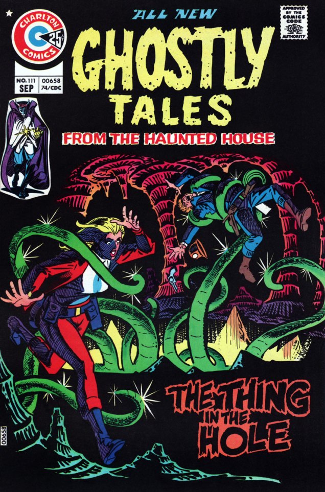
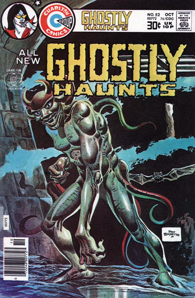
First, two beauties from Steve Ditko (if you’d like more Ditko – and who wouldn’t? – visit my co-admin RG’s lovely posts about him: Ditko’s Ghostly Haunts and Happy 90th birthday, Mr. Ditko!), both featuring “70s Ditko green“. (It’s that characteristic green hue that often appears on his covers, a fitting term coined by erudite Professor Fester.)

And moving on to other series, other artists:


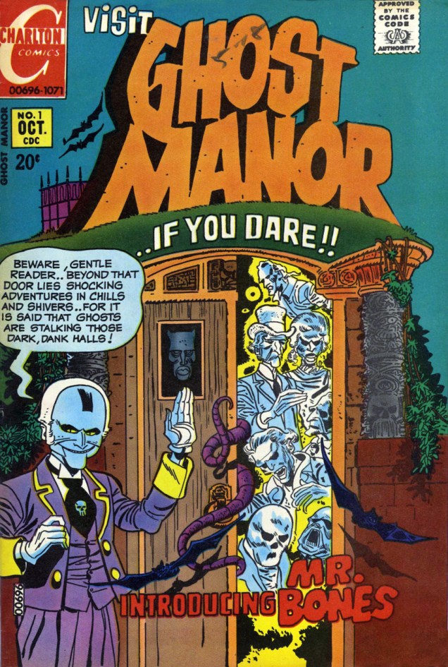
We couldn’t find a good enough scan of this issue online, and it’s one of the rare Ghost Manors co-admin RG doesn’t actually own, so here’s a cover photostat (slightly coloured):


~ ds

Great article! It’s nice to see the younger generation appreciating the wonders of Charlton. By the way, I’m the one who coined the term “70s Ditko Green”!
Cheers—
Fester Faceplant
LikeLike
Thank you! Haha, now I’m really glad you read this post – I don’t like not giving the proper credit where it’s due, especially when it’s such an apt phrase. Cheers right back at you!
LikeLike
Really Appreciate this blog post, how can I make is so that I get an alert email every time you publish a new update?
LikeLike
Hi Gerald! I believe all you need to do is click on the “Follow” button… which will then give you a choice of receiving an alert every time a post is published, or receiving a weekly email. Glad to have you on board!
LikeLike