Panning the murky old print stream for the odd glimmering nugget
Promo, Tools
For as long as they’ve been around, comics have been recruited in the name of commercial (or educational) enterprise. Or just plain propaganda. Here are some… notable examples.
« The mind loves the unknown. It loves images whose meaning is unknown, since the meaning of the mind itself is unknown. » — René Magritte
Last month, we flew off to explore the wonders of Belgium, most specifically Flanders. All other attractions aside, I thought I’d share with you some of the marvels of the country’s comics culture. Hop on!
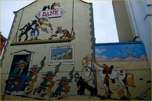
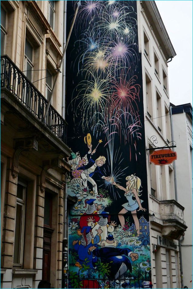
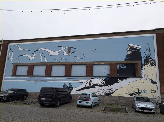
At Ostende’s cozy Le Touquet seaside restaurant, we were shown the shortest path to the loo by no less a personage than the legendary Cowboy Henk, touting local drink Blonde Kuif.This group scene from René Goscinny and Albert Uderzo‘s Astérix was appropriately located in a schoolyard, with kids eagerly playing ball just a few metres away.In a different range, this mural suitably pays homage to French ‘ligne claire‘ master Yves Chaland (1957-1990).It was nice to see the frescoes maintained. This one, located in Antwerp, celebrates Flemish cartoonist Jeff Nys‘ Jommeke: « It seems fitting that this wall by artist Jef Nys, the greatest Flemish cartoonist for children, is in an area surrounded by schools. His most popular comic was Jommeke, a story about a young boy, with a pet parrot named Flip, who goes on some crazy adventures along with his best friend Filiberke. Nys started Jommeke in 1955 and created close to 300 comic albums. They have sold over 51 million albums alone in Belgium, making Jommeke the second best-selling comic series in the country. » [ source ]My friend and colleague Arnaud Hilmacher provided the answer: « That’s obviously Mulligan and the old nun in ‘Aventure en Jaune‘ by Yann & Conrad. » Merci, Arnaud!Another lovely one saluting one of Belgium’s bédé superstars, Maurice de Bevere, alias ‘Morris’ (1923-2001).We found that Brussels’ streets were frequently adorned with striking mosaic markers, such as this one, featuring André Franquin‘s Marsupilami. I forget what thoroughfare this was, I’m afraid.This one captures Philippe Dupuy and Charles Berberian‘s Monsieur Jean and his presumed and entirely laudable and justified appreciation of Belgian beer, the world’s finest — you can keep your IPAs, thank you.A mural devoted to Michel Greg and Daniel ‘Dany‘ Henrotin’s Olivier Rameau, fittingly painted on the side of a Fireworks store at 9, rue du chêne, Brussels. Top to bottom: Ebouriffon, Olivier Rameau, Colombe Tiredaile, the 3 Ziroboudons, Alphonse Pertinent.Despite having no Belgian roots that I can figure, Hugo Pratt‘s Corto Maltese clearly is beloved in these parts. He landed no fewer than *four* murals, all neatly in a row. Here are my two favourites.A most unusual — and striking — composition.And now we come to my Holy Grail, Brussels’ Gil Jourdan mural… there are two more in Maurice Tillieux‘s hometown of Auderghem (here’s one, and the other, and yet another in the bédé-themed Janson metro station in Charleroi). The author appears for size comparison.Local graffiti artists come to the rescue: it seems inconceivable — to me, anyhow — that there isn’t a mural devoted to Willy ‘Will’ Maltaite‘s characters. There used to be a lovely « Isabelle » fresco in Brussels, but, citing damage, it was painted over in 2017. However, here’s an unofficial, and brilliant one featuring Tif et Tondu… and their archnemesis, Monsieur Choc. Take a bow!
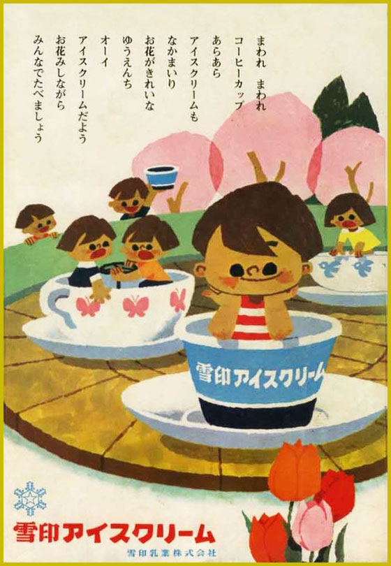
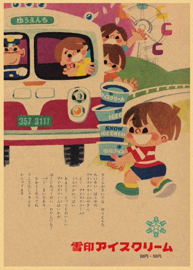
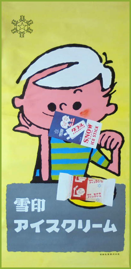
The mild case of writer’s block co-admin RG referred to in his latest post is still with me, and has perhaps even graduated from ‘mild’ to ‘pronounced’. Still, the Venn diagram overlap of spring gradually unfurling its petals and an upcoming trip to Japan smoothly leads me into today’s topic — Japanese ice cream ads from the 1960s, a glorious injection of the cute and the colourful. While you shouldn’t expect a high level of historical detail about the following images (especially given my purely utilitarian ‘where is the toilet?’ level of Japanese), you can hopefully enjoy this little detour. Don’t forget to have some ice cream today.
Most of these are ads from the Snow Brand, which by now has become Megmilk Snow Brand, one of the largest dairy companies in Japan.
On a far more disquieting note, I’ll wrap up with this USSR ice cream ad from 1937:
‘Ice cream – the best, the tastiest, sold by us’… maybe with the addition of some special powder.
These run the gamut from cheeky to raunchy to creepy, in the classic vein of ghosts for Christmas*. Speaking of Christmas, it may now be over, but the spirit of holiday cheer sure isn’t gone (despite the total absence of snow in these normally snow-covered lands of ours), so let’s have a look!
Some involve all sorts of hivernal mishaps —
The consequences of pre-holiday, er… cheer.
Some of the usual daydreams brought about by possibly too many spirits** —
— and the aforementioned ghosts, somehow especially startling when they’re born under McGill’s pen.
I’ve kept my absolute favourite for last: this revenant is so sad yet grotesque. I’d like to see the faces of people who got mailed this particular card!
~ ds
* As per another lovely tradition, we’ve recently been rewatching Christopher Lee’s Ghost Stories for Christmas. Highly recommended! Some are available on Youtube, like for example Number 13.
** As somebody who attended the Christmas office party this year, I can attest to the funny influence alcohol has on a bunch of normally restrained people when it comes to romantic advances.
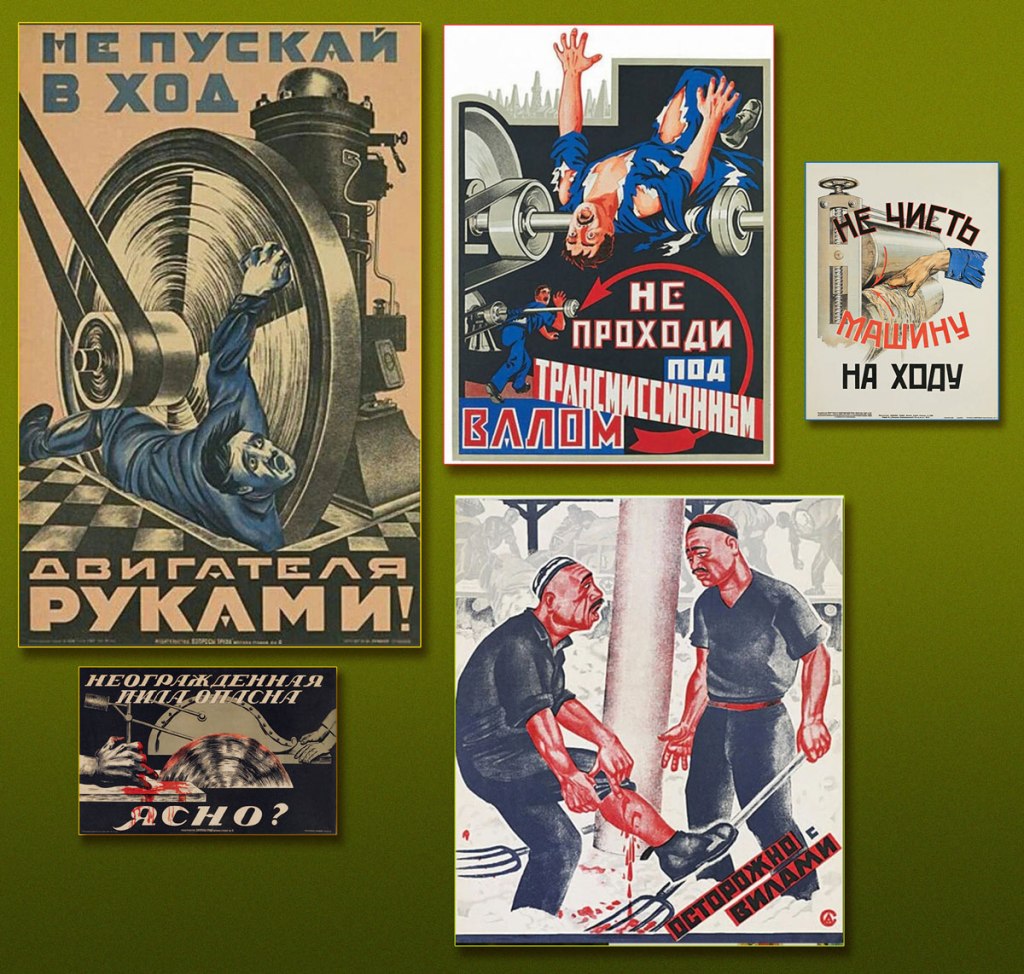
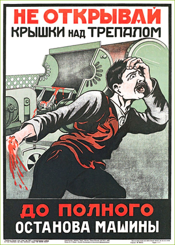
Look, some vintage horror movie posters! Or are they really?
Nope, they’re just posters reminding factory workers of some basic precautionary measures when working with all sorts of heavy equipment.
‘Don’t launch the motor using your hands‘ – ‘Don’t clean the machine while it’s on‘ – ‘An unprotected saw is dangerous – all clear?‘ – ‘Careful with the pitchfork‘
These images are undeniably striking, featuring bold fonts and surprisingly graphic imagery sending one’s imagination into the unpleasantly tactile land of torn appendages and squirting blood. Produced in the early-to-mid 20th century, these were meant to bring home a specific message* during dark times when safety measures were sorely lacking and working personnel was mostly illiterate. Unfortunately, it’s rather difficult to find these posters in decent condition, so today’s selection was somewhat dictated by what could be located online. This leaves out, alas, a couple of particularly gory examples. Still, I think you’ll agree that these fit a Hallowe’en count-down in graphics, if not necessarily in spirit!
*Something that goes like ‘don’t stick your body parts into the machine‘ is a good beginning.
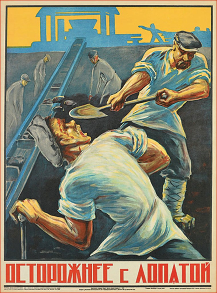
‘Beware of railway couplings‘ – the distorted face of the victim expresses the grotesque horror of a saint being impaled by a devil. These posters must have been a great opportunity for artists to try out different styles in the restrictive atmosphere of the early Soviet union.
‘I was drunk in the workplace!‘
‘Don’t open the lid of the brake before the machine stops completely‘
‘People working above – don’t stand under the scaffolding‘… unless getting your skull smashed by a wrench seems like fun, that is.
‘Don’t leave anything unsecured on the scaffolding‘
‘Mind the wheels! In 1925, 200 people were injured under tramways.‘
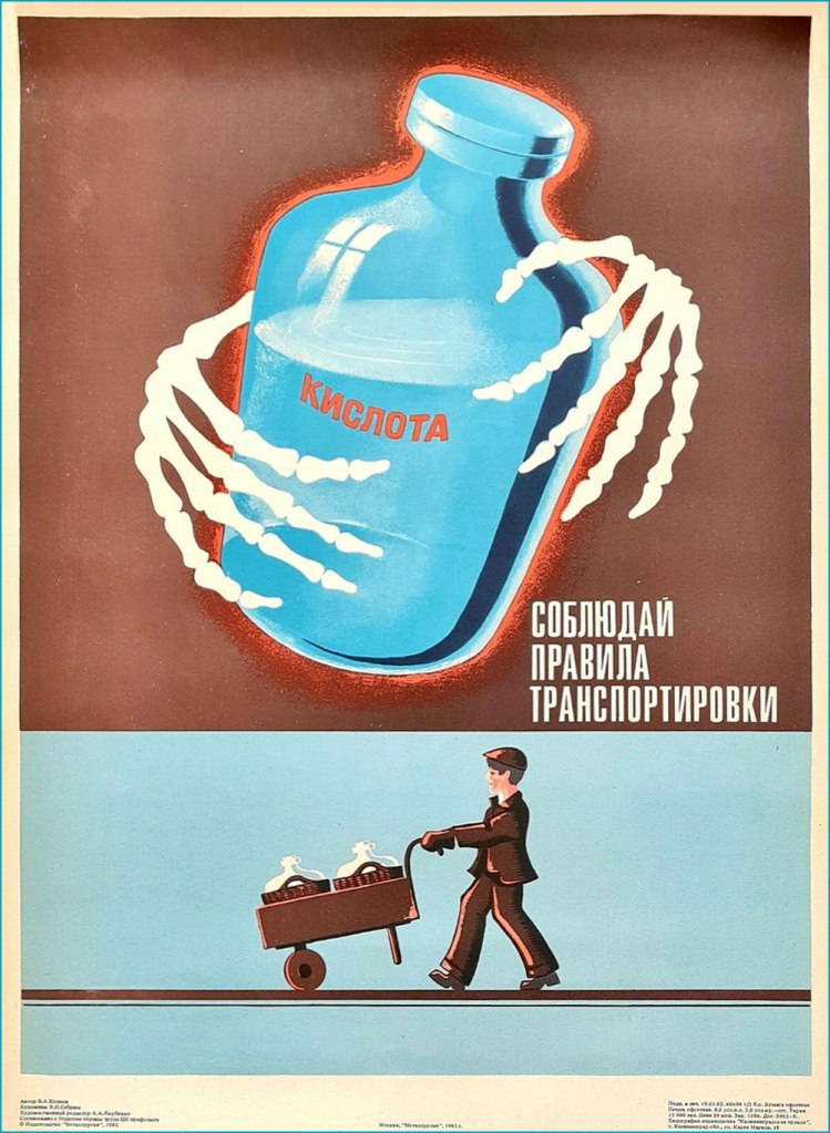
‘Acid – follow the rules for its transport‘
The USSR was not the only country to resort to such candidly illustrated images in an effort to improve safety (let’s face it, a worker with fingers missing is no longer a good worker) – for example, Holland seemed to have its share of posters of chopped off fingers and electrocution.
« I know you’re lookin’ for a ruby in a mountain of rocks, but there ain’t no Coupe de Ville hidin’ at the bottom of a Cracker Jack box. » — Jim Steinman
Crumpets!
It began with crumpets. I was picking up a couple of packages of those scrumptious British griddle cakes at the only store in our small town that carries them — as far as I can tell. Glancing about, I noticed on a nearby shelf something I’d never encountered: packages of Cracker Jill*.
I’d been toying with the notion of a Cracker Jack post, but this surely was a sign. When I got home, the merest bit of research turned this up:
« Introducing Cracker Jill™! After more than 125 years with our iconic Sailor Jack mascot, we’re adding Jill to the team to celebrate the stories of the women and girls who are breaking barriers in sports. With her tenacity, vibrancy, and strength, Cracker Jill™ takes inspiration from the women that change the game on the playing field, and beyond.
Join us in supporting the next generation of athletes by donating to the Women’s Sports Foundation through CrackerJill.com. With a $5 donation or more, we’ll send you a bag of Cracker Jill™ while supplies last. Remember, keep an eye out for Cracker Jill™ in baseball stadiums around the country. »
It’s a most worthy cause, obviously, but a) Jack the Sailor (and his pooch Bingo) has only been the brand mascot since 1916. A mere 107 years, so the math’s off. And b) “Introducing”? There was already a Cracker Jill. Exhibit A, this product from 1977:
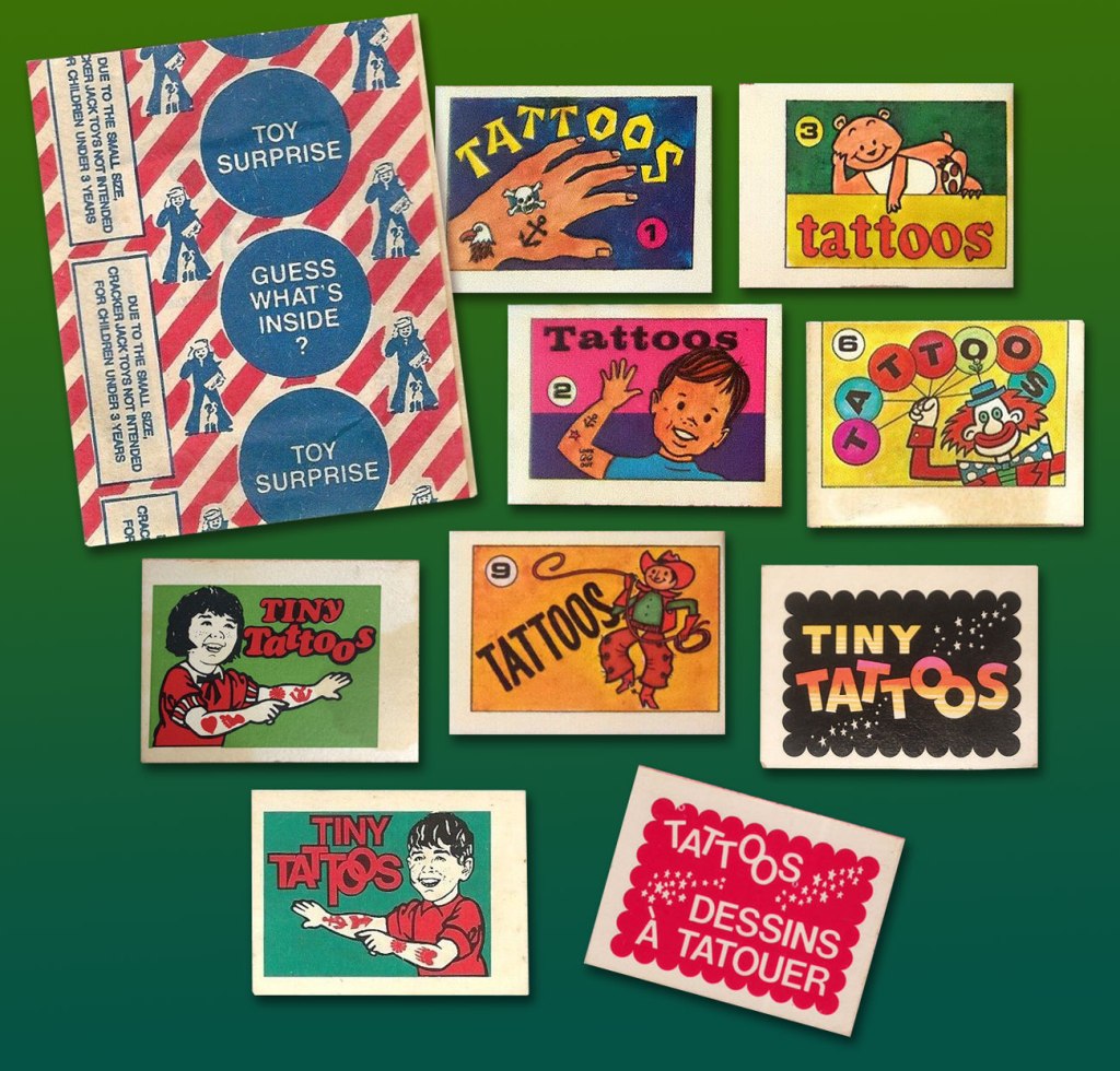
Prudently keeping in mind that this is a huge topic, with reams of historical ramifications, I’ll narrow my focus on a tiny area of the map: the four Cracker Jack prizes I’ve held on to for decades, and that turned up in a box I was browsing through the other day.
« Prizes were included in every box of Cracker Jack beginning in 1912. One of the first prizes was in 1914, when the company produced the first of two Cracker Jack baseball card issues, which featured players from both major leagues as well as players from the short-lived Federal League. Early “toy surprises” included rings, plastic figurines, booklets, stickers, temporary tattoos, and decoder rings. Books have been written cataloging the prizes, and a substantial collector’s market exists. » [ source ]
Like many a cartoonist (just ask Chip Kidd, Charles Burns, Mark Newgarden, Ben Katchor, Wayno, Chris Ware…), I’ve always been irresistibly drawn to the anonymous sprouts of advertising and industry: the artwork adorning matchbooks, cheap novelties and their packaging, beer coasters, liquor labels… so much toil that surely paid peanuts (and perhaps popcorn), unsigned and unappreciated. But a surprising portion of that work, ubiquitous and yet invisible, was created by skilled craftsmen. There’s a necessary economy of means, a simplicity of line — saving time and allowing for crappy, ‘it’ll do’ reproduction, but also effective design and a certain timeless je ne sais quoi.
Back when The Cracker Jack Company was its own entity, a lot more care and attention were bestowed upon minute details. Most of these tattoo booklet cover designs predate the company’s 1964 acquisition by dairy company Borden. The bottom right booklet is a Canadian variant from the late 1970s-early 1980s.
And so, here’s the cream, so to speak, of my small collection of Cracker Jack temporary tattoos. Enjoy!
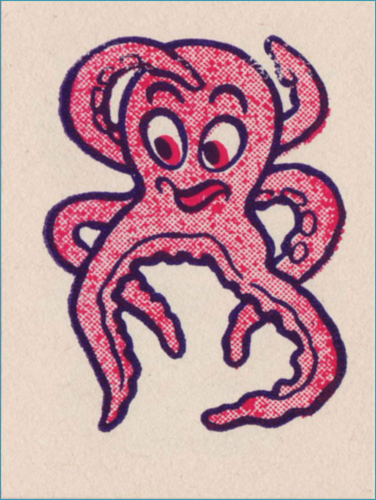
I’m picturing some Bible Belt toddler proudly sporting this one on his arm and giving grandma a massive coronary.Terrible reproduction, obviously, but this line work is splendid. Does the grin make this one less bad-ass… or more?I just love the sheer randomness of some of these entries. I presume no-one was really paying attention.Surely Dan Clowes must have encountered this one. You never know what’s going to linger in your DNA.Well, they got all the accents right in the French text, though the execution, I’m sure you’ll agree, could have been more elegant.Since our Tentacle Tuesday feature is currently on hiatus, I can use this charming pair of cephalopods.He’d make a fine sports team logo… well, not nowadays, since all the humour, joy and brightness have been painstakingly excised from pro sports design. Gotta look *tough*!This did not need a second colour. As a tattoo, I’m sure it was a murky fiasco. But it’s a nice bit of drawing.
-RG
*I’m only a year behind the news on this item, which isn’t too bad in my case.
« I opened my magazine (What did you see?) / I saw Mr. France (What did he have?) / A girl on each shoulder (What else?) / And one in his pants » — 10cc, Sand in My Face (1973)
You may think of this post as a companion piece, a spinoff of its predecessor. I’d had for some time, in the back of my mind, the notion to showcase some obscure French ‘human sculpture’ ads, but it needed more. Comments on the previous post provided the spark.
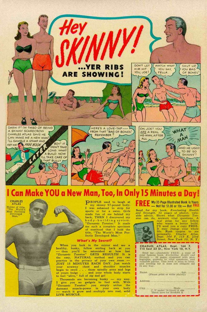
Is there a more classic “humble immigrant makes good in the USA” yarn than that of Angelo Siciliano, born in 1892 in the tiny Italian town of Acri? The Smithsonian has told the full, colourful story, so I’ll spare you a rehashing of it.
Let’s just say that young Siciliano worked hard to overcome adversity and redeem his puny physique, and the rest is the stuff of legend. The principles of ‘dynamic tension‘ and his immortal moniker aside, Angelo’s finest brainstorm was to employ the lowly but then-ubiquitous medium of comic books to introduce his product and its natural audience to each other. Let’s take the tour!
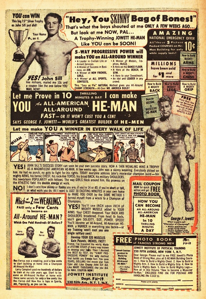
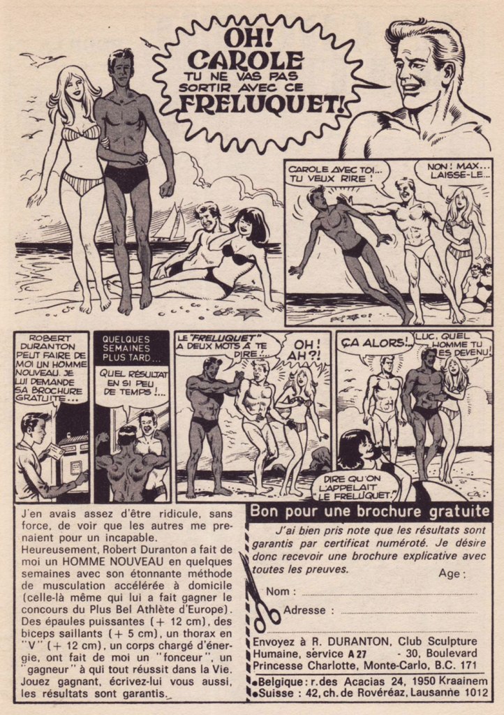
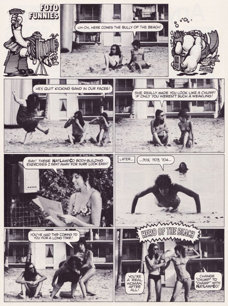
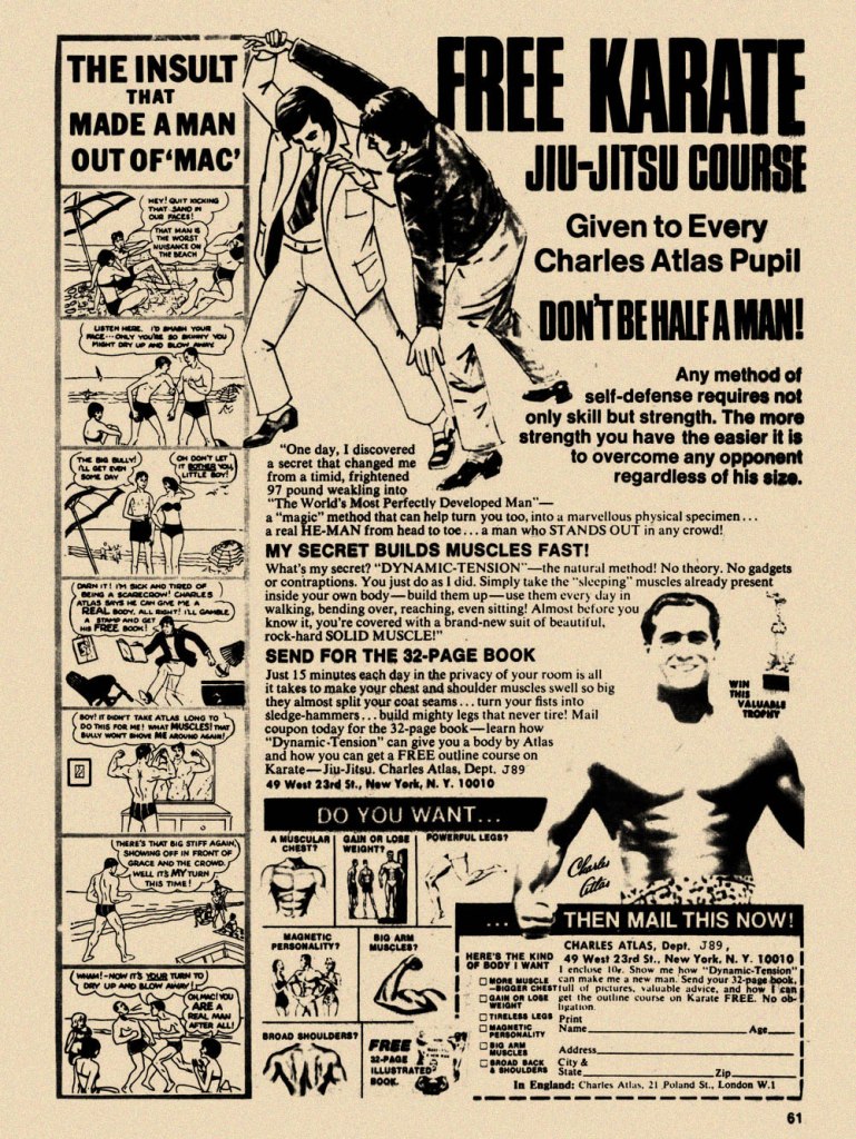
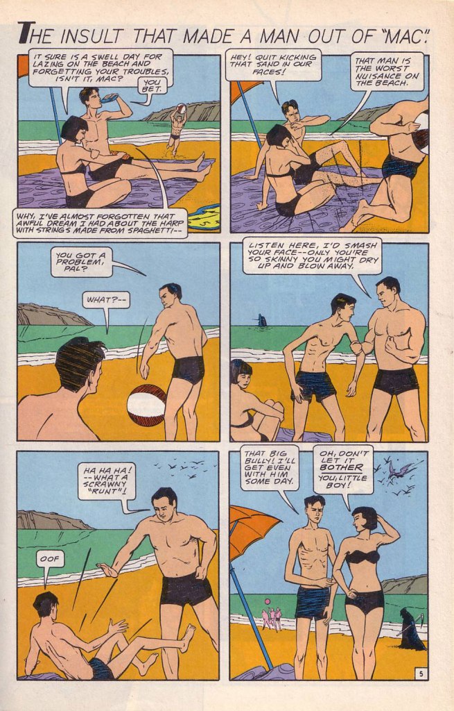
While the Charles Atlas ads began running in the 1930s, this is probably their classical expression. This one saw print as the back cover of Mad no. 14 (Aug. 1954, EC). Its opening insult even inspired Miles Heller’s 1995 salute to the great old comic book ads, Hey Skinny!There was inevitably fierce competition in the self-improvement field. This entry, from the U.S. Nature Products Corp., appeared in Stan Lee’s oh-so-macho Man Comics no. 10 (Oct. 1951, Atlas).Lots and lots of copy — but the all-important cartoon hook is present and accounted for. From the pages of Firehair no. 9 (Fall 1951, Fiction House). The Jowett Institute of Physical Training wants you to get buff! To be fair, George F. Jowett got there first.This is surely the definitive version, with the unforgettable tag line and ‘hero of the beach’ conclusion. I pulled this one from The Witching Hour no. 25 (Nov. 1972, DC), which hit newsstands just a few months before Mr. Atlas passed away, aged 80, on Christmas Eve. I can’t help being amused: French publisher Arédit, whose digest-sized collections of (mostly) reprints of US comics proudly bore the tag « Comics for adults », featured very few outside ads… and those were almost exclusively for self-defense and body-building systems. Here’s a sample trio. This one appeared in Maniaks no 4 (Fall, 1971). This title featured reprints of DC Silver Age ‘humour’ comics… all but the only actually funny one (that would be Sugar and Spike, of course).Oh, I’m sure the ERB Estate got their cut. And who might that R. Duranton fellow be? Four times Mr. France, for one thing! Here he appears with Louis de Funès in a famous scene from Le Corniaud, a 1965 farce starring beloved stars André Bourvil / De Funès and directed by Gérard Oury. This one’s from Kamandi no. 4 (Summer 1976, Artima), which featured reprints of various 60s and 70s DC adventure comics. It was an affordable way to catch up on material one might have missed — or couldn’t afford!This refreshing gender-switched lampoon comes from the pages of National Lampoon no. 26 (May, 1972), the ‘Men!’ issue, guest-edited by Anne Bats, No other credits, dammit. The opening page (of four) of Steve Skeates and Sergio Aragonés‘ wacky satire, from the pages of Plop! no. 2 (Nov.-Dec. 1973, DC). There have been truly countless spoofs of the Atlas adverts… most of them quite dire. Once more, I’ll spare you.By the mid-1970s, with America in the kung-fu grip of martial arts fever, it’s understandable that many a young man was envisioning Bruce Lee‘s lithe, compact physique as an alternative to the hulking musclemen of yore. The Charles Atlas company tried to cover all bases with this ad; from — speaking of old-time musclemen — Doc Savage no. 2 (Oct. 1975, Marvel).
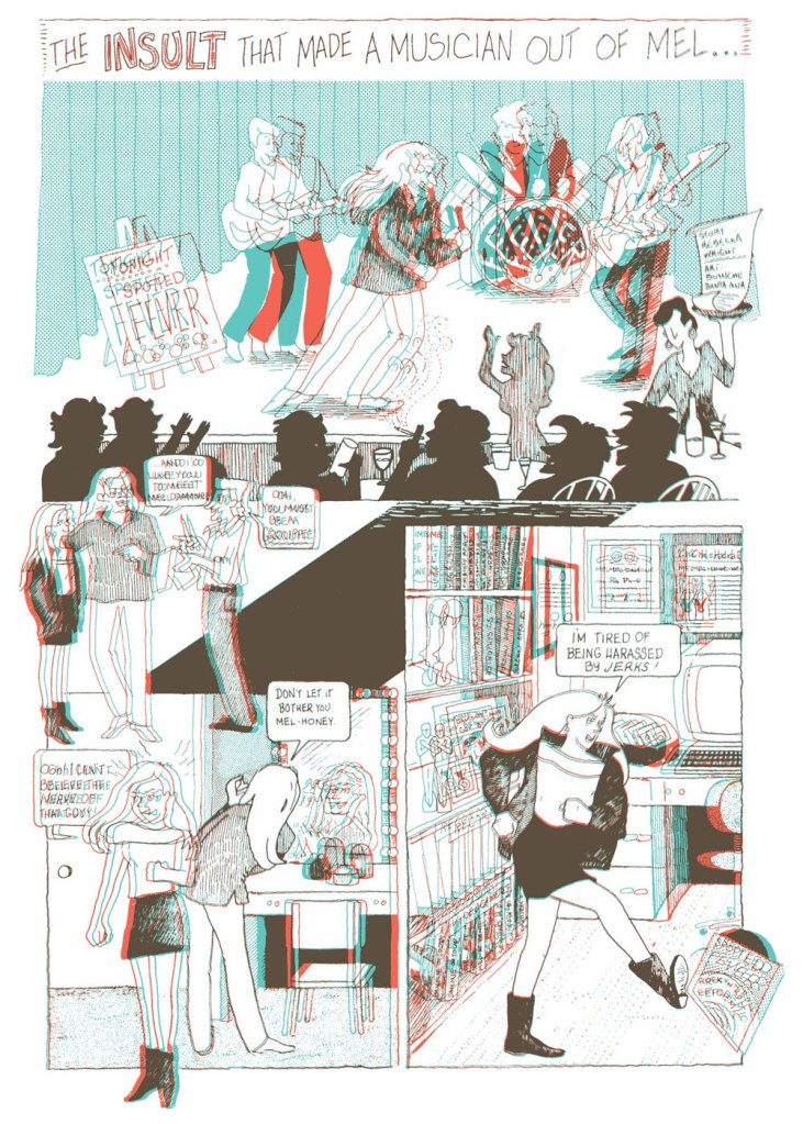
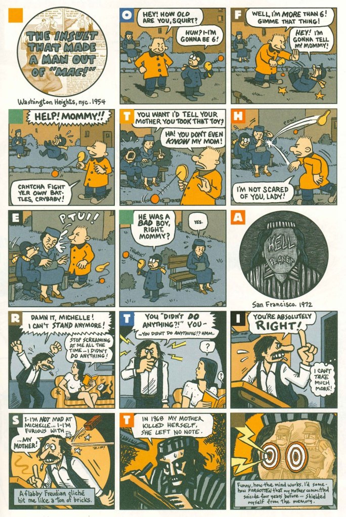
Ah, yes — those days when ‘Bruce‘ was the stereotypical gay name. From the ‘Playboy Funnies’ section of the magazine’s November, 1977 issue.And for something a bit off the beaten path: this is The Insult That Made a Musician Out of Mel, scripted by Rebecka Wright, illustrated by Blanche Santa Ana, with 3-D effects by Ray Zone, from Wimmen’s Comix no. 12 (Nov. 1987, Renegade Press), edited by Angela Bocage and Rebecka Wright.Does this look familiar? This is the first page of Flex Mentallo’s origin tale, as it appeared in Doom Patrol no. 42 (Mar. 1991, DC), written by Grant Morrison, with art by Mike Dringenberg and Doug Hazlewood. I have no idea whether Atlas had a sense of humour, but his successors sure didn’t, as evidenced by the lawsuit they filed against DC Comics over this clear — if brazen — case of satire. I much prefer the TV show version of Flex, I confess.Peter Kuper deftly used the cliché to take a jab at George Bush Sr.’s image and the first Gulf War. Dated and irrelevant? Trying to prove your ‘manhood’ remains distressingly au courant… just consider these two schmucks, to cite but one recent example. And hey, here’s “Stormin’ Norman lying on T.V.” From Bleeding Heart no. 1 (Winter 1991-92, Fantagraphics).Art Spiegelman digs deeper and makes more discerning use of the raw materials at hand with The Insult that Made a Man out of “Mac!”, first previewed in The Virginia Quarterly Review and then collected in Breakdowns Portrait of the Artist as a Young %@?*! (Oct. 2008, Pantheon).
When you move house, as I did a few months ago, some items inevitably get buried while others get kicked loose. For instance, several decades ago, I had picked up (at a dollar fifty apiece, apparently) a tidy little pile of Punch issues from 1946 and 1955. Punch (1841-2022) of course, boasted at the time what was likely the world’s finest roster of cartoonists. Not only were the cartoons splendid — and now I’m old enough to actually get most of the jokes — but even the ads, often produced in-house, were exquisitely illustrated. And so, instead of the cartoons (you can still scratch that itch with our recent Rowland Emett’s Ramshackle Poesy in Motion, for instance), I’m proposing a sampling of adverts from my pile o’ Punches.
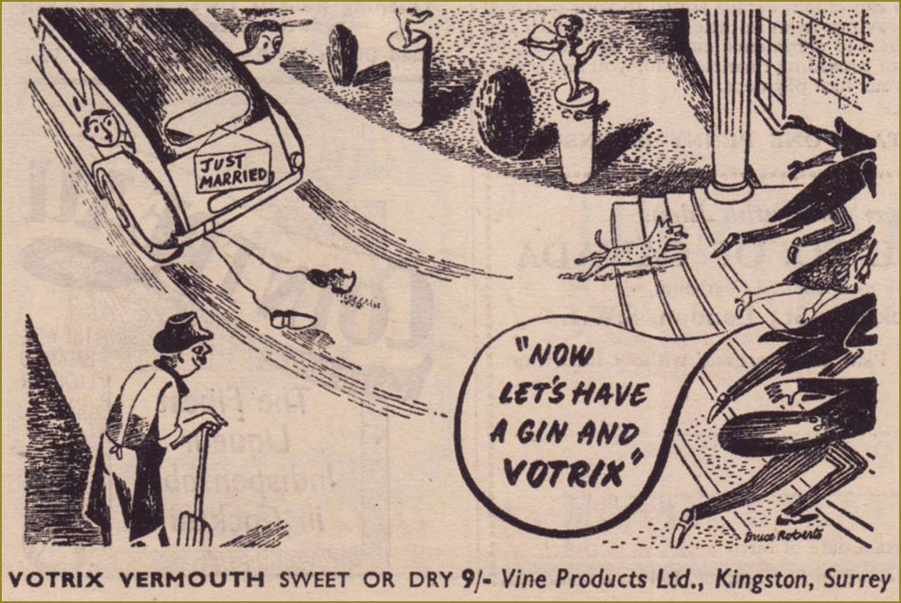
Remember the days before built-in obsolescence? Me neither. I note with pleasure that the grand old Scottish firm of Saxone still stands. For more Anton, check out Anton’s Spivs and Scoundrels, Baronesses and Beezers.From the June 3, 1946 edition of Punch, the Summer Number. This Votrix stuff wasn’t very good, it would appear. « As the second world war started to take hold, the export of vermouth from Italy and France become non-existent. Given the devastation left behind, it was slow to start back up again once the conflict was over. In England Vine Products based in Kingston, Surrey (whom had been making British copies of Sherry and Port for some years) launched Votrix Vermouth advertising it as “Indistinguishable” from pre-war Vermouths from Europe. They claimed it was made with the finest grape juice blended with genuine vermouth herbs. There was a lot of controversy and even several court cases as to how this grape juice was made (and if it was actually wine made from raisins rather than grapes). It was never any real challenge to the vermouths from Italy and France. » [ source ]
While Rothman still exists in name, the company’s true lifespan was 1890-1999. Mergers and acquisitions, that same old story…
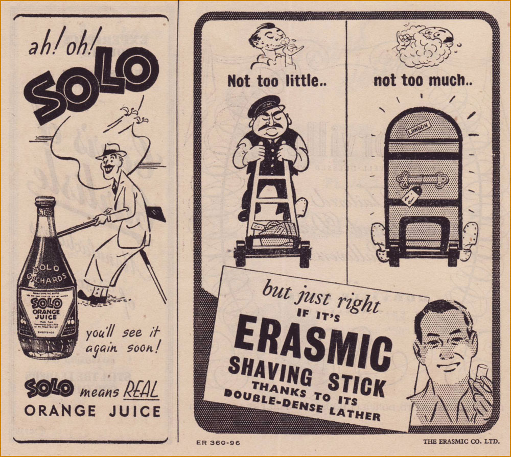
Solo is gone. « Pablo Utrera owned Solo Orchards, an orange juice business. In 1960 Idris Ltd., the soft drinks firm, acquired the whole of the issued share capital of Solo Orchards (“A small but well-known company making quality products“) for a consideration of 143,500 ord. 5s. shares in the company, worth £130,000. By April 1962 Idris had disposed of the Totteridge (Barnet, north London) premises of Solo Orchards, moving production to other factories. » [ source ]
Erasmic (founded in 1869), on the other hand, still operates, its products widely available.
An interesting soft sell approach to selling brakes! Established in 1926, Lockheed merged with Martin Marietta in 1995 to constitute Lockheed Martin.
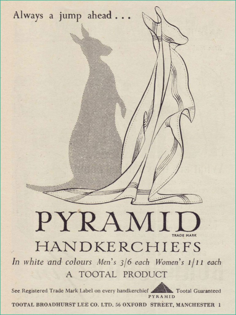
Despite the advent of disposable tissues, Pyramid handkerchiefs appear to have survived. I believe they were named so because they were made from Egyptian cotton. That said, what a clever ad… as a product, hankies hardly strike me as a boundless fount of exciting visual ideas. Get yours here!Having toiled in advertising illustration for some years, I can tell you that the privilege of signing one’s name in an advert is a rarely-accorded one. Unless, of course, your famous name was part of the pitch. This one’s from the pen of Bruce Angrave (1912 – 1983). From the Nov. 28, 1951 issue. Read about the history of the International Wool Secretariat.
Guinness for Strength, went the famous slogan. But was there anything to the Irish brewer’s bold claim? CNN looked into the question. Here, the artwork was provided by John Lobban, who went on to be “one of Britain’s foremost numismatic artists”…. and Paddington Bear illustrators.
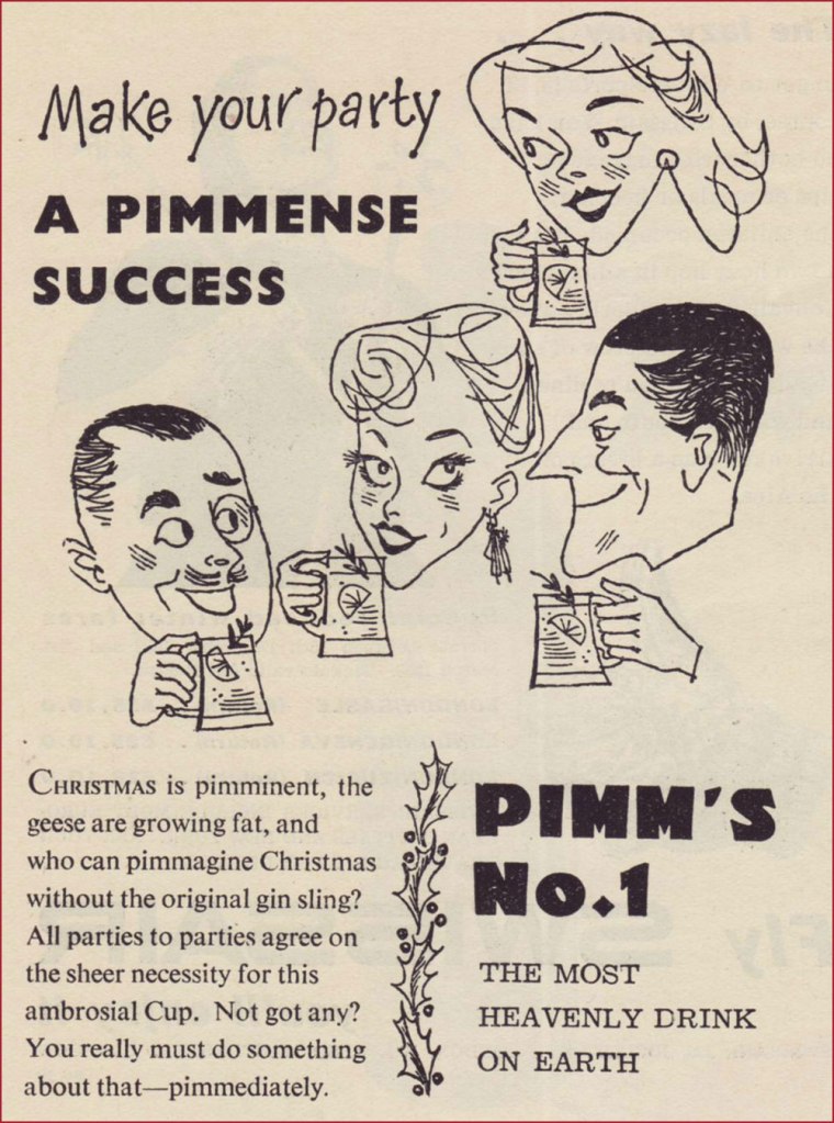
« Every day we left the house in his Phantom V, always with a big pitcher of Pimm’s close at hand. Then we went into this little studio and Richard took his place at the mic with a tall stool to his left and the Pimm’s on the stool. Then we started recording, for maybe three or four hours or until the Pimm’s was gone. He did like to lubricate his voice chords but that was as far as it went – he could have never got through that music in a drunken state. » A decade or so ago, upon reading this quote from songsmith Jimmy Webb about his work with Irish rapscallion Richard Harris, I wondered just what this Pimm’s might be. It was a bit hard to find at the time, and kind of costly for a matter of idle curiosity, but I’m happy to report that it’s delicious.
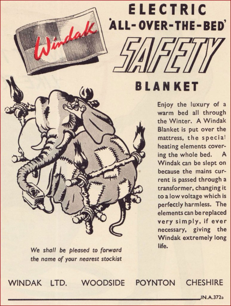
Windak was an offshoot of Baxter Woodhouse Taylor (still around!). Here’s an intriguing bit of trivia: « The Cold-War era of High Altitude flying led there to be an array of different flying suits and helmets trialled for this purpose. At the time, nobody really knew the effects of flying at high altitudes, or what the adverse affects of a sudden cabin depressurisation could be (such as the fear of canopy blowing off). To protect the aircrew against this perceived danger, initial efforts were placed on developing fully enclosed pressure suits. The life span of the development full pressure suits was short lived, as it was soon realised that partial pressure helmets and a pressure jerkin, and eventually just a demand oxygen mask and pressure jerkin was sufficient to “get you down” safely after a cabin depressurisation event. Of the array of full pressure suits tried, this series, known collectively as the “Windak” suit and helmet has become the most well known, due to many television and film appearances in science-fiction works, as space suits. “Windak” was a trade name used by Baxter Woodhouse Taylor, and had been in use since the second world war on items of heated flying clothing. However, people seem to solely refer to this series of full pressure suits as “The Windak Suit“, even though the series contains a few variants. » [ source ]
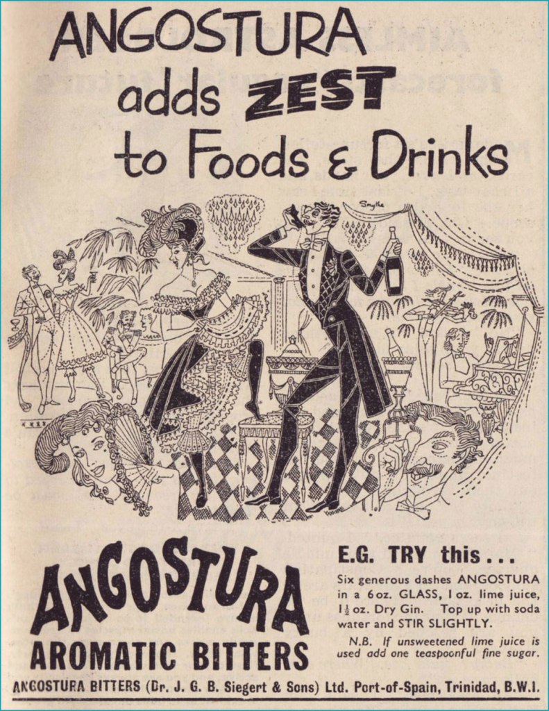
Angostura Bitters remain an essential tool in the mixologist’s attirail.
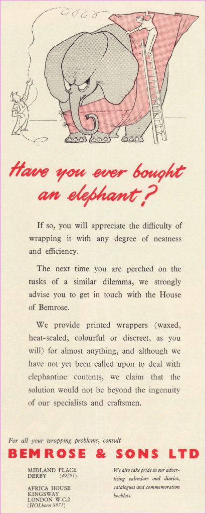
Despite several changes in name and vocation over the years, the firm of Bemrose & Sons abides in some fashion to this day. A perfect example of adapting to survive.
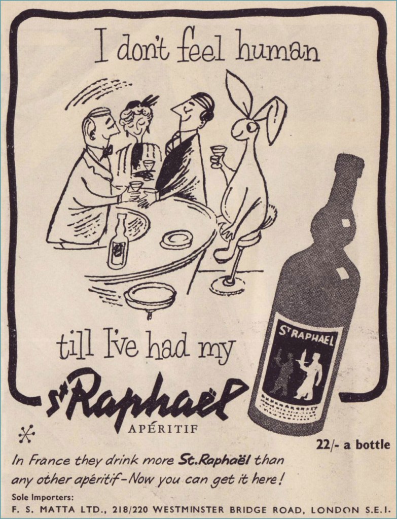
A pair of examples from a series of themed ads. The first saw print in the Aug. 10, 1955 issue, the second in the Sept. 14 one. They didn’t go much for repetition, did they? First concocted in 1830, St Raphaël remains a highly popular apéro. Read its history here. I’m getting a sense that in the liquor business, if you’re hawking a decent quality product, you’re in for the long haul, barring Edgar Bronfman Jr.-level greed and incompetence. But in the business world, that’s as rare as rocking-horse poo, right?
« Bicycles are pieces of art. You get that combination of kinetic engineering, but then, besides the welds, the paint jobs, the kind of the sculpture of it all is quite beautiful. Bikes have such great lines, and all different styles. » — Robin Williams
I’ve been cycling a lot more of late. I’d been using my bike less frequently in recent years, unnerved by the increasingly frantic (and distracted, not a good combo) vehicular traffic of the city. But with my wife taking an interest in the activity, I found myself with a reason to get back in the saddle. This spring, we found a newly opened bike shop, earthy, grimy and unpretentious, where we got our bikes expertly tuned up.
I’ve always loathed those cliquish hipster joints that, in addition to selling overpriced junk, also seem responsible for the ubiquity of those middle-aged, over-equipped, spandex-clad Sunday cyclists, who feel it their sacred duty to pass you, whatever the pace, weather or road conditions, looking for all the world like overstuffed sausages in their lycra casings. The sporting analogue, if you will, of the rich kid who ‘needs’ the most expensive guitar in the shop… never mind that he can’t play a note.
You hopefully will indulge me in this little exercise in nostalgia. I miss the days when our bikes got us around, granted us greater autonomy and kept us in shape. This lifestyle took a backseat in the 1980s, when the BMX craze began to overstate the extreme and the competitive facets of the sport. Now, it’s all ultimate sport this and boot-camp fitness that. Ah, whatever happened to plain old utilitarian fun?
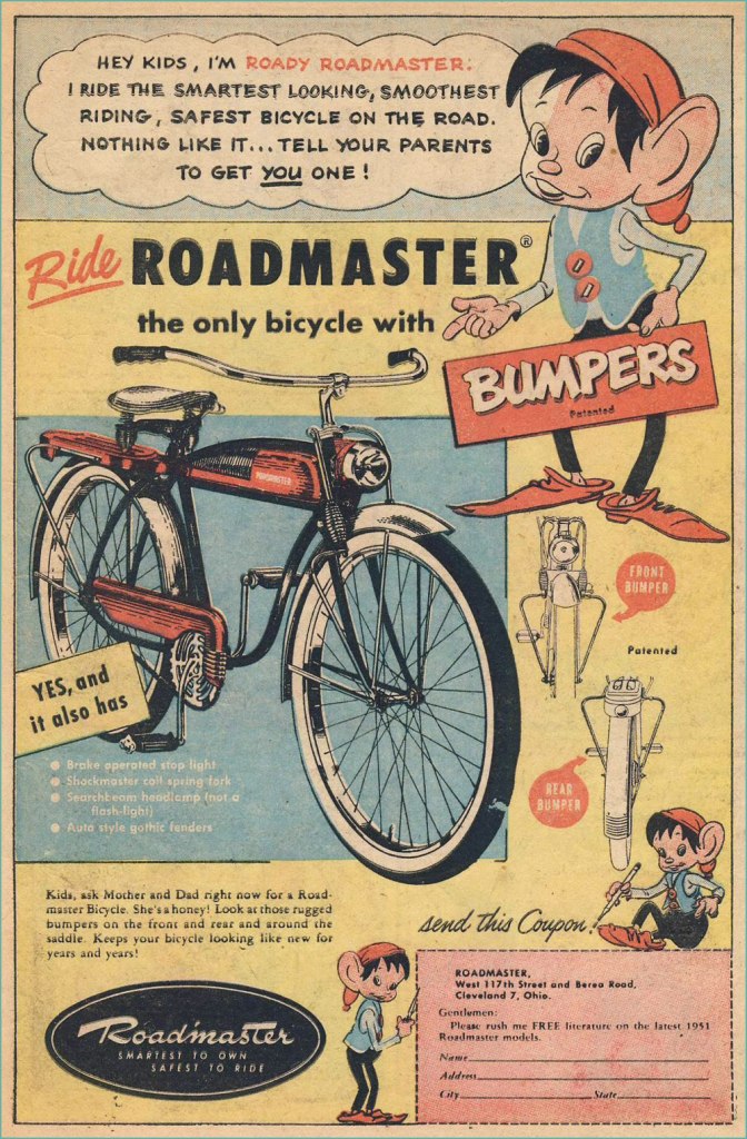
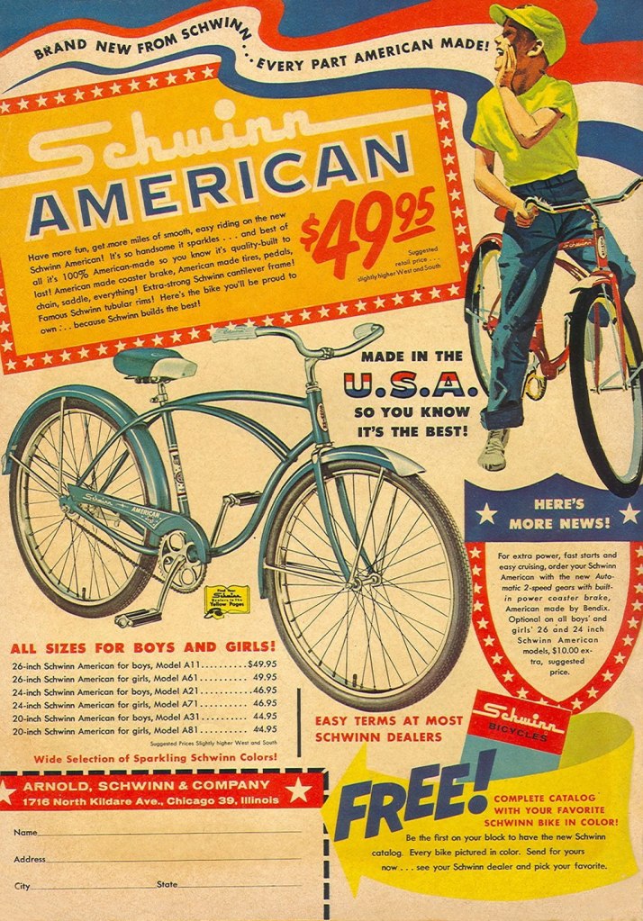
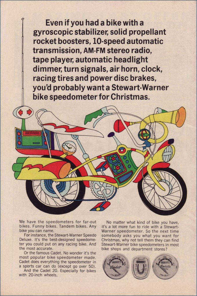
Judging from this ad (circa July, 1951), bicycle makers were trying to make their steeds mimic the clunky look of the era’s motorcycles. Aesthetics would soon improve. Here’s a fairly typical ad, circa 1961. Free catalogue, not to mention a healthy dollop of American jingoism, like it or lump it. Speaking of Schwinn, check out their well-produced promo comics Bicycle Book, from 1949.Ah, yes, the U.S. Royal twins, Roy and Al. In the tradition of the accidentally named Smith Brothers, “Trade” and “Mark”. Unsurprisingly, scouting magazine Boys’ Life was an ideal market for bike-themed ads. This one appeared in the May, 1966 issue. Artist unknown… anyone?You can tell how important the bicycle scene was: not only were manufacturers hawking bicycles, but there was also the ‘aftermarket’ trade of gizmos and doodads. I’ve long supposed ‘speedometer’ to be a dumbed-down term for a tachometer. Even after consulting this ‘helpful’ chart, I’m still not convinced it isn’t. To quote sometime Beach Boys lyricist, DJ and racing enthusiast Roger Christian: “Tach it up, tach it up / Buddy, gonna shut you down.“
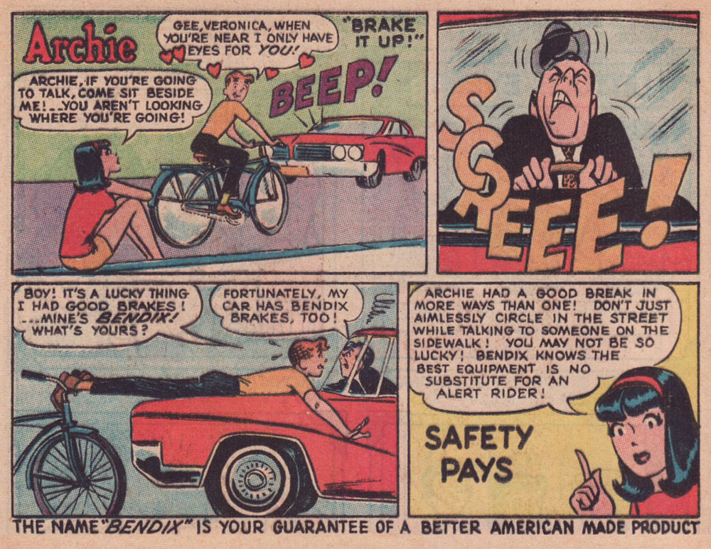
Through much of the 1960s, Bendix (the corporation, not Bill!) commissioned a long-running series of custom ads featuring the Riverdale Gang, illustrated by resident Archie artist Harry Lucey.
This one’s from April, 1965.Archie, the voice of reason? Only in ads and public service announcements. This one’s from October, 1966.This one’s from July, 1968.Ah, that’s more like the Archie Andrews we’re accustomed to. This one’s from August, 1968. I daresay we’ve all encountered too many such ‘cyclists’.An apt reminder that the rich kids always did boast the best, most up-to-date equipment, whatever the sport. Also, I can’t help but think that the cape and tiger tail are just kind of… reckless. Clearly, corporate shill Tigerboy is failing to heed the lessons of Isadora Duncan’s tragic death. Thanks to the ever-thrilling Jack Davis artwork, this is the unsurpassed classic among bicycle ads. It appeared in select DC and Archie titles cover-dated November, 1968. While banana seats may be considered in most quarters as retro kitsch, I earnestly hold that they were bold and cool. Aesthetic and structural experimentation had arrived at the forefront of the cycling industry. This ad appeared in comics cover-dated February, 1969. And here’s a look at a (flawlessly) surviving model. Man, the elegance of those lines!
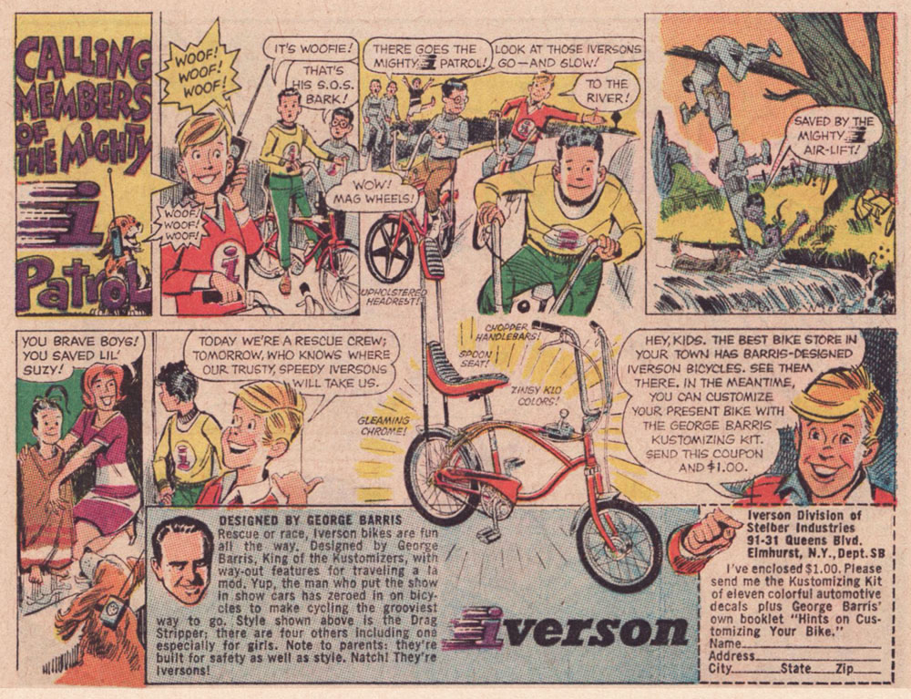
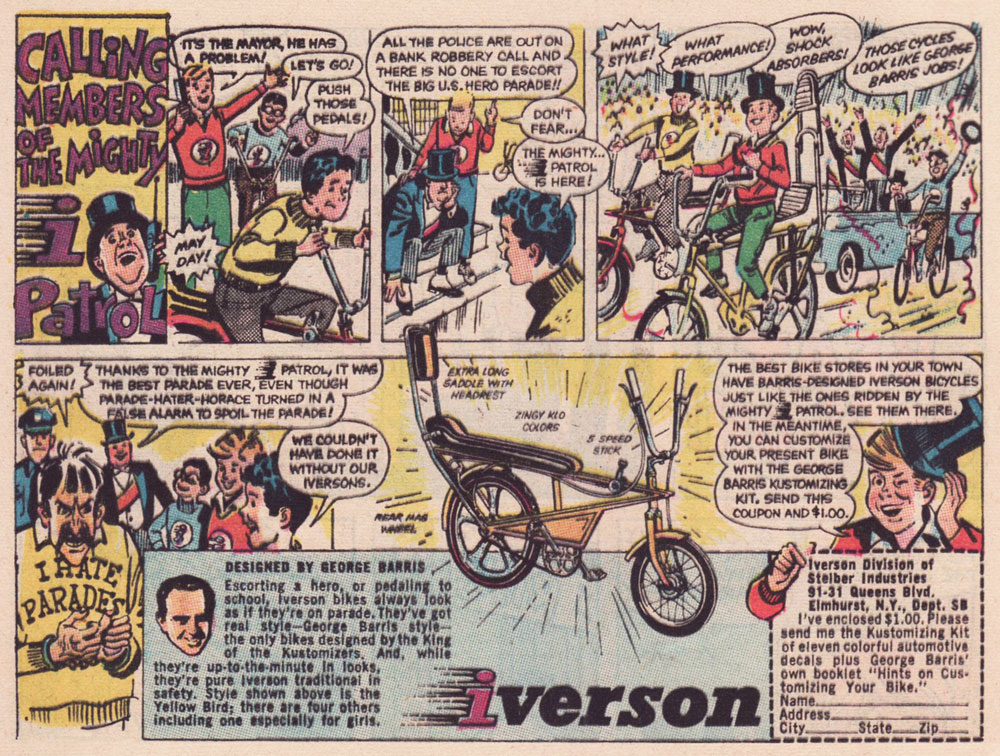
As the 1960s drew to a close, another series of custom comics ads appeared — just under the wire. They spotlight the creations of the famous ‘King of the Kustomizers’, George “Barris” Salapatas (1925-2015), very much in demand thanks to his recent triumph with the Batman tv show’s Batmobile.
This one appeared in various DC titles cover-dated November, 1969. If I had to take a stab at artistic attribution, I would go with the versatile Creig Flessel (1912-2008). Something tells me that in real life, the human chain stunt the Mighty i Patrol pulls would have led to four drowned kids instead of just one — but I’m sure Woofie would have dog-paddled his way to safety.This one appeared in DC titles cover-dated December, 1969. Read a gripping first-hand account of working on the assembly line at the Iverson bicycle factory, circa 1975!I’m assuming that the kid with the sombrero nicked it from Bazooka Joe’s kid brother Pesty. This final adventure saw print in DC titles cover-dated January, 1970.This, however, is the advert that really worked on me. When I got my first grown-up ten speed bike, a few years later, it was a Browning, which lasted me at least a quarter-century, until it snapped right at the load-bearing juncture of the rear fork… the one place where even welding wouldn’t help.
I switched to my backup, a hybrid bike I bought in 1987. It’s still running beautifully. In terms of value for money, a well-maintained bicycle is pretty unbeatable.
My well-thumbed copy of Adventure Cycling in Europe (1981). « Say, Uncle John, did Browning replace you with a pretty-boy model for your comic book ad? » « They sure did, but you know what’s even worse? » « I don’t know, Uncle John, what is? » « I don’t even have a nephew either! » All kidding aside, though it’s over forty years old, it’s still an insightful, entertaining and helpful book. When you go low-tech, change occurs at a slower, more forgiving pace.
I leave you with a song, whence comes the title of this article. It’s from a lesser-known but excellent Donovan album, Open Road, from 1970.
« Theodor Geisel spent his workdays ensconced in his private studio, the walls lined with sketches and drawings, in a bell-tower outside his La Jolla, California, house. Geisel was a much more quiet man than his jocular rhymes suggest. He rarely ventured out in public to meet his young readership, fretting that kids would expect a merry, outspoken, Cat in the Hat-like figure, and would be disappointed with his reserved personality. » — Susan Cain
Today, we honour Theodor Seuss Geisel (1904-1991), born one hundred and eighteen years ago and better known under his nom de plume of Dr. Seuss (one of several, such as Dr. Theophrastus Seuss, Dr. Theodophilus Seuss, Theo LeSieg, L. Pasteur, D.G. Rossetti, and Rosetta Stone. The man loved a good pseudonym.) And no, he wasn’t actually a doctor, though he contributed to more people’s well-being than most physicians could dream of. His alma mater, Dartmouth College, did bestow upon him an honorary doctorate, in 1956. Furthermore, it renamed, in 2012, its medical school (fourth oldest in the United States, founded in 1797) Geisel School of Medicine at Dartmouth in recognition of the good man’s financial contributions over the years. Cool, uh?
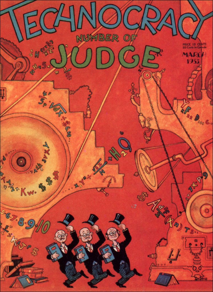
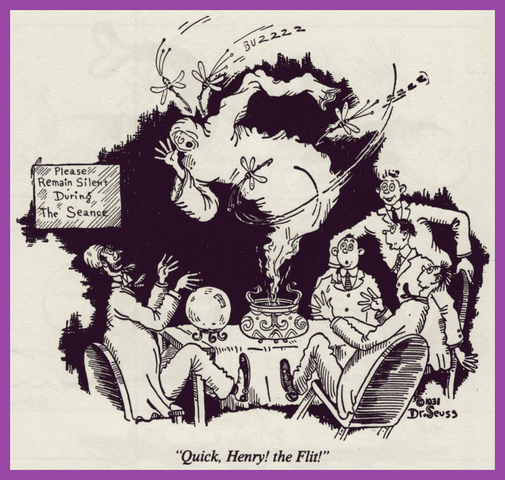
It certainly did in my case — when I wanted to learn English as a kid, his books were the ones I reached for. Results!Geisel’s cover for Judge‘s March, 1933 issue. A sample of his 1930’s magazine work. Dang — now I can’t get that song out of my head.And another. Teetotallers may not know (or they may know too well, hence the abstinence) that DT stands for the latin delirium tremens, or alcohol withdrawal-induced delirium. As for these beasts, you’ll have cause to worry if you should See Them Everywhere, and not merely aboard Goah’s Ark.« Long before his success as Dr. Seuss, Theodore Geisel (Dartmouth Class of 1925), designed advertisements for Flit, Standard Oil Company’s wildly popular spray-pump insecticide which later contained DDT. Over the course of 17 years, Geisel’s humorous advertisements helped make Flit a household name throughout the 1930s and 1940s. At the time, liberal spraying of pesticides around people, animals, and crops was highly encouraged with little regard to potential environmental impacts. » [ source ]. This particular ad hails from 1930. Given the scope of Geisel’s genius and the length of the ad campaign, there are many, many highlights. More like ‘Bug Game Hunter’!
Over the years, these ads came in every format.
A 1941 poster for Flit. The casual, harum-scarum use of dangerous chemicals may seem quaint to our jaded modern eye, but it goes on, all right. Personally, I cringe when I encounter ads for Procter and Gamble’s Febreze, for instance. Seems a tad irresponsible to me, given the risks.
This is the opening installment of Hejji, Geisel’s very short-lived (April 7 to June 23, 1935, twelve episodes in all — read them all here) Sunday comic strip, the man’s sole entry into the syndicated comic strip arena, preceding by a couple of years the publication of his first book, And to Think That I Saw It on Mulberry Street (1937). Hejji was oh-so-briefly published by William Randolph Hearst’s King Features Syndicate. Fickle, fickle!
« In these pages Dr. Seuss was already introducing us to his wonderful talent for creating unusual and delightful creatures. Hejji and his master “The Mighty One” would meet many an odd creature like Bearded Bees, Wombats, and the great Pitzu bird. All of these would be encountered in the attempt to impress the object of “Mighty One’s love, “The Fair One”. Unfortunately, as the legend goes, Seuss was let go during great depression job cuts by William Randolph Hearst. Of course Seuss would later go on to create his extraordinary children’s books including Cat in the Hat, and The Grinch that stole Christmas. Hejji pages are some of the rarest and most sought-after on the comic-strip market. Printed exclusively as Tabs and only carried in a few newspapers, their rarity is as great as the popularity of their creator. As a result, each and every page carries the highest premium. » [ source ]
In 1982, Darmouth College commissioned none other than Everett Raymond Kinstler to paint this portrait (oil on canvas) of his esteemed colleague.
« A kid one time fell asleep chewing Bubble Yum, and he woke up with his mouth full of spider eggs. » — Some nameless rumour-monger
The other day, a neighbour was asking me whether it was a safe for his Golden Retriever puppy to eat the worms it was digging up (I was impressed), the guy presuming that said worms were quite filthy and rife with germs. I replied that no, it’s probably all the rooting through the trash and gobbling up whatever it finds that’s giving the pup gastric distress. Worms, in fact, are considered a delicacy in many a culture, including some European ones. Not that I’ve indulged: just like The Kinks’ Apeman, I’m a strict vegetarian.
This brought to mind those 1970s rumours of earthworms serving as filler in McDonald’s burgers (never mind that worms are a far costlier ingredient than is beef). Which led in turn to the equally-outlandish notion that the secret of Bubble Yum’s softness (introduced in 1975 by Life Savers, it was the first soft bubble gum ever concocted) lay in its containing spider eggs. Again, steady procurement would have proved quite a daunting challenge.
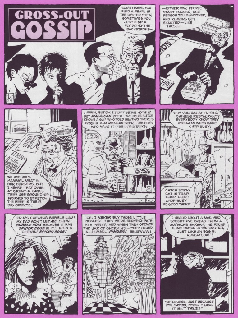
Art by Tomm Coker, from The Big Book of Urban Legends (1994, Paradox Press/DC); edited by Bronwyn Carlton Taggart and featuring the most inconstant levels of skill and talent you’re ever likely to encounter in a professional comics publication: a couple dozen or so versatile cartoonists, and over a hundred superhero hacks and/or photo tracers utterly out of their depth, a reminder of just how shallow the talent pool is. This isn’t one of the good pieces, but it’s nowhere near the bottom.
A trade ad from 1977, the year of Bubble Yum’s national (and international, as this Canadian can attest) rollout.
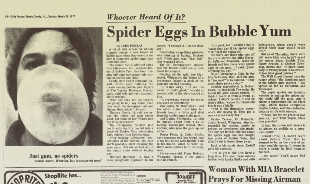
But the bubble was about to burst (or at least deflate somewhat), as reported by The New York Times (March 29, 1977):
The Great Spider Egg Mystery remains unsolved but it may yet have several happy endings. The mystery concerns Bubble Yum, a popular new bubble gum that has, in a year, overtaken such symbols of earlier childhoods as Dubble Bubble and Bazooka. A few weeks ago came toil and trouble: the unexplained spread of lurid rumors among children in the New York area that, gasp!, Bubble Yum contained spider eggs (or, according to haughtier youthful accounts, caused cancer). Stores which had up to then been unable to stock enough to meet demand suddenly saw sales plummet. Last week, the manufacturer, Life Savers, Inc., took out full‐page ads in 30 area newspapers to combat the rumors.
This is not the first time the bubble gum business has been beset by evil rumor. When Jimmy Carter was a boy, youngsters in Sumter County, Georgia, were scared off by reports that bubble gum was made with snake oil —until they were reassured by an ad in the Americus Times‐Recorder. Nor is bubble gum normally regarded as the stuff of moral lessons. Its history, since it was invented by Walter Diemer in 1928, is marked by such milestones as packaging it with baseball cards (1933) or making it squeakless (1953).
But there is something more significant, and appealing, in the open way in which Life Savers has chosen to deal with its problem. We hope the spider egg rumors are expunged as successfully now as the snake oil rumors were then. And there will be a happier ending still if the subject is properly understood to be not bubble gum but canard. No consumer is too young to learn the malign effects of rumor or to understand that there will always be someone, not always in youthful innocence, eager to raise the cry—whether about Communists in government, environment, energy or bubble gum—of “spider eggs.”
From Morris County, NJ’s Daily Record, March 27, 1977 edition.
Susan M. Smith wrote, in her 1989 thesis, Consumer Rumors and Corporate Communications:
Whether the rumor is isolated or widespread, the company must select media that reach the rumor’s community of interest, and particularly, its influential leaders. The importance of this is shown by what happened after a rumor episode in New York City for the Life Saver’s Company. The company conducted an all-out attack to combat a rumor in 1977 that the company’s innovative, new soft chewing gum. Bubble Yum, contained spider eggs. It sought publicity, inserted full-page newspaper ads, and sent letters with a copy of the ad to the city’s PTA groups, school principals, and retail outlets.
The campaign successfully stopped the rumor, but Bubble Yum’s New York sales did not recover for many years. It turns out that even though the company had blanketed the city with its rumor denial, it never spoke directly to product users, the school-age children, to bolster confidence in the product. The selection of inappropriate media makes the refutation message miss the rumour’s public allowing the rumor to continue to spread or delaying recovery from the rumor.
Speaking of advertising: Marvel’s knockoff of Scholastic’s Dynamite, Pizzazz (1977-79), which included lots of ads, featured this piece in its 6th issue (March 1978, Marvel). This gives you a sense of Bubble Yum’s success, as the product was, in its field, what’s termed a disruptive innovation. Chewing gum no longer had to be hard.
Inevitably, the imitators came! Smooooth N’ Juicy, Hubba Bubba, Bubblicious, the oddball Freshen Up, and so on. Marvel switched its advertising allegiance to Topps. This is from Pizzazz no. 11 (Aug. 1978, Marvel). The art looks to me to be the work of Mad magazine veteran Jack Rickard (1922-1983).
A few issues later, (Pizzazz no. 14, Nov. 1978, Marvel), in a brazen display of corrupt insincerity, came this so-called Consumer Guide (note that only Topps products are pictured). Really, is Bubble Yum “the hardest, toughest gum our testers had to chew“? Surely anyone who’s ever tried to chew something from the Bazooka family knows better. My jaw aches just from the memory.
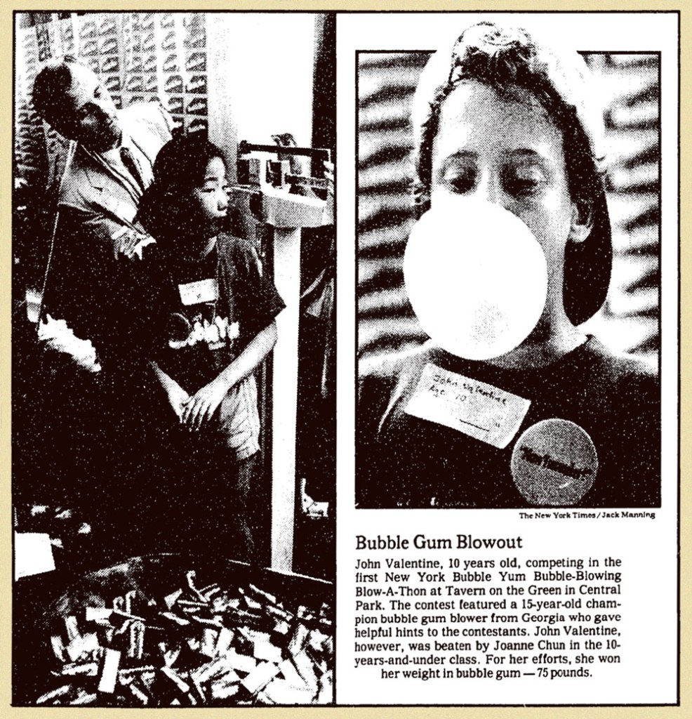
The company continued efforts to restore its reputation in the New York market, where the rumours had caused the most harm. A piece from The New York Times‘ Tuesday, July 22, 1980 edition.
This ad ran in Adventure Comics no. 487 (Nov. 1981, DC) and several other titles in the following months.
Now that’s better: in 1982, they turned to the incomparable Jack Davis to illustrate one of their print ads. Given his prodigious speed, he couldn’t have spent more than an hour on this specific piece, but it works far better than its predecessors. Incidentally, the ‘Super Yum’ thing (replacing Soft ‘n Juicy) appears to have been a move to block a competitor from using the appellation.
But I suppose all this controversy merely seems quaint now, what with all today’s heavy weaponizing of misinformation. Besides, the bubblegum market has been rather moribund in the past few decades, since apparently Nobody Likes to Chew Gum Anymore.
For a bit of sugar high nostalgia, I’ll leave you with a pair of vintage Bubble Yum ads: 1976’s brand introduction, featuring The Flavor Fiend;
And 1988’s spot co-starring a young Leonardo DeCaprio, which shows us he was clearly born with that insufferable smugness, or at least had honed it to perfection by his teens.


