The Old Year’s Final Boarding Call

« On New Year’s Eve the whole world celebrates the fact that a date changes. Let us celebrate the dates on which we change the world. » — Akilnathan Logeswaran

Earlier this month, as we showcased Justin Green’s Musical Legends, I mentioned that I was reserving one of the strips for a special occasion, and it has come.

JustinGreenLastTrainA
Originally published in the December, 2001 issue of Pulse!

« Shedding light on past and present musicians — and there are countless possibilities — is  a real challenge. But when it works, the comic vision can change the listening experience. » Justin Green, from his Authoroonist Acknowledgements & Apologies (2004).

This entry stands out from its brethren in that the artist was personally involved in, or more precisely a witness to, the events depicted. In addition, no famous or semi-famous musical figure occupies the spotlight; instead, we get a gentle, low-key, soulful anecdote.

Who’s Out There has had a good year, and so we thank all of you readers around the world (and I do mean around the world: according to WordPress’ statistics, comics fans visited us from a whopping eighty-three countries these past twelve months) and wish each of you a wonderful, or at the very least better, year 2019.

-RG

Little Dot’s Playful Obsession

« Y’gotta develop an annoying compulsion if y’wanta get anywhere in this world! » — Dan Clowes’ Willy Willions (Eightball No. 5, Feb. 1991)

Dorothy Polka, known to the world at large as « Little Dot », made her first appearance in Harvey’s Sad Sack Comics no. 1 (Sept. 1949). All you need to know is that she’s inordinately fond of dots and circles, and that she has an absurdly large extended family. That raises a few choice questions, but we’ll leave them for someone else to tackle.

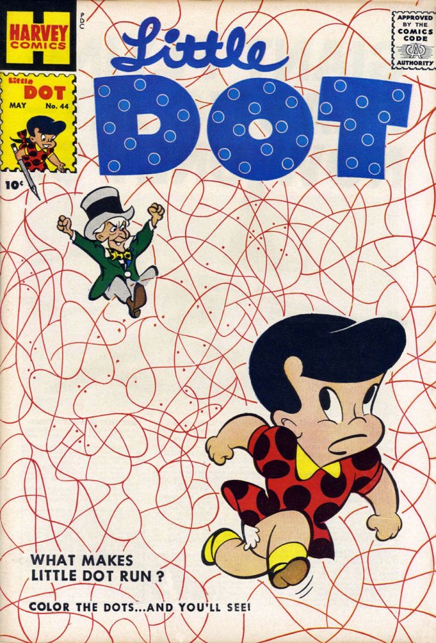
While I cheerily dismiss the bulk of Harvey Comics’ post-Code output as at best charming in a decidedly minor way, I opt to focus on the line’s most singular highlight: art director/chief artist Warren Kremer‘s endlessly inventive and escalatingly bonkers cover variations on the Harvey stable’s absurdly formulaic monomanias. Kremer clearly viewed the preposterous task he’d been handed as an opportunity to continually challenge himself with elegant design exercices and experiments. While I see little point in collecting, nor even reading most Harvey Comics, my admiration for Mr. Kremer just grows and grows. Perhaps these examples will give you a sense of what I see in them.

Oh, and bonus points to Kremer for his increasingly callous treatment of that omnipresent visual blight, the Comics Code Authority stamp. Clearly, he judged the censorious seal de trop.

LittleDot29A
Little Dot no. 29 (January, 1958)
LittleDot38A
Little Dot no. 38 (October, 1958)
LittleDot44A
Little Dot no. 44 (May, 1958)
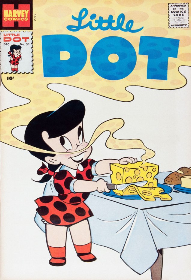
LittleDot51A
Little Dot no. 51 (December, 1959) Gruyère? Impressive refinement for a little kid. Perhaps there’s more to the little lady than meets the eye…
LittleDot52A
Little Dot no. 52 (January, 1959)
LittleDot97A
Little Dot no. 97 (January, 1965)
LittleDot119A
Little Dot no. 119 (October, 1968)
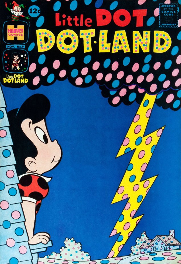
LittleDotland9A
Little Dot Dotland no. 9 (November, 1963)
Dotland38A
A timely one: Little Dot Dotland no. 38 (March, 1969)
DotUncles21A
Little Dot’s Uncle$ and Aunt$ (they’re loaded, I guess) no. 21 (November, 1967)

-RG

John Severin, ‘Super Comics’ Cover Man

« I got into the comic business the same way I got into the bubble gum business: somebody gave me a job. » — John Severin

I’ve said it before, and I still feel that way: If you’re going to discuss a career of such length, variety, depth and consistency as John Severin’s (from the late 1940s to the early 2010s!) it’s simply too easy to lose your way in the details, sidebars and bifurcations. Best to pick a small area and stick to it, particularly if you don’t have the luxury of endless pages to devote to the task.

Speaking of sidebars: In this forum, I keep returning to the topic of Israel Waldman and his dodgy, but mesmerizing publishing ventures. The many scattershot titles issued under the IW / Super Comics (1958-1964) banner were printed on shoddy paper (which makes them, nowadays, nearly impossible to find in any sort of decent shape), were sold outside the usual channels (in bags of three through department stores, and not the fancy ones at that), consisted of rather hoary, indifferently-packaged reprints… but foxy businessman Waldman didn’t scrimp on the one count that mattered: he shelled out top dollar to commission top talent to create attractive covers. That sweet old bait-and-switch.

Sure, some of these random assemblages of decaying pulp happen to be good comics, but given the nature of odds, it was bound to happen.

John Powers Severin, born ninety-seven years ago today (Dec. 26, 1921-Feb. 12, 2012), was part of Waldman’s cadre of cover artistes, and he delivered beautifully, as he always did, right to the end of his career.

Here, then, are some highlights of these little-seen Severin pieces. Happy birthday, Mr. Severin!

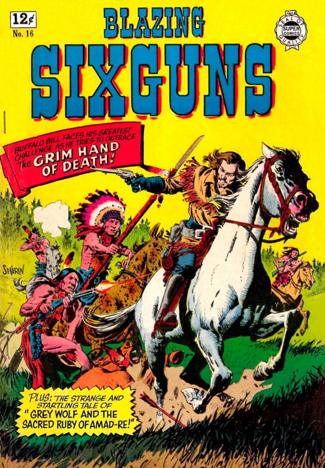
Blazing6guns16A
Blazing Sixguns no. 16 (1964), ten issues, 1958-1964. Read this issue here.
Danger10A
Here’s Danger no. 10 (1963), the first of  seven issues. Read it here.
FantasticAdv10A
This is Fantastic Adventures no. 10 (the first of seven issues, 1963-64). Read it here.
Gufighters18A
Looks like Marvel’s Kid Colt did a bit of moonlighting for Super Comics (as did king of all media Gabby Hayes!). This is Gunfighters no. 18, fifth and final issue of the series (1958-1964).
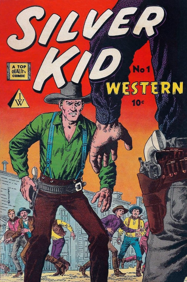
SilverKid01A
This is Silver Kid Western no. 1 (1958), first of two issues. Read it here.
Robin-Hood9A
This is Robin Hood no. 9 (1958),  third of five issues (1958-1964). Read it here.
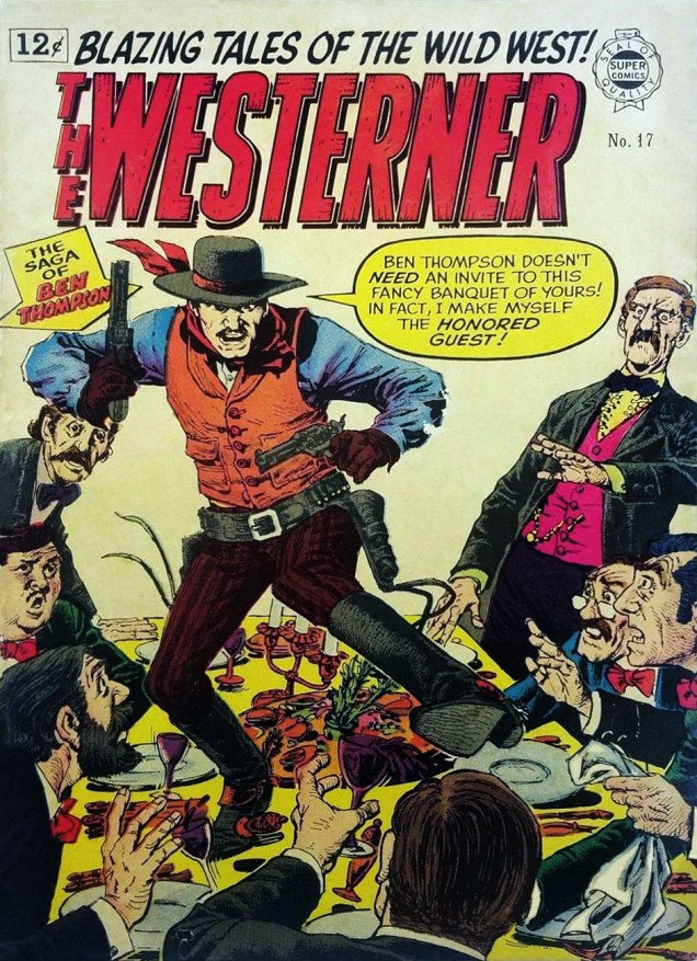
Westerner17A
An alternative view of table étiquette from real-life figure Ben Thompson. This is The Westerner no. 17 (1964), third of three issues.

And if you’re hankering for more John Severin, check out our earlier post and/or this illuminating, life-spanning and definitive Comics Journal interview.

-RG

Tentacle Tuesday: “Foul as Sewer Slime!”

This is the final Tentacle Tuesday of the year (the next one falls on January 1st). As few tentacles venture out into the snow, I had to find something else to celebrate the occasion. I’ve been hoarding some images for sharing at some later date, and I feel the moment has come to return to a topic that’s dear to my heart – for each girl, there must be some tentacles…

Amethyst-Princess ofGemworld4
Amethyst, Princess of Gemworld no. 4 (August, 1983). This is a page from the story Dark Journeys!, drawn by Ernie Colón. I can’t vouch for the quality of the writing of this series, but the covers are a lot of fun for those of us who like Colón (I’ll hold my hand up there).
Cinema Sewer17
Cinema Sewer no. 17 (2005), cover by Mike Hoffman. CS, in case  you didn’t know, is a movie magazine (a mix of articles, illustrations and comics), the brainchild of Canadian Robin Bougie. Let’s give a polite round of applause to the strategically placed tentacles!

As long as we’re in the gutter, err, sewer… Sewer slime!

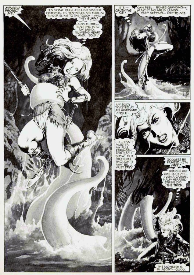
EpicIllustrated2311_Page_65
A page from “Marada the She-Wolf” , written by Chris Claremont and illustrated John Bolton,  from Epic Illustrated no. 23 (April, 1984). I was convinced the octopus was attacking a pregnant girl until I looked closer. Damn deceptive black-and-white!

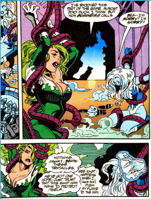
Next, a window with the world of superheroines… in which zippers magically stop just before full frontal nudity, every woman boasts a F cup size, hair writhes passionately all by itself, and pain looks like lust. “Nothing… beats these tentacles.” Thank you, Beatriz da Costa, for those immortal words.

JLA-#100
Justice League America no. 100 (June, 1995, DC). Opening Up the Game is scripted by Gerard Jones, pencilled by Chuck Wojtkiewicz, inked by Bob Dvorak and Doug Selogy. Wait, how many people had to get involved in this?!

The next one is an obvious – even boring – scene: girl tied up, blah blah, tentacles reaching for her *yawn* nether regions… Bonus points if she’s wearing some terrifically overwrought hair decoration/jewelry/shoes (and nothing else).

WarlordofMars-Dejah Thoris10-JoeJusko
Original art for Warlord of Mars: Dejah Thoris no. 10, variant cover A by Joe Jusko (Feb. 2012, Dynamite).

Here’s to a new year of grabbery and slimy appendages, then!

~ ds

How do you like *your* Christmas?

« Christmas, Christmas, Christmas, Christmas makes me happy
I love Christmas cold and grey, I love it sweet and sappy
Says crazy kissin’ Cousin Flo:
‘Let’s break out the mistletoe’ »

FourColor201, 1948
The heart-warming cover of that Four Color no. 201, 1948. Art by Walt Kelly. Check out the adorable moon-jumpin’ cow in the top left corner!
Dell's Four Color #302
This is the back cover of Dell’s Four Color no. 302 (Santa Claus Funnies), 1950. Such warm colours. Art by Canadian Mel Crawford, who worked on various Dell publications in the 1950s (such as Howdy Doody, Mr. Magoo, and Four Color Comics) to later become an accomplished watercolours/acrylics painter.

« Christmas, Christmas, Christmas, Christmas out the waz
Christmas, Christmas, Christmas, Christmas up the schnozz
Come all ye faithful, don’t be slow
It’s Christmas time, you can’t say no »

Creepy68-Christmas
Creepy no. 68 (January 1975), cover by Ken Kelly. “House’ and “about” don’t rhyme, but it’s the season to forgive. I like how Santa appears to be bawling in frustration.
VaultofHorror35
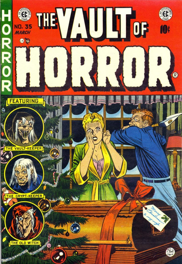
Vault of Horror no. 35 (EC, 1954), cover by Johnny Craig. Maybe open the lid of the coffin first, dumbass?

« Momma wants a kitchen sink
And daddy wants a stiffer drink
Grandma wants us to cut the crap
Grandpa wants a nice long nap »

Richard-Thompson-Christmas
Illustration by Richard Thompson. Who else wants some Festive Dietetic Crackers? I’d definitely sit with the mouse.

« Christmas, Christmas, Christmas, Christmas everywhere
Christmas, Christmas, Christmas, Christmas pullin’ out my hair
Shoppers lined up out the door
Traffic backed up miles and more
It’s Christmas time, so what the heck
Let’s go spend the whole paycheck »

MargeBuell-LittleLulu-Christmas
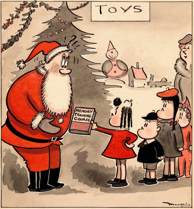
A Little Lulu cartoon by Marge Buell (Saturday Evening Post, 1944).
HilaryBarta-FelizNavidada
From the pleasantly warped mind of Hilary Barta with a fond tip of the Santa hat to old Uncle Salvador, obviamente. Да да да!

« Deck the halls, it is the season
We don’t need no rhyme or reason
It’s Christmas time, go spread the cheer
Pretty soon gonna be next year »

SensationComics38
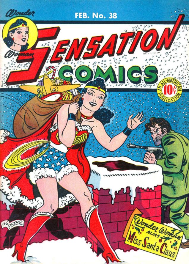
Sensation Comics no. 38 (1945), cover by H.G. Peter.
LittleOrphanAnnie-Christmas
Original art for a Christmas card of Little Orphan Annie by Harold Gray. Just some 70 years ago, right?

Merry Christmas!

~ ds

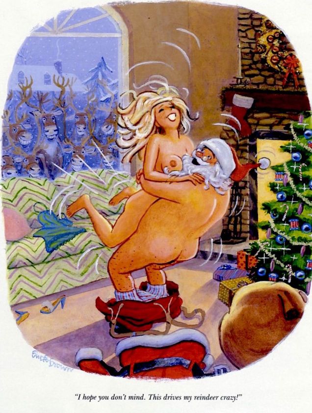
Playboy Cartoons for a Festive Mood

With every passing year, I have more and more trouble getting into the spirit of Christmas (especially since all the snow has now melted). An early present of Rodney Crowell’s Christmas Everywhere helped a bit, but to speed things along some more – and before Christmas Eve takes me by surprise – I’d like to titillate everybody’s taste buds with this spread of Playboy Christmas cartoons.

BuckBrownChristmas
Cartoon by Buck Brown (real name Robert Brown), an African-American cartoonist and painter, creator of the naughty (and adorable!) Granny.
SokolChristmas
Cartoon by Austrian Erich Sokol. A little linguistic tidbit: “sokol” means “hawk” in Russian.

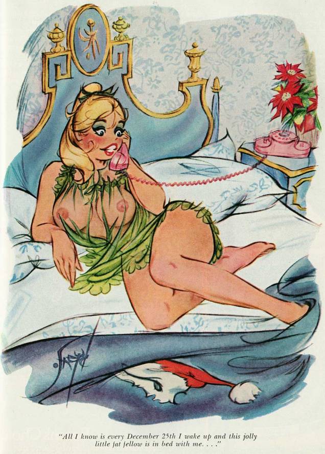
And on the topic of bedding Santa Claus…

DougSneydChristmas
Cartoon by Canadian Doug Sneyd.
DediniChristmas
Eldon Dedini! (We ran an earlier exposé about him here.) Who needs naked women when you have the (slightly grabby) three magi?
JackColeChristmas1955
Cartoon by the ineluctable Jack Cole! Don’t forget to take a peek at my mate’s post, The Unforgettable Jack Cole.
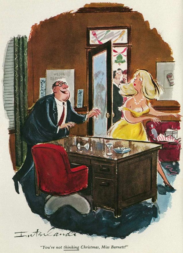
PhilInterlandiChristmasPlayboy
Cartoon by Phil Interlandi.

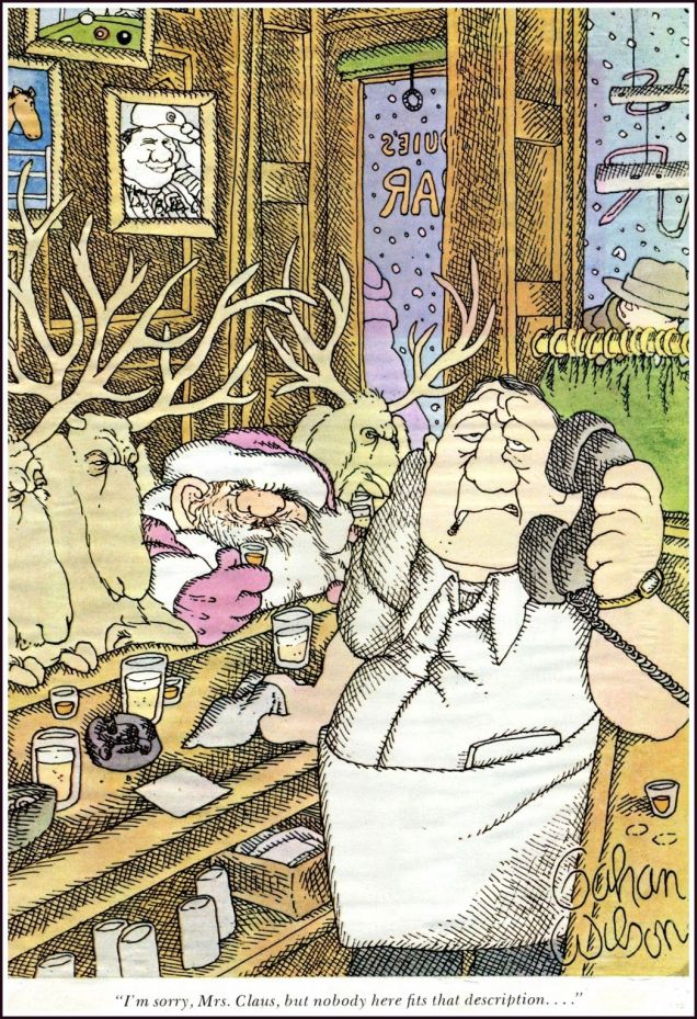
And, on a slightly morbid note, three cartoons by Gahan Wilson (who paints what he sees!)

GahanWilsonChristmasDrunk

GahanWilsonChristmasSanta

GahanWilsonChristmas

~ ds

Newsflash: check out this post’s sequel, the imaginatively-titled More Playboy Cartoons for a Festive Mood!

Dateline: Frontline – The Cary Burkett Interview, Part 3

« From time to time a sputtering doodle-bug shatters the torpor of the overcast sky. One second, sometimes two … at most three … of silence. Visualizing that fat cigar with shark fins as it stops dead, sways, idiotically tips over, then goes into a vertical dive. And explodes. Usually it’s an entire building that’s destroyed. » — Jacques Yonnet

Perhaps the title gave the game away, but we’re back with part three to wrap up (in style!) our talk with Cary Burkett on his and Jerry Grandenetti‘s (and Ric Estrada‘s) Dateline: Frontline (1977-1981).

Who’s Out There: How hands-on an editor was Paul Levitz?

CB: Paul was more hands-on at the beginning. We would have a plot conference and he would toss out suggestions and sometimes specific directions. But Paul was a very smart guy, and he had a way of figuring out how to best to work with individual writers. With me, it usually worked better to plant a seed and let it develop rather than to nail things down too tightly. I didn’t think fast in a plot conference setting, I was too intimidated by Paul’s creativity and confidence. I think Paul figured this out and found ways to drop a little guidance in that I could take time to mull over on my own.

Paul was also extremely busy, not just an Editor but the Editorial Coordinator for the whole line of DC comics, and that is a whopping responsibility. So as things progressed, he was less hands-on. I like to think he began to trust the material I was giving him.

WOT: Was there much distance between the précis Mr. Levitz assigned you to do and the scenario you handed in?

CBI don’t think so.

WOT: Dateline: Frontline is clearly a bit of a ‘pill in the hamburger’, that is to say, instructive, eye-opening material. Was this ‘Trojan Horse’ approach considered and deliberate? (Surely it wasn’t just intended as pure entertainment!)

CBIn a way, it was deliberate, although not carefully considered or planned out. The trajectory was set by Paul when he passed on to me the book The First Casualty as background guidance. The tone of that book and all the eye-opening material in it definitely influenced the approach to the series. The very idea that the main character would be a war correspondent, not a soldier or fighter, meant that these stories would have a different kind of focus. That concept came from Paul, along with the title of the series.

Of course, in comics, you could do a series with a war correspondent where the protagonist becomes a fighter, a behind-the-lines de-facto special forces soldier. If this had been a Jack Kirby strip in the ‘60’s, the correspondent would probably be thrown into situations every issue where he had to fight his way out to save threatened soldiers from some Nazi ambush. You know what I mean.

So we knew we weren’t going for pure entertainment, sure. And the more research I did, the more interested I became in the reality of what happened in the war, and the more I wanted to portray that. And since it was just a 6-page, irregular backup series, we could go in that direction.

WOT: If you were to write this series today, what, if anything, would you do differently? What effect might the intervening years and the current political climate have, for instance?

CBToo much to think about. But I will say this, I think to try to tie the series to any current political issue would tend to push it into something contrived to fit the agenda. In a way, then, it would become a kind of political propaganda, the very opposite of what the series grapples with.

That’s part of why I wasn’t so interested in setting it during the Vietnam War back in 1976 or ’77. Today, it could be put in that setting without triggering a firestorm of controversy which might drown out what the series is trying to show.

My point is that the issue of seeking truth in a time of war is not limited to any time or place. By attaching the theme to a current political hot button issue, it becomes weaker, not stronger. It becomes more limited, not broader. And it’s more difficult to hear.

My preference would be to see the series deal with the questions outside of the current political setting, and hopefully along the way to see in some way how they apply today.

Maybe that is the ‘Trojan Horse’ method you mentioned.

WOT: I’d say you nailed it.

WOT: Were you writing and planning much in advance? Are there any contemplated, but unpublished, plotlines you’d care to share?

CBI wasn’t planning specifically very far in advance. I was never sure which set of stories might be the last. But I had a vague outline in my head that I would progress through the major events of the war, choosing specific ones for Clifford to be present reporting. They would be chosen for their historical significance but also to advance general themes of the conflict between reporting the truth and trying to win a World War.

The final series of stories, I think, would have been centered on events in Hiroshima and Nagasaki, and somehow Clifford would have found a way to write a story about it which revealed some of the horrible details … which of course, would never have seen the light of day. Even now, thinking about this, some lines of dialogue closing out the series kind of come to my mind.

I see Clifford, exhausted and disappointed, having given his all to get this incredible story, bitter and at the breaking point. Like it happens to all of us sometimes, the fact that he can’t publish this story seems to him to be an event that sums up his whole life as a failure. He questions why he made such a herculean effort to get the story, why he ever even bothered to try. All his previous failures to get the truth out come back to accuse him.

Maybe it’s his old mentor, the older reporter who tried to ground him a few times, who has the last word. And those words would be about the truth, and the value of searching for it no matter the outcome. And that the truth itself will stand even if only one person knows it. And the old reporter, cynical as he might have seemed at times, would be shown to have his own ideals which have sustained him through the same battles that Clifford has fought.

Yeah, maybe it sounds a bit corny out of the context of the story. But I think I’d go there. I might even have the old reporter say something like, “Truth may seem to be the first casualty in a war. But Truth can never really die, right? Someday people will know the truth about what happened.”

HA! I never expected a story idea for Dateline:Frontline would pop into my head like that after all these years. Seems like this would be a good closing question for this interview. I appreciate you bringing it up, and thanks for giving me a chance to reminisce.

WOT: And thank you for doing it so thoughtfully and graciously.

WhoThereLogotype

And now, to see our readers off with a story, here, as promised last time, is the concluding episode of Dateline:Frontline’s London trilogy.
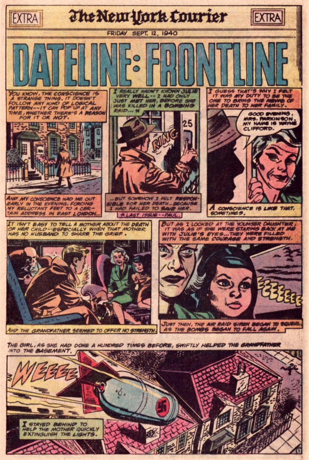
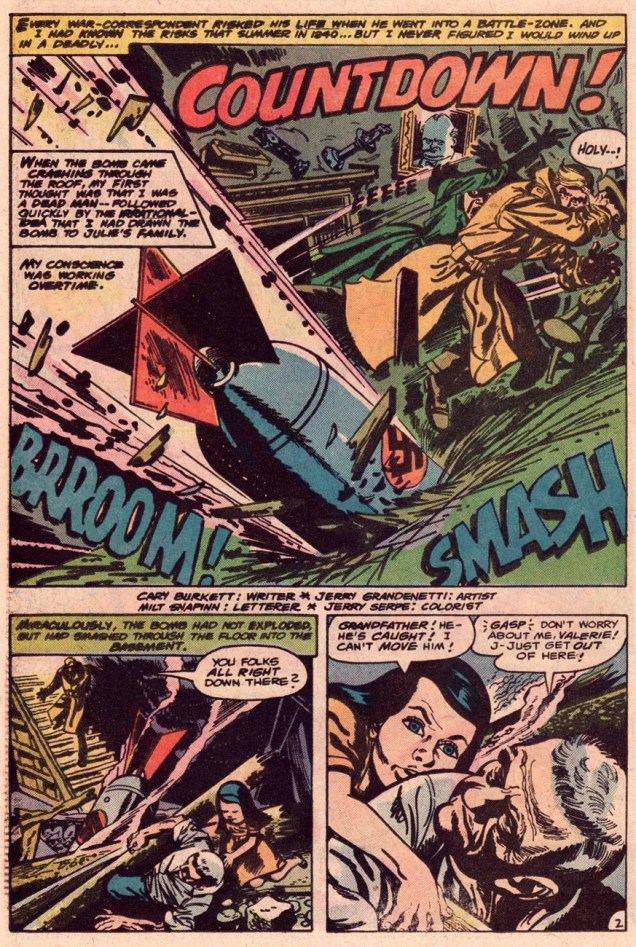
Dateline3London01ADateline3London02ADateline3London03ADateline3London04ADateline3London05ADateline3London06A

And as a parting bonus, a vintage in-house biography of young Mr. Burkett!

BurkettBio78A

-RG
Tentacle Tuesday: Convoluted Critters

Occasionally, I notice a comic book cover with a tentacled monster so peculiar that one starts wondering whether the artist was on drugs or just couldn’t give a shit. That is not a criticism, however: where grabby appendages are concerned, the weirder, the better. Even if some of these guys have a face (muzzle? rictus?) even a mother couldn’t love, or their anatomy defies all laws of biology, we’ll welcome them with open arms!

As usual, in chronological order.

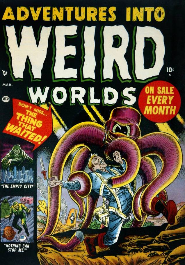
First in our line-up is this little fella in a hat. At least he looks like he’s wearing a cap, although perhaps he just has a square head with a skin flap hanging over the sides. At first glance, his tentacles are hollow, although their flesh is probably just a dull shade of battleship grey. So what’s this “thing that waited”? Soviet soldiers who are actually alien invaders. Duh.

AdventuresintoWeirdWorlds3
Adventures Into Weird Worlds no. 3 (March 1952), cover by Joe Maneely.

This next cover is probably a little more standard for pseudo-octopus fare: a lady with huge, ahem, bazooms (Russ Heath liked ’em busty, it seems – seriously, just look at the size of those things!) threatened by some horrific monster who’s dispatching her companion as expediently as possible. Still, the somewhat Wolverton-esque, grave-dwelling aliens with pincers at the end of their tentacles are odd-looking enough to squeeze their way into this post.

Spellbound20A
Spellbound no. 20 (March 1954), cover by Russ Heath.

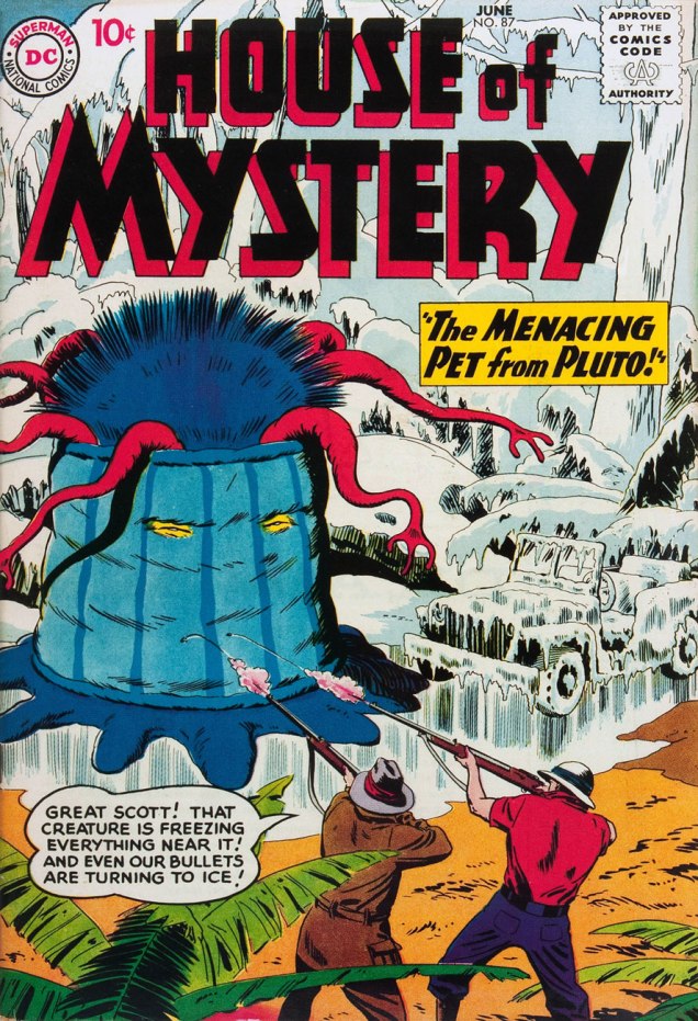
This toupee-clad creature with evil gimlet eyes doesn’t look much like a pet, if you ask me. How are those grabby little arms attached to its head, anyway? Wait, who am I talking about, again? 😉

HouseOfMystery87
House of Mystery no. 87 (June 1959), cover by Bob Brown.

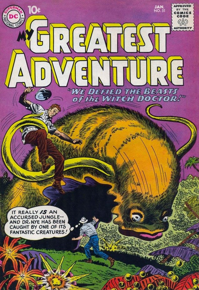
“My Greatest Adventure” was a title that promised much, and it must have been difficult to live up to it every month. Witness the following “fantastic” creature – a furry slug with disturbingly fleshy lips and tentacles. I can’t vouch for my reaction had I been an excitable ten-year old, but to this blasé adult, the poor beast summoned by some psycho witch doctor (the jungles seem to be always overrun with them) is just begging to be put out of its misery.

MyGreatestAdventure51
My Greatest Adventure no. 51 (January 1961), pencilled by Dick Dillin and inked by Sheldon Moldoff.

Our next exhibit finally features a proper alien, one who looks strange but at least makes sense as a unified, functioning creature. I love his sadly drooped whiskers, his dejected expression that’s strangely at odds with his pontifical speech.

Tales oftheUnexpected66
Tales of the Unexpected no. 66 (October 1961), cover by Bob Brown.

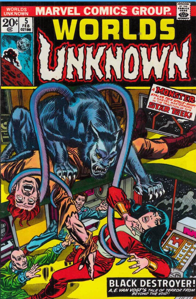
« Make him a werewolf! But in space! And give him tentacles! » Yeah, guys, that went over really well. A Marvel Masterwork, my ass. But wait: Black Destroyer! is an adaptation of A. E. van Vogt’s short story from 1939. And did Cœurl, the black cat-like creature, have tentacles in the story? Why, yes, he did.

« His great forelegs—twice as long as his hindlegs—twitched with a shuddering movement that arched every razor-sharp claw. The thick tentacles that sprouted from his shoulders ceased their weaving undulation, and grew taut with anxious alertness. Utterly appalled, he twisted his great cat head from side to side, while the little hairlike tendrils that formed each ear vibrated frantically, testing every vagrant breeze, every throb in the ether. » (read the full story here.)

WorldsofUnknown5
Worlds Unknown no. 5 (February 1974), cover pencilled by Gil Kane and inked by Frank Giacoia. Cœurl looks like he’s floating on top of the corpse – I don’t think the artists spent too much time watching an actual cat at work.

Read the comics version of Black Destroyer! here.

My last offering for today is the cutest, featuring an adorable blue varmint who gets my full sympathy and support. Weird? Sure, a bit – he’s got a tentacle sprouting out of his forehead – but beauty is in the eye of the beholder, right? This cover also proves that monsters are just as interested in tooth-whitening procedures as us humans.

TheDefenders72
The Defenders no. 72 (June 1979), pencilled by Herb Trimpe and inked by Al Milgrom.

~ ds

Ectoplasm-Bedeviled Pulchritude: Maurice Whitman’s Ghost Comics

At its best, Maurice Whitman’s art has the power to capture one’s imagination. He has an excellent eye for dynamic layouts, and his ghoulies and creepies are often drawn in a kind of a squiggly, sketchy way that really brings them alive for me. Not to be forgotten are his shapely women, usually in various states of déshabillé. Sometimes his covers are too chaotic, and don’t really hold together, leading the viewer to scratch his (or her!) head in confusion; but when it works, when all the pieces fall into place, his art can be glorious.

Ghost Comics had but 11 issues published between 1951 – 1954, so I could have included all of them in this post… but you can see a gallery of these covers on other websites, and besides, some of them are firmly in the “doesn’t quite work” category. Here are my favourites, then – five out of eleven, not bad!

GhostComics1
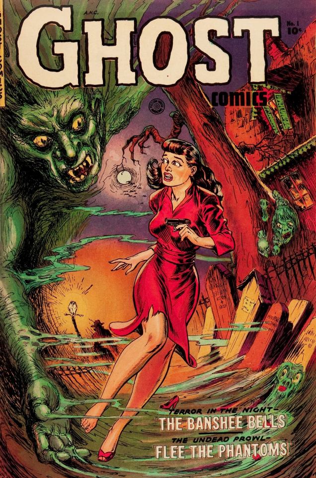
Ghost Comics no. 1, 1951. I like the details, such as the lost shoe, the cute little ghost in the bottom right corner, a mysterious dark figure by a lamppost (as if the green demon wasn’t terrifying enough)… and the warping of the scene really works, imho.

The following cover is kind of the raison d’être of this whole post – I adore it. Whitman put so many reach-out-and-touch-it details into it – talk about the juxtaposition between terror and sex-appeal! The woman’s négligé is probably the sheerest it has been my pleasure to encounter in pre-code comics. Her hair is also beautifully drawn, especially that little curl that seems to be reaching for the candle.

GhostComics2

Clearly, I’m not the only one to pay special attention to this cover – it was chosen as the cover of Ghosts and Girls of Fiction House!, another addition to Craig Yoe’s Chilling Archives of Horror Comics.

GhostComics3
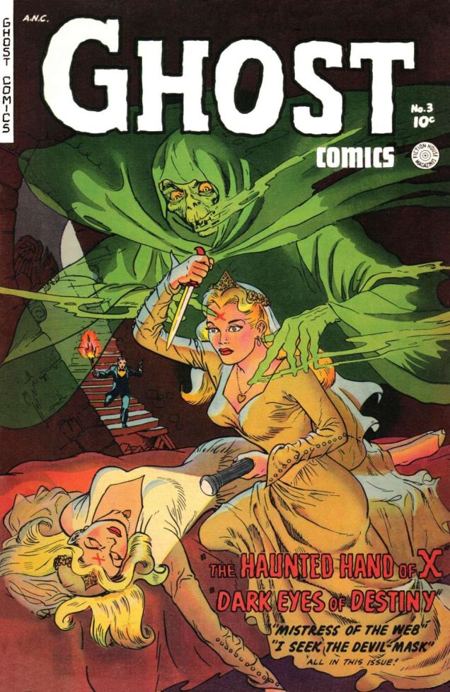
Ghost Comics no. 3, 1952. This one has crisper, cleaner lines, but the potent composition calls out to the viewer (and after a few minutes spent in contemplation of the art, you can start wondering what the hell is going on here, and how on earth does it make any sense?)
GhostComics4
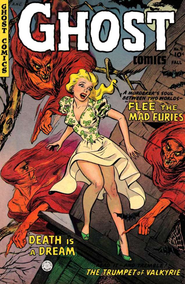
Ghost Comics no. 4, Fall 1952. Whitman was clearly fond of a certain type of blonde… not that anyone’s objecting. The two teeny bats on the right have captured my heart.
GhostComics8
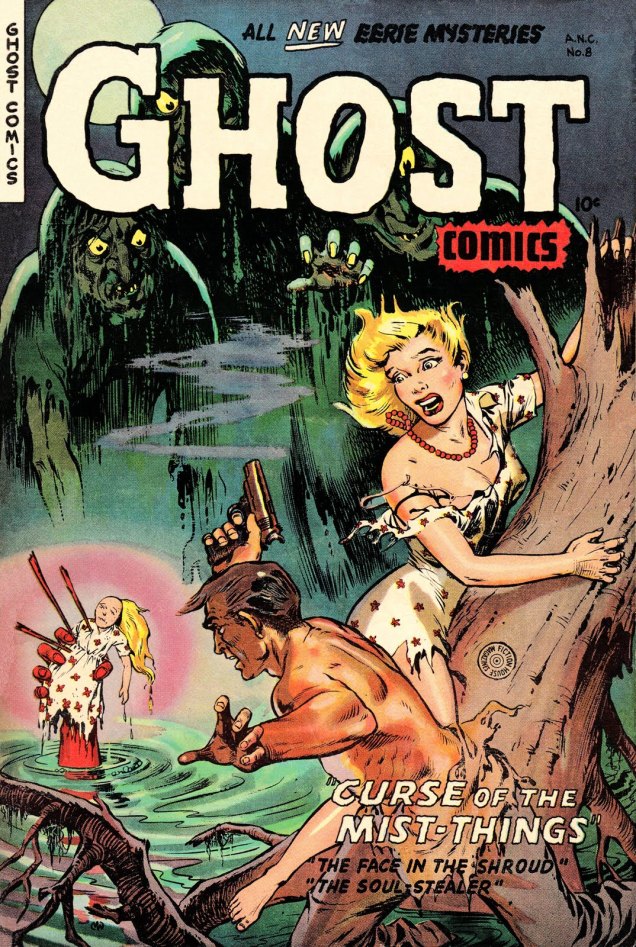
Ghost Comics no. 8, 1953. Come on, witch, you could have made a better effort with the doll’s hair! Are these the furies from no. 4?

All issues, should you want to read them, can be found at comicbookplus.

~ ds

Justin Green’s Musical Legends

« My father had a lifelong interest in helping musicians. I even encountered his presence when reading the autobiography of Anita O’Day. She said that there was a real estate man in Chicago who always made sure her band had a place to stay. That was Pop. » – Justin Green

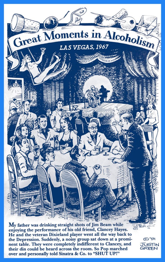
How did Justin Green, one of the Founding Fathers of the Underground Comix movement, wind up holding down a regular feature for a decade (1992-2002) in Tower Records‘ in-house magazine, Pulse!? The whole chain of events began with a strip about his dad’s drinking. Of course.

GreatMomentsA
« It was my father’s spirit that instigated this cartoon project…. this was ’91 (Blab No.6, Summer 1991, Kitchen Sink Press), and I was living in Sacramento. Mark Weidenbaum was then an editor at Pulse! Magazine, published and distributed by Tower Records, which had its headquarters in West Sacramento. He had just seen the piece when he found out I lived nearby. He wanted to explore the idea of an ongoing musical biography cartoon feature. »
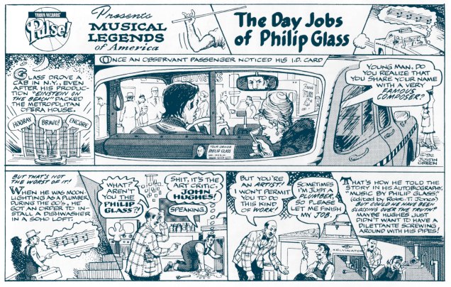
MusicalLegendsGlassA
The second instalment (April, 1992). A little Einstein on the Beach, anyone?
MusicalLegendElvisA
August, 1992. Elvis certainly had his faults, but racism or ingratitude were not among these.
MusicalLegendsGaryA
My own introduction to the Reverend’s music came, as it surely came to many others, through Jackson Browne‘s fine cover of his Cocaine (Running on Empty, 1977). « I was talking to my doctor down at the hospital. He said, ‘Son, it says here you’re twenty-seven, but that’s impossible — you look like you could be forty-five’. »
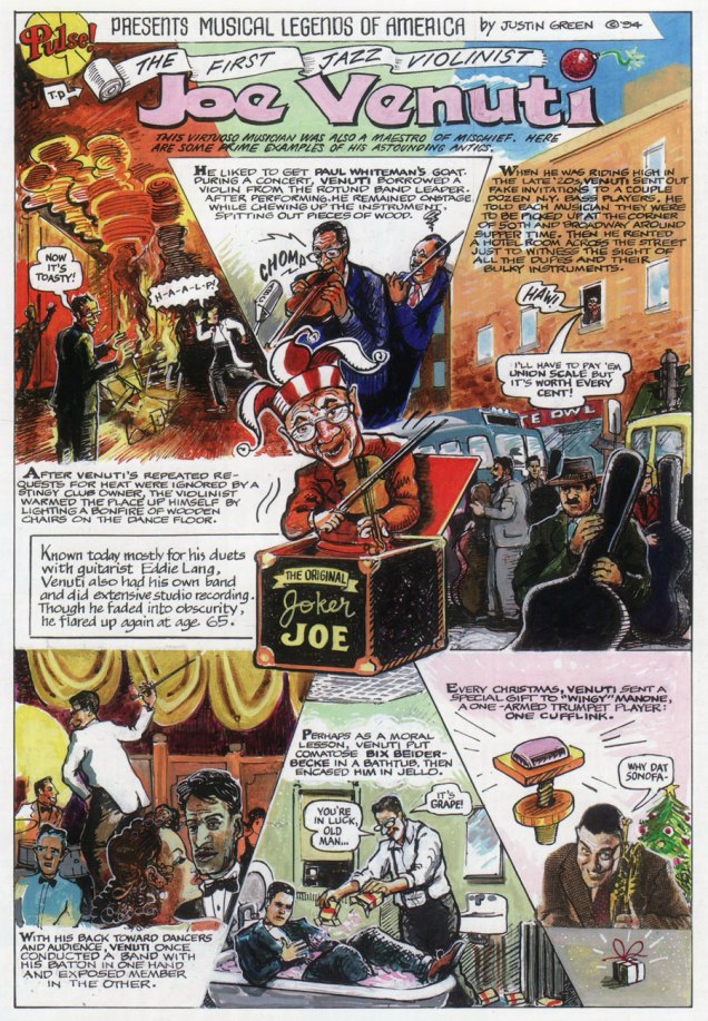
MusicalLegendsVenutiA
The strip frequently appeared in colour. Here’s my favourite example, from April, 1994. And here’s a fine Venuti performance. No, he wasn’t *always* joking.
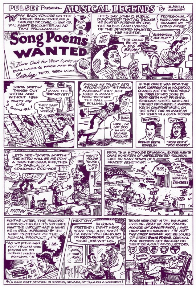
MusicalLegendsRoddA
Ah, Rodd Keith, the main man behind those infamous Song Poems ads, comic book fixtures in the 1970s. The weren’t a scam… not in the traditional sense. November, 1996. Lend your ear to his Ecstasy to Frenzy.

While Green isn’t a native virtuoso draftsman like, say, R. Crumb or Rick Griffin, and he’s only fair-to-middling when it comes to likenesses, he *is* a born storyteller, and that’s really what’s most needed for an endeavour of this nature. Compressing a lifetime, or at least a career, into a single-page strip (two at the most!) is remarkably tricky and demanding, and if it looks deceptively easy here, he’s succeeded.

In selecting strips for this post, I didn’t lean towards my own favourite musicians, opting instead for what I felt were the strongest pieces, regardless of topic. However, I’m reserving my very favourite for a special New Year’s Eve post. Hope you enjoyed these musical time capsules! If you did, you’ll be happy to learn that the fine folks at Last Gasp collected the set in 2003.

-RG