*No, I am not referring to the popular company that lets customers hire favourite ‘stars’ to record personalized videos; a month ago, I didn’t even know this existed, and my life has not been improved by this knowledge.
Sometimes an octopus stays politely in the background, waving hello shyly from behind a rock, or waiting for a dance invitation like a bashful kid at a high-school dance (do they still have these?) I never know where to use these covers; their tentacled nature is undeniable, but their octopuses are so peripheral to the main story that they tend to be overlooked when I am in search of a unifying theme for a post.
cam·e·o/ˈkamēˌō/
a small character part in a play or movie, played by a distinguished actor or a celebrity.
a piece of jewellery, typically oval in shape, consisting of a portrait in profile carved in relief on a background of a different colour.
I’m not sure this counts as a “portrait in profile”, but I will happily accept it as a cameo.
All right, on to the comics…
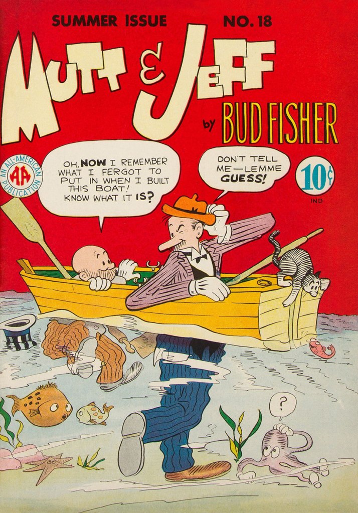
Mutt & Jeff no. 18 (Summer 1945, All-American). Cover is by Sheldon Mayer. So the octopus has only four tentacles, but he’s a cutie!
Treasure Chest vol. 22 no. 9 (December 1966, George A. Pflaum). Cover by Reed Crandall. This cover is of course dedicated to Jules Verne.
Treasure Chest, a long-running catholic publication we mention routinely though not too often (for details, see co-admin RG’s Hallowe’en Countdown IV, Day 24), runs the gamut from informative to fun, sometimes both at the same time. There are occasional clunkers (like the admittedly rather entertaining multi-part story I am currently reading about Godless Communism), but overall it’s well worth picking up, should some issue catch your eye.
Can you spot the octopus, right there in the window? He’s all set to escape, I think. Bonus: bats! As the top says, this is a strip from June 1970, scripted by Brant Parker and Johnny Hart, with art by Parker. These two have created The Wizard of Id in 1964, so this strip has been around for quite a while…
I originally had in mind happy, frolicking octopuses for this post, so here is one instance of just that. As a matter of fact, his smile is somewhat unnatural and more of a rictus, but I don’t want to be picky…
Bunny no. 14 (March 1970, Harvey). Cover by Hy Eisman. More (dubious) puns than one can shake a stick at… it’s almost like reading a Piers Anthony novel.
I’ll quote from Don Markstein’s excellent summary of this hare-brained comic series: « Bunny was aggressively, even obsessively trendy. Even at the time, it seemed to lay on the love beads and “psychedelic” display lettering a bit thick. […] But she owed her painfully discordant Sixties-ness to nobody. […] It’s as if her entire raison d’être was to parody the decade of student activism and radical youth fashions, even while living it. To make matters worse, this teenage girl comic was edited, written and drawn by middle-aged men who were probably, like most middle-aged men, unable to communicate with their own daughters. To vary the dialogue, in which everything that wasn’t “groovy” was “outasight”, they made up their own slang. Things could also be “zoovy” or “zoovers” or even, in extreme cases, “yvoorg” — which was obviously “groovy” spelled backward, but no hint was ever given as to how it might be pronounced. »
« I used to be Snow White, but I drifted. » — Mae West
Spring has most definitely arrived, even up here in the Northern latitudes.
Last week, while wandering the neighbourhood on a gorgeous, inviting day, we roamed farther afield than usual, and happened upon a mostly-deserted parking lot flanked by a humongous pile of sooty snow. I’ve always been fascinated by these filthy behemoths; where I grew up, increasingly crusty and grotesque snowbanks would endure midway through June each year.
It always made sense to me that, being dark, these mounds would absorb more heat from the spring sunlight and melt faster than pristine snow. Counterintuitively, they just stuck around. As it usually turns out, there are more factors at play than one might initially suspect. Here’s a handy scientific explanation.
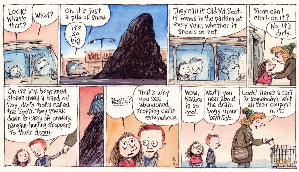
Another individual who shared my bemused interest in the phenomenon was incredibly-gifted cartoonist Richard Church Thompson (1957-2016), who bestowed upon the unsightly obsidian lumps some intriguing bits of mythology, as he so often and compellingly did to the base materials of the everyday.
This Richard’s Poor Almanac entry « … predates Cul de Sac by some years, yet keen eyes will note the kids in silly hats and the pile of parking lot snow, which have both found their way into the strip. »
Thompson: « CUL DE SAC began as a Sunday-only feature in The Washington Post Magazine in 2004. I painted them in watercolors instead of the process color needed for most newspaper comic strips. »The syndicated strip remake, from Sunday, January 9, 2011. Rats! Now we’ll never hear about the bathtub drain bogy…
Alice retells the Sooti legend with some slight distortions… but you just wait until Dill recounts it his way. Sadly, this was the final allusion to these mysterious creatures. This is the Cul de sac daily from Tuesday, Feb. 8, 2010.
We set off on a quest just yesterday and indeed, there are abandoned shopping carts by the score… if you know where to look.
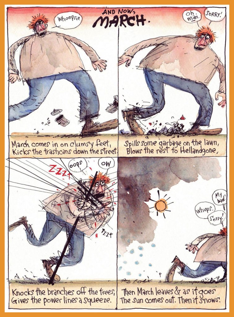
And a bonus seasonal entry to wrap things up! Then it snows.
For more Thompson marvels, do check out our general category, The Stupendous Richard Thompson, and expect massive doses of both awe and amusement.
« Is the spring coming? » he said. « What is it like?» «It is the sun shining on the rain and the rain falling on the sunshine…»| Frances Hodgson Burnett, The Secret Garden
Having been meaning for a while now to concentrate on tentacled plant life, I was hitherto stopped by the idea that it’s somewhat unseemly to talk about flora when most of our readership is buried in snow and ice. But now, well! – today was the first day of the year suitable for wearing shorts, and green shoots are popping up wherever one’s gaze happens to land.
We have waited for quite a long time before co-admin RG managed to get his hands on this issue… and it turned out that the insides vary from ‘lacklustre’ to ‘wow, that’s ugly!’ Still, the wonderful, striking cover makes it worth owning, I believe.
Horror: The Illustrated Book Of Fears no. 2 (February 1990, Northstar). Cover by Mark Bernal.
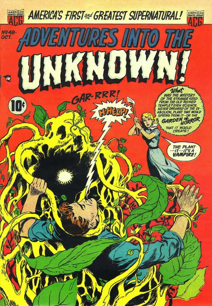
ACG got its tentacle parade in Tentacle Tuesday: ACG’s Adventures Into the Tentacles, but as usual, some material didn’t quite fit the theme, and I saved the following cover for a more appropriate occasion. This, I do believe, is the moment.
Adventures into the Unknown no. 48 (October 1953, ACG), cover by Ken Bald.
Speaking of adventures, let’s delve into Strange Adventures for a bit. The following story has a rather peculiar plot – « Star Hawkins is down on his luck and has to pawn Ilda, his robot secretary. Luckily, Star is hired to locate a fugitive who’s thought to be hiding on Vesta, an asteroid mining settlement, in the Red Jungle. But with a little tracking skill and the help of the creepy vegetation of the Red Jungle, he nabs the fugitive, gets his prisoner, and gets Ilda back from the pawn shop, promising never to pawn her again. »
Page from The Case of the Martian Witness!, scripted by John Broome, pencilled by Mike Sekowsky and inked by Bernard Sachs, published in Strange Adventures no. 114 (March 1960, DC).
Here’s another Earthman (who has dreamed of this moment, by his own admission!) struggling with some coquettish plant tentacles that just want to be friends.
A page from Super-Athlete from Earth!, scripted by Gardner Fox, pencilled by Gil Kane and inked by Bernard Sachs, published in Strange Adventures no. 125 (February 1961, DC).
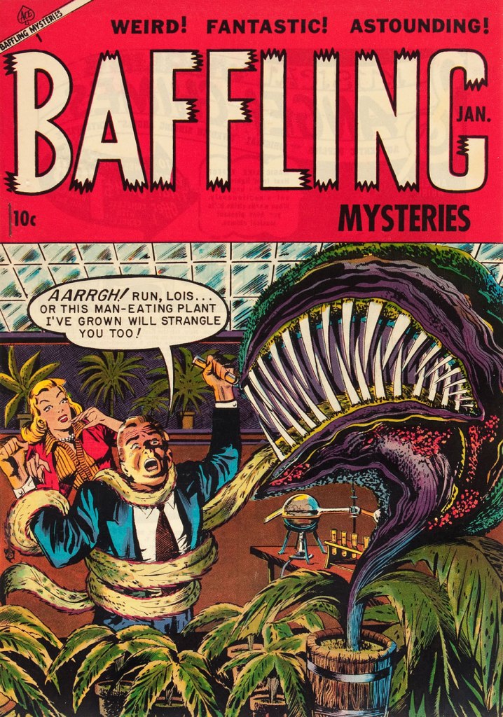
The next thing after adventures is, naturally, mysteries. If they’re strange, puzzling mysteries, even better… what’s that word I’m looking for… ah, yes: baffling! Another day, yet another ravenous man-eating plant.
Baffling Mysteries no. 19 (January 1954, Ace Magazines). Cover is presumed to be by George Roussos. I think strangulation is not even the worst option here.
One more happy tromp through the jungle? Sure, why not!
The following image was originally created as a cover for House of Mystery no. 251 (1977, DC), but was nixed in favour of another, Neal Adams-penned illustration, which we’ve already featured in a previous post (Tentacle Tuesday: Plants Sometimes Have Tentacles, Too). I prefer this gruesome version (complete with skeleton being digested!… also more detail, more dynamic layout and better anatomy of all involved), pencilled by José Luis García-López and inked by Bernie Wrightson.
« Only times and places, only names and ghosts. » — Aldous Huxley
Last November, after we spotlighted a pair of mid-70s Gold Key gems I had presumed to be the brainchildren of Connor Freff Cochran (as it turned out, I was only half right; see my revised original post), we heard from the gentleman himself (and I don’t use the term lightly), who generously shared with us his sharp recollections and insights. Once you’ve read them, I’m confident that you’ll agree that such goods would have been squandered as mere comments at the bottom of a post.
So I’ve picked out another Freff favourite to feature, which will be followed by the author’s commentary.
But first, let us set the stage through a bit of autobiography and an inestimable glimpse into the 1970s publishing scene.
Here’s the skinny. Heeding a suggestion Kelly Freas had made to me eight months earlier, I moved to New York City right after Labor Day 1973. (It was a two-step process. First I hitchhiked from San Francisco to Toronto for that year’s Worldcon, then I caught a ride the rest of the way to NYC from there.) I was six weeks away from turning 19, and gung-ho to launch a career as a professional cover artist and illustrator. I also wanted to work in comics, and thought the best way to break in and learn the ropes was to start as an inker. On the comics side I took my portfolio around to Marvel, DC, Gold Key, and Warren. On the book/magazine side, I went to any publisher where I could land an appointment.
It was not a stellar launch. My portfolio was full of SF convention art show pieces, some semi-prozine illustrations, and a handful of two-toned small press book covers. It wasn’t bad stuff, but it was certainly not well-targeted to the people I was trying to impress. A couple of magazines did pay me for spot illustrations. Jim Baen — brand-new managing editor at GALAXY and IF — liked my stuff, but he wasn’t in charge of art assignments. As for my attempt to break into comic inking, that was a complete washout. There was a paper shortage on, and because of publishing cutbacks there wasn’t enough work for established inkers, let alone a newbie like me. Marvel did give me a bunch of pencil Xeroxes to do vellum samples over…but I was a pen inker, not a brush guy, and pen inking wasn’t the Marvel house look in 1973. I did get to know and hang around with a bunch of people in the company, but I didn’t get any work there.
At Gold Key, though…
At Gold Key, Wally Green looked at my portfolio and said “We don’t need any more artists. But we do need writers. Can you write?” Years later I learned that Wally was trying to plug the production hole created when Len Wein stopped scripting for him. Most likely he put that same question to every stranger who walked through the door. In the moment, though, all I knew was that I’d be an idiot to say anything but yes. Wally then introduced me to his second-in-command, Paul Kuhn. Paul handed over some sample issues of TWILIGHT ZONE, and told me to come back when I had a five-page script to show him. A few days later I brought in a story called “The Stand-In”, which was read and bought on the spot. Thus did my accidental writing career begin. This was in early October 1973. At the beginning of 1974 I did the math and decided to quit my 9-5 job, because by then I was making more from three days per month of Gold Key scripting (at the princely sum of $10 per page) than my fulltime gig was generating. I’ve been self-employed ever since.
I wrote for GRIMM’S GHOST STORIES, RIPLEY’S BELIEVE IT OR NOT, BORIS KARLOFF TALES OF MYSTERY, TWILIGHT ZONE, DARK SHADOWS (for a different editor, Denise Van Lehr), ADAM-12, and even one issue of Gold Key’s STAR TREK. Roughly once a month Paul would agree to a pitch session. I’d bring 10-15 different story ideas with me, knowing I needed to sell at least five to meet my monthly minimum nut (which was low, since I lived in a 7’ x 12’ fifth-floor walkup room on the West Side that rented for $50). Paul would listen intently, but he couldn’t look me in the face most of the time because he had a permanent spastic tic in his neck. Inevitably he would reject all but a couple of ideas, at which point I had to invent more on the spot and talk him into buying them. It was GREAT story development training.
Paul had an eidetic memory for every damn comic book Gold Key had ever published, which was its own kind of problem. This is a real exchange we once had:
Paul: I don’t know…
Me: Paul —
Paul (shouting through the open door to Wally, in the next-over office): Hey, Wally! Freff has an idea for an art museum guard ghost story. Didn’t we do a museum guard ghost story, what, nine years ago?
Wally: I think so.
Paul: Sorry, Freff. That’s out. What else have you got?
Me: Paul, your readers are eight years old. They weren’t even born when that other story was published! And anyway, it’s an ART museum guard ghost story. What kind of museum was it last time?
Paul: History.
Me: So no art.
Paul: Okay, I’ll think about it.
(He did…and still passed on the idea.)
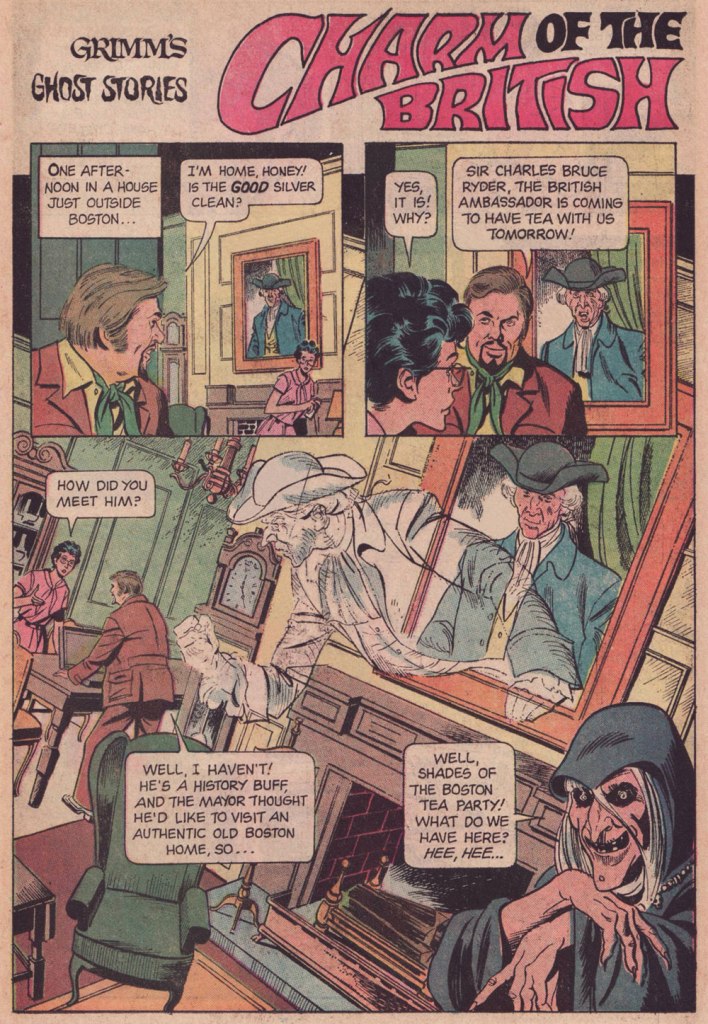
And here’s our featured tale: Charm of the British, first published in Grimm’s Ghost Stories no. 22 (March 1975, Gold Key).
Before I return the floor to Freff, it bears mentioning that this tale was illustrated by Argentine cartoonist José Delbo (born in 1933 and still among us), then on the cusp of a five-year run on DC’s Wonder Woman. Delbo was quite recently in the news for the astonishing windfall he received from a crypto artwork auction. In these uncertain times, what 87-year-old on a fixed income couldn’t use an extra million to top up his or her nest egg?
While I confess I’ve never quite warmed up to most of Delbo’s DC work (his inkers did him no favours), I do have a soft spot for his solid run on Charlton’s Billy the Kid (1966-74!), I dug his deft comic touch on Dell’s The Monkees, and let’s not forget his inspired work on the real ‘weird western tales’ series, Charlton’s gonzo Geronimo Jones (1971-72).
I hear James Mason as the British Ambassador. How about you?
And now, with a first-hand account of its genesis, Mr. Connor Freff Cochran!
The publication date of the issue with “Charm of the British” was March 1975. Gold Key comics typically hit the stand a month sooner than the official date, so that makes this a February 1975 release. From that, and some internal clues, I can narrow the writing window down to the first three weeks of September 1974.
I’d been away from NYC all the previous summer, living in Champaign-Urbana, IL, where I was self-training just in case my application to that year’s Ringling Brothers Clown College was accepted. I finally got word that I’d made it when I arrived at the World SF Convention, which was held over Labor Day weekend in Washington, DC. (One day later I went out for Chinese food and got a fortune cookie that read “You will visit a strange place and find fresh work.”) The Clown College started on September 23rd and ran for just over two months, during which time I would be unable to do any paying freelance work. So between the end of WorldCon and flying to Venice, FL on 9/22, I crammed in every job I possibly could – which included selling and writing as many Gold Key stories as I usually did in three or four months. Wally Green and Paul Kuhn knew I would be unavailable until late November/early December at the soonest, so they did something they hadn’t done with me before, and built up inventory.
“Charm of the British” was one of those inventory pieces. It paid $60 (my page rate for scripting was $10), and looking back I have no idea what the exact trigger for the idea was. Most likely it was improvised during a pitch & sell session with Paul. Those were always insane. The typical structure: I’d come in once a month with 8-10 ideas, knowing that I needed to sell five or six to guarantee my monthly budget. Paul would say yes to one or two and reject the rest. At which point the improv would begin, with me inventing more stories on the spot while he tried to get me to leave… something I would only do after getting him to say yes as many times as needed. I was 19 years old, and it was great training for a creative future.
The title’s a minor bit of wordplay, of course – “charm” as in magic and manners, both.
Grimm always had to have jokey intro and outro lines for each story. The outro on this one wasn’t anything to be proud of, but all these years later I’m still happy with the punny “shades” (of the Boston Tea Party) in the intro.
These were stories for young kids, so you couldn’t go into detail about anything. But I did enjoy slipping in as many real Revolutionary War references as I could, both direct (namechecking Paul Revere) and indirect (referencing Revere’s profession by having my lead character ask for “the good silver” in the first panel). “I won’t be judging without representation anymore” is obviously a riff on “no taxation without representation.” No child who read this comic book was ever going to remember it years later, when they encountered the real phrase in some history class, but maybe a bit of subconscious memory would help the knowledge stick, you know? In any case I enjoyed playing with all these references.
Page 2, panel 2: I absolutely did NOT write that unnecessary “Why, No!” Either Paul or Wally or the letterer added that. Didn’t make sense to me then, and makes no sense to me now. Similarly, the “Thinks they he can come in…” in panel 4 on that page is definitely an editing/letterer goof. I wrote “Thinks he can come in…”
As usual, my character names referenced friends, sometimes combined with private jokes. Fan friends Eli Cohen and Susan Wood had begun dating recently, so I named the house owners “Eli and Susan Wood” (though all reference to the name “Susan” somehow vanished in the editing process). Susan eventually became one of the major academic names in the science fiction field, before she sadly passed, much too young, in 1980. Our visiting British Ambassador got the name of a junior high school friend of mine who had spent a lot of his childhood growing up in Europe. These days he’s a partner with the law firm of Thompson Coburn LLP, in St. Louis. Revolutionary War ghost Nathaniel Emerson is a combination of Nathaniel Hawthorne and Ralph Waldo Emerson (they were neighbors in Concord, MA for a time), with a sideways nod to NYC fan David Emerson. David had recently shared an apartment with Eli Cohen, so it amused me to have an “Emerson ghost” hanging around to haunt an Eli living space…
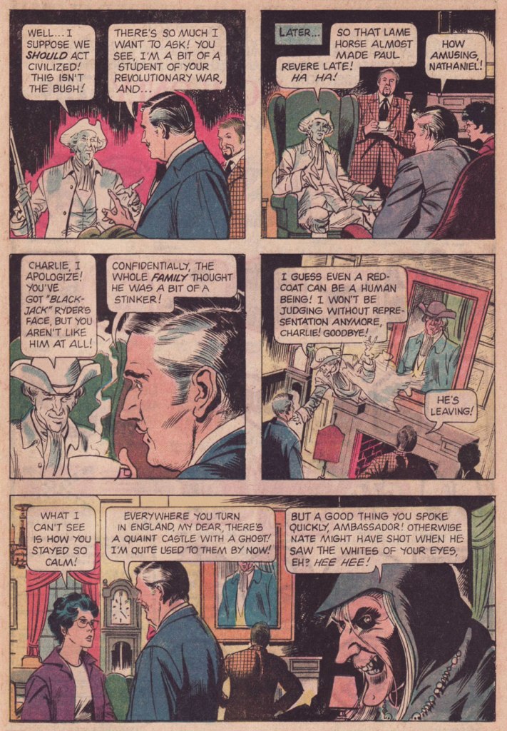
Looking back from today, it amuses me to think of Outlander’s evil British soldier “Black Jack Randall” and his nice-guy modern descendant, who both have the same face. It’s a neat coincidental lineup with my evil British soldier “Black Jack” Ryder and his nice-guy, same-face descendant.
Overall… confronted with this story after nearly 50 years, I’m pleasantly surprised. It’s got some nice lines, it turns in unexpected directions, and none of the characters are idiots (though they are all amazingly blasé about spectral appearances). I can imagine the Ambassador and the ghost of Nathaniel Emerson becoming the best of friends, making regular visits back and forth across the Pond… and hanging out together in the afterlife when the Ambassador finally dies from eating one too many diplomatic desserts.
Alternatively, of course, there’s a story to be written about the Ambassador coming home to England and being haunted by Black Jack’s ghost, who is appalled that any descendant of his would make nice with Yankee riffraff like Nathaniel…
Again, my heartfelt and slightly befuddled gratitude to Mr. Cochran for all his cordiality and patience. We’ve more of it to share with our readers, so expect a sequel in the near future. Cheers!
The tentacled well of funny animal insanity from the Golden Age is nearly bottomless. Just when I think I’ve more or less covered it all, some new goofy octopus cover that I have never seen before pops up, or an unhinged inside story swims by and waves a cheerful ‘hi there!’ with a free tentacle.
Next up, two pages from The Daffy Diver, published in Dizzy Duck no. 32 (November 1950, Standard Comics), artist once again unknown:
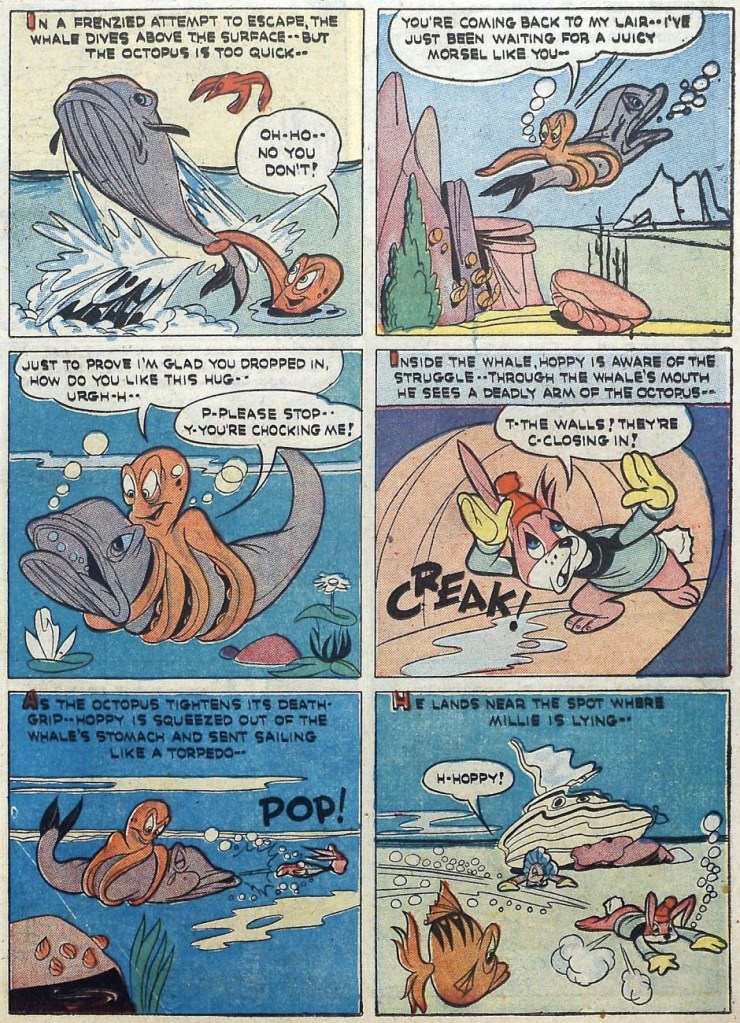
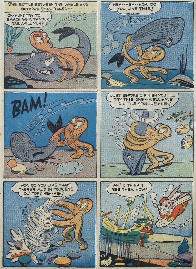
I promised some bunny action – but not the kind that springs immediately to mind! Enjoy this 2-page tentacled tussle in this Hoppy the Marvel Bunny story illustrated by Chad Grothkopf and published in Fawcett’s Funny Animals no. 5 (April 7th, 1943, Fawcett).
For dessert, two covers, because a man does not live on inside pages alone!
National Comics no. 70 (February 1949, Quality Comics). Cover by Gill Fox.
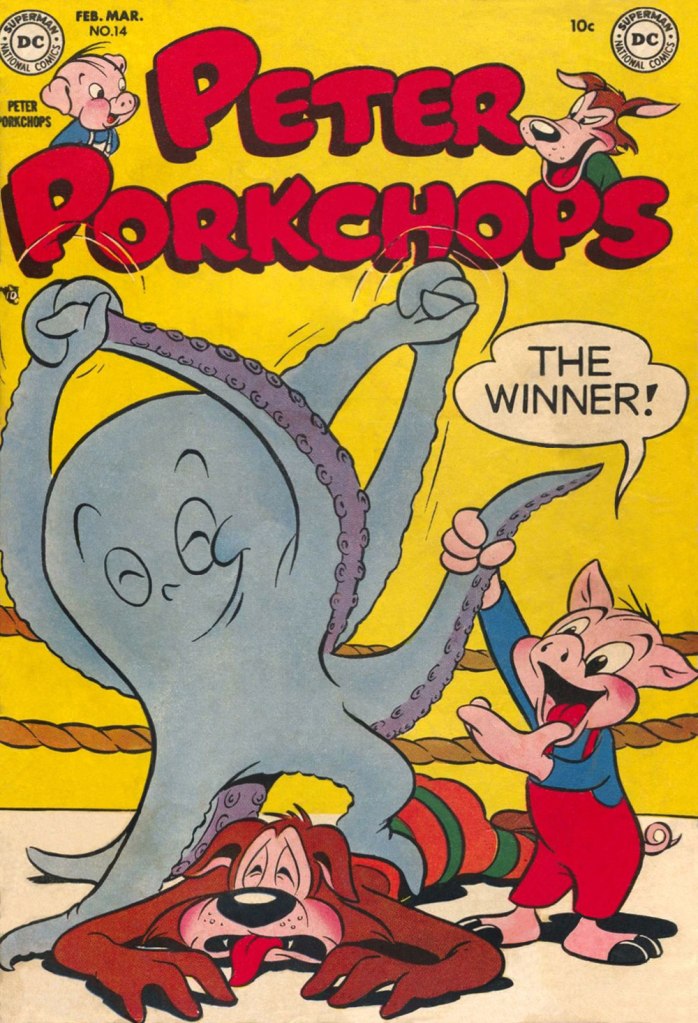
Peter Porkchops no. 14 (February-March 1952, DC); cover by Otto Feuer.
« It took me some years to clear my head of what Paris wanted me to admire about it, and to notice what I preferred instead. Not power-ridden monuments, but individual buildings which tell a quieter story: the artist’s studio, or the Belle Époque house built by a forgotten financier for a just-remembered courtesan. » — Julian Barnes
Depending on where and when you are, this post will take you far away and to long ago.
For instance, during the storied humour magazine Le Rire’s prime years (roughly the first quarter of the 20th century), Gerbault was featured in most issues, often on the front or back cover, and generally in sumptuous colour. Well, you’ll see what I mean. Clearly not one to rest on his laurels, he somehow found time to lend his sundry gifts to the theatrical, advertising, etching, and fine art fields.
Here’s a bit of context if you don’t know who Saint Denis was. Love his interaction with the initially skeptical doggo! Originally published in La Vie Parisienne, and collected in Parisiennettes (1897), with colours by J. Chauvet.
There’s the lad, Paris’ first Bishop, at the Cathédrale Notre-Dame de Paris. Hope he wasn’t damaged in the blaze.
Gage d’amour (“Token of Love”), originally published in La Vie Parisienne, and collected in Parisiennettes (1897), with colours by J. Chauvet.
Les Coulisses de l’Amour is a collection of cartoons published between 1893 and 1895 in La Vie Parisienne. Racist caricatures abound but, to be fair, everybody gets it in the neck.
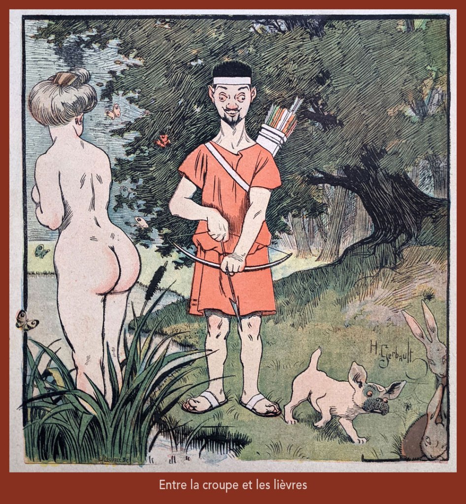
“Entre la croupe et les lièvres” is a play on “Il y a loin de la coupe aux lèvres” (English equivalent: “there’s many a slip ‘twixt the cup and the lip”), with ‘coupe’ replaced by ‘croupe’ (rump) and ‘lèvres’ by ‘lièvres’ (hares) — It was featured on the cover of Le Rire no. 261, (Nov. 4, 1899), eloquently demonstrating the vast cultural gulf between Edwardian England and Belle Époque France… not to mention the United States!
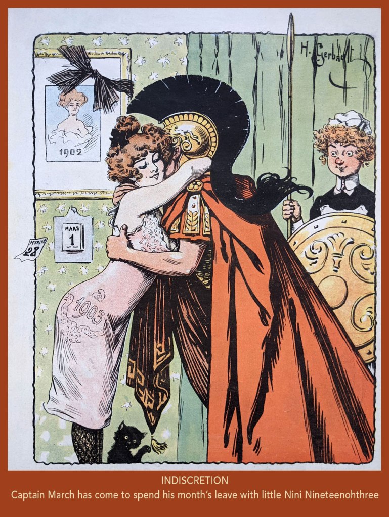
From Le Rire no. 7, (March 21, 1903). In French, the Roman God of war and the year’s third month are both “Mars”. Why is it even “March” in English?
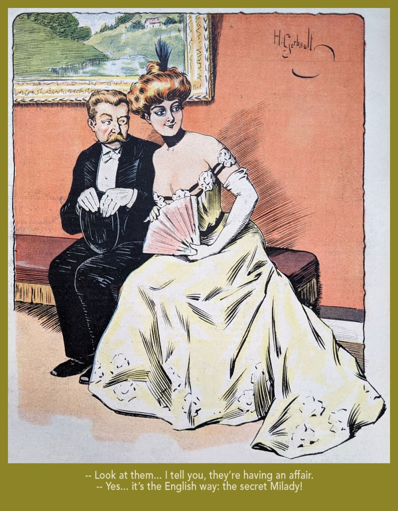
Taking the piss out of that old English discretion (some might call it hypocrisy); from Le Rire no. 18 (June 6, 1903).
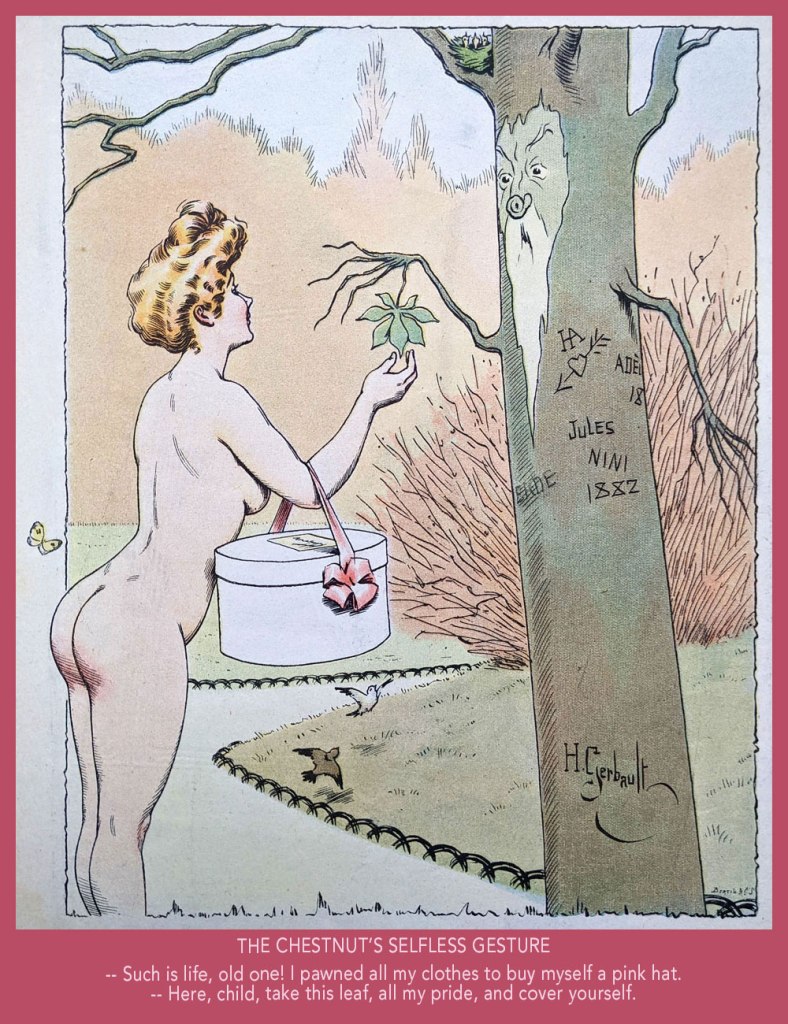
From Le Rire no. 59, (March 19, 1904).
From Le Rire no. 160 (Feb. 21, 1906).
From Le Rire no. 380 (May 14, 1910). Missals are also known as ‘prayer books’.
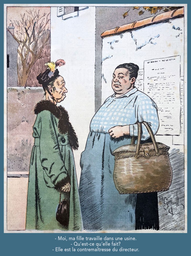
Despite being quite amusing, this one loses it all in translation. Still, “contremaître” is a foreman; its feminine form is “contremaîtresse”, which combines foreman and “mistress”; you’ll hopefully get the idea. This piece appeared in Le Rire rouge (as Le Rire was called during The Great War) no. 179 (Apr. 20, 1918). Note the beautifully understated colour work.
From Le Rire no. 189 (Sept. 10, 1922). « Je m’fiche à poil, rien que pour l’embêter! » in the original; sometimes it’s mighty hard to do proper justice to the source text.
Greetings, tentacle aficionados! Phew, this post started out as just a couple of images and spun somewhat out of control. My thanks to co-admin RG for cleaning up, re-arranging and even colourizing the following scans and photographs. Today we gaze at cephalopod apparitions in newspapers strips from the 40s and 50s. There are actually few things I like better: there is something comforting about the smell of an old newspaper (even if we have to imagine it!), the aesthetic appeal of yellowed paper, the concerns of imaginary characters who lived so long ago and yet who seem so close to us. Irrelevant to the modern age? Not at all. Look past the technological trimmings and you’ll find people who have lived and loved and struggled much like we do today. On a lighter note, the techniques of fighting off tentacles haven’t changed much, either!
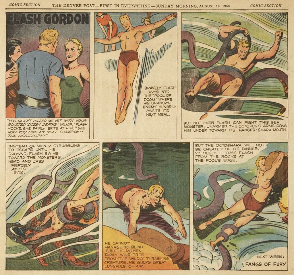
Flash Gordon, created in 1934 by Alex Raymond for King Features Syndicate to compete with the Buck Rogers newspaper strip, was immensely popular, witnessed by both its longevity – the strip continued all the way into 2003 – and multiple licensed products on offer for starry-eyed kids who wanted a spaceship or ray gun to call their own. Raymond left in 1944 to join the US Marines, and Austin Briggs, who up to that point was drawing the Flash Gordon dailies (introduced in 1941 to capitalize on the popularity of Raymond’s Sunday strips), switched to drawing Sundays, the dailies now cancelled. The following is from August 18th, 1946, art by Austin Briggs.
In 1951, King Features reinstated the Flash Gordon dailies and put Dan Barry in charge, famously assisted by Harvey Kurtzman and Harry Harrison on scripts, and a bevy of ghost-drawing writers.
The following are two Flash Gordon dailies from 1954. These reprints hail from Flash Gordon: Dan Barry Vol. 2: The Lost Continent, which collects dailies from October 26th 1953 to October 29th 1955.
Frank Robbins created Johnny Hazard for King Features Syndicate in 1944. What I find impressive is that the strip continued, with no other writers or artists involved, all the way until 1977 – contrast that with other newspaper adventure strips from around that time. Robbins must have been a powerhouse. To quote from the no-longer-updated (its creator, Donald Markstein, died in 2012), but still kindly maintained by relatives Toonopedia, « … Unlike many fictional two-fisted adventurers, [Johnny Hazard] matured — not as quickly as real people, but after a third of a century or so, he was quite gray at the temples. And a third of a century was as long as the strip ran. It was popular enough at first, and ran far longer than most post-war adventure strips, but the times were against it. Newspaper editors were more interested in daily gags than continuous stories, and Johnny Hazard succumbed to the trend in 1977. Robbins went to work for DC Comics, where he drew Batman, and Marvel, where he drew The Invaders, and never again created his own feature. » Eventually, Robbins is said to have retired, moved to Mexico, and devoted himself to painting – where he remained his death in 1994. This daily is from July 1951.
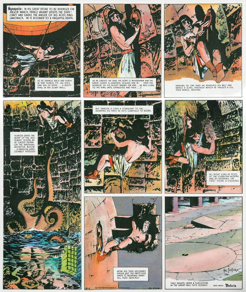
Prince Valiant is one of those newspaper strips institutions that most readers will have heard of, though some, kind of like me, may be uncertain about about the who, the when, and the hows of it. It was created by Canadian Hal Foster (1892-1982) – who, while illustrating the Tarzan newspaper strip (more about this a little further down!), developed a craving to work on his own oeuvre. He pitched his medieval adventure idea to William Randolph Hearst, who was so impressed that he even gave Foster ownership of the strip. It’s still ongoing (after a little more than 4000 Sundays!) This magnum opus has been credited with plenty, as the « greatest contribution to English literature in the past hundred years », « the pinnacle of comic strip adventure storytelling », and so on. I feel a little bad for being bored to tears by it, but as the Russians say, ‘и на старуху бывает проруха‘, more-or-less directly translated ‘even a crone can blunder’, or in other words, even Homer nods. The following Sundays are from April-May 1941 – spending two nights in a well, instead of trying to fight off the octopus, is an interesting approach, and I’m sure both man and animal were immensely frustrated.
I promised to say more about Tarzan – ah, the very, very long-running Tarzan strip. Started in 1929 with an adaptation of Edgar Rice Burroughs‘ Tarzan of the Apes illustrated by the aforementioned Hal Foster, syndicated by the United Feature Syndicate, it went on (and on…) all the way until 1995, with quite the cast of different artists over the years. The following Sunday is from the Burne Hogarth years, and is part of a story cycle called Tarzan and N’ani, which was published between December 14th 1947 and May 9, 1948. As for Hogarth, he seemed to hold the distinction of being the only artist with two runs on Tarzan: he drew the strip from 1937 to 1945, and again from 1947 to 1950.
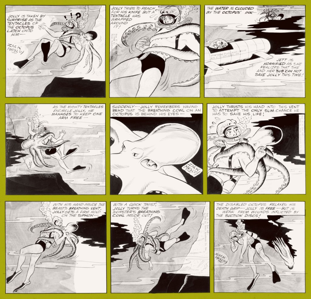
The Adventures of Smilin’ Jack, distributed by the Chicago Tribune Syndicate, ran from 1933 to 1973. I know that doesn’t sound as impressive because all strips discussed so far had crazily long runs, and yet: Smilin’ Jack, as it came to be called a little later on, lasted a good fifty years, which is partially explained by this strip’s motley cast of endearing supporting characters, but also by the realism with which Jack’s flying adventures were depicted – Zack Mosley, the creator, was an aviation enthusiast and licensed pilot with a true love of everything aeroplane. The following three dailies are from November 1956. You’ll be happy to learn that Mosley, upon retiring at 67, spent the rest of his days flying his own plane.
Created by George Shedd, a former Al Capp assistant, for the Post-Hall Syndicate, Marlin Keel ran between 1953 and 1954. Very little information about it survives – from what I understood, Shedd first wrote and drew this newspaper strip by himself, and later relinquished the illustration to assistants. Most notable (and what seems to be motivating rare collectors) is the involvement of Alvin Carl Hollingsworth (1928-2000), one of the few African-Americans working in the field at the time, who started by helping out (not sure to what degree) and became the official illustrator of Markin Keel towards the end of its run. Hollingsworth, who’s often mentioned as Joe Kubert‘s classmate at NYC’s High School of Music & Art – a fact that, albeit cool, underplays Hollingsworth’s talent and career – seems to have always maintained an interest in painting. Later in life, in the 1970s, he abandoned the comics field in favour of becoming a (fine) painter – you can see some of his paintings here. This is the original art for a 1954 Sunday strip.
The octopus may be off-camera, but my appreciation of Bob Montana made me include this strip in today’s roster. That’s right, it’s not my fault! This is an Archie daily from July 24th, 1953.
I hope you enjoyed this walk down history’s lanes and byways!
« It was exactly an assembly line. You could look into infinity down these rows of drawing tables. » — Gil Kane
Some of our more sensitive readers may have noticed that we’ve been none too gentle with Gil Kane (1926-2000) in the past, dealing him some rather rough lumps at times. But that’s not the whole story: in taking stock of such a protracted and prolific (dare I say profligate?) career as his, much of it inevitably spent on autopilot, one must be discerning. In other words, I like some of Kane’s work, but there’s plenty of it I don’t care for. Still, WOT’s rule of thumb is that if we altogether loathe an artist and/or his work, we’ll just turn a blind eye.
And speaking of the sense of sight, what makes a great comic book cover? Must be my art school training and subsequent work in advertising tipping the scales, but to me, design and layout reign primordial as ingredients… as values. I’m often dismayed at many a would-be critic’s apparent method of assessing an image’s artistic worth, namely: how many popular characters does it feature? Is it action-packed? Is the issue sought-after and expensive? Does it feature a famous character’s début? Is it drawn by a fan-favourite artist who unquestionably can do no wrong… because he’s a fan-favourite artist who unquestionably can do no wrong? (and how dare you claim otherwise!)
Gil Kane reportedly generated around eight hundred covers for Marvel in the 1970s… of all levels of craft and quality. With that kind of frenzied output, it’s impressive that most were perfectly serviceable, given that there certainly was no time for meticulous, sober planning. They were generally over-captioned (not Kane’s fault!) and crassly sensationalistic, but that’s what Marvel sought and settled for.
It’s a shame that Kane and his former classmate at the School of Industrial Art (back in the early 40s!), DC lynchpin Carmine Infantino didn’t get on too well, because their Silver Age collaborations had a special spark… must have been the animosity. It had been noted by the DC brass, as early as the late 50s, that Carmine’s covers reliably caught prospective buyers’ attention and dimes. And so, by 1967, he was unofficially designing most of the publisher’s covers, and certainly the covers of all titles edited by Julius Schwartz. Green Lantern was among these.
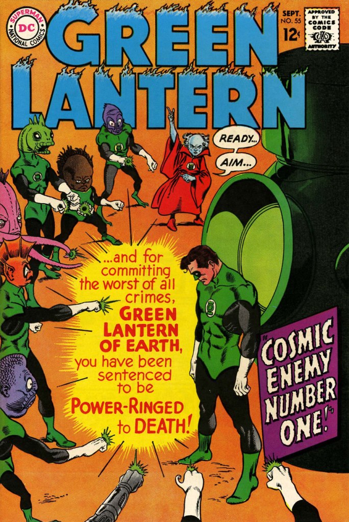
So we turn today’s spotlight on a hot streak of seven. Kane gets his name in the title, but it would be more accurate to say they were Infantino-designed, Gaspar Saladino-lettered, Jack Adler-coloured, Gil Kane-pencilled and Murphy Anderson and Sid Greene-inked covers. The streak begins after Green Lantern no. 54’s downright poor cover, and ends with the interruption of Kane’s impressively long run of consecutive issues.
We begin with Green Lantern no. 55 (Sept. 1967, DC). Harmonious, easy-to-parse arrangement of numerous elements and exemplary integration of text. Design by Infantino, pencils by Kane, inks by Murphy Anderson, lettering by Gaspar Saladino, colours by Jack Adler. Oh, and lest we forget: logo designed by Ira Shnapp (circa 1964), classic Green Lantern uniform designed by Kane (circa 1959).
This is Green Lantern no. 56 (Oct. 1967, DC). Kane was never much for varying his monsters (see below). Pencils by Kane, inks by Anderson.
For a bit of comparison on how things were done from company to company, this is Tales to Astonish no. 91 (May, 1967, Marvel). This is what happens when there’s no planning or attention to detail: in an already-crowded cover, did we really need that ugly box advising us of the presence of The Abomination? He’s right there! (maybe the abomination refers to the cover itself). And the foreshortening nightmare that is the baddie’s left arm was so dire that, when a fan commissioned Arthur Adams to produce a recreation of this cover (which, things being as they are, many surely consider ‘iconic’)… he wisely corrected the anatomy and tweaked the poor composition. Interesting how Marvel’s heavy-fingered yes-man, art director John Romita Sr., was always game to “fix” Ditko and Kirby art, but saw nothing wrong with this one.
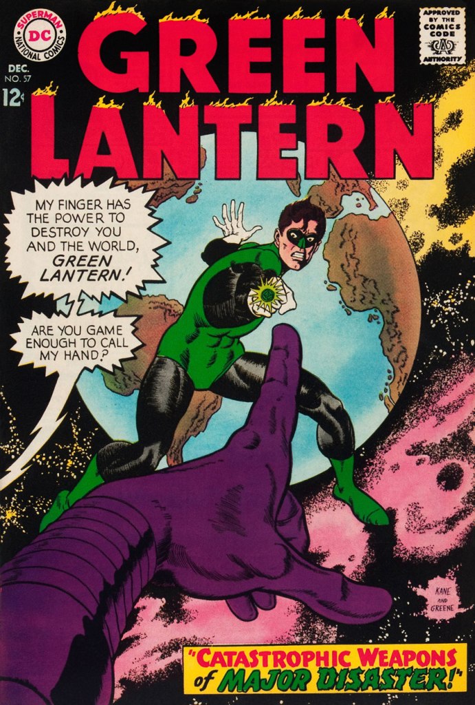
This is Green Lantern no. 57 (Dec. 1967, DC), featuring Catastrophic Weapons of Major Disaster!, written by Gardner Fox, pencilled and inked by Kane. Cover by Kane and Greene… love the placement of the signatures!
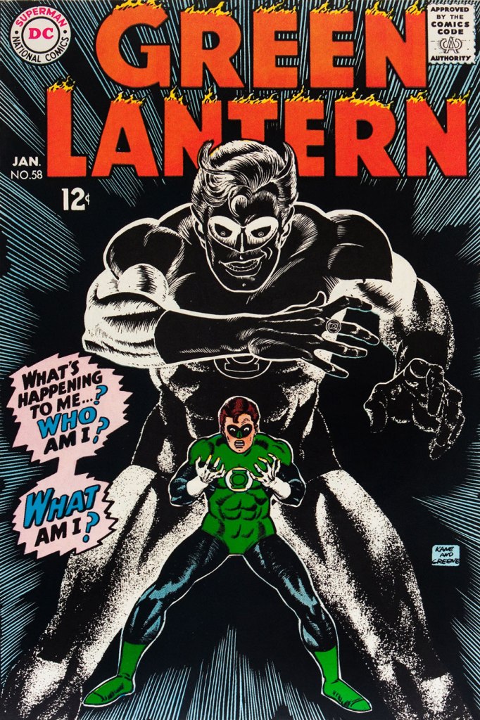
This is Green Lantern no. 58 (Jan. 1968, DC), featuring Peril of the Powerless Green Lantern! (a Julius Schwartz title if there ever was one), written by Gardner Fox, pencilled by Kane and inked by Greene. I’m not overly fond of the Kane-Greene mix, but Sid Greene, as a penciller-inker did some splendid work on the Star Rovers series (1961-64), co-created and scripted by Gardner Fox.
An issue whose price few can afford unless they bought it off the racks, this is Green Lantern no. 59 (March 1968, DC); pencils by Gil Kane, inks by Murphy Anderson. Featuring the introduction of GL alternate Guy Gardner, who was to be dubiously re(jack)-booted in the 1980s, by Steve Englehart and Joe Staton, as a jackass with an ugly uniform and a worse haircut. Never mind the fact that the Green Lantern Corps would never bestow power and stewardship on such an immature and pompous loose cannon.
This is Green Lantern no. 60 (April 1968, DC); an evident Infantino design, with pencils by Kane and inks by Anderson… which interestingly ends up producing a prototype of Brian Bolland‘s distinctive style… a decade early.
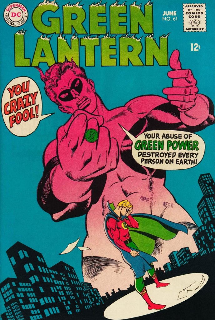
This is Green Lantern no. 61 (June 1968, DC); pencils by Kane, inks by Greene, and featuring (groan) Thoroughly Modern Mayhem!, scripted by Mike Friedrich, pencilled by Kane and inked by Greene. Co-starring Alan Scott, the Golden Age Green Lantern.
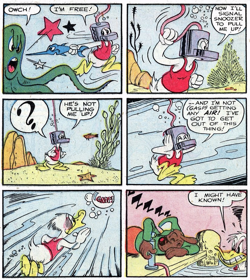
The first helmets were used by Assyrian soldiers in 900 B.C., and they were made of thick leather and bronze to protect the head from blunt objects, swords and arrows during combat. Research shows that helmets can significantly reduce the severity of injuries sustained from head trauma. That’s why it’s so important to always wear a helmet when taking part in a potentially dangerous activity.
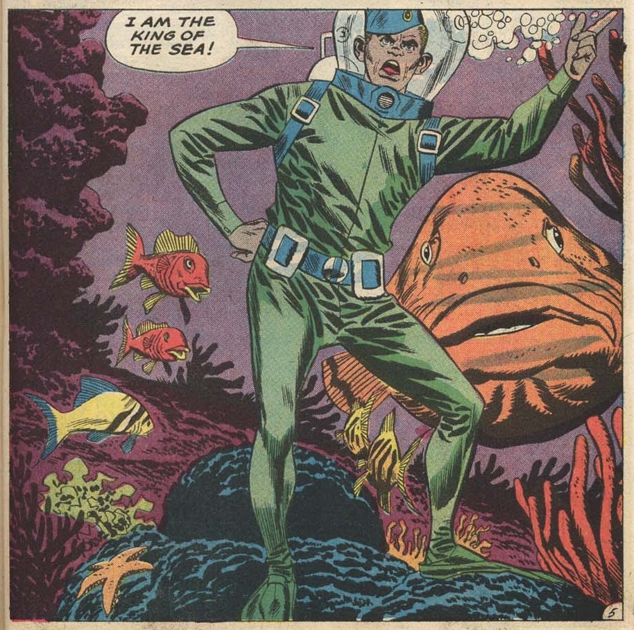
You may argue that helmets are just a way to be able to breath underwater, a compromise between the bulky scaphandre (less elegantly ‘diving suit’ in English) and the scuba diving mask. Breathing, ha, that’s just a distraction to the real purpose of a helmet during an octopus encounter: it makes the diver’s head look a little like an octopus’ head, thus confusing him and giving a much necessary advantage.
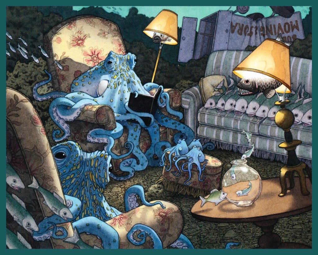
Install yourself comfortably following the example of this happy family of cephalopods, and let’s have a look…
I first encountered David Wiesner when I bought his Mr. Wuffles! book on a whim (it had cats!), but Flotsam, a collection of underwater life illustrations published in 2006, is also clearly of some interest.
Out first helmet of the day is a reasonable imitation of a diving suit! The following page is from Prisoner of the Undersea World!, scripted by Gardner Fox, illustrated by Sid Greene, and published in Strange Adventures no. 155 (August 1963, DC).
I am not sure how he could drink and eat without taking his helmet off, and taking it off would surely mean drowning – luckily, the frogs were smarter than him!
I am pleased to report that not only did the octopus come out of that encounter in one piece, no frog denizens were seriously harmed, either (which makes this tale pretty special, since human heroes tend to go and annihilate anything they don’t understand).
Actual attempts at establishing communication? Colour me impressed!
Our second is a helmeted beauty (albeit twisting in a way that isn’t anatomically feasible) and some of her teammates from U.N.D.E.R.S.E.A. (or United Nations Department of Experiment and Research Systems Established at Atlantis).
Undersea Agent no. 2 (April 1966, Tower Comics), pencilled by Mike Sekowsky and inked by Frank Giacoia.
The cover story is rife with tentacles, but unfortunately doesn’t feature the scene depicted above at all.
Panel from The Return of Dr Fang, scripted by D. J. Arneson, pencilled by Ray Bailey and inked by Sheldon Moldoff.
On the other hand, Buried Under the Sea, a fun read nicely illustrated by Mike Sekowsky on pencils and Joe Giella and Frank Giacoia on inks, has plenty of sea-helmets… but no cephalopods. One can’t have everything, alas!
One easily understands why she made it onto the cover of the comic!
From helmets that are actually connecting to some diving equipment and oxygen canisters, we move on to ones which are just like an upside-down fish bowl somehow magically sitting on the wearer’s shoulders. Style always takes priority over silly things like actually being able to breathe. For more Adam Strange, scoot over to Tentacle Tuesday: Tangles with Adam Strange!
DC Super Stars no. 8 (October 1976, DC), cover by Ernie Chan (signing as Ernie Chua). This issue features a bunch of reprints, mainly reprinted stories from Mystery in Space.
Speaking of Mystery in Space, no. 21 (August-September 1954) has a very appropriate story… proving that the ol’ anti-cephalopod helmet can be used out of water. This is a page from Interplanetary Merry-Go-Round, scripted by Otto Binder and illustrated by Sy Barry… who’s still with us and about to celebrate his 93rd birthday!
Maybe the Martian monster is going ‘beserk’ (sic) because it’s a sentient creature who’s been chained and used for the amusement of stupid crowds?