While I’m painfully aware that such things are inevitable, the past couple of weeks have been pretty brutal to the ranks of my musical heroes. First went Sylvester ‘Sly Stone’ Stewart; then Brian Douglas Wilson; then Lugee Alfredo Giovanni Sacco, aka Lou Christie, and then Bobby Sherman*… all born in 1943!
It would require quite a stretch to write more about Sly and Lou, but I’ve already devoted a piece to Mr. Sherman (Let’s Hear It for Bobby Sherman!), who enjoyed his own comics series in the early 1970s.
Which leaves us Brian. I’ve been a diehard fan long enough to remember that his name and accomplishments didn’t get separated from his band’s — especially given the embarrassment that the Mike Love-led Beach Boys touring cavalcade had become — until the early 90s. And I also recall that Pet Sounds was, for decades, just an expensive but critically acclaimed commercial failure that didn’t get certified ‘Platinum’ until the year 2000, a third of a century after its release. For similar tales of vindication through gradual changes in fortunes, see The Kinks are The Village Green Preservation Society and The Zombies’ Odessey and Oracle.
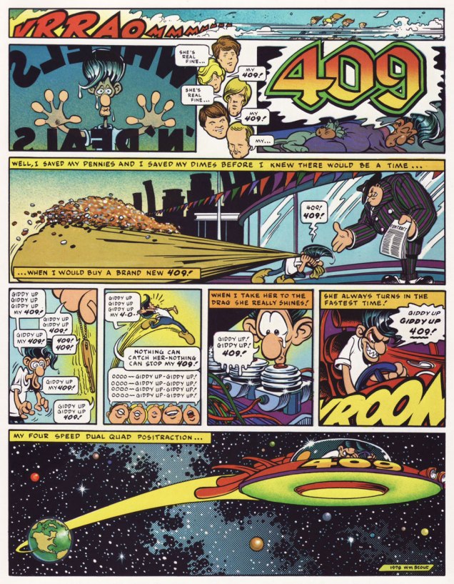
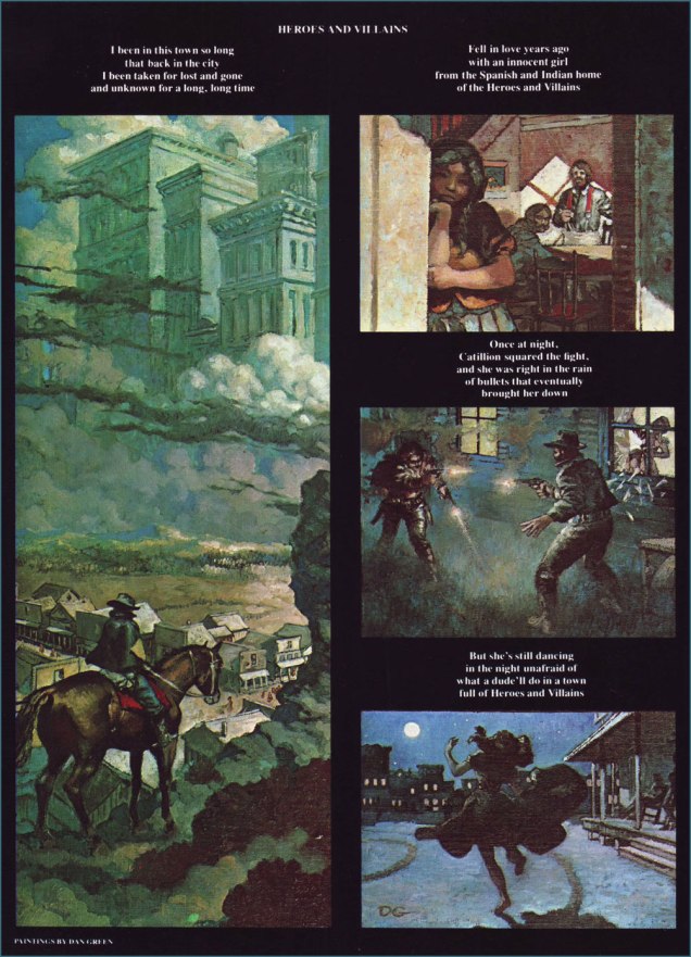
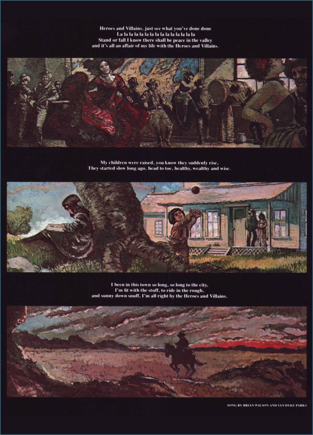
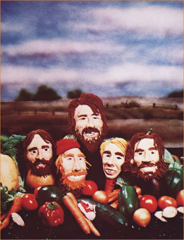
So I turn (for the second time!) to Byron Preiss‘ marvellously illustrated authorized biography of the Beach Boys, from 1978. In addition to a highly entertaining and well-documented text, Preiss, a man with an astonishingly well-filled Rolodex, had the bright idea of tapping various illustrators to contribute their visual cover version of a favourite BB song.
I’ve written about Mr. Stout already, in The Prodigious William Stout, which ought to give you an idea of how I feel about his work. Lyrics by BW collaborator and future record (including a young Bobby Sherman!) producer Gary Usher.Cheeky Harvey Kurtzman spells out just what sort of ‘Fun, Fun, Fun‘ could be had « ’til her daddy takes the T-bird away ».Nice drawing, although the only detail Ralph Reese truly gets right is poor Dennis Wilson‘s ill-starred appetite for the ladies. Also… Mike Love with a guitar, really?Those only familiar with Dan Green (1951-2023; another awkward lacuna from Lambiek’s comiclopedia) as a journeyman inker at Marvel and DC will likely be surprised at his adroitness with a brush. Here he tackles Wilson and Van Dyke Parks‘ (a true gentleman… and also from the class of ’43) arguably most ambitious œuvre, Heroes and Villains.A surprising clay-based entry from Joey Epstein and her husband, our beloved Tom Hachtman, photographed by Ben Asen. The likenesses are pretty solid… save for Brian, who’s too skinny. The song in question is, of course, Vegetables. « I know that you’ll feel better when you send us in your letter an’ tell us the name of your… your favorite vege-table. »This is former Air Pirate and Dirty Duck and Popeye cartoonist Bobby London‘s joyous celebration of Cool, Cool, Water, a tune intended for inclusion on the Beach Boys’ fabled Smile album (though it initially surfaced on their excellent Sunflower LP). To this day, however, London’s got mixed feelings about the whole thing. To begin with, he had no particular fondness for the Beach Boys, and getting dragged by Preiss to a late-70s BB live show, sans Brian (who was in no shape to perform anyhow) and with Dennis likely off promoting his Pacific Ocean Blue album, didn’t move the needle one iota. As London told me: « I had something more interesting and less Crumb-y in mind. » Now *that* is caricature. Despite depicting the Boys as animals, illustrator — and Official Horror Host Hall of Fame inductee — George Chastain unerringly nails the essence of each, not to mention the group dynamics: of course Brian’s off to do his own thing. Not linked to any specific song, this is nonetheless my favourite piece in the book. Take a bow, sir!
-RG
p.s. I should also mention that another one of my favourite musicians died this week, namely Argentine composer Boris Claudio ‘Lalo’ Schifrin, but as he was born in 1932 (he was ninety-three!), his inclusion would have spoiled the pattern. Hope you understand, Lalo. Here’s a mesmerising favourite from his jazz sideman days: 1963’s The Fakir, recorded by Cal Tjader (« the Swedish Nerd king of Latin Jazz », as my friend Rupert dubbed him), and composed, arranged and conducted by Señor Schifrin.
Once again, my initial instinct when I hit upon the notion of showcasing the work of Jean-Michel Folon was: « is he too obvious a subject? ». Then reason stepped in with: « to whom, exactly? »
Which brings me to my own tiny Folon anecdote: about twenty years ago, I was helping out a friend, who usually took off the month of January to travel. As it happened, it was usually the worst month for art freelancers, at least in my experience, so he was helping me out too.
Anyway, instead of working from home or some ad agency’s offices, I would work from his boutique, manning the four telephone lines while his regular employees handled the in-person traffic. One day, I took an order from a nice lady who, while I was filling out the relevant papers, gave her last name as Folon. « Like the illustrator? », I asked. « Yes indeed, he’s my cousin! », she replied, clearly delighted. « I’ve been living here in Canada for thirty years, and you’re the first person who’s ever asked! ». Which goes to show that one should think twice before extrapolating from one’s familiarity with a given subject. Or to put it simply, just because you’ve heard of someone, don’t assume everyone else does… whether they should have or not.
I can’t make mention of Folon without bringing up his strongest formative influences, Saul Steinberg (1914-1999) and André François (1915-2005); we’ll return to these gentlemen in due time.
To put it succinctly, Steinberg brought greater graphic and thematic purity to the gag cartoon… by dispensing with the gag, at least in the traditional sense. Not everyone dared to follow that perilous path, but Folon did, and similarly thrived.
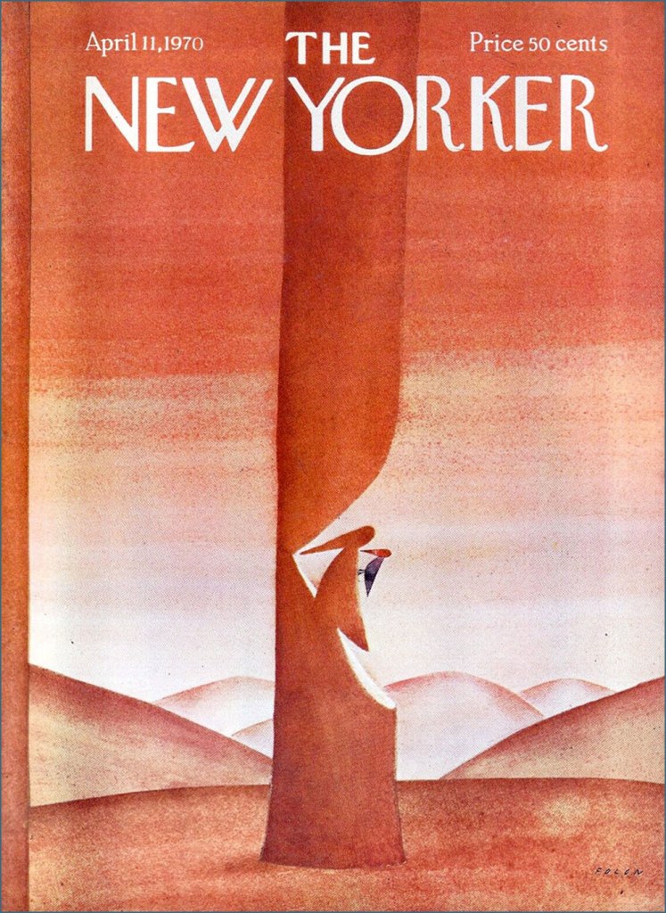
Born in Brussels in 1934, Folon initially studied architecture, but soon detoured into drawing and never returned to his early vocation, though he certainly erected his share of edifices… on paper. He timidly began submitting drawings in 1957. A decade later, he had scaled and conquered the lofty North American market, landing cover assignments with The New Yorker, Esquire and Fortune, among others.
For example, this model of witty understatement from the week of April 11, 1970.
He turned his confident, limpid vision across all printed media, but also sculpture, tapestry, stained glass and animation. He passed away in 2005, but not before designing and establishing his own museum. Be sure to check this stunning place out!
Such a multifaceted career and œuvre being too gargantuan in scope for a simple blog post, I’ll mostly stick to a sampling of some of Jean-Michel’s drawings, produced during his first decade as a professional artist.
*
*
*
*
*
*
*
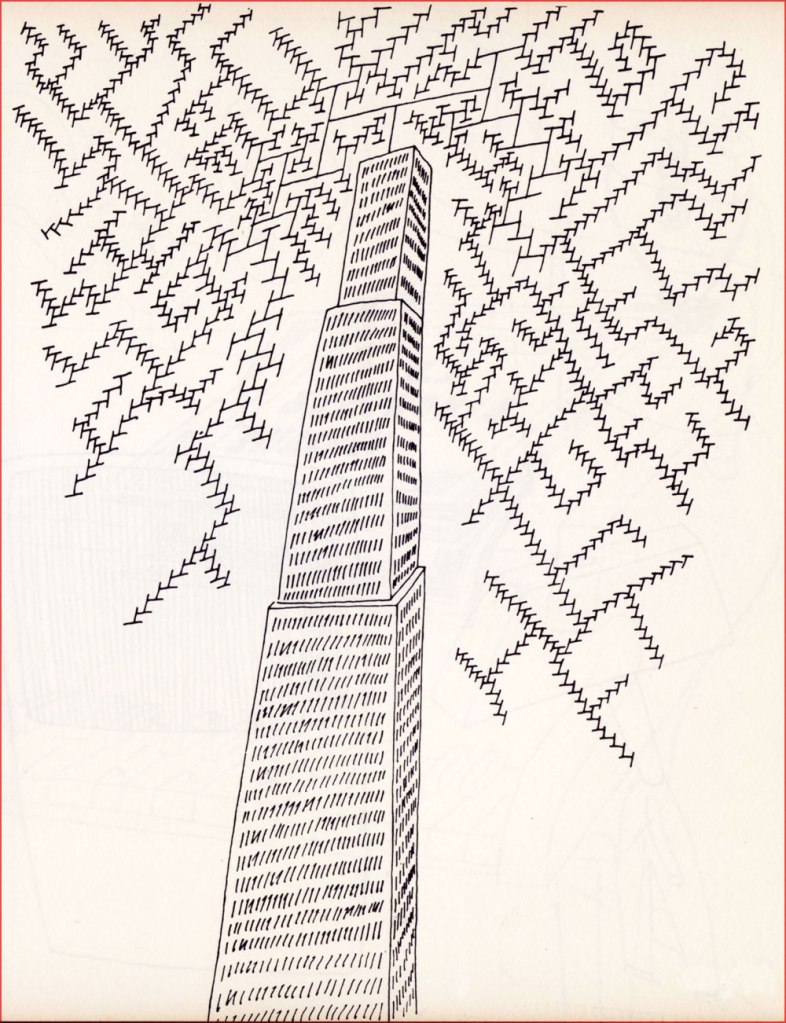
And here’s some of his later work:
This is Folon’s jacket for the 45 RPM single issue of Michel Colombier’s music (his adaptation of a baroque adagio by composer Alessandro Marcello). It had originally been recorded in 1971 for his US debut album, Wings (for Herb Alpert and Jerry Moss’ A&M label), which bore a variation of this Folon image as its European cover; the North American one was, to put it mildly, hideous.
Colombier, incidentally, belonged to that coterie of poor souls who did all the heavy lifting while their ‘collaborator’, Serge Gainsbourg, received and happily hogged all the credit.
In 1975, Colombier recycled the recycled adagio as the opening and closing theme for French public national television channel Antenne 2’s daily programming, accompanied by an appropriately graceful animated sequence by Folon. Another local connection: Folon handled the artwork for this 1979 LP by musical whiz Jean Robitaille, who’d recently co-written the lovely 1976 Summer Olympics’ theme song. But my favourite Robitaille song has to be his duet with beloved songstress Renée Claude (1939-2020), St-Jovite, a fiendishly clever song about a singular sort of voodoo.I must say I’m gobsmacked at the idea of the French post office selecting a Belgian artist to illustrate its stamp commemorating the 1989 bicentennial of the French Revolution. But what do I know? Folon did a great job. When I state that Belgium seems to truly value its artists (see another example here), this is the sort of thing I mean: in 2010, five years after his passing, his native land issued a set of ten postage stamps saluting “The Magic of Folon”. ’nuff said.
« Ideas improve. The meaning of words participates in the improvement. Plagiarism is necessary. Progress implies it. It embraces an author’s phrase, makes use of his expressions, erases a false idea, and replaces it with the right idea. » — Guy Debord
Well, after our brush with Surrealism, let’s hazard a brief detour amidst the Letterists. As we all surely know, The Letterist International was « a Paris-based collective of radical artists and cultural theorists between 1952 and 1957. » I’ll spare you a dry discourse about schools of thought, art and politics and their numerous and acrimonious (perhaps not so dry after all!) schisms.
The main point of interest, in this case, is the Letterists’ pioneering of the rousingly subversive artistic technique of détournement, which involves “taking preexisting images and mixing them together to highlight the underlying ideology of the original image.”
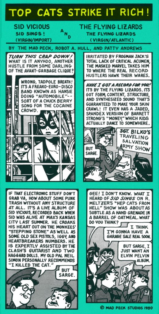
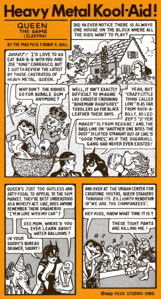
This brings us to the storied career of Providence, Rhode Island’s finest son, John Peck (1942-2025), alias The Mad Peck.
Les Daniels and The Mad Peck Studios’ 1971 Comix was a pretty fair early crack at recounting the history of the comic book up to the peak of the Undergrounds.
A-ha! On the back cover, The Mad Peck indulged his penchant for détournement, repurposing an early 1950’s ad for hair loss reversal scammers Ward Laboratories in a fashion that is in no way relevant to our current, media-savvy, ethically-enlightened world.
In his 1987 retrospective, Peck recalls « Yeah, Comix was good. Maybe a little too good. It’s been stolen from every public library I’ve ever been in. »
By then, he was working steadily for Boston-based music magazine Fusion (1967-74), “doing short reviews of the records nobody else wanted to do.” This one liberally swipes from DC’s long-running Fox and the Crow series (which of course borrows its premise from dear old Aesop’s immortal fable), with a smidgen of Fritz the Cat for the frisky finale.
Fast-forward to 1978, and Peck’s much-improved comix-style capsule reviews are appearing regularly in Creem and The Village Voice.
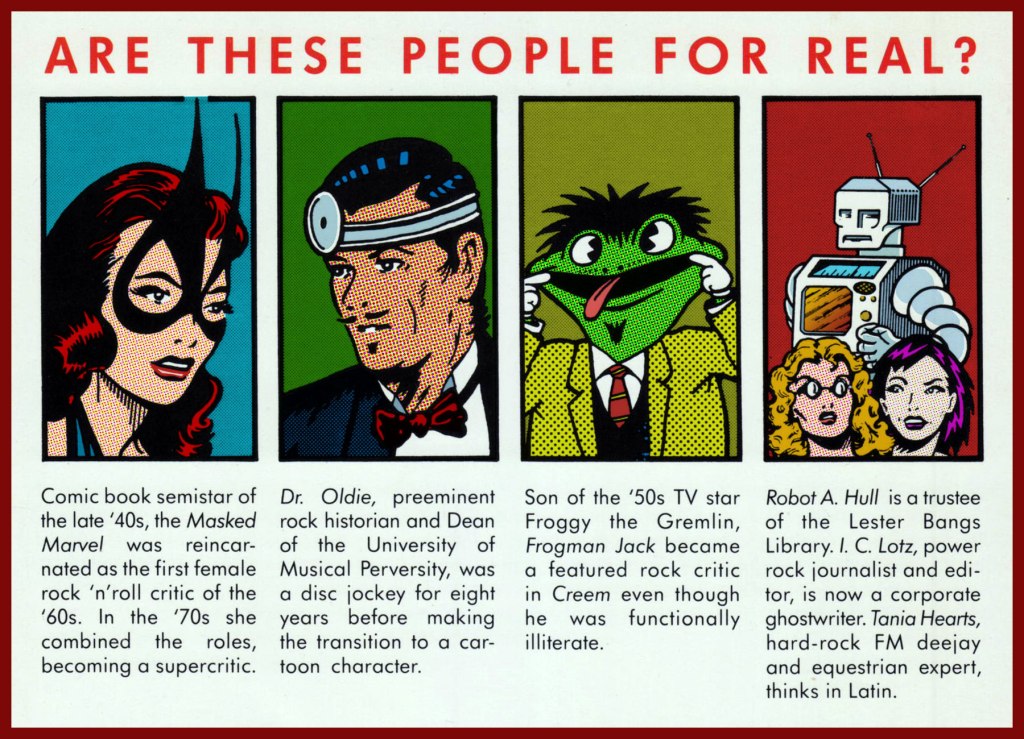
Ah, but she wasn’t a comic book semistar of the *late* 40s… she arrived on the scene in 1941, four months before Wonder Woman, even! Who dat? Why, The Masked Marvel is none other than Golden Age heroine The Black Cat, whose repurposing surely constitutes The Mad Peck’s most brazen act of détournement! This is Black Cat Comics no. 3 (Dec. 45 – Jan. 46, Harvey); cover art by the lady’s creator, Al Gabriele. ‘Action that’ll make you pop your monocle!‘
The Mad Peck really stood out in the landscape of rock criticism in that he wasn’t a rockistsnob (“It’s not rock, therefore it’s crap!“), and that his taste was wide-ranging and often surprising, evidence of a true music lover well-versed in all its strata and permutations.
And still, these Jefferson Airplane alumni had yet to hit bottom (knee-deep in the hoopla, so to speak)!
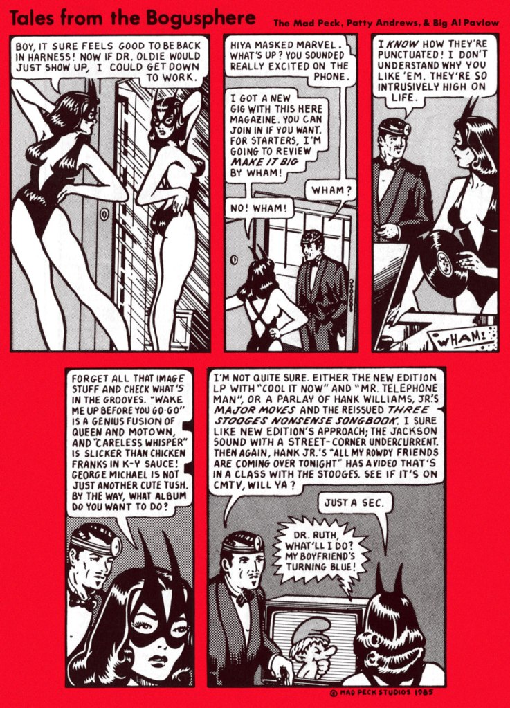
Then ahead to the mid-80s and Bob Guccione Jr.’s Spin (est. 1985), and a short run with a new title, Tales From the Bogusphere. Meanwhile, The Masked Marvel had been sidelined by legal hassles. As the heroine recalls:
I took an extended vacation in 1980 when Marvel Comics threatened to sue Peck after reading ‘Ms. Marvel’ in the Eagles cartoon that led off Creem’s review section in February. I hightailed it before the corporation had me roped into a team-up book with She-Hulk, but Peck had to stick it out while they tried to stick it to him. What really teed me off was that Ms. Marvel, who had oozed out of Marvel’s bullpen in the early ’70s, was such a dynamic concept that her book died almost instantly.
Peck’s experience as a critic left him with an encyclopedic knowledge of doo-wop and early R&B. When financing from rock publications got thin, Peck practiced the art of rock ‘n’ roll arbitrage: buying records at flea markets and “backwater Woolworths” and trading them at statewide record collectors’ conventions that he organized himself.
Peck spun his best finds on his popular WBRU radio show, “Dr. Oldie’s University of Musical Perversity.” Wary of semi-fame, Peck still makes an occasional public appearances in disguise as Dr. Oldie, complete with lab coat and head mirror. [ source ]
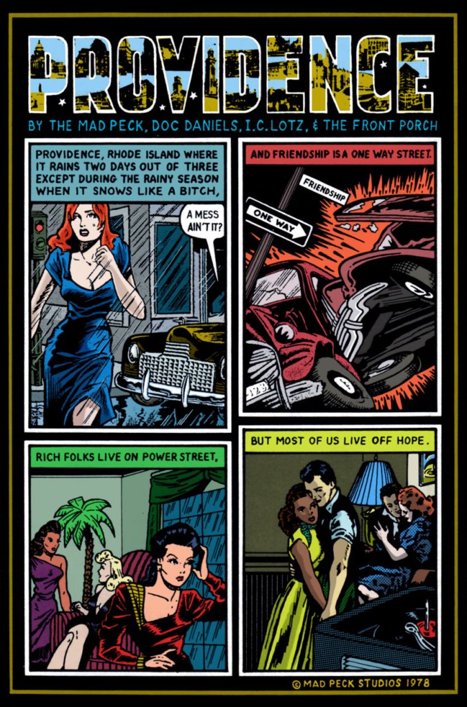
As a bonus, here’s The Mad Peck’s greatest commercial success, a piece first commissioned by Providence’s The Humbox Press for the inaugural issue of its poetry journal Loose Art. A fluke hit, it spawned postcards and posters “and is still keeping the Mad Peck in Camels.”
« In 1978, Peck designed the famous Providence Poster, a composite of witty one-liners that he and Daniels had uttered over the years about their beloved city. » I must confess I could not resist the urge to recolour it.
Channeling a credo he gleaned from a chance encounter with comic book artist Wally Wood — “Don’t draw what you can trace, and don’t trace what you can paste” — Peck made his name as a comic book artist despite an inability to draw anything more complex than psychedelic hand lettering. Most of his characters are swiped from the works of an obscure Golden Age comic artist, Matt Baker.
I can buy that most of his characters were swiped from Baker (hello there, Canteen Kate!), but he also begs, steals and borrows from, namely… Al Feldstein, George Carlson, Phil Davis, Jim Davis (no relation to Phil, and not the Garfield guy either), Bob Oksner, Don Flowers, and a gazillion anonymous advertising and animation toilers. And it works!
As a trailblazer of this particular approach, you might say he was Yesterday’s Tom Tomorrow.
« If you’re having a bad day, catch a wave. » — Frosty Hesson
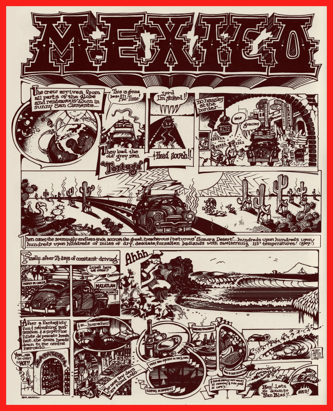
How do you cool down in a heatwave? In this household, when the temperature soars and drags the humidity along, we reach for a soothing surfing movie, preferably one by peerless surf auteurBruce Brown* (1937-2017). Last week, it was his 1959 opus, Surf Crazy, in which a group of SoCal surfers venture down to unsurfed Mexico, which in turn called to mind “Mexico“, an early ’70s underground two-pager recounting a similar sojourn.
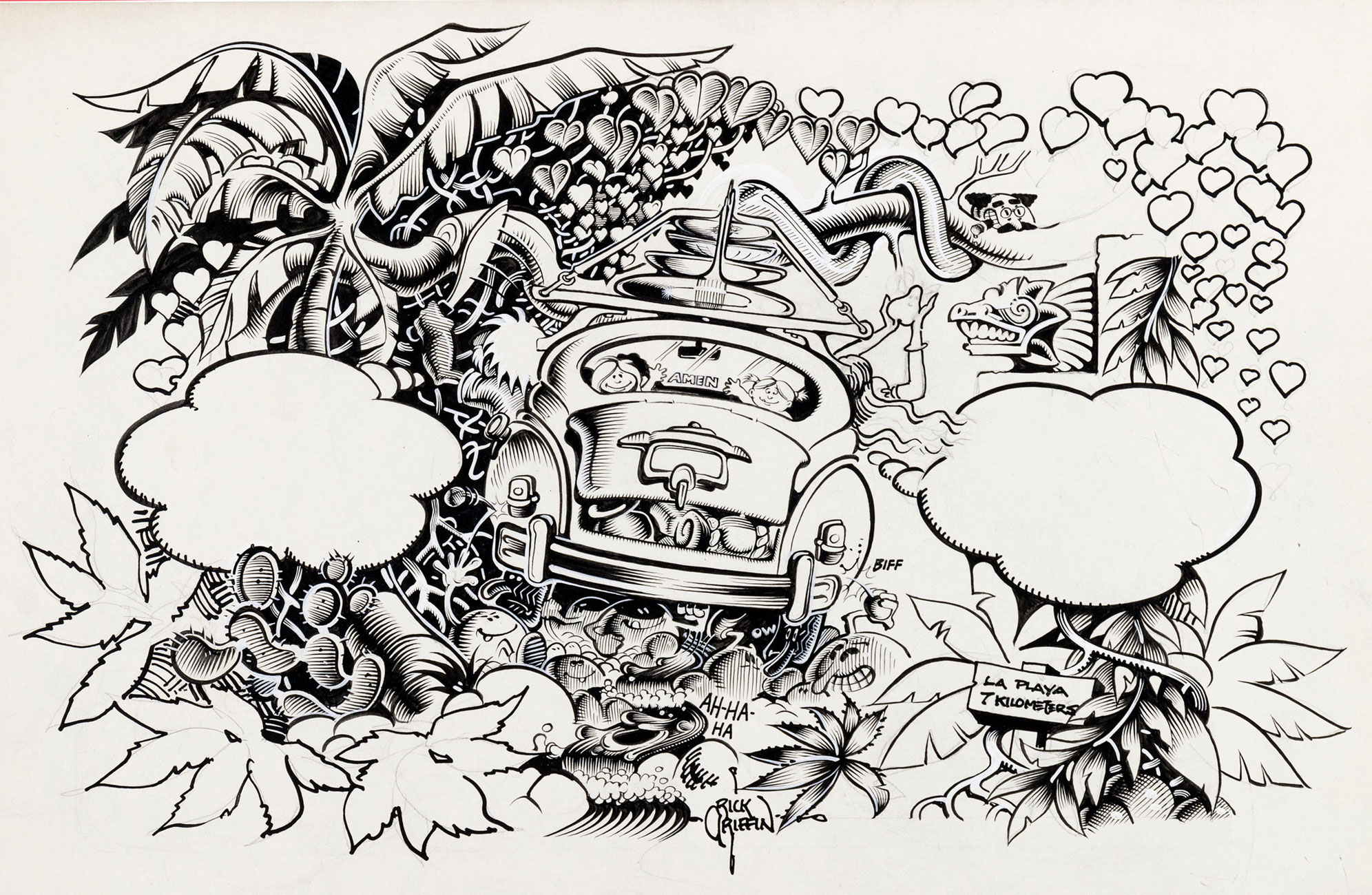
Which, this nominally being a comics blog, leads us to the one and only artiste embodying and straddling both the underground cartoonist’s and surfer’s ethos, Rick Griffin!
An early Griffin collection, Surfer Toons (1964, John Severson), featuring his early creation, Murphy, likely inspiration for notorious jewel thief Murph the Surf‘s sobriquet.
A bio of the young surfer-cartoonist from The Surfer vol. 3 no.3 (Aug.-Sept. 1962). The photo confirms that his Murphy strip was autobiographical.
« In 1964, a serious car accident left Rick unable to work for several months. Later that year, Surfer started a new series titled The Adventures of Griffin and Stoner. They were make-believe surf trips that Ron Stoner, a famous surf photographer, and Griffin were supposed to have taken around the world. » Stoner’s real-life adventures, however, were not so happy.
In this mid-to-late-60s illustration, we witness early signs of Griffin’s mature, more assured line. A simplified version of this piece would appear in The Surfer‘s March, 1972 issue.
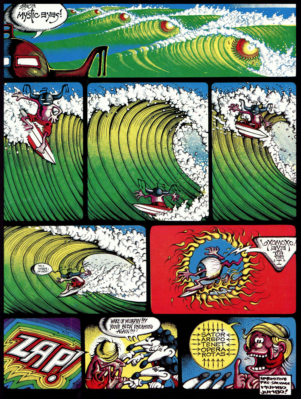
Griffin’s tour-de-force adaptation of Them’s Mystic Eyes appeared in an issue of The Surfer in 1970. Witness how Griffin’s depiction of Murphy has evolved over the decade. The fancy helmet is a Hopi Indian ceremonial mask, a frequent artifact and motif in the artist’s subsequent œuvre. Weedy song, imho — and yet, meaning is where you find it.
Also from 1970: Griffin created this piece for his patron John Severson‘s surf documentary Pacific Vibrations, (in which he also appeared!) and it provides a fine example of Griffin’s matchless lettering**. And there’s that Hopi mask again. Though it was quite a popular poster in the 1970s, If you ask me, though, accomplished as it is, it utterly fails to evoke surfing.
Tales From the Tube, as it originally appeared in 1972, inserted into an issue of Surfer Magazine (Vol. 12 no. 6); some copies exist separately, however. Also to be found within its pages: Roberts Crumb and Williams, Steve Clay Wilson, Bill Odgen, Glen Chase and Jim Evans.
TFTT was later reissued (now with a price) in the regular comix format by The Print Mint. As you can see, Griffin reimagined and re-separated his colours. Which version do *you* prefer?
Visual splendour, not coherence, was always Griffin’s stock-in-trade. And why not? This travelogue premiered in Tales From the Tube.
More poster (and soundtrack) artwork for surfing documentaries, this time 1972’s Five Summer Stories and its 1976 sequel, Five Summer Stories Plus Four, directed by Greg MacGillivray, a prolific, award-winning director and cinematographer to this day.
… another Tales From the Tube, another Surf doc affiche from ’76. « This film and the other surf films for which Griffin has done posters are not usually shown on the regular movie circuits. Their soundtracks are usually composed of rock music of various forms – soft to hard – with a few breaks for narration. The surfing scene throughout the world has grown large enough to support the production of many films each year. »
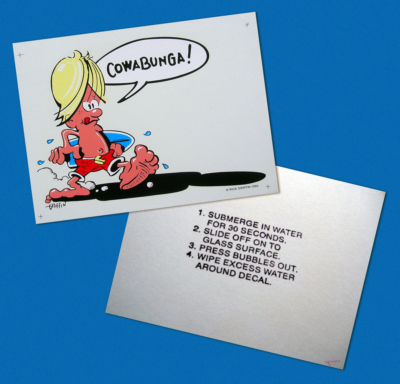
As you can see, Murphy abides. A 1993 sticker, with instructions.
-RG
*I’ll go even further: for me, it pretty much has to be Bruce Brown. His easy charm and wit, not to mention his untrained-yet-superb set of filmmaking skills leave other surfing cinéastes floundering in his wake. From what I’ve seen over the years, their work either seems too dry (ha!) or overdone and overeager. I’m still keeping an eye on the horizon, nevertheless. The relative unavailability of quality prints for most of these films is a hefty obstacle, while their soundtracks are far, far easier to find (e.g. Gone With the Wave, The Fantastic Plastic Machine…)
**“At this stage [1969], Griffin’s lettering almost ceased to be functional as legible typography. In fact, in even earlier work, he jokingly incorporated meaningless calligraphy into his posters. Rick pioneered and carried to an extreme in the 1960’s this disregard for the legibility of lettering, creating totally abstract forms the resemble letters. His particular style influenced and encouraged artists locally and throughout the world to reconsider all previous limitations that they were placing on stylized lettering and the ways that it could be used with other graphic forms.” From Gordon McLelland‘s monograph, Rick Griffin (1980, Perigee).
« … there arose such a clatter, I sprang from my bed to see what was the matter. Away to the window I flew like a flash, tore open the shutters and threw up the sash. » ― Clement C. Moore, A Visit From St. Nicholas (1823)
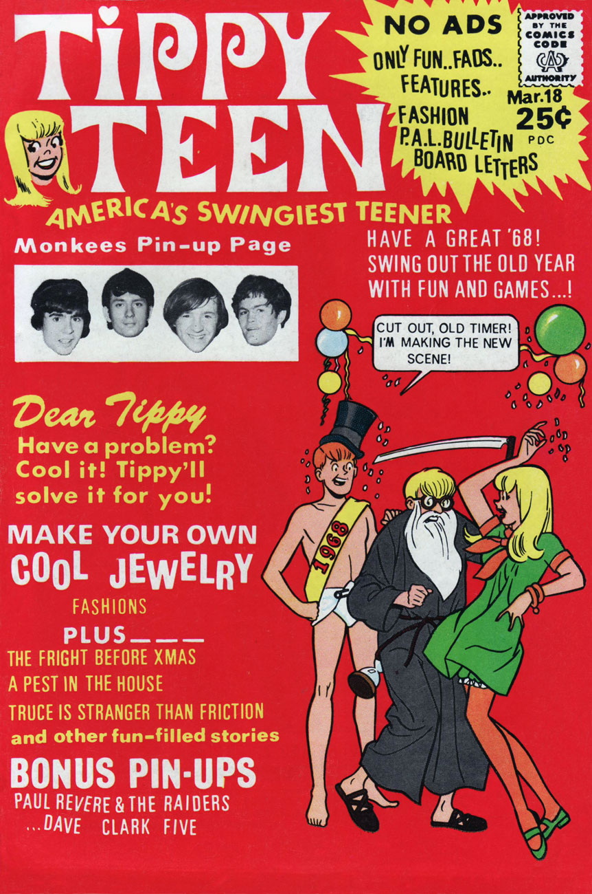
Not too long ago, we glanced at the interesting case of Tower’s teen line, another instance of works insufficiently popular to be properly reprinted, yet still sought after by collectors and aficionados and consequently on the pricey side. And so it is within this limbo that Tippy Teen and Go-Go and Animal find themselves consigned, in the rather fine company of Sugar and Spike and Angel and the Ape. Let’s not strand them there for the duration, please.
So why do I consider Tippy Teen superior to Archie? For one thing, while there’s some underwhelming artwork to be found here and there (sorry, Doug Crane), there’s nothing dismal (no Al Hartley, no Dick Malmgren, no Gus Lemoine, no Stan Goldberg…), and the writing is generally superior, thanks to, among uncredited others, the great Jack Mendelsohn (recycling and updating his old scripts, but that’s not the end of the world).
Here’s a little seasonal piece I find quite witty and charming. The well-paced work of an anonymous scripter and my beloved Samm Schwartz, it appeared in Tippy Teen no. 18. The whole issue’s quite solid, and since it’s in the public domain, you can enjoy it right here.
This is Tippy Teen no. 18 (March 1968, Tower). Cover artwork by Samm Schwartz.
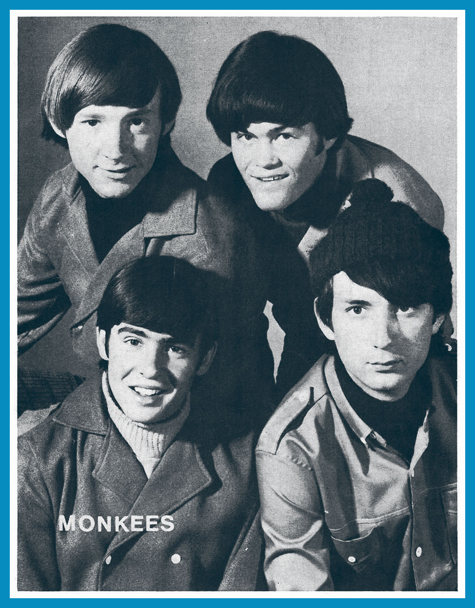
What kind of a grinch would I be if I failed to include the Monkees pin-up promised on the cover? I shudder to even entertain the notion. In the usual order, Messrs. Peter Tork, Mickey Dolenz, Davy Jones and Michael Nesmith.
« You know, the dog food that Billy Jack loves! » — The Firesign Theatre
Ah, September the 18th. Today’s the birthday of the staggeringly accomplished William Stout (born in 1949), master of ancient reptiles, bootleg record covers, friend of The Firesign Theatre, former Russ Manning assistant (none but the best would do!), and I’ll spare you the illustrious details of his career in cinema. Still, let’s look around a bit, shall we?
Here’s an unforgettable cover from Alien Worlds no. 3 (July, 1983, Pacific Comics). This scene gave me nightmares, and still raises a shudder. These critters look like a hybrid of a platypus and a piranha. Happy landings!
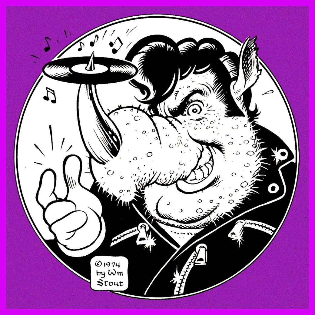
Stout’s wonderful original logo for Rhino Records, circa 1974.
Speaking of ’74, isn’t that rhino a dead ringer for Swan’s oleaginous right-hand man, Philbin, from Phantom of the Paradise?
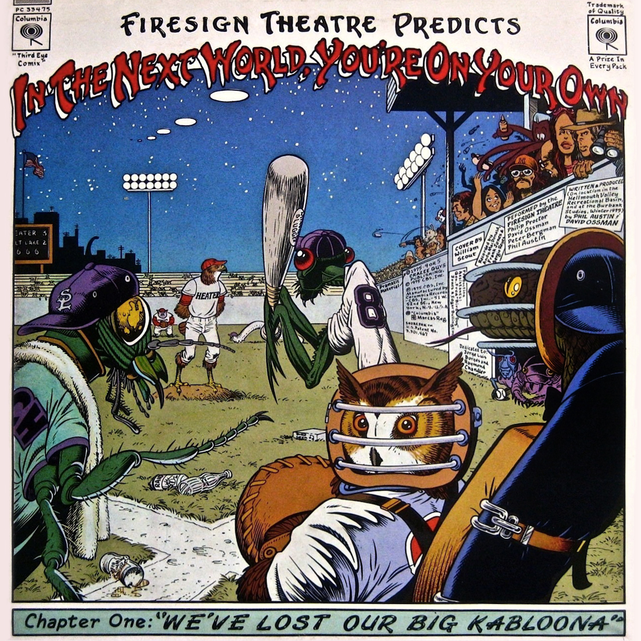
This is the back cover (the recto is equally sumptuous) for The Firesign Theatre‘s 1975 opus, In the Next World, You’re On Your Own, featuring a pair of classic sidelong suites, Police StreetandWe’ve Lost Our Big Kabloona.
A clutch of underground classics? Sure. Here’s Cocaine Comix no. 1 (Feb. 1976, Last Gasp).
Another number one (with a bullet, of course): 50’s Funnies no. 1 (1980, Kitchen Sink). More lies inside!
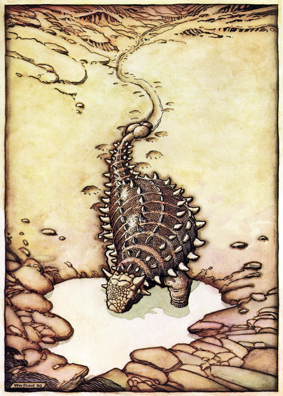
A favourite page from Stout’s masterpiece (or certainly his great labour of love, at the very least): The Dinosaurs: A Fantastic New View of a Lost Era (1981, edited by Byron Preiss). This piece (the first he drew for the book) is entitled Hot Weather. « After lifting his head for air, he drank more and then wallowed his whole length and breadth into the ooze, vocalizing for the first time that day, and loudly. »
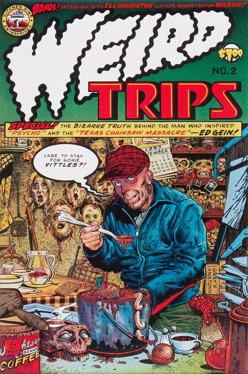
Say hello to friendly Ed Gein. Weird Trips no. 2 (1978, Kitchen Sink). Please note the sinisterly customized Kitchen Sink Enterprises logo, Wrightson–brand coffee, and EC Comics narrator The Old Witch impishly peeking from a lower-right shelf. And yes, can’t go disemboweling your fellow man and woman without a copy of Gray’s Anatomy. Preparation is everything!
Well, there never was any doubt that Mr. Stout was an EC Comics überfan. The Comics Journal no. 81 (May, 1983, Fantagraphics).
« You’ve got his likeness emblazoned onto
the top of a tin box Perfect big heart
perfect blue eyes
perfect teeth and
perfectly flowing locks » — The Motorz, ‘Bobby Sherman Lunchbox’
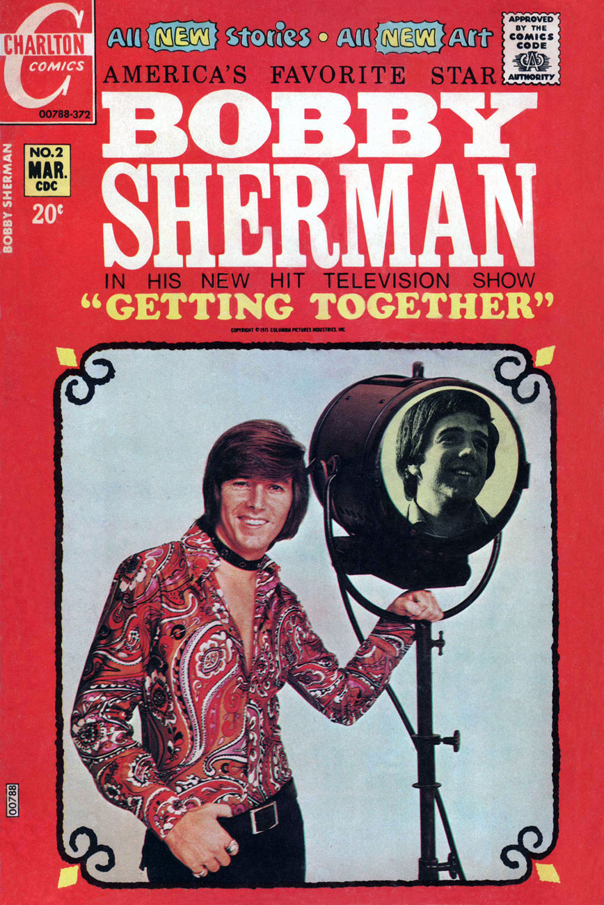
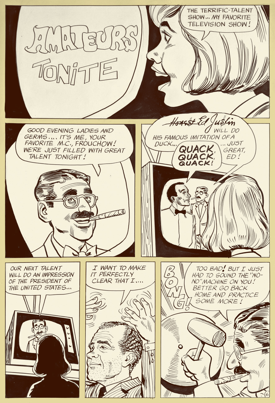
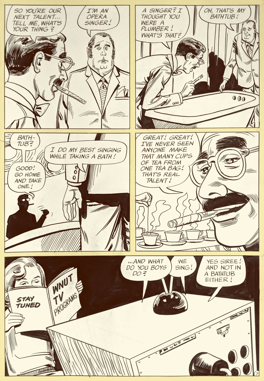
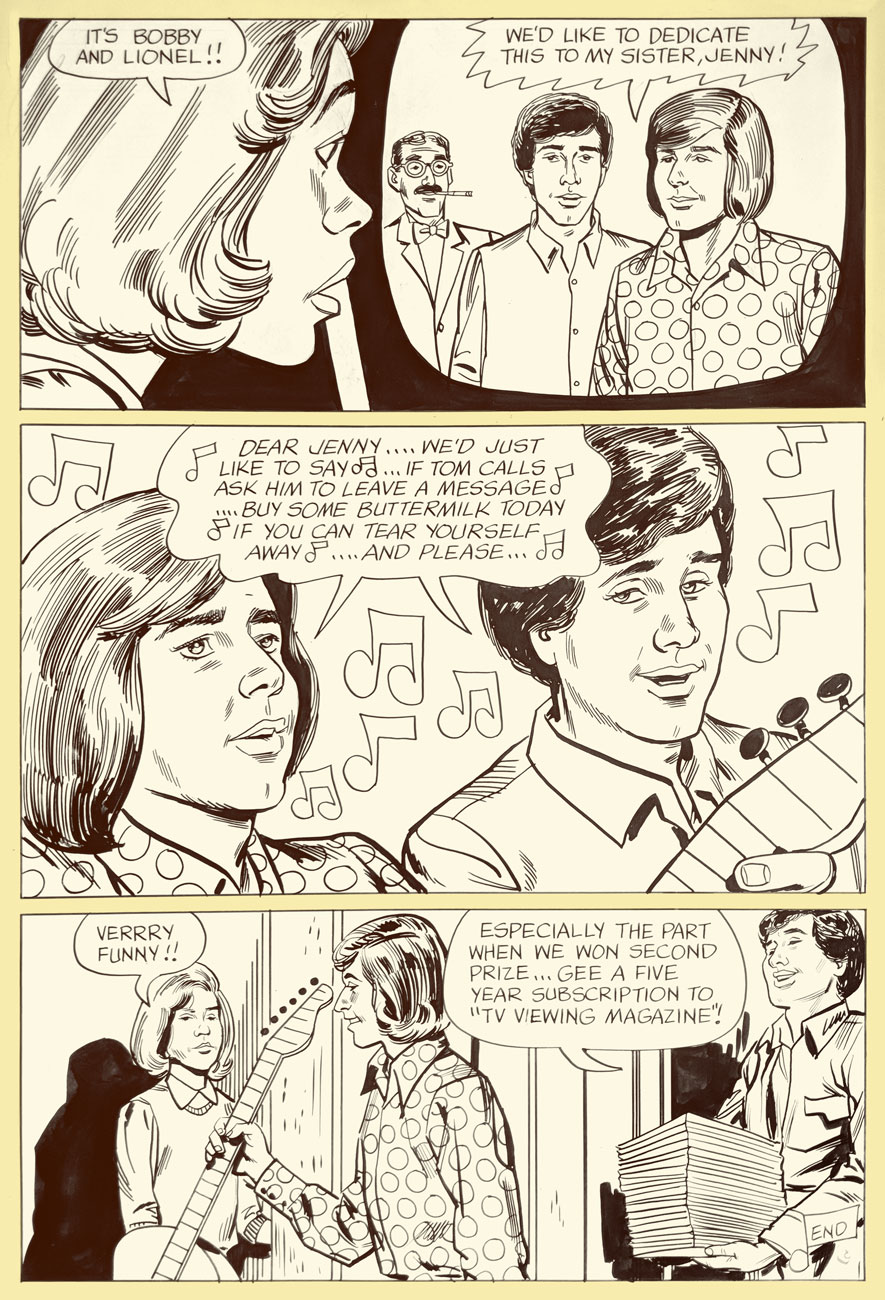
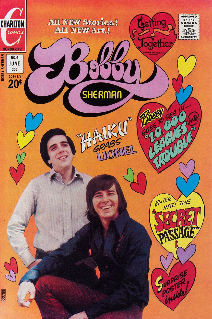
It’s birthday number seventy-six for singer, actor, songwriter, Charlton comics star and all-around swell guy Robert Cabot “Bobby” Sherman, Jr. (born July 22, 1943).
This is Bobby Sherman no. 1 (Feb. 1972). Story and art by the much-maligned Tony Tallarico. You know what, though: he’s alright in our book. One of these days, we’ll make our case.
His Getting Together co-star, Wes Stern, also celebrates his birthday this Thursday, July 25. He’ll be seventy-two. You may remember Wes from his recurring rôle as Brenda Morgenstern’s shy, foot-fetishist beau Lenny Fiedler on Rhoda (early on, before the show utterly went South).
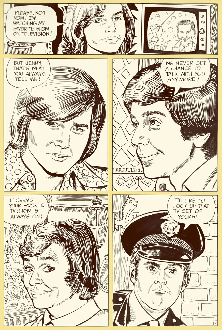
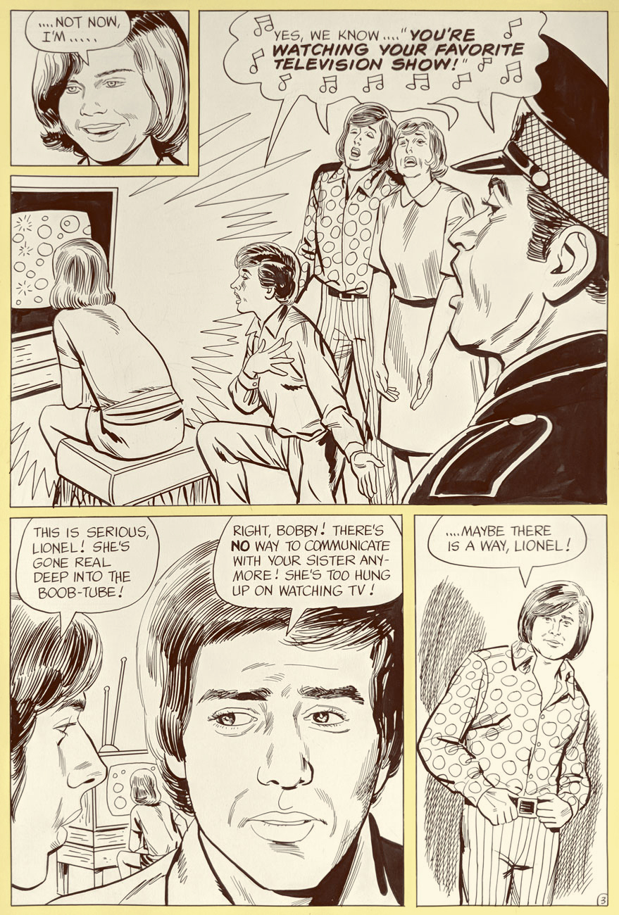
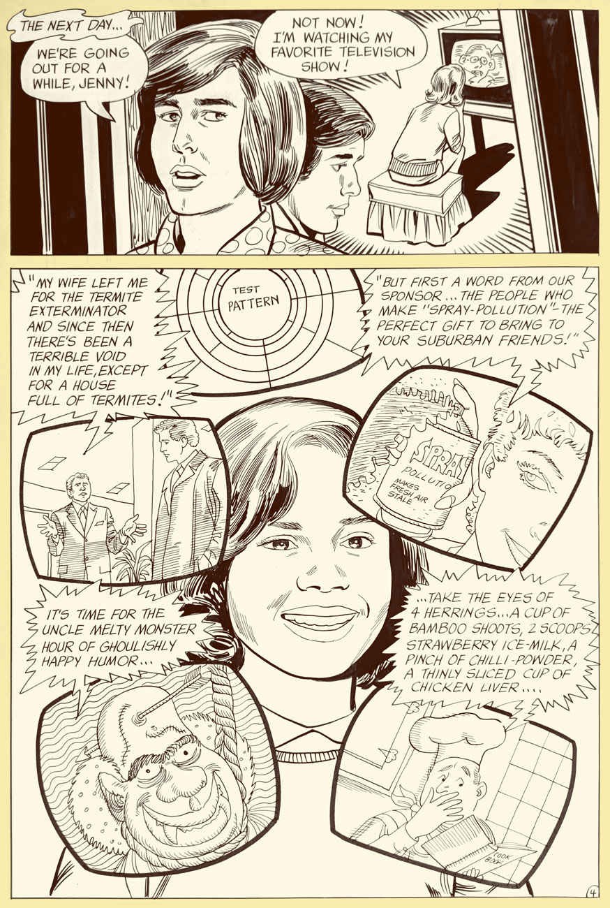
This is Bobby Sherman no. 2 (Mar. 1972). Story and art by Mr. Tallarico.
Bobby and Wes had the singular honour of starring in seven issues of their own Charlton comic book (February to October 1972). Our excerpt is number 2’s « A Guide to TV? », written and illustrated by Tony Tallarico and shot from the original art. Good-natured fun, especially when the Getting Together cast of characters is around. In the 1971 Fall season, the snappy little show was off to a promising start, but found itself, in the eleventh hour, scheduled against the powerhouse tv hit of 1971, Norman Lear’s abrasive All in the Family, and that was all she wrote.
Ah, back in those innocent days when watching seven hours of TV was the stuff of humorous exaggeration. Now (depending on how it’s defined and whom you ask) it’s *below* the daily average.
Inside joke alert: “Honest Ed Justin” alludes to one of Bobby’s songwriting partners, Ed Justin. Here’s one of their musical collaborations. And, hey, two posts in a row featuring Tricky Dick cameos… I’m on a roll! Incidentally, ‘Amateurs Tonight” predates The Gong Show by nearly half a decade. Was Chuck Barris perchance a Charlton reader?
But that’s all water under the bridge. By the mid-70s, Bobby basically walked away from the grind of public life, and the odd tour or charity event aside, he’s been volunteering with the LAPD, training recruits in first aid, CPR, and so forth. A solid citizen, no irony or sarcasm intended.
One more?
This is Bobby Sherman no. 4 (June, 1972). M. Tallarico strikes again!
Once again, we wish the most joyous of birthdays to Bobby and Wes!
« Painstaking drawings with an eloquent orchestration of hatchings and tickings, marvelous details of period and setting, a narrative that leapfrogs from the precise to the unexplained, a tone of vague delights in both visual and linguistic oddities. » — ‘Mr. Earbrass Jots Down a Few Visual Notes: The World of Edward Gorey’ by Karen Wilkin (1994)
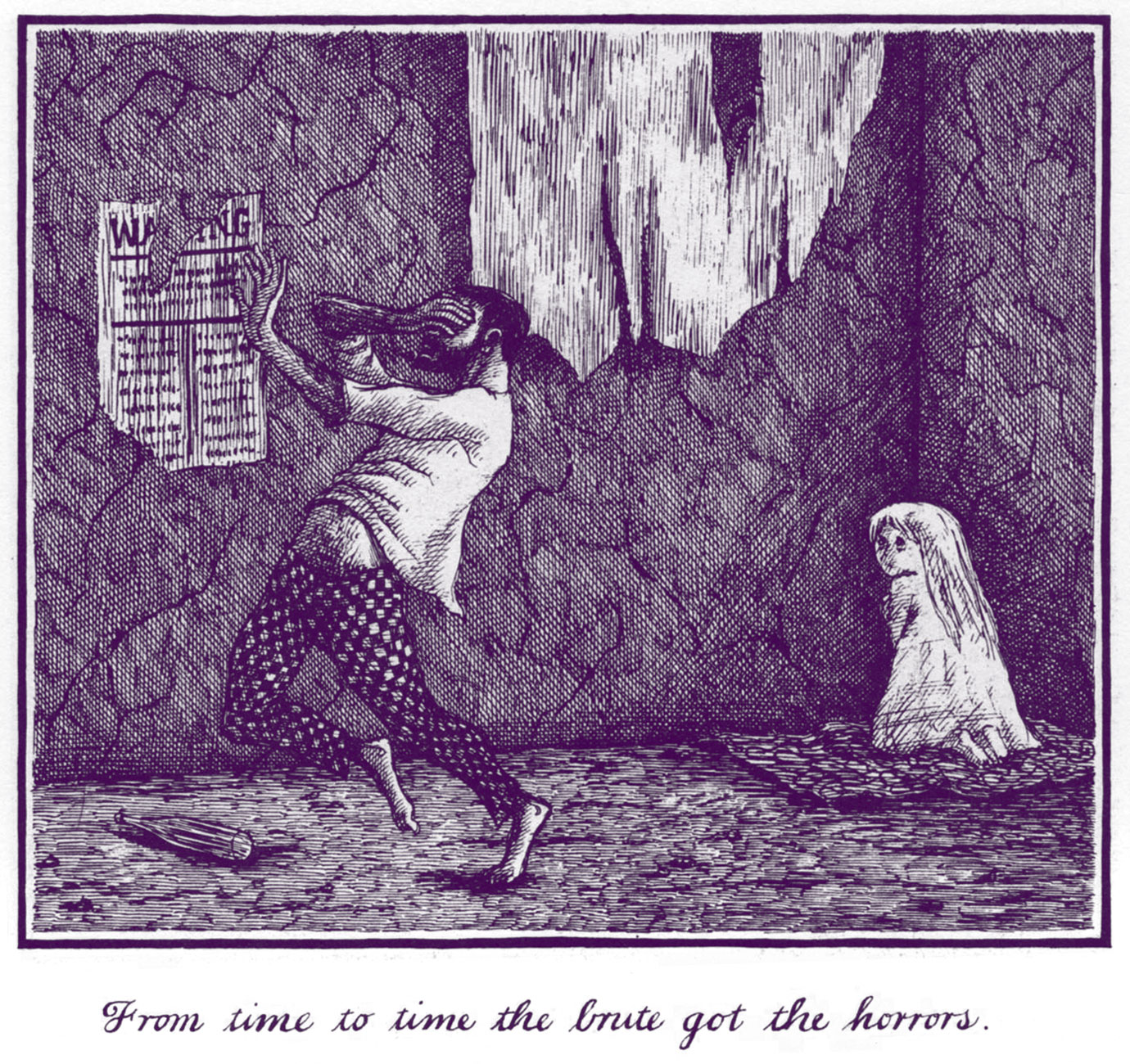
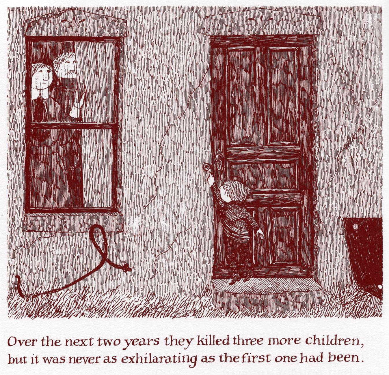
So very much has already been written and said, in all media, about Edward St. John Gorey (February 22, 1925 – April 15, 2000) that there seems little of substance to add. As his work’s ultimate appeal rests in its enduring, expertly wrought sense of mystery, it should be in the Master’s spirit to show rather than tell. Consequently, here’s a gallery of favourite extracts from Gorey’s voluminous œuvre. I’ve omitted both my personal pick, The Willowdale Handcar or The Return of the Black Doll (1962) and the too-obvious-by-half The Ghashlycrumb Tinies or After the Outing (1963), the former because I’m planning to examine it more leisurely in the future, while the latter… still manages to squeak in, after a fashion. See our bonus at the end.
The Doubtful Guest (1958).
The Hapless Child (1961).
The Wuggly Ump (1963).
The Osbick Bird (1970).
The Disrespectful Summons (1971).
The Glorious Nosebleed (1975).
The Broken Spoke (1976).
The Broken Spoke (1976).
The Loathsome Couple (1977).
The author and his creature in New York City, 1958.
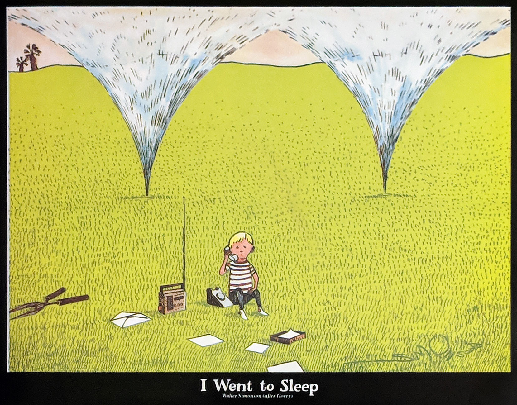
Bonus bits: An entry from The Ghashlycrumb Tinies (« N is for Neville, who died of ennui ») turned up, of all places, in Byron Preiss‘ splendid The Beach Boys (1979), which chronicled the band’s history up to that point through reams of quotations and illustrations, matching a gazillion visuals artists with a favourite BB tune. Gorey’s entry (reprinted and détournée with the author’s consent) was the setup for a dyptich. It provides a visual for Busy Doin’ Nothing (1968) one of Brian Wilson‘s finest compositions from his years in the wilderness; well before Seinfeld, it’s a song about nothing, set to a lilting bossa beat. Hey, get the mug!
I generally have little use for Walt Simonson‘s work, which I find overly-mannered and illegible, but I give him full marks here for wit, creativity and musical discernment. His contribution to Byron Preiss’ book focused on Brian Wilson’s bucolic I Went to Sleep (also 1968), a companion to Busy Doin’ Nothing and a fascinating miniature that gives a sense of Brian’s eventual creative direction had he not been forced to stick with the tried-and-true, official Beach Boys sound to this day. Simonson does a very effective Gorey pastiche, don’t you think?
« You know, the kids had quarrelled, so they’re taken off to see a corpse, which is decayed and completely hanging. It was parody. » — Gorey, interviewed by Clifford Ross (1994)
Oh, and if you should find yourself in the vicinity of in Yarmouth, Massachusetts, do drop by the Edward Gorey House!
Pete was born in Washington, D.C. on February 13, 1942, which makes him the doyen of the group. Like Mike “Wool Hat” Nesmith, he was a musician first, likely the group’s most instrumentally proficient. Peter wound up auditioning for the tv show after his name was suggested by Stephen Stills, who wasn’t quite right for the part… but definitely a good sport.
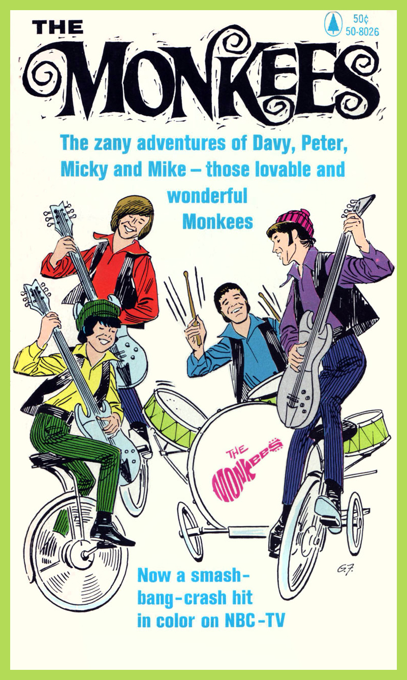
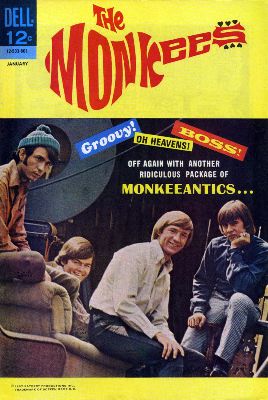
Peter and his fellow Monkees were featured in their own Dell comic book (is there any greater honour?), which lasted from March, 1967 to October, 1969, seventeen issues in all (with some reprinting.) That was one of Dell’s few savvy moves in their waning days, and one of their few readable titles outside John Stanley‘s output.
Peter the muse. From ‘Way-Out’ West, The Monkees (1966, Popular Library). See below!
This cute lil’ volume contained a bunch of fun (what else) Monkees romps written by Howard Liss and ably illustrated by Eisner- Iger Studio veteran Gene Fawcette.
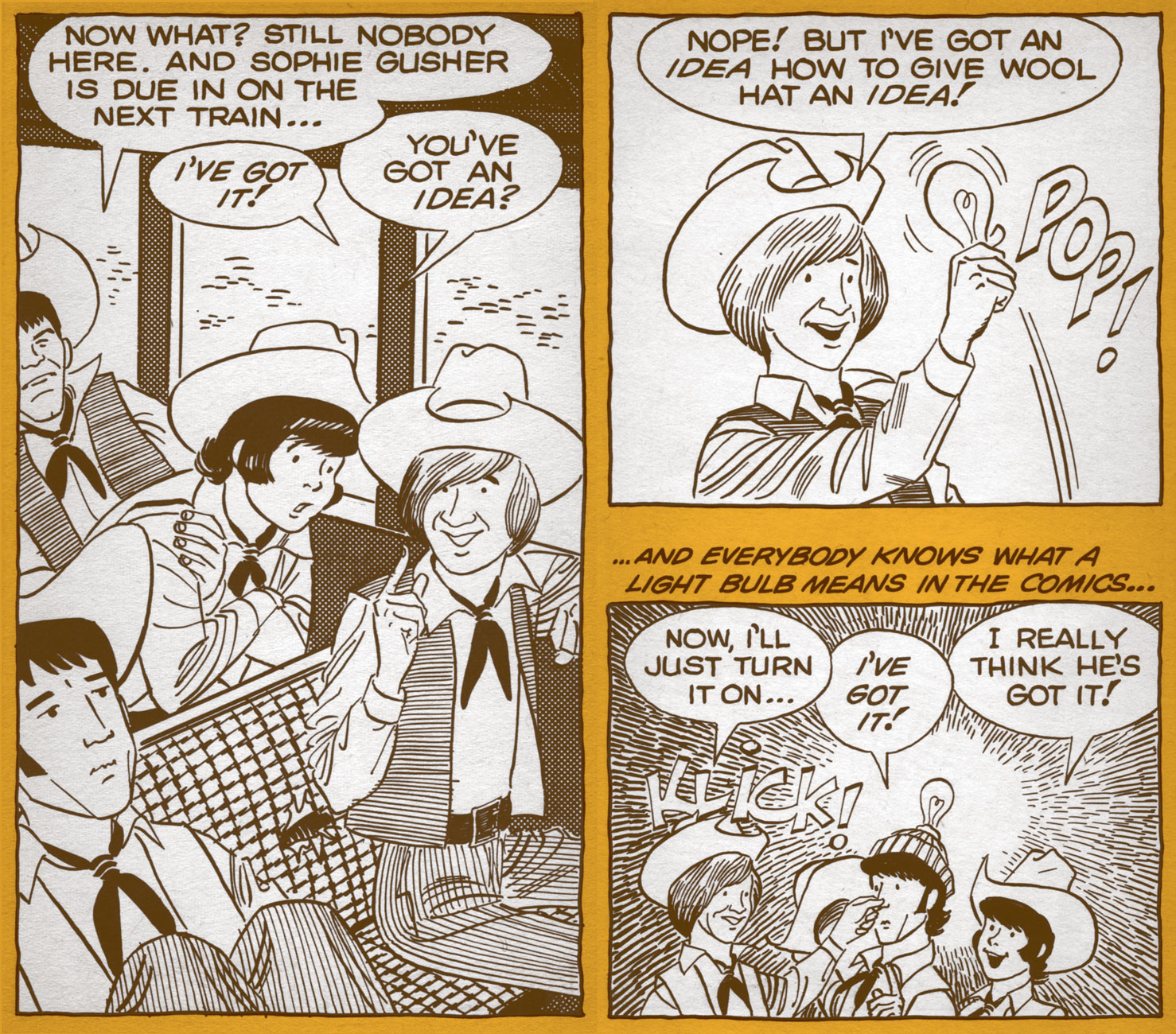
José Delbo‘s splash page from Beezle, Beezle, Who’s Got the Beezle?, The Monkees no. 8 (Jan. 1968, Dell). Scripter unknown… but he’s pretty good.
The issue in question: The Monkees no. 8 (Jan. 1968, Dell)
The Monkees no. 4 (Sept. 1967, Dell)
The Monkees no. 14 (Oct. 1968, Dell)
Ah, but Dan Clowes has known it all along! From Eightball no. 13 (Apr. 1994, Fantagraphics)
Update: Peter Tork passed away on Thursday, February 21, 2019, barely a week beyond his 77th birthday. Au revoir, Peter!
« When I was a boy, I always saw myself as a hero in comic books and in movies. I grew up believing this dream. » – Elvis Aaron Presley (1935 — ?)
Today, somewhere, the King of Rock ‘n’ Roll celebrates his eighty-fourth birthday, be he alive, dead or undead, he lives on. And never forget: Elvis is everywhere!
A most salty salute to the King of Rock ‘n’ Roll on his birthday! Compared to earlier decades, the 1980’s (and on!) were not kind to the anthology comic book. Thankfully, the meagre rewards and resounding indifference weren’t enough to quite dissuade some foolhardy souls from giving the format a go. But the fanboys wanted spandex, they wanted continuity and they soon wanted their « decompressed storytelling ». Bah. In 1981, Kitchen Sink Comix published the lone issue of Terry Beatty‘s labour of irradiated passion, Tales Mutated for the Mod. (June, 1981). Unlike John Byrne and others’ unceasing and pointless ‘tributes’ to Fantastic Four No. 1, this cover version of Harvey Kurtzman‘s Mad No. 1 is fiendishly clever. Kudos, Mr. Beatty!
Gary Panter crafted this loving tribute in 1984, a one-shot published by RAW. Such heady stuff was well ahead of its time!
The back cover… this beats Power Records‘ meek offerings flat!
The oft-inaccurate Grand Comics Database really fumbles it this time: the instantly-recognizable icon on the right is, according to them… Fabian. Dopes. Hamilton, Ontario’s Win Mortimer (1919-1998), inducted into the Joe Shuster Hall of Fame in 2006, drew this cover for DC’s Heart Throbsno. 95 (April-May 1965); given the time period and The Pelvis’ shirt, he would presumably be shooting the dire Paradise, Hawaiian Style. If you’re of a mind to commemorate the King’s anniversary with one of his mid-60s cinematic offerings, better opt for the far finer Tickle Me (1965).
His (alleged) paper boy claims, and I do want to believe him, that the Big E has peacefully decamped to the quietude of Eerie, Indiana. Looking good, Big E!