« If you’re having a bad day, catch a wave. » — Frosty Hesson
How do you cool down in a heatwave? In this household, when the temperature soars and drags the humidity along, we reach for a soothing surfing movie, preferably one by peerless surf auteurBruce Brown* (1937-2017). Last week, it was his 1959 opus, Surf Crazy, in which a group of SoCal surfers venture down to unsurfed Mexico, which in turn called to mind “Mexico“, an early ’70s underground two-pager recounting a similar sojourn.
Which, this nominally being a comics blog, leads us to the one and only artiste embodying and straddling both the underground cartoonist’s and surfer’s ethos, Rick Griffin!
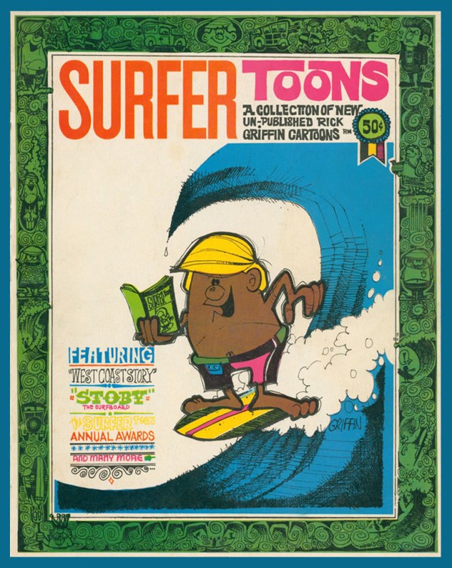
An early Griffin collection, Surfer Toons (1964, John Severson), featuring his early creation, Murphy, likely inspiration for notorious jewel thief Murph the Surf‘s sobriquet.A bio of the young surfer-cartoonist from The Surfer vol. 3 no.3 (Aug.-Sept. 1962). The photo confirms that his Murphy strip was autobiographical.« In 1964, a serious car accident left Rick unable to work for several months. Later that year, Surfer started a new series titled The Adventures of Griffin and Stoner. They were make-believe surf trips that Ron Stoner, a famous surf photographer, and Griffin were supposed to have taken around the world. » Stoner’s real-life adventures, however, were not so happy.In this mid-to-late-60s illustration, we witness early signs of Griffin’s mature, more assured line. A simplified version of this piece would appear in The Surfer‘s March, 1972 issue.
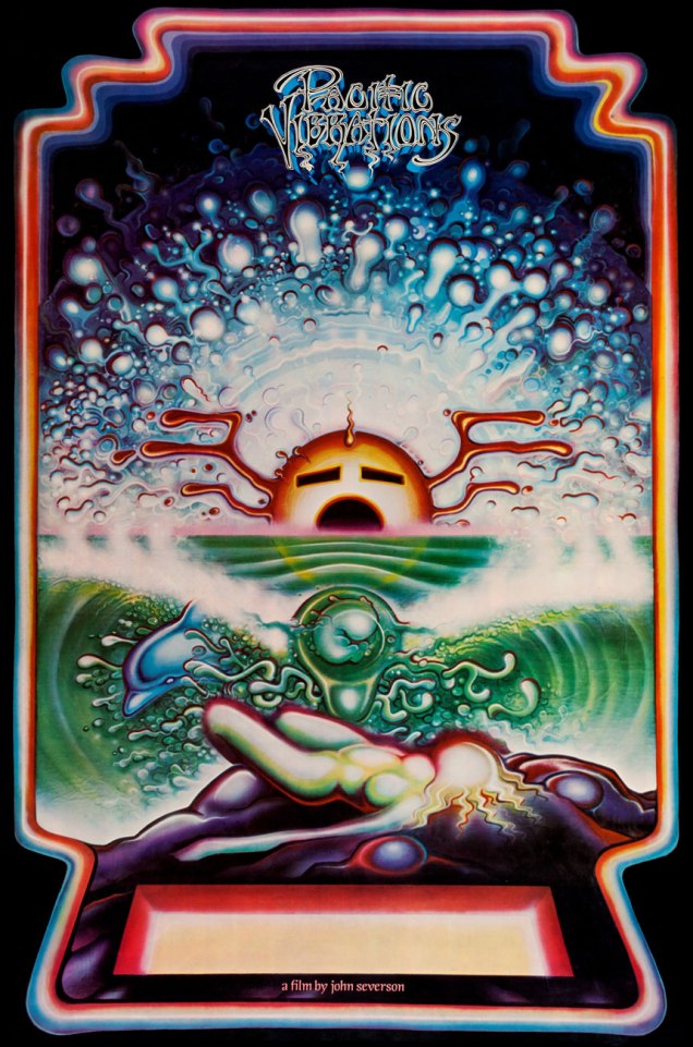
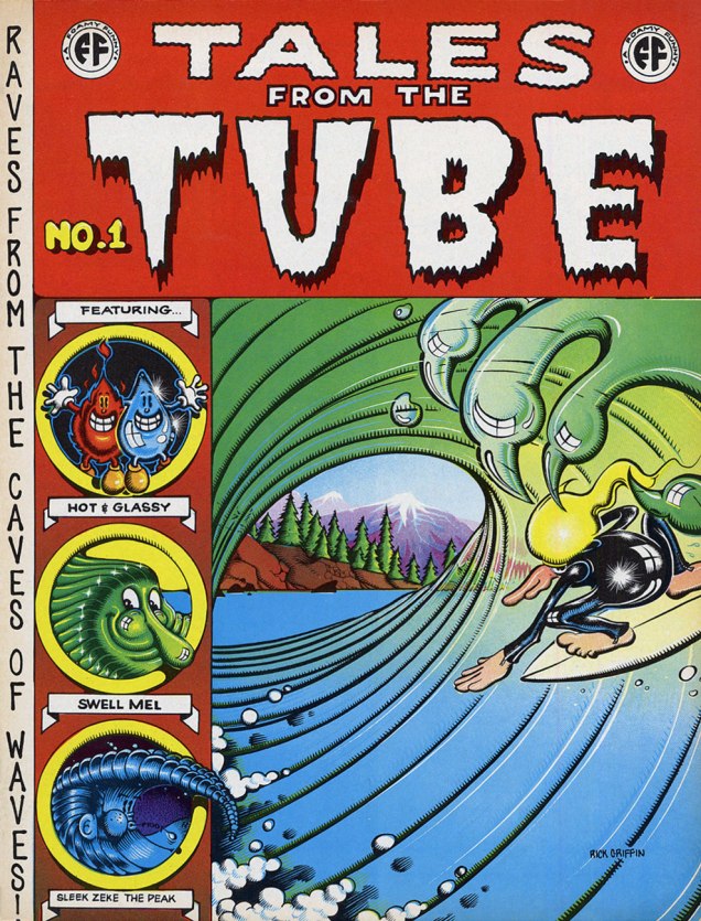
Griffin’s tour-de-force adaptation of Them’s Mystic Eyes appeared in an issue of The Surfer in 1970. Witness how Griffin’s depiction of Murphy has evolved over the decade. The fancy helmet is a Hopi Indian ceremonial mask, a frequent artifact and motif in the artist’s subsequent œuvre. Weedy song, imho — and yet, meaning is where you find it.Also from 1970: Griffin created this piece for his patron John Severson‘s surf documentary Pacific Vibrations, (in which he also appeared!) and it provides a fine example of Griffin’s matchless lettering**. And there’s that Hopi mask again. Though it was quite a popular poster in the 1970s, If you ask me, though, accomplished as it is, it utterly fails to evoke surfing.Tales From the Tube, as it originally appeared in 1972, inserted into an issue of Surfer Magazine (Vol. 12 no. 6); some copies exist separately, however. Also to be found within its pages: Roberts Crumb and Williams, Steve Clay Wilson, Bill Odgen, Glen Chase and Jim Evans.TFTT was later reissued (now with a price) in the regular comix format by The Print Mint. As you can see, Griffin reimagined and re-separated his colours. Which version do *you* prefer?
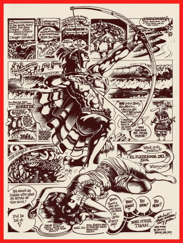
Visual splendour, not coherence, was always Griffin’s stock-in-trade. And why not? This travelogue premiered in Tales From the Tube.More poster (and soundtrack) artwork for surfing documentaries, this time 1972’s Five Summer Stories and its 1976 sequel, Five Summer Stories Plus Four, directed by Greg MacGillivray, a prolific, award-winning director and cinematographer to this day.… another Tales From the Tube, another Surf doc affiche from ’76. « This film and the other surf films for which Griffin has done posters are not usually shown on the regular movie circuits. Their soundtracks are usually composed of rock music of various forms – soft to hard – with a few breaks for narration. The surfing scene throughout the world has grown large enough to support the production of many films each year. »As you can see, Murphy abides. A 1993 sticker, with instructions.
-RG
*I’ll go even further: for me, it pretty much has to be Bruce Brown. His easy charm and wit, not to mention his untrained-yet-superb set of filmmaking skills leave other surfing cinéastes floundering in his wake. From what I’ve seen over the years, their work either seems too dry (ha!) or overdone and overeager. I’m still keeping an eye on the horizon, nevertheless. The relative unavailability of quality prints for most of these films is a hefty obstacle, while their soundtracks are far, far easier to find (e.g. Gone With the Wave, The Fantastic Plastic Machine…)
**“At this stage [1969], Griffin’s lettering almost ceased to be functional as legible typography. In fact, in even earlier work, he jokingly incorporated meaningless calligraphy into his posters. Rick pioneered and carried to an extreme in the 1960’s this disregard for the legibility of lettering, creating totally abstract forms the resemble letters. His particular style influenced and encouraged artists locally and throughout the world to reconsider all previous limitations that they were placing on stylized lettering and the ways that it could be used with other graphic forms.” From Gordon McLelland‘s monograph, Rick Griffin (1980, Perigee).


One thought on “Deep in the Soup With Rick Griffin”