« RAREBIT n. A Welsh rabbit, in the speech of the humorless, who point out that it is not a rabbit. To whom it may be solemnly explained that the comestible known as toad-in-a-hole is really not a toad, and that ris-de-veau à la financière is not the smile of a calf prepared after the recipe of a she banker. » — Ambrose Bierce, The Devil’s Dictionary
It’s dicey to make a broad generalization about what people have heard of and what they haven’t, so I’ll just say that, for a comic strip more than a century old, likely Canadian Winsor McCay‘s Little Nemo in Slumberland is rather well remembered (and represented) in the greater culture.
The strip has inspired numberless adaptations and the cultural landscape is quite peppered with Nemo references, both overt and veiled.
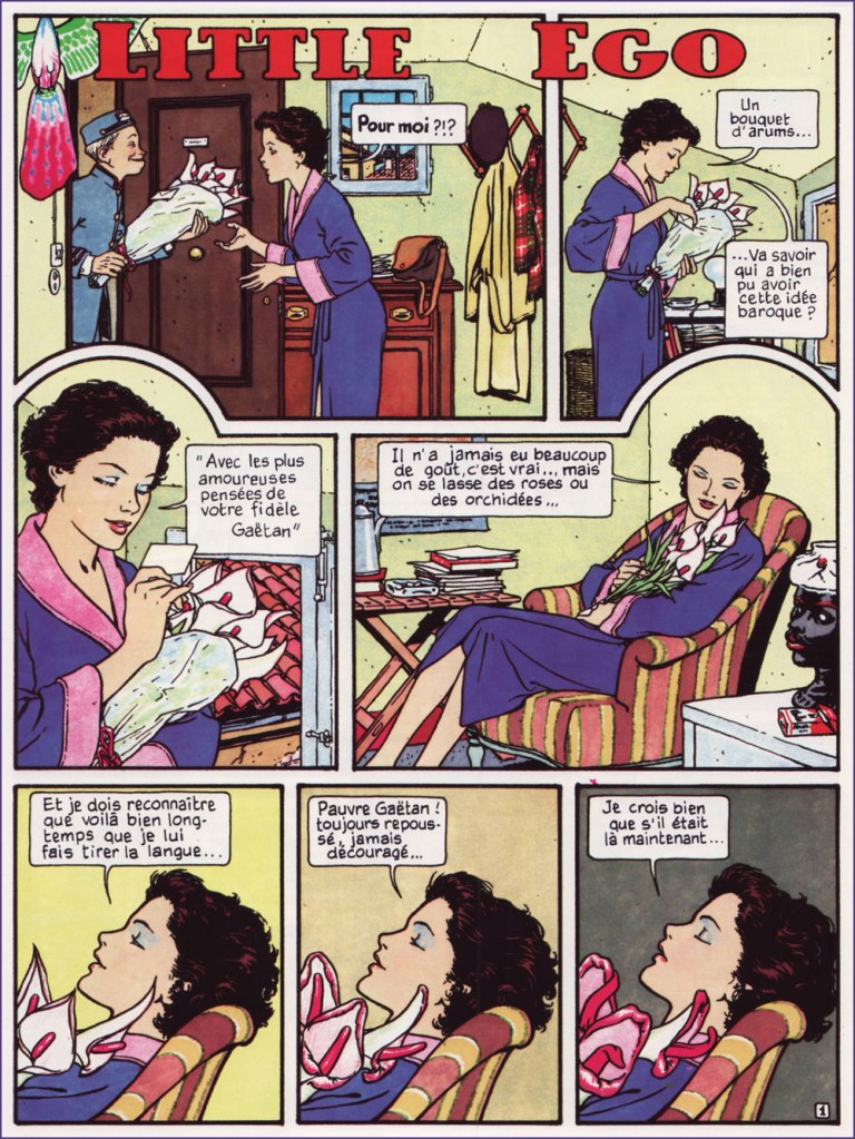
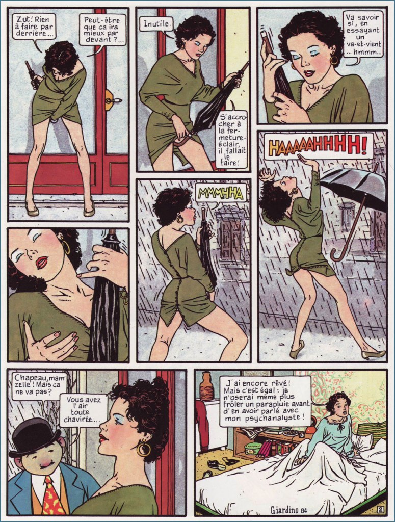
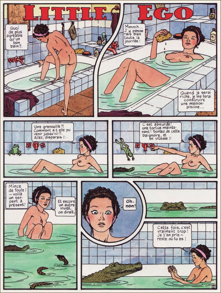
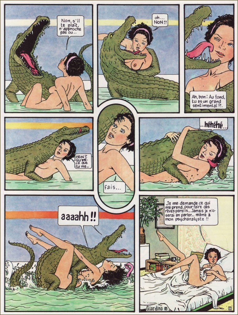
In the early 1980s, Italian cartoonist Vittorio Giardino (1946–) created a series of short pieces (first published in issues of Comic Art and Glamour International), intended as an erotic pastiche of McCay’s brainchild.
Here are the Little Ego pieces I value most.
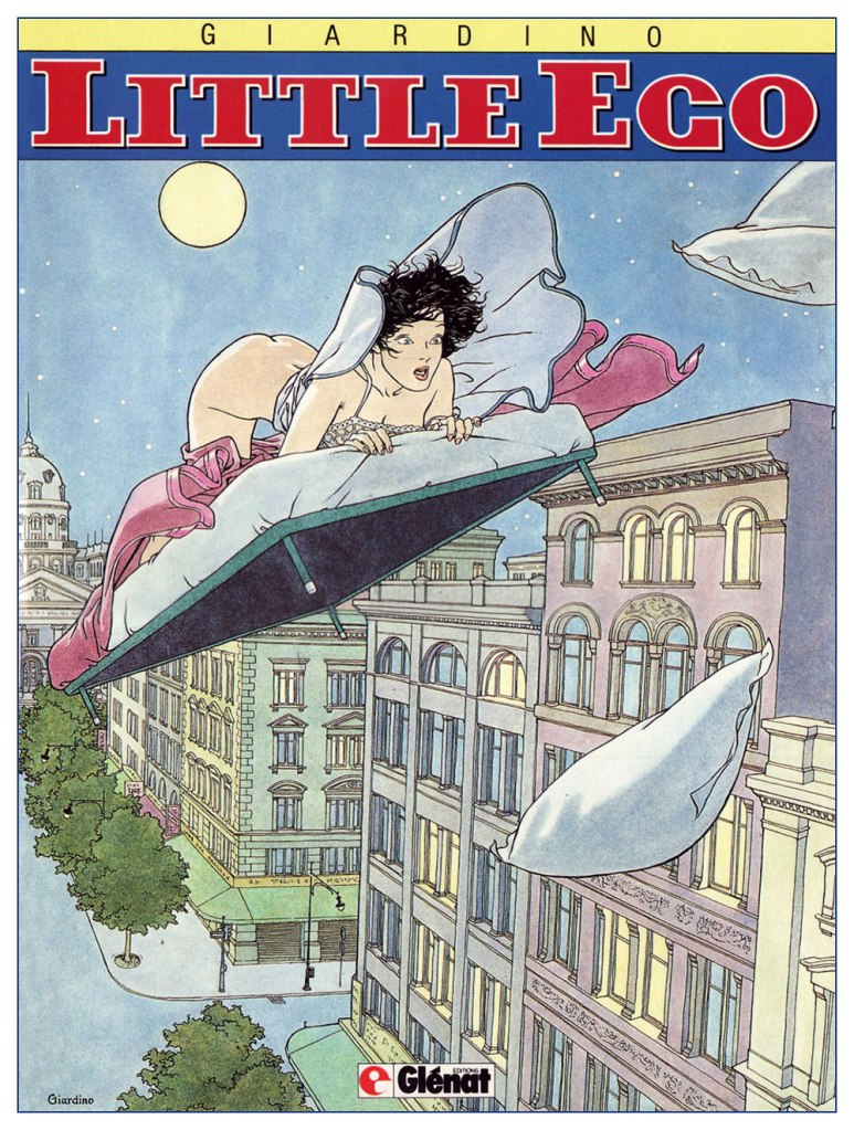
I must admit I only enjoy the earlier, less grandiose ones, in no small part because they’re scarcely Nemo-like. Instead, they’re patterned after an earlier McCay creation, and my personal favourite, Dreams of the Rarebit Fiend (1904-25), which I’ve long treasured in its beloved and exemplary Dover collection.
« I wonder what’s come over me to have such dreams… I’ll never be able to speak of them… even to my shrink!! »Here’s the cover art of the original French collected edition (1989, Glénat).
To quote the late cartoonist and local favourite Richard Thompson:
« There are strips that are classics that I respond to on many levels without loving them (Little Nemo is one). I can enjoy such strips without really learning too much from them. »
I share Mr. Thompson’s ambivalent sentiment about Nemo. It’s an indisputable masterwork, mind-bogglingly accomplished, and best enjoyed in its original size.
See what I mean? An original-size Little Nemo showcase cleverly included in Graphis Magazine‘s Comics: The Art of the Comic Strip (1972, The Graphis Press, Zurich).
But its epic scale and themes fail to move me. I far prefer the quotidian-turning-absurd magic of the Rarebit Fiend.
At length, feeling perhaps constrained by the two-page format, Giardino moved on to a longer, sustained narrative full of aerial derring-do, treacherous desert vistas, opulent palaces, and lots and lots of rapes (a fumetti standard).Not my thing, thanks all the same.
I drew from the French edition of the strip since it’s the one I own, but also for its superior reproduction and as the English translation is rather flat and witless in comparison. [ see for yourself! ]
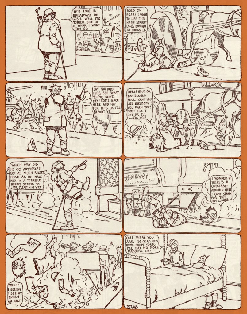
Here’s a tasty pair of sample Rarebit Fiend strips.
… and we return to Richard Thompson, who introduced his own ‘strip within a strip’ parody with Little Neuro within his Cul de sac (2004-2012).
Cul de sac’s March 26, 2008 daily, wherein Little Neuro is first touched upon. « Little Neuro is a parody/homage to the great fantasy strip Little Nemo in Slumberland. I thought up Little Neuro in the early ’80s, but I had to invent Petey before I knew what to do with it. »Cul de sac’s Sunday, September 6, 2009 strip. Thompson: « Obviously an excuse to draw a dragon. I don’t get many. »
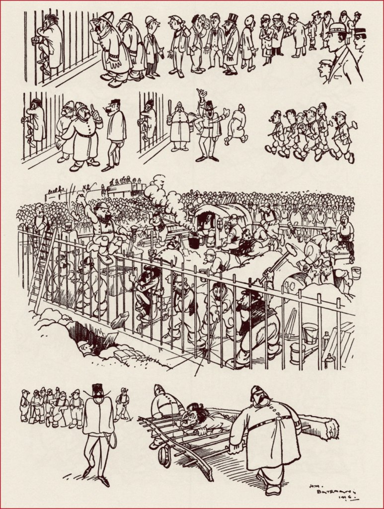
Henry Mayo Bateman (1887-1970) was a British cartoonist now frequently described as ‘the most innovative cartoonist of his generation’. His main claim to fame is the ‘The Man Who…‘ cartoons; as it often happens with when the popularity of a creation goes far beyond what the artist originally had in mind, Bateman himself was ambivalent about it, and felt constrained by its acclaim. Be as it may, a lot of his cartoon collections (most of them hopelessly out of print) are named according to this template: Man Who Drew 20th Century (1969), The Man Who Was H. M. Bateman (1982), H. M. Bateman: The Man Who Went Mad on Paper (2012)… The one I have in my collection broke away from this mold –it’s a French collection titled Mimodrames, with all text inside, including the titles of cartoons, in both French and English. Strangely, the French cartoon captions seem more à propos than the English ones.
Case in point: this was called ‘Prisoner when arrested clung to the railings‘, which in French was translated to ‘Le protestataire qui se cramponna aux grilles à l’arrivée de la police‘, and yet protestataire is more like ‘protester’, not ‘prisoner’, which I think is more fitting.
Bateman seemed to be predestined for his career; having decided at the ripe old age of 13 to dedicate his life to becoming an artist, he spent all his free time drawing and sold his first cartoon at 14 (!) Though his father was adamant that his sole male offspring should follow his footsteps and become a respectable businessman, Bateman’s small yet steadily increasing income from his cartoons and the growing demand for them by halfpenny weekly comic papers finally forced his pa to grudgingly agree to his son pursuing a career in art. Bateman was 16 at the time.
‘The Man who filled his fountain pen with the hotel ink’
Bateman continued to sell cartoons throughout his studies; by 1906, his work was in demand by many publications much fancier than the inexpensive comic papers he started out in. Percy Venner Bradshaw, fellow artist and founder of the Press Art School, meeting him that year for the first time, found a ‘quiet, shy, delicate boy who was much more interested in colour than in line work, and who could only with difficulty be induced to talk about either‘. A fitting description of a man who appeared quiet and reserved, who felt things more keenly than his peers or his colleagues – a swift glance at his best work dispels an impression of similarity between him and the rowdier cartoonists. Not that Bateman couldn’t be funny – but something lurked behind the chuckle, some dark cloud lingering over his characters. As Anthony Anderson (not the American actor, nor the British murderer; all I was able to find out about him is that he’s listed as an editor of many books) notes in the introduction to Mimodrames:
« The more one examines his drawings the more one feels that, despite his conservatism, Bateman’s sympathies lay not with the offended but with the offender, a sympathy for the underdog, the little man. Indeed, in many of his cartoons, especially during the war, the little man was often Bateman himself – a clear self-portrait. »
This sensitivity comes loud and clear through Bateman’s writing as well – to quote, for example, his description of a medical examination undergone in 1916, when conscription for WWI was in full swing:
«In company with other doubtfuls, I was made to hop naked and submit to a bombardment of tests before a glaring army doctor sternly ordered me to ‘go away and get some clothes on’, as if I was responsible for appearing before him in that condition. And in return for my afternoon’s exhibition I was handed an unhealthy looking card bearing the magic symbol of C.3. I had done what I could to convert myself to cannon fodder. I just wasn’t fit for it. »
This description reminds me of Brel’s Au suivant (for those who don’t speak French, Scott Walker’s Next).
‘The Maid who was but human’, or ‘La bonne avait de l’humour’ (something like ‘the maid had a sense of humour).
‘The Man who broke the tube’
I would also be remiss in failing to mention his work for satirical magazines Punch and the Tatler (the famous ‘The man who…’ cartoons ran in the latter, often in glorious colour double-page spreads). According to Anderson, Bateman became the highest paid cartoonist in Britain around the 1920s and 1930s.
‘The editor of a yellow newspaper receiving news of a horrible murder committed in circumstances of the most revolting atrocity’
Bateman’s dearest ambition throughout his life seemed to have been to become a serious, dedicated painter. When he was 46, he set his lucrative career aside, and went to Spain and France to paint. Anderson ends the introduction with the nicest epitaph I’ve read in a while:
«He spent the next three decades gradually shedding more and more of his old life, retiring to a small house on the edge of Dartmoor, travelling extensively and on his own […], always with his sketch books, his paints and his fishing rod. He became peaceful, solitary, content. He died on the island of Gozo in 1970, still painting every day, living in a small hotel with very few possessions but in the room with the finest view. »
Another source mentions that Bateman fought long and hard with Inland Revenue, so perhaps his self-exile to Gozo, an island in Malta, was not as poetic as it sounds. I wasn’t able to find much information about that, other than his obvious dislike of taxmen (exemplified by cartoons such as The Income Tax Official in Hades) – but taking periodic stabs at the taxman is a traditional cartoonist sport, so it doesn’t really prove anything.
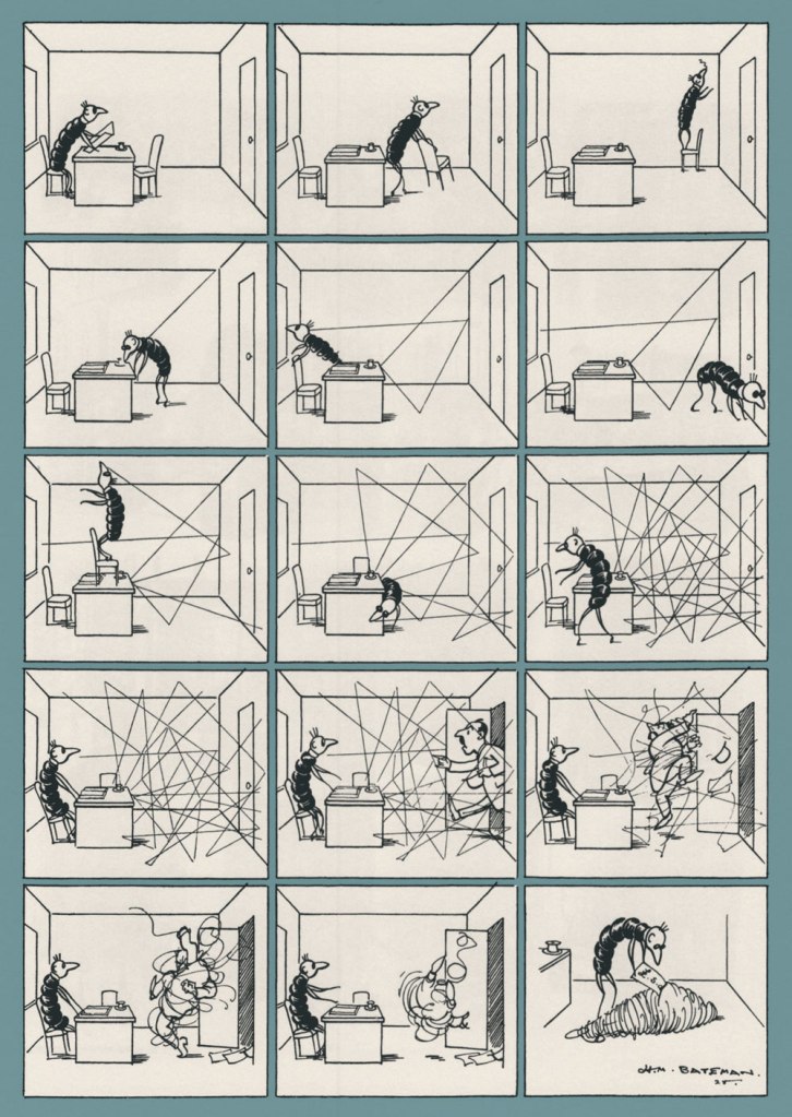
‘The Income-Tax Worm at Work’
These were some of my favourite Bateman pages, I hope you enjoyed them!
« Trees cause more pollution than automobiles. » — Ronald Reagan
After some of the time-consuming epics we’ve been running lately, I’d been looking for a short piece to help me catch my breath; as it happens, I’d been saving a special piece for this day and occasion.
I’ve always much admired any well-done bit of scientific popularization, and given people’s abysmal ignorance, and even worse, their utter lack of curiosity on the subject of trees (among others!), this one stands out as increasingly timely and poignant. Just yesterday, I stumbled upon an alarming article from Smithsonian Magazine pointing out that the hard lessons of the Dust Bowl were either not learned or simply forgotten. So it goes…
The strip was reprinted in TCOFAF vol. 23 no. 6 (Nov. 16, 1967) with improved colouring, so it’s the version you see here.
The title of this post quotes (with a slight spelling change) a once-famous poem by George Pope Morris (1802-1864), which goes:
Woodman, spare that tree! Touch not a single bough! In youth it sheltered me, And I’ll protect it now. ‘twas my forefather’s hand That placed it near his cot; There, woodman, let it stand, Thy axe shall harm it not!
That old familiar tree, Whose glory and renown Are spread o’er land and sea, And wouldst thou hew it down? Woodman, forbear thy stroke! Cut not its earthbound ties; 0 spare that aged oak, Now towering to the skies!
When but an idle boy I sought its grateful shade; In all their gushing joy Here too my sisters played. My mother kissed me here; My father pressed my hand. . . But let that old oak stand!
My heartstrings round thee cling Close as thy bark, old friend; Here shall the wild bird sing, And still thy branches bend. Old tree! the storm still brave; And, woodman, leave the spot . . . While I’ve a hand to save, Thy axe shall harm it not.
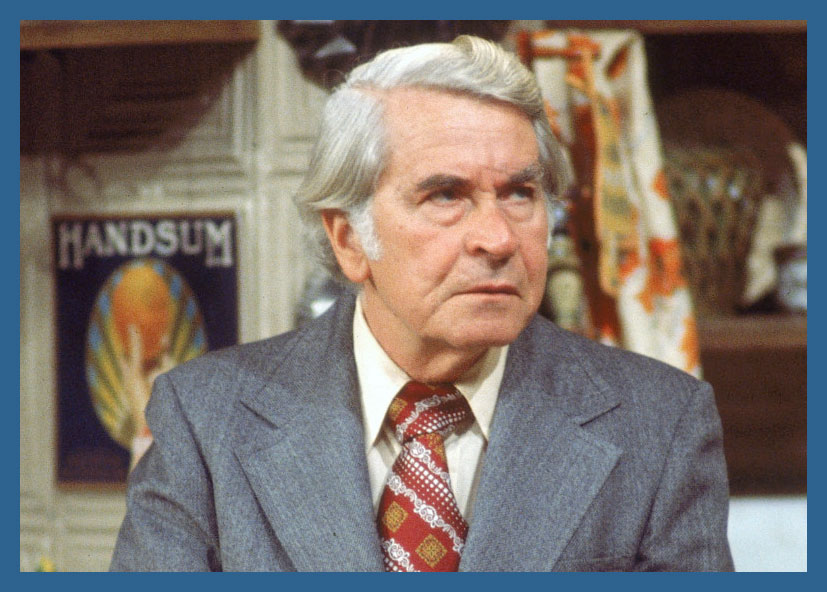
« Now why should I spare that tree, Kotter? What’s in it for me? »
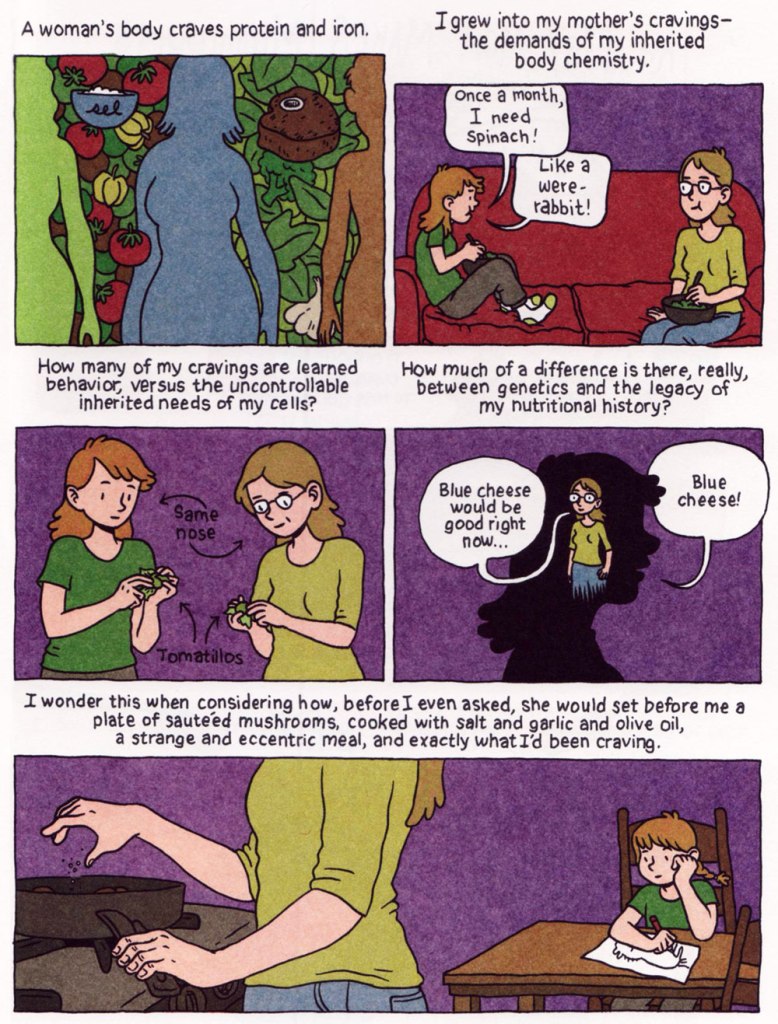
Given my appetite for recipes and the cookbooks they’re published in, it was just a matter of time before I stumbled across the hybrid genre of cooking memoir in comic book form. Needless to say, these two art forms have been friends for a long time: comics have been highlighting food in different ways for probably as long as comics have existed. As for cookbooks, it used to be common practice to include illustrations (maybe even cartoons in the margins!), not the lavishly printed photographs we are used to today, alongside the recipes. A treasured 1930s Soviet cookbook inherited from my grandparents, falling apart but no less charming for it, features little cartoons on every other page, similar to how the drawings of Robert Gring once adorned the pages of Assimil language guides (see co-admin RG’s Robert Gring’s Wits-Sharpening Fun).
But I believe that endeavours to specifically write a whole graphic novel/cooking memoir (replete with recipes!) is a fairly recent phenomenon. I’m not talking about stuff like Stan Lee Presents the Mighty Marvel Superheroes’ Cookbook (1977, complete with recipes for ‘He-Man Pancakes’ and ‘Thor’s Cabbage Rolls’), but a thoughtful examination of food functioning as connective tissue between generations and memories. It also helps when the recipes are actually appetizing.
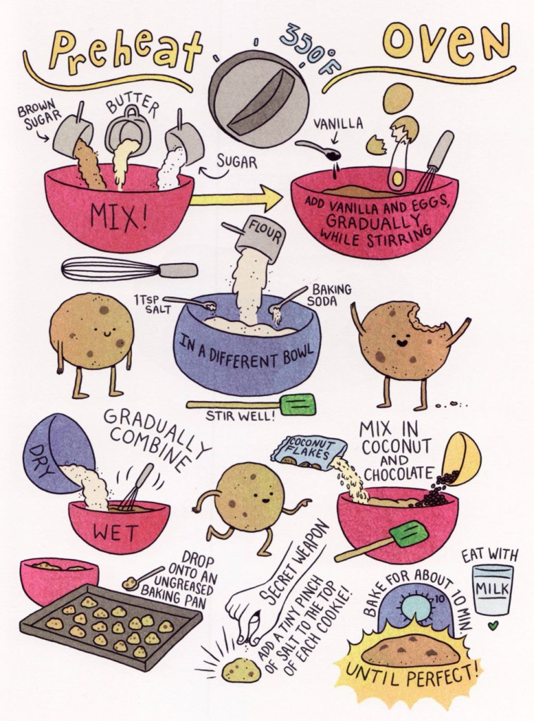
Why is Captain America lasciviously fondling a meatball when absolutely no meatballs are involved in this recipe? Art by Joe Giella.
I’m actually not fond of cookbooks that delve into family anecdotes, as that type of narrative tends to get bogged down in saccharine sentiment that obscures the bigger picture, as the narrator collapses into dreamy sighs about how genuine cooking used to be (as compared to the sterile, hurried modern approach, presumably). The visually-oriented nature of comics seems much better suited to emphasise that telling-stories aspect, besides which drawing ingredients and techniques over and over again must get tiresome rather fast, which tilts the stories-to-recipes ratio firmly in favour of the former. Here are some excerpts from books in my library, each taking a slightly different focus on the subject.
An excellent example of memoir-cum-comic-cum-cookbook is Lucy Kingsley‘s joyous Relish: My Life in the Kitchen (2013), probably my favourite example of this subgenre. Its colourful, cartoony style is the perfect backdrop for Kingsley’s pilgrimage through memories – and as the daughter of a professional chef with a penchant towards nature and an aesthete dedicated to fancy gourmet food, she has a great variety of cuisine-related reminiscences to share.
Cook Korean! (2018) by Robin Ha draws strong connections between Ha’s Korean roots and her gradually evolving relationship with her mother. Mothers, as they tend to be the first source of a newborn’s food and the child’s main guide to new flavours, crop up a lot in these recollections, but here the emphasis is more on reconnecting with one’s ancestry through traditional food. I bought this book for the recipes, but I was touched by Ha’s obvious enthusiasm and desire to make this cookbook a fun, easy-going romp through not only a lot of Korean staples, but also people’s attitudes towards them.
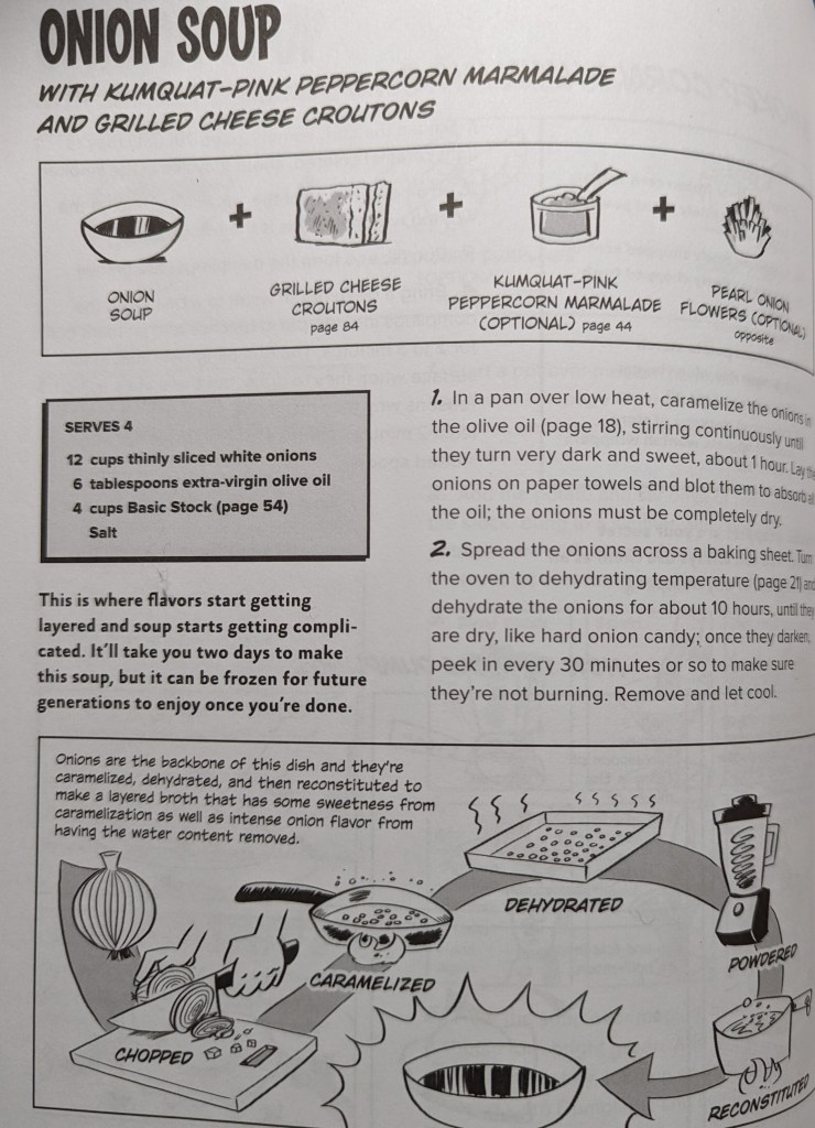
Dirt Candy (2012) by Amanda Cohen and Ryan Dunlavey chronicles the hard life of the chef/owner of a NYC restaurant. While I am not quite on board with Cohen’s claim that vegetables are boring unless they’re treated in very specific and fancy ways, her clear frustration at the reputation of vegetarian (I’m sorry, ‘vegetable‘) cuisine is educational and entertaining, as she spends a chunk of the cookbook discussing the evolution the Americans’ tortuous relationship with vegetables and ‘healthy’ food.
I’m still on the fence about whether I think it’s pretentious or not, but vegetarian cooking with ‘gloopy brown sauce’ is definitely a thing.
I have not tried any Dirt Candy recipes yet, as most of them require a multitude of bowls and techniques, not to mention the sort of time investment I currently reserve for other projects. The culmination of that approach is Cohen’s recipe for onion soup, which demands two days of preparation and would have also required the sacrifice of your first-born, if this hadn’t been a vegetarian (sorry, vegetable…) cookbook.
I applaud bold new ingredient combinations, but I think most of us are perfectly happy to keep our kumquats away from our onion soup.
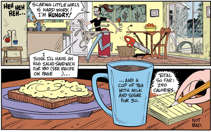
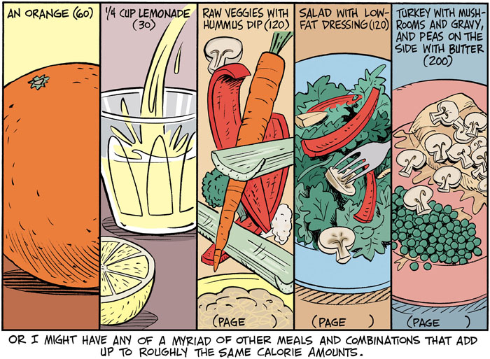
Carol Lay‘s The Big Skinny: How I Changed My Fattitude (2013) recounts her tortured relationship with food and how she finally was able to come to grips with her weight. It’s not that easy to laugh at yourself, and Lay successfully pulls it off, which makes this memoir instantly endearing whether one swears by counting calories or is convinced that it’s the sort of madness psychiatrists make a living on.
~ ds
P.S. I couldn’t write a post about comics and food without mentioning Ben Katchor, a WOT favourite. He has many beautiful perambulations into the territory of food, but one might mention The Dairy Restaurant for starters.
« There’s no need for some of the language that’s been thrown at some of the artists and writers. These men are highly skilled craftsmen and deserve a lot of respect. » — editorial comment in T.H.U.N.D.E.R. Agents no. 14 (July, 1967, Tower)
This post has been inspired by sundry signs and omens I’ve encountered these past few days: first, a casual mention dropped by Bizarro ink stud Wayno on his blog; then a fond-but-hazy recollection by a graphic designer colleague… and so this week, the agents of T.H.U.N.D.E.R.* make the scene. Well, one of them does.
As with many other choice cultural items of the era, I was first tantalised by a little volume entitled Dynamo, Man of High Camp from the back pages of Famous Monsters of Filmland, devoted to its in-house Captain Company catalogue: Warren magazine back issues, rubber masks and hands, posters, LPs, Super 8 reels, paperbacks, novelties… a veritable trove of wonders. And unlike many a mail-order house, these goodies were the real deal, solid classics avidly sought after and treasured to this day.
Since much has been written about the history of Tower Comics (1965-1969), I’ll skip that part. Here’s the gist of it.
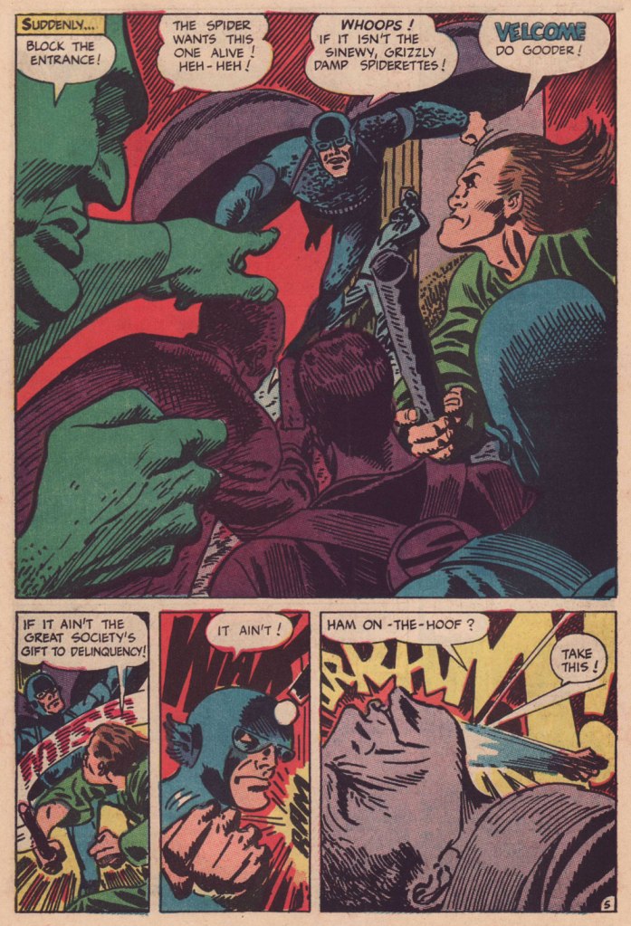
Of course, I adore the Wally Wood material, all the more the unfailingly delicious Steve Ditko-Wood combo. A fine surprise was George Tuska‘s nimble comedic touch on the misadventures of ‘Weed’. But my very favourite flavour in the T.H.U.N.D.E.R. cocktail is ‘Raven’ as written and illustrated by Manny Stallman (1927-97), a quintessentially eccentric delight.
Introduced by Steve Skeates and George Tuska in Enter the Raven (T.H.U.N.D.E.R. Agents no. 8, Sept. 1966), the character’s sole point of interest was that he was a mercenary who, originally intending to betray T.H.U.N.D.E.R., had a change of heart.
Along came Manny. He took over the character, redesigned him from stem to stern, and gave him a memorable arch-nemesis in Mayven, the Poet. But enough of this prattle, let’s have a look!
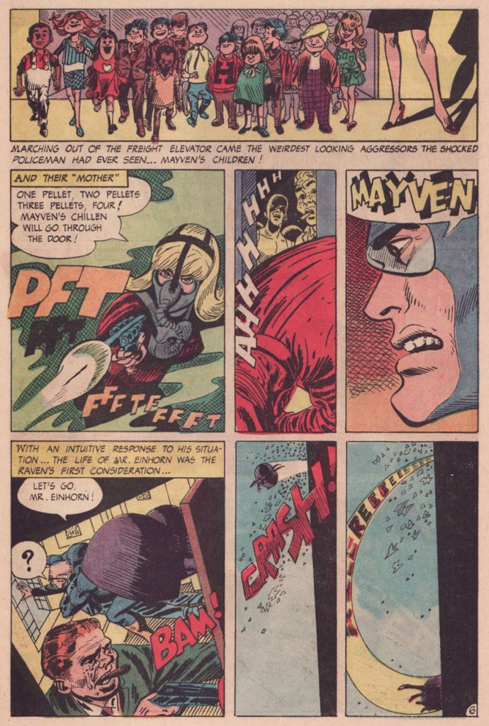
This is page two of Raven Battles Mayven the Poet (T.H.U.N.D.E.R. Agents no. 9, Oct. 1966, edited by Samm Schwartz), spotlighting Mayven’s signature weapon: explosive tots. Stallman had no trouble with action: another page from Raven Battles Mayven the Poet.Mayven, captured in the previous episode, wastes no time in making good — and memorable — her escape from the clink; the opening pages from Mayven Returns (T.H.U.N.D.E.R. Agents no. 10, Nov. 1966).Bold, dynamic, sloppy in all the right places and the right ways. And I *love* that Raven makes an ungodly racket when he flies, itself a great source of visual interest.A three-page sequence from the following episode, The Case of Jacob Einhorn (T.H.U.N.D.E.R. Agents no. 11, Mar. 1967), wherein ice-cold Mayven takes on the assignment to eliminate Mr. Einhorn, a fictive stand-in for legendary ‘Nazi hunter’ Simon Wiesenthal (1908-2005). I wouldn’t want to give too much away… read the whole shebang here!
After a mere five Raven episodes, Stallman was gone. Judging from the letters columns, reader reaction had overwhelming been of this nature:
“In issue #9 the art on the Raven was awful“
“You’re using a lot of grade D artists… as for whoever draws the Raven, his art is utterly atrocious.”
“How about having Chic Stone draw Raven in addition to Lightning?“
« Unsurprisingly, many of the fans of the era hated Stallman’s work and mocked it openly in their letters and in fanzines. Comic book fans have often had very narrow boundaries for what they consider an appropriate style for a super hero strip. And Stallman was coloring way outside of those lines with his work. »
After an issue’s hiatus, the Raven returned, once more reimagined (minus the imagination) this time by Gil Kane. Just another run-of-the-mill flying dude. I’ve always held that Kane should never be allowed to ink himself, but he also makes an excellent case, in his sole Raven outing (and Raven’s final flight), that he shouldn’t be allowed to write, either. Here’s a sample:
Ahem. All these walking child-shaped time bombs reminded me of a rather fine comic book from a couple of decades later.
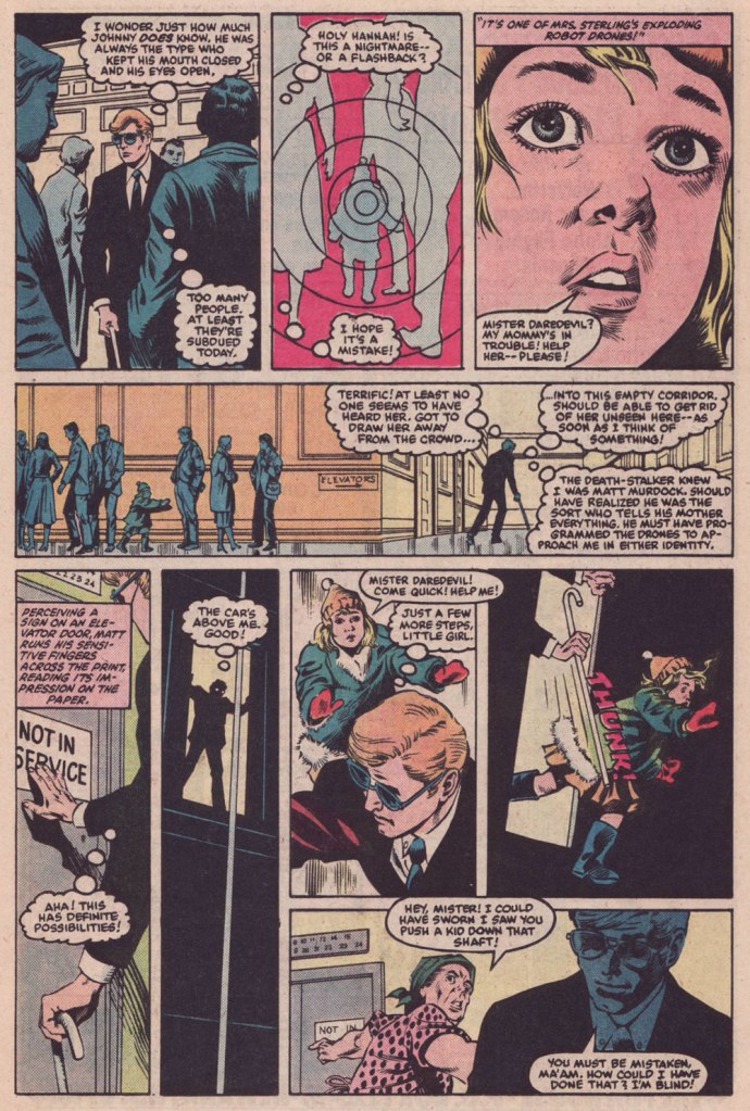
This is Daredevil no. 209 (Aug. 1984, Marvel), cover by David Mazzucchelli.This issue is a thrillingly relentless continuation of a thrillingly relentless (but in a different way) Winchester-mystery-house-of-murder tale, The Deadliest Night of My Life!, co-scripted by Harlan Ellison and his pal Arthur Byron Cover. Here, Byron Cover carries the ball, and offers us this darkly delicious sequence. Pencils by Mazzucchelli, inks by Danny Bulanadi.
It could all be coincidence, but I like to imagine that the exploding kids idea is a sharp hybrid of notions from two Mario Bava flicks from 1966: the murderous little girl from Operazione paura aka Kill, Baby… Kill, and the booby-trap beauties from Le spie vengono dal semifreddo aka Dr. Goldfoot and the Girl Bombs.
In closing, I’m happy to report that Mr. Stallman landed on his feet after his fall from the Tower. Honestly, the comics industry, and its fans, didn’t deserve the likes of him. He would go on to recount the Adventures of the Big Boy (published by the Bob’s Big Boy chain of restaurants) for a whopping seventeen years, among other fine assignments. And if ever there was a mensch, he surely was the one. Here’s a telling passage from his obituary:
« When a 1991 stroke caused cartoonist Manny Stallman’s right hand to intermittently go numb, he didn’t let it stop him. He simply took it upon himself to learn to draw with his left hand.
After making that switch, he had trouble drawing the tightly controlled figures he had created for years as a leading artist in what has been called the Golden Age of Comics. So he took advantage of the larger figures he could draw, transposing them onto a blackboard to help teach English and citizenship classes to Russian immigrants at the Albert L. Schultz Jewish Community Center in Palo Alto.
Despite additional health problems that included diabetes and congestive heart failure, he also led classes for Chinese immigrants and taught computer-aided drawing to disabled children. “Manny decided to stop focusing on what he had been able to do before his strokes,” says his wife, Jane Stallman.
“He decided to start ‘where I am‘ and do whatever he could with whatever capacity he had. His life goal was to make someone smile each day.” »
« Thank you for calling customer service. If you’re calm and rational, press 1. If you’re a whiner, press 2. If you’re a hot head, press 3. » — Randy Glasbergen
Comedy oriented towards employees who work in retail is its own breed of humour. I remember my ex-boss warning me early on that ‘the public is stupid’ – and that’s certainly the impression one gets, being confronted (day in, day out) by customers unable to read signs (no matter how big and prominent one makes them), pulling on doors that are meant to be pushed, and asking questions so inane that it feels slightly surreal.
There are myriad comics poking fun at the daily frustrations of retail… most of them making observations of a rather obvious nature, though frustrated employees will still chuckle at them (it feels nice to be ‘seen’!) I have mixed feelings about all the people leaping from ‘look, I doodle in my spare time’ to ‘I am an Artist who has a Webcomic!’, but that’s a topic for another day. Occasionally one stumbles onto a gem amidst all the ugly pebbles.
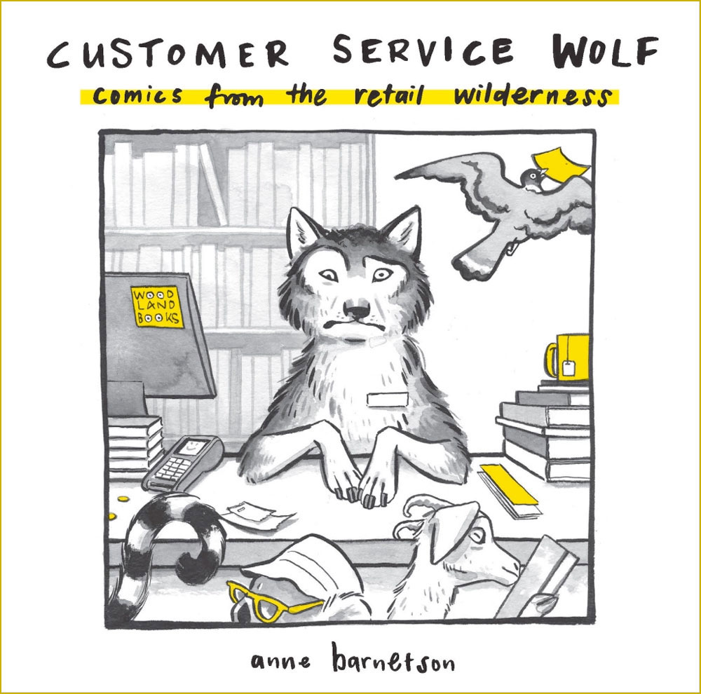
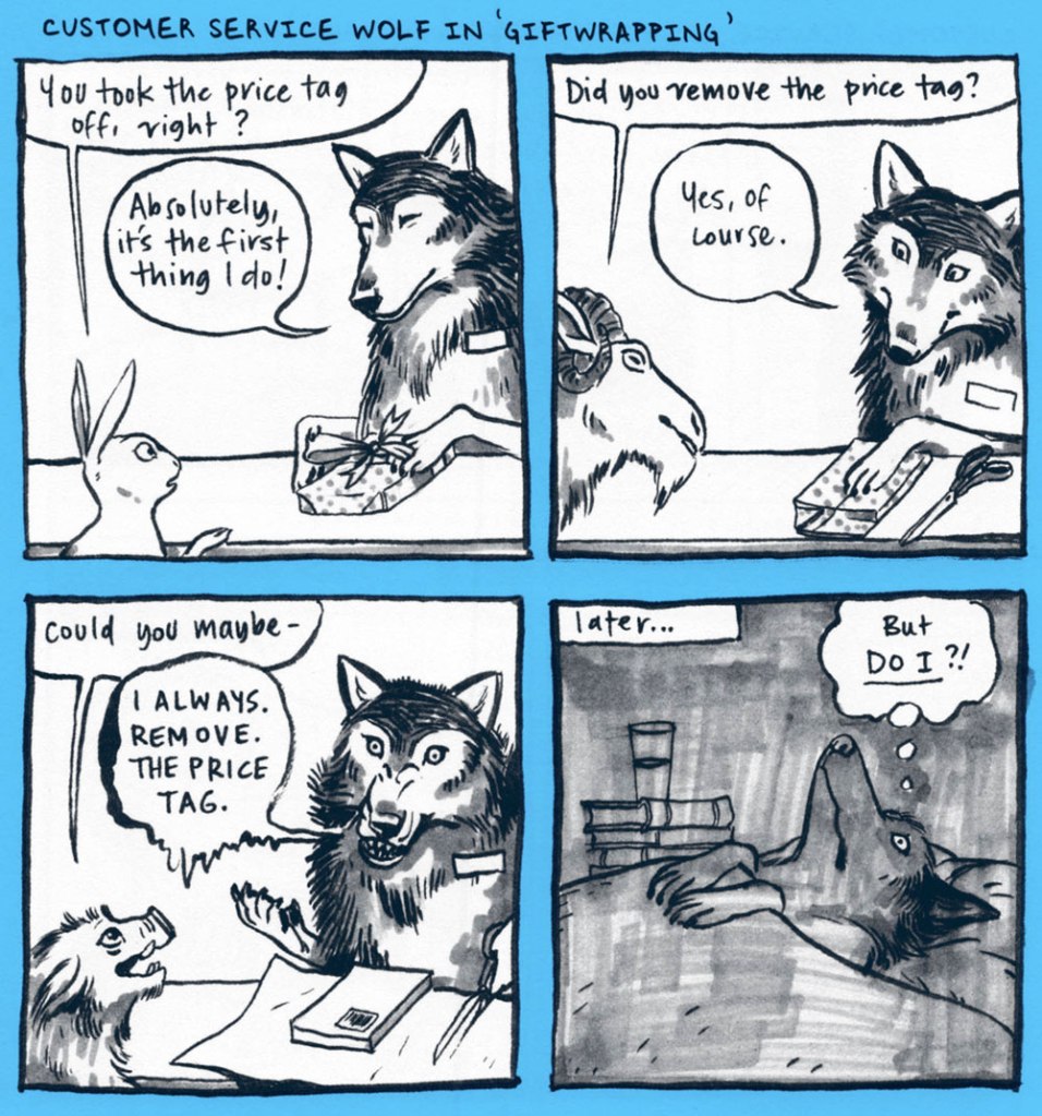
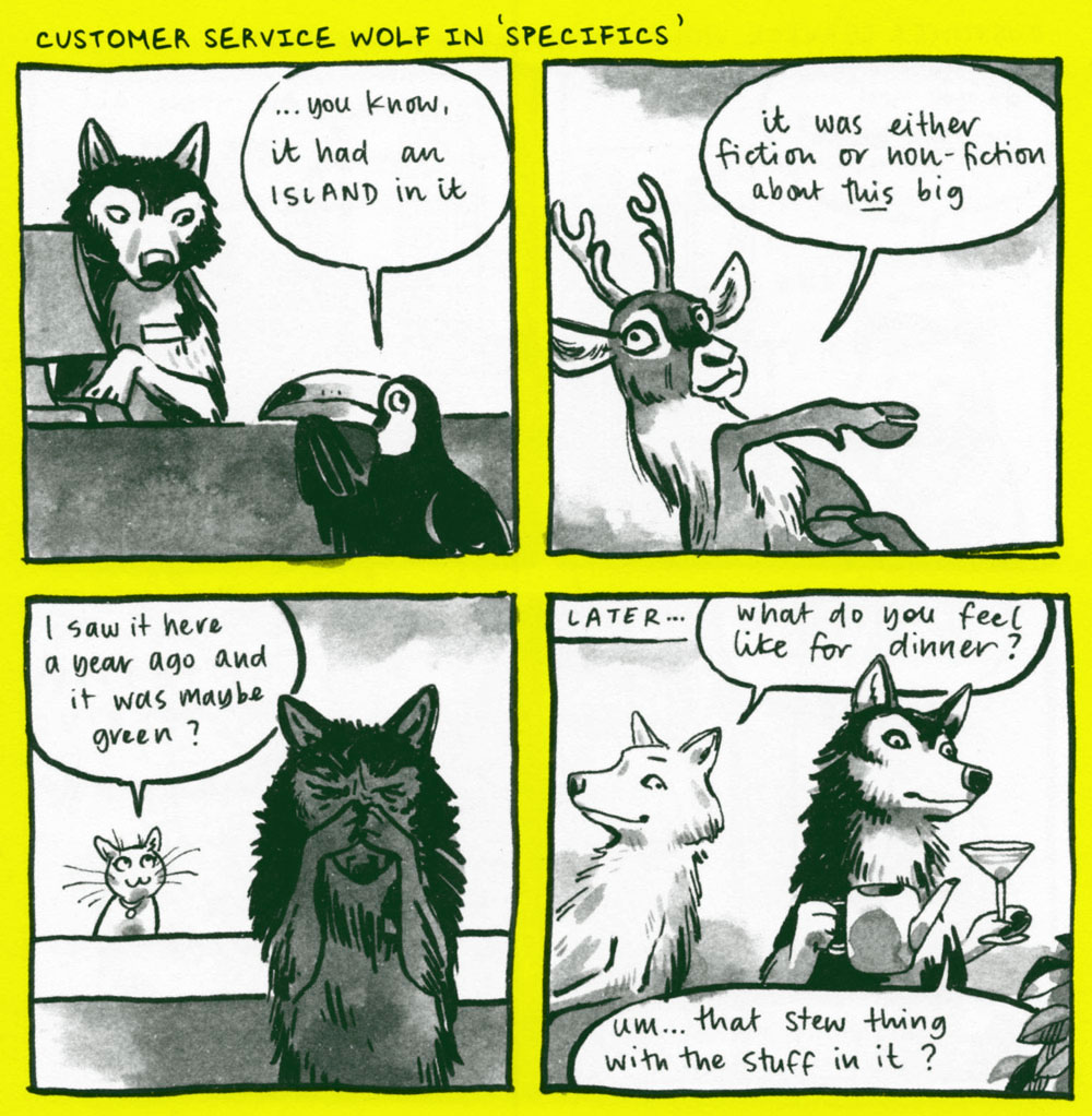
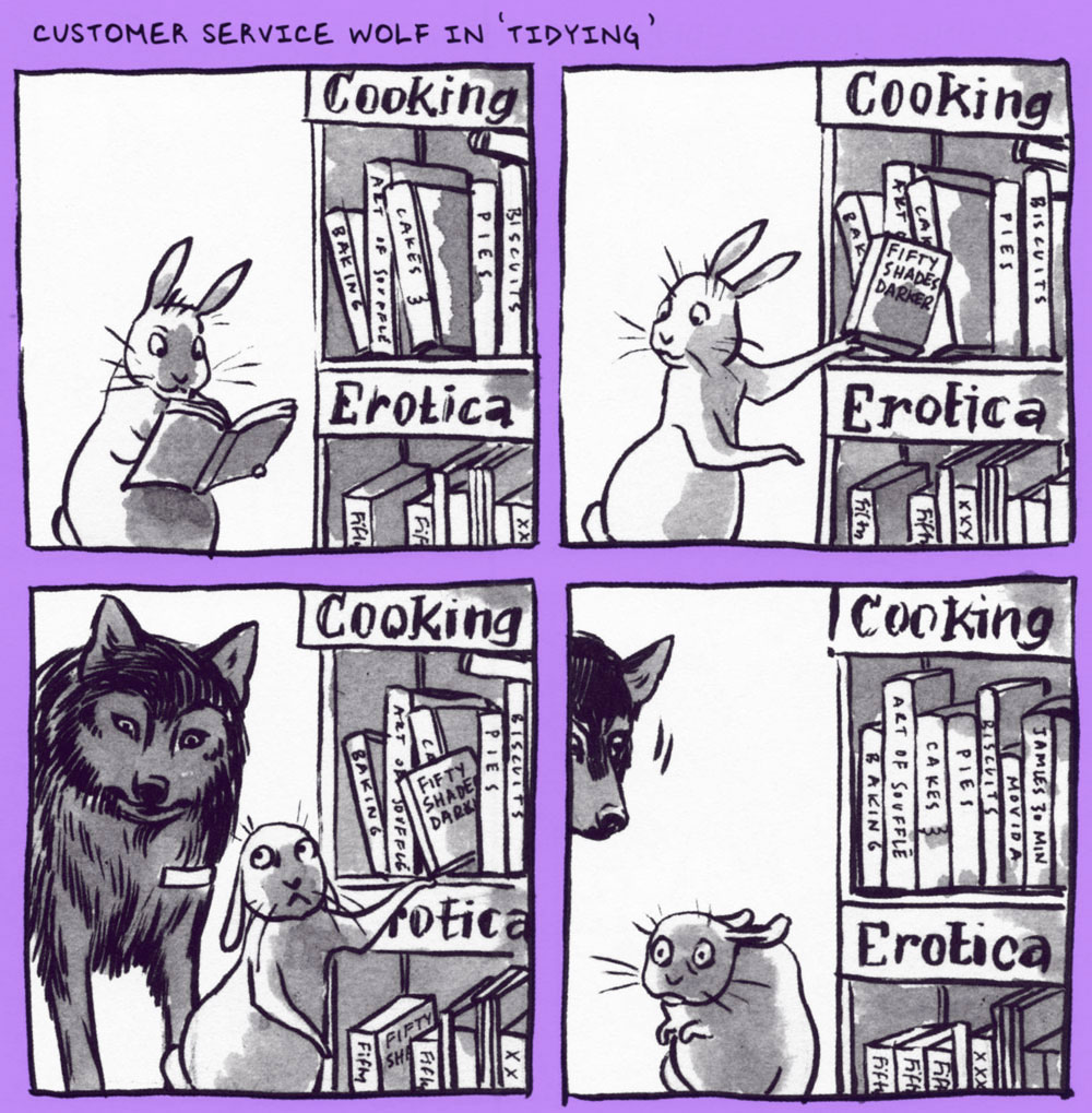
There are several things going for Customer Service Wolf, drawn by Australian illustrator Anne Barnetson. Its immediate appeal is that it’s beautifully drawn, of course. I am impressed at the variety of animals, convincingly depicted. It’s also very self-aware and funny, appending the usual ‘customers are destructive/insane’ stories with an unexpected recurring punchline (hint: it involves a wolf’s sharp jaws). A bookstore is a backdrop for a very special kind of lunacy, and Barnetson has clearly has had her share of it.
The following have been scanned from the collection (2019), but you can view all of them at the Customer Service Wolf tumblr.
One of this strip’s strengths is periodically pointing out that we the employees are not so different from the customers we mock.
« Horse sense is the instinct that keeps horses from betting on men. » — Josephine Tey
While ‘academic’ realism has never been my thing in comics, I’ve always had a soft spot for Gérald Forton (Apr. 10, 1931 – Dec. 18 2021), who left us late last year, and who would be turning 91 today. He’s certainly my favourite Bob Morane artist (1962-67), but that’s not saying much, and besides, not his best work.
And just what is his best work? Ah, that’s easy: Teddy Ted. Just like his forebears, including his grandfather, the legendary Louis Forton (1879-1934), creator of Les Pieds Nickelés and Bibi Fricotin, grew up with an undying passion for horses. The Forton clan bred, raised, sold and raced horses, so it wasn’t a mere case of the banal and stereotypical European passion for the American ‘Far West’ and its Cowboys and Indians.
In 1964, Forton and ace scripter Roger Lécureux (Les pionniers de l’Espérance, Rahan) picked up the reins of a series launched by Jacques Kamb and Francisco Hidalgo and abandoned after three episodes. The new team revamped Teddy Ted, turning the protagonist from a boy to a man and instilling Lécureux’s humanist worldview* into the proceedings.
Teddy Ted and Forton reached their peak soon after the artist left Belgium, and the Bob Morane series, to raise horses in the South of France, a direct source of inspiration and documentation!
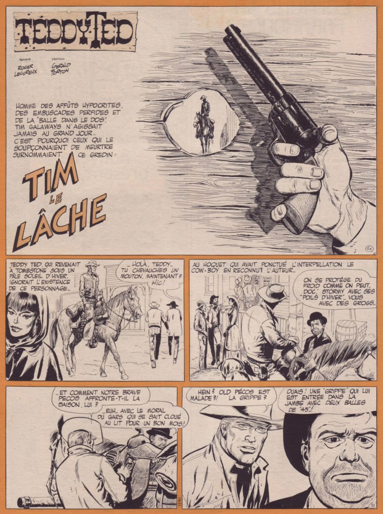
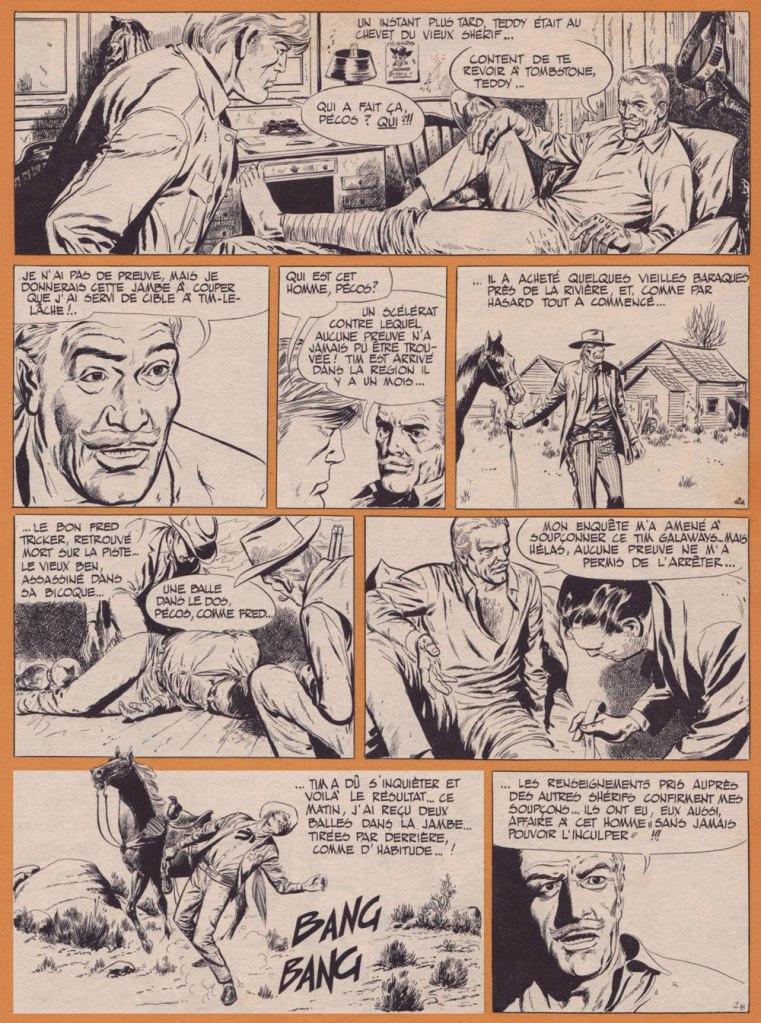
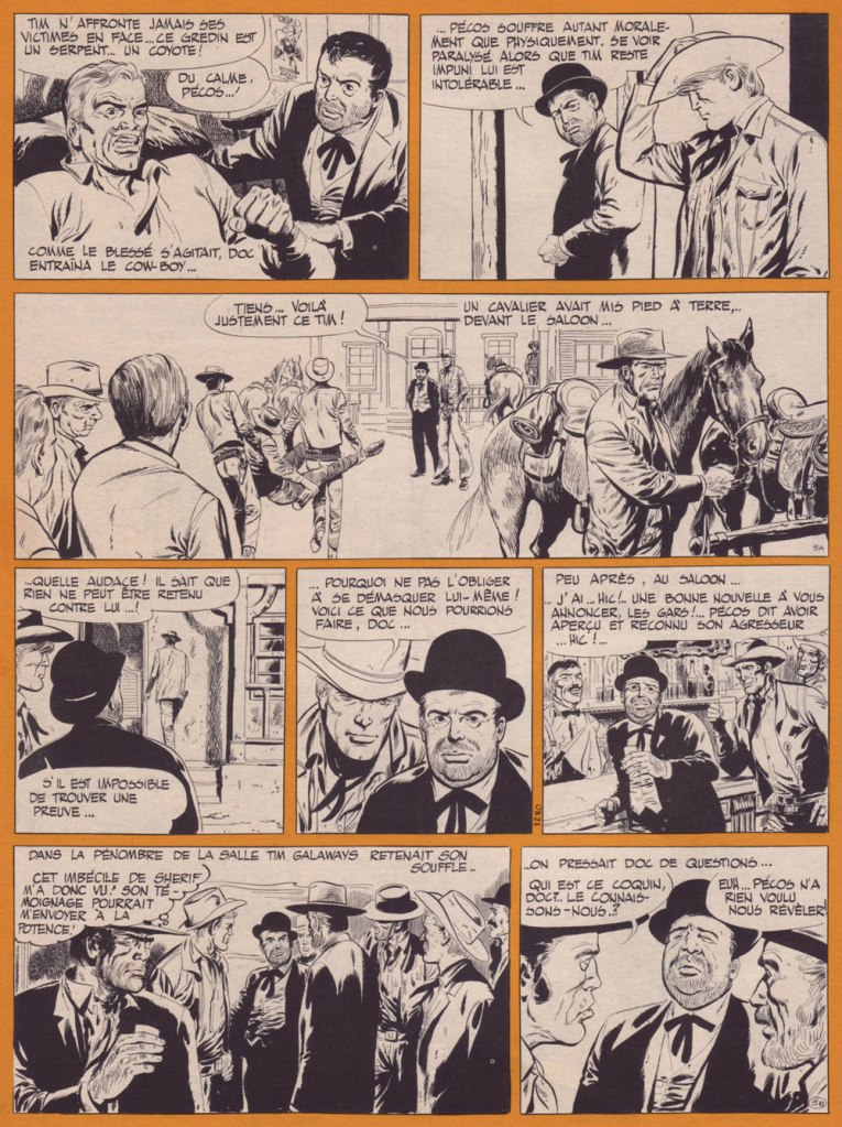
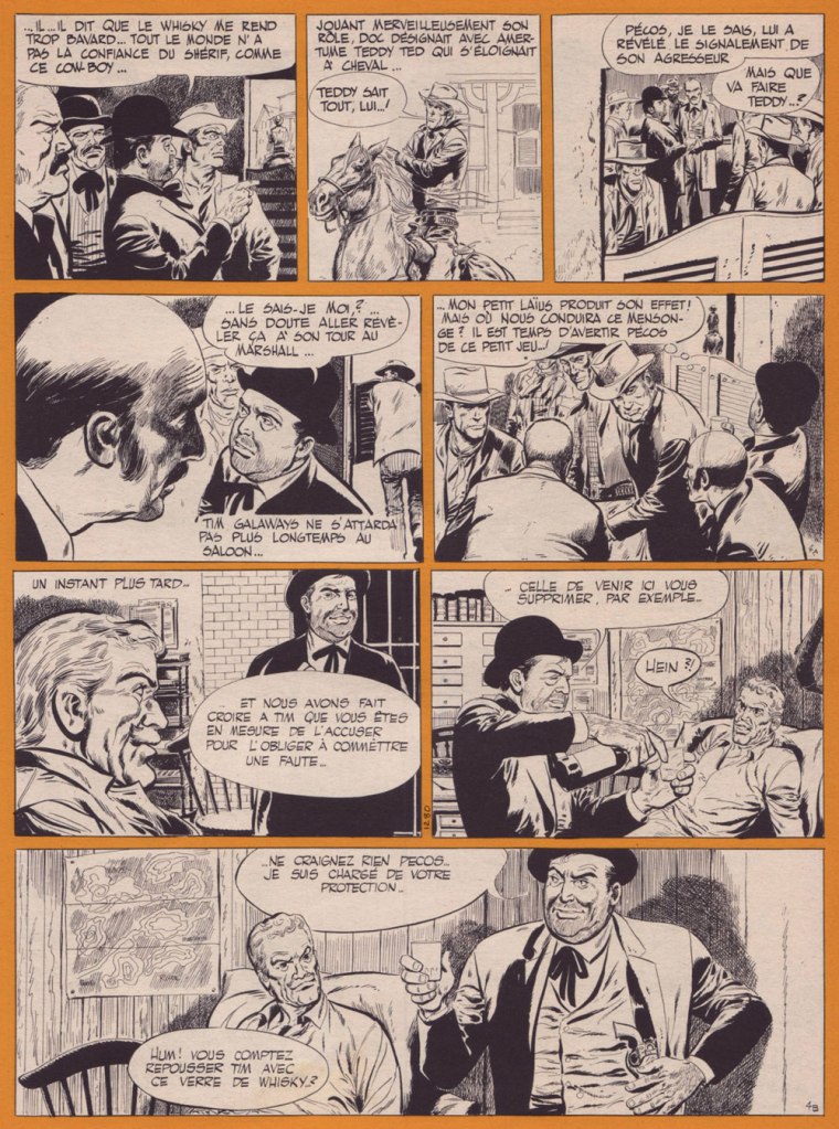
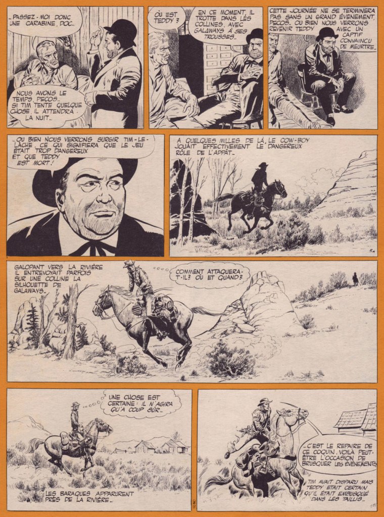
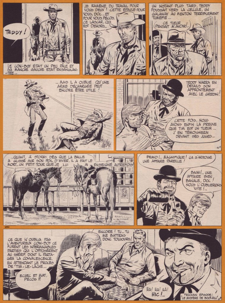
Without further ado, here’s my pick: Tim le lâche, from Pif Gadget no. 42 (Dec. 1969, Vaillant). It’s the tale of a craven back-shooting sneak against whom no-one has been able to garner any evidence, given the lack of survivors or witnesses. Given that Teddy’s close friend Pecos has been ambushed and taken out of commission by Craven Tim Galaways, Teddy and the town drunk (also its doctor!) set a dangerous trap with Teddy as bait and human target.
I’ve long had an aversion to ‘realistic’ European westerns, and that’s largely because of the absurd density of useless detail, the pages so busy and darkly-coloured as to buckle and collapse under the weight of the ink. Forton, by contrast, aside from being a master at spotting blacks, is just as bold in leaving white space where it’s needed, where the reader’s eye needs it. And here, unlike a lot of the technically-challenging genre strips (by which I mean, for instance, aviation, war or car racing, where one all-too-often encounters perfectly depicted machinery and stiff, generic human figures), Forton lavishes attention and care to every single thing, so we don’t wind up with beautiful horses and cardboard everything else. Which brings me around again to my point of Forton’s exceptionalism among the ‘realists’: the verisimilitude of his art is the result of observation, not soulless photo documentation.
After Teddy Ted was dropped from Pif Gadget, circa 1975, by its less-enlightened new management, Forton was picked to illustrate an adaptation of TV’s The Wild, Wild West (“Les mystères de l’Ouest”), which ironically made for the most realistic version of that colourful, but painfully stagey show, thanks to Forton’s excellence at capturing likenesses and conveying wide open spaces and details of period and setting.
By the early 1980s, Forton had moved to the US, where he tentatively freelanced in comic books, where he proved a poor fit. Though the French deemed him one of the most ‘American’ of Franco-Belgian cartoonists, he stood out like a sore thumb in the 1980’s mainstream, likely since his influences hailed not from comic books but rather comic strips, and those of an earlier generation at that (Alex Raymond, Frank Robbins, Milton Caniff… and his idol, Fred Harman).
He then heeded Horace Greeley’s legendary bit of advice and headed to California, bought himself a ranch in Apple Valley and, like many an overqualified but outmoded veteran cartoonist, toiled in mediocre animated shows.
Retiring from the film industry at age 75, he then devoted his time to painting, playing the guitar, riding horses, and burnishing his œuvre for posterity by providing new artwork for reprint collections of his past works, in the midst of a resurgence in Europe.
Humble, active and alert to the very end, Forton finally and peacefully rode into the sunset, at the most venerable age of 90. For more Forton art, check out this lovingly assembled gallery.
-RG
*I’m inclined to draw parallels between Lécureux’s view of the West on Teddy Ted to Star Trek creator Gene Roddenberry‘s approach on Have Gun, Will Travel: compassion, but with a hard edge.
**wherein Will Smith doled out punches rather than slaps
« Any claim to fame I might have I owe to diligent swiping right and left and staying sober at the drawing board. »
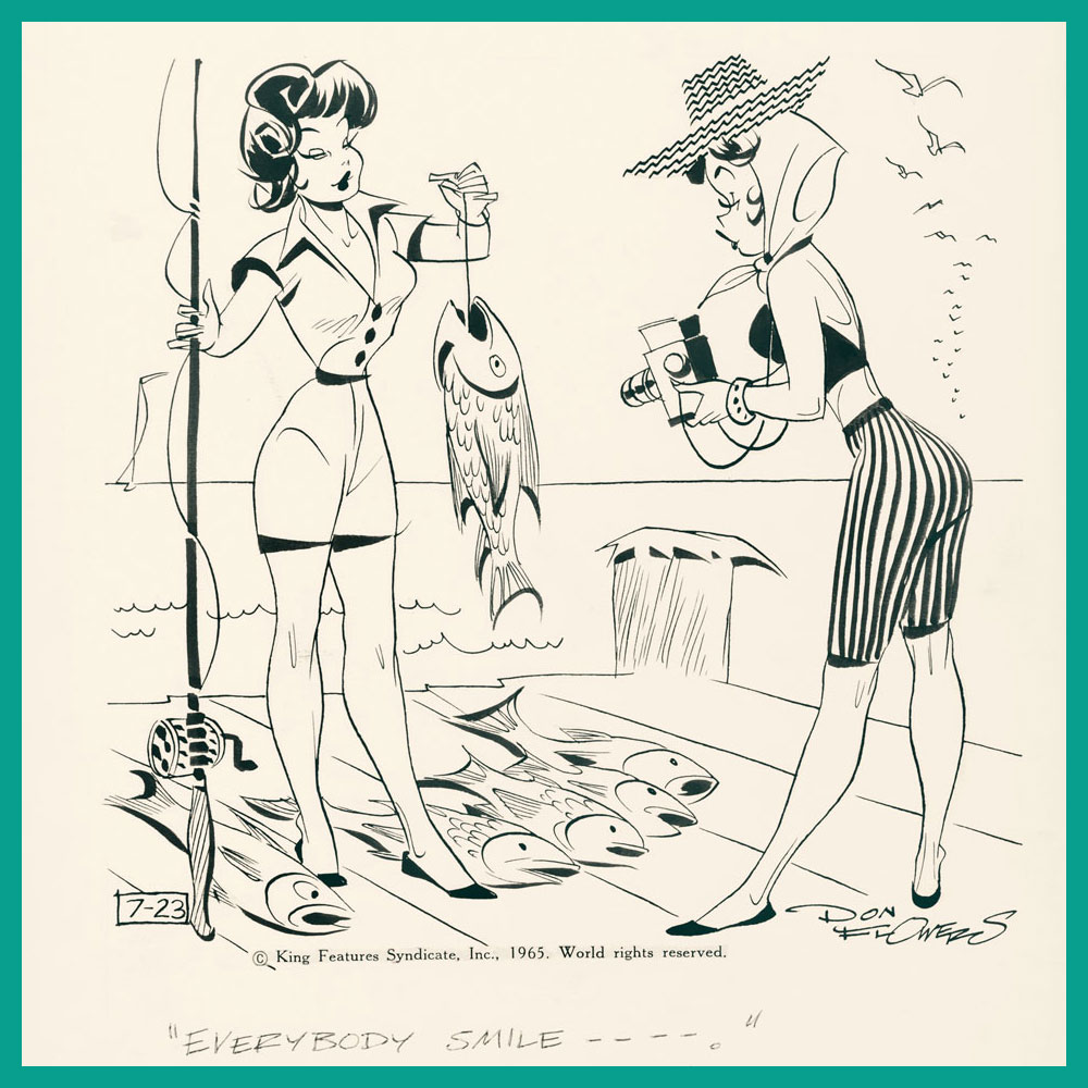
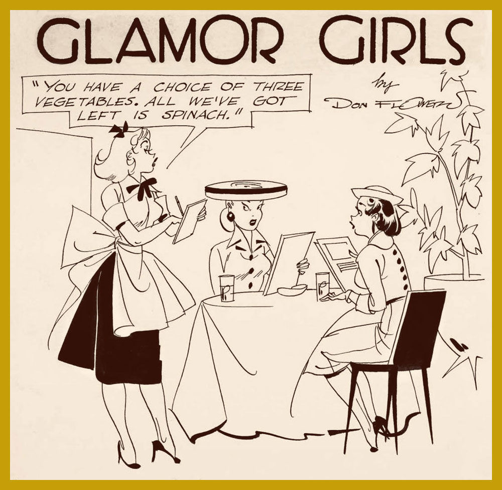
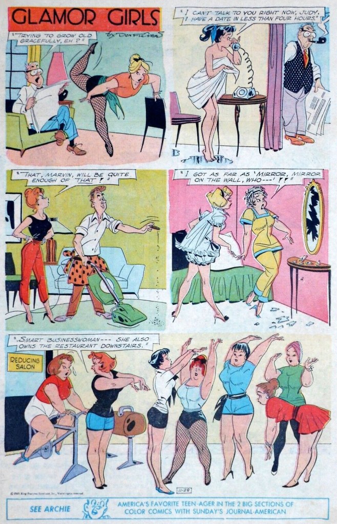
I’ve already talked about cartoonist Don Flowers (1908–1968): see Don Flowers, Sadly Neglected Cartoonist, although I wish I had given it a snappier title. I’ve been slowly ripening (like a pear, that subsequently falls off the tree with a wet, squishy thump) for a follow-up, but biding my time until I finally receive my copy of Glamor Girls of Don Flowers (2006, Fantagraphics). That goal is now (nearly) realized, and since spring seems like the perfect time for this sort of post, shall we strap on our travelling gear and fly back to the beginning of the 1930s?
To recap, Don Flowers created the alliterative Modest Maidens (later renamed into Glamor Girls) for AP Newsfeatures in 1931. The ‘modest’ epithet in the title may seem like a misnomer, or a tongue-in-cheek allusion to the girls’ open-minded mores, but as comic historian-cum-cartoonist Coulton Waugh aptly observed in his The Comics (1947)*, a book acknowledged as the first comprehensive analysis of comic strips*, « sexy they are, and yet, despite every display, somehow they always do remain modest maidens. » This is something one often encounters in cartoon depictions of female pulchritude – the standard male audience seems best attracted to women with a sort of innocent sexuality, borderline unaware of the effect they are producing despite making a calculated effort to produce it. In other words, however disrobed these maidens may be, they are never vulgar or sexually purposeful; they’re not doing, they’re being done to.
The batch of images in my previous post about Flowers focuses more on the usual scenarios – women dating rich guys, alluring dancers in various states of undress, and so on – so today’s array is in a slightly different vein.
An interesting aspect of Flowers strips is that they often feature an interaction between several women with nary a man in sight; and not only that, but they’re not even discussing men.
Even when barefoot, these girls hold their feet as if they were still strapped down in some extravagant heels. On the other hand, high heels deform the foot over time, although nobody wants to be reminded of that in this context.
What the full published page of Glamor Girls looked like (November 29th, 1959).
Much has been said about Flowers’, well, flowery line (and ‘by much’, given that his popularity distinctly waned over decades, I mean ‘not really a lot’). It reminds me mostly of Hank Ketcham‘s style, he of Dennis the Menace fame. For example, add a little scruffy kid in the corner of this strip, and see what you think:
In the meantime, Waugh puts Flowers in the clan of Pattersonites, artists who followed the footsteps of illustrator Russell Patterson (1893-1977). « The Flowers girls [are] a long-legged creation. They have a a real rhythm running through them; they are, in this respect, somewhat more relaxed and graceful than the Patterson product, although the pattersonites can claim a vitality and sparkle on their side. » I would say that the Patterson girls have stronger wills, an independent streak that you can see in the slightly insolent look they give the men who ogle them. For comparison’s sake, the following three are by Patterson:
Sometimes self-defense is necessary.
~ ds
*You can read in full here; the first edition from 1947 goes for a lump sump of money these days. There is an affordable reprint from 1991, but it cannot beat the original cover:
« In Hawaii they say, “aloha.” That’s a nice one, It means both “hello” and “good-bye”, which just goes to show, if you spend enough time in the sun you don’t know whether you’re coming or going. » — George Carlin
By and large, the notorious 1990s trend of autobiographical (at times navel-gazing) comics was undermined by its practitioners’ dearth of meaningful life experience and insight. Obviously, there’s been plenty of notable exceptions, before and since: on the insight front, for one, Canadian David Collier is an undervalued master of the documentary form.
As for life experience, puissant Dennis P. Eichhorn (1945-2015) put all the pasty, effete cartoonists to shame with his spectacularly turbulent, bold-type life. A gifted writer and storyteller, well-versed in the comics medium, he galvanised the creativity of his many collaborators, a broad yet aptly-selected crew of graphic practitioners, many of whom he’d met in the course of his lengthy writing and editorial stint with Seattle’s fabled The Rocket weekly.
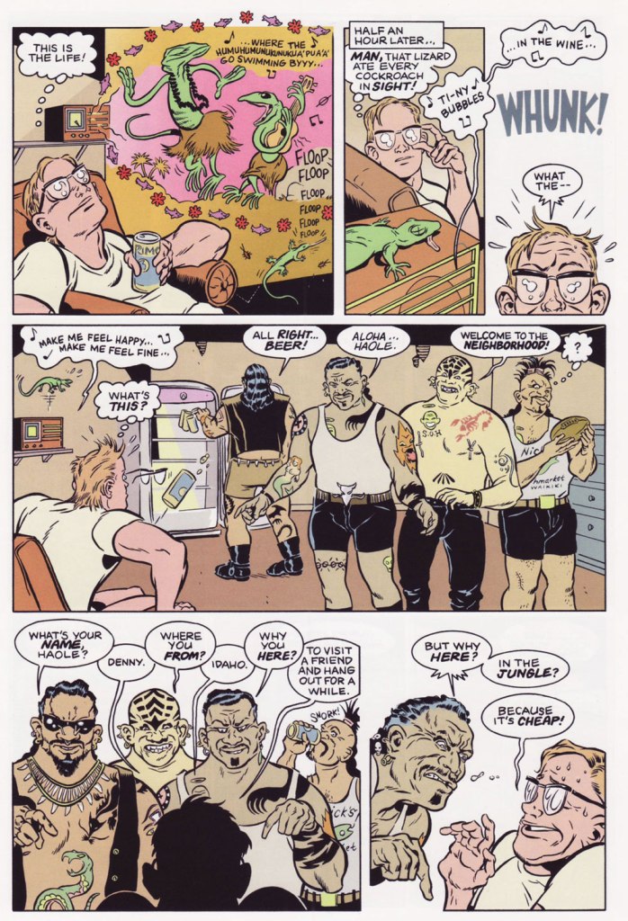
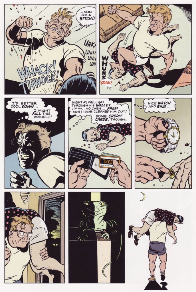
I initially assumed I’d run into trouble in settling on the one story to showcase, but nope… right away, I knew just the ticket… a ticket to the Big Island.
Monkey See, Monkey Do, written by Eichhorn and illustrated by Gene Fama, first saw print in Real Stuff no. 11 (Jan. 1993, Fantagraphics); there, it appeared in black and white, but was coloured, presumably by Fama himself, for Swifty Morales Press’ lovingly-done 2004 Real Stuff anthology.The issue originally featured a Charles Burns cover coloured by Jim Woodring (another master of autobiography, en passant). Burns presumably wasn’t too keen on the original palette (whose murkiness, to be fair, rather overwhelmed his drawing), so he recoloured it himself for the anthology. This is the all-Burns version. Compare, if you will, to the Woodring rendition. A candid shot of our fair young author on a visit to Seattle, circa 1992, with Mr. Eichhorn, along with a friendly member of the local ethylic intelligentsia, who successfully lobbied for inclusion in the shot. You decide who’s who.
-RG
p.s. It would be easy to assume that āhole is just a fancy way of saying ‘asshole’, but it isn’t *necessarily* so; to wit:
āholen. An endemic fish (Kuhlia sandvicensis) found in both fresh and salt water. The mature stage is āhole, the young stage āholehole. Because of the meaning of hole, to strip away, this fish was used for magic, as to chase away evil spirits and for love magic. It was also called a “sea pig” (puaʻa kai) and used ceremonially as a substitute for pig. Foreigners were sometimes called āhole because of the light skin of the fish. He āhole ka iʻa, hole ke aloha, āhole is the fish, love is restless [of āhole fish used in love magic]. [ source ]