« Remember you belong to nature, not it to you » — Grey Owl
Why it took me this long to spotlight David Collier, who’s been one of my favourite cartoonists for decades, is, even to myself, a bit of a puzzle. Is it perhaps because his work already receives plenty of attention – chiefly in English Canada (what we in Québec mockingly call ROC — Rest of Canada)? Could be, but I’m ready now.
While Collier’s rough-hewn, scratchy line won’t get him confused with, say, Tom Palmer or Brian Bolland in this particular plane of reality, it’s absolutely perfect for his writing and persona. He’s a riveting storyteller who catches — and properly interprets — details any more casual observer would miss, yet he’s frequently unable to read the room. He’s a formidable writer, but his spelling* is… perhaps lamentable is too strong a word, at least for his English. He is, however, utterly impervious to French**.

.
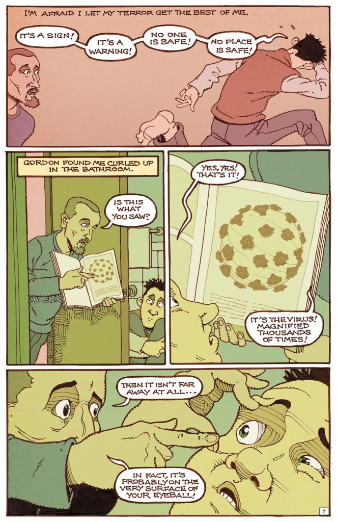
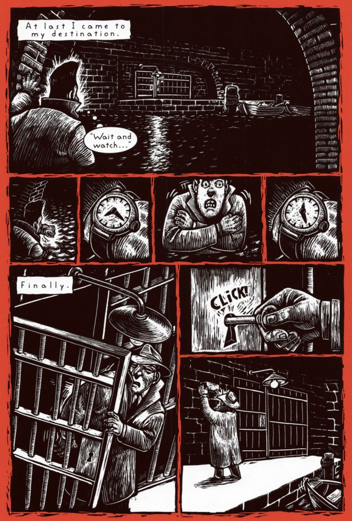
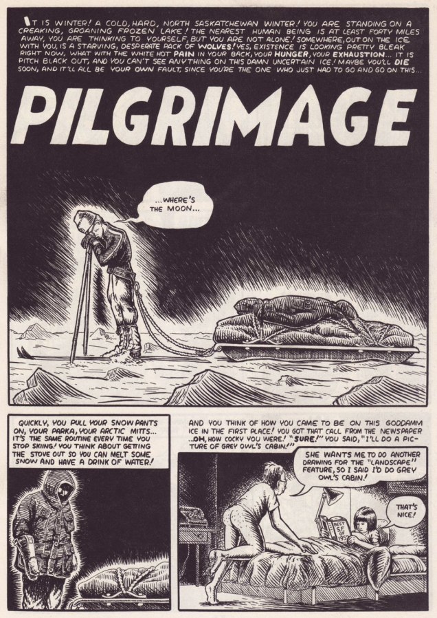
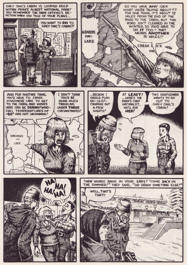
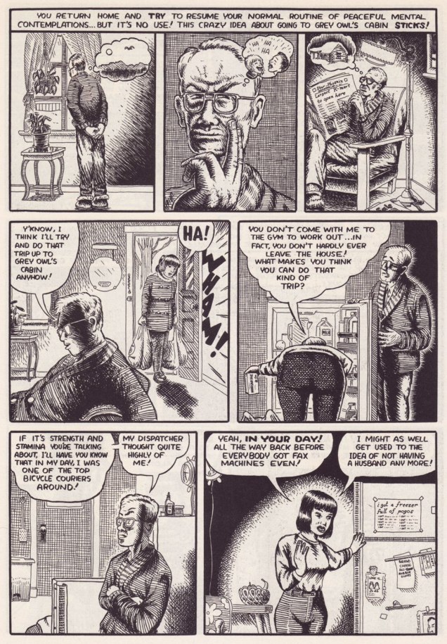
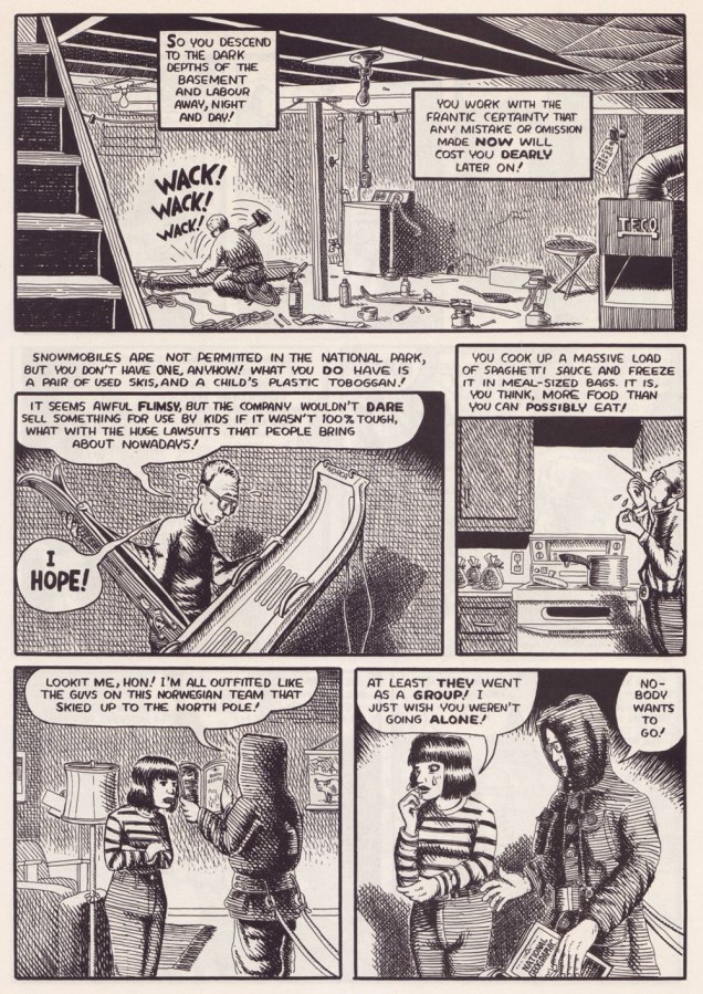
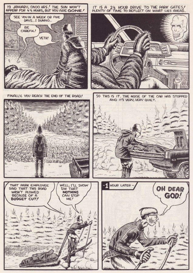
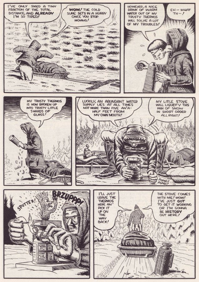
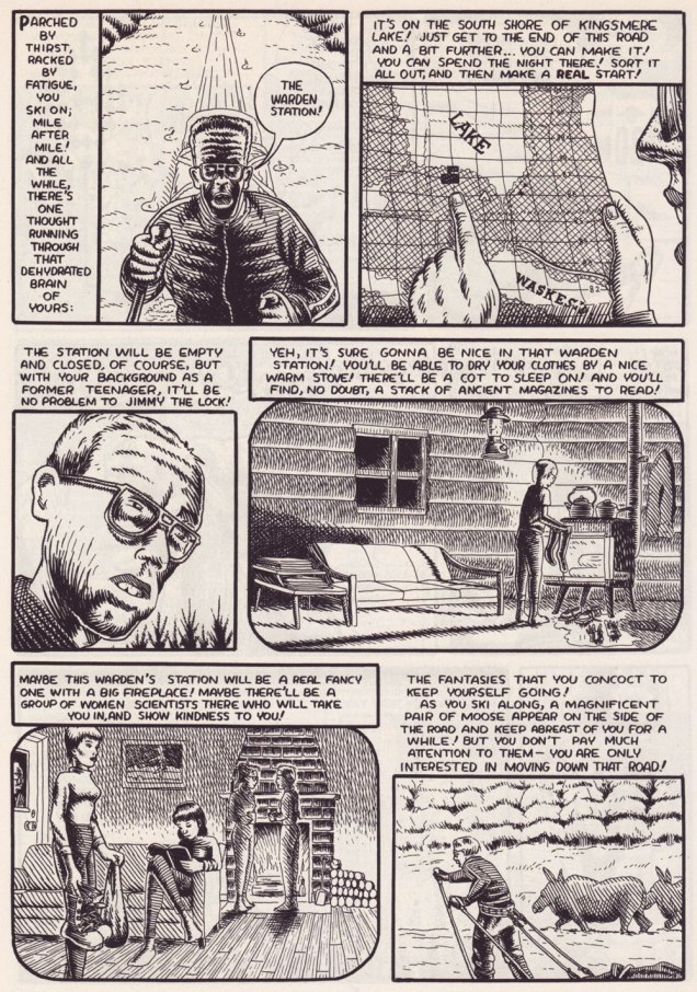
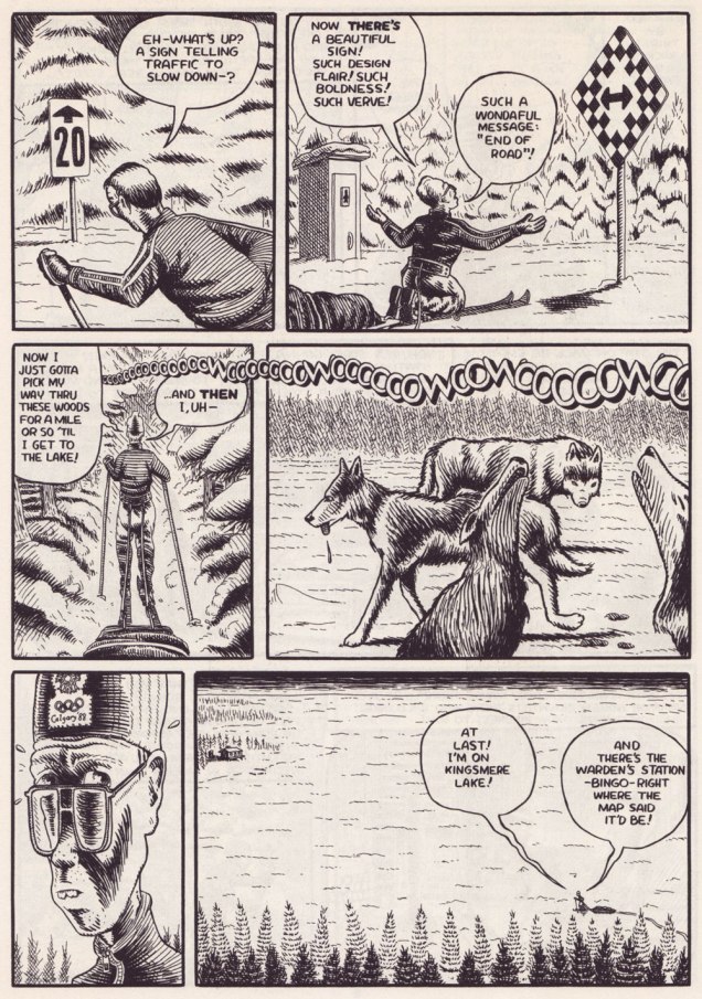
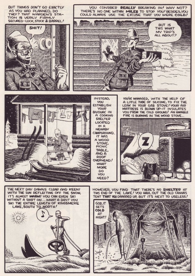
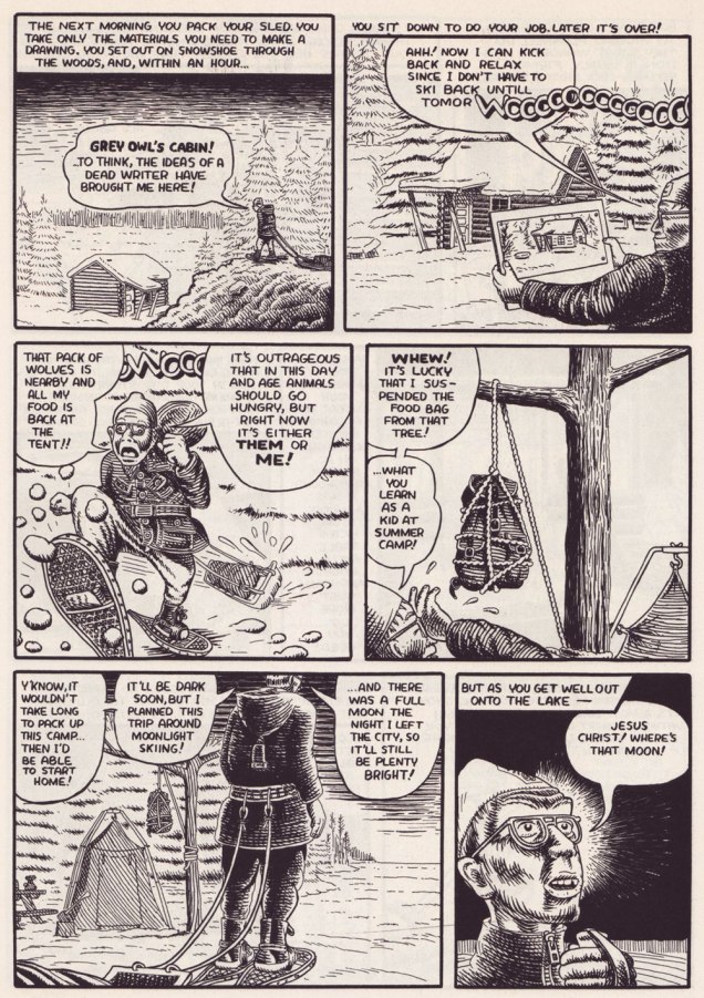
Collier is also entirely at ease with long-form narratives. Here’s a personal favourite of manageable length. It was this piece that made me a loyal fan. The issue of Collier’s it appeared in brilliantly splits its pages between David’s perilous trek to Grey Owl’s cabin and his account of the man’s life story, providing both a solid history lesson and a portrait of the artist as comics character. This material was also reprinted in Portraits From Life.
.
.
.
.
.
.
.
.
.
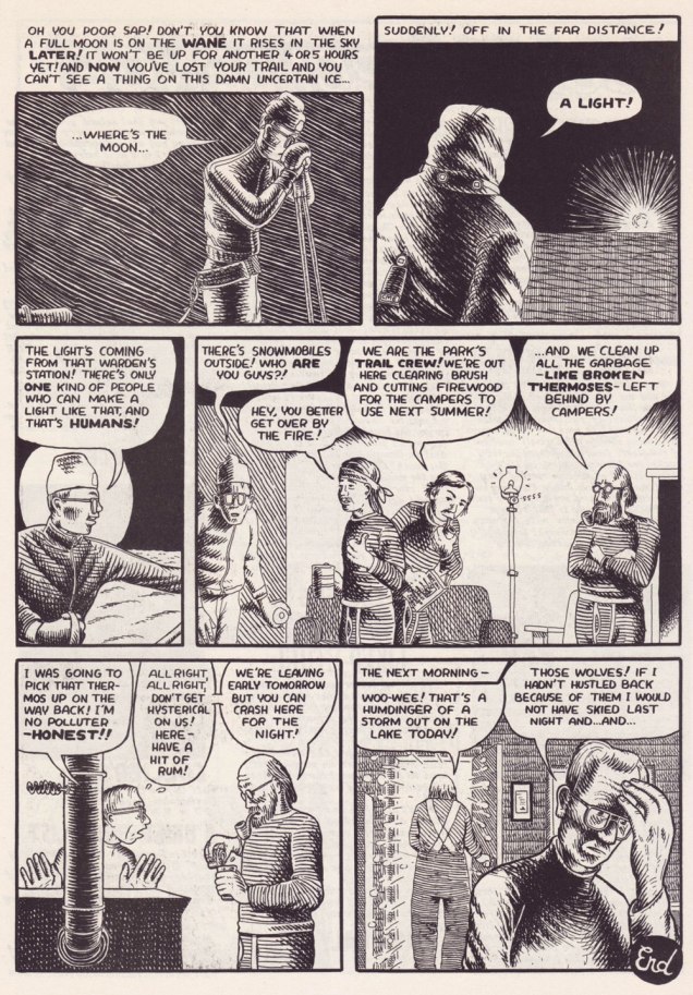
I find it intriguing that Collier, a Canadian history buff if there ever was one, was unfamiliar — circa the early 90s — with the larger-than-life personage of Grey Owl (alias Archibald Stansfeld Blarney, I mean Belaney) the Buffy Sainte-Marie of his day… but we all have our blind spots. Lo and behold, just a few years later, comes the Hollywood biopic. Interesting coincidence…
I’m happy to say that Collier has continued to grow, even if his French isn’t improving. The most recent book of his I read, Morton: A Cross-Country Rail Journey, was also likely his finest. But that was nearly a decade ago. Let’s hope for something new soon!
-RG
*Robert Crumb himself had scolded him about his spelling… way back in the 1980s.
**the nadir of this is the appearance of « Homme de le bois » (which even a mediocre copy editor would have immediately flagged) right there on the cover, and again inside The Frank Ritza Papers (2004, Drawn and Quarterly). While D&Q were quick to assign Collier a ‘fact-checker’, spelling — especially French spelling! — didn’t seem to be much of a concern. Sigh.