« I am fond of pigs. Dogs look up to us. Cats look down on us. Pigs treat us as equals. » — Winston Churchill
Recently, I’d been drawing a blank as to the topic of my next post. So I did what one does in such distressing circumstances: I pulled something at random from the nearest bookshelf — just filled a couple of days earlier, conveniently.
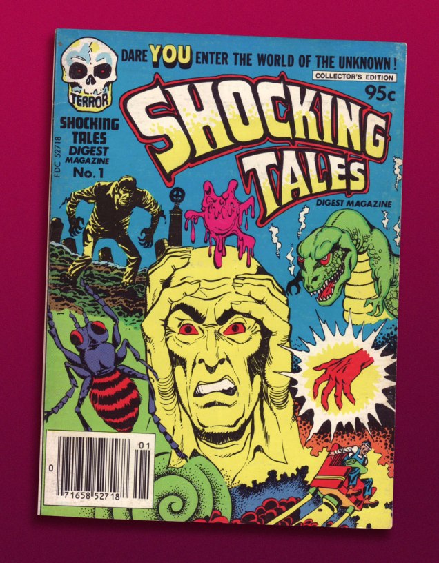
And it paid off: my hand landed upon a screwball, one-shot digest published by a near-defunct Harvey Comics. Its contents? A hodgepodge of 1950s horror and SF tales, including, for instance, Bob Powell‘s classic Colorama (1953) and some of his Man in Black (1957-58) stories. Ninety-five cents well spent.
This is Shocking Tales Digest Magazine no. 1 (Oct. 1981, Harvey).
The finest riches in dem dar hills, however, consist in some rather obscure — given its regal pedigree — Jack Kirby material from the late 1950s, reportedly written, pencilled and inked by The King.
However, given the dodgy printing quality of a comics digest, I had to pull out my second-oldest Kirby Komic (the most ancient being December 1952’s Black Magic no. 5 — read it here!) and very, very carefully scan the relevant pages. Oh, the sacrifices I make for this blog! 😉
.
.
.
.
.
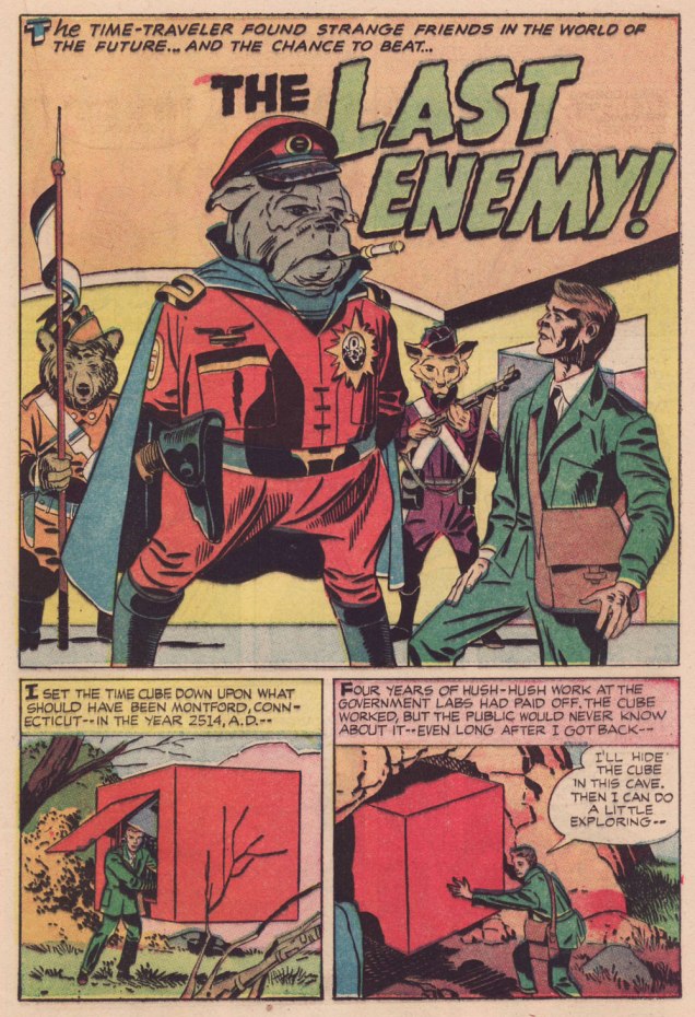
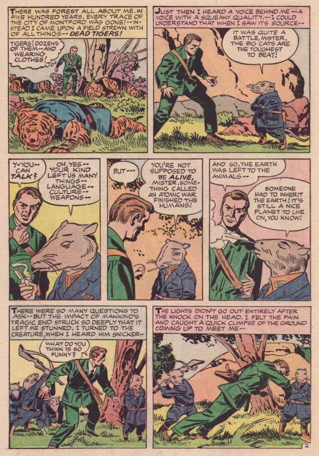
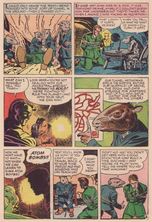
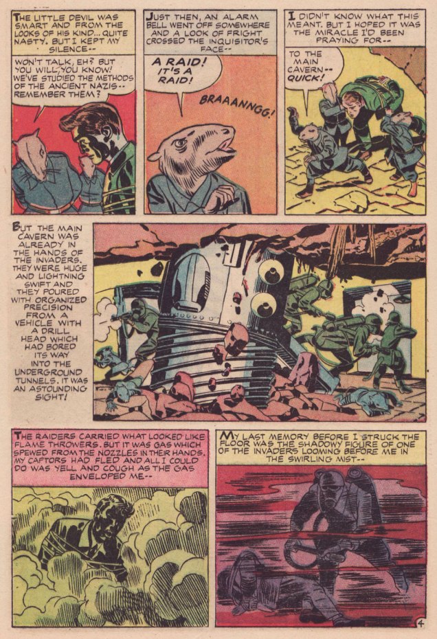
Kirby has often been unfairly slagged for ‘riffing on’ the popular Planet of the Apes franchise, but The Last Enemy predates the 1968 film’s source, Pierre Boulle‘s 1963 novel La planète des singes by some six years… and besides, the ‘animals taking over’ theme has a long history in science-fiction. To name but a pair of antecedents, there’s Lester Del Ray‘s The Faithful (from 1938) and Clifford Simak‘s City (linked stories published between 1944 and 1951 and amalgamated in 1952).
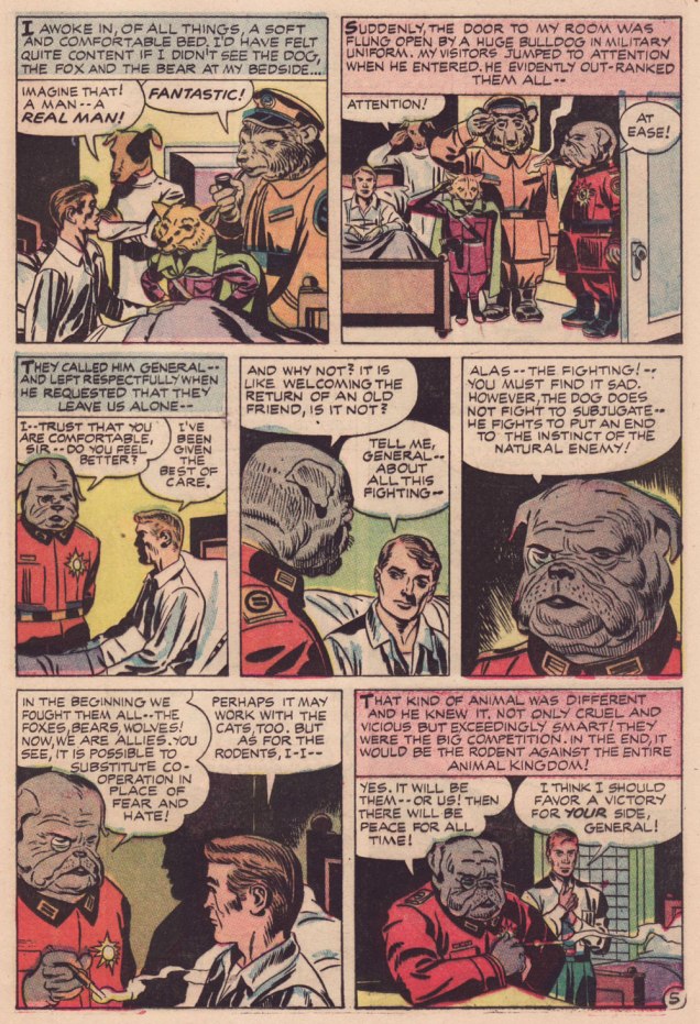
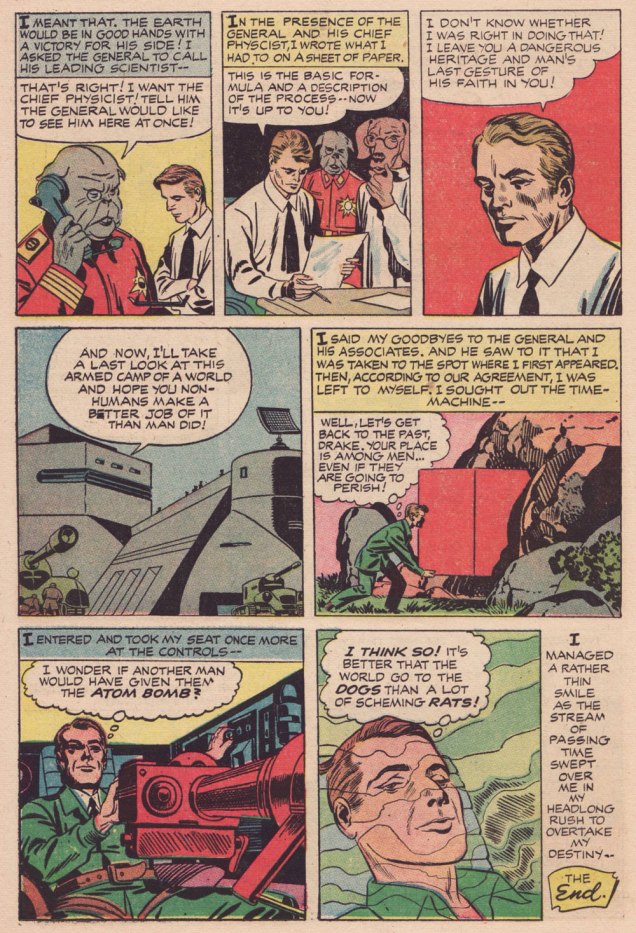
Here’s a second story, which I like even better, thanks to its humorous touches. Several of its plot ideas could have been expanded upon in OMAC, had Kirby been granted time and opportunity.
.
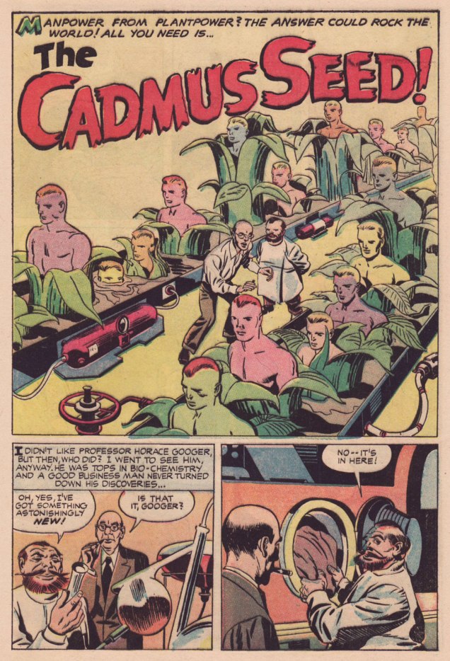
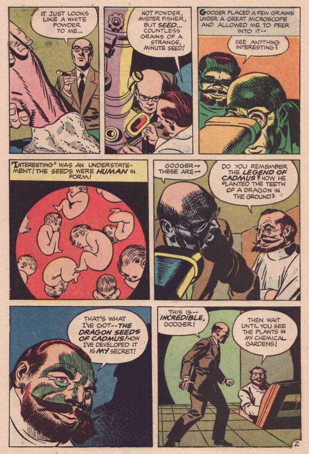
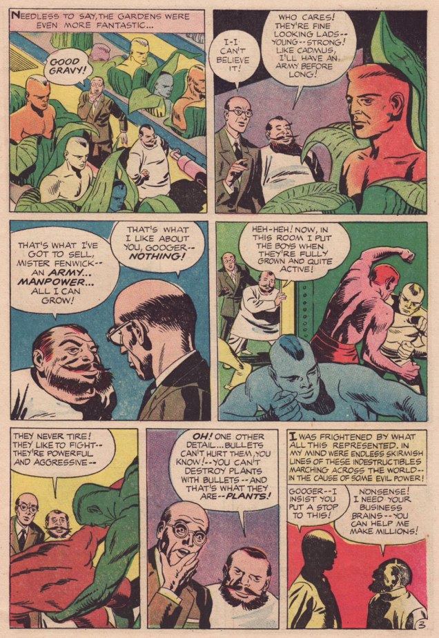
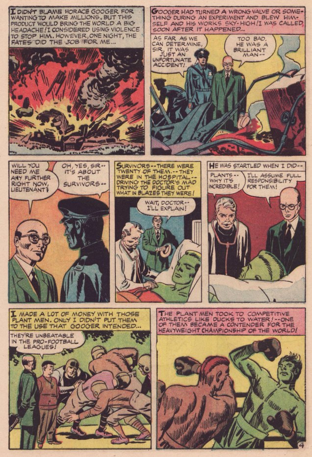
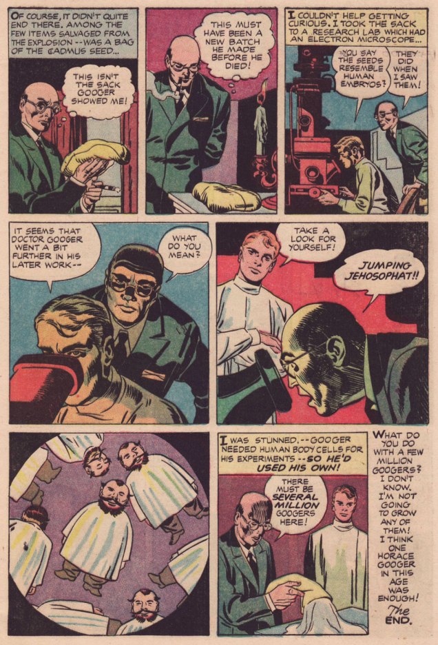
Learn all about the aforementioned Legend of Cadmus and amaze your friends (or bore them to tears, depending on the quality of your circle)!
.
.
.
I suppose I can take Babs having her favourite pooches cloned, but I shudder at the prospect of, ahem, certain people being genetically reproduced on an industrial scale. Another argument for nailing that particular Pandora’s box shut for good.
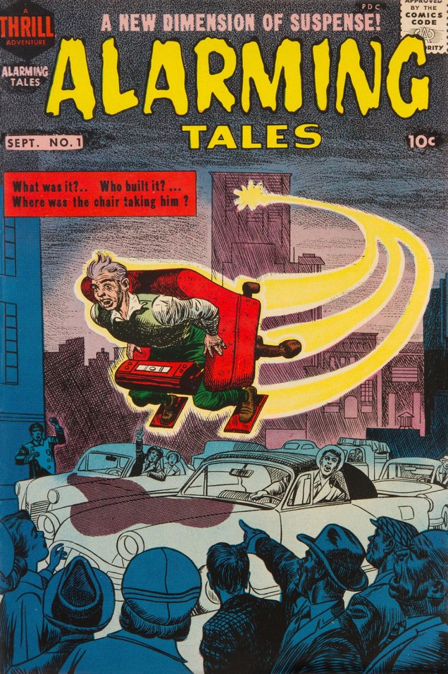
Both yarns appeared in this jam-packed. all-in-colour-for-a-dime wonder, Alarming Talesno. 1 (Sept. 1957, Harvey). I was fortunate enough to pick up a copy for peanuts, eons ago — but fret not, you can read it gratisright here.
Cover artwork by Joe Simon (main figure) and Kirby (everything else). Further details on this issue can be found here… and you can read the rest of it here!
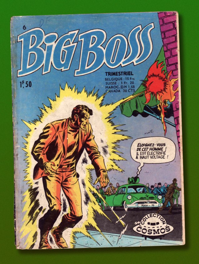
This is Big Boss no. 6 (Oct. 1971, Arédit-Artima); cover by Ruben Moreira.
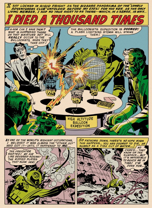
One might be inclined to say that, with its themes of adventurers cheating death or living on borrowed time, I Died a Thousand Times inspired Kirby’s Challengers of the Unknown, except that Ace, Rocky, Prof and Red had burst into print a few months earlier. Suffice it to say that they sprang from the same fertile well. It’s always intriguing to observe how the particular seed of an idea can be grown in a myriad of directions.
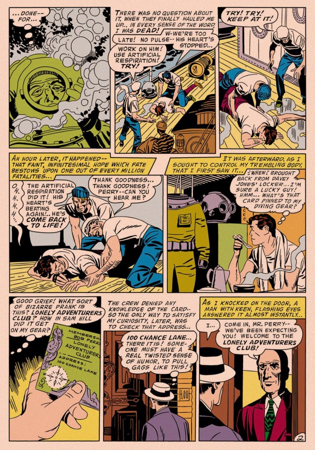
If you’ll forgive me the intrusion, this is how the opening panel appeared in the Big Boss reprint. In order to make things more readable in the digest format — and in black and white — Arédit‘s in-house art department routinely reframed and even augmented the artwork, with varying degrees of competence and success. This is one of the more accomplished efforts. The story’s writer is unknown (though it features a most Kirbyesque plot); it was pencilled and likely inked by King Kirby, and originally appeared in My Greatest Adventure no. 16 (July-Aug. 1957, DC); edited by Whitney Ellsworth; Jack Schiff; Murray Boltinoff and George Kashdan… let’s just say DC *was* a tad heavy on the management side in those days.
Though Kirby’s standalone short stories of this period are as charming and inventive as you’d expect, this modest trove of material has by and large been neglected. While a handful of these tales (The Thief of Thoughts; The Creatures from Nowhere!; The Cats Who Knew Too Much!; The Man Who Betrayed Earth; The Negative Man; and The Stone Sentinels of Giant Island) were semi-randomly reprinted in the early 1970s when DC had lots of pages to fill, this one didn’t resurface in North America until 2011’s pricey-then-and-pricier-now hardcover Jack Kirby Omnibus no. 1.
« This is the very center of everything there is. A huge black hole eating up the galaxy. The end of everything. » — Clifford D. Simak
Early in the Fall of 1979, I was pleasantly surprised to discover some new work by Jack Kirby in our weekend paper’s comics section. Things had been awfully quiet on the Kirby front since late 1978, the ‘King’ having unhappily — and quite understandably — left Marvel for the second time that decade.
This new work was part of the long-running anthology strip Walt Disney’s Treasury of Classic Tales (1952-1987). I dutifully collected the shabbily-printed comics sections and patiently hoped for an improved presentation.
The October 28, 1979 Sunday strip, as it appeared in newsprint. Incidentally (and unoffically) here’s the whole story.The surviving original art page from the same date, for comparison.
Western Publishing, usual licensee of Disney product since its acrimonious split from Dell in 1962, then issued a Black Hole adaptation, in both a slick magazine and comic book format. But — holy bait-and-switch! — it wasn’t the Kirby version!
A typical page from the Western Publishing adaptation. Written by Mary Carey and illustrated by Dan Spiegle (1920-2017), a perennial favourite of the publisher’s. Another mystery: since Spiegle had earlier proven himself well-capable of capturing likenesses, one must assume that the decision to dispense with likenesses of Anthony Perkins and Ernest Borgnine and replace them with those of, I dunno, ‘Weird’ Al Yankovic and Ontario prime minister Doug Ford must have come down from on high. But… why?
I’ve been musing over these riddles ever since (in my spare time). Recently, I decided to act by putting the question to one who was there… namely Mr. Michael Royer, who’s been most gracious to us with his time and recollections (check out our three-part interview with MR!) — and continues to be!
RG: Mr. Royer, I’ve long been baffled as to why Disney (or Western Publishing, at any rate), thought it necessary to commission two separate comics adaptations of The Black Hole. I’ve always surmised that Kirby was considered too wild for them, but that’s just speculation on my part.
Since you were working for Disney at the time, and you inked the Kirby adaptation, I presume that you played some kind of role behind the scenes as well. Could you share some of the facts with me (and my readers)?
MR: Jack Kirby was selected to draw THE BLACK HOLE Sunday comic strip on MY recommendation. Gold Key editors always selected their OWN artist for similar licensed material… plus they were in no position to pay their artist the fee I got Jack. I inked and lettered HOLE and made necessary changes to the robots to protect the image for toy, etc. sales trademarks. Jack was an impressionist and I made the robots “on model.”
Jack became so bored with the scripts, that were done “storyboard” like by someone who had NO understanding of how to make comic art interesting and exciting, that he asked me to layout the FINAL Sunday page, which I did. I had told the powers that be at Disney that Jack must get his originals back but, of course, being Disney, they did not return them as they had promised. Jack only got the remaining pages not yet sold by the Circle Galleries after threatening Disney with a lawsuit. Disney gave me one of the Sunday originals because someone had spilled a cup of coffee on it.
The head of our Creative Services dept. at Disney was not a big fan of Kirby* and after I had inked the first Sunday he had another staff artist “fix” the faces, which stood out like what they became: inept changes. I yelled “DON’T CHANGE THE FACES!” They gave in to my warning.
It was an interesting time back then. Bob Foster and I were the ONLY artists in Creative Services who had worked in comic books and strips. They would never take our word about things until our department head, Bob and I, were on a conference call with Sylvan Beck (King Features Strip Editor in New York) and then they believed what we had to say about the ways a Sunday strip could be drawn to fit many formats. It was very frustrating at times knowing more than your “bosses.”. But… it is the same old story. Middle management was loaded with MBAs who didn’t know shit from shinola! We used to joke that if one had an MBA anyone could get hired at Disney… You didn’t have to know a damn thing about anything else except how to get the MBA.
RG:I’ve read somewhere that the Black Hole scripts were the work of Carl Fallberg. I mean, if that’s true, surely he wasn’t the one who storyboarded the script, as it’s a bit hard to reconcile ‘NO understanding of how to make comic art interesting and exciting’ with a visual artist of Fallberg’s calibre… might he have delegated the task to some flunky?
MR:It was Fallberg… storyboard layouts for each panel/page. I liked Carl and he was a nice man, but he had no idea how to “jazz” up the film visually and Jack wasn’t about to rock the boat, by being his usual inventive self. The script layouts were just like the film… boring. Just a blow by blow of what was going on in the film. The comic strip could have been exciting if Carl hadn’t just “stuck” to the movie. But, perhaps I am being too critical. Carl was probably “following orders” from our department head. When I tried out to do strip art for Disney in the late 60s or early 70s that same department head told me NOT to worry about “likenesses” of the actors. So when I told in my samples they were turned down because “no one looked like the actors.” Gawrsh…as Goofy would say. As I said… Bob Foster and I were the only guys in Creative Services who had ever been intimately involved in comic book or strip art production in our department. Things did change a bit eventually.**
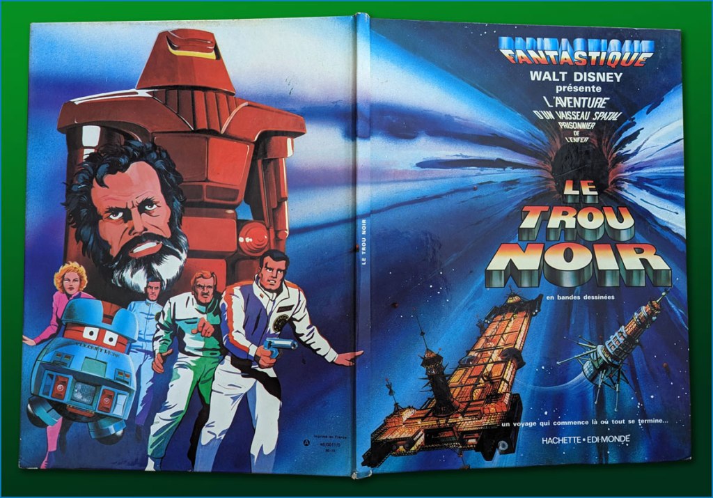
I’ve heard it said that the Kirby Black Hole material has never been reprinted or collected in full… which is only true if you only count English-language editions. I happen to have on hand the well-produced French collected edition (Fall 1980, Edi-Monde/Hachette). It was serialised earlier in the weekly Le Journal de Mickey (published continuously since 1934!).I’ve mostly gone with the action sequences. In an episode of Sneak Previews, film critics Gene Siskel and Roger Ebert perceptively assessed The Black Hole‘s shortcomings.Here’s a look at the hardcover collection in question, with its amusing cod-Kirby painted back cover.
I leave the final words to Mr. Royer, along with my earnest appreciation of his gregarious generosity!
MR:As a point of interest (or none at all), I designed and drew the Sunday page BLACK HOLE title panel as well as lettering, correcting robots and inking. I have a full set of B&W proofs if any one is interested in putting them into print. Offered to loan them to IDW but I guess they weren’t interested. My price must have been too high. Two comp copies of whatever they printed. LOL sigh.
*this was decades before Disney became perfectly fine with reaping billions upon billions from Kirby’s creations.
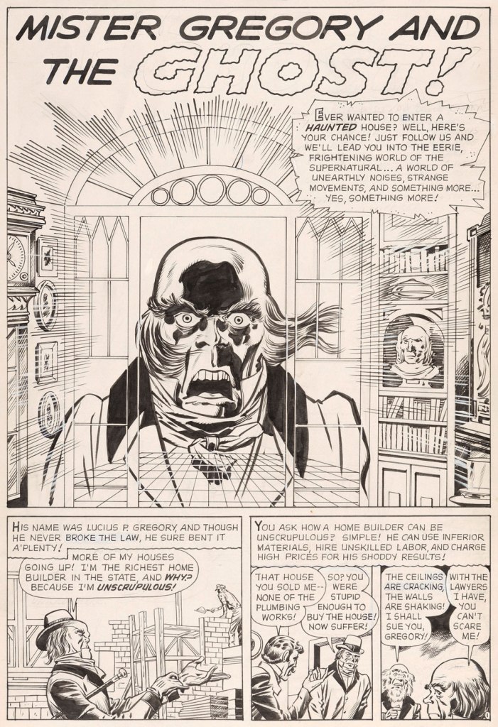
« From the body of one guilty deed a thousand ghostly fears and haunting thoughts proceed. » — William Wordsworth
Today’s selection is an early, early favourite of mine. I first encountered it in French, in the pages of Capitaine America no. 8 (Aug. 1971, Les Éditions Héritage); back in those days, Québécois printer-packager Payette & Simms would reprint, in black and white, recent Marvel comics in their ‘Format Double’ package, a terrific deal at 25 cents: you got two issues’ worth, no ads, plus a bonus short story. P&S’ paper stock and printing were better than Marvel’s — but their lettering and translation work generally left much to be desired*.
In this case, despite the allure of the slickly sumptuous Gene Colan / Joe Sinnott artwork, the issue’s out-of-nowhere high point was (you guessed it!) a modest little story plucked from the predawn of the so-called ‘Marvel Age’, Mister Gregory and the Ghost!, from a pre-Thor issue of Journey Into Mystery (no. 75, Dec. 1961). Many may disagree with me on this one, but boy, those post-Kirby issues of Cap’n ‘merica just serve to demonstrate what happens without a perpetual motion plot engine like Jack Kirby to propel and guide the series: when you try to introduce new foils for the hero, you get bonehead non-ideas like biker gangs, a jealous scientist in the body of a gorilla, or in issue 123’s Suprema, the Deadliest of the Species!, a brother-and-sister hypnosis act who drive around a gadget-filled tanker truck that magnifies Suprema’s power by way of a *very* 70’s medallion her brother wears around his neck. Then Cap feels its vibrations (“Ping!”) through his shield, and … oh, I won’t spoil the thing’s idiotic charms any further for you: read it here.
This is Journey into Mystery no. 75 (Dec. 1961, Marvel); pencils by Jack Kirby, inks by Dick Ayers, colours by Stan Goldberg.
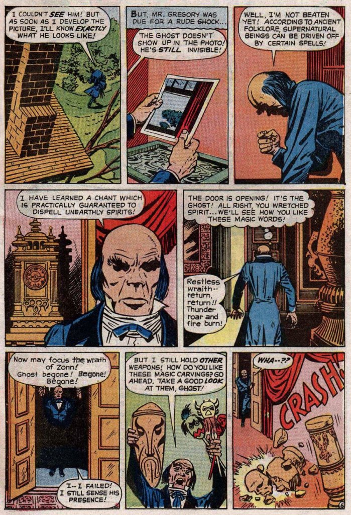
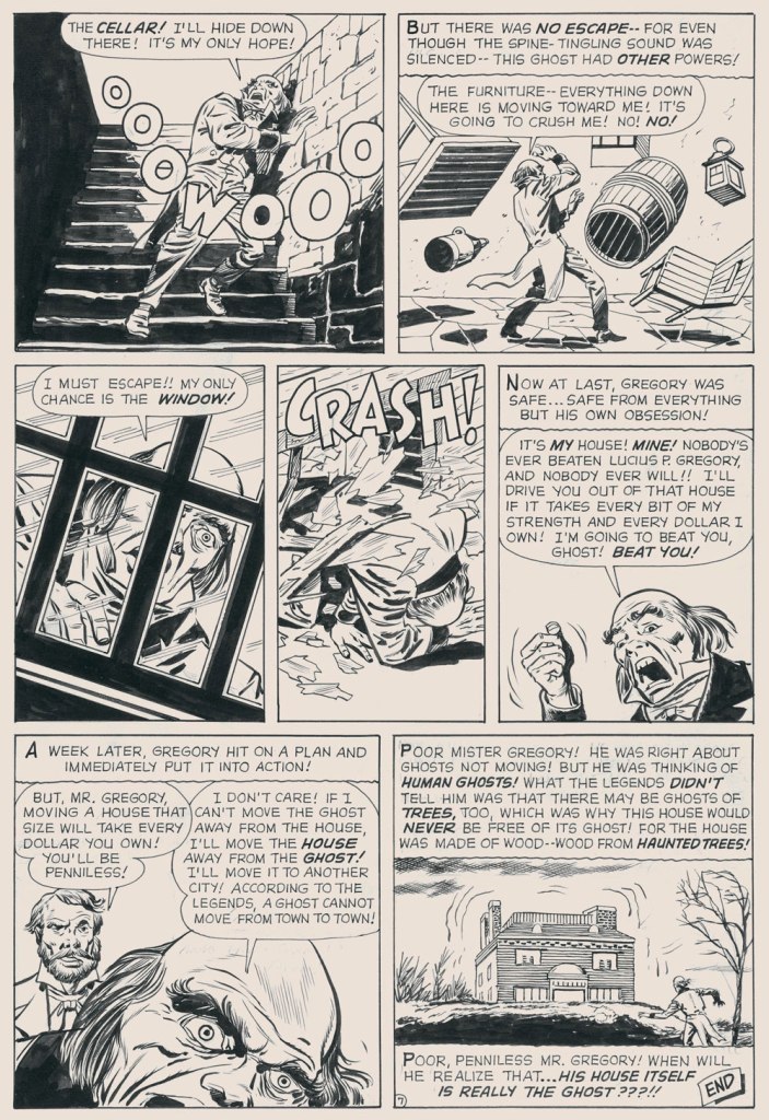
Ahem — back to Mister G and his Ghost. It’s not exactly a masterpiece of writing either (Larry Lieber?), but it presents Kirby at his moody, understated best. Upon seeing it in colour, I realised how providential my monochromatic encounter had been. While the story’s been reprinted a few times (in 1966, 1971, and in 2020 in a fancy and pricey hardcover omnibus), the printing’s always been pretty shoddy. As you’ll see.
But… it seems that most, if not all of the original art survives, so we’ll make the most of the situation and mix our sources as needed — hope the effect isn’t too jarring!
I find Kirby’s layout for this page to be especially ingenious and interesting.I’ve used the recoloured reprint from Fear no. 4 (July, 1971, Marvel), which was an improvement over JIM75’s, albeit a slight one.
-RG
*here’s an example of Éditions Héritage’s lovely calligraphy, from this very story:
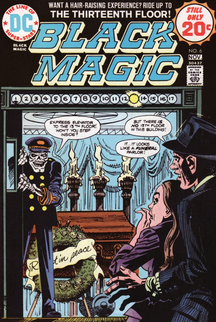
A Jack Kirby cover scene gets winningly recast for the 70s by Jerry Grandenetti, himself a contributor to the original series. This is Black Magic no. 6 (Oct.-Nov. 1974, DC).
When I was a kid (of twelve or so, if memory serves), I found a muddy and mildewed copy of this issue in the woods, which tremendously added to its allure, if not its readability.
And since I’ve mentioned it, here’s the original Kirby cover, regrettably one of the King’s least engaging, if you ask me. This is Black Magic no. 11 (vol. 2 no.5, Apr. 1952, Prize).
Well… little did I know what a protracted history this particular little scenario had. Let’s return to the presumed beginning, or at least the industrial age version.
Around the turn of the last century, the prolific English writer Edward Frederic Benson (1867 – 1940) wrote a story entitled The Bus Conductor [ read it here ] that saw print in Pall Mall Magazine in 1906. It was quite well-received, then began to widely make the rounds… as putative fact.
Things kicked into high gear in the mid-1940s, as the tale was recounted as an oft-heard anecdote in editor Bennett Cerf‘s 1944 short story anthology, Famous Ghost Stories, which contained a Benson contribution… but not The Bus Conductor.
That same year, Cerf shared the anecdote with the legion of readers who picked up his highly-entertaining (and still dirt-cheap and easy to find, over three-quarters of a century later, which gives you a sense of its original success and ubiquity) book of anecdotes, Try and Stop Me. The pertinent chapter was the splendidly-titledThe Trail of the Tingling Spine. As examined earlier on this blog, this chapter was used by EC Comics’ Bill Gaines and Al Feldstein as what they termed ‘springboards’ for their earliest stories.
Cerf’s version, from Try and Stop Me:
When an intelligent, comely girl of twenty-odd summers was invited for the first time to the Carolina estate of some distant relatives, their lovely plantation fulfilled her fondest expectations. She was given a room in the west wing, and prepared to retire for the night in a glow of satisfaction. Her room was drenched with the light of a full moon.
Just as she was climbing into her bed, she was startled by the sound of horses’ hooves on the gravel roadway. Curious, she walked to the window and saw, to her astonishment, a magnificent old coach pull up to an abrupt stop directly below her. The coachman jumped from his perch, looked up and pointed a long, bony finger at her. He was hideous. His face was chalk-white. A deep scar ran the length of his left cheek. His nose was beaked. As he pointed to her, he droned in sepulchral tones, “There is room for one more!” Then, as she recoiled in terror, the coach, the horses and the ominous coachman disappeared completely.
The girl slept little, but the next day she was able to convince herself that she merely had a nightmare.
The next night, however, the horrible experience was repeated. The same coach drove up the roadway. The same coachman pointed at her and exclaimed, “There is room for one more!” Then, as before, the entire equipage disappeared.
The girl, now panic-stricken, could scarcely wait for morning. She trumped up some excuse to her hosts and left immediately for home.
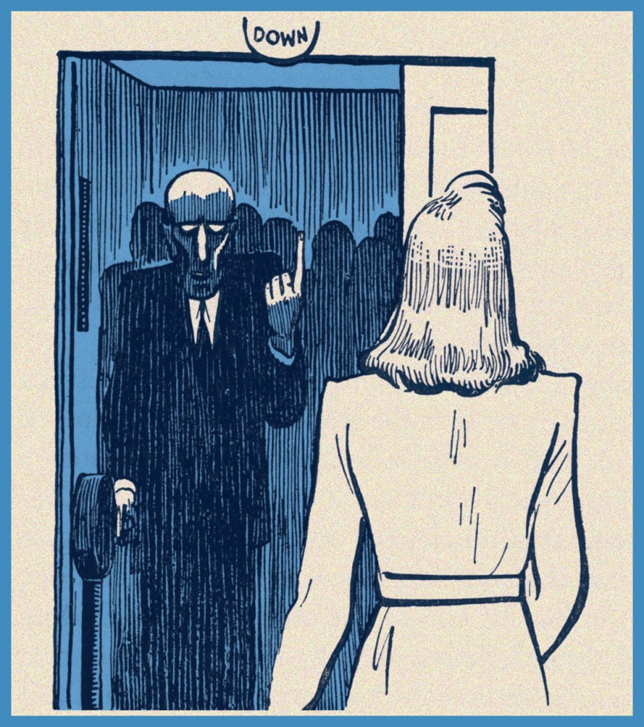
Upon arrival, she taxied to her doctor from the station and told him her story in tremulous tones. The doctor persuaded her that she had been the victim of a peculiar hallucination, laughed at her terror, and dismissed her in a state of infinite relief. As she rang for the elevator, its door swung open before her.
The elevator was very crowded, but she was about to squeeze her way inside — when a familiar voice rang in her ear. “There is room for one more!” it called. In terror, she stared at the operator.
Try and Stop Me was lavishly and diversely illustrated by The New Yorker great Carl Rose, which surely must have contributed considerably to its success. I’d say Simon and Grandenetti were quite familiar with this striking image.
He was the coachman who had pointed at her! She saw his chalk–white face, the livid scar, the beaked nose! She drew back and screamed… the elevator door banged shut.
A moment later the building shook with a terrible crash. The elevator that had gone on without her broke loose from its cables and plunged eighteen stories to the ground. Everybody in it, of course, was crushed to a pulp.
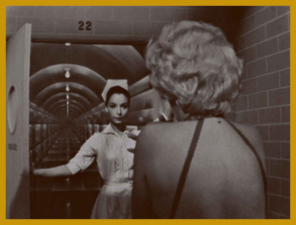
On to the Sixties: Rod Serling also drew upon the Cerf anecdote as grist for his The Twilight Zone episode Twenty Two (season 2, episode 17, aired Feb. 10, 1961). Here’s a pivotal scene from it.
Well, that’s certainly easier on the eyes than that gaunt vulture of an elevator operator… but no less menacing. You may recognize Mr. Spock’s future bride, Arlene Martel.
The Twilight Zone’s continuing popularity pretty much killed the scenario’s urban legend potency (Snopes.com checked it out!) In 1999, Urban legend authority Jan Harold Brunvand wrote, in his Too Good to Be True – The Colossal Book of Urban Legends:
According to my readers when I wrote a newspaper column in 1989 about the old ‘Dream Warning’ legends, The Twilight Zone version was the only one most of them knew. After numerous reruns, the TV episode had virtually replaced the folk legend in the popular mind. Every reader who wrote me following my column mentioned this episode, with one exception, and this person mentioned that he saw the plot enacted in a mid-1940s film, called Dead of Night. I’ll bet my legend-hunting license that this film, too, borrowed from the Cerf version.
I wouldn’t make that wager if I were you, Mr. Brunvand… since Dead of Night properly credits Benson.
To give you a sense of how effectively these stories flit and flicker across storytelling modes and media, power pop wizard Scott Miller (1960-2013) opened his band Game Theory‘s 1988 album, Two Steps From the Middle Ages, with a haunting ditty entitled Room for One More, Honey, an acknowledged quotation of the Twilight Zone episode.
« Challenge Merlin and be a fool! — Challenge a demon — and be destroyed! »
Suddenly having so much time on my hands (courtesy of COVID-19) is an eerie, though by no means unpleasant, experience. While I could crochet mini couches for my cats or enrol my partner’s help to re-create some favourite classic paintings, I prefer to catch up on books I’ve been meaning to read for a while. Case in point: in April, I’ve been joyously absorbing Jack Kirby’s Fourth World saga, reprinted in a handsome 4-tome omnibus (and to which I have easy access, thanks to co-admin RG’s vast library). That ended all too soon, and I moved on to a collection of Etrigan the Demon. It was a somewhat underwhelming experience, especially given the epic scope of Fourth World, but of course still worth a read.
The red-eyed, yellow-skinned creature called Etrigan came into existence in 1972. Mark Evanier, in his introduction to Jack Kirby’s The Demon, explains: « There was, at the time, a feeling around DC that perhaps superheroes were on the way out again. Ghost and mystery comics like House of Mystery and Phantom Stranger seemed to be selling, and some in the office felt the next trend was what Joe Orlando, who edited most of them, dubbed “weird adventure” comics. A few weeks later, [Carmine] Infantino asked Jack to whip up something in that category… »
Kirby accepted the challenge and, despite his lack of interest in horror, created The Demon, patterning his face on a a detail from Hal Foster‘s Prince Valiant strip as an inside joke.
As great a storyteller Kirby is, I think being asked to write about a subject he wasn’t particularly into had its repercussions. Although he clearly tried to give Etrigan a stimulating playground of supernatural rogues of varying degrees of viciousness to bat around, the overall result is rather underwhelming by Kirby standards. I’ve seen quite a few people in comic forums expressing their undying love for the Demon – if you’re one of them, I’m open to being convinced!
I actually first encountered Etrigan the Demon in a Swamp Thing issue written by Alan Moore. He first made an appearance in Swamp Thing no. 26 (July 1984) and then came back for the 14-issue storyline American Gothic that ran from June 1985 to July 1986. In Moore’s hands, Etrigan cut a dashing, mysterious figure, and he spoke in rhyme, which was a really nice touch. I admit I was disheartened to find out that he really wasn’t that exciting in his original form.
However, he *did* encounter tentacles, and more than once!
I was rather hoping the Somnambula would stick around, but it came and went in one page. Merlin’s Word… Demon’s Wrath! was published in The Demon no. 5, January 1973.
The spoiled and malicious brat Klarion and his cat/pussycat-princess Teekl are my favourite characters of the series. The One Who Vanished!! was published in The Demon no. 15 (December 1973), the penultimate issue. This scene is reminiscent of a sequence from the 1961 movie Night Tide.
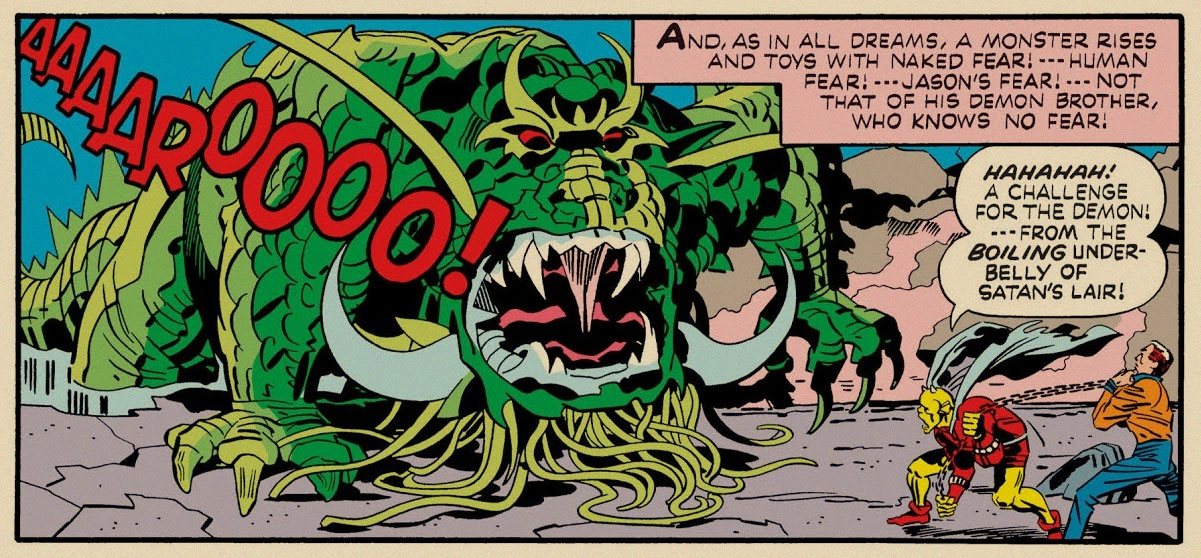
In the following (and final) issue, tentacles reared their grabby suckers yet again. Immortal Enemy! was published in Demon no.16 (January 1974). One more complaint from me – Kirby’s use of the philosopher stone (which Warly is clutching on this page) as a sort of Deus ex machina, that can be used for accomplishing pretty much everything (some examples: it produces the ultimate cold or demon flame, shields the owner from thousand-volt electricity or brings people back form the dead, turns people into vultures or an Egyptian mummy or a chair into flowers, randomly makes objects levitate, etc.) This makes one wonder why Jason bothers running around at all, instead of elegantly waving the stone about and solving all problems instantly.
The three pages above are Etrigan’s encounters with actual tentacles, but we have an honorary mention of almost-tentacles-but-not-quite, which I wanted to include in the spirit of thoroughness.
Can the following creature’s beard tentacles be used to grab anything? We never learn if they’re prehensile or not, because the fear-monster doesn’t stick around long enough.
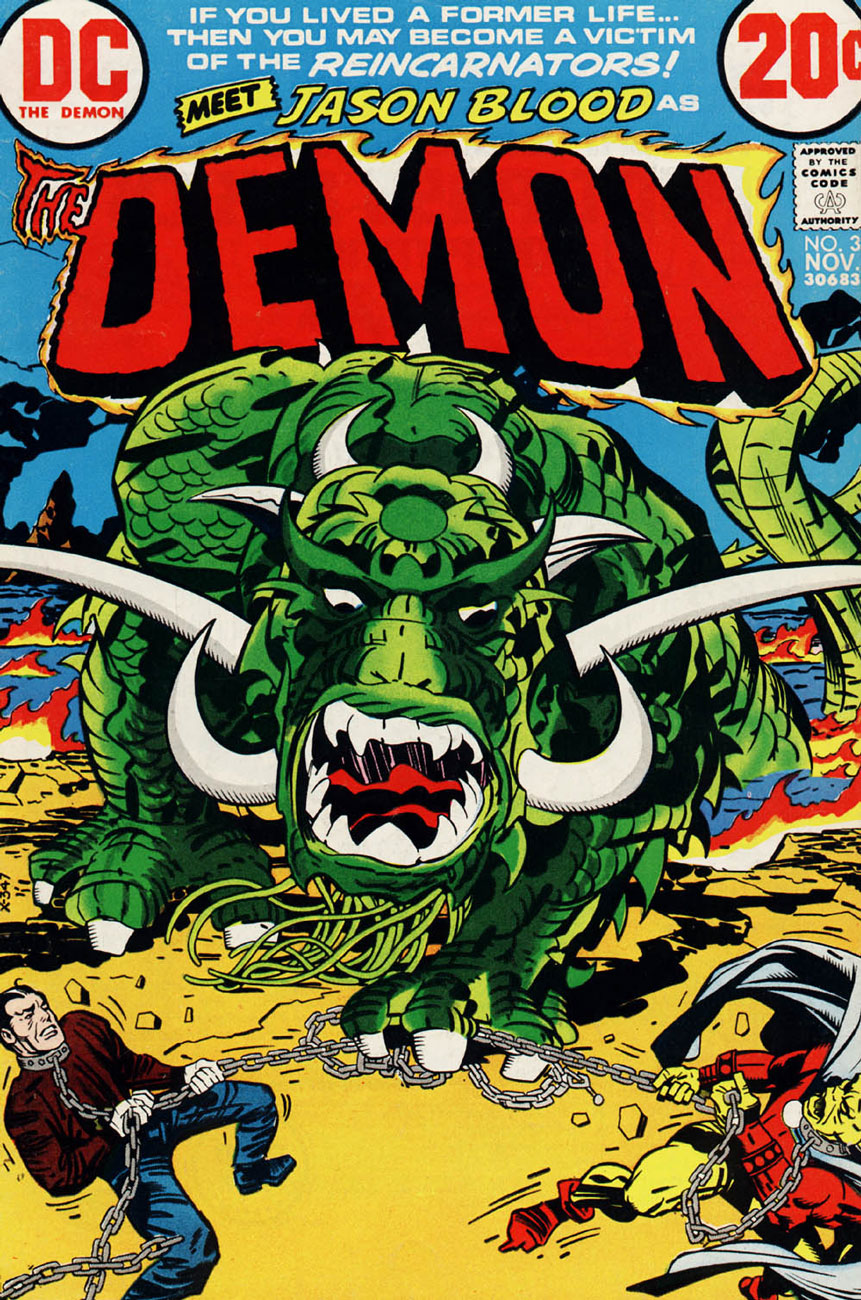
The Demon no. 3 (November 1972). This little baby is one of my favourite monsters of the series, despite just being part of Jason Blood/Etrigan’s nightmare – one can really felt its crushing weight. Besides, it’s probably a preview of the Kamara, a creature that becomes what the person fears most, and an awe-inspiring enemy.
A panel from Reincarnators.
In case anyone is interested, I am currently re-reading Kamandi: the Last Boy on Earth, which was my first exposure to Kirby.
« Silence at the proper season is wisdom, and better than any speech. » — Plutarch
When I think of cover layouts, I always recall the sage advice of my art school book design teacher, who posited that « a poster should be One Angry Fist », as you only have a second or two to make your point to the undecided consumer. That knuckle sandwich is what gets your message across, not a bunch of clichés and slogans; these only detract from the power of your image.
While we’re obviously dealing, in comics, with a commercial medium, it’s hard to not view it as creative interference, a lack of confidence**. While all publishers indulged in cover overhyping to some degree, Marvel and DC were the main offenders, and DC at least had superior title and logo designers***.
In the 60s, Jack Kirby created a massive amount of stunning cover art for Marvel… which editor Stan “Ne’er ’nuff Said” Lee buried, as often as not, under his trademark wiseass hyperbole. One might argue that this hardsell approach worked, commercially speaking. Artistically, on the other hand… well, the debate lingers on.
One could counter that cover hype only increased in the subsequent decades (imitated, amplified and distorted), and that stands to reason. That trend is pretty universal, since everything is getting louder, literally and figuratively: commercials, recordings, everyday life. Indeed: louder, sweeter, saltier, faster, meatier and of course cheesier.
Ah, but for what seems like a mere blip in its history, which is to say around ’68-’69*, Marvel somewhat dialled down the verbiage and let some prime Kirby compositions enjoy a bit of breathing room (at least on Fantastic Four, the company’s second-best seller — and number 16 overall for 1968).
This particular streak is circumscribed by two ho-hum (by lofty Kirby standards) covers: flat FF 81 and messy FF 88 (featured here)… which leaves us with plenty of goodies in the middle. Let’s take the tour, shall we?
This is Fantastic Four no. 82 (Jan. 1969, Marvel). Inks by Joe Sinnott. Silence by Stan Lee. Now isn’t that better?
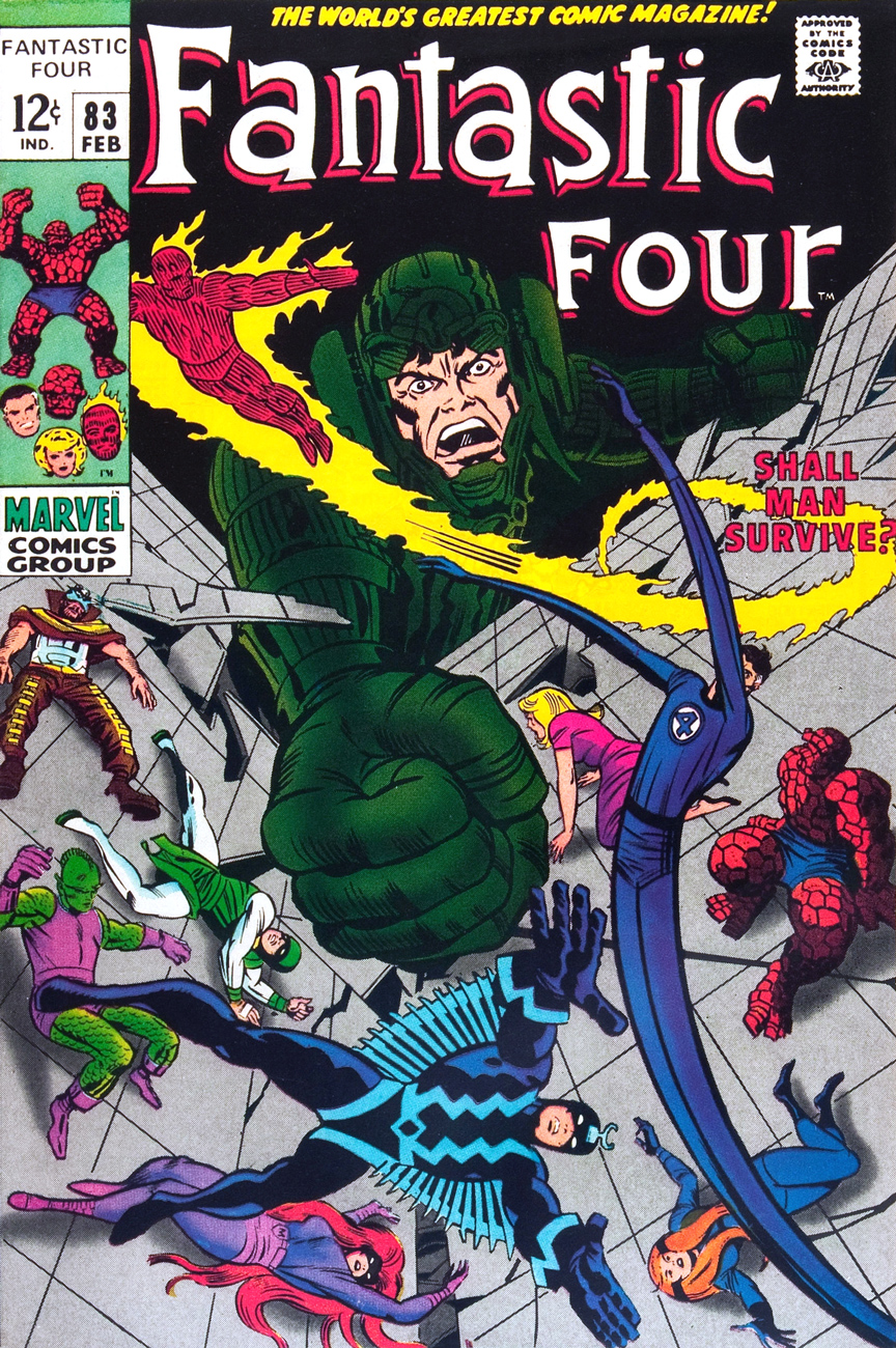
Maximus tries to usurp Black Bolt’s throne, like clockwork. Just a discreet story title… though even then, it’s still intrusive. This is Fantastic Four no. 83 (Feb. 1969, Marvel)
See picturesque Latveria. Enjoy the charms of its capital, Doomstadt, located just north of the Kline River. Don’t forget to drop in for some howdy-dos at the small but proud nation’s administrative centre, Castle Doom. This is Fantastic Four no. 84 (Mar. 1969, Marvel). Beyond-meticulous inks by Mr. Sinnott.
This is Fantastic Four no. 85 (Apr. 1969, Marvel). Again, did we even need a title? Mechanical lettering, to boot, so it’s not even expressive.
Short of a classic, but a nice entry nonetheless. And quiet! This is Fantastic Four no. 86 (May 1969, Marvel).
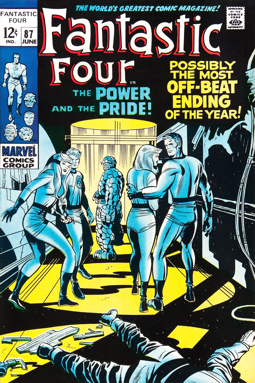
This is always the first image that springs to (my) mind when people bone-headedly claim that Kirby’s work is too over-the-top, ham-fisted and frantic. Even the colours (Stan Goldberg, is that really you?) are admirably subdued. Of course, Stan had to panic and turn on the hype in the eleventh hour. The title would have sufficed. This is Fantastic Four no. 87 (June 1969, Marvel). Giacoia-esque inks by Mr. Sinnott.
There. Isn’t that better? The might of Photoshop harnessed to noble ends.
In the face of all this, is it any wonder I found so refreshing the design quietude and purity of some recent comic books covers, such as the Chris Samnee creations we recently spotlighted? There’s hope, thanks to some enlightened folks out there.
**Steve Ditko, for one, grasped that if you couldn’t have your publisher’s confidence and trust in your craft and visual salesmanship, you could go elsewhere and enjoy a publisher’s laisser-faire.
***Marvel would even, in the 70s, hire on the sly, for freelance jobs, DC’s reigning lettering ace, Gaspar Saladino. Heaven knows The Avengers badly needed a logo makeover.
« Somehow, this thing had caught the spark of life! And, anything that lives will fight to stay alive… even if it’s just a Rag-a Bone and a Hank of Hair! »
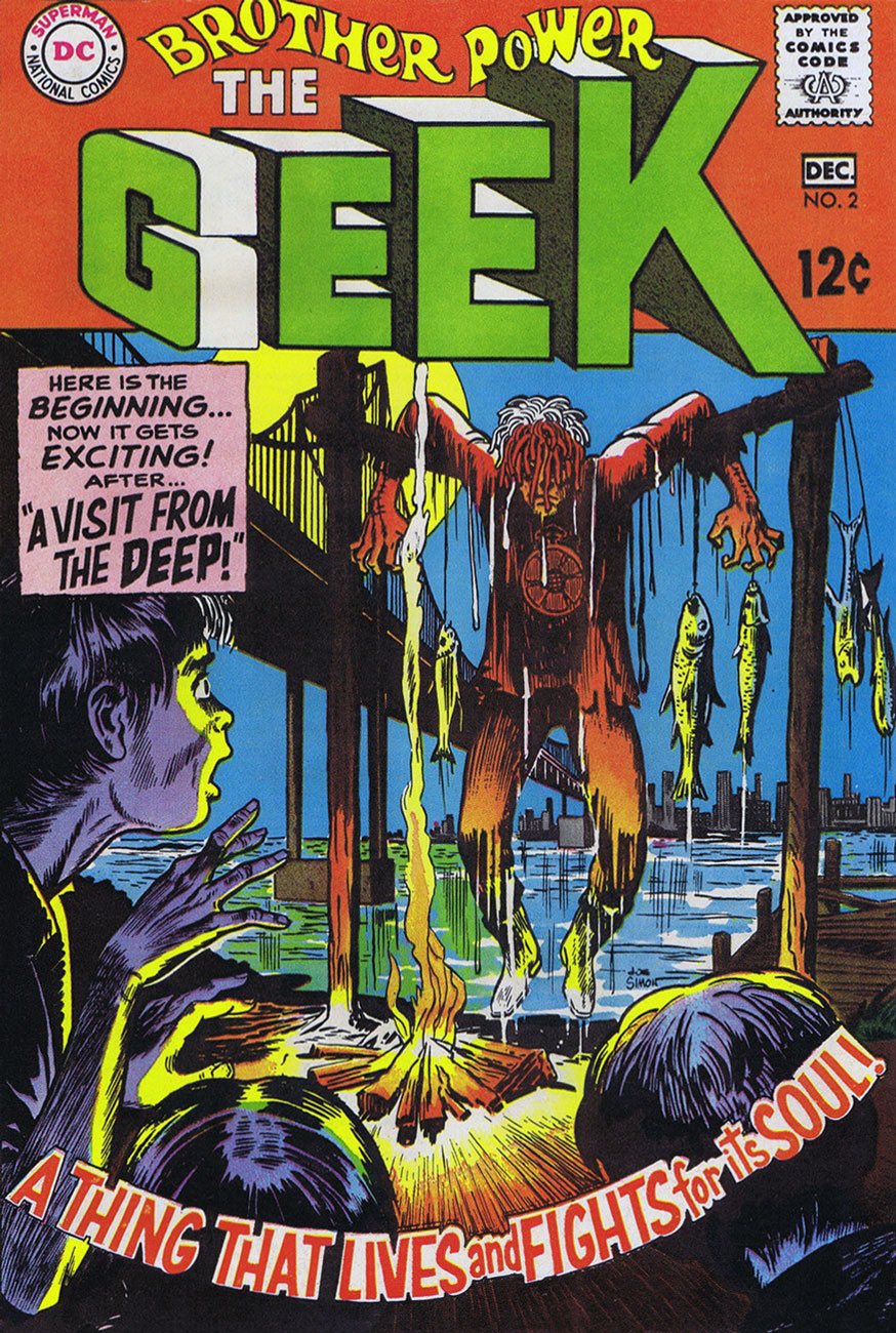
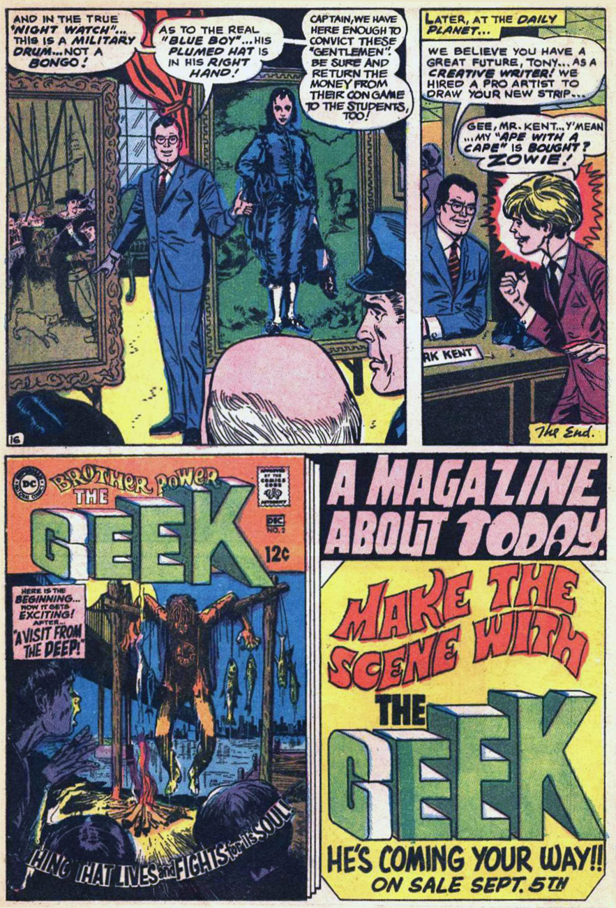
Ah, Brother Power, the Geek. A notorious flop for DC in 1968… or was it? At the time, it took several months for a book’s initial sales reports to make their way back to the publisher. Axing a title after two measly issues is quite a preemptive and premature strike against it. I suspect a case of toxic in-house politics. From the onset, editorial cold feet had the suits meddling with the project: the character of the animated rag doll was to be called The Freak, which was nixed in favour of the less druggy but more chicken-head-bite-y TheGeek.
This is Brother Power The Geek no. 2 (Nov.-Dec. 1968, DC); cover by Joe Simon, colours by DC’s peerless production manager Jack Adler, and logo presumably by Gaspar Saladino.
I recall that this particular house ad seared itself into my brain at a very young age, but I had to wonder where exactly I’d first encountered it. As it turns out, it was in a random comic book that happened to land my way in childhood, namely Superman no. 211 (Nov. 1968), featuring You, Too, Can Be a Super-Artist!, written by Frank Robbins (I just found out!) and illustrated by Ross Andru and Mike Esposito.
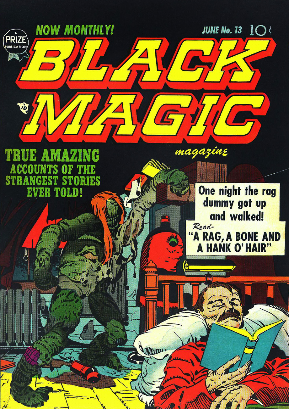
This is Black Magic no. 13, aka vol. 2 No.7 (June 1952, Prize); cover, of course, by Jack Kirby, with likely inks by Joe Simon. Read it here!
This lovely panorama is from Brother Power The Geek no. 1 (Sept.-Oct. 1968, DC). Written, laid out and inked by Joe Simon, finished pencils by Al Bare.
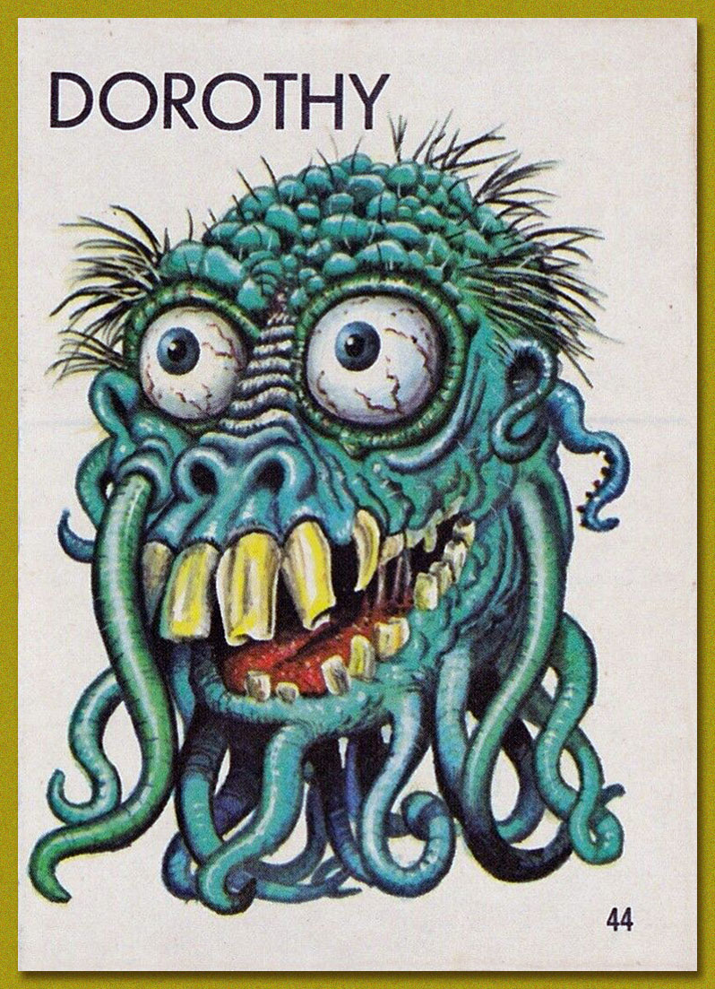
Say, have I seen Brother Power’s fellow detainees somewhere? Why, yes, of course! It’s Tentacle Master Wally Wood‘s Dorothy, Stanley and Doris, introduced to the world by Topps‘ Ugly Stickers back in 1965! Designed by Wood, they were painted by the masterful Norman Saunders.
Brother Power the Geek, despite its commercial failure and infamy, offered a good-natured, unpretentious romp, even if didn’t quite show us « The Real-Life Scene of the Dangers of Hippie-Land! » You can’t always get what you want.
Brother Power was brought back under DC’s Vertigo imprint in 1993, but as with the revival of its fellow Joe Simon creation, Prez, it received a « groovy » and « ironic » hipster treatment. Bah.
« He’s back from the dead / the telegram read / If you get on a flight / You could catch him tonight / You’ll find Commissar / He’s at the Munich Hilton Bar » — B.A. Robertson
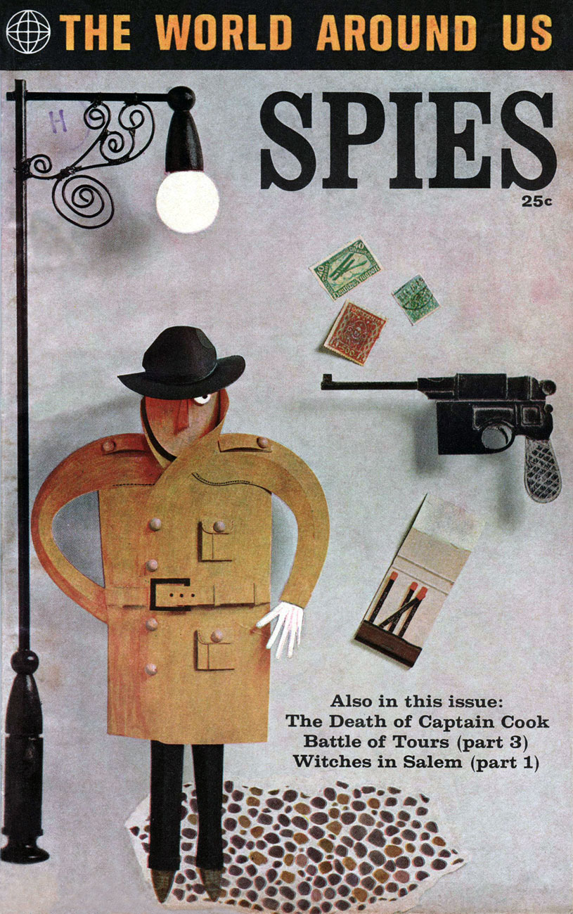
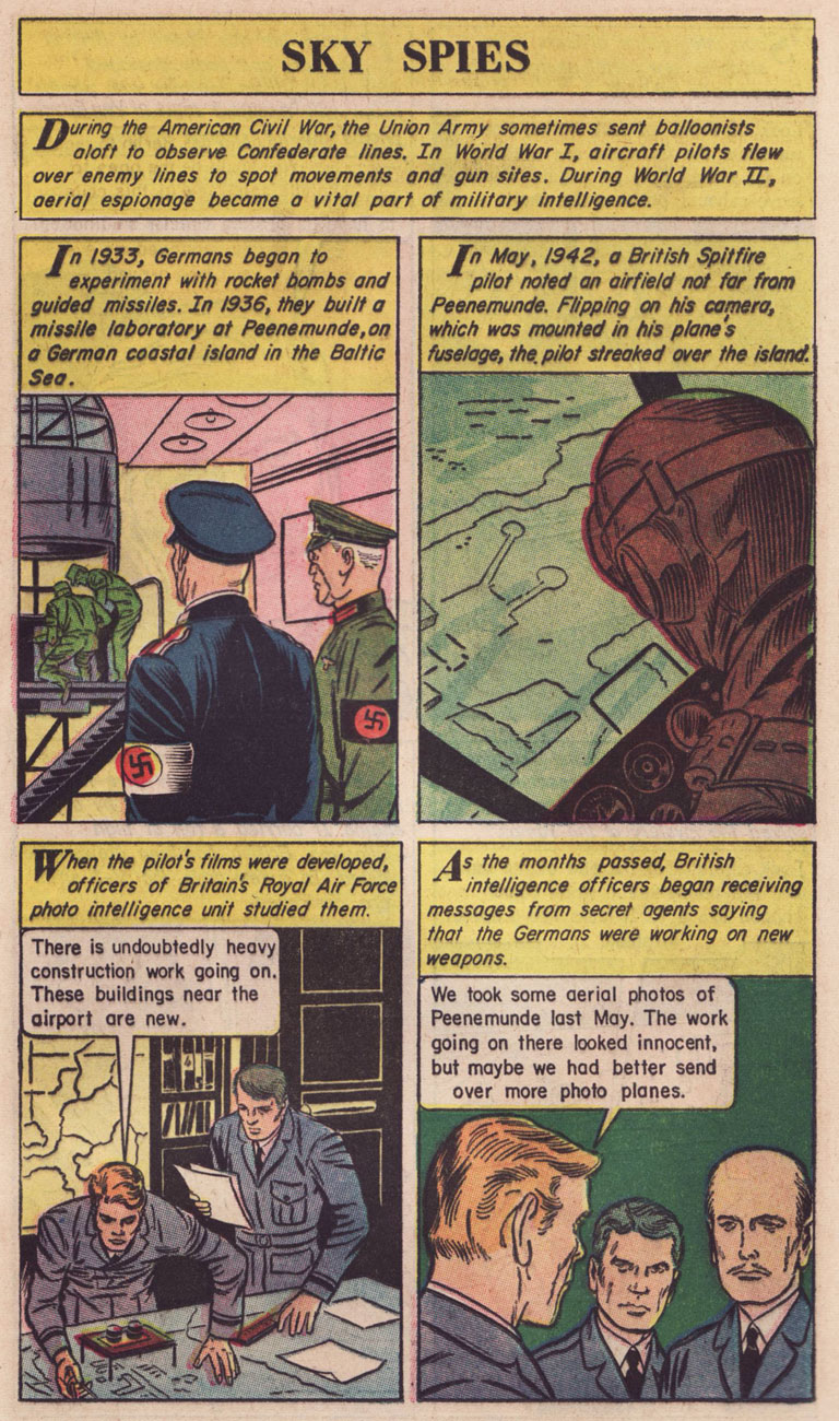
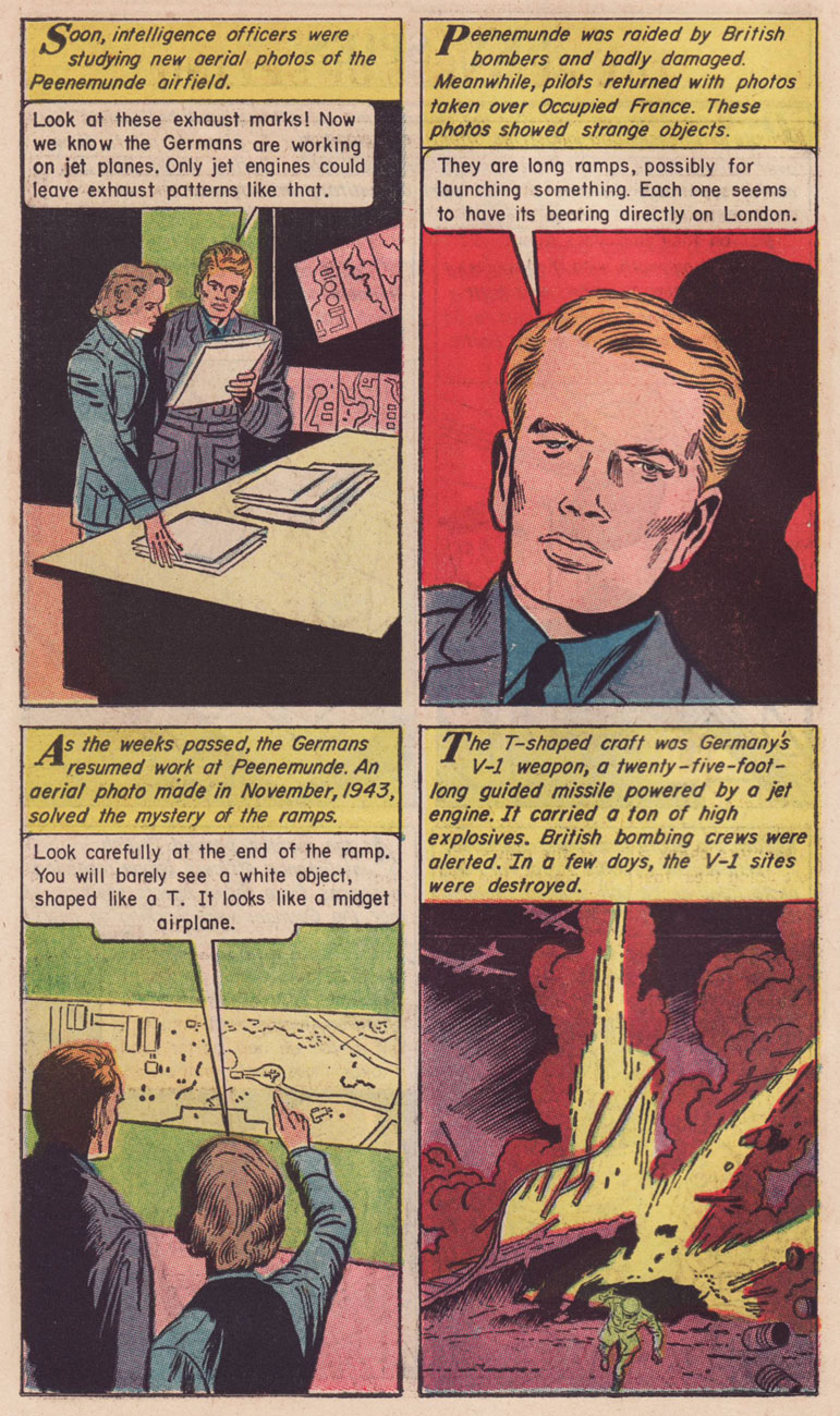
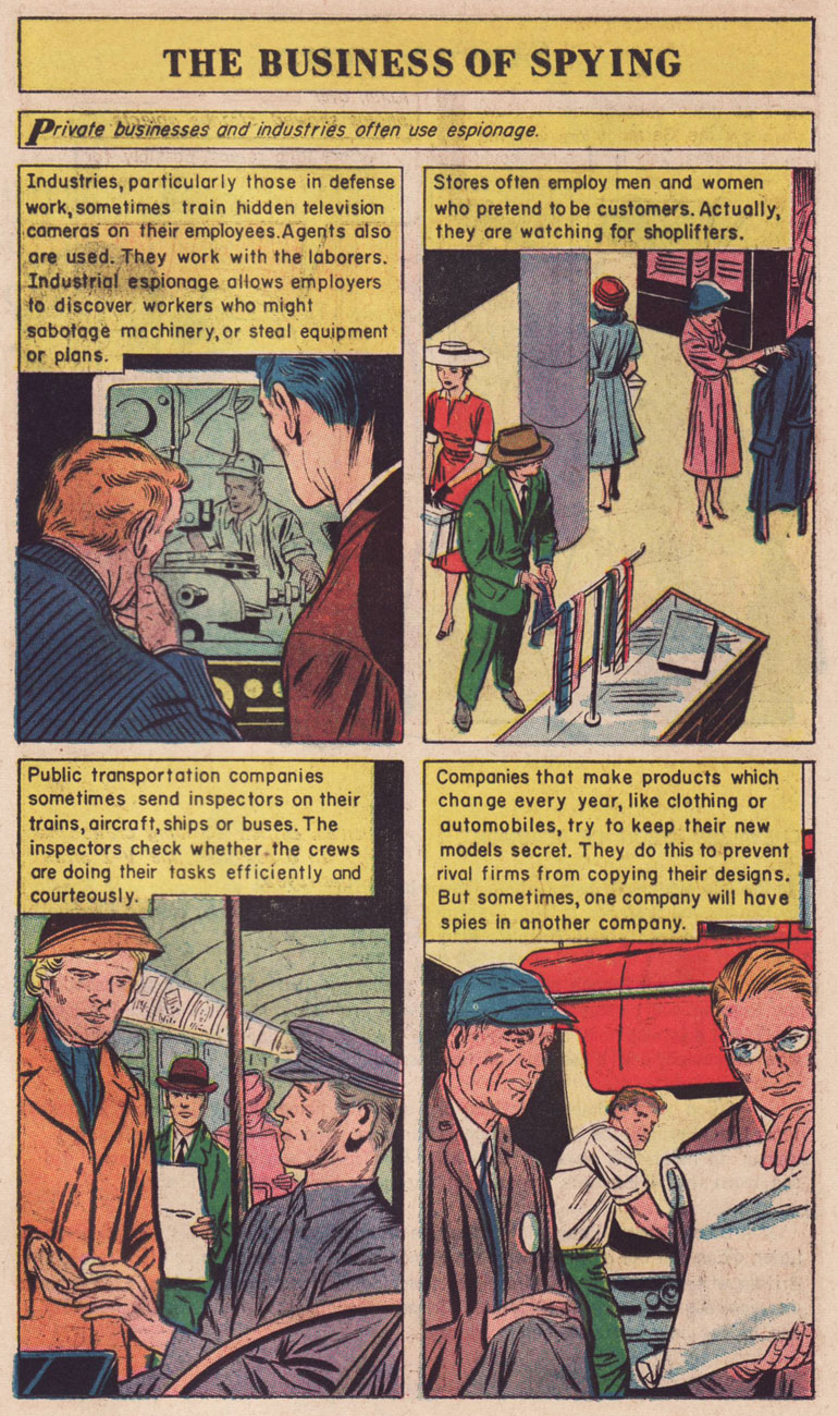
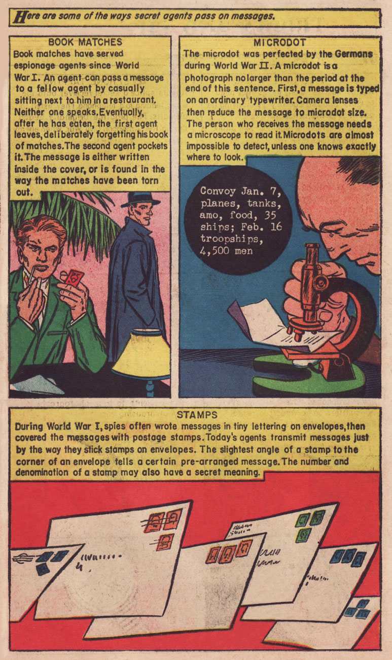
In 1958, Classics Illustrated publisher Gilberton tried something a bit different: a mostly non-fiction documentary title on various topics entitled The World Around Us, and featuring The Illustrated History of… Dogs, Space, Pirates, Great Explorers… depending on your area of interest, these could mean unrelenting tedium or sheer bliss. I haven’t encountered many issues, but the two I own, Ghosts and Spies, count among my prized paper possessions.
This is The World Around Us no. 35 (August, 1961), featuring this lovely mixed media piece by The Unknown Artist, whose cover remains defiantly unblown. On the inside, some fine company: George Evans, Norman Nodel, Edd Ashe, Jo Albistur… and Jack Kirby (inked by Dick Ayers)… the most beaten-down, anonymous, excitement-dialed-down-to-one Kirby you’re ever likely to see. Oh, he could do the job just fine, but the job, and the publisher, were not making anything of his regal strengths*. He would recall that this was « … the worst paying job of my entire life, including times I worked for free. »
Those early post-Code years were difficult ones for the diminished comics industry, and Kirby’s situation wasn’t exactly rosy: he’d been blacklisted at DC, thanks to the Jack Schiff / Sky Masters imbroglio, and his work at Harvey Comics had dried up. So what was a prolific artist to do, but pick up whatever bits of freelancing were available, here and there…
Quoting from Paul Gravett‘s review of Classics Illustrated: A Cultural History, we find this telling statement: « The most demanding editor was Roberta Strauss, a stickler for detail, who would count soldiers’ buttons or pleats in skirts and even called an editorial meeting in her hospital room only days after her son’s birth. » Give me Harvey Kurtzman‘s editorship** any old day!
**« Kurtzman’s editing approach to Two-Fisted Tales and Frontline Combat was a stark contrast to EC editor Al Feldstein‘s style. Whereas Feldstein allowed his artists to draw the story in any manner they desired, Kurtzman developed detailed layouts for each story and required his artists to follow them exactly. »
« Though the refined eyes of the aesthete may consider Kirby’s work crude, ornery, and anti-intellectual, the fact remains that he combined the virtues and limitations of his class with a stubborn genius to produce a body of comics work that has remained consistently true to its source and is unparalleled both in quantity and quality. » (Gary Groth)
Strike while the iron is hot, it is said, and thus part II of our celebration of Jack Kirby‘s tentacle prowess comes hard on the heels of Tentacle Tuesday Masters: Jack Kirby, Part 1. I’d like to thank co-admin RG for his vast knowledge of Kirby comics, as well as his suggestions and scans – that’s what (among other things) partners are for. Whereas part 1 focused on Kirby’s 70’s work for DC, today’s post (also firmly entrenched in the 1970s) is a celebration of his brief but intense return to Marvel Comics.
All art is scripted and penciled by Jack Kirby and inked by Mike Royer, unless otherwise indicated.
We start with the somewhat less interesting, but nevertheless tentacular, Hercules.
Marvel Premiere no. 26 (November 1975), penciled by Kirby and inked by Vince Colletta. Only the cover is by Kirby, the inside story being a collaboration between Bill Mantlo, George Tuska and Vince Colletta.
Now that we have the boring stuff over with, we move on to the spacey part of this post: epic voyages into the cosmos, mind-shattering encounters with Gods and fights to the death with unthinkable monsters of fearsome power! As usual, in chronological order: one must respect tradition.
« To make his comic, Kirby watched 2001 again, referenced a stack of stills, and pulled from the screenplay and Arthur C. Clarke’s novelization. The illustrations were instantly recognizable to anyone who’d seen the film, but the characters were uniquely his: beefy and emotive with a touch of uncanny. There are also moments of pure Kirby: a splash page of a spacesuit-clad astronaut gaping at an exploding cosmic sky, an acid-trip interpretation of the climatic Star Gate sequence. »
Panel from Wheels of Death (again, read the story on Diversions of a Groovy Kind) published in 2001: A Space Odyssey no. 4 (March 1977). *My* question is, does anybody remember any tentacles in the film? I know, I really have a one-track mind.
« Kirby was the right choice for the assignment, but, Mark Evanier (a comic book writer, Kirby friend and colleague, and author of the biography Kirby: King of Comics) says, he was wary of taking on someone else’s story, especially one as iconic as Kubrick’s vision of 2001. “He didn’t feel he had a lot of wiggle room to expand or inject himself into it,” Evanier says. “He had to keep reminding himself, ‘That’s my viewpoint, that’s not Stanley Kubrick’s,’ and adjusting.”» (source: The Crazy Legacy of Jack Kirby’s Forgotten 2001: A Space Odyssey)
I wanted to find a good overview of The Eternals, and thought I had found it (plenty of pictures, an overall idea of the leitmotifs driving the series – and importantly, NO MENTION OF THE MOVIE)… until I came to the end of the article in question and saw that the author was next going to read Neil Gaiman‘s take on The Eternals* to see if the latter had fixed some of Kirby’s plot flaws, at which point I choked on the water I was sipping. But, but! the author repented, and so I give you Review: The Eternals by Jack Kirby from the blog Giant Size Marvel.
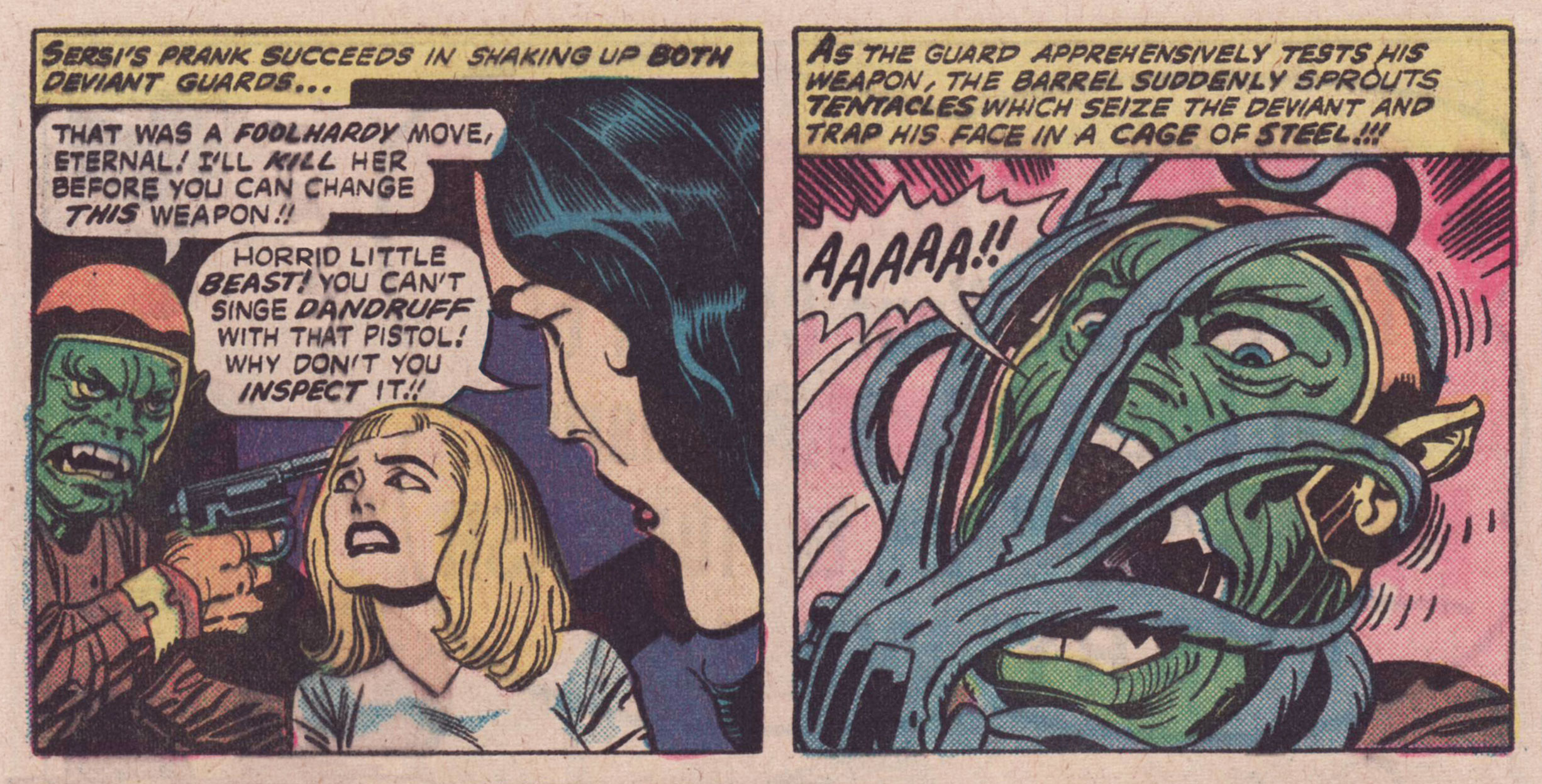
Panels from God and Men at City College published in The Eternals no. 6 (December 1976).
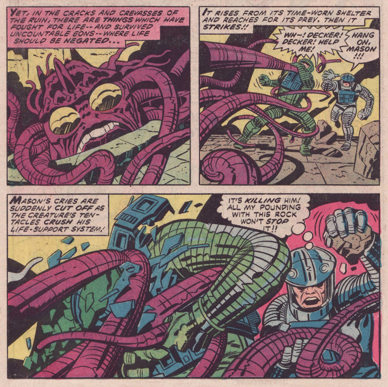
Panel from Disaster Area, published in The Eternals no. 15 (September 1977).
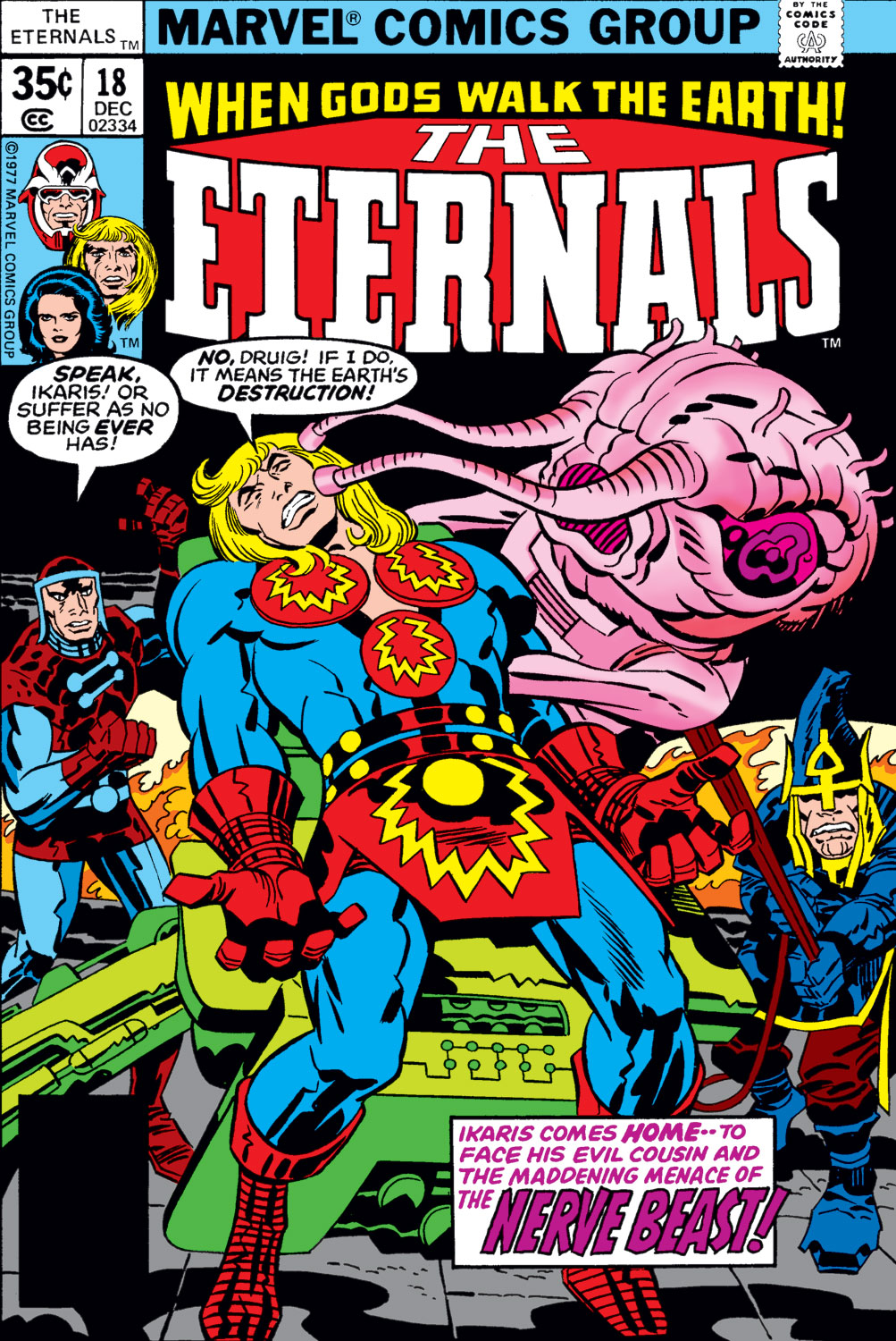
The Eternals no. 18 (December 1977), penciled by Jack Kirby and inked by Frank Giacoia.
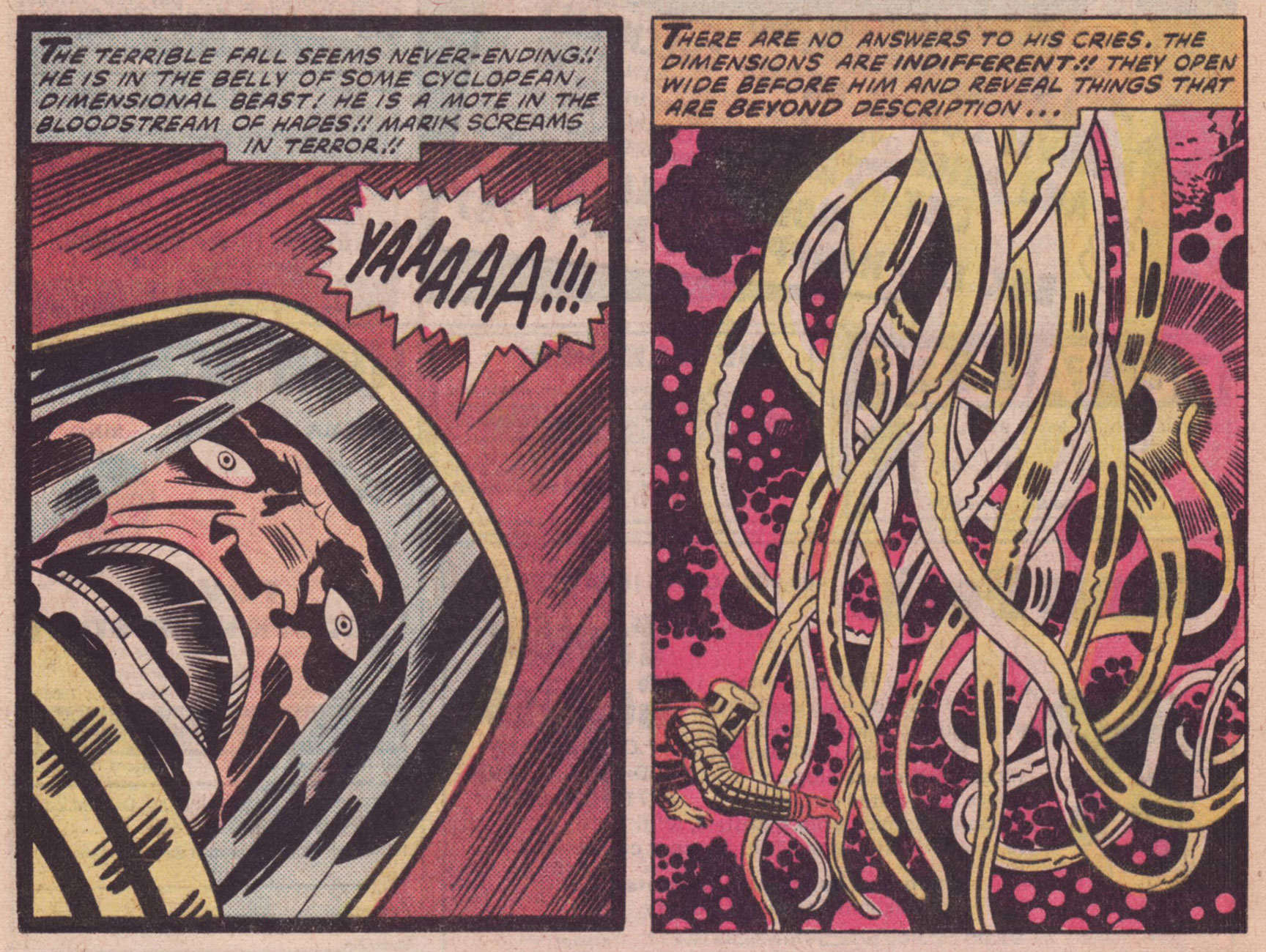
Panels from To Kill a Space God, published in The Eternals no. 18 (December 1977).
Panels from To Kill a Space God, published in The Eternals no. 18 (December 1977).
Surely everyone knows Captain America already, but here are his 7 Most Awesome Moments (arguable, but a good starting point) by the good folks at Comic Alliance.
Here we have energetic tentacles, free-flowing-energy cephalopods…
Captain America no. 205 (January 1977), penciled by Jack Kirby and inked by Joe Sinnott. The thing with the tentacles is Agron, who (which?) will eventually learn to animate a corpse, but for now he’s just in his energy form.
Page from Agron Walks the Earth!, scripted and penciled by Jack Kirby and inked by John Verpoorten, published in Captain America no. 205 (January 1977). I *told* you Agron would animate a corpse, but did you listen?
Double splash from Arnim Zola — The Bio-Fanatic!!, scripted and penciled by Kirby and inked by Frank Giacoia and John Verpoorten, published in Captain America no. 209 (May 1977).
You asked for it (right?): Doughboy in action! Technically, those are rubbery arms, not tentacles, but as someone who regularly makes sourdough bread, I assure you, dough *does* sprout tentacles and will latch onto your hands and arms with them.
Page from Arnim Zola — The Bio-Fanatic!!, scripted and penciled by Kirby and inked by Frank Giacoia and John Verpoorten, published in Captain America no. 209 (May 1977).
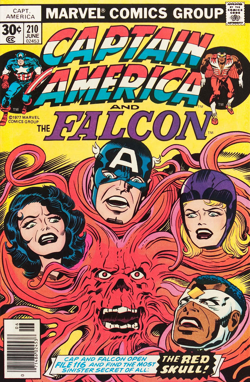
Captain America no. 210 (June 1977), penciled by Kirby and inked by John Verpoorten. The Red Skull taking a leaf out of Medusa’s book? Seriously, those have *got* to be hair extensions.