« People think the show gave Letterman an opportunity, but they don’t see the table with 10 guys in shorts wearing baseball caps pitching jokes for things for him to say. They don’t see the index cards that say: ‘Ask this first.’ It’s all spelled out for him, and everything is pre-interviews. He’s basically had to be this hand puppet, with everybody’s hands up his butt to tell him what to say and do. » — Joyce Brabner on David Letterman
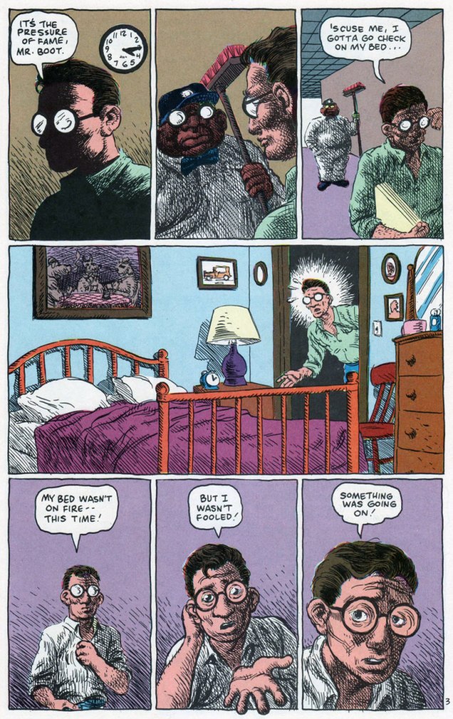
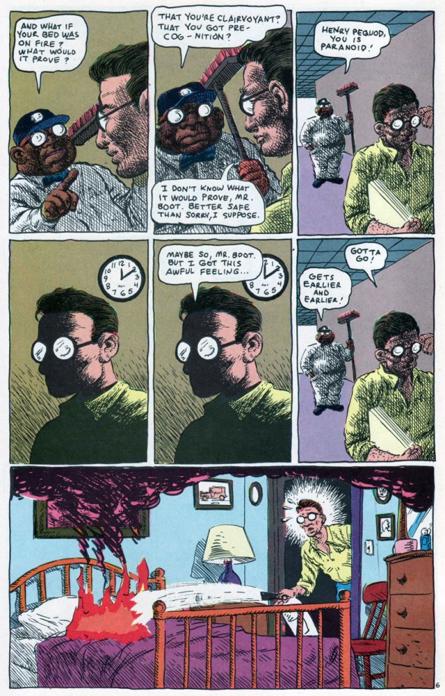
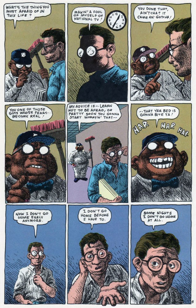
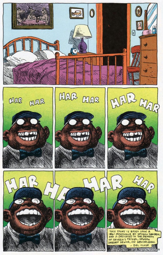
We already snuck a peek at the darker side of DC Comics’ short-lived ’80 mirage Wasteland (18 issues, 1987-89), but the title’s modus operandi was variety… within a set format. Here’s another highlight from one of the earliest and strongest issues, before its co-authors TheSecond City comedy legend Del Close and Grimjack co-creator John Ostrander lost the plot, interest, or both. This is American Squalor (Wasteland no. 3, Feb. 1988, DC Comics). The underrated Don Simpson, the Wasteland bullpen’s utility player, its most versatile and loyal member, gets to strut his stuff, albeit in a lovely Crumb ersatz, down to the lettering.
What I find so impressive about this story is the scope of its ambition, fulfilled on several unlikely levels: it achieves success as a parody, a pastiche, a tribute, and as its own, standalone bit of workaday folk philosophy. Clearly, calling upon the trappings and rhythms of Crumb and Pekar’s American Splendor was just the starting point.
I’d love to track down (Close’s old Second City colleague) the Severn Darden monologue Close claims to have used as a springboard, but not everything was dutifully recorded for “posterity” in those days…
« I loved Harvey. He was a wonderful guest. The kind you don’t see anymore. The only real problem with Harvey was my immaturity. » — David Letterman
I wasn’t around in the 70s. (Literally, as in “I hadn’t been born yet”.) So when somebody – in, oh, say 2008 or so – handed me a copy of some ghost comics printed by Charlton Comics (I don’t remember what exactly), that was my first exposure to this publishing company. I wasn’t aware that I wasn’t « supposed » to like this stuff… and by the time some kind soul pointed out that it’s not exactly orthodox to seek out Charlton publications, it was too late to change my mind. Clearly, that’s how monsters with no taste are created.
Charlton Comics had the reputation for inferior printing (as one of my friends put it, « godawful colours and reproduction and paper ») and low quality control. I’d say that when one contemplates the variety of artistic styles and the dizzying panoply of artists published by them, the quality of the printing distinctly becomes a less important consideration. Charlton paid badly, sure, but since when do people decide what they like and what they don’t based on how artists are treated? (Just look around – companies that trample on creators’ rights are doing very well indeed.) It seems like a knee-jerk reaction; I often wonder if people who automatically react with sneers to the very mention of Charlton have actually read any of the comics this company printed. Or perhaps they’re scared by some of the artists’ styles which are just too wild, too squiggly, just not clean enough. (Sloppy line work! Anathema to any comic book lover worth his salt, right?)
Anyway, Charlton’s « loose editorial oversight » meant there was no house style to speak of, and artists with highly idiosyncratic styles could let their eccentricities shine.
You may notice some names are conspicuously absent from today’s post. Tom Sutton, exhibit A of the “chaotic, scratchy art” category, will get a Tentacle Tuesday post all to himself at a later date. Some beloved artists just didn’t draw any tentacles for Charlton (as far as I know!): Warren Sattler, Don Perlin, Sam Glanzman, Don Newton, Rocco Mastroserio, etc. Wayne Howard is already part of a Tentacle Tuesday (see Plant Tentacle Tuesday), as is Enrique Nieto (Tentacle Tuesday: Spunky Skirmishes).
Without further ado, but with lots of tentacles…
First, two beauties from Steve Ditko (if you’d like more Ditko – and who wouldn’t? – visit my co-admin RG’s lovely posts about him: Ditko’s Ghostly Haunts and Happy 90th birthday, Mr. Ditko!), both featuring “70s Ditko green“. (It’s that characteristic green hue that often appears on his covers, a fitting term coined by erudite Professor Fester.)
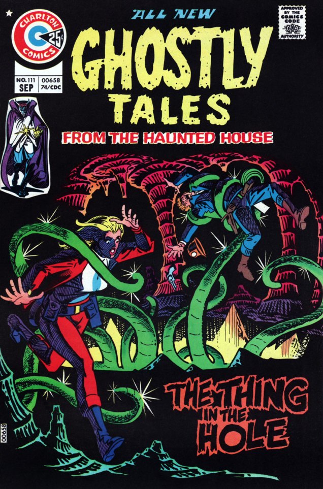
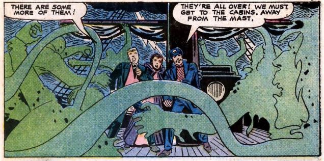
Ghostly Tales no. 111 (September 1974), cover by Steve Ditko. « The Thing in the Hole » is a really cool story, but it’s written and drawn by Tom Sutton, and as such it’s off-limits for now (I’m hoarding material for a different post.)Ghostly Tales no. 122 (August 1976), cover by Steve Ditko.Do these green noose-appendage-things count as tentacles? Sure they do! Panel from The Crew That Was Hanged!, illustrated by Steve Ditko and written by Joe Gill.
And moving on to other series, other artists:
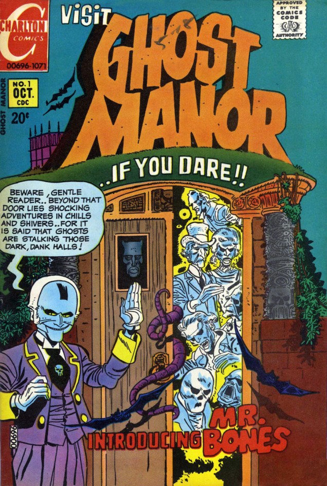
Haunted no. 8 (October 1972), cover by Jack Abel (1927-1996), perhaps best known as an inker for DC and Marvel.Newly-weds that are half-squid, half-fly, but newly-weds nonetheless. Page by Peter A. Morisi (1928-2003), who went by the nom de plume of PAM (or, since his signature’s M looks like a triple “I”, “PAIII!”). He was a NYC police officer, and moonlighted as a comics artist. I really like his calm, easily recognizable style and the way his characters seem to be frozen in each panel. There’s something quite effective about this stillness, a pleasing contrast between the drama and action of a story and the way people are staring off-panel in quiet contemplation, even when terrified. This story is called “Wrong Turn” and comes from Haunted no. 13, 1973.(Baron Weirwulf’s) Haunted (Library) no. 28 (July 1976), cover by Mike Zeck, whose career actually started at Charlton (he later moved on to Marvel to work on Master of Kung Fu, Captain America, etc.).« The creature’s tendril closed so gently around his leg, he didn’t notice it at first. Then a second grasped his arm! »The Source is the cover story of Haunted no. 28. Is old Thomas Willet mad? Well, he just has unusual taste in pets, that’s all (and, as tradition demands, he will pay dearly for his extravagance). Pencils and inks by Frank Bolle (1924-2020), who worked for Gold Key and Charlton, illustrated horror stories for Warren titles, and also had a hand in several newspaper strips (Winnie Winkle, Apartment 3-G, Stan Drake’s The Heart of Juliet Jones, and Gil Thorp).Ghost Manor no. 1 (October 1971), cover by the ever-masterful Pat Boyette (1923-2000), who’s a big favourite at Who’s Out There. Go read a whole story by him: Pat Boyette — Hillbilly Makes Good
We couldn’t find a good enough scan of this issue online, and it’s one of the rare Ghost Manors co-admin RG doesn’t actually own, so here’s a cover photostat (slightly coloured):
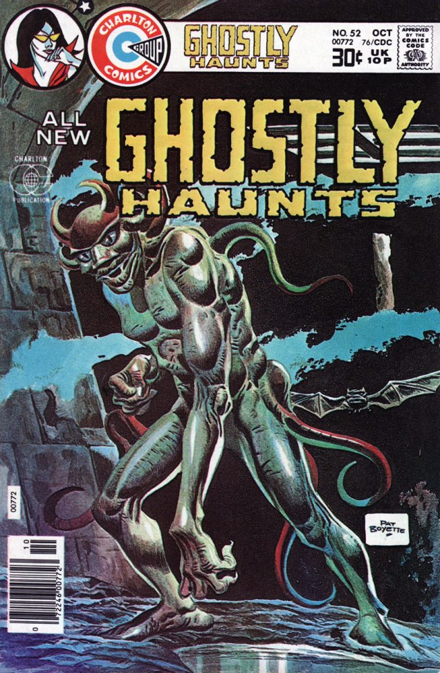
Ghost Manor no. 58 (August 1981), cover by the Recreo Studio.Ghostly Haunts no. 48 (February 1976), cover by Rich Larson (we’ve seen him before in Haunted House of Lingerie — see Tentacle Tuesday: a Day at the Beach).Ghostly Haunts no. 52 (October 1976), another cover by Pat Boyette, this time gorgeously painted.Beyond the Grave no. 11 (October 1983), cover by Mitch O’Connell(also present in Have Tentacles, Will Space Travel).
Writer-Artist-Colourist Jean Cézard (né Jean César), born March 23, 1924 in the small French village of Membray, saw a ghost in his room when he was ten years old. In the morning light, the spectre turned out to be naught but one of his mom’s blouses, but the seed was sown: the incident would inspire his most famous creation, Arthur le fantôme justicier.
Arthur first manifested himself (though still invisible!) in issue 449 of comics weekly Vaillant (December 20, 1953). The editorial team realizing the character’s vast potential and charm, Arthur then returned with issue 451 (January 3, 1954), this time fully visible (when he so desired) and he was set for the afterlife. After his creator’s 1977 passing, Arthur’s adventures continued for a time in lesser hands, but really, Cézard was irreplaceable.
Arthur was Cézard’s favourite series to work on, because he could set the little revenant’s* adventures anywhere and any when, and he certainly did.
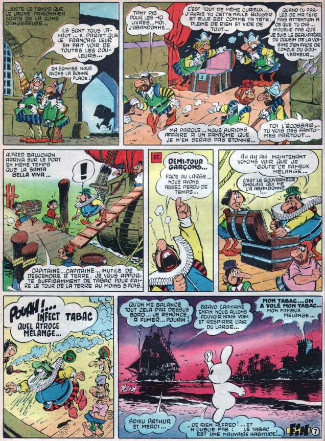
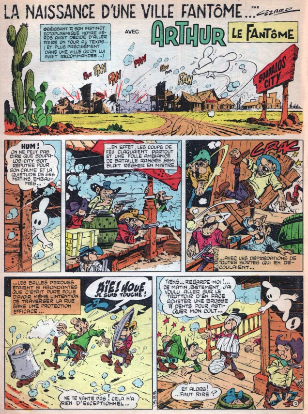
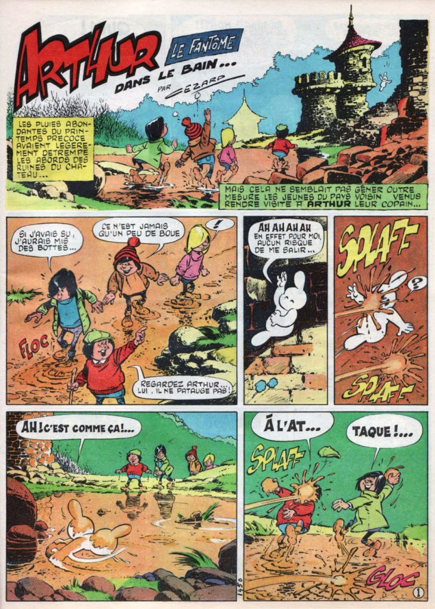
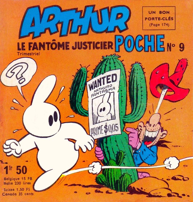
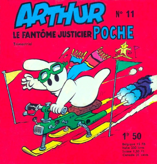
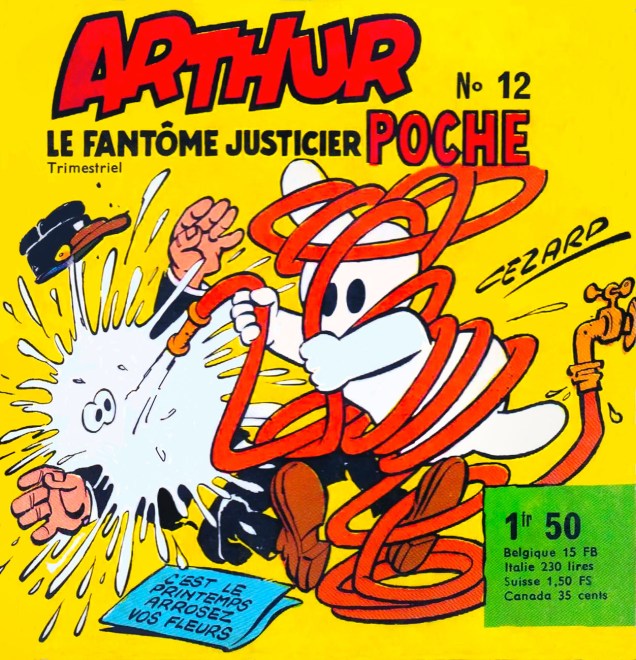
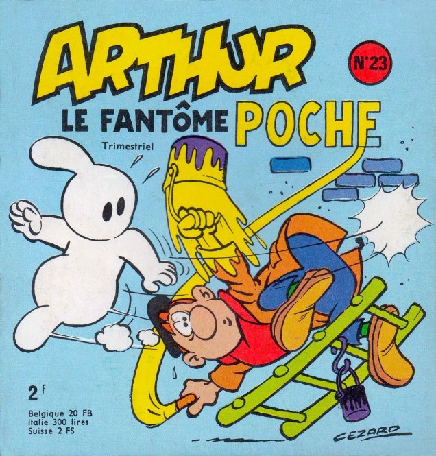
It’s all but impossible to single out an absolute favourite Cézard page, but then again, I’m not held to such arbitrary limitations. Here’s the closing page of Un fameux coup de tabac, from Pif Gadget no. 33 (i.e. Vaillant no. 1271, October, 1969) Those colours!And here we have a true splash by Jean Cézard. I wanted to showcase his astonishing aptitude for rendering castles (haunted or otherwise), not to mention complex action scenes. Arthur le fantôme et les nuisances was published in Pif Gadget no. 113 (Vaillant no. 1350, April, 1971).La naissance d’une ville fantôme (“Birth of a Ghost Town”), set of course in the American West (ah, ces Français et leur ‘Far West’) ran in issue 155 of Vaillant’s successor Pif Gadget in February, 1972.Dans le bain… (“In the Bath…”) ran in Pif Gadget no. 212 (March, 1973). By this point, at its peak, with a print run of 540,000 copies, Pif Gadget sold more than its three main competitors (Pilote, Tintin and Spirou) … combined. Then somebody got greedy, with the usual results.Should anyone wonder whether Cézard could also handle a less crowded, sparer layout, his covers for Arthur Poche should settle the issue. This is Arthur Poche no. 9 (July, 1966).While Cézard was quite a fast worker (in a given month, he could produce around 20 pages, which means, in his case, writing, pencilling, inking, lettering *and* colouring), when it came to the half-comics, half games pocket-sized quarterly Arthur Poche, he merely provided covers. The Arthur material therein was the work of Cézar-trained Michel-Paul Giroud. This is Arthur Poche no. 11 (January, 1967).This is Arthur Poche no. 12 (April, 1967).This is Arthur Poche no. 23 (January, 1970)
Les Éditions Toth, an ambitious Parisian publisher, set out to restore and reprint the works, but after five volumes (2002-2006), the enterprise seems to have stalled. However, another specialty publisher, Éditions du Taupinambour, picked up the gauntlet and published all of Cézard’s Pif Gadget Arthur stories (1969-77) in 13 volumes. That leaves, it seems, a gap of five years or so.
In closing, an anecdote about the loneliness of the long-distance cartoonist, told by Pif’s finest editor-in-chief Richard Medioni (1947-2016) in his definitive chronicle of Vaillant’s rise and fall, Mon camarade, Vaillant, Pif Gadget : l’histoire complète, 1901-1994 (2012, Vaillant Collector): « So I begin to read the episode that Jean has brought — when an author hands me his new pages, I necessarily read them in his presence, because I’m eager to read them, of course, but also out of respect for the work accomplished — and I admire it.
As I read on, Cézard comments here and there… when I laugh, he smiles. Sometimes, he points out a detail in the drawing that I missed… he never ceases to observe me and appears satisfied when I react as he had hoped.
Suddenly, it dawns upon me just how important such a session is to him. I bring up the notion and he explains:
“I spend days at my drawing table, alone, without a soul to appreciate my toil. And it’s a lot of time. No-one to give me a sense of what works and what doesn’t, what will bring a laugh and what will fall flat. So, when I come here, in seeing your response, I get that indispensable connection with my audience…” »
-RG
*Arthur, unlike, say, Casper, isn’t the shade of some dead child: his parents made him the old-fashioned way.
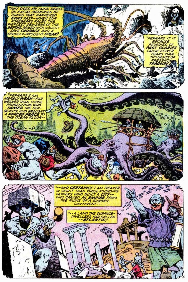
Created by Bill Everett, Namor the Sub-Mariner first appeared in Marvel Comics no. 1 (October 1939). The offspring of a human sea captain and a princess of Atlantis (and thus proudly bearing the title of Prince), he possessed the aquatic talents one expects of a regular merman and the exceptional strength of a carnival strongman. The cool thing about Namor is that right off the bat, he was a rather negative character – to be more precise, he was an Enemy of the United States (Everett didn’t mince words or characters, huh?) As Les Daniels states in his Marvel: Five Fabulous Decades of the World’s Greatest Comics (1991), « Namor was a freak in the service of chaos. Although the Sub-Mariner acted like a villain, his cause had some justice, and readers reveled in his assaults on civilization. His enthusiastic fans weren’t offended by the carnage he created as he wrecked everything from ships to skyscrapers. » This chaos culminated in an epic fight with Human Torch in 1941 when Namor took things a little too far and threatened to inundate the whole island of Manhattan. This little skirmish didn’t prevent him from joining the Allies’ side once World War II started, however, which gave a more constructive outlet for his somewhat destructive energies.
Right from the beginning, the Sub-Mariner was a complex character who just wouldn’t fit into the standard good guy/bad guy dichotomy. He underwent through quite a few transformations, disappearing for a bit right after WWII like many of his super-and-anti hero compatriots (but never for more than a couple of years at a time) and resurfacing during the Silver Age as a slightly different character. Namor’s concern about encroaching technology and hate of humanity, his fierce independence, made him a likeable character for those of us who like mavericks. He is a tragic character, a king without a kingdom who finds that Atlantis and its people have been destroyed by nuclear testing. After that, who wouldn’t hold a grudge? Anyway, if you’d like a more cogent overview of the Sub-Mariner’s history, visit The Great Comic Book Heroes.
To get back on topic, given how much time Namor spends underwater, it’s hardly surprising that he quite frequently encounters tentacles.
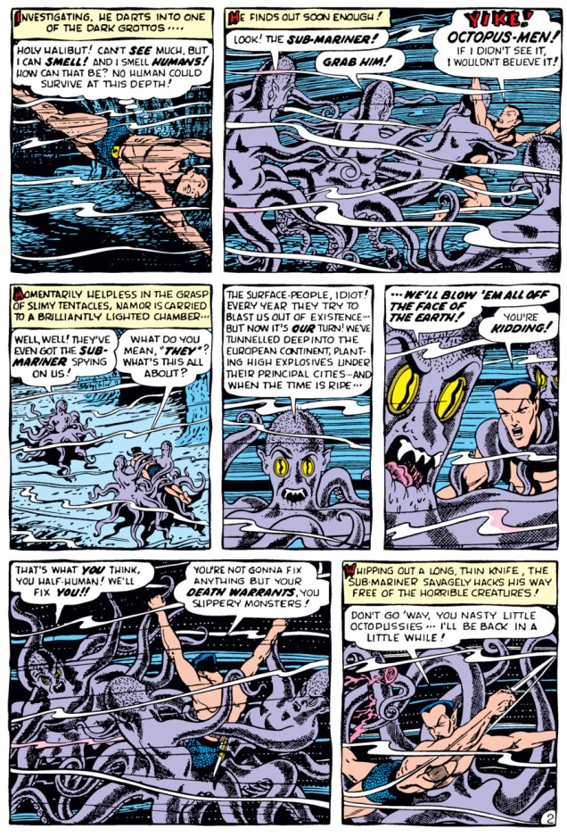
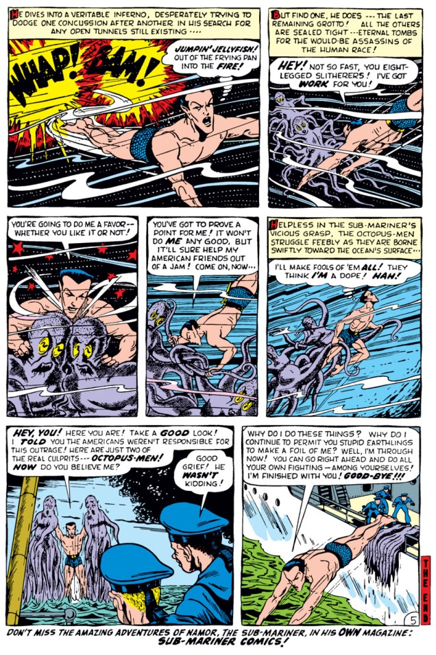
First, a story scripted and drawn by Bill Everett – who better to introduce the character than his creator? This is “The Octopus-Men!”, printed in The Human Torch no. 38 (August 1954).
« The Original Aquaman » ? My, aren’t we testy. Now, now, you boys both belong to a long, storied tradition.
Skipping ahead some twenty years, a page from “Namor Agonistes!”, scripted by Roy Thomas, pencilled by Ross Andru and inked by John Severin, printed in Sub-Mariner no. 38 (June 1971). This is sort of an origin story of the Sub-Mariner. Lovely art, n’est-ce pas?
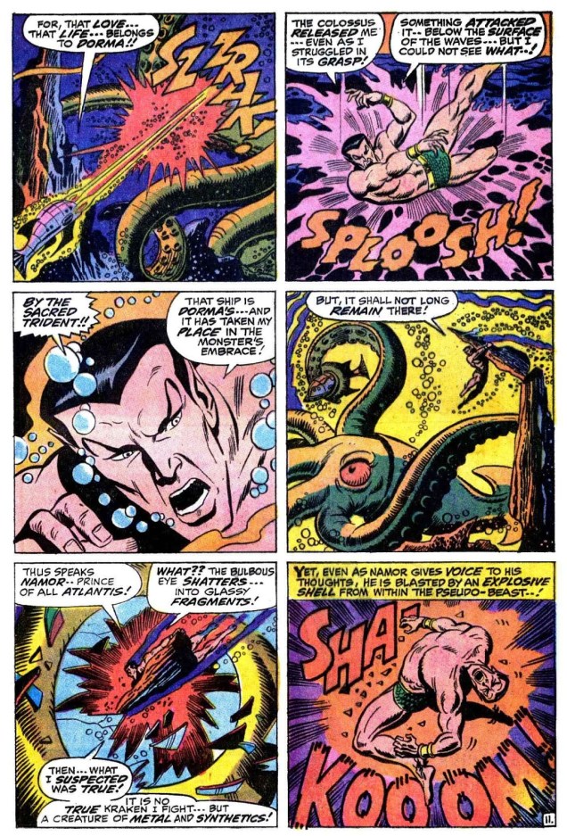
A page from “When Wakes the Kraken!”, scripted by Roy Thomas, pencilled by Sal Buscema and inked by Mike Esposito, printed in Sub-Mariner no. 27 (July 1970):
Oh, let’s have a couple of covers, too.
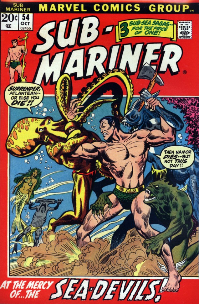
A rather random assortment of creatures, isn’t it? Sub-Mariner no. 13 (May 1969), pencils by Marie Severin and inks by Joe Sinnott.Umm… why is a piranha wielding an axe? Sub-Mariner no. 54 (October 1972), pencilled by Alan Weiss and inked by Frank Giacoia.
I mostly sneer at modern “reboots” of Golden or Silver Age characters, but Namor’s appearance in the excellent Thor the Mighty Avenger (Marvel, 2010) was completely à propos. (The series is a happy union of an absorbing story with great graphics – it’s written by Roger Langridge with art by Chris Samnee.) Here’s a page from “Thursday Morning“, published in Thor the Mighty Avenger no. 5 (December 2010).
« It’s spring fever. That is what the name of it is. And when you’ve got it, you want—oh, you don’t quite know what it is you do want, but it just fairly makes your heart ache, you want it so! » — Mark Twain
André Montpetit (1943-2012) was a prodigiously talented québécois cartoonist and illustrator who, after wowing the public and his peers in the late 1960s and early 1970s, essentially turned on his heels and walked away from it all. Was it fear of success, fear of failure, self-loathing, self-respect or something else that prompted his slow fade? Hard to tell.
In the meantime, here’s a seasonally sardonic piece he produced in 1971. It saw print in the March 20, 1971 issue of Perspectives, a supplement bundled with each Saturday edition of Québec’s Le Soleil daily newspaper from 1959 to 1982.
The sun appears… the birds return… the flowers grow back… the beasts awaken… the city has an air of joy… it’s the season of love. « Let us go contemplate the marvels of nature! »« Oh, the beautiful pigeon! » « Oh, such a pretty flower! » « Oh! A small, limpid puddle! » « I’ve had enough! I’m going home!!! » « You’re right. It’s going to rain! » IN GENERAL, PEOPLE WATCH THE SPRING ON TELEVISION. IT’S LESS DANGEROUS.
In recent years, writer-director Saël Lacroix endeavoured to put together a documentary to assemble and organize the known facts and to fill in some of the blanks of Montpetit’s troubled career and existence. The result, Sur les traces d’Arthur (aka Tracing Arthur) was released in 2016. Watch the trailer here.
This year, spring officially begins on March 20th, so it’s still a few days away… but the vernal bevy of birthdays has already started. Al Jaffee is still our first Spring Birthday Boy – he was always precocious, you know! Born in 1921 on March 13th, he turns 98 today, and that’s a truly impressive age, even for the oldest working cartoonist. Break out the bubbly!
Take my hand as we gallop through Jaffee’s career at a fast clip. In chronological order, then…
Original art for “Pain Relief Speed Test On Actual People In Actual Pain“, published in Humbug no. 7 (February 1958).
The New York Herald Tribune Syndicate published Tall Tales from 1957 to 1963. Al Jaffee came up with the idea of this strip’s format (one vertical panel for dailies, and a series of vertical panels for Sundays) when he was in financial straits – its unorthodox configuration ensured that newspaper editors would be able to squeeze it in *somehow*.
Sunday Tall Tales strip from 1960.
Visit The Fabulous Fifties blog for more – the amazing Ger Apeldoorn has scanned tons of Tall Tales from old newspapers, a monumental (and much appreciated) endeavour.
Sunday Tall Tales strip from 1961.
« The world is full of bloviators. And this kind of stuff, when there’s someone on the public scene who’s really going beyond his duties as a politician or a religious leader or a sportsman, he’s fair game. The main thing is to keep your eyes and ears open and when you hear something that’s clearly baloney, such as “eight out of 10 doctors smoke Chesterfield cigarettes” – these are ads that actually ran! One of the tobacco companies had the nerve to claim that doctors prefer their cigarettes. So it’s easy to shoot down that kind of bull. But you do it with a gentle hand, you don’t preach and say “tobacco kills! How can these doctors do that?!” No, you just go them one step further and say, “In addition to eight out of 10 doctors smoking this brand of cigarette, in their time off, they each drink a gallon of bourbon, which also has health benefits.” » |source|
« Thanks a lot for ignoring my recent request for a house call, Doc! You saved me ten bucks!! It went toward the funeral!!! » Now, isn’t this a happy vernal scene? (Look at the pretty flowers!) Al Jaffee painted this “Get Mad” picture postcard for publication in The Worst From Madno. 12 (1969).First edition of Mad’s Al Jaffee Spews Out More Snappy Answers to Stupid Questions, (Signet, February 1972).
« I’m not an educator or a preacher. I think the important thing, in my line of work anyway, is that you’re helping the reader to think for himself. It’s not just about getting a chuckle from them. When you expose hypocrisy or nonsense or plain ol’ stupidity, you want to do it in a way that makes the reader connect the dots. Don’t tell the joke, just hint at the joke. If you over-explain it, it’s no good. » /source/
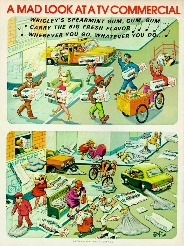
This painting (layout by Harvey Kurtzman, art by Al Jaffee) was designed to accompany an Esquire article from April 1972 about Elaine’s, a hip restaurant in NYC that was known for attracting writers, actors, and other prominent New Yorkers. Incidentally, Elaine Kaufman, the owner of this establishment, was a barrel of laughs (I’m not saying that sarcastically, either). « Kaufman was known for not mincing her words, for booting less-favored customers to seat new arrivals and for forbidding hamburgers to be served in her restaurant. She was once arrested after a physical altercation with a visiting Texan. Elaine also once had a fist fight with the actress Tara Tyson, and also chased away the notorious paparazzo Ron Galella by hurling two garbage can lids at him and exclaiming, “Beat it, creep… you’re bothering my customers”. » Ah, the people you knew at Elaine’s…The back cover of Mad no. 170 (October 1974), “A Mad Look at a TV Commercial“.
You might be wondering if Mr. Jaffee’s art and wit were any good much later in his career, say in the 90s. Stupid question, bub. Of course they were!
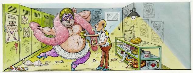
Original art from Mad’s Restaurant Survival Guide (Mad no. 300, January 1991).Art from a 1998 issue of Mad Special illustrating yet another round of Snappy Answers to Stupid Questions. When I said ’round’, I meant it: these are stupid questions asked at a wrestling programme. This one was probably “does this pink boa make me look fat?”
Have you ever wondered what Al Jaffee is like in person? Here’s your chance to find out:
“But you haven’t even mentioned MAD fold-ins!”, you might exclaim in dismay. Hey, I’m not gonna repeat myself… visit A MAD Dash… Inside for that and more Jaffee silliness.
Oh, fine, you guys. Just one, though, ’cause otherwise we’ll be here for another couple of hours, and frankly I’ve got hungry cats to feed.
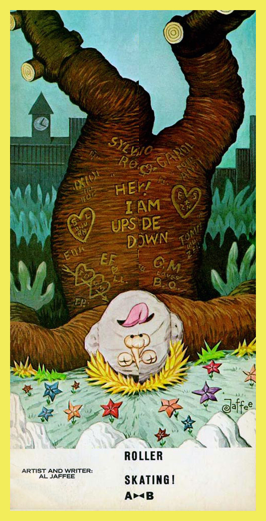
What new way are people falling head over heels these days?, published in Mad no. 216 (July 1980).
You say you’re having trouble folding your screen? Geez, do we have to do *all* the work around here?
Many happy returns, Mr. Jaffee! <3<3<3
Mr. Jaffee and his wife Joyce in 2016, when he was but 95 years old. When he once quipped «Serious people my age are dead», he meant it as gospel. 😉
The Golden Age of comics proffered quite a lot of anthropomorphic animals to its readers. The stuff on offer ran the gamut of different definitions of humour, from inane slapstick to pleasant goofiness, all the way to batshit surrealism. There’s at least one common streak running through this zoological revelry – tentacles!
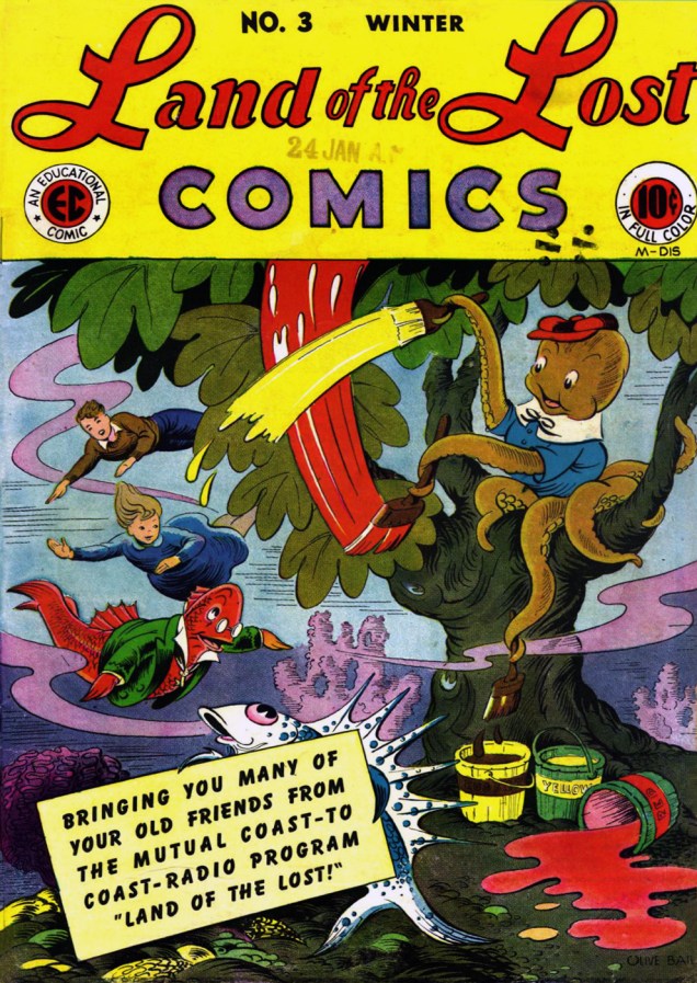
Our first exhibit is a charming comic from the 40s. Land of the Lost was a radio series broadcast from 1943 to 1948 on Mutual Broadcasting System and ABC, written, produced and narrated by Isabel Manning Hewson. Each episode started with the line « In that wonderful kingdom at the bottom of the sea… », and presented a new under-the-sea adventure of Isabel and Billy, two kids lucky enough to have an adorable avuncular fish for an underwater guide. (The fish was called Red Lantern, and was most notably voiced by Art Carney.) You can listen to an episode from 1945 here.
Coming back to our beloved cartoons: in 1946, EC Comics started publishing Land of the Lost Comics, a series that lasted for 9 issues. Hewson remained the writer, and the art was handled by Olive Bailey (not the Olive Bailey who helped crack Germans’ Enigma cipher machine in WWII.) The result was impressive: these comics are delectable, combining beautiful art with inventive plots that may be goofy, but have a solid internal logic. Hewson gave her sea-creatures vibrant personalities, and it’s so much fun to dive (not pun intended) into this world.
Land of the Lost Comics no. 3 (winter 1946), cover by Olive Bailey. Read the whole issue here… and then read other issues, too. Somebody needs to publish a collection of this stuff.
The following panels are from “Jack Frost“, scripted by Isabel Manning Hewson and drawn by Olive Bailey, published in Land of the Lost Comics no. 3.
Squidlet goes out of control, like all young octopuses are prone to doing.
Thank you, cool ladies, for all the fun!
Land of the Lost also became an animated cartoon as part of Famous Production Studios‘ Noveltoon series: Land of the Lost (1948), Land of the Lost Jewels (1950) and Land of Lost Watches (1951). I find the animation to be definitely subpar to the comics or the radio show, but I’ll let you judge for yourselves. (Jack Mercer is in it, albeit briefly!)
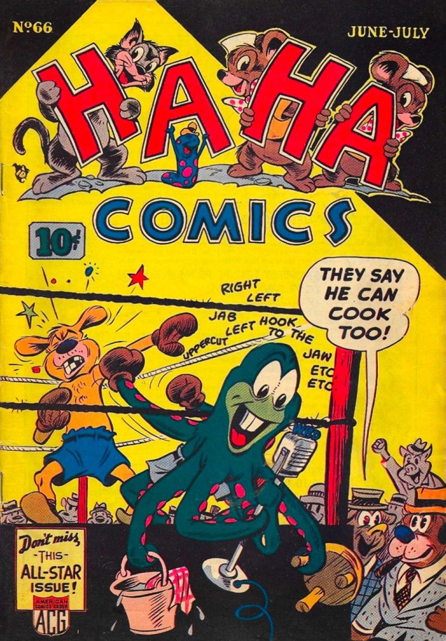
Did you know octopuses love to box? This implausible situation is definitely part of the lazy artist’s roster. To wit:
Ha Ha Comics no. 66 (June-July 1949), cover by Dan Gordon. It was really hard to find a scan of this issue in decent condition (thanks to co-admin RG), and comicbookplus doesn’t even have it in its database (you can read pretty much all the other issues of Ha Ha Comics, though).
Ha Ha Comics, a sister anthology of Giggle Comics, was published by ACG. (With issue #100, Ha Ha became Teepee Tim, going from animal hijinks to young Indian shenanigans for all of… three issues.) It’s quite a the playground of anything goes, but upon careful inspection, one easily finds good art shining among the dirt-pile of mediocrity, and diverting storytelling among hackneyed yarns.
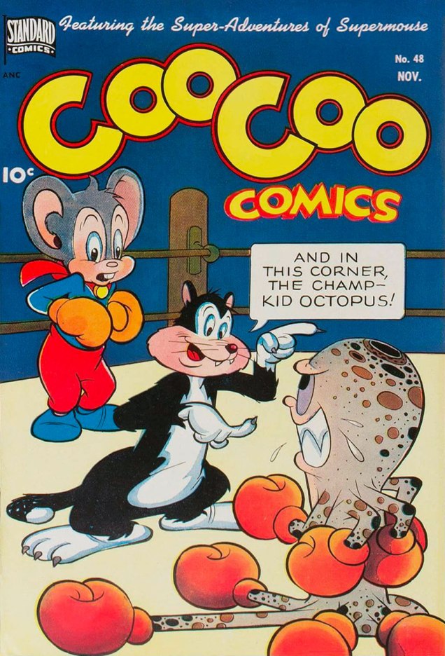
Coo Coo Comics no. 48 (November 1949), cover by Carl Wessler. Published by Standard Comics under the imprint of Pines (from Ned L. Pines, publisher). Read the issue here (no tentacles whatsoever, though).
How many arms does the fellow up above have, nine? I suppose that’s why he’s the champ!
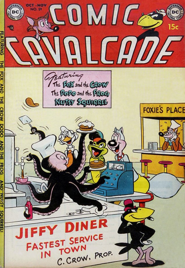
Comic Cavalcade went all funny-animals only with issue 30 (Dec-Jan 1948), when superheroes faded from popularity (oh man, that’s hard to imagine now, isn’t it?) It lasted until 1954, by which time it shrank from its original 96 pages to 76, however retaining its 15-cent cover price.
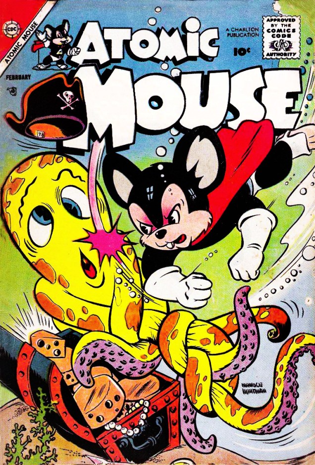
Comic Cavalcade no. 59 (Oct-Nov 1953), art probably by Rube Grossman. Read it here.Dinky Duck no. 10 (July 1954). WTF is a Dinky Duck? Terrytoons’ answer to Daffy Duck, says Toonopedia; or, tout simplement, a smaller-than-average duck. The poor duckling never caught on, but the cartoons did result in a comic series, published by Pines and then St. John.Atomic Mouse no. 25 (February 1958), cover by Maurice Whitman. Atomic Mouse was created in 1953 for Charlton Comics by Al Fago, their first animal superhero. The series was published for ten years (!), between 1953 and 1963, so it must have had at least a modicum of popularity.
« Everything is vague to a degree you do not realize till you have tried to make it precise. » — Bertrand Russell
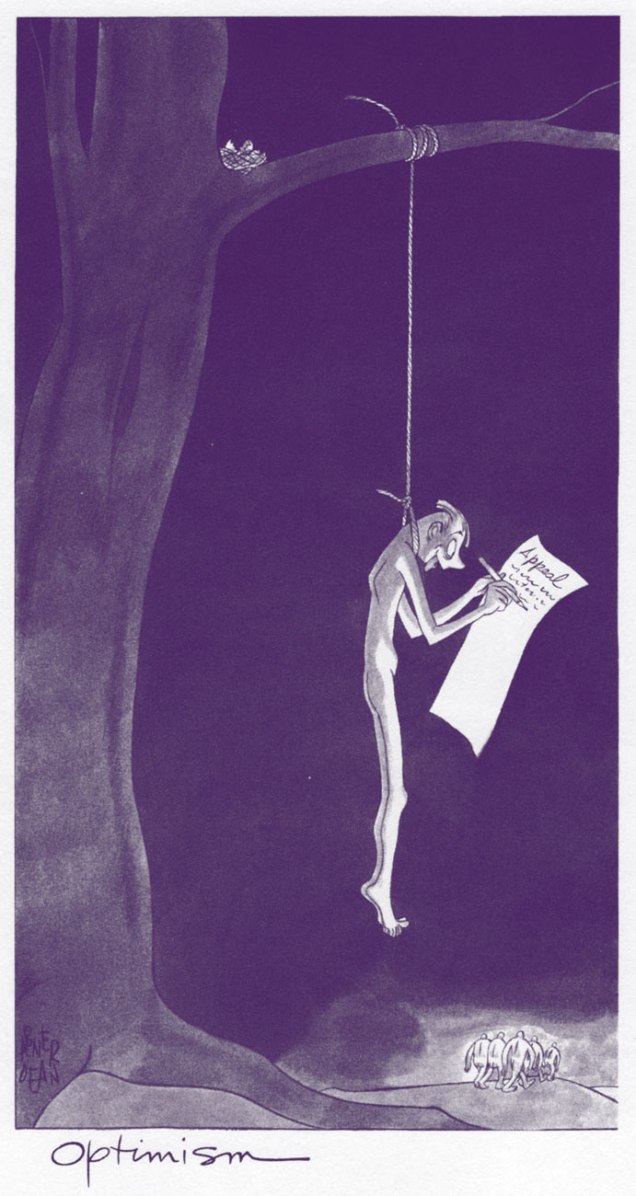
When last we left Abner Dean (catch up with Part One), he was contemplating a professional change, something transcendent, something more lasting, but still using most of the traditional tools of cartooning. We can surmise that, at first, the resultant works weren’t necessarily to be shared widely: “I’m at work on a long series of drawings now that are not intended for publication ”, Dean had confided to a friend in 1941.
First came, in 1942, a Life Magazine article premiering a handful of these drawings. Then, in 1945, It’s a Long Way to Heaven landed in bookshelves.
Incredibly (if you’ll forgive the cynicism), the book, and its sequels, were solid sellers. Given the groundbreaking character of these cartoons (for the lack of a more fitting term), such well-merited success is quintuply impressive. Hell, maybe the audience for such material actually existed then.
« Much as he hates to admit it, the life of the average man (which means virtually all of us) tends to assume the form of a longish doze, interrupted by fits and starts of bewildered semi-alertness. We will invent a hundred ways of heading off self-alertness to one that may force us to ask ourselves who the devil we are. You cannot turn on your radio or unfold your newspaper without being offered all the answers. But where shall we go if we wish to be asked the questions? » — Clifton Fadiman, from his “Prefatory Note” to What Am I Doing Here?
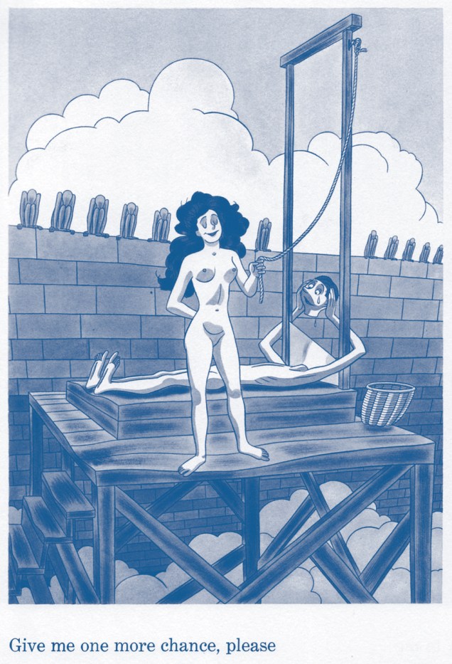
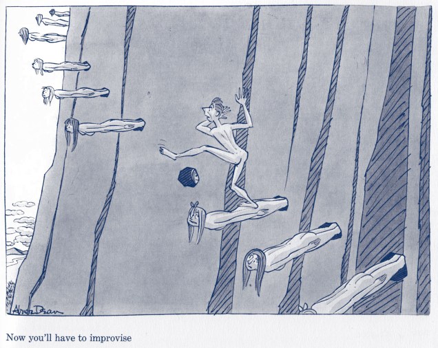
Regrettably, Dean’s five books in this new idiom [It’s a Long Way to Heaven (1945); What Am I Doing Here? (1947); And On the Eighth Day (1949); Come As You Are: A Book about People at Parties (1952) and Cave Drawings for the Future (1954)] have all-but-entirely faded from collective memory, but there have been encouraging stirrings of a revival in recent years, owing to the efforts of a dedicated handful of brave souls.
Dedicated… and perhaps influential: What Am I Doing Here? was granted a new facsimile edition in 2016. Here’s a brief review.
As in the case of the couldn’t-be-more-highly-recommended Abner Dean’s Naked People: A Selection of Drawings from Four of His Books (1963), we’re omitting any excerpts from Come As You Are, not because it’s inferior work, quite the contrary, but because it deserves a showcase of its own. We’ll return to it.
In the meantime, enjoy these peeks into Abner Dean’s Id and, I daresay, the human condition at large. Thanks to Dean’s visionary approach, these haven’t acquired a wrinkle in the past eighty or so years.
From It’s a Long Way to Heaven (1945)From It’s a Long Way to Heaven (1945)From What Am I Doing Here? (1947)From What Am I Doing Here? (1947)From What Am I Doing Here? (1947)From What Am I Doing Here? (1947)From What Am I Doing Here? (1947)From And On the Eighth Day (1949)From Cave Drawings for the Future (1954)
« Quodo seemed to be a paradise. It was a lush green planet of peace and solitude. Then the pilot met the blonde… » — Nicola Cuti, “Weird World”
Kenneth Smith (1943-), the fantasy artist, inhabits the same body as Kenneth Smith, the retired philosophy professor and incorrigible obfuscator. Whereas someone like, say, Bertrand Russell would make his point clearly and concisely, Kenneth would just pile it higher and higher, leaving the reader entangled in a maze of syntax and syllogism.
Since you may not be familiar with the man’s infamous column in The Comics Journal, Dramas of the Mind, here’s a typical quotation from the man, where he, er… takes on “obscurantism”:
« In characterizing realities no less than in taking positions on issues, consciousness generalizes, i.e. genericizes: in articulating or formulating, it reduces things, even our own selves, to forms, abstractions, idealizations, types, archetypes, simplisms. “Thinking” is an activity that ultimately grounds or resolves itself in the satisfying, self-certain form of orthodoxies, preconceptions, uncriticized and imperative norms; and it is overwhelmingly inept to recognize just how pathetic, parasitic or placental is its relation to its “own” fundamental norms of understanding and valuation. Rarely if ever does any act of thinking grow so laserlike or iconoclastically intensive as to escape from the dense miasma of what is acceptable. To think what actually is is even more contranatural for humans than to see what actually is: as subjectivizing as “seeing” is, “thinking” is many degrees or magnitudes more saturated with conditioned biases, delusions, self-deceptions. A program of hygiene or asepsis for the sanity, acuity and clarity of syncretic or wholesided thinking—a discipline of orthotics for sobering, grounding and polemicizing of well-formed gnoseonoesis—is needless to say unknown in modernity. Not just language but virtually all of intellect, education, culture, etc. have been adapted into utilities, tools whose very aspectivity militates against the nakedness of “evidence,” which is to say, against candor and against truth: regardless of what it may be called, “evidence,” even the most obvious and blatant, is in actuality not so “evident” to most people, and the modern development of “sophistication” or “education” typically worsens the obscurantism. »
For all that, I’ll take a guy with such an overflowing abundance of vocabulary and ideas that he doesn’t know when to quit… over most of the boneheads frequently passing for writers nowadays. Still, if you don’t mind, we’ll (mostly) stick to his Warren artwork today.
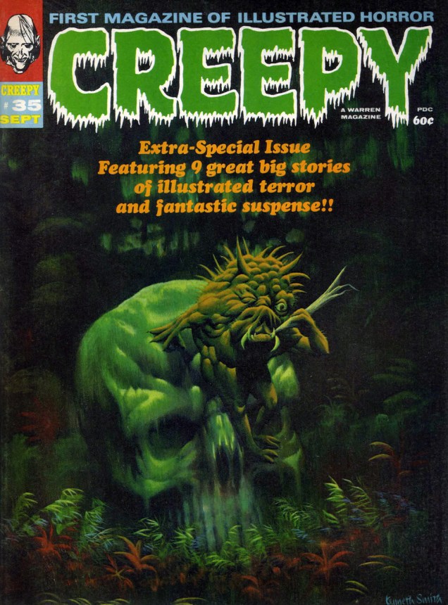
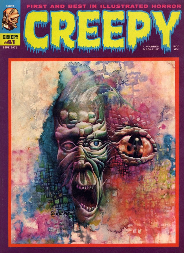
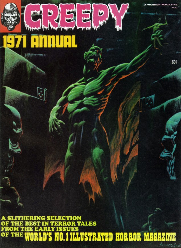
Creepy no. 35 (Sept. 1970). Regardless of its month of release, its lovely shades of emerald bring thoughts of springtime to mind.Creepy no. 36 (Nov. 1970), unique amidst Smith’s Warren covers in that it presents the human form in a somewhat less… grotesque fashion.This is Creepy no. 41 (Sept. 1971). Owing to its lower than usual print run, this ranks amongst the scarcest Warren issues.This is Creepy 1971 Annual, all reprints, but quite a choice roster of them: Ditko, Toth, Boyette, Craig, Crandall, Sutton, Adams, and Torres.And here we have Mr. Smith’s last, and arguably least, Warren cover. Only a detail of the full painting was used. Eerie 1971 Annual also features naught but reruns.And this is the original painting in its entirety. Sorry about the glare, but this is likely the only publicly available image of this privately-owned piece.
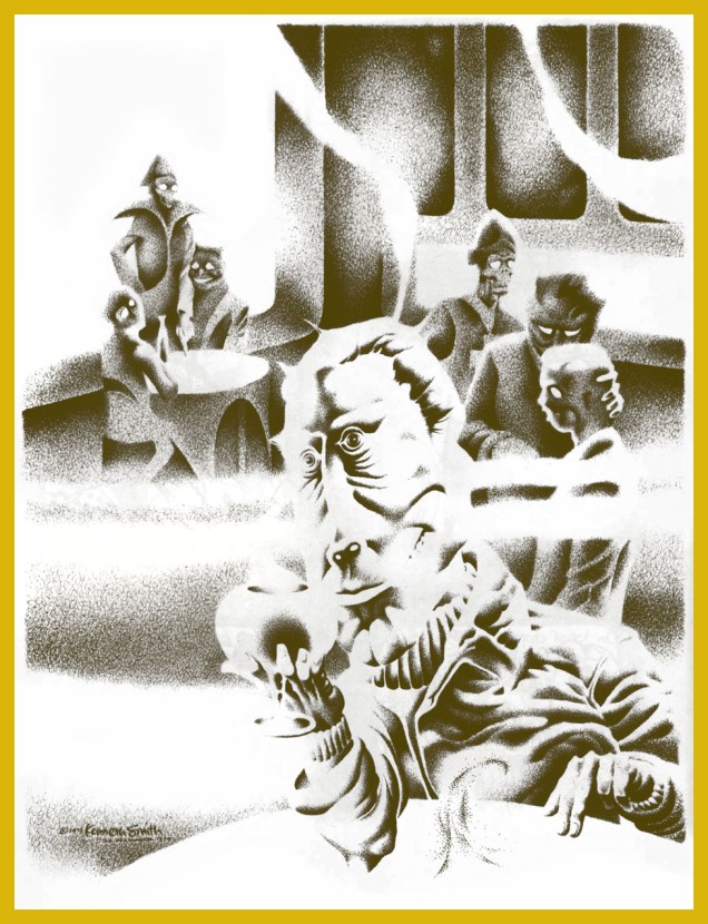
Bonus time: Mr. Smith created this lovely piece to illustrate R.A. Lafferty‘s masterful short story Mr. Hamadryad. I first encountered them* in the anthology Prime Cuts no. 1 (Jan. 1987, Fantagraphics). Hey, any fan of Old Man Lafferty’s is someone I’d happily clink glasses with. Cul sec, Mr. Smith!
« I believe that Mr. Hamadryad was the oddest-looking person I had ever seen. Surprisingly I regarded him so, for I first became aware of him in The Third Cataract Club in Dongola, and some very odd-looking gentlemen came into The Third Cataract. If you cock an eyebrow at someone in that place, then he’s really odd. » — R.A. Lafferty
*Smith’s illustration first graced Lafferty’s tale in the limited edition (1000 copies) collection Golden Gate and Other Stories (1982, Corroboree Press, MN). However, “Mr. Hamadryad” first turned up in STELLAR I (Judy-Lynn Del Rey, ed., 1974).
Kitchen Sink Press, a trailblazing publisher of underground comix that grew out of Denis Kitchen’s successful attempts at self-publishing, has seen its share of tentacles. (For a detailed story of how Kitchen Sink grew from a modest artists’ cooperative into a force to be reckoned with, as well as a discussion of its 30-year legacy, pay Comixjoint a visit.)
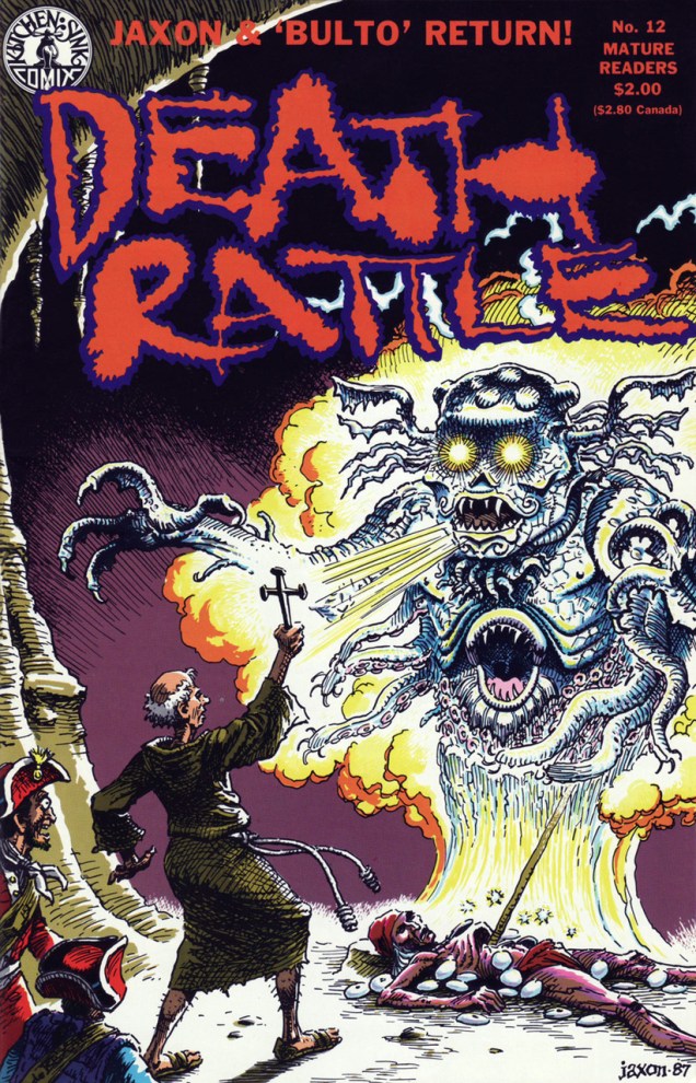
First we have a pair of entries from the Death Rattle catalogue. There were 3 “volumes” (series, if you will) published, and my favourite is volume 2, consisting of 18 issues coming out between October 1985 and October 1988, starting out in glorious colour but reverting to black-and-white with issue 6 (which was fine, actually). It’s a remarkably consistent anthology nearly devoid of clunkers, and featuring awesome stories and art by Rand Holmes, Jaxon, Tom Veitch, Al Williamson, Wally Wood, Steve Stiles, etc. It’s also where Mark Schultz’ Xenozoic Tales series was introduced (Death Rattle no. 8, December 1986)!
Death Rattle no. 4 (April 1986), cover by Rand Holmes, who’s already ascended to the rank of Tentacle Tuesday Master.Death Rattle no. 12 (September 1987), cover by Jaxon (Jack Jackson). The cover belongs to Jaxon’s “Bulto… The Cosmic Slug“, an epic eleven-parter that I really enjoyed reading (and not only because of its manifold tentacles). We’ll talk about that again.
Speaking of Jaxon, I’d like to quote from General Jackson, a tribute written by Margaret Moser (who dated him on-and-off through the years).
« The last time I saw Jack was a humid, late summer night in 2005 at the South Austin Museum of Popular Culture. His hair was nearly white and had lost its red-brown burnish, but his mustache was bushy as ever, and he resembled God Nose himself. He was a little grumpy, probably feeling bad, and I was with my boyfriend, so I didn’t sit on his lap. I did kiss his leathery cheek and fetch him a beer. He smelled like cigarette smoke and maybe of Old Spice.
On Wednesday, June 7, just three weeks after his birthday, Jack Jackson took his life at the graves of his parents outside Stockdale. His diabetes and arthritis were getting worse, affecting his ability to draw, and he’d been diagnosed with prostate cancer. Unwilling to face a debilitating course of chemo treatment, he put down his pen forever and made his own kind of peace with the unforgiving future. »
On to something more cheerful! Next, we have a bit of a non sequitur in this otherwise horror-centric post, although one might argue that being grabbed by an octopus is a traumatic experience. What’s The Spirit doing in here, you might ask?
« Kitchen Sink continued publishing multiple undergrounds and alternative comics through the ’80s and ’90s, but also expanded into publishing non-underground comics, graphic novels and extensive anthologies, most notably by Will Eisner, Al Capp, Milton Caniff and Harvey Kurtzman. » |source|
The Spirit no. 34 (August 1987), cover by Will Eisner.Page from “A Day at the Beach“, drawn and scripted by Will Eisner and inked by André Leblanc, printed in The Spirit no. 34 (August 1987). Somehow I’m not surprised that Eisner draws a mean-yet-elegant octopus.
All rested now? Okay, back to horror.
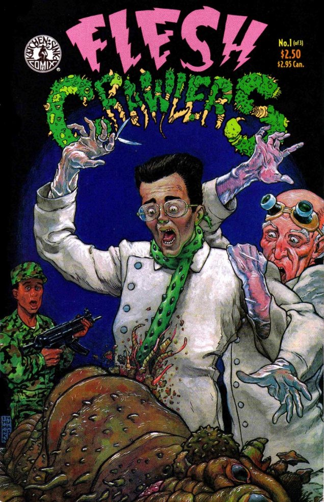
Flesh Crawlers no. 1 (1993), written by Richard Rainey and illustrated by Michael Dubisch. A quick look at the latter’s catalogue shows that Dubisch happily adds tentacles to whatever he’s drawing.
The scientist seems to have been preparing to dissect the specimen – turnabout is fair play! This cover reminds me of this, actually:
Barney & Clyde is a syndicated newspaper strip with jokes that are actually funny and characters that you can get attached to, a rarity these days. You can read it online.
Back on topic, another attack of the Flesh Crawlers:
Flesh Crawlers no. 3 (1993), written by Richard Rainey and illustrated by Michael Dubisch.
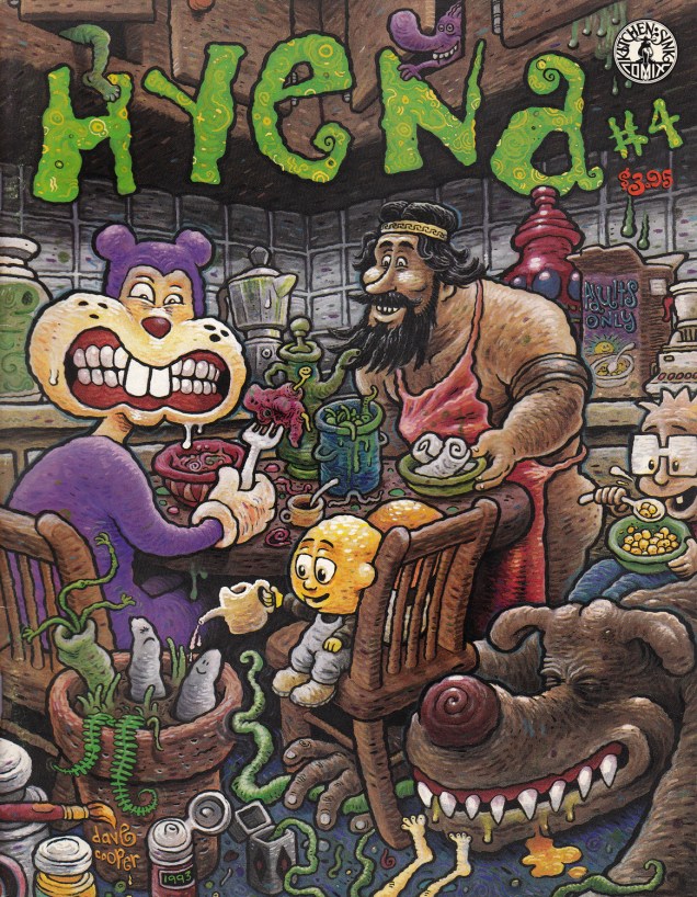
My final submission for today involves a cozy family scene where Frank is peacefully having breakfast with, err… Potted turnip babies and an almost-nude greek serial killer. I think.
Hyena no. 4 (1993, Tundra), cover by Dave Cooper. If Jim Woodring’s work frequently creeps me out, Cooper’s comics are viscerally repulsive to me (I think he goes for “nauseating” on purpose, but I’m not in the camp of people who like to experience strong emotions by watching disgusting, repulsive things happen). This cover, though, is all right.