« Parmi les champignons se cachent d’ignobles individus, des espèces savoureuses et des sujets tout à fait pacifiques… »
December may not be exactly the month one associates with mushrooms, but that is precisely when mycophiles get broody and start cataloguing (mentally or otherwise) new species encountered during the warmer months*, dreaming about spring and its new flush.
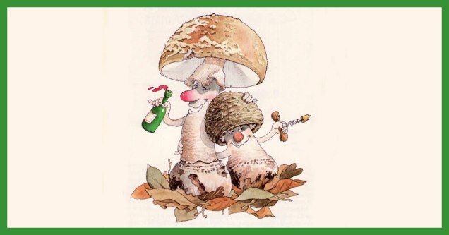
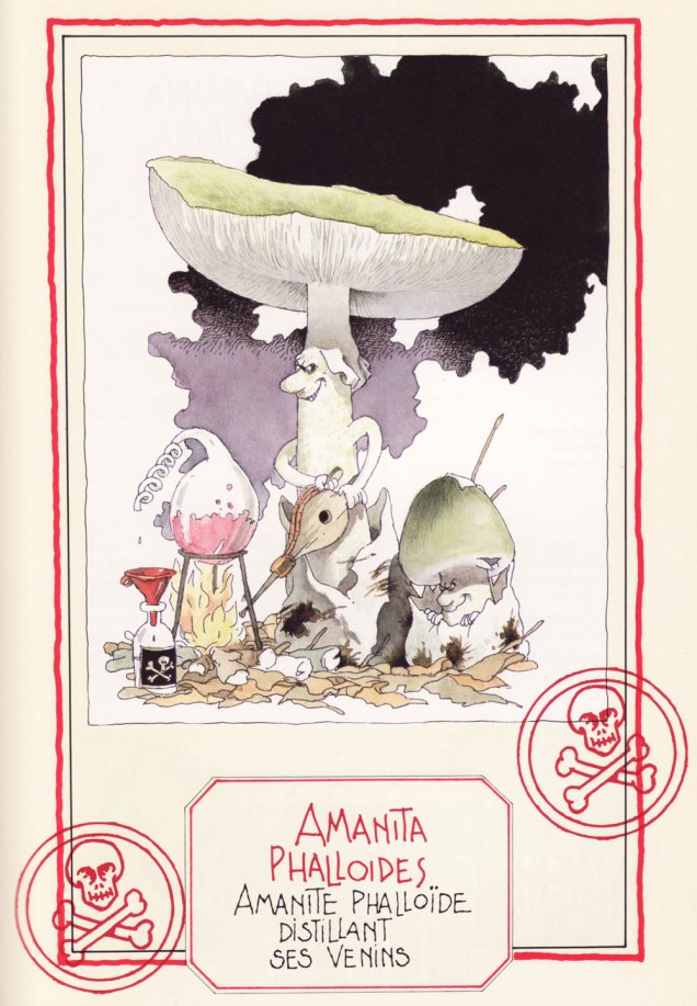
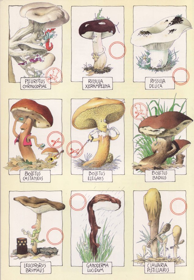
Here’s a selection of mushroom portraits taken from Le gratin des champignons by Roland Sabatier, an outstanding artist previously featured by co-admin RG in « Pépin le Long, You’re Fired! » (and, need I mention, a member of the Mycological Society of France). The second reaction I had upon leafing through this volume’s pages (the first was to squeal delightedly) was stunned admiration regarding the level of detail with which each mushroom is illustrated. I am by no means the first to note this (in his outstanding introduction, Georges Becker**, co-author of this tome, makes much the same point in far more eloquent prose), but it bears mentioning that while Sabatier may have transformed mushrooms into wonderful characters with their own games and stories, he managed to so very rigorously observe and illustrate their characteristics that one could actually use this book as a mushroom guide and not get, you know, poisoned.
Let’s get cooking!
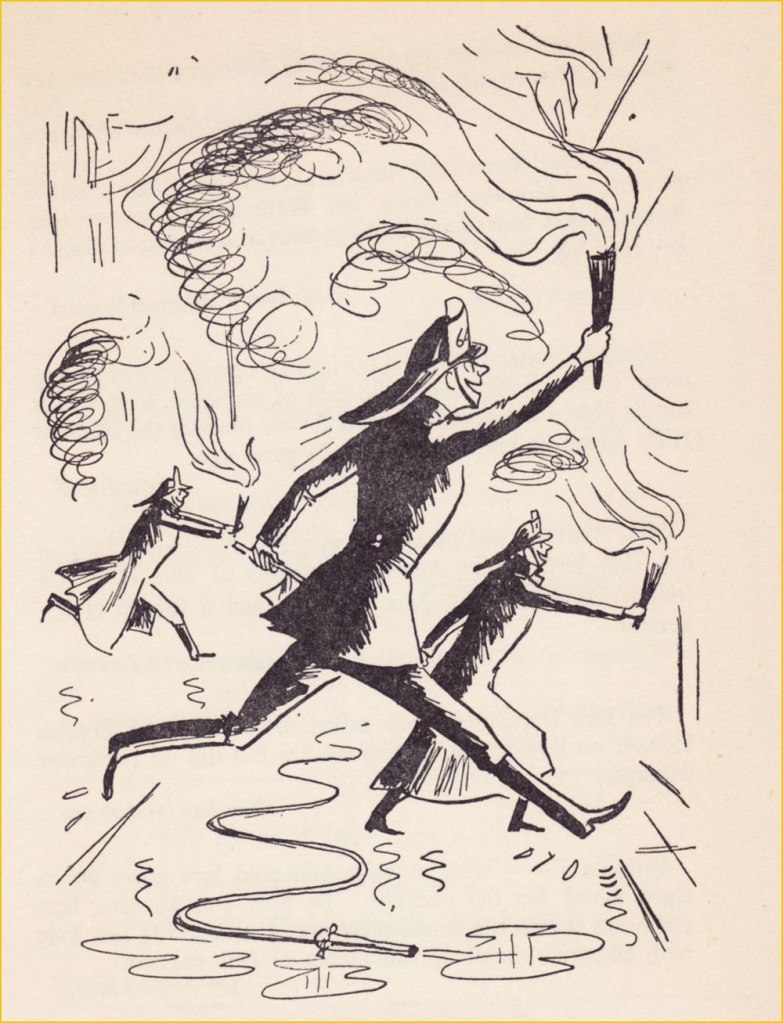
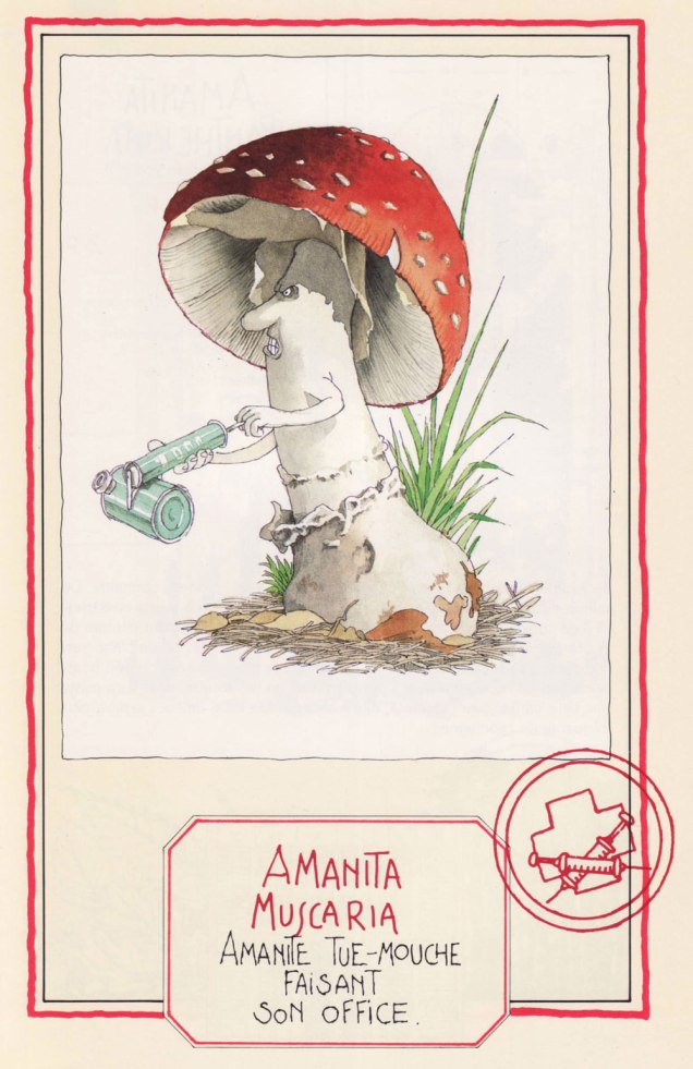
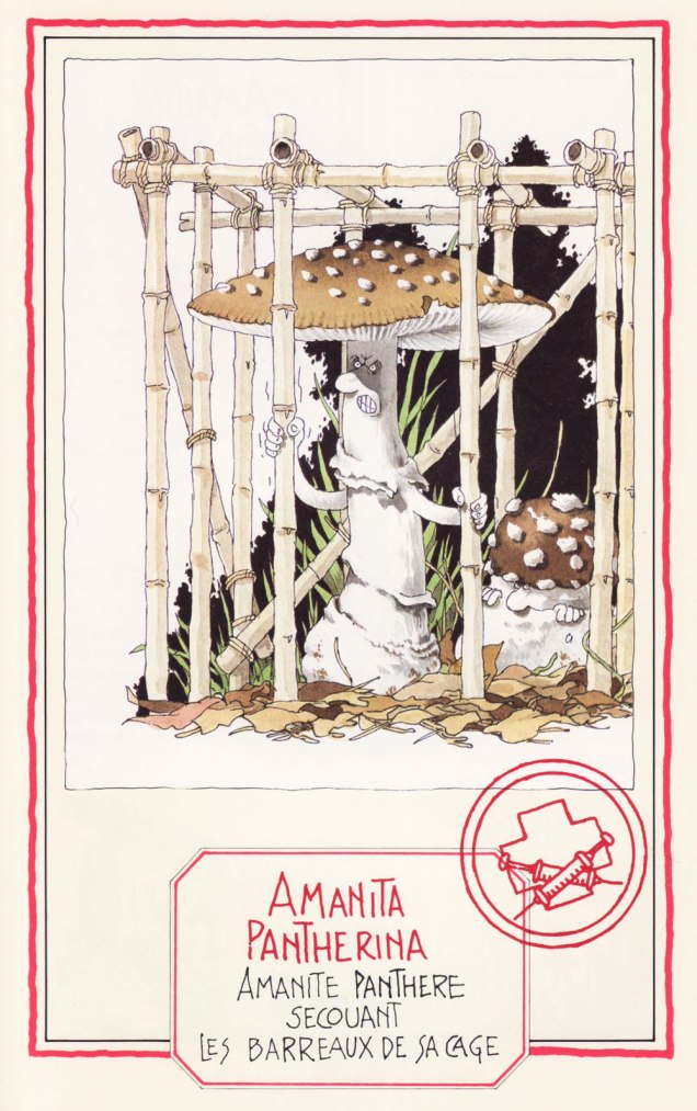
Speaking of getting poisoned, meet four Amanitas, a most deadly genus… with a few delicious, choice morsels thrown in to keep us on our toes:

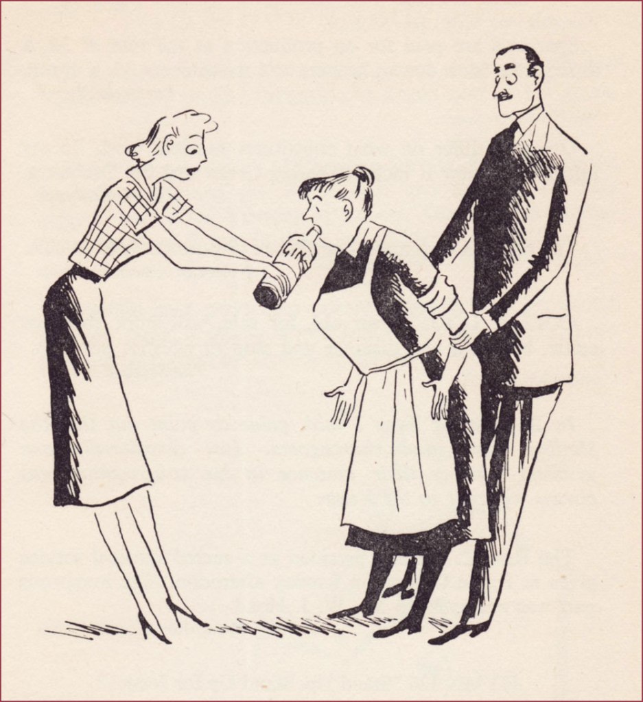
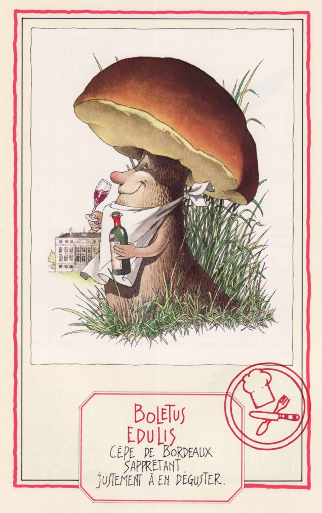
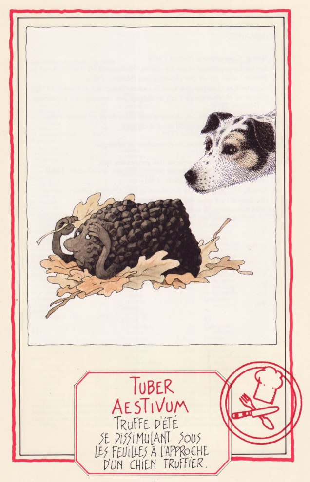
Now we move on to more traditionally edible characters —


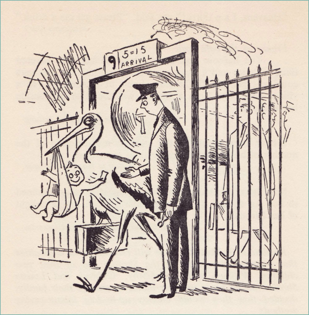
First published in 1986, this book has known several editions to update nomenclature (some mushroom families and names have changed considerably in the last 40 or so years, which is its own topic). We have the 1991 edition, published by Glénat. Sabatier had so many favourite mushrooms he illustrated, they didn’t even all make it into the book officially… which is truly a crime. Take a peek at some other of his mushroom people, only included on the inside of the book’s cover (but at least included in that smaller capacity!):
~ ds
* Technically one can find some mushrooms during winter, but that is not my area of expertise (at least as yet).
** French mycologist of renown (1905-1994), as well as writer, politician and apparently even musician (piano).
*** I’m actually not a big fan. This Agaricus tastes too much like the ‘champignon de Paris’ mushrooms sold in supermarkets to be of much interest.