Fungus Friday: Amanita New Year (To Get Over This One)

It’s nearly New Year’s eve, and a Friday, which seems like some sort of omen for a gallery of vintage winter postcards featuring toadstools, seeing as Fungus Friday is every bit as tangible as Tentacle Tuesday (go here if you’re late to the tentacle train). The connection between hibernal celebrations and mushrooms might not be an immediately obvious one, but one has to keep in mind that the way we celebrate Christmas is distinctly pagan.

More in reference to mushrooms, it has been argued that Santa Claus actually started out his folkloric life as a shaman who gets high on Amanita* (either by direct consumption, or by drinking the urine of reindeer who have consumed them). When one looks for coincidences, one finds them, but nevertheless it’s worthwhile pointing out that the pine trees we adorn our households with for Christmas form a symbiotic relationship with Amanita muscaria (yes, that iconic red toadstool with white warts that so often stands in for a generic mushroom in many stories), and that Santa Claus’ red-and-white costume follows its colours. For more in-depth analysis, I highly recommend Santa Claus Was a Psychedelic Mushroom (written by Derek Beres, who also coined the great alliteration ‘psychedelic piss’ when discussing reindeer-processed Amanitas).

This claim has been disputed by people (some of whom were foaming at the mouth, and not necessarily from mushroom consumption) who point out that this is rather a case of retro-fitting facts into the storyline. You may accuse me of intellectual laziness, but I actually don’t give a fig about where Santa Claus came from. Of more relevance to me (and this post) is this bit: ‘Fly agaric does not appear in authentic Germanic Christmas cards, they’re New Years cards which use fly agaric as a good luck symbol, alongside horse shoes and four-leaf clovers.’ The Fliegenpilz is indeed a good luck charm in Germany, so that’s quite possible. New Year’s card are certainly germane to this time of year, now that the ecstatic joys of Christmas (ahem) are a week behind us.

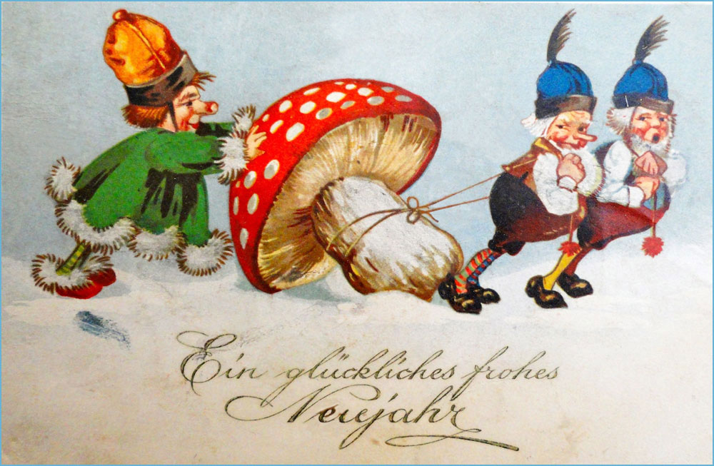
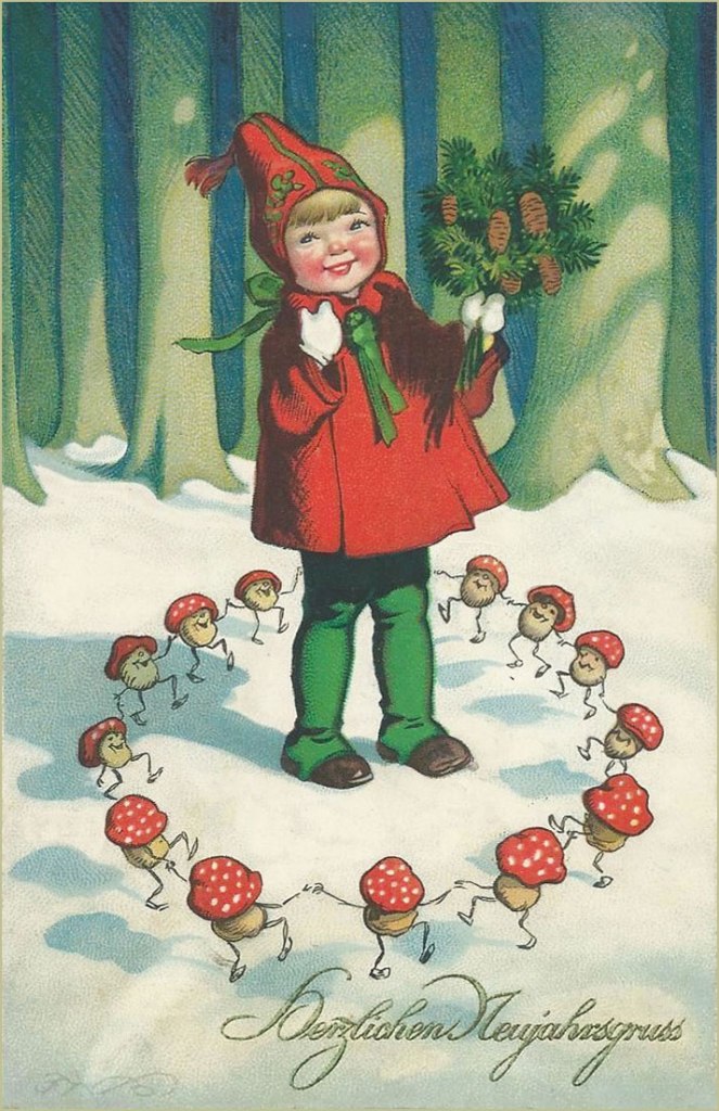
Either way, enjoy the array of vintage postcards from the late 1930s-1940s, most of them German. Whatever they’re supposed to symbolize (the ones with writing do mention New Year, not Christmas), to a modern reader’s eyes they’re delightfully weird, and I won’t blame anyone for thinking that some drugs were involved.

The Amanitas-as-good-luck-charm theory seems to be borne out in the following, given the presence of clover, horse hooves, etc.:

I wonder if the kid in white represents the Destroying Angel (Amanita virosa and similar) – its name gives more than a hint about its toxicity. Perhaps ‘Mushroom Grandpa’ should stay away. Pigs are also a good luck charm, so they make more than one appearance in these postcards (though much like the rabbit’s foot, they’re distinctly unlucky for the actual animal, since they get gobbled up…)
Boldog Új Évet is actually in Hungarian, not German, and means Happy New Year
… and Daudz laimes jauna gada is in Latvian.

Who knew so much revelry was taking place around a couple of mushrooms?

The closest I was able to find is Head uut aastat, which is Happy New Year in Estonian. This post is proving to be quite a language lesson.
Another Latvian postcard. The one on the left is totally sloshed.
Gelukkig Nieuwjaar is in Dutch.

The rest of these are in German:

There is something disquieting about a pink-cheeked child surrounded by dancing mushrooms.
‘Wow, this thing is big and it’s all for me!’
An Amanita drawn by somebody who wasn’t sure what they looked like (hint: it’s not a raspberry).
Weihnacht is sort of like Christmas eve in German-speaking countries. Note that this postcard differs from others in two ways – it features a bolete, not an Amanita, and wishes the viewer Merry Christmas, not Happy New Year (with a bag full of money, apparently).

Happy New Year to all our dear readers, and may your paths be littered with tasty mushrooms in the coming year!**

*Amanita muscaria is considered poisonous, as far as foraging mushrooms go, though it has a long history of being used as a psychedelic/intoxicant by many tribes (namely, by the indigenous people of Siberia). A strong dose causes delirium and a host of other side-effects, which fade after a few days. I might add that some Russians (and god knows Russians will eat whatever mushroom is even remotely edible – I say that with nothing but admiration) consider it a good edible, provided you boil it in water three times or so. I might try that one of these days! I have no interest in psychedelic properties, but plenty of interest in culinary ones.

**Assuming you like them, of course.

~ ds

Sitting Pretty: Averardo Ciriello’s Maghella

« Italy hasn’t had a government since Mussolini. » — Richard M. Nixon

Today, let’s bask in some purely visual glory. Let’s take a gander at a small corner of the mind-boggling œuvre of Averardo Ciriello (1918 – 2016). As you can see from these dates, he was a long-lived fellow, and I’m delighted to report that he was healthy, hearty and active well into his nineties.

He was one of those illustrators who truly delighted in their craft, and so produced an enormous body of work that bore every sign of inspiration and enthusiasm. Since my plan is to focus on a specific period of his career, I’ll skip most of his early work — though it’s well worth returning to — and give you a couple of famous pieces to give you as a sense of his success and importance in his field.

It’s fair to say that Ciriello excelled across the board, likenesses included. This is the Italian poster for 1956’s Forbidden Planet.
And this one for 1965’s Bond adventure Thunderball. Since the Bond movies were as much Italian as British production (if not moreso), it’s no surprise that producer Cubby Broccoli did not scrimp, tapping Ciriello for the series’ Italian promotional campaign.

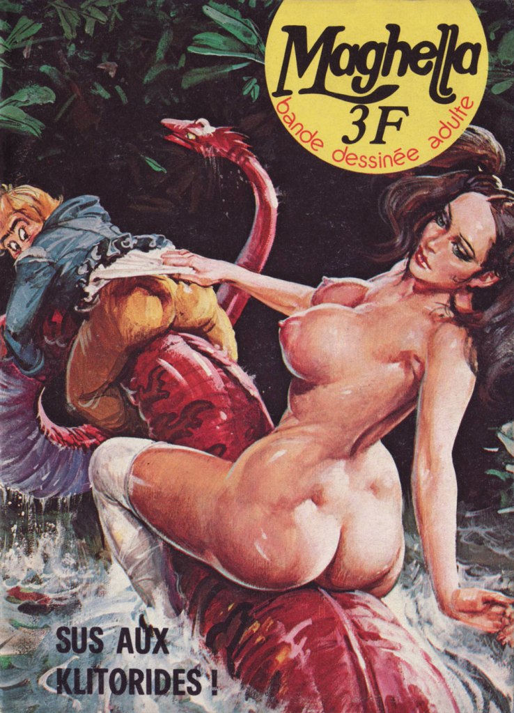
Now for the heart of it: I frankly marvel at Ciriello’s willingness to provide hundreds of cover paintings for cheap, mass market erotica fumetti. The way I see it, it’s evidence that he greatly enjoyed the assignment, and that the money was but a secondary concern at best. We’ve briefly touched upon the Maghella series (in our all-time most popular post, as it happens), but here’s some more.

This is Maghella no. 1 (Nov. 1974, Elvifrance).
This is Maghella no. 15 (Oct. 1975, Elvifrance).
This is Maghella no. 22 (Mar. 1976, Elvifrance). ‘Gode’, aside from being a city in Ethiopia and a species of fish, is the abbreviation of godemichet, which is to say… a dildo.
This is Maghella no. 24 (Apr. 1976, Elvifrance).
This is Maghella no. 41 (Apr. 1977, Elvifrance). Since you’re bound to ask, here’s a recipe for Salade russe, which actual Russians call ‘Salade Olivier‘. DS made it for lunch a couple of days ago, and it was delicious.
This is Maghella no. 42 (May 1977, Elvifrance). Unlike most artists specialising in ‘erotica’, Ciriello could draw anything, in any style, and effortlessly mix sensuality with comedy with horror with angst. A true master — sorry, maestro.
This is Maghella no. 66 (Jan. 1979, Elvifrance).
This is Maghella no. 77 (Feb. 1980, Elvifrance). I assure you, those pun-based titles are utterly untranslatable.
Censorship inevitably got into the act. Here’s one of several instances, the before (with imposed editorial revision indicated) and after of Maghella no. 110 (Sept. 1978, Publistrip); said censorship seems to have driven up the cover price, to boot. This precious bit of info gleaned from a lovely monograph of the artist, Gianni Brunoro and Franco Giacomini’s Ciriello: Una Vita per l’illustratione (2016, Edizioni Di).

-RG

Treasured Stories: “The Code of Duckburg” (1958)

« We never knew his name; we only knew him as “the good artist”. But his style spoke for him. He was instantly recognizable despite his anonymity — at once different from the other funny animal artists and better. » — Dwight R. Decker

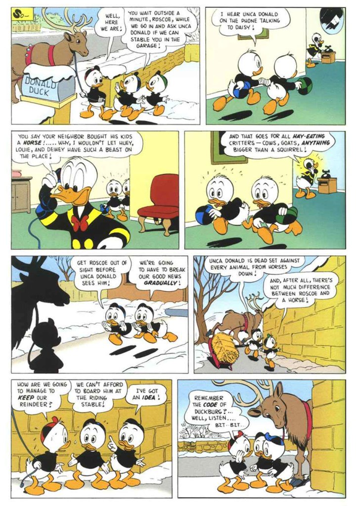
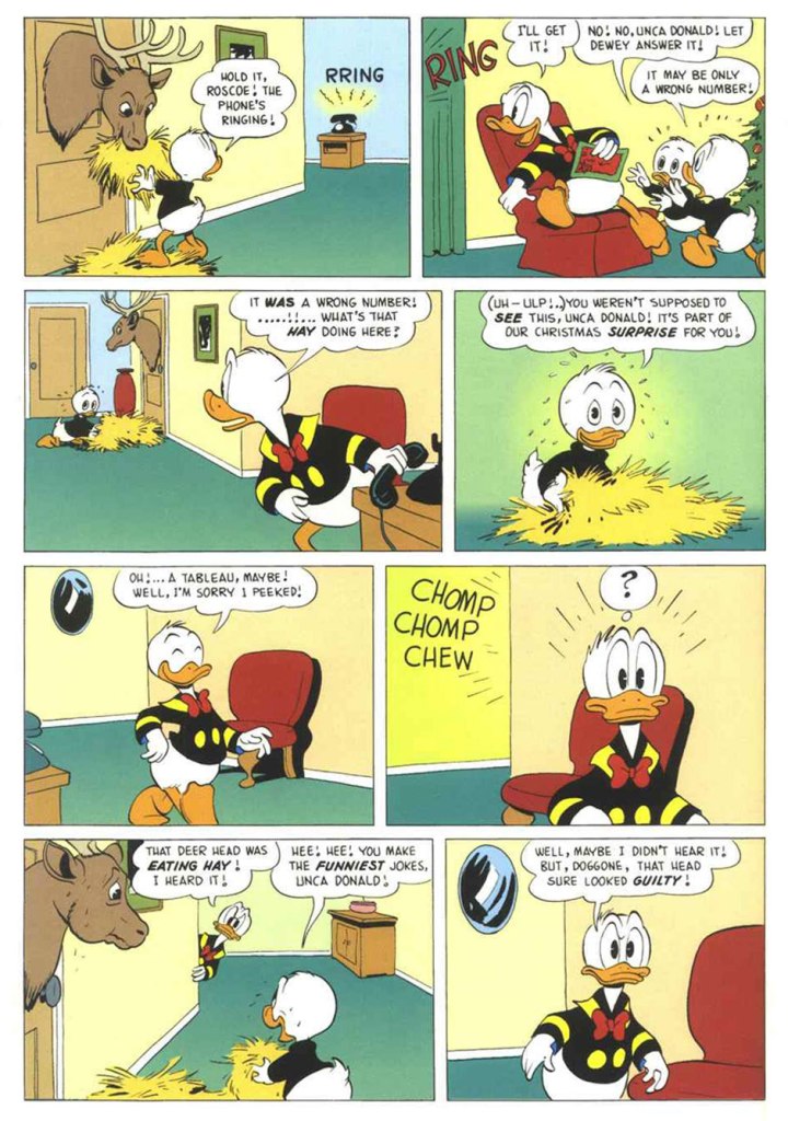
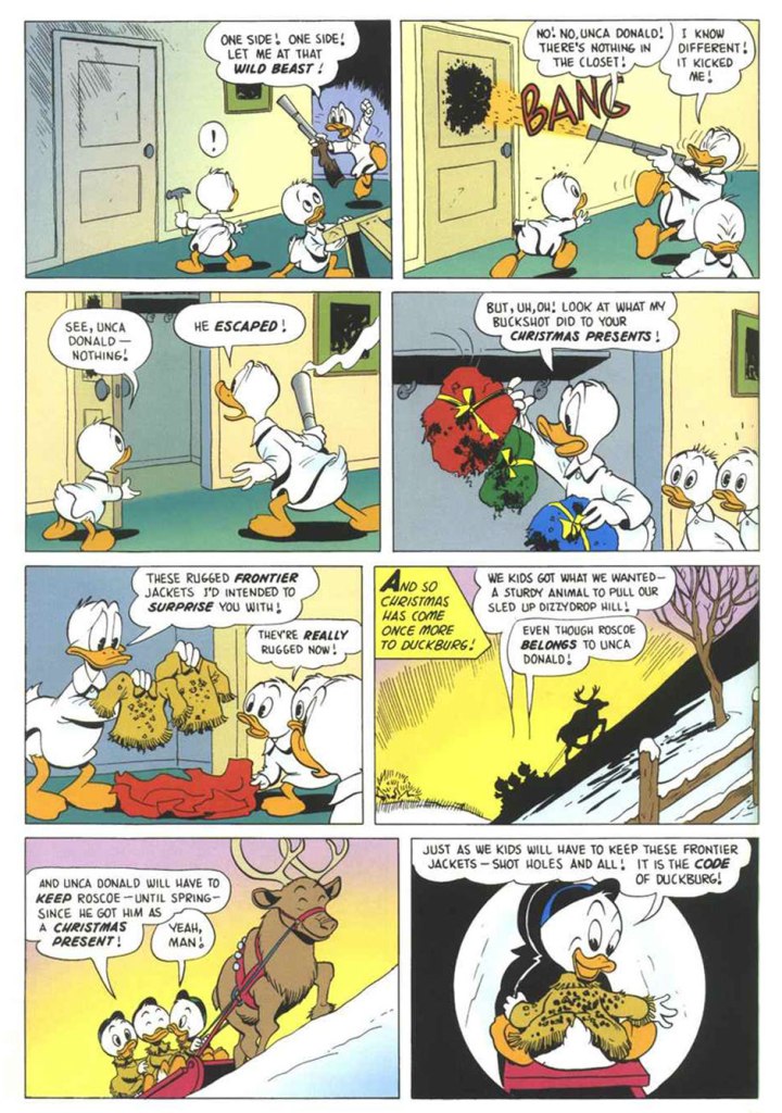
The great Duck Man, Carl Barks, despite having little interest in the holiday, drew over two dozen Christmas-themed stories featuring Donald and his relatives (and wrote the bulk of them). Now, so very much has been written and said about Barks that I won’t bother to add much here. I’ll just let his work speak for itself and breathe. I opted for a lesser-known ten-pager, not coincidentally one of my favourites. “The Code of Duckburg” originally saw print in Walt Disney’s Comics and Stories no. 208 (Jan. 1958, Dell), but I’m using a more contemporary issue boasting better printing and a commendably tasteful colouring job, from Walt Disney’s Uncle Scrooge no. 317 (Jan. 1999, Gladstone). It must be said that the folks at Gladstone did right by the ducks — it was more of a labour of love than a strictly commercial venture.

Here’s a closer peek at a panel from page 3: just look at the joy on Roscoe’s face. Unlike Donald, his nephews are unfailingly kind to (other) animals, great and small. That’s what makes them such sterling exemplars of the Junior Woodchucks.
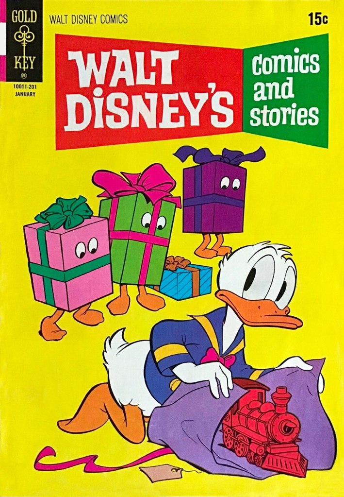
The issue of WDC&S where our story first appeared didn’t have a Holiday-themed cover, but this one reprinting it did. This is Walt Disney’s Comics and Stories no. 376 (Jan. 1972, Western); pencils by Tony Strobl and inks by Larry Mayer.

And as a bonus (there has to be a bonus!), here’s a look at a Barks model sheet. « The Barks sense of whimsy extended even to the model sheets he drew for other artists to follow. » I made it a larger image so that all the small details remain discernible. Happy Holidays, everyone!

-RG

America’s ‘Most Visible Cartoonist’, Jim Benton

« I’m not saying I’m cool. That’s your job. » — Happy Bunny

When it comes to Jim Benton‘s work, it seems I got in on the ground floor, thanks to a friend’s shrewdly chosen gift of the man’s first cartoon collection, ‘Dealing With the Idiots in Your Life‘, twenty-nine years ago this Christmas. Yikes!

In a way, Benton’s nearly too obvious a subject for a post: his work is everywhere you turn, but such a large audience seems to have been reached at the cost of relative anonymity. In other words, people know his work, but they may not know his name. I’m sure his name does, however, enjoy some currency with a couple of generations of younger readers familiar with his Dear Dumb Diary (nearly 10 million sold!) and Franny K. Stein (over five million sold) series.

Given his intimidatingly formidable output, I’ll stick to material from his first collection, which I like best anyhow… which is not to say, echoing what all and sundry tell Sandy Bates in Stardust Memories, that I strictly prefer “the early, funny ones“. Mr. Benton is possibly even funnier — or at least more sophisticated — today than he was at the dawn of his career, but these early cartoons are less ubiquitous than this century’s crop.

At this stage, Benton’s style — both in concept and execution — still wore some heavy influences, namely that of Bernard Kliban.
It wouldn’t surprise me one bit if this cartoon had near-universal appeal, given the fearful hold of cognitive dissonance: after all, most of us think others have a tenuous grasp on reality.
Cute Citizen Kane reference.
A timeless and oddly poignant state of affairs.
Some of you will likely have occasion to muse over this very question during the Holidays.
This one’s *very* Kliban-esque.
In this one, I see a bit of his fellow Scholastic alum Tom Eaton‘s touches. All for the good.
More Kliban (surely intentional!) but with sprinklings of Nicole Hollander and perhaps Scott Adams.
Taking Will Rogers’ famous bon mot to its, er… logical conclusion.
Here’s a jolly one for the season.

In closing, a bonus one from quite recent days. While I’m less fond of the digital tablet aesthetic of his latest work, his writing has acquired some even sharper edges. Sadly, this strip will likely be relevant only to medieval citizens of the German town of Hamelin, right?

For more Benton, right from the source, note the address: https://www.instagram.com/jimbentonshots/

-RG

Fred: Bold Lines and Moustache Twirling

« Crosses and gallows – that deadly historic juxtaposition. » — Howard Zinn

Bonsoir, mesdames et messieurs…

All right, time for me to tackle (though a bit sideways, I’ll explain) another of my daunting heroes. This time out, it’s Frédéric Othon Théodore Aristidès (1931-2013), better — and more simply — known as ‘Fred’.

A compulsive and constant scribbler, he attended no institute of artistic learning but his own (and didn’t bother to complete his secondary education), and made inroads into the field by the dawn of the 1950s, landing in Ici Paris, France-Dimanche, Le Rire, Paris-Presse, France-Soir, Punch, and even as a gagman (uncredited!) for The New Yorker (others, among them Otto Soglow, would illustrate the gags for publication).

In 1960, he was, with Georges Bernier — aka Le professeur Choron — and François Cavanna, of the founding trio behind corrosive (and at times banned by the French government) satirical magazine Hara-Kiri, drawing its first sixty covers… and a lot of (self) righteous ire. Any press is good press, or so they say…

Mid-decade, he began his long and fruitful association with Pilote, launching, with the magazine’s 300th issue (July 22, 1965, Dargaud) his undeniable masterpiece, Philémon. And this is where my ‘sideways’ loophole comes in: I’m truly not ready to tackle the overflowing poetic cornucopia that is Philémon. By way of introduction, I’ll stick to the margins and showcase instead some of Fred’s ‘brutish and nasty’ (a rough translation of Hara-Kiri’s motto) panel cartoons and short pieces. There’s a lot to this guy.

Which reminds me of a time, a couple of decades ago, when Montreal’s FIFA (Festival international des films sur l’art/International Festival of Films on Art) presented a series of TV shows showcasing individual cartoonists, among them Chris Ware, Art Spiegelman… and Fred. I recall that Messrs Ware and Spiegelman were just as miserable and neurotic as expected, there was also this Manga master that felt trapped as a cog in an assembly line. Meanwhile, in sharp contrast to the existential angst, Fred was brimming with evident delight and joie de vivre at his good fortune to be a working cartoonist*, grinning and scribbling in his sun-dappled studio, leisurely strolling through his village, charming the ladies, enjoying a glass of wine and a wedge of fine aged cheese… I concluded that here was an eloquent encapsulation of the respective cartooning cultures of a few nations. Regrettably, I haven’t been able to track down this documentary series, not even in the FIFA archives. Nevertheless, here’s a short visit with the dear man, by then living in Paris.

As life tends to imitate art, so has this more or less come to pass.
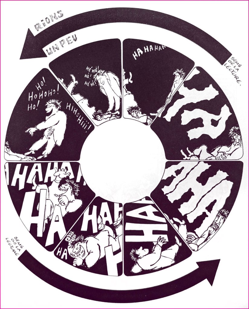
Obviously, you can’t nag anyone into quitting. This ingenious collage strip appeared in Pilote no. 670 (Sept. 1972, Dargaud).
An example — quite literally — of gallows humour.
Too much of a good thing can kill you — or ‘You may come to rue your mockery’.
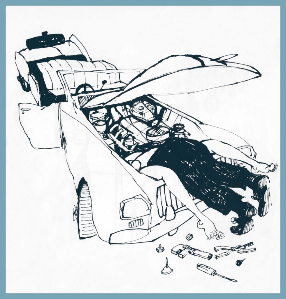
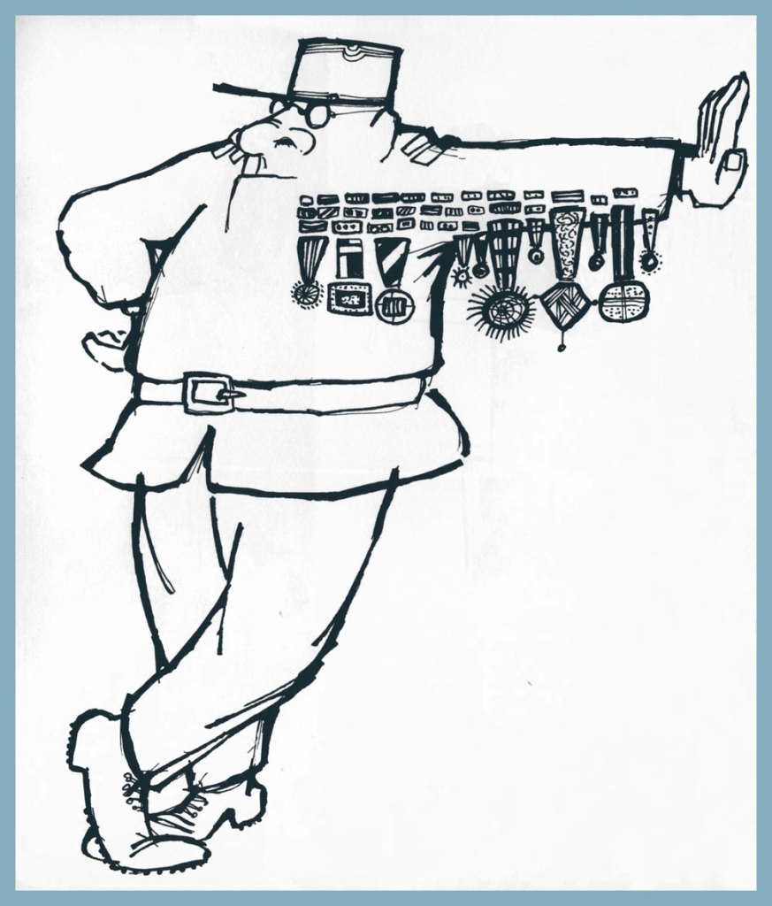
If one looks for common ground between the more… mordant of French cartoonists, you’ll find their shared, blistering contempt for their nation’s Military brass.
The title is a French idiom which roughly translates to “There’s a nip in the air”. This collection of short pieces Fred wrote and drew for Pilote was published in early 1973 by Dargaud.
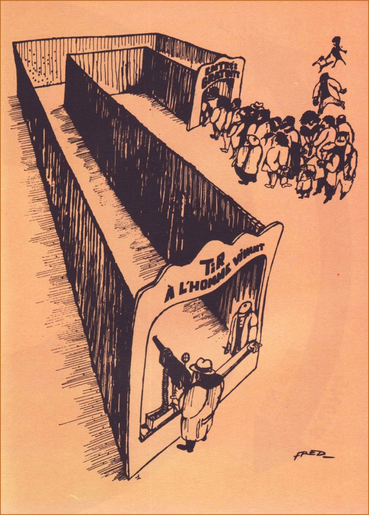
At one end, “Live Human Shooting”; at the other, “Free Admission”.
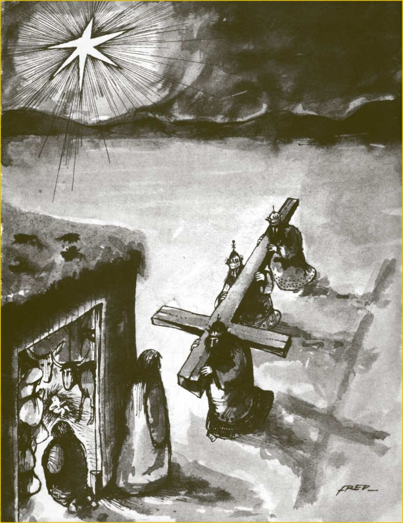
You want it darker? Oh, and also seasonal? Well, your wish is my command.

-RG

*this is serious, though: when Fred stopped drawing comics in the late 1980s, he fell into a deep depression and wound up in a psychiatric hospital. The cure? A return to creating comics. Surely there’s a lesson in this.

Pudge, Girl Blimp, Goes Cavorting

« While so many other women underground cartoonists were reclaiming the right to their own bodies in the wake of Roe v. Wade with comics like Abortion Eve and Tits n’ Clits, Marrs was reclaiming hers by reveling in its grotesqueries—namely, burps, pimples, compleat dandruff, BO, flatulence, ‘and other bodily emissions’. »

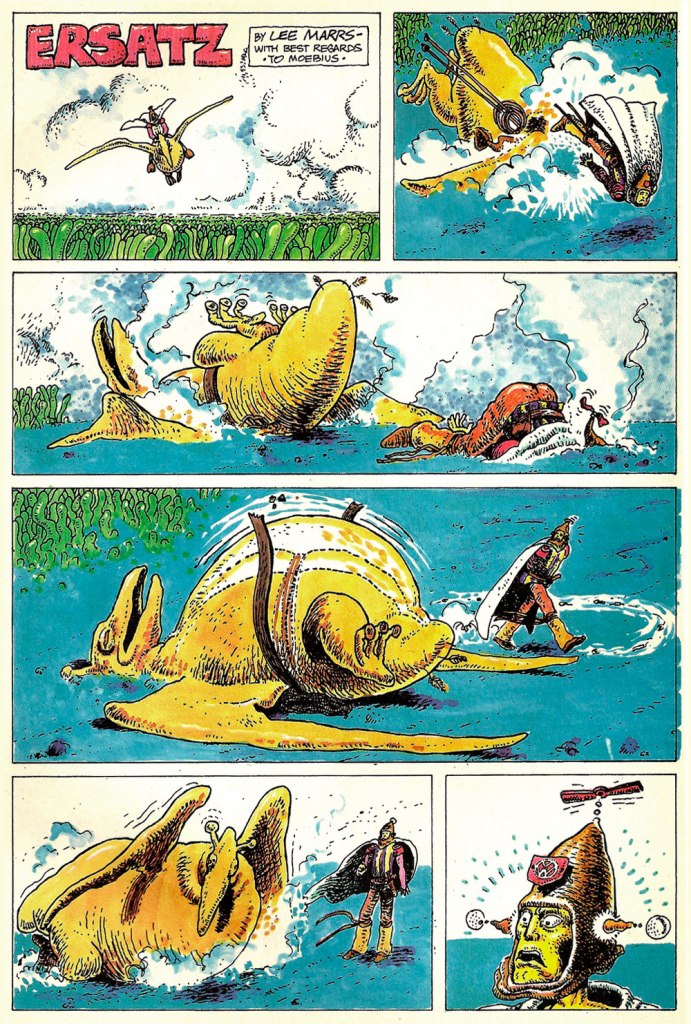
My first exposure to underrated cartoonist Lee Marrs was the story A Feline Feast, which you can conveniently read in co-admin RG’s post Felines and Moonshine: Two by Lee Marrs. I liked the expressive sketchiness of her line straight away, but only got around to what’s arguably her magnum opus, The Further Fattening Adventures of Pudge, Girl Blimp, much later.

In a fairer world, Marrs would be a much better known name. Was is because her output was so wide-ranging, or because she was writing frankly about women as actual human beings, not some glorified version thereof? I think fame is largely down to luck, and I guess luck was not exactly au rendez-vous. Still, fame or no fame, it’s undeniable that her career has been long, varied, and, I imagine, satisfying. It has been summarized by Monica Johnson writing for The Rumpus, so if you want the nitty-gritty of it, head over here; I’ll just mention that she was one of the first female underground comics artists, as well as one of the ‘founding mommies’ of Wimmen’s Comix.

Wimmen’s Comix no. 3 (October 1973, Last Gasp). The ranks of Marrs’ fellow Wimmen’s Comix founders have been cruelly decimated of late: our respectful farewells to Diane Noomin (who died last Sept. 1st) and Aline Kominsky-Crumb (who died November 29th).

Comixjoint explains,

« Our squat, face-stuffing heroine Pudge is introduced with her hitchhiked arrival in San Francisco from Normal, Illinois as a fat 17-year-old runaway. She’s also a virgin and she really wants to get laid, but that won’t happen in the first issue (or the second). Pudge’s backstory is further complicated by the fact that she is, in reality, a Martian, and the government of Mars has sent two guardian Martians to Earth in order to keep an eye on her… »

The Further Fattening Adventures of Pudge, Girl Blimp no. 1 was published by Last Gasp in 1973 and then reprinted, with a new cover, by Star*Reach, which also released issues no. 2 and 3. This is no. 3 from October, 1977.

I wasn’t setting out to write yet another post about an ‘historically important’ series; these things are accidental. The following scans are from a 2016 collection, The Further Fattening Adventures of Pudge, Girl Blimp, which almost looks like a print-on-demand affair, the art reproduced a tad shoddily and fuzzily. Where is the lavish hard-cover edition with bonus material, I would like to know? Well, we’ll settle for this in the meantime.

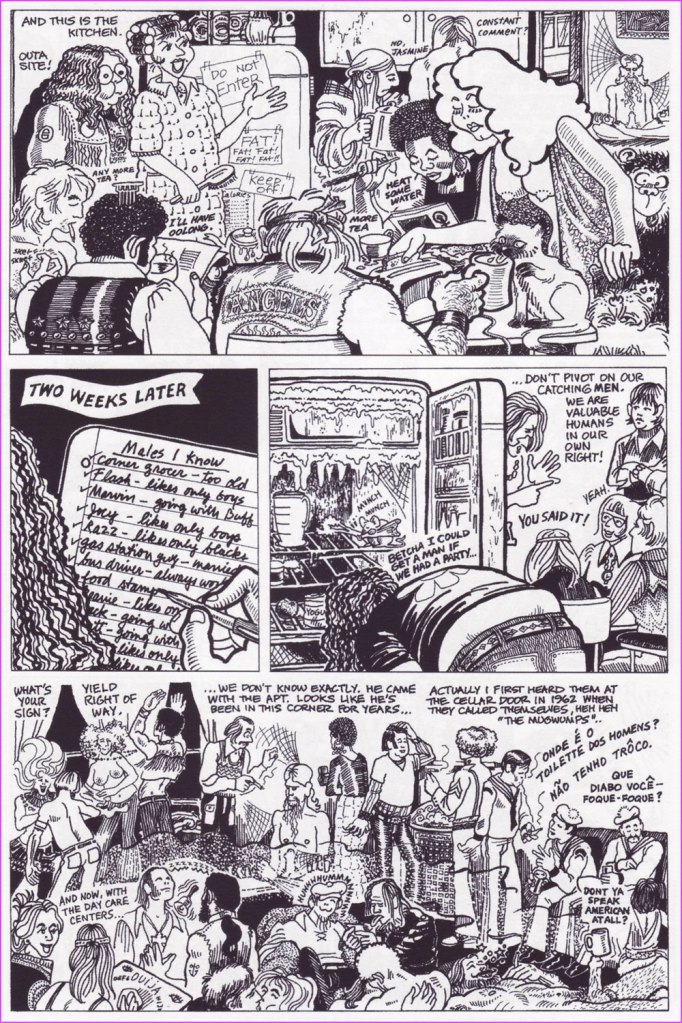
A little peek into the commune where Pudge lives, as well as a glimpse at one of the many parties (an occasion to find some guy to have sex with, hopefully).

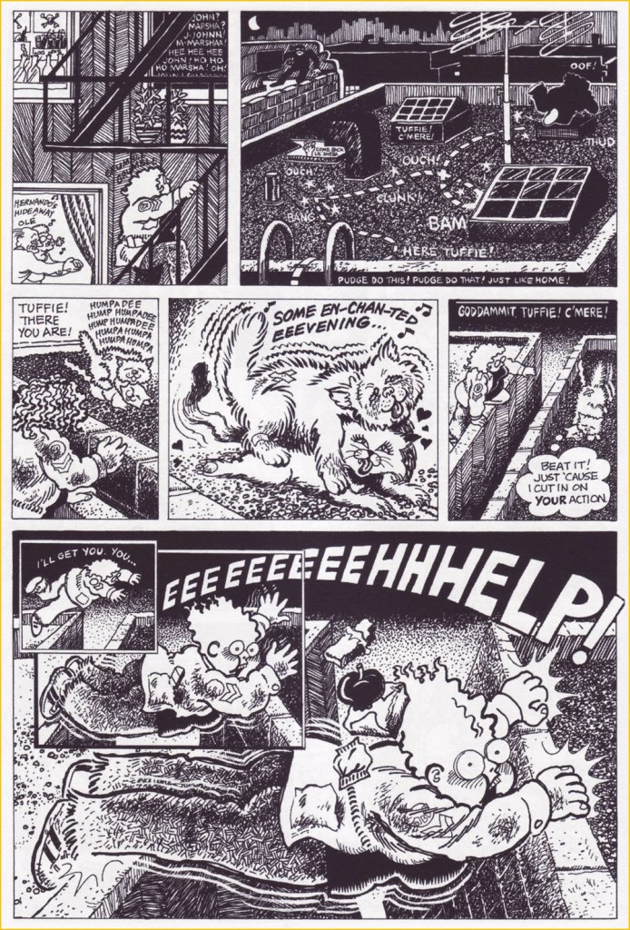
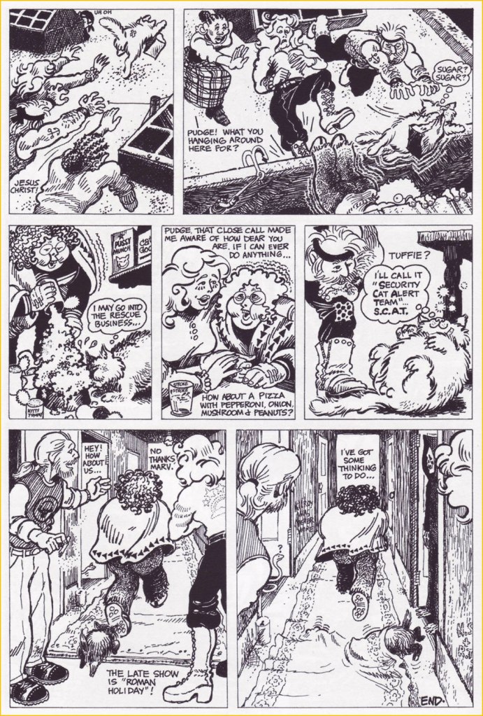
Here is a four-page sequence that I chose not only because it involves a cat (though I admit that influenced me), but mostly because it shows the nice dynamics of the close-knit group of ‘perverted hippies’ Pudge lives with:

Finally, a look at one of Pudge’s many attempts to hold a job:

The lovely thing about this series is that it never comes off as cringy, despite all the plot traps this comic could have fallen into. Pudge is not some sort of idealized, sexy Voluptuous Woman, and neither is she a butt of fat jokes. Her girth is a facet of her, along with her personality, curls, and puppy enthusiasm for some things – some people love her, some people don’t, and that’s fine. When she loses weight, her beau bemoans ‘sigh… I’m gonna miss all those yards of bouncy flesh…’ but he is not fetishizing her. Besides adroitly handling what’s arguably a taboo topic (although a lot more today than it was in the 70s, I imagine), Marrs also lovingly depicts a totally believable camaraderie between a rather disparate group of people of all races and interests; addresses sex in a playful and positive yet realistic way; and even delivers a sort of a public service message, as we follow Pudge while she gets a crash course in contraception, is instructed on how to find her cervix, and compares breasts with friends. She may occasionally end up in jail or suffer disappointments as she discovers that life is more complicated than she thought… but in the end, this is a friendly and welcoming world to spend some time in.

I’ll leave you with this Moebius parody, published in Imagine no. 3 (August 1978, Star*Reach):

~ ds
Hot Streak: Herb Trimpe’s The Incredible Hulk

« Gamma rays are the sort of radiation you should avoid. Want proof? Just remember how the comic strip character “The Hulk” became big, green, and ugly. » — Neil deGrasse Tyson

It may seem a counterintuitive notion, but some artistic virtuosi, while draftsmen supreme, may be sorely lacking in pure design chops, while some otherwise unremarkable craftsmen design splendidly. The same general principle applies to a colour sense, or handwriting. As the cliché goes, the most skilled brain surgeon’s penmanship may just yield sloppy gibberish, what’s wittily described as chicken scratch writing.

My point in this case is that, while Herb Trimpe (1939-2015) has never ranked among the comics industry’s glory boys, I consider him one of its finest cover artists. It’s a special skill and quite a scarce one…

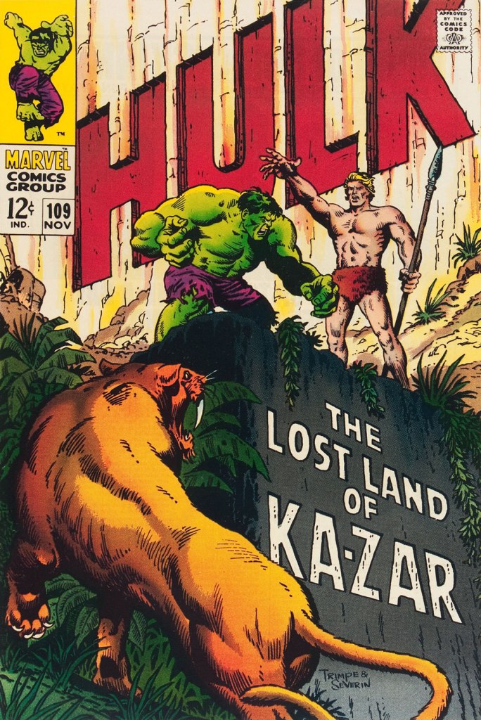
Herb’s streak begins with The Incredible Hulk no. 109 (Nov. 1968, Marvel), his first cover for the series. And yes, being seconded by one of comics’ all-time finest inkers (and cover artists!) didn’t hurt, but this is flawless layout work in the first place.
This is The Incredible Hulk no. 110 (Dec. 1968, Marvel), again boasting John Severin inks (and quite likely Marie Severin colours).
This surviving piece of production art grants us the opportunity to admire the splendid inks. I honestly don’t know what Ka-Zar was hoping to achieve here, though. Trimpe also produced another, rejected, version of this cover (scroll down, it’s near the bottom) the action tackled from quite a different angle. Featured in IDW’s ultra-fancy, signed-and-numbered limited run in the ‘where can I fit this damn monster?’ Artist’s Edition format in 2015, it demonstrates just how tight Trimpe’s pencil work was.
This is The Incredible Hulk no. 111 (Jan. 1969, Marvel). Dan Adkins takes over the inker’s chair.
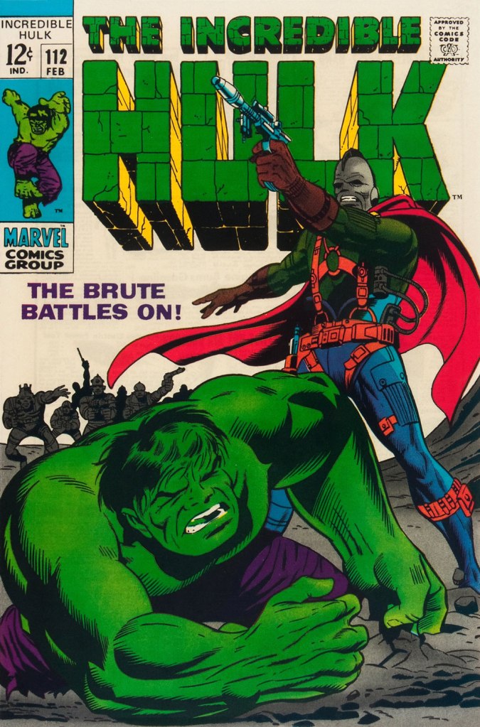
This is The Incredible Hulk no. 112 (Feb. 1969, Marvel). Notice how innocent of hype and verbiage these covers are?
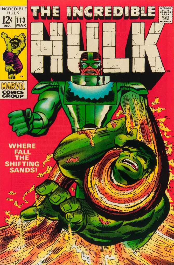
This is The Incredible Hulk no. 113 (Mar. 1969, Marvel). I always preferred the simplicity of The Sandman’s garb as envisioned by his creator, Steve Ditko. He was depicted as a bully in a striped green and black sweater, which was fine for a guy able to turn his body into sand. When Jack Kirby redesigned him, he gave him a cool-looking, but frankly rather impractical getup.

And that’s where this streak ends, as far as I see it: the following few issues feature decent covers, but nothing outstanding. But there were scores of excellent Trimpe Hulk covers to come. The blocky dynamism of his visuals, so easy to underrate, made his covers a reliable breath of fresh air in the mire of formulaic and overwritten Marvel 1970s covers (et tu, Gil Kane?)

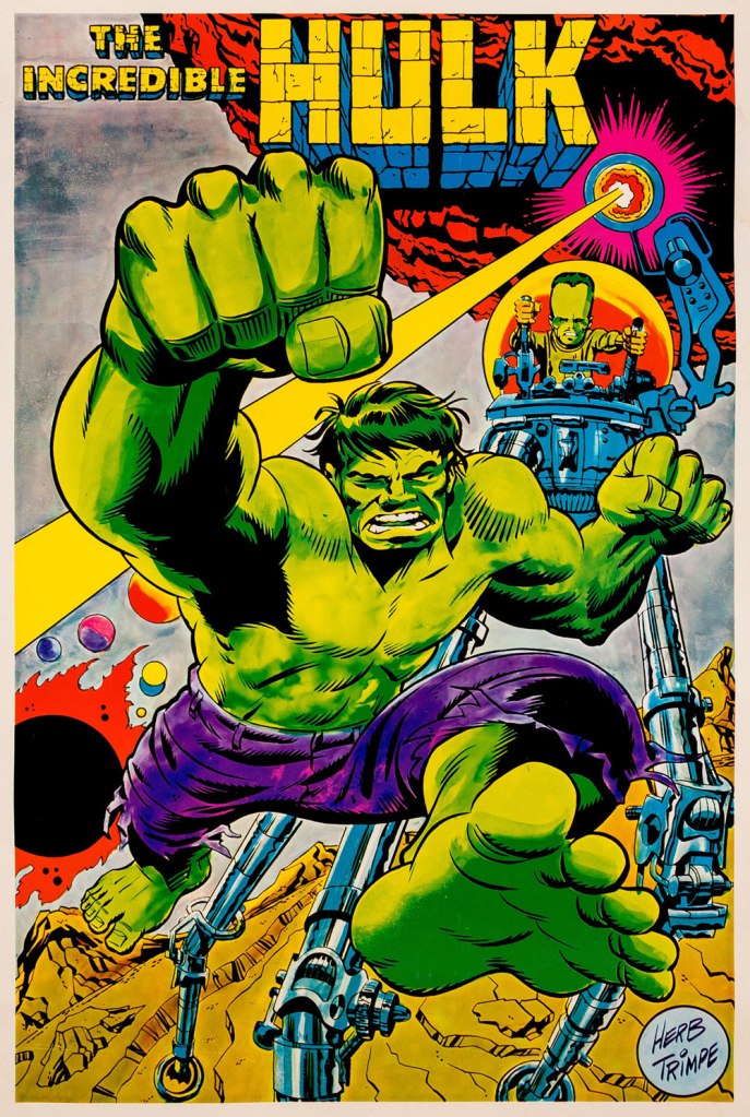
As a bonus, here’s a 1970 Marvelmania poster, one in a series of products exclusively available through mail-order. Nowadays, any of them routinely fetches princely sums. If you think Herb’s perfectly nailed the King Kirby aesthetic with this one, you wouldn’t be far wrong, but there’s a twist. The drawing was designed and pencilled by Kirby, then in the process of leaving Marvel for DC. Trimpe was asked to ink the drawing, redraw the Hulk’s face in his own style, and delete Kirby’s signature. I forget just where I read about this, but Trimpe had some heavy moral qualms about being made a party to this petty act of malice.

By all accounts (including my own), Mr. Trimpe was a gracious, upstanding, talented gentleman. Here’s OTHER GENERATIONS: STARTING OVER; Old Superheroes Never Die, They Join the Real World, a fascinating piece he wrote in 2000 for the New York Times, recounting… well, just read it.

-RG