« Gamma rays are the sort of radiation you should avoid. Want proof? Just remember how the comic strip character “The Hulk” became big, green, and ugly. » — Neil deGrasse Tyson
It may seem a counterintuitive notion, but some artistic virtuosi, while draftsmen supreme, may be sorely lacking in pure design chops, while some otherwise unremarkable craftsmen design splendidly. The same general principle applies to a colour sense, or handwriting. As the cliché goes, the most skilled brain surgeon’s penmanship may just yield sloppy gibberish, what’s wittily described as chicken scratch writing.
My point in this case is that, while Herb Trimpe (1939-2015) has never ranked among the comics industry’s glory boys, I consider him one of its finest cover artists. It’s a special skill and quite a scarce one…
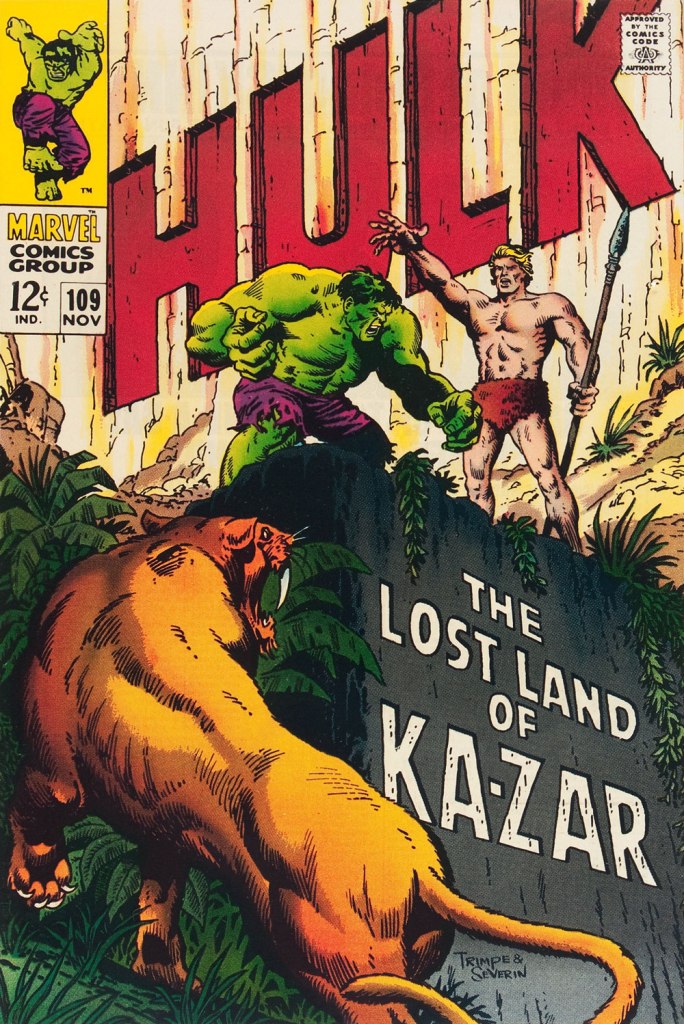
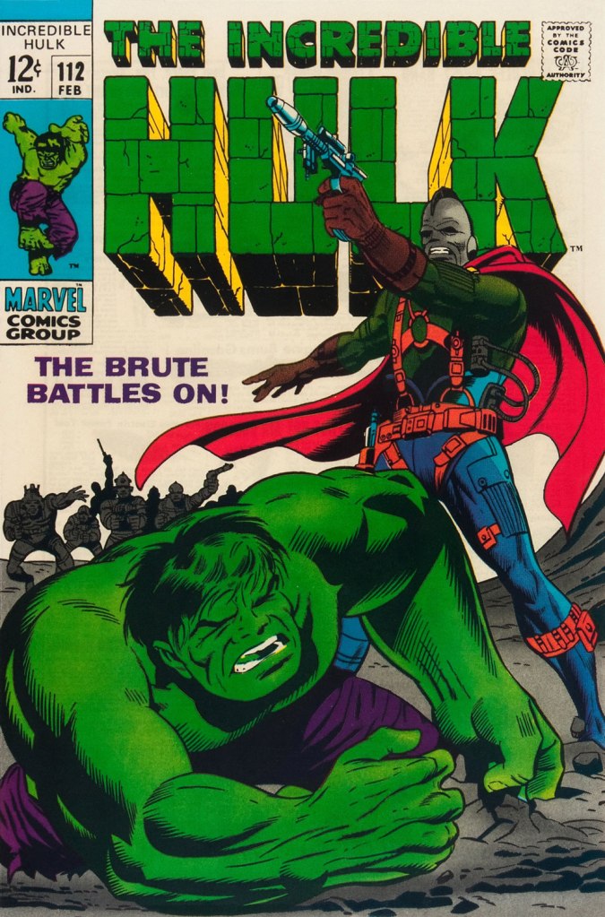
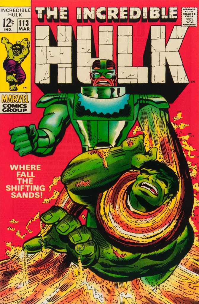
Herb’s streak begins with The Incredible Hulk no. 109 (Nov. 1968, Marvel), his first cover for the series. And yes, being seconded by one of comics’ all-time finest inkers (and cover artists!) didn’t hurt, but this is flawless layout work in the first place. This is The Incredible Hulk no. 110 (Dec. 1968, Marvel), again boasting John Severin inks (and quite likely Marie Severin colours).This surviving piece of production art grants us the opportunity to admire the splendid inks. I honestly don’t know what Ka-Zar was hoping to achieve here, though. Trimpe also produced another, rejected, version of this cover (scroll down, it’s near the bottom) the action tackled from quite a different angle. Featured in IDW’s ultra-fancy, signed-and-numbered limited run in the ‘where can I fit this damn monster?’ Artist’s Edition format in 2015, it demonstrates just how tight Trimpe’s pencil work was.This is The Incredible Hulk no. 111 (Jan. 1969, Marvel). Dan Adkins takes over the inker’s chair. This is The Incredible Hulk no. 112 (Feb. 1969, Marvel). Notice how innocent of hype and verbiage these covers are? This is The Incredible Hulk no. 113 (Mar. 1969, Marvel). I always preferred the simplicity of The Sandman’s garb as envisioned by his creator, Steve Ditko. He was depicted as a bully in a striped green and black sweater, which was fine for a guy able to turn his body into sand. When Jack Kirby redesigned him, he gave him a cool-looking, but frankly rather impractical getup.
And that’s where this streak ends, as far as I see it: the following few issues feature decent covers, but nothing outstanding. But there were scores of excellent Trimpe Hulk covers to come. The blocky dynamism of his visuals, so easy to underrate, made his covers a reliable breath of fresh air in the mire of formulaic and overwritten Marvel 1970s covers (et tu, Gil Kane?)
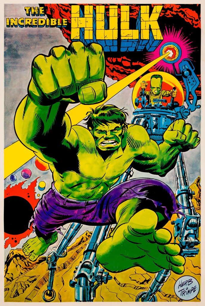
As a bonus, here’s a 1970 Marvelmania poster, one in a series of products exclusively available through mail-order. Nowadays, any of them routinely fetches princely sums. If you think Herb’s perfectly nailed the King Kirby aesthetic with this one, you wouldn’t be far wrong, but there’s a twist. The drawing was designed and pencilled by Kirby, then in the process of leaving Marvel for DC. Trimpe was asked to ink the drawing, redraw the Hulk’s face in his own style, and delete Kirby’s signature. I forget just where I read about this, but Trimpe had some heavy moral qualms about being made a party to this petty act of malice.
2 thoughts on “Hot Streak: Herb Trimpe’s The Incredible Hulk”
AlexJanuary 3, 2023 / 15:49
Hi I just stumbled across this article and wanted to say thanks, it made me appreciate this aspect of his work, which I had not noticed before. Well-written piece too!
Hi Alex — I’m so glad to hear that my post made a bit of difference. Design and mise-en-scène, when executed well (and without “look at me!” showiness), are pretty much invisible components of comics (and other visual media), and thus easily overlooked. I try to do my bit to spotlight somewhat these neglected facets of the art form!


Hi I just stumbled across this article and wanted to say thanks, it made me appreciate this aspect of his work, which I had not noticed before. Well-written piece too!
LikeLiked by 1 person
Hi Alex — I’m so glad to hear that my post made a bit of difference. Design and mise-en-scène, when executed well (and without “look at me!” showiness), are pretty much invisible components of comics (and other visual media), and thus easily overlooked. I try to do my bit to spotlight somewhat these neglected facets of the art form!
LikeLike