« I see a wolf-like thing coming over a dark river — at the shallows — just above a waterfall, the starlight shining up his pelt. I see a brown oak leaf blowing far up in the sky. I see a small bat flying. I see many other things, running under the forest trees and slipping through the highest branches; and they’re all coming this way! » — Ray Bradbury, The Homecoming (1946)
In the early 1960s, before Warren Magazines handled the task more decisively, there was a minor reunion of EC alumni — Joe Orlando, Reed Crandall, George Evans, Wally Wood, Williamson and Torres — at Gold Key. It resulted in some lovely art but minor, toothless stories. Even without the Comics Code, Gold Key’s material was safe as milk.
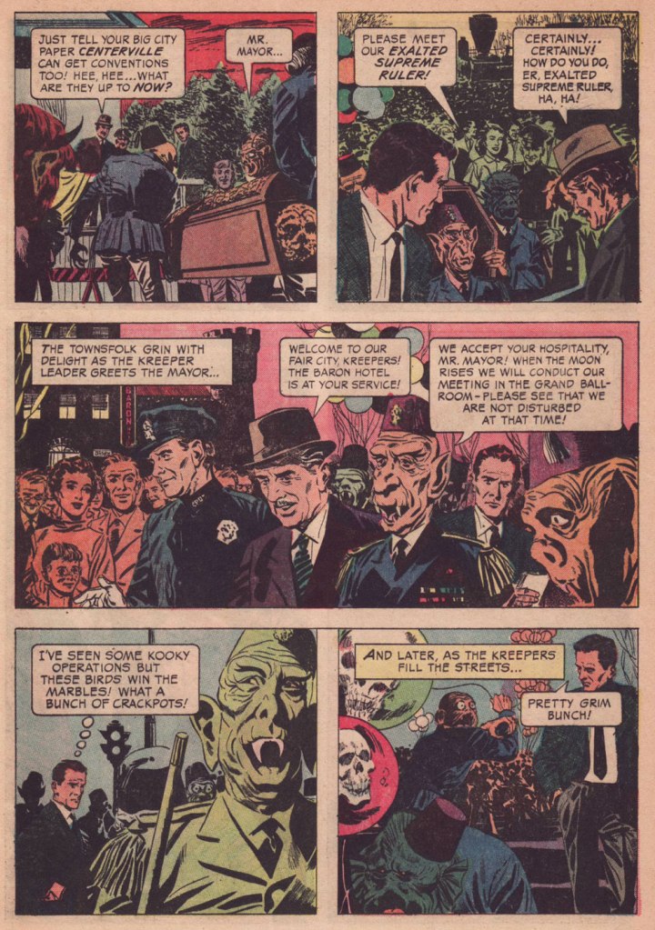
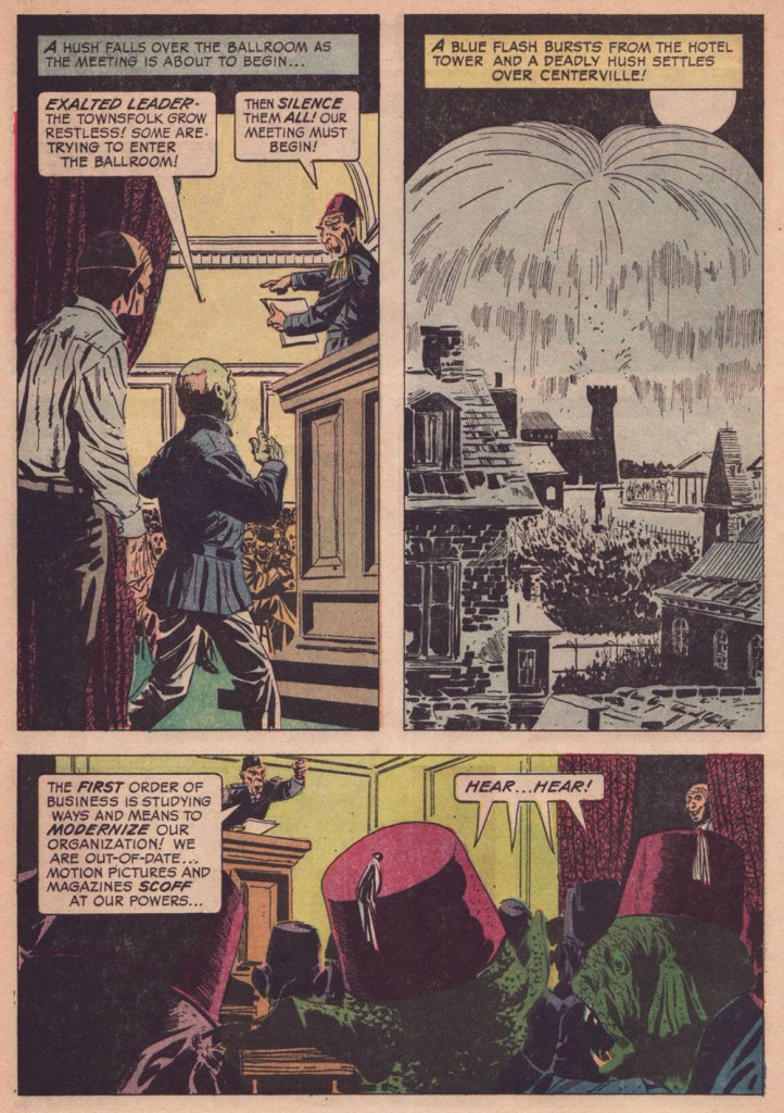
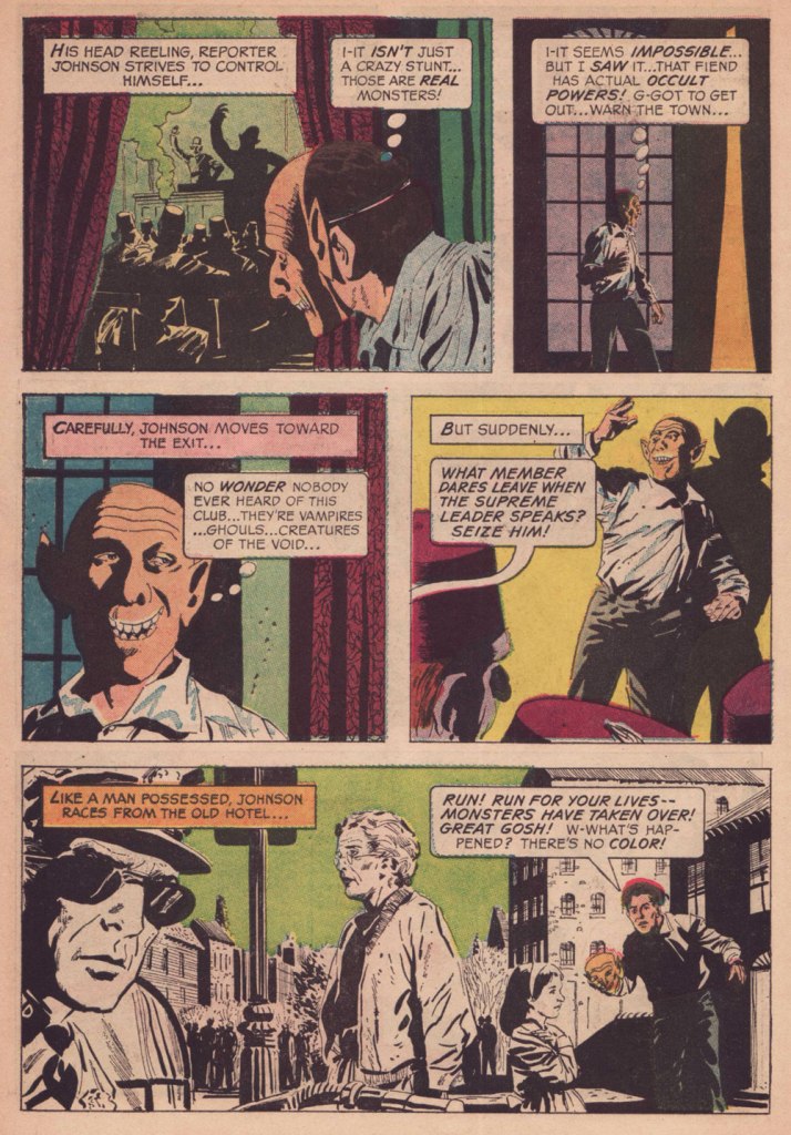
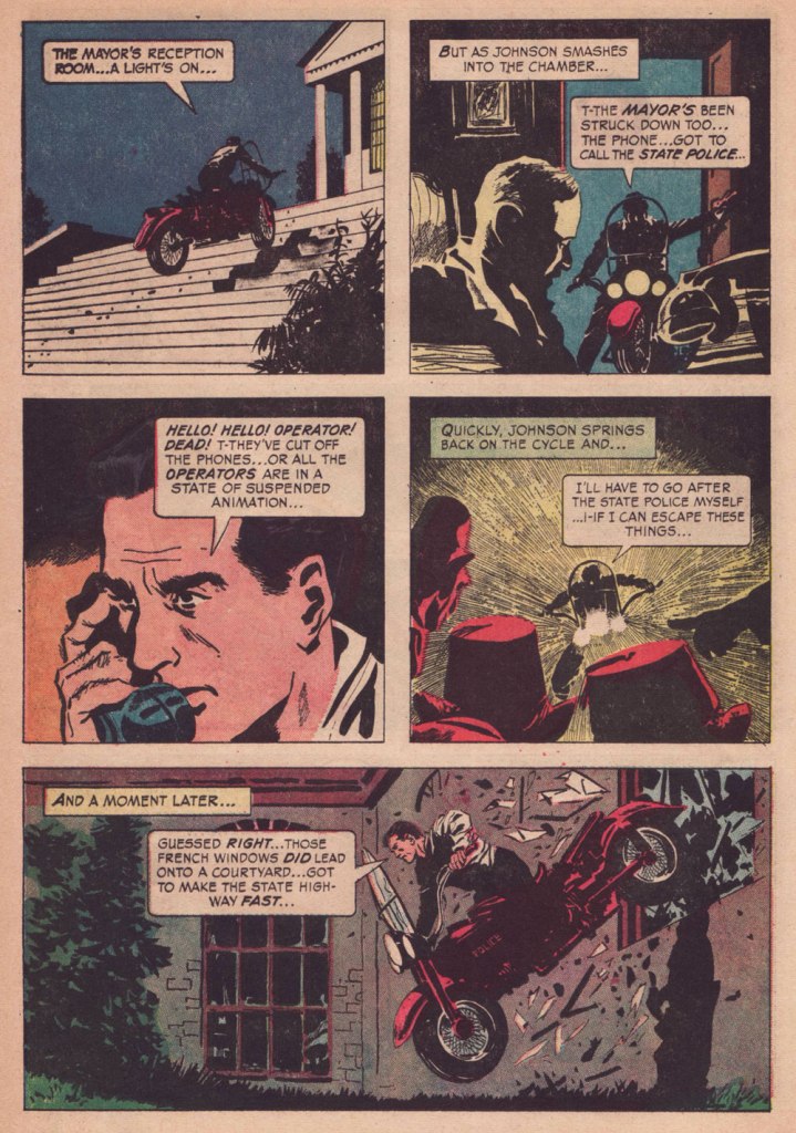
Here’s my favourite of the lot, a tale published in Boris Karloff Tales of Mystery no. 12 (Dec. 1965, Gold Key). I’ve probably tipped my hand with my choice of quote: “The Convention” reminds me of Mr. Bradbury’s timeless The Homecoming [ read it here ].
I like the point the story makes about how most towns — particularly their elected officials — will put up with a lot of obnoxiousness and outright toxicity if it fills up the hotels, bars, restaurants… and whorehouses.Really, a burning cross to vanquish evil… in 1965, given the headlines of the day? By the way, Angelo, that’s not a good Karloff.
Typically for Gold Key comics of that period, no credits are provided, but I’m strongly inclined to attribute authorship to Dave Wood (1926-1974), who happened to work for both Gold Key and DC at the time. It’s his kind of plot. Furthermore, as we’ve learned from the case of Steve Skeates, Julius Schwartz and The Spectre, there are instances when editorial changes to your original plot are significant enough that you can sell it again to someone else… and mum’s the woid.
What am I getting at? Why, our bonus, a cover-featured Dave Wood gem from the following year and with a quite familiar theme.
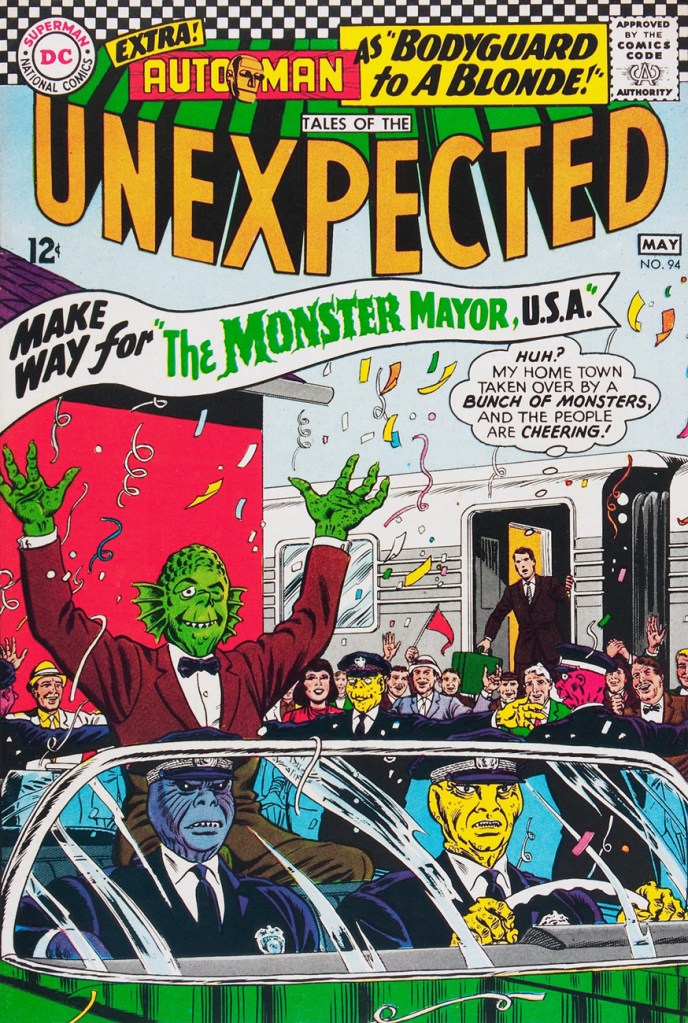
« Our appearance makes little difference… so long as we are in power! » Evidently, political cynicism is nothing new. DC’s Jack Schiff-edited “mystery” titles were a lot of utter bushwah, but oddly mesmerising if one surrendered to the spirit of the thing. And to a Bernard Baily and Mort Meskin fan, they offered a pretty sweet cornucopia. “The Monster Mayor, U.S.A.” is one of a series of oddball situations triggered by an invisible (but green!) sentient cloud from outer space called “The Green Glob“. The sort-of series ran in TOTU 85 to 98, then 100, 102 and 103. Weirdies!
This is Tales of the Unexpected 94 (April-May, 1966). Cover by Murphy Anderson.
-RG
*One might reasonably argue that Tatjana Wood (née Weintraub in 1926), who anonymously assisted her then-husband on some EC stories, is also eligible. She’s ninety-seven if she’s a day!
« History deals mainly with captains and kings, gods and prophets, exploiters and despoilers, not with useful men. » — Henry Louis Mencken
A few months ago, I was reading an old John Severin interview (in Graphic Story Magazine no. 13, Spring, 1971, Richard Kyle, editor) conducted by John Benson, and this passage stuck with me:
BENSON : Who are your favorite comics writers that you’ve worked with?
SEVERIN: I don’t even know who writes half the stories. Well, there are two guys, but they aren’t essentially comics writers. I like to work with Jerry DeFuccio and with Colin Dawkins. They write stories.
Which in turn led me to another Severin interview, this one conducted by Gary Groth in the early 2010s.
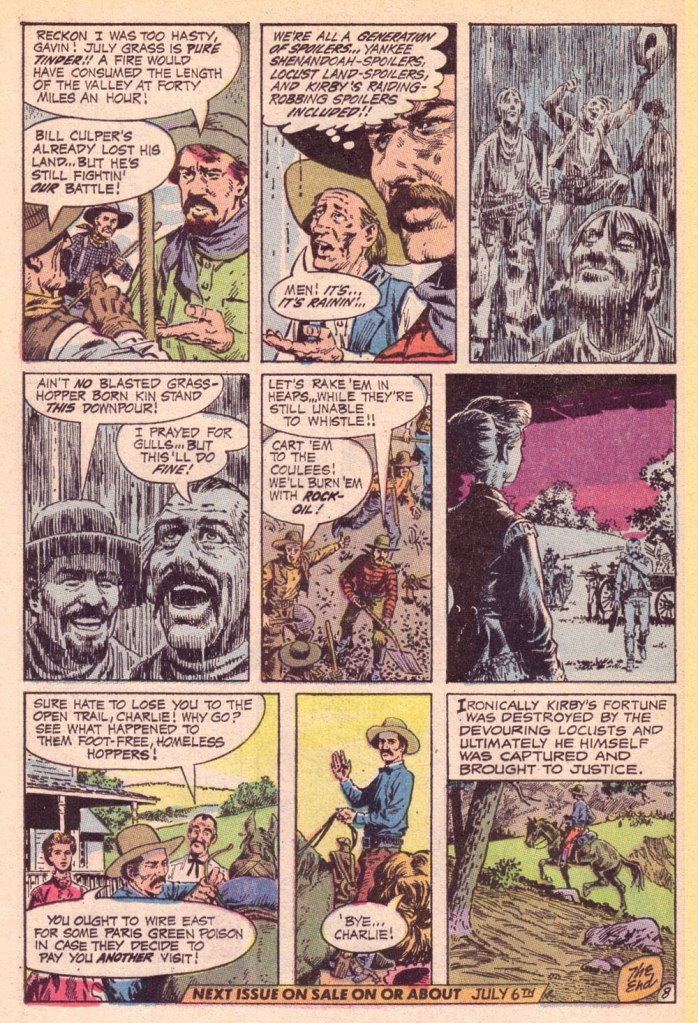
GROTH: In the back of the book, I’m looking at one issue of Son of Tomahawk actually, which I guess is a post-Tomahawk spin-off, but Frank Thorne does the lead feature and you did a really beautiful backup, I think one of your best strips during this period called Spoilers, that Jerry DeFuccio wrote.
SEVERIN: Really?
GROTH: You don’t sound like you have any recollection of this whatsoever.
SEVERIN: No, not at all. Oh, there’s an awful lot of stuff. Once I do a script and turn it in, it’s only with minor exceptions that I’ll remember the thing next week! I might remember it later on if somebody reminds me of something, but if somebody said, “What did you do last week?” I’d be damned if I know.
Severin’s reaction, to me, is a reminder of two things: first, that some artists (and fans!) are only interested in the visual aspects of comics. And second, that work conditions in the comics field (and most other commercially driven endeavours) are pretty inhumane if you have to just keep chugging on, with little time or impetus to look back and sniff the newsprint, let alone reflect.
Jerome ‘Jerry’ DeFuccio (1925 – 2001) was born on this day, ninety-eight years ago. While he’s most closely associated with his quarter-century stint as associate editor of Mad Magazine, readers of EC’s war/adventure titles know he could also pen, in excellent fashion, a thoroughly gripping yarn. Here’s one of the handful he later did for DC, for editor Joe Kubert. And while Son of Tomahawk wasn’t commercially successful, it was a highlight of its era, a truly adult comic book. See for yourself:
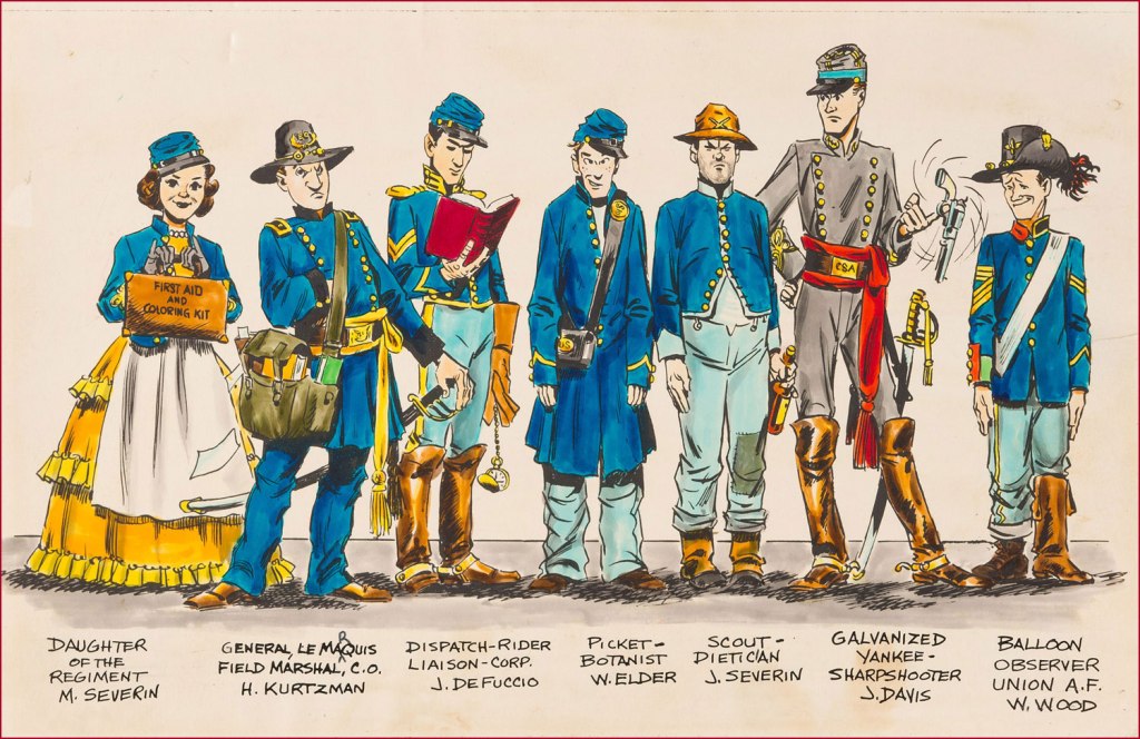
‘Spoilers!’ saw print in Tomahawk no. 135 (July-Aug. 1971, DC). Here’s a lovely illustration of some of the EC gang, in civil war drag . Like it says, DeFuccio’s third from the left. Ink and wash over graphite pencil on Bristol board. » Drawn in the 1950s, this piece saw print in 1983, in issue 9 of the excellent EC fanzine Squa Tront.
GROTH: Was DeFuccio working for Mad at that time?
SEVERIN: Yeah.
GROTH: It seems like you remained friends with DeFuccio for a very long time.
«“Good grief!” yelled the ones that had stars at the first. “We’re still the best Sneetches and they are the worst. But, now, how in the world will we know,” they all frowned, “if which kind is what, or the other way round?” » — Dr. Seuss‘ The Sneetches (1961)
A few days ago, this news item piqued my interest: « The assistant director of communications for Olentangy Local School District abruptly stopped the reading of the Dr. Seuss book “The Sneetches” to a third-grade classroom during an NPR podcast after students asked about race. »
Naturally, since this sorry episode made its way around the world and rightly gave rise to quite the furore, the school district has since thrown its patsy under the bus.
This mention of Dr. Seuss’ timeless classic The Sneetches made me think of another slightly earlier parable of systemic racism, Bill Gaines, Al Feldstein and Joe Orlando‘s Judgment Day (1953), and the similarly telling reaction would-be guardians of bluenose morality had to it.
Initially, I thought posting such an already eminent story as ‘Judgment Day’ was a trifle too obvious. But then again, how famous can a standalone comic book story published seventy years ago be, in the true scale of things? Really, it can never be famous enough.
In the course of an excellent article, CBR.com’s Brian Cronin summed up the skirmish (spoiler alert! you may want to read the story first if you haven’t already):
« The last traditional comic book produced by EC Comics was 1955’s Incredible Science Fiction (a series that had just begun a few months earlier, taking over the numbering from Weird-Science Fantasy) #33.
The last story in the issue, “Eye for an Eye,” had to be pulled at the last minute due to objections by the Comics Code Authority.
So Gaines and editor Al Feldstein decided to reprint “Judgment Day” in its place.
However, Gaines and Feldstein were then told that this replacement story ALSO violated the Comics Code.
Judge Charles Murphy (administrator of the Code) said that they would have to change the astronaut from black to white if they wanted it to be included. This was not part of the Code at the time. Feldstein and Gaines felt that Murphy was just deliberately messing with them.
After being told that, clearly, the color of the astronaut’s skin was practically the whole point of the story, Murphy backed down a bit, but said that they would at least have to get rid of the perspiration on his skin. It could possibly be that Murphy felt that it was exploitative. I do not know, and neither did Feldstein nor Gaines, who only had their suspicions that they were being screwed with.
Feldstein and Gaines both refused to comply (I believe the terms they used included at least one use of the word “fuck“), and Gaines threatened a lawsuit and/or a press conference to shine a light on why exactly the story was objected to.
The story ran as is. »
And so here it is (boasting superior reproduction, thank you, technology):
Originally published in Weird Fantasy no. 18 (Mar.-Apr. 1953, EC). Beautifully understated, it’s easy to understand why its creators considered it a high point of their respective careers.
As is generally the case with such anecdotes, there are other accounts and explanations:
« At least three versions of the story about Gaines’ dispute with the CMAA exist. In an interview, Gaines said a story showing a black astronaut with sweat on his face was rejected because the code forbid ridicule of any religion or race. When he threatened to sue, the code administrator backed down. A second version of the story suggests that Gaines was not able to get approval for the comic, but printed it with the seal anyway. A third account, told by Gaines’ business manager, said the EC story was rejected because it featured robots, which challenged Code Administrator Charles Murphy’s religious beliefs that only man was granted the ability to think. »
I like that, no matter which angle or reality we consider, Judge Murphy never fails to, er… rise to the occasion.
In closing, here’s a scrumptious cartoon anecdote about Messrs. Orlando and Gaines.
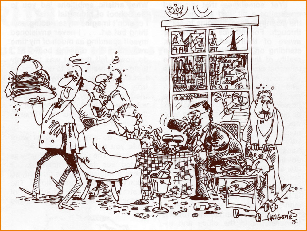
« Here’s Sergio Aragones‘ version of one of the many outings Joe Orlando and his publisher/pal Bill Gaines made to the best restaurants in Paris. While on one of the now famous MAD trips, Joe and Bill would eat 4 or 5 times a day! They went from restaurant to restaurant, always ordering the specialty of the house — with appropriate wines, of course! Yep — they’ve been on a very strict diet since (… but it hasn’t helped!) » Originally published in The ‘Special Joe Orlando Issue‘ of Amazing World of DC Comics (no. 6, May-June 1975, DC).
« And by the time they reached the shore of the quiet lake the sun was clouding over and fog moved in across the water so swiftly and completely that it frightened Doug to see it move, as if a great storm cloud from the autumn sky had been cut loose and sank to engulf the shore, the town, the thumping, happy brass band. » — Ray Bradbury, Farewell Summer (1980)
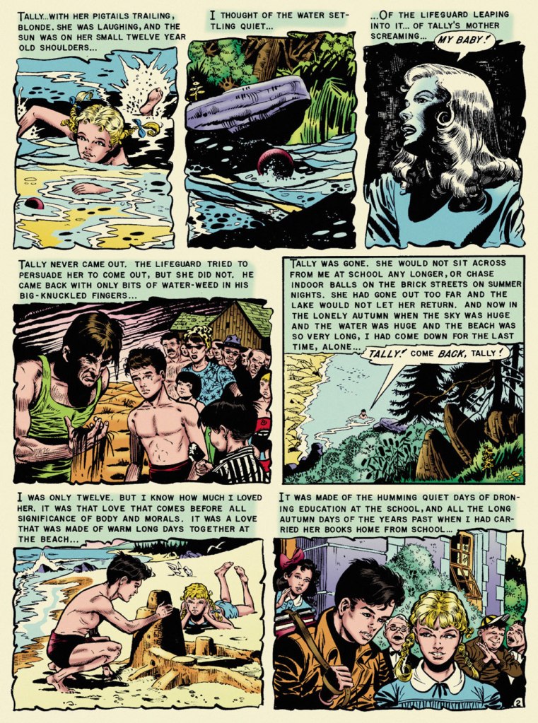
With summer on the wane — never mind the heat and humidity! — it seems fitting to feature, on the one hundred and second anniversary of Ray Bradbury’s birth, what’s possibly my very favourite EC comics adaptation of his work, Al Feldstein and Joe Orlando‘s ‘The Lake’. The other contenders jockeying for the top spot would be Johnny Craig‘s ‘Touch and Go!‘ (from the story ‘The Fruit at the Bottom of the Bowl‘) and Bernie Krigstein‘s ‘The Flying Machine‘. This mournful coming-of-age story was a speck of maturity in a boundless hinterland of juvenilia. I was agreeably surprised to find that there are some who concur with me on that point:
« It is hard for me to imagine how the 1953 comic book reader must have reacted when they picked up Vault of Horror #31 and read “The Lake” (adapted by Feldstein and Joe Orlando). The same month, Batman was fighting a crime predicting robot and Superman was helping to peel potatoes for Lois Lane during her stint in the Women’s Army Corps. So to go from that to this, a hauntingly sophisticated tale of a young boy obsessed with the death of his childhood sweetheart, must have been mind-blowing. »
Now, I trust I don’t have to school you about the life and times of Mr. Bradbury (1920-2012). Were it the case, I’d still skip the lesson, thanks to this 1953summary, which will suit our current purposes just fine:
The good folks at EC comics, namely those in charge — proprietor William Maxwell Gaines and his loyal acolyte and second-worst artist, Al Feldstein — decided to adapt the works of young Ray… without bothering to first secure his blessing. After a few (splendid) adaptations, Bradbury shrewdly wrote: « Just a note to remind you of an oversight. You have not as yet sent on the check for $50.00 to cover the use of secondary rights on my two stories ‘The Rocket Man’ and ‘Kaleidoscope.’ . . . I feel this was probably overlooked in the general confusion of office work, and look forward to your payment in the near future. ». By 1953, the collaboration was well established, and so…
Bless her soul and all that, but I found Marie Severin‘s latter-day recolouring for Fantagraphics’ ‘definitive’ edition to be on the garish side, so I’ve toned it down somewhat. Computers aren’t for everyone. Russ Cochran‘s stunningly ambitious and still-definitive The Complete EC Library featured John Benson, Bill Mason and Bhob Stewart‘s insightful and in-depth interviews and notes. Here’s what Benson wrote about The Lake:
« One of the few serious errors in the EC Bradbury adaptations is Joe Orlando’s imagery in ‘The Lake‘. Ignoring the many clues in the text (the long beach, the sand, the incoming waves) and taking his cue only from the title, Orlando drew a mountain lake, with pines and rushes, and a lodge in the background. But Bradbury’s lake was Lake Michigan, and this is a story that draws on the special poignance of the first autumn days at a large tidal beach. Had Orlando drawn on his undoubted experiences of the Atlantic seashore, he would have come much closer to the spirit of the original.
Readers who compare the dialogue in the EC version with the full version of the story in The October Country will find some seemingly inexplicable differences. The explanation is not that Feldstein cavalierly tampered with Bradbury’s text but quite the opposite. Feldstein was faithful to the story as it appeared in the May 1944 Weird Tales and in Bradbury’s first book anthology Dark Carnival (now long out of print). It was Bradbury himself who rewrote passages for this and other stories in The October Country, published after the EC adaptations. »
Orlando’s a funny guy. Like Harry Harrison, he started out as a friend, collaborator and friendly competitor of Wally Wood‘s. Unlike Harrison, who left the comics field to become a successful SF writer, Orlando was briefly able to more-or-less keep pace with Wood. It must have been nerve-wracking and of course quite unsustainable. While I hold that Orlando’s most aesthetically accomplished art job is ‘A Rottin’ Trick!‘ from Tales from the Crypt no. 29 (Apr.-May 1952, EC) and his most significant has to be anti-racist parable ‘Judgment Day!‘, from Weird Fantasy no. 18 (Mar.-Apr. 1953, EC), ‘The Lake‘ triumphs, thanks to its writing. After his peak of ’52-’53, Orlando’s art deteriorated fast. He made a bit of comeback in the mid-60s (the ‘Adam Link‘ stories at Warren were highlights) but… that’s when he was more often than not signing his name to Jerry Grandenetti‘s work. He found his niche as an editor at DC, and whatever artwork he produced thereafter seemed, to me, rushed and half-hearted. But he was a pretty good editor!
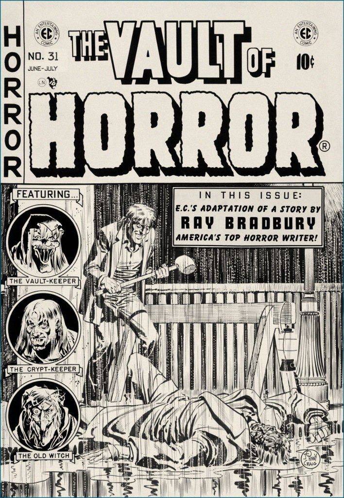
It’s a bit incongruous that what must be EC Comics’ quietest, most ruminative horror story should appear under one of its most violent (‘hard hitting’ comes to mind… literally) covers. Johnny Craig’s work could be — and generally was — quite understated, but on days when he wasn’t in that particular restrained frame of mind… look out! This is the original cover art from Vault of Horror no. 31 (June-July 1953, EC).
In closing, a word of warning: you’ll be seeing precious little of us in the coming month of September, as we’re preparing ourselves for a major change of domicile. We’ll be living in boxes for a spell, but I’m hoping to be back in time for the annual Hallowe’en Countdown. The show must go on!
« Krigstein was a heartfelt sort of warm guy, but always in conflict. He was getting sick and tired of being embroiled and embattled. He fought hard to keep interested, but began getting cynical. » — Gil Kane, or Eli Katz if you prefer, fellow K-Man.
Over seven hundred posts in, why have we never featured Bernard Krigstein, despite the fact that both of us absolutely adore his work? Part of the reason is that so much of value and insight has already been written on the subject, and part of it is that he’s hard to write about, which makes the existing literature even more remarkable and worth treasuring. And yet, there’s still so much left to say!
Hell, since it’s his birthday (born on March 19, 1919, he would now be one hundred and three years old), I’ll give it a try.
I’m not quite certain what precisely was my proper introduction to Mr. Krigstein’s œuvre: it was either my encounter with the whimsical The Hypnotist! (written by Carl Wessler, originally published in Astonishing no. 47, March 1956, Atlas), as reprinted in Weird Wonder Tales no. 19 (Sept. 1976, Marvel), or with Pipe-dream, scripted by Johnny Craig and reprinted in Nostalgia Press’ Horror Comics of the 1950’s (1971, edited by Bhob Stewart, Ron Barlow and original publisher Bill Gaines… mine was the French-language edition). I enjoyed the first one just fine, but the latter blew my young mind, not that I was equipped to fully appreciate it. Kudos to the editors for including the tale, because it really stood out amidst the tried-and-true and somewhat formulaic EC classics. It had no heavy, easily digested moral, it was illustrated in a sketchy, vaporous, elastic style that bore no resemblance to its more conventional company, to say nothing of the writing.
Pipe-dream originally appeared in Vault of Horror no. 36 (Apr.-May 1954, EC); written by Johnny Craig (who was also editor). This version was recoloured from original Silverprints by Marie Severin for Greg Sadowski‘s rather sublime B. Krigstein Volume One (2002, Fantagraphics).
As it turns out, even the story’s colourist, a young Marie Severin, had some severe misgivings about it: as she noted many years later, « I can’t remember a thing about coloring ‘Pipe Dream‘ the first time. I rushed through it because I found it so depressing. The whole subject was so dingy to me. I was just a kid, you know — I didn’t want to know anything about dope. When I saw it again, it brought back all those negative feelings. I suppose I shielded myself from them by doing it quickly. Now that I’ve lived a while I can appreciate its beauty, and I’m better equipped to color it. »
To be fair, she had done her usual fine job on it.
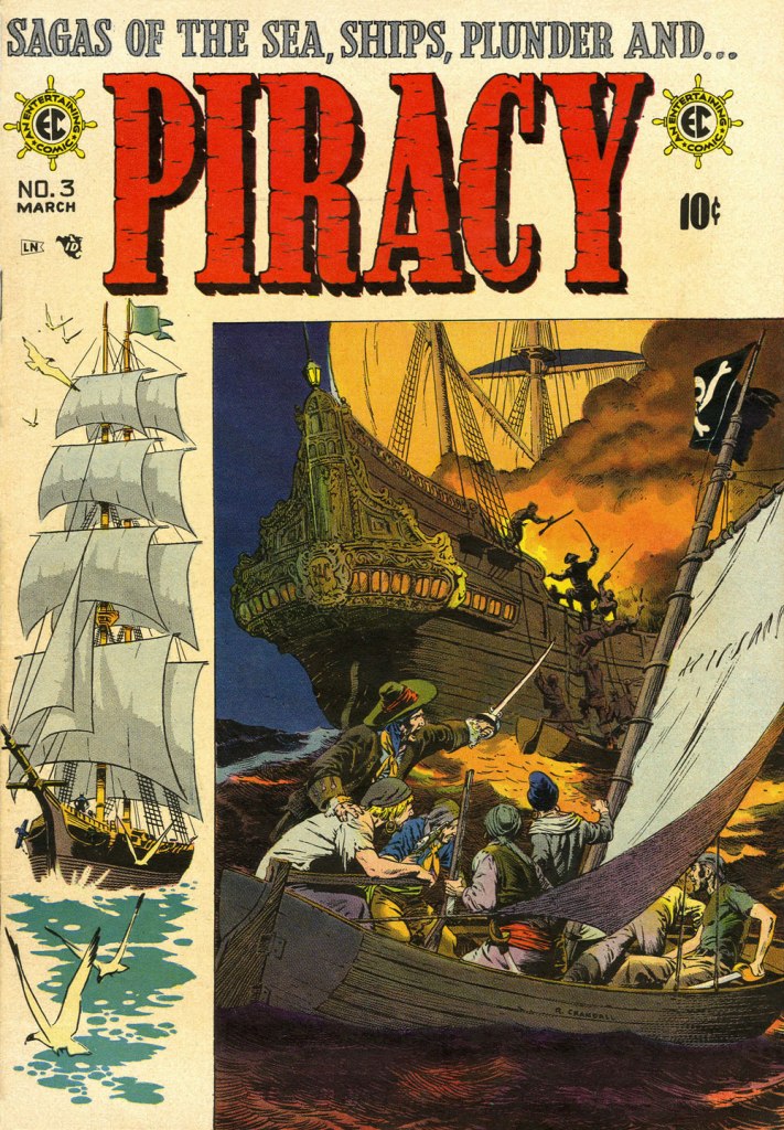
Having come late to the EC stable, Krigstein didn’t get too many cover opportunities. This is his second, and final shot, Piracy no. 6 (Aug.- Sept. 1955, EC)… and, I daresay, a classic. Krigstein sure could paint the elements evocatively: from the same year, an illustration from Herman Melville’s Moby Dick (Pocket Library Series no. 28, 1955).A 1949 photo of the radiant artist, having just been awarded First prize in black and white graphics by the Brooklyn Society of Artists. I think that part of what makes me favourably disposed towards Krigstein is that he’s a dead ringer for my accountant, a most worthy fellow himself.
If one could find any fault in Greg Sadowski’s definitive two-volume Krigstein monograph, it’s that his research missed one crucial entry in his subject’s funnybook bibliography… the last, and longest one! Here’s hoping for an updated edition, some sweet day.
It took another hardy historian, England’s Paul Gravett, to uncover the fascinating, final piece of the puzzle. It turned up in Gravett’s The Mammoth Book of Best Crime Comics (2008, Running Press). A comic book spinoff of the television series based in turn upon Salvatore Albert Lombino‘s (aka Evan Hunter, Ed McBain, Hunt Collins, Curt Cannon, Richard Marsten, D.A. Addams and Ted Taine) 87th Precinct series, it appeared in the final year of Dell’s Four Color series. So here are a few extracts (as Mr. Gravett would surely call them) from Blind Man’s Bluff; scripter unknown, pencilled and inked by Krigstein, from Four Color no. 1309, June 1962, Dell). By all means, read the whole thing here!
Gravett says of the tale: « Illustrated by the EC Comics genius Bernie Krigstein, it was described by him as ” … the most fantastically absurd story that has ever been typed or presented to an artist… ” A painter himself at the time, Krigstein quit the series after rejecting the unknown writer’s second script and pursued his art career, sadly never to draw comics again. Despite his misgivings, his swansong has a bizarre fascination to it. »
Well, that about wraps it up. See what I mean about how much there is to say? All this blather, and I never even got around to introducing the villains of the piece, Kanigher and Lee.
« Like everyone in his right mind, I feared Santa Claus. » — Annie Dillard
’twas 1982, and DC’s mystery anthology titles were dead or dying (the last one standing, The House of Mystery, had but a year or so left to go), and The Unexpected, published since 1956, was a mere two issues away from cancellation. Latter-day editor Dave Manak had done a fine job with the means at his disposal, wisely engaging Joe Kubert (1926-2012) to grace close to ten issues with his ever-elegant artwork.
This is perhaps the finest of the lot, a wistful, old-fashioned cover that dispenses with most of the clichéd Holiday iconography.
This is The Unexpected no. 220 (March 1982, DC). Pencils and inks by Joe Kubert with extra-fine lettering by Gaspar Saladino (1927-2016), truly a key element of the cover’s visual appeal. “Drive carefully, darling!” Is that woman worried about *everything*? Talk about fretful. Insurance agents must adore her. From the Fairhaven and Bon Marché allusions, one may presume that the events are set in the state of Washington.To give credit where credit is due, the unexplained bit with Santa’s hand on the phone is the story’s subtlest touch. He’s the one who phoned in the tip — anonymously, one presumes. Santa does not abide off-brand competition.
The issue’s lead, Holiday-themed story, boasts gorgeous art by powerful and versatile Puerto Rican cartoonist Ernie Colón (1931-2019), and it’s unusually well-coloured for the era (not to be confused with well-printed!), in that the shadings convey projected light and ambiance, not merely the prevalent, simplistic colour-by-numbers approach.
The writing, on the other hand…
Santa Is a Killer! is an artless hodge-podge of tropes, a kiddie rehash of Johnny Craig’s timeless “… and All Through the House” (Vault of Horror no. 35, Feb. 1954, EC), dressed up with the done-to-death-and-then-some “That — wasn’t *you*? Then — it must have been the –*choke* — real ghost / Satan / Santa Claus / Carlos Santana / Tooth Fairy / Larry “Bud” Melman!) “twist”. Did I mention that I love the art?
Since we strive to avoid repetition, and as my partner-in-mischief ds has already featured this legendary cover in her How do you like *your* Christmas? post, here instead is the original 1954 Silverprint proof, a colour guide for the printer’s edification and coloured by hand, presumably by EC’s resident chromatic conjuress, Marie Severin (1929-2018). Cover art by Johnny Craig.
It’s a little-known fact that VoH35’s dear, doomed wife’s peignoir was later snapped up for a pittance at an estate sale by a young rake by the name of Danny Rand. Soon, with a few minor alterations, he had himself a nifty (and silky!) crime-fighting ensemble. Just don’t ask ‘is that a ladies’ nightgown you’re wearing?‘ if you don’t want your features rearranged. This is Iron Fist no. 8 (Oct. 1976, Marvel). Cover art by John ‘Booster Cogburn‘ Byrne and Dan Adkins. And though « The Canadian Government has apologized for Bryan Adams on several occasions » (and presumably for Céline Dion and Justin Bieber also), I say it’s high time Canuck honchos proffered their excuses as to cuddly Mr. Byrne.
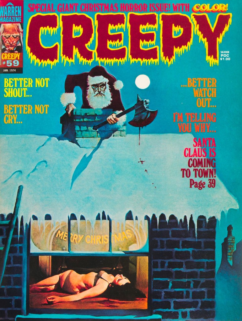
To give you some idea of how prevalent the ‘Santa as homicidal maniac’ notion was by the 1970s, here’s another semi-famous instance: this is Creepy no. 59 (Jan. 1974, Warren); cover by Spain’s Manuel Sanjulián (b. 1941). A year later, writer-director Bob Clark (Porky’s, A Christmas Story) would unleash his influential Black Christmas.
« Programmed for love, she can be quite tender Treat her unkind, nothing offends her She vacuums the carpet and doesn’t complain She’ll walk the dog in the pouring rain. » — Was (Not Was), Robot Girl
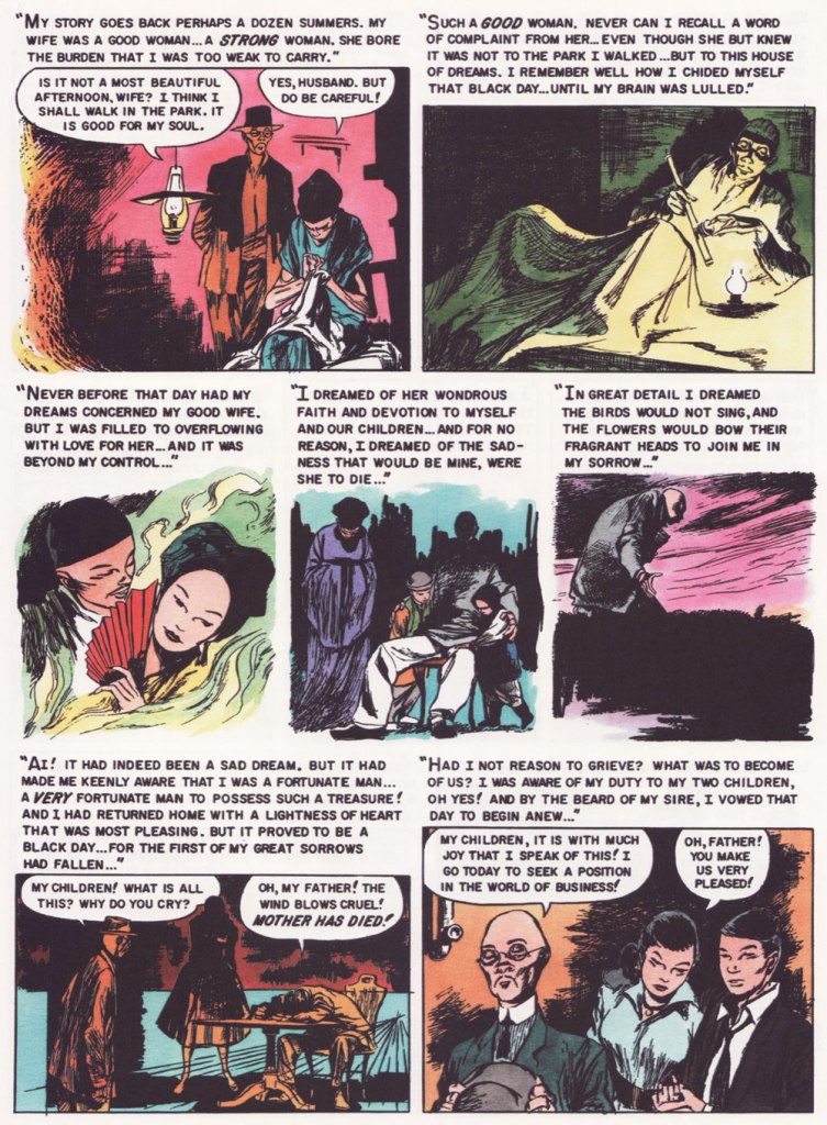
Today, on the occasion of his birthday (this would be number 112), we celebrate the great writer and editor Leo Rosenbaum (1909-1974), Potentate of Pseudonyms. If you know of him at all, odds are it’s under his nom de plume of Richard E. Hughes, pioneering chief writer and editor of the American Comics Group (ACG, 1943-67), and then perhaps under one of the numerous colourful aliases he adopted to conceal the fact that he was doing most, if not all, the company’s writing. In alphabetical order, meet Pierre Alonzo, Ace Aquila, Brad Everson, Lafcadio Lee (a salute to the Irish-born writer of Japanese ghost stories of Kwaidan fame, perhaps?), Kermit Lundgren, Shane O’Shea, Greg Olivetti (probably inspired by the brand of his typewriter!), Kurato Osaki, Pierce Rand, Bob Standish and Zev Zimmer.
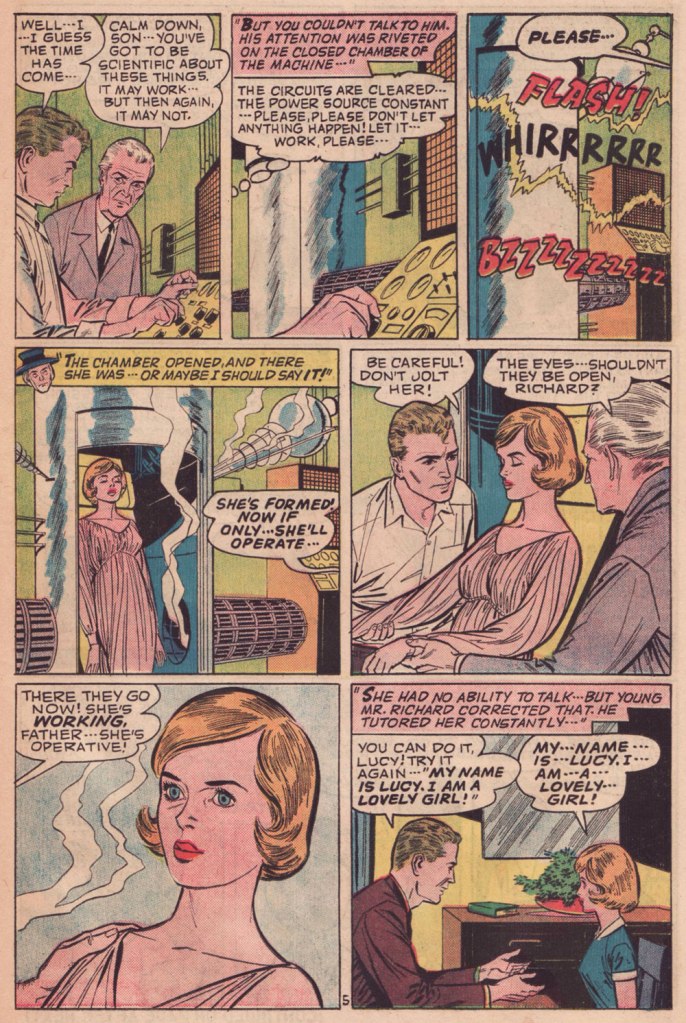
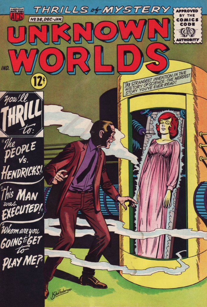
Early in my comics collecting days, I spent a lot of time consulting Robert Overstreet‘s The Comic Book Price Guide (a practice I’ve utterly abandoned) gleaning random bits of trivia and dreaming about potential acquisitions. One item that greatly piqued my interest was this note:
From the 12th edition of The Comic Book Price Guide (1982, Overstreet Publications).
Well, I did eventually get my hands on a copy, and I must say wasn’t disappointed. And since I was taught to share with the other kids, here’s the story in question.
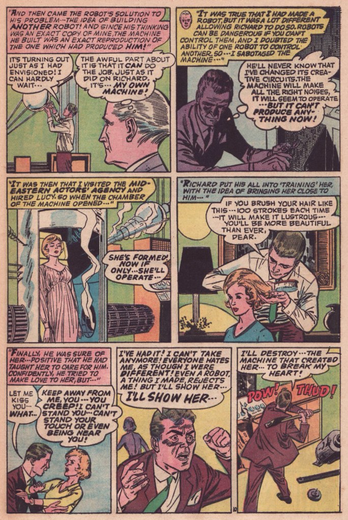
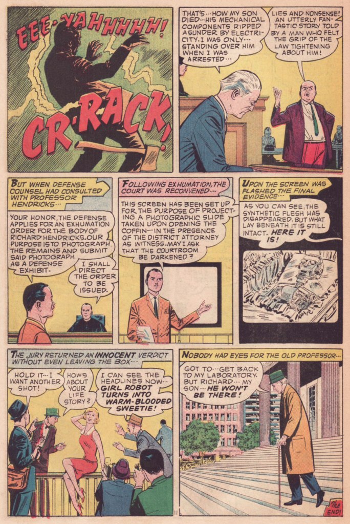
While “The People…” draws upon familiar elements of The Bride of Frankenstein and say, Inherit the Wind, I daresay that its heart-rending conclusion is its very own. And here’s the cover. This is Unknown Worlds no. 36 (Dec. 1964 – Jan. 1965, ACG); art by Kurt Schaffenberger.
As for the artist: Johnny Craig (1926-2001) had been absent from the comics field most of the decade that followed EC Comics’ near-total collapse and the advent of the Comics Code, when he suddenly turned up at ACG (he’d been toiling in advertising). He would later do some work with Warren, Marvel and DC until the early 80s, at which point he more or less retired. Craig’s always been near the very top of my favourites at EC. Since he was, artistically-speaking, painstaking (‘slow as mollasses in February‘, my art school drawing teacher was fond of saying) and quite self-critical, Gaines entrusted him, as he did in the case of Harvey Kurtzman, with some editorial and scripting responsibilities to make up the income shortfall and keep him around and happy. And so the Craig-edited-and-led Vault of Horror is easily the finest of the company’s horror trio, largely thanks to Craig’s solid writing skills, not to mention his inspired artwork. Craig’s stories provided a much-needed breather from Gaines and Feldstein’s often powerful, but also formulaic and overwritten tales.
Interestingly, while Craig’s art style is overall understated and full of spit and polish, he created several of the company’s most transgressive images (such as this one and that one). Editor-writer Hughes knew precisely what he was doing (as any editor worth his salt should) when he conceived this story and assigned it to Craig. It plays superbly to the man’s strengths, if you ask me.
« When a naked man is chasing a woman through an alley with a butcher knife and a hard-on, I figure he isn’t out collecting for the Red Cross. » — Clint Eastwood in Dirty Harry (1971)
As is often the case, I had something else in the pipeline for this week… but then I came across a beautiful biography of a wise man whose birthday was just around the corner. Now if the other guy (he’s 88) can just hold on and stay alive another week, things’ll be just fine.
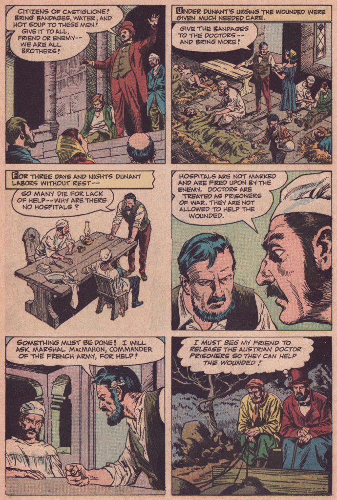
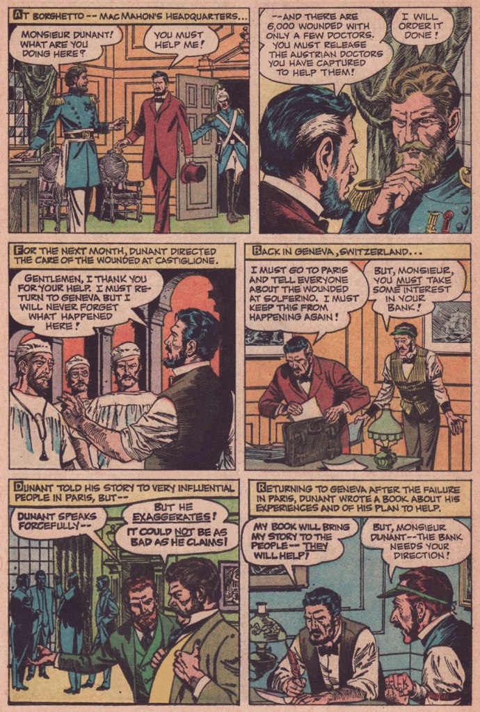
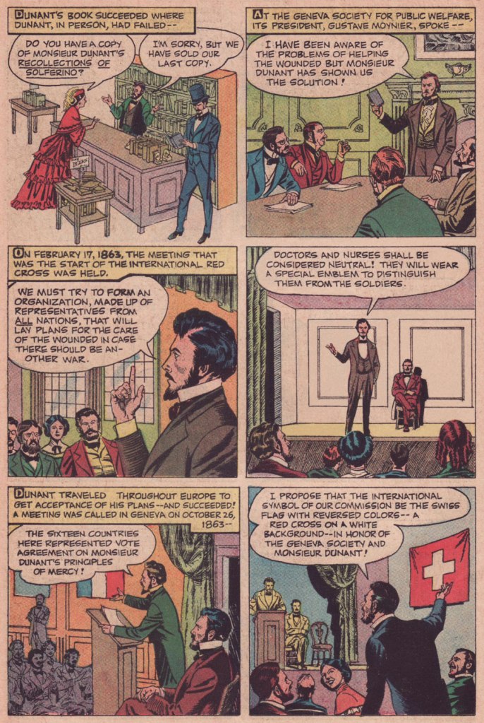
In these riotous days when acts and thoughts of kindness and compassion are being denounced as political and partisan, we would do well to remember the life and example of International Red Cross founder, Henri Dunant (né Jean-Henri Dunant, May 8, 1828 in Geneva, Switzerland). Read on…
To Treasure Chest’s credit, they’re not being tribal or sectarian at all: Dunant wasn’t even Catholic, but rather Calvinist.
As you can witness, Reed Crandall (1917-1982) was not the type of artist to cut corners. Unlike some of his peers who could not be bothered to properly draw, say, details of background, period or costume, Crandall lavished attention and care to each and every element, yet without overpowering the narrative. His pages aren’t mere sequences of panels: they’re smartly composed for smoothness of flow and tonal balance.
Though nowadays his fame rests largely upon his brief but fruitful association with EC Comics (1953-56) and its echo at Warren Magazines (1964-1973), the greater bulk of his work was produced for Quality Comics (1941-1956) and for the catholic comics anthology Treasure Chest of Fun & Fact (1960-1972). All Men Are Brothers was, as it happens, his first work to be published in Treasure Chest.
Here’s a tongue-in-cheek but revealing snippet from a profile of Crandall that appeared in Creepy no. 10 (Aug. 1966, Warren):
« Combined with Reed’s fantastic drawing ability and mastery of rendering technique, is the rare ability to take any subject or setting and impart to it a complete sense of realism and authenticity. This, along with the fact that he is one of the most genial and unassuming men in the comics field, has earned him the high regard of his fellow artists, in addition to a growing circle of reader-admirers.
Asked about his ambitions, Reed replied: “To live in an ivory tower and to try to learn to draw and paint, also to pursue unendurable pleasure indefinitely prolonged.” It looks to us as though the drawing and painting are pretty far along already, so surely the ivory tower and prolonged pleasure can’t be too far behind… and in our opinion, it couldn’t happen to a nicer guy! »
As for writer John Randolph, who knows? He scripted twenty or so non-fiction pieces for TC between 1955 and 1962, then appears to have moved on. It must be noted that he understood the comics medium, as his work (often with Crandall) was well-paced and not overwritten, the words and visual in steady harmony. Many a writer, lacking the restraint and finesse required for the collaborative pas de deux of comics, tends to crowd out the illustrator, box him in (j’accuse, Al Feldstein!) or pointlessly restate what’s right there in the visuals (Et tu, True Believer?). Add to that the difficulty of elegantly condensing a life or career in six pages… as in this case. Take a bow, Mr. Randolph, whoever you are.
All Men Are Brothers originally appeared in Treasure Chest of Fun & Fact vol. 16 no. 7 (Dec. 8, 1960, Geo. A. Pflaum); cover by Crandall.
Crandall is most closely associated with the long-running Quality (and DC thereafter) character of Blackhawk (a Will Eisner co-creation). This is Modern Comics no. 78 (Oct. 1948, Quality). Between the operas, musicals, and films, John Luther Long’s Madame Butterfly sure gets around! Read the issue here!
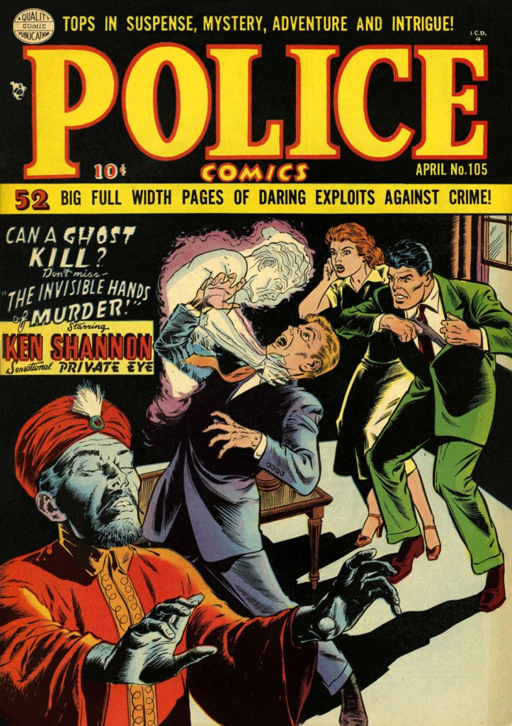
More orientalism, but what a cover! This is Police Comics no. 105 (Apr. 1951, Quality). This title was the former and first home of longtime headliner Plastic Man, who bowed out with issue 102. Superheroes, you’ll recall, suffered fading popularity by the early 1950s. Read the issue here!
While Crandall arrived a bit late to the EC party, he made his lasting mark. Versatile as he was, I’d argue he was most in his element on this swashbuckling title, one of EC’s last-ditch, doomed attempts to placate the censors. Wally Wood drew the ship on the left, a recurring element of the cover layout. EC colourist Marie Severin (1929-2018) truly deserves a long round of applause for the sublime job she performed here. This is Piracy no. 3 (Feb.-Mar. 1955, EC).
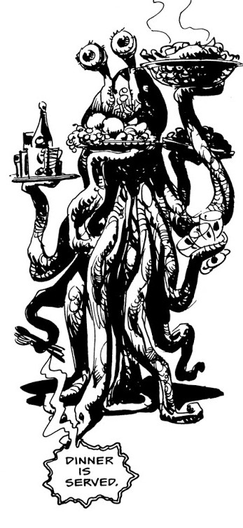
Sometimes tentacles are positioned so close to the head that one gets the impression they’re sprouting directly from it. Whether accidental or not, the result is quite horrific – sometimes in a good way, if one enjoys the creepy and bizarre. In this Tentacle Tuesday, we’ll come across literal cases of octopus-instead-of-head, beard-tentacles (stylish!) and alien cepha-cerebellum-pods, which I hope will catch on as a term.
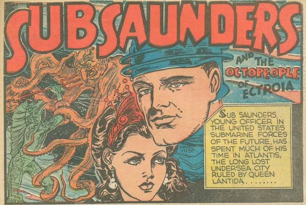
The following has been taken from The Octopeople of Ectroia, illustrated by Henry Kiefer, and published in Fantastic Comics no. 8 (July 1940, Fox Comics). If the introductory panel gives but a brief glimpse of the creature we are about to encounter…
… the splash page gives us an eyeful of her charms. Now we know what Baba Yaga would look like with tentacles instead of her usual limp grey tresses. Incidentally, a few days ago an enterprising fellow won enough support (and funding) from the Lego community to make his Lego Baba Yaga idea an (eventual) reality. She would come with her traditional hut on hen’s legs, a black cat and “everyday useful things” like horseradish drinks. Needless to say, I want one.
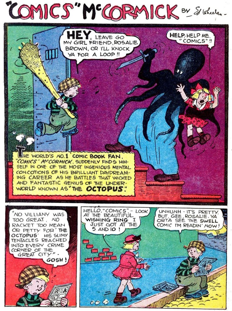
“Comics” McCormick has had more than just one encounter with cephalopod-headed men! The following is the cover of Fat and Slat no. 4 (Spring 1948, EC Comics), illustrated by Ed Wheelan.
And here is a page from The Octopus, printed in Terrific Comics no. 3 (May 1944, Helnit Publishing). Is it the same villain? Well, nearly: they’re Octopus-Man and Octopus, differentiated only by the costumes they sport under all those tentacles.
Edgar S. Wheelan (1888-1966) was the creator of Fat and Slat and “Comics” McCormick, and he is well remembered for his introduction of some cinematic techniques to comic strips. Of special significance is his Minute Movies, created for the George Matthew Adams Newspaper Service. This series of animated shorts not only had its stars (and continuity!), but also made full use of techniques that weren’t usually employed in comics, like close-ups, long shots and head shots with title cards.
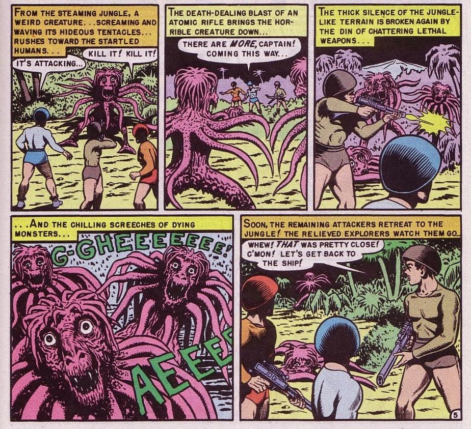
The following sequence is an oldie-but-goodie from the oft-quoted Origin of the Species!, scripted by Bill Gaines and Al Feldstein, and illustrated by Feldstein. It was first published in Weird Fantasy no. 8 (July-August 1951, EC Comics). For those of you who may not have read it and are wondering whether those tentacled beasts were somehow the progenitors of the human race… no, they weren’t. As for the plot, it raises more questions than it answers, which I believe is not atypical of a Feldstein tale (from those I’ve read, they tend to be like a movie with plenty of drama and special effects, but little sense).
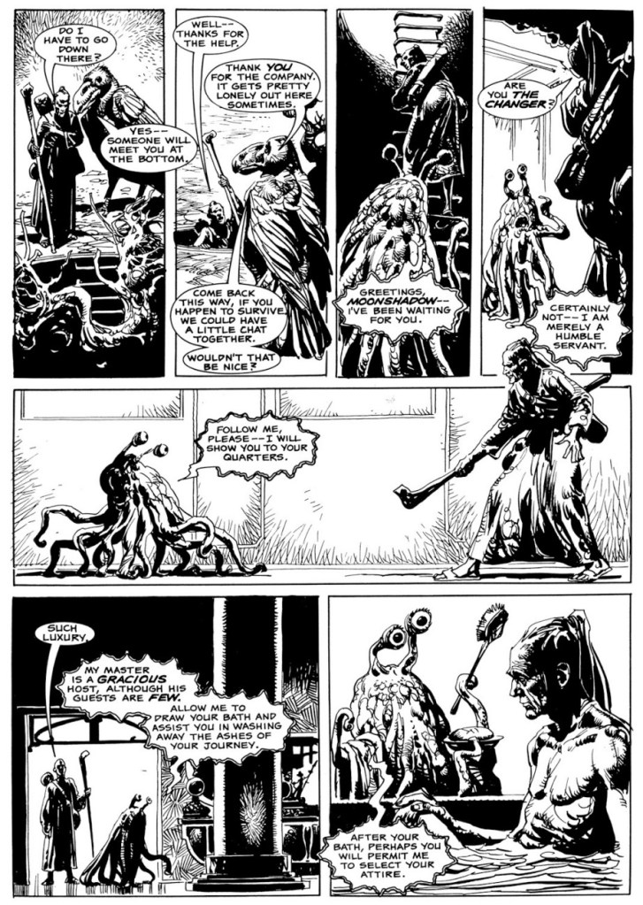
I recently came across a 3-part story published in Eerie numbers 91 to 93 that I quite liked: the tale of Moonshadow, the assassin who never failed, scripted by Bob Toomey and illustrated by José Ortiz. As luck would have it, two of the instalments were rife with tentacles!
The following page (and also the preceding panel) is from Suzanna Don’t You Cry, part 2 of the tale, published in Eerie no. 92 (May 1978, Warren).
Last but hardly least, a page from Kingdom of Ash, published in Eerie no. 93 (June 1978, Warren).
Fast forwarding some twenty years, we land in the middle of a pirate tale – and what suits a pirate more than a headful of tentacles (and a peg-leg)? This page is from Autopsy in B-Flat, written and illustrated by Gary Gianni and first published in Hellboy: Almost Colossus no. 1 (June 1997, Dark Horse) as a back-up feature. Gianni’s The Monstermen stories have since been collected separately.
What we gather from this dialogue is that octopus pirates like pork.
Finally, I think I promised some tentacles in lieu of beard, and the early stages of this guy’s transformation surely qualify:
This creature appears in the pages of Nocturnals: Black Planet (October 1998, Oni Press), with all plotting and art handled by auteur Dan Brereton. Actually the pages of this collection are so rife with tentacles that I’m going to force myself to be succinct.
Another instance of tentacles-as-hair:
Cover for Nocturnals: Black Planet (October 1998, Oni Press).
Thanks to friend Barney for pointing this last batch out!
« I grew up in a farm town in the Midwest, where not much exciting happened. I liked the idea of lives lived at night and the shadowy characters who lived in that demi-monde. — Michael Emerson
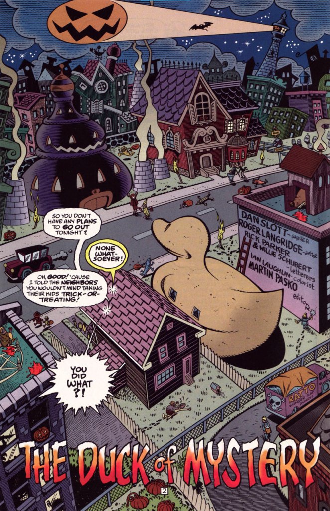
And our final slot goes to… the eminent Mr. Roger Langridge!
An average, ‘nuclear’ family moves to a small town in the Midwest, which turns out to be mind-numbingly strange… a fact entirely lost on the clueless parental units. Sound familiar?
It’s obvious, given the time frame (five years late), that Gross Point was, to be charitable, keenly influenced by the television show Eerie, Indiana (1991-92)… whose short run (just one season and a mere nineteen episodes… plus fifteen novels!) belies its lasting appeal and influence.
But, and there’s a sizeable ‘but’… both series provide considerable, often subversive entertainment, and come from a long line of high-concept, cœlacanth-out-of-aqua sagas. You might say that Gross Point stands as a darker, yet goofier Eerie, Indiana. Incredibly, it was still approved by the clearly-agonizing, utterly irrelevant Comics Code Authority!
This is Gross Point no. 5 (Dec. 1997, DC), the Halloween special… but then again, as they say, “Every day is Halloween in Gross Point“. Cover by Sean Taggart.
The facetious small print:
Gross Point is a fictitious town, not to be confused with that differently-spelled one in Michigan. The magazine Gross Point is a work of satire. The stories, characters and incidents mentioned in this magazine are entirely fictional. No resemblance to actual persons, living or dead, or comatose, deformed, deranged, disfigured, dismembered, disembodied, discarnate, decaying, reincarnated, undead, immortal, reanimated, telepathic, pyritic, telekinetic, magical, transformed, trans-channelled, enchanted, cursed, possessed, monstrous, cannibalistic, demonic, vampiric, reptilian, lycanthropic, subterranean, mummified, extra-terrestrial, or interdimensionally-stranded, is intended or implied, or should be inferred. Any similarity to same without satiric purpose is coincidental.
The Pickett family’s colourful neighbourhood in Gross Point. Sublime pencils and inks by Roger Langridge. He truly brought a sense of place to his work on GP.
“Tight as a duck’s arse!” This is the issue when we find out — at last! — the answer to the mystery of the duck-shaped house next door.
Groucho, who else? DC clearly panders to the late 90s teen set with a hybrid parody of its own late 60s mystery anthology title and a legendary Depression-era comic. Well, it works for me, but what do *I* know?
A sizeable part of why this is Gross Point’s finest hour: Langridge gets to trot out his rather credible EC-vintage Wally Wood/Will Elderersatz.
… and then goes full-on Mad-style Will Elder! This bourgeois chiller scared the Dickens out of the local youths.
In Issue two, we are told that:
Gross Point differs from most new DC titles in recent memory in that it was internally created. The concept from the series was the brainchild of the internal development program of the Special Projects Group, headed by Group Editor Martin Pasko [ né Jean-Claude Rochefort, in Montréal, QC ], who is also this title’s editorial overseer.
In other words, Created by committee, which accounts for the utter lack of originality… which is yet no impediment to its ultimate worth.
However, and a big However it is, some savvy, enlightened creative moves were made, most of all by recruiting stupendous penciller/inker Langridge, as well as Sean ‘S.M’ Taggart (perhaps a bit of nepotism, what with him married to a DC editor, but never mind, he’s good) and writers Dan Slott and Matt Wayne, among others.
The series lasted a not-too-shabby fourteen issues, which you can still get your calloused mitts on dirt cheap online and in the quarter bins, as it’s never been collected. I daresay it might have been a smash hit… if, say, Scholastic had published it.
Well, that wraps up another year’s selection! If you’re craving more, then the 93 entries of the previous trio of Hallowe’en Countdowns are (un)naturally at your disposal.