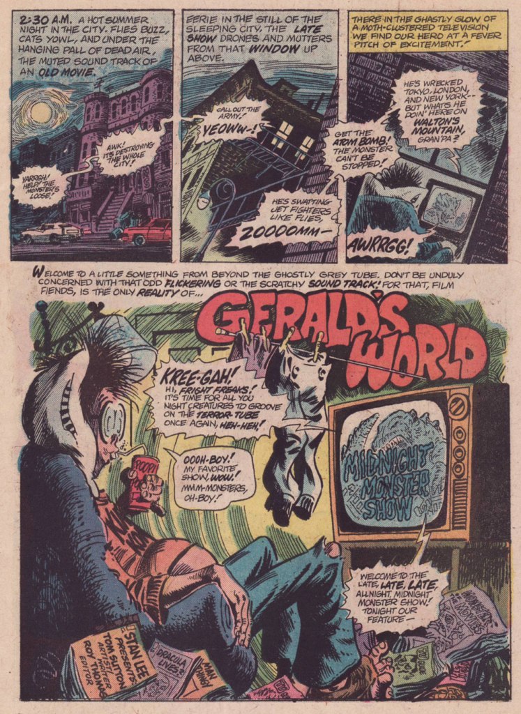
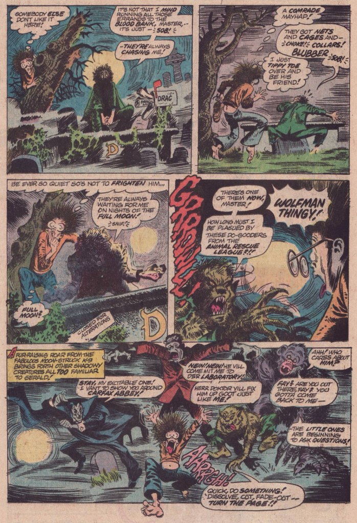
« … so I’d work on it until three or four o’ clock in the morning — that is the time to do Loevecraftian machinations. » — Tom Sutton (2001)
If you ask me, Marvel’s attempts at humour never came off*, being both strained and generally directed at superheroes, who are ridiculous in the first place. It’s like mocking pro wrestling — What’s the point?
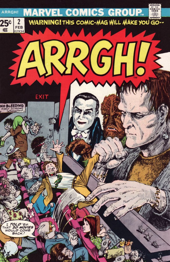
Marvel did half-try its clammy hand at a horror humour comic book midway through the 70s, and while much of it looked decent, it was consistently unfunny. You can give it your best Will Elder, but it won’t stick if you don’t have that rare magic comical gene.
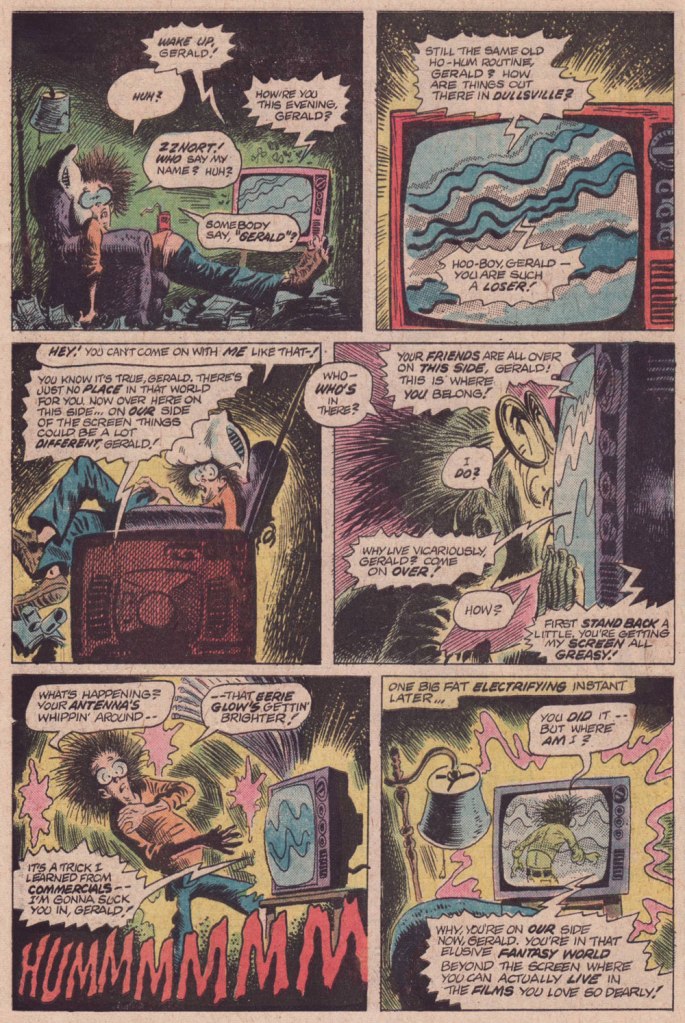
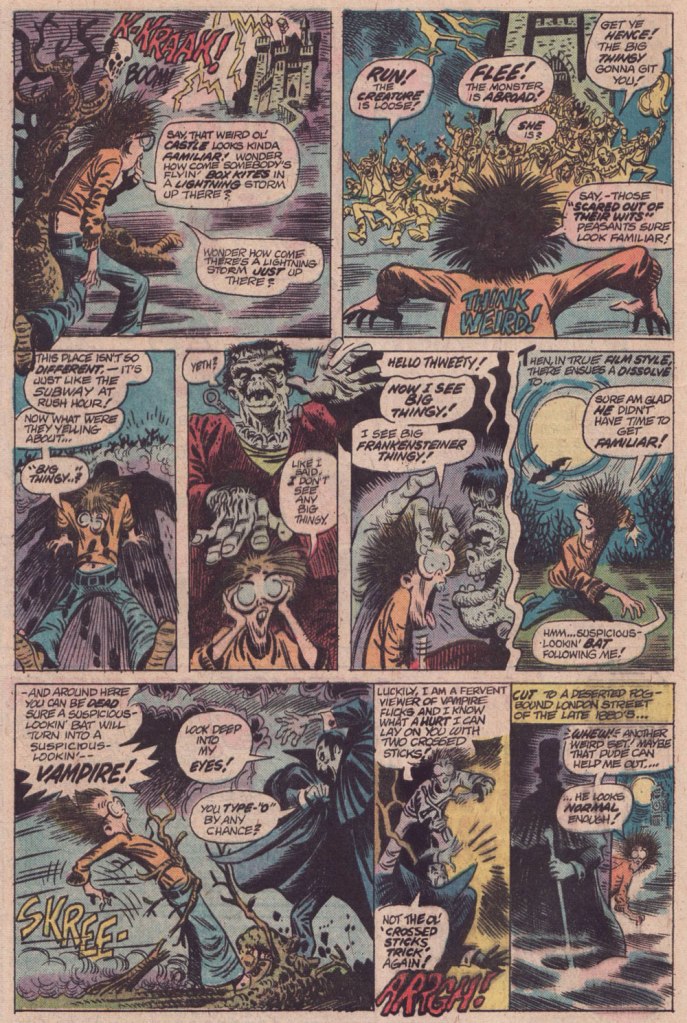
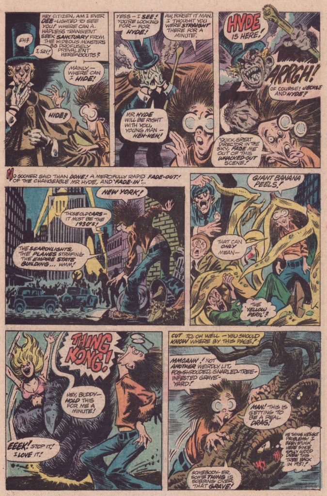
And while I’d love to say that Tom Sutton (1937-2002) had it, I’m afraid he didn’t. But Gerald’s World was a story close to his heart, to the point where he actually remembered creating it and having fun doing so.
« Right, and I did “Gerald”, who stayed up all night watching Fay Wray or something like that. I had fun with those! You know there were people who really didn’t like those things? » (Comic Book Artist no. 12, 2001)
It’s overstuffed, but it’s brimming with mood and solid craft. Take it away, Tom!
For a dose of real-life, depressing horror, read the definitive, late-in-life Tom Sutton interview, ‘An Odd Man Out‘. I’m afraid it’s unlikely to leave you swooning with affection and goodwill for the comic book industry.
And here’s Marie Severin‘s cover for that issue. This is Arrgh! no. 2 (Feb. 1975, Marvel). By issue five, the final one, Marvel were down to licencing 1954 Get Lost! material from Ross Andru and Mike Esposito.
-RG
*there’s always an exception, isn’t there? I’ll proudly vouch for Scott Gray and Roger Langridge‘s Fin Fang Four stories, circa the late Oughties. Recommended? You bet.
« And by the time they reached the shore of the quiet lake the sun was clouding over and fog moved in across the water so swiftly and completely that it frightened Doug to see it move, as if a great storm cloud from the autumn sky had been cut loose and sank to engulf the shore, the town, the thumping, happy brass band. » — Ray Bradbury, Farewell Summer (1980)
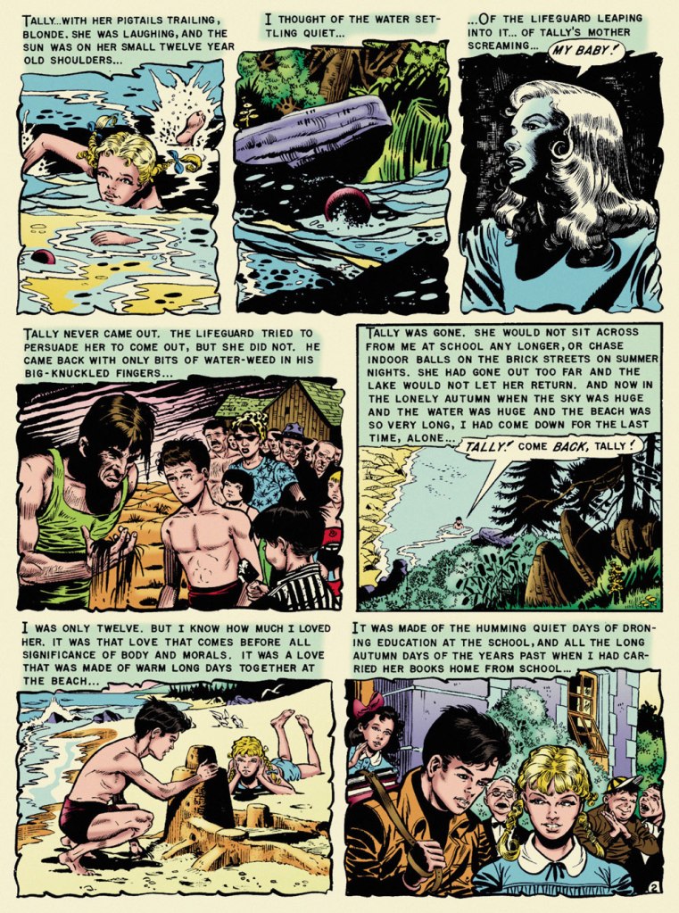
With summer on the wane — never mind the heat and humidity! — it seems fitting to feature, on the one hundred and second anniversary of Ray Bradbury’s birth, what’s possibly my very favourite EC comics adaptation of his work, Al Feldstein and Joe Orlando‘s ‘The Lake’. The other contenders jockeying for the top spot would be Johnny Craig‘s ‘Touch and Go!‘ (from the story ‘The Fruit at the Bottom of the Bowl‘) and Bernie Krigstein‘s ‘The Flying Machine‘. This mournful coming-of-age story was a speck of maturity in a boundless hinterland of juvenilia. I was agreeably surprised to find that there are some who concur with me on that point:
« It is hard for me to imagine how the 1953 comic book reader must have reacted when they picked up Vault of Horror #31 and read “The Lake” (adapted by Feldstein and Joe Orlando). The same month, Batman was fighting a crime predicting robot and Superman was helping to peel potatoes for Lois Lane during her stint in the Women’s Army Corps. So to go from that to this, a hauntingly sophisticated tale of a young boy obsessed with the death of his childhood sweetheart, must have been mind-blowing. »
Now, I trust I don’t have to school you about the life and times of Mr. Bradbury (1920-2012). Were it the case, I’d still skip the lesson, thanks to this 1953summary, which will suit our current purposes just fine:
The good folks at EC comics, namely those in charge — proprietor William Maxwell Gaines and his loyal acolyte and second-worst artist, Al Feldstein — decided to adapt the works of young Ray… without bothering to first secure his blessing. After a few (splendid) adaptations, Bradbury shrewdly wrote: « Just a note to remind you of an oversight. You have not as yet sent on the check for $50.00 to cover the use of secondary rights on my two stories ‘The Rocket Man’ and ‘Kaleidoscope.’ . . . I feel this was probably overlooked in the general confusion of office work, and look forward to your payment in the near future. ». By 1953, the collaboration was well established, and so…
Bless her soul and all that, but I found Marie Severin‘s latter-day recolouring for Fantagraphics’ ‘definitive’ edition to be on the garish side, so I’ve toned it down somewhat. Computers aren’t for everyone. Russ Cochran‘s stunningly ambitious and still-definitive The Complete EC Library featured John Benson, Bill Mason and Bhob Stewart‘s insightful and in-depth interviews and notes. Here’s what Benson wrote about The Lake:
« One of the few serious errors in the EC Bradbury adaptations is Joe Orlando’s imagery in ‘The Lake‘. Ignoring the many clues in the text (the long beach, the sand, the incoming waves) and taking his cue only from the title, Orlando drew a mountain lake, with pines and rushes, and a lodge in the background. But Bradbury’s lake was Lake Michigan, and this is a story that draws on the special poignance of the first autumn days at a large tidal beach. Had Orlando drawn on his undoubted experiences of the Atlantic seashore, he would have come much closer to the spirit of the original.
Readers who compare the dialogue in the EC version with the full version of the story in The October Country will find some seemingly inexplicable differences. The explanation is not that Feldstein cavalierly tampered with Bradbury’s text but quite the opposite. Feldstein was faithful to the story as it appeared in the May 1944 Weird Tales and in Bradbury’s first book anthology Dark Carnival (now long out of print). It was Bradbury himself who rewrote passages for this and other stories in The October Country, published after the EC adaptations. »
Orlando’s a funny guy. Like Harry Harrison, he started out as a friend, collaborator and friendly competitor of Wally Wood‘s. Unlike Harrison, who left the comics field to become a successful SF writer, Orlando was briefly able to more-or-less keep pace with Wood. It must have been nerve-wracking and of course quite unsustainable. While I hold that Orlando’s most aesthetically accomplished art job is ‘A Rottin’ Trick!‘ from Tales from the Crypt no. 29 (Apr.-May 1952, EC) and his most significant has to be anti-racist parable ‘Judgment Day!‘, from Weird Fantasy no. 18 (Mar.-Apr. 1953, EC), ‘The Lake‘ triumphs, thanks to its writing. After his peak of ’52-’53, Orlando’s art deteriorated fast. He made a bit of comeback in the mid-60s (the ‘Adam Link‘ stories at Warren were highlights) but… that’s when he was more often than not signing his name to Jerry Grandenetti‘s work. He found his niche as an editor at DC, and whatever artwork he produced thereafter seemed, to me, rushed and half-hearted. But he was a pretty good editor!
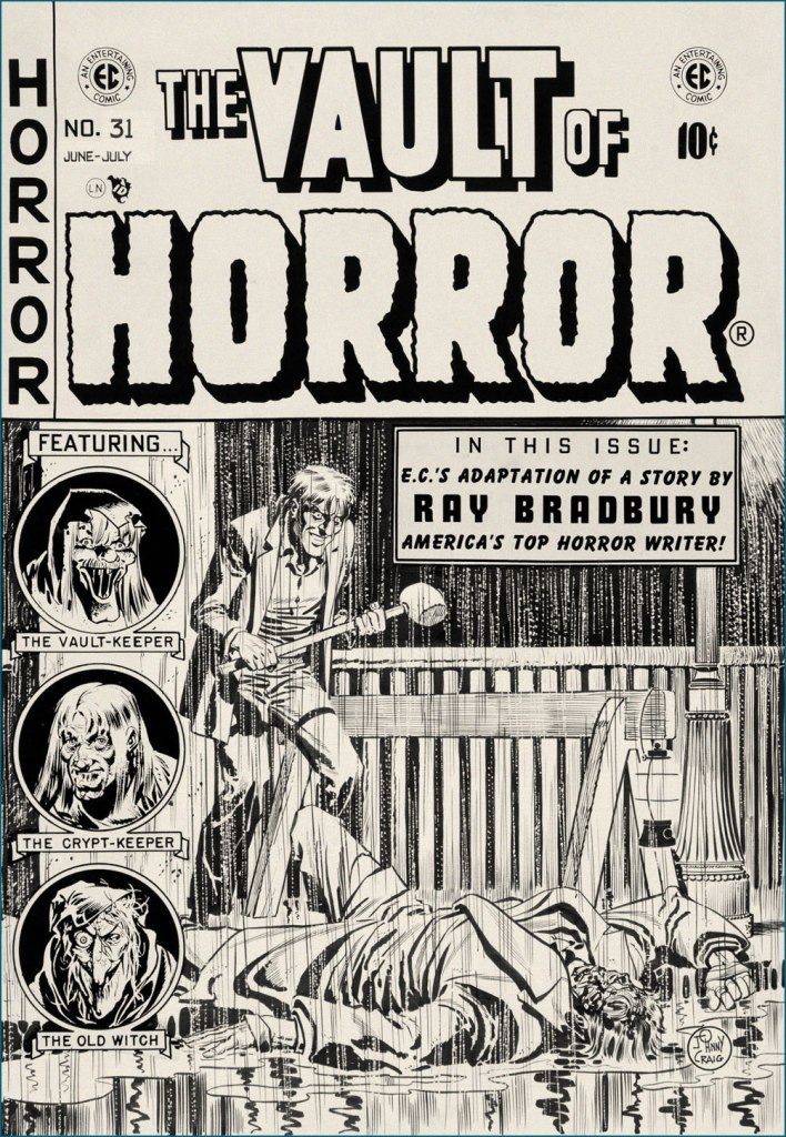
It’s a bit incongruous that what must be EC Comics’ quietest, most ruminative horror story should appear under one of its most violent (‘hard hitting’ comes to mind… literally) covers. Johnny Craig’s work could be — and generally was — quite understated, but on days when he wasn’t in that particular restrained frame of mind… look out! This is the original cover art from Vault of Horror no. 31 (June-July 1953, EC).
In closing, a word of warning: you’ll be seeing precious little of us in the coming month of September, as we’re preparing ourselves for a major change of domicile. We’ll be living in boxes for a spell, but I’m hoping to be back in time for the annual Hallowe’en Countdown. The show must go on!
« Taking sartorial risks and not following other people is what makes you stand out. » — Zac Posen
I was planning a big commemorative post for today, but I got tangled up in my calendar and realised in time that I was a couple of weeks off. So instead, I’ll just blow off a little steam.
Some cartoonists are born character designers. Others, not so much. The Rhino, a Stan Lee-John Romita Sr. creation, first appeared in The Amazing Spider-Man no. 41 (Oct. 1966, Marvel), soon after Steve Ditko‘s abrupt but quite justified resignation. Isn’t that just a dog of a cover? (pencils and inks by Romita, colours by Stan Goldberg).
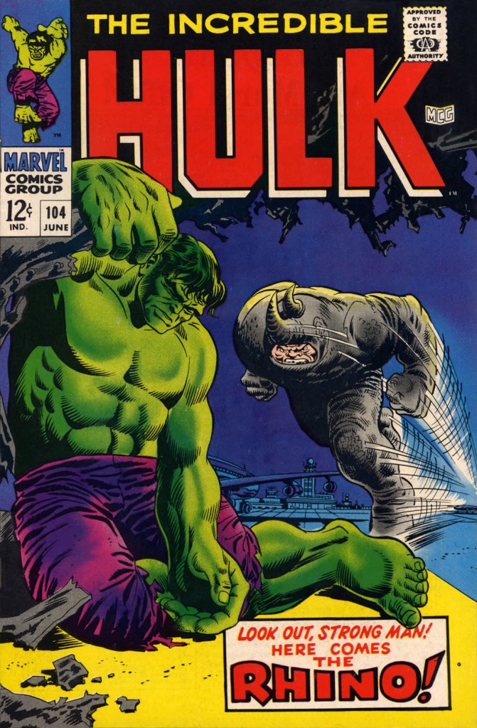
“I’ve been getting these migraine headaches, Doc” “What do you do for a living?” “Uh…” Seriously, what can you do with a character who obviously can’t move that fast, has to lean his head down to strike… blindly, and isn’t particularly smart? All Spidey has to do is duck, which is one of his chief talents.Answer: you pit him against a more suitable adversary, preferably a dumber one. This later, but still ludicrous, appearance is The Incredible Hulk no. 104 (June 1968, Marvel). Cover by Marie Severin and Frank Giacoia.
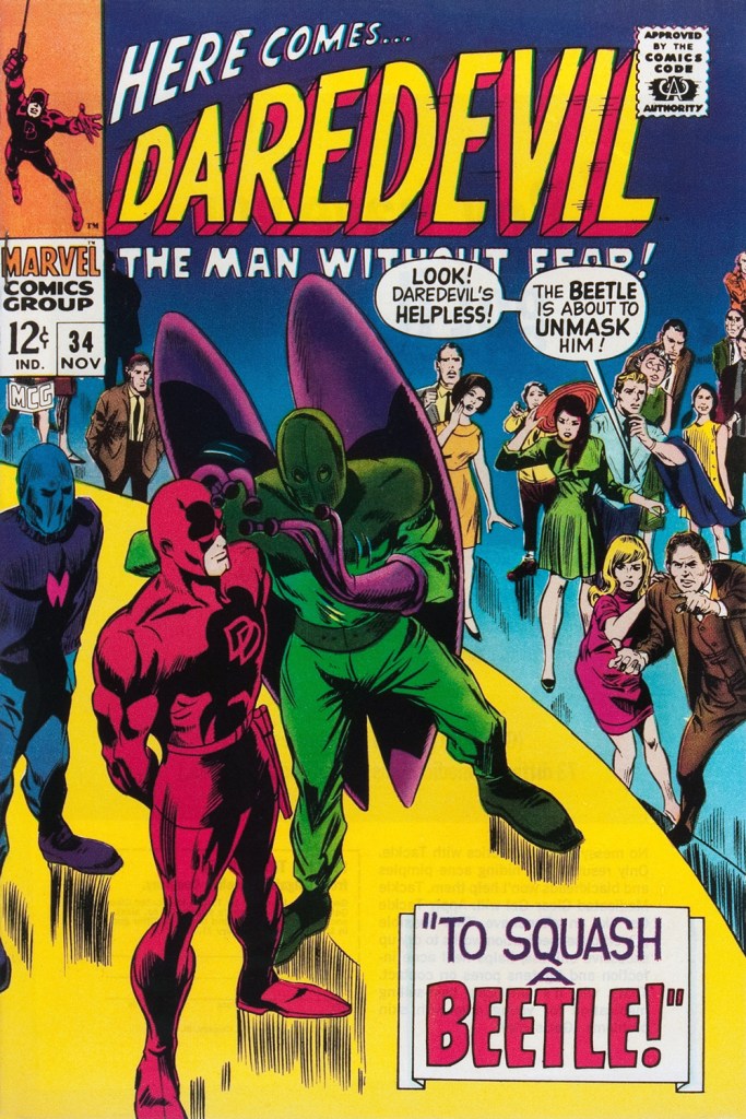
Somehow, Daredevil seems to wind up with more than his share of poorly-attired villains. It’s as if they know he’s blind and won’t judge them too harshly on sartorial grounds.
The Beetle first scurried into view in Strange Tales no. 123 (Aug. 1964, Marvel), tackling the Human Torch (and The Thing). Too bad it wasn’t Doctor Strange he was sparring with, since his threads would then have been designed by Mr. Ditko instead of by Carl Burgos.
He then went on to bug the aforementioned ‘hornhead’. This is Daredevil no. 34 (Nov. 1967); pencils by Gene Colan, inks by Bill Everett. Why does everyone on stage appear to wear a size 15 shoe? At least!
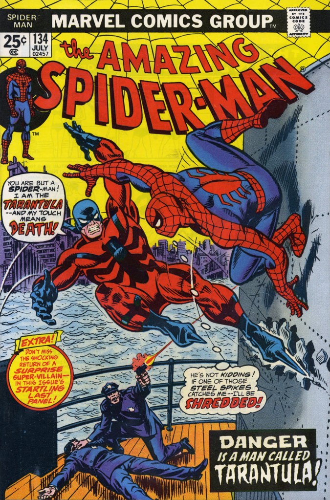
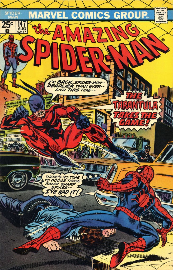
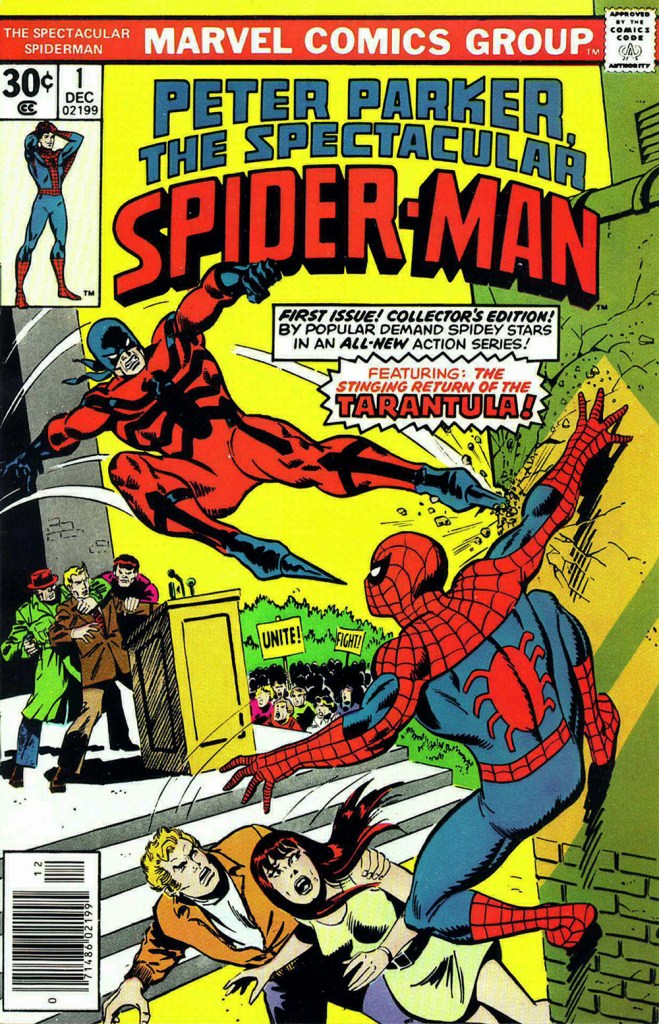
The costume of the Tarantula (a glorious Gerry Conway-Ross Andru creation!) is such an impractical conceit that they pretty much have to use him in the same position on every cover. The guy can barely walk in such, er — calzado, let alone fly at Spider-Man with such force. Just a lousy idea, on every level — tarantulas bite, they don’t sting, Gerry.
This is The Amazing Spider-Man no. 134 (July 1974, Marvel). Art by John Romita Sr. So… much… pointless…. exposition.They just had to bring him back! This time, Gil Kane and John Romita Jr. do the honours. This is The Amazing Spider-Man no. 147 (Aug. 1975, Marvel).No formula at work here, no sir. This is Peter Parker, the Spectacular Spider-Man no. 1 (Dec. 1976, Marvel). Cover by Sal Buscema. Tarantula creator Conway was the editor, which explains a lot — but hardly excuses it.
Poor Razor-Fist was created by writer Doug Moench and artist Paul Gulacy. How did he get dressed? How did he go to the bathroom? How did he feed himself? How did he get his head to bend that far back? (Perhaps he’s a Pez Dispenser).
This is The Hands of Shang-Chi, Master of Kung Fu no. 30 (July 1975, Marvel). Cover by Gil Kane and (most likely) Frank Giacoia. I guess all the male lions were taking a nap somewhere.
Should you hanker for more of these, er… dressing-downs, you might want to inspect our earlier instalment along these lines, « You’re going out wearing THAT? ».
« Like everyone in his right mind, I feared Santa Claus. » — Annie Dillard
’twas 1982, and DC’s mystery anthology titles were dead or dying (the last one standing, The House of Mystery, had but a year or so left to go), and The Unexpected, published since 1956, was a mere two issues away from cancellation. Latter-day editor Dave Manak had done a fine job with the means at his disposal, wisely engaging Joe Kubert (1926-2012) to grace close to ten issues with his ever-elegant artwork.
This is perhaps the finest of the lot, a wistful, old-fashioned cover that dispenses with most of the clichéd Holiday iconography.
This is The Unexpected no. 220 (March 1982, DC). Pencils and inks by Joe Kubert with extra-fine lettering by Gaspar Saladino (1927-2016), truly a key element of the cover’s visual appeal. “Drive carefully, darling!” Is that woman worried about *everything*? Talk about fretful. Insurance agents must adore her. From the Fairhaven and Bon Marché allusions, one may presume that the events are set in the state of Washington.To give credit where credit is due, the unexplained bit with Santa’s hand on the phone is the story’s subtlest touch. He’s the one who phoned in the tip — anonymously, one presumes. Santa does not abide off-brand competition.
The issue’s lead, Holiday-themed story, boasts gorgeous art by powerful and versatile Puerto Rican cartoonist Ernie Colón (1931-2019), and it’s unusually well-coloured for the era (not to be confused with well-printed!), in that the shadings convey projected light and ambiance, not merely the prevalent, simplistic colour-by-numbers approach.
The writing, on the other hand…
Santa Is a Killer! is an artless hodge-podge of tropes, a kiddie rehash of Johnny Craig’s timeless “… and All Through the House” (Vault of Horror no. 35, Feb. 1954, EC), dressed up with the done-to-death-and-then-some “That — wasn’t *you*? Then — it must have been the –*choke* — real ghost / Satan / Santa Claus / Carlos Santana / Tooth Fairy / Larry “Bud” Melman!) “twist”. Did I mention that I love the art?
Since we strive to avoid repetition, and as my partner-in-mischief ds has already featured this legendary cover in her How do you like *your* Christmas? post, here instead is the original 1954 Silverprint proof, a colour guide for the printer’s edification and coloured by hand, presumably by EC’s resident chromatic conjuress, Marie Severin (1929-2018). Cover art by Johnny Craig.
It’s a little-known fact that VoH35’s dear, doomed wife’s peignoir was later snapped up for a pittance at an estate sale by a young rake by the name of Danny Rand. Soon, with a few minor alterations, he had himself a nifty (and silky!) crime-fighting ensemble. Just don’t ask ‘is that a ladies’ nightgown you’re wearing?‘ if you don’t want your features rearranged. This is Iron Fist no. 8 (Oct. 1976, Marvel). Cover art by John ‘Booster Cogburn‘ Byrne and Dan Adkins. And though « The Canadian Government has apologized for Bryan Adams on several occasions » (and presumably for Céline Dion and Justin Bieber also), I say it’s high time Canuck honchos proffered their excuses as to cuddly Mr. Byrne.
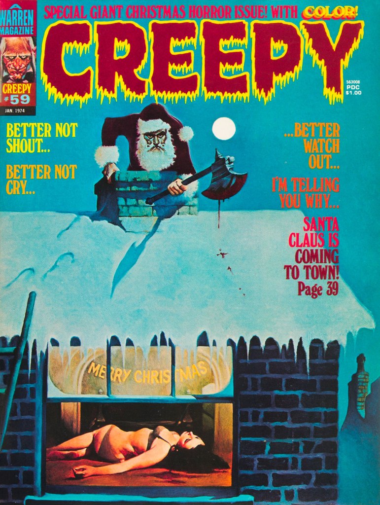
To give you some idea of how prevalent the ‘Santa as homicidal maniac’ notion was by the 1970s, here’s another semi-famous instance: this is Creepy no. 59 (Jan. 1974, Warren); cover by Spain’s Manuel Sanjulián (b. 1941). A year later, writer-director Bob Clark (Porky’s, A Christmas Story) would unleash his influential Black Christmas.
« La matière en était gélatineuse et peu consistante; elle se décomposa, au bout de quelques heures, en un liquide rose et gluant, d’une odeur insupportable.* » — Jean Ray, Dans les marais du Fenn
Aw, good old muck monsters…
Perhaps the first to emerge, at least in the English language, was Theodore Sturgeon’s “It”, published in Unknown’s August, 1940 issue, whose title page warned: “IT wasn’t vicious, IT was simply curious — and very horribly deadly!“
But IT was preceded, by some years, by Raymond Marie de Kremer alias Jean Ray’s superb Dans les marais du Fenn (« In the Fenn Marshes »), first published in the Belgian literary magazine L’ami du livre’s issue of November 1st, 1923! A handful of Ray stories (often published under his alternate nom de plume, “John Flanders”) were published in US pulps, including the legendary Weird Tales, but “Dans les marais…” appears to have somehow, to this day, remained untranslated to English.
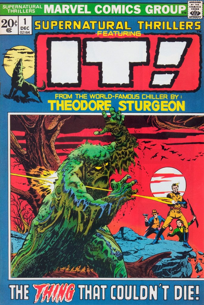
This is Supernatural Thrillers no. 1 (December, 1972, Marvel), an adaptation by Roy Thomas, Marie Severin and Frank Giacoia. Cover by Jimmy “Profa” Steranko.
The opening — and best — page from Marvel’s IT adaptation, which fails, imho, because Rascally Roy, overly attached to the original text, doesn’t let the visuals breathe. The mediocre results, at once too pedantically faithful and well off the mark, are no substitute for Sturgeon’s original.
IT originally saw print in this issue of Street & Smith’s Unknown, which had, just one month earlier, abandoned its striking painted covers for this money-saving but comparatively stodgy, ‘dignified’, Reader’s Digest-style design. It looks like there’s a page missing — the best one!
And they were soon at it again. How did they manage to convince themselves that this was going to succeed as an adaptation? This is Worlds Unknown no. 6 (Apr. 1974, Marvel). Pencils by Gil Kane and inks by Ernie Chan, with extensive alterations by John “Heavy Hand” Romita. This has been bestowed the impressive (if true) honour of being called The Lyingest Cover in Marvel Comics History.
-RG
*« Its matter was gelatinous and insubstantial; it decomposed, within a few hours, into a viscous pink liquid of unbearable odour. »