« Taking sartorial risks and not following other people is what makes you stand out. » — Zac Posen
I was planning a big commemorative post for today, but I got tangled up in my calendar and realised in time that I was a couple of weeks off. So instead, I’ll just blow off a little steam.
Some cartoonists are born character designers. Others, not so much. The Rhino, a Stan Lee-John Romita Sr. creation, first appeared in The Amazing Spider-Man no. 41 (Oct. 1966, Marvel), soon after Steve Ditko‘s abrupt but quite justified resignation. Isn’t that just a dog of a cover? (pencils and inks by Romita, colours by Stan Goldberg).
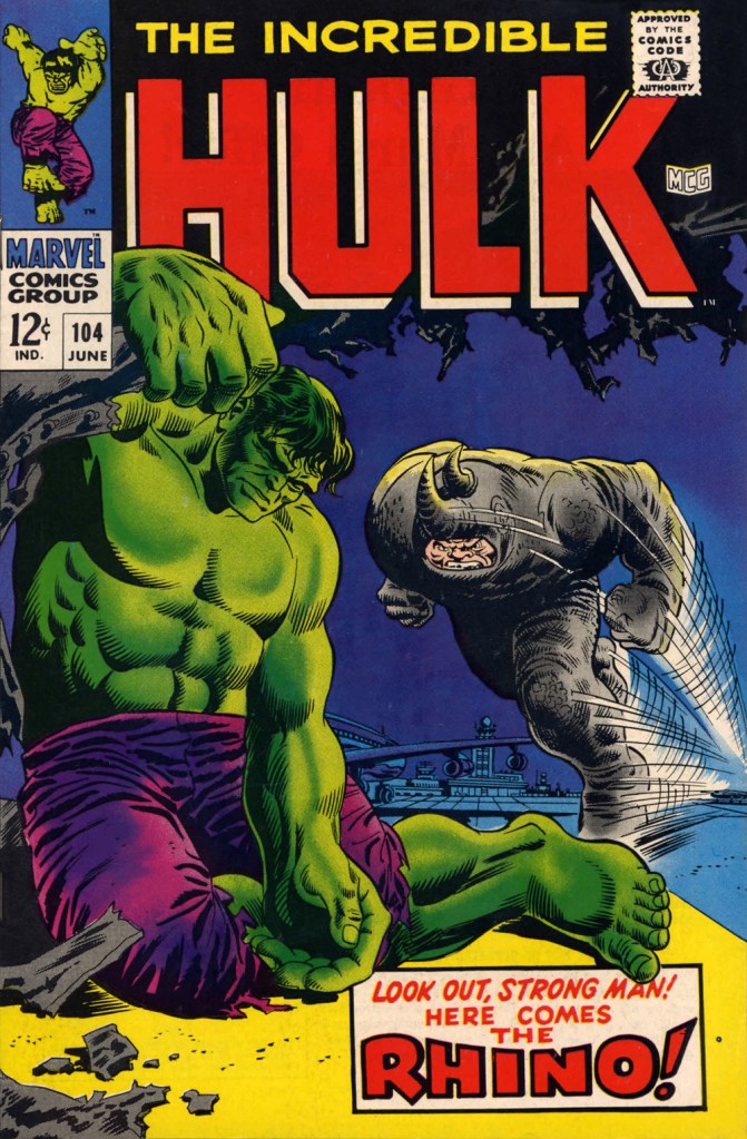
“I’ve been getting these migraine headaches, Doc” “What do you do for a living?” “Uh…” Seriously, what can you do with a character who obviously can’t move that fast, has to lean his head down to strike… blindly, and isn’t particularly smart? All Spidey has to do is duck, which is one of his chief talents.Answer: you pit him against a more suitable adversary, preferably a dumber one. This later, but still ludicrous, appearance is The Incredible Hulk no. 104 (June 1968, Marvel). Cover by Marie Severin and Frank Giacoia.
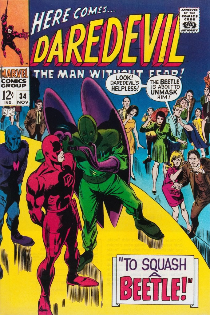
Somehow, Daredevil seems to wind up with more than his share of poorly-attired villains. It’s as if they know he’s blind and won’t judge them too harshly on sartorial grounds.
The Beetle first scurried into view in Strange Tales no. 123 (Aug. 1964, Marvel), tackling the Human Torch (and The Thing). Too bad it wasn’t Doctor Strange he was sparring with, since his threads would then have been designed by Mr. Ditko instead of by Carl Burgos.
He then went on to bug the aforementioned ‘hornhead’. This is Daredevil no. 34 (Nov. 1967); pencils by Gene Colan, inks by Bill Everett. Why does everyone on stage appear to wear a size 15 shoe? At least!
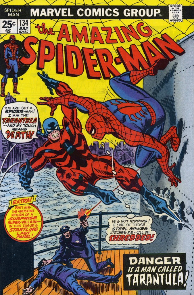
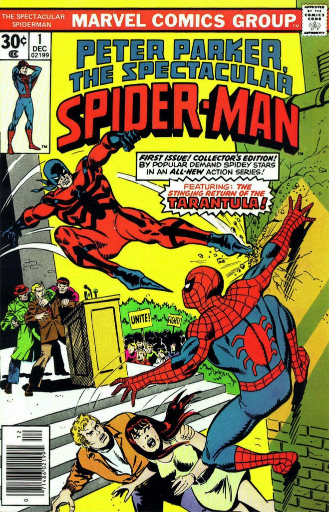
The costume of the Tarantula (a glorious Gerry Conway-Ross Andru creation!) is such an impractical conceit that they pretty much have to use him in the same position on every cover. The guy can barely walk in such, er — calzado, let alone fly at Spider-Man with such force. Just a lousy idea, on every level — tarantulas bite, they don’t sting, Gerry.
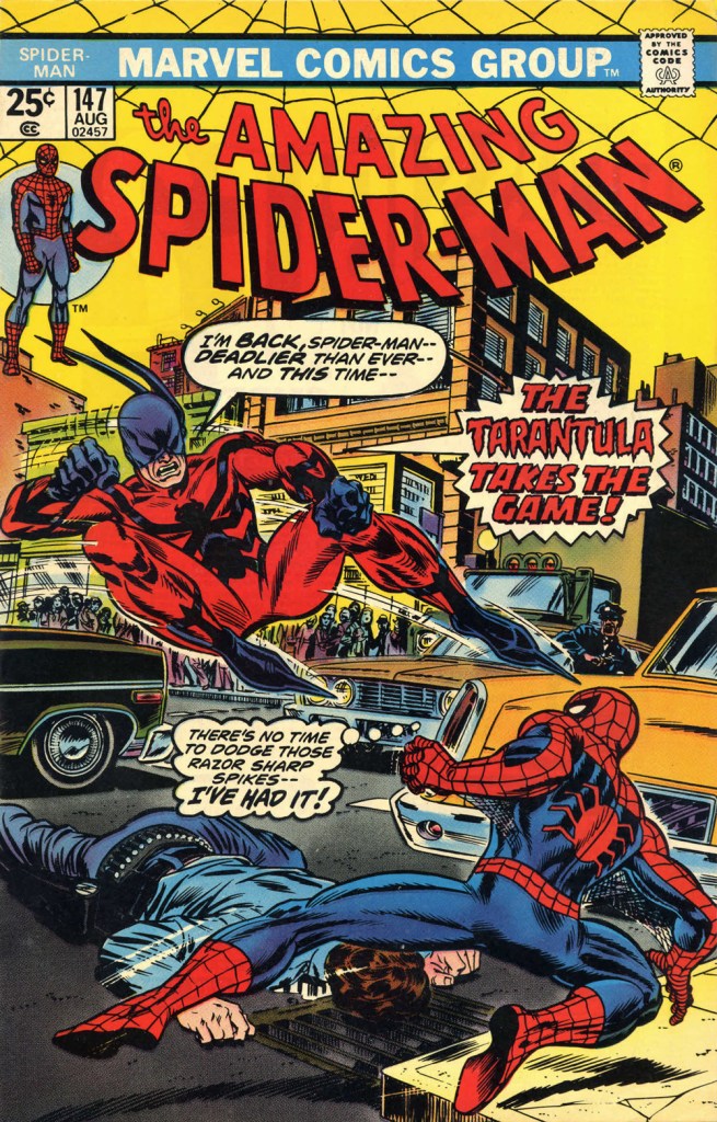
This is The Amazing Spider-Man no. 134 (July 1974, Marvel). Art by John Romita Sr. So… much… pointless…. exposition.They just had to bring him back! This time, Gil Kane and John Romita Jr. do the honours. This is The Amazing Spider-Man no. 147 (Aug. 1975, Marvel).No formula at work here, no sir. This is Peter Parker, the Spectacular Spider-Man no. 1 (Dec. 1976, Marvel). Cover by Sal Buscema. Tarantula creator Conway was the editor, which explains a lot — but hardly excuses it.
Poor Razor-Fist was created by writer Doug Moench and artist Paul Gulacy. How did he get dressed? How did he go to the bathroom? How did he feed himself? How did he get his head to bend that far back? (Perhaps he’s a Pez Dispenser).
This is The Hands of Shang-Chi, Master of Kung Fu no. 30 (July 1975, Marvel). Cover by Gil Kane and (most likely) Frank Giacoia. I guess all the male lions were taking a nap somewhere.
Should you hanker for more of these, er… dressing-downs, you might want to inspect our earlier instalment along these lines, « You’re going out wearing THAT? ».
« There’s no need for some of the language that’s been thrown at some of the artists and writers. These men are highly skilled craftsmen and deserve a lot of respect. » — editorial comment in T.H.U.N.D.E.R. Agents no. 14 (July, 1967, Tower)
This post has been inspired by sundry signs and omens I’ve encountered these past few days: first, a casual mention dropped by Bizarro ink stud Wayno on his blog; then a fond-but-hazy recollection by a graphic designer colleague… and so this week, the agents of T.H.U.N.D.E.R.* make the scene. Well, one of them does.
As with many other choice cultural items of the era, I was first tantalised by a little volume entitled Dynamo, Man of High Camp from the back pages of Famous Monsters of Filmland, devoted to its in-house Captain Company catalogue: Warren magazine back issues, rubber masks and hands, posters, LPs, Super 8 reels, paperbacks, novelties… a veritable trove of wonders. And unlike many a mail-order house, these goodies were the real deal, solid classics avidly sought after and treasured to this day.
Since much has been written about the history of Tower Comics (1965-1969), I’ll skip that part. Here’s the gist of it.
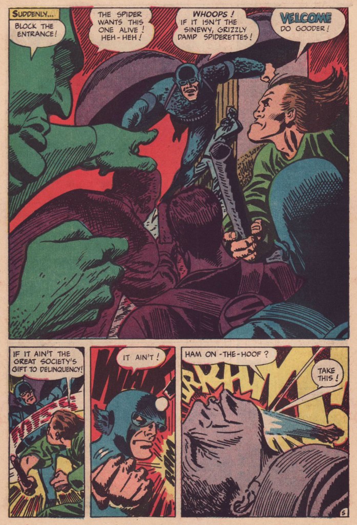
Of course, I adore the Wally Wood material, all the more the unfailingly delicious Steve Ditko-Wood combo. A fine surprise was George Tuska‘s nimble comedic touch on the misadventures of ‘Weed’. But my very favourite flavour in the T.H.U.N.D.E.R. cocktail is ‘Raven’ as written and illustrated by Manny Stallman (1927-97), a quintessentially eccentric delight.
Introduced by Steve Skeates and George Tuska in Enter the Raven (T.H.U.N.D.E.R. Agents no. 8, Sept. 1966), the character’s sole point of interest was that he was a mercenary who, originally intending to betray T.H.U.N.D.E.R., had a change of heart.
Along came Manny. He took over the character, redesigned him from stem to stern, and gave him a memorable arch-nemesis in Mayven, the Poet. But enough of this prattle, let’s have a look!
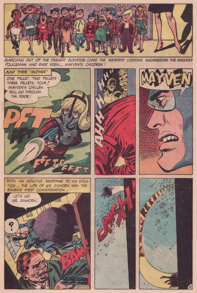
This is page two of Raven Battles Mayven the Poet (T.H.U.N.D.E.R. Agents no. 9, Oct. 1966, edited by Samm Schwartz), spotlighting Mayven’s signature weapon: explosive tots. Stallman had no trouble with action: another page from Raven Battles Mayven the Poet.Mayven, captured in the previous episode, wastes no time in making good — and memorable — her escape from the clink; the opening pages from Mayven Returns (T.H.U.N.D.E.R. Agents no. 10, Nov. 1966).Bold, dynamic, sloppy in all the right places and the right ways. And I *love* that Raven makes an ungodly racket when he flies, itself a great source of visual interest.A three-page sequence from the following episode, The Case of Jacob Einhorn (T.H.U.N.D.E.R. Agents no. 11, Mar. 1967), wherein ice-cold Mayven takes on the assignment to eliminate Mr. Einhorn, a fictive stand-in for legendary ‘Nazi hunter’ Simon Wiesenthal (1908-2005). I wouldn’t want to give too much away… read the whole shebang here!
After a mere five Raven episodes, Stallman was gone. Judging from the letters columns, reader reaction had overwhelming been of this nature:
“In issue #9 the art on the Raven was awful“
“You’re using a lot of grade D artists… as for whoever draws the Raven, his art is utterly atrocious.”
“How about having Chic Stone draw Raven in addition to Lightning?“
« Unsurprisingly, many of the fans of the era hated Stallman’s work and mocked it openly in their letters and in fanzines. Comic book fans have often had very narrow boundaries for what they consider an appropriate style for a super hero strip. And Stallman was coloring way outside of those lines with his work. »
After an issue’s hiatus, the Raven returned, once more reimagined (minus the imagination) this time by Gil Kane. Just another run-of-the-mill flying dude. I’ve always held that Kane should never be allowed to ink himself, but he also makes an excellent case, in his sole Raven outing (and Raven’s final flight), that he shouldn’t be allowed to write, either. Here’s a sample:
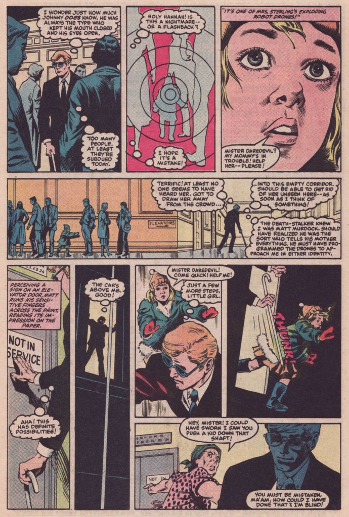
Ahem. All these walking child-shaped time bombs reminded me of a rather fine comic book from a couple of decades later.
This is Daredevil no. 209 (Aug. 1984, Marvel), cover by David Mazzucchelli.This issue is a thrillingly relentless continuation of a thrillingly relentless (but in a different way) Winchester-mystery-house-of-murder tale, The Deadliest Night of My Life!, co-scripted by Harlan Ellison and his pal Arthur Byron Cover. Here, Byron Cover carries the ball, and offers us this darkly delicious sequence. Pencils by Mazzucchelli, inks by Danny Bulanadi.
It could all be coincidence, but I like to imagine that the exploding kids idea is a sharp hybrid of notions from two Mario Bava flicks from 1966: the murderous little girl from Operazione paura aka Kill, Baby… Kill, and the booby-trap beauties from Le spie vengono dal semifreddo aka Dr. Goldfoot and the Girl Bombs.
In closing, I’m happy to report that Mr. Stallman landed on his feet after his fall from the Tower. Honestly, the comics industry, and its fans, didn’t deserve the likes of him. He would go on to recount the Adventures of the Big Boy (published by the Bob’s Big Boy chain of restaurants) for a whopping seventeen years, among other fine assignments. And if ever there was a mensch, he surely was the one. Here’s a telling passage from his obituary:
« When a 1991 stroke caused cartoonist Manny Stallman’s right hand to intermittently go numb, he didn’t let it stop him. He simply took it upon himself to learn to draw with his left hand.
After making that switch, he had trouble drawing the tightly controlled figures he had created for years as a leading artist in what has been called the Golden Age of Comics. So he took advantage of the larger figures he could draw, transposing them onto a blackboard to help teach English and citizenship classes to Russian immigrants at the Albert L. Schultz Jewish Community Center in Palo Alto.
Despite additional health problems that included diabetes and congestive heart failure, he also led classes for Chinese immigrants and taught computer-aided drawing to disabled children. “Manny decided to stop focusing on what he had been able to do before his strokes,” says his wife, Jane Stallman.
“He decided to start ‘where I am‘ and do whatever he could with whatever capacity he had. His life goal was to make someone smile each day.” »
« It’s wisest always to be so clad that our friends need not ask us for our names. » — James Fenimore Cooper
(Being a compendium of fashion faux-pas and various sartorial eccentricities.)
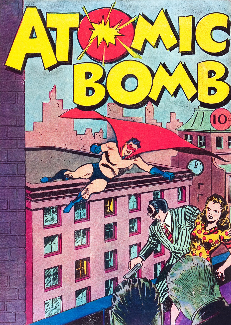
Now here’s a figure shrouded in mystery (and little else): Captain Wizard, whose sole appearance was on the cover (and not enough of it) of Atomic Bomb no. 1 (Gerona/Jay Curtis, 1946), a scarce one-shot. Artist unknown, regrettably.
What are this intriguing man of (relative) mystery’s abilities, aside from autonomous flight, quasi-nudity, bountiful love handles and a snazzy roué moustache? Did he “scare straight” hapless criminals with his sweaty, virile bear hugs? Sigh… I fear we shall never truly know. He’s in the public domain, the gent’s overdue for a revival!
I suppose there are many ways to compete for the prized title of « Most outré criminal Batman and Robin have ever encountered » (awarded every other year in October at Gotham City Hall; call 608-555-1313 for reservations): powers, weapons, motivations, henchmen, moniker, targets, modus operandi…
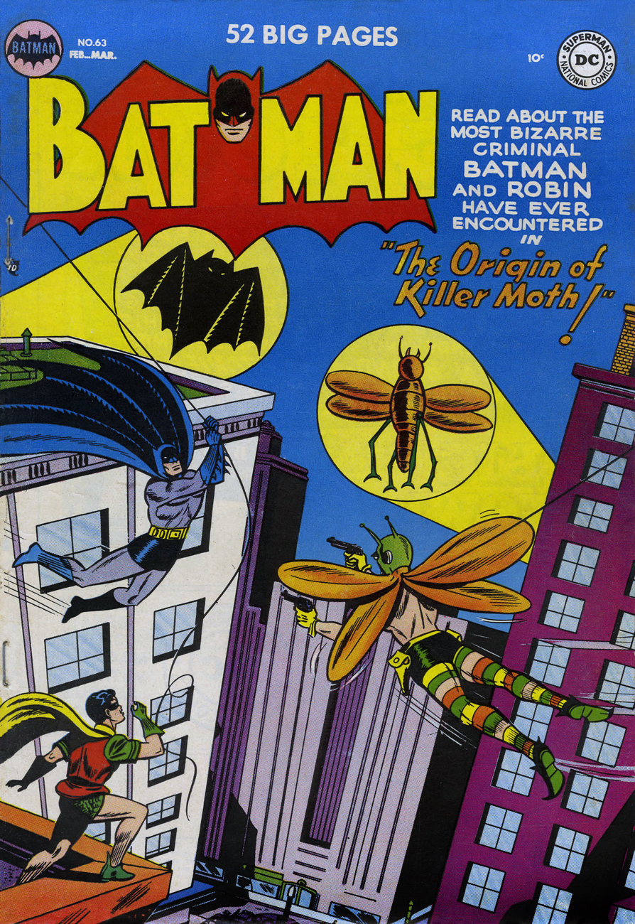
The Killer Moth made his play for the brass ring by donning the most garish and unsightly garb imaginable. Here he is making his début in Batman no. 63 (Feb. 1951), The Origin of Killer Moth! This sorry buffoon’s inception is credited to Bill Finger, Dick Sprang and Lew Schwartz, presumably to dilute the blame.
Of course, it’s unfair of me to pick on Killer Moth’s costume. I’m sure he took full opportunity to hone and refine his look over the next couple of decades. Plenty of down time to mull things over at his leisure in the clink, right?
To precious little avail, apparently. Here he is a quarter century on, in Batman Family no. 10 (April, 1977); his wings have arguably been upgraded to a cape, but he’s still evidently daltonic. Cover by Bob Brown and John Calnan. Sadly, this was some of veteran Brown’s last published work; he passed away from leukaemia in January, 1977.
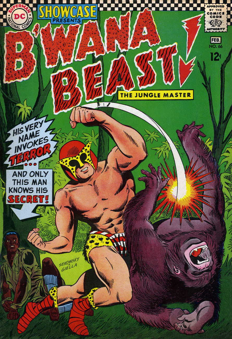
Another entry from the closet of shame. His Very Name Invokes Terror… among the dandies of the Serengeti, who blanch and quake at the notion of being seen in public with him. However, that headgear of his reportedly drove Sir Elton mad with envy.
Showcase no. 66 (Jan.-Feb. 1967), The Birth of B’wana Beast, pencilled (and possibly scripted, but who’d admit it?) by Mike Sekowsky and inked by George Roussos. Edited by George Kashdan… who was unceremoniously relieved of his editorial duties after a mere two Showcase issues, both featuring B’wana Beast.
With Jack Kirby and Steve Ditko having decamped (not to mention Stan futilely slouching towards Hollywood), Marvel in the early 70s had not only lost its visionary plotters, but also its ace character designers.
Also, after 30 years or so of men in suits and hats, it was deigned that the younger and hipper generation should have characters whose wardrobe bore at least a tangential relationship to its own.
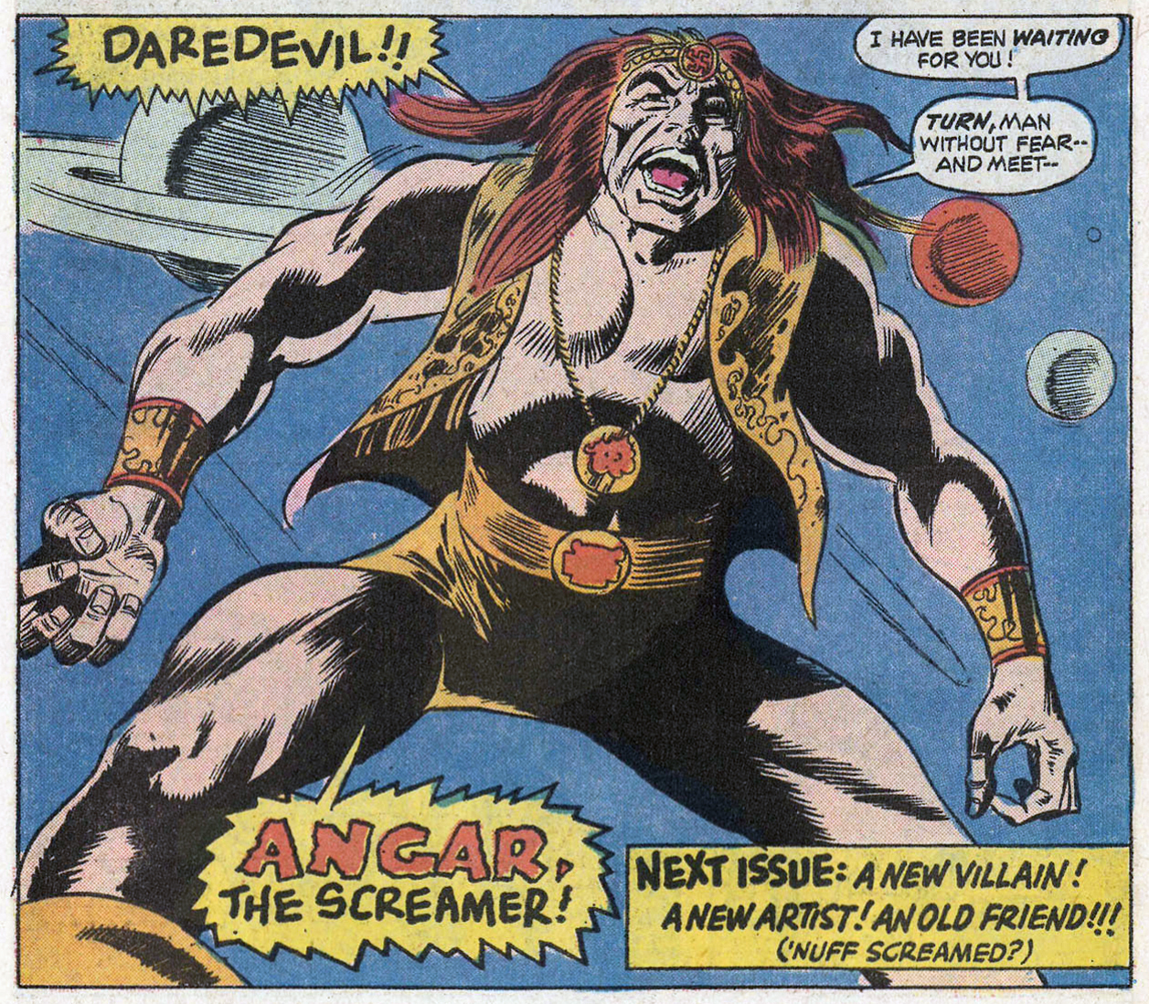
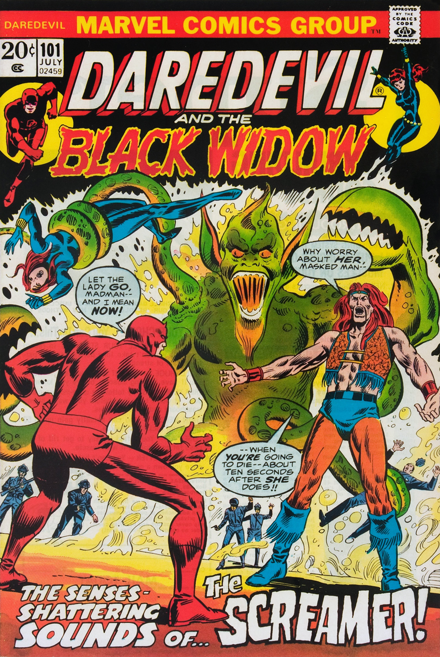
Created for the 100th issue of Daredevil by scripter Steve Gerber and penciller Gene Colan (who ended his initial long run on the title with that issue; was Angar the final straw, or was it the even more wince-inducing toadying to Jann Wenner?), Angar the Screamer was, to quote the amaranthine words of Wikipedia, « … born in San Francisco, California. He became a hippie and a radical social activist. He volunteered for an experiment that endowed him with sonic powers that caused people to hallucinate. » Groovy. Perfect for… 1973?
If anything, we can be grateful that Angar’s colour scheme is relatively restrained. I suppose it makes sense for a flower child to opt for earth tones. This is the concluding, cliff-hanging panel from Mind Storm! (Daredevil no. 100, June, 1973). Pencils by Gene Colan, inks… nay, “embellishments” by John Tartaglione. Read that, er… masterwork right here.
Poor DD’s saddled with calves thicker than his thighs. Cover art by Rich Buckler and Frank Giacoia, with the usual fussing and turd polishing by John Romita Sr..
This is Angar’s first cover appearance, Daredevil no. 101 (July 1973), in a tale that could only be called… Vengeance in the Sky With Diamonds!
There *are* indeed tentacles within, so you’ll likely encounter these, some enchanted Tentacle Tuesday…
« Oh, this is perfect . . . this is exactly what comic books are supposed to look like. » — Chris Samnee on encountering Frank Robbins‘ “Man-Bat Over Vegas” [ source ]
For a change of pace, here’s an artist in the prime of life and at the peak of his powers.
Chris Samnee, born in 1979, first caught my interest when he collaborated with Roger Langridge on Thor: The Mighty Avenger, for which he reaped the 2011 Harvey Award for Most Promising New Talent. But some of my superhero-lovin’ friends had been raving about Samnee’s work for a while.
While obviously a man of his time, he’s clearly drunk deep from the well of classic illustration, comic books and most of all, comic strips. It’s hard to miss in his work echoes of Alex Toth, Doug Wildey, Frank Robbins, Milton Caniff, Will Eisner, Roy Crane… an artistic heritage not too unlike his fellow Daredevil alumnus David Mazzucchelli‘s… fine company, plumb in that sweet spot between ‘realistic’ and ‘cartoony’, and wisely drawing from both.
As befits a first-rate cover artist, Samnee thoroughly thinks and feels his pictures through, thumb-nailing his layouts and planning his moves. Here are some of his preliminaries from The Rocketeer: Cargo of Doom (2011), for which he shared (with David Aja) the 2013 Will Eisner Award for Best Penciller/Inker.
Cargo of Doom marks the first time ever when the character of Betty isn’t sexualized to the hilt. That’s got to count for something.
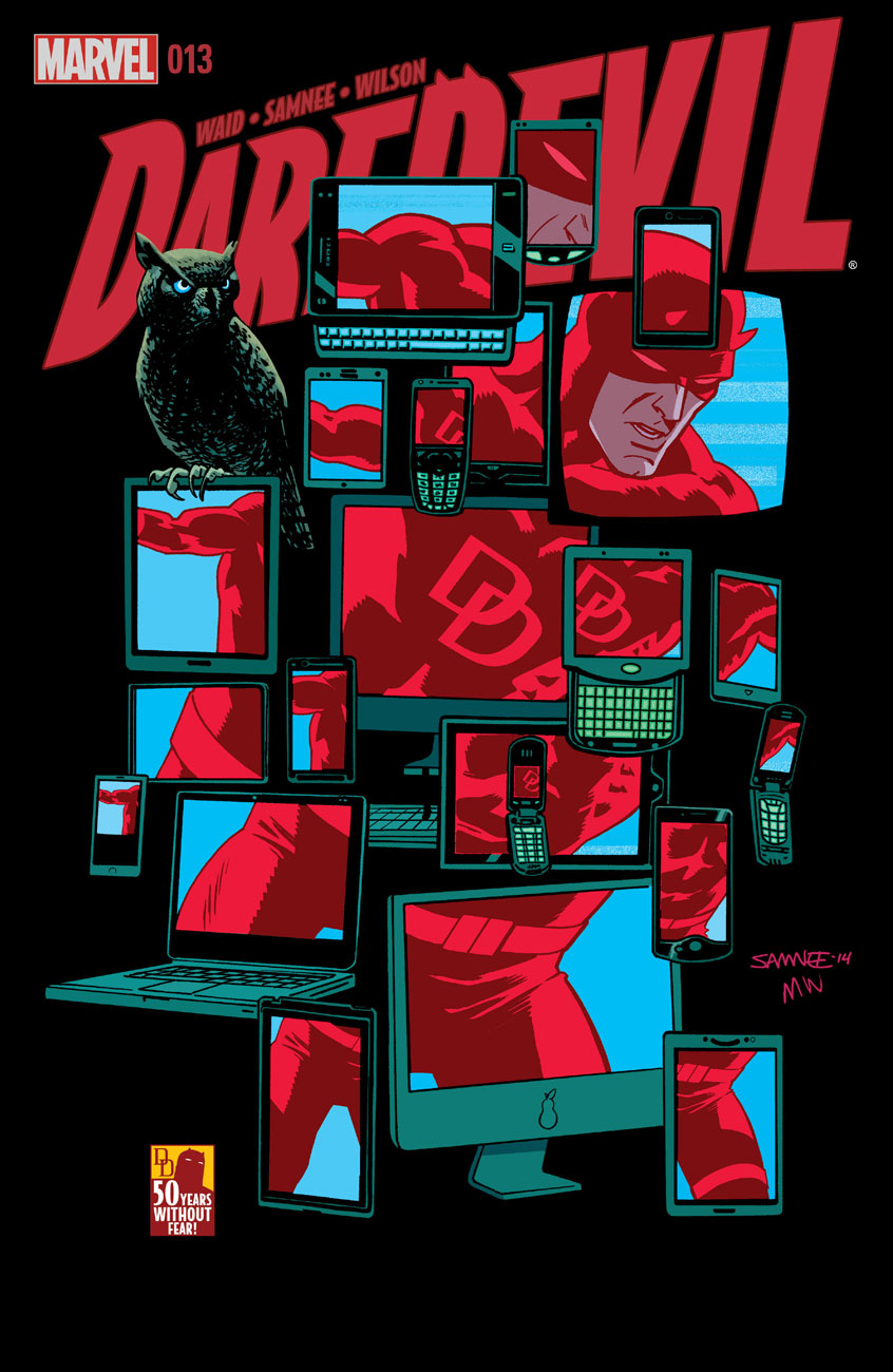
This is Daredevil no. 9 (Dec. 2014). Incidentally, after the intrusion of bar codes on covers in 1975, followed by an increasingly hard-sell culture, the kind of elegantly spare, striking design I personally gravitate to hasn’t had it easy. A surprising step in the right direction came in recent years with the demise of the Comics Code, the introduction of digital editions and the appearance of a handful of enlightened editors (take a bow, Axel Alonso!), first at DC/Vertigo, then (as usual) later at Marvel.
This is Daredevil no. 10 (Jan. 2015). Another example of a digital edition: compare this to a 1970s Marvel cover!
This is Daredevil no. 11 (Feb. 2015). The Stunt-Master, seen here, first appeared in Daredevil no. 58 (Nov. 1969). It was the era of Evel Knievel and his Daredevils.
This is Daredevil no. 11 (Feb. 2015). Hey, even more room for the art!
And this is Daredevil no. 13 (Apr. 2015).
And speaking of inks, he sharply stands out in that regard in today’s assembly-line industry. It’s different for every artist, but Samnee loves to ink. He claims: « My pencils are just awful. I can’t imagine anybody else inking me nowadays because most of the work is done in the ink. ». I can relate.
While I greatly enjoyed Thor: The Mighty Avenger, the covers were solid but not outstanding. But Mr. Samnee’s still improving (!), and so a couple of years down the pike, and with the crucial input of colourist Matthew Wilson, a man without fear of colour saturation, we have a hot streak! And yeah, surrounding issues 8 and 14 kind of fell flat, so it’s a fairly short one. But there are quite a few quite outstanding covers outside of this subjective selection, so keep an eye out, and prepare to have it dazzled.