« In the bleak midwinter, frosty wind made moan, Earth stood hard as iron, water like a stone; Snow had fallen, snow on snow, snow on snow, In the bleak midwinter, long ago. » — Christina Rossetti
Christmas is nearly upon us, but while a great many will opt to retreat into the miasma of nostalgia to forget what an annus horribilis it’s been, I’ve picked something a bit more appropriately sombre in tone to nail down the occasion.
But with a more hopeful chaser… to balance things out a bit.
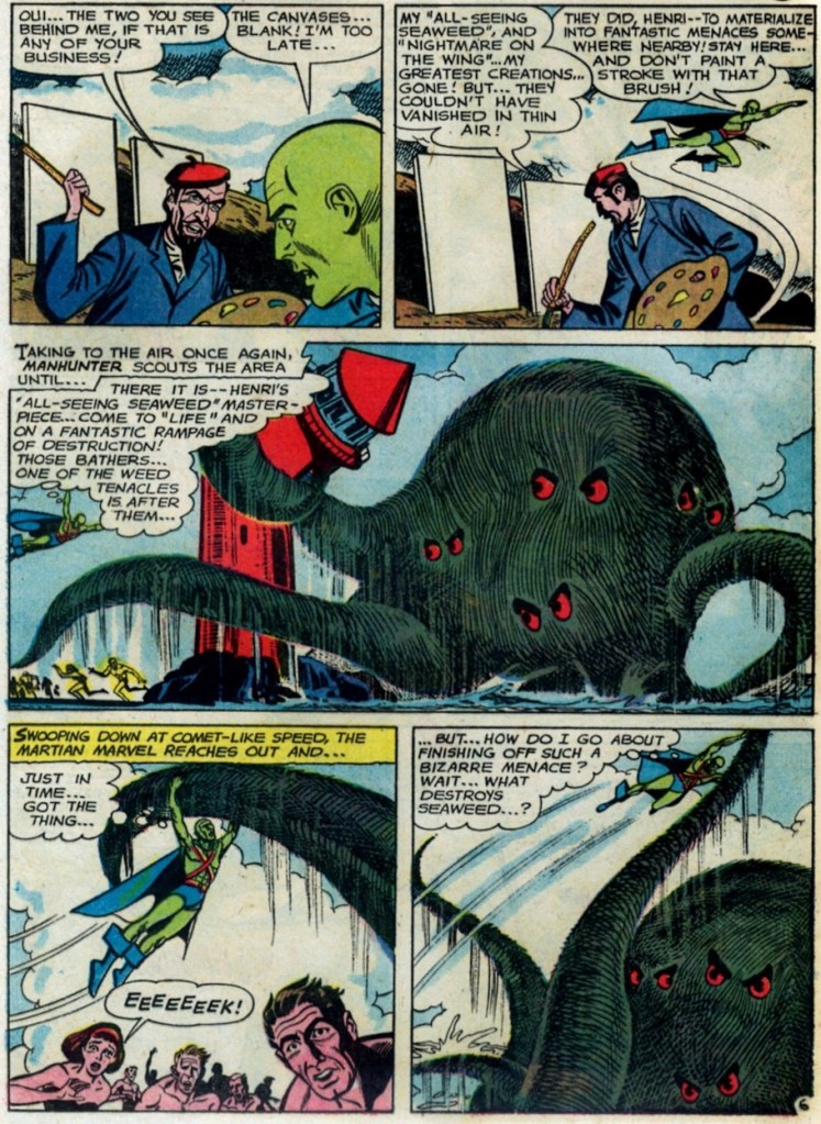
When the indefatigable Carmine Infantino (1925-2013) stepped down from his multi-hatted rôle of publisher, editor-in-chief, cover designer and art director — and so on — at DC, he found that no-one was beating his door down to offer him a similar position.
So he went back to drawing, as a freelancer. As Infantino put it: « Jim Warren was the first comics publisher to contact me after DC. I said “I’ll do work for you, but nothing full-time because I’m busy with other things.” He said, “Okay, whatever you’re willing to give me.” I wasn’t really comfortable with the Warren material — it was the sexiest work I’d ever done! Jim had an older audience and wanted it that way. My feelings about the material never affected the mutual respect Jim and I had for one another. » [ source ]
All told, Infantino pencilled around forty stories for Warren in a span of four years. There was even a brief period when he just about monopolized individual issues of Creepy and Eerie, which was offset by pairing him with wildly disparate inkers. Sometimes the results sang, sometimes they croaked.
Here’s a case of rarely combined styles that nevertheless meshed beautifully: Infantino and John Severin. Let’s face it, who’s more reliably excellent than Mr. Severin?
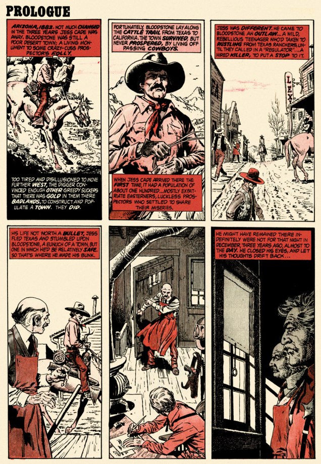
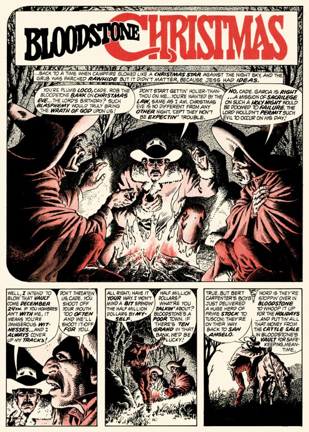
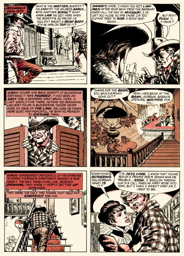
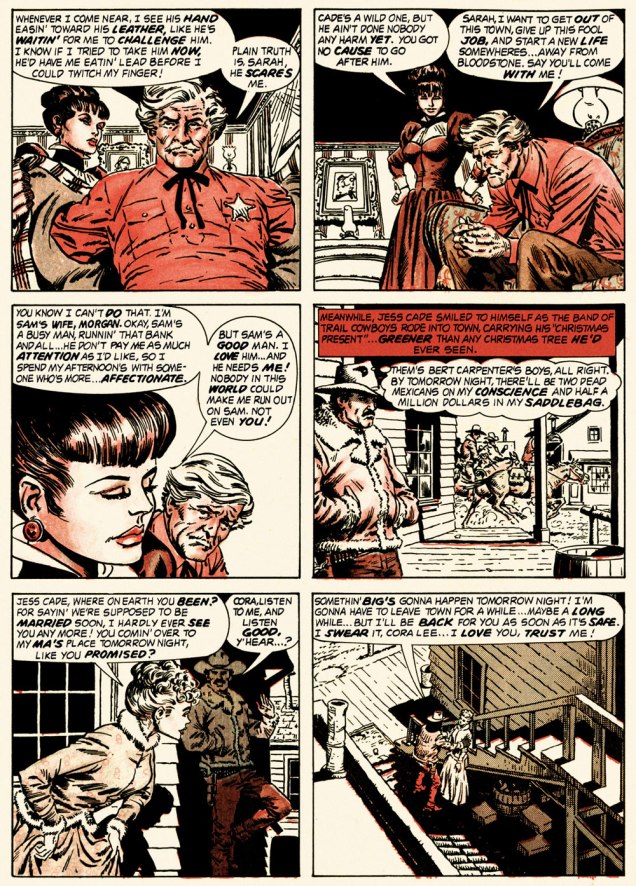
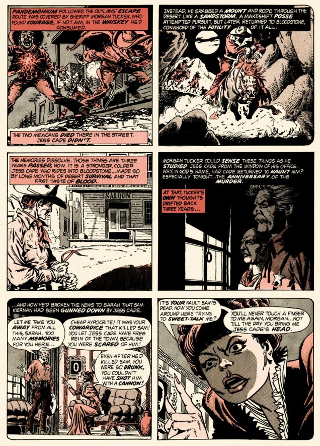
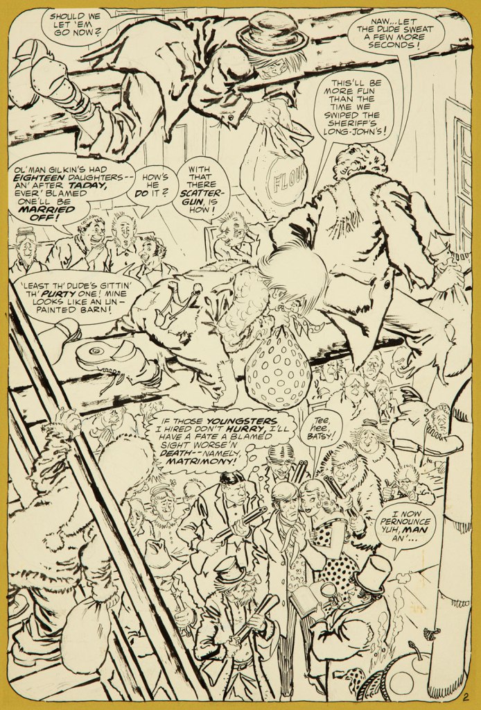
And so this is… Bloodstone Christmas, written by Gerry Boudreau, pencilled by Infantino, and inked by John Powers Severin (1921-2012).
.
.
.
.
.
.
.
I won’t pretend that the entire cast isn’t peopled with stock characters, but its sting in the tail lands satisfyingly, prefiguring the flavour of weird westerns by Joe Lansdale, for one.
.And now, for something sweeter.
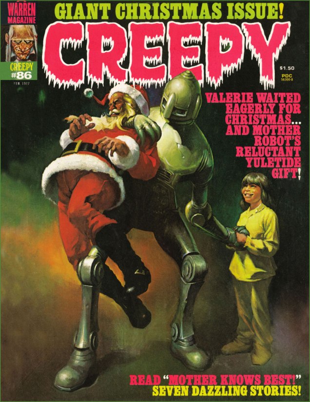
This is Creepy no. 86 (Feb. 1977, Warren). Cover by Ken Kelly (1946-2022).
And now, for the sweeter part of our double-header.
.
.
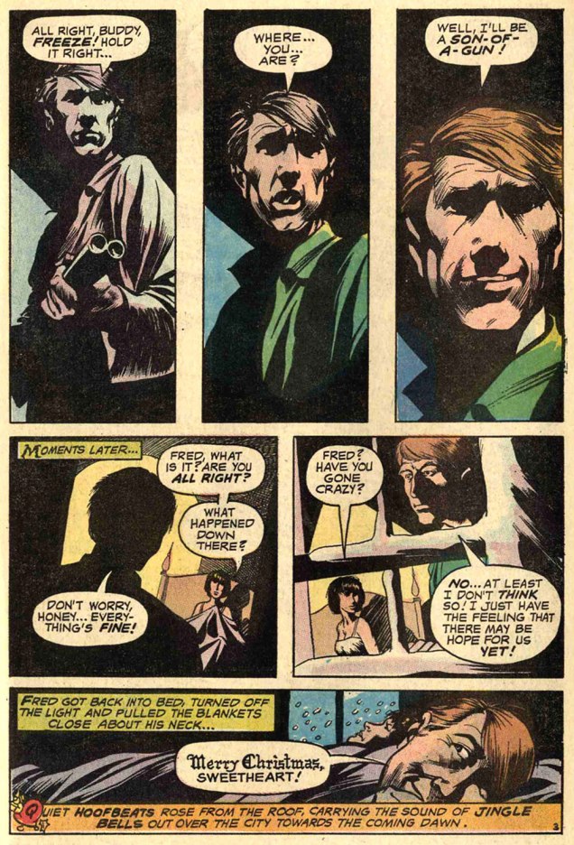
Night Prowler was an early collaboration by Swamp Thing‘s co-creators, writer Len Wein and artist Bernie Wrightson. It was published in House of Mystery no. 191 (Mar.-Apr. 1971, DC). Joe Orlando, editor.
Oh, and Happy Holidays to you, esteemed readers!
-RG
p.s. Oh, and speaking of carmine, the colour, not the man: I just read, a few days ago, in Steve Ettlinger‘s superb Twinkie, Deconstructed (2007), that « the fascinating, rich magenta carmine, also known as cochineal, is extracted from the dried body of the female cochineal insect », and that « the output of the Canary Islands is used almost exclusively to colour the Italian apéritif Campari. » Caveat emptor, then! Ironically, « carmine dye is produced from the acid that females naturally secrete to deter predators. » Not, however, industrious humans.
« May the man who has his finger on the button have a lovely day today / Hope nothing hangs him up or ticks him off or bums him out in any way / Lord, help him keep his cool cause he could pull the final curtain on my play / May the man who has his finger on the button have a lovely day today. » — Larry Wilkerson (as warbled by Bobby Bare)
The idea for this post came to me a couple of days ago, and this afternoon, while cobbling together the visual components, it dawned on me that today’s Memorial Day (Remembrance Day for Canadians, and ‘Victory Day‘ for those afflicted with brain worms and/or syphillis), and therefore quite à propos.
DC’s The Day After Doomsday series first turned up — of all places — in the pages of The Witching Hour, a page and a half bit of filler fluff by Len Wein and Jack Sparling. It must have struck a chord, if not with readers, then with its creators, for the feature stubbornly kept a-rising from its post-apocalyptic grave.
In spite of its episodic and arguably slight nature, TDBD enjoyed surprising longevity. It truly found its home in the Joe Orlando-edited Weird War Tales (1971-1983, DC’s gateway title for war fans into ‘horror’ and vice versa), where most of its dispatches saw print. You never know what’s going to catch on with the unwashed masses.
A most humble beginning for a series, this brief scene appeared in The Witching Hour no. 9 (June/July 1970, DC). Script by Wein, art by Jack Sparling (1916-1997). Dick Giordano, editor.
.
Humour rears its homely head in the concurrently appearing second instalment — too close to call! — this one from House of Secrets no. 86 (June/July 1970, DC). Same creative team.
.
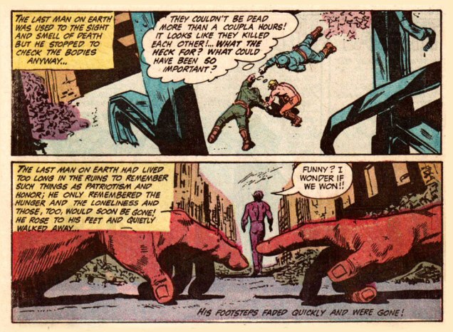
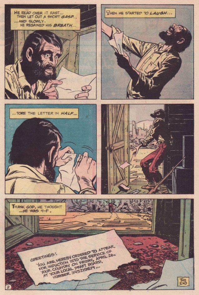
My candidate for the series’ finest hour, this episode elegantly riffs both on the Vietnam War Draft and on Fredric Brown‘s classic 1948 short-short ‘Knock‘, wherein «The last man on Earth sat alone in a room. There was a knock on the door… » 4-F, incidentally, signifies « Registrant not acceptable for military service. To be eligible for Class 4-F, a registrant must have been found not qualified for service in the Armed Forces by an MEPS under the established physical, mental, or moral standards. » And let’s hear it for perennially under-appreciated artiste Bill Draut (1921-1993).
That issue had a splendid cover, and so here it is!
This is Weird War Tales no. 30 (Oct. 1974, DC); cover pencils and inks by Luis Domínguez, from a probable design by publisher Carmine Infantino.
.
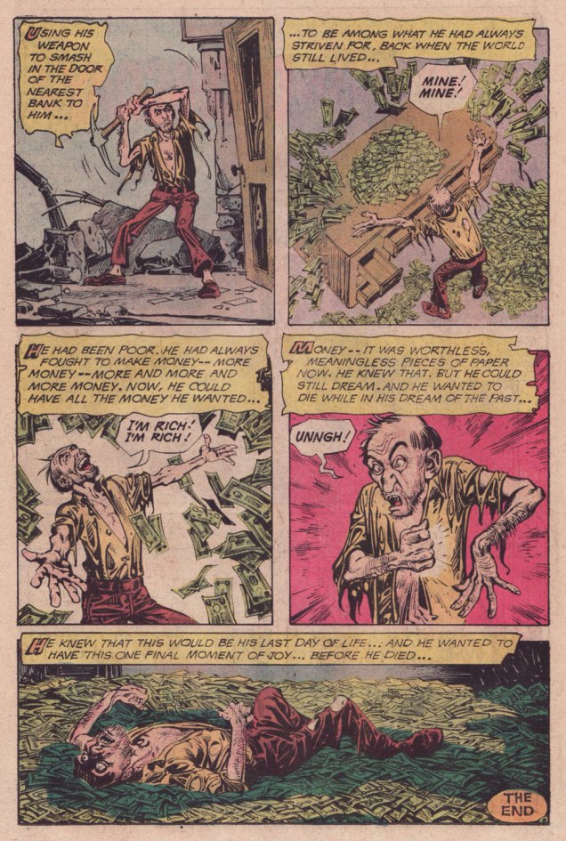
A scroogey teaming of WOT? favourites Steve Skeates and Alfredo Alcala, this turned up in Weird War Tales no. 35 (March 1975, DC). I’ll bet they had trouble deciding whether to run it in Plop! or WWT.
.
Finally, this one appeared in Weird War Tales no. 48 (Sept./Oct. 1976, DC). Script by Skeates, art by Buddy Gernale.
« I think people will believe anything about someone they haven’t seen for a while. » — Gabriel Kaplan
I’ve been meaning to do a Welcome Back, Kotter post for several years. But when I thought about it, I understood that hitching it to the show’s fiftieth anniversary made considerably more sense than, say, its forty-seventh. And while I adore William Johnston‘s sextet of tie-in novels, it would be quite a stretch for a comics blog to cover. Far closer to the mark lies Arnold Drake‘s trio of WBK storybooks, illustrated by Mel Crawford and Jack Sparling. But in the end, I bided my time and managed to get in touch with the scribe first assigned the Kotter Komic assignment, Elliot S! Maggin. And boy, am I glad I did. And so, fifty years to the day of the airing of its pilot episode*, let’s talk Kotter!
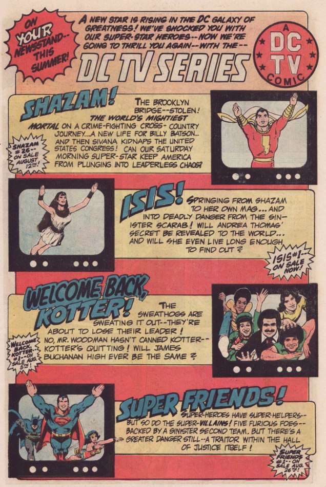
Remember the DC TV line? This ad ran in several DC titles over the summer of ’76.
WOT: First, a bit of context: correct me if I’m wrong, but in the early stages of your career writing comics, you always worked alongside editor Julius Schwartz. Then, in late ’75 or early ’76, something changed, and you began writing for other editors’ titles. What’s the story?
ES!M: Well, Julie was kind of proprietary about me for most of the time I was working with him.
WOT: A sideways sort of compliment.
ES!M: I guess. At some point, Dorothy Woolfolk was editing the Lois Lane book, and… he introduced me to her. She just came into his office for some reason. She said: « Oh, you know, you should write some stuff for me! » And he said « No, he’s very busy, go away! » And he chased her out of the office. And I’m thinking, « Oh, okay. That’s how we’re doing it. »
So I didn’t really go about… I didn’t really make friends with many of the other editors. I tried to make friends with Joe Orlando. You know, I’d have lunch with him once in a while, I guess.
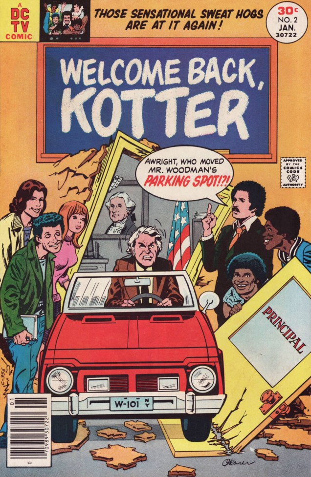
This is Welcome Back, Kotter no. 1 (Nov. 1976, DC); cover by Bob Oksner.
ES!M: But around the time Kotter came out…
You know, people used to hang out outside of Julie’s office door, listening to us plot, because it was so loud. We would yell and scream at each other constantly. He was this Jewish boy from the Bronx, and I was this Jewish boy from Brooklyn, and once I got comfortable working with a guy thirty-five years older than me, we’d just fight all the time. And every once in a while, we’d get serious.
WOT: Serious fighting, or serious work?
ES!M: Yeah, yeah! The fighting was work.
WOT: Sometimes that line is dreadfully thin.
ES!M: I guess at that point, he got mad at me, and I didn’t get work for a couple of weeks. I went to Joe, and I said: « What ya got? », and he said he’s doing this Welcome Back, Kotter book, and I said « Great! I watch that show, that’s fun. » So I wrote the first issue, and that was fine.
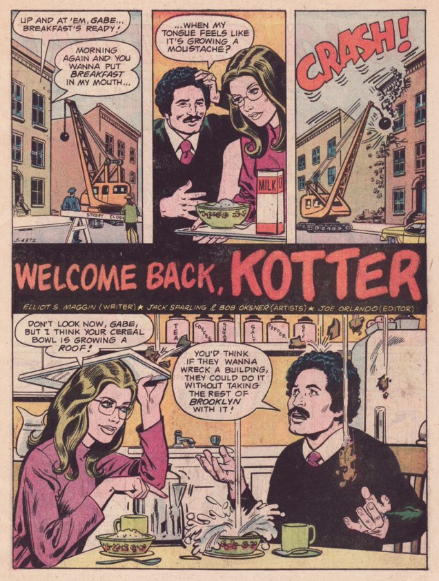
Here’s a quartet of pages from the première issue. Pencils by Sparling and finishes (and surely likenesses) by Oksner.
.
.
Aw, Maggin’s Mr. Pevey would have made a great addition to the TV show’s cast.
ES!M: They called me down in Carmine‘s office, to watch episodes of the show. It had been on maybe six weeks at that point. Episodes I had already seen, but I liked hanging out in Carmine’s office, because it was big, and he had a lot of toys around. So they set up this video tape… thing, and I watched the shows again, and I wrote the second issue.
This is Welcome Back, Kotter no. 2 (Jan. 1977, DC); cover by Oksner.Art-wise, the second issue seemed comparatively rushed, and sans Oksner, likenesses pretty arbitrary. See what I mean? The GCD attributes the inks to Sparling, but I lean towards Frank Springer.
ES!M: I was living in an apartment complex on Long Island, and there were all these kids around… little kids. And I would work at home, mostly. So they would hang around with me, whenever they realized I was home. They would… shoot me through the window or… something. At some point, whenever I’d write a gag, I would…
WOT: … run it past them?
ES!M: Yeah! And they’d laugh, and run off and play some more. And I figured, as long as they laughed, it was okay. Because they were hearing the voice of Barbarino, or whoever. At some point Travolta would say, « Uh? », or « Duh », or « What d’you think? », something dull, that he delivered in a funny way. And the kids related what I wrote to what Travolta did on screen, so they were getting it. And at some point I realized that Joe [editor Orlando] didn’t watch the show.
WOT: Oops.
ES!M: And he would then object to my Barbarino bits, or Horshack bits, or whatever. So I told him « You’ve got to watch the show, you’ll get it! » But you know, after maybe… how many issues did I write, three, four?
WOT: Just two, I’m afraid. You wrote the first couple, then Tony Isabella did one, then Mark Evanier…
ES!M: I’m sure he (Evanier) watched the show — he watched everything.
WOT: He was even the show’s story editor for part of its second season. So… then Bob Toomey wrote four issues, Scott Edelman two, and there was a leftover story by Evanier that saw print in the WBK Collector’s Edition in 1978.
ES!M: But Joe did not. I mean, he didn’t have time, and he was madly in love with his wife, and he didn’t watch television at all (laughs). He wasn’t paying attention to the source material.
WOT: That happens. But it seems a pretty unfortunate blind spot for a book’s editor.
ES!M: I wrote two issues, and at some point, Joe said: « You can’t write! ». He said « No, you can’t write! » A blanket condemnation of everything I’d ever done.
WOT: Oooh.
ES!M: By that time, I’d made up with Julie, and I was writing more Superman stuff. After that, wherever any of my fights with Julie got serious, I’d go down the street to Marvel, and do something there. Then I would make up with Julie, and they’d never see me again… until I had another fight with Julie.
That was my experience writing Kotter.
And here’s what undoubtedly has to be the Guernica, if you will, of Kotter art: Bob Oksner‘s superlative cover for Limited Collectors’ Edition C-57, from 1978, DC’s final — and finest — WKB publication. Feel free to open it in another tab for a fuller view… I provided a larger image so you can fully take in the wealth of details.
WOT: In closing, how are you keeping busy these days?
ES!M: I just wrote a book called Lexcorp. A novel. Which you should probably plug.
WOT: Done!
ES!M: It’s a first-person story that Lex Luthor tells. And he identifies himself as an unreliable narrator, like… Huckleberry Finn. But it does tell the story of how he saves the world. Stuff like that.
I’m working on another book, working on a time travel story. And my ex-wife asked me to write an autobiography so my grandchildren know who I am.
I have all these people I know with Pulitzer Prizes; and at some point in the autobiography, I wrote: « I have about a dozen Pulitzers floating around through my life, and none of them are mine. This book is available for consideration. »
WOT: Mr. Maggin, thank you so much for taking the time to share these stories with us!
-RG
*the pilot episode, for some reason, was aired third, on September 23, 1975, while the show premiered on the 9th of September with ‘The Great Debate‘ (featuring a wonderfully smarmy James Woods).
« With pen and ink, I can achieve a scratchy, foggy effect that is appropriate. It was a continual process of learning. » — Nick Cardy
While WOT? favourite Nick Cardy (1920-2013) — who would turn one hundred and four years old today! — spent a lot of time chronicling the undersea adventures of Aquaman, his lingering true love, despite his busy schedule as DC’s premier cover artist, was the Teen Titans — he contributed, either as penciller, inker… or cover artist — to all forty-three issues of the original series.
And what I loved most about editor Murray Boltinoff‘s books is that they were packaged as horror books even when they nominally featured superheroes, a welcome respite. The costumes seemed an afterthought, a most unusual and refreshing attitude. Here, then, is a gallery of Mr. Cardy’s moodiest, most sinister Teen Titans cover artwork.
This is Teen Titans no. 33 (May-June 1971, DC). This is Teen Titans no. 34 (July-Aug. 1971, DC). Lettering by Ben Oda.This is Teen Titans no. 35 (Sept.-Oct. 1971, DC).This is Teen Titans no. 36 (Nov.-Dec. 1971, DC).This is Teen Titans no. 41 (Sept.-Oct. 1972, DC).This is Teen Titans no. 42 (Nov.-Dec. 1972, DC).This is Teen Titans no. 43 (Jan.-Feb. 1973, DC).
« I was a peaceful sedentary man, a lover of a quiet life, with no appetite for perils and commotions. But I was beginning to realise that I was very obstinate. » — John Buchan
Over the course of several posts, I’ve extolled at length Carmine Infantino‘s skill as a cover designer. Yet the ability to envision and execute a single static image does not automatically translate into the skill of clearly and tidily breaking down a story into a suite of sequential panels, in much that same way that a superbly dexterous surgeon may be incapable of writing legibly. It pleases me to declare that Mr. Infantino’s no one-way specialist.
Infantino describes the evolution of his visual thinking: « The use of negative and positive shapes inside the panel had to mean something. So, to me, if the shapes didn’t draw the eye in, then they weren’t worthwhile. I had to move and change the shape to make it work for me. And that’s what I did. For me beforehand, the figure was the most important thing, and nothing else in the panel mattered. But later on, I found out that it was the total figure I had to worry about. » (all Infantino quotes excerpted from The Amazing World of Carmine Infantino: an Autobiography (2000, Vanguard Productions; edited by J. David Spurlock)
I’ve long wanted to feature this particular tale… for both script and artwork reasons. However, my copy was in Mysteries in Space: The Best of DC Science Fiction Comics (Apr. 1980, Simon and Schuster/Fireside; Michael Uslan, editor)… and I’d be all-but-guaranteed to destroy this beloved book in any attempt to scan from it. But — aha! — I’ve recently acquired a copy of DC Special no. 13 (Jul.-Aug. 1971), which granted the tale its first encore. Game on!
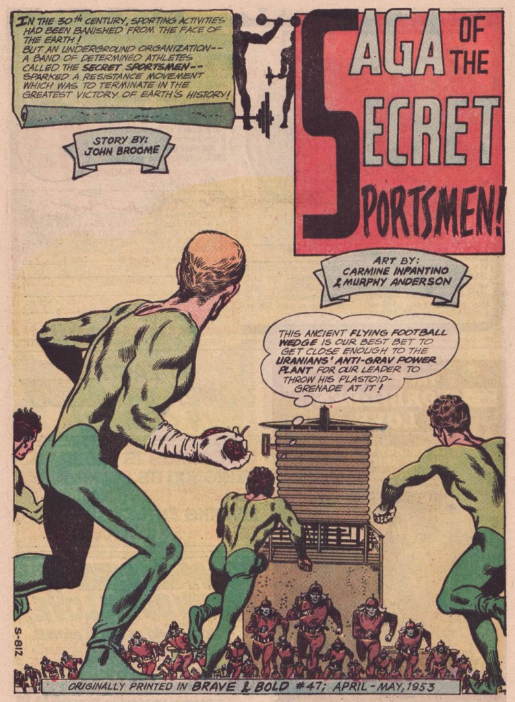
Someone slightly goofed here : The Brave and the Bold no. 47 was published in April-May 1963, not 1953.
.
« The silhouettes I used in ‘Strange Sports Stories‘ [featured in The Brave and the Bold nos. 45-49] were innovations. Julie [editor Julius Schwartz] gave me the script and said, ‘We want this book to look different.” That’s all he said, and I went home and what I devised to make it look different was by using silhouettes as a dramatic device. The action starts in the silhouette, and then you go to the conventional panel, and the action follows through. One might almost call it an animated treatment. »
.
.
.
.
.
.
.
.
.
As smooth and effective as the Infantino-Anderson pairing looks, there was some friction behind the scenes. Infantino explains: « I was beginning to experiment at the time and I threw anatomy out in favor of a higher level of design. Murphy was an excellent draftsman and I’d try to explain what I was trying to achieve to him but this was quite contrary to his own sensibilities. The more stylized I became, the more he thought the work had to be ‘fixed up‘. At one point, he asked for a raise because he had to change my work so much. What he thought he had to ‘fix‘ was the new style I was most excited about. »
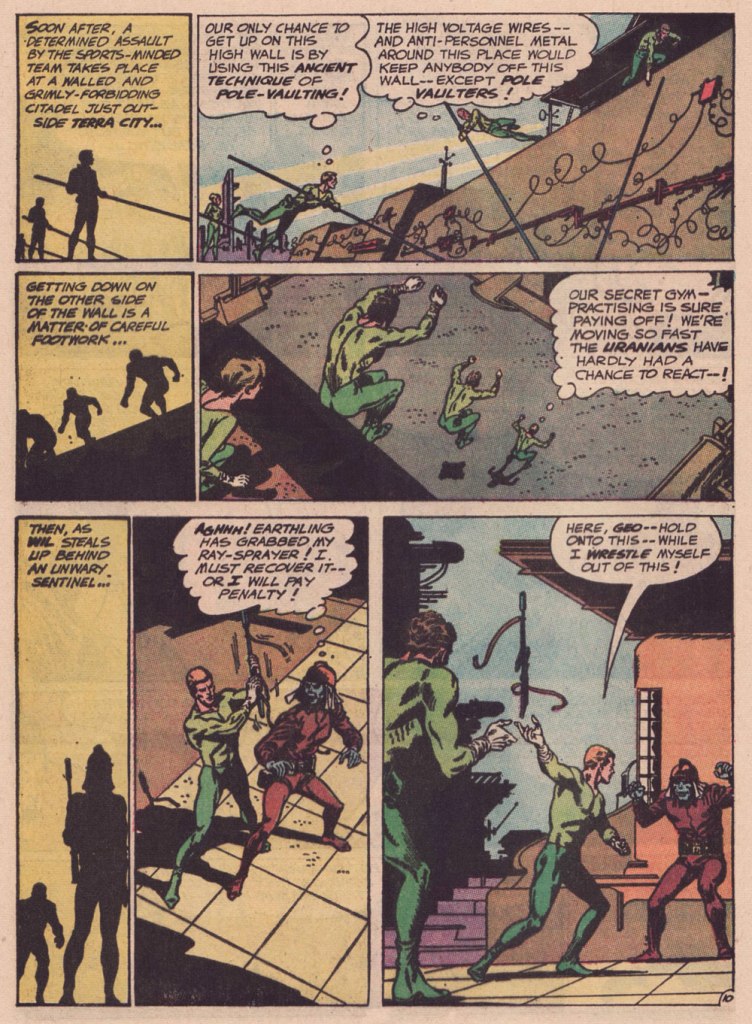
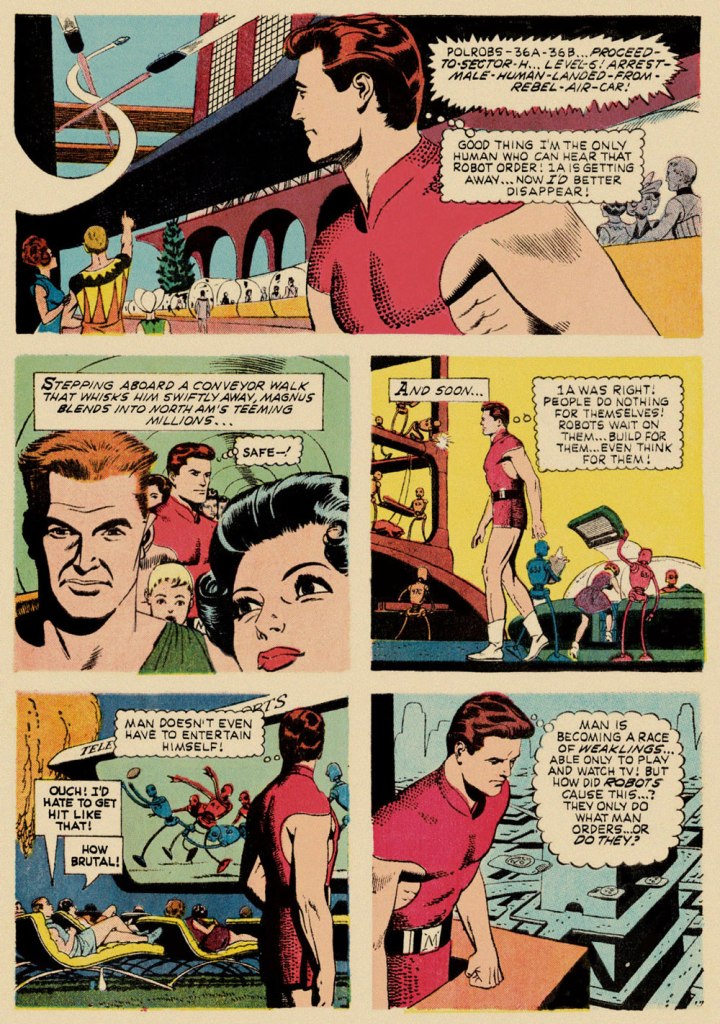
Our featured story shares a central perspective with Russ Manning‘s rightly celebrated Magnus, Robot Fighter, whose inaugural issue had come out a mere two months earlier — though with that close a gap, it’s most likely a simple case of coincidence.
A relevant page from Magnus, Robot Fighter 4000 A.D. no. 1 (Feb. 1963, Gold Key); story and art by Manning, with input from editor Craig Chase, who initially pitched the idea of a SF hero to the publisher.
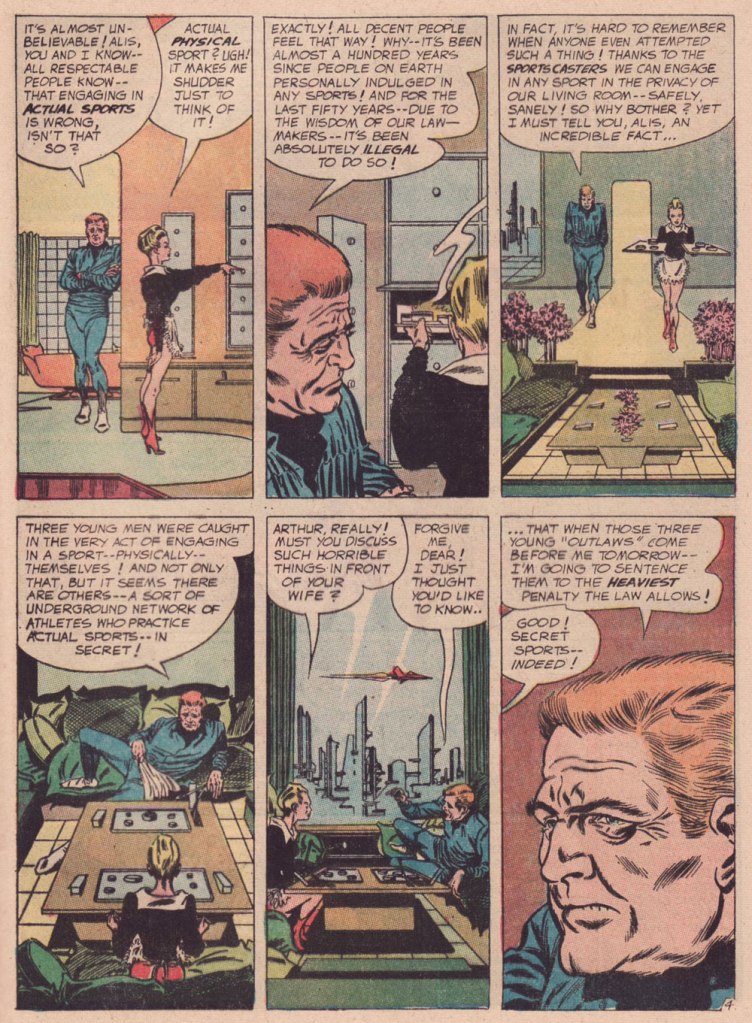
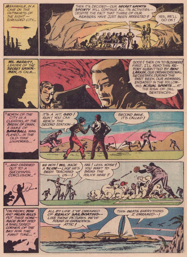
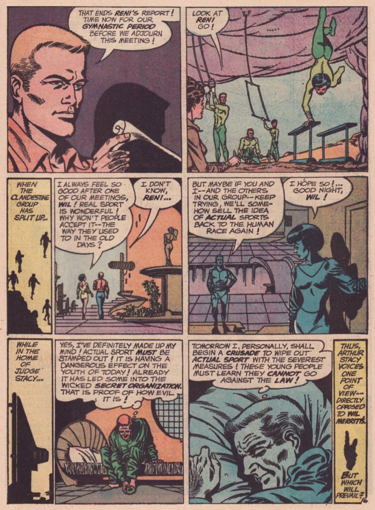
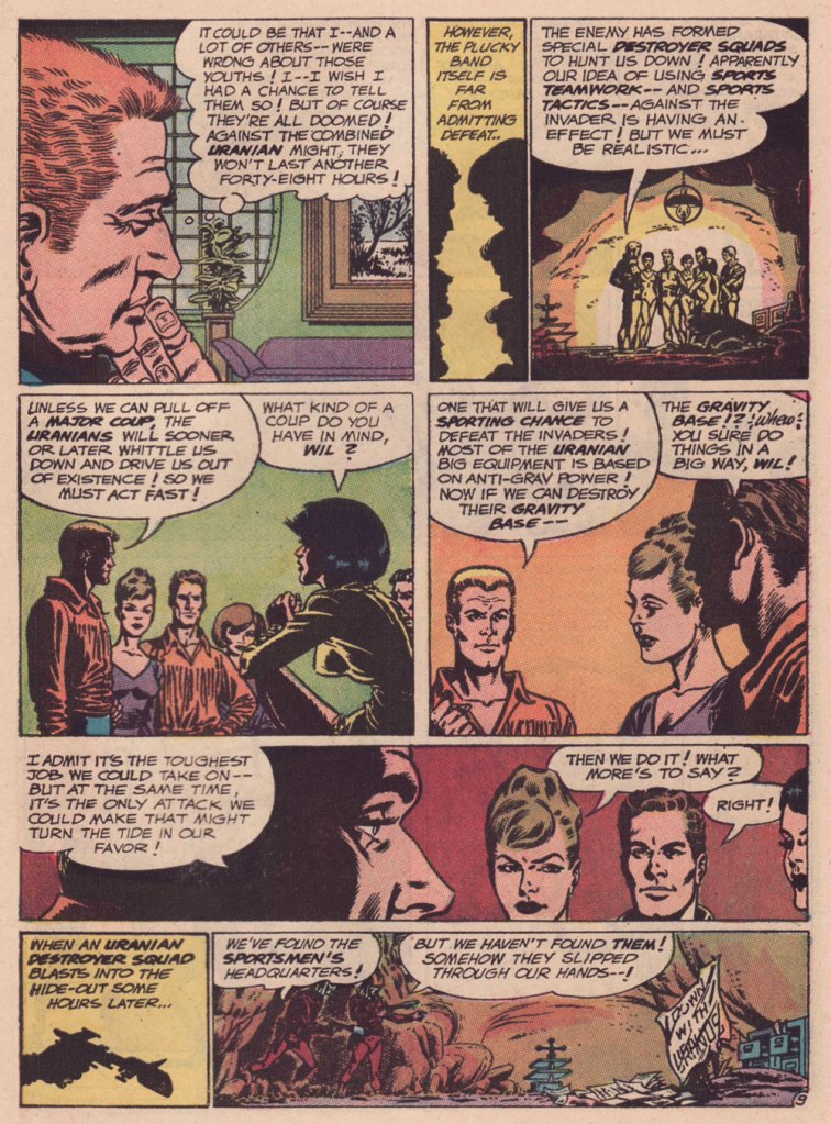
Are we getting less physically able with every succeeding generation, as our elders have been claiming for eons? Is it just a mistaken, shallow assessment arising from tone-deaf obduracy and bad faith — or have our forerunners all been correct about a general and ongoing decline?
« You should be ashamed, Mr. Lash! Making such noises in front of the children! »
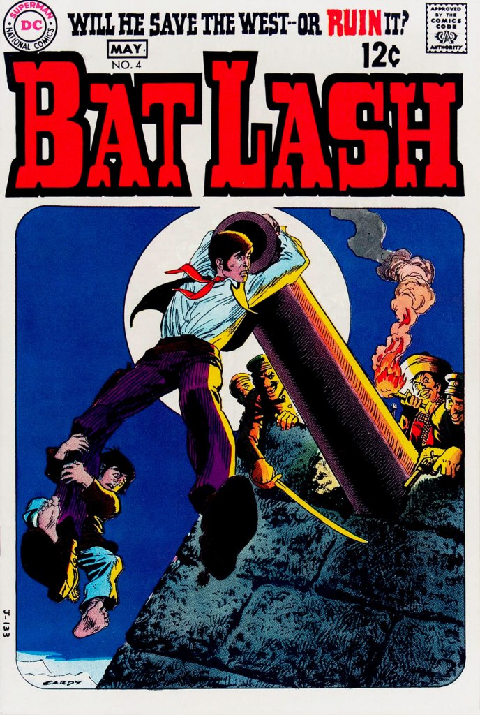
Bat Lash was introduced with issue 76 (August, 1968) of DC’s launching pad title Showcase, wedged between the respective débuts of Hawk and Dove and Angel & the Ape. At various stages of his conception, the character of Bartholomew “Bat” Aloysius Lash reportedly went through the hands of Carmine Infantino (who designed or at least supervised all of the following covers), Joe Orlando, Sheldon Mayer and Sergio Aragonés. Sergio plotted and thumbnailed the mise en scène, Dennis O’Neil added dialogue, then Nick Cardy pencilled and inked. For such a product-by-committee, Bat Lash is quite remarkably good — but then consider the talent involved!
Mind you, I make no claims of originality for Bat — he was distinctly a product of the times, when the vogue of Spaghetti Western had peaked* and ironically left its (off)brand on its model. By the time — in 1968 — its market reached its apex, the Italian Oater idiom threatened to congeal into a morass of clichés, becoming, as these things tend to go, (over)ripe for self-parody. Intentional and otherwise.
I surmise that the key model for Bat Lash was the ever-charming Mario Girotti**, reportedly enlisted thanks to his resemblance to the intense but one-note Franco Nero, even replacing the latter in his star-making, titular role of Django (1966) for a 1968 sequel, Prepare a Coffin, Django.
Ripe for its time it may have been, but I suppose that American audiences were still quite allergic to jarring tonal shifts in their entertainment (now commonplace), and would be for some time — just ask, say, John Carpenter. So the blend of light comedy and dark drama that Bat Lash proposed must have been difficult to market.
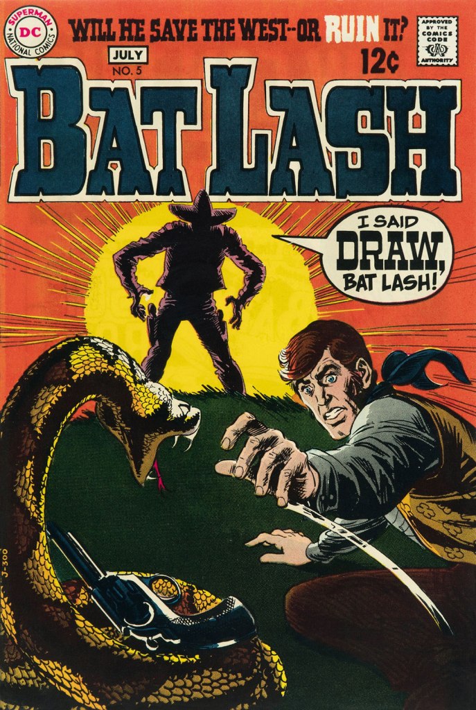
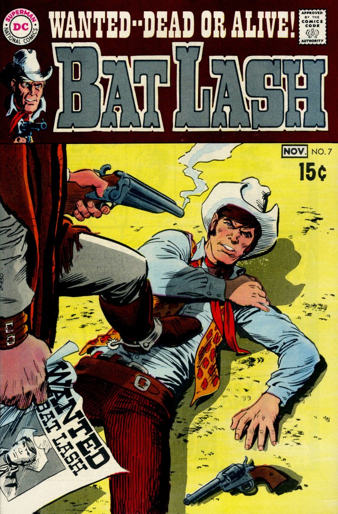
Our streak begins with Bat Lash no. 2 (Dec. 1968-Jan. 1969, DC) since the covers of Showcase no. 76 and Bat Lash no. 1 were good, but not — imho — great. I daresay this one is, in fact, the finest of the lot, with Cardy at his most Tothian.A peek inside the same issue, for contrast: lively and loose inking over rock-solid pencilling, and miles away from the tone of the cover. My guess is that some people weren’t happy.Bat Lash no. 3 (Feb.-Mar. 1969, DC) highlights the comedic side of the feature, which all but evaporated by the last two issues.This is Bat Lash no. 4 (Apr.-May. 1969, DC). Dig Cardy’s expert use of the ‘drybrush‘ technique on the stones.This is Bat Lash no. 5 (June-July 1969, DC). I’m reminded of a similar, later cover featuring one of Bat’s successors, Jonah Hex. The price goes up and the comedy… just goes. This is Bat Lash no. 6 (Aug.-Sept. 1969, DC).… and there goes the original tagline. This is the final issue, Bat Lash no. 7 (Oct.-Nov. 1969, DC)… and so must end this particular hot streak.
And now, some choice bonuses!
From issue 7, editor Orlando gives us some cheeky insight into the creation of an issue of Bat Lash.And plotter Aragonés provides some visual direction. To give you a sense of the less flippant, but not altogether grim, tone of the later issues, this is page two from issue 7. DC Comics of that period were quite ambitious with the limited means of the four-colour reproduction process, using plenty of backlighting and projected light… quite another level.
I was *delighted* to see ol’ Bat Lash turn up in the Weird Western Tales of DC’s outstanding Justice League Unlimited animated series, , along with some of his distinguished colleagues. In the usual order: Ohiyesa ‘Pow Wow’ Smith, El Diablo, Bat Lash, Jonah Hex.
-RG
* “In 1968, the wave of spaghetti Westerns reached its crest, comprising one-third of the Italian film production, only to collapse to one-tenth in 1969.” [ source ]
« I was always concerned more with the visuals than with the copy — and the visuals had to be provocative! » — Infantino*, in a nutshell.
To recap, under the parameters I’ve set for this category a hot streak is a series of outstanding consecutive covers by a single artist (inkers may vary) on the same comic book title. Since it’s my party, I occasionally make allowances (e.g. allowing entry to a scruffier, but still presentable, specimen), but it’s more challenging and more fun to play it straight.
By my reckoning, there are very few truly great cover artists to begin with, and their output is often stifled by indifferent, incoherent or hostile art direction, poor lettering and colouring choices beyond the unfortunate artist’s control, lack of interest in the imposed subject matter… you get the picture. And there’s also the difficulty of getting a decent streak going when the editor keeps shuffling cover artists.
The artist in his suit and tie (and cigar!) days at DC.
I’ve gone on at length (I refer you in particular to Hot Streak: Nick Cardy’s Aquaman, Previously) about the gargantuan amount of work Carmine Infantino (1925-2013) knocked out conceiving comic book covers during his executive years at DC (1966-75), but most of his best designs were executed by others. I mean the man was already doing the work of five people, what more could he do?
« At DC Comics, I worked round the clock, including weekends, and never taking a vacation in the 10 years I served there. I not only was creating new titles, designing most of the covers, plotting stories and going on the road for the distribution of the magazines, plus doing radio shows and then running out to California to be totally included with Puzo and the producers creating the Superman movies I &II. Time got so tight that I would design covers on the way to the airport and have the driver deliver them to Sol Harrison, who in turn gave them to the waiting artists. I would be at my desk from 7 a.m. to 9 p.m. It began to be a destructive grind. »
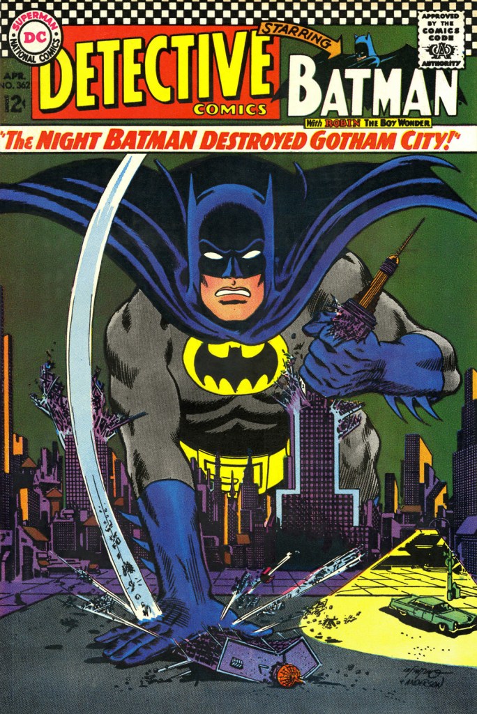
While Carmine is most closely associated with Silver Age characters The Flash and Adam Strange, I couldn’t discern, in these titles, a run of sufficiently stellar *and* consecutive covers (Flash nos. 139-142 and Mystery in Space nos. 69 to 71 come closest… do bear in mind that I have no consideration for ‘key’ issues or ‘famous’ or ‘event’ covers). It’s no real surprise that Infantino’s design work rose to a crescendo of accomplishment and consistency when he was made the company’s de facto art director, late in 1966. And what was he working on at the time? Batman. So, since Detective no. 261 bears a ho-hum cover and no. 269 is pretty spiffy, but the work of Gil Kane, here’s Mr. Infantino’s hot streak:
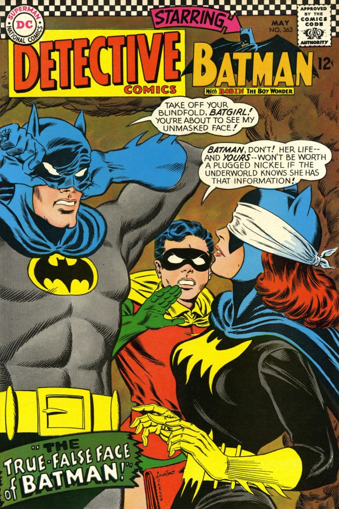
This is Detective Comics no. 362 (Apr. 1967, DC), pencilled by Infantino and inked by Murphy Anderson. Carmine wasn’t a fan of the so-called ‘Go-Go Checks’, that checkerboard pattern that once famously adorned those distinctive yellow NYC cabs. He didn’t mince words, either: « What a ridiculous thing: it was the stupidest idea we ever heard because the books were bad in those days and that just showed people right off what not to buy. ». Certainly, in the case of Detective Comics, they left the top of the page far too cluttered.This is Detective Comics no. 363 (May 1967, DC), featuring (this) Batgirl‘s second appearance. She’d been created by editor Julius Schwartz and Infantino at the request of the hit Batman TV show‘s producers, figuring that the series needed a heroine for a little extra spice. Art by Infantino and Anderson.This is Detective Comics no. 364 (June 1967, DC). Roy Reynolds, alias The Getaway Genius, was a fun civilian villain whose finest hour, in my view, came at the tail end of 1973 with Batman no. 254‘s King of the Gotham Jungle! (written by Frank Robbins, pencilled by Irv Novick and inked by Dick Giordano), when he was unexpectedly caught between the Batman and the Man-Bat. I wouldn’t be surprised to learn that a Batmaniac or three had reconstructed this Joker edifice in their backyard or basement, out of Lego blocks or papier mâché… or actual bricks.
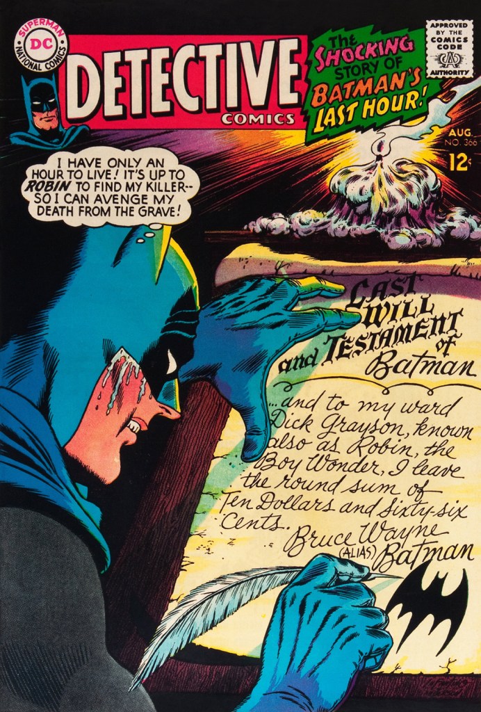
Carmine really went to town on this one, and it’s rightly earned its place in the hall of classics. This is Detective Comics no. 365 (July, 1967, DC). The cover story, The House the Joker Built! is scripted by John Broome, pencilled by Bob Kane ghost Sheldon “Shelly” Moldoff and inked by Joe Giella.Speaking of design, here’s the masterful Ira Schnapp‘s house ad for Detective 365, as it appeared in Green Lantern no. 54 (July, 1967, DC), among other titles.This is Detective Comics no. 366 (Aug. 1967, DC); I love those moody colours and light effects, that tell-tale Infantino candle and the mysteriously parsimonious inheritance bequeathed to Robin.This is Detective Comics no. 367 (Sept. 1967, DC), an intriguing preview of Where There’s a Will — There’s a Slay!, written by Gardner Fox, pencilled by Infantino, inked by Sid Greene. I wonder how many young readers enthusiastically destroyed the cover to assemble the puzzle…
Note also the improved logo placement (a return to issue no. 327 original ‘new look’ logo, actually), giving the layout a chance to… breathe a bit better. The Batman cameo at top left is still de trop.
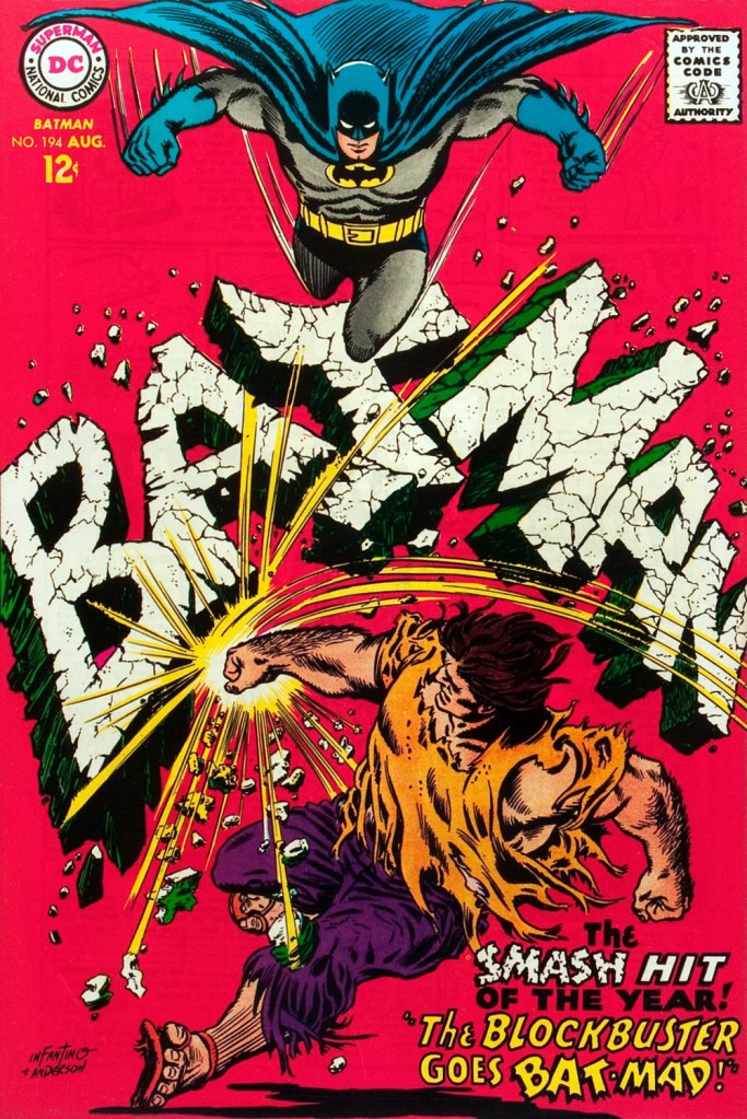
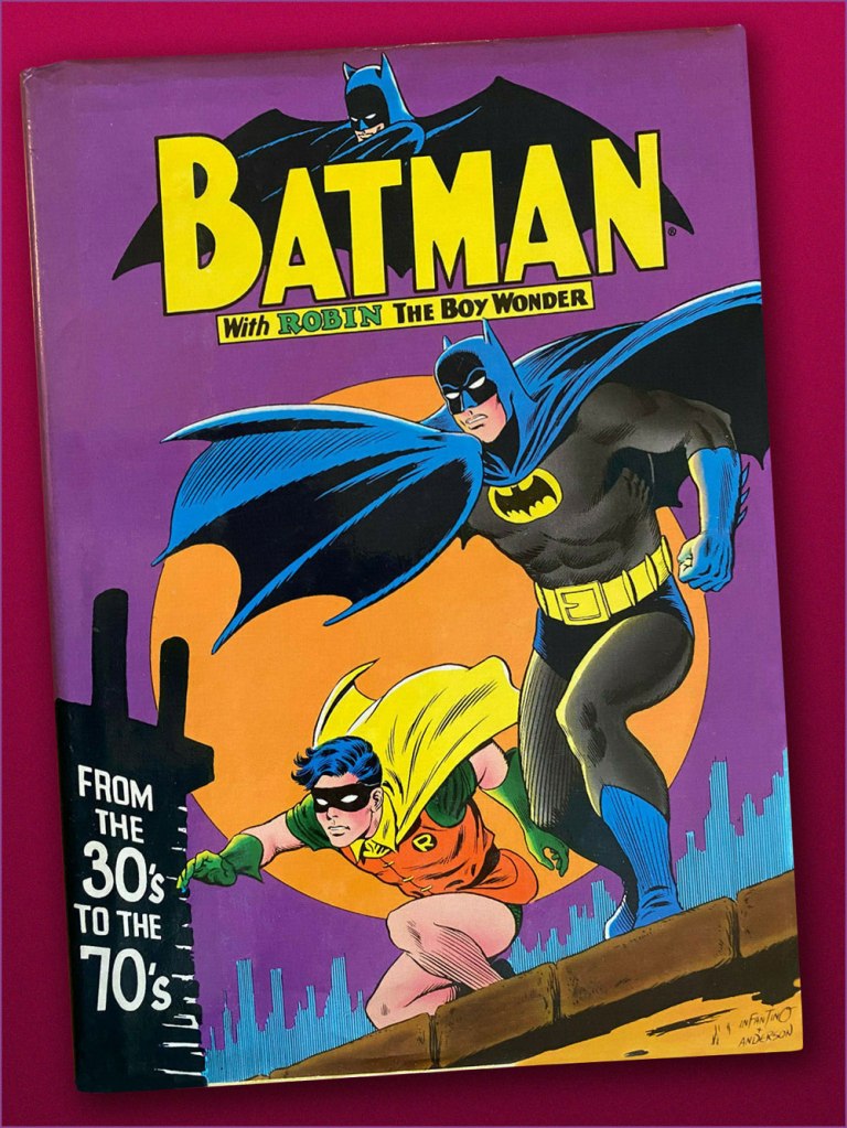
This is Detective Comics no. 368 (Oct. 1967, DC). Infantino reportedly created the covers first, and editor Schwartz assigned his writers to work up a scenario to fit. This one could not have been a cakewalk. Gardner Fox was the unlucky recipient of that gargantuan task.Since it’s not an issue of Detective, this cover’s not *technically* part of the streak… but as it features Batman, and it appeared between issues 365 and 366 of Detective, I’m throwing it in. Infantino and Anderson’s literal and figurative blockbuster of a cover for Batman no. 194 (Aug. 1967, DC). Its cover aside, a pretty ho-hum issue. The book and the character were in urgent need of another overhaul, and it was just around the corner. « When Donenfeld saw this cover, he had a fit! He said, ‘I don’t see the logo on top!’ I said ‘You don’t have to — you’ve got Batman up there!’ »Aw, heck — here’s Ira Shnapp’s accompanying house ad, a work of art in itself, wouldn’t you agree?Speaking of immortal Infantino Batman images: « Aurora wanted action shots of their models, so I did this rough layout, sent it to them, and they liked it! I had a moon behind him, but they dropped it. The tree created the design. I was very high into design at this point (1964) — the design was pouring out of me! ». Here’s a look at the finished model.I couldn’t very well leave out what’s possibly the most famous of Carmine’s Bat-scenes: this is Batman From the 30’s to the 70’s (1971, Crown Publishers) a splendid hardcover anthology. Its cover adapts an Infantino-Anderson mini-poster that originally saw print in Detective Comics no. 352 (June 1966, DC) and bore instead the inscription « Best Bat-Wishes Batman and Robin ». Superman, Wonder Woman and Captain Marvel, er… ‘Shazam’ also got their own historical anthology in this format.
-RG
*unless otherwise specified, most Infantino quotes are drawn from his excellent, profusely visual 2001 autobiography (with J. David Spurlock), The Amazing World of Carmine Infantino (Vanguard Publishing).
« Even as a youngster reading 2000 AD from its first issue in 1977, it was clear that Brian’s artwork was special. It was the perfect mixture of American-inspired dynamism, a British sense of the absurd, and avant-garde European SF imagery, rendered in meticulous, almost inhumanly perfect linework. It was a deeply seductive style… » — David Roach
As far as I can tell, everyone loves Brian Bolland‘s (b. 1951) work. It’s sophisticated in design yet direct, highly detailed yet clean as a whistle *and* neat as a pin, technically adept, varied but unfailingly his. As a sequential cartoonist, he can be a bit stiff, but as a cover artist, he’s pretty untouchable. For about a second and a half, I was tempted to spotlight his work in our Hot Streak! category, but that would have been absurd, such is Bolland’s high level of consistency and volume of work. So I’ll “merely” feature an even dozen of his Animal Man covers (out of a total of 64, 1988-1993).
After Alan Moore made an unexpected splash with his work on Swamp Thing, the folks at DC scrambled, in ‘have you got a sister?‘ fashion, to strip-mine the UK’s writerly talent pool. In came Grant Morrison, Neil Gaiman, Pete Milligan, Jamie Delano, Garth Ennis, Warren Ellis, and so on…
For the cockiest of these writers, the typical bravura move was to prove their commercial acumen by revamping the most obscure existing character they could think of* (typically, characters DC’s then-editors had never heard of); in Gaiman’s case, it was Sheldon Mayer’s Black Orchid**, and in Morrison’s, Animal Man. As minor characters (a lesson learned from Alan Moore’s Watchmen), these heroes could be subjected to numberless and unceasing torments and humiliations at the writer’s whim.
Created by writer Dave Wood and illustrator Carmine Infantino, Animal Man was introduced, sans costume at first, presumably as he was intended as a one-off, in DC’s long-running SF anthology Strange Adventures no. 180 (Sept. 1965). First known as A-Man, he gained his superhero togs in his third appearance, Strange Adventures no. 190 (July 1966). After a mere five appearances in SA, he virtually vanished… until the second ‘British Invasion‘.
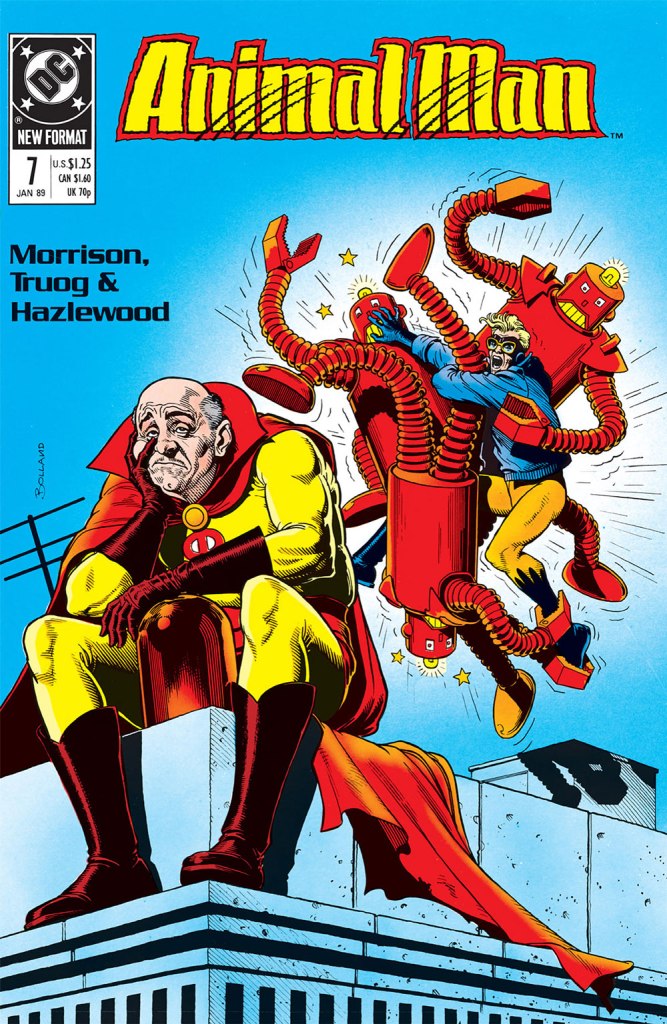
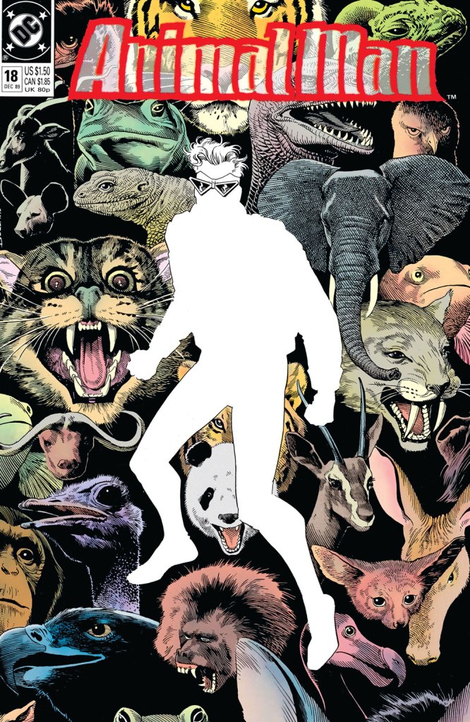
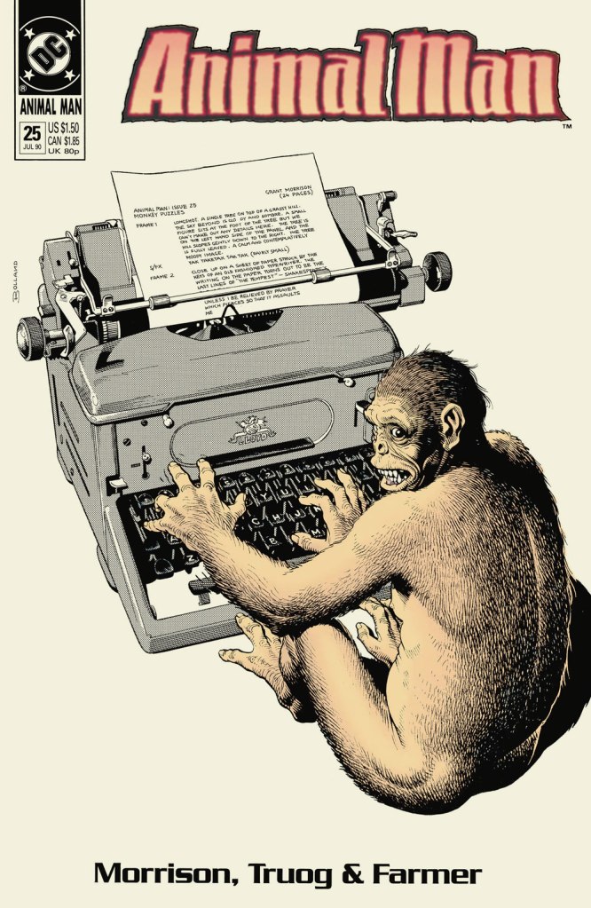
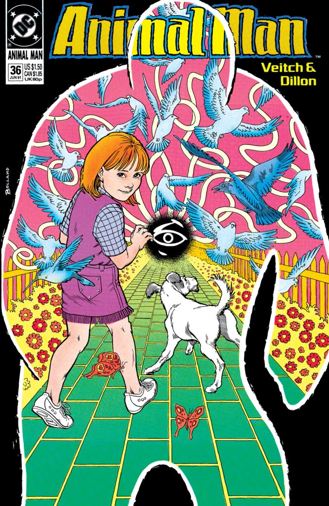
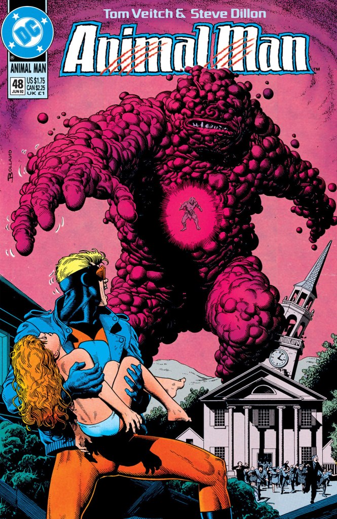
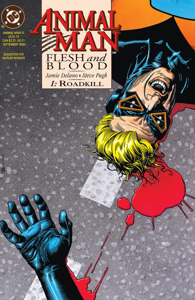
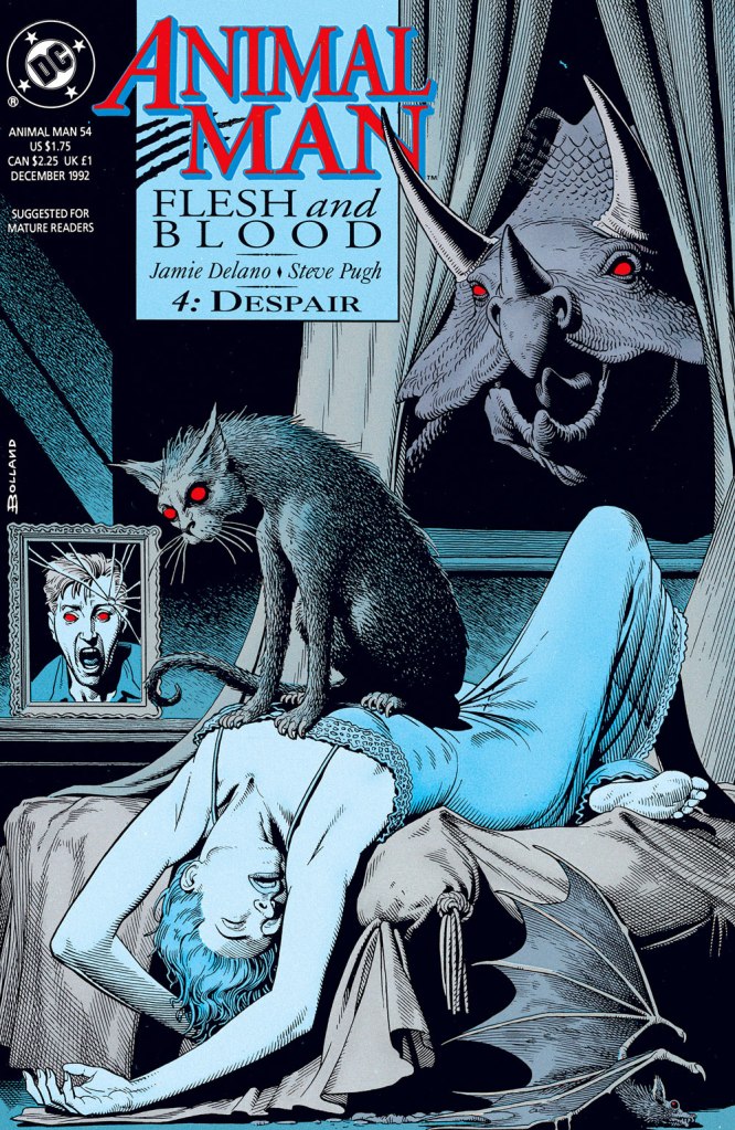
This is Animal Man no. 5 (Winter 1988, DC); logo by Todd Klein. In this celebrated issue, Grant Morrison mashes up the Bernie Krigstein segments of Harvey Kurtzman‘s Bringing Back Father! (Mad no. 17, Nov. 1954, EC) and Alan Moore and Don Simpson‘s In Pictopia! (Anything Goes! no. 6, Dec. 1986, Fantagraphics) then anoints the ointment onto a Wile E. Coyote/Jesus avatar. This is Animal Man no. 7 (Jan. 1989, DC). Bolland’s tonal versatility is a tremendous boon, his superpower, if you will. He brings to this cover a deft comic touch intended, but sadly lacking from the inside story. This is Animal Man no. 18 (Dec. 1989, DC), a clever reverse-emphasis homage to one of the great covers of the 1960s, Carmine Infantino (designer) and Neal Adams (penciller-inker)’s Strange Adventures no. 207 (Dec. 1967, DC), winner of the 1967 Alley Award for best cover of the year. This is Animal Man no. 24 (June 1990, DC). Bolland has a ball redrawing classic Silver Age covers… including issues of Brother Power the Geek, The Inferior Five and Swing With Scooter! The central figure is an old Justice Society foe, the Psycho-Pirate (Mark II in this case), created in 1965 by Gardner Fox and Murphy Anderson. The GCD notes: « Cover prominently features several of the key comics that established the concept of the multiverse (The Flash no. 123, Green Lantern no. 40, Justice League of America no. 21). » Oh, you thought *Marvel* had come up with the ‘Multiverse‘? It’s high time you met Hugh Everett. And while we’re on the subject, here’s a touching song his son wrote about him.This is Animal Man no. 25 (July 1990, DC), a sharp illustration of that old favourite, the Infinite monkey theorem. First writer switch! Morrison out, Milligan in. This is Animal Man no. 28 (Oct. 1990, DC). Back to front: the Notional Man (with the forceps), the Front Page, Animal Man, and Nowhere Man (as in…)A bold change of pace, this is Animal Man no. 36 (June 1991, DC). Milligan out, Veitch in. This is Animal Man no. 41 (Nov. 1991, DC). This is Animal Man no. 48 (June 1992, DC). At the centre of the gloopy pink monster hovers snappy dresser and fellow animal-powered justicer B’wana Beast. This is Animal Man no. 49 (July 1992, DC).Veitch out, Delano in, and a layout change to boot. This is Animal Man no. 51 (Sept. 1992, DC). By now, it’s pretty much a straight horror title.This is Animal Man no. 54 (Dec. 1992, DC), a striking homage to Henry Fuseli‘s immortal painting, The Nightmare.
-RG
*To be fair, their first eighty-five choices likely had proved unavailable.
**Mayer had asked that his 1970s creation, The Black Orchid, never be given an origin or have her mystery dispelled. Gaiman just aped what Mr. Moore had done (but brilliantly) with Swamp Thing… and made her a literal plant. Bah.
JLA’s roster has rotated throughout the years, but for the sake of this post, only the seven original members will get cephalopod tussling privileges! Here they are, with the conspicuous absence of Batman and Superman who are no doubt rushing behind the scenes to rescue everybody (but don’t worry, we’ll get to them as well):
The Brave and Bold no. 28 (February-March 1960, DC). Cover pencilled by Mike Sekowsky and inked by Murphy Anderson.
I’ll start with Superman, otherwise he’ll get offended – you know how susceptible he can be. Rather, a double whammy of Superman and Flash, who stumble upon some rather adorable (aside from their propensity to eating people) tentacled aliens. Of course our superheroes decide to make a race out of it, because concentrating on saving some planet or other is clearly not exciting enough – and Batman just happened to be hanging around to give the starting signal. Some afternoons are just that quiet. Race to Save the Universe!, scripted by Denny O’Neil, pencilled by Dick Dillin and inked by Joe Giella, was published in World’s Finest Comics no. 198 (November 1970, DC).
Nevertheless, this dynamic duo does allow itself to get distracted from its marathon, just long enough to defeat this green cutie:
Don’t underestimate kittens.
Incidentally, Superman already has a Tentacle Tuesday all to himself (Tentacle Tuesday: It’s a Bird! It’s a Plane! It’s a Tentacle!) Still, here he is collaborating (more like ‘rescuing’) Jimmy Olsen from an intriguing green (why must they always be green?) monstrosity with worm-like tentacles. Ugh, not the most appealing. These pages are from The Voyage of the Mary Celeste II!, scripted by Jerry Siegel, pencilled by Curt Swan and inked by George Klein and published in Superman’s Pal, Jimmy Olsen no. 75 (March 1964, DC).
DC’s “Big Three” – its most iconic and popular – are of course Superman, Batman and Wonder-Woman. As far as the latter is concerned, as much as I love this character, seeing as we already have two Tentacle Tuesdays posts in her honour – Tentacle Tuesday: H.G. Peter and Wonder Woman lend a hand and Tentacle Tuesday: More Golden Age Wonder Woman Wonders! – I think I’ve said everything I had to say on the subject. Thus, we move on to Batman, albeit briefly because there is also Tentacle Tuesday: All Aboard the Batmarine! to peruse. He’ll have to share the stage with Superman, but I’m sure he’ll be a good sport about it.
World’s Finest Comics no. 110 (June 1960, DC). Pencilled by Curt Swan and inked by Sheldon Moldoff.
The cover story is The Alien Who Doomed Robin, scripted by Jerry Coleman and inked by Sheldon Moldoff.
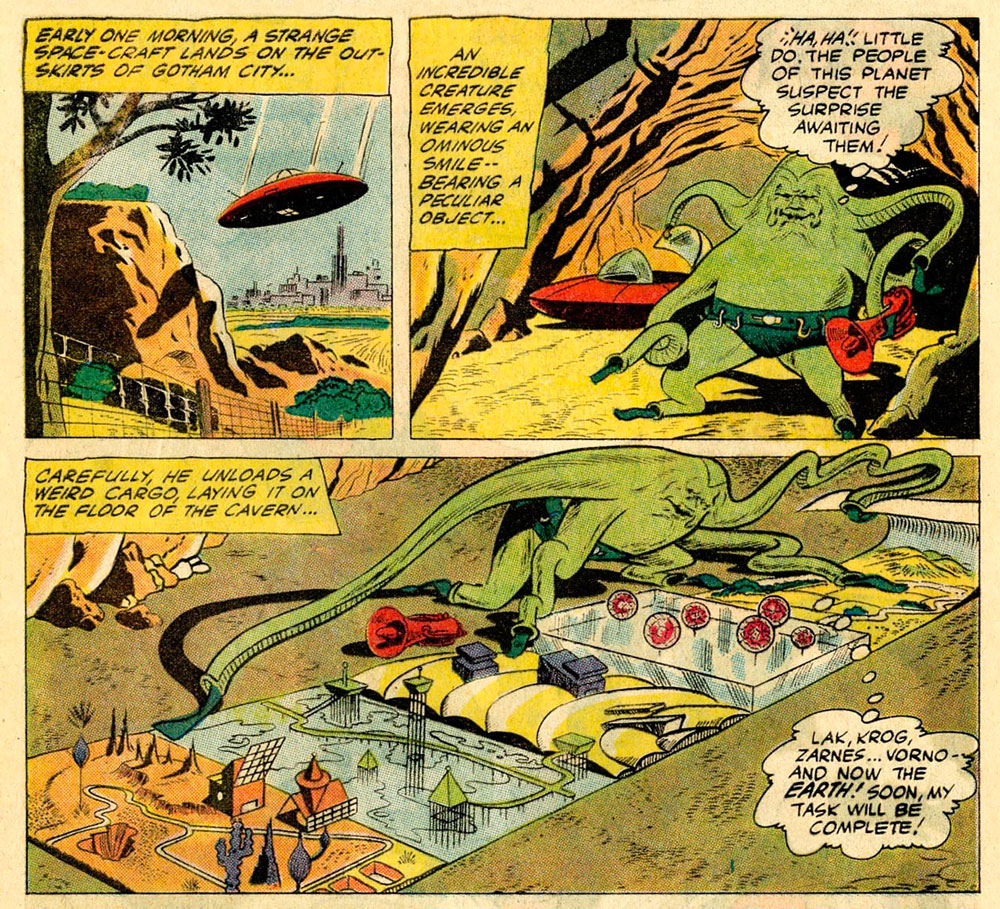
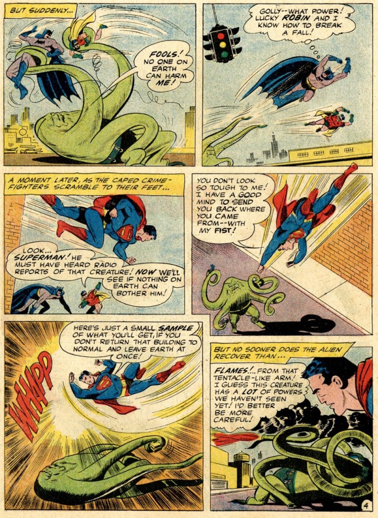
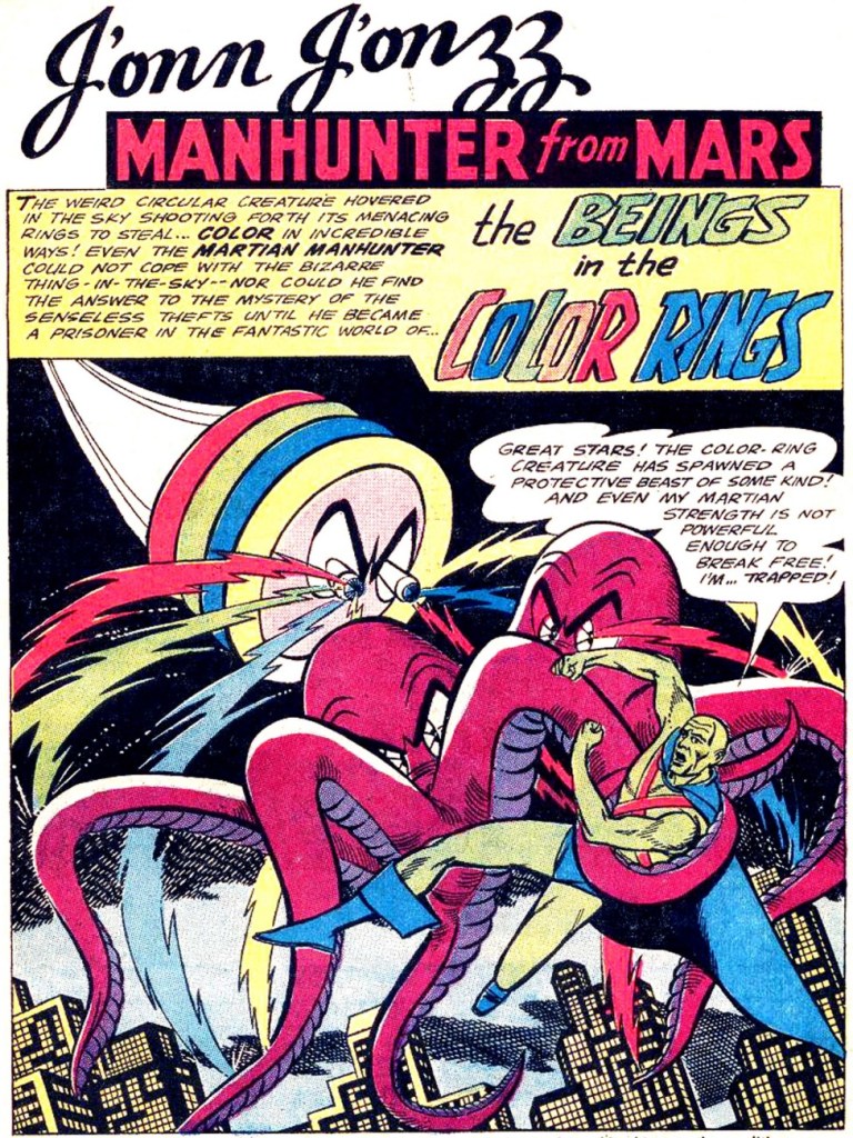
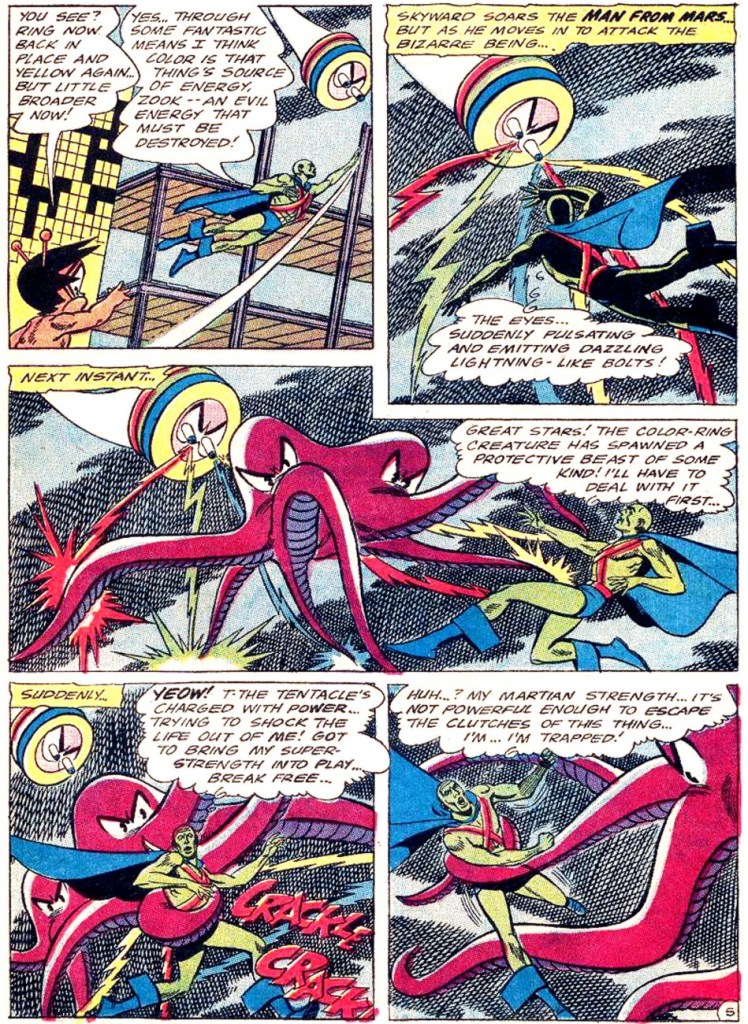
Our next JLA member is the Martian Manhunter, whom I have a strange soft spot for. It’s well known that girls just can’t resist green skin! In honour of this bias, here are not one, but two excerpts from stories featuring tentacles front and centre.
First, two pages from The Beings in the Color Rings, scripted by Dave Wood and illustrated by Joe Certa, published in House of Mystery no. 148 (January 1965, DC).
And for dessert, a page from The Supernatural Masterpieces!, scripted by Dave Wood and illustrated by Joe Certa, published in House of Mystery no. 150 (April 1965, DC).
Naturally, Aquaman has encountered more than a handful of octopuses in his long undersea career – I went on about that in some length in Tentacle Tuesday: Aquaman and his Octopus Sidekicks. I have plenty more where that came from, so there surely be a part II to that particular tale… in the meantime, here is a rather striking cover that didn’t make it into that post.
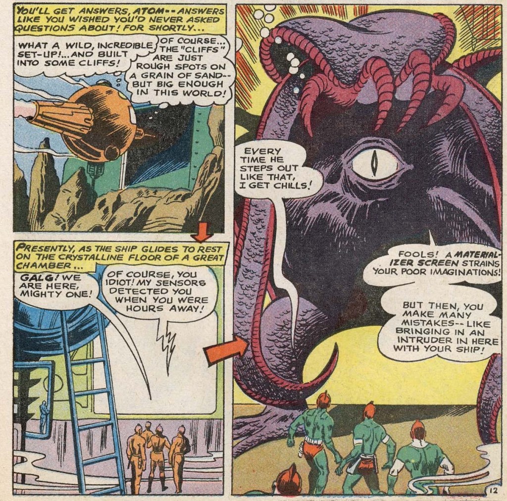
The Brave and the Bold no. 73 (August-September 1967, DC). Cover pencilled by Carmine Infantino and inked by Charles Cuidera.
The cover story is Glag the Destroyer, scripted by Bob Haney, pencilled by Howard Purcell and inked by Sal Trapani.
Last… and maybe least, because I could never warm up to him… is Green Lantern. The following pages are from a story pencilled by Gil Kane, who doesn’t generally get glowing reviews from WOT. Nevertheless co-admin RG wrote an ingenious post combining our common dubiousness about Kane and percolated it through specifically Green Lantern covers – the result is Hot Streak: Gil Kane’s Green Lantern, which impressed, if not quite convinced, me.
Funny Thing Happened on the Way to Earth!, scripted by John Broome, pencilled by Gil Kane and inked by Vince Colletta, was published in Green Lantern no. 70 (July 1969, DC).
I hope you enjoyed this overview of the Justice League of America as filtered through the rather eccentric lens of tentacles.
« Suffering sea snakes! Can this really be happening, Aquaman? » — Aqualad has a query.
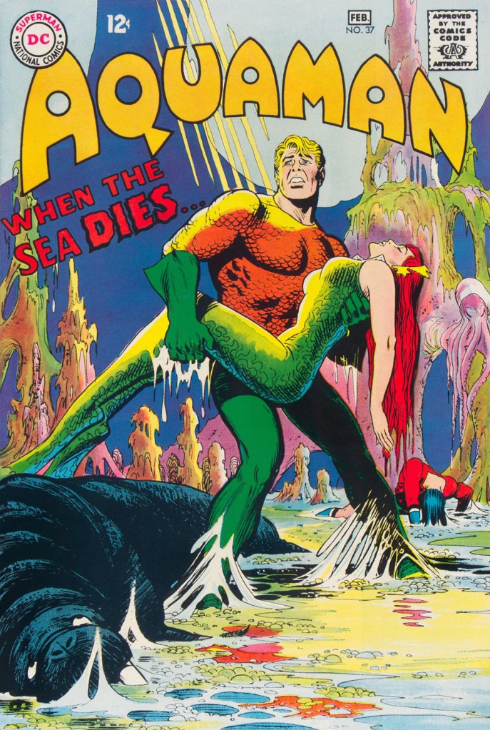
I just realised, a few days ago, that I’d left something hanging for too long: nearly two years ago, I turned the spotlight on a series of Aquaman covers, casually (in my debonair way) letting it be known that there existed another, earlier, and even longer (well, by one) run of exemplary Aquaman covers. The time has come to see whether I was talking through my hat… or not.
Now, at the risk of repeating myself, it must be stated that, since we’re dealing with DC’s late Silver Age, there’s more to any given cover than a signature. DC’s recently-ascended art director, Carmine Infantino, had a hand in designing virtually every DC cover between late 1966 and early 1976. How strong a hand varied from cover to cover, of course. A good designer sometimes knows when to hold back and be invisible, or just about.
Infantino always strove to improve himself and update and hone his skills. Well into his career (he’d started in 1940 at Timely), he pulled an unexpected (and very smart) move. As he recalled it in The Amazing World of Carmine Infantino (2000, Vanguard Productions):
« Around 1960, I went back to school again, this time to study under a gentleman named Jack Potter at the School of Visual Arts. What Jack taught me about design was monumental, and I went through a metamorphosis working with him. I’d sit there confused and he’d tear the work apart. But then it was a light bulb going off – bam! – and I’d understand everything he was getting at.
After studying with Potter at the SVA, my work started to grow by leaps and bounds. I was achieving individuality in my work that wasn’t there before.
I threw all the basics of cartooning out the window and focused on pure design. Everything I did was design-oriented. That was quite the challenging task. But that’s where Potter’s teaching took me.
… I started putting hands in captions, that was decorative. He taught us to do everything decoratively. I’d always found captions very dull. So I thought I’d break the captions into smaller paragraphs and use hands to get people to read them. I regularly pushed design and perspective to the extreme. »
And speaking of reinvention, I must also salute Nick Cardy’s own mid-career creative burst. Prior to the mid-60s, Cardy had always been one of those genteel, tasteful but entirely unexciting journeymen, the way most DC editors liked ’em. I can think of precious few long-timers that managed to convincingly reinvent themselves and greatly raise their game, well into their career, without utterly misplacing their original identity (that disqualifies you, Keith Giffen) in the process. Alex Toth, Jerry Grandenetti and perhaps Sheldon Mayer come to mind…
At any rate, when Infantino got together with Cardy on those covers, all hell broke loose, in the best possible way.
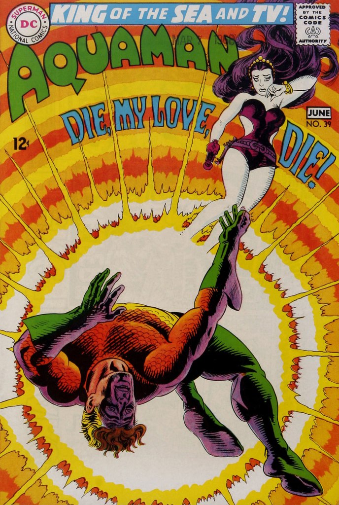
This is Aquaman no. 37 (Jan.-Feb. 1968, DC). The despondent walrus, bottom left, is family pet ‘Tusky’. Oh, and my apologies for ever-so-slightly poaching some potential Tentacle Tuesday material.
This is Aquaman no. 38 (Mar.-Apr. 1968, DC). I wonder what’s up with the redundant vertical logo, top left.
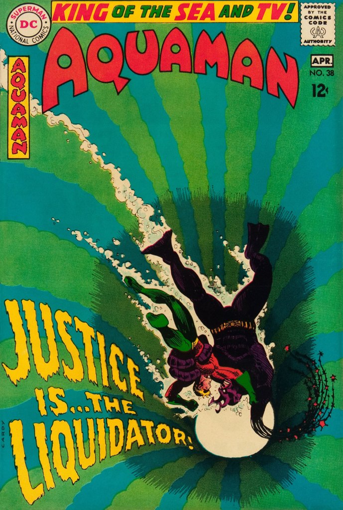
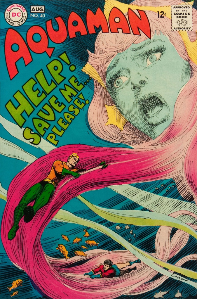
In case you’re wondering about Aquaman’s expanded regal duties (“and TV!“), they were showing repackaged reruns of his half of the previous year’s Superman / Aquaman Hour of Adventure. A Filmation production, so don’t expect too much if you haven’t seen it. But back to the comic book: this dazzling scene announces the saga of “How to Kill a Sea King!”, as our amphibious hero seeks to thwart a hostile Venusian takeover of Earth and sea. Script by Bob Haney, art by Cardy. This is Aquaman no. 39 (May-June 1968, DC). Oh, and the hottie? That’s “Aliena”. A real bolt of ‘inspiration’ there, Mister Haney.
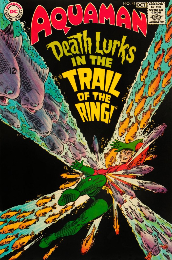
This is Aquaman 41, (July.-Aug. 1968, DC). Such dynamically-designed fun! This is where the new creative team of Stephen Skeates and Jim Aparo joins new editor Dick Giordano (his second issue), but Cardy remains on covers… because Aparo, who resided a couple of states over, couldn’t attend the cover conferences.
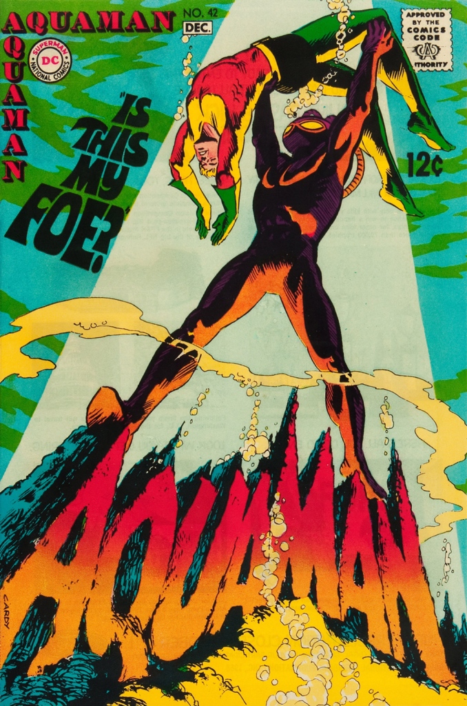
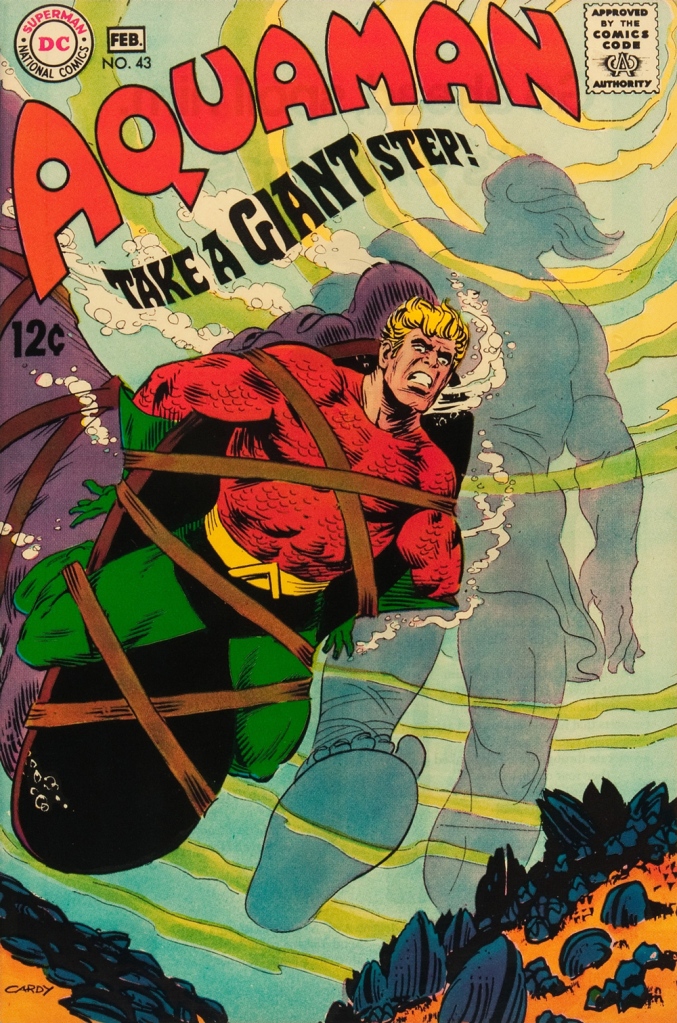
This is Aquaman 41, (Sept.-Oct. 1968, DC), a highlight among highlights from the redoubtable team of Infantino (publisher-designer), Cardy (penciller-inker), Giordano (editor), Jack Adler (production manager and colourist), and, inside, Skeates (writer) and Aparo (penciller-inker-letterer). There’s a texture to the colour work (most evident on the foreground piraña… a freshwater fish, incidentally) that’s unusual for comics of that period. I wonder how it was achieved…
This is Aquaman no. 42 (Nov.-Dec. 1968, DC).
This is Aquaman no. 43 (Jan.-Feb. 1969, DC). Face-first in a bed of mussels, with several tons of pressure? Yikes.
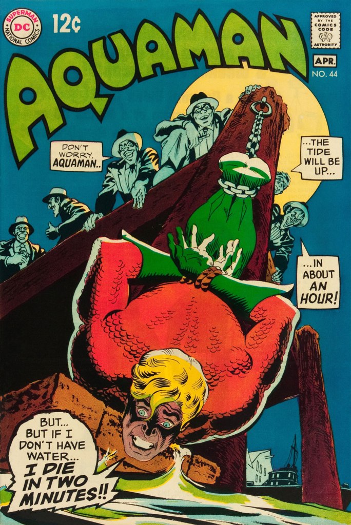
This is Aquaman no. 44 (March-April 1969, DC). I love how, despite the gravity of the situation, the mobsters are kind of cartoony. Cardy would most fruitfully mine this tragicomic vein in the brilliant but short-lived western Bat Lash (1968-69).
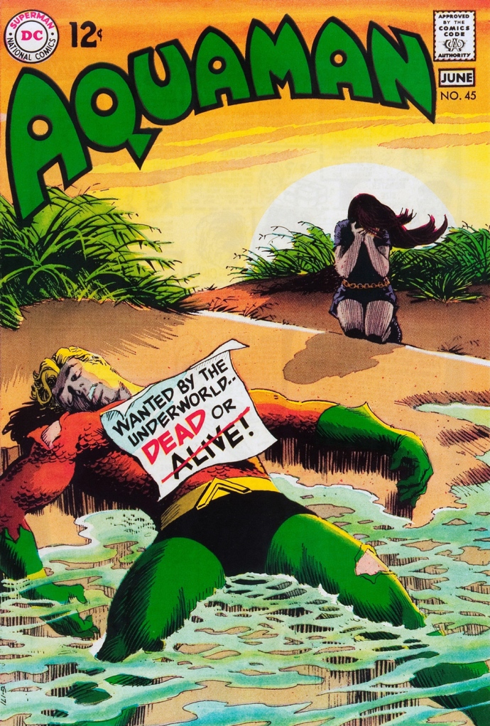
This is Aquaman no. 45 (May-June 1969, DC), concluding Skeates and Aparo’s two-parter, the self-explanatory “Underworld Reward”. An undeniably epochal cover by Mr. Cardy. To wit, so compelling and mysterious is this scene that it’s merited an astute blogger’s impressively in-depth analysis… well worth a peek.