« Who’s Aquaman? I never heard of him! »
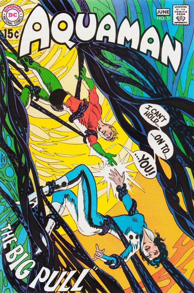
« He’s one of the super-beings from the place called Earth! He lives at the bottom of the ocean! » — Steev & Jimm, rubberneckin’ in Aquaman no. 51
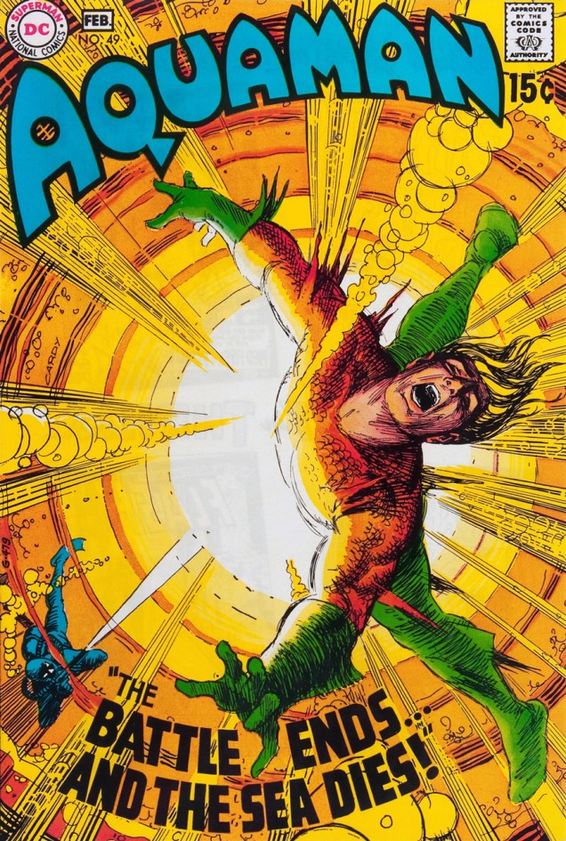
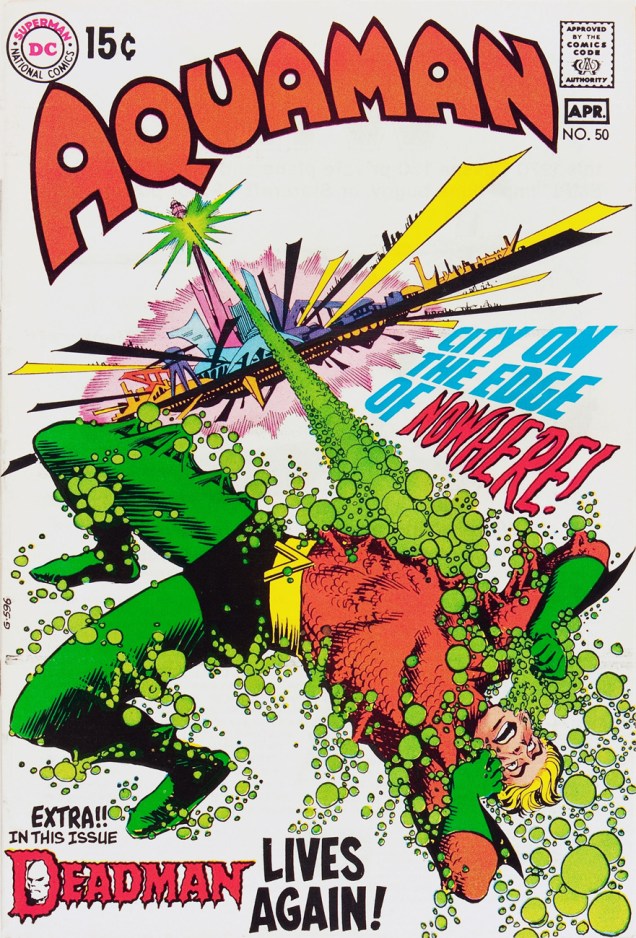
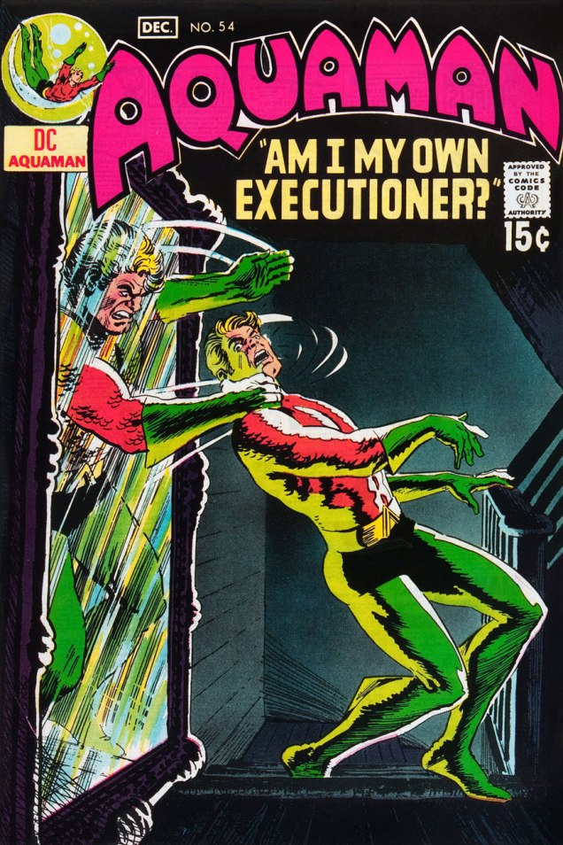
Some may have wondered at the deep, abiding affection held, by a certain savvy contingent of comics aficionados, for sea king Aquaman. After all, he’s a bit of a second-stringer, and he’s had a pretty spotty record for decades. Well, I’d say one has to have encountered the erstwhile Arthur Curry at his peak, in the hands of the Stephen Skeates, (writer) Jim Aparo (penciller-inker-letterer), Dick Giordano (editor-poacher), Nick Cardy (cover artist), Carmine Infantino (editor-in-chief/art director), Jack Adler (colourist) and Gaspar Saladino (cover letterer) set.
Fond as I am of Nick Cardy and Ramona Fradon‘s work, the series’ Skeates-Aparo period is more my speed. I can’t quite put my finger on it. There’s a whiff of the end of the world, something ominous and immediate about it, despite the fanciful settings. I guess it was « relevance », but with a lighter touch and without the cringe-inducing bathos of the concurrent Green Lantern-Green Arrow series. Because of Aquaman’s aquatic nature, environmental doom seldom seems far. The Skeates-Aparo rampage lasted from issue 40 (June 1968) to number 56 (April 1971). Aparo returned to the character just a few years down the road (Adventure Comics no. 441, Sept. 1975), but by then, he’d already begun his long, painful artistic deterioration.

But back to the covers: this represents, in my view, Cardy’s second hot streak on this title. From the beginning of his career (in 1940 with the Iger/Eisner shop!) Cardy had always been a reliably competent artist, but rarely a very exciting one. That all changed in the mid-Sixties when newly minted art director/editor-in-chief Carmine Infantino made him his right-hand man and co-designer of DC’s covers. This greater latitude gave Cardy wings. Cardy’s first Aquaman hot streak opens on issue 37 (Jan.-Feb. 1968) and closes with issue 45 (May-June 1969). Issues 46 to 48 are nice enough, but short of transcendence… beyond that bump in the road, we’re set for a smooth run of splendid covers.


Under normal circumstances, this run of covers would have turned out quite differently for, as Steve Skeates told me a few years ago, « The only reason Jim [Aparo] didn’t do the covers was that he lived out of town, couldn’t come in for cover conferences! »
-RG

Very nice selection of covers by the incredible Nick Cardy! Thanks also for pointing out where Carmine Infantino probably had a hand in the layouts / design.
By the way, I really have to disagree with your comment about Jim Aparo’s “long, painful artistic deterioration.” As someone who started reading Batman in 1989, his work on that character in the late 1980s and early 90s was stunning. For me Aparo’s art is one of the definitive interpretations of the Dark Knight and his world. Just my opinion, of course.
LikeLike
Hi Ben! Barring vacations, I imagine Infantino had a hand in every DC cover of his reign, but the percentage of his influence varies. Sometimes it’s nearly all Cardy (or Kirby or Kubert or Dominguez), sometimes it’s easy to imagine that the result barely deviates from Carmine’s quick sketch.
As for Aparo, well… sometimes there’s en entire essay implied within a handful of words. I wasn’t just dismissing Aparo. I mean, consider how he started out at Charlton doing pencils, inks *and* letters. Now, exact proportions vary from artist to artist, but I’d say what gave Aparo his essence was his inking. Case in point: Aparo ran into deadline trouble a few times on The Spectre in 1974. Joe Orlando, in his wisdom, cleverly solved the problem: he got two fast, strong pencillers (Frank Thorne and Ernie Chan) to provide breakdowns, which Aparo finished in his customary style. Most people wouldn’t (and don’t, frankly) perceive the difference. Same with Aparo over John Byrne (Legends of the Dark Knight #1, 1980).
Now Aparo had a certain pace he was comfortable with, basically a page a day. Through most of the 1970s, he would work on alternating bi-monthlies. Then DC wanted more, and he had to step up production when Brave & Bold went monthly (if memory serves). Things got a mite sketchier, more automatic, bit by bit. Then it was decided, correctly, that he could work faster if relieved of his inking and lettering chores (save for covers). Pencilling is what pays more. It could have worked out, but no, they stuck him, for keeps, with lackluster Mike DeCarlo, definitely *not* in the upper bracket of former Giordano pupils (Terry Austin, Joe Rubinstein, Klaus Janson…). Between Mike Barr’s writing and DeCarlo’s inks, Batman & The Outsiders was nobody’s career highlight. I admit it, I wrote Aparo off at that point. His involvement with Jim Starlin’s nasty Death in the Family would add another blight to the tally.
Unexpectedly (it surprised me, anyhow), though, there was still a spark in Mr. Aparo that a real inker could bring out: Bill Sienkiewicz’s bold, not to say radical, finishes on Aparo (and on Sal Buscema, by the same token) circa 1996 or so made for some fine-looking, visually bracing comics. And I don’t even particularly like Sienkiewicz!
Oh, and I hardly think anyone would be so clueless as to deny Aparo’s solid standing and contribution to Batman’s saga. No one here and accounted for, at any rate.
See what you’ve done, Ben? 😉
LikeLike
Will you make an article about the inside artwork of Aparo ?
LikeLike
Well, since there’s evident interest… I’ve had something rattling in the back of my mind on that topic. Guess I should commit it to writing sooner than later. Thanks for the suggestion… such feedback is *greatly* appreciated!
LikeLike