« It is through his creation that the artist translates most certainly the man. Elegance of line, subtlety of colour, freshness of inspiration, modesty of feelings without ever falling into mushiness, Peynet is the antidote of all that pollutes our spirits today. He offers to us the key, key to the enchanted world where he catches in his nets that which we strive to destroy. » — Max Favalelli
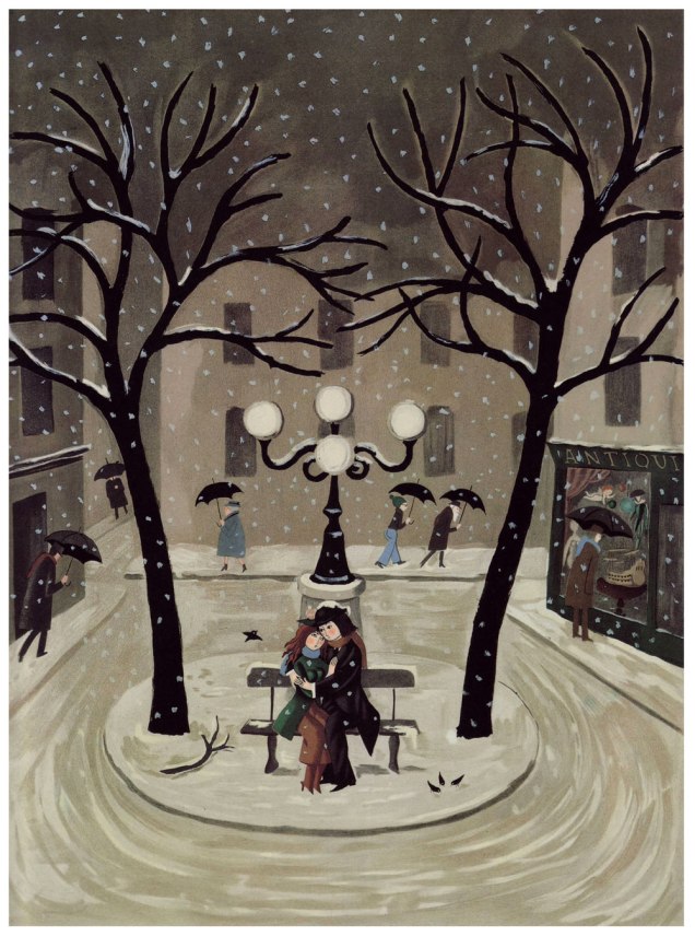
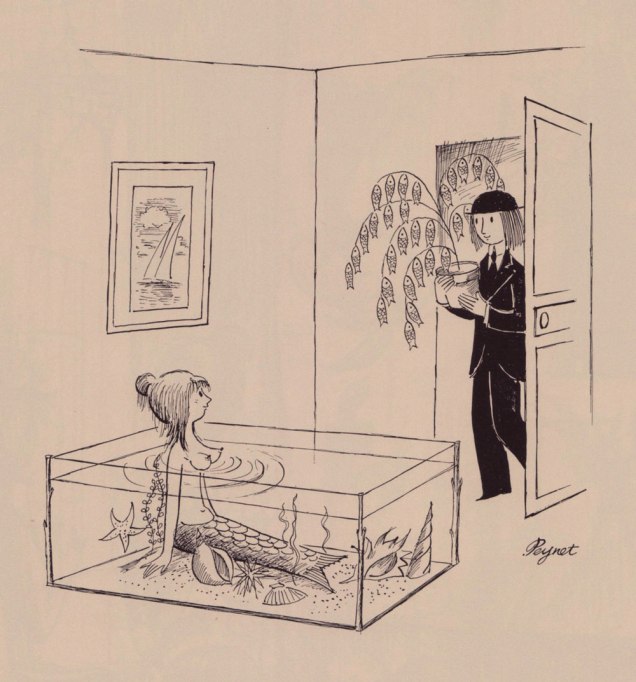
Hello again! I’d been considering devoting a post to Raymond Peynet (1908-1999) for some time, but I realised at some point that this was another textbook case of ‘The tip of the iceberg‘; sure, I’d seen his Les amoureux cartoons in most of my newer issues of Le rire — which is to say issues in the merely sixty to eighty years old range — but the tiniest modicum of research revealed an impressively sustained worldview, some rather breathtaking bits of mass-marketing, and, most significantly, consistent quality and conceptual integrity.
This topic, obviously, would have made for an ideal Valentine’s Day post, but since I was out of town on family business that day, and, more pointedly, we don’t really feel the need to mark that random occasion, it didn’t happen. And yet here we are… one month later to the day.
Having done my homework, I now present to you Mr. Peynet and his ‘amoureux’, immortalised through some six thousand drawings, but also four (!) museums — two in France, and two in Japan, a a life-size bronze statue in Hiroshima’s Peace Memorial Park, some 250 distinct models of latex dolls, several postage stamps, posters, champagne bottle labels… you name it.
Obviously, I’m just scratching the surface. But since Peynet-mania seems to have largely skipped over North America, this might prove a useful, if belated, introduction.
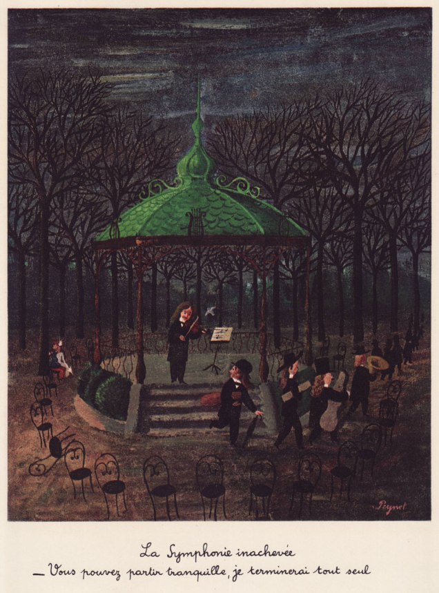
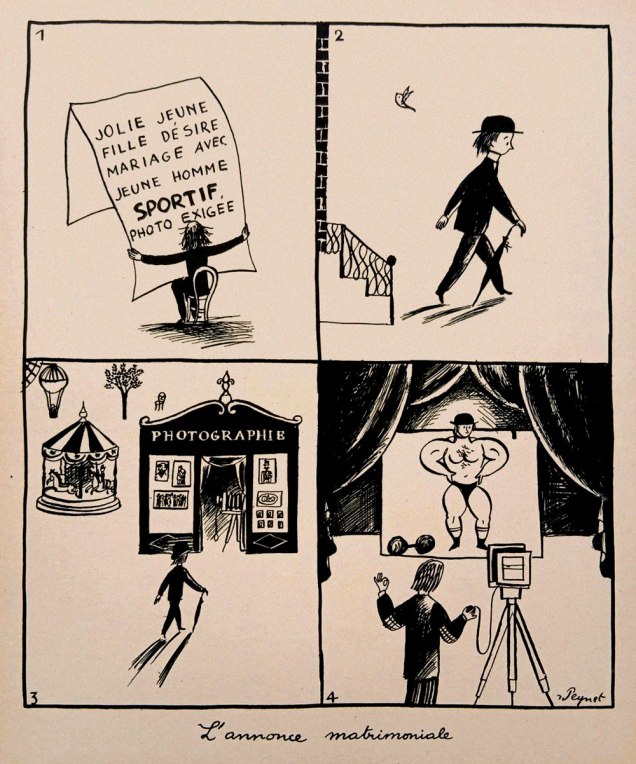
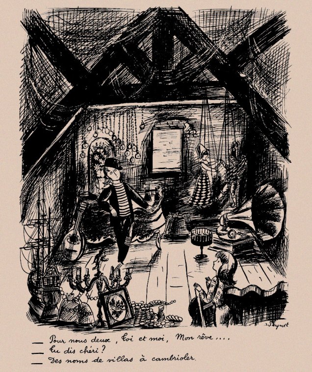
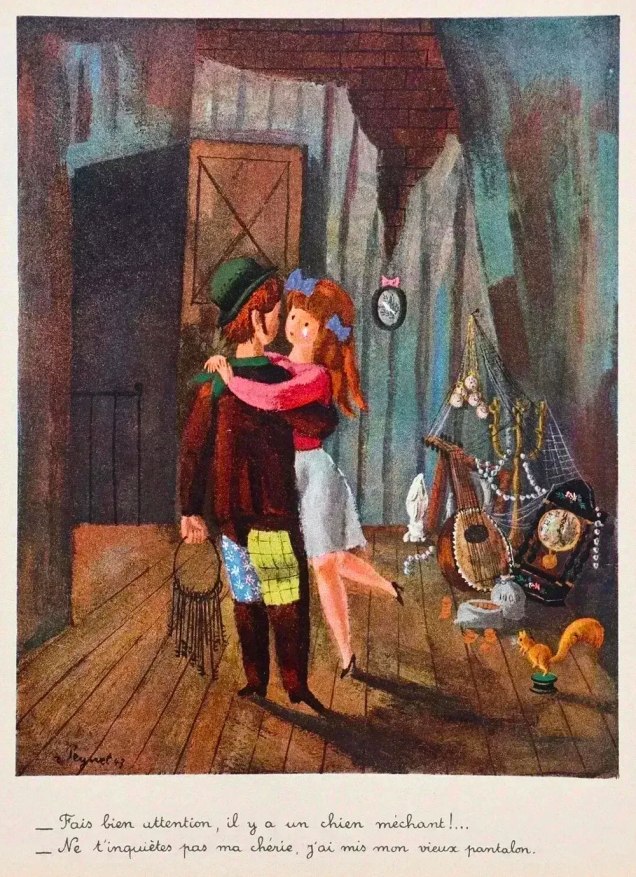
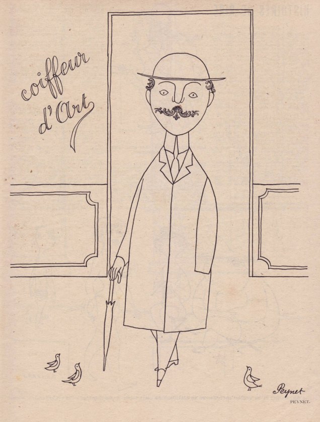
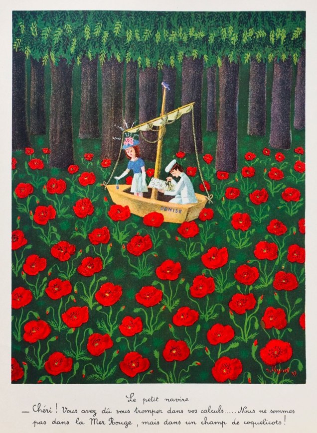
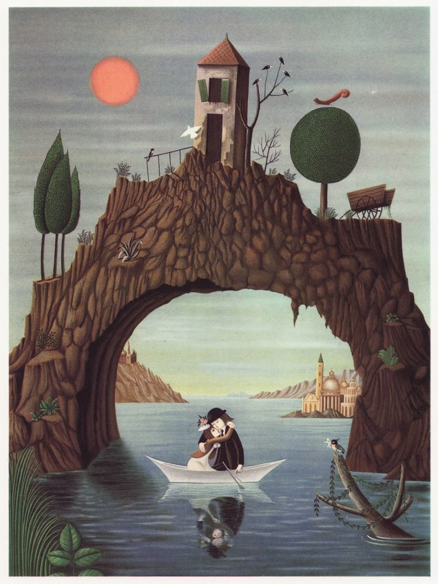
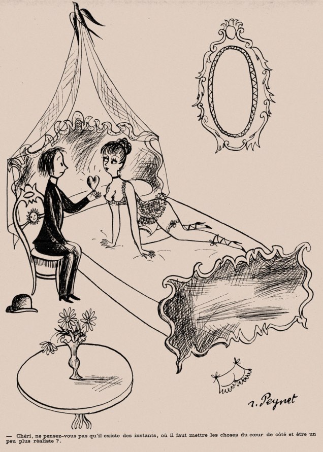
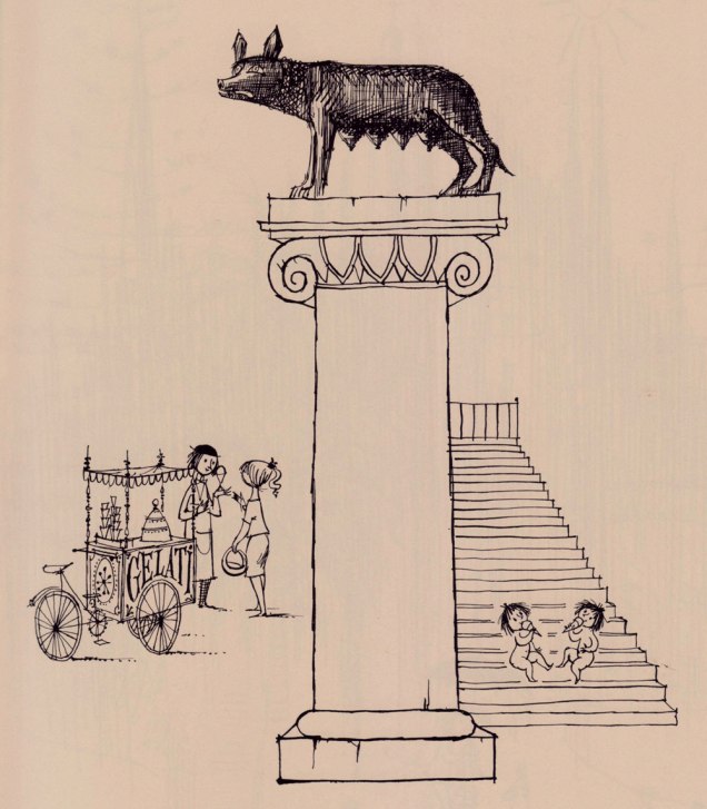
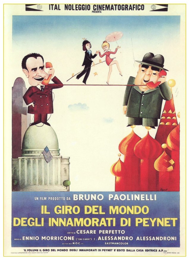
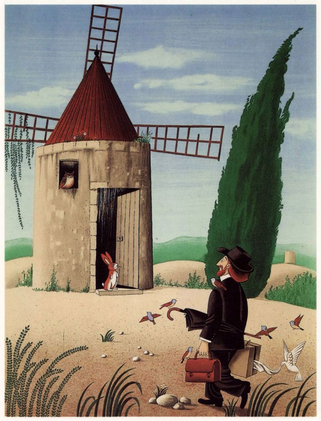
« I will give you my flu, you will give me your bronchitis… we will share the medication. » A lithograph created between 1970 and 1986 for Éditions Les Maîtres contemporains.The Unfinished Symphony: « Don’t worry, you may leave, I’ll finish it by myself. » (Limited edition litograph, 1943). This is how it all began for Peynet. Here’s the whole story of the time and place, clumsily — but charmingly — translated.The Marriage Ad: « Pretty young lady seeks marriage with athletic young man, photo required. » I doubt that Richard Sala ever encountered Peynet’s work, but I can’t help but find that this particular piece prefigures his style somewhat.« –– For Us Two, You and I, My Dream… » « — I beg your pardon, darling? » « These are names of villas to burgle. »« — Be very careful, there’s a mean dog! » « — Don’t worry, my love, I’m wearing my oldest pair of pants. » (Limited edition litograph, 1943)« The Artistic coiffeur ». From Le rireno. 22 (nouvelle série), July, 1953. Shades of the influential Saul Steinberg, which I *will* have to write about at some point.The Little Ship: « Darling! You must have erred in your calculations… we aren’t on the Red Sea, but rather in a field of poppies! » (Limited edition litograph, 1943).« — You’re not accompanying him through his dreams? » « — Never on Sundays, I’ve too much to do around the house. » « — No other lovers love each other as much as we do. » « — Well… take a look at these two below… » Lithograph created between 1970 and 1986 for Éditions Les Maîtres contemporains.« Dearest, don’t you think that there are times when one must set aside things of the heart and be more down to earth? » From Le rireno. 26 (nouvelle série), Feb. 1948. Even back in the 1940s, it wasn’t all chaste naïveté.Lithograph, Éditions Arnaud de Vesgre, 1970. Without being derivative in the least, this piece pleasantly reminds me of Francisco Botero‘s work. Okay, this one’s fairly subtle. I’ll give you a hint: the kids are named Romulus and Remus. Originally published in the collection Per le strade, per le nuvole (“Through the streets, through the clouds”) (Edizioni Elmo, Milan, 1953). Likely another cartoon from Le Rire (Peynet rarely skipped a number), but I don’t own that particular issue.In 1974, out of Italy, came an animated feature (there had been a French short film in 1961), boasting — most appropriately — a gorgeous waltz composed by Ennio Morricone at his peak. The feature is available to watch here.Lithograph from Alphonse Daudet‘s Lettres de mon moulin (« Letters From my Windmill »), Éditions Arnaud de Vesgre, 1985.
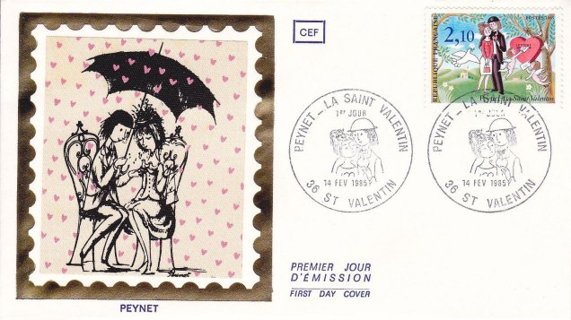
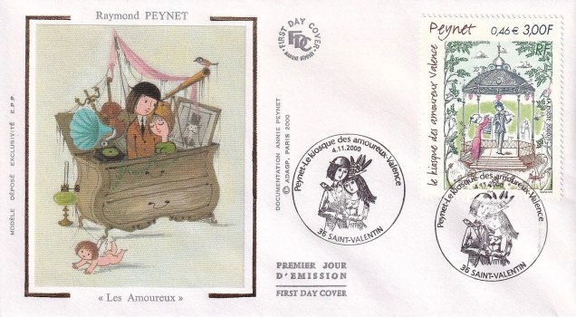
Peynet and his creations were twice honoured by the French post office with a clutch of different stamps. Here are some samples.
First day cover from Valentine’s Day, 1985.First day cover from November 11, 2000, posthumously this time, Peynet having gone to his glory the previous year, joining his wife and muse of sixty-six years, Denise, who’d passed away in 1996. Here’s a lovely obituary from The Guardian.
To see you off musically, here’s a classic song that Peynet’s best friend, Georges Brassens, wrote about the illustrator’s petits amoureux.
« Parmi les champignons se cachent d’ignobles individus, des espèces savoureuses et des sujets tout à fait pacifiques…»
December may not be exactly the month one associates with mushrooms, but that is precisely when mycophiles get broody and start cataloguing (mentally or otherwise) new species encountered during the warmer months*, dreaming about spring and its new flush.
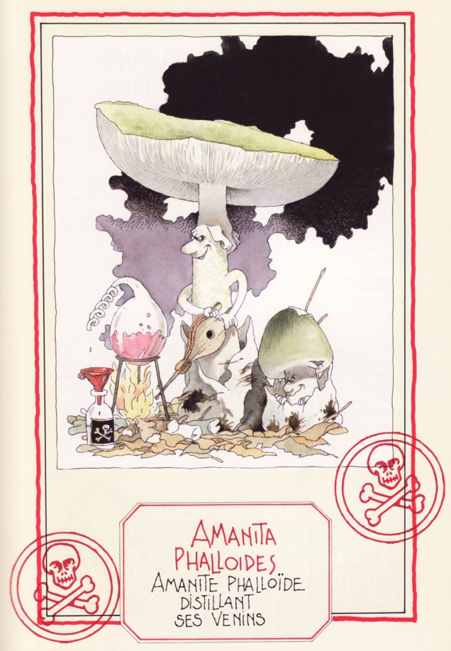
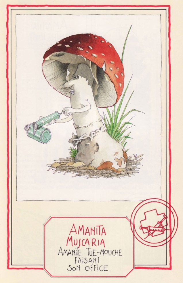
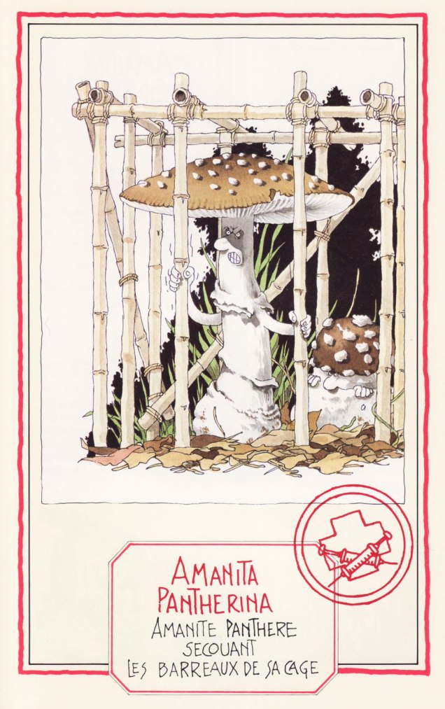
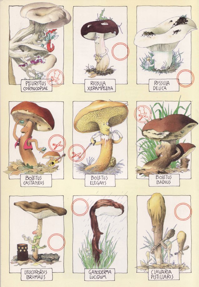
Here’s a selection of mushroom portraits taken from Le gratin des champignons by Roland Sabatier, an outstanding artist previously featured by co-admin RG in « Pépin le Long, You’re Fired! » (and, need I mention, a member of the Mycological Society of France). The second reaction I had upon leafing through this volume’s pages (the first was to squeal delightedly) was stunned admiration regarding the level of detail with which each mushroom is illustrated. I am by no means the first to note this (in his outstanding introduction, Georges Becker**, co-author of this tome, makes much the same point in far more eloquent prose), but it bears mentioning that while Sabatier may have transformed mushrooms into wonderful characters with their own games and stories, he managed to so very rigorously observe and illustrate their characteristics that one could actually use this book as a mushroom guide and not get, you know, poisoned.
Let’s get cooking!
Speaking of getting poisoned, meet four Amanitas, a most deadly genus… with a few delicious, choice morsels thrown in to keep us on our toes:
The Death Cap… distilling its own venom. A most lethal animal.
The Fly Agaric, probably the most depicted mushroom in the arts, ‘performing its function‘. Despite its reputation, it is not deadly per se, as alluded to in a previous post (Fungus Friday: Amanita New Year (To Get Over This One)).
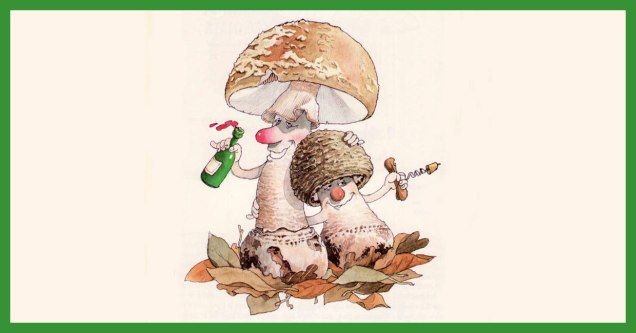
The Blusher, so called for its propensity to blush a pink hue when bruised (or embarrassed, one presumes). These wino amanitae exiting the tavern definitely look sloshed.
The handsome Panther Cap, shaking the bars of its cage. Like its Fly Agaric cousin, it’s not deadly as such, and has some psychoactive components. Admire its striking looks here.
Now we move on to more traditionally edible characters —
The Banded Agaric is also known as ‘Pavement mushroom’, which explains this fur-foxed lady showing her goods… walking the beat, as it were. This lady is tough as nails, and has been known to burst right through the pavement. Is she edible? You bet! ***
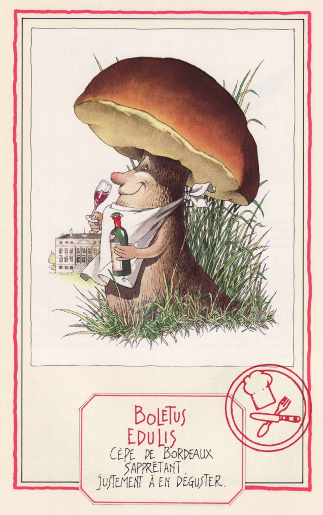
Ah, mushroom of many names (does this make it the rose of mushrooms?) – Penny Bun, Porcino, Cep, call it what you will… highly prized throughout cultures, fragrant à souhait. Here the cèpe de Bordeaux is about to savour some Bordeaux wine.
A favourite of WOT admins, the Fairy Ring Mushroom, saddled with an unfairly gloomy Latin name (‘marasme’ comes with an etymology of ‘wasting away’ or ‘decay’), dancing a ronde. Undemanding and widely spread, this mushroom dries most excellently (sometimes right on the very lawn it grows upon) and enlivens soups and stews throughout winter.
Another well-known mushroom, the Golden Chanterelle, as beautiful as it is fragrant. Will I picture these playing tiny little violins every time I find them in a forest? Absolutely.
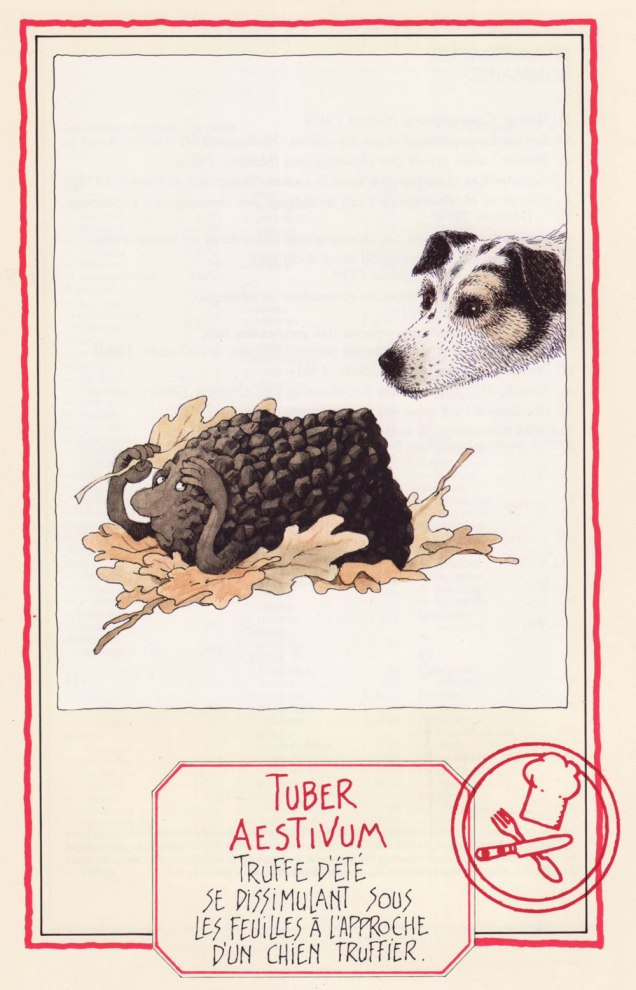
We couldn’t resist adding this scene depicting the Summer Truffle trying to camouflage itself as a truffle-sniffing dog approaches. I love the inquisitive gleam in the doggo’s eye.
We wrap up with, well… I trust you can interpret the Latin well enough without me. The Common Stinkhorn (‘stinky satyr indulging in his depravity‘) is actually edible, though not nearly as popular (or tasty) as another member of its family, the pretty Veiled Lady. Whether you would actually want to eat it is another question.
First published in 1986, this book has known several editions to update nomenclature (some mushroom families and names have changed considerably in the last 40 or so years, which is its own topic). We have the 1991 edition, published by Glénat. Sabatier had so many favourite mushrooms he illustrated, they didn’t even all make it into the book officially… which is truly a crime. Take a peek at some other of his mushroom people, only included on the inside of the book’s cover (but at least included in that smaller capacity!):
~ ds
* Technically one can find some mushrooms during winter, but that is not my area of expertise (at least as yet).
** French mycologist of renown (1905-1994), as well as writer, politician and apparently even musician (piano).
*** I’m actually not a big fan. This Agaricus tastes too much like the ‘champignon de Paris’ mushrooms sold in supermarkets to be of much interest.
« The mind loves the unknown. It loves images whose meaning is unknown, since the meaning of the mind itself is unknown. » — René Magritte
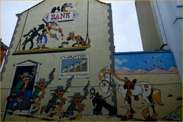
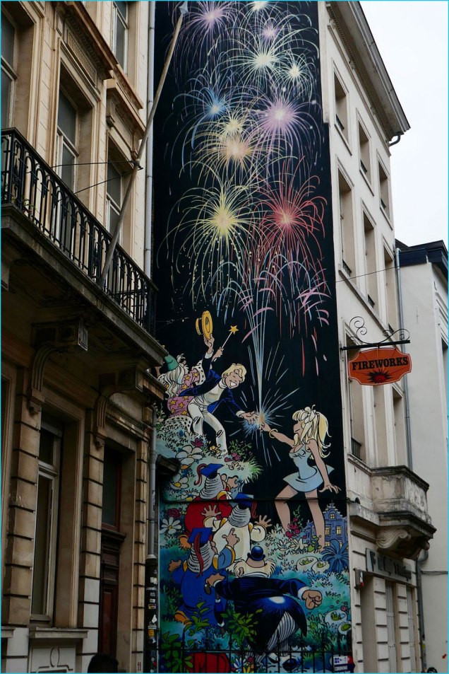
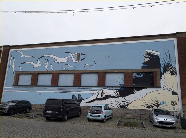
Last month, we flew off to explore the wonders of Belgium, most specifically Flanders. All other attractions aside, I thought I’d share with you some of the marvels of the country’s comics culture. Hop on!
At Ostende’s cozy Le Touquet seaside restaurant, we were shown the shortest path to the loo by no less a personage than the legendary Cowboy Henk, touting local drink Blonde Kuif.This group scene from René Goscinny and Albert Uderzo‘s Astérix was appropriately located in a schoolyard, with kids eagerly playing ball just a few metres away.In a different range, this mural suitably pays homage to French ‘ligne claire‘ master Yves Chaland (1957-1990).It was nice to see the frescoes maintained. This one, located in Antwerp, celebrates Flemish cartoonist Jeff Nys‘ Jommeke: « It seems fitting that this wall by artist Jef Nys, the greatest Flemish cartoonist for children, is in an area surrounded by schools. His most popular comic was Jommeke, a story about a young boy, with a pet parrot named Flip, who goes on some crazy adventures along with his best friend Filiberke. Nys started Jommeke in 1955 and created close to 300 comic albums. They have sold over 51 million albums alone in Belgium, making Jommeke the second best-selling comic series in the country. » [ source ]My friend and colleague Arnaud Hilmacher provided the answer: « That’s obviously Mulligan and the old nun in ‘Aventure en Jaune‘ by Yann & Conrad. » Merci, Arnaud!Another lovely one saluting one of Belgium’s bédé superstars, Maurice de Bevere, alias ‘Morris’ (1923-2001).We found that Brussels’ streets were frequently adorned with striking mosaic markers, such as this one, featuring André Franquin‘s Marsupilami. I forget what thoroughfare this was, I’m afraid.This one captures Philippe Dupuy and Charles Berberian‘s Monsieur Jean and his presumed and entirely laudable and justified appreciation of Belgian beer, the world’s finest — you can keep your IPAs, thank you.A mural devoted to Michel Greg and Daniel ‘Dany‘ Henrotin’s Olivier Rameau, fittingly painted on the side of a Fireworks store at 9, rue du chêne, Brussels. Top to bottom: Ebouriffon, Olivier Rameau, Colombe Tiredaile, the 3 Ziroboudons, Alphonse Pertinent.Despite having no Belgian roots that I can figure, Hugo Pratt‘s Corto Maltese clearly is beloved in these parts. He landed no fewer than *four* murals, all neatly in a row. Here are my two favourites.A most unusual — and striking — composition.And now we come to my Holy Grail, Brussels’ Gil Jourdan mural… there are two more in Maurice Tillieux‘s hometown of Auderghem (here’s one, and the other, and yet another in the bédé-themed Janson metro station in Charleroi). The author appears for size comparison.Local graffiti artists come to the rescue: it seems inconceivable — to me, anyhow — that there isn’t a mural devoted to Willy ‘Will’ Maltaite‘s characters. There used to be a lovely « Isabelle » fresco in Brussels, but, citing damage, it was painted over in 2017. However, here’s an unofficial, and brilliant one featuring Tif et Tondu… and their archnemesis, Monsieur Choc. Take a bow!
« Doubt is not a pleasant condition, but certainty is absurd. » — François-Marie Arouet
Going back to 1975: for a few years, I’d been buying Vaillant’s Pif poche (and sometimes its companion titles, Pifou, Arthur, Placid et Muzo, Totoche, and Gai-Luron… poche) as well. However, since the 1973 putsch by the raging primitives* and sundry bean counters, the publisher’s output had largely gone to seed.
I was still picking up, when faced with a dismal crop at the newsstand, the occasional ‘poche’, mostly for the games and puzzles, which comprised half of the editorial content. I was intrigued by an oddly-named stylist, one ‘Rik Cursat’ (unusual name for a Frenchman, I thought… still, nice of him to sign his work!), whose assured line and friendly absurdity had caught my eye.
A game page from Placid et Muzo Poche no. 80 (Aug. 1975, Éditions de Vaillant). Sometimes he used his initials, sometimes he signed in full. « Using all letters above the drawing, find the names of two fruits. » The answers: PÊCHE and CITRON. This one appeared in Pifou Poche no. 63 (Sept. 1975, Éditions de Vaillant). « Using all the letters above the drawing, put together the names of two animals. » The answers: CANE and CHIEN.
It was only decades later that I thought to dig a little deeper. To my delight, it turns out that Cursat had a long and prolific, award-festooned career. Given his international success, it’s a bit of a mystery why he would have slummed it in the (presumably) low-paying back pages of frankly disposable kids’ publications. My guess is that his output was continuous and downright profligate, but he was reluctant to let a good drawing go to waste.
Henri ‘Rik’ Cursat** (1928-2006) was born and died in France’s third-largest city, Lyon. Deeply attached to his hometown, he reportedly produced over the course of his career some 20,000 drawings for its various daily newspapers, especially Le Progrès de Lyon, in whose employ he remained for some thirty-two years.
And since his body of work was so gargantuan and diverse, I’ll keep my focus narrow, borrowing from Absurdement vôtre, a 1977 selection of his cartoons published in Éclats de rire, a gags ‘n’ gals rag not unlike the American ‘Humorama‘ digests. He was, in fact, Éclats’ editor-in-chief for nearly a decade. Yet somehow his own cartoons are anything but crass or lowbrow.
Cursat had some pet recurring themes. One was literal gallows humour.
.
« He’s a repeat offender! »« It’s the downstairs neighbour; he claims that our fish is bothering him! »« Garçon, I don’t have a knife! »« Watch out for his left hook! ». Hooks were another of Cursat’s pet motifs.
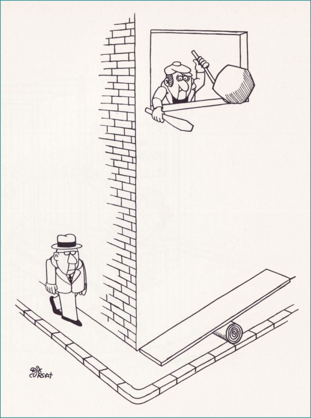
Another frequent theme was the mugger lying in wait just around the corner. Here’s a trio of variations:
.
.
.
.
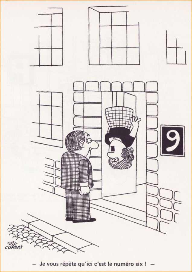
« Are you the architect? »« I keep telling you: this is number six! ». Another inspired riff on the same basic idea.
.
« Garçon, there isn’t a single fly in my soup! »Impishly looking at you, plotting a gag. The artist in the late 1970s.
« In man’s struggle against the world, bet on the world. » – Franz Kafka
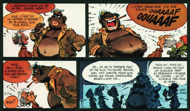
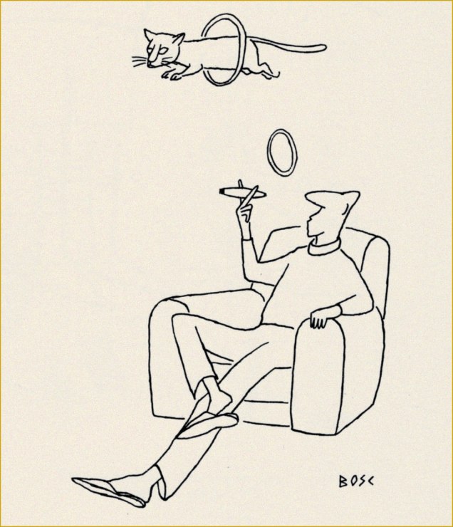
Time for another entry in our leisurely, unsystematic and subjective survey of Europe’s most significant panel cartoonists. Today, we examine the life and work of Jean-Maurice Bosc (1924-1973).
His is a familiar story: guy goes to war, comes home changed (likely suffering from what was once called ‘shell shock’, then ‘battle fatigue’, and nowadays ‘post-traumatic stress disorder’ — “burying the pain under jargon“, as George Carlin put it), can’t return to old routine in the family vineyard, tries other tacks, decides on drawing; looks for gainful employment, starting at the very top, miraculously gets in. Thrives for several years, producing well over 3000 drawings, seeing print in countless magazines all over the globe. Then it turns sour.
Originally published in Paris-Match, this one landed successfully in Best Cartoons From Abroad 1955 (Crown, 1955; Lawrence Lariar and Ben Roth, editors).Another Paris-Match cartoon, it was reprinted in Best Cartoons From Abroad 1958 (Crown, 1958; Lariar and Roth, editors). Sometimes gallantry just isn’t enough.
Jacques Sternberg wrote, in Les chefs-d’œuvre du dessin d’humour (1968, Éditions Planète):
« Returned in a highly weakened state from Over There, Bosc, resigned to forced rest, began to draw after falling in love with the drawings of Mose and Chaval. Over a few months, he produced hundreds of drawings, giving the humorous arts, without even realising it, a most singular starkness, a particular line that belongs quite exclusively to Bosc, though it’s been much and often mimicked since.
It was in 1952 that Bosc went up to Paris. Eight days later, a stroke of luck: he lands a whole page in Paris Match, which was to turn him into one of the magazine’s stars. »
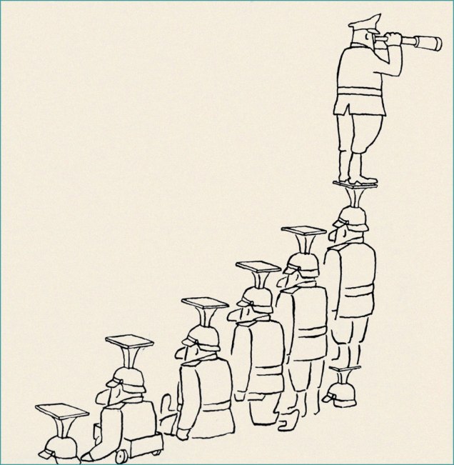
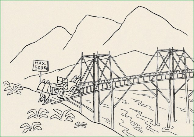
Hierarchy explained in one picture.The Touring Club de France (1890-1983) was a French social club devoted to travel, founded by enthusiasts of the vélocipède. We are told to « Please leave this place as clean on leaving as you would like to find it on entering », although ‘en vous retirant‘ might be more faithfully translated as ‘upon pulling out‘.
« After spending three years mindlessly obeying orders, two of which in the Vietnamese jungle, Bosc was severely traumatized. “After what I’ve witnessed in Indo-China“, he wrote, “I could no longer eat or sleep, ever.” He later told his sister that he had shot dozens of fellow soldiers, saw gruesome fights and, while imprisoned, heard prisoners being tortured. She recalled that he could no longer stand loud noises and got furious whenever she wanted to kill a mere spider. Bosc became a lifelong opponent of war and militarism. »
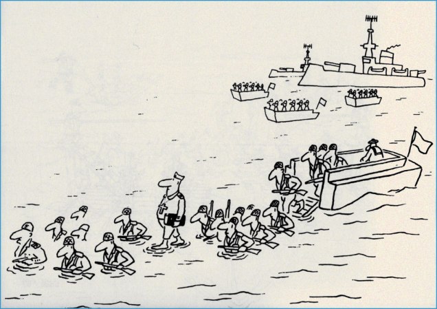
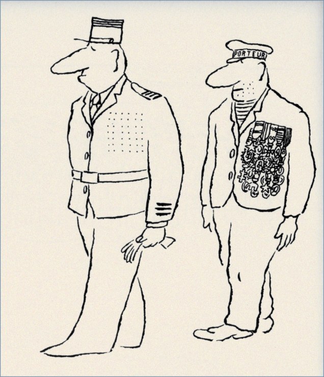
Just in case anyone’s not yet familiar with the Venus de Milo…The feat of walking on water is actually not strictly associated with Christian myth: ninjas also reportedly do it. « Porteur », as you’ve surely surmised, means ‘porter’ or ‘carrier’.
Like most of his friends and colleagues, « … Bosc had lived through the Nazi occupation in World War II. After the Liberation, he felt disgusted by his country’s attempts to keep subjugating their overseas colonies to similar oppression and exploitation. President Charles de Gaulle was the sum of everything they hated: a conservative politician who didn’t agree with the growing sentiment of anti-colonialism, the sexual revolution and disregard for Church, army and family values. Bosc often ridiculed De Gaulle in his work. Once, the cartoonist was fined 3,000 francs, with a month’s probation, for daring to mock the army in a magazine. Bosc’s work revealed he had no respect for politicians. Interviewed by Paris Match in 1965, Bosc claimed that Alexander the Great was his “favorite great statesman, since he died at age 33.” » [ source ]
A stellar example of military logic.
This way, at least *everyone* gets to keep dry.
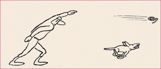
Here’s a video of a guy launching a hand grenade into a frozen lake. This one just might be Bosc’s single best-known cartoon. It goes: “My castle”; “My mill”; “My dog”; “My car”; “My farmer”; “My wheat”; “My bull”; “My wife”; “My guard”; “My pool”; “My garden”… “My ass!”.
I won’t gloss over the tragedy of his final years:
« Tragedy struck in 1968, when his good friend and colleague Chaval committed suicide. In June 1969, Bosc had a mental breakdown and was hospitalized. Suffering from an illness depigmenting his skin, he weakened more and more, often to the point of no longer being able to stand on his own two feet. He went in and out of clinics, even tried electroshock therapy, but nothing helped. As his health deteriorated, so did his mood. From 1970 on, he basically quit drawing cartoons. In 1973, the depressed cartoonist went to his garage and shot himself. He was 48 years old. »
Despite his having left us over half a century ago, Bosc is remarkably well-remembered. His Lambiek biography, written by Belgian cartoonist Kjell Knudde, is richly detailed and informative. His official website, hosted by Bosc’s devoted nieces and nephews, is a marvel of commemoration.
« The hardest tumble a man can make is to fall over his own bluff. » — Ambrose Bierce
Today, I’m going totally ‘mainstream’ on you for a change. Last week, I ventured into a movie theatre for the first time since 2019 (Knives Out was my last such outing) to see my first superhero film since 2012 (The Avengers was my last such outing). And so, while the new Superman epic wasn’t perfect, I found much to enjoy about it.
Among the ideas explored in the film was that baddie Lex ‘Elon’ Luthor, from carefully observing The Man of Steel over several years’ worth of skirmishes, had managed to analyse and codify his combat moves, in order to predict and counter them.
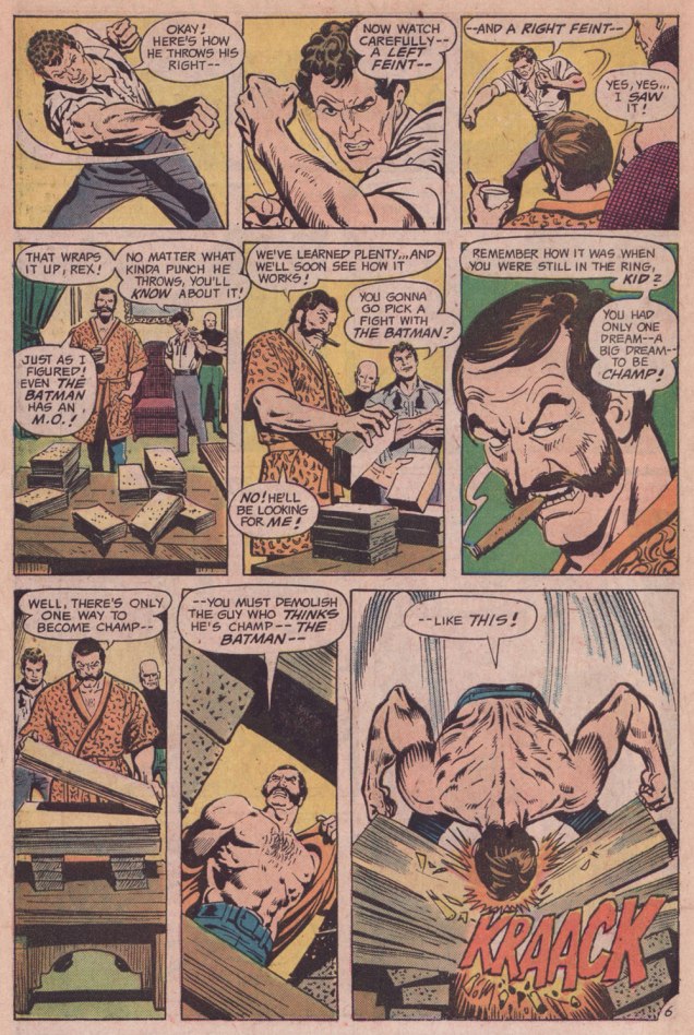
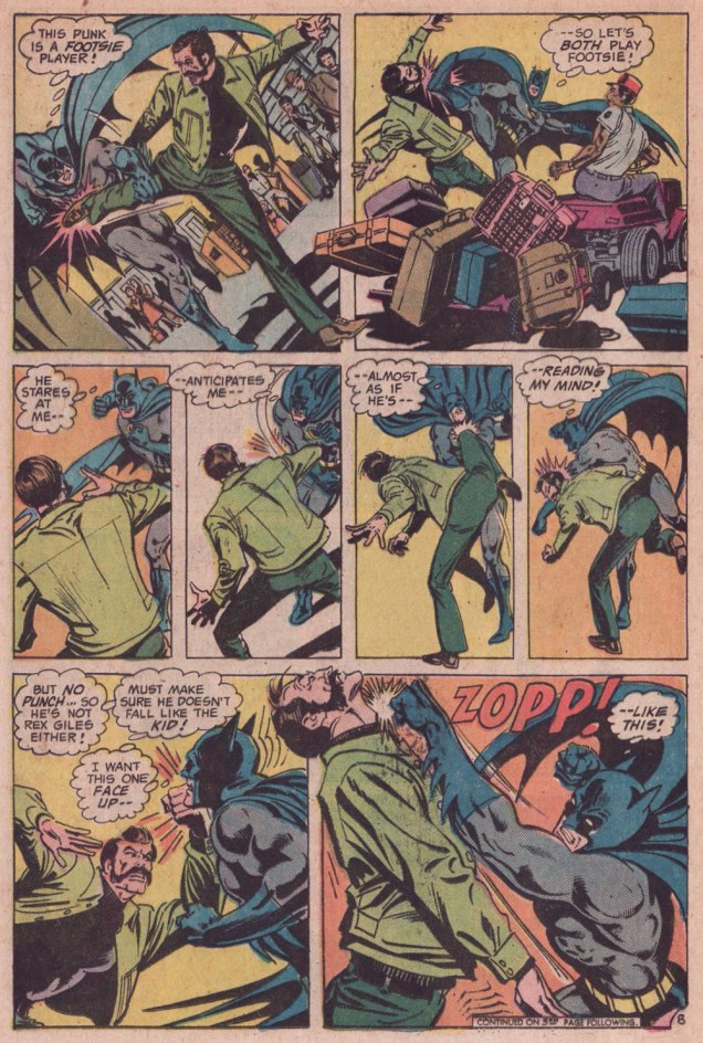
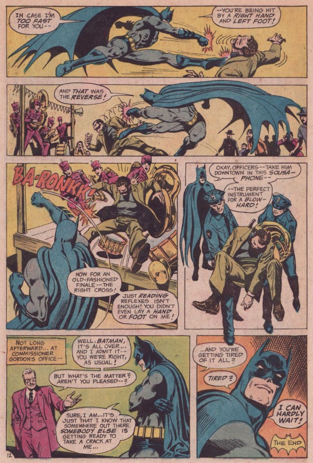
I was reminded of that angle serving as the basis of a favourite Batman story by my favourite Batman writer (and hardly anyone else’s, apparently), David Vern Reed (1914-1994). Despite its publication in a popular, long-running title, this tale is obscure to the point of never having been reprinted in English.
I’m terribly fond of the Schwartz-era Batman, especially the 1970s, because it’s relatively light on costumed supervillains, Batman acts like the detective — albeit a remarkably athletic one — he’s supposed to be, and the plots often hinge on ‘ordinary’ (though clever) criminals striving to outsmart Bats. A favourite example: Vern’s « The Underworld Olympics ’76! » (Batman 272-275, Feb.-May 1976) tetraptych. I think I can safely rule out childhood nostalgia: in my small town, distribution was quite spotty, so I never even *saw* those issues at the time, encountering them instead as an adult, decades on.
If I have a quibble about the art, it’s that Ernie Chan’s finishes mesh poorly with García-López’s usual rock-solid breakdowns. Perhaps it’s because Chan likes to have more to do; given that García-López, his own best inker, typically turns out pencil renderings that are utterly complete and tight as a drum, the job is quite unlike, say, Chan inking a Big John Buscema Conan job — as he so often did — wherein Chan has to do 80 percent of the work over Buscema’s sparse breakdowns, stock poses and rote shortcuts. In contrast, inking García-López essentially reduces the task to tracing over his flawless pencils, which can’t be all that stimulating, educational as it may be.
Speaking of Garcia-Lopez, a priceless anecdote: writer Andrew Helfer, a frequent collaborator, recalled, in his introduction to TwoMorrows’ Modern Masters Volume Five (2007): « … it was Jean Giraud, aka Mœbius, and he was staring at a drawing of Wonder Woman by José Luis García-López. « This García-López », he asked in a heavy French accent. « He uses models, no? » « No, » I answered, smiling. « Son of a bitch! » Mœbius hissed.
« We live in the age of the refugee, the age of the exile. » — Ariel Dorfman
The tale of Czechoslovakia is a fascinating but painful one — as anyone who’s read any Kundera at all surely knows — between the Nazi and Soviet occupations, Czechoslovakia suffered steadily and profoundly through most of the 20th century. For my part, I gained a sharper view of the situation from reading an in-depth 1969 article about Czech economist Ota Sik (1919-2004).
Meanwhile, our protagonist, painter-illustrator Miroslav Šašek (1916-1980) had fortunately already settled to Paris by the time things got too ticklish back home.
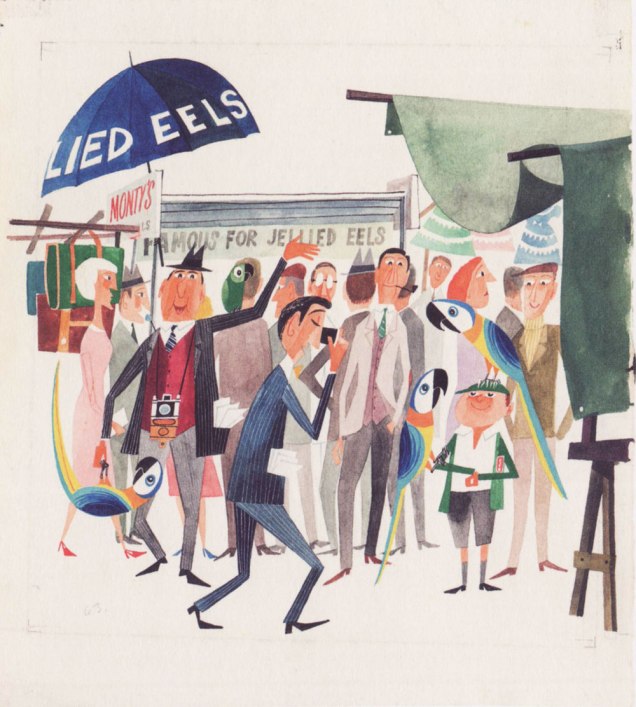
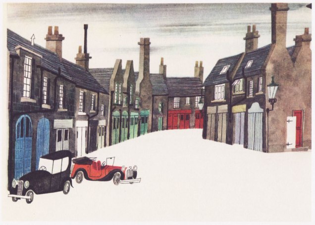
For several years, he’d been mulling over the idea of a ‘kiddies’ guide to Paris’, and in 1957, he was ready to shop it around. Venerable English publishing firm W.H. Allen (1835-1991) took a gamble, and Tintin’s home, the even more venerable Belgian maison Casterman (founded in 1780 and still around) signed on as well. Pictured here is an early German edition.Collage *and* a prudent black cat? Count me in. The closing piece (I haven’t seen them all and counted, but I’m told each book in the series comprised eighty illustrations) from This Is Paris / Paris. Here’s a handful of other drawings from the book.Original art from an interior ‘This Is London‘ illustration, second book in the series and published in 1959. Read it here! « London is full of interest. On Sunday morning you can go up to Petticoat Lane open-air market. » Good old British cuisine… after ninety-four years in business, Tubby Isaac’s Jellied Eel Stall closed for good in 2013. Jellied Eel made it to an impressive second place in Ranker’s List of Most Disgusting Meats, bested (ha!) only by Icelandic Rotten Shark Meat (fresh shark was nasty enough for me — holy ammonia, Batman!). You can still cast your votes for your favourites loathsome viands.The trusted old house of WH Smith is nowadays but a shell of its former glory.Illustration from This Is Rome (1960). Such masterful use of a) negative space and b) collage. For the record, SPQR stands for Senatus Populusque Romanus, which translates to “The Senate and People of Rome”. The acronym has lately been misappropriated by white supremacists. So many dog whistles fouling the air these days…Cover art from (just like it says) This Is Venice (1961). Those were better days: note the welcome absence of billionaires’ yachts.Illustration from This Is Edinburgh (1961). « The trip to Edinburgh was one of Šašek’s favourites — “I loved working on This Is Edinburgh, though I hated the weather there. In the middle of summer, it was cold and rainy. You needed a hot-water bottle in bed with you. Working conditions were good though because the nights are very short in Edinburgh. I worked from 4 a.m. to midnight and finished the book in two months.” » W.H. Allen employee Jeffrey Simmons, who worked with Šašek throughout the series, stated that « [ Šašek ] … always made the decision himself about which destination to tackle next. And I confess that sometimes they seemed quite perverse choices to me. They weren’t always chosen on a commercial basis, I don’t think. They were all successful, of course, but some much more so than others. ». I suspect that he was referring to his pick of the Scottish capital, who had a population of less than half a million at the time. But if it inspired him — and it clearly did — I wouldn’t call it perverse. This Is San Francisco (1962). « After the book’s publication in 1962, Šašek returned to receive the Key to the City. »Interior illustration from This Is San Francisco (1962). These elements likely wouldn’t have worked as a photograph, but the greater flexibility of illustration — more latitude in colour and contrast, the dropping out of extraneous visual components — make this composition sing (like the wires, presumably.)An incredible one from This Is Hong Kong (1965). « “Hong Kong was a hard book to do because of the language problem. It took me hours and hours to draw the characters of the alphabet. I tried to use a camera, but it didn’t work. Sometimes I could have screamed! Three times, ten times, twelve times over it took me to perfect one picture! » While some artists may have been satisfied with a generic representation of the Chinese characters, Šašek’s respect for his readers would not allow for any short cuts. He was acutely aware of the eagle eyes of children through the many letters he received from them. »Nearing the end of the line: a look at some original art from This Is Australia (1970), the penultimate book in a series of eighteen.A portrait of the artist mid-musing, dated 1961.
While the series, obviously a product of its time, receded in popularity over the years, it’s thankfully been undergoing a revival in this century. Such an invaluable time capsule deserves to be preserved for posterity, both on historical and artistic grounds.
This is *nearly* a tale of two Rolands, both named Sabatier, both born in France and in the year 1942. One deservedly became a darling of the avant-garde as a standard bearer of the ‘Lettrisme’ art movement. He was evidently a genius, he passed away in 2022, and well, that’s not the one I’ll be writing about, at least this time.
So we’re left with the otherRoland Sabatier (1942 –), who’s a bit of a cypher: the Lambiek comiclopedia somehow failed to include him, despite his considerable achievements. Roland also — bafflingly — fails to even rate a passing mention in Richard Medioni‘s otherwise exhaustive Mon camarade, Vaillant, Pif Gadget, L’Histoire complète 1901-1994. To be perfectly honest, I hadn’t heard of him until this year, when I ordered a batch of cheap issues of Vaillant from a friendly French dealer. While I already knew the vast majority of the fabled bédé weekly’s stars, one unknown entity stood out, by virtue of both obscurity and evident talent.
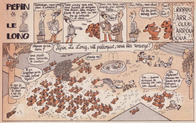
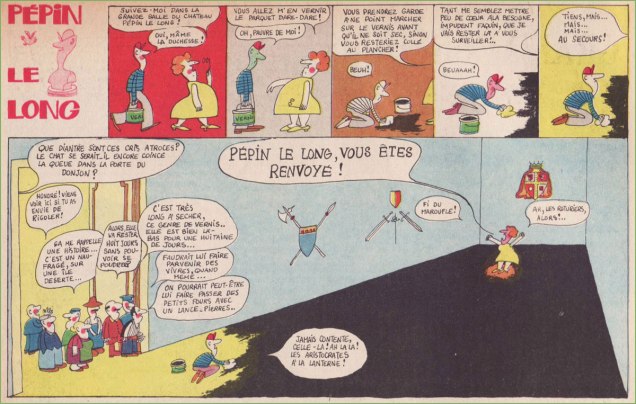
Pépin le long is a high concept strip about a poor schmuck who keeps getting fired, generally through some innocent mistake. His moniker is a play on Pépin le bref (714-768), one of the early kings of France, and a sterling example of the absolute necessity of keeping church and state separate. *That* Pépin is perhaps most famous for being papa to Charlemagne (748–814), King of the Franks and first Holy Roman Emperor.
Originally published in Vaillant, le journal de Pif no. 1131 (Jan. 15 1967, Les Éditions Vaillant).Originally published in Vaillant, le journal de Pif no. 1132 (Jan. 22 1967, Les Éditions Vaillant).Originally published in Vaillant, le journal de Pif no. 1133 (Jan. 29 1967, Les Éditions Vaillant).Originally published in Vaillant, le journal de Pif no. 1135 (Feb. 12 1967, Les Éditions Vaillant). I love those enthusiastic doggies, even if they do strip a horse to the bone like they’re piranhas.Originally published in Vaillant, le journal de Pif no. 1141 (Mar. 26 1967, Les Éditions Vaillant).Originally published in Vaillant, le journal de Pif no. 1144 (Apr. 16 1967, Les Éditions Vaillant).… and the swan song, second of two strips appearing in issue 1144. Excellent use of the vertical format for the finale!« No, young man: I’m the other, avant-garde Roland Sabatier. »
There were only ten Pépé le long strips, and I’ve managed to gather seven. Not bad, given their rarity.
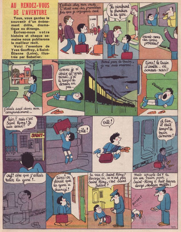
Before Pépin, in 1965-66, Sabatier had illustrated several — some forty — instalments of Vaillant’s established « Au rendez-vous de l’aventure » (1956-66), wherein readers sent in their personal stories of everyday adventure. Here’s a pair of examples.
Originally published in Vaillant, le journal de Pif no. 1068 (Oct. 31 1965, Les Éditions Vaillant).Remember cursive? Originally published in Vaillant, le journal de Pif no. 1073 (Dec. 5 1965, Les Éditions Vaillant).
« You mean the secret password is Llanfairpwllgwyngyllgogerychwyrndrobwllllantysiliogogogoch? » — Barbarella
Unlike French rock ‘n’ roll, French science-fiction isn’t an oxymoron.
A couple of months back, I happened to order a handful of issues of Fiction (1953-1990), nominally the French-language edition of The Magazine of Fantasy & Science Fiction… yet superior in the sense that Fiction’s focus was broader, encompassing as it did more elusive genres like fantastique, while devoting ample space to excellent critical essays… in the French manner.
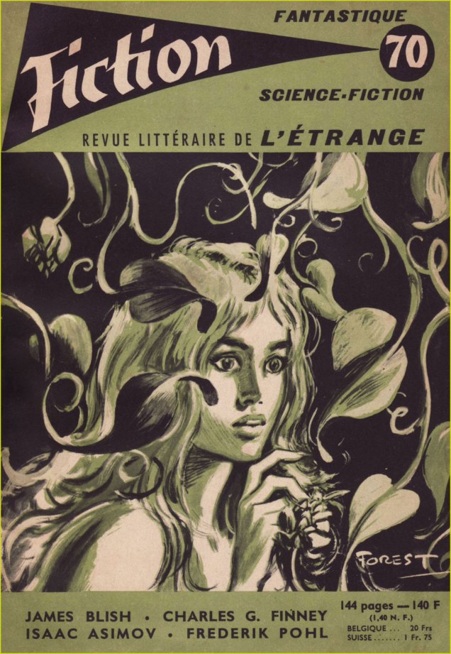
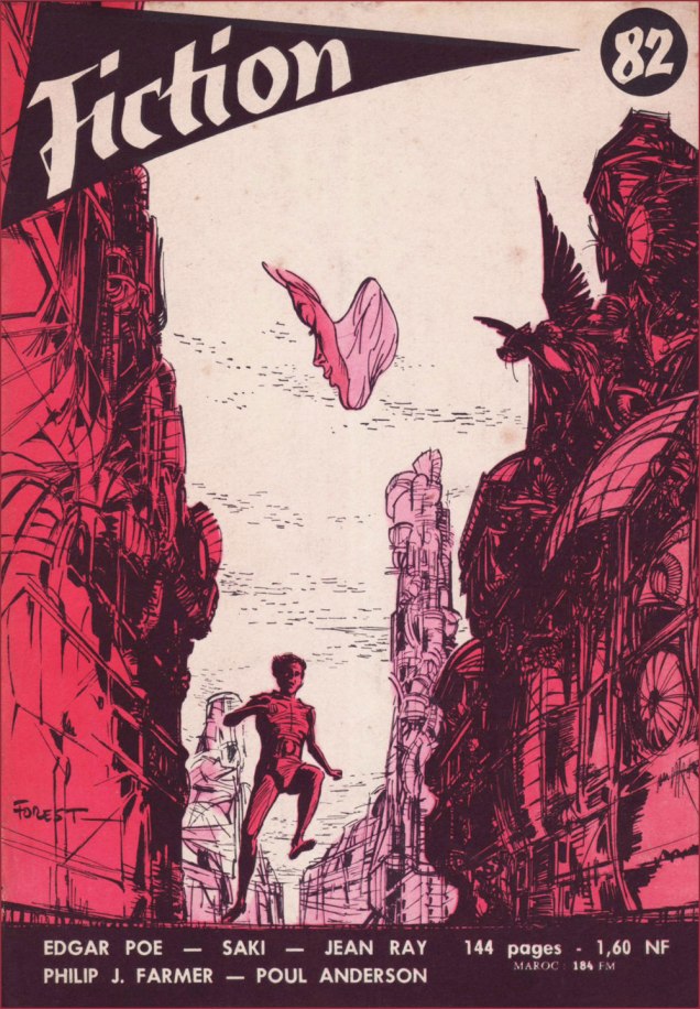
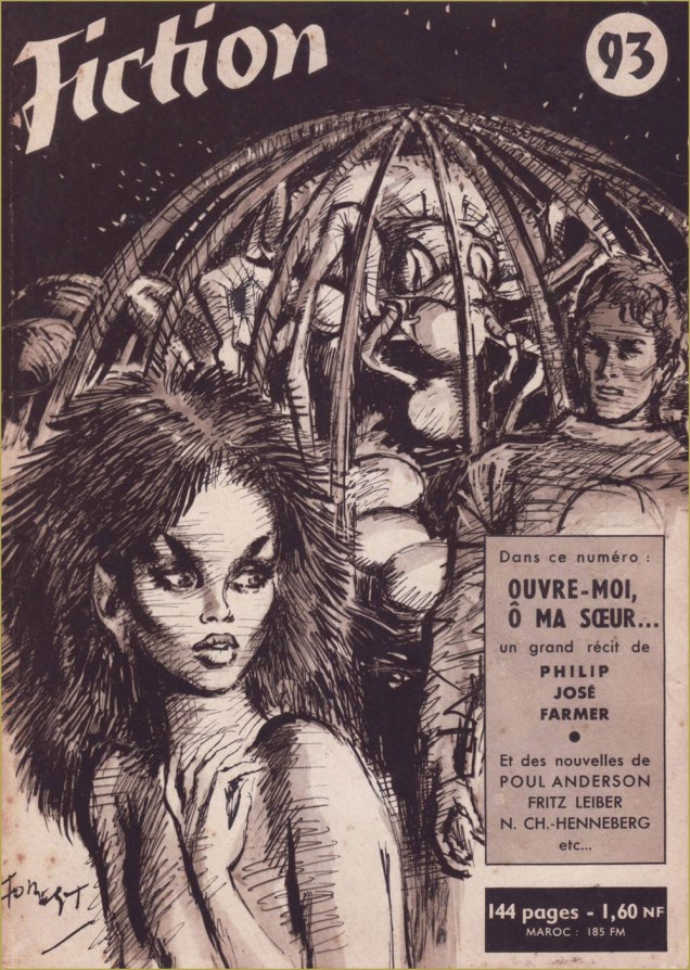
I was buying specific issues for their reprints of tales by my favourite writer, Jean Ray, and a couple of the issues happened to bear covers by future superstar Jean-Claude Forest (1930-1998), fabled creator of Barbarella, Hypocrite and Bébé Cyanure, as well as scripting early episodes of Paul Gillon‘s Les naufragés du temps.
As it turned out, Forest had lent his talents to quite a bevy of covers for Fiction — which speaks well of their editorial discernment — and as the kind seller had priced other issues at a most modest price — these are nearly seventy years old, let’s not forget — I opted to spring for more Forest rarities… and so here we are.
This is Fiction no. 61 (Dec. 1958, Éditions Opta), with Forest’s cover illustrating Julia Verlanger‘s “La fenêtre“.This is Fiction no. 64 (Mar. 1959, Éditions Opta), with Forest’s cover illustrating Robert F. Young‘s “La déesse de granit” (« Goddess in Granite »).This is Fiction no. 68 (July 1959, Éditions Opta), with Forest’s collage cover illustrating Charles Henneberg‘s “Au pilote aveugle“.Is that you, Barbarella? This is Fiction no. 70 (Sept. 1959, Éditions Opta), with Forest’s halftone cover illustrating Ilka Legrand‘s “Le rire dans la maison“.This is Fiction no. 75 (Feb. 1960, Éditions Opta), with Forest’s cover illustrating Thomas Owen‘s “Le manteau bleu“. Owen (né Gérald Bertot, 1910-2002) was among the great Belgian writers of the fantastique genre.This is Fiction no. 76 (Mar. 1960, Éditions Opta), with Forest’s cover depicting — you guessed it — Theodore Sturgeon‘s “The Silken-Swift“, translated here as « Douce-agile ou La licorne ».This is Fiction no. 81 (Aug. 1960, Éditions Opta), with Forest’s cover illustrating André Pieyre de Mandiargues‘ “Clorinde“.This is Fiction no. 82 (Sept. 1960, Éditions Opta), with Forest’s cover illustrating Philip José Farmer‘s “The Night of Light“, translated here as « La nuit de la lumière ». I love what Forest does with the composition, its focal point that elusive butterfly with a woman’s face.Forest goes gothic! This is Fiction no. 90 (May 1961, Éditions Opta), featuring a well-timed reprint of Henry James‘ 1898 novella “The Turn of the Screw” (read it here!), several months ahead of Jack Clayton and Freddie Francis‘ fine cinematic version, « The Innocents ».This is Fiction no. 93 (Aug. 1961, Éditions Opta), with Forest’s cover illustrating Philip José Farmer‘s “Open to me, my Sister“, translated here as « Ouvre-moi, ô ma sœur… ».This is Fiction no. 97 (Dec. 1961, Éditions Opta), with Forest’s cover illustrating Michel Demuth‘s “La route de Driegho“.This is Fiction no. 105 (Aug. 1962, Éditions Opta); exceptionally, Forest’s cover doesn’t refer to any of the inside stories; instead, he offers a scene featuring Pygar the blind angel, last of the ornithanthropes, a character from the bédéiste’s signature series Barbarella, which had just begun serialisation in V Magazine that spring. Finally — at least in my collection — this is Fiction no. 117 (Aug. 1963, Éditions Opta); Forest’s intriguing cover doesn’t appear to correspond to any of the stories within.
A word of warning: I plan to further elaborate on the superiority of French science-fiction in comics, but it’s daunting work, and might take a while yet, so bear with me. I’m pretty busy these days.
« The poet is a madman lost in adventure. » — Paul Verlaine
Today, we’ll examine the early history of Italian fumetti maestro Ugo Eugenio Prat’s (aka Hugo Pratt, 1927-1995) most famous personage, Corto Maltese.
Maltese (named, indeed, after Dashiell Hammett’s famous novel… or rather its John Huston-helmed cinematic adaptation) created in 1967 for the Italian magazine Sgt. Kirk… saddled with a modest print run of 3000… and rather soon cancelled owing to low sales! There, Corto turned up — as a minor player — in a tale entitled Una Ballata del Mare Salato (“A Ballad of the Salt Sea”). Corto’s peregrinations then followed their tortuous course in French bédé weekly Pif Gadget from 1970-73, where the strip mostly baffled — or even enraged — readers but was tirelessly championed by the enlightened editorial team. In his Prix Goncourt-winning biography*, Hugo Pratt, trait pour trait, Thierry Thomas states: « With each new episode, the magazine received letters from readers who couldn’t make head nor tail of it, and demanded Rahan, nothing but Rahan. » Clearly, the world wasn’t ready for Corto… but that acceptance would gradually arrive, at least in the non English-speaking world**.
While the Corto saga has been made available over the years in several fine editions in most of the European languages, it took a long time for English to be added to the roster. In the USA, IDW has managed the fairly monumental but inarguably laudable task; I only wish the covers weren’t so ill-conceived, sadly a feature, rather than a bug, of editor-designer (and translator!) well-meaning Dean Mullaney‘s reprint collections at IDW**.
This presentation by Pif Gadget’s editor-in-chief, Georges Rieu, ran on the inside front cover of the magazine’s 59th issue, between Corto’s first and second appearances:
« You’ve met him while leafing through your PIF, last week… you may have deemed him, at first glance, cynical and cold… but you quickly realised that this nonchalance was but an appearance: Corto Maltese is a kind-hearted adventurer and his attitude serves only to mask a generosity that pulls him into adventures he’d rather avoid… adventures that drag him to the four corners of Central America, from Chile to the Caribbean, in savage lands where magic and ancient superstitions yet reign… in a search for lost civilisations and treasures.
Our friend, artist Hugo Pratt, has spent nearly ten years in patiently piecing together the history of Corto Maltese… in gathering all the documents that speak of these vanished worlds, in questioning the old sailors of the ports along the coasts of the Atlantic and of the Caribbean Sea…
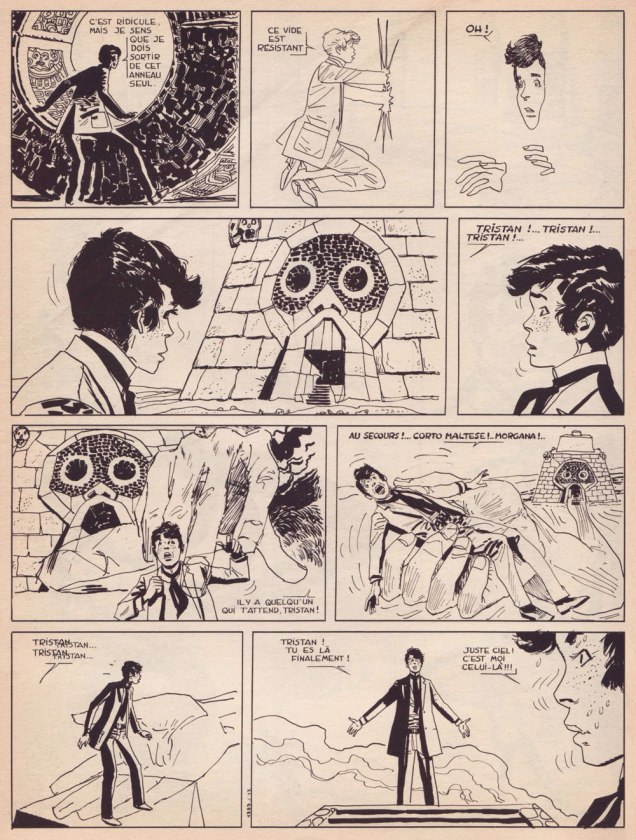
Today, he reveals to us the fruit of his research… adventures that, we are sure, will enthral you. Hurry over to page 11 and join Corto Maltese and his friends aboard their boat. »Corto’s young friend, Tristan Bantam, has some interesting visions in a sequence from Rendez-vous à Bahia (“Rendezvous in Bahia”… of course), Corto’s second solo tale, first published in Pif Gadget no. 59.
Rieu’s successor as Pif’s editor-in-chief, Richard Médioni, wrote: « In brief, in the Fall of 1969, Hugo Pratt found himself out of work. » After Pratt is crowned, that year, Best Italian Cartoonist at the Salone Internazionale dei Comics in Lucca (Europe’s oldest comics festival)… « It was expected that all publishers (French, Italian, and others, all present at the Salon) would push and shove their way to Hugo Pratt to propose a collaboration… but no such thing happened. Only Pif Gadget showed interest. »
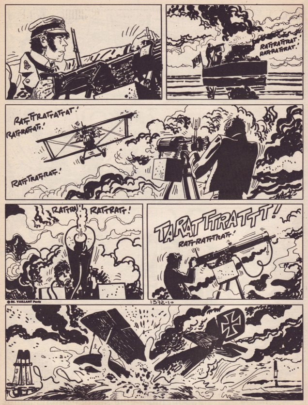
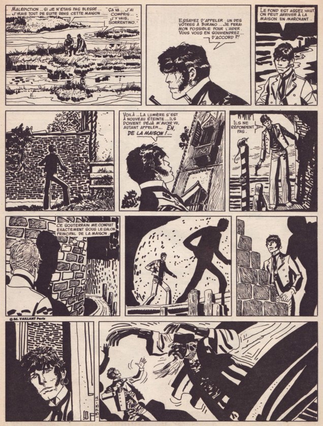
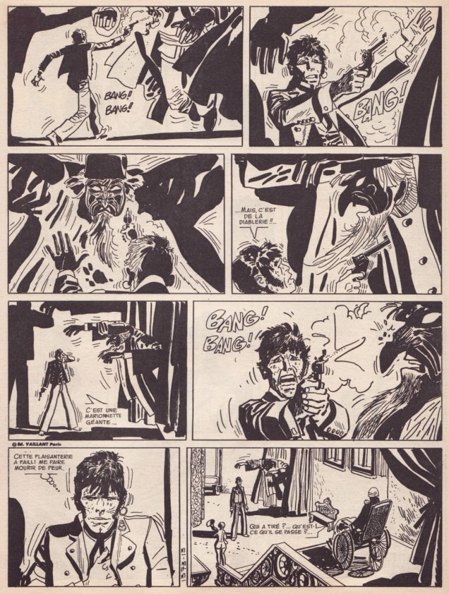
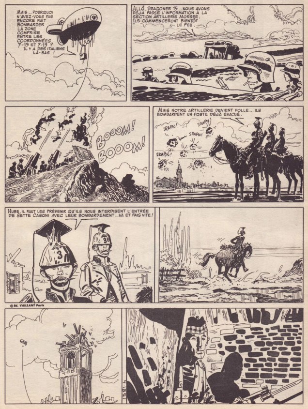
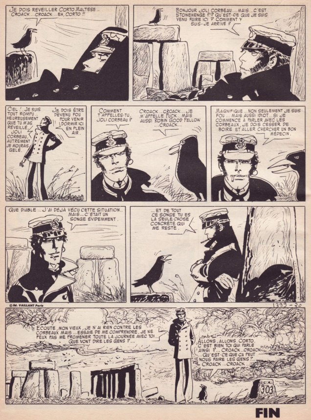
High drama and ace storytelling from À cause d’une mouette (“Because of a Seagull”), from Pif Gadget no. 89 (Nov. 1970, Vaillant).Corto is forced to take a hand in a skirmish in L’ange à la fenêtre d’Orient (“The Angel at the East Window”), first published in Pif Gadget no. 135 (Sept. 1971, Vaillant).The usually unflappable Corto gets the fright of his life in this bravura sequence, also from L’ange à la fenêtre d’Orient.Two pages from Sous le drapeau de l’argent (“Under the Banner of Money”), my initial encounter with Signor Pratt’s world. Published in Pif Gadget no. 143 (Nov. 1971, Vaillant).The quiet coda of Le songe d’un matin d’hiver (“A Winter Morning’s Dream“), set in Britain and plunging the reader into a dazzling brew of magical realism and English mythology from Pif Gadget no. 161 (March 1972, Vaillant). The featured crow is of course Puck, aka Robin Goodfellow, which you may recall from Will Shakespeare’s A Midsummer Night’s Dream. One might say it’s a bit like The Sandman, but without all the preciousness, not to mention having to deal with Neil Gaiman.
Bonus factoid: Hugo Pratt was related to another artistic giant, William Henry Pratt, aka Boris Karloff!
**According to his biographer, one of Pratt’s eternal regrets is that his work never broke through in America, land of his childhood cartooning heroes George Herriman, Milton Caniff, Alex Raymond and Burne Hogarth.
***One need only look at Mullaney’s Rip Kirby, where a blobby, lazy Photoshop shadow directly contradicts the light source indicated by Alex Raymond, a guy you’d assume it would be unwise to second-guess.