« New Year’s Resolution: To tolerate fools more gladly, provided this does not encourage them to take up more of my time. » — James Agate
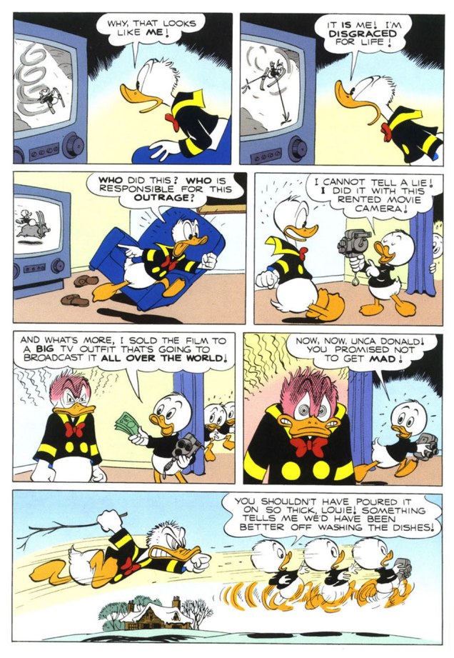
And another one gone… another one bites the dust, in the immortal words of John Deacon. Adios, 2025.
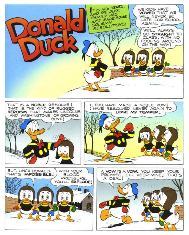
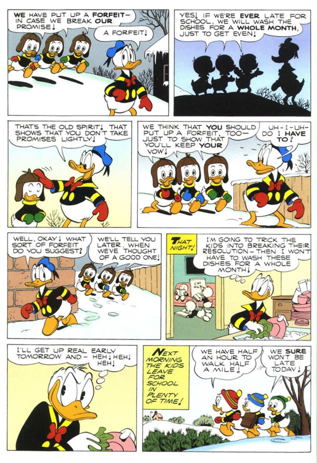
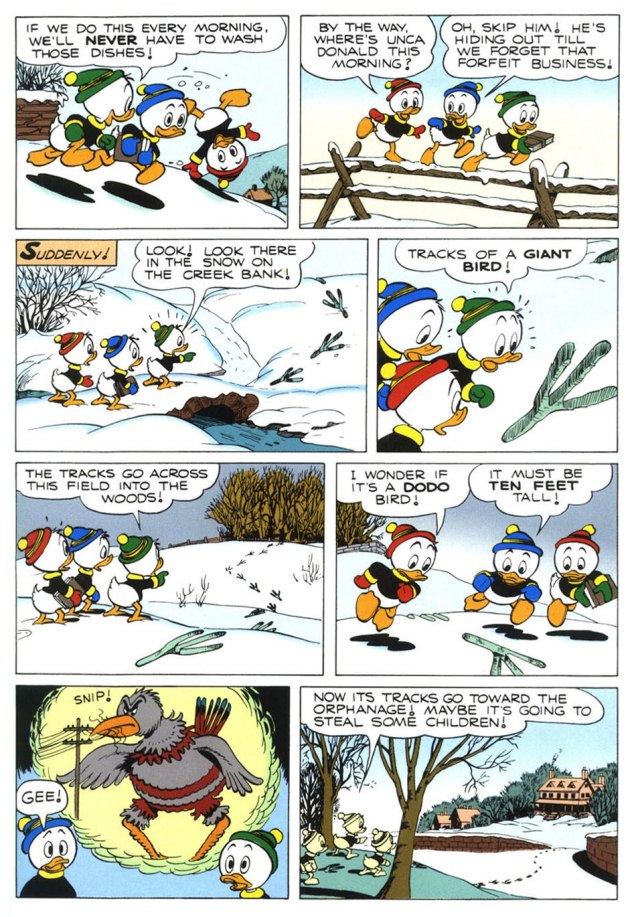
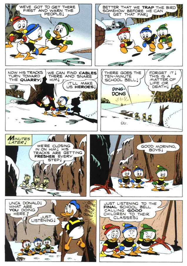
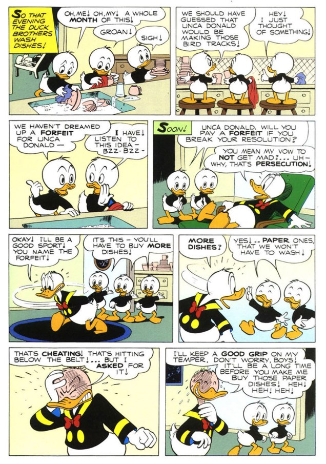
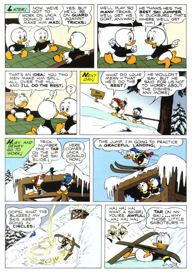
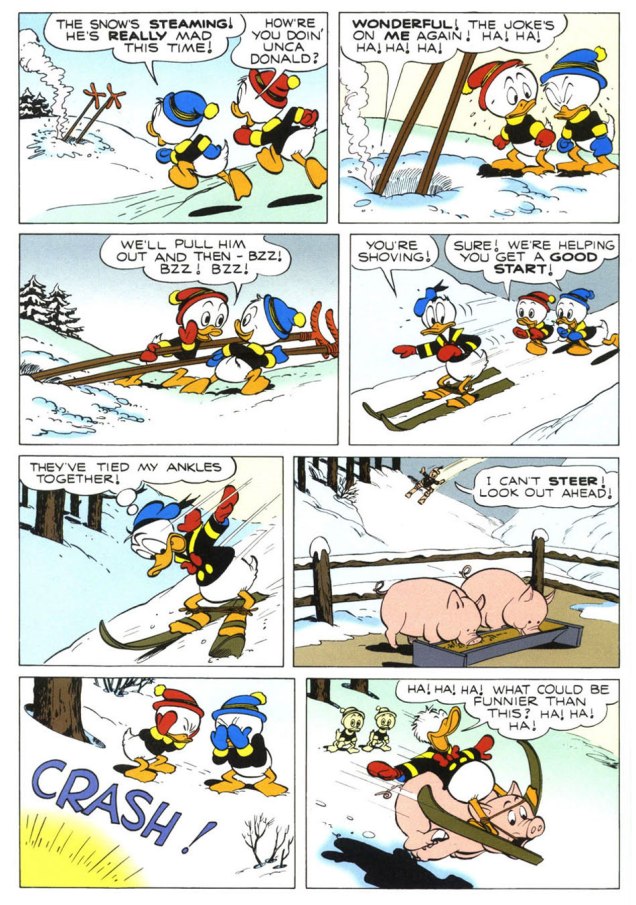
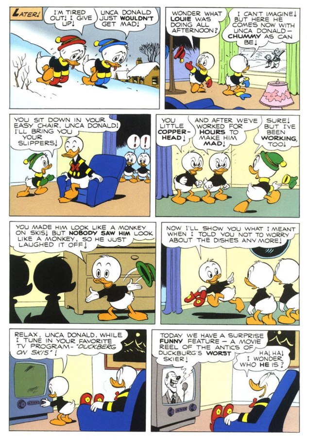
To send off the annum, and instil some hope into the ceremony, I turn to the superlative Carl Barks (1901-2000), « The Good Duck Artist », and this classic — but not overly familiar — ten-pager from Walt Disney’s Comics and Stories no. 173 (Feb. 1955, Dell)*, scripted, pencilled and inked by Mr. Barks and lettered by his wife Garé, a superb artist in her own right. Take it away, folks!
.
.
.
.
.
.
The boys’ ironic recycling of the giant bird stilts is a brilliant touch.
.
.
.
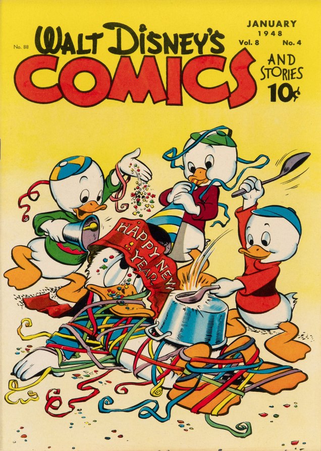
One of Barks’ most refreshing innovations is that he steered Donald’s nephews away from the typical, simplistic ‘little devils’ characterization they were saddled with at their conception. Barks made them crafty but essentially noble, in marked contrast to their Unca Donald. The issue of WDC&S that our story premiered in didn’t feature a New Year’s-themed cover, so here’s an earlier one, from none other than Walt Kelly. This is Walt Disney’s Comics and Stories no. 88 (Jan. 1944, Dell).
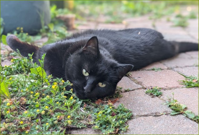
At the end of this wretched, truly merciless year, I dedicate this post to our beloved cat, Barnabas, who left us — peacefully — just this afternoon. May he be 2025’s final innocent victim.
*However, I opted for the superior reproduction values — trust me — of the reprint featured in Walt Disney’s Comics and Stories no. 623 (Apr. 1998, Gladstone). Kudos to Susan Daigle-Leach for the tasteful latter-day colouring.
« In the bleak midwinter, frosty wind made moan, Earth stood hard as iron, water like a stone; Snow had fallen, snow on snow, snow on snow, In the bleak midwinter, long ago. » — Christina Rossetti
Christmas is nearly upon us, but while a great many will opt to retreat into the miasma of nostalgia to forget what an annus horribilis it’s been, I’ve picked something a bit more appropriately sombre in tone to nail down the occasion.
But with a more hopeful chaser… to balance things out a bit.
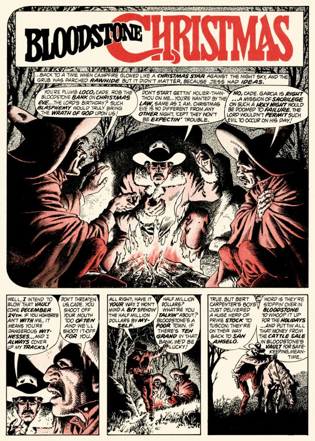
When the indefatigable Carmine Infantino (1925-2013) stepped down from his multi-hatted rôle of publisher, editor-in-chief, cover designer and art director — and so on — at DC, he found that no-one was beating his door down to offer him a similar position.
So he went back to drawing, as a freelancer. As Infantino put it: « Jim Warren was the first comics publisher to contact me after DC. I said “I’ll do work for you, but nothing full-time because I’m busy with other things.” He said, “Okay, whatever you’re willing to give me.” I wasn’t really comfortable with the Warren material — it was the sexiest work I’d ever done! Jim had an older audience and wanted it that way. My feelings about the material never affected the mutual respect Jim and I had for one another. » [ source ]
All told, Infantino pencilled around forty stories for Warren in a span of four years. There was even a brief period when he just about monopolized individual issues of Creepy and Eerie, which was offset by pairing him with wildly disparate inkers. Sometimes the results sang, sometimes they croaked.
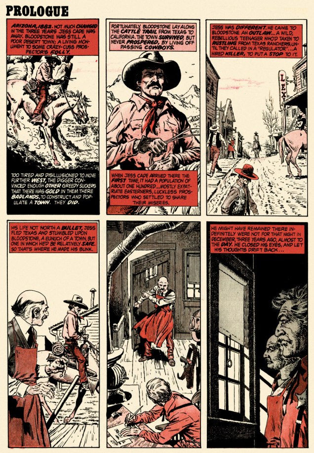
Here’s a case of rarely combined styles that nevertheless meshed beautifully: Infantino and John Severin. Let’s face it, who’s more reliably excellent than Mr. Severin?
And so this is… Bloodstone Christmas, written by Gerry Boudreau, pencilled by Infantino, and inked by John Powers Severin (1921-2012).
.
.
.
.
.
.
.
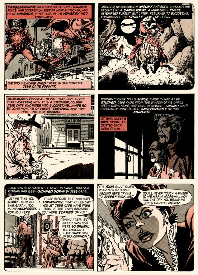
I won’t pretend that the entire cast isn’t peopled with stock characters, but its sting in the tail lands satisfyingly, prefiguring the flavour of weird westerns by Joe Lansdale, for one.
.And now, for something sweeter.
This is Creepy no. 86 (Feb. 1977, Warren). Cover by Ken Kelly (1946-2022).
And now, for the sweeter part of our double-header.
.
.
Night Prowler was an early collaboration by Swamp Thing‘s co-creators, writer Len Wein and artist Bernie Wrightson. It was published in House of Mystery no. 191 (Mar.-Apr. 1971, DC). Joe Orlando, editor.
Oh, and Happy Holidays to you, esteemed readers!
-RG
p.s. Oh, and speaking of carmine, the colour, not the man: I just read, a few days ago, in Steve Ettlinger‘s superb Twinkie, Deconstructed (2007), that « the fascinating, rich magenta carmine, also known as cochineal, is extracted from the dried body of the female cochineal insect », and that « the output of the Canary Islands is used almost exclusively to colour the Italian apéritif Campari. » Caveat emptor, then! Ironically, « carmine dye is produced from the acid that females naturally secrete to deter predators. » Not, however, industrious humans.
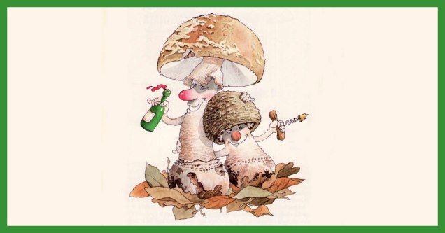
« Parmi les champignons se cachent d’ignobles individus, des espèces savoureuses et des sujets tout à fait pacifiques…»
December may not be exactly the month one associates with mushrooms, but that is precisely when mycophiles get broody and start cataloguing (mentally or otherwise) new species encountered during the warmer months*, dreaming about spring and its new flush.
Here’s a selection of mushroom portraits taken from Le gratin des champignons by Roland Sabatier, an outstanding artist previously featured by co-admin RG in « Pépin le Long, You’re Fired! » (and, need I mention, a member of the Mycological Society of France). The second reaction I had upon leafing through this volume’s pages (the first was to squeal delightedly) was stunned admiration regarding the level of detail with which each mushroom is illustrated. I am by no means the first to note this (in his outstanding introduction, Georges Becker**, co-author of this tome, makes much the same point in far more eloquent prose), but it bears mentioning that while Sabatier may have transformed mushrooms into wonderful characters with their own games and stories, he managed to so very rigorously observe and illustrate their characteristics that one could actually use this book as a mushroom guide and not get, you know, poisoned.
Let’s get cooking!
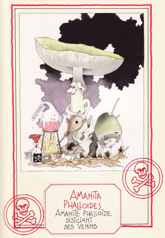
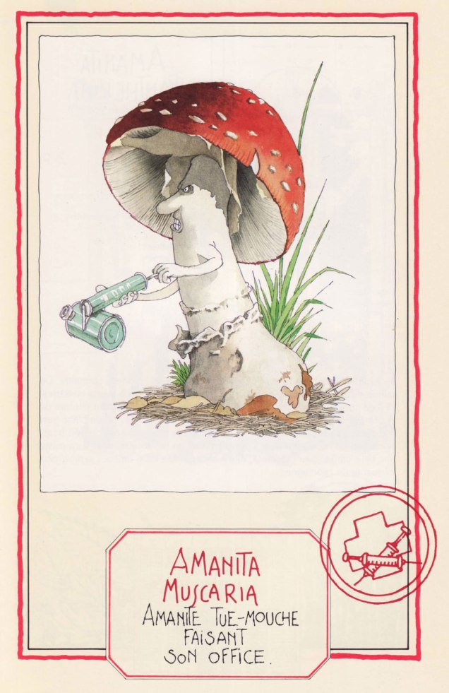
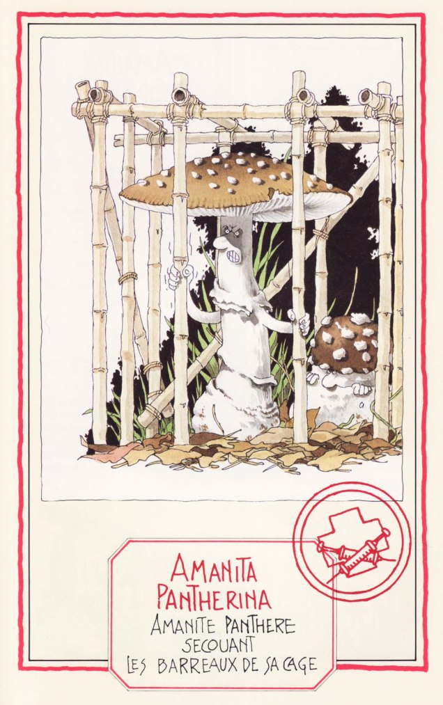
Speaking of getting poisoned, meet four Amanitas, a most deadly genus… with a few delicious, choice morsels thrown in to keep us on our toes:
The Death Cap… distilling its own venom. A most lethal animal.
The Fly Agaric, probably the most depicted mushroom in the arts, ‘performing its function‘. Despite its reputation, it is not deadly per se, as alluded to in a previous post (Fungus Friday: Amanita New Year (To Get Over This One)).
The Blusher, so called for its propensity to blush a pink hue when bruised (or embarrassed, one presumes). These wino amanitae exiting the tavern definitely look sloshed.
The handsome Panther Cap, shaking the bars of its cage. Like its Fly Agaric cousin, it’s not deadly as such, and has some psychoactive components. Admire its striking looks here.
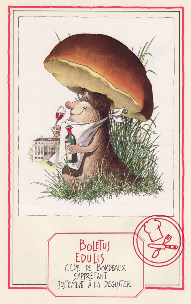
Now we move on to more traditionally edible characters —
The Banded Agaric is also known as ‘Pavement mushroom’, which explains this fur-foxed lady showing her goods… walking the beat, as it were. This lady is tough as nails, and has been known to burst right through the pavement. Is she edible? You bet! ***
Ah, mushroom of many names (does this make it the rose of mushrooms?) – Penny Bun, Porcino, Cep, call it what you will… highly prized throughout cultures, fragrant à souhait. Here the cèpe de Bordeaux is about to savour some Bordeaux wine.
A favourite of WOT admins, the Fairy Ring Mushroom, saddled with an unfairly gloomy Latin name (‘marasme’ comes with an etymology of ‘wasting away’ or ‘decay’), dancing a ronde. Undemanding and widely spread, this mushroom dries most excellently (sometimes right on the very lawn it grows upon) and enlivens soups and stews throughout winter.
Another well-known mushroom, the Golden Chanterelle, as beautiful as it is fragrant. Will I picture these playing tiny little violins every time I find them in a forest? Absolutely.
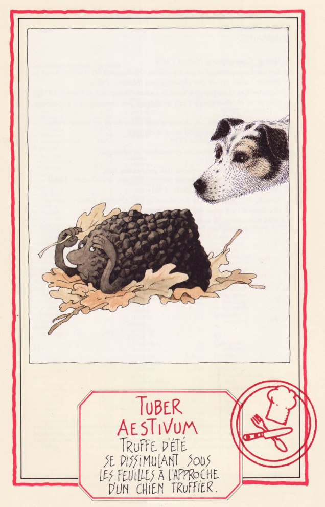
We couldn’t resist adding this scene depicting the Summer Truffle trying to camouflage itself as a truffle-sniffing dog approaches. I love the inquisitive gleam in the doggo’s eye.
We wrap up with, well… I trust you can interpret the Latin well enough without me. The Common Stinkhorn (‘stinky satyr indulging in his depravity‘) is actually edible, though not nearly as popular (or tasty) as another member of its family, the pretty Veiled Lady. Whether you would actually want to eat it is another question.
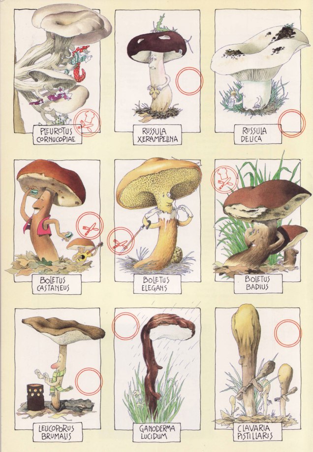
First published in 1986, this book has known several editions to update nomenclature (some mushroom families and names have changed considerably in the last 40 or so years, which is its own topic). We have the 1991 edition, published by Glénat. Sabatier had so many favourite mushrooms he illustrated, they didn’t even all make it into the book officially… which is truly a crime. Take a peek at some other of his mushroom people, only included on the inside of the book’s cover (but at least included in that smaller capacity!):
~ ds
* Technically one can find some mushrooms during winter, but that is not my area of expertise (at least as yet).
** French mycologist of renown (1905-1994), as well as writer, politician and apparently even musician (piano).
*** I’m actually not a big fan. This Agaricus tastes too much like the ‘champignon de Paris’ mushrooms sold in supermarkets to be of much interest.
« The mind loves the unknown. It loves images whose meaning is unknown, since the meaning of the mind itself is unknown. » — René Magritte
Last month, we flew off to explore the wonders of Belgium, most specifically Flanders. All other attractions aside, I thought I’d share with you some of the marvels of the country’s comics culture. Hop on!
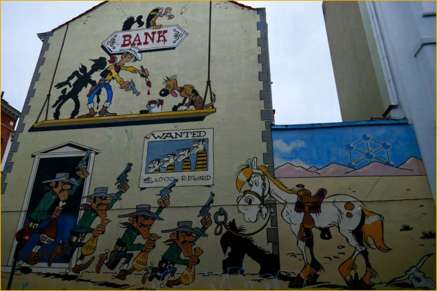
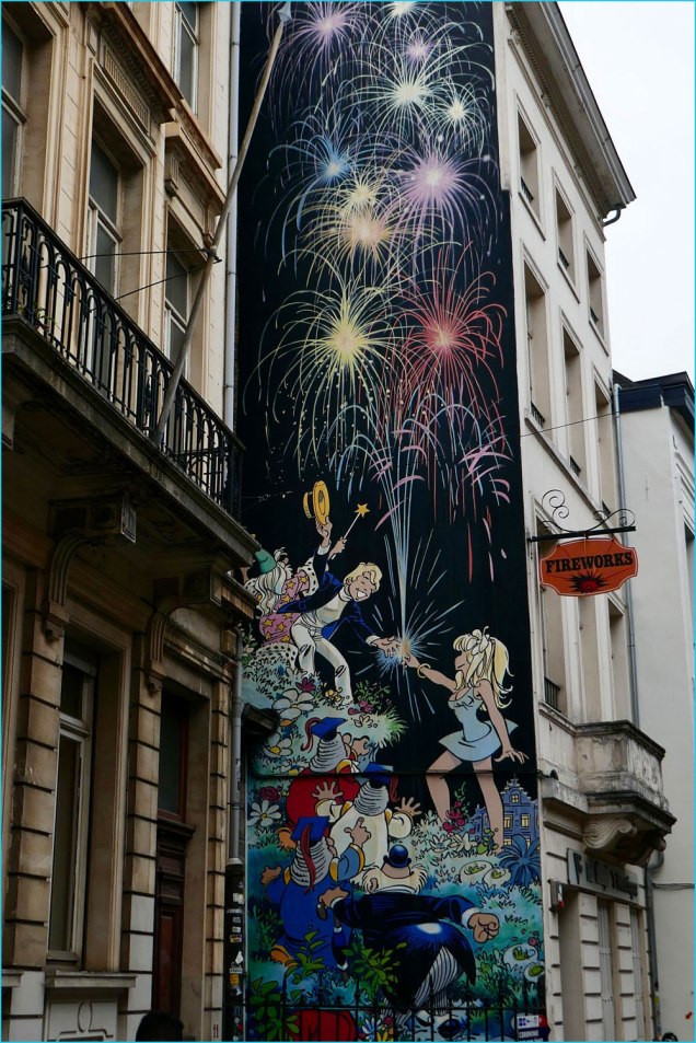
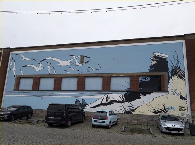
At Ostende’s cozy Le Touquet seaside restaurant, we were shown the shortest path to the loo by no less a personage than the legendary Cowboy Henk, touting local drink Blonde Kuif.This group scene from René Goscinny and Albert Uderzo‘s Astérix was appropriately located in a schoolyard, with kids eagerly playing ball just a few metres away.In a different range, this mural suitably pays homage to French ‘ligne claire‘ master Yves Chaland (1957-1990).It was nice to see the frescoes maintained. This one, located in Antwerp, celebrates Flemish cartoonist Jeff Nys‘ Jommeke: « It seems fitting that this wall by artist Jef Nys, the greatest Flemish cartoonist for children, is in an area surrounded by schools. His most popular comic was Jommeke, a story about a young boy, with a pet parrot named Flip, who goes on some crazy adventures along with his best friend Filiberke. Nys started Jommeke in 1955 and created close to 300 comic albums. They have sold over 51 million albums alone in Belgium, making Jommeke the second best-selling comic series in the country. » [ source ]I’ve no idea who these characters might be, but I raise my glass (of Belgian beer, naturally) to the vibrant creativity of the nation’s graffiti practitioners.Another lovely one saluting one of Belgium’s bédé superstars, Maurice de Bevere, alias ‘Morris’ (1923-2001).We found that Brussel’s streets were frequently adorned with striking mosaic markers, such as this one, featuring André Franquin‘s Marsupilami. I forget what thoroughfare this was, I’m afraid.This one captures Philippe Dupuy and Charles Berberian‘s Monsieur Jean and his presumed and entirely laudable and justified appreciation of Belgian beer, the world’s finest — you can keep your IPAs, thank you.A mural devoted to Michel Greg and Daniel ‘Dany‘ Henrotin’s Olivier Rameau, fittingly painted on the side of a Fireworks store at 9, rue du chêne, Brussels. Top to bottom: Ebouriffon, Olivier Rameau, Colombe Tiredaile, the 3 Ziroboudons, Alphonse Pertinent.Despite having no Belgian roots that I can figure, Hugo Pratt‘s Corto Maltese clearly is beloved in these parts. He landed no fewer than *four* murals, all neatly in a row. Here are my two favourites.A most unusual — and striking — composition.And now we come to my Holy Grail, Brussel’s Gil Jourdan mural… there are two more in Maurice Tillieux‘s hometown of Auderghem (here’s one, and the other, and yet another in the bédé-themed Janson metro station in Charleroi). The author appears for size comparison.Local graffiti artists come to the rescue: it seems inconceivable — to me, anyhow — that there isn’t a mural devoted to Willy ‘Will’ Maltaite‘s characters. There used to be a lovely « Isabelle » fresco in Brussels, but, citing damage, it was painted over in 2017. However, here’s an unofficial, and brilliant one featuring Tif et Tondu… and their archnemesis, Monsieur Choc. Take a bow!
« May the man who has his finger on the button have a lovely day today / Hope nothing hangs him up or ticks him off or bums him out in any way / Lord, help him keep his cool cause he could pull the final curtain on my play / May the man who has his finger on the button have a lovely day today. » — Larry Wilkerson (as warbled by Bobby Bare)
The idea for this post came to me a couple of days ago, and this afternoon, while cobbling together the visual components, it dawned on me that today’s Memorial Day (Remembrance Day for Canadians, and ‘Victory Day‘ for those afflicted with brain worms and/or syphillis), and therefore quite à propos.
DC’s The Day After Doomsday series first turned up — of all places — in the pages of The Witching Hour, a page and a half bit of filler fluff by Len Wein and Jack Sparling. It must have struck a chord, if not with readers, then with its creators, for the feature stubbornly kept a-rising from its post-apocalyptic grave.
In spite of its episodic and arguably slight nature, TDBD enjoyed surprising longevity. It truly found its home in the Joe Orlando-edited Weird War Tales (1971-1983, DC’s gateway title for war fans into ‘horror’ and vice versa), where most of its dispatches saw print. You never know what’s going to catch on with the unwashed masses.
A most humble beginning for a series, this brief scene appeared in The Witching Hour no. 9 (June/July 1970, DC). Script by Wein, art by Jack Sparling (1916-1997). Dick Giordano, editor.
.
Humour rears its homely head in the concurrently appearing second instalment — too close to call! — this one from House of Secrets no. 86 (June/July 1970, DC). Same creative team.
.
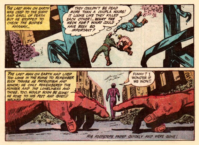
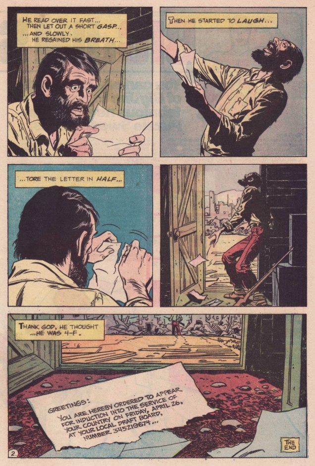
My candidate for the series’ finest hour, this episode elegantly riffs both on the Vietnam War Draft and on Fredric Brown‘s classic 1948 short-short ‘Knock‘, wherein «The last man on Earth sat alone in a room. There was a knock on the door… » 4-F, incidentally, signifies « Registrant not acceptable for military service. To be eligible for Class 4-F, a registrant must have been found not qualified for service in the Armed Forces by an MEPS under the established physical, mental, or moral standards. » And let’s hear it for perennially under-appreciated artiste Bill Draut (1921-1993).
That issue had a splendid cover, and so here it is!
This is Weird War Tales no. 30 (Oct. 1974, DC); cover pencils and inks by Luis Domínguez, from a probable design by publisher Carmine Infantino.
.
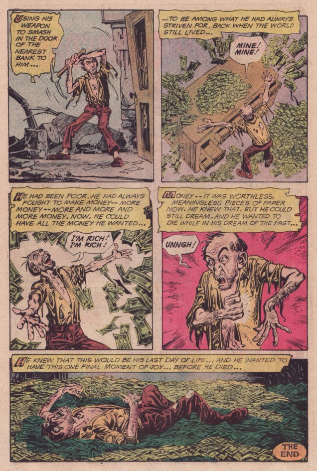
A scroogey teaming of WOT? favourites Steve Skeates and Alfredo Alcala, this turned up in Weird War Tales no. 35 (March 1975, DC). I’ll bet they had trouble deciding whether to run it in Plop! or WWT.
.
Finally, this one appeared in Weird War Tales no. 48 (Sept./Oct. 1976, DC). Script by Skeates, art by Buddy Gernale.
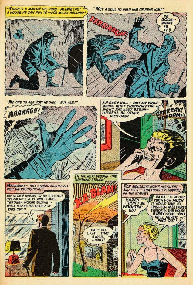
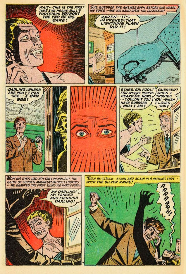
« Before he can become a wolf, the lycanthrope strips naked. If you spy a naked man among the pines, you must run as if the Devil were after you. » — Angela Carter (1940-1992)
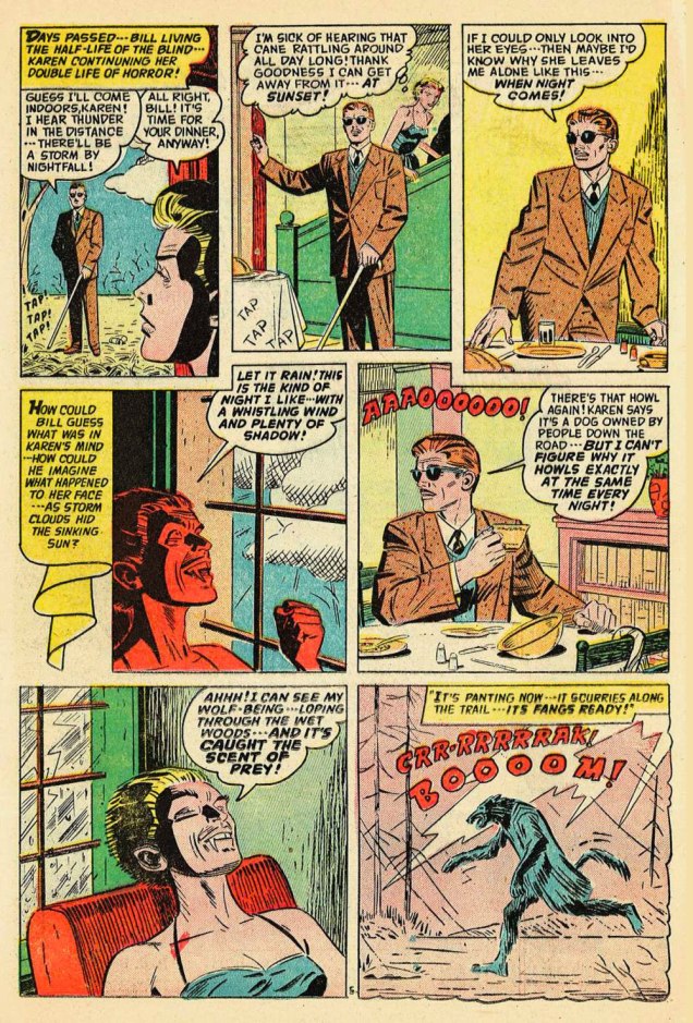
First of all, Happy Hallowe’en! On this finest of occasions, I bring you a wonderfully novel take on the hoary theme of the werewolf, handled by one of the truly unsung — save, it would seem, but some of his most distinguished peers* — draughtsmen of the Golden Age, namely Emil Gerswhin (1922-1999).
And yes, *that* George. Just like, say… the Partches, Virgil and Harry, genius clearly ran rich throughout the Gershwin line.
.
.
.
.
.
.
I wasn’t alone (Steve Bissette saw it too) in concluding that the terrific Mitch O’Connell just has to be Mr. Gershwin’s most direct — and worthiest — artistic progeny.
*By « distinguished peers », I mean the likes of Alex Toth, Al Williamson and Stephen Bissette. The latter wrote, in his introduction (essential reading alert!) to PS Artbooks’ Adventures Into the Unknown Volume 4 (March 2013, PS Artbooks): « Like almost all of the ACG horror comics, Gershwin’s work was the antithesis of the festering, tactile rot that made celebrated Pre-Code genre artists like Graham Ingels, Jack Davis, and Basil Wolverton so indelibly iconic: horror comics you could almost smell. Gershwin’s imagery is comparably sterile, even antiseptic, but his storytelling is as direct and no-nonsense noir as the best of Johnny Craig, his energetic pen-and-brush work as crisp and razor-sharp as Jack Davis‘ (sans the grit and grue and bits of meat and dirt spattering every motion), his staging as audacious as that of any cartoonist of his day. »
Bissette goes on to quote Williamson on Gershwin: « Oh, God, Gershwin was good. … he and [Ogden]Whitney were their best ever! A real draftsman, a solid cartoonist all-around. You should look him up, you could learn a few things. »
As for Toth, check out — his handwriting’s always a treat to see — what he wrote to Emil’s daughter Nancy over the course of their correspondance.
Again, our spotlighted tale isn’t the cover feature, but I nonetheless felt it my sacred duty to share this unusual beauty by Ken Bald (1920-2019). This is Forbidden Worlds no. 34 (Nov.-Dec. 1954, ACG), the title’s final Pre-Code issue. In 1955, FW would return to the stands after nine-month hiatus and take its final bow in 1967 after a sprightly run of 145 issues.
-RG
P.s. And while I dodged the headache of our traditional countdown this year, nothing — least of all me — is preventing you from raiding the boneyard of our past efforts, shameless ghouls that you are. Here are some handy links to put you into Hallowe’en orbit for a good long while :
Grimm’s Ghost Stories (60 issues, 1972-1982, Gold Key/Whitman) is a title I’ve been, in my usual fashion, lazily collecting for decades. I’ve always found in the Gold Key ambiance a soothing respite from the obsessive continuity and slam bam histrionics of DC and (the chief offender) Marvel.
While writer Arnold Drake‘s numerous credits at DC (and, to a lesser degree, Marvel) are well documented, his passage at Western/Gold Key in the mid-to-late 1970s is unjustly shrouded in obscurity. Let’s just say he — along with his young colleague Freff — brought complexity, warmth and wit to the publisher’s frankly formulaic fare.
.
.
.
.
.
.
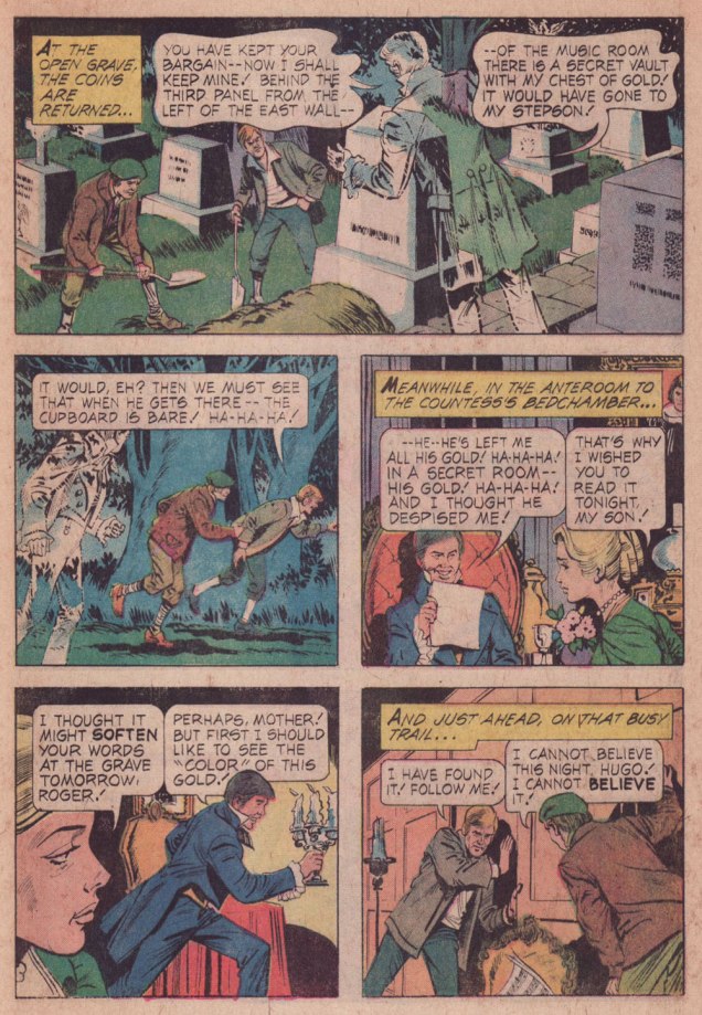
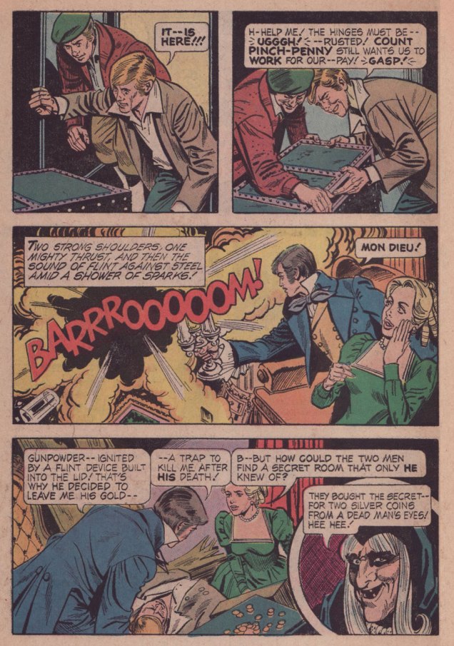
This isn’t the spookiest ghost story of them all, far from it, but that’s hardly the point, is it? Fun fact: the practice of putting coins on the deceased’s peepers was poetically called ‘Charon’s Obol‘.
I love the well-developed characters… despite the tale’s brevity. The willful stepson whose only sin is that of being a free thinker; the grave-robbers who can keep their wits about them in all circumstances; and the pragmatic miser’s spectre who’ll trade one act of revenge for another in a pinch.
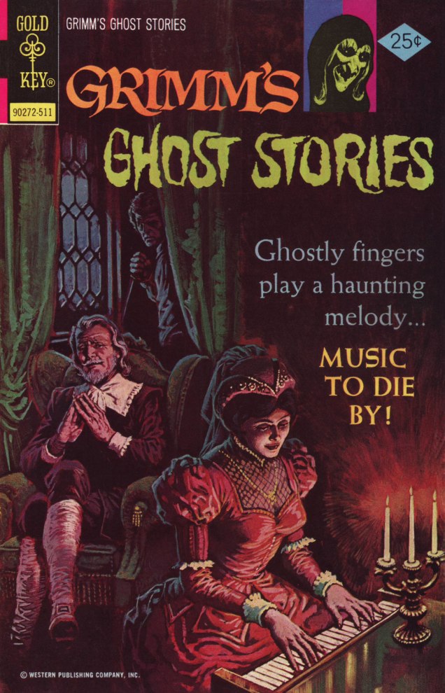
While ‘Silver’ wasn’t the cover-featured story, I wouldn’t pass up the chance to spotlight such a fine, understated Luis Domínguez painting. This is Grimm’s Ghost Stories no. 27 (Nov. 1975, Gold Key). For our gallery of this Argentine master’s finest, check out Luis Domínguez (1923-2020): A Farewell in Twelve Covers.
« The sacred is found boring by many who find the uncanny fascinating. » — Mason Cooley
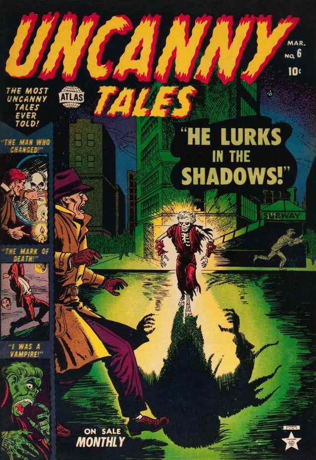
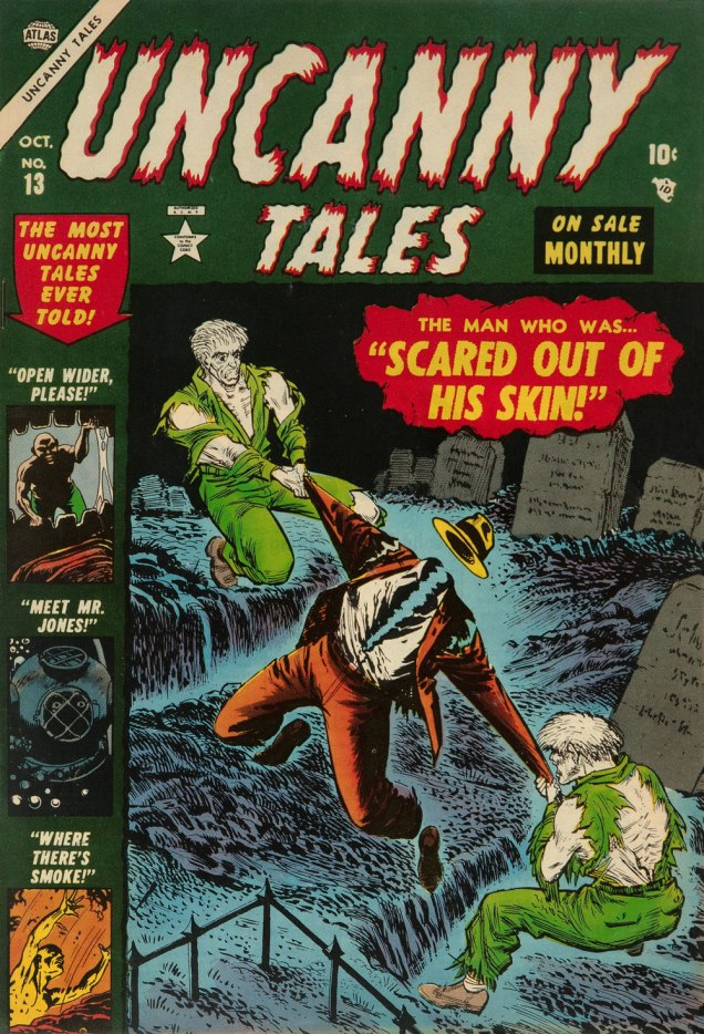
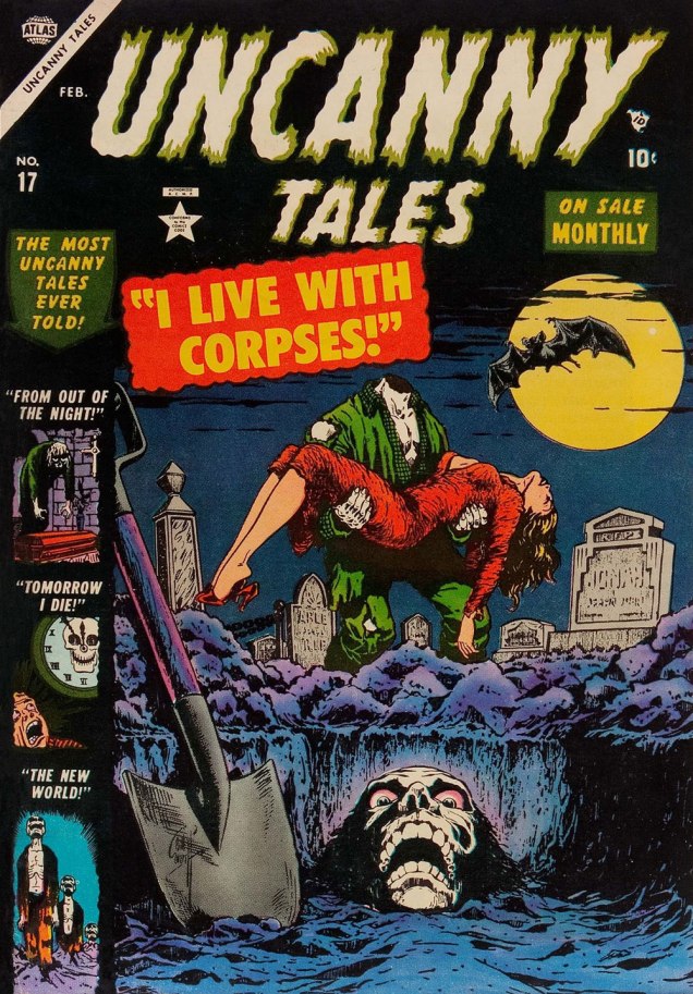
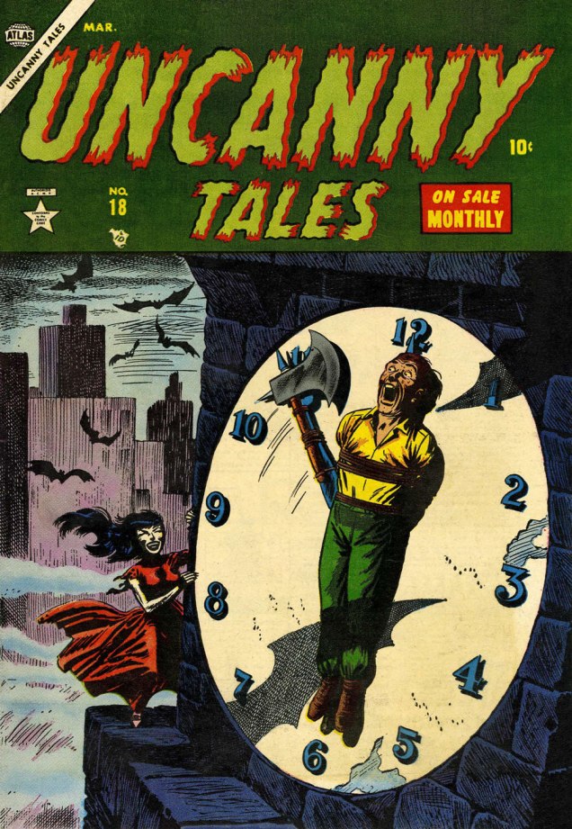
I’ve expressed many a time my ambivalent affection for Golden Age Atlas horror comics: in short, despite their slapdash, often incoherent writing, they had a solid stable of artists (which makes the thin writing all the more disappointing); but most of all, they generally had eye-catching covers, splendidly coloured (easy a task to underestimate!) and blessed with a light touch absent on the insides.
Today, I’ve picked out my favourite covers from Uncanny Tales (fifty-six issues, 1952-57). Enjoy!
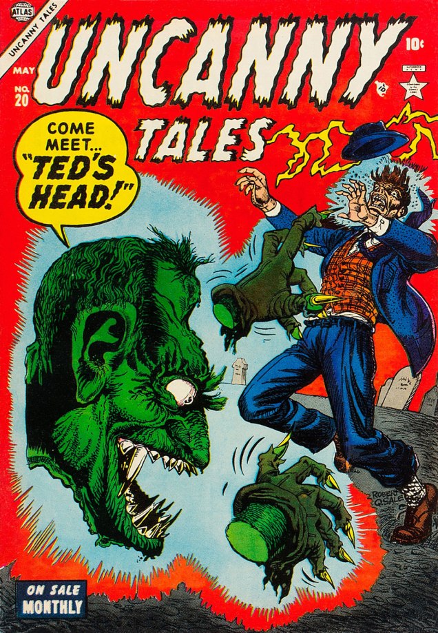
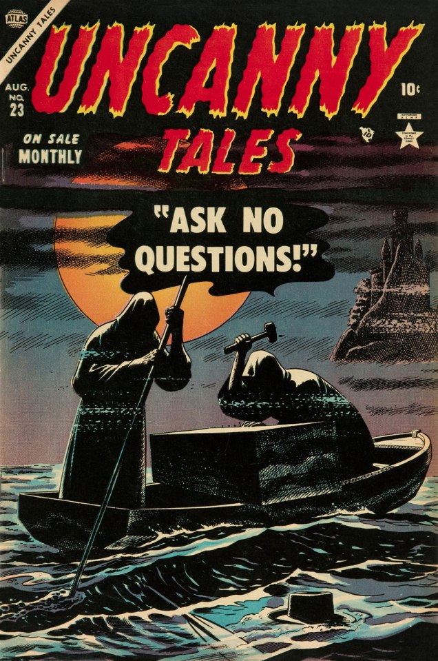
This is Uncanny Tales n. 5 (Feb. 1953, Atlas), cover art by Bill Everett, colours — consistently fine! — presumably by Stan Goldberg in all cases.This is Uncanny Tales n. 6 (Mar. 1953, Atlas), cover art by Bill Everett.This is Uncanny Tales n. 13 (Oct. 1953, Atlas), cover art likely a collaboration by Sol Brodsky and Carl Burgos.This is Uncanny Tales n. 17 (Feb. 1954, Atlas), cover art by Bill Everett.This is Uncanny Tales n. 18 (Mar. 1954, Atlas), cover art by Russ Heath. For a gallery of further Heath spookies, check out this entry from last year. This endearingly goofy one is Uncanny Tales n. 20 (May 1954, Atlas), with cover artist Robert Q. Sale giving it his best Joe Maneely imitation.Surely the leading candidate for “Most understated Marvel cover of the 1950s”… if not of all time. Stan must have been away from the office. This is Uncanny Tales no. 23 (Aug. 1953, Atlas); Art by Russ Heath. I’m understandably reminded of that old-timey jibe, « Walk East until your hat floats ».This is Uncanny Tales n. 27 (Dec. 1954, Atlas), cover art by Max ‘Carl Burgos‘ Finkelstein.And one post-Code entry, since it’s so outstanding. This is Uncanny Tales no. 48 (Oct. 1956, Atlas), Another subtle one by Russ Heath, but in a totally different register. Kudos!
« True friends stab you in the front! » — Oscar Wilde
First, the update: we’re off to Belgium for a much-needed vacation… which is frankly incompatible with our usual Hallowe’en Countdown.
Surely you can still get into the spirit of the season by revisiting any of the eight previous editions.
We’ll still try to post as often as possible, and I promise you that the topics all will honour the mischievous spirit of All Hallows’ Eve.
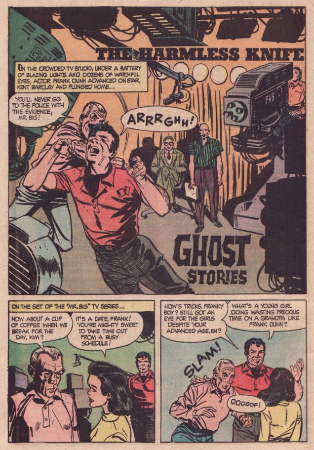
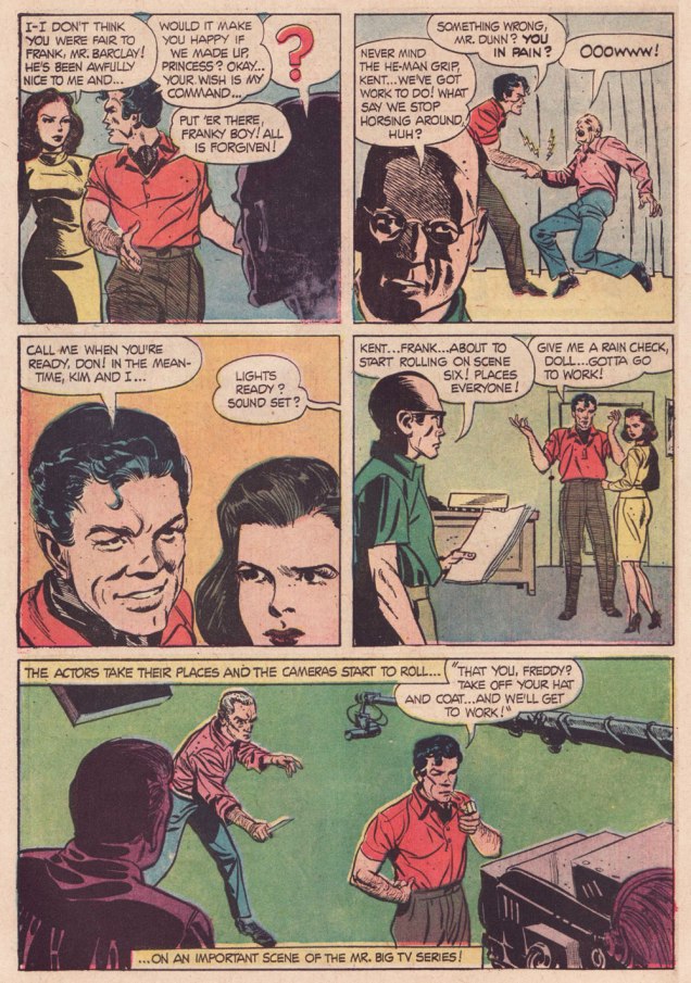
To wit: a few years ago, George, exalted founder of trefology… and assiduous friend of WOT?, asked me to track down — and hopefully feature — an elusive story he recalled from his callow youth. He described the plot, which rang a bell… at least that’s what I said at the time. Last month, he gently reminded me of my mission and, this time, I’m seeing it through.
And so here’s The Harmless Knife from Ghost Stories no. 14 (June 1966, Dell), later reprinted in Ghost Stories no. 34 (Oct. 1972, Dell)… which is where George encountered it.
Here’s his reaction:
THAT’S IT! Ah, I remember it well.
I’m pretty sure I bought that comic at a little roadside grocery near Strawberry, CA. We usually spent most of the summer on the beach, and comic books were an essential part of my day.
My mom loved the area so much she eventually moved there (with all my comics in tow—so, in a manner of speaking, my Dell horror comic returned home).
As was generally the deplorable case with Dell, no credits. Therefore… writer unknown, but pencils and inks by Frank Springer (1929-2009).
.
.
.
.
.
Amusingly, I’d featured another story, A Room With a Dreadful Secret — from the very same issue! — a few years ago. Read it so I won’t have to repeat myself needlessly… thanks!
« I think people will believe anything about someone they haven’t seen for a while. » — Gabriel Kaplan
I’ve been meaning to do a Welcome Back, Kotter post for several years. But when I thought about it, I understood that hitching it to the show’s fiftieth anniversary made considerably more sense than, say, its forty-seventh. And while I adore William Johnston‘s sextet of tie-in novels, it would be quite a stretch for a comics blog to cover. Far closer to the mark lies Arnold Drake‘s trio of WBK storybooks, illustrated by Mel Crawford and Jack Sparling. But in the end, I bided my time and managed to get in touch with the scribe first assigned the Kotter Komic assignment, Elliot S! Maggin. And boy, am I glad I did. And so, fifty years to the day of the airing of its pilot episode*, let’s talk Kotter!
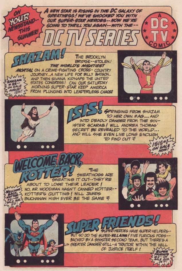
Remember the DC TV line? This ad ran in several DC titles over the summer of ’76.
WOT: First, a bit of context: correct me if I’m wrong, but in the early stages of your career writing comics, you always worked alongside editor Julius Schwartz. Then, in late ’75 or early ’76, something changed, and you began writing for other editors’ titles. What’s the story?
ES!M: Well, Julie was kind of proprietary about me for most of the time I was working with him.
WOT: A sideways sort of compliment.
ES!M: I guess. At some point, Dorothy Woolfolk was editing the Lois Lane book, and… he introduced me to her. She just came into his office for some reason. She said: « Oh, you know, you should write some stuff for me! » And he said « No, he’s very busy, go away! » And he chased her out of the office. And I’m thinking, « Oh, okay. That’s how we’re doing it. »
So I didn’t really go about… I didn’t really make friends with many of the other editors. I tried to make friends with Joe Orlando. You know, I’d have lunch with him once in a while, I guess.
This is Welcome Back, Kotter no. 1 (Nov. 1976, DC); cover by Bob Oksner.
ES!M: But around the time Kotter came out…
You know, people used to hang out outside of Julie’s office door, listening to us plot, because it was so loud. We would yell and scream at each other constantly. He was this Jewish boy from the Bronx, and I was this Jewish boy from Brooklyn, and once I got comfortable working with a guy thirty-five years older than me, we’d just fight all the time. And every once in a while, we’d get serious.
WOT: Serious fighting, or serious work?
ES!M: Yeah, yeah! The fighting was work.
WOT: Sometimes that line is dreadfully thin.
ES!M: I guess at that point, he got mad at me, and I didn’t get work for a couple of weeks. I went to Joe, and I said: « What ya got? », and he said he’s doing this Welcome Back, Kotter book, and I said « Great! I watch that show, that’s fun. » So I wrote the first issue, and that was fine.
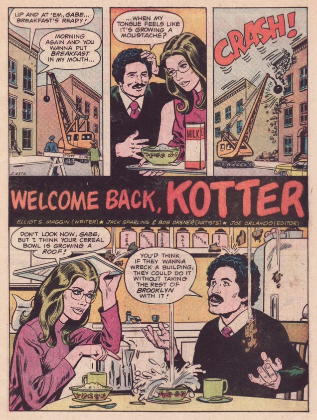
Here’s a quartet of pages from the première issue. Pencils by Sparling and finishes (and surely likenesses) by Oksner.
.
.
Aw, Maggin’s Mr. Pevey would have made a great addition to the TV show’s cast.
ES!M: They called me down in Carmine‘s office, to watch episodes of the show. It had been on maybe six weeks at that point. Episodes I had already seen, but I liked hanging out in Carmine’s office, because it was big, and he had a lot of toys around. So they set up this video tape… thing, and I watched the shows again, and I wrote the second issue.
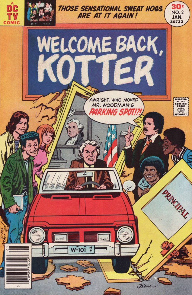
This is Welcome Back, Kotter no. 2 (Jan. 1977, DC); cover by Oksner.Art-wise, the second issue seemed comparatively rushed, and sans Oksner, likenesses pretty arbitrary. See what I mean? The GCD attributes the inks to Sparling, but I lean towards Frank Springer.
ES!M: I was living in an apartment complex on Long Island, and there were all these kids around… little kids. And I would work at home, mostly. So they would hang around with me, whenever they realized I was home. They would… shoot me through the window or… something. At some point, whenever I’d write a gag, I would…
WOT: … run it past them?
ES!M: Yeah! And they’d laugh, and run off and play some more. And I figured, as long as they laughed, it was okay. Because they were hearing the voice of Barbarino, or whoever. At some point Travolta would say, « Uh? », or « Duh », or « What d’you think? », something dull, that he delivered in a funny way. And the kids related what I wrote to what Travolta did on screen, so they were getting it. And at some point I realized that Joe [editor Orlando] didn’t watch the show.
WOT: Oops.
ES!M: And he would then object to my Barbarino bits, or Horshack bits, or whatever. So I told him « You’ve got to watch the show, you’ll get it! » But you know, after maybe… how many issues did I write, three, four?
WOT: Just two, I’m afraid. You wrote the first couple, then Tony Isabella did one, then Mark Evanier…
ES!M: I’m sure he (Evanier) watched the show — he watched everything.
WOT: He was even the show’s story editor for part of its second season. So… then Bob Toomey wrote four issues, Scott Edelman two, and there was a leftover story by Evanier that saw print in the WBK Collector’s Edition in 1978.
ES!M: But Joe did not. I mean, he didn’t have time, and he was madly in love with his wife, and he didn’t watch television at all (laughs). He wasn’t paying attention to the source material.
WOT: That happens. But it seems a pretty unfortunate blind spot for a book’s editor.
ES!M: I wrote two issues, and at some point, Joe said: « You can’t write! ». He said « No, you can’t write! » A blanket condemnation of everything I’d ever done.
WOT: Oooh.
ES!M: By that time, I’d made up with Julie, and I was writing more Superman stuff. After that, wherever any of my fights with Julie got serious, I’d go down the street to Marvel, and do something there. Then I would make up with Julie, and they’d never see me again… until I had another fight with Julie.
That was my experience writing Kotter.
And here’s what undoubtedly has to be the Guernica, if you will, of Kotter art: Bob Oksner‘s superlative cover for Limited Collectors’ Edition C-57, from 1978, DC’s final — and finest — WKB publication. Feel free to open it in another tab for a fuller view… I provided a larger image so you can fully take in the wealth of details.
WOT: In closing, how are you keeping busy these days?
ES!M: I just wrote a book called Lexcorp. A novel. Which you should probably plug.
WOT: Done!
ES!M: It’s a first-person story that Lex Luthor tells. And he identifies himself as an unreliable narrator, like… Huckleberry Finn. But it does tell the story of how he saves the world. Stuff like that.
I’m working on another book, working on a time travel story. And my ex-wife asked me to write an autobiography so my grandchildren know who I am.
I have all these people I know with Pulitzer Prizes; and at some point in the autobiography, I wrote: « I have about a dozen Pulitzers floating around through my life, and none of them are mine. This book is available for consideration. »
WOT: Mr. Maggin, thank you so much for taking the time to share these stories with us!
-RG
*the pilot episode, for some reason, was aired third, on September 23, 1975, while the show premiered on the 9th of September with ‘The Great Debate‘ (featuring a wonderfully smarmy James Woods).