« New Year’s Resolution: To tolerate fools more gladly, provided this does not encourage them to take up more of my time. » — James Agate
And another one gone… another one bites the dust, in the immortal words of John Deacon. Adios, 2025.
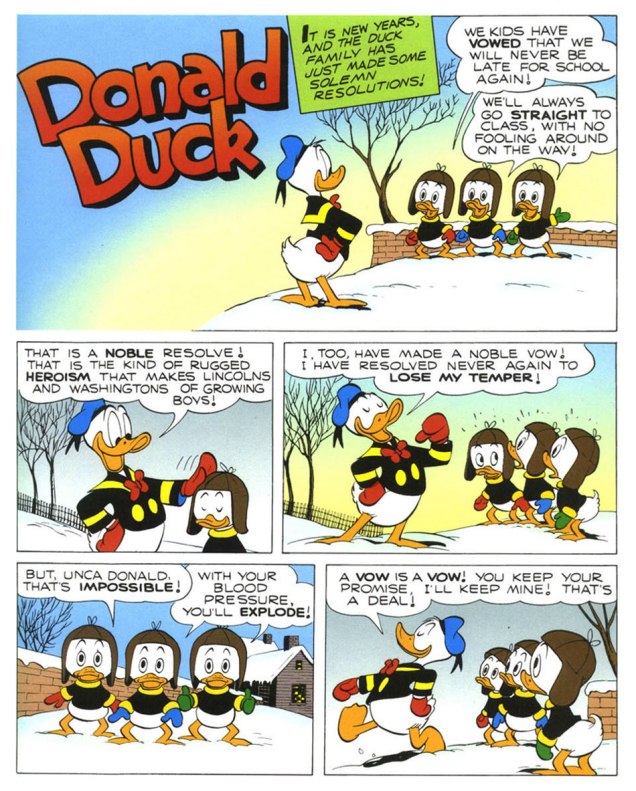
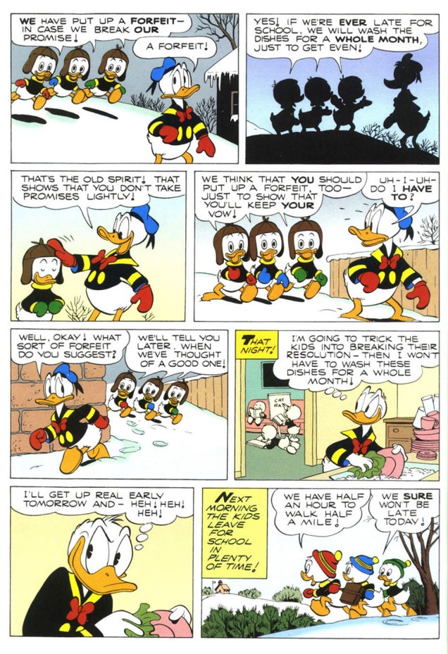
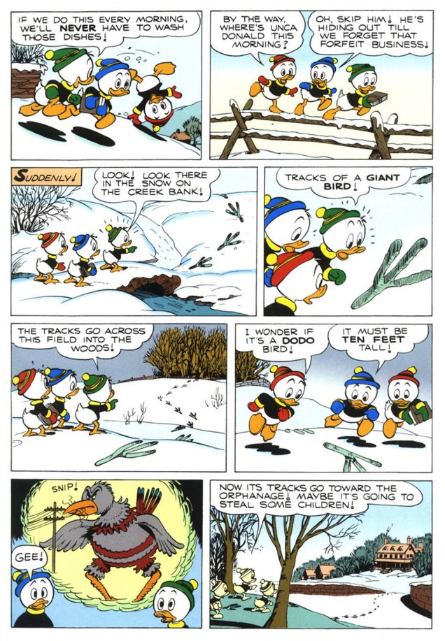
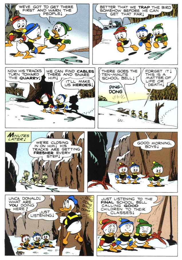
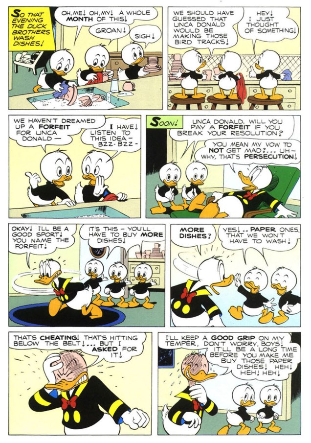
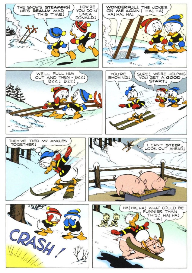
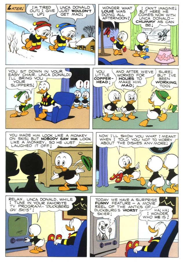
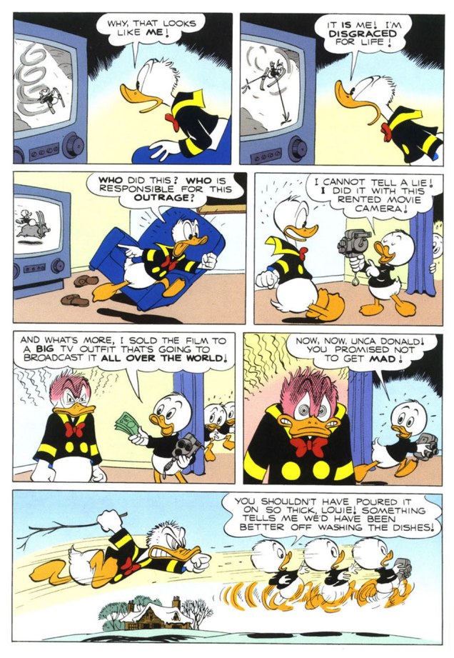
To send off the annum, and instil some hope into the ceremony, I turn to the superlative Carl Barks (1901-2000), « The Good Duck Artist », and this classic — but not overly familiar — ten-pager from Walt Disney’s Comics and Stories no. 173 (Feb. 1955, Dell)*, scripted, pencilled and inked by Mr. Barks and lettered by his wife Garé, a superb artist in her own right. Take it away, folks!
.
.
.
.
.
.
The boys’ ironic recycling of the giant bird stilts is a brilliant touch.
.
.
.
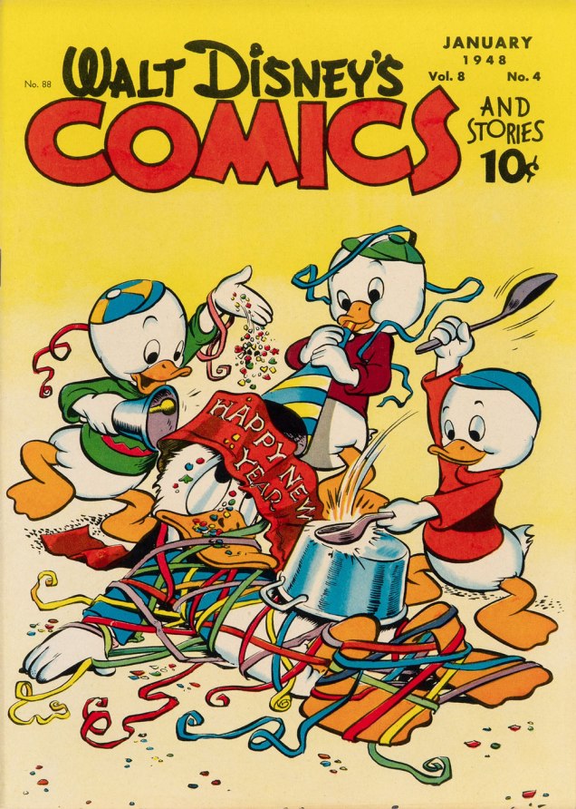
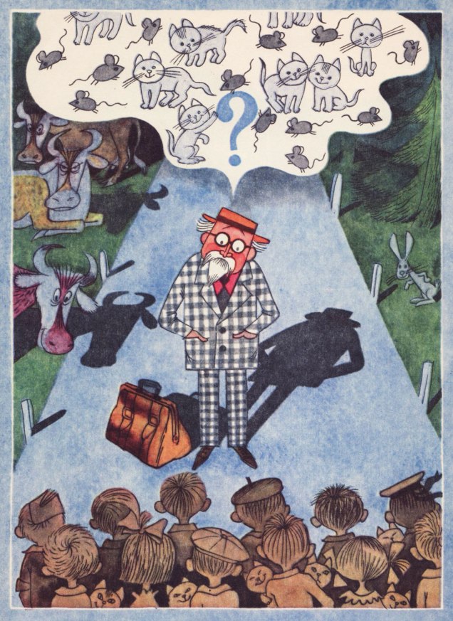
One of Barks’ most refreshing innovations is that he steered Donald’s nephews away from the typical, simplistic ‘little devils’ characterization they were saddled with at their conception. Barks made them crafty but essentially noble, in marked contrast to their Unca Donald. The issue of WDC&S that our story premiered in didn’t feature a New Year’s-themed cover, so here’s an earlier one, from none other than Walt Kelly. This is Walt Disney’s Comics and Stories no. 88 (Jan. 1944, Dell).
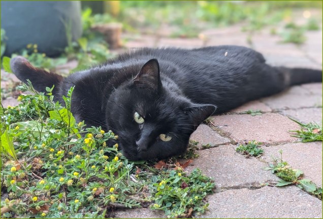
At the end of this wretched, truly merciless year, I dedicate this post to our beloved cat, Barnabas, who left us — peacefully — just this afternoon. May he be 2025’s final innocent victim.
*However, I opted for the superior reproduction values — trust me — of the reprint featured in Walt Disney’s Comics and Stories no. 623 (Apr. 1998, Gladstone). Kudos to Susan Daigle-Leach for the tasteful latter-day colouring.
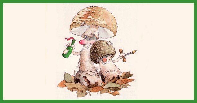
« Parmi les champignons se cachent d’ignobles individus, des espèces savoureuses et des sujets tout à fait pacifiques…»
December may not be exactly the month one associates with mushrooms, but that is precisely when mycophiles get broody and start cataloguing (mentally or otherwise) new species encountered during the warmer months*, dreaming about spring and its new flush.
Here’s a selection of mushroom portraits taken from Le gratin des champignons by Roland Sabatier, an outstanding artist previously featured by co-admin RG in « Pépin le Long, You’re Fired! » (and, need I mention, a member of the Mycological Society of France). The second reaction I had upon leafing through this volume’s pages (the first was to squeal delightedly) was stunned admiration regarding the level of detail with which each mushroom is illustrated. I am by no means the first to note this (in his outstanding introduction, Georges Becker**, co-author of this tome, makes much the same point in far more eloquent prose), but it bears mentioning that while Sabatier may have transformed mushrooms into wonderful characters with their own games and stories, he managed to so very rigorously observe and illustrate their characteristics that one could actually use this book as a mushroom guide and not get, you know, poisoned.
Let’s get cooking!
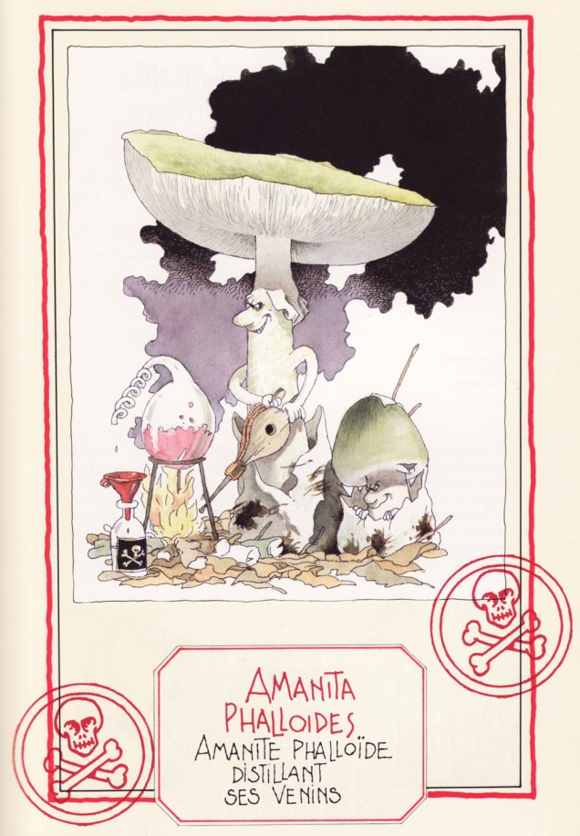
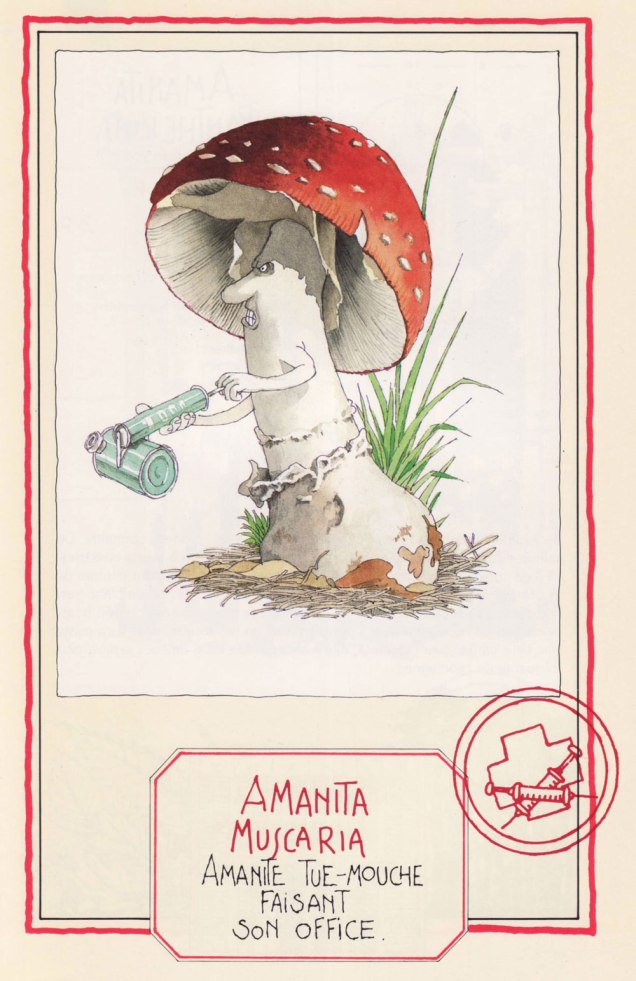
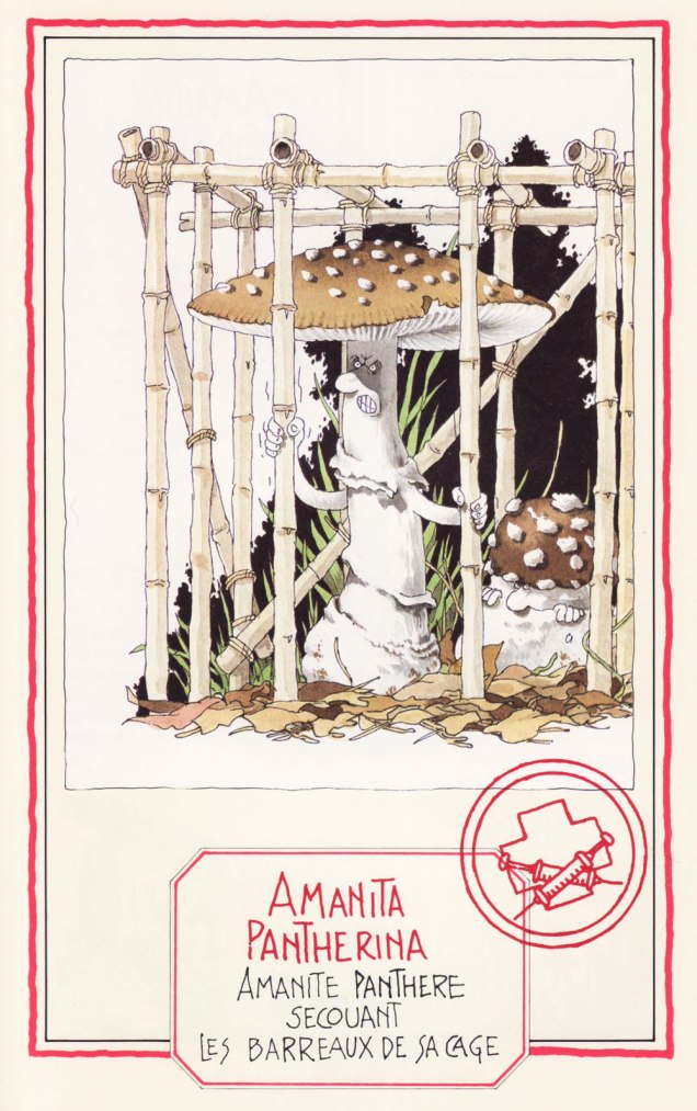
Speaking of getting poisoned, meet four Amanitas, a most deadly genus… with a few delicious, choice morsels thrown in to keep us on our toes:
The Death Cap… distilling its own venom. A most lethal animal.
The Fly Agaric, probably the most depicted mushroom in the arts, ‘performing its function‘. Despite its reputation, it is not deadly per se, as alluded to in a previous post (Fungus Friday: Amanita New Year (To Get Over This One)).
The Blusher, so called for its propensity to blush a pink hue when bruised (or embarrassed, one presumes). These wino amanitae exiting the tavern definitely look sloshed.
The handsome Panther Cap, shaking the bars of its cage. Like its Fly Agaric cousin, it’s not deadly as such, and has some psychoactive components. Admire its striking looks here.
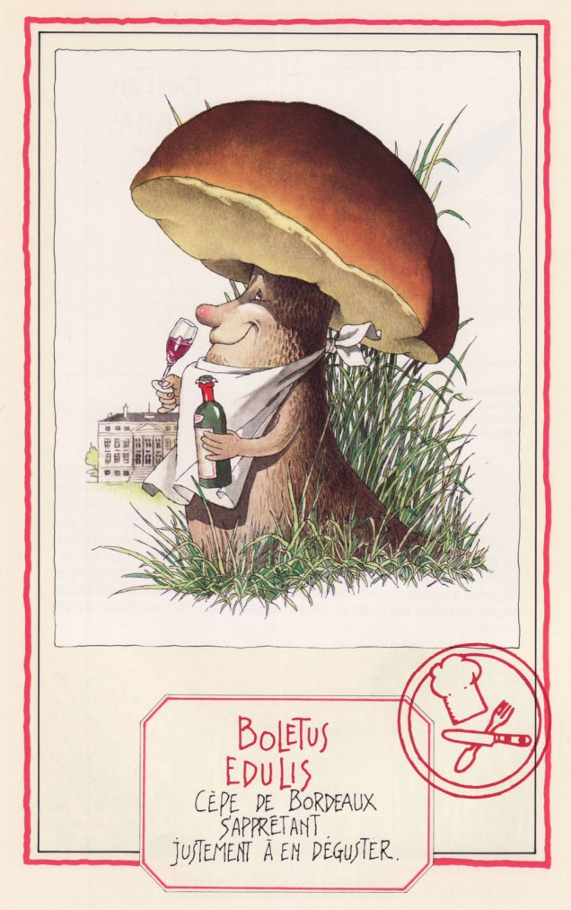
Now we move on to more traditionally edible characters —
The Banded Agaric is also known as ‘Pavement mushroom’, which explains this fur-foxed lady showing her goods… walking the beat, as it were. This lady is tough as nails, and has been known to burst right through the pavement. Is she edible? You bet! ***
Ah, mushroom of many names (does this make it the rose of mushrooms?) – Penny Bun, Porcino, Cep, call it what you will… highly prized throughout cultures, fragrant à souhait. Here the cèpe de Bordeaux is about to savour some Bordeaux wine.
A favourite of WOT admins, the Fairy Ring Mushroom, saddled with an unfairly gloomy Latin name (‘marasme’ comes with an etymology of ‘wasting away’ or ‘decay’), dancing a ronde. Undemanding and widely spread, this mushroom dries most excellently (sometimes right on the very lawn it grows upon) and enlivens soups and stews throughout winter.
Another well-known mushroom, the Golden Chanterelle, as beautiful as it is fragrant. Will I picture these playing tiny little violins every time I find them in a forest? Absolutely.
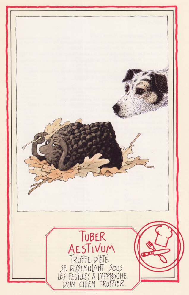
We couldn’t resist adding this scene depicting the Summer Truffle trying to camouflage itself as a truffle-sniffing dog approaches. I love the inquisitive gleam in the doggo’s eye.
We wrap up with, well… I trust you can interpret the Latin well enough without me. The Common Stinkhorn (‘stinky satyr indulging in his depravity‘) is actually edible, though not nearly as popular (or tasty) as another member of its family, the pretty Veiled Lady. Whether you would actually want to eat it is another question.
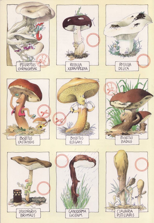
First published in 1986, this book has known several editions to update nomenclature (some mushroom families and names have changed considerably in the last 40 or so years, which is its own topic). We have the 1991 edition, published by Glénat. Sabatier had so many favourite mushrooms he illustrated, they didn’t even all make it into the book officially… which is truly a crime. Take a peek at some other of his mushroom people, only included on the inside of the book’s cover (but at least included in that smaller capacity!):
~ ds
* Technically one can find some mushrooms during winter, but that is not my area of expertise (at least as yet).
** French mycologist of renown (1905-1994), as well as writer, politician and apparently even musician (piano).
*** I’m actually not a big fan. This Agaricus tastes too much like the ‘champignon de Paris’ mushrooms sold in supermarkets to be of much interest.
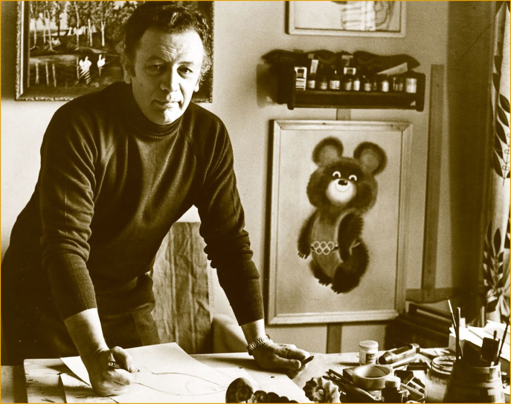
I grew up on the illustrations of Soviet illustrator/cartoonist Victor Chizhikov (1935-2020). I’m not sure whether I’m from the last generation that remembers his work this well — on a similar topic of ‘boy, we’re old’, older non-Slavic readers might be familiar with Misha, the mascot that Chizhikov designed for the 1980 Moscow Olympic Games.
Chizhikov with his creation Misha (both a nickname for Mikhail, and a contraction of ‘bear’).
In 1955, Chizhikov started contributing illustrations and caricatures to Krokodil, a publication I was born too late to be personally familiar with (though I did write a post about it). While he has definitely drawn a number of ‘adult’ cartoons in his life, it’s his cheerful anthropomorphic animals, mushroom-studded landscapes and gently roguish children that linger in people’s minds, and those appeared from 1956 and onwards, frolicking through the pages of Весёлые картинки (Merry pictures), a publication aimed at children between 4 and 11. In 1958, Chizhikov also joined the staff of Мурзилка* (Murzilka), a magazine for the 7 to 13 year old crowd. I had subscriptions to both as a child. My grandfather was especially keen on giving me a well-rounded education, though he needn’t have worried, as I come from a family where nearly everybody was a voracious reader, albeit occasionally disagreeing on genre. I used to have a stack of Весёлые картинки somewhere, but I got rid of it at some point with the impetuousness of a young adult, alas.
An issue of «Мурзилка» from 1968.
A page from a 1965 issue of «Мурзилка» depicting scenes made up of palindromes.
Original art for an illustration created for a 1975 issue of «Мурзилка».
Page from a 1966 issue of «Весёлые картинки» — ‘Petrushka in the land of fairytales‘ was a recurring feature. Chizhikov had a most fluid line when needed.
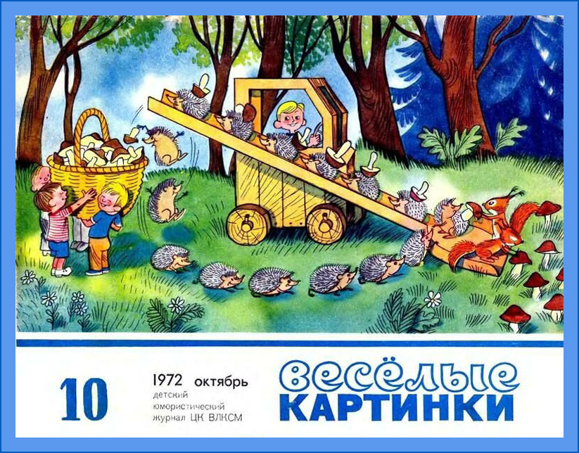
The October page from a 1972 calendar published in «Весёлые картинки».
An issue of «Весёлые картинки» from 1982.
Interestingly, Chizhikov was daltonic, something one would never be able to guess from his illustrations. It is said that his wife would label pots of paint and pencils to help him out, but I don’t know what variant of colour blindness he was stricken with. A critic once described his characters as having a ‘mischievous squint, as if they live in an eternal summer in the bright sun‘ — maybe they were just squinting trying to discern the nuances between colours?
‘The Lamplighter Ant’
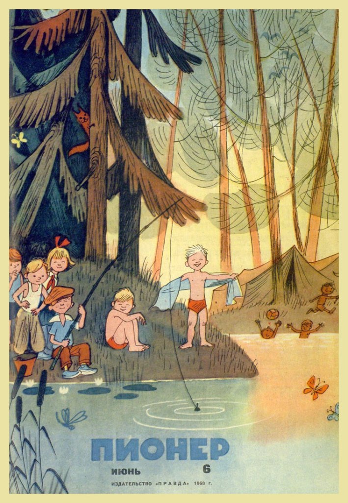
Issue of «Пионер» from 1958 — this was a magazine for 10 to 14 year-olds, but I don’t remember ever encountering any issues in the wild (possibly because my family objected to buying something called ‘Pioneer‘).
I owe this trip down memory lane to a friend who gave me a 1971 edition of 25 загадок — 25 отгадок (25 riddles — 25 answers) written by the immensely energetic and thus ubiquitous Korney Chukovsky** and illustrated by Chizhikov. Many thanks, Drew!
« Two stallions I have, they carry me on water. The water is tough, as if it were a stone. »
« If pine trees knew how to run and jump, they would flee from me to never cross my path again, because I am very steely, mean and toothy. »
« Small houses are running down the street, carrying little girls and boys. »
« Kondrat was walking to Leningrad, and coming towards him were twelve kids, each with three baskets, with a cat in each basket, and each cat having 12 kittens, each kitten holding four little mice. How many kittens and mice are the kids carrying to Leningrad? »
Cover of another book by Chukovsky, the ever-popular Doctor Aybolit, whose name translates literally to something like ‘Doctor Ouchithurts’. This character was loosely based on Hugh Lofting’s Doctor Dolittle, as well as Chukovsky’s friend Zemach Shabad, known for treating not only sick children, but also the equally ailing animals the children would bring along to their appointments.
~ ds
*Мурзилка is still around today, and given that it began publication in 1924, it is now listed in Guinness Worlds Records as the longest running children’s magazine in the world.
** 1882-1969, author of innumerable absurd ditties, rhymes and poems so well remembered and loved that many got incorporated into Russian as idioms; brilliant translator of English novels, stories and poems, making them accessible to a Russian-speaking audience for the first time; dissenter of governments, be it Soviet or Russian.
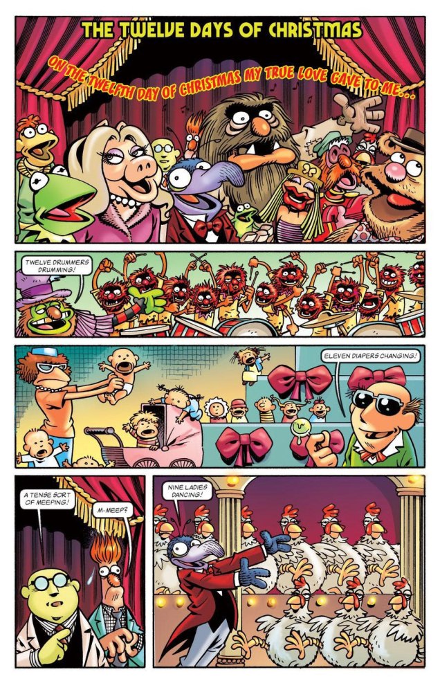
Speaking of festive mayhem, there is none better than penned (imagined, executed!) by Roger Langridge. Over the scope of his long (and ongoing!) career, the whole ‘rocking around the Christmas tree’ thing has shown up at least a couple of times — you may not have snow where you live, but take a gander at these and watch your holiday spirits soar (especially if bolstered by a bit o’ tipple).
Here’s are some merry excerpts taken from The Four Seasons: Winter storyline printed in Muppets: The Four Seasons (2012, Marvel) for your enjoyment:
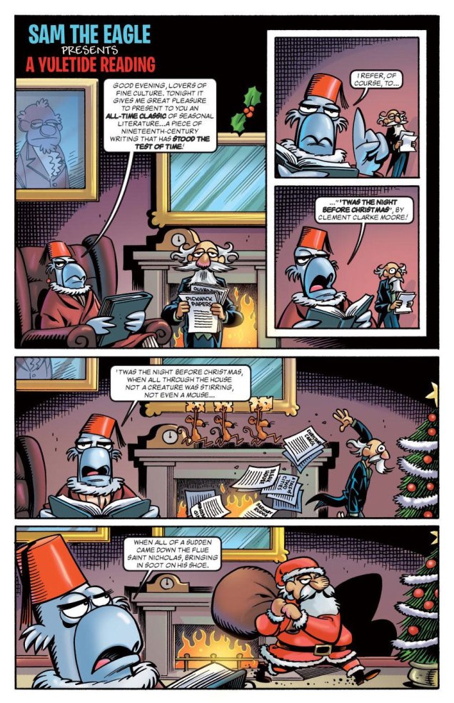
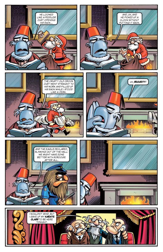
From the same issue, in this two-page digression (though what is The Muppets if not a series of glorious digressions), Sam narrates Dickens’ magnum opus… oh, nevermind.
Speaking of Dickens, though, he did not go un-Langridged, happily:
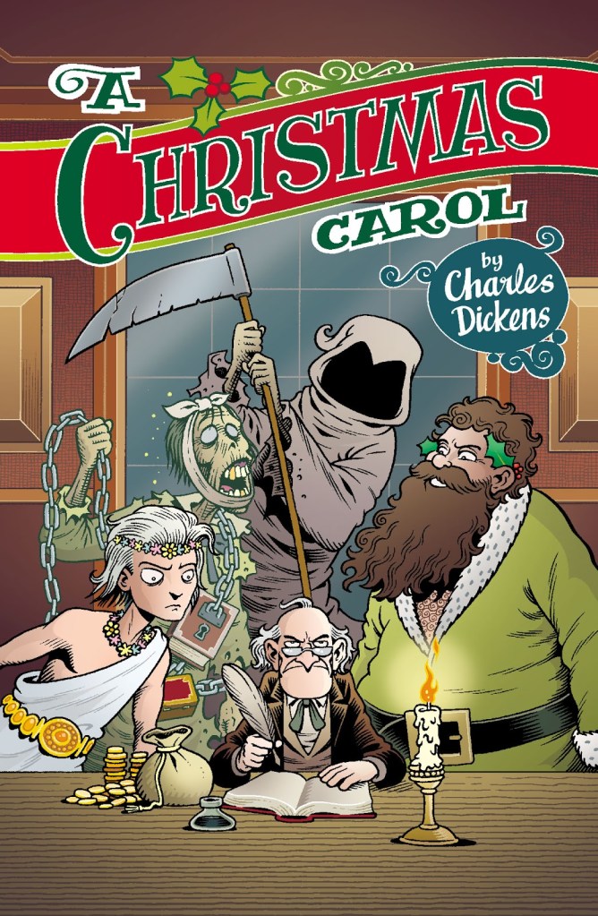
A Christmas Carol (2013, St Mark’s Press)
To further your cheer, a few more pages from Langridge’s Abigail & The Snowman (2016, KaBOOM!). This decade sure is a depressing one for all artistic professions — current active cartoonists seem to be mostly doomed to juggling thankless jobs for corporate giants such as Disney-slash-Marvel while defending their right to be (and to own their work) from AI pilfering (although ‘pilfering’ is too cute a word for it). Even such pundits as RL can rarely afford to work on what’s actually dear to their hearts. In that context, the sweet (and thoughtful) story of Abigail and her snowman friend was a very welcome addition to Langridge’s career, lodged as it was between two extremely underwhelming Dynamite-published affairs where he acted as the writer, namely King: Mandrake the Magician (2015) and Betty Boop (2017). I’m now convinced that Langridge’s art can save a poor script (thanks to jokes and beautifully non-sequitur asides inserted into the art), whereas a flat artist can ruin a plot faster than you can shout ‘Gisele Lagacé‘.
Langridge has been drawing daily cartoons based on his life for around 5 years now. This is the strip’s final week, as he has decided that it’s time to move on to something else, so I wanted to mention it before it’s too late — especially since it’s perfectly relevant to the season.
Strip from December 21, 2023
And a merry Christmas to all! We’ll see you again before the New Year.
Back of Bob Foster’s Myron Moose no. 1 (Myron Moose Comic Book Works, 1971); this art print was also released years later, as can be seen by the date on it.
We are technically a three-cat household — that’s how many cats we had decided we could comfortably handle. For a while we stuck to this number, and when one cat departed, another one would come to take his place. Then number four walked through the door — he was sort of a part-time cat, until he became decidedly one of ours. Well, four isn’t that much more work than three. When number five appeared, bedraggled, underfed and with a perpetually sad expression (‘he had that look you very rarely find — the haunting, hunted kind‘, to quote Tim Rice), we wanted to give him to a rescue society… and of course ended up keeping him.
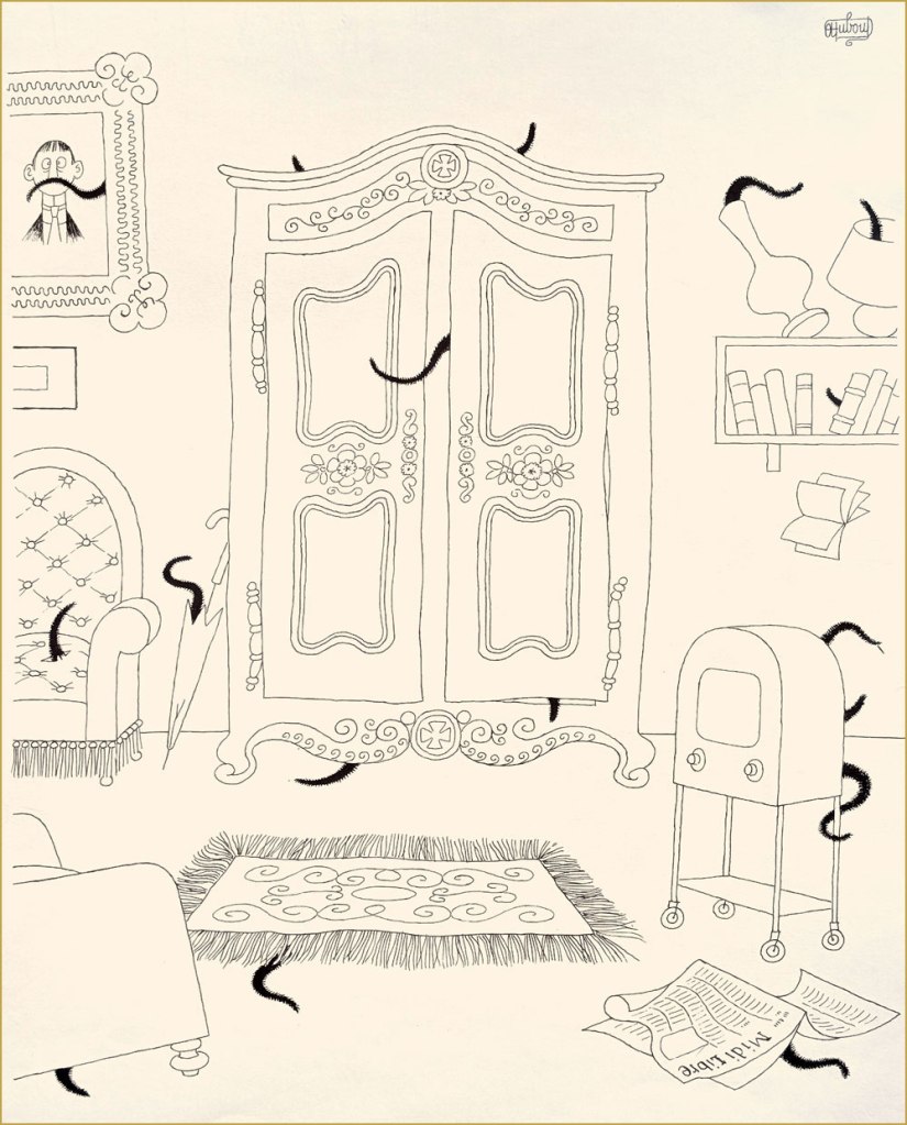
Albert Dubout (born as lbert Dubout, 1905-1976), was primarily an illustrator of books (notably, his amical collaboration with French writer San-Antonio, many of whose novels proudly bore Dubout’s covers and inside illustrations), and, with equal talent, a cartoonist and poster designer (check out some of his film posters here), not to mention a calligrapher with a number of delightfully mellifluous signatures. His official website can be found here, in case you want to take a peek.
The following excerpts have been scanned from Les chats (Editions Hoebeke, 1999).
*I don’t like Hemingway at all, but I do have a certain grudging respect for a man who kept some 40+ cats. Rhetorical question: are cats living at that high a density within one house really having a good time?
Hi there! Co-admin RG asked for some assistance with his Halloween count-down (admittedly, 31 posts in a row is a bit much), so I’m here each Tuesday for the month to come, a throw-back to the Tentacle Tuesdays of yesteryear.
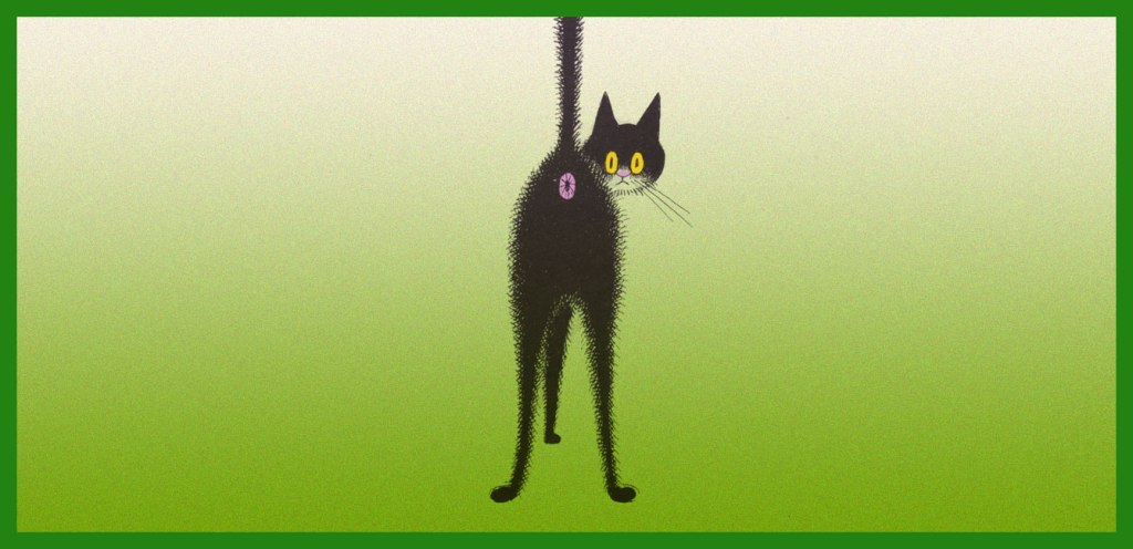
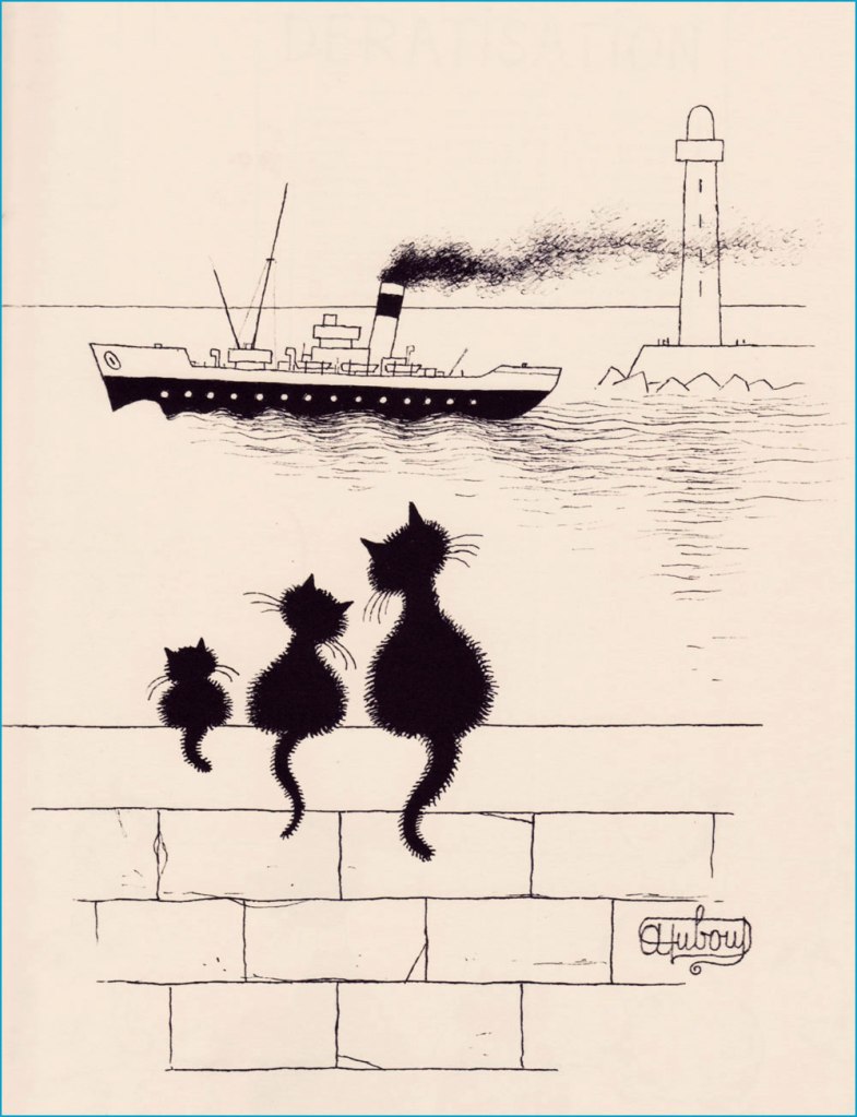
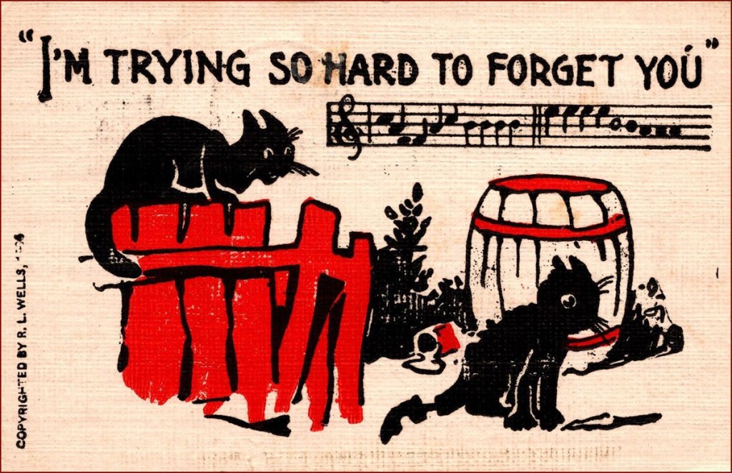
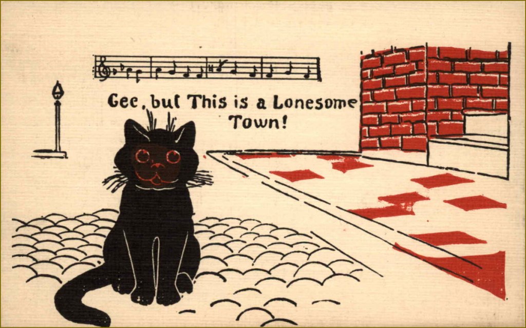
As you probably noticed, we like supposed bad omens around here, and lean into superstitions, too. I consider a black cat crossing my path is as a definite stroke of luck, as is having one of those beautiful silky beasts at home at all times (we are blessed with one such beast). The anglophone world has long had a tortuous relationship with black felines. Harbinger of luck or malevolent pawn of Satan? Flip a coin. Nevertheless, in the 20th century black cats seemed to have had a charmed streak, and appeared in many postcards as definite auguries of good luck. For my own self, I am sympathetic to witches (though not to the point of actually believing in their existence) and also of anarchism, of which the black cat has been adopted as a symbol from the late 19th century. Whatever way you look at it, black cats are cool.
Here are some postcards from the very early 20th century, say around 1905-1906. Unfortunately I cannot say who R. L. Wells is, other than noting that they have a very district style and seem to have created a wide array of postcards.
Our very own silky black beast. My camera usually has trouble focusing on his blackness, so this is a rare decent — and most recent! — photo.
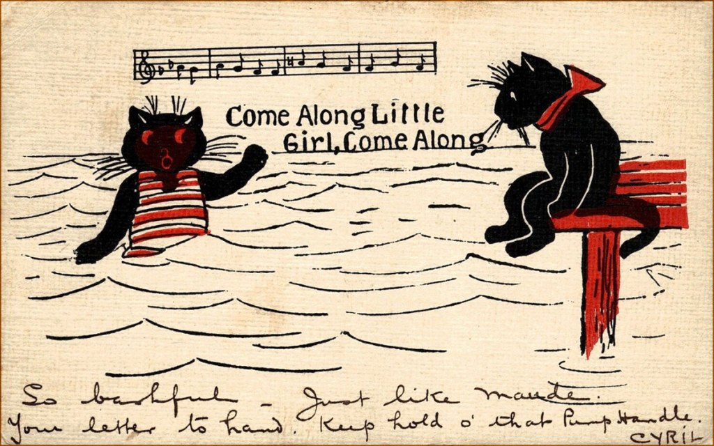
And the following postcards are by the equally mysterious H. M. Rose (or is my Google-fu weak as water, today?), from 1913.
For a great selection of vintage black cat postcards, affix your peepers on this collection, among which is found this cat, my absolute favourite for its strangely human teeth and dazed expression of sorrow mixed with euphoria.
« I know you’re lookin’ for a ruby in a mountain of rocks, but there ain’t no Coupe de Ville hidin’ at the bottom of a Cracker Jack box. » — Jim Steinman
Crumpets!
It began with crumpets. I was picking up a couple of packages of those scrumptious British griddle cakes at the only store in our small town that carries them — as far as I can tell. Glancing about, I noticed on a nearby shelf something I’d never encountered: packages of Cracker Jill*.
I’d been toying with the notion of a Cracker Jack post, but this surely was a sign. When I got home, the merest bit of research turned this up:
« Introducing Cracker Jill™! After more than 125 years with our iconic Sailor Jack mascot, we’re adding Jill to the team to celebrate the stories of the women and girls who are breaking barriers in sports. With her tenacity, vibrancy, and strength, Cracker Jill™ takes inspiration from the women that change the game on the playing field, and beyond.
Join us in supporting the next generation of athletes by donating to the Women’s Sports Foundation through CrackerJill.com. With a $5 donation or more, we’ll send you a bag of Cracker Jill™ while supplies last. Remember, keep an eye out for Cracker Jill™ in baseball stadiums around the country. »
It’s a most worthy cause, obviously, but a) Jack the Sailor (and his pooch Bingo) has only been the brand mascot since 1916. A mere 107 years, so the math’s off. And b) “Introducing”? There was already a Cracker Jill. Exhibit A, this product from 1977:
Prudently keeping in mind that this is a huge topic, with reams of historical ramifications, I’ll narrow my focus on a tiny area of the map: the four Cracker Jack prizes I’ve held on to for decades, and that turned up in a box I was browsing through the other day.
« Prizes were included in every box of Cracker Jack beginning in 1912. One of the first prizes was in 1914, when the company produced the first of two Cracker Jack baseball card issues, which featured players from both major leagues as well as players from the short-lived Federal League. Early “toy surprises” included rings, plastic figurines, booklets, stickers, temporary tattoos, and decoder rings. Books have been written cataloging the prizes, and a substantial collector’s market exists. » [ source ]
Like many a cartoonist (just ask Chip Kidd, Charles Burns, Mark Newgarden, Ben Katchor, Wayno, Chris Ware…), I’ve always been irresistibly drawn to the anonymous sprouts of advertising and industry: the artwork adorning matchbooks, cheap novelties and their packaging, beer coasters, liquor labels… so much toil that surely paid peanuts (and perhaps popcorn), unsigned and unappreciated. But a surprising portion of that work, ubiquitous and yet invisible, was created by skilled craftsmen. There’s a necessary economy of means, a simplicity of line — saving time and allowing for crappy, ‘it’ll do’ reproduction, but also effective design and a certain timeless je ne sais quoi.
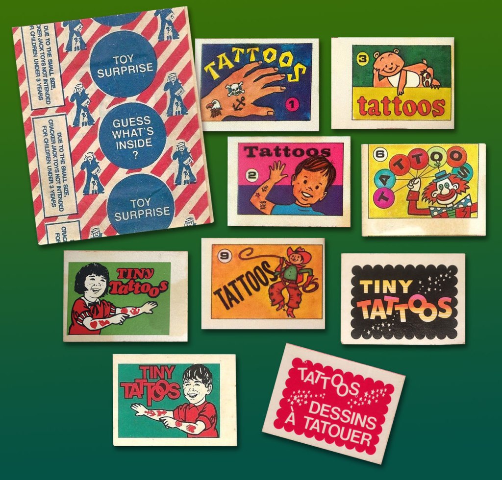
Back when The Cracker Jack Company was its own entity, a lot more care and attention were bestowed upon minute details. Most of these tattoo booklet cover designs predate the company’s 1964 acquisition by dairy company Borden. The bottom right booklet is a Canadian variant from the late 1970s-early 1980s.
And so, here’s the cream, so to speak, of my small collection of Cracker Jack temporary tattoos. Enjoy!
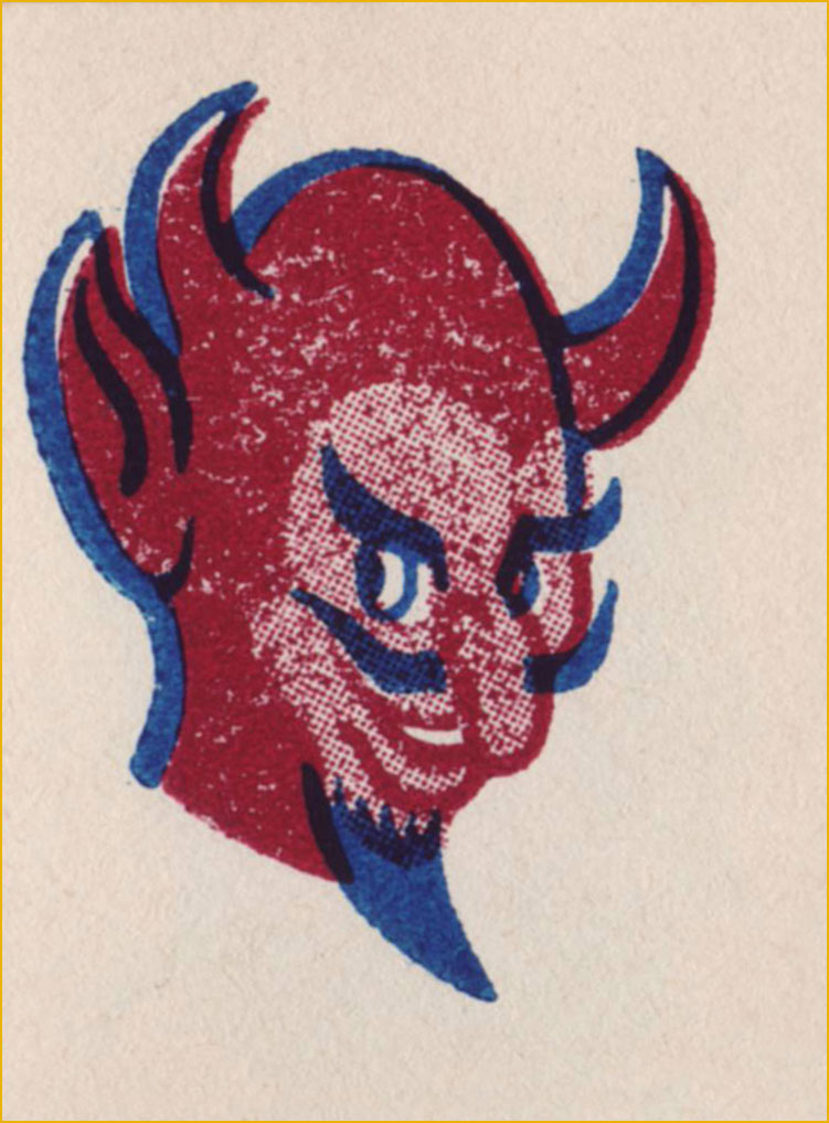
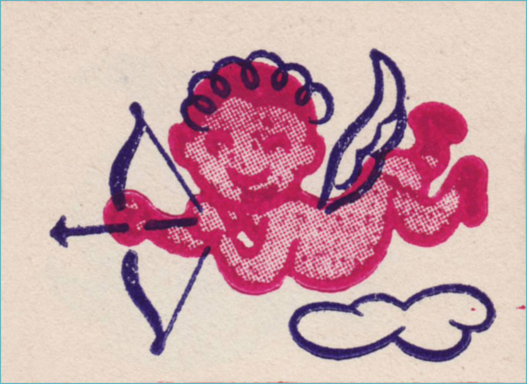
I’m picturing some Bible Belt toddler proudly sporting this one on his arm and giving grandma a massive coronary.Terrible reproduction, obviously, but this line work is splendid. Does the grin make this one less bad-ass… or more?I just love the sheer randomness of some of these entries. I presume no-one was really paying attention.Surely Dan Clowes must have encountered this one. You never know what’s going to linger in your DNA.Well, they got all the accents right in the French text, though the execution, I’m sure you’ll agree, could have been more elegant.Since our Tentacle Tuesday feature is currently on hiatus, I can use this charming pair of cephalopods.He’d make a fine sports team logo… well, not nowadays, since all the humour, joy and brightness have been painstakingly excised from pro sports design. Gotta look *tough*!This did not need a second colour. As a tattoo, I’m sure it was a murky fiasco. But it’s a nice bit of drawing.
-RG
*I’m only a year behind the news on this item, which isn’t too bad in my case.
« He made the cat his own. He invented a cat style, a cat society, a whole cat world. British cats that do not look and live like Louis Wain cats are ashamed of themselves.» — H. G Wells
British artist Louis William Wain (1860-1939) had one of those lives that capture one’s imagination* – from a sensitive child born with a facial defect (a cleft lip) and prone to terrifying nightmares, to a youth that would wander around London instead of attending classes, to ultimately a man committed to the pauper ward of a mental asylum. Along the way, he married a lower-class woman ten years his senior despite the scandal this caused, lost her three years later to breast cancer, and produced thousands of cat drawings and paintings.
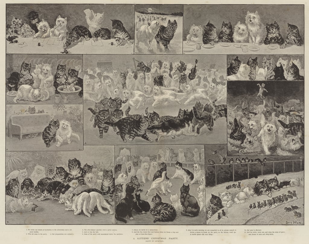
Wain started out as a illustrator of country scenes, houses and estates, livestock at shows, and so on, for publications like Illustrated Sporting, Dramatic News, and The Illustrated London News. His wife’s Emily’s health decline gave Wain the push into feline territory, as he consoled her with caricatures of their cat Peter during her illness. Emily pushed him to try and get this work published, so he showed some drawings to the editor of The Illustrated London News, for which he was freelancing. He was commissioned to paint A Kittens’ Christmas Party, which featured 150 frolicking kittens, took 11 days to finish, and was an instant hit. Emily died soon after in 1887.
Some sources say 200 kittens, I didn’t count them.
Source diverge – according to some, in his grief, Wain threw himself heart and soul into cats and animals in general – he was involved in animal charities and championed a better treatment for animals, including fighting against the routine muzzling of dogs. In another version, he Emily’s death was a ‘merciful release’ and threw himself into work, ended up being considered a ‘cat expert’ just because he drew so many of them (and had distinctly outlandish ideas of their physiology). This can be said of much of Wain’s life, actually – the basic facts are known, but interpretations of the whys and hows vary wildly.
His first cat Peter was black-and-white with a white forehead, and his prototype often appeared in illustrations.
It goes without saying that Wain doubtlessly influenced generations of future artists. These days art with anthropomorphized felines is quite a humdrum sighting, given how much our current culture is obsessed with cats. In this context, it may be hard to recall that several centuries ago people often thought of cats from a practical standpoint, as somewhat filthy-yet-useful vermin-destroyers. This began to change during the Victorian era, and surely Wain’s cats, omnipresent in newspapers and magazines, accelerated this shift in thinking.**
Wain was an immensely prolific artist, but sadly that did not guarantee him a peaceful and wealthy life. When he was 20, his father died, leaving Wain to financially support his mother and sisters, so he had a heavy burden to bear from a young age. By all accounts a modest man, he was quite naïve about financial matters, a walking demonstration of the financially inept artist stereotype***. He often gave his art away, or sold it without retaining copyright, which meant no royalties despite all sorts of merchandise with his cats – postcards, books, toys, biscuit tins, china, et j’en passe. His work was so ubiquitous at some point that publishers did not need to pay him for new material, they could just go on reprinting in perpetuity with nothing but financial gain to themselves while Wain got further into debt.
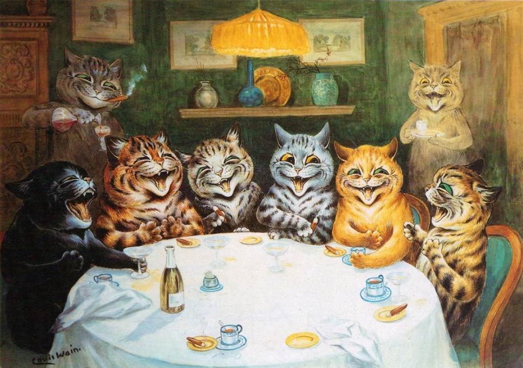
These cats are obviously cute, but I think what makes them interesting is that Wain would satirize what he saw around him. He might have been an impractical dreamer, but he had a keen eye for human flaws.
He also produced a series of designs for ceramic cats (and some pigs and dogs as well). These sculptures were exhibited in 1914, but did not result in significant sales. A shipment of cats headed for the United States was taken down by a German U-boat torpedo, and that was it – Wain’s financial investment was lost.
« By the time the war broke in 1914, Wain found himself struggling to find a market amid the wartime paper shortage. By the 1920s, he was in poverty. His depression continued, and his mental health deteriorated. Often known to strike out in violent and erratic ways, he was eventually committed to the pauper ward of London’s Springfield Mental Hospital in 1924. »
A lot of articles about him focus on mental issues. Did his wife’s death push him into some form of dementia? Was it just hereditary (one of his sisters was committed when he was 30)? Was he autistic? Was he schizophrenic? The former is a more modern view, whereas the latter theory was proposed by psychiatrist Dr. Walter Maclay in 1939 and stuck when he made a whole case out of it.
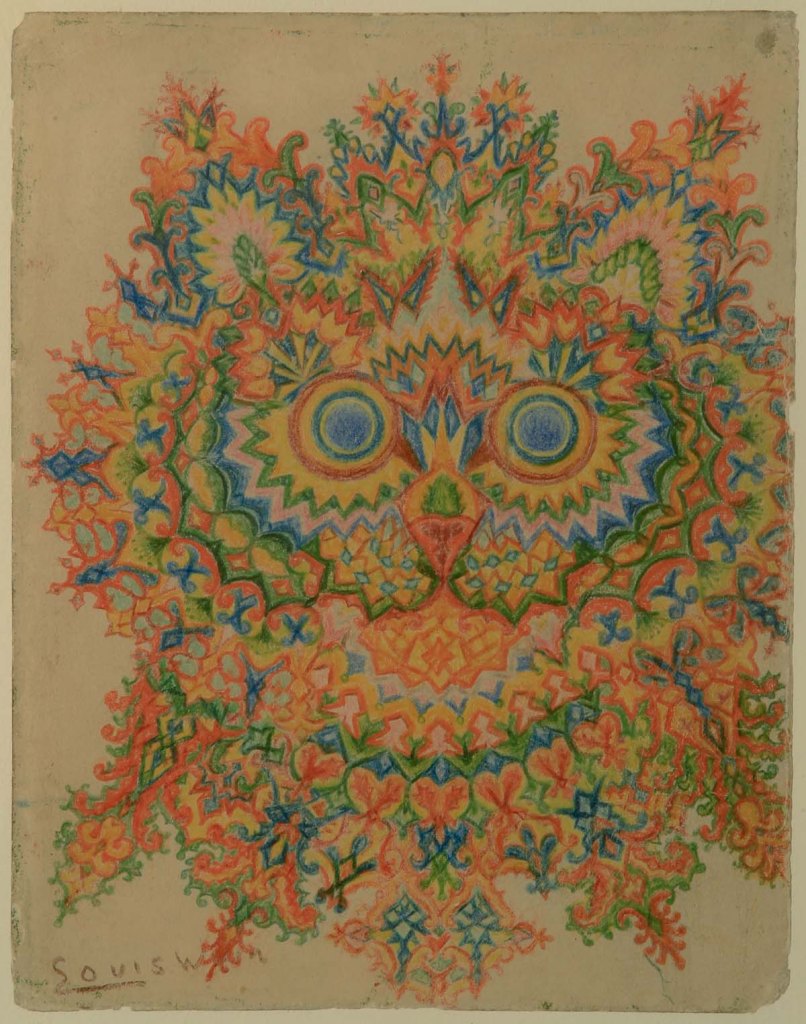
«Maclay collected the work of artists suffering with mental illness and in 1939 he came across eight pictures by Louis Wain in a shop, which he arranged in an assumed chronological order to demonstrate the progression of the schizophrenic mind. His theory was that as the sequence of cat illustrations became more fragmented, so too had the artist’s mental state deteriorated. […] The series of drawings, now known as ‘Kaleidoscope Cats’, became a popular visual example of the schizophrenic mind. Long gone was the Edwardian interpretation of Wain’s work as ‘charming’ and ‘humorous’. Instead, his art was often presented as ‘psychotic’ or ‘disturbed’, both words used in a major exhibition at the Victoria & Albert Museum in 1972.» [source]
Perhaps it’s a modern perspective, but what on earth is ‘psychotic’ about this image?His later work, colourful and somewhat surreal, has been identified by some as an important precursor to psychedelic art.
I think it’s quite depressing to think of Louis Wain first and foremost as an interesting case of mental illness. While it’s an important topic to address, it’s hard not to interpret this emphasis as a side-effect of the human tendency to bask in someone else’s tragedy – we’re avid of gory details and stories that support the general consensus that artists are tortured souls fighting inner demons. Perhaps that’s what reassures ‘normal’ people – we may not be brilliant or creative, but at least we have a healthy psyche! Except that we don’t, but that’s a conversation for another day.
«It is also highly possible that his experimentation in style was inspired by the family’s background in textile design. […] Indeed, these later kaleidoscopic cat patterns were often constructed around a clear grid system, revealing them as careful compositions rather than the product of impulsiveness coming from someone who is gradually losing his perceptive skills. Additionally, some of Wain’s later work was figurative and proves that he continued to be an accomplished and coherent artist whilst in a mental health care setting.» [source]
In 1930, Wain was transferred to Napsbury, which had a colony of cats, and stayed there fairly peacefully until his death in 1939. I hope he’s surrounded by friendly cats, wherever he may be now.
~ ds
* As a matter of fact, a movie about his life, The Electrical Life of Louis, was released in 2021 .
** I am obviously not saying that Wain introduced anthropomorphism to art, as that has been around since the days of early human history, but he did make a large dent in the public’s perception of cats.
*** Such skills have to be taught, as artistic temperament need not necessarily go hand-in-hand the inability to handle everyday matters such as finance, but add that to the list of ‘things we should do as a society’.
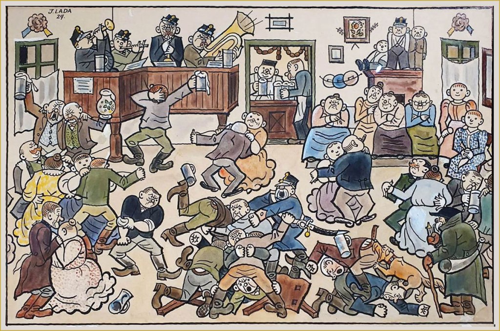
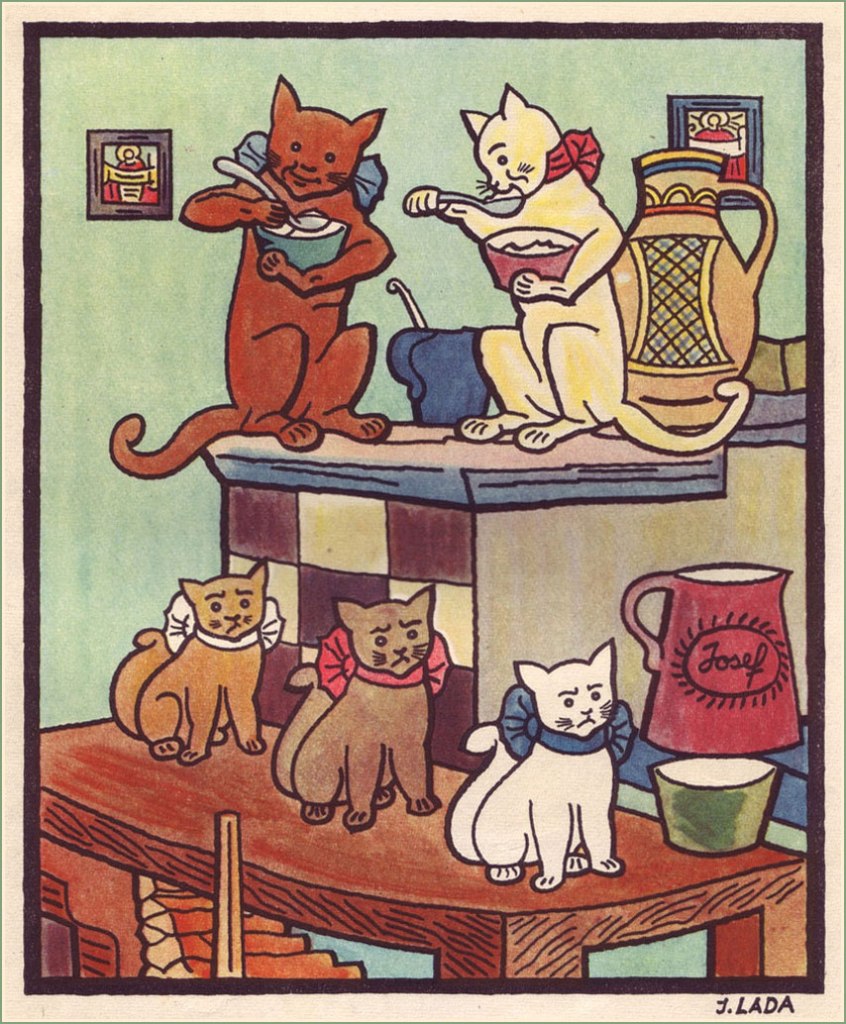
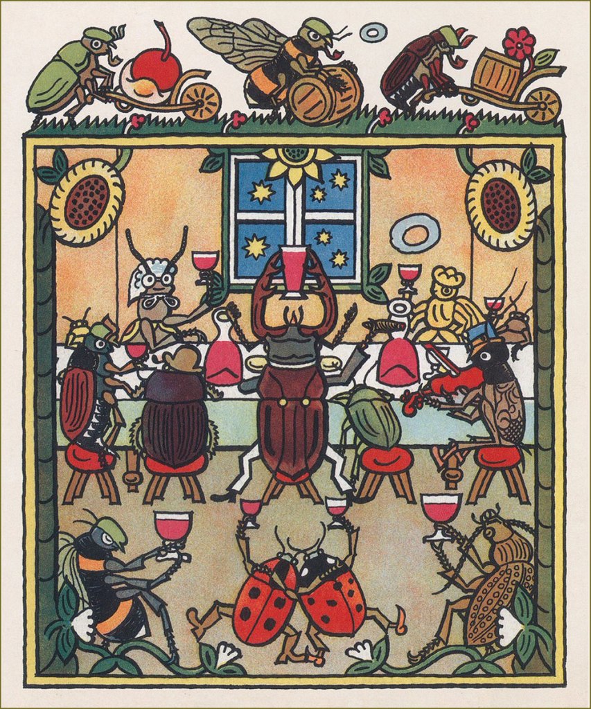
When I looked up Czech painter-caricaturist Josef Lada (1887-1957), I was surprised to find him called ‘one of the best-loved Czech painters of all time‘. There’s no question that Lada’s work remains immensely popular among Czechs, but I suppose the question for context would be « how many painters from that corner of the world are well known outside of outside of the Czech Republic and ex-USSR countries » (probably not many). Lada doubtlessly deserves his lasting fame, at any rate.
My familiarity with his style comes from his illustrations for Jaroslav Hašek‘s sardonically hilarious novel The Good Soldier Švejk, a favourite family book from which we can all quote at length, and which I own in several Russian editions (thanks to inheriting my grandfather’s copy). There have been many adaptations of Švejk, but I can only imagine him the way Lada depicted him. Visit BibliOdyssey for a glimpse of the good soldier.
While his renown is assured thanks to his work on Hašek’s magnum opus, the entirely self-taught Lada is also fondly remembered for his illustrations to children’s books (which he occasionally wrote himself), as well as paintings of pastoral life, probably inspired by his childhood in the small village of Hrusice. For a fuller biography, head over to The Genius of Josef Lada, the most complete source of information that I could find online in English.
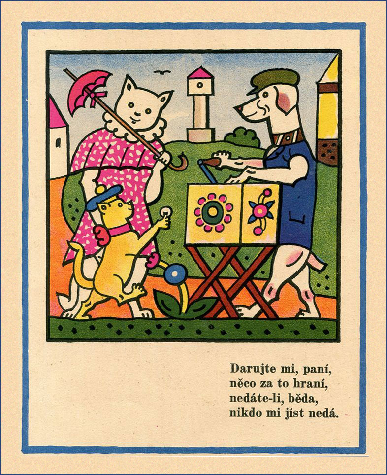
Here’s an assortment of images from various books – among others, Ezopské bajky (The Fables of Aesop) from 1931; Kocour Mikeš (Tomcat Mikeš), written and illustrated by Lada between 1934 and 1936, and being a sort of a take on Puss in Boots; Nezbedné Pohádky (Naughty Fairy Tales) from 1946 – as well as some postcards and aforementioned village illustrations.
A typical pub night, 1929.
Winter Pleasures, 1936.
« In the first year of his life, [Lada] had a life-altering accident – he fell on his father’s knife and the injuries sustained permanently blinded his right eye. Some art historians later attributed the artist’s flat-perspective painting style to this incident.»
Lada’s depiction of ‘vodnik‘, an evil water spirit.
A page from Zvířátka (which translates to ‘beasts’ or ‘animals’), a book comprising a dozen animal illustrations.
A New Year postcard from 1928.
A collection of Lada’s caricatural cartoons – ‘A Hundred Cheerful Drawings’ – published in 1970. I found this little volume in a used bookstore, and was delighted to find what was clearly the work of the artist who illustrated Švejk – I didn’t know Lada by name, back then. I don’t speak Czech, but it’s still plenty fun to leaf through.
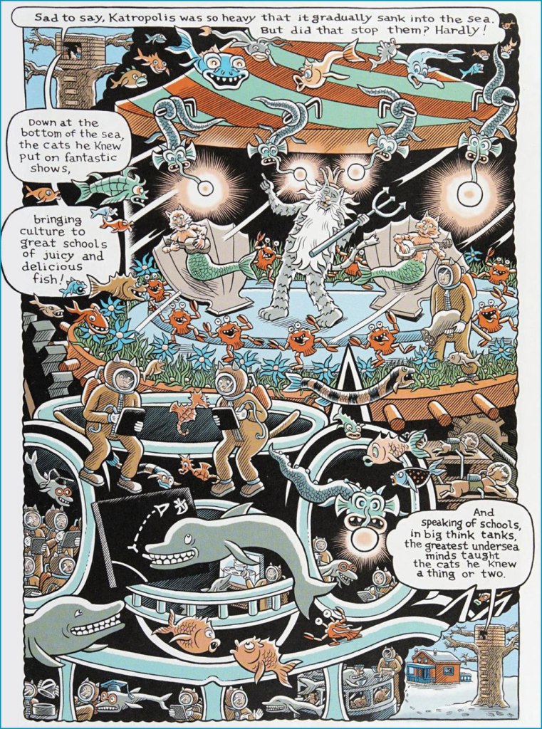
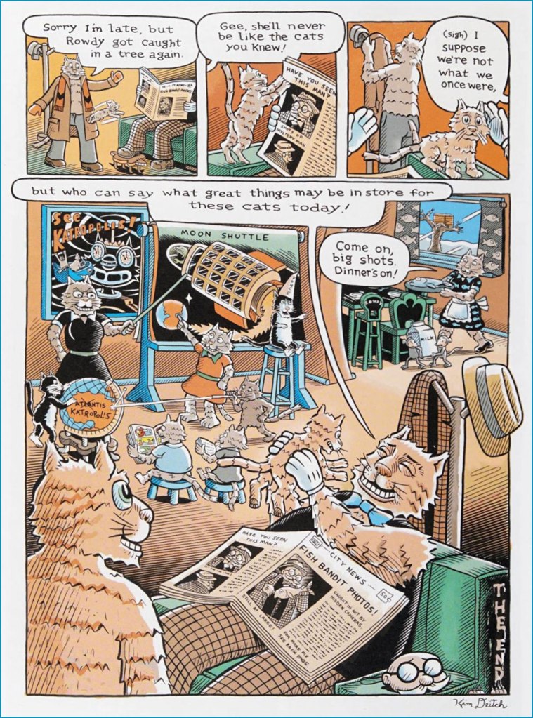
Underground comix artist Kim Deitch probably doesn’t need much of an introduction, other than perhaps to mention that he’s the son of amazing illustrator/animator Gene Deitch, about whom we have talked before (see Back When ‘Hipster’ Wasn’t a Dirty Word: Gene Deitch’s The Cat). For the most part, I respect more than enjoy K. Deitch’s work, appreciating his style and attention to detail, but unable to maintain more than a passing interest in the dream logic of his tales. The story we are sharing today charmed me, as it combines his typical soaring and detail-driven landscapes with a really fun ‘what if?’ plot and a clear appreciation for cats, always an advantage for an artist, in my book.
These Cats Today! comes from the pages of Big Fat Little Lit (2006, Puffin), which collects most material from the three volumes of Little Lit, Art Spiegelman and Françoise Mouly’s anthology that featured comics created for children by a varied roster of artists (a lot of whom have collaborated with Spiegelman on RAW), as well as some Golden Age additions by the likes of by Walt Kelly, Crockett Johnson, and Basil Wolverton. School Library Journal described it as ‘a sensational introduction to traditional literature for a visually sophisticated generation‘. If by ‘traditional literature’ they mean ‘traditional folk tales’ (before they got bowdlerized*), then sure. The stories of Big Fat Little Lit are cynical and pleasantly warped; people get beheaded, eaten, and transformed, and often find that what they thought would bring them happiness just engenders its own problems.
Actually, it was quite difficult to select which story to run, as this anthology is packed with wicked goodies, but this whimsical tale won out (my other favourites are by Kaz, Maurice Sendak, Richard Sala and Joost Swarte, and may yet pop up in another post). Note that if you look beyond the surface of These Cats Today!, you’ll find plenty of cruelty in this fun narrative – dogs enslaved to power up the majestic and glittering Katropolis, force-fed stuffed mice**, these details are briefly mentioned, yet in plain view for those perceptive enough to notice. Truly, for its seeming gentleness, this story belongs into the Little Lit line-up.