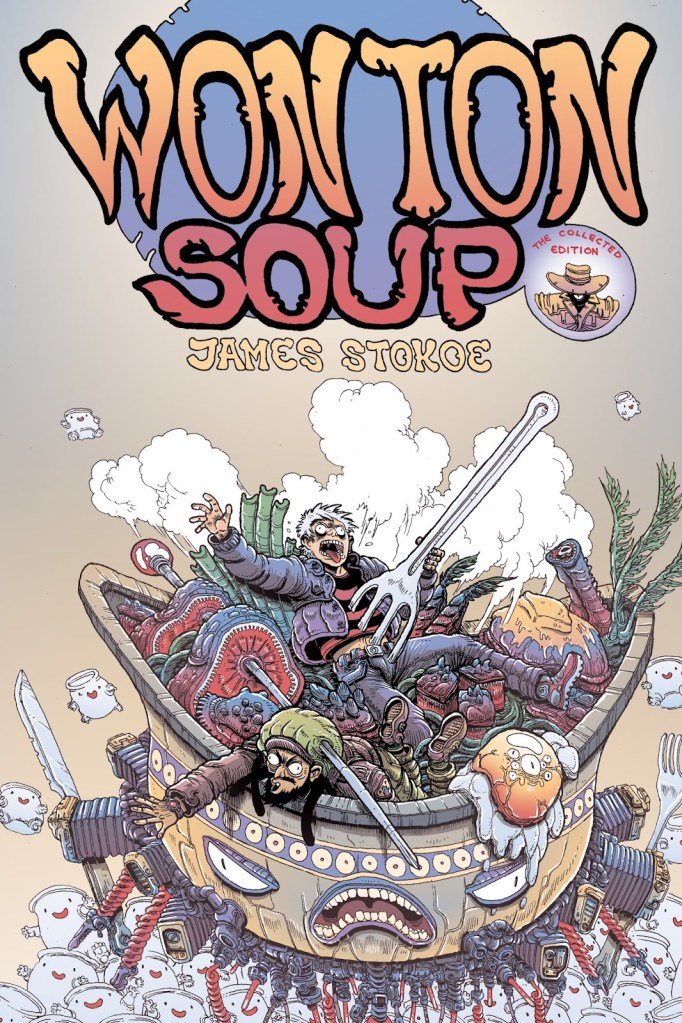
Today I’d like to feature a (chunk of) story by James Stokoe, a contemporary Canadian artist. As is the case in many instances, I discovered his work when I spotted Wonton Soup in an excellent comic book shop in Montréal (now, alas, permanently closed — we miss it and its kind owner). Wonton Soup is in black-and-white, which hides Stokoe’s strength (or weakness, depending on how you feel about this aesthetic) – his liberal use of bright colour gradients.
A splash page from Orc Stain, which currently stands at 7 issues, with more having been promised in 2015 and still eagerly awaited by fans of the series. It’s too bad, I’d love to know what happens to the protagonist…
Stokoe also often uses this combination of lime green and purple, anathema to some artists.
Unlike his close friend comics artist Brandon Graham, whose style is sort of graffiti-ish (not that all graffiti have the same art style, obviously), Stokoe favours tons of detail on everything. Given that he’s often drawing some sort of monster and colouring all of that in (what could be argued) rather garish fashion, the overall result often looks like somebody’s grotesque fever dream.
However, going back to his earlier work, one finds a more stripped-down style without the tons of cross-hatching. Case in point – the aforementioned Wonton Soup, published between 2007 and 2009, and collected into one book (Wonton Soup: Big Bowl Edition) in 2014.
The blurb on the back describes it as ‘[something] that can be pitched in high concept terms as Iron Chef meets John Carpenter‘s 70’s comedy Dark Star‘.
I love made-up food, which is something both Stokoe and Graham’s worlds are rich in, so of course this series was right up my alley of street snacks. Not all of it is great, and the sexual exploits of Deacon, the co-pilot of our ‘space trucker-cum-chef’ protagonist, can get weird, to say the least (I could live without the whole storyline about the sex bear, frankly), but it still makes for really fun reading. Here is my favourite chapter (quite abridged and subsequently summarized). Is this over-the-top? Absolutely. Having recently watched a few episodes of recent Iron Chef, though, I can say that the latter is more bombastic than a competition between a space trucker and hive mind Twingos from Nebula 5, with a giant omniscient tongue for a judge (a vast improvement over judges in Iron Chef, frankly — where do they find these people?)
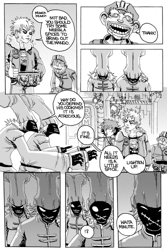
It starts with Johnny Boyo visiting his old school for chefs, which he quit a year ago to travel and get a taste of what’s out there on other planets….
When he comes upon a student forcibly evicted from one of the kitchens for having prepared a particularly lacklustre mango chutney chili. Jonny catches the bowl that’s flung after the body and tastes the chili —
“I remember you!” exclaim the Twins.
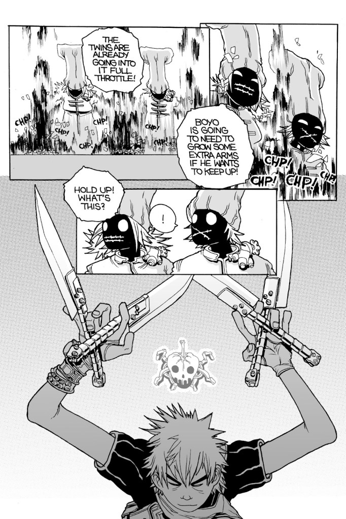
First refusing to participate in the challenge, Johnny reconsiders (after some encouragement from his old teacher).
The Twins are faster and fancier, but Johnny has some tricks up his sleeve (or in his holster, at any rate).
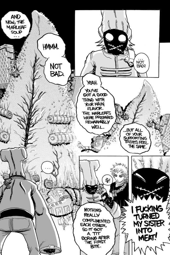
One of the twins decides to sacrifice his delicious sister (years of food absorption through pores marinated her deliciously!), but does this help him overpower his adversary?
And there you have it. If you’re of the cross-section of people who love food, comics, and are not averse to vulgarity, I recommend giving this collection a go.
Having long followed the man’s career, briefly met him and heard him speak, I’m convinced that he deserves every accolade he receives, and I know all this attention won’t even go to his head for, in addition to his staggering talent, the man just radiates patience and kindness.
In 2006, he was concluding a talk in Montréal by taking some questions from the audience, and an old lady asked an incredibly basic one… that most would have dismissed or shrugged off with a « how can you not know that already? ». But no, he gently responsed to her query in the most illuminating way, elevating the moment to the delight of everyone in the audience, including, of course, the lady with the question.
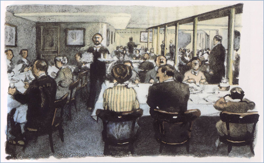
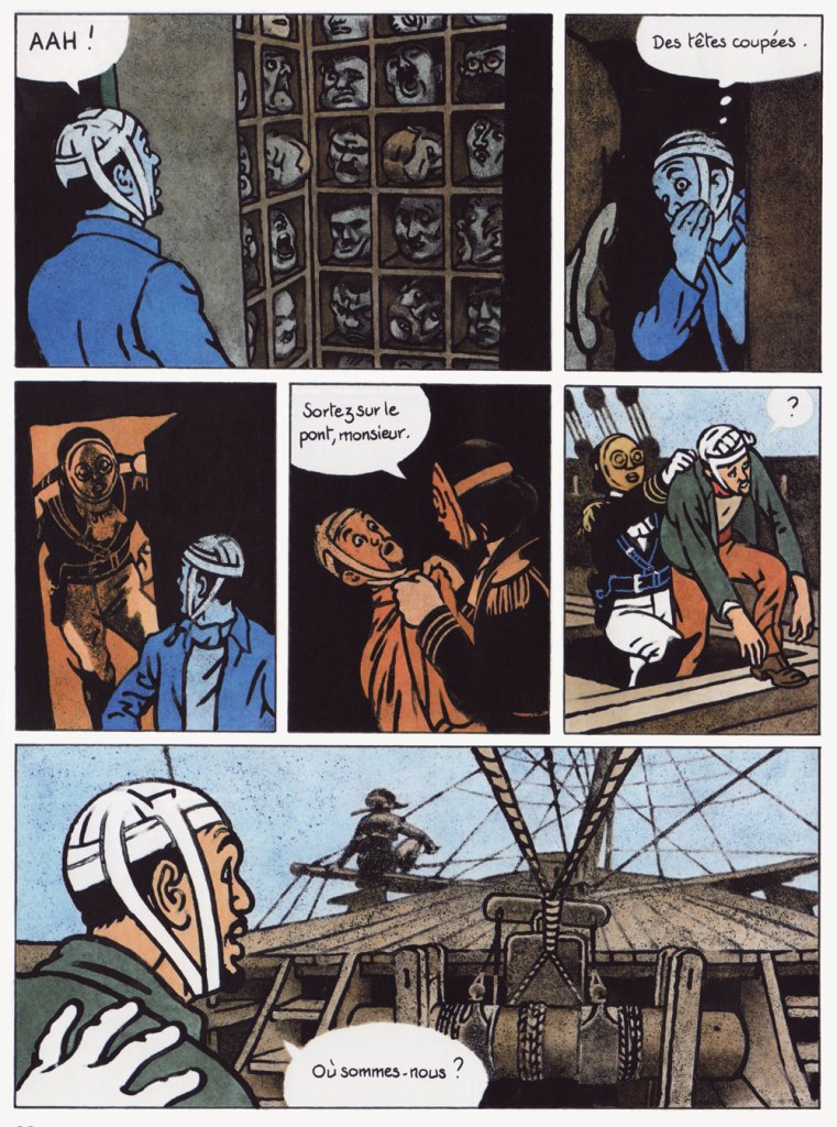
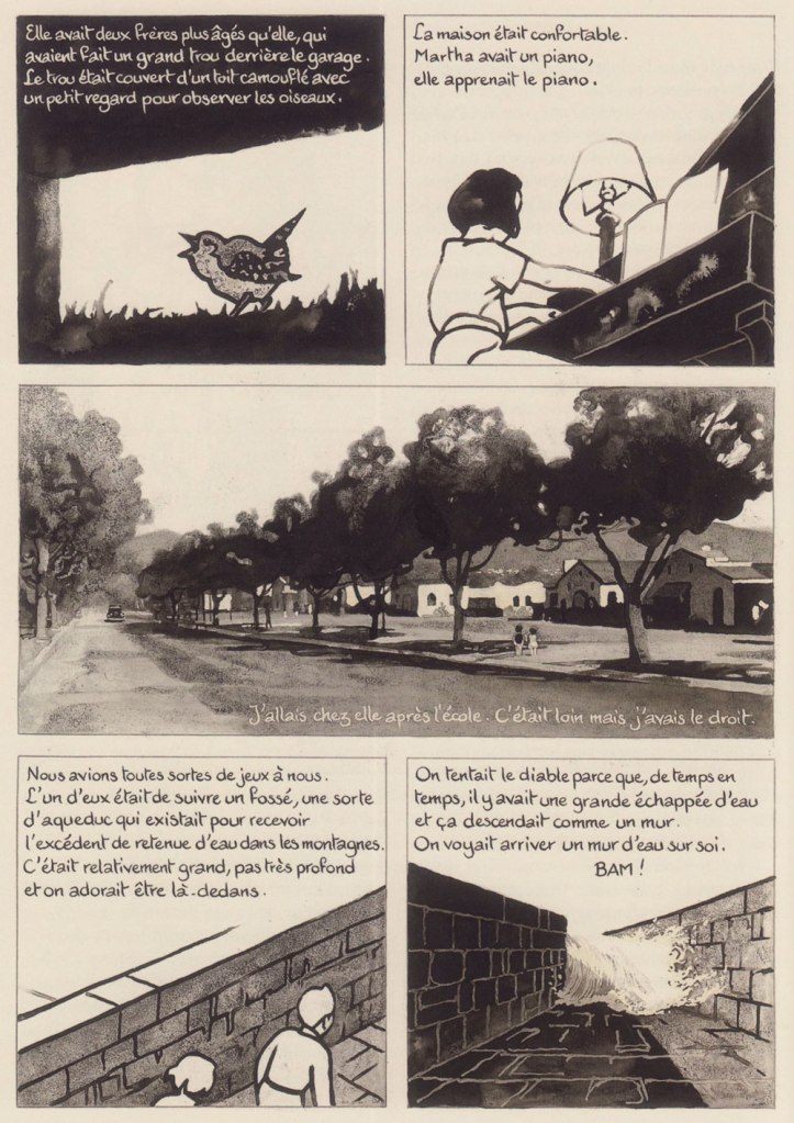
A 1997 illustration created for an issue of long-running (1971-) bright kids’ magazine Okapi on the theme of The Titanic. This shows the doomed ship’s third class restaurant.A sequence from the album that first brought Guibert to prominence, La fille du professeur, a collaboration with Joann Sfar, whose script won the 1997 René Goscinny award at the Angoulème festival. Note the remarkable fluidity and animation of the choreography. A sequence from his wild collaboration with WOT? favourite David B., 1999’s Le capitaine écarlate (The Scarlet Captain), which fancifully thrusts real-life author Marcel Schwob (1867-1905) amidst the lunatic fray.The pirate ship, travelling through the sky on its own wave, is trapped betwixt an airship and the grappling hooks of the Parisian police posted on the Eiffel tower. Of course.Here’s a glimpse into Guibert’s working method, two panels from Le capitaine écarlate: « Inking the pencils is always a problem: it’s even nonsensical to have to draw the same thing twice! Generally, the inking stiffens the drawing, since the pencilling stage is allusive and the inking stage is descriptive. So I try to do the opposite: I settle all the drawing problems in pencil and then, I put my page over a light table in order to reinvent the drawing in pen, leaving out a lot of the details. But that’s just a last resort. It’s hard to be quick and spontaneous while trying to convey subtle things. Ideally, I’d love to do without pencilling, but I need it to nuance my drawing. » (from a talk with Hugues Dayez published in La nouvelle bande dessinée, 2000, Éditions Niffle)A page from his probable magnum opus, La guerre d’Alan, in which he recounts visually the real-life recollections of an American exile he met by chance in 1994 on the Île de Ré. This part of the saga is available in English as Alan’s War. Here, a bunch of malnourished GIs hike for an hour for a steak meal provided by a lumberjack. For Alan, coming from a family of modest means, it was his first time eating steak. « Observe, improve yourself, fill up your noggin! » is the crux of his advice to young cartoonists. Leading by example, he’s constantly observing and rarely stops drawing. Thankfully, some collections of Guibert’s sketches have seen print, and they’re delightful. Here are some samples from Le pavé de Paris (Oct. 2004, Futuropolis), which is the exact size of a Parisian cobblestone, just like those lobbed at the police by demonstrating students during the tumultuous events of May 1968.I’m in awe at his ability to discern and render infinitely delicate shifts and nuances of colour and tone, especially in low light.« Drawing allows you to tear off pieces of reality and to take them home. In my notebooks, I know that the most beautiful drawings, the most vibrant ones, are those I did in places or before people that I want to keep near me. »« This is why my notebooks are so precious to me: they are riddled with accidents and unrepeatable little things. And while I practically can’t bear to open one of my published books, I often find myself checking out my notebooks. »A page, drawn in 1999 and intended for L’enfance d’Alan. Guibert initially planned to cover his friend’s life in order, but postponed the childhood part, since he possessed fuller documentation of Alan’s war years. In the end, this page didn’t make the cut, which gives you some idea of the very high standards Guibert sets for himself.L’enfance d’Alan appeared in 2012, and was followed in 2016 by Martha & Alan; like the rest of the Alan Cope memoirs, they were published by L’Association. The lion’s share of what’s kept me this long from showcasing one of my very favourite cartoonists: most of it is virtually impossible to scan, unless I’m willing to destroy the spine of some often rare, precious — and treasured! — volumes.
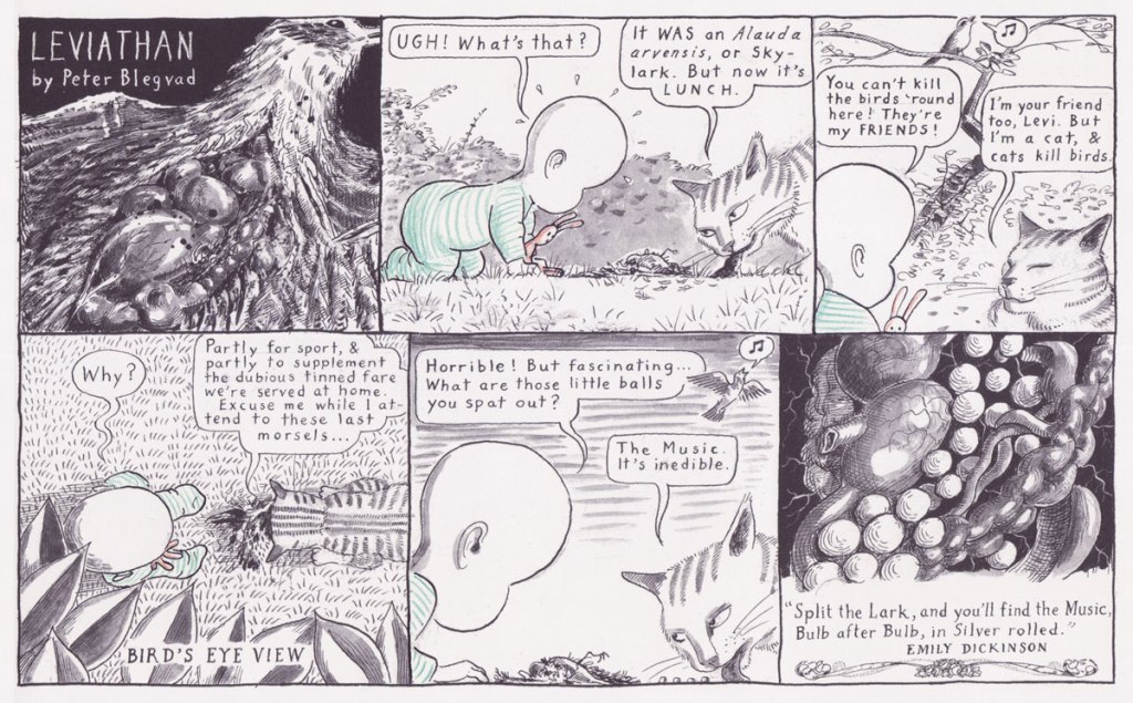
«Babies of course are not human — they are animals, and have a very ancient and ramified culture, as cats have, and fishes, and even snakes: the same in kind as these, but much more complicated and vivid, since babies are, after all, one of the most developed species of the lower vertebrates. » — Richard Hughes
I am fairly neutral about children, and prefer to stay away from them for the most part (although there are some pleasant exceptions to this rule). However, I enthusiastically dig through children’s books when given half a chance, and greatly enjoy comics about ankle biters of the ‘wise far beyond their years’ variety. Some authors’ worlds are so compelling that one wishes to be teleported into them. Who wouldn’t love to hang out with Sugar and Spike, or Cul de Sac’s Alice, or Daniel Pinkwater’s Robert Nifkin?
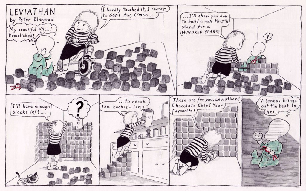
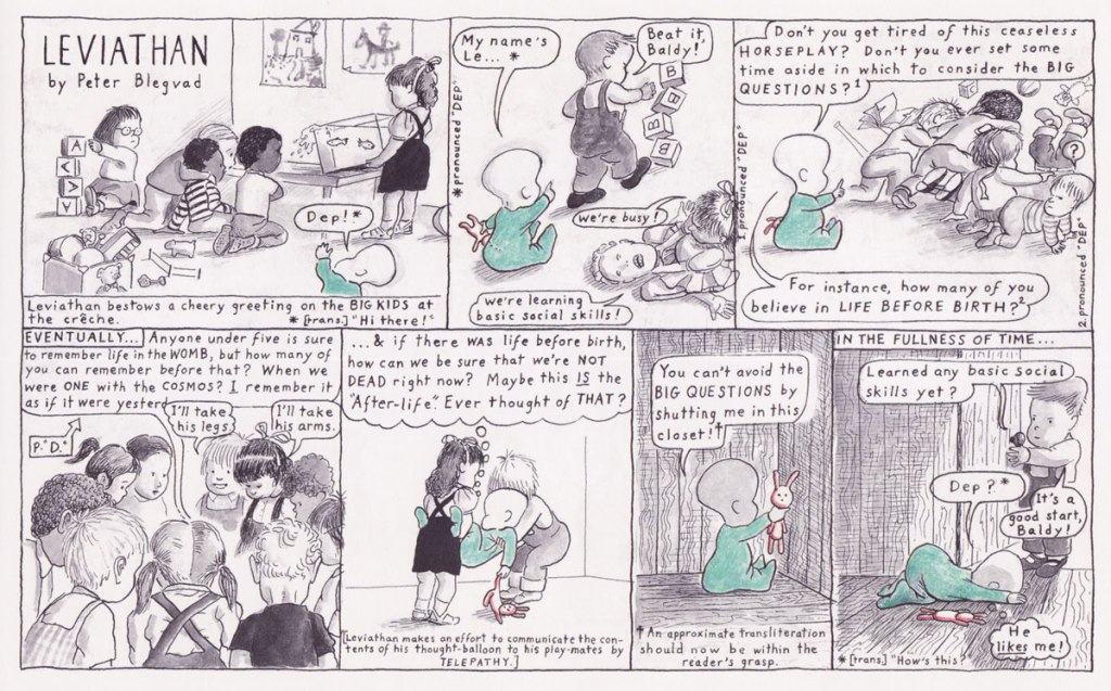
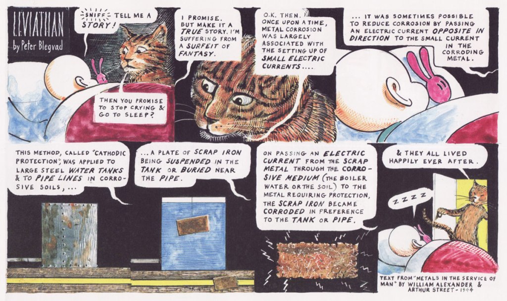
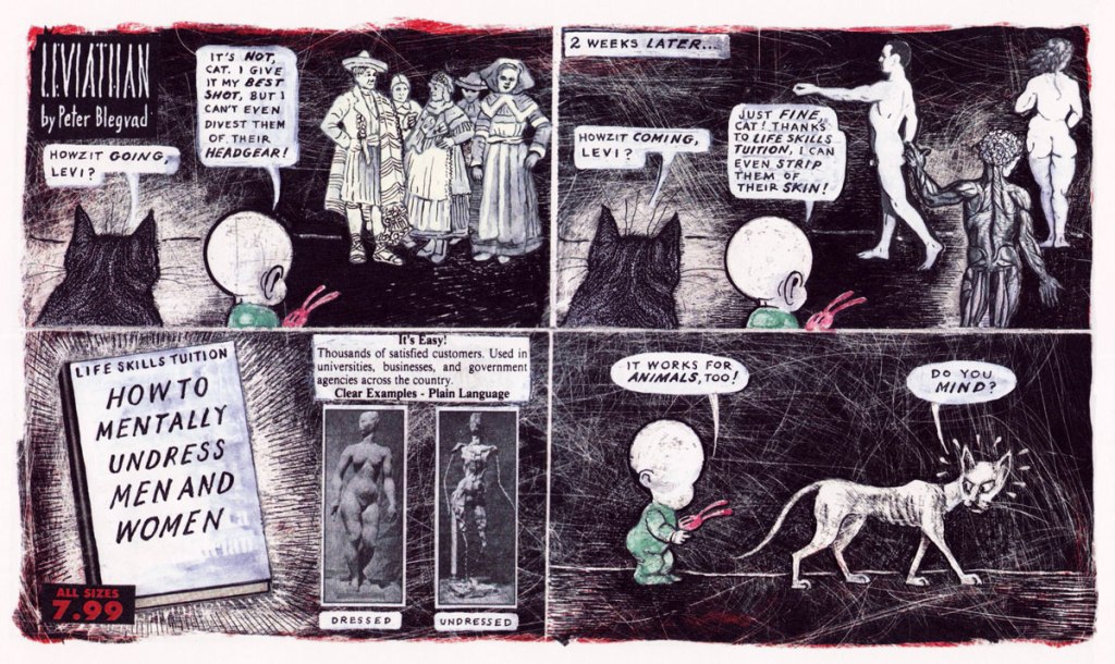
Though I have no such desire to rub elbows with the faceless, introspective Leviathan, his perambulations are great fun to watch. As per his name, he’s more than a little bit of a megalomaniac – as one can argue that all children are. Bred from a long line of ‘more or less faceless neotenic grotesques‘, such as Crockett Johnson’s Barnaby or Walter Berndt’s Smitty, Levi is an infant trying to make sense of the world around him through philosophical musings, an occasional break through the fourth wall, and conversations with his feline companion, Cat.
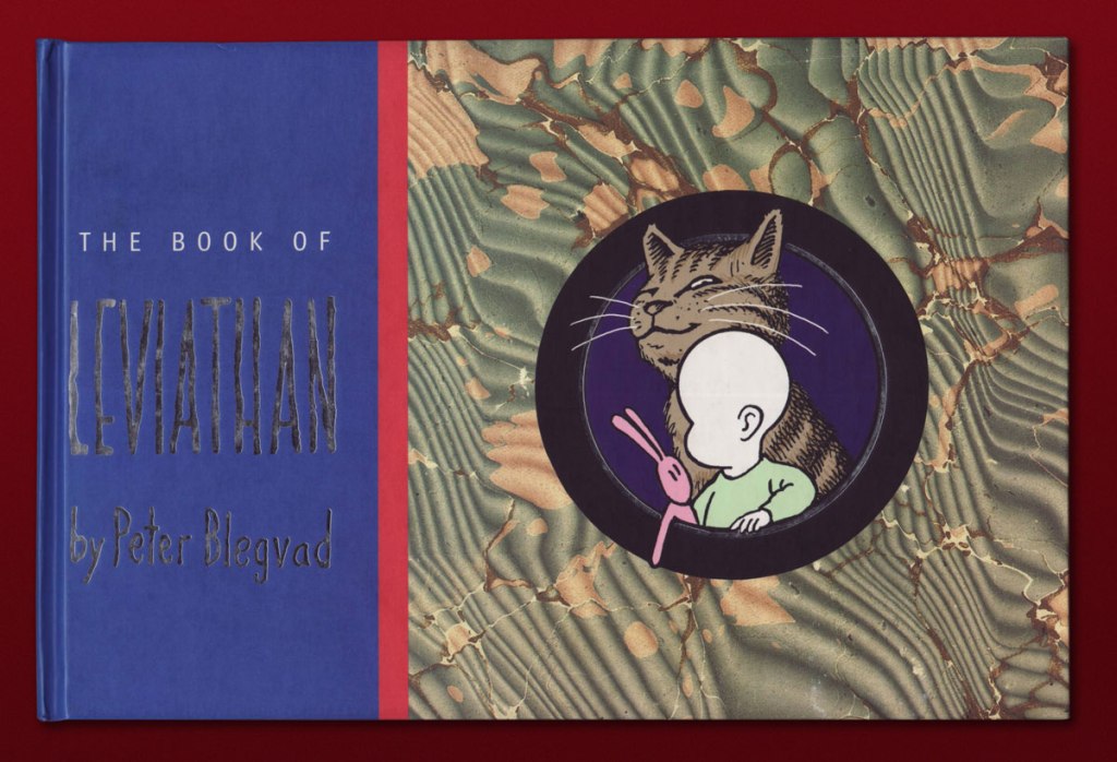
His patriarch is American Peter Blegvad, son of Danish illustrator Erik Blegvad (which accounts for the hard-to-pronounce family name that I tend to misspell as ‘Blevgrad’, since ‘grad’ is a common suffix for a city in Russian*), more known for his musical career than remembered for his cartooning one. Leviathan was published in the Sunday section of British newspaper The Independent** from 1992 to 1999, and some of the strips were collected in The Book of Leviathan, issued in 2000 by The Overlook Press. The latter is how I came across this strip, in the apartment of a friend kind enough to give me his copy when he saw how absorbed I was.
Levi’s big sister Rebecca is a habitual tyrant, though not without a certain charm.
In case you’re wondering re: snow vocabulary, some have disputed this claim as false and stemming from a misunderstanding of Eskimo-Aleut languages, which are agglutinative, and can form new words by combining other words. Here’s a quick article if you’re curious about the specifics.
Like all great observers of children’s rituals, Blegvad clearly had some children around to inspire him.
Q: How did you get the idea of naming a tiny baby Leviathan?
A: From my own kids: they’re both, you bring them home and they’re bigger than anything else in your life.
Q: Why did you switch from Levi’s parents to the Cat?
A: The Cat was easier to draw.
Leviathan seems to invite a hate-or-love kind of response from readers; as Rafi Zabor notes in the introduction to the collection, ‘I have met a few intelligent, literate, artistically sophisticated people who just don’t get it, and their non-response to what is obviously just for starters a classic of its kind, assuming it has a kind, has always puzzled me. ‘ As somebody who belongs in neither camp, I would suggest that this strip sometimes has its head up it arse, and goes so far into self-indulgent metaphysics that it loses its anchor for the sake of willful obfuscation – and sometimes it’s brilliant and very funny. As if to demonstrate the former, Zabor finishes his introduction with ‘Words fail. Times change. Cats meow. Leviathan swims in its native deep, glistening through serial sea-green waters, sending off spectra of intelligible light as it steers with ribbed and radiant fins.’ Nevermind such dubious metaphors – I posit that it’s Leviathan’s playfulness, juggling as it does quotes from long-dead philosophers, questionable puns and surreal vignettes flavoured with Freudio-biblical mythology, is worth the occasional muddle through a high-concept strip that didn’t quite pan out.
~ ds
* I keep misspelling his name as ‘Blevgad’, which would be very unmelodic to Russian ears, as ‘blev‘ means ‘puke’ and ‘gad‘ is sort of like ‘bastard’. I did in fact misspell it several times in this very blog post, until co-admin RG set me straight. Very embarrassing.
** Was this because Leviathan was too erudite and weird for American audiences? Blegvad was born in NYC in 1951, but was raised in England, spent some years in Germany, then returned to NYC in 1977. Given his proclivity for quoting British authors, I think his sensibilities lie more with Albion.
« We all have a thirst for wonder. It’s a deeply human quality. Science and religion are both bound up with it. What I’m saying is, you don’t have to make stories up, you don’t have to exaggerate. There’s wonder and awe enough in the real world. Nature’s a lot better at inventing wonders than we are. » ― Carl Sagan, Contact
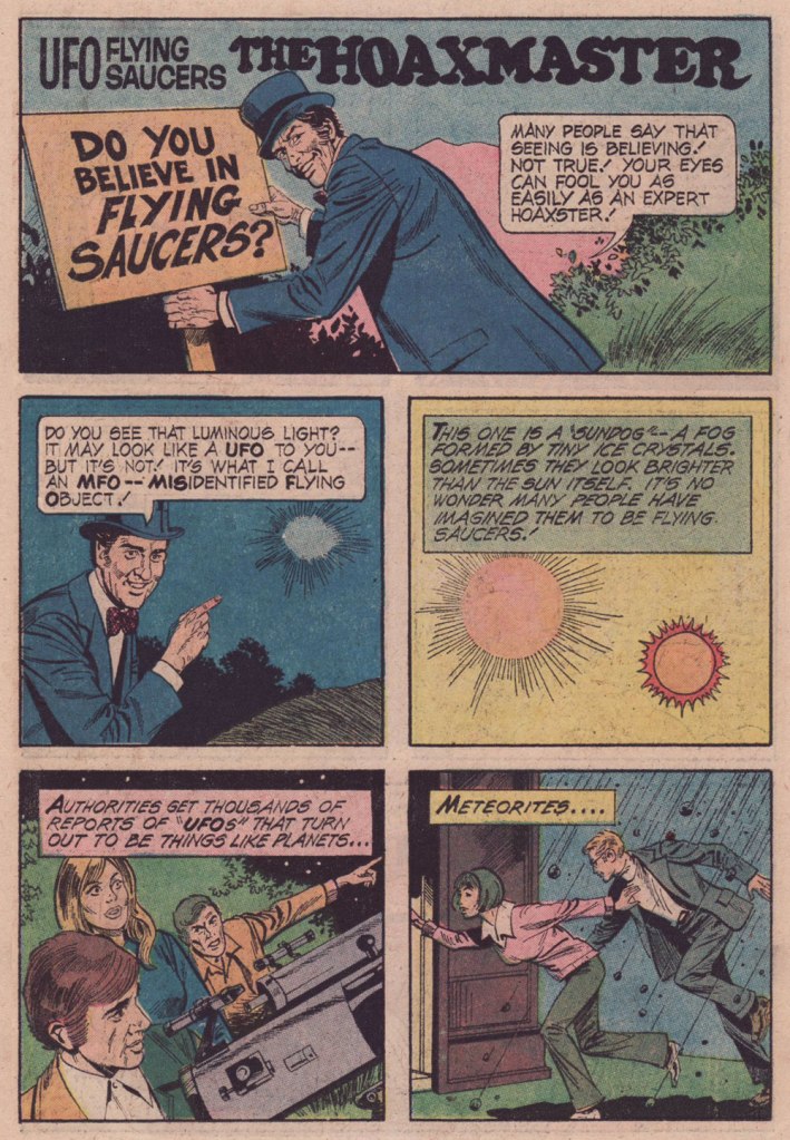
Time to keep a promise — a promise to myself, but just as worthy of being kept. A couple of years ago, I posted the first half of a favourite comics feature of mine, ‘The Hoaxmaster’, which ran in most issues of Gold Key’s UFO Flying Saucers in the 1970s. At the time, I declared that I might get around to posting the second half of the set some World Contact Day, which is today.
The bracing brand of skepticism demonstrated here by the Hoaxmaster, much needed as it was then — smack in the middle of the UFO-Spiritualism-Occultism mania of its era — is yet more urgently needed these days, as the merry-go-round of surreal disinformation spins faster and faster, further out of control with each passing day, it would seem. You may have noticed.
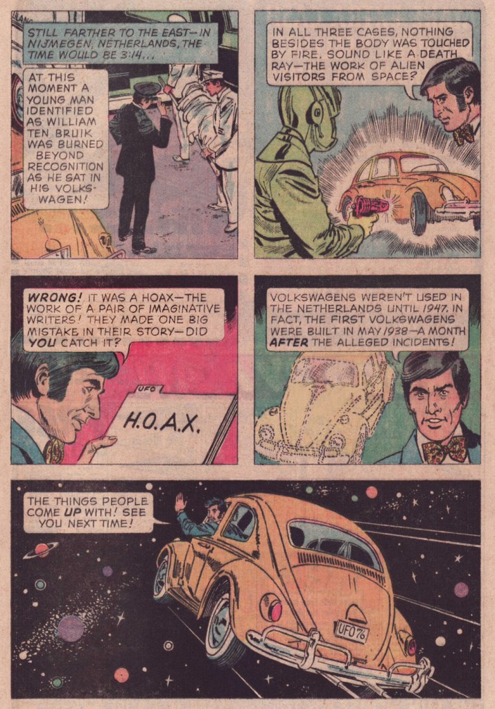
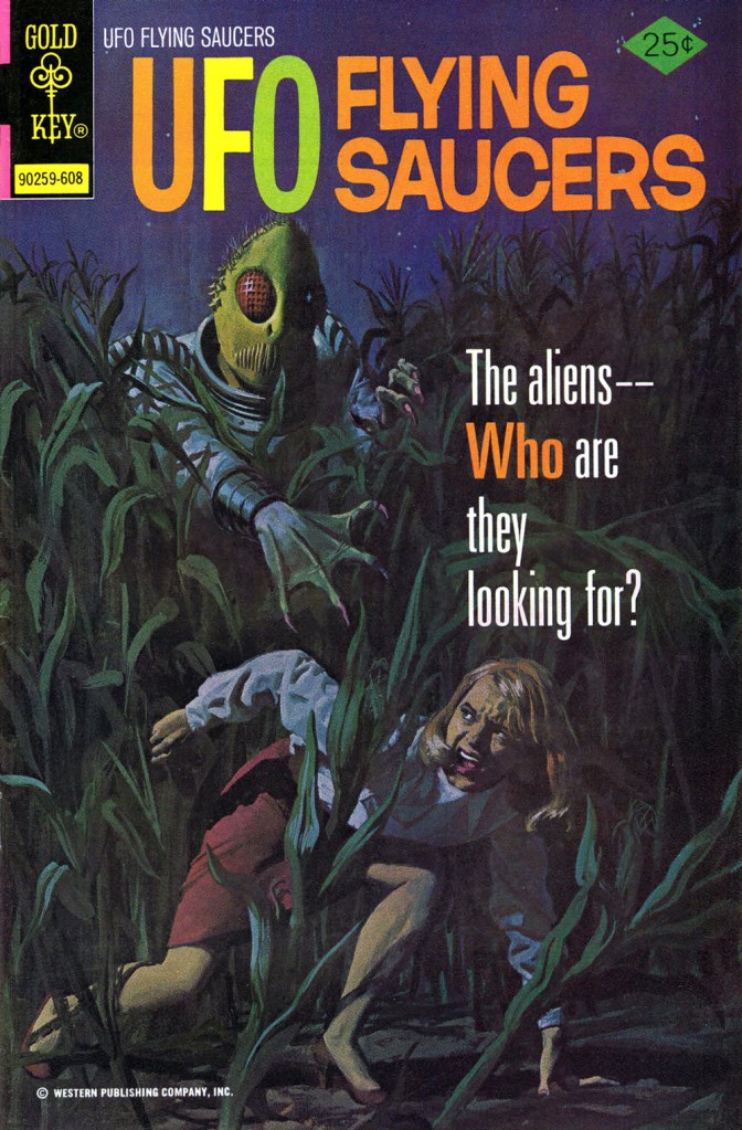
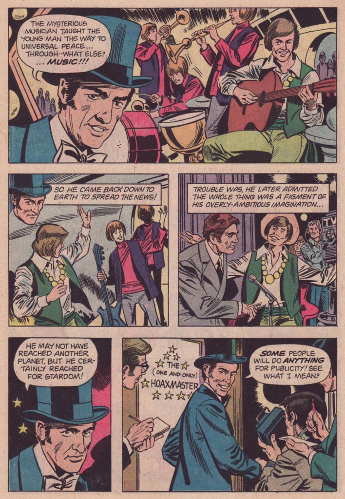
From UFO Flying Saucers no. 9 (Jan. 1976, Gold Key); as with all the Hoaxmaster vignettes, script by Pat Fortunato and artwork by Frank Bolle. From UFO Flying Saucers no. 10 (May 1976, Gold Key).From UFO Flying Saucers no. 11 (Aug. 1976, Gold Key).This was the issue in question, my introduction to the title; it bore this terrific — downright terrifying — painted cover by George Wilson.From UFO Flying Saucers no. 12 (Nov. 1976, Gold Key). Adamski!From UFO Flying Saucers no. 13 (Jan. 1977, Gold Key). Bolle was always a solid artist — which is certainly why he enjoyed such a long and busy career — but I can’t think of any, among the myriad of features he worked on, where he seemed to enjoy himself this much. His work always had a deadpan grace, but here, the wit deployed in the scripts allows him to reveal a seldom-seen facet of his talent.
Like many a bibliophile, I enjoy browsing shelves in a used bookshop without any particular goal or author in mind. On one of my last forays, I found the following book:
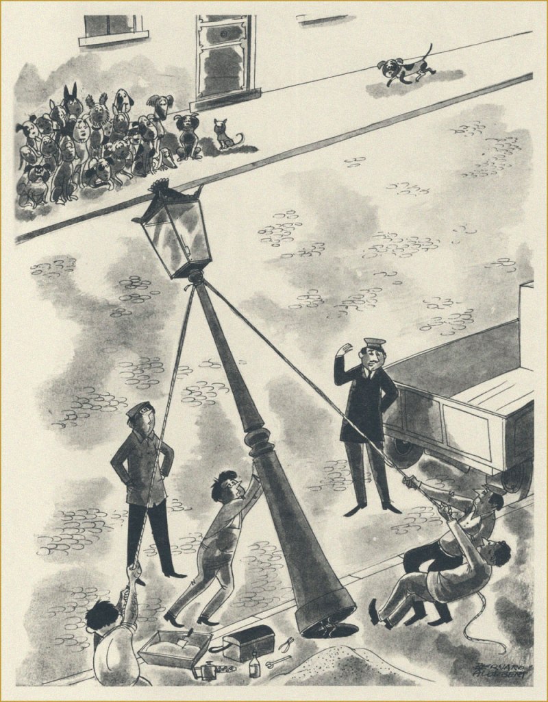
I had never heard of Aldebert (at that point I was under the misapprehension that ‘Bernard’ was his first name, and ‘Aldebert’ his family name), and the jokes were a bit hit-or-miss, but more than just a few charming cartoons lay within… certainly enough to pick up this book from 1970 for the impressive sum of 12 dollars.
Jean Bernard-Aldebert (1909-1974) was a French illustrator with an interesting, if not devoid of tragedy, life. He started drawing for various satirical publications early on, at 19, and for some fifteen years his career was gradually gaining in traction, his cartoons appearing in such weeklies as in Ric et Rac, Marianne and L’os à mœlle. In 1944, this came to an abrupt halt when he was arrested and deported to a German concentration camp (one of the worst, and the last one to have been liberated by the Allies – Mauthausen) for having depicted Hitler as a chimpanzee in one of his caricatures. Miraculously, he survived, and even set his experiences down on paper – these 50 drawings were published as the album Chemin de Croix en 50 Stations in 1946.
After his return to France, he moved away from satire and caricature (frankly, who could blame him?) and onto more humorous publications like Paris Pin-Up and Fou rire, also illustrating many posters and ads, and drawing two comic strips for Ici Paris (Adonis and GIgolette).
This seemed appropriate, given that spring is clearly in the air!
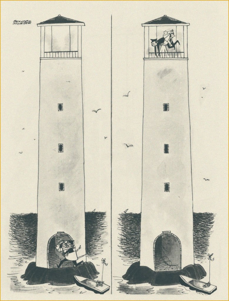
Bernard-Aldebert might have moved away from satirizing serious topics, but it doesn’t mean he lost his sense of observation of the ludicrous aspects of life.
« If you had just a little imagination, you’d come to the beach! » This is my favourite cartoon from this collection.
If people still had to use a sickle, maybe fewer lawns would be tragically over-mown.
I don’t know what year this haunting photograph is from, but I think we can all agree that these eyes look like they’ve seen too much.
« This is the very center of everything there is. A huge black hole eating up the galaxy. The end of everything. » — Clifford D. Simak
Early in the Fall of 1979, I was pleasantly surprised to discover some new work by Jack Kirby in our weekend paper’s comics section. Things had been awfully quiet on the Kirby front since late 1978, the ‘King’ having unhappily — and quite understandably — left Marvel for the second time that decade.
This new work was part of the long-running anthology strip Walt Disney’s Treasury of Classic Tales (1952-1987). I dutifully collected the shabbily-printed comics sections and patiently hoped for an improved presentation.
The October 28, 1979 Sunday strip, as it appeared in newsprint. Incidentally (and unoffically) here’s the whole story.The surviving original art page from the same date, for comparison.
Western Publishing, usual licensee of Disney product since its acrimonious split from Dell in 1962, then issued a Black Hole adaptation, in both a slick magazine and comic book format. But — holy bait-and-switch! — it wasn’t the Kirby version!
A typical page from the Western Publishing adaptation. Written by Mary Carey and illustrated by Dan Spiegle (1920-2017), a perennial favourite of the publisher’s. Another mystery: since Spiegle had earlier proven himself well-capable of capturing likenesses, one must assume that the decision to dispense with likenesses of Anthony Perkins and Ernest Borgnine and replace them with those of, I dunno, ‘Weird’ Al Yankovic and Ontario prime minister Doug Ford must have come down from on high. But… why?
I’ve been musing over these riddles ever since (in my spare time). Recently, I decided to act by putting the question to one who was there… namely Mr. Michael Royer, who’s been most gracious to us with his time and recollections (check out our three-part interview with MR!) — and continues to be!
RG: Mr. Royer, I’ve long been baffled as to why Disney (or Western Publishing, at any rate), thought it necessary to commission two separate comics adaptations of The Black Hole. I’ve always surmised that Kirby was considered too wild for them, but that’s just speculation on my part.
Since you were working for Disney at the time, and you inked the Kirby adaptation, I presume that you played some kind of role behind the scenes as well. Could you share some of the facts with me (and my readers)?
MR: Jack Kirby was selected to draw THE BLACK HOLE Sunday comic strip on MY recommendation. Gold Key editors always selected their OWN artist for similar licensed material… plus they were in no position to pay their artist the fee I got Jack. I inked and lettered HOLE and made necessary changes to the robots to protect the image for toy, etc. sales trademarks. Jack was an impressionist and I made the robots “on model.”
Jack became so bored with the scripts, that were done “storyboard” like by someone who had NO understanding of how to make comic art interesting and exciting, that he asked me to layout the FINAL Sunday page, which I did. I had told the powers that be at Disney that Jack must get his originals back but, of course, being Disney, they did not return them as they had promised. Jack only got the remaining pages not yet sold by the Circle Galleries after threatening Disney with a lawsuit. Disney gave me one of the Sunday originals because someone had spilled a cup of coffee on it.
The head of our Creative Services dept. at Disney was not a big fan of Kirby* and after I had inked the first Sunday he had another staff artist “fix” the faces, which stood out like what they became: inept changes. I yelled “DON’T CHANGE THE FACES!” They gave in to my warning.
It was an interesting time back then. Bob Foster and I were the ONLY artists in Creative Services who had worked in comic books and strips. They would never take our word about things until our department head, Bob and I, were on a conference call with Sylvan Beck (King Features Strip Editor in New York) and then they believed what we had to say about the ways a Sunday strip could be drawn to fit many formats. It was very frustrating at times knowing more than your “bosses.”. But… it is the same old story. Middle management was loaded with MBAs who didn’t know shit from shinola! We used to joke that if one had an MBA anyone could get hired at Disney… You didn’t have to know a damn thing about anything else except how to get the MBA.
RG:I’ve read somewhere that the Black Hole scripts were the work of Carl Fallberg. I mean, if that’s true, surely he wasn’t the one who storyboarded the script, as it’s a bit hard to reconcile ‘NO understanding of how to make comic art interesting and exciting’ with a visual artist of Fallberg’s calibre… might he have delegated the task to some flunky?
MR:It was Fallberg… storyboard layouts for each panel/page. I liked Carl and he was a nice man, but he had no idea how to “jazz” up the film visually and Jack wasn’t about to rock the boat, by being his usual inventive self. The script layouts were just like the film… boring. Just a blow by blow of what was going on in the film. The comic strip could have been exciting if Carl hadn’t just “stuck” to the movie. But, perhaps I am being too critical. Carl was probably “following orders” from our department head. When I tried out to do strip art for Disney in the late 60s or early 70s that same department head told me NOT to worry about “likenesses” of the actors. So when I told in my samples they were turned down because “no one looked like the actors.” Gawrsh…as Goofy would say. As I said… Bob Foster and I were the only guys in Creative Services who had ever been intimately involved in comic book or strip art production in our department. Things did change a bit eventually.**
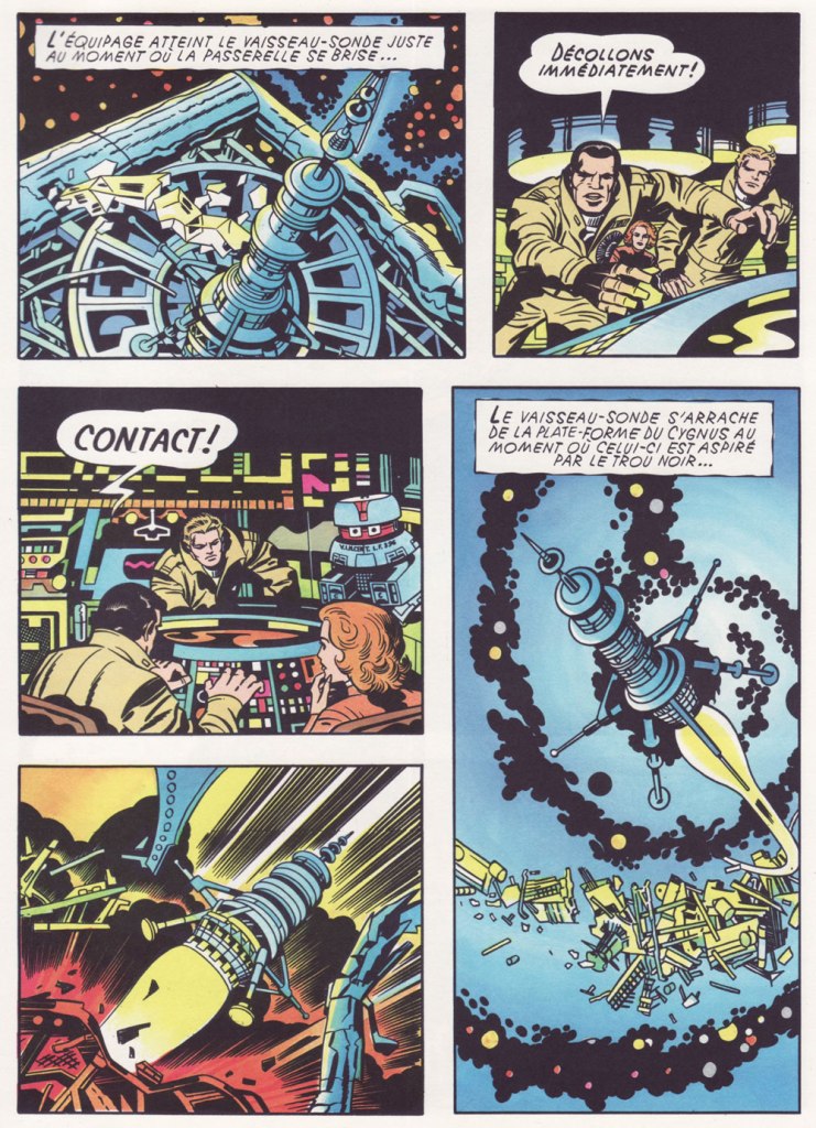
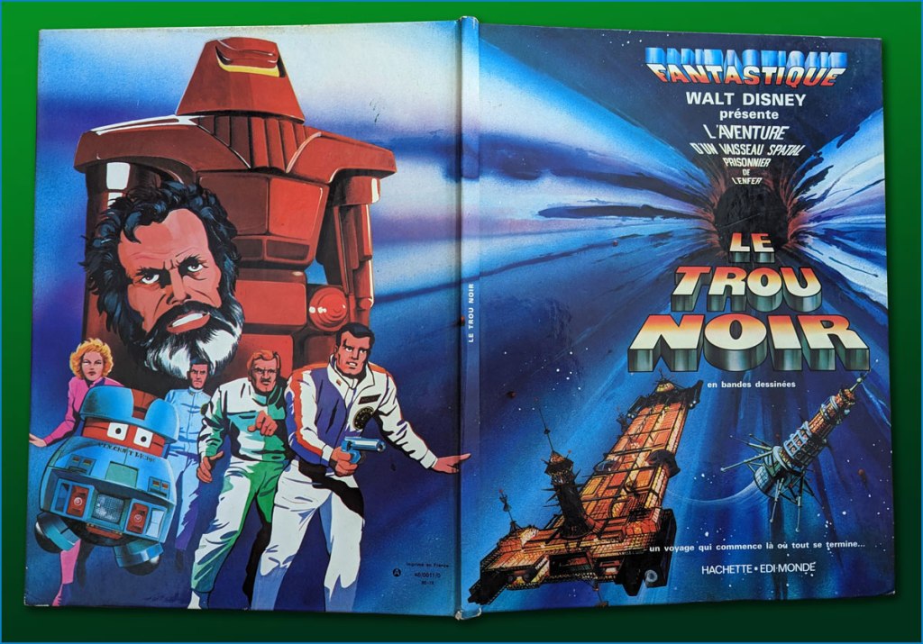
I’ve heard it said that the Kirby Black Hole material has never been reprinted or collected in full… which is only true if you only count English-language editions. I happen to have on hand the well-produced French collected edition (Fall 1980, Edi-Monde/Hachette). It was serialised earlier in the weekly Le Journal de Mickey (published continuously since 1934!).I’ve mostly gone with the action sequences. In an episode of Sneak Previews, film critics Gene Siskel and Roger Ebert perceptively assessed The Black Hole‘s shortcomings.Here’s a look at the hardcover collection in question, with its amusing cod-Kirby painted back cover.
I leave the final words to Mr. Royer, along with my earnest appreciation of his gregarious generosity!
MR:As a point of interest (or none at all), I designed and drew the Sunday page BLACK HOLE title panel as well as lettering, correcting robots and inking. I have a full set of B&W proofs if any one is interested in putting them into print. Offered to loan them to IDW but I guess they weren’t interested. My price must have been too high. Two comp copies of whatever they printed. LOL sigh.
*this was decades before Disney became perfectly fine with reaping billions upon billions from Kirby’s creations.
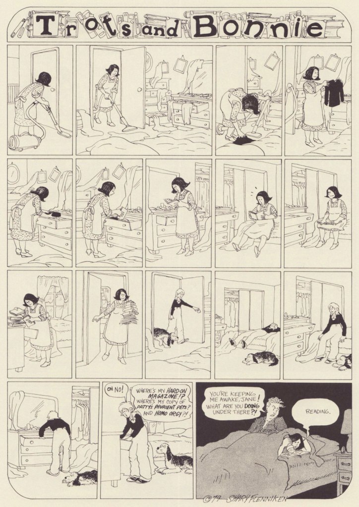
« Bonnie and Pepsi are obsessed with sex, but they’re not there for the male gaze. Their desire is frank and straightforward and more than a little demented, and it’s depicted with a bracing honesty that feels less like a political statement and more like Flenniken is reporting from the front lines with no filter, no safety net, and no intention of telling anything but the truth.»*
I first came across a Shary Flenniken‘s Trots and Bonnie strip in some random issue of National Lampoon. I can’t even really narrow down the decade**, as it ran within its pages from 1972 all the way to 1990. I was intrigued, but not enough to pursue it.
When New York Review Comics published a Trots and Bonnie collection in 2021, gathering 160 strips in a handsome hardcover volume, I was happy to finally be able to partake of T&B in a more organized fashion. One perplexing thing about this collection is that some strips were omitted due to concerns of misinterpretation***. It was apparently feared that some topics would be too controversial, or that the modern reader has lost the ability to interpret things in context. I would have liked the possibility of deciding what has or hasn’t aged well for myself. As it stands, this collection features strips offering a most varied list of topics to horrify the easily triggered (rape, racial epithets, kids getting shot, electrocuted and castrated – albeit by other kids – and pedophilia), so I am truly curious what the censored strips were about. I guess I am now doomed to collect National Lampoon issues (to be fair, the latter was home to many a great cartoonist – Rick Geary, M.K. Brown, Stan Mack, etc.)
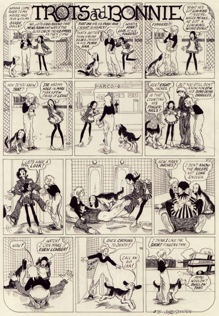
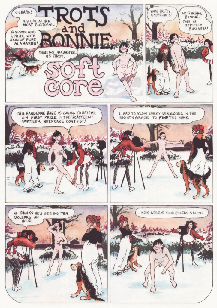
Trots and Bonnie is a hilarious strip, and it’s also quite unsettling in the best of ways. While both cartoonists would surely be offended by this comparison, it makes me think of some of Charles Rodrigues’ work (see Charles Rodrigues’ Pantheon of Scabrous Humour) – the same electrifying unwillingness to shy away from difficult topics, although Flenniken was doing it to make a point, and Rodrigues would do it for sheer perversity. More than once while reading T&B I would start wondering how far a certain storyline would go – and it went all the way to its logical (call it immoral, call it stomach-churning…) conclusion. Just take the Dr. Pepsi’s Vasectomy Clinic from 1974, a panel from which made it as the cover of the collection –
«Two youngish girls, dressed as medical professionals, appear to be playing doctor with a young boy, who lies under a sheet, grinning blankly at the viewer while one of the girls, brandishing a pair of scissors, cheerfully communicates something to the other one. A sweet-looking dog with fancy eyelashes lies at their feet. It’s only once you know the particular strip it comes from, in which Pepsi (the shorter firecracker) and Bonnie (the taller girl) attempt to give neighbor kid Elrod a vasectomy and wind up referring to themselves as a sex-change clinic, that you blanch a bit at the art choice. There you go. That’s “Trots and Bonnie” in a nutshell. » [source]
Boys are sometimes disconcerted by Pepsi’s aggressive style of lechery, but they’re mostly on board. To once again quote Emily Blake, ‘what Flenniken understands and brings gleefully to the page is that adolescent girlhood is positively feral and that teenage girls are both threatened and threats themselves.’ Given that highschools are breeding grounds for boys cruelly bullying flat-chested girls, I can see why Flenniken decided to flip the tables.
There’s so much to unpack here – Trots as the voice of the male gaze, female camaraderie, the hilarious but tragic response of the woman to the suggestion of cream (eliciting a sort semi-guffaw, semi-yelp from this reader), a hint at social unrest caused by police brutality, and that’s just skimming the surface. Flenniken says, ‘You might say I was taking the subject lightly here, but at least I was introducing this to an audience that wasn’t going to see anything like this anywhere else‘. Amen.
It’s also a charming strip, with a heroïne who is refreshingly in no hurry to grow up (despite being prodded into it by her early bloomer friend Pepsi, ‘dressed in incongruously childlike pinafore paired with fishnets, a perfect metaphor for the terrifying underage sex fiend she is’). Bonnie dresses like a tomboy, hates going out with her parents, and collects sex magazines and prophylactics like other kids collect marbles. In a world of sleazy men with a creepy predilection for pre-adolescent flesh, she somehow manages to remain an innocent, and shrug off any unpleasantness in favour of a wide-eyed curiosity about everything, be it boys’ cock sizes or sci-fi movies.
I can 100% relate to the thrill of first seeing a naked man (well, maybe not a dead one, though), and at that age I would probably be running around with a jar of lymph nodes as well, given half a chance.
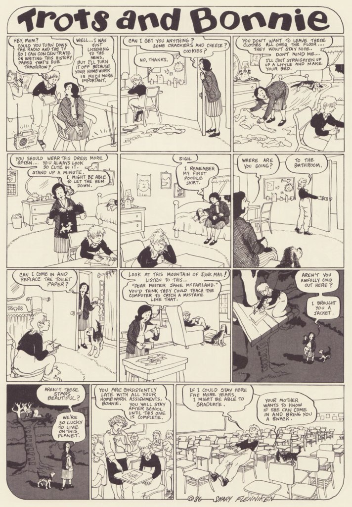
I’ve included more ‘innocent’ strips to showcase that Bonnie is a normal kid with a normal (if staid as hell, especially for the 70s) set of parents. It seems that Flenniken’s friend Mark Evanier suggested Trots’ punchline.
Will men find this strip as hilarious as I do? No idea. But it reminds me of today’s conversation with a (male, gay) colleague, in which he learned that women usually have two or three categories of underwear and spent the rest of the day marvelling at this fact.
I find it charming that there’s someone for everyone in this scene – neither group is focussing on the one best-looking member (accidental pun) to the exclusion of everybody else, but developing an inclusive cloud of lust.
‘I’m partial to gay male porn. And so is Bonnie’s mom now. If you can’t figure out why, you don’t need to know.’
The ridiculous (and lascivious, yuck – Bonnie’s body language makes it clear she is very much creeped out) approach of the psychiatrist is tempered by the punchline – Trots really can talk!
In case that isn’t clear, I heartily recommend purchasing the Trots & Bonnie collection.
~ ds
* This strip is hard to write about and do justice to, and I could not do any better than Emily Flake’s truly excellent introduction to the T&B collection.
** I found it – it was Women’s Erotic Art Gallery, published in 1975.
*** Flenniken explains, ‘the things that I did that we omitted here in this book, I think we looked at those and went, “oh, that might hurt somebody’s feelings or something.” That was me being naïve when I wrote those. A lot of times I was just exploring a subject rather than having a definitive stance. People are pretty darn outrageous today, more so than me. What has changed is what people think is offensive.‘