Hot Streak: Nick Cardy’s Aquaman, Previously

« Suffering sea snakes! Can this really be happening, Aquaman? » — Aqualad has a query.

I just realised, a few days ago, that I’d left something hanging for too long: nearly two years ago, I turned the spotlight on a series of Aquaman covers, casually (in my debonair way) letting it be known that there existed another, earlier, and even longer (well, by one) run of exemplary Aquaman covers. The time has come to see whether I was talking through my hat… or not.

Now, at the risk of repeating myself, it must be stated that, since we’re dealing with DC’s late Silver Age, there’s more to any given cover than a signature. DC’s recently-ascended art director, Carmine Infantino, had a hand in designing virtually every DC cover between late 1966 and early 1976. How strong a hand varied from cover to cover, of course. A good designer sometimes knows when to hold back and be invisible, or just about.

Infantino always strove to improve himself and update and hone his skills. Well into his career (he’d started in 1940 at Timely), he pulled an unexpected (and very smart) move. As he recalled it in The Amazing World of Carmine Infantino (2000, Vanguard Productions):

« Around 1960, I went back to school again, this time to study under a gentleman named Jack Potter at the School of Visual Arts. What Jack taught me about design was monumental, and I went through a metamorphosis working with him. I’d sit there confused and he’d tear the work apart. But then it was a light bulb going off – bam! – and I’d understand everything he was getting at.

After studying with Potter at the SVA, my work started to grow by leaps and bounds. I was achieving individuality in my work that wasn’t there before.

I threw all the basics of cartooning out the window and focused on pure design. Everything I did was design-oriented. That was quite the challenging task. But that’s where Potter’s teaching took me.

… I started putting hands in captions, that was decorative. He taught us to do everything decoratively. I’d always found captions very dull. So I thought I’d break the captions into smaller paragraphs and use hands to get people to read them. I regularly pushed design and perspective to the extreme. »

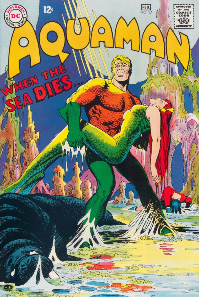
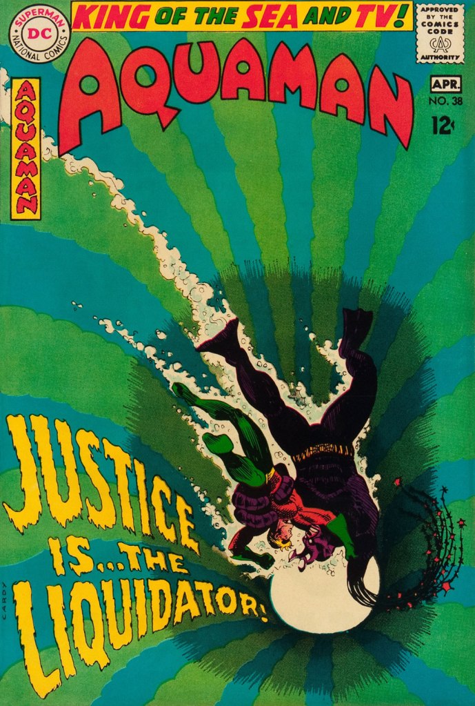
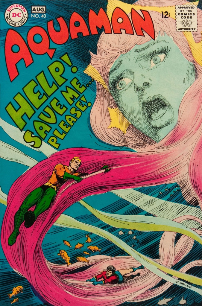
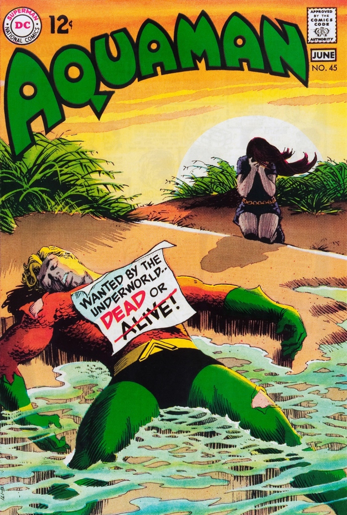
And speaking of reinvention, I must also salute Nick Cardy’s own mid-career creative burst. Prior to the mid-60s, Cardy had always been one of those genteel, tasteful but entirely unexciting journeymen, the way most DC editors liked ’em. I can think of precious few long-timers that managed to convincingly reinvent themselves and greatly raise their game, well into their career, without utterly misplacing their original identity (that disqualifies you, Keith Giffen) in the process. Alex Toth, Jerry Grandenetti and perhaps Sheldon Mayer come to mind…

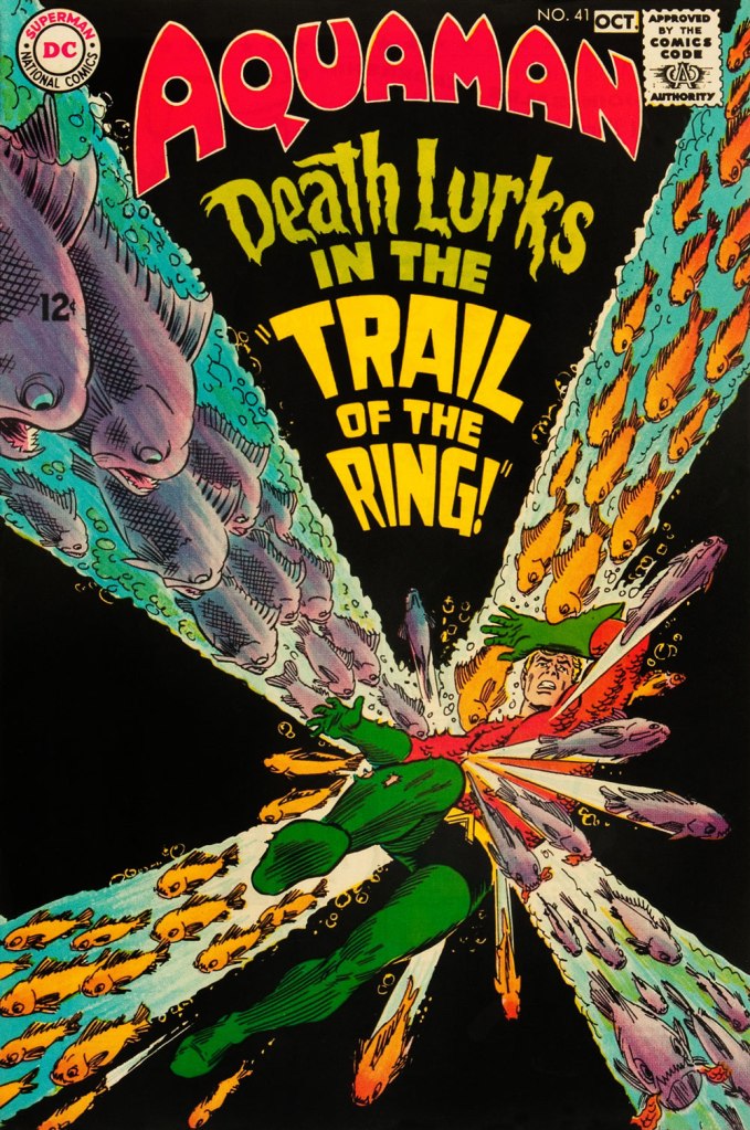
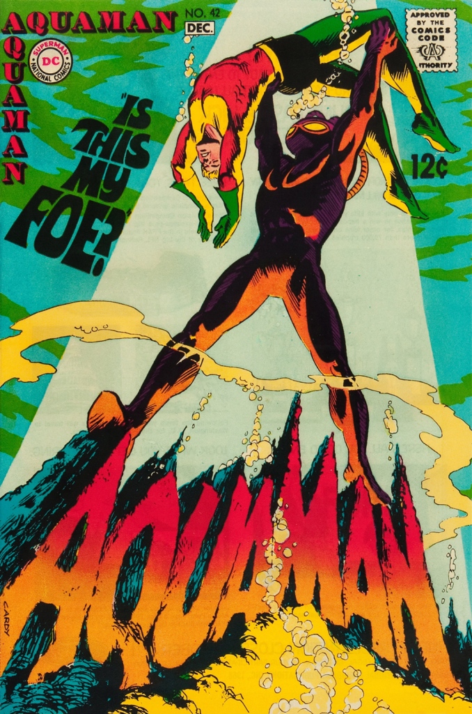
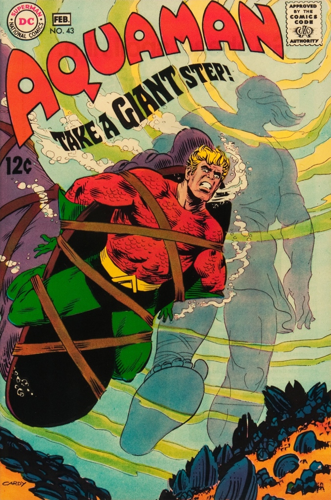
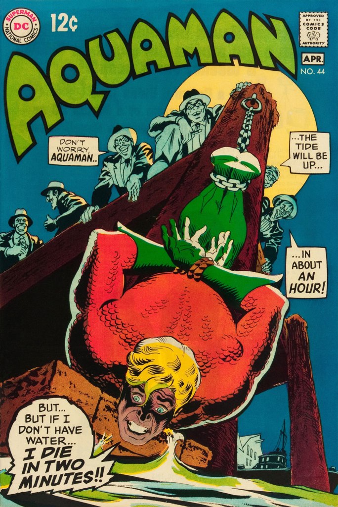
At any rate, when Infantino got together with Cardy on those covers, all hell broke loose, in the best possible way.

This is Aquaman no. 37 (Jan.-Feb. 1968, DC). The despondent walrus, bottom left, is family pet ‘Tusky’. Oh, and my apologies for ever-so-slightly poaching some potential Tentacle Tuesday material.
This is Aquaman no. 38 (Mar.-Apr. 1968, DC). I wonder what’s up with the redundant vertical logo, top left.
In case you’re wondering about Aquaman’s expanded regal duties (“and TV!“), they were showing repackaged reruns of his half of the previous year’s Superman / Aquaman Hour of Adventure. A Filmation production, so don’t expect too much if you haven’t seen it.
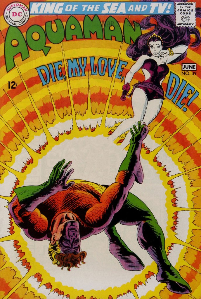
But back to the comic book: this dazzling scene announces the saga of “How to Kill a Sea King!”, as our amphibious hero seeks to thwart a hostile Venusian takeover of Earth and sea. Script by Bob Haney, art by Cardy. This is Aquaman no. 39 (May-June 1968, DC). Oh, and the hottie? That’s “Aliena”. A real bolt of ‘inspiration’ there, Mister Haney.
This is Aquaman 41, (July.-Aug. 1968, DC). Such dynamically-designed fun! This is where the new creative team of Stephen Skeates and Jim Aparo joins new editor Dick Giordano (his second issue), but Cardy remains on covers… because Aparo, who resided a couple of states over, couldn’t attend the cover conferences.
This is Aquaman 41, (Sept.-Oct. 1968, DC), a highlight among highlights from the redoubtable team of Infantino (publisher-designer), Cardy (penciller-inker), Giordano (editor), Jack Adler (production manager and colourist), and, inside, Skeates (writer) and Aparo (penciller-inker-letterer). There’s a texture to the colour work (most evident on the foreground piraña… a freshwater fish, incidentally) that’s unusual for comics of that period. I wonder how it was achieved…
This is Aquaman no. 42 (Nov.-Dec. 1968, DC).
This is Aquaman no. 43 (Jan.-Feb. 1969, DC). Face-first in a bed of mussels, with several tons of pressure? Yikes.
This is Aquaman no. 44 (March-April 1969, DC). I love how, despite the gravity of the situation, the mobsters are kind of cartoony. Cardy would most fruitfully mine this tragicomic vein in the brilliant but short-lived western Bat Lash (1968-69).
This is Aquaman no. 45 (May-June 1969, DC), concluding Skeates and Aparo’s two-parter, the self-explanatory “Underworld Reward”. An undeniably epochal cover by Mr. Cardy. To wit, so compelling and mysterious is this scene that it’s merited an astute blogger’s impressively in-depth analysis… well worth a peek.

-RG

Tentacle Tuesday: Do Send Us a Postcard, Luv!

I don’t know about you, but for me postcards are an intense evocation of nostalgia – so ubiquitous in the last century, and just a pale shadow of their former glorious selves in this day and age. Fortunately, a lot of them have survived through the years, and collectors have taken care to preserve these snippets of the past, whether crass or elegant, stunningly illustrated or just the barest sketch of an idea.

We’ll start with the oldest postcards of today’s post from quite a long time ago – the beginning of the 20th century in France.

These following two French postcards from 1910 are signed by “E. Orot”, though I wasn’t able to find out whose nom de plume that was. The back of the cards says “près des grands flots bleus” (near the great blue waves) which was the name of the seaside-themed series by this mysterious artist.

The poem is something like “Why don’t I have, like this octopus, eight long arms to embrace you, for I would, without getting weary, make my kisses into true masterpieces”.
“Say, why does such a nasty beast have eight arms, and you, so pretty, have only two?”

The following postcard is French, part of a series of images depicting France in the year 2000 as seen by artists in the early 20th century. These were first published as inserts in cigar boxes, and later given second life as postcards. This one is painted by Jean-Marc Côté. « There are at least 87 cards known that were authored by various French artists, the first series being produced for the 1900 World Exhibition in Paris. Due to financial difficulties the cards by Jean-Marc Côté were never actually distributed and only came to light many years later after the science-fiction author Isaac Asimov chanced upon a set and published them in 1986, with accompanying commentary, in the book Futuredays: A Nineteenth Century Vision of the Year 2000. » To see more of these cards, visit A 19th-Century Vision of the Year 2000, which is also where that quote is taken from.

Moving on to France’s “historic rival“, Britain.

All I was able to ascertain is that this postcard is British, from the 40s or possibly 50s. Are these women giantesses, or is this aquarium exhibit meant for children or possibly dwarves? We will never know.

The three following postcards are British, but from varying decades. The Bill going on a date is from the 1950s. Bill’s cold, octopus-like hands (is it the same Bill, some twenty years on?!) are from the late 70s, published by Kromekolor, which seems to have had a chunk of the British market, though very little information is available online. And the nameless guy playing around with a fishing girlfriend is from sometime in the late 60s, and I would not at all be surprised if his name was William.

We have talked about Donald McGill, the king of comic postcards (take a look here) before. I was delighted to find two tentacular offerings from the vast collection of postcards he has drawn.

Continuing in a British vein, this postcard is part of the Seaside Spooners collection by Tom Browne, (another extremely prolific British artist and very much a contemporary of McGill) and is entitled The Lovers’ Seat.

Moving on the good ole U.S. of A. – here’s a pair of American postcards from the 50s, with rather similar jokes.

It’s not very clear why Horace is being propelled out of the boat like that. Is he perhaps terrified of octopuses? Note that it is exactly the same “gag” as in a British postcard featuring William.

And another postcard from 1954. Unfortunately, I don’t know who the illustrator is in either case. I like how Melvin looks puzzled, not scared, by this cephalopod intrusion.

I hope you enjoyed this little voyage! Until next Tuesday…

~ ds

Marc Caro, Before the Movies

« The bureaucracy is expanding to meet the needs of the expanding bureaucracy. » — Oscar Wilde

Marc Caro, born in 1956 in Nantes (birthplace of Jules Verne!), was never a prolific bédéiste, quite possibly because he liked to spread his talent around: musician, animator, film director, designer, art director… et j’en passe!

Today, he’s perhaps best remembered for his collaborative work with long-time accomplice Jean-Pierre Jeunet (they met at an animation festival in 1974!), most famously the films Delicatessen (1991) and La cité des enfants perdus (City of Lost Children, 1995), which they co-directed. While Jeunet went on to Alien: Resurrection (with Caro along as design supervisor), Le fabuleux destin d’Amélie Poulain (most popular French film of all, and a great one for a change!) and his breathtaking adaptation of Sébastien Japrisot‘s Un long dimanche de fiançailles, Caro concentrated on design and art direction. So while nowadays his toil largely occurs behind the scenes, he remains quite active and in great demand.

Back in the early days, though, while juggling animation projects and musical gigs (ah, youth!), Caro created a clutch of brief and brutal vignettes for such fabled publications as Métal hurlant, Fluide glacial, Charlie Mensuel and, on this side of the pond, Raw. Most of these strips were crafted using the daunting technique of scratchboard; done right, it’s strikingly effective, and in Caro’s nimble hands, it’s done right. Another master of the technique is Switzerland’s Thomas Ott.

Our featured piece was translated into English by Elisabeth Bell and lettered by Lea Hernandez [psst: someone left out a word in the first panel…]. It appeared in The New Comics Anthology, edited by Bob Callahan (1991, Collier Books). In this case, Caro is using a combination of scratchboard and Craftint.

That grotesque cigar chomper, top right, brings to mind the savagery of Marshall Arisman‘s work, but in a different medium.

Sadly, this printing doesn’t quit do justice to the finesse of Caro’s rendering. Compare with an excerpt from the French original:

Caro’s retrospective poster for Paris’ Art brut gallery La Halle Saint Pierre‘s Caro/Jeunet exhibition. Sorry, looks like we’ve all missed it. « Reached at home in Nantes, a few weeks after the vernissage, Marc Caro chuckles when it’s pointed out that even their heads are identical. “I’m not sure who first grew out his goatee, but I was first to lose my hair.” »
One of the Caro/Jeunet exhibition’s treasures: Makeup tests and elements of Caro’s storyboards, on loan from the collection of the great makeup designer (and long-time associate) Nathalie Tissier.

See further samples of Caro’s comics work here, and if you crave yet more, you can’t go wrong with L’Association‘s Caro compendium, Contrapunktique.

-RG

Tentacle Tuesday: Tentacles Aren’t So Bad, My Old Fruit*

« The land of embarrassment and breakfast. » Julian Barnes

Ah, yes, it’s time to paddle once again to British shores, after fortifying myself with a few dainty tea sandwiches. In rough chronological order…

Here is a Dr What and His Time Clock strip I found on the excellent Blimey! The Blog of British Comics. I’ll quote Lew Stringer, its author, who is a lot more knowledgeable about British comics than I’ll ever be: «... a weekly humour-adventure serial that ran in Boys’ World in 1964, published by Odhams. The hairstyle and clothing of the character is obviously based on that of the first Doctor as portrayed by William Hartnell. Here’s the episode from Boys’ World Vol. 2 No. 33, dated 15th August 1964. The art is by Artie Jackson, who later drew Danger Mouse (preceding the TV cartoon of the same name/concept) for Smash! in 1966. Jackson also drew many of the Danny Dare strips for Wham! »

Dr What and His Time Clock strip from August 1964, drawn by Artie Jackson.

In case you didn’t know, a beano is British slang for a noisy festive celebration, or, in other words, some sort of a party. Biffo the Bear is not my favourite character from this very long-running publication (started in 1938, still ongoing), but I really like the way this octopus is drawn.

Beano no. 1435 (January 17th, 1970, D.C. Thomson). Cover by David Sutherland.
Chips from March 10th, 1973. The cover is drawn by Mike Lacey, son of adventure strip artist Bill Lacey.

Scream Inn, written and illustrated by Brian Walker, was a beautifully-drawn strip published in Shiver and Shake (and, later, Whoopee!). The location: a hotel run by ghosts. The premise: these ghosts delighted in playing pranks on humans, and offered a million pounds to anybody who would manage to stay at their hotel for an entire night. Readers were invited to suggest what type of person could make it through the night (and were granted a one quid reward if their suggestion made it into a story).

In this one, a friendly octopus is borrowed to terrify a clown:

Scream Inn page published in Whoopee! from June 4th, 1977.

Cookie’s many-tentacled friend Olly makes another appearance a month later, this time used to spook “Jake the Peg with an extra leg”.

Scream Inn detail published in Whoopee! from July 16th, 1977.

Incidentally, isn’t this a nice header?

Elephant on the Run ran in Cheekly Weekly and was drawn mostly by Robert Nixon, with some other artists occasionally filling in. This strip boasted a pleasantly surreal premise: the elephant, Walter, is being relentlessly pursued by a mysterious man in a plastic mac… and suffering from a bad case of amnesia after an unfortunate circus act mishap, he has no idea why he’s being hunted, or what the man wants from him. Still, he runs! Both of them donning a range of improbable costumes to fake each other out – as in the following strip, in which Walter dresses, among other things, as a one legged pirate to elude detection. This sort of wackiness is why I love British comics.

This instalment of Elephant on the Run was published in Cheeky Weekly of November 25th, 1978 and is drawn by Robert Nixon. Look inside this issue here.

I hope you enjoyed this foray into British tentacles! There are plenty more of that stuff in our archives – or go rummaging through the whole British category in THE SUN NEVER SETS ON THE BRITISH EMPIRE!

~ ds

*paraphrasing from ‘Pimlico’ by David Devant & His Spirit Wife. Here are these joyous goofballs:

Into the Inky Shadows With Jerry Grandenetti

« Jerry Grandenetti started out ghosting The Spirit, and nobody… NOBODY… captured the spirit of The Spirit better. Not content to stay in Will Eisner’s shadow forever, he forged his own unique style leading to a highly successful comics career lasting decades. » — Michael T. Gilbert

Since my very first encounter with his work, Jerry Grandenetti (1926-2010; born ninety-five years ago today, another Thursday April 15th) has endured as one of my true artistic heroes. But he’s not celebrated much at all.

Though he’s worked extensively on The Spirit, he’s treated as a bit of a footnote in the Eisner hagiography. His DC war work is well-regarded, but he’s inevitably overshadowed by the Joe KubertRuss HeathJohn Severin trinity. Besides, by and large, the war comics audience doesn’t overlap much with the spandex long johns crowd. Grandenetti has only very occasionally and timidly dipped a toe into the super-heroics fray, and he was far too unusual for overwhelming mainstream acclaim.

In fact, aside from the couple of converts I’ve made over the years, I can only think of three fellow torch-bearing aficionados: Michael T. Gilbert (who digs best the early, Eisner-employed Jerry); Stephen R. Bissette (who favours the spooky 60s and 70s work); and Don Mangus, who’s most into the DC war stuff. I daresay I enjoy it all, but my taste is most closely aligned with Mr. Bissette’s on this particular point. Let’s sample a bit of everything, insofar as it’s feasible to sum up a career spread out over five decades… in a dozen-or-so images.

Opening splash from The Secret Files of Dr. Drew: Sabina the Sorceress, written by Marilyn Mercer and lettered by Abe Kanegson, from Rangers Comics no. 56 (Dec. 1950, Fiction House); this version hails from a reprint (Mr. Monster’s Super Duper Special no. 2, Aug. 1986, Eclipse) using the surviving original art; it was recoloured by Steve Oliff.
Page 3 from The Secret Files of Dr. Drew: Curse of the Mandibles!, written by Marilyn Mercer and lettered by Abe Kanegson, from Rangers Comics no. 55 (Oct. 1950, Fiction House); this version hails from a reprint (Doc Stearn… Mr. Monster no. 4, Dec. 1985, Eclipse) using the surviving original art; it was most tastefully recoloured by Steve Oliff.

In 1954, the powers-that-be at National Periodical Publications (you know, DC) gave Grandenetti some latitude to experiment with their War covers. Grandenetti produced an arresting hybrid of painted and line art. The process involved a grey wash painting that was photostatted, with flat colour laid over the resulting image. The first few attempts yielded striking, but nearly monochromatic results. A bit farther down the pike, the production department got more assured in its technical exploration.

This is G.I. Combat no. 77 (Oct. 1959, DC); wash tones and colouring by Jack Adler, who recalled, in a 1970s interview: « It was suggested that we start doing washes for covers, and we were talking about doing it for so damned long, but nobody attempted it. I think Grandenetti did the first one, an army cover with someone floating in the water. I think that was the first wash cover that was done. That one ended up looking like a full color painting. »
This is G.I. Combat no. 83 (Aug.- Sept. 1960, DC); wash tones and colouring by Jack Adler. In 1995, Robert Kanigher, Grandenetti’s editor on the DC war books and a frequent collaborator, recalled: « Jerry liked to experiment and I had to sit on him to get him to stop it. Especially in his covers, which were outstanding, when I forced him to draw as realistically as possible. »
Original art from The Wrath of Warlord Krang!, smothered in dialogue and exposition by Stan Lee, from Tales to Astonish no. 86 (Dec. 1966, Marvel); inks by Bill Everett. Namor‘s constant random shouts of ‘Imperius Rex!‘ make him sound like a sitcom character with Tourette’s. As far as I’m concerned, it’s possibly been the most annoyingly asinine slogan in comics since Stan stole ‘Excelsior!‘ from Jean Shepherd.
The opening splash from Cry Fear, Cry Phantom, written by Archie Goodwin, from Eerie no. 7 (Jan. 1967, Warren). In the mid-60s, presumably tiring of being pigeonholed as a war artist at DC, Grandenetti made the publishers’ rounds, doing a bit of work for Tower, Gold Key, Charlton, Marvel, Cracked (check it out here) and most memorably Warren where, after ghosting a few stories for Joe Orlando, he unleashed his innovative expressionistic style.

DC was generally hesitant to entrust its more established properties to the more “out there” artists. In the cases of Grandenetti and Carmine Infantino, the solution was to match them with the weirdness-dampening inks of straight-arrow artist Murphy Anderson. And you know what? It did wonders for both pencillers and inker.

This is The Spectre no. 6, October, 1968. A tale told by Gardner Fox (and likely heavily revised by hands-on editor Julius Schwartz, a man who loved alliterative titling) and superbly illustrated by the Grandenetti-Anderson team. Steve Ditko aside, Jerry Grandenetti had no peer in the obscure art of depicting eldritch dimensions (you’ll see!)

Page 13 from Pilgrims of Peril! written by Gardner Fox, from The Spectre no. 6 (Sept.- Oct. 1968, DC); inked by Murphy Anderson. Dig the salute to a trio of real-life spooky writers, all of whom editor Julius Schwartz knew well, having even served as Lovecraft’s literary agent late in his life. By the tail end of the 1960s, Lovecraft’s work was finally making some commercial inroads, thanks largely to Arkham House co-publisher Derleth‘s unflagging diligence.
Page 22 from Pilgrims of Peril! written by Gardner Fox, from The Spectre no. 6 (Sept.- Oct. 1968, DC); inked by Murphy Anderson.
Page 2 from Men Call Me the Phantom Stranger, written by Mike Friedrich, from Showcase no. 80 (Feb. 1969, DC); inks by Bill Draut. This story reintroduced an obscure character from the early 50s, which Grandenetti had drawn a couple of times during his six-issue run. The Phantom Stranger has remained active ever since, but most writers (save Alan Moore, wouldn’t you know it?) don’t really know what to do with him. This, however, is my very favourite PS appearance. Draut, a slightly old-fashioned penciller by this time was, as a slick inker, a wonderful fit for Grandenetti’s confidently loopy layouts.
Page 3 from The Haunting!, written by Jack Oleck, from House of Mystery no. 183 ((Nov.-Dec. 1969, DC). Grandenetti pencils and inks: undiluted!
Page 2 from Eyes of the Cat, written by Robert Kanigher, from House of Mystery no. 189 (Nov.-Dec. 1970, DC); inks by Jerry’s fellow Will Eisner ghost Wallace Wood. The inspired combination of Grandenetti’s adventurous layouts and the velvety unctuousness of Wood’s finishes are a match made in heaven, but one Woody wasn’t fond of. Oh well.

So there you are. Just the tiniest tip of the iceberg. Happy birthday, Mr. Grandenetti!

-RG

Tentacle Tuesday: Planet of Tentacles, part II

It was high time to finish what I started! Here is part two of Tentacle Tuesday: Planet of Tentacles, courtesy of Fiction House. I doubt I will exhaust Planet Comics’ source of tentacles when it comes to inside stories, but at least we’ll be able to say that we’ve completed our tour of its tentacle-bearing covers.

Planet Comics no. 2 (February 1940). Cover by, believe it or not, Will Eisner, a mere 23 at the time. If it’s meant to be scary, it is! Though perhaps the garish colours have something to do with it.
Planet Comics no. 15 (November 1941). Cover by Dan Zolnerowich, under his nom de plume Zolne Rowich.
Planet Comics no. 52 (January 1948). Cover by Joe Doolin.

Honestly, I wasn’t quite sure whether these were tentacles or what, but one look at the cover story dispelled my doubts. Does anybody care that the monsters inside look nothing like the ones on the cover? Naaah.

Mystery of the Time Chamber! was scripted by Ross Gallun and illustrated by Maurice Whitman.
Planet Comics no. 62 (September 1949). Cover pencilled by Joe Doolin and inked by John Celardo.

And, last but not least, look at these baby cephalopods! So cute.

Planet Comics no. 71 (Summer 1953). Cover by Maurice Whitman. Speaking of which, visit Ectoplasm-bedeviled pulchritude: Maurice Whitman’s Ghost Comics for more lovely art!

~ ds

Q: What’s Michael? A: Kobayashi’s Most Special Cat

« Michael is, simply put, Japan’s version of Garfield, Heathcliff and Krazy Kat all rolled into one. » — Wizard: The Guide to Comics*

* I actually disagree with all three comparisons, aside from the fact that the first two comics are also about orange cats, but this is the review Dark Horse used to promote the series.

What’s Michael? (ホワッツマイケル? in Japanese) is a comic series by Makoto Kobayashi about a cat named Michael who goes about his cat life in a pretty standard way. He spends most of the day snoozing, has distinct food preferences, and likes to meow loudly at night while courting his favourite cat lady. One would not be entirely unjustified in thinking that cat lovers will read any old comic that prominently features felines (I have occasionally been guilty of that myself!), but I am convinced that there’s something special about this series.

One of the things that makes it so endearing is that Kobayashi has a very good grip on feline body language, making it fun to follow even the poorest excuse for a plot, like for instance Michael contemplating which cozy enough spot to select for a nap. That being said, he doesn’t limit himself to realistic cat situations, often featuring cats acting like (very goofy) people, parodying human and feline at the same time.

Natural cat body language… and different ways in which cats just can’t bend, cheerfully pointed out.

Some readers are more interested in the outlandish stories, of which there are many (ranging from cat parodies of various movies to plain weirdness), some develop a soft spot for the recurring human (or semi-human) characters. Michael himself switches owners like switching gloves, depending on the needs of the story, and there is not much continuity. Kobayashi’s ideas can be a little hiss or miss, but there’s something here for everyone… provided you like felines, of course… adventures of a vampire count who is scared of cats are side-by-side with wacky cat food commercials, depictions of everyday life of various cat-besieged country bumpkins alternate with cat street gang rumbles, and all of that is sprinkled with humans-as-pets interludes. And, naturally, our ordinary yet handsome tabby Michael drinks, sleeps and plays alongside Popo, his wife, their kittens, and a rotating cast of other cats (Catzilla comes to mind!) and the poor, often put-upon dog nicknamed Bear.

The Count’s quest for a pretty neck to bite is, as always, thwarted by Michael or one of his relatives.
Michael, Popo and their kittens on the prowl for a soft spot for a snooze.
One of the strip’s running jokes is that Michael passionately hates Morning Cat canned food, and will go to ridiculous lengths to avoid eating it.

The following sequence illustrates one of Kobayashi’s favourite tricks, namely to start off with more-or-less normal cat behaviour and veer off into an unexpected direction:

As you have probably noticed, Kobayashi often opts for exaggeration when it comes to people’s facial expressions, which sometimes leads to results that are more grotesque than funny. He also enjoys drawing pretty women, but that is more obvious elsewhere, for instance in his series Club 9 (Dark Horse has published 3 volumes of that and abandoned the project before the story’s end, much to my annoyance).

In Japan, What’s Michael? was published in the weekly magazine Morning starting in 1984, and it even won the Kodansha Manga Award in 1986. There seems to also have been quite a few collections released.

One of the Japanese editions of volume 1 and 2.
Cover of another collection from 1987; Bear likes to sit and watch cats playing.

In 1988, its popularity was also rewarded with a 45-episode anime which was also broadcast in Italy and Spain (at least according to a Russian article I found). The following is the cover of a collection of these episodes, as far as I could ascertain:

In the US, it was published by Dark Horse‘s manga imprint. I am not entirely sold on the translation (the aforementioned country bumpkins, for instance, talk as if they were in a cheesy would-be Western written by somebody who has no understanding of the genre), and it also bothers me that the comics were published in the standard American left-to-right reading direction. I think it is a relatively recent phenomenon to leave manga as it was drawn when translating it into European languages – audiences have become more refined.

An example of the story going interestingly off the rails, in the proper right-to-left format.

Apparently there are stories that have never been translated, as they were deemed unfit for Western audiences (those intrigue me, yet my knowledge of Japanese is nil!), but those that were selected by whomever is in charge of these decisions have been collected in 11 volumes, published between 1997 and 2006. Most of them are quite out of print by now; I managed to gather all eleven over the years, though while writing this post I discovered that Dark Horse has decided to rescue this series out of its out-of-print-darkness and re-publish the works in two 500-page volumes. Am I going to purchase those? Yes, of course, as there is bonus material involved! Though the wrong reading direction remains wrong, alas.

Volume 8 of Dark Horse’s initial What’s Michael? run.

I enjoyed reading a review of the first volume of the reissue on Al’s Manga Blog, and maybe you will, too: What’s Michael? Fatcat Collection Vol 1.

~ ds

Tentacle Tuesday: Treehouse of Tentacular Horror

Treehouse of Horror episodes are easily my favourite Simpsons material, and not just because Hallowe’en is the most interesting ‘holiday’ of the year (in my hardly humble opinion). Of course, abandoning the pretence of any continuity makes for entertaining, anything-goes storytelling, but what I find especially appealing is that these little gems take the Simpsons’ brand of humour, admittedly already somewhat dark, and kick it up a notch all the way into full-blown black humour and gore.

The comic books series of the same name continued this tradition, offering readers a fun grab bag of horror and science fiction film parodies, literary references and just plain madcap-yet-macabre nonsense. Not all stories are good; plots vary widely in quality, and even a good plot falls flat in the hands of an artist lacking the expertise to pull it off. However, through the years (there are 23 issues of total, published between 1995 and 2017) a number of illustrious comic artists and writers have contributed their talents to this misshapen, haphazardly hammered treehouse.

You will not be too surprised to hear that a number of stories included tentacles, be it in a secondary capacity or featured front and centre. The quotidian presence of aliens Kang and Kodos ensures that, but there are also a number of plant and chest hair tendrils, Homer-as-octopus, Cthulhu guest appearances and god knows what else. The following is by no means an exhaustive list; I have striven to include a bit of everything. Two stories have made it into previous Tentacle Tuesdays (see Tentacle Tuesday Masters: Hilary Barta and Tentacle Tuesday: tentacles, some fresh, some older than time).

We start with Treehouse of Horror number one and its parody of a Little Shop of Horrors.

Little Shop of Homers, scripted by Mike Allred and pencilled by Luis Escobar and Bill Morrison, was published in Treehouse of Horror no. 1 (October 1995).

The cover of number two features… err, is that Kang or Kodos? with tentacles in full display. You may insert a ‘all aliens look alike’ joke here, to be fair, these two can mostly be told apart by their voice, Kang’s being deeper.

Treehouse of Horror no. 2 (September 1996). Cover by Bill Morrison, who, incidentally, is the co-founder of Bongo Comics and creator of Roswell: Little Green Man.

The insides offer us the tentacles of Sideshow Bob, whose transformation into a blob is distinctly cephalopodian in nature.

Sideshow Blob! was scripted by Paul Dini and illustrated by Bill Morrison and Tim Bavington.

Skipping over a few tentacle-less issues (for shame!), we arrive at number five, in which Mr Burns and Smithers, having been turned into Rigellians, demonstrate a proficient use of tentacles for their god-intended purpose, namely grabbing and choking.

Apu on Rigel 7, written and illustrated by Doug TenNapel, was published in Treehouse of Horror no. 5 (September 1999). I’d like to say a few words about TenNapel, here: my first encounter with his sense of humour was through the video game Earthworm Jim, which has retained a special place in my heart though I last played it some twenty years ago. I’ve read some of his graphic novels, and though I was mostly underwhelmed, TenNapel’s wild imagination was a pleasure. Having said that, his politics and beliefs have led him to gradually transforming into a judgmental asshole, which is completely at odds with the empathy he displays in his comics.

Leaving Kang and Kodos behind for now, we can play the game ‘option A or option B’: if somebody was forcing you to choose between having a third eye or tentacles instead of hands, which would you go for?

Treehouse of Horror no. 9 (September 2003); cover by Bill Morrison. Here we see how Homer has opted for the more destructive, tentacle-hands choice.

The following, incredibly boring parody of LOTR at least offers one genuine octopus, perhaps supposed to be the Watcher in the Water.

Ring Around the Simpsons, scripted by Ian Boothby and illustrated by Dan Brereton.

The following cover is Kodos (or Kang? sorry, guys) again, which I’m including because I like it…

Treehouse of Horror no. 12 (September 2006). Cover by Bill Morrison.

… and because one of its stories featured a somewhat original interpretation of tentacles: chest hair!

Willie: Portrait of a Groundskeeper was written and illustrated by Eric Powell.
Aliens’ penchant for busty human females is one of those mysteries of life…

One of my favourite tropes, octopus-in-the-library (wait… it’s not actually a trope, but it should be!), is aptly used in number thirteen:

Prop, Prop, Whiz, Whiz!, scripted by Ian Boothby and Pia Guerra, pencilled by Pia Guerra and inked by Terry Austin, was published in Treehouse of Horror no. 13 (September 2007).

Mutants with tentacles traipse on in number sixteen…

I Screwed Up Big-Time and Unleashed the Glavin on an Unsuspecting World!, scripted and illustrated by Evan Dorkin, was published in Treehouse of Horror no. 16 (September 2010).

… and plant tentacles rear their acquisitive little tendrils again in number eighteen.

Treehouse of Horror no. 18 (September 2012). Cover by Tentacle Tuesday Master Hillary Barta!

Finally, the last (alas!) cover of this series feature tentacles a’plenty! What a great note to end this on.

Treehouse of Horror no. 23 (September 2017). Cover pencilled by Jason Ho and inked by Mike Rote.

~ ds

Between 117 and 007: Francis Coplan, Agent FX-18

« Generally speaking, espionage offers each spy an opportunity to go crazy in a way he finds irresistible. » — Kurt Vonnegut

I love a good tale of espionage, but not in the Bond mould. While the adventures of Fleming’s 007 have their charm, it’s not exactly plausible spycraft, nor is it expected to be, I reckon. The world-weary, less flashy and more cerebral approach pioneered by Eric Ambler (Passport to Danger, A Coffin for Dimitrios) and Graham Greene (The Confidential Agent, The Quiet American) is more in keeping with my interests.

« Before Ambler, international thrillers tended to be dominated by such writers as John Buchan, Herman Cyril McNeile (known as “Sapper”), and their many imitators. These books were often rousing adventures, but filled with improbabilities, both of plot and character, plus a hearty jingoism and a well of right-wing, Old World prejudice that would curl your hair today. » [ source ]

As far as I’m concerned, I’m afraid that describes Fleming’s writing to a T. By contrast, I was right chuffed when I learned, a couple of days ago, of this striking bit of news about worthy Ambler disciple John le Carré (The Spy Who Came in From the Cold, Tinker Tailor Soldier Spy), who passed away last year.

Now, given his prodigious and lasting popularity, most people likely presume that James Bond was the first “super spy”. While espionage chronicles have been around nearly as long as there’s been storytelling, the spy, if he survived his adventure, rarely embarked on a sequel.

That state of affairs was scrambled somewhat by the arrival on the scene of Hubert Bonisseur de la Bath, alias OSS 117. Created by Jean Bruce, he’s starred in 265 novels, which have sold in excess of 75 million copies. The series was initially published by the legendary Fleuve Noir press, which lent the English language the now-ubiquitous (and often misused) term of ‘Noir‘.

As it happens, Mr. Bruce decided, after 25 novels in three years, to shift his series over to a rival publisher (Presses de la Cité*). Fleuve noir, understandably scrambling to avoid a massive shortfall, commissioned a pair of Belgian writers, Gaston Van den Panhuyse and Jean Libert (under the joint nom de plume of Paul Kenny) to concoct a replacement agent secret. The new fellow was Francis Coplan, alias FX-18. He was featured in 237 novels between 1953 (beating James Bond to the stands by a couple of months) and 1996.

Coplan’s début, 1953’s Sans issue (“No Exit”)

In 1966, les Presses de la Cité began issuing, through their Arédit/Comics Pocket line, graphic adaptations of OSS 117 novels; Coplan followed in 1969. As a kid (and later!), I assiduously steered clear of these: stiff and generic-looking artwork, overly-verbose scripts. At nearly 200 pages, the comics were barely shorter than the novels (generally less than 250 pages long), so the adaptors clearly didn’t make full use of the visual medium’s condensing potential.

So why am I even discussing these?

Because I discovered recently that an artist whose work I do rate highly, José de Huéscar (1938-2007), drew, as it happens, a handful of Coplan issues, and demonstrably well at that. Here are some samples, pulled from the original art.

Position clé, page 33 (1971). Note Huéscar’s confident use of a dry brush technique and his bold use of negative space (panel one in particular).
Sabotages sanglants, page 16 (1971). Ingenious, low-tech Coplan is far more John Drake than James Bond, and that’s how I prefer my spies!
Sabotages sanglants, page 24 (1971). Inventive, but not gratuitous or confusing, ‘camera’ work.
Sabotages sanglants, page 29 (1971). Fun with textures, great depth of field work, again with clear storytelling despite the invasive captions.
Sabotages sanglants, page 43 (1971). Another page that would have resulted in static talking heads. The meal the characters share is virtually relegated to the captions, and Huéscar wisely moves the action (so to speak) outside.
Sabotages sanglants, page 85 (1971). Having left London for Cairo, Coplan recruits some local help. In lesser hands, this would have just been graphically tedious talking heads.
Sabotages sanglants, page 92 (1971). Yes, this will get Francis into trouble.
Front and back covers of Coplan no. 7: Position clé (Jan. 1971, Arédit), and Coplan no. 10: Sabotages sanglants (Oct. 1971, Arédit). Seems like the cover artist (likely prolific Italian painter Carlo Jacono) had a favourite model!

-RG

*the competitors would merge in 1962, when Presses de la Cité bought Fleuve Noir. While les Presses always did a steady business in translations of American novels, their output comprised a healthy contingent of French-language originals (including excellent series by San-Antonio and Georges Simenon); nowadays, after the usual jumble of soul-killing mergers and acquisitions, they mostly traffic in translated novelisations of American TV shows and pop franchises, a dismal parallel path to globalisation and the steady decline of French culture from the second half of the 20th century.