Bending Reality With Steve Skeates

« Carefully, the old man utters a cacophonous incantation… then lets his mind go blank. » — Stephen Skeates

We recently (last March 30) lost a fine fellow and writer in Steve Skeates (1943-2023). I’ve long appreciated his work, as I felt he was among the very few ‘mainstream’ comic book writers who could actually be funny, not to mention gripping or thought-provoking*, whatever the situation demanded.

At its peak, his writing also stood out by virtue of its containing actual creative ideas rather than the usual mishmash of bromides and creativity-stifling continuity that the fanboys clamoured for.

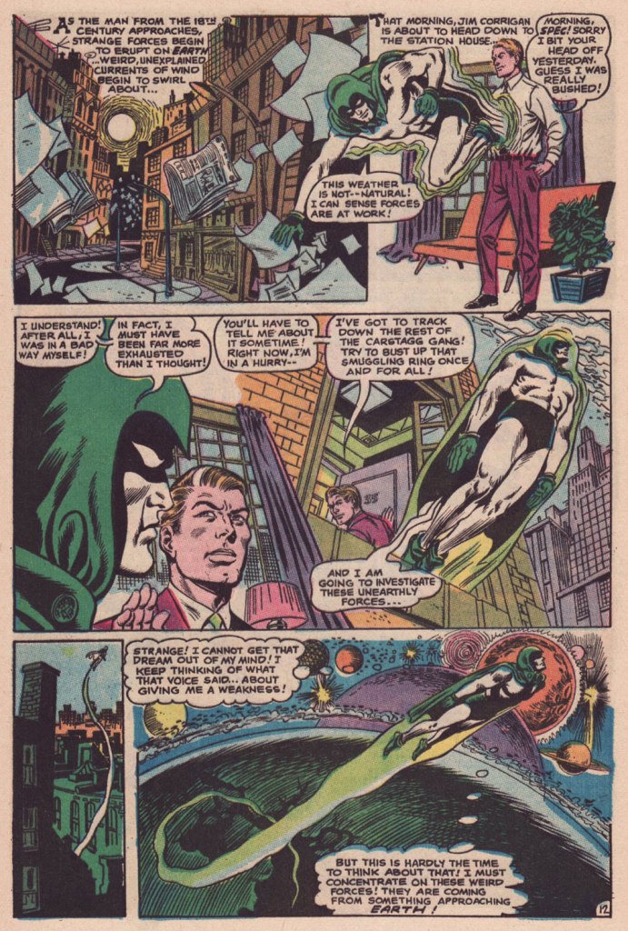
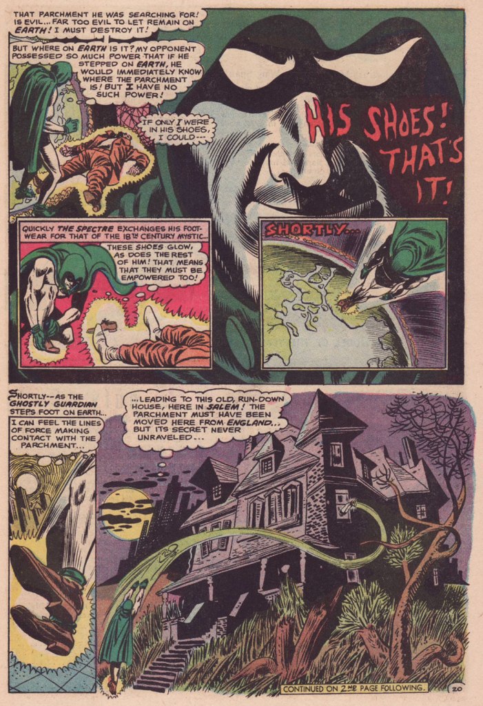
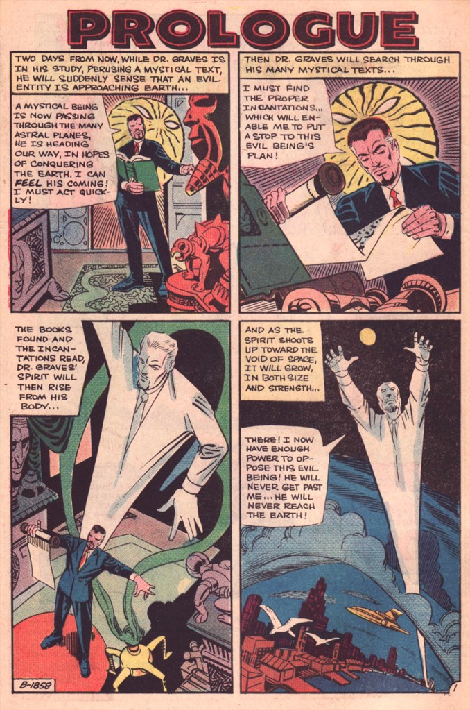
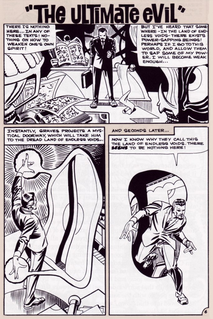
Today, I’ll showcase a bicephalous favourite, The Spectre in « The Parchment of Power Perilous » and Dr. Graves in « The Ultimate Evil », both springing from the same author… and the same plot.

How did this come to pass? Skeates told the story in an article entitled « Graves Acting Strangely: The Ultimate Evil Reconsidered », published in Charlton Spotlight no. 5 (Fall 2006, Argo Press, Michael Ambrose, editor).

« … at that particular point in time, I was totally unaware of the unique manner in which Julie [Schwartz ] approached his profession, typically in the dark when it came to the fact that this longtime comic book icon was far more actively involved in the plotting process than any other editor up at DC. […] I ambled into Julie’s well-kempt office armed with an intricate plot… something I had stayed up half the night before constructing, working, reworking, polishing and repolishing, only to have Julie read it over, extract a couple of ideas he liked, and unceremoniously toss the rest of it away. […] the two of us set about constructing what basically amounted to a brand-new plot based on those couple of ideas of mine that Julie liked, ideas that had somehow gotten his creative juices flowing. »

Charles J. “Jerry” Grandenetti (1926-2010) shows to breathtaking advantage his mad compositional virtuosity, anchored by Murphy Anderson’s rational inks. Skeates again: « … inker Murphy Anderson was the perfect stabilizing force, his meticulously detailed inks reining in Grandenetti’s insanity just enough so that even the latter’s wildest notions — colliding planes (no, not aircraft — planes of existence), his frequent disdain for panel borders, the same character shot from two or three separate angles within seemingly the same panel, etc. — became perfectly understandable, making the story so much utter fun to follow (even for someone like me who obviously knew exactly where it was going. ) »
Grandenetti’s two previous issues on the title, illustrating Gardner Fox’s Pilgrims of Peril (check out a stunning excerpt here) and The Ghost That Haunted Money!, had demonstrated that he likely was the only match for Ditko when it came to depicting hallucinatory other-dimensional vistas. Let’s face it, just about all who followed Ditko on Doctor Strange either half-heartedly aped Ditko’s designs or drew other dimensions as if they were Wally Wood’s outer space (or Dali’s The Persistence of Memory). Well, save for Tom Sutton, I guess. Grandenetti could have done a great job, but honestly, I like his career as it is. The day Steve Ditko walked away from Doc Strange is the day the character ceased to exist, as far as I’m concerned.
Five pages from The Spectre n. 8 (Jan.-Feb. 1969), edited by the… mighty hand of Schwartz. Special kudos to the uncredited colourist (though DC’s assistant production manager Jack Adler surely supervised), who did a superlative job, making discerning use of bold contrasts and close harmonies. It would have been so easy to end up with a garish mess!

Unlike (with one notable exception, initials SD) his colleagues who scampered from Charlton to DC along with editor Dick Giordano (Denny O’Neil and Jim Aparo, for instance) in the late 1960s, Skeates maintained his Charlton work for a time. He explained: « I simply possessed too much affection for what I was producing for that Derby, Connecticut company to do anything along those lines. » Skeates enjoyed « … contributing to Charlton’s take on the “mystery” anthology, ghostly compilations somehow edgier, funkier, and far more fun than those produced by DC and Marvel. »

« Furthermore, unlike DC, Charlton didn’t require that I first submit a plot outline, get it approved, and then write my story. Instead, I could just suddenly turn in a finished product, on spec, a way of working I very much preferred — diving right in with the plot idea only sketchily there, not boxed in even by myself but allowing the story to work itself out, to go where it wanted to go. » Amen.

The one time we saw the Doctor M. T. Graves truly get his mystical groove on was in this tale of two Steves, Skeates and Ditko, a splendid bit of recycling-but-not-quite.

And he’s how the whole ball of wax coalesced: « I suddenly remembered that fairly intricate Spectre plot that Julie had long ago summarily tossed aside. Hey, y’know, I might just be able (especially if I placed most of my emphasis on those portions that Julie hadn’t extracted, working on the bulk of my original plot while rather downplaying those couple of ideas that Julie and I had built our new plot on) to transform that baby into a workable Dr. Graves adventure! »

This is The Many Ghosts of Doctor Graves no. 12 (Jan.-Feb. 1969, Charlton). Edited by Sal Gentile.

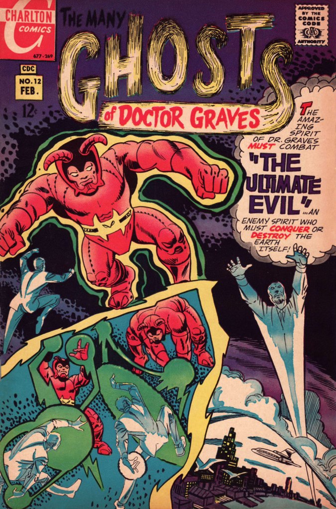
« Boom! I was into it, writing this story nearly as fast as I could type. Of course, to in effect have Graves play the role of the Spectre, I could see no way around making certain alterations to my protagonist’s makeup, making him far more mystically powerful than he had ever before seemed, more like Marvel’s Doctor Strange than anyone else…

Yet I could see no real problem in any of that, unless of course someone up at Charlton wound up doing supremely silly like assigning the art for this story to none other than Ditko himself — which, as it turned out, is exactly what happened! »

Some — perhaps all, who knows? — of this tale’s original art (or at least production photostats) has survived, and gives us the opportunity to gaze upon Ditko’s artwork in its raw state, so to speak.

Hail and farewell, Mr. Skeates. You will be missed.

-RG

*From the thought-provoking aisle, may I steer you towards Skeates’ intriguing Dr. Thirteen tale, « … and the Dog Howls Through the Night! »?

Hot Streak: Nick Cardy’s Aquaman, Previously

« Suffering sea snakes! Can this really be happening, Aquaman? » — Aqualad has a query.

I just realised, a few days ago, that I’d left something hanging for too long: nearly two years ago, I turned the spotlight on a series of Aquaman covers, casually (in my debonair way) letting it be known that there existed another, earlier, and even longer (well, by one) run of exemplary Aquaman covers. The time has come to see whether I was talking through my hat… or not.

Now, at the risk of repeating myself, it must be stated that, since we’re dealing with DC’s late Silver Age, there’s more to any given cover than a signature. DC’s recently-ascended art director, Carmine Infantino, had a hand in designing virtually every DC cover between late 1966 and early 1976. How strong a hand varied from cover to cover, of course. A good designer sometimes knows when to hold back and be invisible, or just about.

Infantino always strove to improve himself and update and hone his skills. Well into his career (he’d started in 1940 at Timely), he pulled an unexpected (and very smart) move. As he recalled it in The Amazing World of Carmine Infantino (2000, Vanguard Productions):

« Around 1960, I went back to school again, this time to study under a gentleman named Jack Potter at the School of Visual Arts. What Jack taught me about design was monumental, and I went through a metamorphosis working with him. I’d sit there confused and he’d tear the work apart. But then it was a light bulb going off – bam! – and I’d understand everything he was getting at.

After studying with Potter at the SVA, my work started to grow by leaps and bounds. I was achieving individuality in my work that wasn’t there before.

I threw all the basics of cartooning out the window and focused on pure design. Everything I did was design-oriented. That was quite the challenging task. But that’s where Potter’s teaching took me.

… I started putting hands in captions, that was decorative. He taught us to do everything decoratively. I’d always found captions very dull. So I thought I’d break the captions into smaller paragraphs and use hands to get people to read them. I regularly pushed design and perspective to the extreme. »

And speaking of reinvention, I must also salute Nick Cardy’s own mid-career creative burst. Prior to the mid-60s, Cardy had always been one of those genteel, tasteful but entirely unexciting journeymen, the way most DC editors liked ’em. I can think of precious few long-timers that managed to convincingly reinvent themselves and greatly raise their game, well into their career, without utterly misplacing their original identity (that disqualifies you, Keith Giffen) in the process. Alex Toth, Jerry Grandenetti and perhaps Sheldon Mayer come to mind…

At any rate, when Infantino got together with Cardy on those covers, all hell broke loose, in the best possible way.

This is Aquaman no. 37 (Jan.-Feb. 1968, DC). The despondent walrus, bottom left, is family pet ‘Tusky’. Oh, and my apologies for ever-so-slightly poaching some potential Tentacle Tuesday material.
This is Aquaman no. 38 (Mar.-Apr. 1968, DC). I wonder what’s up with the redundant vertical logo, top left.
In case you’re wondering about Aquaman’s expanded regal duties (“and TV!“), they were showing repackaged reruns of his half of the previous year’s Superman / Aquaman Hour of Adventure. A Filmation production, so don’t expect too much if you haven’t seen it.
But back to the comic book: this dazzling scene announces the saga of “How to Kill a Sea King!”, as our amphibious hero seeks to thwart a hostile Venusian takeover of Earth and sea. Script by Bob Haney, art by Cardy. This is Aquaman no. 39 (May-June 1968, DC). Oh, and the hottie? That’s “Aliena”. A real bolt of ‘inspiration’ there, Mister Haney.
This is Aquaman 41, (July.-Aug. 1968, DC). Such dynamically-designed fun! This is where the new creative team of Stephen Skeates and Jim Aparo joins new editor Dick Giordano (his second issue), but Cardy remains on covers… because Aparo, who resided a couple of states over, couldn’t attend the cover conferences.
This is Aquaman 41, (Sept.-Oct. 1968, DC), a highlight among highlights from the redoubtable team of Infantino (publisher-designer), Cardy (penciller-inker), Giordano (editor), Jack Adler (production manager and colourist), and, inside, Skeates (writer) and Aparo (penciller-inker-letterer). There’s a texture to the colour work (most evident on the foreground piraña… a freshwater fish, incidentally) that’s unusual for comics of that period. I wonder how it was achieved…
This is Aquaman no. 42 (Nov.-Dec. 1968, DC).
This is Aquaman no. 43 (Jan.-Feb. 1969, DC). Face-first in a bed of mussels, with several tons of pressure? Yikes.
This is Aquaman no. 44 (March-April 1969, DC). I love how, despite the gravity of the situation, the mobsters are kind of cartoony. Cardy would most fruitfully mine this tragicomic vein in the brilliant but short-lived western Bat Lash (1968-69).
This is Aquaman no. 45 (May-June 1969, DC), concluding Skeates and Aparo’s two-parter, the self-explanatory “Underworld Reward”. An undeniably epochal cover by Mr. Cardy. To wit, so compelling and mysterious is this scene that it’s merited an astute blogger’s impressively in-depth analysis… well worth a peek.

-RG

Hot Streak: Gil Kane’s Green Lantern

« It was exactly an assembly line. You could look into infinity down these rows of drawing tables. » — Gil Kane

Some of our more sensitive readers may have noticed that we’ve been none too gentle with Gil Kane (1926-2000) in the past, dealing him some rather rough lumps at times. But that’s not the whole story: in taking stock of such a protracted and prolific (dare I say profligate?) career as his, much of it inevitably spent on autopilot, one must be discerning. In other words, I like some of Kane’s work, but there’s plenty of it I don’t care for. Still, WOT’s rule of thumb is that if we altogether loathe an artist and/or his work, we’ll just turn a blind eye.

And speaking of the sense of sight, what makes a great comic book cover? Must be my art school training and subsequent work in advertising tipping the scales, but to me, design and layout reign primordial as ingredients… as values. I’m often dismayed at many a would-be critic’s apparent method of assessing an image’s artistic worth, namely: how many popular characters does it feature? Is it action-packed? Is the issue sought-after and expensive? Does it feature a famous character’s début? Is it drawn by a fan-favourite artist who unquestionably can do no wrong… because he’s a fan-favourite artist who unquestionably can do no wrong? (and how dare you claim otherwise!)

Gil Kane reportedly generated around eight hundred covers for Marvel in the 1970s… of all levels of craft and quality. With that kind of frenzied output, it’s impressive that most were perfectly serviceable, given that there certainly was no time for meticulous, sober planning. They were generally over-captioned (not Kane’s fault!) and crassly sensationalistic, but that’s what Marvel sought and settled for.

It’s a shame that Kane and his former classmate at the School of Industrial Art (back in the early 40s!), DC lynchpin Carmine Infantino didn’t get on too well, because their Silver Age collaborations had a special spark… must have been the animosity. It had been noted by the DC brass, as early as the late 50s, that Carmine’s covers reliably caught prospective buyers’ attention and dimes. And so, by 1967, he was unofficially designing most of the publisher’s covers, and certainly the covers of all titles edited by Julius Schwartz. Green Lantern was among these.

So we turn today’s spotlight on a hot streak of seven. Kane gets his name in the title, but it would be more accurate to say they were Infantino-designed, Gaspar Saladino-lettered, Jack Adler-coloured, Gil Kane-pencilled and Murphy Anderson and Sid Greene-inked covers. The streak begins after Green Lantern no. 54’s downright poor cover, and ends with the interruption of Kane’s impressively long run of consecutive issues.

We begin with Green Lantern no. 55 (Sept. 1967, DC). Harmonious, easy-to-parse arrangement of numerous elements and exemplary integration of text. Design by Infantino, pencils by Kane, inks by Murphy Anderson, lettering by Gaspar Saladino, colours by Jack Adler. Oh, and lest we forget: logo designed by Ira Shnapp (circa 1964), classic Green Lantern uniform designed by Kane (circa 1959).
This is Green Lantern no. 56 (Oct. 1967, DC). Kane was never much for varying his monsters (see below). Pencils by Kane, inks by Anderson.
For a bit of comparison on how things were done from company to company, this is Tales to Astonish no. 91 (May, 1967, Marvel). This is what happens when there’s no planning or attention to detail: in an already-crowded cover, did we really need that ugly box advising us of the presence of The Abomination? He’s right there! (maybe the abomination refers to the cover itself). And the foreshortening nightmare that is the baddie’s left arm was so dire that, when a fan commissioned Arthur Adams to produce a recreation of this cover (which, things being as they are, many surely consider ‘iconic’)… he wisely corrected the anatomy and tweaked the poor composition. Interesting how Marvel’s heavy-fingered yes-man, art director John Romita Sr., was always game to “fix” Ditko and Kirby art, but saw nothing wrong with this one.
This is Green Lantern no. 57 (Dec. 1967, DC), featuring Catastrophic Weapons of Major Disaster!, written by Gardner Fox, pencilled and inked by Kane. Cover by Kane and Greene… love the placement of the signatures!
This is Green Lantern no. 58 (Jan. 1968, DC), featuring Peril of the Powerless Green Lantern! (a Julius Schwartz title if there ever was one), written by Gardner Fox, pencilled by Kane and inked by Greene. I’m not overly fond of the Kane-Greene mix, but Sid Greene, as a penciller-inker did some splendid work on the Star Rovers series (1961-64), co-created and scripted by Gardner Fox.
An issue whose price few can afford unless they bought it off the racks, this is Green Lantern no. 59 (March 1968, DC); pencils by Gil Kane, inks by Murphy Anderson. Featuring the introduction of GL alternate Guy Gardner, who was to be dubiously re(jack)-booted in the 1980s, by Steve Englehart and Joe Staton, as a jackass with an ugly uniform and a worse haircut. Notwithstanding the fact that the Green Lantern Corps would never bestow power and stewardship on such an immature and pompous loose cannon.
This is Green Lantern no. 60 (April 1968, DC); an evident Infantino design, with pencils by Kane and inks by Anderson… which interestingly ends up producing a prototype of Brian Bolland‘s distinctive style… a decade early.
This is Green Lantern no. 61 (June 1968, DC); pencils by Kane, inks by Greene, and featuring (groan) Thoroughly Modern Mayhem!, scripted by Mike Friedrich, pencilled by Kane and inked by Greene. Co-starring Alan Scott, the Golden Age Green Lantern.

-RG