Panning the murky old print stream for the odd glimmering nugget
Hot Streak!
A ‘hot streak’, by our definition — highly subjective of course — is a consecutive run of outstanding covers illustrated by a particular artist (inkers, colourists, et al may vary). In the context of commercial comics, and given their often impersonal, chain-assembly production methods, nearly every factor conspires against consistent excellence. And so we seek out the exceptions.
« Truly the universe is full of ghosts, not sheeted churchyard spectres, but the inextinguishable elements of individual life, which having once been, can never die, though they blend and change, and change again for ever. » — H. Rider Haggard
Here at WOT?, we’re both Russell aficionados, but with some reservations. I think I needn’t delve into such details, when my partner ds already eloquently laid it out in her post Grains of Golden Sand: P. Craig Russell’s Fantasies… and I happen to fully agree with her reasoning.
What’s perhaps not been explicitly stated is Russell’s virtually infallible way with a cover, both in design and execution. As I keep emphasising, great — and consistently great at that — cover artists are pretty thin on the ground.
Someone at DC must have seen his gorgeous seven-issue run of covers for Elric Stormbringer*(1997, Dark Horse/Topps) and offered him the Spectre gig.
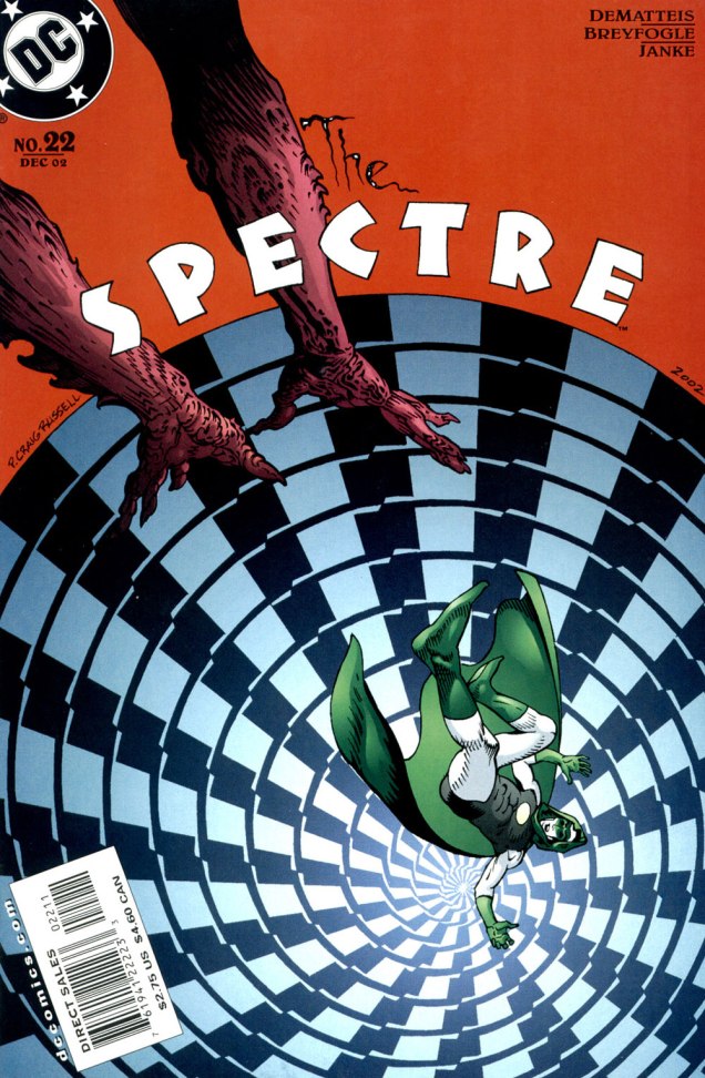
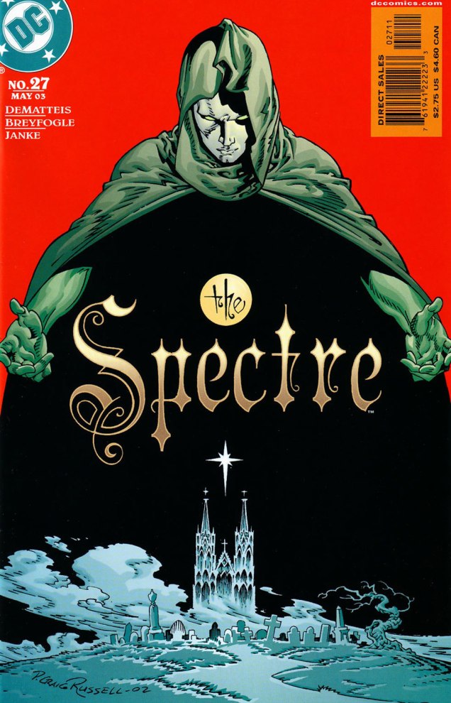
Hey, something from this century! This is The Spectre no. 19 (Sept. 2002, DC). A nice bit of Kirby tribute on Darkseid. In this case, and in fact throughout the Russell sequence, the expressive colours are the work of Lovern Kindzierski.This is The Spectre no. 20 (Oct. 2002, DC). It’s worth pointing out the added value of Russell being a consummate letterer/font designer. Without a logo set in stone (as is generally the case, usually at the insistence of the marketing department) the savvy artist benefits from the extra freedom of counting the title logo among the moving parts of his design. Cue the de rigueurWill Eisner/Abe Kanegson mention.This is The Spectre no. 21 (Nov. 2002, DC). When I showed her these, ds expressed some surprise at her failing to devote a Tentacle Tuesday Masters entry to Mr. Russell.This is The Spectre no. 22 (Dec. 2002, DC).This is The Spectre no. 23 (Jan. 2003, DC).This is The Spectre no. 24 (Feb. 2003, DC).This is The Spectre no. 25 (Mar. 2003, DC).This is The Spectre no. 26 (Apr. 2003, DC).This is The Spectre no. 27 (May 2003, DC). Thus ends the streak…. with the series.
It doesn’t hurt that The Spectre, the brainchild of Superman co-creator Jerry Siegel (1914-1996) and artist Bernard Baily (1916-1996), boasts one of the best-designed superhero costumes of all, virtually unchanged since his introduction, some eighty-five years ago. The exception in this case is the chest emblem, which I presume is meant to indicate that *this* Spectre is former Green Lantern Hal Jordan, instead of defunct flatfoot Jim Corrigan. A bit of a boneheaded notion, imho, and typical of the incessant rebooting and tinkering these poor legacy characters are subjected to by dishwater-dull ‘creatives’.
-RG
*The Elric series was also under consideration, but The Spectre’s nine-issue streak is numerically more impressive.
While that chain of events is a fascinating bit of history, what I’m here to celebrate is a sequence of classic covers by recent — 2024 recent — Will Eisner Comic Awards Hall of Fame inductee Creig Valentine Flessel (1912-2008). Flessel produced eighteen of the first nineteen Detective Comics covers (the premiere issue bore a striking, but rather primitive drawing by associate editor Vin Sullivan), visibly gaining assurance and verve as he sped along. By my reckoning, however, it’s only with the eleventh issue that he solidly hit his stride, which he never let up until the assignment passed into other hands… and then came Batman.
Anyway, here they are: no hand-holding, no patronising, superfluous captions… just graphic purity — and sweat-soaked, pulpy thrills galore.
This is Detective Comics no. 11 (Jan. 1938, DC).This is Detective Comics no. 12 (Feb. 1938, DC).This is Detective Comics no. 13 (Mar. 1938, DC).This is Detective Comics no. 14 (Apr. 1938, DC).This is Detective Comics no. 15 (May 1938, DC).This is Detective Comics no. 16 (June 1938, DC).This is Detective Comics no. 17 (July 1938, DC).This is Detective Comics no. 18 (Aug. 1938, DC). Even as a relatively sheltered white teenager, I could easily tell that Sax Rohmer‘s Fu Manchu stories were racist (and sexist as well) « Yellow Peril » tripe… even in the context of their era, they went the extra mile. This is Detective Comics no. 19 (Sept. 1938, DC), Flessel’s final cover for the title.
Flessel would turn up all over the place. Gary Groth writes, introducing his definitive, career-spanning Flessel interview:
« Flessel never became an auteur with a truly recognizable narrative voice or characters that he could call entirely his own. He was so skilled and versatile that he became an artistic chameleon, a commercial propensity that served him well throughout his career. He wrote and drew stories for the earliest published comic books: More Fun, Detective Comics and Adventure; worked for the advertising firm of Johnstone and Cushing; assisted Al Capp on Li’l Abner and worked with Charlie Biro on Crime Does Not Pay in the ’50s; spent the ’60s and early ’70s drawing David Crane, a comic strip about a minister in a small town and segued seamlessly into an eight-year gig doing The Tales of Baron Von Furstinbed for Playboy. »
Detail (the whole spread would have been impossible to scan properly) from one of Flessel’s long-running series of Eveready Batteries adverts, done in the employ of the celebrated Johnstone and Cushing ad agency (this one’s from 1951). On his The Fabulous Fifties blog, Ger Apeldoorn showcases a number of these lovelies — check ’em out!Flessel turned up as Jerry Grandenetti‘s inker on my favourite issue of Joe Simon and Grandenetti’s much-maligned, short-lived but quite charming Prez (no. 4, Feb.-Mar. 1974, DC). Notwithstanding the — intentionally — fanciful elements of the Wild in the Streets-inspired social satire, old hand Simon had a much firmer grasp on how politics actually work than did any of the earnest, self-consciously ‘relevant’ comics writers of the day. And one can only sigh nostalgically at days when the worst thing that might slither into the White House was a mere vampire…
Flessel’s ability to depict ladies of the buxom and comely variety had certainly played a role in his landing a gig assisting Al Capp on Lil’ Abner for a couple of years in the late 1950s. At the time, Capp spent much of his time touring college campuses and berating the younger set, as was his wont.
Said virtuosity in the light-hearted and erotic stood him in good stead for an eight-year gig on The Tales of Baron Von Furstinbed for The Playboy Funnies; this one’s from the January, 1983 issue of Playboy Magazine. And here’s another, for good measure.
In closing, a brief exchange from The Comics Journal interview — please do go and read the whole thing, it’s a gem!
GROTH: I have a note that you had something to do with Superboy from 1958 to ’59.
FLESSEL: I did one. You know, it’s frightening; it’s like going out and drinking a lot of martinis and doing a job and not remembering.
« You should be ashamed, Mr. Lash! Making such noises in front of the children! »
Bat Lash was introduced with issue 76 (August, 1968) of DC’s launching pad title Showcase, wedged between the respective débuts of Hawk and Dove and Angel & the Ape. At various stages of his conception, the character of Bartholomew “Bat” Aloysius Lash reportedly went through the hands of Carmine Infantino (who designed or at least supervised all of the following covers), Joe Orlando, Sheldon Mayer and Sergio Aragonés. Sergio plotted and thumbnailed the mise en scène, Dennis O’Neil added dialogue, then Nick Cardy pencilled and inked. For such a product-by-committee, Bat Lash is quite remarkably good — but then consider the talent involved!
Mind you, I make no claims of originality for Bat — he was distinctly a product of the times, when the vogue of Spaghetti Western had peaked* and ironically left its (off)brand on its model. By the time — in 1968 — its market reached its apex, the Italian Oater idiom threatened to congeal into a morass of clichés, becoming, as these things tend to go, (over)ripe for self-parody. Intentional and otherwise.
I surmise that the key model for Bat Lash was the ever-charming Mario Girotti**, reportedly enlisted thanks to his resemblance to the intense but one-note Franco Nero, even replacing the latter in his star-making, titular role of Django (1966) for a 1968 sequel, Prepare a Coffin, Django.
Ripe for its time it may have been, but I suppose that American audiences were still quite allergic to jarring tonal shifts in their entertainment (now commonplace), and would be for some time — just ask, say, John Carpenter. So the blend of light comedy and dark drama that Bat Lash proposed must have been difficult to market.
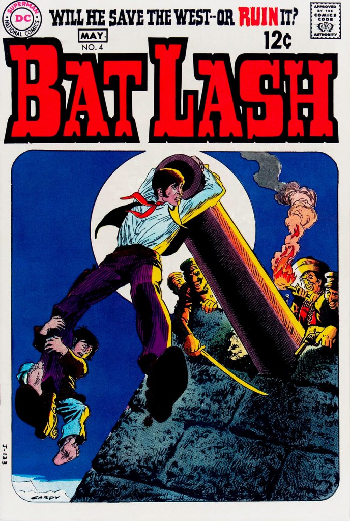
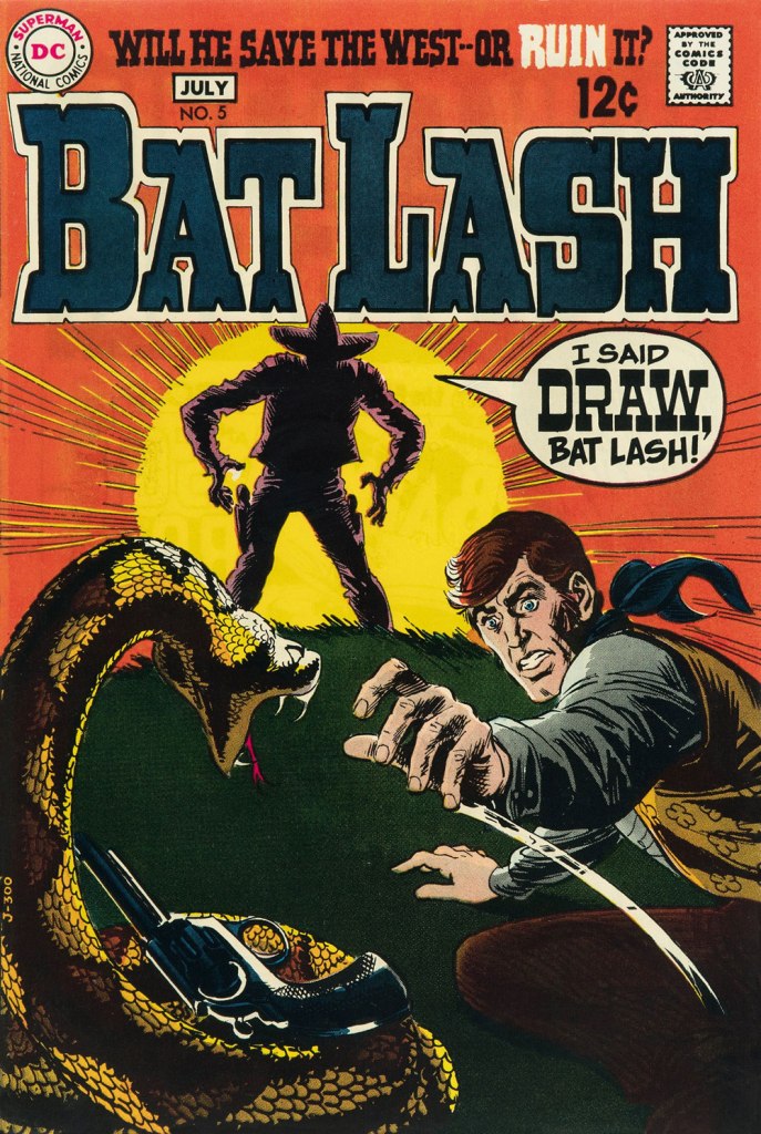
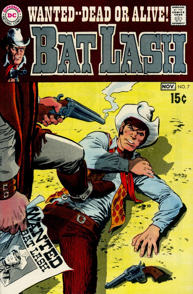
Our streak begins with Bat Lash no. 2 (Dec. 1968-Jan. 1969, DC) since the covers of Showcase no. 76 and Bat Lash no. 1 were good, but not — imho — great. I daresay this one is, in fact, the finest of the lot, with Cardy at his most Tothian.A peek inside the same issue, for contrast: lively and loose inking over rock-solid pencilling, and miles away from the tone of the cover. My guess is that some people weren’t happy.Bat Lash no. 3 (Feb.-Mar. 1969, DC) highlights the comedic side of the feature, which all but evaporated by the last two issues.This is Bat Lash no. 4 (Apr.-May. 1969, DC). Dig Cardy’s expert use of the ‘drybrush‘ technique on the stones.This is Bat Lash no. 5 (June-July 1969, DC). I’m reminded of a similar, later cover featuring one of Bat’s successors, Jonah Hex. The price goes up and the comedy… just goes. This is Bat Lash no. 6 (Aug.-Sept. 1969, DC).… and there goes the original tagline. This is the final issue, Bat Lash no. 7 (Oct.-Nov. 1969, DC)… and so must end this particular hot streak.
And now, some choice bonuses!
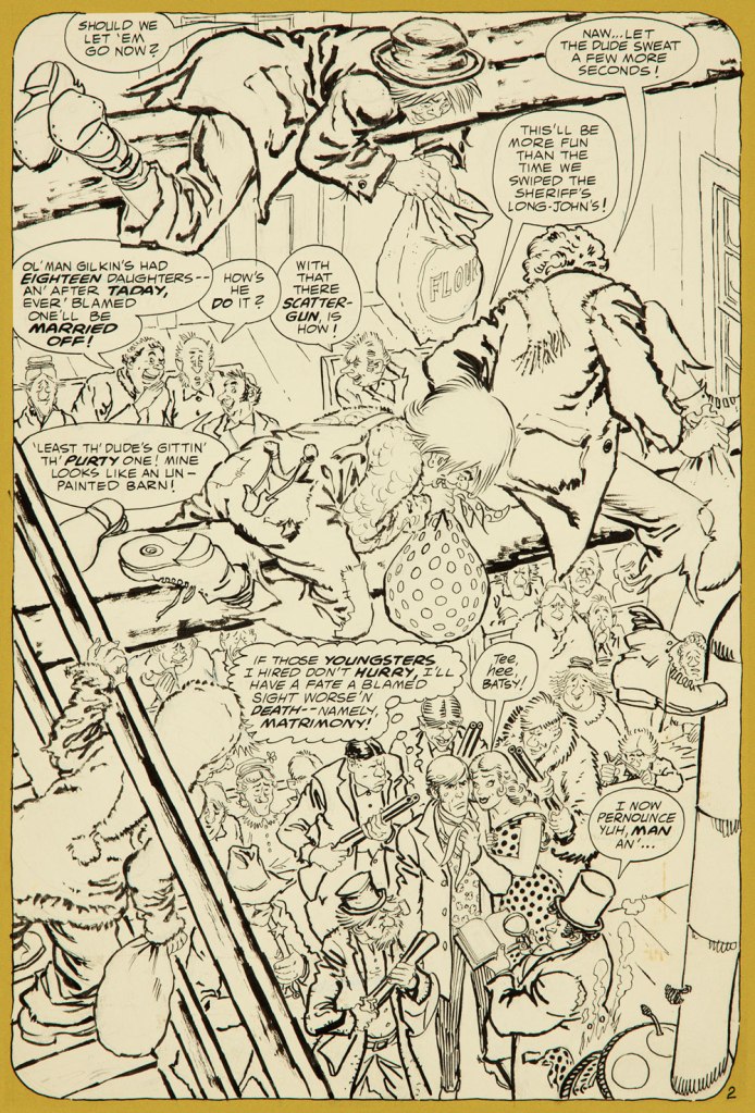
From issue 7, editor Orlando gives us some cheeky insight into the creation of an issue of Bat Lash.And plotter Aragonés provides some visual direction. To give you a sense of the less flippant, but not altogether grim, tone of the later issues, this is page two from issue 7. DC Comics of that period were quite ambitious with the limited means of the four-colour reproduction process, using plenty of backlighting and projected light… quite another level.
I was *delighted* to see ol’ Bat Lash turn up in the Weird Western Tales of DC’s outstanding Justice League Unlimited animated series, , along with some of his distinguished colleagues. In the usual order: Ohiyesa ‘Pow Wow’ Smith, El Diablo, Bat Lash, Jonah Hex.
-RG
* “In 1968, the wave of spaghetti Westerns reached its crest, comprising one-third of the Italian film production, only to collapse to one-tenth in 1969.” [ source ]
« Gamma rays are the sort of radiation you should avoid. Want proof? Just remember how the comic strip character “The Hulk” became big, green, and ugly. » — Neil deGrasse Tyson
It may seem a counterintuitive notion, but some artistic virtuosi, while draftsmen supreme, may be sorely lacking in pure design chops, while some otherwise unremarkable craftsmen design splendidly. The same general principle applies to a colour sense, or handwriting. As the cliché goes, the most skilled brain surgeon’s penmanship may just yield sloppy gibberish, what’s wittily described as chicken scratch writing.
My point in this case is that, while Herb Trimpe (1939-2015) has never ranked among the comics industry’s glory boys, I consider him one of its finest cover artists. It’s a special skill and quite a scarce one…
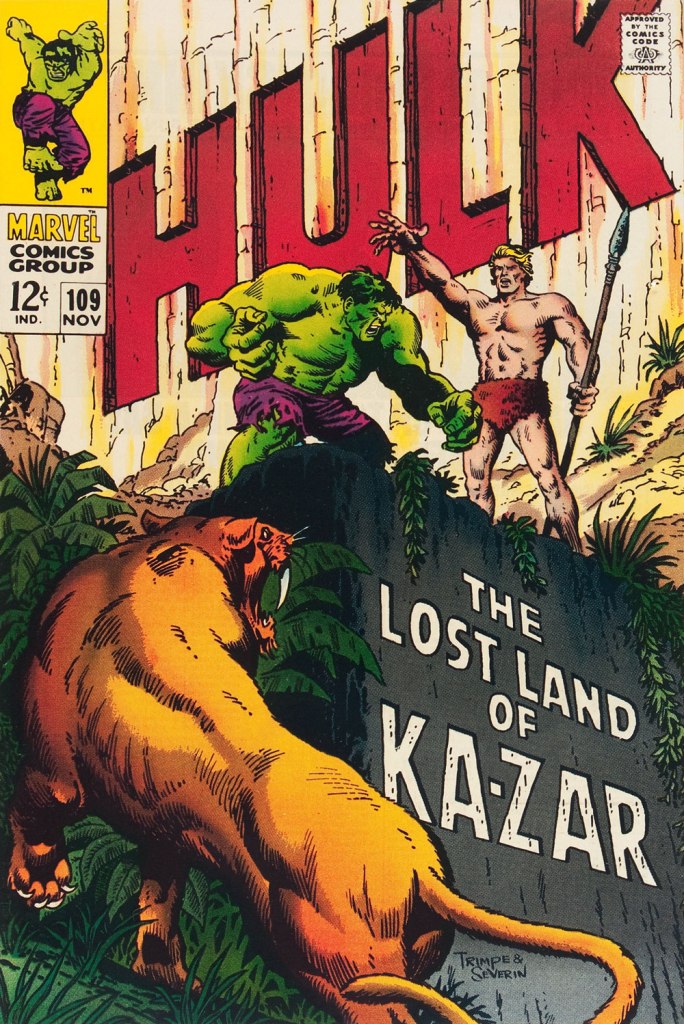
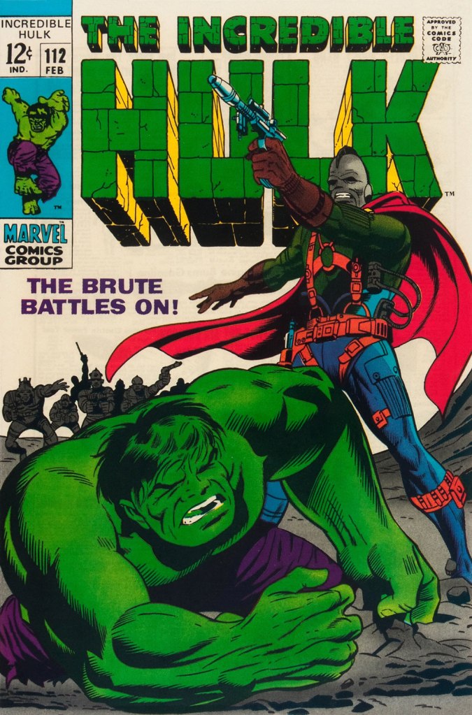
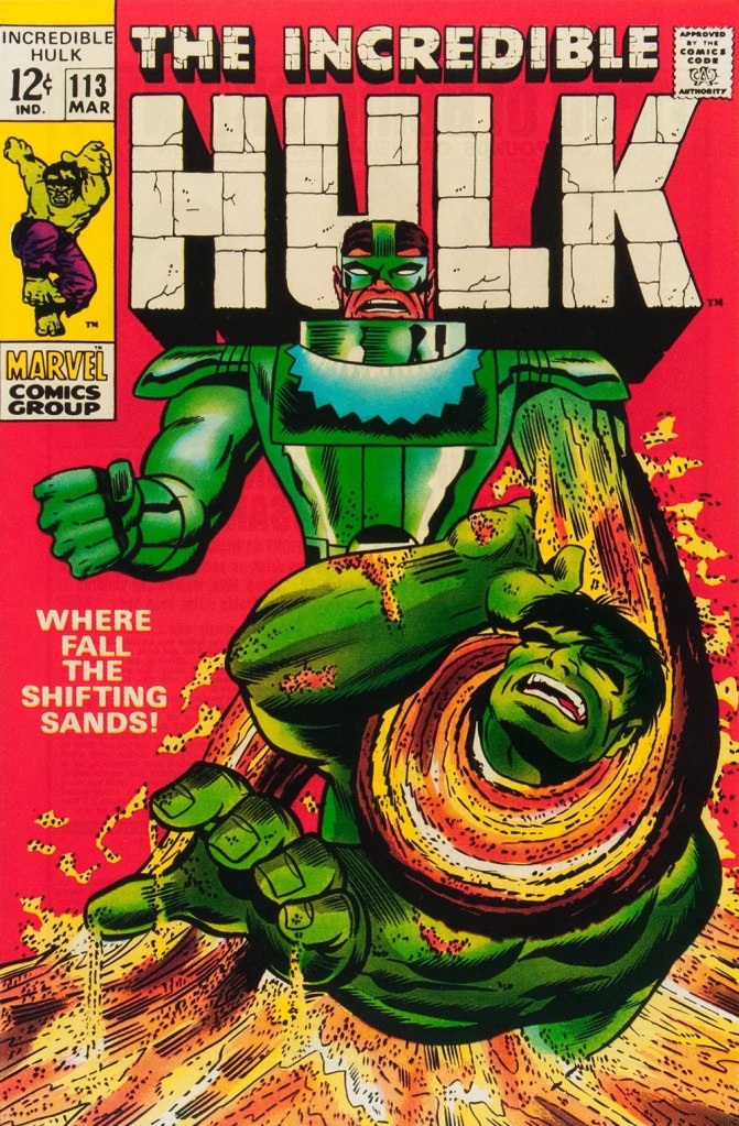
Herb’s streak begins with The Incredible Hulk no. 109 (Nov. 1968, Marvel), his first cover for the series. And yes, being seconded by one of comics’ all-time finest inkers (and cover artists!) didn’t hurt, but this is flawless layout work in the first place. This is The Incredible Hulk no. 110 (Dec. 1968, Marvel), again boasting John Severin inks (and quite likely Marie Severin colours).This surviving piece of production art grants us the opportunity to admire the splendid inks. I honestly don’t know what Ka-Zar was hoping to achieve here, though. Trimpe also produced another, rejected, version of this cover (scroll down, it’s near the bottom) the action tackled from quite a different angle. Featured in IDW’s ultra-fancy, signed-and-numbered limited run in the ‘where can I fit this damn monster?’ Artist’s Edition format in 2015, it demonstrates just how tight Trimpe’s pencil work was.This is The Incredible Hulk no. 111 (Jan. 1969, Marvel). Dan Adkins takes over the inker’s chair. This is The Incredible Hulk no. 112 (Feb. 1969, Marvel). Notice how innocent of hype and verbiage these covers are? This is The Incredible Hulk no. 113 (Mar. 1969, Marvel). I always preferred the simplicity of The Sandman’s garb as envisioned by his creator, Steve Ditko. He was depicted as a bully in a striped green and black sweater, which was fine for a guy able to turn his body into sand. When Jack Kirby redesigned him, he gave him a cool-looking, but frankly rather impractical getup.
And that’s where this streak ends, as far as I see it: the following few issues feature decent covers, but nothing outstanding. But there were scores of excellent Trimpe Hulk covers to come. The blocky dynamism of his visuals, so easy to underrate, made his covers a reliable breath of fresh air in the mire of formulaic and overwritten Marvel 1970s covers (et tu, Gil Kane?)
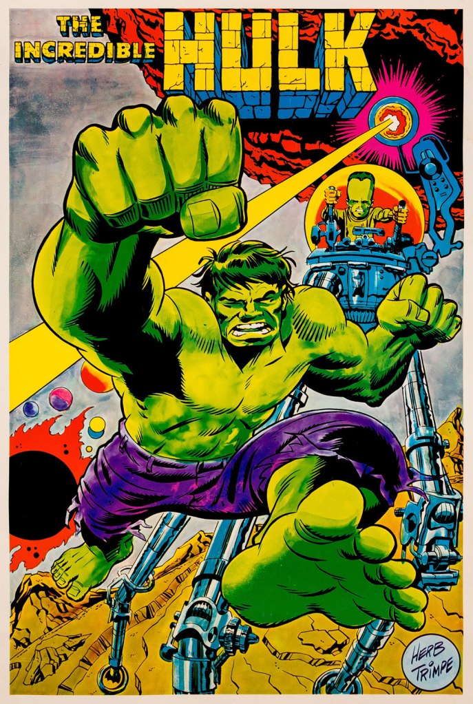
As a bonus, here’s a 1970 Marvelmania poster, one in a series of products exclusively available through mail-order. Nowadays, any of them routinely fetches princely sums. If you think Herb’s perfectly nailed the King Kirby aesthetic with this one, you wouldn’t be far wrong, but there’s a twist. The drawing was designed and pencilled by Kirby, then in the process of leaving Marvel for DC. Trimpe was asked to ink the drawing, redraw the Hulk’s face in his own style, and delete Kirby’s signature. I forget just where I read about this, but Trimpe had some heavy moral qualms about being made a party to this petty act of malice.
« I was always concerned more with the visuals than with the copy — and the visuals had to be provocative! » — Infantino*, in a nutshell.
To recap, under the parameters I’ve set for this category a hot streak is a series of outstanding consecutive covers by a single artist (inkers may vary) on the same comic book title. Since it’s my party, I occasionally make allowances (e.g. allowing entry to a scruffier, but still presentable, specimen), but it’s more challenging and more fun to play it straight.
By my reckoning, there are very few truly great cover artists to begin with, and their output is often stifled by indifferent, incoherent or hostile art direction, poor lettering and colouring choices beyond the unfortunate artist’s control, lack of interest in the imposed subject matter… you get the picture. And there’s also the difficulty of getting a decent streak going when the editor keeps shuffling cover artists.
The artist in his suit and tie (and cigar!) days at DC.
I’ve gone on at length (I refer you in particular to Hot Streak: Nick Cardy’s Aquaman, Previously) about the gargantuan amount of work Carmine Infantino (1925-2013) knocked out conceiving comic book covers during his executive years at DC (1966-75), but most of his best designs were executed by others. I mean the man was already doing the work of five people, what more could he do?
« At DC Comics, I worked round the clock, including weekends, and never taking a vacation in the 10 years I served there. I not only was creating new titles, designing most of the covers, plotting stories and going on the road for the distribution of the magazines, plus doing radio shows and then running out to California to be totally included with Puzo and the producers creating the Superman movies I &II. Time got so tight that I would design covers on the way to the airport and have the driver deliver them to Sol Harrison, who in turn gave them to the waiting artists. I would be at my desk from 7 a.m. to 9 p.m. It began to be a destructive grind. »
While Carmine is most closely associated with Silver Age characters The Flash and Adam Strange, I couldn’t discern, in these titles, a run of sufficiently stellar *and* consecutive covers (Flash nos. 139-142 and Mystery in Space nos. 69 to 71 come closest… do bear in mind that I have no consideration for ‘key’ issues or ‘famous’ or ‘event’ covers). It’s no real surprise that Infantino’s design work rose to a crescendo of accomplishment and consistency when he was made the company’s de facto art director, late in 1966. And what was he working on at the time? Batman. So, since Detective no. 261 bears a ho-hum cover and no. 269 is pretty spiffy, but the work of Gil Kane, here’s Mr. Infantino’s hot streak:
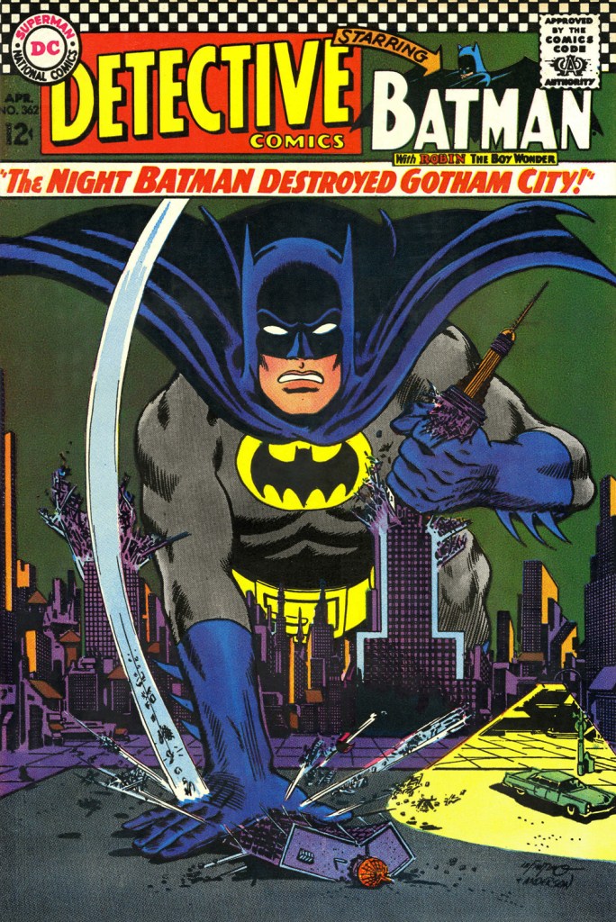
This is Detective Comics no. 362 (Apr. 1967, DC), pencilled by Infantino and inked by Murphy Anderson. Carmine wasn’t a fan of the so-called ‘Go-Go Checks’, that checkerboard pattern that once famously adorned those distinctive yellow NYC cabs. He didn’t mince words, either: « What a ridiculous thing: it was the stupidest idea we ever heard because the books were bad in those days and that just showed people right off what not to buy. ». Certainly, in the case of Detective Comics, they left the top of the page far too cluttered.This is Detective Comics no. 363 (May 1967, DC), featuring (this) Batgirl‘s second appearance. She’d been created by editor Julius Schwartz and Infantino at the request of the hit Batman TV show‘s producers, figuring that the series needed a heroine for a little extra spice. Art by Infantino and Anderson.This is Detective Comics no. 364 (June 1967, DC). Roy Reynolds, alias The Getaway Genius, was a fun civilian villain whose finest hour, in my view, came at the tail end of 1973 with Batman no. 254‘s King of the Gotham Jungle! (written by Frank Robbins, pencilled by Irv Novick and inked by Dick Giordano), when he was unexpectedly caught between the Batman and the Man-Bat. I wouldn’t be surprised to learn that a Batmaniac or three had reconstructed this Joker edifice in their backyard or basement, out of Lego blocks or papier mâché… or actual bricks.
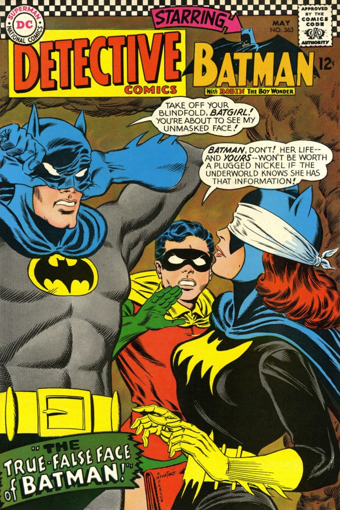
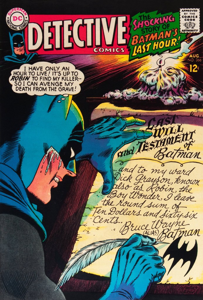
Carmine really went to town on this one, and it’s rightly earned its place in the hall of classics. This is Detective Comics no. 365 (July, 1967, DC). The cover story, The House the Joker Built! is scripted by John Broome, pencilled by Bob Kane ghost Sheldon “Shelly” Moldoff and inked by Joe Giella.Speaking of design, here’s the masterful Ira Schnapp‘s house ad for Detective 365, as it appeared in Green Lantern no. 54 (July, 1967, DC), among other titles.This is Detective Comics no. 366 (Aug. 1967, DC); I love those moody colours and light effects, that tell-tale Infantino candle and the mysteriously parsimonious inheritance bequeathed to Robin.This is Detective Comics no. 367 (Sept. 1967, DC), an intriguing preview of Where There’s a Will — There’s a Slay!, written by Gardner Fox, pencilled by Infantino, inked by Sid Greene. I wonder how many young readers enthusiastically destroyed the cover to assemble the puzzle…
Note also the improved logo placement (a return to issue no. 327 original ‘new look’ logo, actually), giving the layout a chance to… breathe a bit better. The Batman cameo at top left is still de trop.
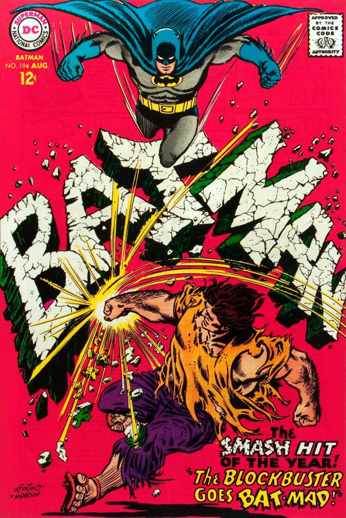
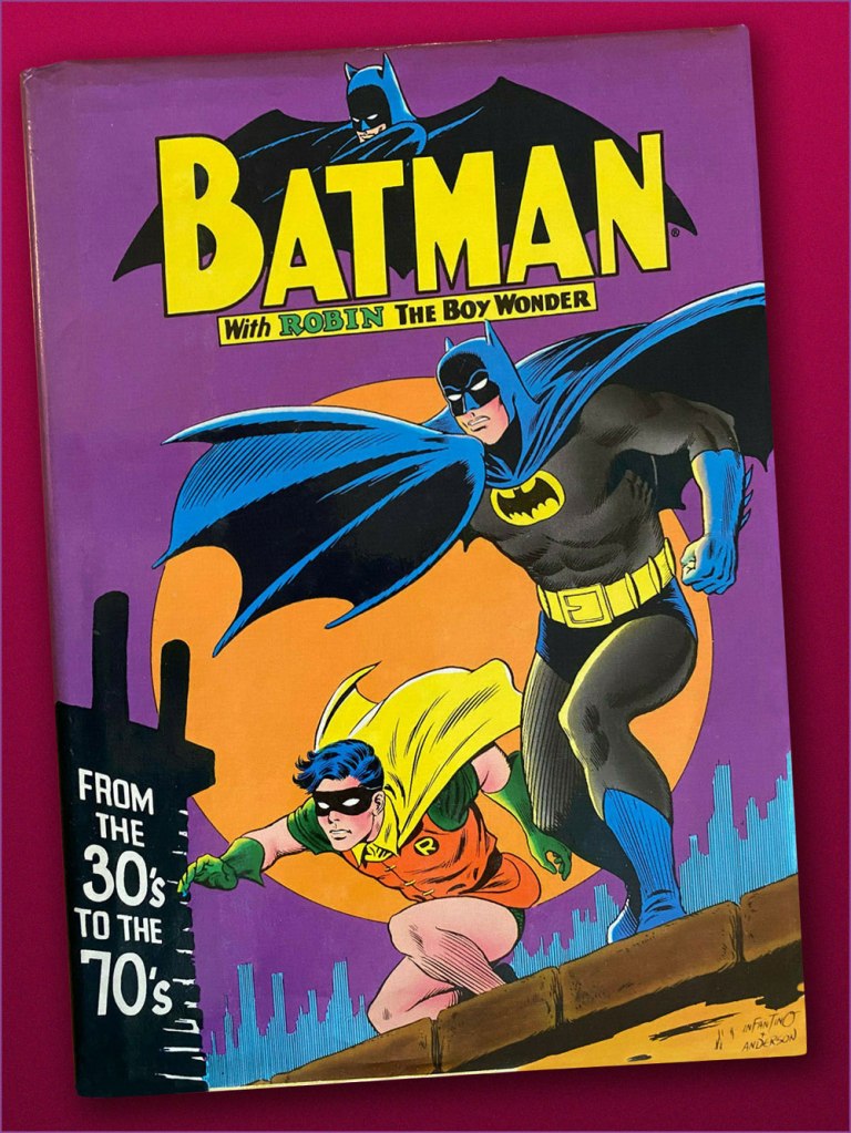
This is Detective Comics no. 368 (Oct. 1967, DC). Infantino reportedly created the covers first, and editor Schwartz assigned his writers to work up a scenario to fit. This one could not have been a cakewalk. Gardner Fox was the unlucky recipient of that gargantuan task.Since it’s not an issue of Detective, this cover’s not *technically* part of the streak… but as it features Batman, and it appeared between issues 365 and 366 of Detective, I’m throwing it in. Infantino and Anderson’s literal and figurative blockbuster of a cover for Batman no. 194 (Aug. 1967, DC). Its cover aside, a pretty ho-hum issue. The book and the character were in urgent need of another overhaul, and it was just around the corner. « When Donenfeld saw this cover, he had a fit! He said, ‘I don’t see the logo on top!’ I said ‘You don’t have to — you’ve got Batman up there!’ »Aw, heck — here’s Ira Shnapp’s accompanying house ad, a work of art in itself, wouldn’t you agree?Speaking of immortal Infantino Batman images: « Aurora wanted action shots of their models, so I did this rough layout, sent it to them, and they liked it! I had a moon behind him, but they dropped it. The tree created the design. I was very high into design at this point (1964) — the design was pouring out of me! ». Here’s a look at the finished model.I couldn’t very well leave out what’s possibly the most famous of Carmine’s Bat-scenes: this is Batman From the 30’s to the 70’s (1971, Crown Publishers) a splendid hardcover anthology. Its cover adapts an Infantino-Anderson mini-poster that originally saw print in Detective Comics no. 352 (June 1966, DC) and bore instead the inscription « Best Bat-Wishes Batman and Robin ». Superman, Wonder Woman and Captain Marvel, er… ‘Shazam’ also got their own historical anthology in this format.
-RG
*unless otherwise specified, most Infantino quotes are drawn from his excellent, profusely visual 2001 autobiography (with J. David Spurlock), The Amazing World of Carmine Infantino (Vanguard Publishing).
« Like its politicians and its wars, society has the teenagers it deserves. » — J. B. Priestley
Here at WOT central, we’re both massive Bob Oksner (1916-2007) fans, and it’s not generally for the writing. For a long time, his multi-faceted talent was used to great effect all over the DC Comics line, but he rarely received the acclaim he so richly deserved.
After DC sent up a trial balloon with Showcase no. 70 a year prior, Binky returns after a decade’s sabbatical (an eternity in the teen world!). This is Leave It to Binky no. 61 (June-July 1968, DC). The product was slightly updated (fashions and hairdos) dusty reprints with fabulous new covers.
This is Leave It to Binky no. 62 (Aug.-Sept. 1968, DC). For the record, Peggy is Binky’s blonde girlfriend. Let’s face it, she’s the true star of this book.
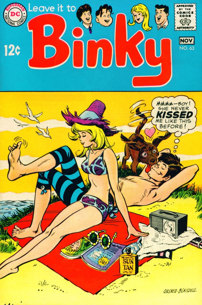
This is Leave It to Binky no. 63 (Oct.-Nov. 1968, DC). Lovely inks provided by fellow Golden Age veteran Tex Blaisdell (1920-1999).
This is Leave It to Binky no. 64 (Dec. 1968-Jan. 1969, DC).
This is Leave It to Binky no. 65 (Feb.-Mar. 1969, DC).
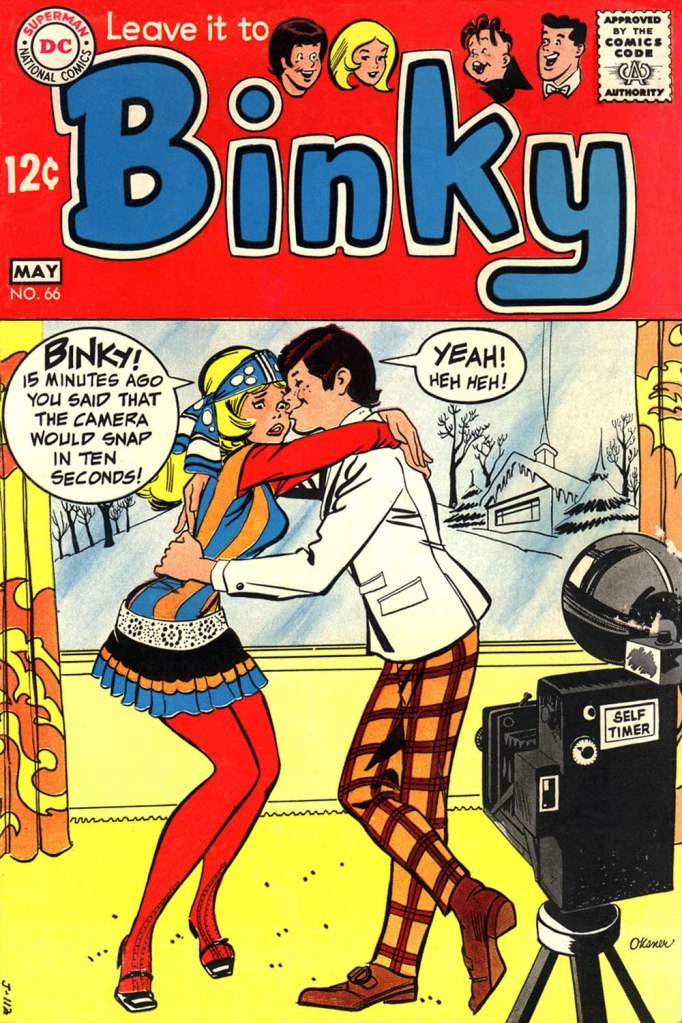
This is Leave It to Binky no. 66 (Apr.-May 1969, DC).
During last year’s Hallowe’en Countdown, I spotlighted Mr. Oksner’s fine work on DC’s long-running licenced Bob Hope and Jerry Lewis titles, but also featured his holiday-appropriate Binky cover. For thoroughness’ sake, here it is again: this is Leave It to Binky no. 67 (June-July 1969, DC).
And one more: this is DC Special no. 2 (Jan.-Mar. 1969, DC). Hard to fathom why this one came out at all, its great cover aside.
And then it was over, in this visual idiom anyway: with the following issue (LITB68), DC brought in well-traveled Henry Scarpelli to handle the covers and create the impression that Binky was just one more Archie clone. Over the subsequent four issues, a handful of (pretty good) new stories were mixed in with the reprints. Then came a change of title and a new logo. The book, now simply called Binky, was a full-on Archie ersatz, and lasted another ten issues into 1971… with one final special popping out of nowhere in the summer of ’77. For ol’ Binky, par for the course!
« Suffering sea snakes! Can this really be happening, Aquaman? » — Aqualad has a query.
I just realised, a few days ago, that I’d left something hanging for too long: nearly two years ago, I turned the spotlight on a series of Aquaman covers, casually (in my debonair way) letting it be known that there existed another, earlier, and even longer (well, by one) run of exemplary Aquaman covers. The time has come to see whether I was talking through my hat… or not.
Now, at the risk of repeating myself, it must be stated that, since we’re dealing with DC’s late Silver Age, there’s more to any given cover than a signature. DC’s recently-ascended art director, Carmine Infantino, had a hand in designing virtually every DC cover between late 1966 and early 1976. How strong a hand varied from cover to cover, of course. A good designer sometimes knows when to hold back and be invisible, or just about.
Infantino always strove to improve himself and update and hone his skills. Well into his career (he’d started in 1940 at Timely), he pulled an unexpected (and very smart) move. As he recalled it in The Amazing World of Carmine Infantino (2000, Vanguard Productions):
« Around 1960, I went back to school again, this time to study under a gentleman named Jack Potter at the School of Visual Arts. What Jack taught me about design was monumental, and I went through a metamorphosis working with him. I’d sit there confused and he’d tear the work apart. But then it was a light bulb going off – bam! – and I’d understand everything he was getting at.
After studying with Potter at the SVA, my work started to grow by leaps and bounds. I was achieving individuality in my work that wasn’t there before.
I threw all the basics of cartooning out the window and focused on pure design. Everything I did was design-oriented. That was quite the challenging task. But that’s where Potter’s teaching took me.
… I started putting hands in captions, that was decorative. He taught us to do everything decoratively. I’d always found captions very dull. So I thought I’d break the captions into smaller paragraphs and use hands to get people to read them. I regularly pushed design and perspective to the extreme. »
And speaking of reinvention, I must also salute Nick Cardy’s own mid-career creative burst. Prior to the mid-60s, Cardy had always been one of those genteel, tasteful but entirely unexciting journeymen, the way most DC editors liked ’em. I can think of precious few long-timers that managed to convincingly reinvent themselves and greatly raise their game, well into their career, without utterly misplacing their original identity (that disqualifies you, Keith Giffen) in the process. Alex Toth, Jerry Grandenetti and perhaps Sheldon Mayer come to mind…
At any rate, when Infantino got together with Cardy on those covers, all hell broke loose, in the best possible way.
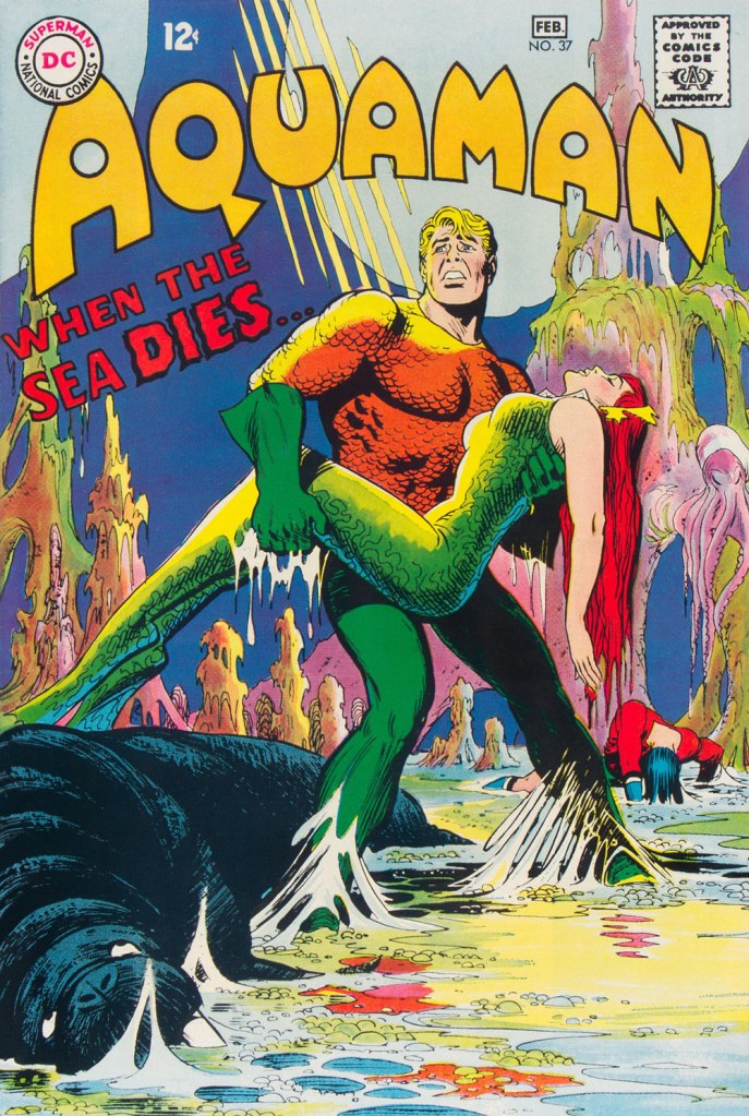
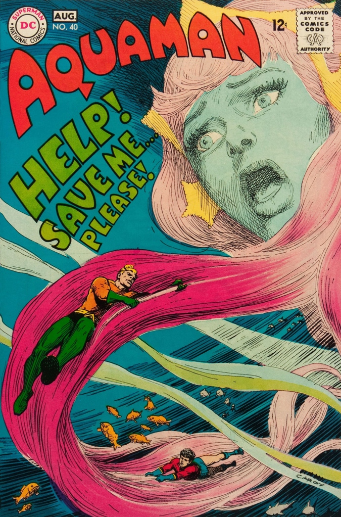
This is Aquaman no. 37 (Jan.-Feb. 1968, DC). The despondent walrus, bottom left, is family pet ‘Tusky’. Oh, and my apologies for ever-so-slightly poaching some potential Tentacle Tuesday material.
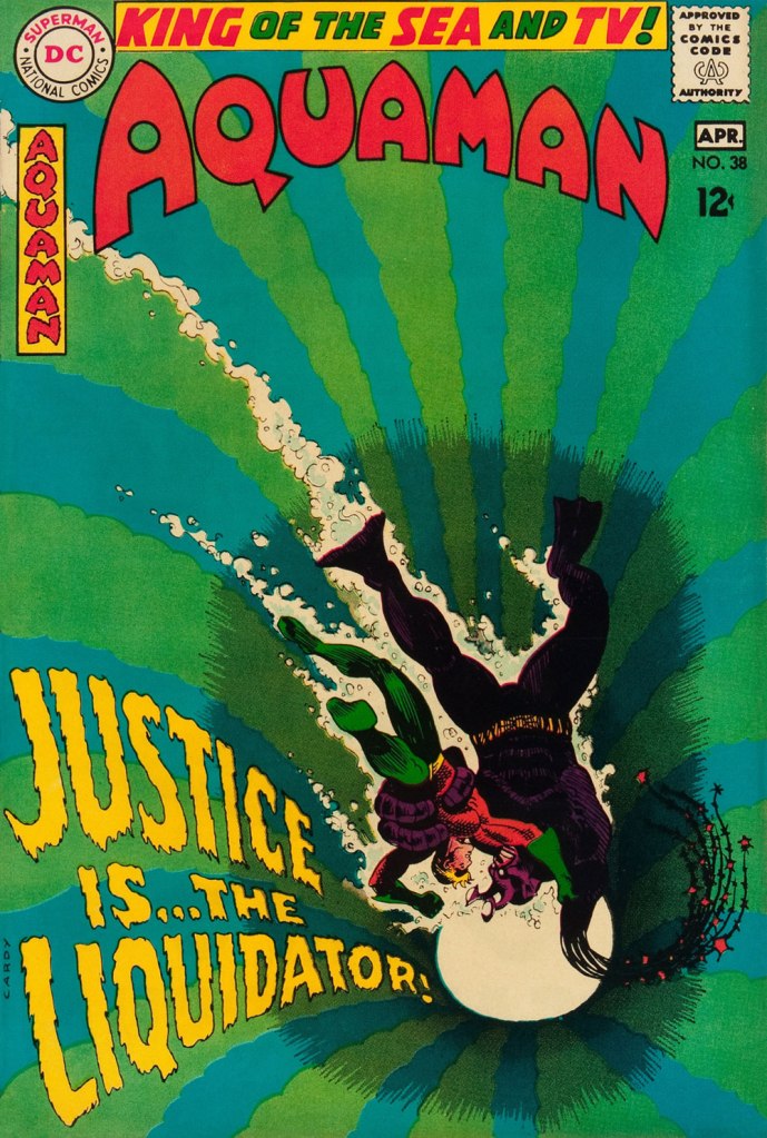
This is Aquaman no. 38 (Mar.-Apr. 1968, DC). I wonder what’s up with the redundant vertical logo, top left.
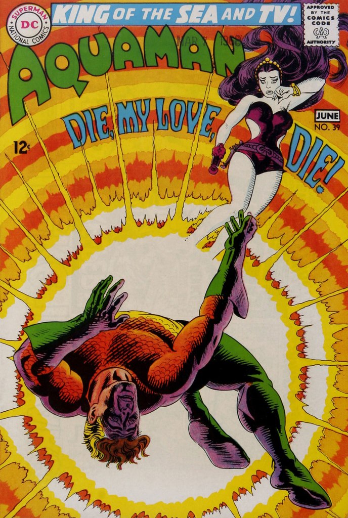
In case you’re wondering about Aquaman’s expanded regal duties (“and TV!“), they were showing repackaged reruns of his half of the previous year’s Superman / Aquaman Hour of Adventure. A Filmation production, so don’t expect too much if you haven’t seen it. But back to the comic book: this dazzling scene announces the saga of “How to Kill a Sea King!”, as our amphibious hero seeks to thwart a hostile Venusian takeover of Earth and sea. Script by Bob Haney, art by Cardy. This is Aquaman no. 39 (May-June 1968, DC). Oh, and the hottie? That’s “Aliena”. A real bolt of ‘inspiration’ there, Mister Haney.
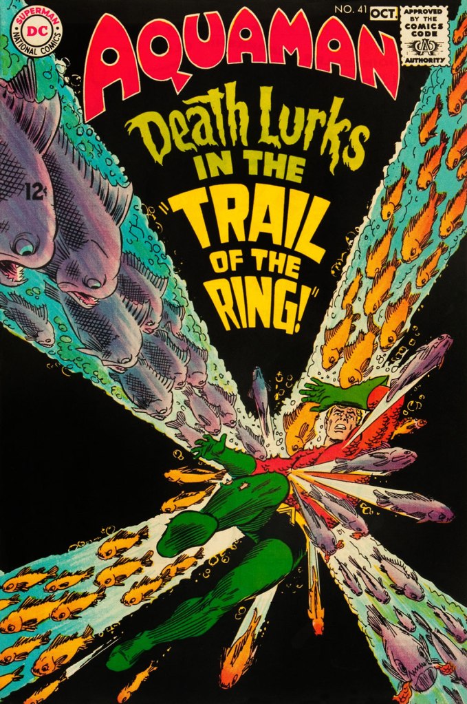
This is Aquaman 41, (July.-Aug. 1968, DC). Such dynamically-designed fun! This is where the new creative team of Stephen Skeates and Jim Aparo joins new editor Dick Giordano (his second issue), but Cardy remains on covers… because Aparo, who resided a couple of states over, couldn’t attend the cover conferences.
This is Aquaman 41, (Sept.-Oct. 1968, DC), a highlight among highlights from the redoubtable team of Infantino (publisher-designer), Cardy (penciller-inker), Giordano (editor), Jack Adler (production manager and colourist), and, inside, Skeates (writer) and Aparo (penciller-inker-letterer). There’s a texture to the colour work (most evident on the foreground piraña… a freshwater fish, incidentally) that’s unusual for comics of that period. I wonder how it was achieved…
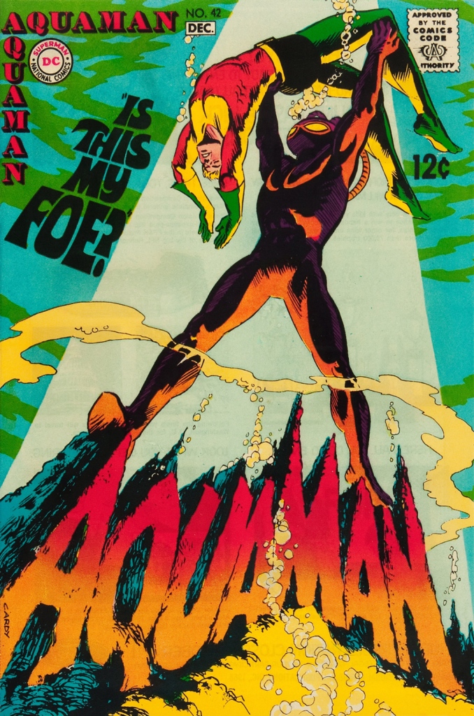
This is Aquaman no. 42 (Nov.-Dec. 1968, DC).
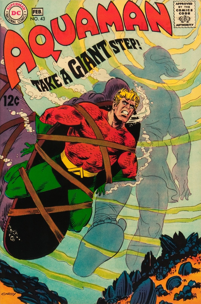
This is Aquaman no. 43 (Jan.-Feb. 1969, DC). Face-first in a bed of mussels, with several tons of pressure? Yikes.
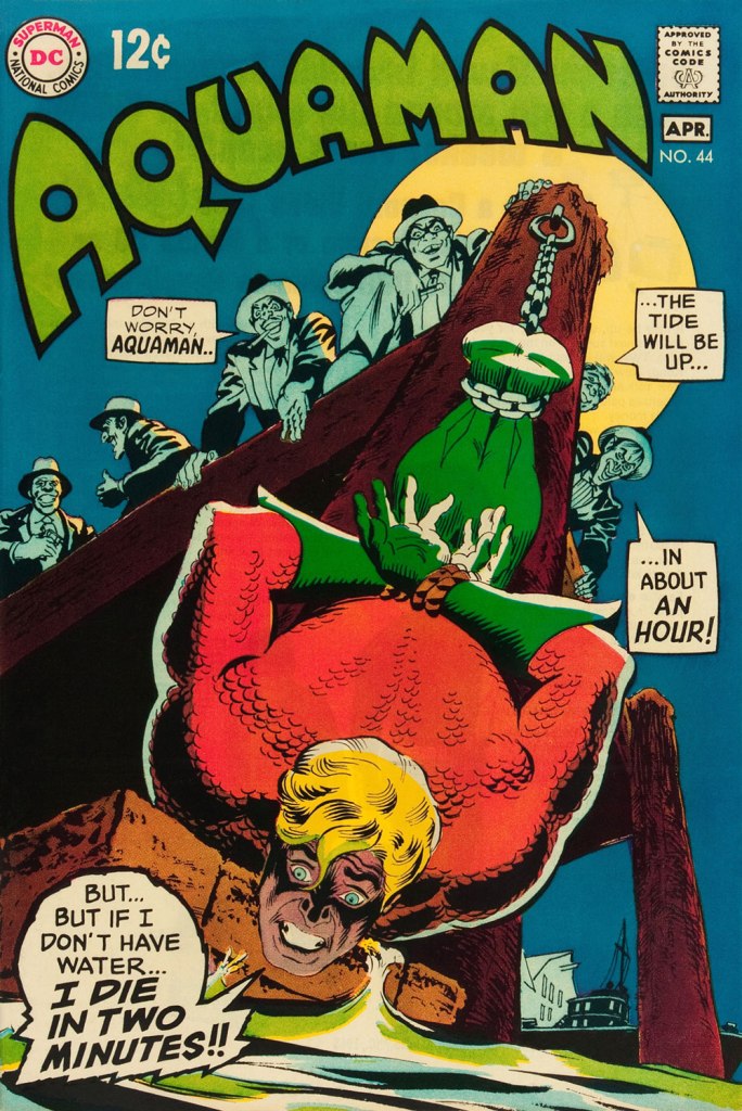
This is Aquaman no. 44 (March-April 1969, DC). I love how, despite the gravity of the situation, the mobsters are kind of cartoony. Cardy would most fruitfully mine this tragicomic vein in the brilliant but short-lived western Bat Lash (1968-69).
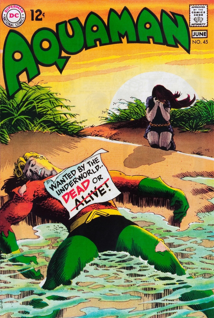
This is Aquaman no. 45 (May-June 1969, DC), concluding Skeates and Aparo’s two-parter, the self-explanatory “Underworld Reward”. An undeniably epochal cover by Mr. Cardy. To wit, so compelling and mysterious is this scene that it’s merited an astute blogger’s impressively in-depth analysis… well worth a peek.
« It was exactly an assembly line. You could look into infinity down these rows of drawing tables. » — Gil Kane
Some of our more sensitive readers may have noticed that we’ve been none too gentle with Gil Kane (1926-2000) in the past, dealing him some rather rough lumps at times. But that’s not the whole story: in taking stock of such a protracted and prolific (dare I say profligate?) career as his, much of it inevitably spent on autopilot, one must be discerning. In other words, I like some of Kane’s work, but there’s plenty of it I don’t care for. Still, WOT’s rule of thumb is that if we altogether loathe an artist and/or his work, we’ll just turn a blind eye.
And speaking of the sense of sight, what makes a great comic book cover? Must be my art school training and subsequent work in advertising tipping the scales, but to me, design and layout reign primordial as ingredients… as values. I’m often dismayed at many a would-be critic’s apparent method of assessing an image’s artistic worth, namely: how many popular characters does it feature? Is it action-packed? Is the issue sought-after and expensive? Does it feature a famous character’s début? Is it drawn by a fan-favourite artist who unquestionably can do no wrong… because he’s a fan-favourite artist who unquestionably can do no wrong? (and how dare you claim otherwise!)
Gil Kane reportedly generated around eight hundred covers for Marvel in the 1970s… of all levels of craft and quality. With that kind of frenzied output, it’s impressive that most were perfectly serviceable, given that there certainly was no time for meticulous, sober planning. They were generally over-captioned (not Kane’s fault!) and crassly sensationalistic, but that’s what Marvel sought and settled for.
It’s a shame that Kane and his former classmate at the School of Industrial Art (back in the early 40s!), DC lynchpin Carmine Infantino didn’t get on too well, because their Silver Age collaborations had a special spark… must have been the animosity. It had been noted by the DC brass, as early as the late 50s, that Carmine’s covers reliably caught prospective buyers’ attention and dimes. And so, by 1967, he was unofficially designing most of the publisher’s covers, and certainly the covers of all titles edited by Julius Schwartz. Green Lantern was among these.
So we turn today’s spotlight on a hot streak of seven. Kane gets his name in the title, but it would be more accurate to say they were Infantino-designed, Gaspar Saladino-lettered, Jack Adler-coloured, Gil Kane-pencilled and Murphy Anderson and Sid Greene-inked covers. The streak begins after Green Lantern no. 54’s downright poor cover, and ends with the interruption of Kane’s impressively long run of consecutive issues.
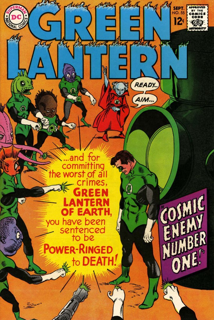
We begin with Green Lantern no. 55 (Sept. 1967, DC). Harmonious, easy-to-parse arrangement of numerous elements and exemplary integration of text. Design by Infantino, pencils by Kane, inks by Murphy Anderson, lettering by Gaspar Saladino, colours by Jack Adler. Oh, and lest we forget: logo designed by Ira Shnapp (circa 1964), classic Green Lantern uniform designed by Kane (circa 1959).
This is Green Lantern no. 56 (Oct. 1967, DC). Kane was never much for varying his monsters (see below). Pencils by Kane, inks by Anderson.
For a bit of comparison on how things were done from company to company, this is Tales to Astonish no. 91 (May, 1967, Marvel). This is what happens when there’s no planning or attention to detail: in an already-crowded cover, did we really need that ugly box advising us of the presence of The Abomination? He’s right there! (maybe the abomination refers to the cover itself). And the foreshortening nightmare that is the baddie’s left arm was so dire that, when a fan commissioned Arthur Adams to produce a recreation of this cover (which, things being as they are, many surely consider ‘iconic’)… he wisely corrected the anatomy and tweaked the poor composition. Interesting how Marvel’s heavy-fingered yes-man, art director John Romita Sr., was always game to “fix” Ditko and Kirby art, but saw nothing wrong with this one.
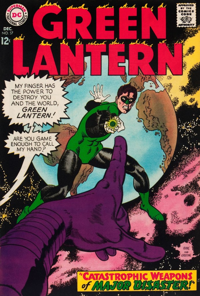
This is Green Lantern no. 57 (Dec. 1967, DC), featuring Catastrophic Weapons of Major Disaster!, written by Gardner Fox, pencilled and inked by Kane. Cover by Kane and Greene… love the placement of the signatures!
This is Green Lantern no. 58 (Jan. 1968, DC), featuring Peril of the Powerless Green Lantern! (a Julius Schwartz title if there ever was one), written by Gardner Fox, pencilled by Kane and inked by Greene. I’m not overly fond of the Kane-Greene mix, but Sid Greene, as a penciller-inker did some splendid work on the Star Rovers series (1961-64), co-created and scripted by Gardner Fox.
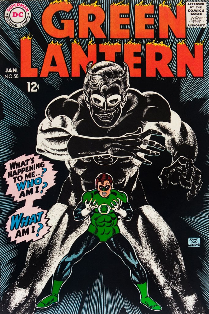
An issue whose price few can afford unless they bought it off the racks, this is Green Lantern no. 59 (March 1968, DC); pencils by Gil Kane, inks by Murphy Anderson. Featuring the introduction of GL alternate Guy Gardner, who was to be dubiously re(jack)-booted in the 1980s, by Steve Englehart and Joe Staton, as a jackass with an ugly uniform and a worse haircut. Never mind the fact that the Green Lantern Corps would never bestow power and stewardship on such an immature and pompous loose cannon.
This is Green Lantern no. 60 (April 1968, DC); an evident Infantino design, with pencils by Kane and inks by Anderson… which interestingly ends up producing a prototype of Brian Bolland‘s distinctive style… a decade early.
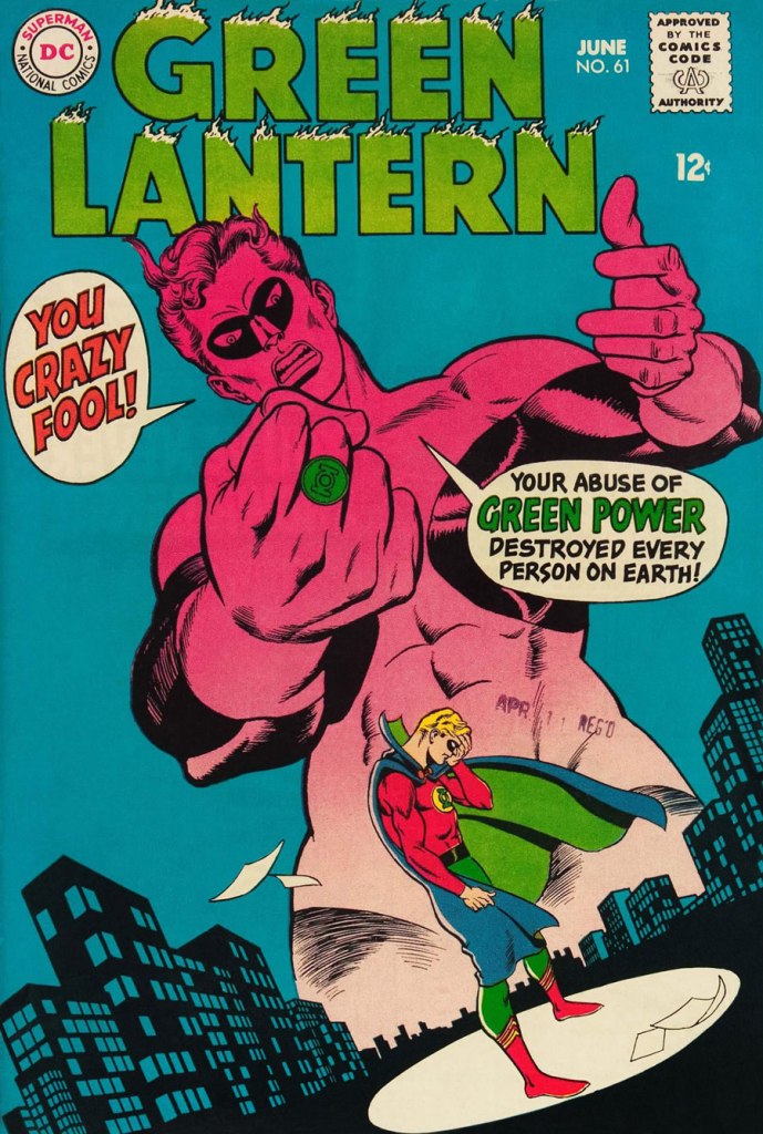
This is Green Lantern no. 61 (June 1968, DC); pencils by Kane, inks by Greene, and featuring (groan) Thoroughly Modern Mayhem!, scripted by Mike Friedrich, pencilled by Kane and inked by Greene. Co-starring Alan Scott, the Golden Age Green Lantern.
« Who are these men, Tomahawk? » « My Rangers! We fought against renegades… from Pennsylvania to Kentucky! When the country got too crowded, Moon Fawn and I moved out West… where a man has room to breathe! » — Tom Hawk sums up his change of station.
Inevitably, with the Silver Age and its superhero reascendancy, to the eventual detriment of all other genres, the historical adventure strip’s slow decline set in.
As Don Markstein put it:
« Toward the latter part of the ’50s, practically all DC comics ran aliens, monsters and other goofy sci-fi stuff on the covers, no matter how badly it clashed with the title’s subject matter — even war comics often sported dinosaurs in that position. And so, all through the late 1950s and early to mid ’60s, Tomahawk fought gigantic tree men, miraculously-surviving dinosaurs, mutated salamanders, and other menaces that seem somehow to have escaped the history books. There was even a giant gorilla among them, and putting a gorilla on the cover was also a contemporary trend at DC. »
It all comes down to the editor, and Tomahawk was long edited by Jack Schiff, who just adored that sort of (admittedly fun) claptrap, then by his associate Murray Boltinoff, who at least was more flexible.
To wit, with issue 116 (May-June 1968) came a change and a relative return to the feature’s roots. First, Neal Adams was brought in to provide covers, and the more outré aspects were phased out. With issue 119 (Nov.-Dec. 1968), the book’s final creative team was brought aboard: writer Robert Kanigher and illustrator Frank Thorne (1930-2021), eventual creator of Moonshine McJugs. Thorne replaced Fred Ray (1920-2001) who, while he wasn’t a Tomahawk originator, had been chronicling the mountain lion’s share of his exploits since 1947. He would draw a handful of short pieces for DC’s war books before leaving the comics field in the early 1970s, writing historical non-fiction and art directing and illustrating for publications Civil War Times Illustrated, American History Illustrated, True Frontier, The West and Yank (despite the title, not a porno mag).
With the heart of the creative team in place, it was a change of editors that prompted Tomahawk’s final mutation, and arguably its most interesting: Joe Kubert took over the editorial reins, and the action was moved four decades or so forward in time. Tom ‘Tomahawk’ Hawk had settled down with a Native woman, Moon Fawn, sired a pair of sons, and was by then a lanky, crotchety old coot, but not quite helpless. His elder son Hawk was the protagonist, and they encountered frontier-style prejudice, greed, corruption, tribalism, paranoia… you guessed it: it was a ‘socially-relevant‘ comic, but hardly the cringe-fest that was the concurrent Green Lantern/Green Arrow. I daresay that Kubert and Kanigher’s respective politics were rather too complex for that.
This is Tomahawk no. 131 (Nov.-Dec. 1970, DC). Inside: Hang Him High!, written by Robert Kanigher and illustrated by Frank Thorne. I like how nonplussed Hawk is at the prospect of doing the Brand New Tennessee Waltz..
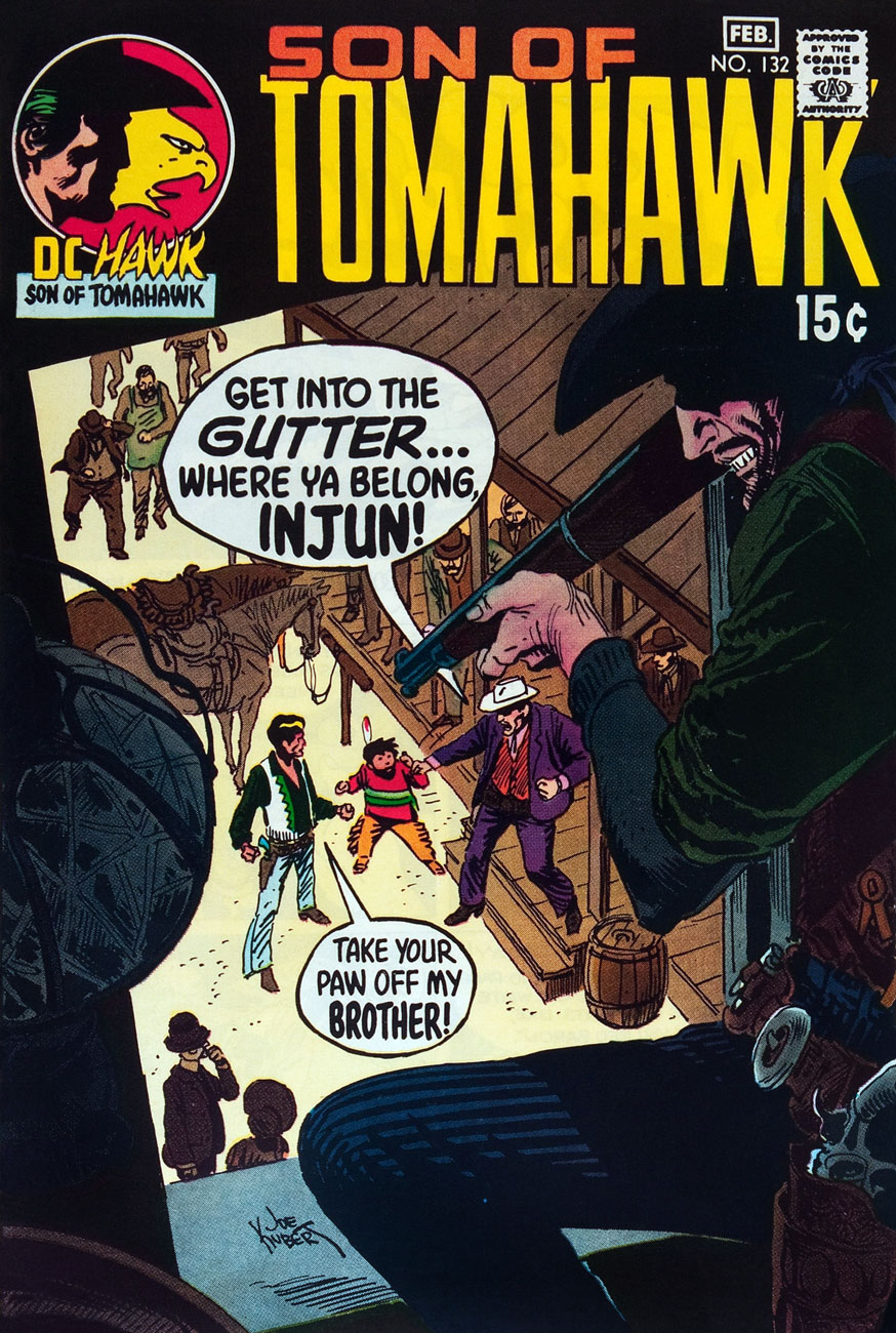
This is Tomahawk no. 132 (Jan.-Feb. 1971, DC). Inside: Small Eagle… Brother Hawk!, written by Robert Kanigher and illustrated by Frank Thorne.
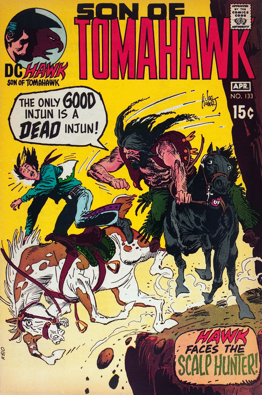
This is Tomahawk no. 133 (Mar.-Apr. 1971, DC). Inside: Scalp Hunter, written by Robert Kanigher and illustrated by Frank Thorne.
This is Tomahawk no. 134 (May-June 1971, DC). Inside: The Rusty Ranger, written by Robert Kanigher and illustrated by Frank Thorne.
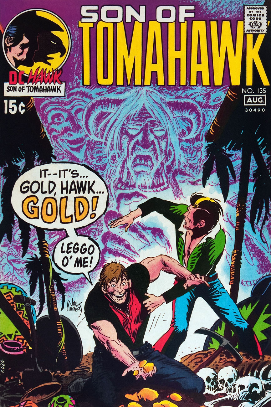
This is Tomahawk no. 135 (July-Aug. 1971, DC). Inside: Death on Ghost Mountain!, written by Robert Kanigher and illustrated by Frank Thorne, and the powerful Spoilers, written by Jerry DeFuccio and illustrated by John Severin. This was my admittedly random introduction to the series.
This is Tomahawk no. 136 (Sept.-Oct. 1971, DC). Inside: A Piece of Sky!, written by Robert Kanigher and illustrated by Frank Thorne, plus an extraordinary Firehair tale by Kubert… but then they all are.
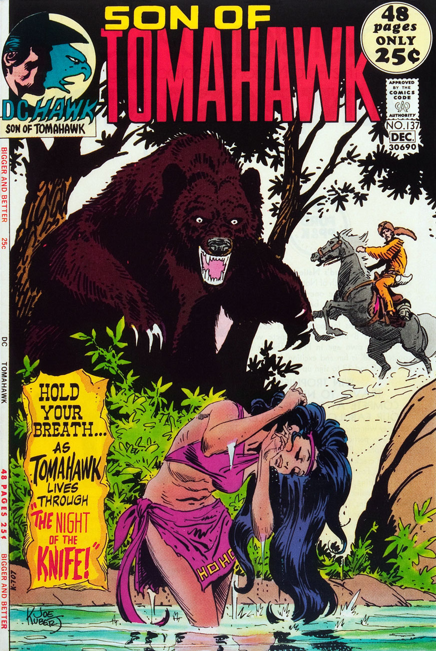
This is Tomahawk no. 137 (Nov.-Dec. 1971, DC). Inside: Night of the Knife!, written by Robert Kanigher and illustrated by Frank Thorne, plus a selection of fine reprints.
This is Tomahawk no. 138 (Jan.-Feb. 1972, DC). Inside: Christmas, written by Robert Kanigher and illustrated by Frank Thorne, as well as an assortment of worthy reprints boasting artwork by Nick Cardy, Sam Glanzman, Norman Maurer and Mort Drucker.
This is Tomahawk no. 138 (Mar.-Apr. 1972, DC). Inside: Death Council, written by Robert Kanigher and illustrated by Frank Thorne, plus a clutch of reprints illustrated by Fred Ray, Gil Kane, and none other than Frank Frazetta.
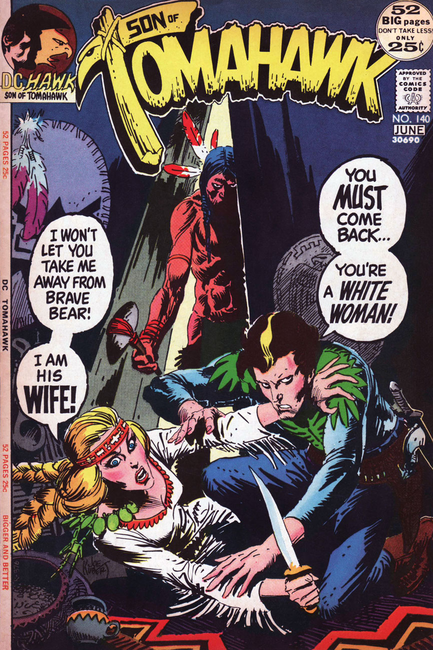
This is Tomahawk no. 140 (May-June 1972). Inside: The Rescue!, written by Robert Kanigher and illustrated by Frank Thorne. Gaspar Saladino‘s brand new logo, a rare misfire, was unveiled just in time for the book’s cancellation.
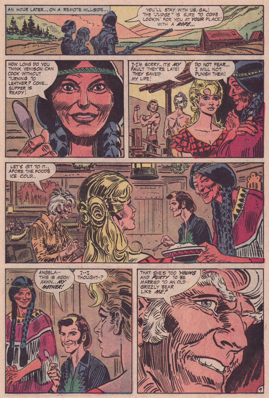
As for the interior art, I’d say it’s Frank Thorne’s finest work. The notorious Alexander Toth would of course disagreed, far preferring Thorne’s work when Thorne’s style bore a heavy… Toth influence (here’s an example from 1957.) For comparison, here’s a pair of interior pages from Tomahawk no. 131‘s Hang Him High!
Thanks to their production manager, Jack Adler, DC had the finest, most nuanced colouring in the field in the late 60s and early 70s.
Toth would, in (final) conversation with The Comics Journal publisher Gary Groth, in 1996, froth forth:
« I repeatedly warned Frank: “For Christ’s sake, get the hell away from Kubert. He’s not doing you any good. His influence on you is negative, not positive, so get the hell away from him and stop aping his style and stop putting on all that shit that you lived without for years. You did nice, clean, hard-lined stuff, and it’s been detrimental to your work.” He confessed: “Yes, Joe Kubert and his style are hard to resist.” So, yes he had the influence, and he liked it. Well, good luck. »
« I have learned to live each day as it comes, and not to borrow trouble by dreading tomorrow. It is the dark menace of the future that makes cowards of us. » — Dorothy Dix
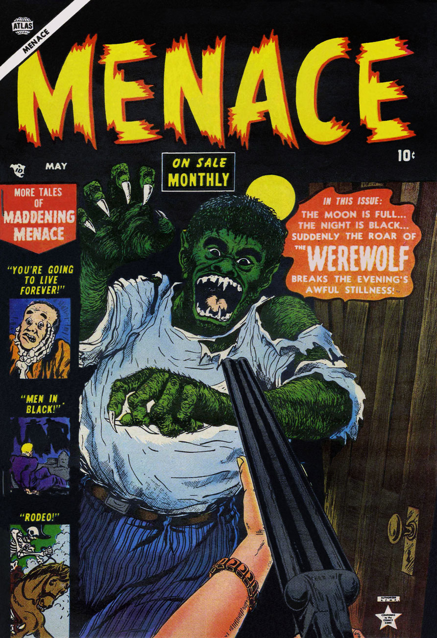
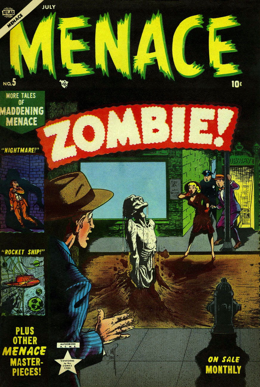
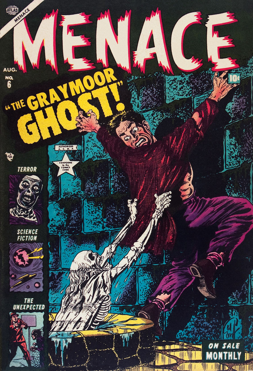
Menace was a short-lived (11 issues, 1953-54, Atlas) horror anthology title that’s mostly remembered*, if at all, for its one-shot introduction of a zombi by the name of Simon Garth. Because Atlas never really played the gore card, its successor Marvel was able to mine most of its Pre-code material as cheap filler in their 1970s bid to flood the market. Don’t get me wrong, though; these titles were still a lot of primitive fun, and in most cases, I’d pick an issue of Weird Wonder Tales, Where Monsters Dwell or Uncanny Tales From the Grave over the latest Fantastic Four or Spider-Man.
The writing was by no means daring or even coherent, but the artwork was frequently rather fine, with none quite finer than Bill Everett‘s, particularly his covers, which elegantly straddled the line between fearsome and goofy.
I’d be tempted to say that Everett (1917-1973) was at his peak when he created these, but the bittersweet fact of it is that Everett was still at the height of his artistic powers, even as he was slowly dying in the early 1970s.
This particular hot streak ends not because Everett turned in a lesser job, but because other hands provided covers for the rest of the run. Talented hands, at that (Carl Burgos, Gene Colan, Russ Heath, Harry Anderson), but none of the other Menace covers are a patch on Everett’s mighty half-dozen.
These monsters look kind of playful and kooky, don’t they? This is Menace no. 1 (March 1953, Atlas). Inside we find Everett, George Tuska, Russ Heath and Werner Roth art. Oh, and Stan Lee stories. Colours by Stan Goldberg.This is Menace no. 2 (April 1953, Atlas). Colours by Stan Goldberg.This is Menace no. 3 (May 1953, Atlas). Colours by Stan Goldberg. Was the title’s monthly schedule truly supposed to be a selling point?This is Menace no. 4 (June 1953, Atlas). Colours by Stan Goldberg.If you think that’s impressive, you should see what mushrooms can do to asphalt!** This is Menace no. 5 (July 1953, Atlas). Simon Garth was dug up (sorry) in 1973, likely at the behest of continuity addict Roy Thomas, to star (if you can call it that) in his own black & white magazine, Tales of the Zombie (10 issues, 1973-75). Like The Man-Thing, he was essentially mindless and shambling, and so mostly a pawn or an uncomprehending witness to others’ tragedies. The best of the mangy lot is, imho, The Blood-Testament of Brian Collier (TotZ no.7… read it here.) It’s not great, but it sure looks pretty, thanks to the sublime Alfredo Alcala, who’s quite in his element here.Don and Warren also met Simon. Read Lee and Everett’s 1953 Zombie!This is Menace no. 6 (August 1953, Atlas). Colours by Stan Goldberg.
That strange compulsion that’s creeping over you, that ungodly craving for more Bill Everett, cannot quite be slaked without incurring a terrible cost, be it in human lives, the forfeiting of your immortal soul, or both. But do check out my co-admin ds’ earlier tribute to Mr. Everett’s nightmares, Bill Everett’s Restless Nights of Dread, it might tide you over until dawn.
-RG
*these babies are rare, in any condition.
**Here’s an example:
« A bump in the garage floor turned into a half meter of mushrooms in little more than three days. It crushed its way through five centimetres of asphalt in Åge Reppes garage in Stord, western Norway. It is the water pressure in the cells of the fungus that makes it able to crack the asphalt, says a biologist at the local university. » [ source ]. These are inky caps. Edible, but some species are toxic when consumed with alcohol. These are commonly known as ‘tippler’s bane‘.