« I was always concerned more with the visuals than with the copy — and the visuals had to be provocative! » — Infantino*, in a nutshell.
To recap, under the parameters I’ve set for this category a hot streak is a series of outstanding consecutive covers by a single artist (inkers may vary) on the same comic book title. Since it’s my party, I occasionally make allowances (e.g. allowing entry to a scruffier, but still presentable, specimen), but it’s more challenging and more fun to play it straight.
By my reckoning, there are very few truly great cover artists to begin with, and their output is often stifled by indifferent, incoherent or hostile art direction, poor lettering and colouring choices beyond the unfortunate artist’s control, lack of interest in the imposed subject matter… you get the picture. And there’s also the difficulty of getting a decent streak going when the editor keeps shuffling cover artists.
The artist in his suit and tie (and cigar!) days at DC.
I’ve gone on at length (I refer you in particular to Hot Streak: Nick Cardy’s Aquaman, Previously) about the gargantuan amount of work Carmine Infantino (1925-2013) knocked out conceiving comic book covers during his executive years at DC (1966-75), but most of his best designs were executed by others. I mean the man was already doing the work of five people, what more could he do?
« At DC Comics, I worked round the clock, including weekends, and never taking a vacation in the 10 years I served there. I not only was creating new titles, designing most of the covers, plotting stories and going on the road for the distribution of the magazines, plus doing radio shows and then running out to California to be totally included with Puzo and the producers creating the Superman movies I &II. Time got so tight that I would design covers on the way to the airport and have the driver deliver them to Sol Harrison, who in turn gave them to the waiting artists. I would be at my desk from 7 a.m. to 9 p.m. It began to be a destructive grind. »
While Carmine is most closely associated with Silver Age characters The Flash and Adam Strange, I couldn’t discern, in these titles, a run of sufficiently stellar *and* consecutive covers (Flash nos. 139-142 and Mystery in Space nos. 69 to 71 come closest… do bear in mind that I have no consideration for ‘key’ issues or ‘famous’ or ‘event’ covers). It’s no real surprise that Infantino’s design work rose to a crescendo of accomplishment and consistency when he was made the company’s de facto art director, late in 1966. And what was he working on at the time? Batman. So, since Detective no. 261 bears a ho-hum cover and no. 269 is pretty spiffy, but the work of Gil Kane, here’s Mr. Infantino’s hot streak:
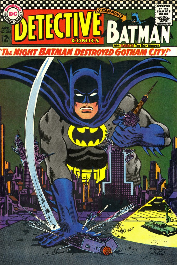
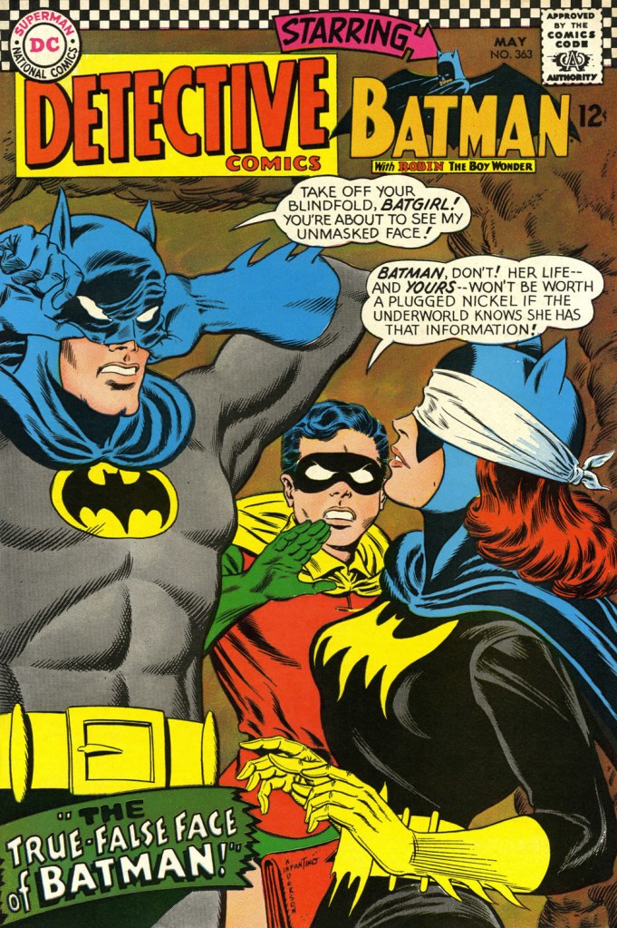
This is Detective Comics no. 362 (Apr. 1967, DC), pencilled by Infantino and inked by Murphy Anderson. Carmine wasn’t a fan of the so-called ‘Go-Go Checks’, that checkerboard pattern that once famously adorned those distinctive yellow NYC cabs. He didn’t mince words, either: « What a ridiculous thing: it was the stupidest idea we ever heard because the books were bad in those days and that just showed people right off what not to buy. ». Certainly, in the case of Detective Comics, they left the top of the page far too cluttered.This is Detective Comics no. 363 (May 1967, DC), featuring (this) Batgirl‘s second appearance. She’d been created by editor Julius Schwartz and Infantino at the request of the hit Batman TV show‘s producers, figuring that the series needed a heroine for a little extra spice. Art by Infantino and Anderson.This is Detective Comics no. 364 (June 1967, DC). Roy Reynolds, alias The Getaway Genius, was a fun civilian villain whose finest hour, in my view, came at the tail end of 1973 with Batman no. 254‘s King of the Gotham Jungle! (written by Frank Robbins, pencilled by Irv Novick and inked by Dick Giordano), when he was unexpectedly caught between the Batman and the Man-Bat. I wouldn’t be surprised to learn that a Batmaniac or three had reconstructed this Joker edifice in their backyard or basement, out of Lego blocks or papier mâché… or actual bricks.
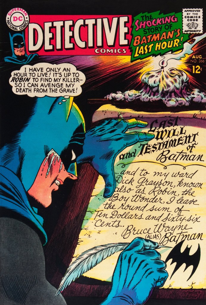
Carmine really went to town on this one, and it’s rightly earned its place in the hall of classics. This is Detective Comics no. 365 (July, 1967, DC). The cover story, The House the Joker Built! is scripted by John Broome, pencilled by Bob Kane ghost Sheldon “Shelly” Moldoff and inked by Joe Giella.Speaking of design, here’s the masterful Ira Schnapp‘s house ad for Detective 365, as it appeared in Green Lantern no. 54 (July, 1967, DC), among other titles.This is Detective Comics no. 366 (Aug. 1967, DC); I love those moody colours and light effects, that tell-tale Infantino candle and the mysteriously parsimonious inheritance bequeathed to Robin.This is Detective Comics no. 367 (Sept. 1967, DC), an intriguing preview of Where There’s a Will — There’s a Slay!, written by Gardner Fox, pencilled by Infantino, inked by Sid Greene. I wonder how many young readers enthusiastically destroyed the cover to assemble the puzzle…
Note also the improved logo placement (a return to issue no. 327 original ‘new look’ logo, actually), giving the layout a chance to… breathe a bit better. The Batman cameo at top left is still de trop.
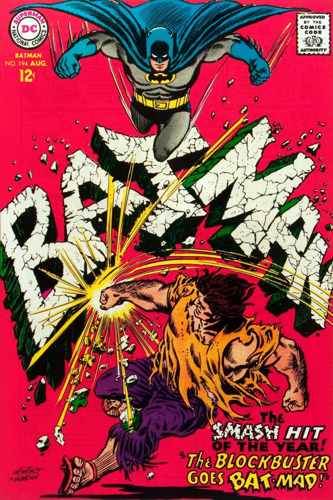
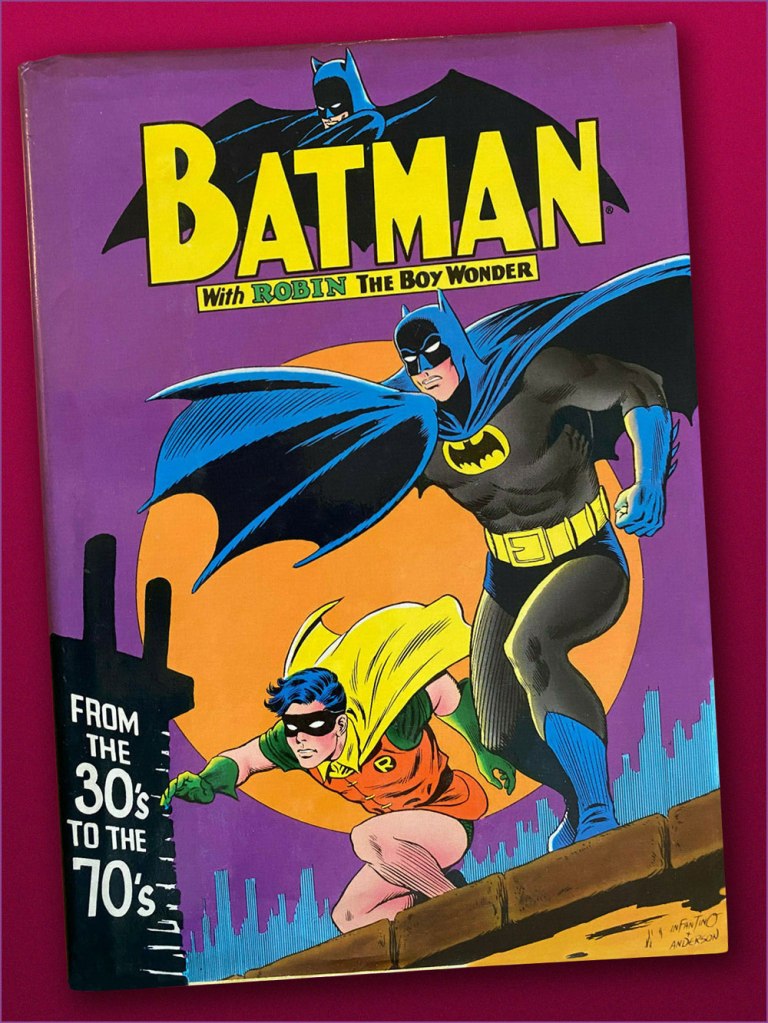
This is Detective Comics no. 368 (Oct. 1967, DC). Infantino reportedly created the covers first, and editor Schwartz assigned his writers to work up a scenario to fit. This one could not have been a cakewalk. Gardner Fox was the unlucky recipient of that gargantuan task.Since it’s not an issue of Detective, this cover’s not *technically* part of the streak… but as it features Batman, and it appeared between issues 365 and 366 of Detective, I’m throwing it in. Infantino and Anderson’s literal and figurative blockbuster of a cover for Batman no. 194 (Aug. 1967, DC). Its cover aside, a pretty ho-hum issue. The book and the character were in urgent need of another overhaul, and it was just around the corner. « When Donenfeld saw this cover, he had a fit! He said, ‘I don’t see the logo on top!’ I said ‘You don’t have to — you’ve got Batman up there!’ »Aw, heck — here’s Ira Shnapp’s accompanying house ad, a work of art in itself, wouldn’t you agree?Speaking of immortal Infantino Batman images: « Aurora wanted action shots of their models, so I did this rough layout, sent it to them, and they liked it! I had a moon behind him, but they dropped it. The tree created the design. I was very high into design at this point (1964) — the design was pouring out of me! ». Here’s a look at the finished model.I couldn’t very well leave out what’s possibly the most famous of Carmine’s Bat-scenes: this is Batman From the 30’s to the 70’s (1971, Crown Publishers) a splendid hardcover anthology. Its cover adapts an Infantino-Anderson mini-poster that originally saw print in Detective Comics no. 352 (June 1966, DC) and bore instead the inscription « Best Bat-Wishes Batman and Robin ». Superman, Wonder Woman and Captain Marvel, er… ‘Shazam’ also got their own historical anthology in this format.
-RG
*unless otherwise specified, most Infantino quotes are drawn from his excellent, profusely visual 2001 autobiography (with J. David Spurlock), The Amazing World of Carmine Infantino (Vanguard Publishing).
I think of these mid-60s DC comics as being a lot less sexy than their Marvel counterparts, but clearly that’s underselling them. Infantino was obviously a creative powerhouse at DC:
Love that quote: ‘I was very high into design at this point (1964) — the design was pouring out of me!’
Btw, that’s not Gil Kane inking the page from Detective Comics #365? Looks like his signature crisply stylized line work…
Finally, hilarious Batman model, particularly the old creepy tree trunk that suggests a crossover with Aurora’s monster models! Funny that Infantino felt that tree was a stellar example of the design ‘pouring out of him’ when he had so many really interesting covers under his belt.
> I think of these mid-60s DC comics as being a lot less sexy than their Marvel counterparts, but clearly that’s underselling
> them. Infantino was obviously a creative powerhouse at DC:
On the design and production front, I have a lot of trouble with Marvel’s covers. While they had splendid cover artists at their disposal, Kirby and Ditko of course, but also John Severin, they essentially had Stan Lee (and Uncle ‘Martin’) as art directors (and John Romita Sr., ever the Yes Man, just followed orders and made revisions), and these philistines constantly undermined their artists’ vision through hubris, ego, and lack of trust. So many a set — it was never just one! — of utterly pointless, badly lettered captions ruined a beautifully conceived design. The expertly arranged negative space would be filled with stupid text (mostly in clunky boxes!) time and time again. Art Simek was no Ira Shnapp or Gaspar Saladino.
And while Stan Goldberg proved he was a fine colourist in the 1950s, it’s clear that, in the 1960s, he was presumably told at Marvel to keep the backgrounds monochromatic (that is to say… grey) in order to make the characters ‘pop’. That gets old fast.
> Love that quote: ‘I was very high into design at this point (1964) — the design was pouring out of me!’
I love it too! I can relate about the mysterious ways of inspiration; when you’re on, it feels like the creativity is coming out of nowhere, certainly beyond one’s conscious control.
> Btw, that’s not Gil Kane inking the page from Detective Comics #365? Looks like his signature crisply stylized line work…
You mean the house ad from Green Lantern no. 54? Yep, that’s Kane inking himself.
> Finally, hilarious Batman model, particularly the old creepy tree trunk that suggests a crossover with Aurora’s monster
> models!
Makes sense that it caught the Aurora people’s fancy, then!
> Funny that Infantino felt that tree was a stellar example of the design ‘pouring out of him’ when he had so many really
> interesting covers under his belt.
It’s certainly memorable, for what that’s worth! You’d be surprised how often a given artist’s taste in their own work differs from the public’s view of it. I always find it sad when a creator considers anything of his that met with less-than-enthusisatic commercial response a failure, period. Burt Bacharach’s a depressing example of that mindset.
I’d love to see you do a slide lecture comparing covers from silver age Marvel and DC. I generally paid a lot more attention to the inside art work than the covers, but I think I see what you’re saying, in terms of sometimes cluttering up the cover with verbiage.
You’ve probably seen this guy’s amusing ‘if Marvel’s titles were done by DC’ series:
>I generally paid a lot more attention to the inside art work than the covers, but I think I see what you’re saying, in terms of
> sometimes cluttering up the cover with verbiage.
What were you, a subscriber? 😉
>You’ve probably seen this guy’s amusing ‘if Marvel’s titles were done by DC’ series:
Damn, I’d pay good money for that Ghost Rider 80-pager! Great stuff.
> It’s not fair, of course, yet does encapsulate a general impression I had at the time!
One thing I’ve noticed is that what gets picked on is almost unfailingly Mort Weisinger’s titles, with an occasional Jack Schiff Batman. Fact is, DC’s Big 3 (Superman, Batman, Wonder Woman) books, in the 1960s, were dismally retrograde* and out of touch, helmed by dictatorial ornery editors (not to mention the albatross that was Bob Kane on Batman) who were most definitely *not* visually oriented. To improve the books, Infantino installed artists as editors (Giordano, Sekowski, Kubert…), but in the case of Schiff and Weisinger, he had to wait out their retirement.
When I hear people dismiss 1960s DC as childish, it’s as if these folks had only access to Superman comics. What about, say, Enemy Ace, Adam Strange, or Bat Lash? Oh, I guess they want maturity, but only through superheroes. “Bah!”, I say. 😉
> You’re showing otherwise, however. Keep up the great work.
Aw, thank you so much! Your input is always greatly appreciated. Cheers!
*Bob Kanigher even went so far as making Ross Andru imitate the 1940s style on Wonder Woman (issues 159-164) — in 1966!


Another fascinating column!
I think of these mid-60s DC comics as being a lot less sexy than their Marvel counterparts, but clearly that’s underselling them. Infantino was obviously a creative powerhouse at DC:
Love that quote: ‘I was very high into design at this point (1964) — the design was pouring out of me!’
Btw, that’s not Gil Kane inking the page from Detective Comics #365? Looks like his signature crisply stylized line work…
Finally, hilarious Batman model, particularly the old creepy tree trunk that suggests a crossover with Aurora’s monster models! Funny that Infantino felt that tree was a stellar example of the design ‘pouring out of him’ when he had so many really interesting covers under his belt.
LikeLike
Hi SB! You wrote:
> Another fascinating column!
Thank you!
> I think of these mid-60s DC comics as being a lot less sexy than their Marvel counterparts, but clearly that’s underselling
> them. Infantino was obviously a creative powerhouse at DC:
On the design and production front, I have a lot of trouble with Marvel’s covers. While they had splendid cover artists at their disposal, Kirby and Ditko of course, but also John Severin, they essentially had Stan Lee (and Uncle ‘Martin’) as art directors (and John Romita Sr., ever the Yes Man, just followed orders and made revisions), and these philistines constantly undermined their artists’ vision through hubris, ego, and lack of trust. So many a set — it was never just one! — of utterly pointless, badly lettered captions ruined a beautifully conceived design. The expertly arranged negative space would be filled with stupid text (mostly in clunky boxes!) time and time again. Art Simek was no Ira Shnapp or Gaspar Saladino.
And while Stan Goldberg proved he was a fine colourist in the 1950s, it’s clear that, in the 1960s, he was presumably told at Marvel to keep the backgrounds monochromatic (that is to say… grey) in order to make the characters ‘pop’. That gets old fast.
> Love that quote: ‘I was very high into design at this point (1964) — the design was pouring out of me!’
I love it too! I can relate about the mysterious ways of inspiration; when you’re on, it feels like the creativity is coming out of nowhere, certainly beyond one’s conscious control.
> Btw, that’s not Gil Kane inking the page from Detective Comics #365? Looks like his signature crisply stylized line work…
You mean the house ad from Green Lantern no. 54? Yep, that’s Kane inking himself.
> Finally, hilarious Batman model, particularly the old creepy tree trunk that suggests a crossover with Aurora’s monster
> models!
Makes sense that it caught the Aurora people’s fancy, then!
> Funny that Infantino felt that tree was a stellar example of the design ‘pouring out of him’ when he had so many really
> interesting covers under his belt.
It’s certainly memorable, for what that’s worth! You’d be surprised how often a given artist’s taste in their own work differs from the public’s view of it. I always find it sad when a creator considers anything of his that met with less-than-enthusisatic commercial response a failure, period. Burt Bacharach’s a depressing example of that mindset.
Thanks again for your insightful comments, SB!
LikeLike
I’d love to see you do a slide lecture comparing covers from silver age Marvel and DC. I generally paid a lot more attention to the inside art work than the covers, but I think I see what you’re saying, in terms of sometimes cluttering up the cover with verbiage.
You’ve probably seen this guy’s amusing ‘if Marvel’s titles were done by DC’ series:
It’s not fair, of course, yet does encapsulate a general impression I had at the time!
You’re showing otherwise, however. Keep up the great work.
LikeLiked by 1 person
Hi SB! You wrote:
>I’d love to see you do a slide lecture comparing covers from silver age Marvel and DC.
Ha! I can totally seem myself doing that. I’d create versions of Marvel covers without the clunky verbiage and hype, compare and contrast. I did that once with a Fantastic Four cover, here: https://whosoutthere.ca/2019/11/22/hot-streak-jack-kirbys-fantastic-four/
>I generally paid a lot more attention to the inside art work than the covers, but I think I see what you’re saying, in terms of
> sometimes cluttering up the cover with verbiage.
What were you, a subscriber? 😉
>You’ve probably seen this guy’s amusing ‘if Marvel’s titles were done by DC’ series:
Damn, I’d pay good money for that Ghost Rider 80-pager! Great stuff.
> It’s not fair, of course, yet does encapsulate a general impression I had at the time!
One thing I’ve noticed is that what gets picked on is almost unfailingly Mort Weisinger’s titles, with an occasional Jack Schiff Batman. Fact is, DC’s Big 3 (Superman, Batman, Wonder Woman) books, in the 1960s, were dismally retrograde* and out of touch, helmed by dictatorial ornery editors (not to mention the albatross that was Bob Kane on Batman) who were most definitely *not* visually oriented. To improve the books, Infantino installed artists as editors (Giordano, Sekowski, Kubert…), but in the case of Schiff and Weisinger, he had to wait out their retirement.
When I hear people dismiss 1960s DC as childish, it’s as if these folks had only access to Superman comics. What about, say, Enemy Ace, Adam Strange, or Bat Lash? Oh, I guess they want maturity, but only through superheroes. “Bah!”, I say. 😉
> You’re showing otherwise, however. Keep up the great work.
Aw, thank you so much! Your input is always greatly appreciated. Cheers!
*Bob Kanigher even went so far as making Ross Andru imitate the 1940s style on Wonder Woman (issues 159-164) — in 1966!
LikeLike