« The sacred is found boring by many who find the uncanny fascinating. » — Mason Cooley
I’ve expressed many a time my ambivalent affection for Golden Age Atlas horror comics: in short, despite their slapdash, often incoherent writing, they had a solid stable of artists (which makes the thin writing all the more disappointing); but most of all, they generally had eye-catching covers, splendidly coloured (easy a task to underestimate!) and blessed with a light touch absent on the insides.
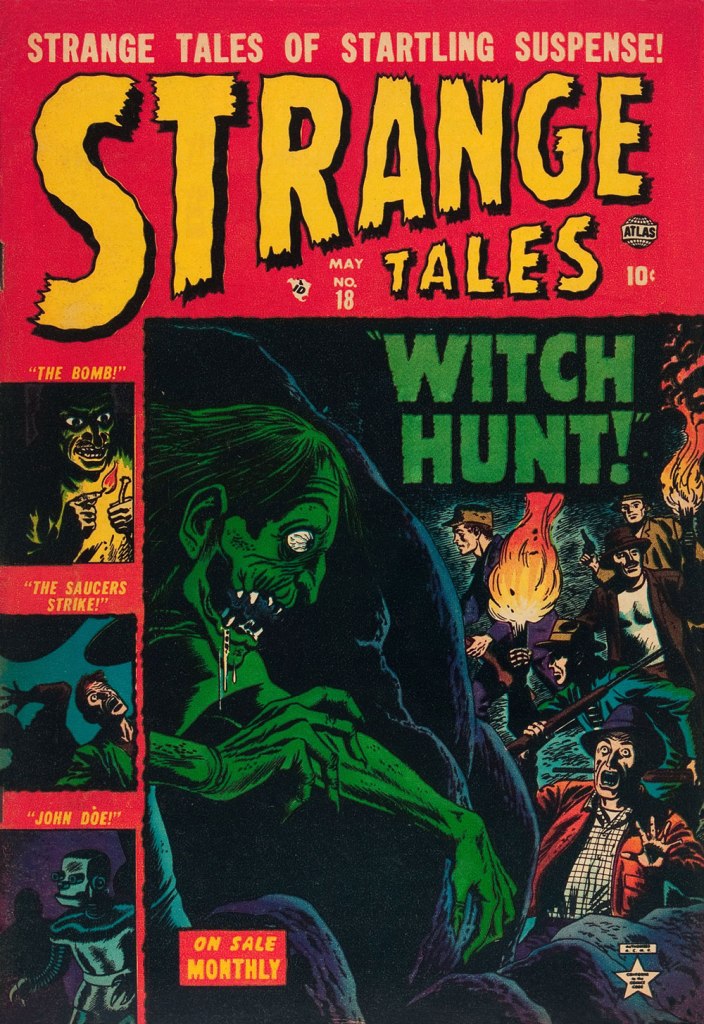
Today, I’ve picked out my favourite covers from Uncanny Tales (fifty-six issues, 1952-57). Enjoy!
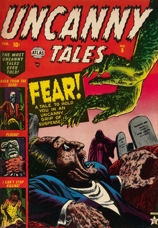
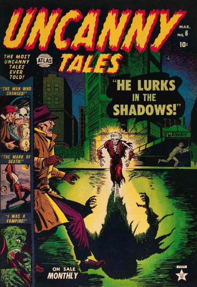
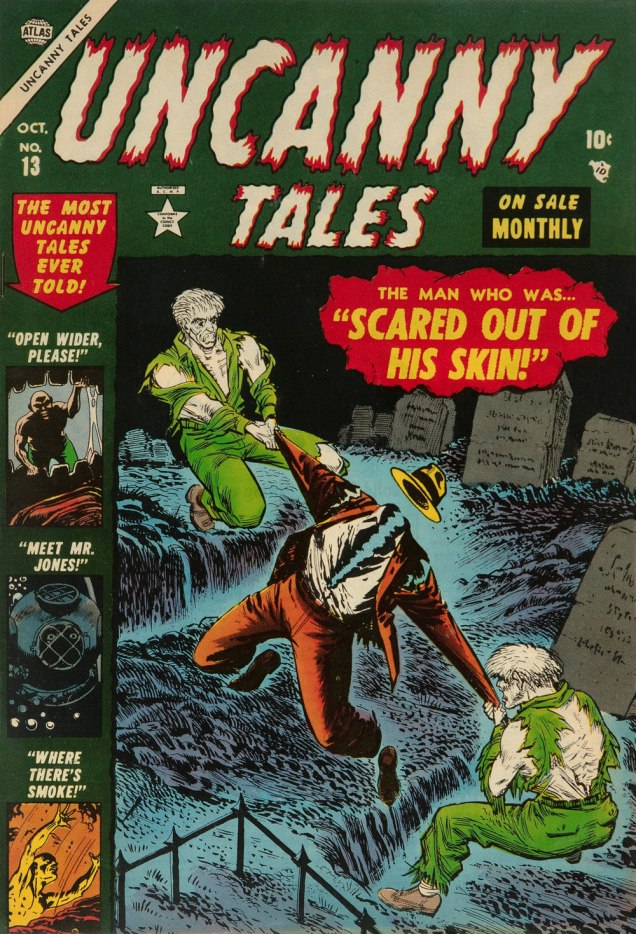
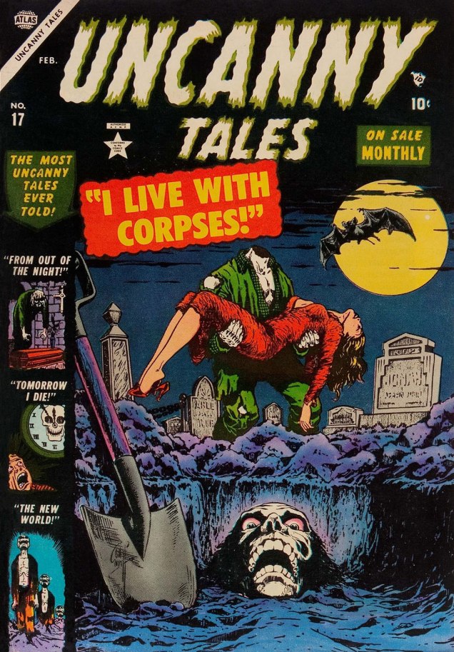
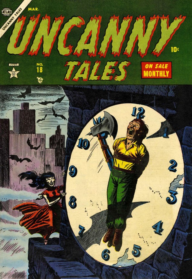
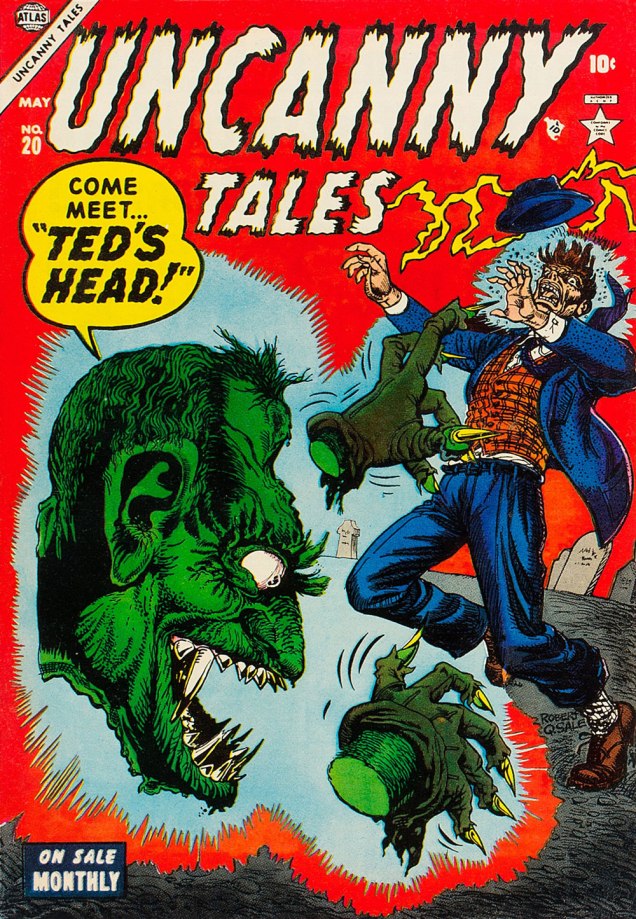
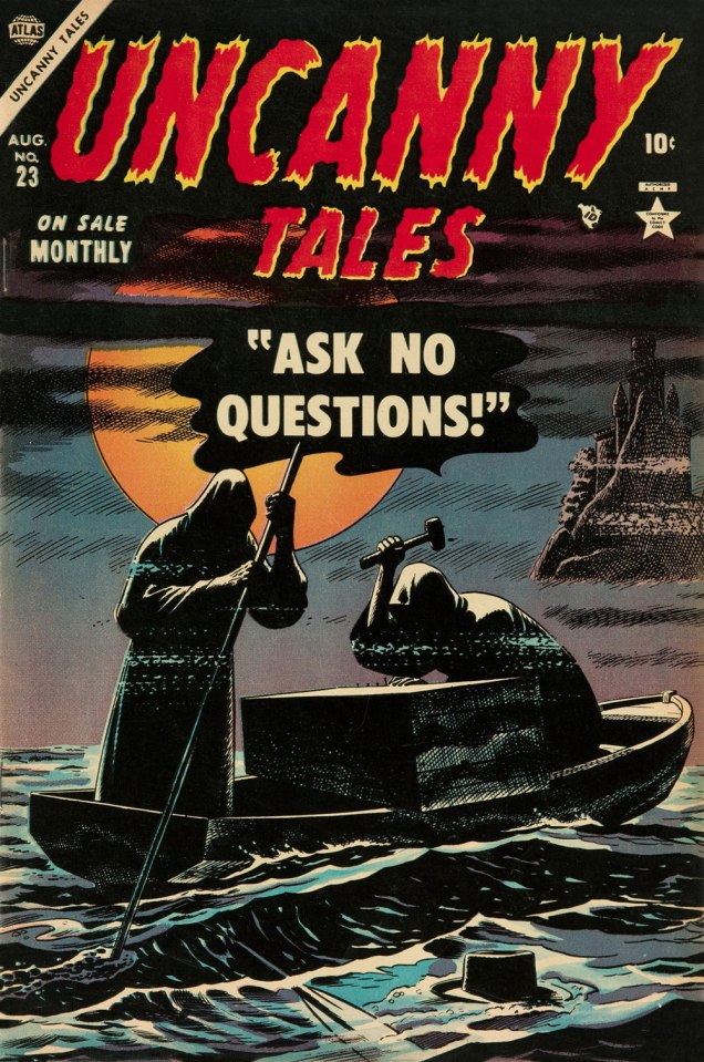
This is Uncanny Tales n. 5 (Feb. 1953, Atlas), cover art by Bill Everett, colours — consistently fine! — presumably by Stan Goldberg in all cases.This is Uncanny Tales n. 6 (Mar. 1953, Atlas), cover art by Bill Everett.This is Uncanny Tales n. 13 (Oct. 1953, Atlas), cover art likely a collaboration by Sol Brodsky and Carl Burgos.This is Uncanny Tales n. 17 (Feb. 1954, Atlas), cover art by Bill Everett.This is Uncanny Tales n. 18 (Mar. 1954, Atlas), cover art by Russ Heath. For a gallery of further Heath spookies, check out this entry from last year. This endearingly goofy one is Uncanny Tales n. 20 (May 1954, Atlas), with cover artist Robert Q. Sale giving it his best Joe Maneely imitation.Surely the leading candidate for “Most understated Marvel cover of the 1950s”… if not of all time. Stan must have been away from the office. This is Uncanny Tales no. 23 (Aug. 1953, Atlas); Art by Russ Heath. I’m understandably reminded of that old-timey jibe, « Walk East until your hat floats ».This is Uncanny Tales n. 27 (Dec. 1954, Atlas), cover art by Max ‘Carl Burgos‘ Finkelstein.And one post-Code entry, since it’s so outstanding. This is Uncanny Tales no. 48 (Oct. 1956, Atlas), Another subtle one by Russ Heath, but in a totally different register. Kudos!
« His deadline-flouting attention to detail was so ambitious that, whenever one of his jobs was delivered, editor Archie Goodwin reported, everyone gathered around to see what “that crazy bastard Heath” had done. » — Michael Dean
In my opinion, Atlas comics generally weren’t very good. But they remain fascinating because of one impressive asset: the line boasted no less than four absolutely top-notch cover artists, namely Joe Maneely, Bill Everett, John Severin… and Russ Heath. It may seem like nothing, but that was a truly phenomenal assemblage of talent in one place at one time. However, the writing was pedestrian and the second-stringers were, well… second-rate. But oh, some of those covers…
Today, we’ll coyly peek at some of Mr. Heath’s horror covers.
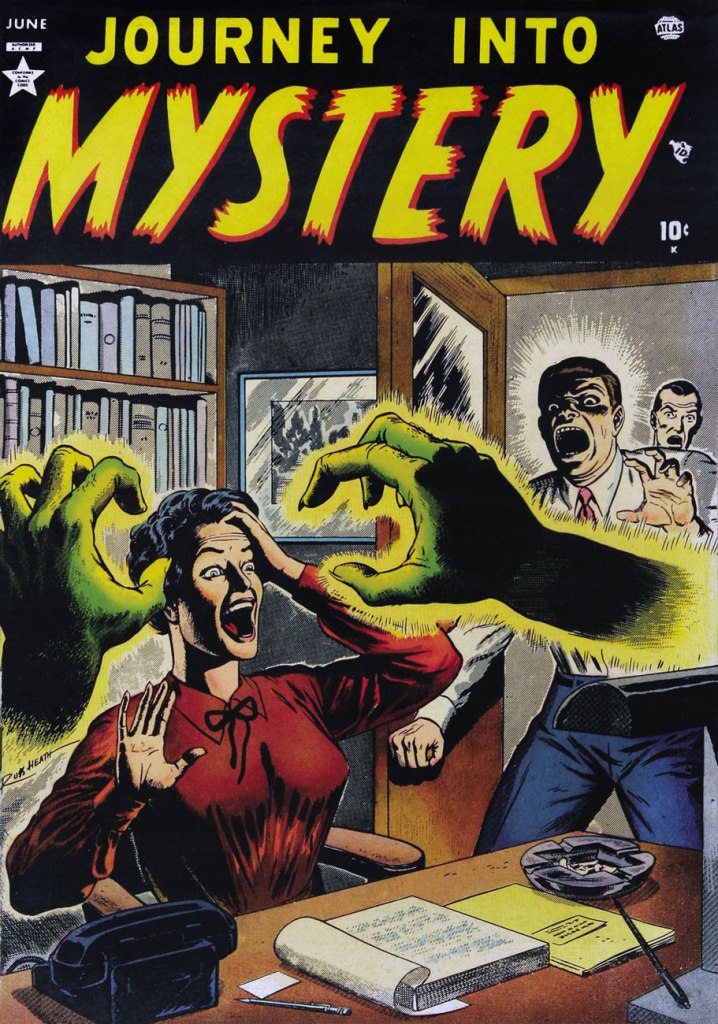
This is Marvel Tales no. 104 (Dec. 1951, Atlas); colours, in every case, by Stan Goldberg.This is Astonishing no. 9 (Feb. 1952, Atlas).This is Suspense no. 14 (Feb. 1952, Atlas). This one’s especially intriguing: there’s so much going on, yet it’s not overly busy… the mark of a first-rate cover designer.This is Journey into Mystery no. 1 (June 1952, Atlas). By now, I have a sneaking suspicion that Mr. Heath liked his ladies… on the buxom side.This is Adventures into Terror no. 11 (Aug. 1952, Atlas).This is Spellbound no. 3 (May 1953, Atlas). Yes, it’s the worm.This is Strange Tales no. 18 (May 1953, Atlas).
« Drinking your own blood is the paradigm of recycling. » — Gary Busey
Say, isn’t there something… sorta quaint about that cover?
In the 1970s, while DC and Charlton consistently provided all-new material*, Marvel quickly switched to an all-reprint formula (the better to save money whilst flooding the market, my dear!), sometimes even on the covers, with some amusingly inappropriate updates at times.
This is Dead of Night no. 2 (Feb. 1974). Alterations by unknown hands. Only one issue of this title would feature new material: its eleventh and final issue (introducing The Scarecrow); this number, however, reprints pre- and post-code Atlas stories from 54-56.
This is Marvel Tales no. 125 (July 1954, Atlas); cover art by Harry Anderson. The milky semi-transparency is a nice touch.
Okay, here are another pair of before and afters:
This is Tales to Astonish no. 34 (Aug. 1962, Marvel). Cover pencils by Jack Kirby, inks by Dick Ayers. Hardly a classic, not to mention that it lazily recycles the story’s opening splash. It’s also a textbook demonstration of what I dislike about Marvel colouring in the Silver Age: I’m guessing it was company policy to leave the backgrounds mostly in grey to make the characters ‘pop out’. A sound commercial policy, perhaps, but artistically, it seems pretty stale to me.
This is Monsters on the Prowl no. 29 (Aug. 1974, Marvel). A classic instance of John Romita‘s alteration-happy art direction. Making the protagonist a woman and adding a witness are both dishonest touches, for what it’s worth. On the plus side, I do like the lightning bolt (good use of existing space!), and the colouring is a marked improvement. Edited by Rascally Roy Thomas.
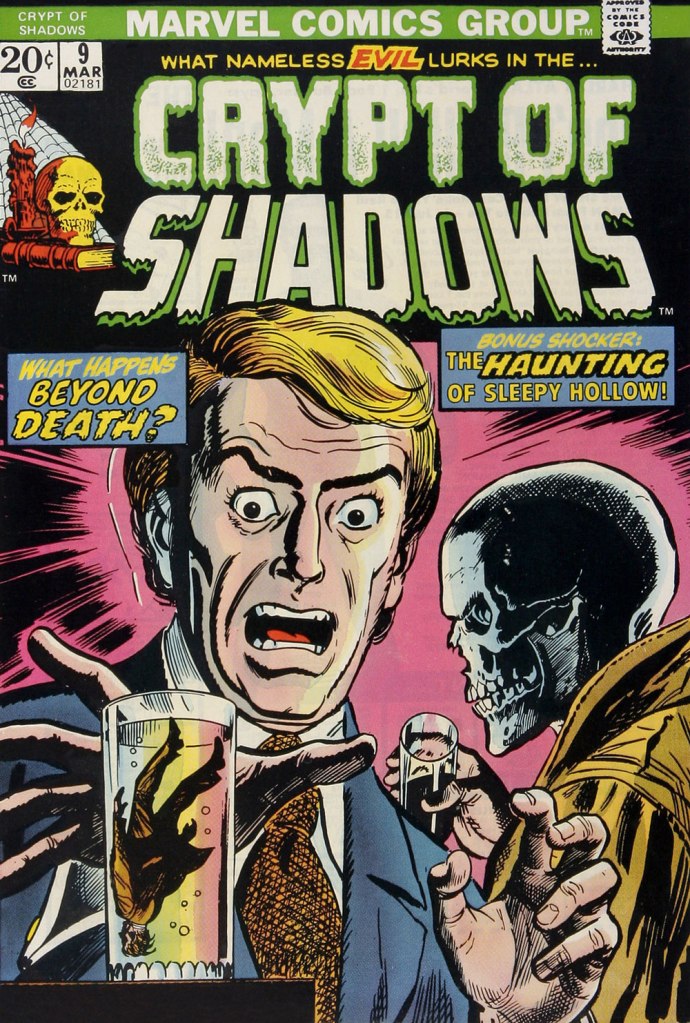
This is Mystic no. 30 (May, 1954, Atlas); colours by Stan Goldberg. A striking cover by Russ Heath…
… is, if not ruined, then at the very least diminished by clumsy and pointless updates, including the removal of Heath’s signature (although upon seeing the ‘improvements’ perpetrated upon his work, he might have opted for the comics equivalent of an ‘Alan Smithee‘ or ‘Cordwainer Bird‘ credit). This is Crypt of Shadows no. 9 (Mar. 1974, Marvel). Alterations, once more, by unknown, guilty hands. Also edited by Roy Thomas (just so you know who’s responsible).
-RG
*and if and when they didn’t, they’d tell you! Not so with Marvel. As for Gold Key, they would just pretend the material was ‘reprinted by popular demand’.
« A knot you are of damned bloodsuckers. » — William Shakespeare
One of my favourite Atlas mood-masters was Anthony Lewis “Tony” DiPreta (July 9, 1921 – June 2, 2010); it appears Mr. DiPreta and his colleague Murphy Anderson share not merely a birthday, but a day of birth as well.
Tony DiPreta’s long career in comics began with his arrival at the “Busy” Arnold studio, with his first credits appearing in early 1942. He worked extensively for Hillman Periodicals, handling such features as Airboy (yay!), Skinny McGinty, Flying Dutchman and Stupid Manny; Lev Gleason Publications (various crime stories and The Little Wise Guys); and of course Atlas Comics, where he chiefly, but not exclusively, cut loose on moody-but-not-gory horror stories, often with a finely-turned streak of gallows’ humour.
Tony survived the post-Code near-collapse of the comics industry when he succeeded Moe Leff on Ham Fisher‘s Joe Palooka strip, which he carried until the feature’s final curtain in 1984. In the 1970s, he also did a bit of moonlighting for Charlton, contributing to a couple of issues of The Flintstones spin-off The Great Gazoo. In 1994, DiPreta took on another venerable, long-running newspaper strip, medical soap opera Rex Morgan, M.D., until his well-earned retirement (DiPreta’s, not Morgan’s) in 2000.
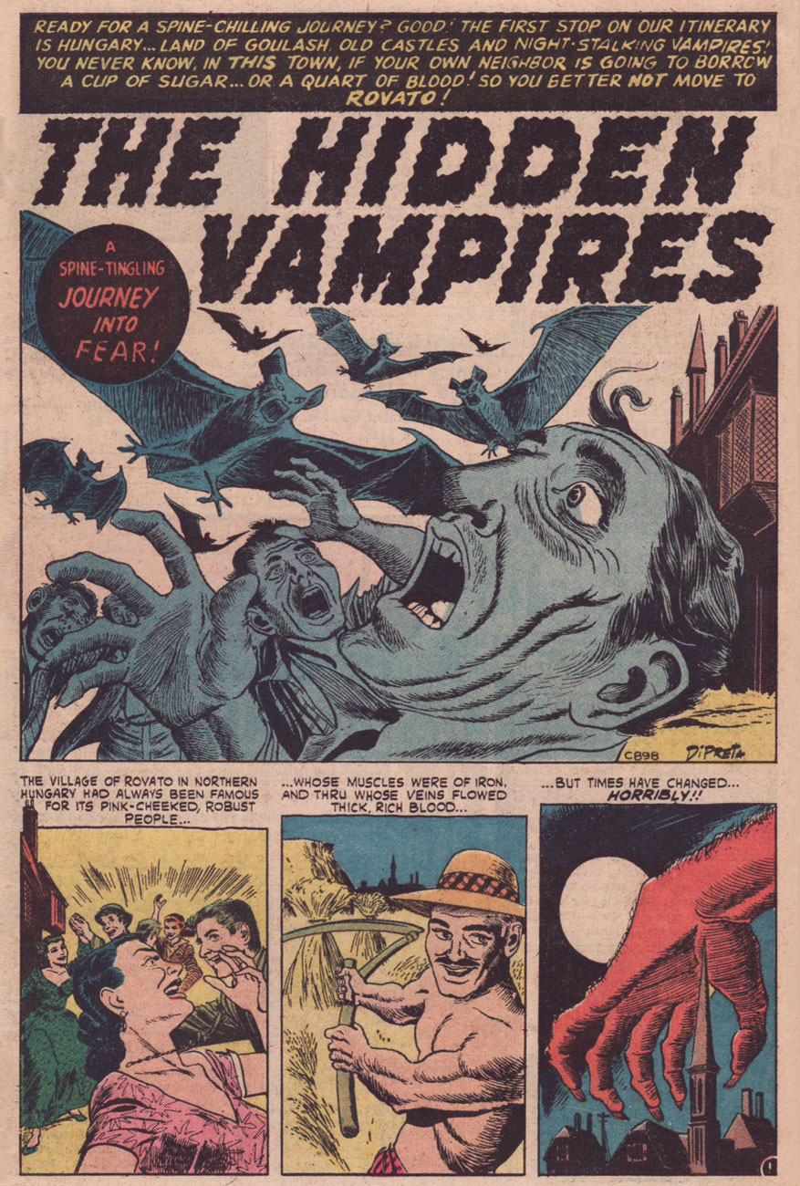
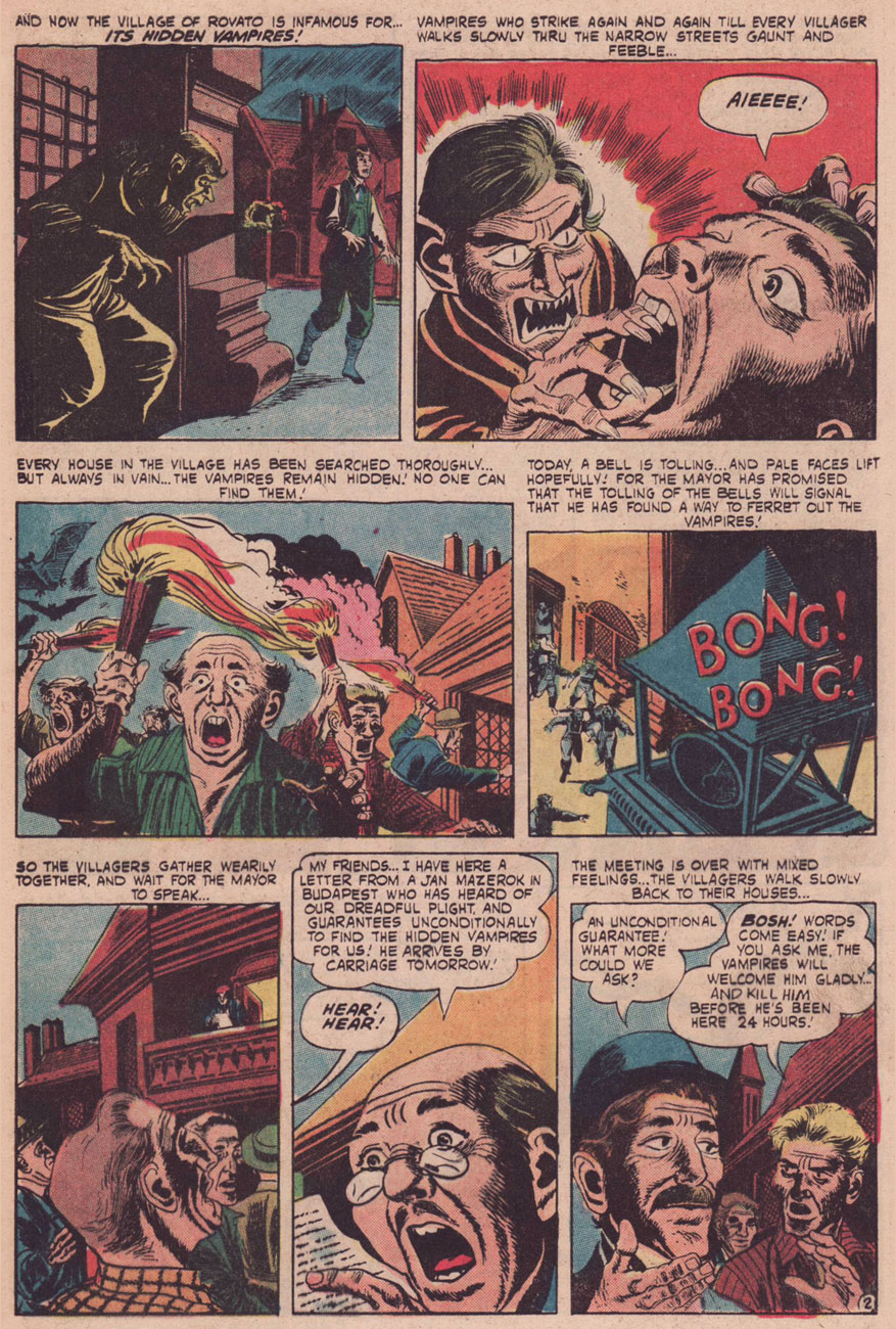
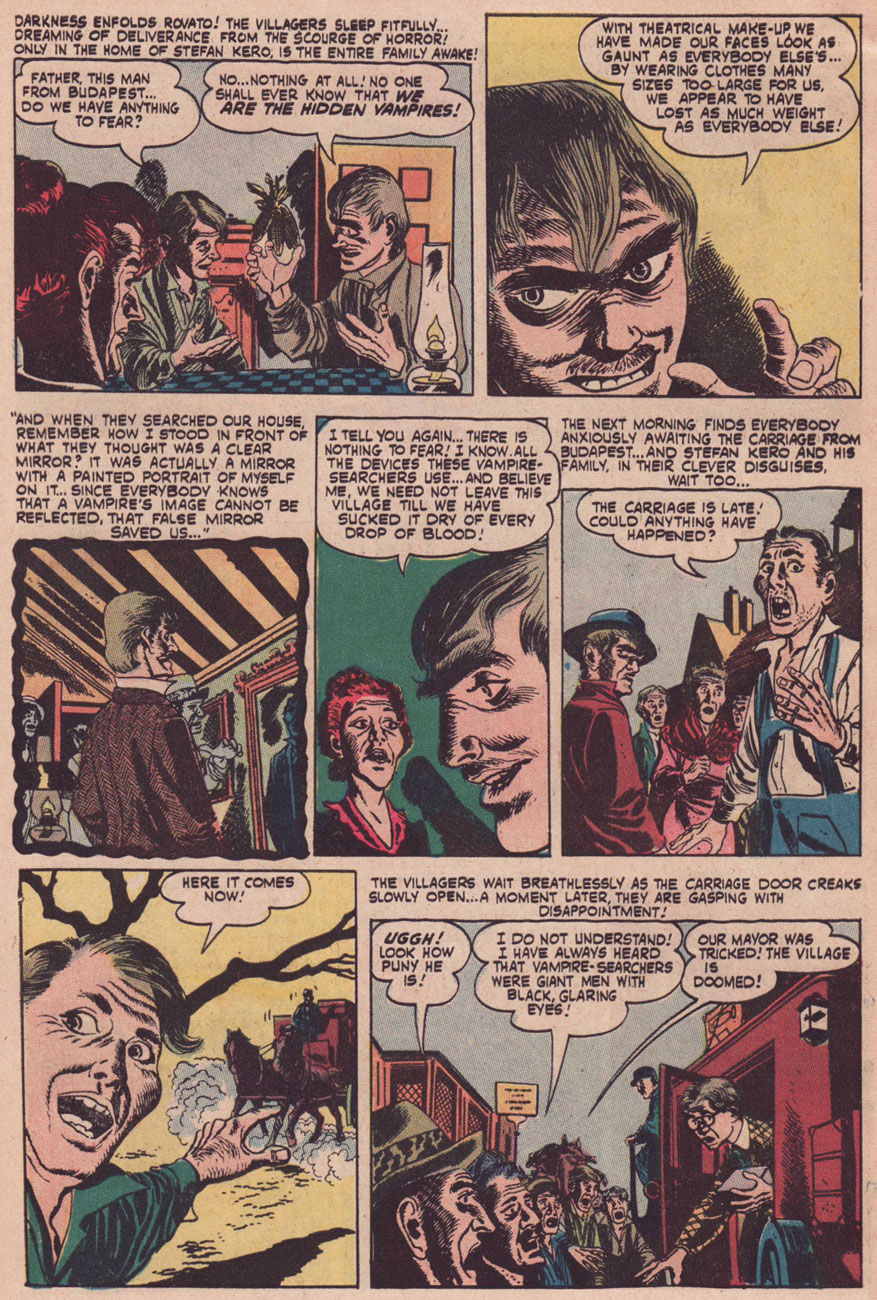
For your reading pleasure and mine, I’ve selected this adorably wacky tale from Atlas’ Journey Into Mystery no. 11 (August, 1953). Writer unknown, which is a shame.
Well, I suppose it might have been simpler to see who wasn’t around in the daytime, but let’s face it, Mazerok’s method is far more entertaining and original.
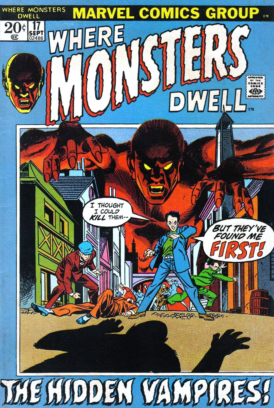
The story was reprinted in Where Monsters Dwell no. 17 (Sept. 1972, Marvel); though cover-featured, the cover itself was a lacklustre job by an overworked and uninspired Gil Kane, stuck here with Vinnie Colletta, though to be fair, there’s nothing here to ruin. Beyond the cover, the insides are great: two Ditko stories (« I Opened the Door to… Nowhere! » and « The World Beyond », a low-key Russ Heath (« If the Coat Fits », also from JIM 11), and our featured yarn.
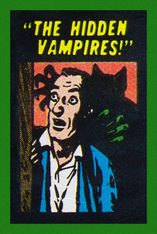
Now that’s more like it! The Hidden Vampires‘ original place of appearance, Journey Into Mystery no. 11 (Aug. 1952, Atlas), boasts a just-about-classic cover by Russ Heath, with a fine colouring job by Stan Goldberg.
Heath did a lovely job with the small space allotted to preview the other stories. Pre-Code Atlas books were graced with a clever and attractive cover grid.
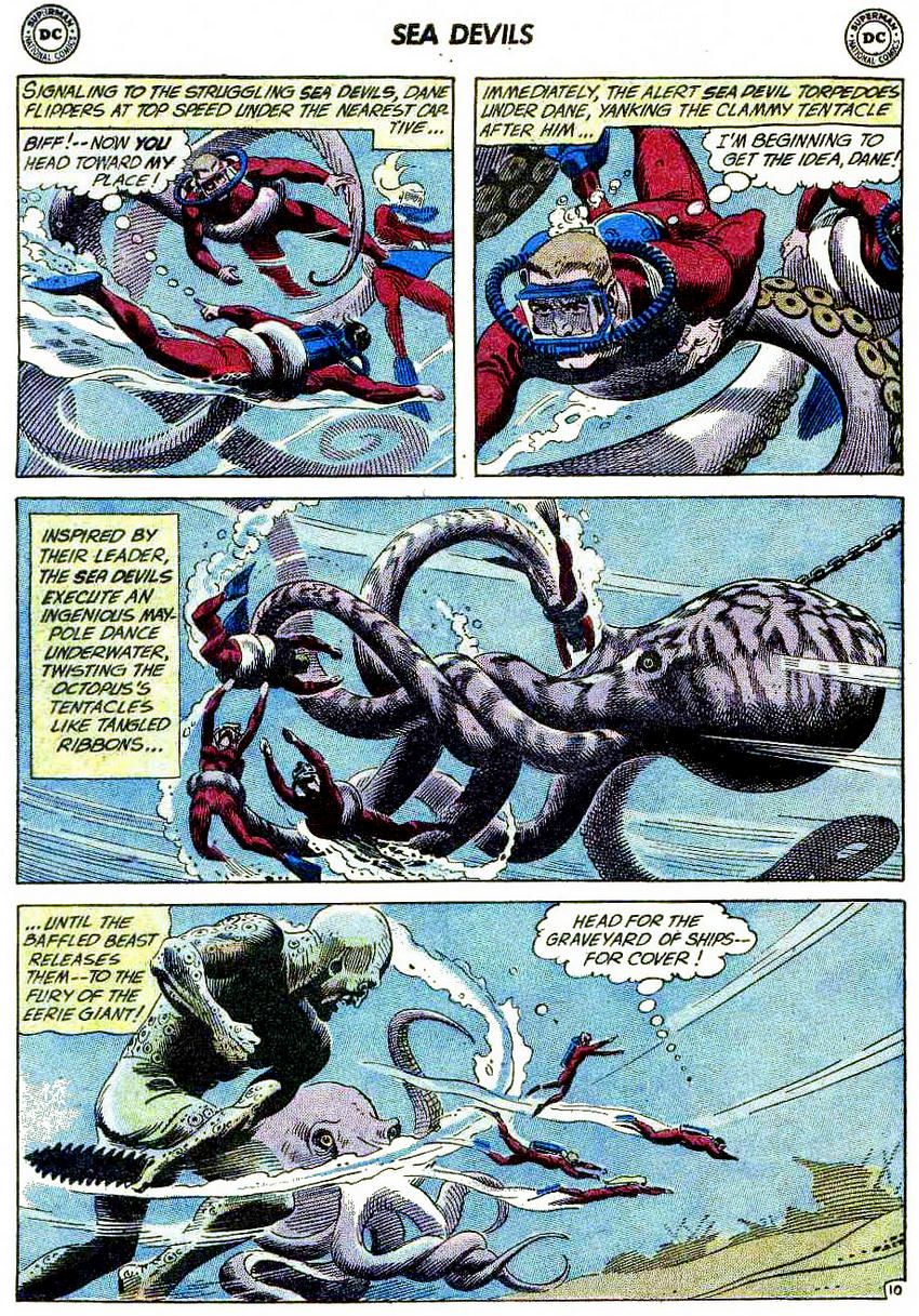
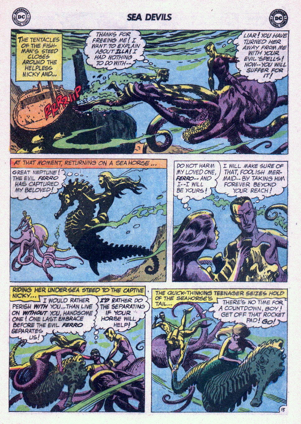
Sea Devils no. 1 (September-October 1961). Cover by Russ Heath.
The Sea Devils vs. the Octopus Man! is scripted by Robert Kanigher and illustrated by Russ Heath.
The same team returns to tentacles with Sea Devils no. 6:
The Flame-Headed Watchman!, scripted by Robert Kanigher and drawn by Russ Heath, was published in Sea Devils no. 6 (July-August 1962).
Now we unfortunately have to leave Heath behind and walk over to the territory of Howard Purcell, whose art is not nearly as striking, but still quite serviceable.
Sea Devils no. 17 (May-June 1964), cover by Howard Purcell.
The Impossible Maritime Menacesis scripted by Arnold Drake, penciled by Howard Purcell and inked by Sheldon Moldoff.
Sea Devils no. 19 (September-October 1964), cover by Howard Purcell. Is it just me or does the guy on the left look like a Ditko villain?
The Sea-Devil Robots is penciled by Howard Purcell and inked by Sheldon Moldoff.
Sea Devils no. 21 (January-February 1965), cover by Howard Purcell.
The Forty-Fathom Doom!, scripted by Jack Miller, penciled by Howard Purcell and inked by Sheldon Moldoff, boasts quite an assortment of tentacles:
Everybody is almost in identical position as on the cover – but the octopus has lost his baby blues and gained a pair of poached eggs.
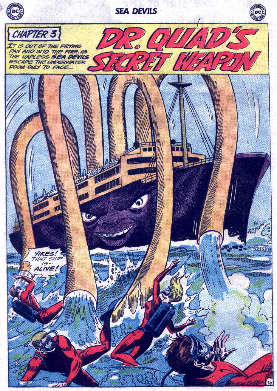
And, in case you’re wondering where that quote at the top of this post comes from… The ‘heh, heh’-ing octopus is Dr. Quad.
Occasionally, I notice a comic book cover with a tentacled monster so peculiar that one starts wondering whether the artist was on drugs or just couldn’t give a shit. That is not a criticism, however: where grabby appendages are concerned, the weirder, the better. Even if some of these guys have a face (muzzle? rictus?) even a mother couldn’t love, or their anatomy defies all laws of biology, we’ll welcome them with open arms!
As usual, in chronological order.
First in our line-up is this little fella in a hat. At least he looks like he’s wearing a cap, although perhaps he just has a square head with a skin flap hanging over the sides. At first glance, his tentacles are hollow, although their flesh is probably just a dull shade of battleship grey. So what’s this “thing that waited”? Soviet soldiers who are actually alien invaders. Duh.
Adventures Into Weird Worlds no. 3 (March 1952), cover by Joe Maneely.
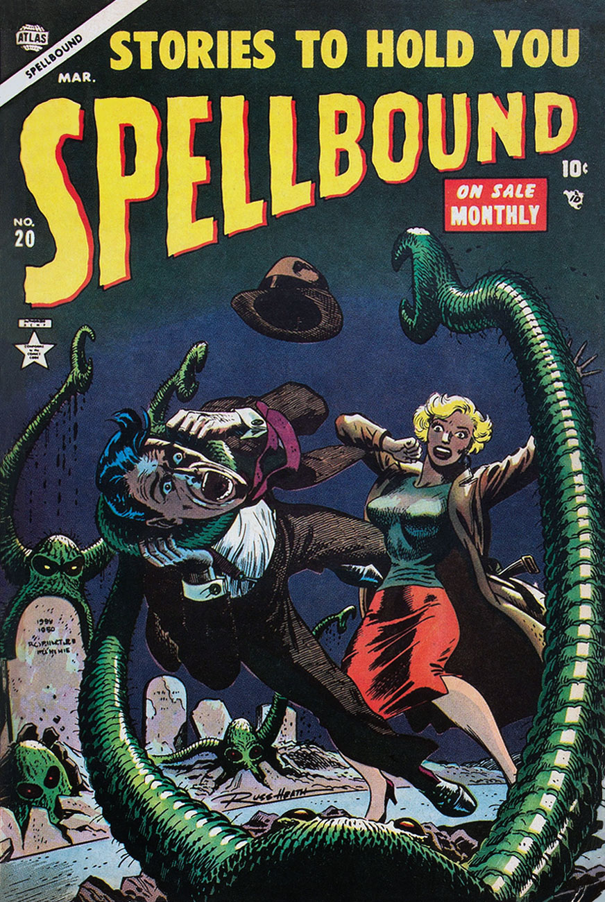
This next cover is probably a little more standard for pseudo-octopus fare: a lady with huge, ahem, bazooms (Russ Heath liked ’em busty, it seems – seriously, just look at the size of those things!) threatened by some horrific monster who’s dispatching her companion as expediently as possible. Still, the somewhat Wolverton-esque, grave-dwelling aliens with pincers at the end of their tentacles are odd-looking enough to squeeze their way into this post.
Spellbound no. 20 (March 1954), cover by Russ Heath.
This toupee-clad creature with evil gimlet eyes doesn’t look much like a pet, if you ask me. How are those grabby little arms attached to its head, anyway? Wait, who am I talking about, again? 😉
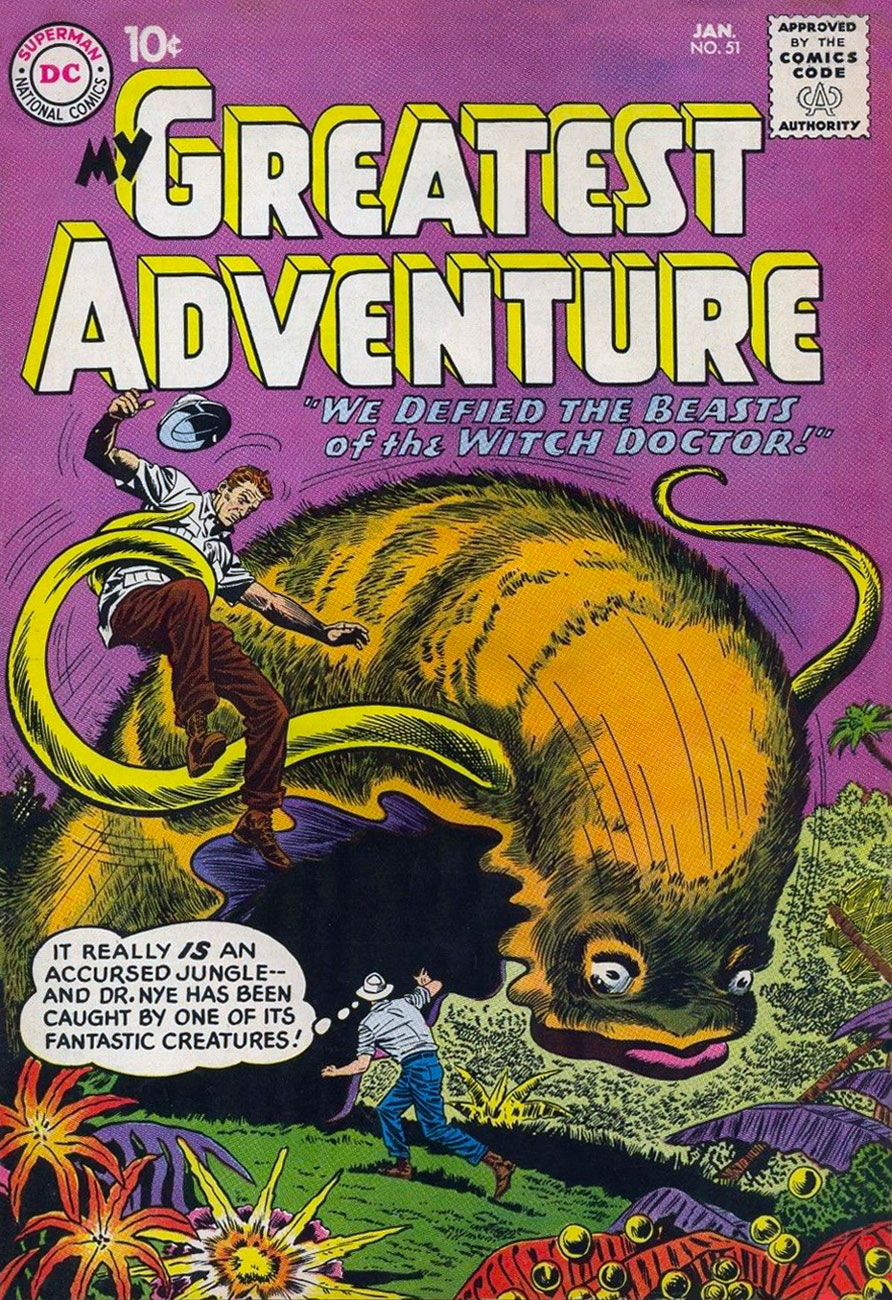
“My Greatest Adventure” was a title that promised much, and it must have been difficult to live up to it every month. Witness the following “fantastic” creature – a furry slug with disturbingly fleshy lips and tentacles. I can’t vouch for my reaction had I been an excitable ten-year old, but to this blasé adult, the poor beast summoned by some psycho witch doctor (the jungles seem to be always overrun with them) is just begging to be put out of its misery.
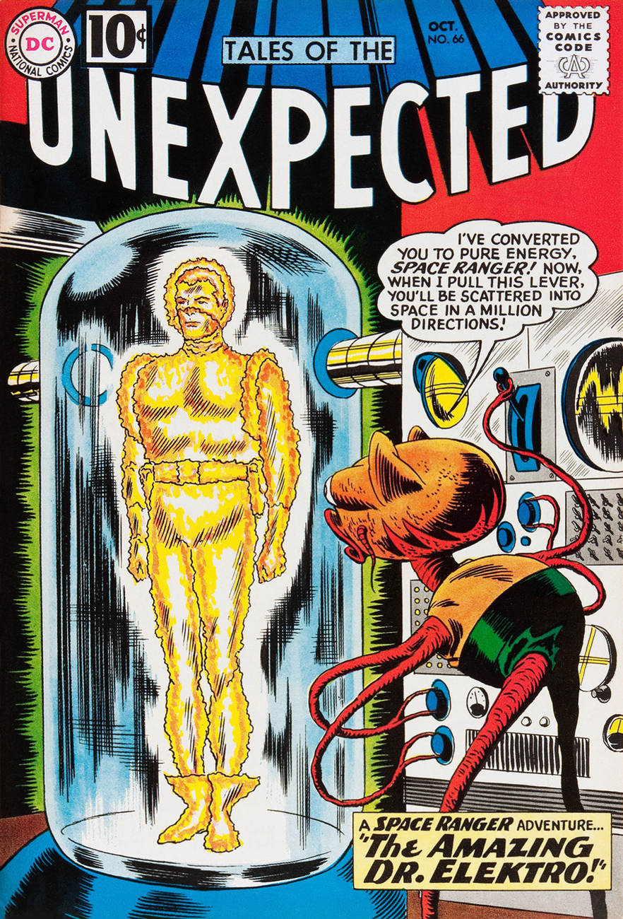
Our next exhibit finally features a proper alien, one who looks strange but at least makes sense as a unified, functioning creature. I love his sadly drooped whiskers, his dejected expression that’s strangely at odds with his pontifical speech.
Tales of the Unexpected no. 66 (October 1961), cover by Bob Brown.
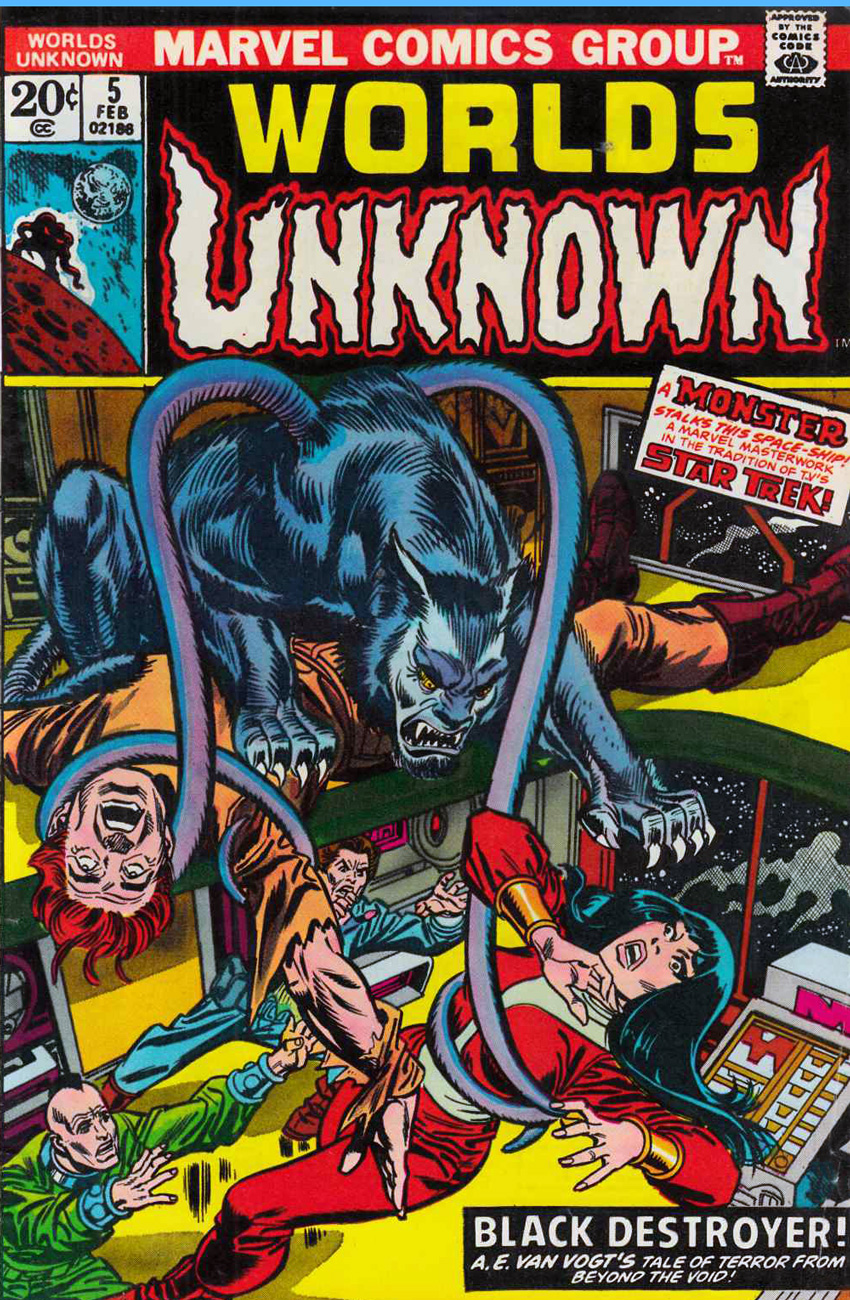
« Make him a werewolf! But in space! And give him tentacles! » Yeah, guys, that went over really well. A Marvel Masterwork, my ass. But wait: Black Destroyer! is an adaptation of A. E. van Vogt’s short story from 1939. And did Cœurl, the black cat-like creature, have tentacles in the story? Why, yes, he did.
« His great forelegs—twice as long as his hindlegs—twitched with a shuddering movement that arched every razor-sharp claw. The thick tentacles that sprouted from his shoulders ceased their weaving undulation, and grew taut with anxious alertness. Utterly appalled, he twisted his great cat head from side to side, while the little hairlike tendrils that formed each ear vibrated frantically, testing every vagrant breeze, every throb in the ether. » (read the full story here.)
Worlds Unknown no. 5 (February 1974), cover pencilled by Gil Kane and inked by Frank Giacoia. Cœurl looks like he’s floating on top of the corpse – I don’t think the artists spent too much time watching an actual cat at work.
My last offering for today is the cutest, featuring an adorable blue varmint who gets my full sympathy and support. Weird? Sure, a bit – he’s got a tentacle sprouting out of his forehead – but beauty is in the eye of the beholder, right? This cover also proves that monsters are just as interested in tooth-whitening procedures as us humans.
« Look! An undersea monster! Spearing that torpedo like it was a sardine! It’s a nightmare! »
Writer-editor Bob Kanigher, flanked by artists Ross Andru and Mike Esposito, drew first blood in « The War that Time Forgot », chronicled in DC’s Star Spangled War Stories beginning with issue 90 (May, 1960). The idea was scarily basic, but it was an irresistible premise, at least where young boys were concerned: let’s face it… soldiers vs dinosaurs. How might a T-Rex fare against a bazooka charge? Well…
The only time the series (what I’ve read of it… Andru and Esposito are no dream team of mine) did anything for me was a tale about two soldiers, one American and the other Japanese, stranded together on « Monster Island » and having to save each other’s sashimi. And this was before Lee and Toshirô got together on their own little slice of Hell in the Pacific, yet! I enjoyed the human interest aspect of the tale.
While I, like pretty much any other kid, was fascinated by dinosaurs early on, I quickly soured on inaccurate and fanciful depictions of the beasts. The War That Time Forgot is just one long, tedious dino-butchering exercise, be they harmless herbivores or kill-frenzied carnivores. Piss-poor palaeontology, that. Give me King Kirby‘s Devil Dinosaur any old time instead: that series runneth over with surreal, freewheeling fun, with nary a claim to accuracy in sight or in mind.
Ahem. The WTTF ran its course in SSWS until issue 137 (February-March, 1968), and was replaced by the far more nuanced Enemy Ace by Kanigher and Joe Kubert. Their all-time high, arguably in the case of Kubert, and without the faintest shadow of a doubt in Kanigher’s case.
So why am I writing about this series if I care so little about it? Well, when Andru (meh) or Kubert (great, true to form) weren’t handling cover duties, Russ Heath was. And while I’m fairly unmoved by Heath’s skill as a storyteller (too static, too measured), he was a first-rate cover artist, most strikingly for DC’s 1960s war books (and hey, Sea Devils) and Atlas’ 1950s westerns and horror titles.
So, in fond remembrance of Mr. Heath, who left us last week at the age of ninety-one, here’s a gallery of his Star Spangled War Stories covers featuring The War That Time Forgot. Thank you, sir.
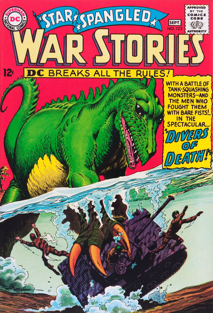
Star Spangled War Stories no. 122 (Aug. – Sept. 1965). Grey toning and colour by Jack Adler.
Star Spangled War Stories no. 123 (Oct. – Nov. 1965). Dinosaurs love those orange skies, which set off their scales to fine advantage.
Star Spangled War Stories no. 130 (Dec. 1966 – Jan. 1967). The first Japanese-American “Enemy Mine” team-up, but the Japanese guy gets no redemption before dying. Grey toning and colour by Jack Adler… probably my favourite cover of the lot.
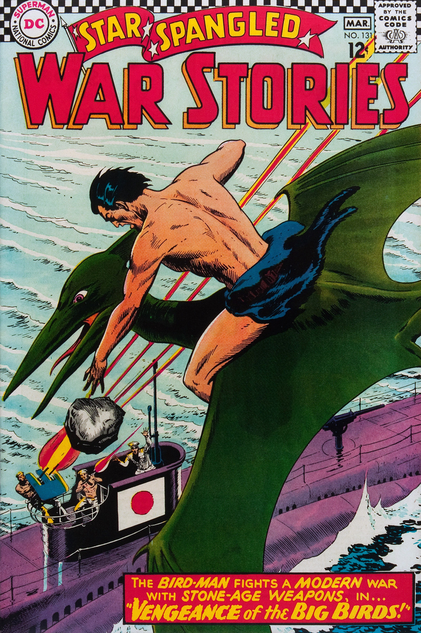
The Bird-Man provides a new wrinkle to bloodthirsty war criminal Curtis LeMay‘s « Bomb them back to the Stone Age » pronouncement. Star Spangled War Stories no. 131 (Feb. – Mar. 1967).
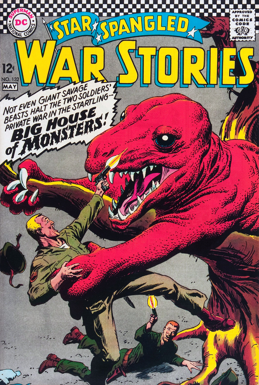
Star Spangled War Stories no. 132 (Apr. -May 1967).
Star Spangled War Stories no. 133 (June – July 1967).
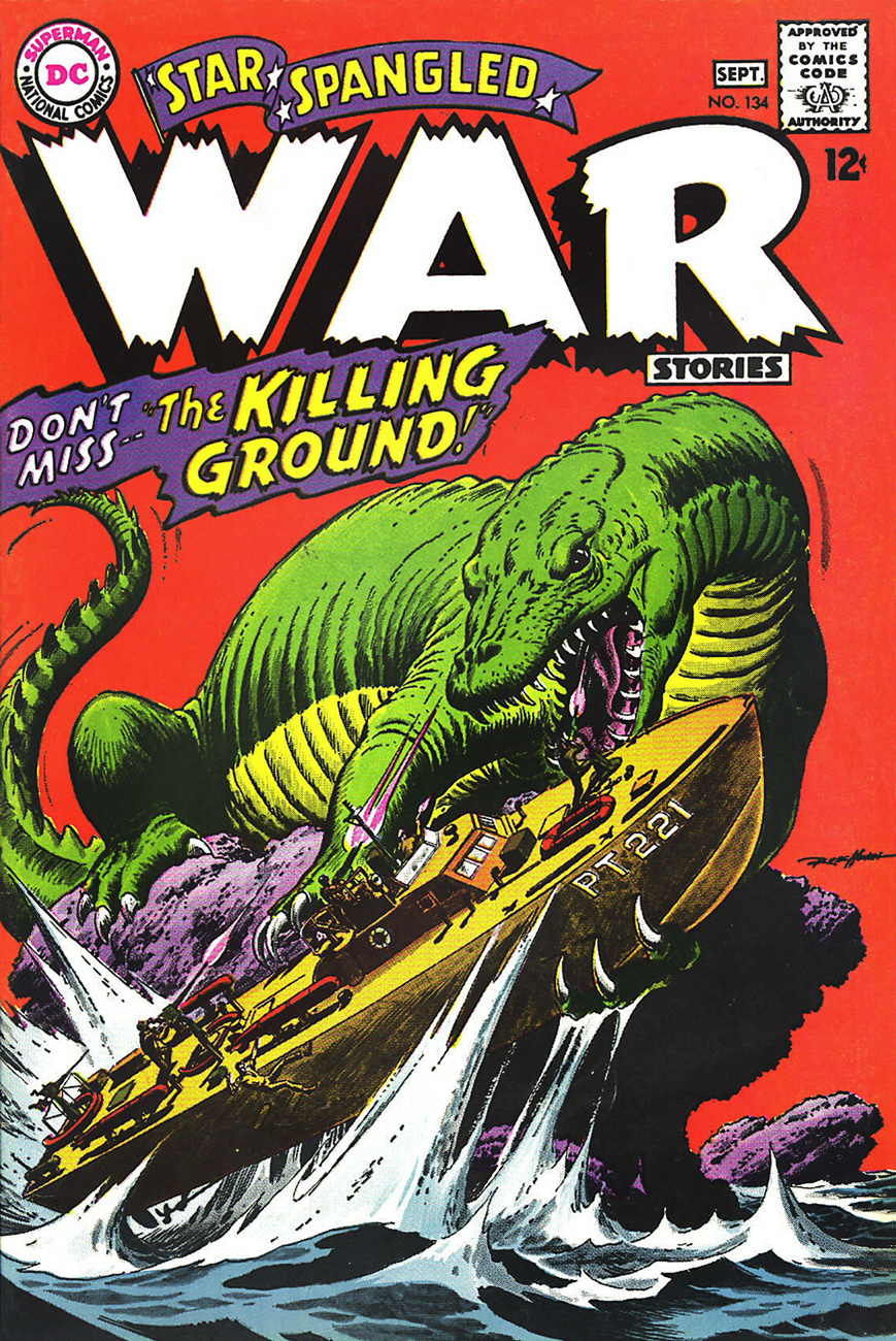
Star Spangled War Stories no. 134 (Aug. -Sept. 1967). Once more, grey toning and colour by the indispensable Mr. Adler.
Star Spangled War Stories no. 135 (Oct. – Nov. 1967).
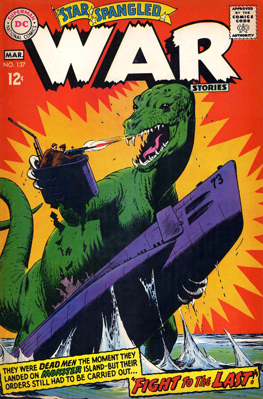
Last call! Star Spangled War Stories no. 137 (Feb. -Mar. 1968).
Addendum to SSWS 131: apparently, « Bird-Man » started a trend, as everyone and his distant ancestor soon was riding a Pteranodon of his own. To wit: Tomahawk #109 (Mar. – Apr. 1967… just a month later).
What do dinosaurs care about the American Revolutionary War? And yet the poor, noble Pteranodons all perish in the end… « for the cause » . Tomahawk no. 109 (March-April 1967), cover art by Bob Brown.
« Newly dead, the gases of decomposition moving in the stomach… moving the body like a rag doll whose lips flutter and belch… »
Atlas anthology Men’s Adventures (25 issues, 1950-54) was a pretty schizoid entity, with an editorial emphasis waffling from your typical would-be rugged he-man stuff (issues 4* to 8) to battle action (9 to 20) to mild horror (21-26) to, as a last resort, superheroes (27-28).
Russ Heath delivers his usual fine job for Men’s Adventure no. 26 (March 1954, Atlas). I like the matching green outfits on the cadavers. Yay, team!
In the mid-1970s you could tell that Marvel was running low on reprintable pre-Code material when items from Men’s Adventure began to pop up in its mystery anthologies.
Our cover story turned up then in Chamber of Chills no. 20 (Jan. 1976) announced by this ridiculous Ron Wilson/Dan Atkins cover. There’s a Broadway musical in there, I swear.
Since this was 1970s Marvel, the corpse is not only well-preserved, he’s buff as it gets. For comparison, read “Midnight in the Morgue” (writer unknown, art by Dick Ayers), with our thanks and a fond tip of the hat to The Horrors of It All blog.
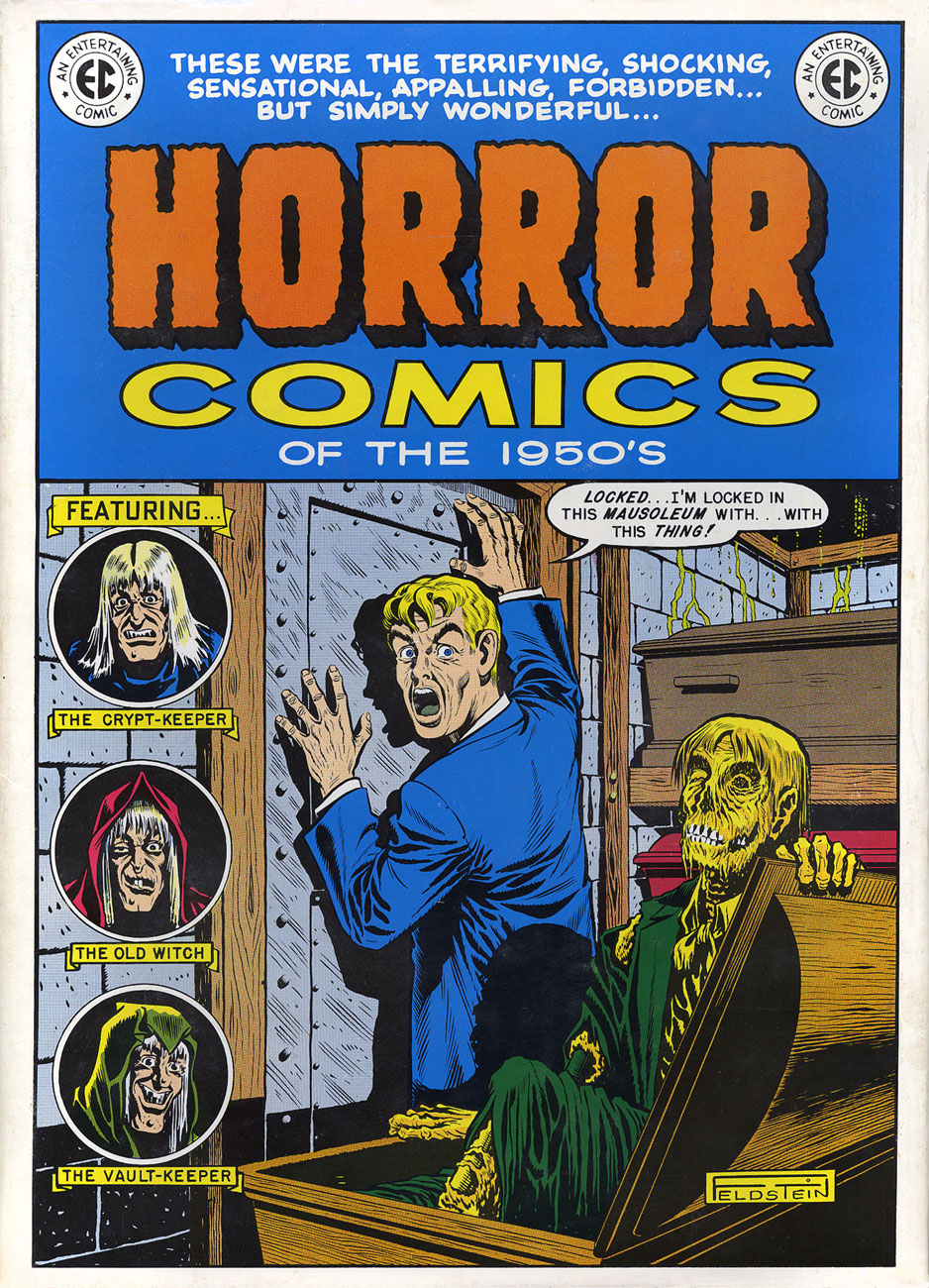
A more haunting variation on the “trapped in the morgue with the not-quite-dead” theme is Nostalgia Press’ historically significant Horror Comics of the 1950’s (1971, edited by Bhob Stewart, Ron Barlow and original publisher Bill Gaines), which gathered, in full colour, 23 EC classics, including one previously unpublished story, An Eye for an Eye. The cover revives (ha!) Al Feldstein’s Tales From the Crypt no. 23 art from 1951.
Like many fellow modern-day EC Fan-Addicts, this book first came to my attention through the Captain Company catalogue that occupied the back pages of Warren Magazines. So many elusive, haunting grails… many of them turning out to be great beyond all reasonable expectations.
*the actual first issue… typical 1950s comics numbering scheme.