Take Ten With Shel Silverstein

« Join the army and see the next world. » — Dylan Thomas

A couple of eternities ago, in Shel Silverstein: Without Borders, we profiled you-know-who and showcased the travel cartoons he produced for Hugh Hefner and Playboy Magazine. Now, we reach back even earlier, to his first stirrings as a professional cartoonist… and a lifelong rover. As it would turn out, Shel truly was a free spirit.

A little bit of biography to set the stage… circa 1955. I can just about hear him, in that distinctive voice of his, hawking hot dogs at Comiskey Park!
« In 1955, Stars and Stripes published Take Ten, a book collection of his cartoons that was sold through military PXs et commissaries. » And also by mail!
« Here they are… the Centaurs and Bird men… the Geniis and Cobras… the fifteen-foot PFC’s and two-inch E-1’s. Here is TAKE TEN, the first collection of Shel Silverstein’s cartoons, taken from Pacific Stars and Stripes, Army Times and his untapped top drawer. Here is a pocket-full of cartoons that will make you smile and chuckle and laugh out loud. »

Lisa Rogak writes, in her A Boy Named Shel (2007, St. Martin’s Press):

Once he arrived in Tokyo, Shel was assigned to the Pacific Stars and Stripes to past up stories and photo features for the paper. When his work was done — which he performed as quickly as possible — he turned his attention to drawing cartoons using the material that was right in front of him: the military. Shel roamed the streets of Shinbashi, a neighborhood that GIs frequented that once served as the end of the line of Japan’s first railroad. He spent hours each day wandering the streets taking note of the activities of his fellow soldiers, which would invariably end up in one of his cartoons.

He initially did it for his own amusement, through within a few weeks, the paper began to print his work. After spending six months juggling newspaper paste-up with cartooning, he convinced his editors to take him off layout duties and allow him to wander the Far East and send back reports in the form of one-panel cartoons. They agreed.

Evidently, Mrs. Silverstein’s boy was a most charming and persuasive fellow. He would soon pull the same stunt on Hugh Hefner… but none can claim, in either case, that he failed to deliver on his lofty promises!

Here’s a little bit of background on that famous old General, should you need it.
Here’s a helpful guide to US Military acronyms. Who knows, it might spare you some confusion one day.

Even with his freedom, Shel had a hard time dealing with the restraints of army protocol. Corky Alexander, the late editor of the English language Tokyo Weekender, first met Shel at Stars and Stripes. “He was an army corporal and was perhaps the worst soldier in the history of armed might, down through the ages,” he said.
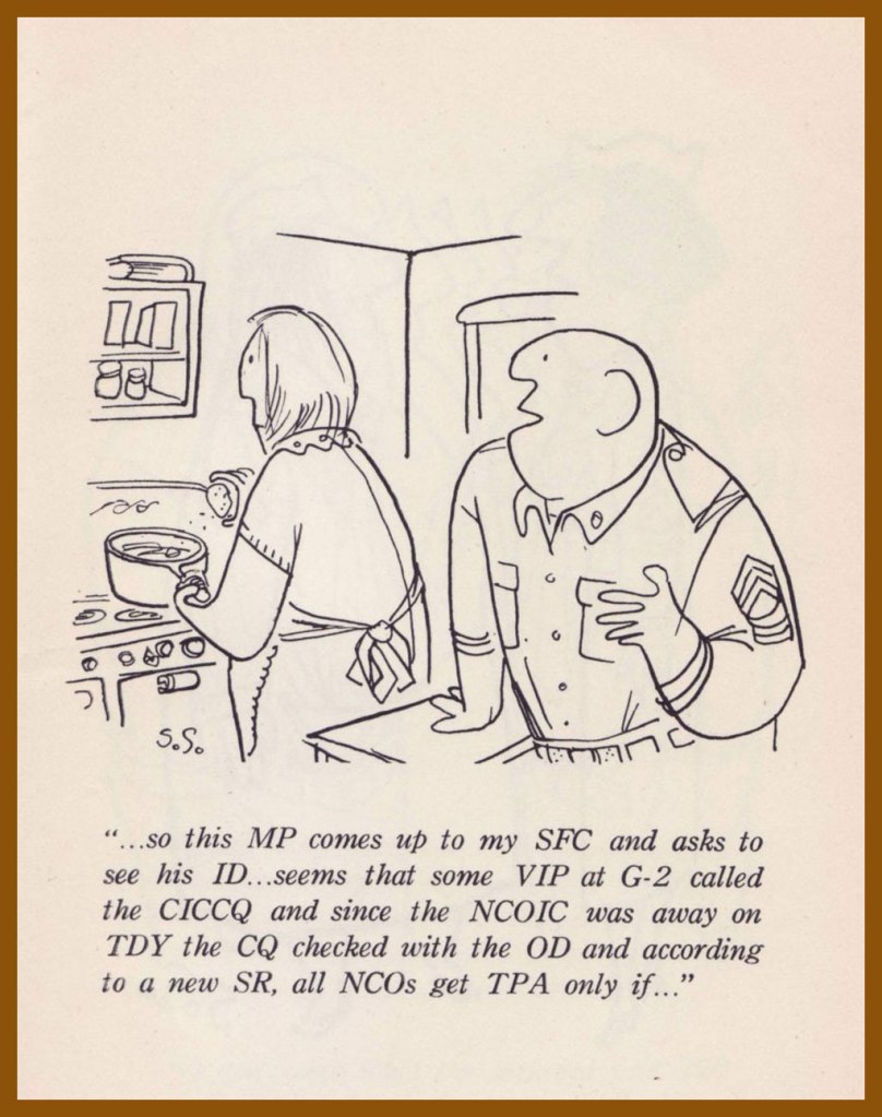
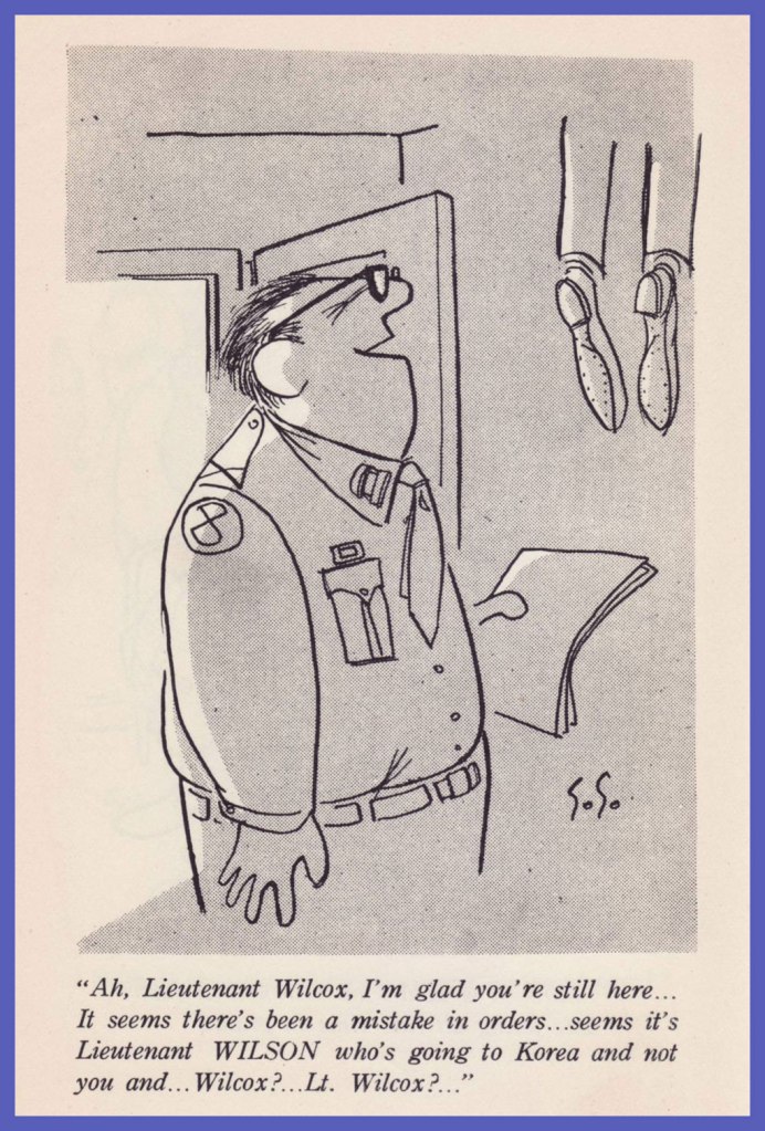
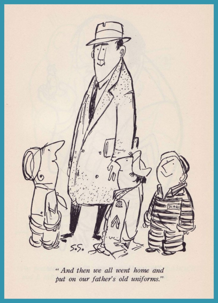
His technique followed a simple pattern. First he thought of an object — say, his first sergeant. He’d concentrate until he would come up with 20 or 30 gags on the one subject. Out of it came situations peopled by his long-nosed characters, his little men, his giants, the animals and the strange creatures for which he has a special affection.

His favorite overall targets were the officers. “They even made zebras off-limits to me because they had stripes,” Shel said.

Old habits die hard. An occupational hazard, you might say.
This, er.. pet might be an early prototype of Shel’s mythic Floobie Doobie Doo.
Now what is that?
It ain’t no dog and it ain’t no cat.
It’s nine feet tall with eyes of blue.
I never seen such a thing
As a thing called a Floobie Doobie Doo.
« Shel’s humor had struck such a nerve, and soldiers based in the Pacific shared his cartoons with their families and other civilians to show them what life in the military was really like, that a larger audience for his work was a natural consequence. In 1956, Ballantine Books published a thirty-five-cent mass market paperback edition of Take Ten called Grab Your Socks! »

In his foreword to Take Ten, Shel’s good buddy and PS&S colleague Bob Sweeney recounts:

In a letter to the home office, Bob Brown of the S&S Seoul Bureau wrote:
He stays up all night chewing pencils, drawing cartoons and writing ideas on little scraps of paper he never finds again. In the first twenty minutes he was here he had our little office more cluttered than the convention hall in his native Chicago.”

But,” added Brown, “he knows the people he draws. He’s lived through the same experiences and heard the same lines.

Here then are the simplicities as well as the subtleties — the obvious and the obtuse — the wonderful conglomerate of a man who loves to write, to draw, to create — and best of all — who loves to laugh.

-RG

Tentacle Tuesday: Educational Cephalopods

Today we bring you a selection of edifying cartons that will (hopefully) teach you something about our friends the cephalopods. Like how to check that you really are looking at an octopus, for instance: like with most things in life, just ask!

Cartoon published in Mad Magazine no. 486 (February 2008) The author, in all senses of the word, is our beloved Al Jaffee.

I like the idea of learning from comics, but stories written specially to teach children (or the occasional adult) moral lessons or scientific facts often end up incredibly boring, insultingly condescending, or painfully obvious. However, (gently) throw an octopus into the mix, and I’ll be willing to consider it!

Of course sometimes the octopus is the student, albeit an undressed one.

Treasure Chest Vol. 21 no. 4 (October 21st, 1965). The cover is by Pete Hironaka, born in California to Japanese parents. Treasure Chest of Fun & Fact was a comic book series that was Catholic-oriented and featured inspirational Christian stories and such, but also ran stories about science, history, and just plain adventure, emphasizing values like teamwork, honesty, etc. throughout. No, it’s not as boring as it sounds! Most of the stories weren’t at all preachy, just kind to their characters, which is something I really appreciate. The title was distributed throughout parochial schools from 1946 to 1972.

Are there tentacles inside? Well, yes!

I am slightly disturbed by how angry Murphy is at the octopus’ supposed ignorance (especially since he’s so blatantly wrong). Art by Pete Hironaka.
I wish octopus lobotomy wasn’t on the menu, but what can you do…

On the topic of classrooms – octopuses have to write essays, too, just like any old student Joe. It’s a bit hard to hold a pencil with a tentacle, though.

An illustration by Lynda Barry, 2018.

I’ve never watched SpongeBob SquarePants, because the idea of a protagonist who’s some sort of dumb-looking kitchen sponge (I’m sorry, “sea sponge”) has never appealed to me. It may be brilliant, for all I know. However, whenever I encounter a SpongeBob comic, I’m always surprised at how good the stories are. Given that the calibre of some contributing artists and writers (Ramona Fradon, Tentacle Tuesday Master Hilary Barta, WOT favourite Stephen R. Bissette, Tony Millionaire of Many Tentacles, the aforementioned Al Jaffee, Michael T. Gilbert… come on, it’s like a who’s who of comics talent), this is actually less astonishing than one might expect – and the fact that Stephen Hillenburg, the creator, managed to attract such talent speaks well of him. Another fact, namely that that he worked as a teacher of marine science at the Ocean Institute of Dana Point (California) and decided to create an educational comic book depicting the life of anthropomorphic sea creatures, confirms that he’s one cool (sea) cucumber.

A cephalopod installment of Flotsam & Jetsam, scripted by Maric Wicks and illustrated by Nate Neal. This page was published in SpongeBob Comics no. 9 (June 2012, United Plankton Pictures)

A final educational strip, although to be perfectly honest with you, a tad on the boring side. Mark Trail was created by Ed Dodd an eternity ago (which is to say, April 1946). Dodd was a national parks guide and (quite naturally, one would hope) an environmentalist, so his syndicated newspaper strip featured a lot of environmental disasters, mostly orchestrated by human hands (but the evil guys often received a satisfying punch in the mouth from Trail, a nature writer-cum-photographer – if only it were this easy in real life!)

This strip is from August 16th, 2020.

After passing through a few pairs of hands, the strip landed at the doorstep or artist James Allen, who began by assisting on the Sunday page in 2010, and formally took over in 2014, to continue until 2020, at which juncture he left his position by mutual agreement with the syndicate. After some years of reruns, Mark Trail is now continuing once again, this time with artist Jules Rivera at the helm.

I admire Dodd’s art and plotting, and in my opinion the others who have continued the strip in recent years (from 1978 and onwards) lack his doigté and his talent to various degrees. For example, take a look at the original art for the Sunday strip of September 25, 1955:

Clearly drawn by someone who loved and understood animals. Art by Ed Dodd.

Of course it doesn’t help that the recent Sundays had garish (by my assessment) colours. For a more detailed story of Mark Trail, head over to this Daily Cartoonist article.

~ ds

Off to the Isle of Cats — and Back by Teatime!

« It’s no good trying to teach people who need to be taught. » — Aleister Crowley

You may have happened across our earlier post on that astounding but tragically short-lived touche-à-tout, Gerard Hoffnung (1925-59). Well, here’s a look at another facet of the man’s work, crafted this time in tandem with, of all people, the definitive-but ambivalent biographer of opprobrious occultist and Ozzy song subject Aleister Crowley, namely the intriguing John Symonds (1914-2006). Come to think of it, the affiliation makes impeccable sense, and it proceeds swimmingly.

In an era where it often seems that those rare adults who yet read do so at toddler-ish levels, it’s easy to forget how many so-called children’s books of yore had plenty to offer the refined adult mind. Here, then, are some highlights from Messrs. Hoffnung and Symonds’ 1955 opus, The Isle of Cats.

« He closed his eyes, yawned, arched his back and began to dig his claws in and out of the sofa. Uncle Tom was no ordinary cat, for he could tell the time, look through a telescope (keeping one paw over the other eye, of course), beat up an egg, steer a raft, smoke a pipe and do many other things. »
« He’s the Mayor, » whispered Uncle Tom to Gabby, « so be nice to him. »
« He was still saying thank you as he and Uncle Tom were being driven away in the Mayor’s car, followed by various cats on bicycles, tricycles and penny-farthings. »
The wrestling bout pitting Tim the Terror (left) against The Furry Fury (right). Things end with a crash when Tim lets go.
« The Hall of Fame contained the portraits of the island’s most celebrated cats. »
« There were portraits of lots of other famous cats, including Martha who had seven hundred and forty nine children, six hundred and eighty three of whom survived, and were now working hard as tram-drivers, crossing-sweepers, lamp-lighters, pastry-cooks and so forth, with the exception of three who simply won’t work at all. »
« At the Orphanage, all the kittens were lined up on either side of the Great Hall, looking as good as gold, their hankerchiefs sewn to their shirts, close enough to their noses to blow into them. »
« Just then they sailed over the madhouse and saw some cats standing on their heads, waving their legs in the air. »
The book’s endpapers illustration, granting the reader a lofty view from the Mayor’s hot air (of course) balloon.

As a bonus, for the finale, here’s the poster Hoffnung was commissioned to illustrate for the classic, Brexit-anticipating 1949 Ealing Studios comedy Passport to Pimlico. [ watch the trailer! ]

Hoffnung’s loving widow, Annetta, wrote, in her 1988 biography of Gerard: « As he sat at his drawing board, increasingly involved and complicated fantasies tumbled from Gerard’s pen onto the paper. In 1949 came perhaps the most intricate of all, a drawing for the poster advertising a popular film of the day, Passport to Pimlico. I do not have the original design but it is unlikely to have been larger than 12″ x 15″, and to squeeze so much into so little space is no mean achievement. » I couldn’t find a trace of this image online, so I’m providing a nice ‘n’ large scan for you. Eat your heart out, Will Elder!

-RG

Tentacle Tuesday: The Tentacles Are Coming! The Werewolves Are Here!

« The tentacles had burned where they’d touched our skin… and the oozing slime they’d rubbed into the wound didn’t help. We panted and trembled »

I have little interest in werewolves, despite just having finished one in wool. I’d say I place them somewhere between Frankenstein’s monster (in which I have zero interest – sorry!) and Dracula (whom I am generally intrigued by, depending on whose version we’re talking about). Having said that, the bizarre concept of werewolf vs tentacles grabbed my imagination by its incongruity. “Grarr”, as the werewolf might say.

The author and her werewolf; he doesn’t have a name, yet.

The Giant-Size Werewolf may not be as rife in tentacles as the Giant-Size Dracula, but it has its moments. “A man, a woman… and rampaging hordes” has a certain nice ring about it!

A page from Tigra the Were-Woman!, published in Giant-Sized Creatures no. 1 (July 1974). Script by Tony Isabella, pencils by Don Perlin and inks by Vince Colletta.

When the Moon Dripped Blood!, scripted by Doug Moench and illustrated by Yong Montaño, was published in Giant-Size Werewolf no. 4 (April 1975):

Anybody would be startled by slimy tentacles coming out from under a robe… slimy and burning, at that.

Doug Moench continues his tentacle shenanigans one month later in Werewolf by Night no. 7 (March 1975).

Cover pencilled by Gil Kane (Tentacle Tuesday dabbler!) and inked by Tom Palmer.

The Amazing Doctor Glitternight was scripted by Doug Moench and illustrated by Don Perlin:

Likely beating all records for how much text you can cram into one splash page.
The “yecch-monster” awakens as Glitternight somehow manages to exude both light and darkness, and simultaneously nourish and feed. I get the impression somebody was paid by the word for this story.
Has the werewolf ever heard that “words are very unnecessary“? Was it essential to inform us that he might have been stunned, or maybe paralyzed, and it doesn’t matter anyway, as both are just words?

Next time the Werewolf encounters tentacles, it’s an epic, 2-issue tale of the desperate fight against ‘soul-eater’ Marcosa, an ectoplasmic wraith who occasionally takes a physical form and often deploys tentacles to do his dirty work for him.

Werewolf by Night no. 36 (January 1976). Cover Don Perlin.

Marcosa in Death (plot-spoiler: death is not actually involved) was scripted by Doug Moench and illustrated by Don Perlin:

Moral of the tale: don’t open doors when you don’t know what’s behind them.

Marcosa doesn’t quite die despite all the gnashing of teeth and ripping of tentacles, so the story continues to its grim conclusion in the next issue. The End, scripted by Doug Moench and illustrated by Don Perlin, was published in Werewolf By Night no. 37 (March 1976).

Perlin goes wild drawing teeth! An orthodontist’s worst nightmare (or perhaps a nice little earner).

What other giant-sized topic will we continue with next time? Only time will tell! Stay tuned…

~ ds

Treasured Stories: “Tee for Three” (1975)

« Coming to play golf is not what I would consider to be an essential purpose. » — Nicola Sturgeon

I’ve long wanted to showcase one of Samm Schwartz‘s Jughead stories on this blog, but always hit the same snag: which one? Not too long ago, while revisiting my trove of 1970s issues, I came upon just the specimen. Tee for Three appeared in Jughead no. 247 (Dec. 1975, Archie). I’ll spare you the hideous-as-usual Stan Goldberg cover.

While we know the story was illustrated by Samm Schwartz, the writer’s identity remains unknown. Schwartz usually took a hand in the scripting, but he didn’t really ever work alone. The likeliest miscreants are his usual accomplices, Frank Doyle and George Gladir.

Why this one among hundreds of others, then? For one thing, it’s longer; at eleven pages long, it’s a towering freak amidst the customary five-or-six pagers.

But that’s not all: Tee for Three also boasts an unconventional plot, one that cried out for (and received) a more leisurely deployment. Its tone is also surprising: it’s quite deadpan and sanguine in its absurdity.

For once, you can envision why these three, despite being frenemies or plain rivals, would actually hang out: they challenge and entertain one another. And even collaborate when the occasion calls for it. In this case, Jug, Archie and Reggie are so bonded in their good-natured folie à trois that the rest of the world doesn’t have a clue and hardly stands a chance.

While such a golf contest would surely result in much injury, property damage and litigation in the ‘real’ world, it sure seems like a rollicking bit of sport here, and isn’t that what good fiction is for(e)?

-RG

Tentacle Tuesday: State of the Modern Tentacle

Tentacles have always been omnipresent in comics, but there’s been a true explosion of tentacular material in recent years. Sadly, the quantity is inversely proportional to the quality, and the comics market seems to be flooded with covers so aesthetically unappealing that I can’t bring myself to feature them. Still, I’ve been accumulating covers from 21st century – here are a few that I can get behind, albeit half-heartedly.

Army of Darkness vs. Re-Animator! (October 2006, Dynamite Entertainment). Cover by Canadian comics artist Nick Bradshaw.

As any story loosely based on an H. P. Lovecraft character (in this case Herbert West) and featuring a crossover as the main point of interest (in this case, West is fighting Ash Williams from the Evil Dead series), this is, not to put too fine a point to it, crap.

Dark Goodbye vol. 1 (April 2007, Tokyopop). Cover by Drew Rausch.
Great Pacific no. 16 (July 2014) – variant cover by Charles Paul Wilson III.

Great Pacific has been lauded as an interesting comic with a powerful message of environmental preservation, but this is the only cover I kind of like, the others being distinctly on the ugly side (albeit abounding with tentacles). I see comics as a great merging of words and images, so when the pictorial side leaves so much to be desired, my interest in reading the story is nil — I’ll go read a book instead.

I had low expectations for Professor Dario Bava, but this was surprisingly a rather fun read, despite its extremely derivative nature, abounding, as publicity promised, naked women, monsters, exorcisms and lesbian scenes involving a nun in lingerie.

The art is not great but quite serviceable, involving a murky but non-offensive palette with some colour pops.

A collection of Dan Brereton art, published in November 2013 (Little Eva Ink).

I can actually say that I like Brereton’s painted and colourful style (co-admin RG demurs on that point), and as he seems to quite enjoy painting tentacles, his art will surely crop up again in one of my posts.

~ ds

Nomenclature, or How to Tell Your Thingamajig From Your Whatchamacallit

« The beginning of wisdom is to call things by their proper name. » — Confucius

To a bibliophile, shelf space is precious. In recent years, I’ve happily purged my library of many a bulky and obsolete reference tome. With the sheer mass of information that’s migrated online, it’s frequently far simpler to tap a few key words than to scan the shelves in order to pull out and peruse some quaint and curious volume of forgotten lore. Frequently — but not always. One significant exception is my copy of What’s What, accurately touted as « a visual glossary of everyday objects — from paper clips to passenger ships ». Obviously, it covers the expected doohickeys and other dinguses, contraptions and doodads, esteemed constituents of our flora and fauna… but, on occasion, it drifts deep into left field, and that gives it spice. To wit, its entry on cartooning:

Cartooning: Many one-panel cartoons use captions or labels below the illustration for dialogue or explanation. Those appearing on the editorial pages of newspapers are called editorial or political cartoons and usually feature an exaggerated likeness, or caricature, of some well-known figure, as the main character. Comics, or comic books, use cartooning throughout. A complete shericasia, or shallop, is used by a cartoonist to depict a complete swing at an object, be it a golf ball or another person.

This most edifying illustration was the work of Mike Witte (b. 1944), who later chucked this charming infusion of the old ‘big foot’ school of cartooning to settle into an in-demand but pasteurised version of Ralph Steadman‘s style (itself, I would argue, a more grotesque version of Ronald Searle‘s approach). Still, bully for him — it’s a hard business to earn a proper living in. Sure, the classic big foot tradition already had a modern master in Elwood Smith… but the more the merrier! (and speaking of Onomatopeia…)
Mort Walker‘s Beetle Bailey Sunday strip from July 9, 1978, a most judicious choice, was dissected.
Here’s my well-thumbed, yellowing copy of What’s What: it’s the first book trade edition (Nov. 1982, Ballantine), copies of which, or the updated edition, circa the early 1990s, can still be obtained dirt cheap. And “Nose leather?” Awww.

To this array of clever cartooning terms, we simply must remedy one omission, and it’s a crucial one: Kirby Krackle!

A page from Nazi “X” (Captain America no. 211, July 1977, Marvel) with the wild and wooly Arnim Zola – the Bio-Fanatic – flexing his mental muscles. Written, pencilled and edited by Jack Kirby, inked and lettered by our dear Mike Royer, and coloured by Glynis Wein.
Another example, to make sure everyone gets it straight? The sky’s ablaze with Kirby Krackle in this ominously magnificent splash from Kamandi no. 24 (Dec. 1974, DC) and its tale of The Exorcism! Written, pencilled and edited by Jack Kirby, inked and lettered by Douglas Bruce Berry, and most likely coloured by Jerry Serpe.

-RG

Tentacle Tuesday: Wonder Girl in the Silver Age, Part I

« Mer-Boy! You’re making me angry! » « You’re beautiful when you’re angry! »

Today’s batch of tentacles all come from the heads and hands of one team: scripts by Robert Kanigher, pencils by Ross Andru and inks by Mike Esposito. I make no secret of my dislike for Kanigher scripts when there are women involved*, but the Andru & Esposito team deliver some very nice art to go with the dubious plotting. Besides, we are concentrating on tentacles… though I can’t promise an occasional plot-jab. 🙄

*My complaints about his scripts are two-fold: that his plots make precious little sense is one, but that sort of nonsense is often fun to read, as long as one doesn’t take it seriously. However, the barrage of misogyny, not so much. I go on about it in some length in Don’t Let a Mysogynist Plan Your Wedding: Robert Kanigher and Wonder Woman’s Utterly Unsuitable Suitors, but if you need an immediate example, here are some example of great art and scripting claptrap. I just chose a random, non-tentacle issue from that era… the following panels are from The Cave of Secret Creatures, published in Wonder Woman no. 116 (August 1960).

The pretty mermaid’s suggestion is to make Wonder Girl jealous by inviting her to a party and then proceeding to ignoring her altogether. Monumentally stupid? Yes. Is Firra being obtuse on purpose? It’s very possible. Remove the fantastical monsters and the whole superpowers thing, and these stories will read like a hackneyed romance comic.
What’s the point of bathing in perfume (yikes, by the way) before going to an underwater party?
More bad advice from the mermaid. Have you ever heard ANY girl say that “girls are all alike”?

It’s too bad, because it’s really fun to spend some time with this underwater society of mer-teenagers hanging out, drinking seaweed sundaes, and gossiping.

A page from Mer-Boy’s Secret Prize!, published in Wonder Woman no. 119 (January 1961).

Anyway, I promised you some tentacles, and by Jove (or by Hera!) I shall deliver. Between issue no. 112 and issue 126, Wonder Girl (occasionally her grown-up counterpart, Wonder Woman) has fought more octopuses than one can shake a stick at.

Restraining order, anyone?

The reason for that is simple – the daft Mer-Boy (and the adult Mer-Man) is a frequent plot hinge of these stories, either harassing Wonder Girl for a kiss, quarrelling with her other (equally daft) suitors, or being in desperate need of rescuing when his imbecilic antics land him (yet again) in hot water. I guess that’s one thing I can say about the plotting – at least WG is not a damsel in distress… And I by far prefer him to Steve Trevor (the other suitor who often comes up in these things), whose behaviour is exemplified in, for instance, Wonder Woman no. 127 (January 1962) – he tricks Wonder Woman into agreeing to marry him by faking a serious wound, complains about the food she cooks for him, and then flies into a murderous rage when she takes off from their honeymoon to stop a nuclear missile. (Oh, and it was all a dream, by the way!)

As if to emphasize the retrograde nature of these comics, each issue we are treated to a “marriage around the world” page detailing strange customs. For example, from Wonder Woman no. 128 (February 1962):

Artist unknown. I tried finding out if this was true and could find nothing at all, so the author of this was either talking out of his ass, or has special connections with Urdu tribes… Better to marry a doormat than to become one, I guess?

O! give me back the days of Wonder Woman depicted by W. M. Moulton and H. G. Peter! *ahem* And now, tentacles.

Page from The Chest of Monsters!, published in Wonder Woman no. 112 (February 1960). “Having to rescue Mer-Boy yet again”, part 300.
Page from Mer-Boy’s Undersea Party, published in Wonder Woman no. 115 (July 1960). Um, yes, rescuing Mer-Boy again.
Pages from Wonder Woman’s Impossible Decision, published in Wonder Woman no. 118 (November 1960). Oh, now it’s Steve who’s having problems, for a little variety!

In case you’re wondering what the Impossible Decision is, Wonder-Woman has to choose which of her suitors to save. Personally, I would let both of them plummet.

In a previous story, Wonder Woman has to choose between saving Steve or saving a whole world, so I think she’s no stranger to fucked-up situations, thanks to Mr. Kanigher.
Two excerpts from Amazon Magic-Eye Album! published in Wonder Woman no. 123 (July 1961)
Admiring the action from a polite distance, Mer-Boy is useless as usual.
A page from The Unmasking of Wonder Woman! This story was published in Wonder Woman no. 126 (November 1961).

After Wonder Woman rescues the octopus from some bloodthirsty sharks, they become friends! Perhaps because for once, no suitor is involved.

I’ll end Part I on this positive note.

~ ds

Archie Goodwin’s “Sinner” (1966)

« If you’re going to be a sinner, be the best sinner on the block. » — Anton Szandor LaVey

I’m afraid the appeal of Archie Goodwin’s (1937-1998) writing has always escaped me. As you’d expect with a career as busy and prolific as his was, there are notable exceptions*. But I think, as is often the case in comics, he gets a lot of credit for tepid, formulaic writing that happens to be masterfully illustrated. You know, like just about every story from the early Creepy and Eerie (Goodwin was editor and principal writer of the Warren line for its first four years or so) with their groan-inducing ‘shock’ endings: “But I’m a vampire, and we don’t like competition around here!” or “We ghouls don’t cotton much to werewolves!” or “You’ve guessed my secret too late — I’m a witch!” or “For I am… Death!

On the other hand, he was a fine editor and, by all accounts, a terrific human being. In 2013, Mark Evanier put it this way: « At a time when some editors in comics were notorious for treating their freelancers with disrespect and yelling, Goodwin had a sterling reputation. He always would. Archie was nice. He was honest. »

It is to his great distinction that even such divisive, eternally-acerbic figures as Jim ShooterFirst and foremost, everyone loved Archie. Archie had a manner about him that you just couldn’t not like him. While he was tough as nails, and he was probably the best that passed through this business, he managed to do it without offending anyone. He managed to be respected and remain friends with everyone and do his job. ») and Alex TothNone of us were working there [at Warren ] for the money, because there wasn’t much. We were working there to work with Archie. ») reserved naught but effusive praise for the man.

But you know what I really like about Archie? His drawing, which was all-too-rarely showcased. While he did adjoin thumbnails layouts to his scripts, Goodwin’s drawings rarely appeared in print, aside from some jokey editorial asides at Marvel in the 1980s. Here’s Sinner, written and illustrated by Goodwin, from Wally Wood’s prozine Witzend no. 1 (Summer 1966).

Sinner would be reprinted a few times, notably in the second issue of Marvel’s Heavy Metal knockoff Epic Illustrated (Summer, 1980), edited** by Goodwin. Marvel had passed on the Métal Hurlant licensing rights and, when Heavy Metal proved a smash hit, launched their ersatz. Such is the way of Marvel.
This is Witzend no. 1, featuring a splendid cover layout by Goodwin…. it’s harder than it looks, especially when it looks this good… and given the relatively primitive means employed. I tell you, Archie missed his calling.
Goodwin’s, adobe, clean line and silhouette graphic approach has always reminded me of this fine album cover from a few years earlier, which is to say 1963. It was designed by A&M Records art director Peter Whorf (yes, the legendary Whipped Cream & Other Delights cover was also one of his).

Despite all this, Archie Goodwin’s greatest claim to fame simply has to be the tremendous legwork he did as Nero Wolfe’s assistant.

« Archie Goodwin’s first prose story was published by Ellery Queen’s Mystery Magazine, which warned him he could not use Archie Goodwin as a pen name because it was a Rex Stout character in the Nero Wolfe books. According to Goodwin’s wife Anne T. Murphy, the magazine’s editors ‘then were so delighted when he wrote back to say that it was his real name that they used the anecdote as the introduction to the story, which ran in the July 1962 issue.’ »

-RG

*Notable exceptions: The Success Story, with art by Al Williamson (Creepy no. 1, 1964) has actual bite. Despite its rote-EC-revenge-from-beyond-the-grave finale, it’s a bitter parody of real-life comic-strip parasites such as Don Sherwood (Dan Flagg, The Partridge Family) and Alfred Andriola (Kerry Drake). There’s the tragically moving Island at World’s End, illustrated by Gray Morrow (Eerie no.4, July 1966). And a handful of inspired little tales that truly fired up the creativity of a freshly-emancipated Steve Ditko: Collector’s Edition (Creepy no. 10, Aug. 1966); Second Chance! (Creepy no. 13, Feb. 1967); Deep Ruby! (Eerie no. 6, Nov. 1966); and my very favourite, Room With a View (Eerie no. 3, May 1966… their first collaboration!). If anyone’s interested, the Goodwin-Ditko outings have been handsomely collected in Creepy Presents: Steve Ditko (2013, Dark Horse).

It must be said that Goodwin knew how to match a plot with the proper illustrator. As he explained, « I always tried to write the stories for individual artists. Sometimes, I’d ask them if there was a certain setting or a certain kind of story they were interested in, and I also knew what they did best. » It’s a shame that, overall, the stories themselves were so timid and unambitious, so mired in the glories of the past. Some people can’t help pulling their punches, I suppose.

**To give you a fair idea of Marvel’s delusions of corporate grandeur at the time, Epic Illustrated no. 2‘s convoluted and deceptive editorial credits read thus: Stan Lee (editor); Archie Goodwin (editorial director); James Shooter (consulting editor); Marian Stensgard; Louise Jones; Larry Hama; Ralph Macchio (editorial); Roy Thomas (contributing editor); Maggie Thompson (contributing editor); Don Thompson (contributing editor). Dollars to doughnuts that Goodwin and Louise Jones did all the actual work.