« I think the most gruesome thing in life is people — if they let themselves go. I’ve been letting myself go for years, and I’m beginning to feel gruesome. I want to entertain and communicate. I don’t want to hurt anyone’s feelings, but I have to be honest — like that old baseball umpire — and call ’em like I see ’em. My drawings aren’t as bad as the models themselves. » — Basil Wolverton
Here at WOT? headquarters, we’re both card-carrying, fervent Basil Wolverton* fanatics, but we haven’t devoted the column space commensurate with our affection for his work. Why? Because Wolverton, despite toiling in underpaid obscurity for most of his career and inevitably never becoming a household name, was always a critic and historian’s darling, insofar as there was a scholarly press to express its appreciation. Things began to turn around in the early 1970s, just in time.
Whatever subject or genre he put his hand to, Wolverton’s singular style shone through, and not as a handicap: his funnies were hilarious, his horror was harrowing… but they were distinctly from that same, most gifted of hands.
The artist at work (presumably) on his caricature of Red Skelton, circa 1949.
Most of Basil’s humour work was (with the partial exception of Powerhouse Pepper, 1942-49) relegated to ‘filler’ features, generally hidden gems glittering in the mediocre midst of loads and loads of higher-profile rubbish. Don’t just take my word for it: here’s a typical example of the sorry setup.
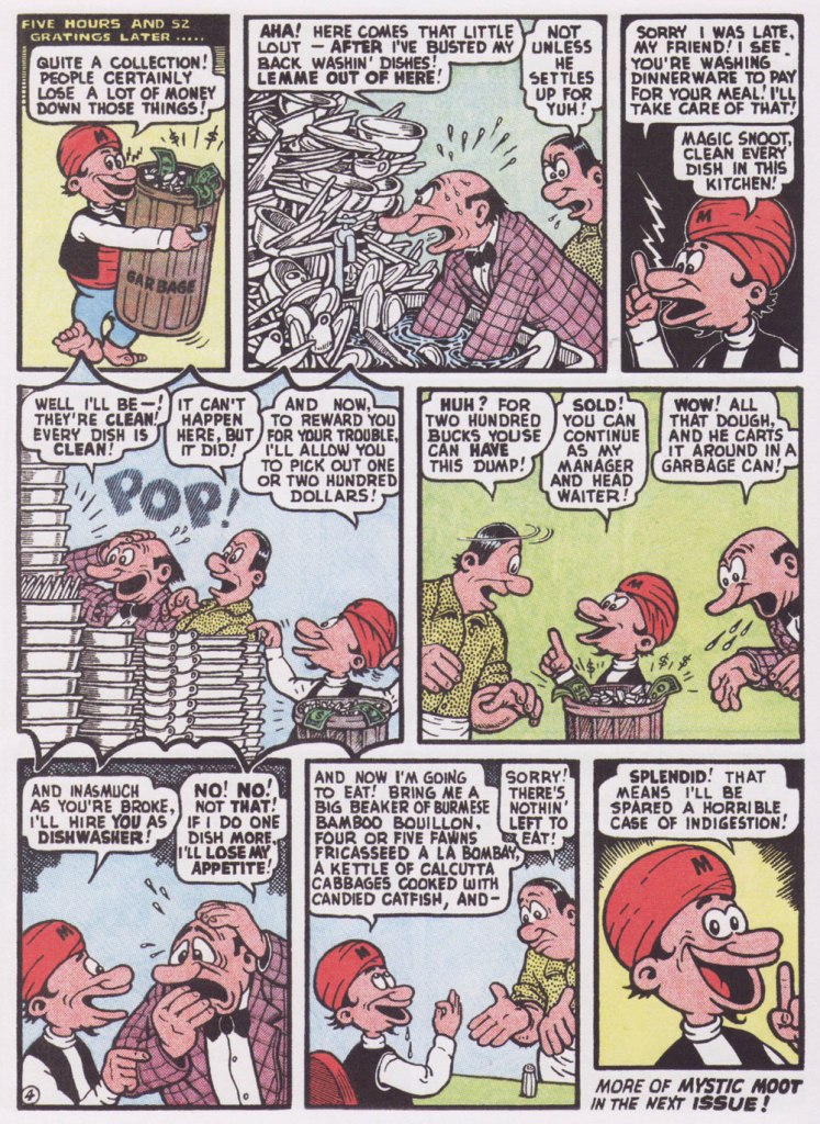
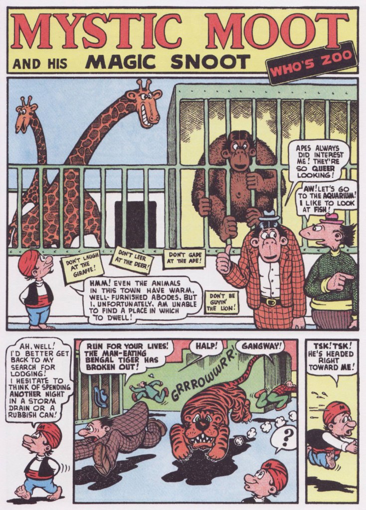
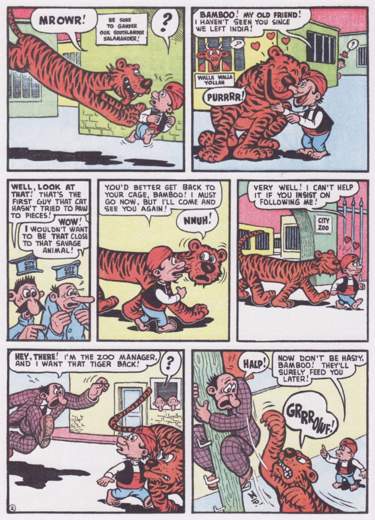
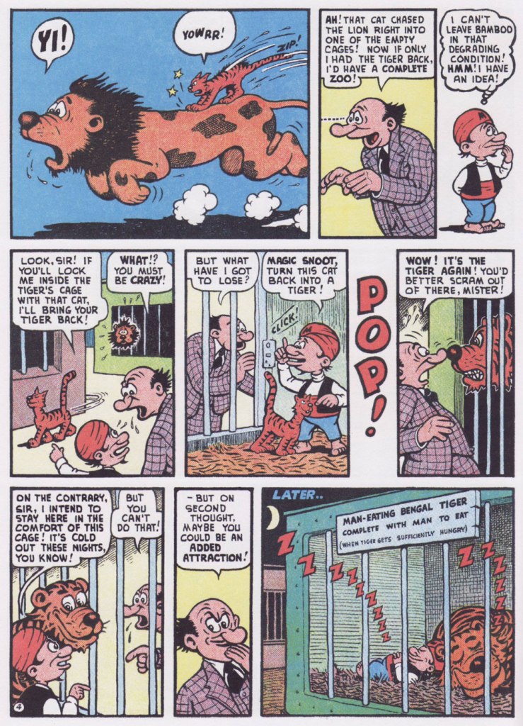
From this thrilling new assemblage, I’ve picked a pair of short samples, both featuring my favourite Wolverton protagonist, Mystic Moot (and his Magic Snoot). Sadowski informs us that:
« In July 1945, editor Virginia Provisiero invited the artist to submit ideas for a four-page ‘magic or mystic character’. He responded with Champ Van Camp and his Magic Lamp, but the editor suggested ‘a weird magician who had hocus-pocus powers instead of this lamp and genie affair‘. Wolverton hit the bull’s-eye with his second try, Mystic Mose and his Magic Nose, though Managing Editor Will Lieberson came up with a catchier moniker. »
Historian Henry Steele, in his indispensable overview of Wolverton’s career (published in Bill Spicer‘s blandly-titled but most excellent Graphic Story Magazine‘s issues 12 and 14, circa 1970-71), eloquently describes Mystic Moot as :
« Basically a kindly and almost simple soul, he is eternally cheerful and never at a loss. He is perennially helping others, usually unfortunate nobodies liked the jobless glutton, the bankrupt small businessman, the farmer with no crop, the henpecked husband, intimidated lumberjacks and prospectors, widows, orphans and kindred down-and-outers. He uses his magic powers only in the most haphazard ways, and never relies on them on his own behalf unless it is absolutely necessary.
Perhaps because of the passive Eastern philosophy of its subject, Mystic Moot strikes one as being the most minor key of all Wolverton’s features — which, while it implies difference, does not mean inferiority in any sense. »
Originally published in Comic Comics no. 2 (May 1946, Fawcett).
Here’s one for my fellow animal lovers out there!
Originally published in Comic Comics no. 7 (Oct. 1946, Fawcett).
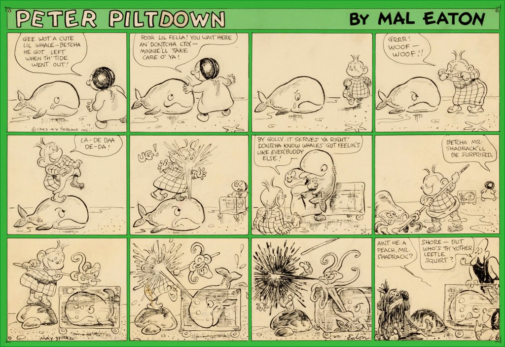
It’s time for a Peter Piltdown Tentacle Tuesday! We have previously written about Peter Piltdown, Mal Eaton’s nearly forgotten strip, but a few Sundays were kept in reserve for very obvious (tentacular!) reasons. Given the paucity of these strips, I am truly amazed that the original art of four octopus strips is available online. Eaton has a great ease with depicting flexible, expressive tentacles, so I am very pleased to be able to raise him to the rank of a 🐙Tentacle Master🐙!
Without further ado (just a little side note: these images were found on Heritage Auctions – I am not lucky enough to own any Mal Eaton art, or at least not yet!) …
May 31st, 1942. I didn’t know that whales ate octopus, but apparently they do – ‘the majority of toothed whales will eat whale food species such as squid, octopus, crustaceans and fish.‘
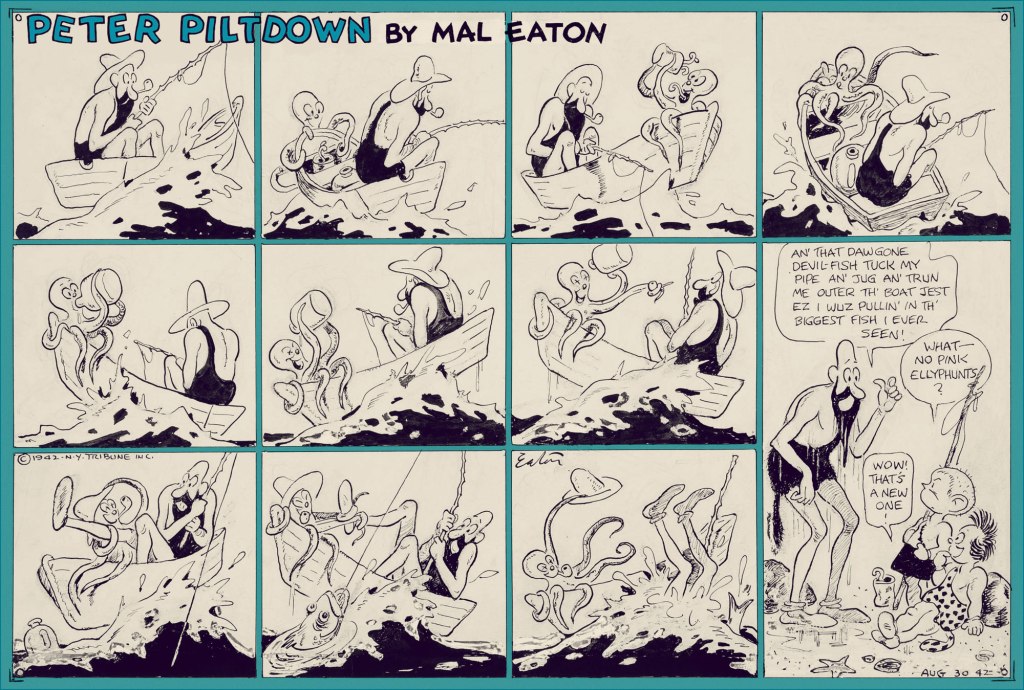
August 30th, 1942. This octopus knows how to live it up! This strip makes up for the unfortunate end of the member of his species in the previous one.
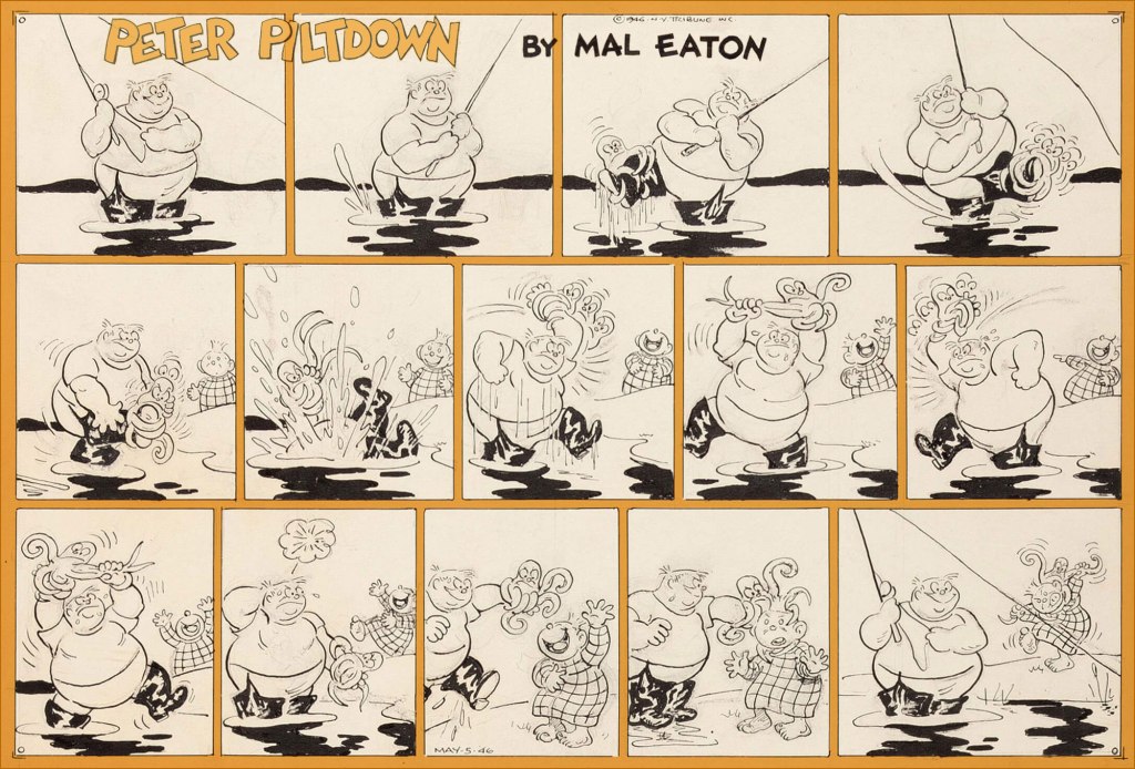
May 5th, 1946. I don’t know what the octopus wanted the man’s leg for in the first place, but he sure looks peeved by this whole interaction. These fishing bouts are just fraught with octopus danger…
… even if the danger is sometimes imaginary. August 18th, 1946.
Speaking of day-dreaming, I like to fantasize that Mal Eaton had a whole octopus-centric strip, and that one day somebody is going to unearth it and publish a beautiful collection. In the meantime, I’d happily settle for another volume of Jack Kent’s King Aroo…
« Night after night, Shepherd forged the inchoate thoughts and feelings of a whole generation of fans into an axiom that went something like: ‘The language of our culture no longer describes real life and, pretty soon, something’s gonna blow.‘. » — Donald Fagen
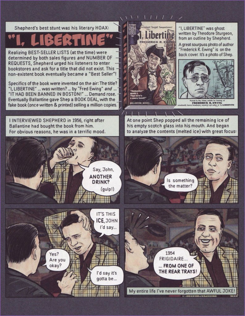
Today’s a very august occasion, for it marks the birth centennial of that sublime storyteller, Jean Shepherd (July 26, 1921 – October 16, 1999), so we’ll celebrate it… in comics!
« Since 2012, cartoonists Ethan Persoff and Scott Marshall have been collaborating on an extensive interview project with John Wilcock, an underground publisher of the 1960s. The graphic novel biography… focuses a year-at-a-time on Wilcock’s interesting and largely undocumented life, from co-founding the Village Voice in 1955, to becoming a member of Andy Warhol’s Factory in the early Sixties, establishing the Underground Press Syndicate, and other interesting moments, until Wilcock left NYC in 1972. » This particular entry appeared in the pages of The American Bystander no. 2 (Spring, 2016). For more info on the project (including a generous helping of choice excerpts), now complete and available for purchase, direct your browser here.
The front and back covers of I, Libertine‘s paperback edition (1956, Ballantine). Here’s a full, fascinating account of how this literary hoax unfolded. Take note, fellow Theodore Sturgeon fans!
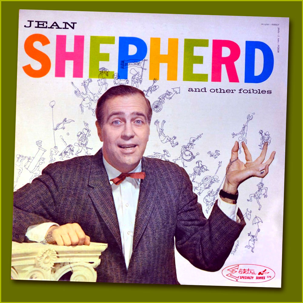
Shep’s second LP, Jean Shepherd and Other Foibles (1959, Elektra), was abundantly illustrated by his good friend, Renaissance Man (and local favourite) Shel Silverstein, who also authored the liner notes and played washboard and kazoo!
« In addition to the liner notes, Shel drew a veritable parade of characters marching across the front and back album cover of Foibles, incorporating the message, ‘Jean Shepherd is a dirty rotten, one-way sneaky son of a bitch‘, spelling it out backwards to escape the censors. » (from Lisa Rogak’s A Boy Named Shel (2007, St. Martin’s Press)
Another interesting comics connection: In Foibles‘ opening track, [ hear it here] Shep recalls an old favourite: « How many of you remember ol’ Peter Pain? He used to work in the comic strips, you remember, in those little strips that appeared under Moon Mullins, under The Gumps? He was green, was shaped like a pickle, he had stubble all over, he wore a black derby. He was a tremendous figure… a great American! He was the first Beat Poet. » Here’s one of Peter’s misadventures, circa 1948, illustrated by Jack Betts. You’ll find many more of these entertaining ads on Ger Apeldoorn’s highly-recommended blog, The Fabulous Fifties.
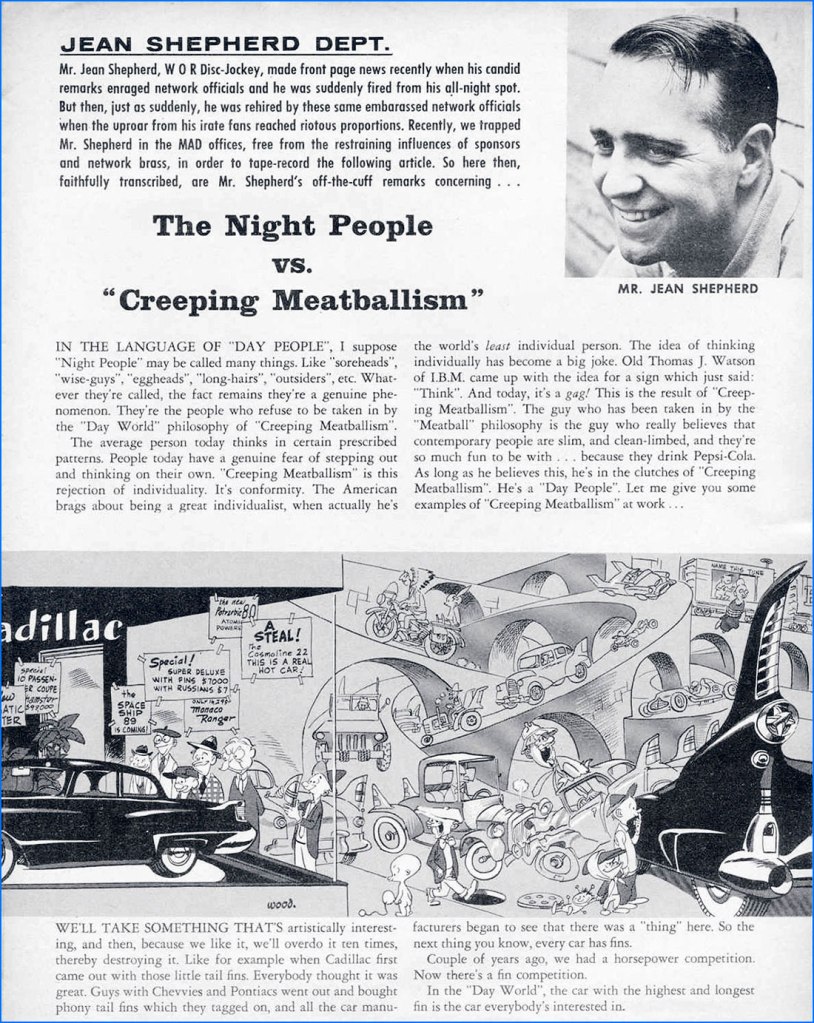
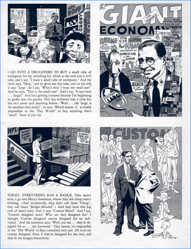
Seldom seen since its publication, this was Shepherd’s collaboration with Wally Wood at the height of his powers. The Night People vs. “Creeping Meatballism“ appeared in Mad Magazine no. 32 (Apr. 1957, EC).
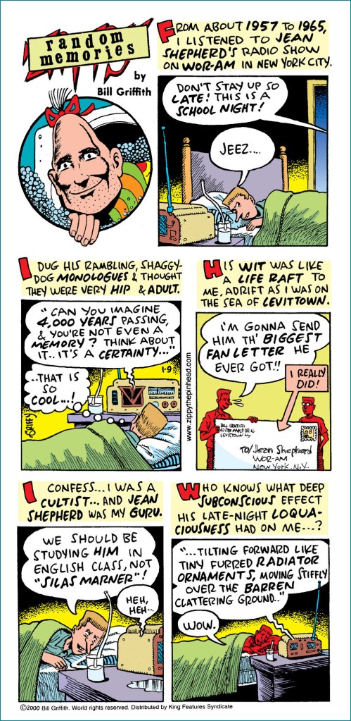
One gets a sense of Shepherd’s outsize and hopefully abiding significance from the quality of the minds he has helped warp. For example, here’s Underground Comix pioneer and Zippy the Pinhead creator Bill Griffith‘s fond tribute to Mr. Shepherd, published soon after Shep’s passing. A grateful tip of the hat to Mr. Griffith, who graciously provided me with a high-quality image of this, his Sunday, January 9, 2000 strip.
Let’s close in highfalutin fashion with a most pertinent bit of Longfellow (1807–1882):
The shades of night were falling fast, As through an Alpine village passed A youth, who bore, ‘mid snow and ice, A banner with the strange device, Excelsior!
His brow was sad; his eye beneath, Flashed like a falchion from its sheath, And like a silver clarion rung The accents of that unknown tongue, Excelsior!
In happy homes he saw the light Of household fires gleam warm and bright; Above, the spectral glaciers shone, And from his lips escaped a groan, Excelsior!
“Try not the Pass!” the old man said; “Dark lowers the tempest overhead, The roaring torrent is deep and wide!” And loud that clarion voice replied, Excelsior!
“Oh stay,” the maiden said, “and rest Thy weary head upon this breast! “ A tear stood in his bright blue eye, But still he answered, with a sigh, Excelsior!
“Beware the pine-tree’s withered branch! Beware the awful avalanche!” This was the peasant’s last Good-night, A voice replied, far up the height, Excelsior!
At break of day, as heavenward The pious monks of Saint Bernard Uttered the oft-repeated prayer, A voice cried through the startled air, Excelsior!
A traveller, by the faithful hound, Half-buried in the snow was found, Still grasping in his hand of ice That banner with the strange device, Excelsior!
There in the twilight cold and gray, Lifeless, but beautiful, he lay, And from the sky, serene and far, A voice fell like a falling star, Excelsior!
« Quite suddenly I began to draw. No one paid much attention to this, nor to the fact that the drawings were immediately grotesque. This was assumed to be one of the penalties for being ‘cackhanded’, local dialect for mocking a left-hander, which is what I am. In addition, nobody suggested that there was anything ludicrous in the fact that, for the first time since the Searles had plodded their way through the bogs to escape the Vikings, a left-handed Searle was proclaiming that the had to be An Artist, instead of a gravedigger, or whatever. » from Ronald Searle in Perspective (1984, Atlantic Monthly Press)
Who’s Out There? is a peaceful little family – we don’t often have disagreements about cartoonists or their art, and if occasionally one of us loves something while the other one is neutral about it, it doesn’t often happen that we are in total dissent. However, exceptions proving the rule, British illustrator Ronald William Fordham Searle (1920-2011) is one such point of contention: I like his style, co-admin RG doesn’t much care for it.
I was a little late to the party, and came to Searle’s in a rather circuitous fashion. In a used bookstore (isn’t how these things always start?), I noticed a book called The Grapes of Ralph: Wine According to Ralph Steadman (1996, Houghton Mifflin Harcourt), and was intrigued enough to purchase it. Steadman’s splotchy, wild style was perfect for a book about fermented grape juice – he frequently coloured his art in a manner reminiscent of wine stains, and the unhinged art hinted at the artist being more than slightly soused. Well… where, you may ask, does Searle come in? Steadman was heavily influenced by his style, so much so that for a while I embarrassingly thought that Grapes of Ralph was actually illustrated by the former.
One of the more focused splashes (haha, wine splashes, right) in The Grapes of Ralph.
However, Searle has proven to be a lot more appealing to me from an aesthetic viewpoint – I have kept The Grapes of Ralph, but I don’t glance in its direction often. As for co-admin RG, he explains that he mainly dislikes Searle for being responsible for bad copy-cats like Steadman.
There are plenty of articles written about Searle – his extensive body of work has gained its share of acclaim and awards, and many appear illustrators appear to have been heavily influenced by his style. For example, The War Drawings of Ronald Searle from Illustration Chronicles tells the story of how Searle survived, and chronicled with daily sketches, the experience of being a Japanese prisoner of war. There is no need for me to go over that chunk of history. That being said, a lot of his books are quite out of print, and those are generally the ones I find most interesting. Before Searle’s art went progressively more speckled and unfocused (which is what Steadman, with whom this post started, is mostly channelling), his drawings had a crispness of exaggeration I find really appealing, a certain floweriness under the cover of which very acerbic (and very British) observations are delivered to the delighted viewer.
An example of looser lines of later years (this is from 1980); still enjoyable because the palette is restrained.
My favourite is his St. Trinian series (from 1941 and onwards), chronicling shenanigans at a boarding school for girls. What started as a series of doodles to amuse a friend’s schoolgirl daughters became an institution of its own – this topic was so popular that Searle’s cartoons were even adapted (awkwardly, in my opinion) into seven (!) movies. I recommend this helpful article from Tweedland The Gentlemen’s Club for historical details. For all the popularity of these schoolgirls from hell (in any obituary, you’ll find some sentence to the effect of ‘for many people, the St Trinian’s cartoons define Ronald Searle’s career‘), St. Trinian collections have been long out of print, for the most part, and one has to make do with mostly inferior, dubiously printed paperbacks claiming to be Best Ofs.
Knell Knudel from Lambiek Encyclopedia explains: « The topic [of boarding schools] had inspired many British novels before. But ‘St. Trinian’s’ was far less realistic and darkly disturbing, motivated by Searle’s war-time traumas. The little girls torture each other on a rack, collect mushrooms to poison people, drown each other at the beach or study books on how to shrink human heads. Amazingly enough, ‘St. Trinian’s’ became massively popular, despite the fact that the world was still recovering from a world war. In 1948 the first book compilation was published. Many more would follow. Gags appeared in countless magazines all over the world. Yet Searle quickly grew tired of his hit series. He felt its formulaic comedy severely limited him. In 1952 he brutally discontinued his hit feature by dropping an atomic bomb on the dreaded school! While it presumably killed its characters, it didn’t terminate its popularity. »
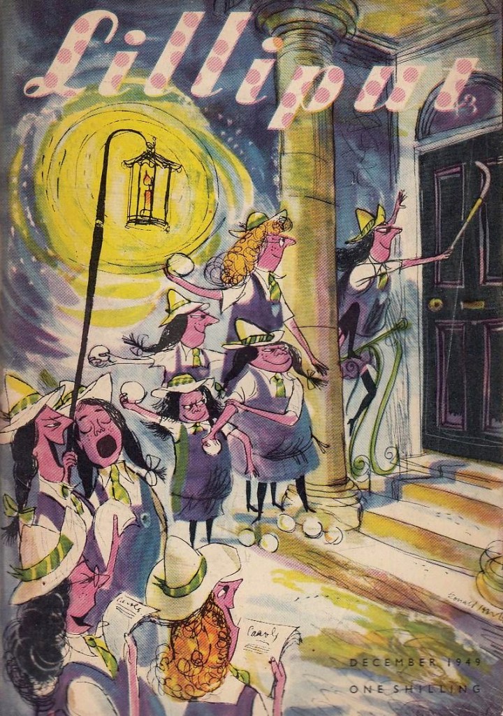
The first St. Trinian cartoon ever published in print appeared in Lilliput (a monthly British magazine which deserves a post of its own) in 1941. This is Lilliput no. 25, December 1949.
Though quite a few collections of cartoons were published at the time, the following three are of main interest: Hurrah For St Trinian’s (1948), The Female Approach (1950), and Back to The Slaughterhouse (1952). Thanks to my bookseller friend Barney (visit his store!), I am the proud possessor of The Curse of St. Trinian’s: The Best of the Drawings (1993, Pavilion Books), a hardcover edition, which scratched the itch but did not quench my desire to own the original editions, with their gloriously yellowed paper and characteristic fragrance.
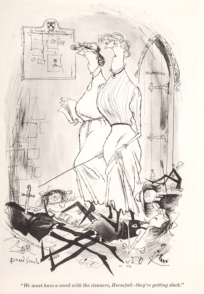
For example, admire the characterization of Angela Menace, as depicted in these three glorious cartoons (one could make a triptych):
« Searle was born, in 1920, in Cambridge, into a socially anonymous background, where male children were expected to be clerks or minor civil servants. Placed almost squarely in the middle of society, he had the ideal vantage point from which to observe his country, without having to suffer the distortion of an undue affection for his origins. It is an easy background to shrug off if you know what you want to do with yourself, and Searle did know, from an early age. We felt obscurely that Searle’s drawings begged authoritarian disapproval simply by existing in such profusion. That they also flayed their subjects with a merciless and unforgiving line – both grotesque and precise – made it all the better. That it was done with such sympathetic relish made it even better than that. Parents were embarrassing, hypocritical cretins, either callous in the victory of worldly success, or living pitiable lives of continual defeat; schoolmasters incompetent frauds, either grasping, sottish, brutal, ignorant or half-dead. Searle got them just right. » — Nicholas Lezard, in an introduction to The Terror of St Trinian’s and Other Drawings (another best-of collection issued in 2006).
I love the new science teacher being so warmly welcomed by both headmistress and schoolgirls – they all seem genuinely delighted.
The Female Approach, interestingly enough, featured plenty of men, too…
… alongside the usual ingénues (who have no idea what they’re doing, but they do it anyway) and temptresses (who know exactly what they’re doing).
“Do you want the time?”
Searle died in 2011 in his beloved France, where he had been living since 1975. He was 91 years old, and spent his last years as a bit of a recluse (though still drawing), far away from the public’s eye – when he passed away, one got the impression that some thought he had done it already years ago. As for St Trinian’s, its popularity seems to sort-of, kind-of linger on: there was yet another movie in 2007, though I would posit that we need fewer movies, and more proper, hardcover reprints of the material that left an enduring trace in people’s memories.
Have a gander at Perpetua, a wonderful website dedicated to everything Searle.
Greetings, tentacle aficionados! First of all, I’d like welcome this new octopus into our household, courtesy of a gift from my mom:
Isn’t he cute?
I felt like going with something more modern this week, though given that the last TT was set in the 60s, that still leaves a healthy 40-50 years to choose from.
Ali Fitzgerald’s Bermuda Square waved its first ‘hi there!’ on May 16th, 2016 in the The Cut, one of New York Magazine‘s website-only divisions describing itself as ‘a site for women who want to view the latest fashion trends; read provocative takes on issues that matter, from politics to relationships; follow celebrity style icons; and preview new products.‘ I don’t believe Bermuda Square fits that neatly into any of these categories, though Iris the octopus is unarguably stylish, and politics and relationships are definitely involved. Does she and her siren friends ever try out some new face cream, or weighs the pros and cons of that foundation one sees ads for absolutely everywhere? Who knows – Bermuda Square strips only live behind The Cut’s pretty rigid paywall (not that I object to writers and illustrators actually being paid, but I would much rather buy a collection of strips than a subscription to an online-only lifestyle magazine – call me old-fashioned).
Fitzgerald describes the world her comics are set in as “a feminist enclave where everyone can co-exist” and a “delicate ecosystem”. It’s a fully fleshed world, with intricate plot lines tracking relationships between characters and some class warfare, since underwater denizens aren’t at all immune from pettiness or envy. « It’s segmented like New York: There is Astora, a Manhattanite underwater mer-city where Margox imagines building a life, and Orchid Island, which resembles a not entirely gentrified Brooklyn or Queens. Solanas Village is a ‘70s-style, separatist female commune on a rocky shore, while the social, watery Tidelands are like a club where everyone mingles. If a sailor stays too long in Bermuda Square, he goes to (and dies in) the Ghost Vortex… »
The following excerpts have been lovingly coloured by co-admin RG.
First-ever strip, with a lovely abundance of tentacles!
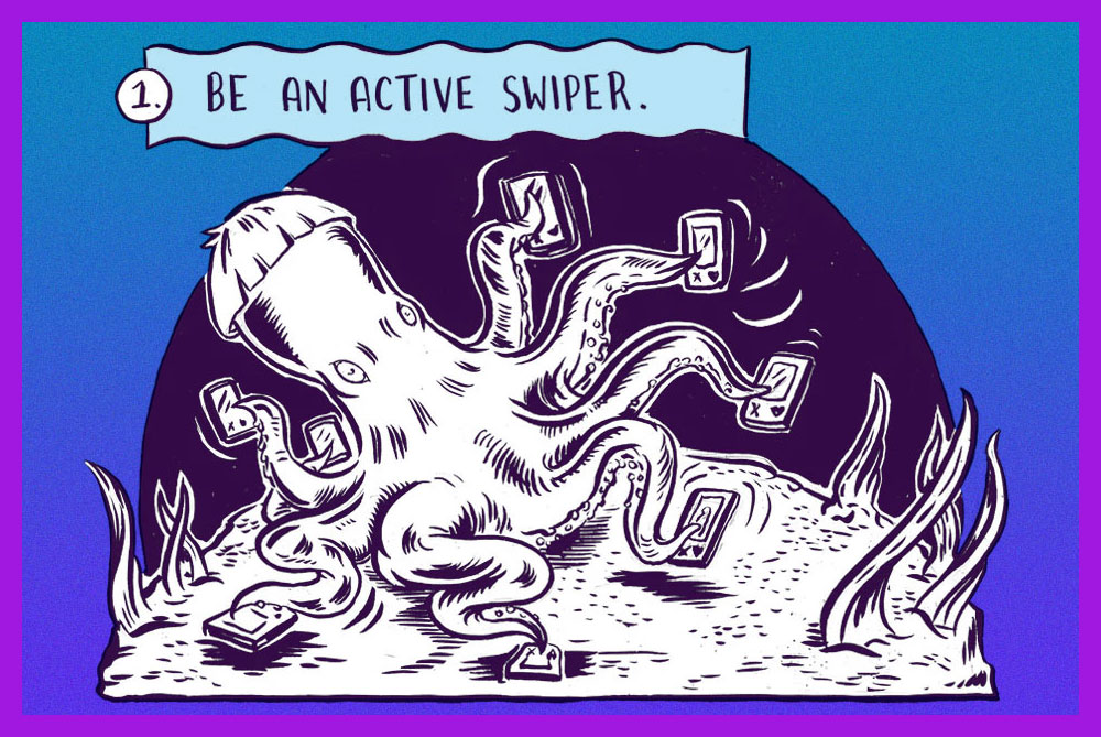
Iris the sex-positive octopus gives tips for using Tinder.
« I don’t mind if my skull ends up on a shelf as long as it’s got my name on it. » —Debbie Harry
A couple of years back, I spotlighted a story by a neglected Golden Age favourite of mine, Anthony Lewis “Tony” DiPreta (July 9, 1921 – June 2, 2010), the wacky The Hidden Vampires! I advise reading it first for comparison (and a bit of background on the artist).
A whole hour! People were armed with unwavering patience back in the day.
So the suits’ great flash of inspiration is not to update a fifteen-year old movie (from 1937!), nor remake it: they’ll just trot it out again. Picture doing this with 2006’s biggest horror hit, Saw III. How do you think it would fare today?
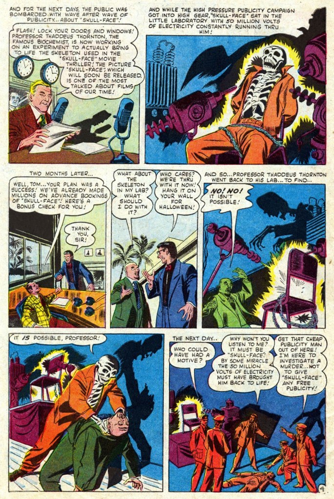
You’d think a seasoned publicist would be a savvier negotiator. I mean, all he needs is some random skeleton. Adjusted for inflation, a thousand 1952 dollars would today be worth 9,829 bucks. But that’s nothing compared to his liberal waste of electric current: the voltage used to execute a convict in the electric chair is around 2,000 volts for less than a minute… and that makes the lights dim all over the area*. Now multiply the voltage by 25,000, and the duration (let’s round it off to a minute, for simplicity’s sake) 80,640 times longer. Picture the resulting electric bill, not to mention the repercussions on the power grid, all for a stunt that could have simply been faked (i.e. just say there’s live current… no-one’s going to check). Oh, and what’s a “famous biochemist” doing on a film studio’s payroll? Come to think of it, it’s not that odd: Thornton was a cynical, opportunistic money-grubbing parasite, the Dr. Memhet Oz of his day…
Note these stellar examples of one of DiPreta’s trademark horror ambiance moves: lighting from below, projecting stark, expertly-delineated shadows.
One has to wonder why Fenton insists on addressing the resurrected ‘Demon’ (he was a demon on the sousaphone) incorrectly as “Skull-Face” (that’ll only aggravate him, you dolt!). Would it have helped if he’d added air quotes?
The ho-hum Sol Brodsky cover of Mystery Tales no. 6 (Dec. 1952, Atlas), but hey, our pal “Skull-Face” is the featured attraction!
The comics industry’s traditional garish colour and murky reproduction fail (spectacularly!) to do justice to DiPreta’s spare, confident and elegant inking line. To remedy the situation, here’s a look at a surviving piece of original art. It hails from “One Must Die” (scripted by Carl Wessler), from Crime Can’t Win no. 11 (June 1952, Atlas), the publisher’s knockoff of Lev Gleason‘s influential Crime Does Not Pay.
A slick Joe Palooka Sunday from July 24, 1966. DiPreta enjoyed quite a run on the strip, illustrating it from 1959 to its 1984 finale.
Wonder Woman is probably my most recurring area of focus when it comes to TT posts – although this is just the third, as it turns out, despite feeling like the fifteenth. The first two were devoted to the Golden Age Wonder Woman (Tentacle Tuesday: H.G. Peter and Wonder Woman lend a hand and Tentacle Tuesday: More Golden Age Wonder Woman Wonders!), and having more-or-less exhausted the GA’s tentacles, we move on the Silver Age (which, in my assessment, is considerably less interesting, but sometimes has quite nice art).
All pages are scripted by Robert Kanigher, pencilled by Ross Andru and inked by Mike Esposito, except for the first page from Stamps Of Doom!, which was scripted by Bill Finger.
Page from The Stamps of Doom!, scripted by Bill Finger (credited as Charles Moulton). printed in Wonder Woman no. 108 (August 1959).
I bitched about Kanigher WW in Tentacle Tuesday: Wonder Girl in the Silver Age, Part I and Don’t Let a Mysogynist Plan Your Wedding: Robert Kanigher and Wonder Woman’s Utterly Unsuitable Suitors. I’m starting to feel like my needle is stuck in the groove, but I will however note one more thing: in my righteous anger about Kanigher’s preposterous depiction of women, I’ve been ignoring that he’s not great at writing men, either. That is… he can write wonderful male characters (see Enemy Ace, for instance), as long as romance is totally off the menu. It’s as if he is saying that romance transforms intelligent, capable men into utter, snivelling dolts (a point of view that one could defend, but within limits). Take a look at what kind of suitors poor Wonder Woman gets saddled with (perhaps their stupidity is one more way of spiting her?) in these panels from Wonder Woman’s Impossible Decision, published in Wonder Woman no. 118 (November 1960):
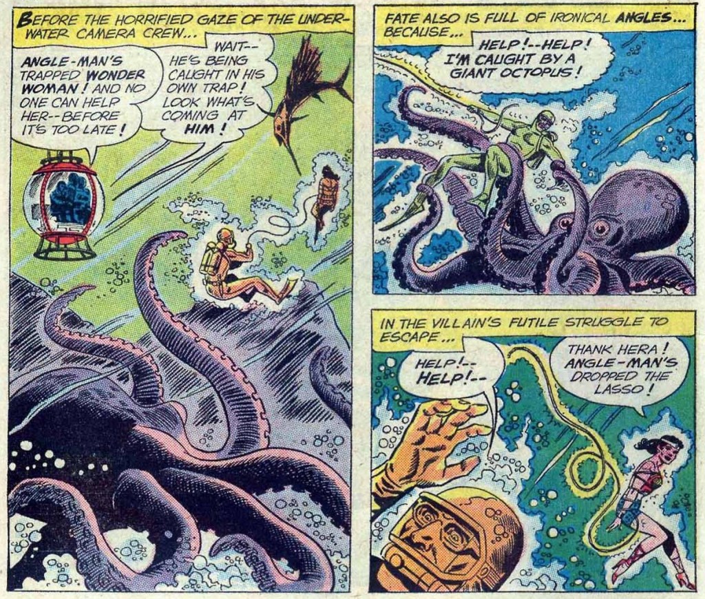
To reiterate: man is sitting on a rock. One wouldn’t think that this is a particularly dangerous activity. And yet one minute he’s contemplating the injustices of life (sitting!), and the next he’s sinking (at the speed of a locomotive) into sea, right into the welcome arms of an octopus. I think the octopus planned it.
The guy’s suffocating, but he’s still fretting about Merman as a rival for WW’s affections.
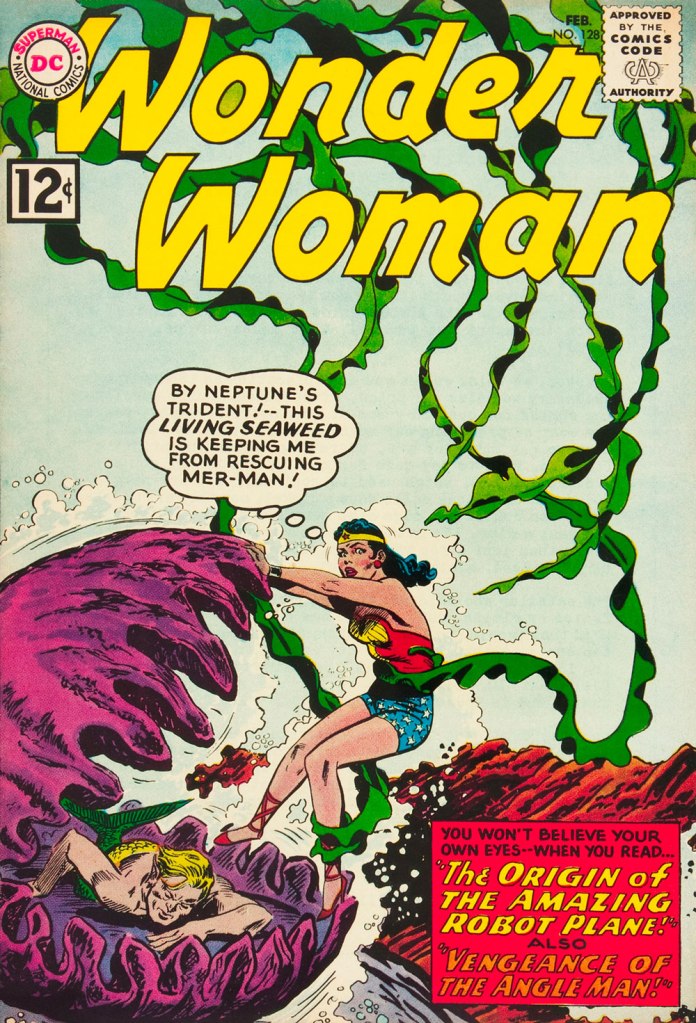
This is Wonder Woman no. 128 (February 1962). Cover by Andru and Esposito.
Allow me to drive one more nail into that coffin, and after this I shall forever hold my peace. I stumbled upon this rather entertaining quote, taken from an interview with Kanigher conducted by Tim Bateman and Steve Whitaker in 1989 (read the full thing here). Here it is, with no further comments from me:
« So Ditko […] tried to force meanings where meanings did not exist. But he tried to tell me that I knew nothing about romance, because his idea of romance was professorial, pedantic. I know what romance is, I’ve written more romance probably than anyone alive. Romance is an excess of passion, and I don’t care if there’re a thousand books that says romance is not that, romance is a time period. Tchaikovsky is a romantic. Excessive, that’s what romance is. So to say that my idea of excessive emotion is not romantic…»
And now, I shall remain mum, and let you savour these tentacles in peace!
Two pages from The Academy of Arch-Villains!, published in Wonder Woman no. 141 (October 1963).
In comics, swordfish are often pitted against octopuses (one doesn’t have to go far for examples – just look at the previous story), but I wonder how often that happens in real life…
Page from War of the Underwater Giants, published in Wonder Woman no. 146 (May 1964).
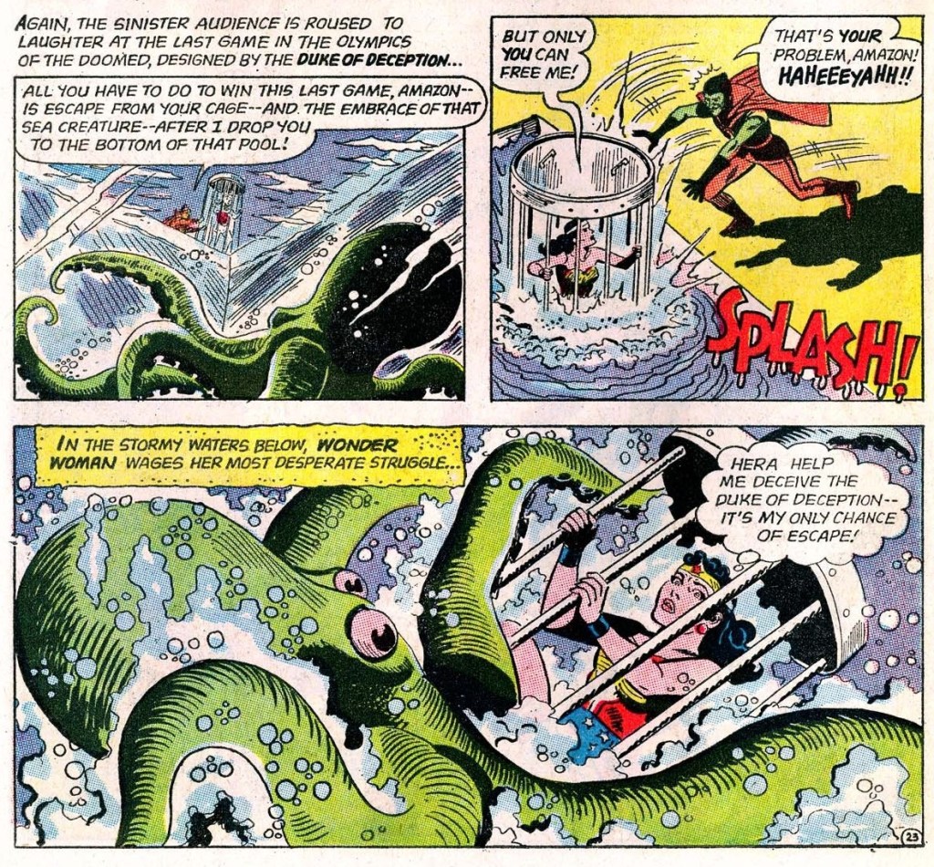
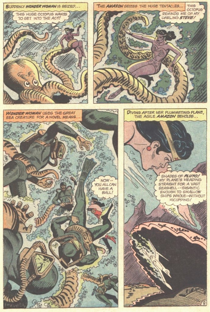
Page from The Olympics of the Doomed, published in Wonder Woman no. 148 (August 1964).
Page from I Married a Monster, published in Wonder Woman no. 155 (July 1965).
The Sinister Scheme of Egg Fu, the Fifth!, published in Wonder Woman no. 166 (November 1966).
« I have argued flying saucers with lots of people. I was interested in possible. They do not appreciate that the problem is not to demonstrate whether it’s possible or not but whether it’s going on or not. » — Richard P. Feynman
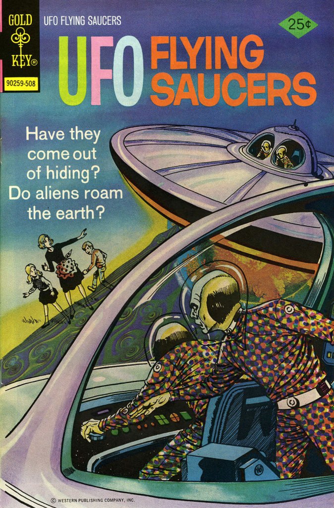
You can follow the rising pitch with the publishing frequency of Gold Key’s UFO Flying Saucers: after its premiere issue hits the stands in 1968, two full years elapsed until the second, then another two until the third… and again to the fourth. It’s fair to presume that the title had been intended as a one-shot, and that encouraging sales led the way to a regular, if sparse schedule. Then the pace picked up after issue four (Nov. 1974), and so ten issues appeared in the span of just over three years. There was a brief hiatus, a retitling to UFO & Outer Space and a further dozen issues saw print, two of them reprints. By late 1979, the series sputtered to a halt.
They may not have been to everyone’s taste, but Gold Key comics provided their audience with a soothing respite and change of pace from Marvel’s endless manic brutality and insipid crossovers. Even amidst the GK line, UFO Flying Saucers stood out. It did a stellar job of covering the flying saucer craze of the Cold War years, thanks to a sober, documentary-style narrative tone and strong artwork, led by Frank Bolle, who fit the template to a T. The tone was surprisingly even-handed (far more so than most modern media; j’accuse, History Channel!) They even tossed a scrumptious pinch of skepticism into the mix now and again, and it’s this delicacy that we’ll be sampling.
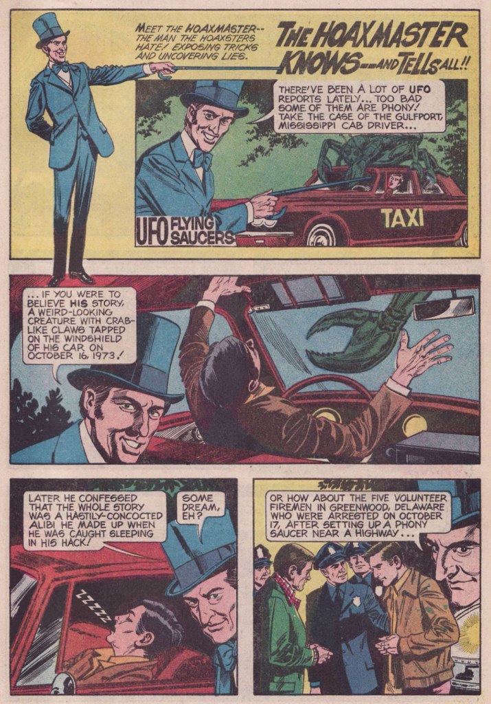
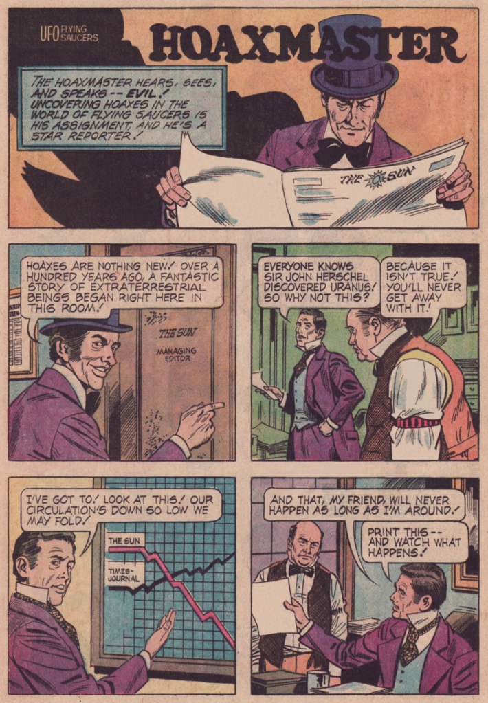
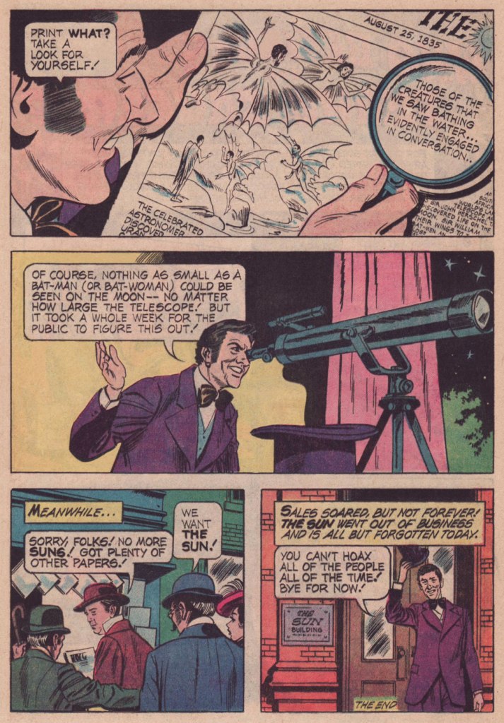
The modern skeptical* movement was spearheaded by the 1952 publication of mathematician and science writer Martin Gardner‘s fascinating In the Name of Science (thereafter better known as Fads & Fallacies in the Name of Science), answering the need for an organised response to a (still) rising tide of irrationality, superstition and scientific illiteracy. When UFO Flying Saucers introduced its series featuring The Hoaxmaster, the skeptics’ flagship publication, The Skeptical Inquirer, was still a couple of years away from being launched. That auspicious occasion came in the fall of 1976, under its original title of The Zetetic: Journal of the Committee for the Scientific Investigation of Claims of the Paranormal.
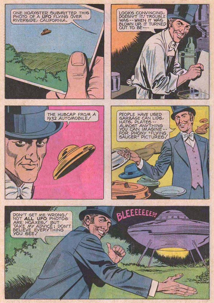
The introduction of The Hoaxmaster, from UFO Flying Saucers no. 4 (Nov. 1974, Gold Key).
And such fakery has only become far, far easier… from UFO Flying Saucers no. 6 (May 1975, Gold Key).
Ah, that John and Marsha/Marcia routine never gets old! From UFO Flying Saucers no. 7 (Aug. 1975, Gold Key).
Mr. Bolle provided just one cover to the series, and while it’s hardly the best one, it certainly stands out amidst the lot. Again, this is UFO Flying Saucers no. 7 (Aug. 1975, Gold Key).
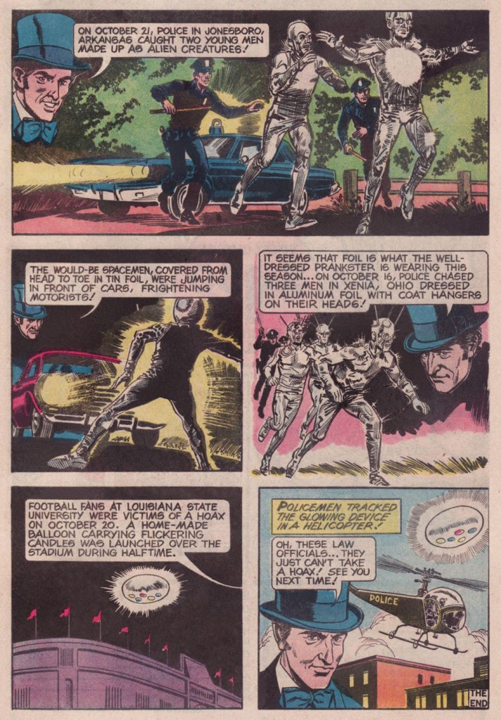
Say, what have we here? Could it be… fake news? From UFO Flying Saucers no. 8 (Nov. 1975, Gold Key).
Sadly, The Hoaxmaster series bears no writing credit. The only writer ever credited in the title is Western Publications staffer Patricia Fortunato, a former story editor of The Golden Magazine. If that’s your work, Pat, take a bow!
In comparison, artist identification is a cinch: the steady hand of Frank Bolle, who left us just last year, at the most venerable age of 95, is instantly recognizable. Artistically active right to the wire, he drew the final leg (1999-2015) of soap opera comic strip Apartment 3-G‘s 54-year-run. Over the course of his singularly long career, he worked for just about every comics publisher… and then some! His reliable proficiency at providing just the right tone to illuminate that delicate borderline between science fact and science fiction made him the ideal choice to adapt John Christopher‘s early young adult post-apocalyptic The Tripods trilogy (The White Mountains, The City of Gold and Lead,and The Pool of Fire), serialised in Boys’ Life magazine in the 1980s. Check it out here!
Well, that’s roughly half of the Hoaxmaster strips. If you’d like to see the rest, let us know… I can probably time it with the next edition of World Contact Day. To sign off on a musical note, here’s its catchy, Canadian-made anthem. Remember, “we are your friends“.
-RG
*as opposed to ‘denialism’, of course. It’s a crucial distinction: know the difference!
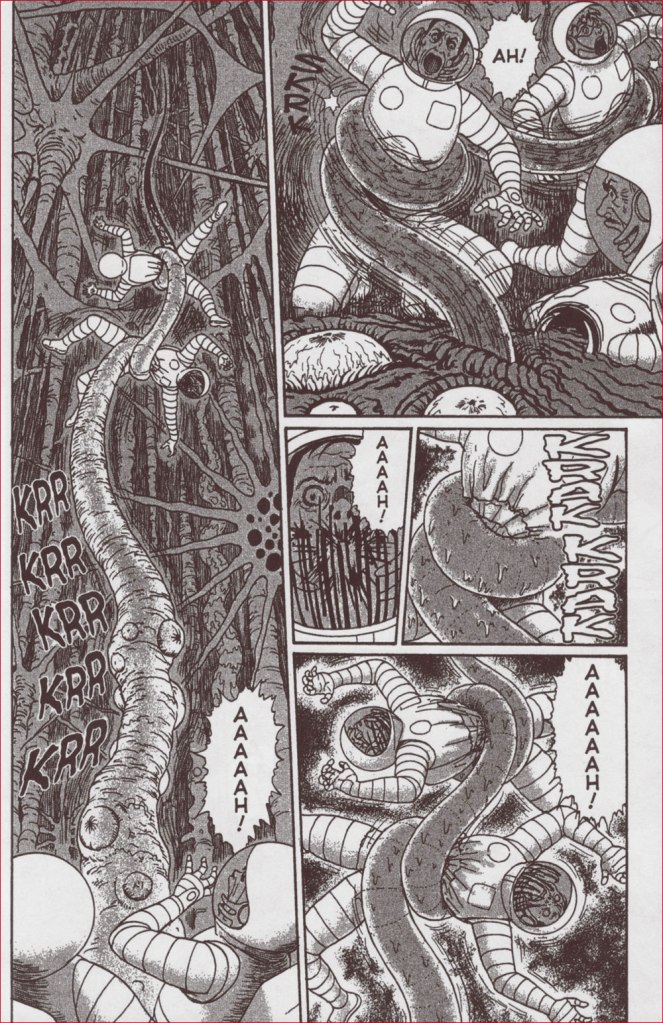
Occasionally, I like going with the flow when selecting the topic for a Tentacle Tuesday. I recently traded for a Junji Ito book I’d never heard of, Remina, and as one of its highlights (um… possibly the only highlight, but more about this later) is the profusion of tentacles within, it seemed like a natural fit for a topic of discussion.
We have only mentioned Junji Ito once before (in Tentacle Tuesday: Octopods Dig Manga!), but I am a fan of his work – or at least of the best of his work. In my assessment, that would be the genuinely disturbing Gyo (with the catchy subtitle of ‘The Death-Strench Creeps‘) and the haunting Uzumaki, as well as a handful of excellent short stories.
I’m by no means a horror manga pundit, but I’ve sampled a certain number of works by mangakas whose work has been translated to English, and found most of these œuvres quite unappealing, be it because of incompetent art, more human cruelty than I can stomach, far too much soap-opera-style drama, or glaring plot loopholes. Ito is not without his flaws, but something sets him apart from other authors working in a similar vein: he can depict stomach-churning gore and moments of quiet dread with equal aplomb. Cartoonists who rely on carnage to horrify their readers are ten a penny, those with a more subtle approach are few; those who can effortlessly transition from one to the other are something special.
As in that old joke about the horse that always takes its rider to the nearest pub, Ito does have a favourite approach: he starts with a most mundane object or incident, elicits a delectably menacing atmosphere out of it, and then gives it all a good twirl until the spiralling events send the protagonists (and sometimes the whole country, if not the whole planet as well) into the welcoming arms of total, uncompromising Armageddon. One might argue that he does that because it’s easier to finish it all than to think of a ‘proper’ ending, but it gives his work a certain surreal quality I really appreciate – everybody is going to die, and now that this little matter is out of the way, we can concentrate on the creative ways this is going to happen.
Remina was serialized in Big Comics Spirits from September 2004 to July 2005. The English volume (released by Viz Media, who have published the bulk of Ito material in English, slowly making their way through his whole bibliography in excellently designed hardcover editions) was released in December 2020. The plot concerns itself with a scientist who discovers a new planet and names it Remina in honour of his beautiful daughter. Of course, the planet turns out to be hurtling towards Earth at physics-defying speeds, annihilating everything in its path (which the main scientist somehow is completely unaware of, until his many lab assistants inform him of the latest developments).
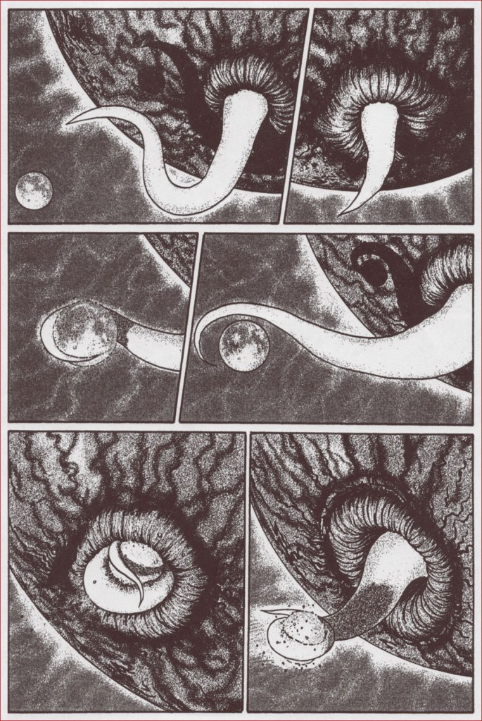
And here it is, eating one of the planets in our Solar System with as much grace as an aristocratic lady carefully nibbling on a sliver of tomato.
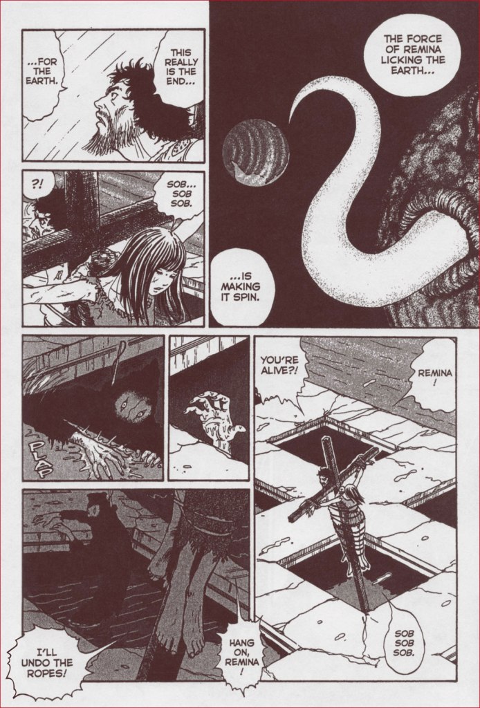
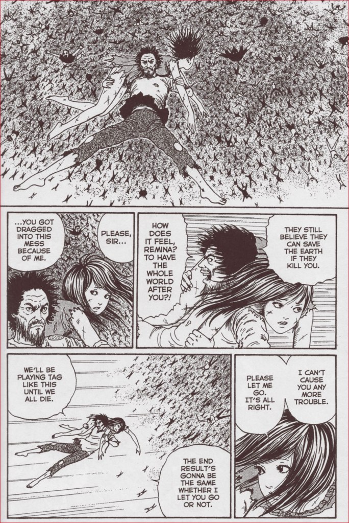
In (not entirely unbelievable) leap of logic, Japanese citizens decide that the impending destruction is caused by Remina, previously an immensely popular and celebrated girl, and that executing this ‘witch’ is going to solve the problem. What follows is a series of chase scenes, with a giant crowd pursuing Remina throughout the progressively more and more destroyed city. Remina’s three protectors (the president of her fan club, her manager, and some uber-rich fanboy who tries to rape her later in the book) drag her around, trying to keep her safe from the murderous crowd, but they don’t do such a great job – she gets crucified next to her dad but survives, set free, captured again, flogged, tortured, crucified again, and so on.
It doesn’t help that Remina, like a lot of Ito’s pretty creations, doesn’t really have a personality. She just sobs, screams for her daddy and her lost love (the manager, who apparently she was profoundly in love with), and implores people to just leave her alone. Scenes of crucifixion and the creepy robes worn by her pursuers indeed suggest religious fervour – as the earth’s gravity changes, cities are destroyed, volcanoes erupt etc., the only thing almost everybody is interested in is Remina’s mutilation and dismemberment.
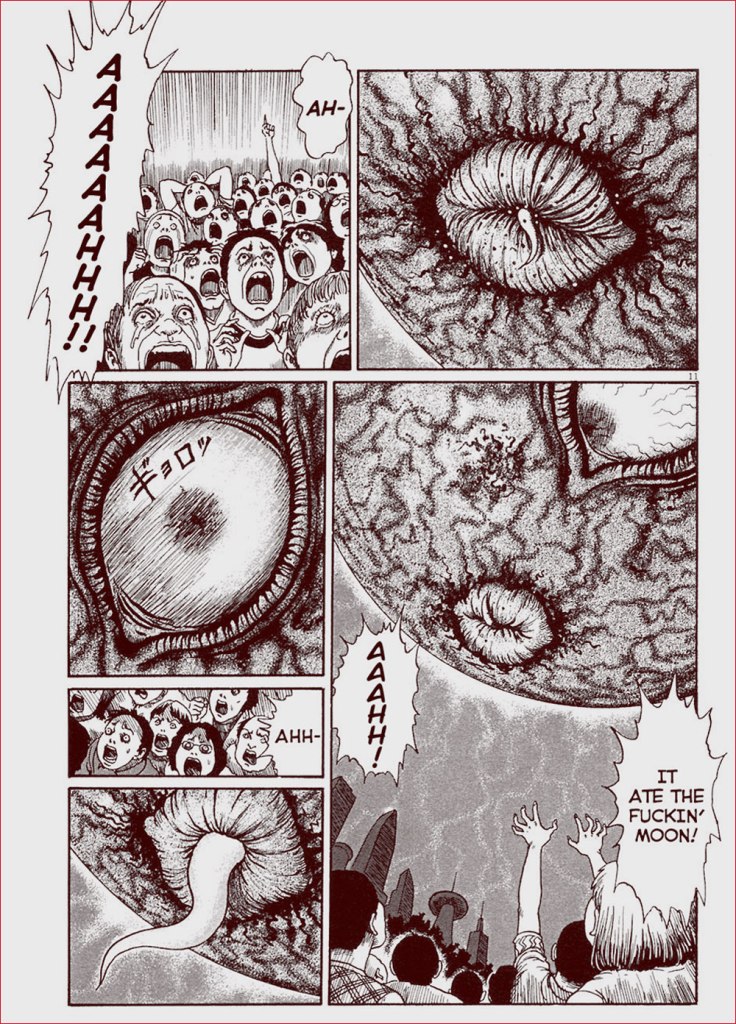
Still, there are some fun moments, most of these involving tentacles! Remina the planet has a giant eye and a coquettish, tentacular tongue that it flicks out to swallow the moon just as Remina the human is about to be killed.
One of more iconic images of Remina, the moment before the moon gets swallowed….
This is a scan from a previous edition of Remina, where the translators were a little looser with language. In the book I have, a laconic ‘it ate the moon‘ is substituted for ‘it ate the fuckin’ moon!‘.
It uses the same ‘tongue’ to lick Earth and accelerate its spinning…
Typical Remina dialogue: “SOB SOB SOB.” Note that this is the second time Remina gets crucified. It is distinctly some sort of unhealthy obsession.
… which sends everyone airborne, and gives rise to funny kung-fu-in-the-air scenes as yet another protector kicks the collective asses of Remina’s would-be executioners.
Then there’s planet Remina’s surface, all writhing tentacles, acid pools and noxious fumes. That’s where most of the tentacle enjoyment lies.
Somewhat atypically, there is even a happy ending, albeit one involving some of the main characters floating around in space in an atomic shelter bunker with a year’s worth of provisions (and hopefully oxygen?)
« There are two kinds of Arctic problems, the imaginary and the real. Of the two, the imaginary are the most real. » — Vilhjalmur Stefansson
As it’s been a record-shattering scorcher of a week over much of North America, I’ve been daydreaming of cooler, much cooler climes whilst simmering at my desk. And why not make a post of it? A couple of years ago, I picked up one of the finest comics I’ve ever encountered, Racontars arctiques: l’intégrale (2018, Sarbacane). Its myriad of virtues, subtle and obvious, made it easy to enjoy, but a challenging work to dissect and properly discuss. But here we are — hope I did it justice!
Danish writer Jørn Riel (b. 1931 in Odense) spent the better part of his twenties and thirties in Greenland as part of a scientific expedition. This sojourn in turn inspired a successful series of tall tales set in the Arctic, fanciful accounts of the lives of hardy explorers, hunters and Inuit natives. His works have been translated into fifteen languages, and in an unusual twist, English isn’t among these.
French cartoonist-illustrator Hervé Tanquerelle (b. 1972 in Nantes) might be termed a cartoonist’s cartoonist, with all that entails: he hasn’t achieved superstar status, but it’s not through any lack of talent or toil. While I’ve often lamented the rather banal tragedy of great North-American artists who can (and do) cruise through decades-long careers without ever coming within hailing distance of a decent script, Hervé Tanquerelle’s path has been paved with glorious scenarios, most of them provided by writer-artist compères: Professeur Bell (with Joann Sfar, 2002-06, which I’ve featured here); Le legs de l’alchimiste (with Hubert Boulard, 2002-07); Les faux visages (with David B., 2012), and his most commercially successful opus thus far, Racontars arctiques (with Gwen De Bonneval, 2009-13). He has just completed work on the ambitious Le dernier Atlas (with De Bonneval and Fabien Vehlmann, 2018-2021), nothing less than a gritty, SF-infused alternate version of the Algerian War.
For Racontars, Tanquerelle even travelled to Greenland with a group of scientists and artists, with Jørn Riel among them, which added layers of authenticity and personality to what was already an undeniable labour of love. Try to envision your average US cartoonist putting out this kind of effort and commitment (one notable exception being, of course, the prodigious William Stout)! Anyway, Tanquerelle made fruitful use of this experience and its attendant documentation with a semi-autobiographical ligne claire account (fittingly published by Casterman, Tintin’s forever home), Groenland Vertigo (2017).
Despite essaying the thankless role of the invisible middleman, Gwen De Bonneval (Tanquerelle’s fellow Nantois, né Gwénaël de Bonneva in 1973), deserves full marks for admirably condensing Riel’s tales without sacrificing their appeal, not to mention cherry-picking the ones most ripe for adaptation (confirmed by co-admin ds, who’s read both the prose and the comics versions).
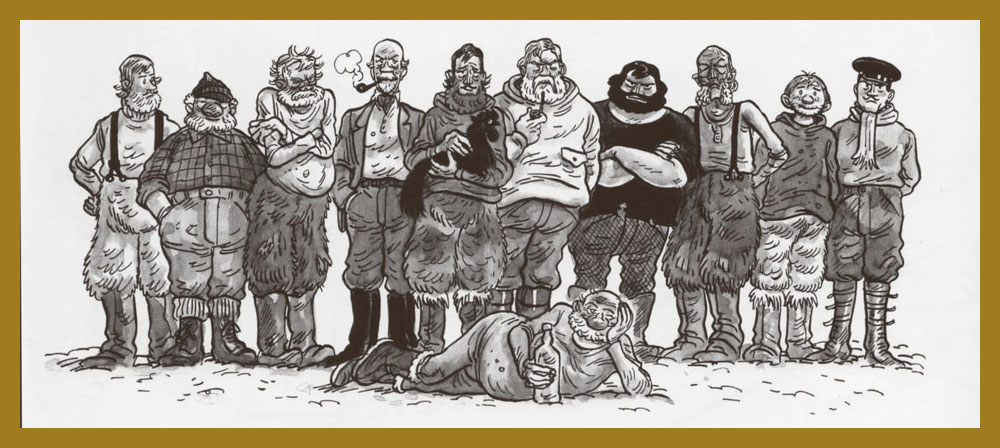
The majority of our esteemed cast: Anton, Museau, Lodvig, Le Comte, Herbert (cradling Alexandre), Mads Madsen, William le Noir, Bjørken, Lasselille, Lieutenant Hansen; and Valfred providing the beefcake in front.
The climatic extremes of the Great North aren’t for everyone, to put it mildly. Anton sinks deep into melancholy.
With its unusual day/night cycle, Greenland is no place for a normal rooster, as we learn from the woeful tale of Alexandre.
« Museau was a first-rate hunter… until he lost his glasses », explains his companion, Bjørken. While treating the puppies to some jam, a freeloader comes along.
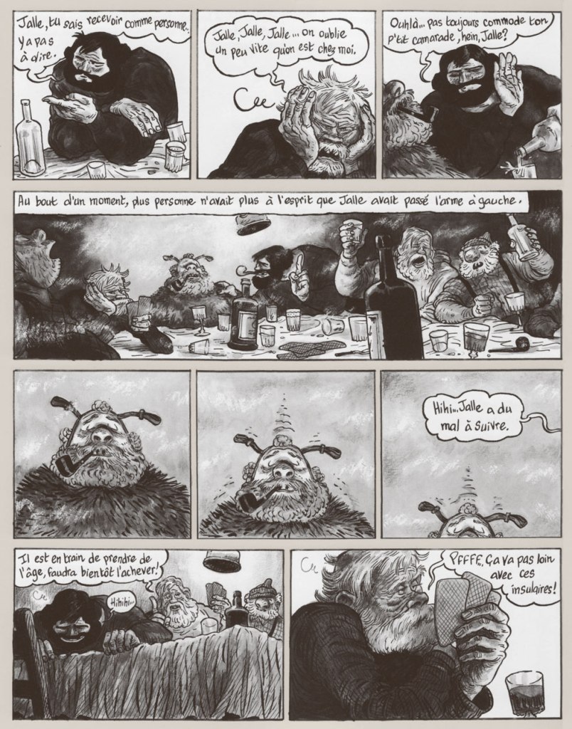
What do you do when someone kicks the bucket during the long winter? The ground being frozen solid, he can’t be buried. And if you leave him outside, foxes or other rascals are liable to carry off the corpse. In this case, you give him a proper send-off — by dropping his coffin into the sea, but first gathering everyone for a boozy feast, with the stiff in the place of honour. Oops, he’s thawing out.
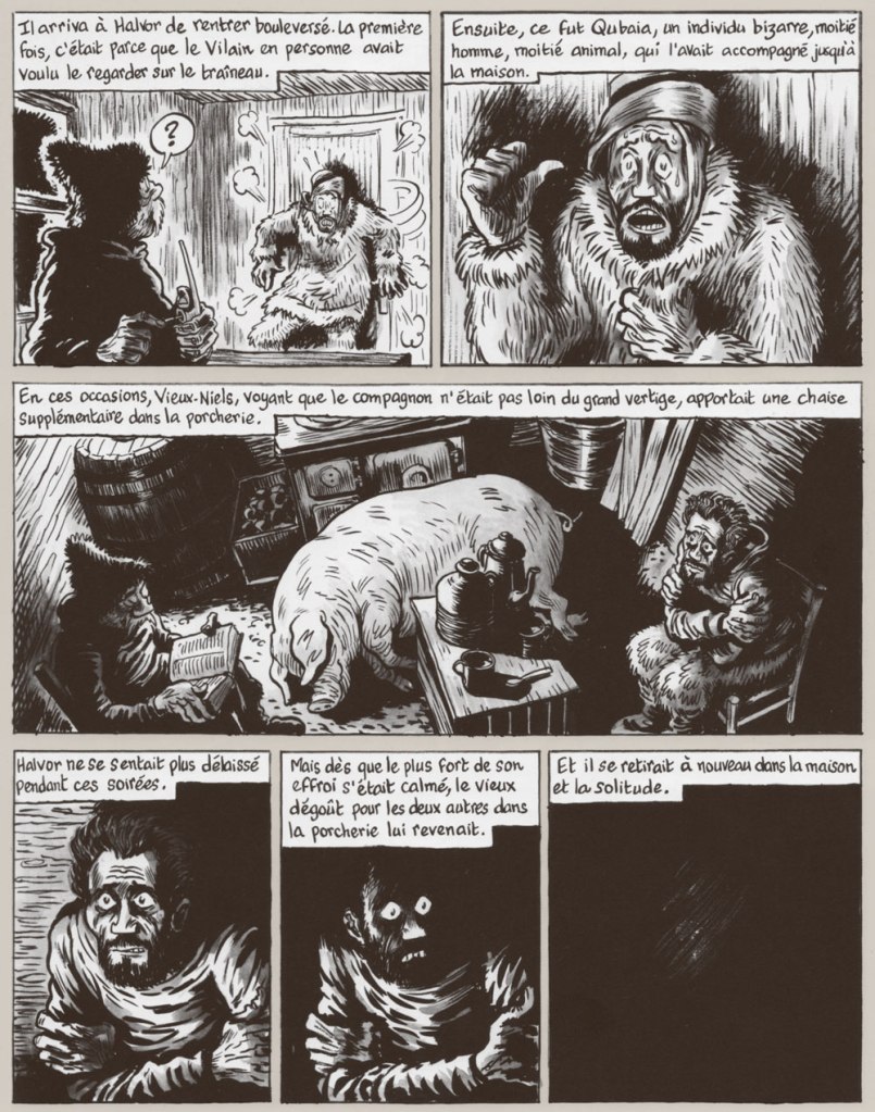
In the darkest of these tales, Le Roi Oscar (that’s the hog), Halvor loses his mind (what his companion calls “the Great Vertigo”), with dire consequences.
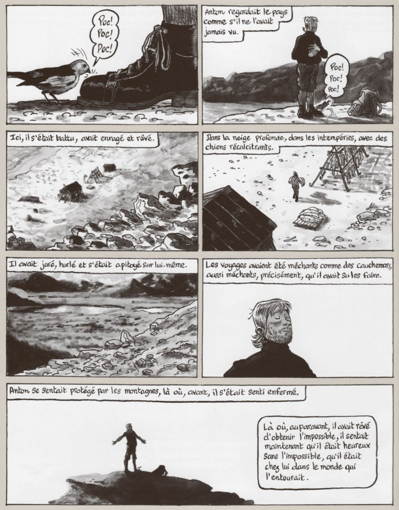
Callow youth Anton Pedersen arrives with a baggage of illusions and misconceptions about the trapper’s life. Reality nearly does him in.
His spirit is saved in extremis by the song of Spring’s first snow bunting, a sweet little guy.
In the set’s wildest and most epic tale, Valfred and Hansen… take a little detour.
The series’ centrepiece is probably La vierge froide (“The Cold Virgin”), in which the men share a useful delusion of Emma, an ideal woman they barter back and forth. Note how Emma’s appearance shifts according to the proclivities of each current companion.
Of this adaptation, Jørn Riel said: « Opening this book is like opening the door to the arctic world as I knew it so many years ago. The trappers in these drawings are exactly as I discovered them then, and to meet them anew this way was both a surprise and a source of great joy. I thank with all my heart the authors and publisher. The trappers of Northeastern Greenland have been resurrected. » Let’s not underestimate the resilience and backbone of such men: after all, the vaunted Vikings gave up living there… because conditions were too harsh for their tender hides.
Jørn Riel defines a racontar (rumours or gossip don’t quite convey the meaning), as “a true story that could pass for a lie. Unless it’s the other way round“. I hope the language barrier doesn’t prove too much of a hurdle. These marvels truly offer a fantastic opportunity for the discerning publisher… and, unless I missed something, the overdue scoop of Riel’s first English-language publication. Hello, Fantagraphics, D&Q…