« I am fond of pigs. Dogs look up to us. Cats look down on us. Pigs treat us as equals. » — Winston Churchill
Recently, I’d been drawing a blank as to the topic of my next post. So I did what one does in such distressing circumstances: I pulled something at random from the nearest bookshelf — just filled a couple of days earlier, conveniently.
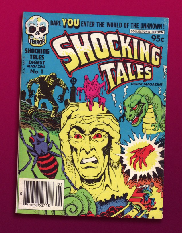
And it paid off: my hand landed upon a screwball, one-shot digest published by a near-defunct Harvey Comics. Its contents? A hodgepodge of 1950s horror and SF tales, including, for instance, Bob Powell‘s classic Colorama (1953) and some of his Man in Black (1957-58) stories. Ninety-five cents well spent.
This is Shocking Tales Digest Magazine no. 1 (Oct. 1981, Harvey).
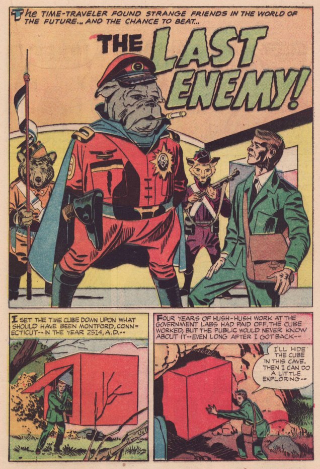
The finest riches in dem dar hills, however, consist in some rather obscure — given its regal pedigree — Jack Kirby material from the late 1950s, reportedly written, pencilled and inked by The King.
However, given the dodgy printing quality of a comics digest, I had to pull out my second-oldest Kirby Komic (the most ancient being December 1952’s Black Magic no. 5 — read it here!) and very, very carefully scan the relevant pages. Oh, the sacrifices I make for this blog! 😉
.
.
.
.
.
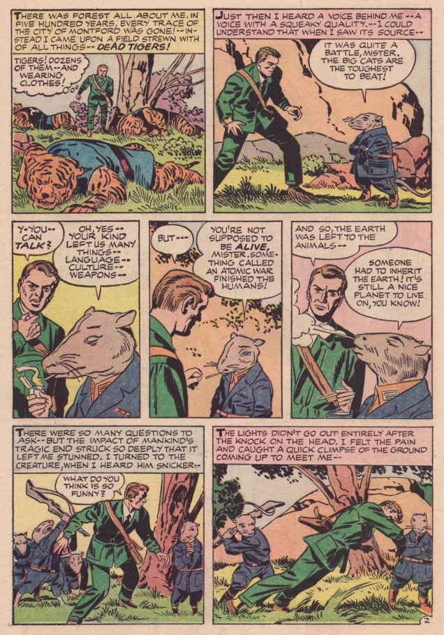
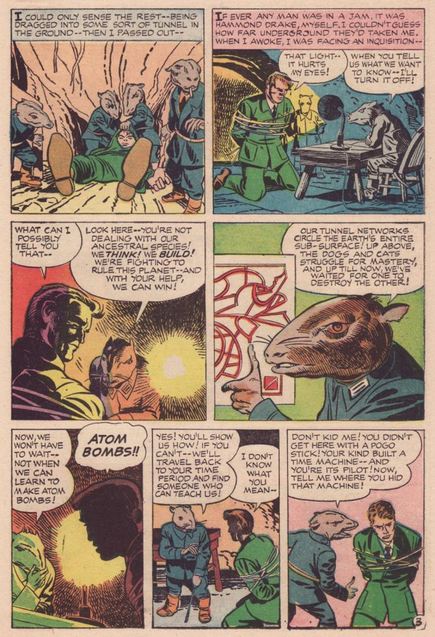
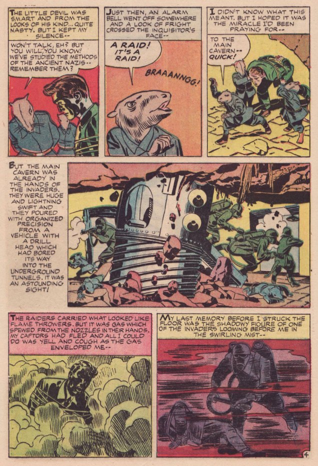
Kirby has often been unfairly slagged for ‘riffing on’ the popular Planet of the Apes franchise, but The Last Enemy predates the 1968 film’s source, Pierre Boulle‘s 1963 novel La planète des singes by some six years… and besides, the ‘animals taking over’ theme has a long history in science-fiction. To name but a pair of antecedents, there’s Lester Del Ray‘s The Faithful (from 1938) and Clifford Simak‘s City (linked stories published between 1944 and 1951 and amalgamated in 1952).
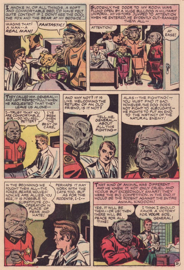
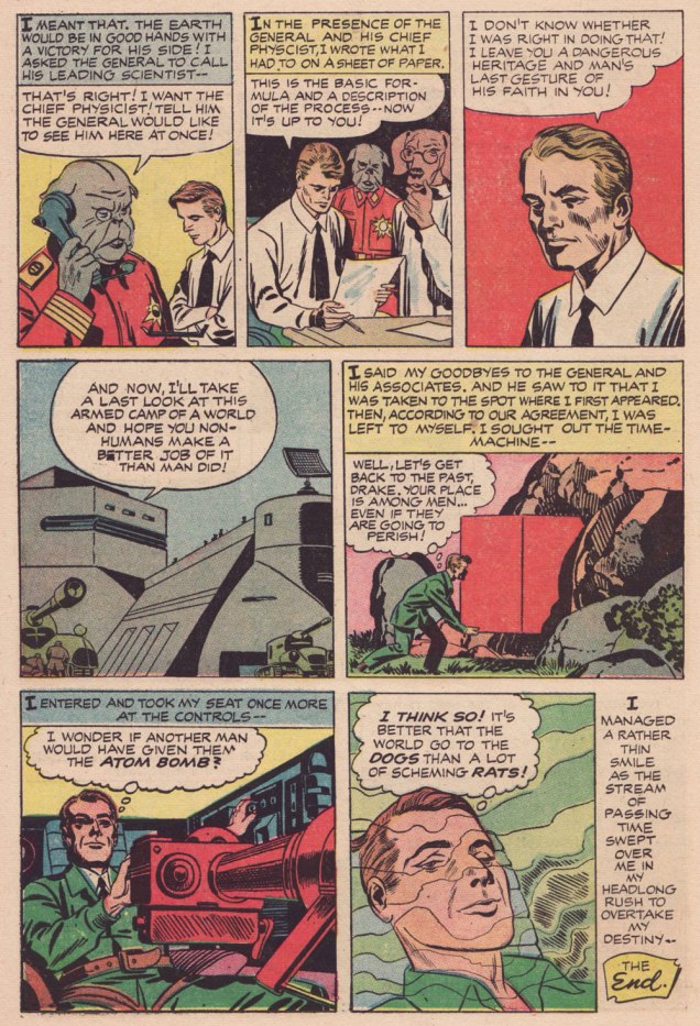
Here’s a second story, which I like even better, thanks to its humorous touches. Several of its plot ideas could have been expanded upon in OMAC, had Kirby been granted time and opportunity.
.
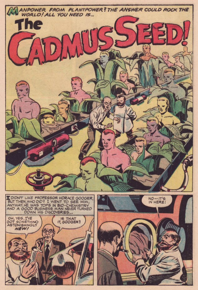
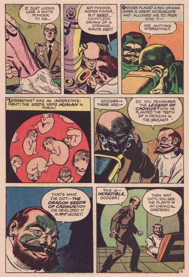
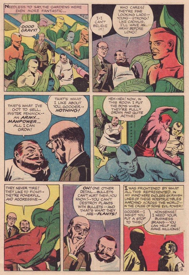
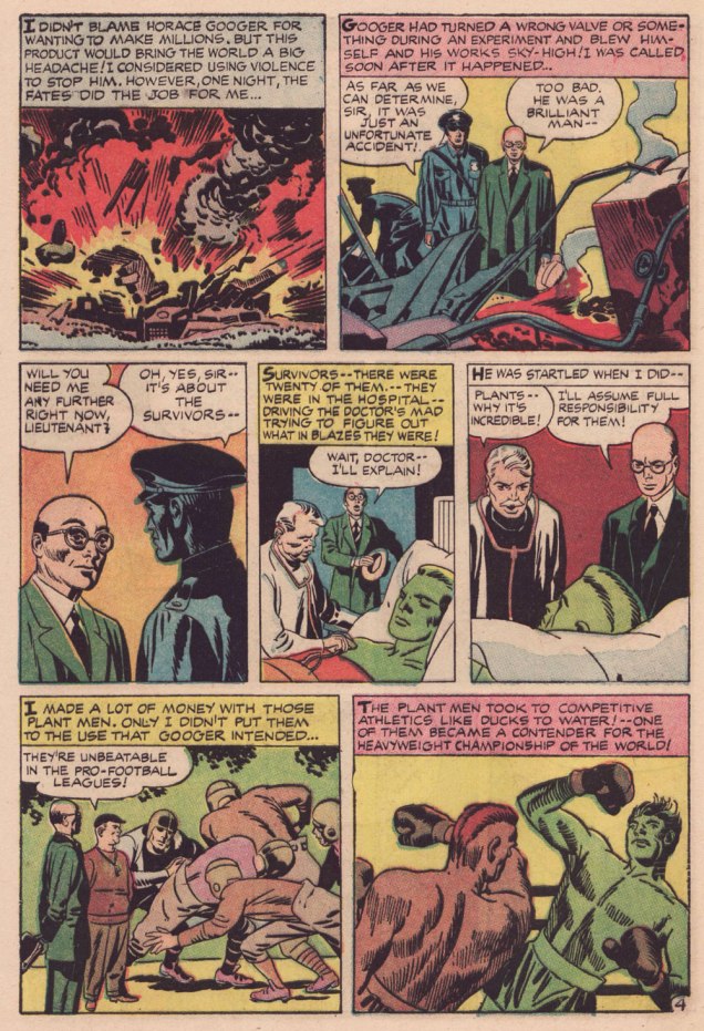
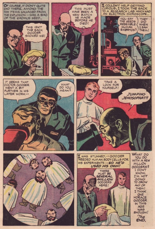
Learn all about the aforementioned Legend of Cadmus and amaze your friends (or bore them to tears, depending on the quality of your circle)!
.
.
.
I suppose I can take Babs having her favourite pooches cloned, but I shudder at the prospect of, ahem, certain people being genetically reproduced on an industrial scale. Another argument for nailing that particular Pandora’s box shut for good.
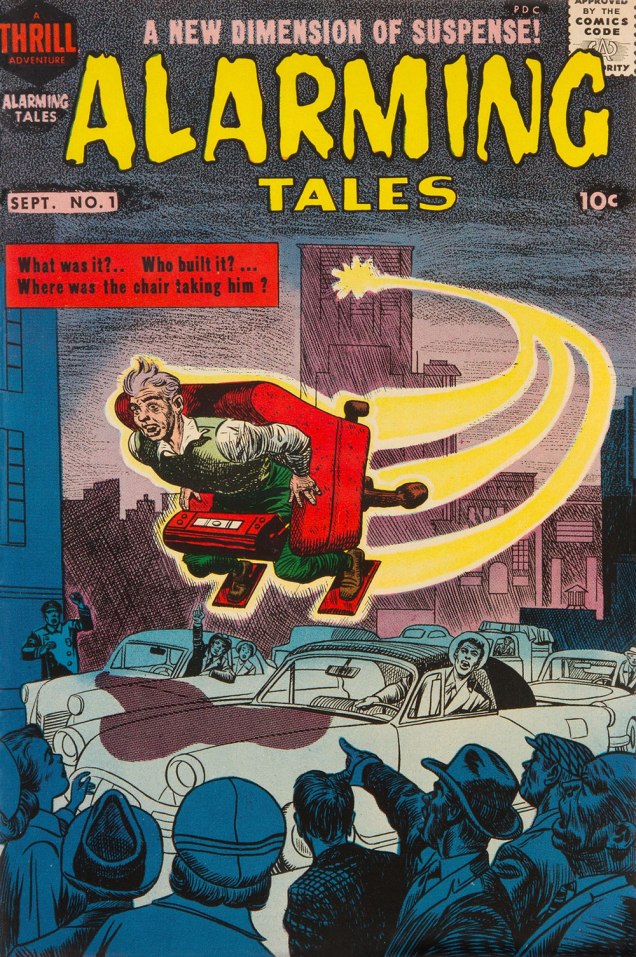
Both yarns appeared in this jam-packed. all-in-colour-for-a-dime wonder, Alarming Talesno. 1 (Sept. 1957, Harvey). I was fortunate enough to pick up a copy for peanuts, eons ago — but fret not, you can read it gratisright here.
Cover artwork by Joe Simon (main figure) and Kirby (everything else). Further details on this issue can be found here… and you can read the rest of it here!
« Taking something from one man and making it worse is plagiarism. » — George Augustus Moore (1852-1933)
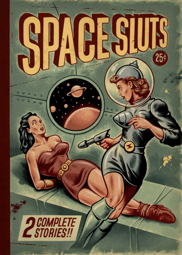
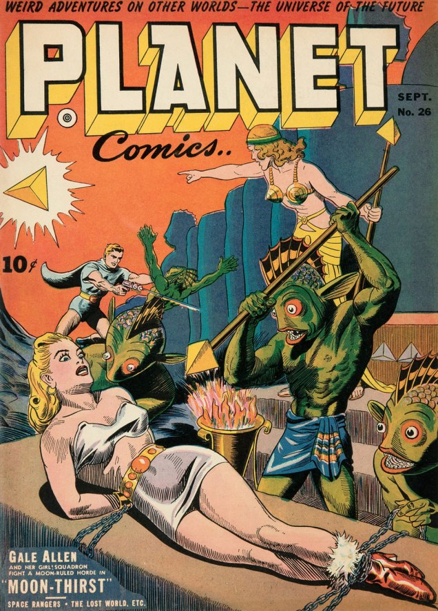
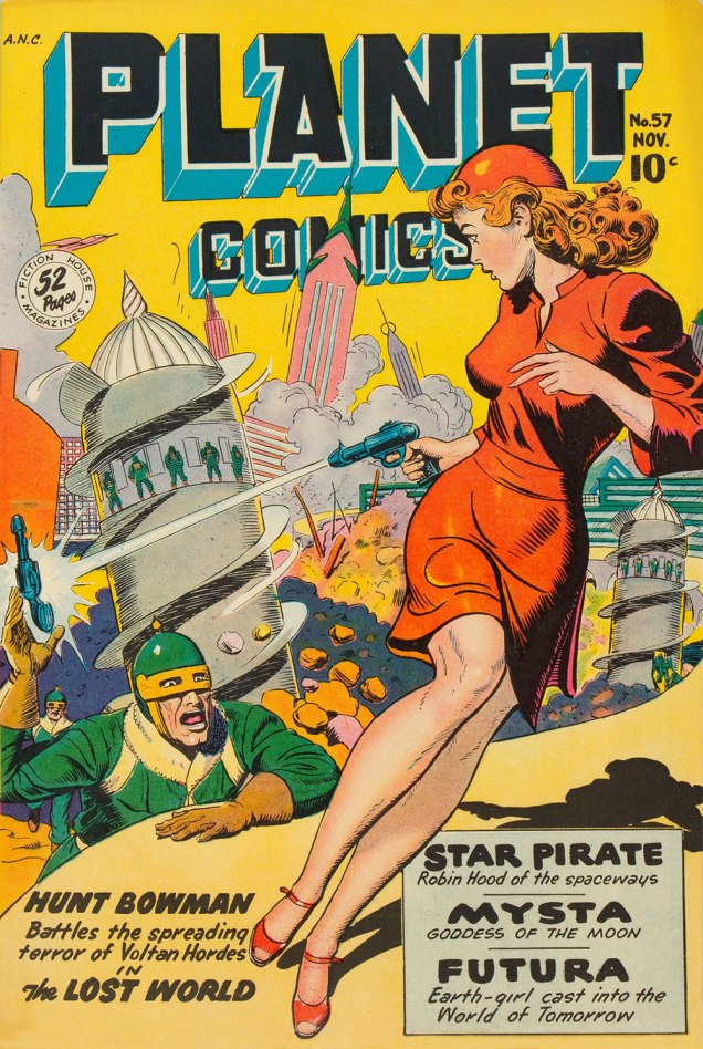
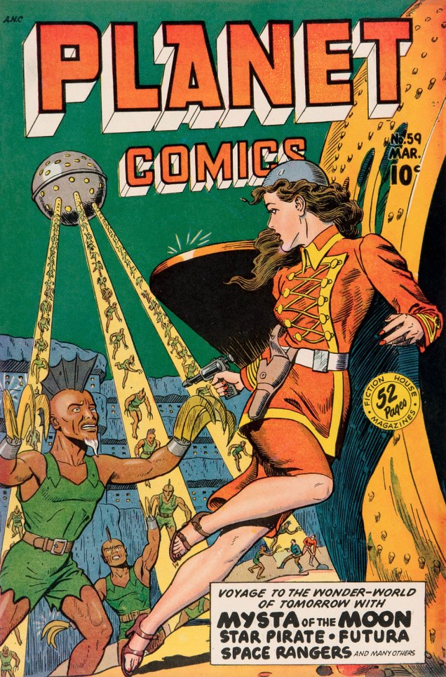
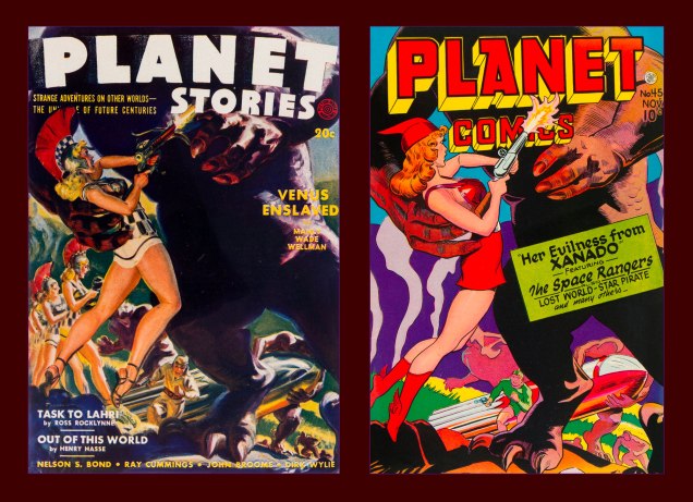
A fortnight or so ago, I came across an image that looked… familiar. It wasn’t slick enough to be AI, so I presumed it was a swipe. My first guess was Fiction House’s Planet Comics, but I initially came up empty. Then I realized my error: I was looking for a reproduction of the whole scene, involving both figures.
After a second pass… bingo: two issues of Planet Comics. At least the swiper was consistent: both covers were drawn by the same guy, Joe Doolin (1896-1967), a prolific pulp and comic book illustrator. Check out his interesting biography.
This is Planet Comics no. 26 (Sept. 1943, Fiction House), cover by Doolin. Frankly, it’s easy to imagine this one recycled, with minor changes, as a Sheena-style jungle scene, another of the publisher’s specialties.As for the source of our second figure, here’s Planet Comics no. 57 (Nov. 1948, Fiction House), cover by Doolin.This is Planet Comics no. 59 (Mar. 1949, Fiction House). A mere two issues later, Doolin virtually reused the same pose*, though obviously, he wasn’t so lazy as to not redraw it from scratch. Pretty nifty outfit on the heroine. Who are these bozos? Inbred descendants of the Savage Dragon and Razor Fist? Jeepers.
I mentioned the clumsy swipe in question to a long-time friend and colleague (salut, Éric!), who informed me that the ‘Space Sluts’ had been making the social media rounds (as they would), and that an alarming proportion of commenters had been fooled into thinking the piece was an artifact of some ancient origin, instead of a recent ‘creation’. No great shock there, as your average Joe Schmoe can’t recognize AI slop either when he sees it (but adores it indiscriminately).
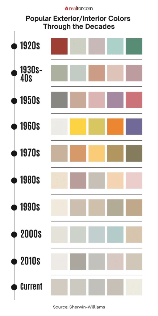
I mean, it’s all wrong: the depressing 21st century desaturated colours (denizens of our current dystopian nightmare shun bright, saturated colours (see graphic below) like a vampire eschews garlic), the telltale phoney brushstrokes of digital art, the incorrect cropping (no art would have been published with the space beyond the edges showing), methods of shading, the ‘dust and scratches’ being the same colour as the printed ink,.. I could go on all night, but I’ve got better things to do.
Then there’s the title. The art is insult enough, but was the shaming necessary? On Facebook, some mooncalf pointed out — incorrectly — that ‘slut’ didn’t have the meaning we’re familiar with until the 1960s. Nope (read on), but it likely wouldn’t have made it into print, and certainly not on the cover of a mainstream pulp magazine. I turn to a favourite reference work, Hugh Rawson‘s Wicked Words (1989, Crown) for the nitty-gritty:
slut. A slovenly woman, one of loose morals, a prostitute, HUSSY, or JADE. “He got very drunk and brought back a sluttish girl to the house. He woke me later to tell me that he had rogered her and her mama, too.“ (Evelyn Waugh, Remote People [in Kenya], 1931). An old word, perhaps related to SLATTERN, slut was applied to women long before the nineteenth century, when it sank to the animal level, becoming a euphemism for a she-dog, or BITCH. In very olden times, it was not restricted to women, e.g. “Why is thy lord so sluttish“ (Geoffrey Chaucer, The Canon’s Yeoman’s Tale, 1387-1400). The feminine senses developed early, however, and they soon became dominant, which is usually what happens when “bad” words have both male and female meanings. Nowadays, only women are sluts or sluttish, the men having managed to get to escape the derogatory designation, just as they did with, for instance, GIRL, HARLOT, and SHREW.
As a side note, Doolin himself was no stranger to swipes, though technically these were above-board, publisher-commissioned recreations.
« The publisher of Fiction House, Thurman T. Scott, was notorious among pulp artists for repeatedly demanding additional revisions before granting final approval of his cover art. Most pulp publishers understood that good covers resulted in good sales, but Thurman T. Scott was obsessed with perfecting an unbeatable formula for maximum sales. The most obvious element of his formula was a big sexy pin-up. This same mania is reflected in the bizarre reappearance of Fiction House pulp covers on Fiction House comics. »
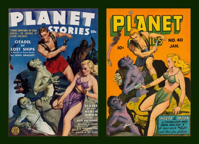
At left, Planet Stories no. 11 (Summer 1942, Fiction House), a cover painted by WOT? favourite Norm Saunders; at right, Planet Comics no. 45 (Nov. 1946, Fiction House), a line art remake by Doolin.At left, Planet Stories no. 14 (Mar. 1943, Fiction House), a cover painted by Jerome George Rozen (1885-1987); at right, Planet Comics no. 40 (Jan. 1946, Fiction House), a line art remake by Mr. Doolin, with a couple of minor modifications tossed in.
-RG
*I expect more from Doolin than from, say, Ross Andru, who used the same basic pose on every single 1970s cover he drew, and I’m barely exaggerating.
« “Obey the government“, said one croak. “We are the government“, said another. » — Ray Faraday Nelson
I’ve been juggling several ideas for posts, most of them leaning more or less to the light-hearted and poetic, save one… and since that outlier is more suited to the current state of affairs, here goes.
.
.
.
.
.
.
.
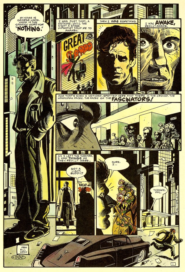
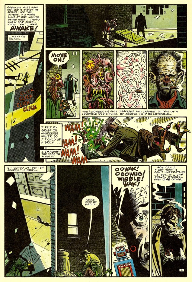
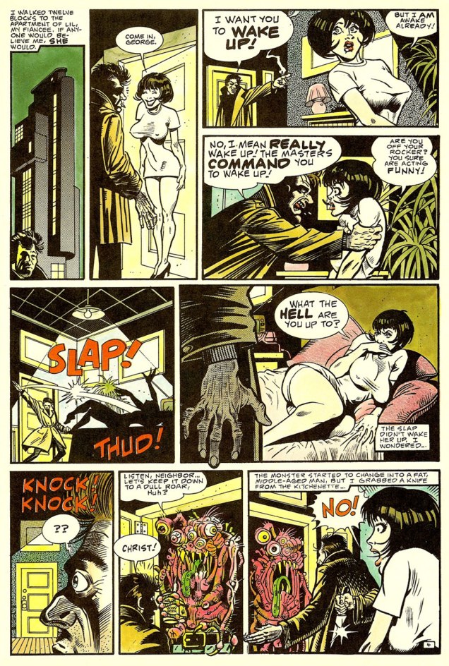
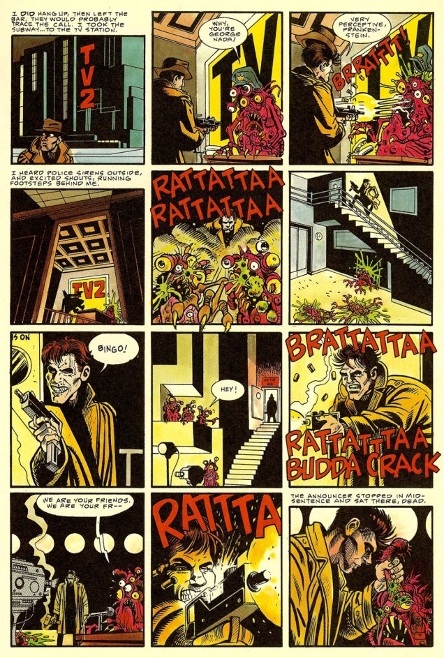
Nada appeared in Alien Encounters no. 6 (Apr. 1986, Eclipse; cat yronwrode, editor). An early work by cartoonist/animator and fine art painter*Bill Wray, he’s gloriously channelling all of his influences at once: Eisner, Steranko, Stout, Reese, Elder, and perhaps a smidgen of Thorne.
You guessed it, the story was adapted by John Carpenter for his 1988 film They Live, one of the great science-fiction films of that decade that bombed at the box office and were later reconsidered… more lucidly. Think Carpenter’s The Thing** (among others… poor guy!), Ridley Scott’s Blade Runner, and this one. At least it didn’t suffer a pointless remake or a Denis Villeneuve sequel. Yet.
Anyway, Carpenter recounted, in an interview published in the venerable American Cinematographer (Sept. 1988), soon after the film’s release: « They Live began three years ago with a comic book I bought called ‘Nada’. It was published by Eclipse Comics, a company which puts out very beautifully rendered science-fiction stories. This particular strip was taken from a short story called ‘Eight O’Clock in the Morning’ by Ray Nelson. » [ source ]
Related aside: on They Live‘s imdb.com page, some lout quite misunderstood the purpose of a FAQ — objectivity, for one thing — and took it upon himself to malign Ray Nelson’s essential contribution. To the question « What are the differences between the short story and the film? », he frothed forth:
The short story, titled Eight O’Clock In The Morning, is an exercise in awful writing. The protagonist goes around murdering “Fascinators” without any discussion of what changes him from a compliant citizen to this state.
What John Carpenter’s story does, in essence, is add fat, muscle, a brain, and pretty much everything else a living organism needs, to a skeleton in the most literal sense. Everything that fills out John Nada’s back story and makes him seem like an actual person who thinks and feels is all John Carpenter’s idea.
Ahem. It seems to me that there just *might* be a slight difference, in terms of expansiveness, between a 94 minute motion picture… and a five page short story. Well, you be the judge: read it here, in its original context and everything!
-RG
*I simply must point out that, though I like Mr. Wray’s work as a cartoonist, I am in absolute awe of his paintings. Here’s how he helpfully puts it: « Making his living as a cartoonist who specialized in painted subjects, he spent many years coalescing a eclectic array of art styles, ultimately finding his voice in a contemporized reflection of traditional California regional painting that focus on humble subject matter rarely considered as fine art. » His paintings are so very *soulful*, demonstrating a glorious grasp of colour and composition, to say nothing of subject and technique. Take a leisurely look here.
**Farewell to The Thing actor T. K. Carter, who passed away just today. What a cast that was!
« You mean the secret password is Llanfairpwllgwyngyllgogerychwyrndrobwllllantysiliogogogoch? » — Barbarella
Unlike French rock ‘n’ roll, French science-fiction isn’t an oxymoron.
A couple of months back, I happened to order a handful of issues of Fiction (1953-1990), nominally the French-language edition of The Magazine of Fantasy & Science Fiction… yet superior in the sense that Fiction’s focus was broader, encompassing as it did more elusive genres like fantastique, while devoting ample space to excellent critical essays… in the French manner.
I was buying specific issues for their reprints of tales by my favourite writer, Jean Ray, and a couple of the issues happened to bear covers by future superstar Jean-Claude Forest (1930-1998), fabled creator of Barbarella, Hypocrite and Bébé Cyanure, as well as scripting early episodes of Paul Gillon‘s Les naufragés du temps.
As it turned out, Forest had lent his talents to quite a bevy of covers for Fiction — which speaks well of their editorial discernment — and as the kind seller had priced other issues at a most modest price — these are nearly seventy years old, let’s not forget — I opted to spring for more Forest rarities… and so here we are.
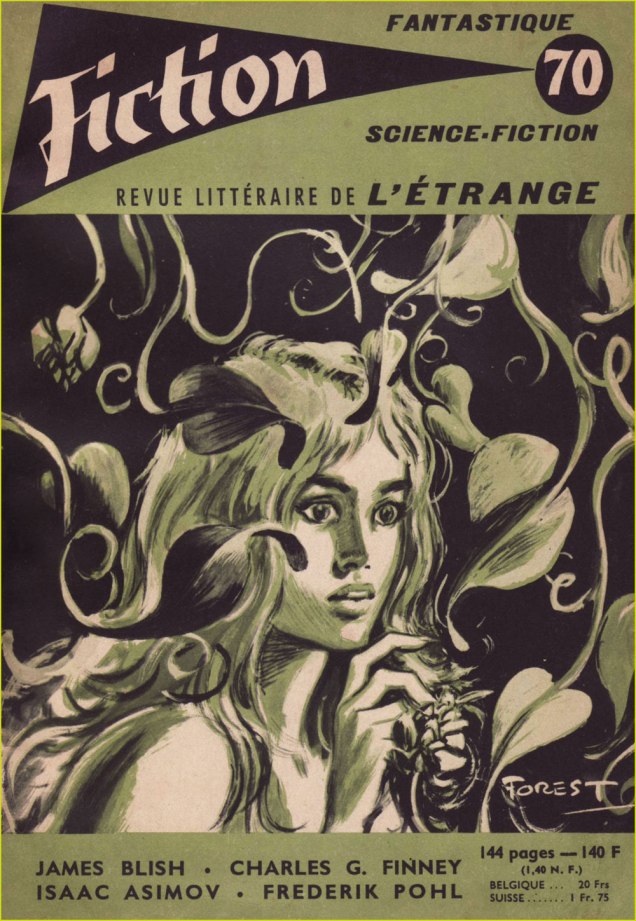
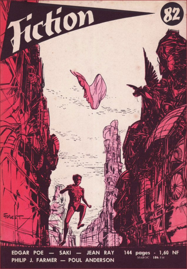
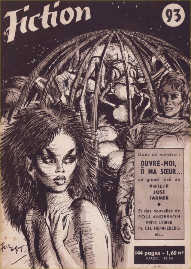
This is Fiction no. 61 (Dec. 1958, Éditions Opta), with Forest’s cover illustrating Julia Verlanger‘s “La fenêtre“.This is Fiction no. 64 (Mar. 1959, Éditions Opta), with Forest’s cover illustrating Robert F. Young‘s “La déesse de granit” (« Goddess in Granite »).This is Fiction no. 68 (July 1959, Éditions Opta), with Forest’s collage cover illustrating Charles Henneberg‘s “Au pilote aveugle“.Is that you, Barbarella? This is Fiction no. 70 (Sept. 1959, Éditions Opta), with Forest’s halftone cover illustrating Ilka Legrand‘s “Le rire dans la maison“.This is Fiction no. 75 (Feb. 1960, Éditions Opta), with Forest’s cover illustrating Thomas Owen‘s “Le manteau bleu“. Owen (né Gérald Bertot, 1910-2002) was among the great Belgian writers of the fantastique genre.This is Fiction no. 76 (Mar. 1960, Éditions Opta), with Forest’s cover depicting — you guessed it — Theodore Sturgeon‘s “The Silken-Swift“, translated here as « Douce-agile ou La licorne ».This is Fiction no. 81 (Aug. 1960, Éditions Opta), with Forest’s cover illustrating André Pieyre de Mandiargues‘ “Clorinde“.This is Fiction no. 82 (Sept. 1960, Éditions Opta), with Forest’s cover illustrating Philip José Farmer‘s “The Night of Light“, translated here as « La nuit de la lumière ». I love what Forest does with the composition, its focal point that elusive butterfly with a woman’s face.Forest goes gothic! This is Fiction no. 90 (May 1961, Éditions Opta), featuring a well-timed reprint of Henry James‘ 1898 novella “The Turn of the Screw” (read it here!), several months ahead of Jack Clayton and Freddie Francis‘ fine cinematic version, « The Innocents ».This is Fiction no. 93 (Aug. 1961, Éditions Opta), with Forest’s cover illustrating Philip José Farmer‘s “Open to me, my Sister“, translated here as « Ouvre-moi, ô ma sœur… ».This is Fiction no. 97 (Dec. 1961, Éditions Opta), with Forest’s cover illustrating Michel Demuth‘s “La route de Driegho“.This is Fiction no. 105 (Aug. 1962, Éditions Opta); exceptionally, Forest’s cover doesn’t refer to any of the inside stories; instead, he offers a scene featuring Pygar the blind angel, last of the ornithanthropes, a character from the bédéiste’s signature series Barbarella, which had just begun serialisation in V Magazine that spring. Finally — at least in my collection — this is Fiction no. 117 (Aug. 1963, Éditions Opta); Forest’s intriguing cover doesn’t appear to correspond to any of the stories within.
A word of warning: I plan to further elaborate on the superiority of French science-fiction in comics, but it’s daunting work, and might take a while yet, so bear with me. I’m pretty busy these days.
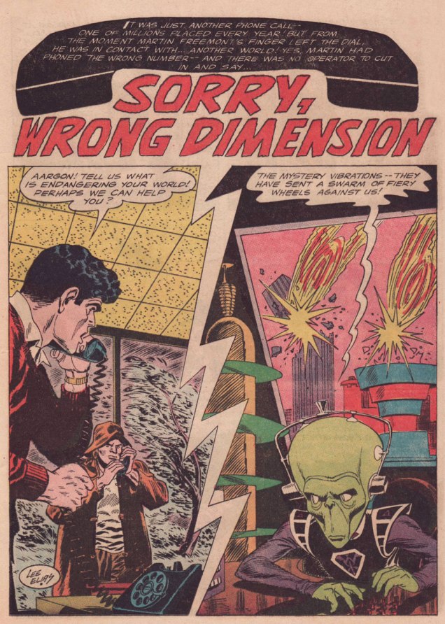
« All realities, all dimensions are open to me! » — Prince
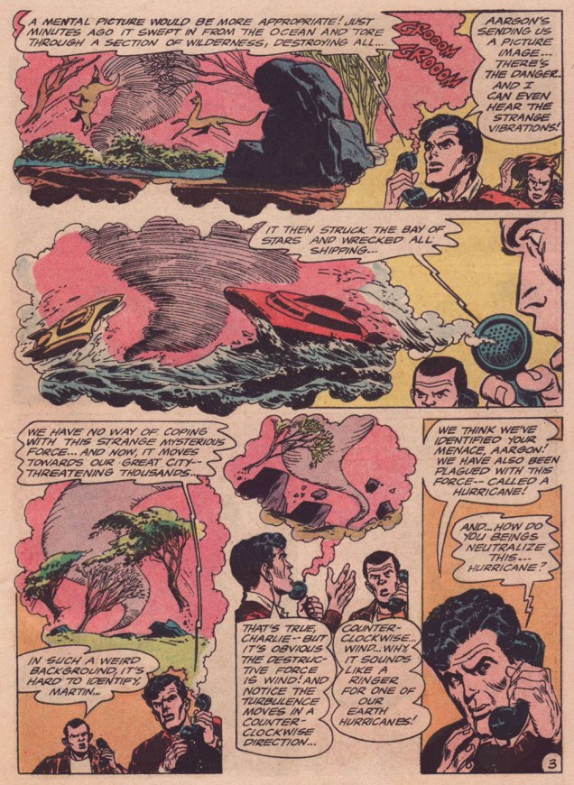
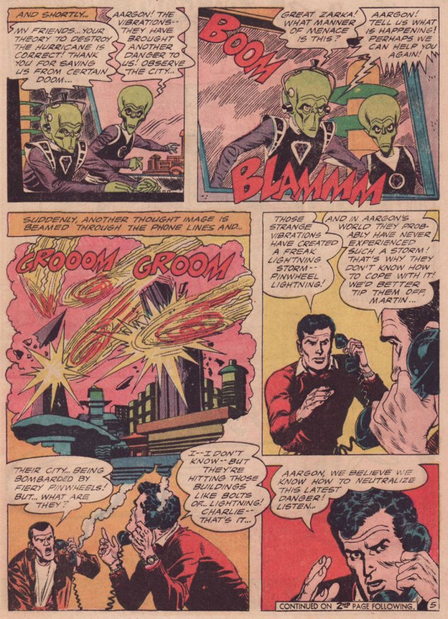
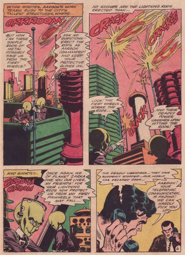
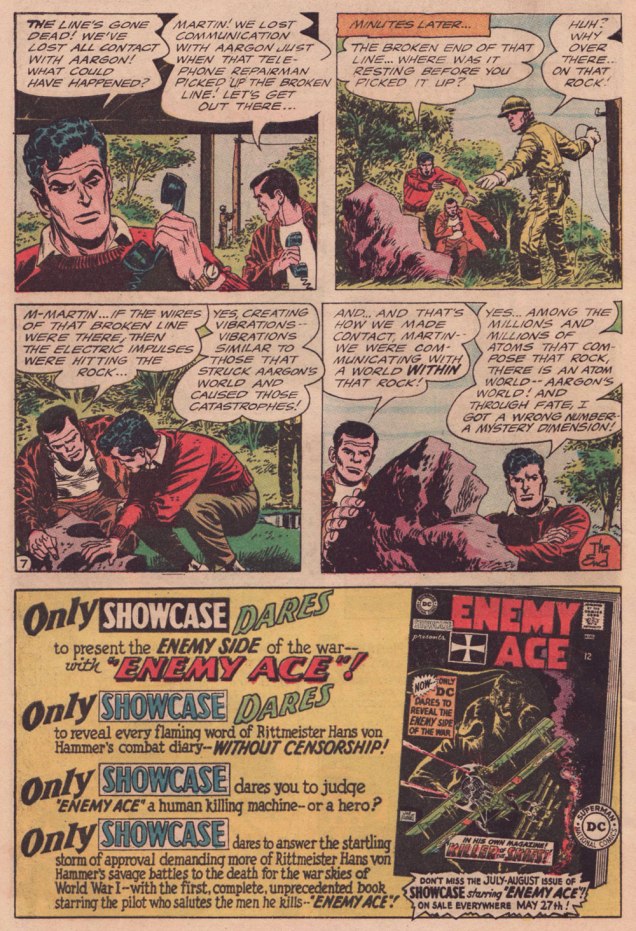
Growing up, Lee Elias (1920-1998) never was a particular favourite of mine. A handful of stories in DC’s mystery titles aside — and I’ve grown to love those — I probably came across his work for Marvel’s Human Fly series, and I was always disappointed when Elias, not my beloved Frank Robbins, turned up in the credits. For the record, Elias drew ten of the nineteen HF issues, and Robbins drew six, plus five covers.
Over time, I noticed his gloriously gruesome cover work with art director-designer Warren Kremer for Harvey’s Pre-Code Horror titles of the early 1950s. His work on DC’s Adam Strange in the mid-1960s is best forgotten — there is only one Adam Strange, and it’s Carmine Infantino‘s (with trusty inker Murphy Anderson along for the Zeta Beam ride, of course). However, I adore Elias’ brief run (with writer Dave Wood) on Ultra the Multi-Alien, the splendidly wacky feature that replaced Adam Strange in Mystery in Space (issues 103 to 110, 1965-66).
Why am I so fond of this particular story? It’s the little things: for once, a story in a Jack Schiff-edited title makes some semblance of adhering to scientific — or at least science-fictional — principles; here, Elias designed an alien race that, given their grumpy, unprepossessing mugs, would typically have been cast as villains, but instead turn out perfectly honourable; the story’s human protagonists give aid to strangers in need, never asking for a thing in return: no Zarkan mineral rights, no salacious dirt on J’onn J’onzz, just selfless dedication to doing the right thing and the satisfaction of averting a crisis. How refreshingly old-fashioned, a cooling balm for these harrowing times.
-RG
p.s. my partner ds should return to our blog soon… she’s at present battling a mild case of writer’s block, so I’m filling in.
Holiday, Oh what a lovely day today, I’m so glad they sent me away, To have a little holiday.*
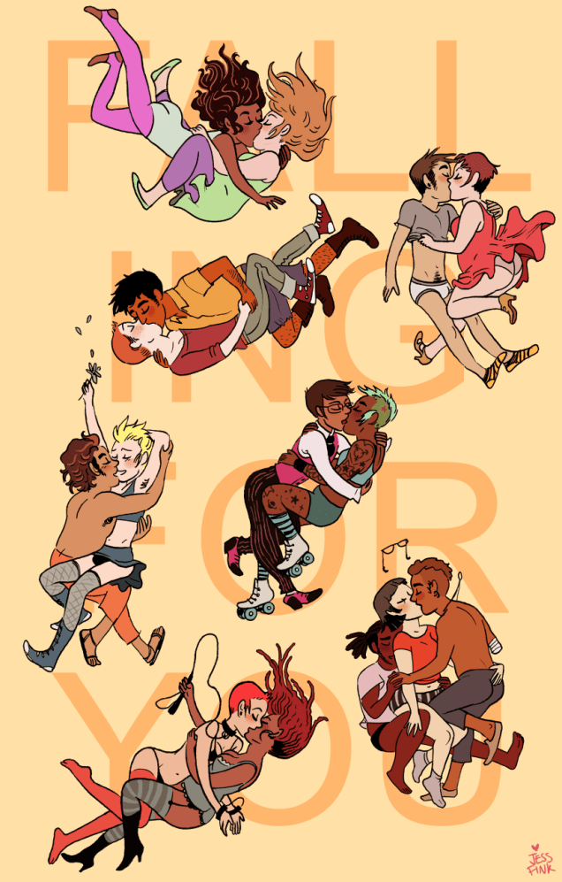
Today we embark on a V̶i̶c̶t̶o̶r̶i̶a̶n̶ r̶o̶m̶a̶n̶c̶e̶** romance set in 1889, seasoned with more than a dash of steampunk, all in the name of sweet (and currently very much needed) escapism. Expect NSFW, in case it matters.
Chester 5000 (Top Shelf, 2011) is a typical love story: boy meets girl, boy loses interest in girl sexually and so builds her a sex robot, girl falls in love with robot, boy gets jealous. The mechanical turn of the plot does in no way impede the emotional progression and, as a matter of fact, one finds oneself distinctly rooting for the very sweet Chester. Really, the fact that he’s a robot only comes into play to show off his many pleasure-centred tool attachments, not to mention his ability to hold a lover in mid-air for extended periods of time.
This comic is entirely mute, told in little vignettes which make it quite clear how the characters are feeling. American cartoonist Jess Fink has been singled out for her titillating talent of depicting luscious breasts, and I quite agree (and extend that compliment to the rest of female anatomy). Here are a few of the tamer scenes —
« Jess Fink’s “erotic, robotic Victorian romance” Chester 5000 XYV, an ongoing Web comic that’s recently been collected into a graphic novel by Top Shelf, is utterly of the zeitgeist. It has enough gadgets to entice the steampunk crowd, enough heat (tempered by romance) to seduce the yaoi*** crowd, enough sex-positivity for the feminist crowd, and enough craft for any “but girls can’t draw” naysayers. » (source: TCJ)
One might say this graphic novel is part of a wave of woman-penned, sex-positive, body-diverse comics — and indeed, Fink has several contributions to the anthology Smut Peddler. As for the anthology, I respect it as an admirable initiative, but is not something I collect because sadly most art within rubs me (ha, ha) the wrong way. I had purchased the 2014 edition because of Fink’s How You Gonna Keep ‘Em Down on the Farm story, but I gave it away to a rather stunned older man who came to pick up a box of random books I no longer wanted. Well, he said he wanted to read something new for a change (while his eyes goggled) — I hope he enjoyed it.
** Co-admin RG would like to point out that this isn’t really Victorian other than in costume, and so objects to that categorisation. I’ll leave the reader to decide whether works of fiction set in a specific period (well before the author’s lifetime) deserve that era’s label or not. The Professor’s Daughter (discussed in Félicitations, Emmanuel Guibert!) was described in a review as ‘a love letter to Victorian London’ despite having been brought to life by two men from the late 20th century, but it was better researched than Chester 5000 — though the latter still has historical details, especially in the second volume, and Fink clearly knows a lot about Victorian costumes, as evidenced by this fun interview. If you want smut from the actual Victorian era, I’d like to point you in the direction of Victerotica – A Carnal Collection, volumes 1 and 2. RG also points out a certain plot similarity to La poupée sanglante, a 1923 novel by Gaston Leroux (author of Le fantôme de l’opéra).
***Speaking of yaoi, volume 2 of the series, Chester 5000 book 2: Isabelle & George (also published by Top Shelf), has some nice mann-gegen-mann action.
This is a post I didn’t want to write — or rather, a post I didn’t want to write under the present circumstances. While I’ve known Bernie Mireault (June 27, 1961 – September 2, 2024) for a long time, I couldn’t presume to call him my friend. We were never particularly close, but we ran in similar circles for a time. Then our paths split, many years ago. But I always liked him and greatly admired and followed his work.
I remember him as a kind, generous, humble man, with a soothing voice and manner. And blessed — and cursed, I suppose — with massive, multifaceted talent. Now that he’s left this world, his memory and his work linger. Allow me to showcase a couple of my most treasured Mireaults.
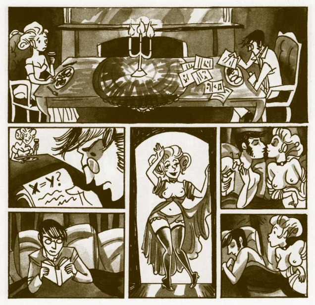
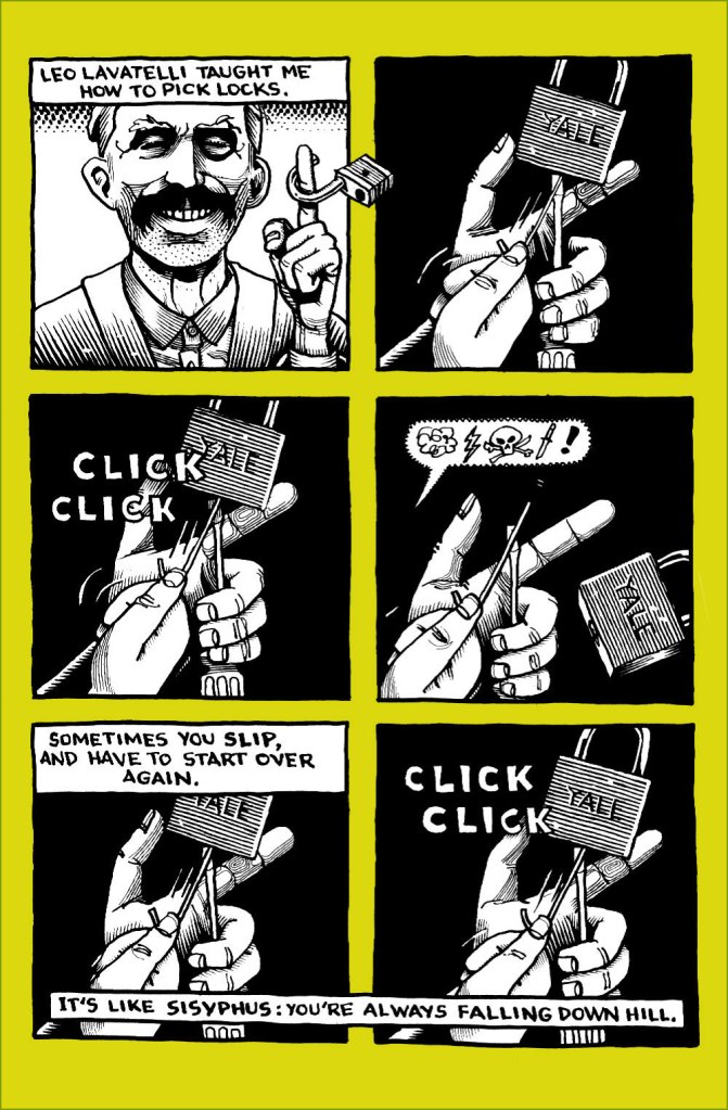
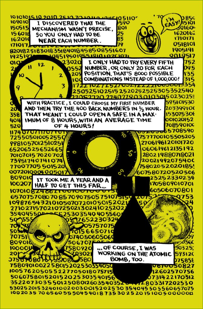
« Though this is fictionalized science, it’s not science fiction. We’ve imagined some of the details, but the characters existed, and did and said (most of) the things you’ll read. » Two-Fisted Science: Safecracker (1997, General Tektronics Labs). Published in advance of the Two-Fisted Science anthology, in order to promote it. However, Bernie’s piece outshines everything else, if you ask me. For good or ill, cheap copies of the comic book are still handily acquired.
This is only (most of) a single chapter of Bernie’s contribution — which totals 30 pages! — but it’s fully enjoyable on its own. Script by Jim Ottaviani, pencils, inks and lettering by Mr. Mireault.
A bit of background about Mr. Lavatelli (1917-1998)…Pray note Bernie’s clever nod to the great Harvey Kurtzman (top left). Of course, working on a story starring genial genius Dr. Richard Feynman already gives you an edge, but Bernie was one of the few cartoonists who could breathe life into the drabbest of narratives. Non-fiction seems especially daunting for today’s cartoonists, for some reason.
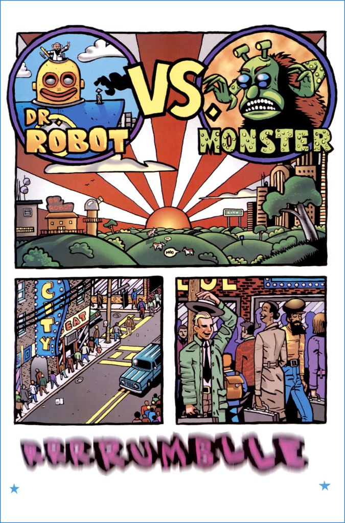
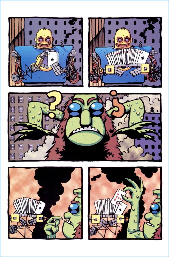
For another facet of Mireault’s talent, and to highlight his peerless colouring chops, here’s my favourite of his too-few Dr. Robot stories, written, pencilled, inked, lettered *and* coloured by Mireault. To this day, insultingly cheap copies are plentiful. Less than the original cover price, for Pete’s sake.
Thanks, Bernie. I’m truly sorry things didn’t work out for you.
I was going to post something very brief this month, telling you what to expect from us in September, which is… nothing else. We’re busily preparing this year’s edition of our Hallowe’en Countdown — which will include some more Mireault, that’s all I can tell you for now. See you soon!
« I was a peaceful sedentary man, a lover of a quiet life, with no appetite for perils and commotions. But I was beginning to realise that I was very obstinate. » — John Buchan
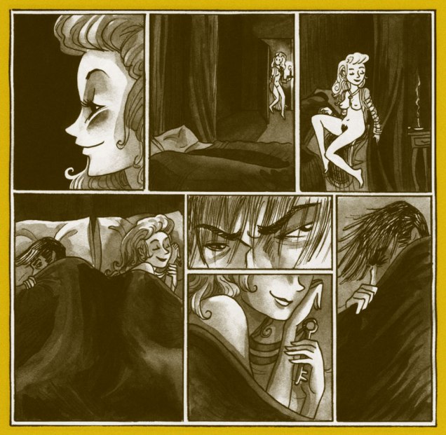
Over the course of several posts, I’ve extolled at length Carmine Infantino‘s skill as a cover designer. Yet the ability to envision and execute a single static image does not automatically translate into the skill of clearly and tidily breaking down a story into a suite of sequential panels, in much that same way that a superbly dexterous surgeon may be incapable of writing legibly. It pleases me to declare that Mr. Infantino’s no one-way specialist.
Infantino describes the evolution of his visual thinking: « The use of negative and positive shapes inside the panel had to mean something. So, to me, if the shapes didn’t draw the eye in, then they weren’t worthwhile. I had to move and change the shape to make it work for me. And that’s what I did. For me beforehand, the figure was the most important thing, and nothing else in the panel mattered. But later on, I found out that it was the total figure I had to worry about. » (all Infantino quotes excerpted from The Amazing World of Carmine Infantino: an Autobiography (2000, Vanguard Productions; edited by J. David Spurlock)
I’ve long wanted to feature this particular tale… for both script and artwork reasons. However, my copy was in Mysteries in Space: The Best of DC Science Fiction Comics (Apr. 1980, Simon and Schuster/Fireside; Michael Uslan, editor)… and I’d be all-but-guaranteed to destroy this beloved book in any attempt to scan from it. But — aha! — I’ve recently acquired a copy of DC Special no. 13 (Jul.-Aug. 1971), which granted the tale its first encore. Game on!
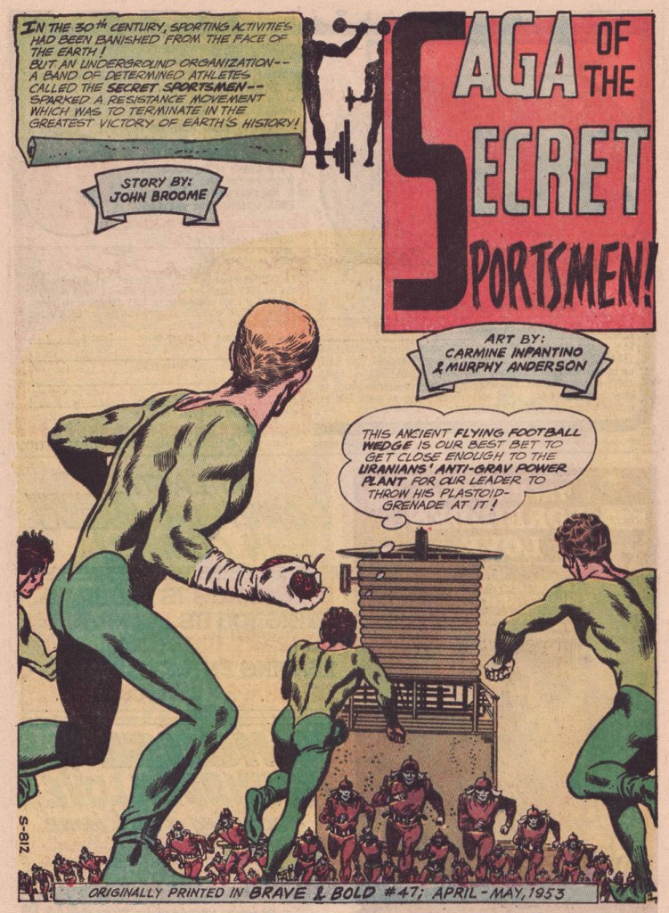
Someone slightly goofed here : The Brave and the Bold no. 47 was published in April-May 1963, not 1953.
.
« The silhouettes I used in ‘Strange Sports Stories‘ [featured in The Brave and the Bold nos. 45-49] were innovations. Julie [editor Julius Schwartz] gave me the script and said, ‘We want this book to look different.” That’s all he said, and I went home and what I devised to make it look different was by using silhouettes as a dramatic device. The action starts in the silhouette, and then you go to the conventional panel, and the action follows through. One might almost call it an animated treatment. »
.
.
.
.
.
.
.
.
.
As smooth and effective as the Infantino-Anderson pairing looks, there was some friction behind the scenes. Infantino explains: « I was beginning to experiment at the time and I threw anatomy out in favor of a higher level of design. Murphy was an excellent draftsman and I’d try to explain what I was trying to achieve to him but this was quite contrary to his own sensibilities. The more stylized I became, the more he thought the work had to be ‘fixed up‘. At one point, he asked for a raise because he had to change my work so much. What he thought he had to ‘fix‘ was the new style I was most excited about. »
Our featured story shares a central perspective with Russ Manning‘s rightly celebrated Magnus, Robot Fighter, whose inaugural issue had come out a mere two months earlier — though with that close a gap, it’s most likely a simple case of coincidence.
A relevant page from Magnus, Robot Fighter 4000 A.D. no. 1 (Feb. 1963, Gold Key); story and art by Manning, with input from editor Craig Chase, who initially pitched the idea of a SF hero to the publisher.
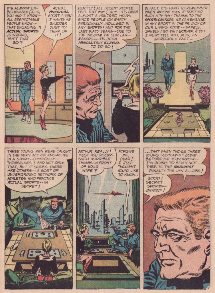
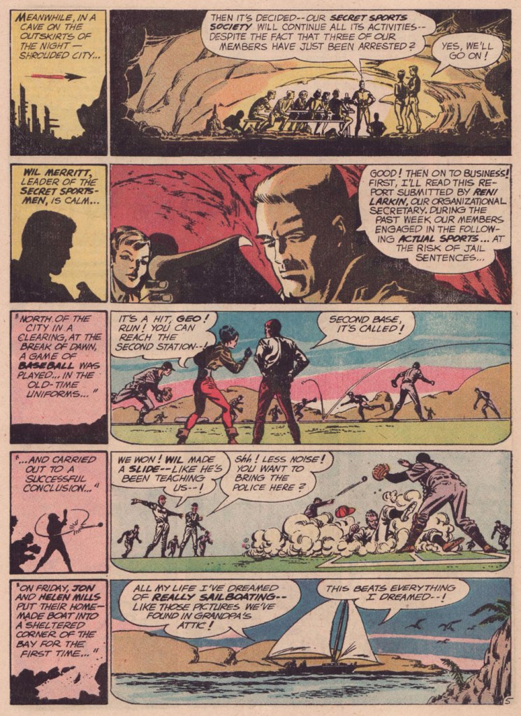
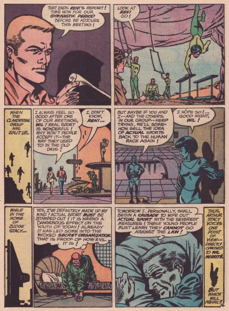
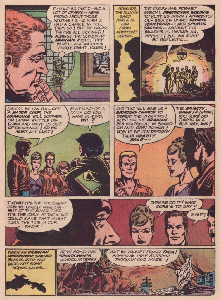
Are we getting less physically able with every succeeding generation, as our elders have been claiming for eons? Is it just a mistaken, shallow assessment arising from tone-deaf obduracy and bad faith — or have our forerunners all been correct about a general and ongoing decline?
« We can lick gravity, but sometimes the paperwork is overwhelming. » — Wernher von Braun
The other day, I was digging through my to-read pile, and came upon a 1950s Charlton science-fiction title I’d picked up for a song during a trip to the Maritimes (that’s New Brunswick in this case), last Fall. Its second story struck me as slight but quite fun, which is pretty much the best one could hope for in those strict, early years under the Comics Code’s oppressive authority. Despite the quickly executed job under overpowering Colletta varnish, I surmised I could identify the penciller’s style: none other than Matt Baker, whom I wrote about almost exactly a year ago, in Matt Baker’s Disquieting Romance. I’d advise you to begin there.
In his review of Matt Baker: The Art of Glamour (2012, TwoMorrows), cartoonist Eddie Campbell provided a useful bit of context: « A final phase, in which Baker had a hard time getting any work at all, is also examined briefly. Between 1955 and ‘59 he mostly pencilled for Vince Colletta, who was somehow well enough placed to pick up as much work as he could handle from Atlas and Charlton. He farmed a great deal of it out to others to pencil, leaving the inking for himself, which is one way to make a living and I’ve never had any problem with it. Colletta is a figure that comic book fans love to vilify. There’s him, Fredric Wertham, and the Red Skull, making the triumvirate of evil. »
But enough telling for now, time for some showing!
This is Mysteries of Unexplored Worlds no. 14 (Aug. 1957, Charlton); cover art by Charles Nicholas and Vincent Alascia. Yes, there was a time when the profligate Alascia was a decent inker.
*
*
*
*
*
Though uncredited, the story was evidently written by Joe Gill. Typical of him, the story is driven by straightforward but purposeful dialogue, in which much is intimated between the lines. It takes the rare gift of economy that tell such a story — and make it work — in just a handful of pages.
So what was in it for Vince Colletta? Basic economics aside — it’s easier to ink well-executed layouts — perhaps he harboured sympathy for this massively talented Black man who couldn’t get work, as all but a few did — regardless of talent — after the massive contraction of the comics field in the mid-Fifties. As a native Sicilian, it couldn’t be far from Colletta’s mind that in America, his own people, not so long before, were forcibly excluded from the ‘Whites’ club.
As Brent Staples wrote in How Italians Became ‘White’ (The New York Times, Oct. 12, 2019): « Italian immigrants were welcomed into Louisiana after the Civil War, when the planter class was in desperate need of cheap labor to replace newly emancipated black people, who were leaving backbreaking jobs in the fields for more gainful employment.
These Italians seemed at first to be the answer to both the labor shortage and the increasingly pressing quest for settlers who would support white domination in the emerging Jim Crow state. Louisiana’s romance with Italian labor began to sour when the new immigrants balked at low wages and dismal working conditions.
The newcomers also chose to live together in Italian neighborhoods, where they spoke their native tongue, preserved Italian customs and developed successful businesses that catered to African-Americans, with whom they fraternized and intermarried. In time, this proximity to blackness would lead white Southerners to view Sicilians, in particular, as not fully white and to see them as eligible for persecution — including lynching — that had customarily been imposed on African-Americans. »
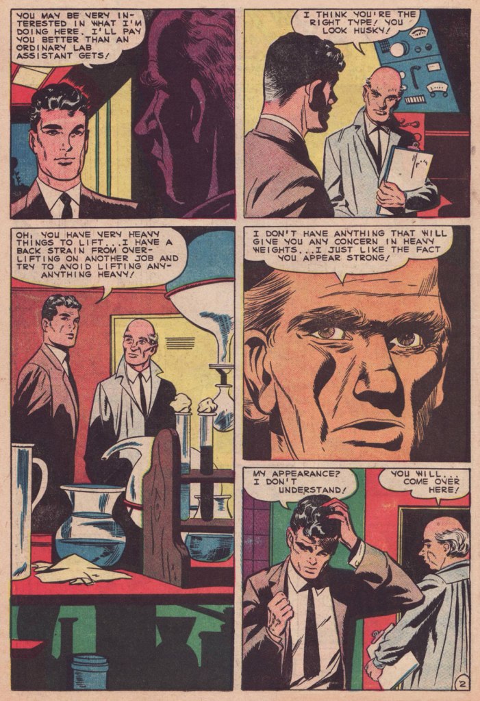
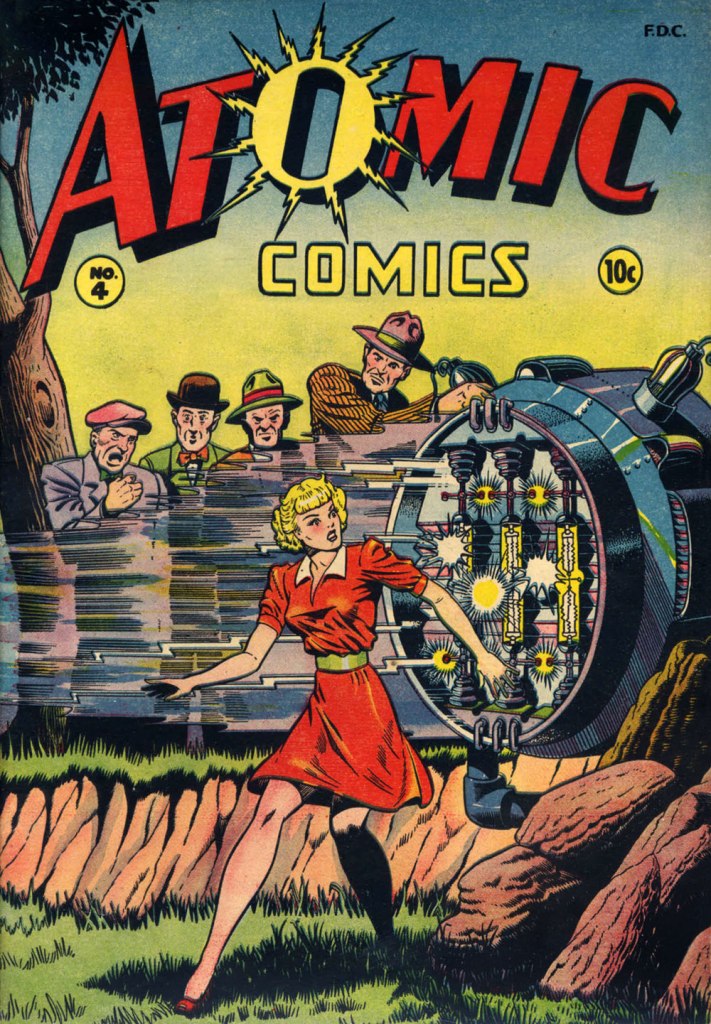
Baker didn’t delve much into the science-fiction genre, but here’s one such case: this is Atomic Comics no. 4 (July-Aug. 1946, Green Publishing). Read it here!Another rarity in Baker’s œuvre: blackness — despite being undermined by the colourist here. This is Amazing Ghost Stories no. 15 (Dec. 1954, St. John). On comicbookplus.com, where you can read this entire issue, a reader commented approvingly: « There are a lot of horror comics set in Haiti. This is the first one I’ve read where it looks like the author did some research on the history of Haiti. »
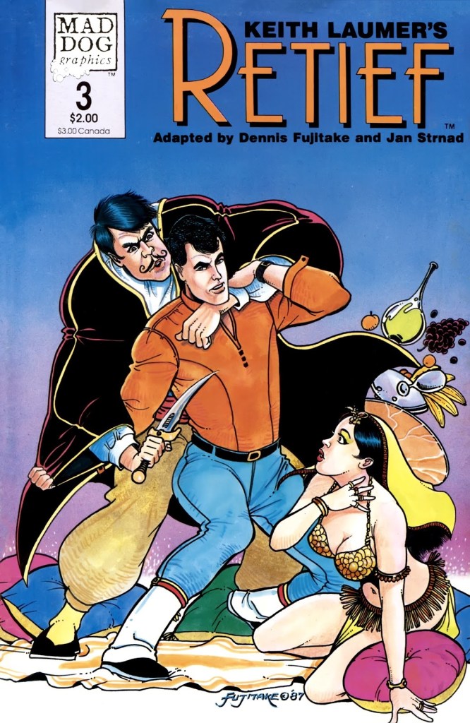
Looking at my shelves, one would be inclined to believe that I am a huge Keith Laumer fan, which wouldn’t be really true. A few of these books have Richard Powers covers (always worth collecting, even if one is not particularly interested in reading the actual book), but the rest have mostly been purchased after I encountered Laumer’s Retief character… in comic book form.
Which is not to say that Laumer’s Retief series is not worth a read, especially if you like a satirical approach to bureaucracy with a geo-political bent. Jame Retief, diplomat for the Corps Diplomatique Terrestrienne*, is the pragmatic voice in an organization mostly focused on excessive paperwork, meaningless awards, and pompous exchanges (in proper attire, naturally) between planetary representatives, all of this governed by a complex system of protocols and other galimatias. Anybody who’s worked for any kind of big company will be able to relate. Laumer served a stint as a vice consul for the United States Foreign Service, so doubtlessly he accumulated a lot of material for this. The novels rarely ascend beyond amusing, though, and the funny bits sometimes feel like somebody’s trying to be Conscientiously Funny.
Writer Jan Strnad, who has a long list of credits under his belt, having worked for pretty much all major comic publishers as well as contributing articles to The Comics Journal and writing novels, and artist Denis Fujitake** adapted several Retief stories into comic book form in the late 80s. These were published by Mad Dog Graphics. This team did such a bang-up job that I by far prefer them to the Laumer material, and no small element of this adaptation’s success is the clean art by Fujitake that brings to vivid life these characters. There were 6 great issues overall (1987-1988), collected in 1990 into Retief!: The Graphic Album.
Let’s have a look at some of my favourite moments. All of the below are excerpts from Keith Laumer stories by Strnad and Fujitake, drawn by Fujitake, and lettered by Gary Kato.
Apparently Laumer himself has always pictured Retief as having dark hair, so one might even say that these comics are closer to his vision than, say, the covers of Retief novels published by Baen Books, where he’s a sort of ditsy blonde*** with a lot of guns and mostly undressed women. I own a few of these… and yuck, one might as well stick to the electronic version.
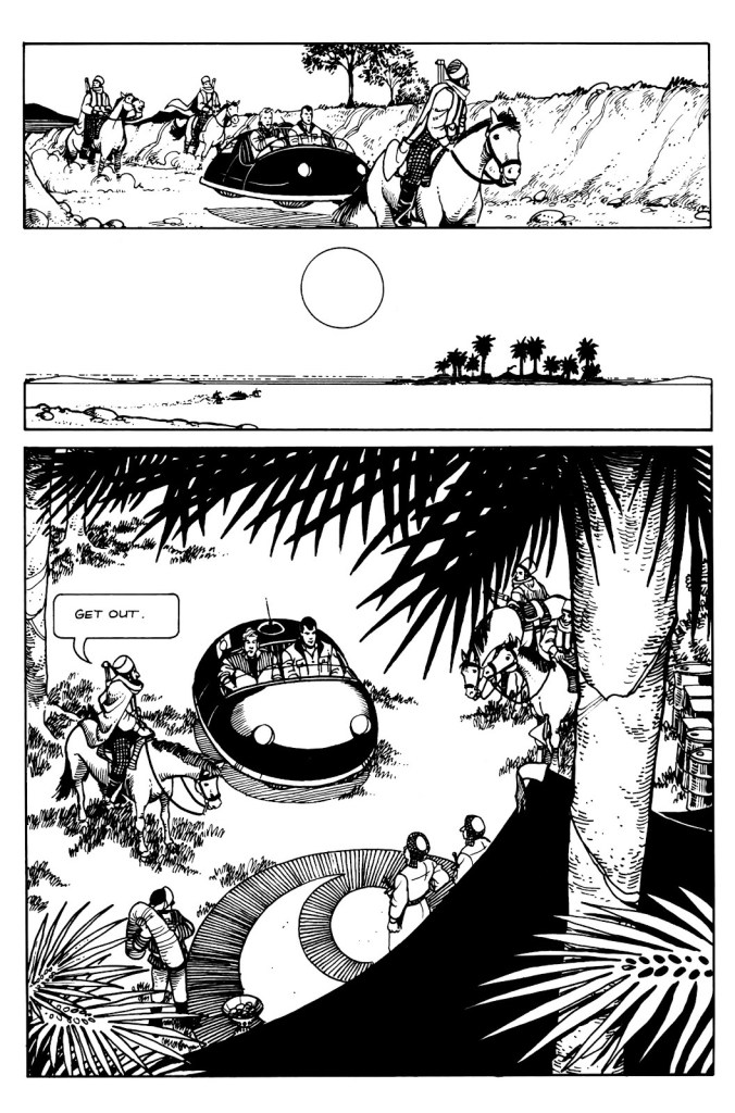
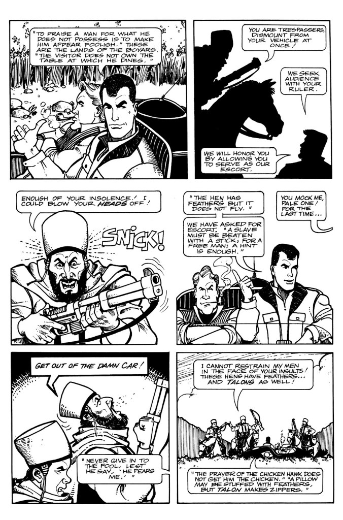
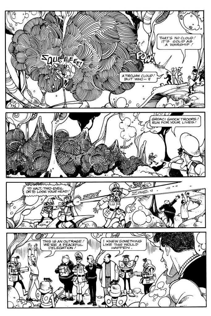
Keith Laumer’s Retief no. 1 (April 1987)
Page from Policy. Issue number 1 introduces us to the sneaky and unscrupulous Groaci, whose representative Mr. Fith has his fingers and 5 eye appendages in all pies. There are plenty of action scenes in Retief, but Fujitake’s art makes an even ordinary conversation fun to watch.
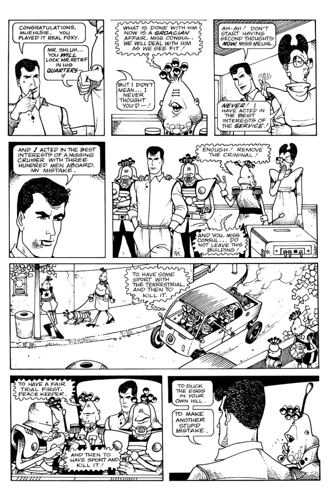
One of the closing pages from Policy, in which Miss Meuhl satisfyingly suffers a slight breakdown (when your values clash with reality, it’s generally an unpleasant process).
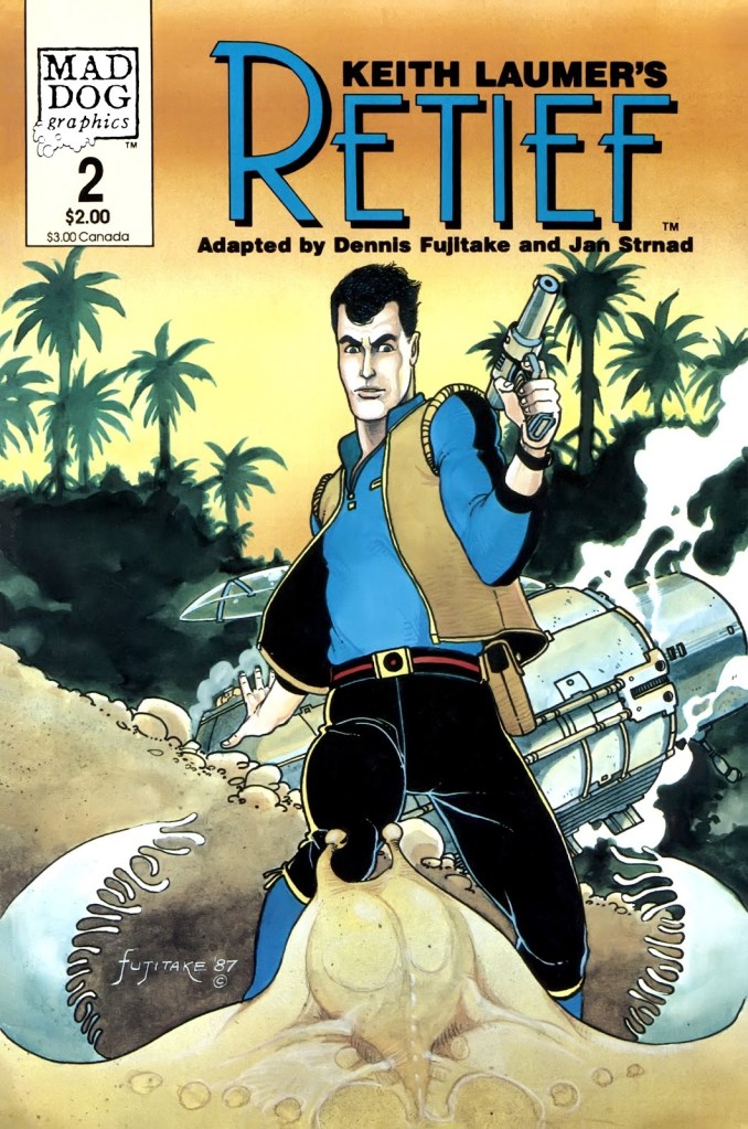
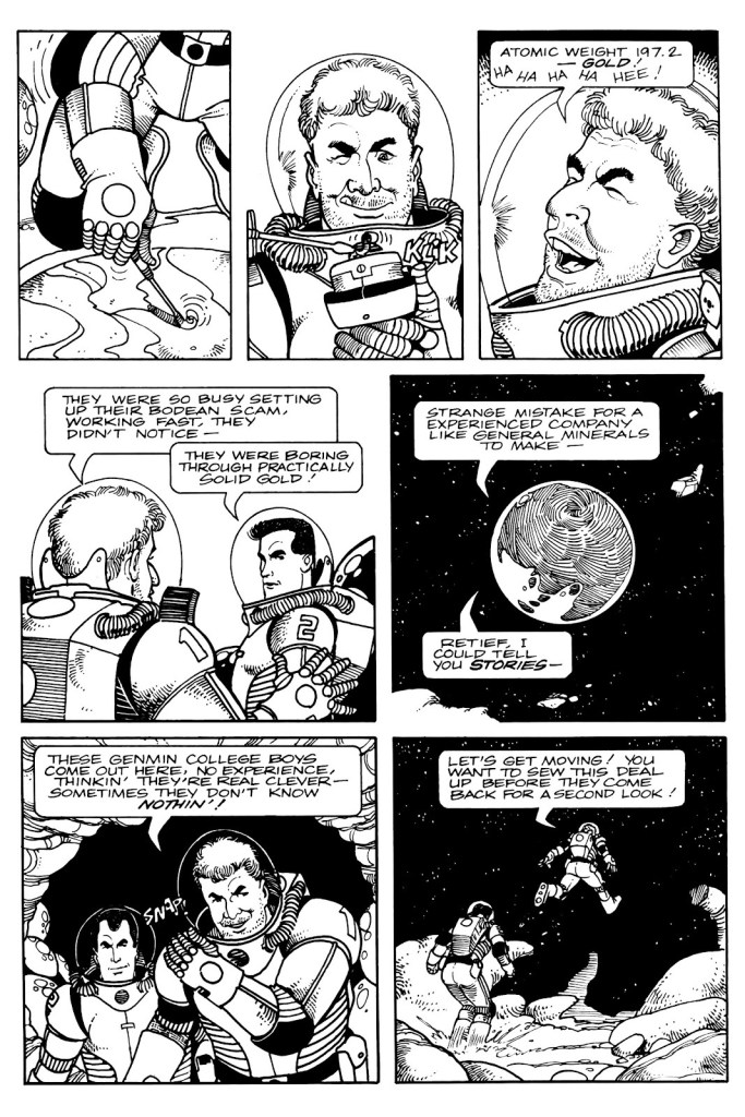
Keith Laumer’s Retief no. 2 (June 1987)
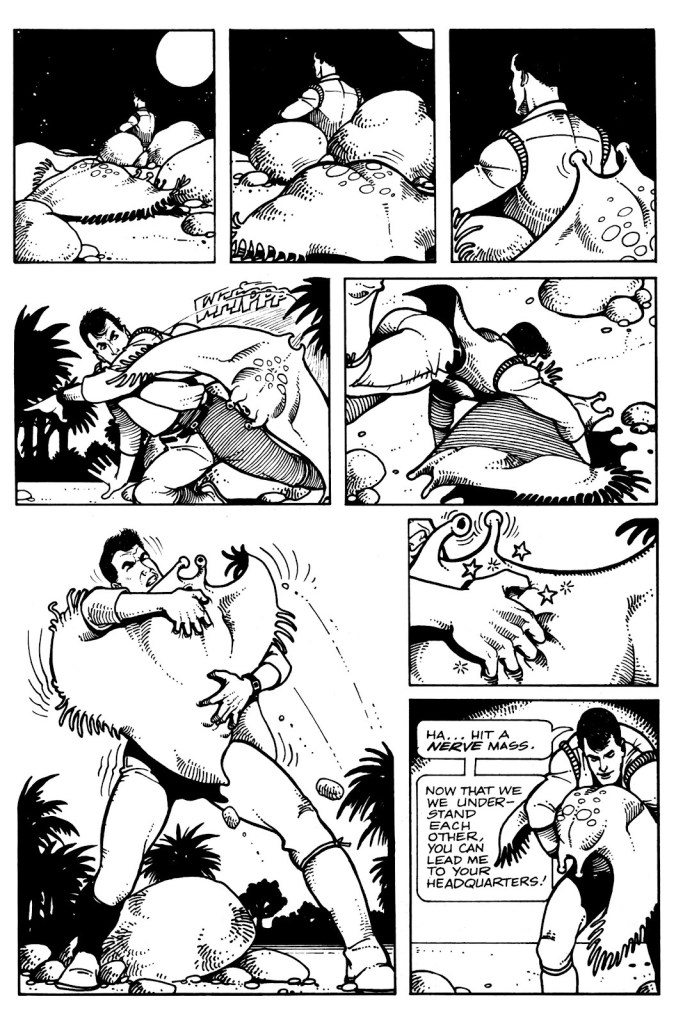
Shades of Brain Bats of Venus, anyone? Page from Sealed Orders, from issue no. 2.
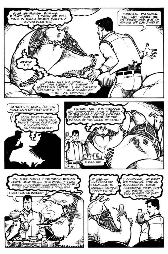
Another page from Sealed Orders, in which Retief is shown to be a bon vivant who can appreciate alien fare.
Keith Laumer’s Retief no. 3 (August 1987). One can’t say the series abounds with buxom women (or women at all, really – aside from the secretary who lost her marbles in the first issue), the Corps Diplomatique Terrestrienne is manned entirely by, well, men. Fujitake draws beautiful babes, though, few and far and between as they are.
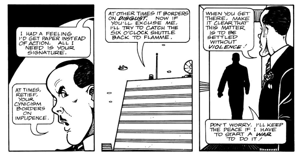
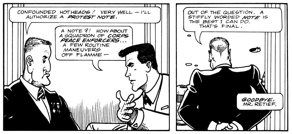
Page from Protest Note, published in no. 3. Retief visits a variety of environments, and Fujitake draws them all with equal conviction.
A fun page from Protest Note with some idiomatic banter.
Page from Saline Solution, published in Keith Laumer’s Retief no. 4 (October 1987). Retief may be a rather refined sort with a taste for fine wine and his own brand for diplomacy, but he does not hesitate to mingle with the plebeian masses – or side with the underdog, which Sam here is a representative of.
Page from Ultimatum, published in Keith Laumer’s Retief no. 5 (January 1988). It must have been a lot of fun to design aliens from a description in a short story, and give them speech bubbles to match (the advantage of hand lettering which, as mentioned previously, is handled by Gary Kato).
The pompous Mr. Magnan (the one in the sort-of baseball cap) has a long stick up his ass, but he’s not without charm, whereas Mr. Ambassador entirely deserves the rag in his mouth (and more).
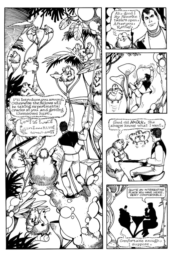
Page from The Forest in the Sky, published in no. 6.
The hamster-like critters of The Forest in the Sky are adorable.. and voracious, especially their youth.
~ ds
*In French, ‘Terrestrienne’ is feminine (if it were an actual word… ‘Terrestre’ would be the right one) and ‘corps’ is masculine, so there’s a grammatical problem in its title.
** Strnad has also collaborated with Fujitake on Dalgoda, published by Fantagraphics from 1984–1986, which will be the subject of another post as soon as I reread the series. Any day now!
*** unsurprising, given that Baen’s Retief cover model was blue-eyed, blond 1980’s hunk Corbin Bernsen, whom you may recall from L.A. Law.
P.S. There is another comic adaptation from 1989, published by Malibu, with scripts by Bruce Balfour, pencils by Darren Goodhart, and inks by Alan Larsen. One word – ew.