Treasured Stories: “Life’s Illusion” (1988)

« Reality is a powerful solvent. » — Tony Judt

I was all set to write about a certain topic… but one hurdle stopped me cold: having recently moved, we are (mostly me, I confess) still somewhat living in boxes. So… where’s that other book? In any one of a hundred or more boxes. Fortunately, I try to always have a backup plan.

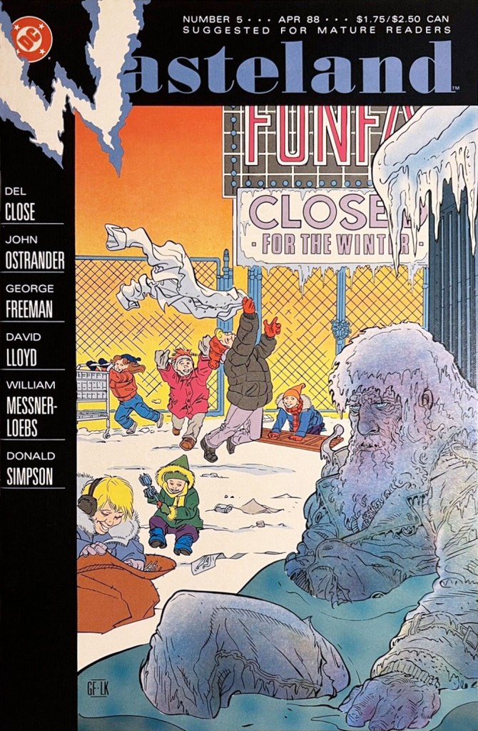
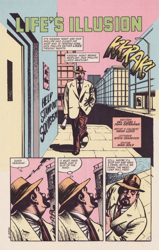
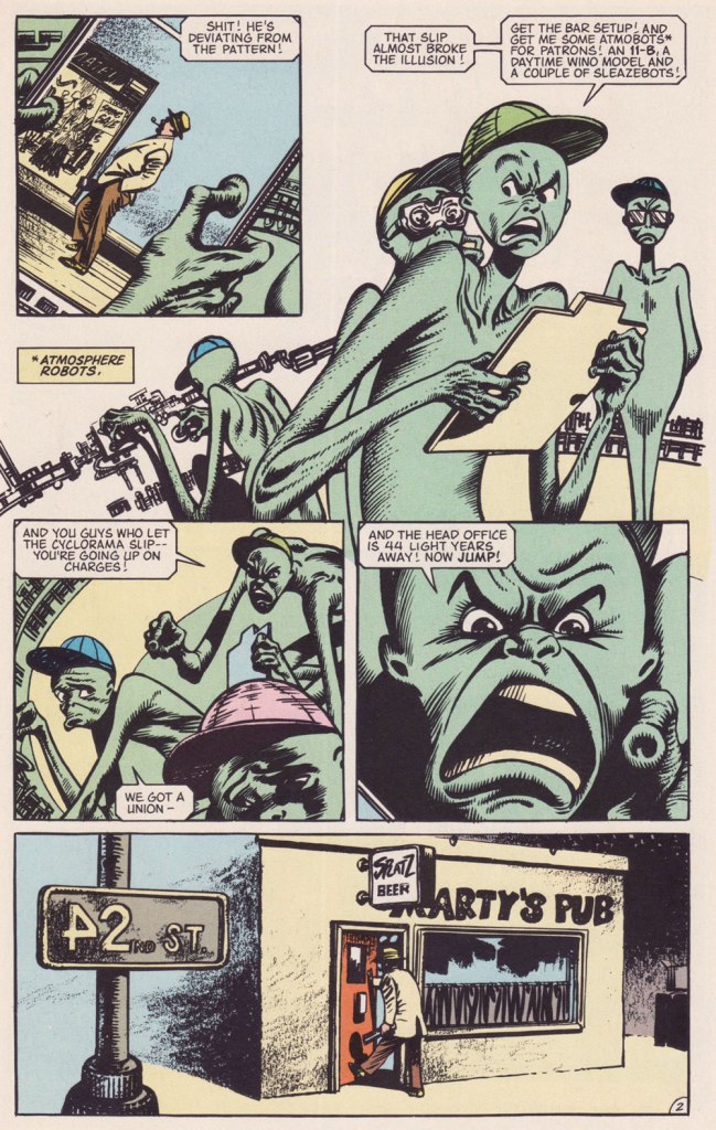
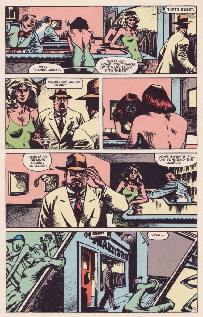
This isn’t the first time I draw attention to an offering from DC’s ambitious but ill-fated Wasteland (1987-88) under the Treasured Stories rubric. See also Foo Goo and American Squalor for more details and to (beware!) suffer a case of thematic whiplash. Whatever warts and blemishes Del Close and John Ostrander‘s Wasteland creations may have borne, they weren’t interchangeable.

Today’s yarn is a spot-on homage to author Philip K. Dick (1928-82), down to the name and occupation. The ‘real’ PKD may have been fond of meat loaf as well, for all I know.

Possibly a reference to PKD’s 1966 novel The Crack in Space?
Another cute detail: « From 1948 to 1952, he worked at Art Music Company, a record store on Telegraph Avenue » (in Oakland, CA). Oh, and Robin Williams was a Del Close fan… and vice versa.
Life’s Illusion appeared in the final semi-decent issue of Wasteland, no. 10 (Sept. 1988, DC)… beyond that point, it was a painful slide into the abyss. Anyway, I love how this story is able to deftly juggle its elements of comedy, tragedy and Dickian metaphysics without dropping the ball. Poor Mary.

PKD had been on my mind lately. Last fall, while rambling around town, I came upon a Little Library housing one of his books, a French-language edition of 1964’s The Three Stigmata of Palmer Eldritch. I’d read the original paperback edition in 1992, but wasn’t sure I quite grasped its dénouement, and had no-one to compare notes with.

Somewhere, eons ago, I’d read that Dick’s manuscripts for his 1960s paperback originals were abridged (i.e. gutted) to fit the publishers’ format and predetermined page count. But this might be apocryphal. As it stands, I can find no trace of such a claim. The story went on to say that publishers in Belgium and France, where the author was more of a draw than in North America, based their renditions upon Dick’s unexpurgated manuscripts, leading to, unusually for translations, results hewing closer to the writer’s intent. It helps that Dick, not given to extravagant stylistic flourishes, is relatively easy to translate.

« This is an illusion ». Here’s the tome in question, published in 1977 by Belgium’s Éditions Marabout, using Guy Abadia’s 1969 translation. Despite the fact that the book’s been retranslated since, I’ve no quibble with this version, save for the lack of credit for the cover illustrator.

I’m currently halfway through, and so far all is clear; I may have to confer with my younger self to explain the plot to him, poor thing.

-RG

George Freeman: Red ‘n’ White and All Colours of the Chameleon

« To many people in the mid-19th century, Canuck was merely a casual synonym for French-Canadian — and like the nicknames for people of various other ethnicities or nationalities, it came with unpleasant overtones. The word is used vulgarly and rather contemptuously” »

A friendly birthday how-do-you-do to mighty Manitoban George Freeman (born May 27, 1951 — that’s seventy-one years ago — in Selkirk, MB). Some of you will remember him for his Jack of Hearts mini-series at Marvel or his collaboration with Michael T. Gilbert on Elric for First; the more adventurous will recall his fine and, ahem, too-brief work on DC’s Wasteland.

By the 1990s, he was also affiliated with Winnipeg’s celebrated Digital Chameleon studio… but to me, he’s the guy who made Richard Comely and Ron Leishman’s Captain Canuck into a contender, as far as I’m concerned.

This is Captain Canuck no.7 (Dec. 1979-Jan. 1980, CKR Productions), featuring Ruse, story by Richard Comely, art by George Freeman. Cover by Freeman, with colours by Freeman or Jean-Claude St. Aubin.
This was the Captain’s first (and sadly, only) Summer Special (July – Sept. 1980, CKR Productions); a winningly mixed bag, it *was* a lot of fun. Cover by Freeman.
Among the goodies included in the Summer Special was a preview of the short-lived CK newspaper strip, which ran in three daily newspapers in Western Canada. It looked quite promising! Written and lettered by Comely, illustrated by Freeman and St. Aubin.

This is Captain Canuck no.14 (Mar.-Apr. 1981, CKR Productions), the final issue — just when the series was going from strength to strength. Sigh.

To demonstrate, here’s the opening sequence from that issue. Freeman and St. Aubin were evidently pushing hard against the conventions and constraints of the era’s crappy printing standards.

In 1995, the Captain even got his own stamp. Quoting the press release: « What do Superman, Nelvana of the Northern Lights, Johnny Canuck, Captain Canuck and Fleur de Lys have in common? For one thing, they’re all super heroes sprung from the wondrous pages of comic books; and for another, they’re all the marvelous creations of Canadian talent. On October 2, these five super heroes will find new adventure in a booklet of 10 stamps from Canada Post Corporation, to be issued in conjunction with Stamp Month 1995. A universal hero in concept, Captain Canuck is undeniably Canadian in nationality, costume and mannerisms. The concept can be traced to Ron Leishman and Richard Comely. Comely changed Leishman’s Captain Canada to Captain Canuck, and in 1974 established the only independent full-colour comic book in Canada. The cover price was 35¢ – 10¢ higher than other comic books at the time – but that didn’t stop Captain Canuck from outselling all American titles. Unfortunately, the series folded with issue No. 14, in March 1981. »
Part one of The Jack of Hearts’ limited series (Jan. 84, Marvel). The character was introduced in, of all places, an issue of The Deadly Hands of Kung Fu (no. 23, Apr. 1976, Marvel); The Jack shuffled around various Marvel titles for a time, culminating in this solo four-parter scripted by his co-creator, Bill Mantlo, and illustrated by Freeman. That costume must have been a bitch to draw.

Oddly enough, while Freeman was my favourite among the stable of artists chosen to illustrate John Ostrander and Del Close‘s scripts on Wasteland (Don Simpson and David Lloyd got the best), I feel he was assigned the least interesting ones to work on, with the exception of the excellent Del Close autobiographical two-parter, On the Road (issues 6 and 7). Beyond that, he drew one cover and split, unwittingly triggering the debacle that was the second half of the series’ run.

This is Wasteland no. 1 (Dec. 1987, DC). Pencils and inks by Freeman, colouring by his Digital Chameleon accomplice, Lovern Kindzierski.
This is Wasteland no. 5 (Apr. 1988, DC). Pencils and inks by Freeman, colouring by Lovern Kindzierski. As denizens of Winnipeg, a notoriously cold city, the guys would know how to colour ice, all right. To quote another famous native son, Randy Bachman : “Portage and Main, Fifty below“.

On the subject of chameleons, it appears that the traditionally held ‘camouflage’ theory of their colour changes is simplistic and generally incorrect.

-RG