« Most magazines have peak moments. They live on, they do just okay, or they die. ‘The New Yorker’ has had a very different kind of existence. » — David Remnick
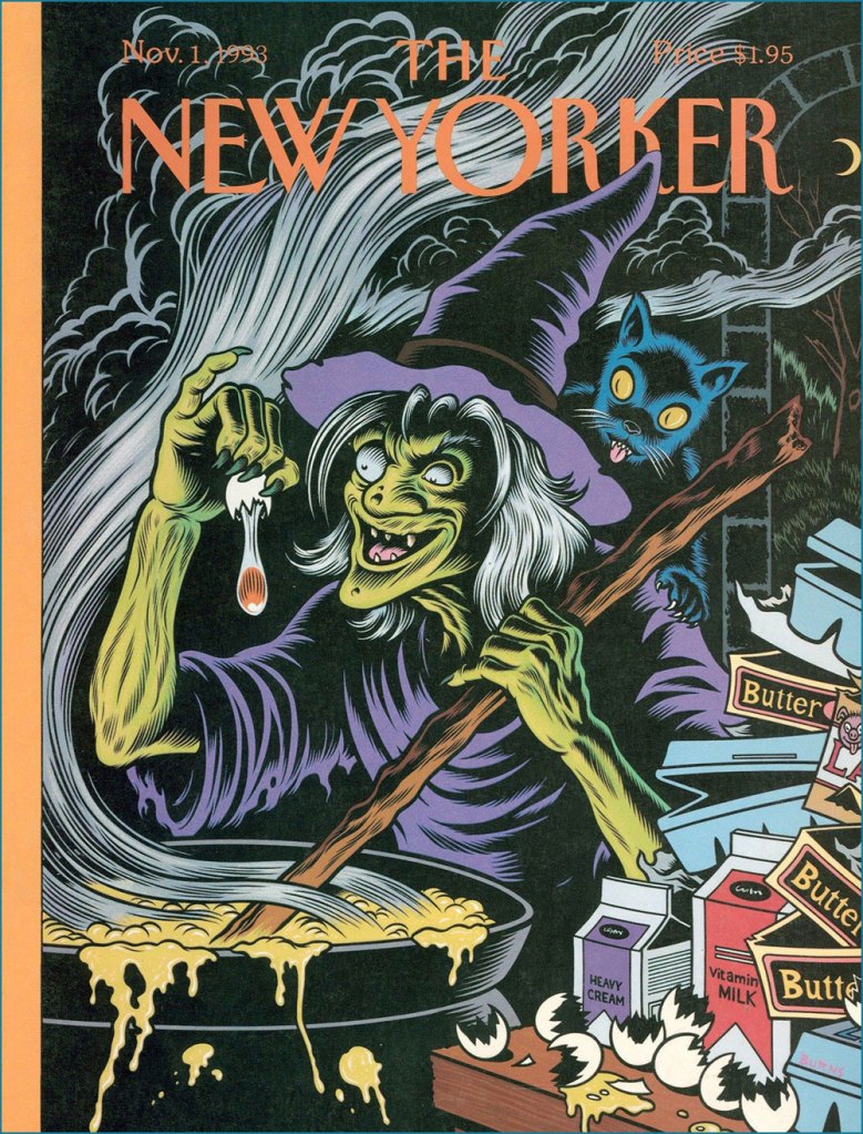
Oh, Françoise. It’s funny — while researching this post, I consulted, among other sources, Françoise Mouly‘s Covering the New Yorker (2000, Abbeville Press). When it came to whittling down my choices to a manageable handful, I realised that the magazine’s long-time ‘art editor’ and I must have fundamentally divergent tastes, for we concurred on but a single entry, one that mostly made the cut so I could include something moderately modern. That would be Charles Burns‘ Strange Brew… which Mouly art-directed.
To be fair, I already knew that the lady and I didn’t see eye to eye. In two words… no, make that one: ‘Tomine‘, I find her taste lacking. It’s not that The New Yorker doesn’t frequently boast outstanding covers; given the depth of the talent pool at its disposal, how could it be otherwise? But like many other fabled institutions, it just isn’t what it once was.
That said, few topics capture cartoonists’ (or should I posh up and say ‘illustrators’?) fancy more than that of Hallowe’en. Check out these beauties Françoise didn’t rate!
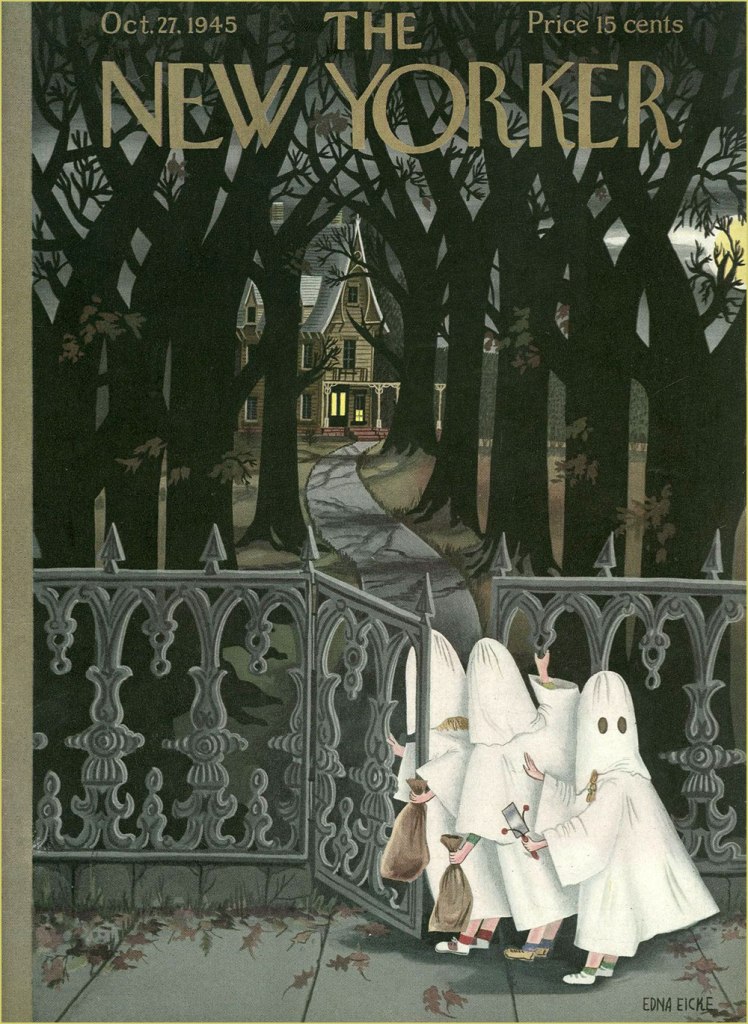
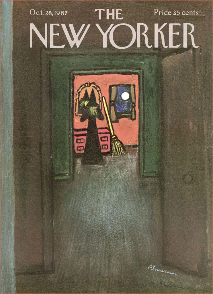
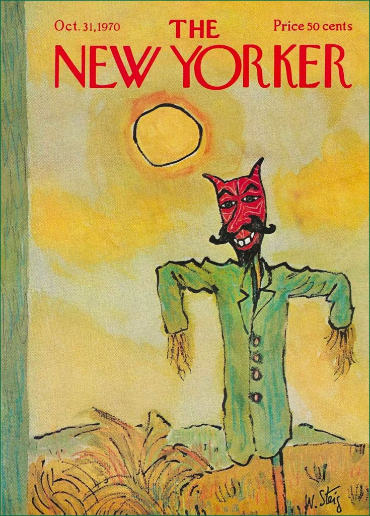
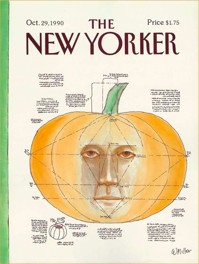
Mysteriously, this one came out nearly a month after Hallowe’en. Most topical and too good to waste? The attack on Pearl Harbor was just around the corner, and with it the beginning of America’s official involvement in WWII. But Bogeyman Adolf was already weighing on countless people’s minds. Cover by Rea Irvin.A moody one by Edna Eicke (1919-1979), this was the Oct. 27, 1945 issue.Another one by Rea Irvin, one of the magazine’s co-founders and its first art editor.This stunning mixed media beauty is one of versatile Laura Jean Allen’s sixteen covers for The New Yorker. Check out more of her work here.A special night requires special preparation! A fetchingly low-key scene from the agile brush of Abe Birnbaum (1899-1966); he painted nearly 200 New Yorker covers, and judging from this one, it’s easy to see why.This one just fills me with glee — and a soupçon of melancholy. It’s not even nocturnal, and yet just exudes Hallowe’en spirit! It’s by the mighty William Steig (1907-2003). For more Steig wizardry, check out our jazzy entry Steig Swoops In: The ‘Epic in Jazz’ Cat Sextet.This one’s by the marvellous Robert Blechman (born 1930 and still with us).A true delight from the pen of Arnie Levin (born 1938). Check out this fine interview with the man.No assortment of New Yorker Hallowe’en covers would be complete without at least one contribution from Charles Addams. I resisted the urge to include more, leaving myself the option of an eventual solo exhibition for the master.A helpful tutorial from Warren Miller (born 1936).This, obviously, is Charles Burns‘ Strange Brew. That is *not* a vegan brew.
« If you take drawing seriously, you never quite feel you’ve arrived. » — Ed Sorel
This time out, I’m pinch-hitting for my co-admin ds, who’s burning the midnight oil these days.
Just about a month ago, when I wrote a piece about Seymour Chwast (b. Aug. 18, 1931), it occurred to me that I should also devote post-haste (just in case) some column space to his fellow surviving Push Pin Studios co-founder, Edward Sorel (b. March 26, 1929). Let us celebrate the living while we can. The dead don’t appreciate nearly as well such gestures .
Opting for a freelancing career, Sorel left Push Pin, just a few years after its founding. He made it, all right, becoming one of the greatest caricaturists of the century. But he was every bit as accomplished a writer, which elevates his work above the ‘merely’ visual.
I’ve always been blown away by how deceptively easy he makes it all look, and that’s what’s so impressive: very loose on the surface, but with an underlying, laser-sharp precision. I could easily go on at some length, but Sorel’s career and art are well-documented themes. Check out, for instance, The Enigmatic Edward Sorel(From The Comics Journal), or this fine New York Times review of his recent memoir (circa 2021), Profusely Illustrated.
And now, some of the man’s work:
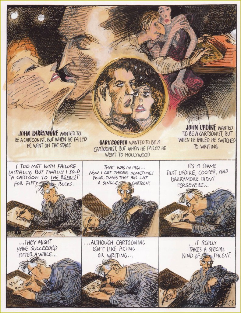
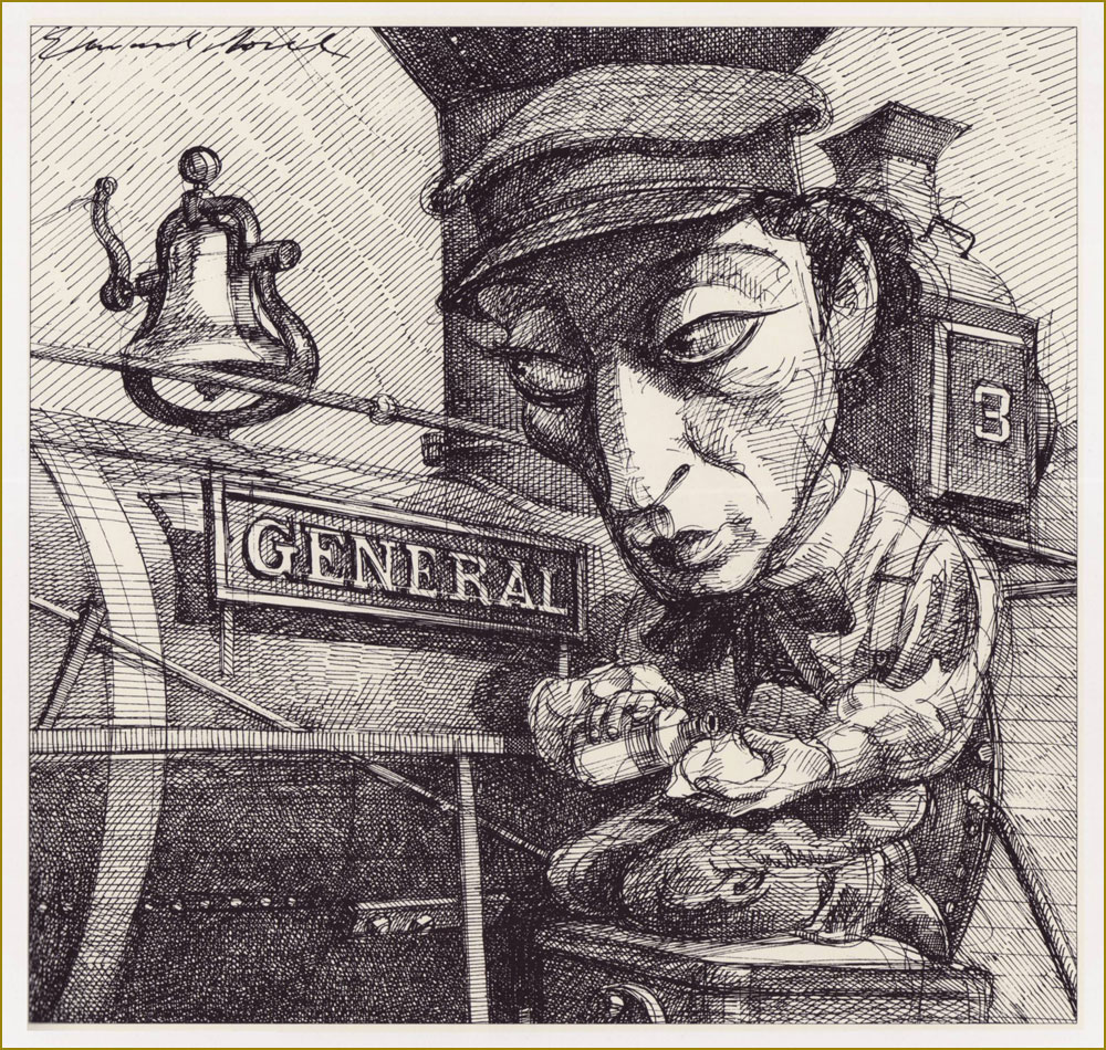
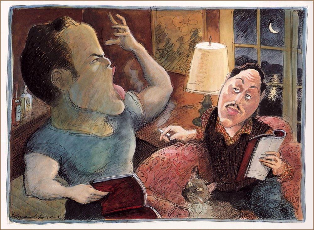
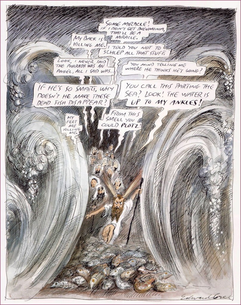
« My long association with Penthouse was unique. They bought every idea I submitted to them, and never changed anything except my spelling. This solipsistic strip appeared in 1990. »He can draw *anything*! This one appeared as The New Yorker‘s Jan. 31, 1994 cover illustration.I suppose every cinephile has his favourite Hitchcock film; mine’s The Lady Vanishes (1938). An entry in Sorel’s “Movie Classics” series, published in the March, 1981 issue of Esquire. « The General, starring Buster Keaton, is the only silent movie I included in my “Movie Classics” series. Based on an actual incident in the Civil War, it often has the look of a Mathew Brady photograph. » From Esquire, Dec. 1980.« Tenor Enrico Caruso is a guest at the St. Francis Hotel when the 1906 earthquake hits San Francisco. He vows *never* to return to a city “where things like this are permitted”. From Sorel’s pictorial essay “Keyhole History” (GQ, Oct. 1984).More rollicking blasphemy for Penthouse (Dec., 1992). Ah, yes. « The 1973 Academy Awards are remembered for Marlon Brando’s refusal to accept his Oscar for The Godfather. His emissary, Apache tribe member Sacheen Littlefeather, explained that Brando’s rejection of the award was to protest Hollywood’s depiction of Native Americans. Backstage, John Wayne was apoplectic. As John Lahr wrote in his article “The Birth of the Oscar“, “The Duke, who had dispatched many an Apache on film, didn’t take kindly to Brando’s protest… Wayne had to be restrained by six men from yanking Littlefeather off the stage.” From The New Yorker, March. 21, 1994. And speaking of Brando… « Marlon Brando is sent up to Cape Cod to read the part of Stanley Kowalski in A Streetcar Named Desire for Tennessee Williams‘ approval. First he fixes the nonfunctioning electricity and plumbing, then he auditions. His performance was stellar in every role. From Sorel’s “First Encounters” series, this entry appeared in Atlantic Monthly‘s July, 1994 issue. Note the kitty’s rapt expression.« Exodus revisited: an educated guess as to what Moses endured as he led his people through the Red Sea. A cartoon for Penthouse, the only mass-circulation magazine to welcome my blasphemy. » Penthouse (like the man said), Apr. 1995. Oh, and Plotz: To burst from strong emotion; often used humorously to express minor shock or disappointment (פּלאַצן, platsn, ‘crack’; cf. German: platzen;) and Schlep: To drag or haul (an object); to walk, esp. to make a tedious journey (שלעפּן, shlepn; cf. German: schleppen;).« Another of my egocentric ramblings, this one a rationalization for not becoming a great artist. » It appeared in the Aug. 21/28 issue of The Nation.« How Was I Supposed to Know? », from The Nation, Sept. 24, 1990. Oh, the sequels just write themselves.Here’s a rather famous one: « Back in the mid-sixties, my friend George Lois had an idea for an Esquire cover that couldn’t be done with photography. He asked me to do it, and I panicked — i.e. I tightened up. When I handed him my finish, he rolled his eyes and said he’d give me until the next morning to do it over. I went beyond panic, but nevertheless did a drawing we were both happy with. » It appeared on the cover of Esquire’s April, 1966 issue, with the caption of “The problems of power for Frank Sinatra”.« Director Michael Blakemore, at a rehearsal of Woody Allen’s one-act contribution to Death Defying Acts, watches in horror as Allen scribbles copious stage directions for him to execute. (Caricaturing Woody Allen is so easy that after drawing him, many an amateur comes to think of himself as a pro.) » From The New Yorker, June 3, 1996. Look at that pen move!
« The world of matis virtually inaccessible to foreigners studying Russian. It is too situational and semantically capricious, too dependent on ludic intonational subtleties. Mat is linguistic theatre, verbal performance art. It exploits the Russian language’s flexible range of suffixes and prefixes, and toys with phonetically similar words from the standard lexicon in order to generate anthropomorphic images. »
Invariably people ardently desire to learn bad words when encountering an immigrant who speaks a language they do not*. While one could surely write an essay arguing that the type of words used as expletives reveals something about the soul of the people in question (as a minimum, it’s a quick way to check what is considered more scandalous in that culture – genitals or religious terminology?), the allure of being able to say ‘fuck’ or whatever when it’s the only thing you can say in that language escapes me.
Idiomatic curses are another kettle of fish, a fascinating topic. Being the bearer of a language, one doesn’t often pause to think how weird a lot of sayings would sound to foreign ears. Russian cursing is quite popular in non-Slavic circles (see Elizabeth Olsen swearing at Conan in Russian on TBS…**), and its basic components are very straightforward (assorted body parts). However, there is considerable artistry involved in combining these blocks and spinning them into a scathing sentence that will inflict proper psychological damage to the target. This could be said about many cultures indeed, but I can confirm that the Slavs cherish their curse slang and go about using it with tender love and great gusto.
Journalist Elmira Kuznetsova and Canadian cartoonist and animator Jess Pollard have undertaken the charming task of (literally) translating and illustrating some choice Russian curses. I’ll quote from an article about this project:
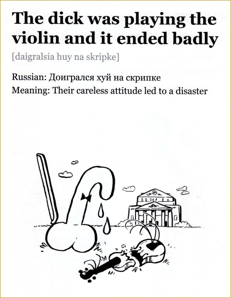
« Jess is learning Russian and one night I was trying to translate to her the Russian curse “На хую я вертел.” The phrase translates as “I don’t care” but the literal meaning is “I spun it on my dick”. Just for laughs, Jess drew a sketch depicting random things being spun on male genitalia. We laughed so hard both at the image and at the absurdity of the literal translation, we decided to make more illustrations. This turned into a comic magazine that we called “An Illustrated Treasury of Russian Curses” that was printed in a batch of 50 copies and sold to our friends. »
Please consider the following as a sampler of A Treasury of Russian Curses (A selection of curses for community building, successful business, and ideal first dates) — I selected a few favourites from volumes I, II and III. Follow this project’s Instagram account, and support a cool idea by buying printed copies or PDFs over at Pollard’s website.
I’d like to point out that the word ‘dick’ selected for these translations doesn’t carry even half the clout of the Russian equivalent, which is one of the Really Bad Words, with arguably more punch than ‘fuck’. The non seven-armed eight-dicked person looks genuinely horrified.
This is a downright poetic and melancholic mental image. Poor little dick.
Co-admin RG rightly pointed out that the bird illustrated resembles a swallow far more than a sparrow.
You will not be surprised to learn that this rhymes in Russian. This scene (complete with Pollard’s favourite smoking raven/crow that appears on the cover of every collection, as well as on her website) is very Slavic indeed, evoking folklore in which a bogatyrmust choose which path to follow at crossroads (also note the typical helmet).
More like surfing — and infinitely more stylish, wouldn’t you say?
I give the highest recommendation to The unique power of Russia’s underground language, written by Victor Evrofeyev and published in The New Yorker (a beautifully translated version by Andrew Bromfield) on September 15, 2003. This post’s introductory paragraph is from it, but here are a few more quotes to whet your appetite:
«When I think of mat, I think of the monstrous energy field of that planet. Mat is a protean language in which archaic strata mix with modernity. It has a unique ability to break free of its erotic context and to characterize universal human feelings and conditions, to express admiration and contempt, ecstasy and catastrophe. »
« Although it retains its sense of blasphemy, mat, in its original form, was also a language of peasant revelry and the liberation of the flesh. In traditional folk culture, women sang obscene ditties as a challenge to their husbands or an invitation to their suitors. Pushkin’s bawdy early poem « Tsar Nikita and His Forty Daughters » describes a culture that has lost the cunt, or, rather, forty cunts: the Tsar dispatches his heralds in search of them and after arduous ordeals they are recovered. »
~ ds
* Life is full of such little repetitive ‘pleasures’, like having to tolerate jokes about magic mushrooms whenever talking about about how one likes to go mushroom picking…
** Why they’re both amused that a reference to the ‘female region’ can be used as a bad word in Russian is puzzling, as English easily offers ‘cunt’ as an equivalent.
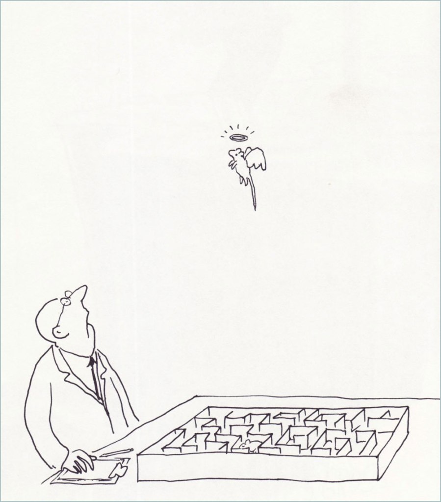
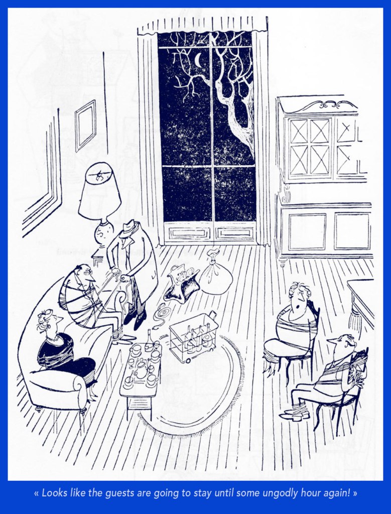
Today’s post is dedicated to shapely posteriors, a particularly estival apparition. Cleavages can be admired year-round, but butts tend to put up an appearance during the season of bumblebees, swim-suit malfunctions, and summer dresses blown about by a warm breeze. There’s no need to take sides in the old battle of boob-man-vs-butt-man (which also entirely ignores the preferences of lesbians etc.), each shall have their day!
«It isn’t often one sees a bowler these days. » A cartoon by Peter Arno published in The New Yorker on August 9th, 1952. The asses may be hidden, but we know they’re there!
«Where the hell where you when I was down here skindiving?» There are many theories about a mermaid’s anatomy, and this particular interpretation opted to emphasize her butt cheeks. This is a Playboy cartoon by Arv Miller, published in May 1957.
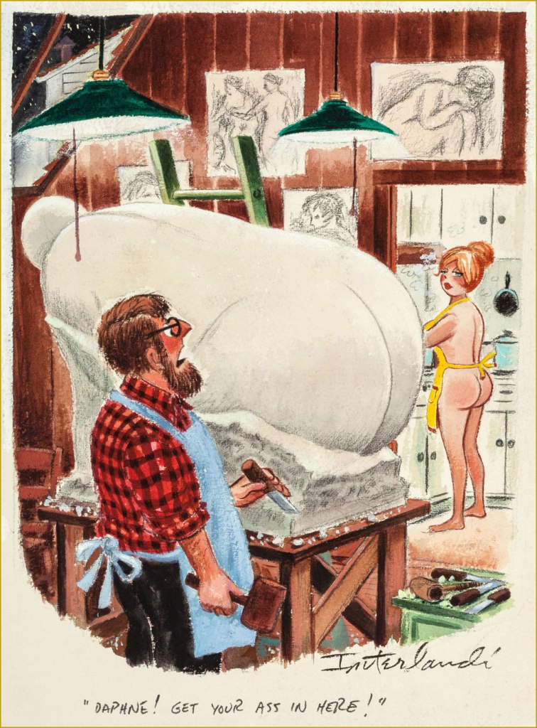
Cartoon by Phil Interlandi (1924-2002), a frequent contributor to Playboy.
Another one by Mr. Interlandi.
Playboy cartoon by Austrian-born Erich Sokol (1933-2003). The secretary could consider no longer choose her undergarments according to the calendar…
Cartoon by Donald Gordon Addis (1935 – 2009), who created several syndicated newspaper strips. He was staunchly anti-religious and a prominent member of the Freedom From Religion Foundation, the latter releasing a retrospective of his work in 2019, Cartoons for the Irreverent.
Presumably I couldn’t get away with a post about asses without featuring some spanking scene. Cartoon by British cartoonist Michael ffolkes 1925-1988, who contributed to a variety of British and American newspapers and magazines and also illustrated an impressive number of children’s books (with a particular proclivity for Roald Dahl ones).
Cartoon by Alden Erikson, about whom not much is known.
«Today We Will Examine the Primary Male Erogenous Zones, Thanks to Dr. Simpson of the Social Sciences Department » . Another cartoon by Erikson, published in September 1966. I had to include a male ass for variety!
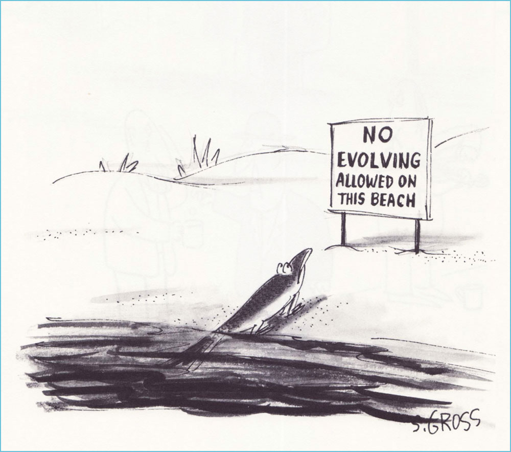
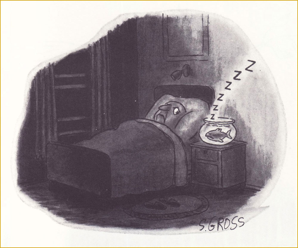
« … while there are lines of taste that many cartoonists will not cross, Mr. Gross leaped over them, doused them with gasoline and lit them on fire, cackling as he did. » — Daniel E. Slotnik, from Gross’s NYT obit.
A couple of weeks ago, we lost yet another of our remaining cartooning titans, hardly a surprising turn of events given the march of time… but this growing void diminishes and impoverishes both the field and the world.
Gross has been eulogised all over the place, notably in obituaries in the New York Times and The New Yorker, his Lambiek entry is lovingly detailed, so there are precious few blanks left to fill in.
All this adulation and appreciation… and yet, all of his books are out of print, so far as I can ascertain. While this does not bode well, I like to think that some savvy publisher will soon make use of Gross’ fastidiously organised files, reportedly comprising over thirty thousand individual cartoons.
For this small homage, I’ve pulled some of my favourites from his most famous (the most infamous being We Have Ways of Making You Laugh: 120 Funny Swastika Cartoons*), 1977’s I Am Blind and My Dog is Dead. Picking favourites is plenty laborious enough, I wasn’t going to slog through seven decades of material, indeed not.
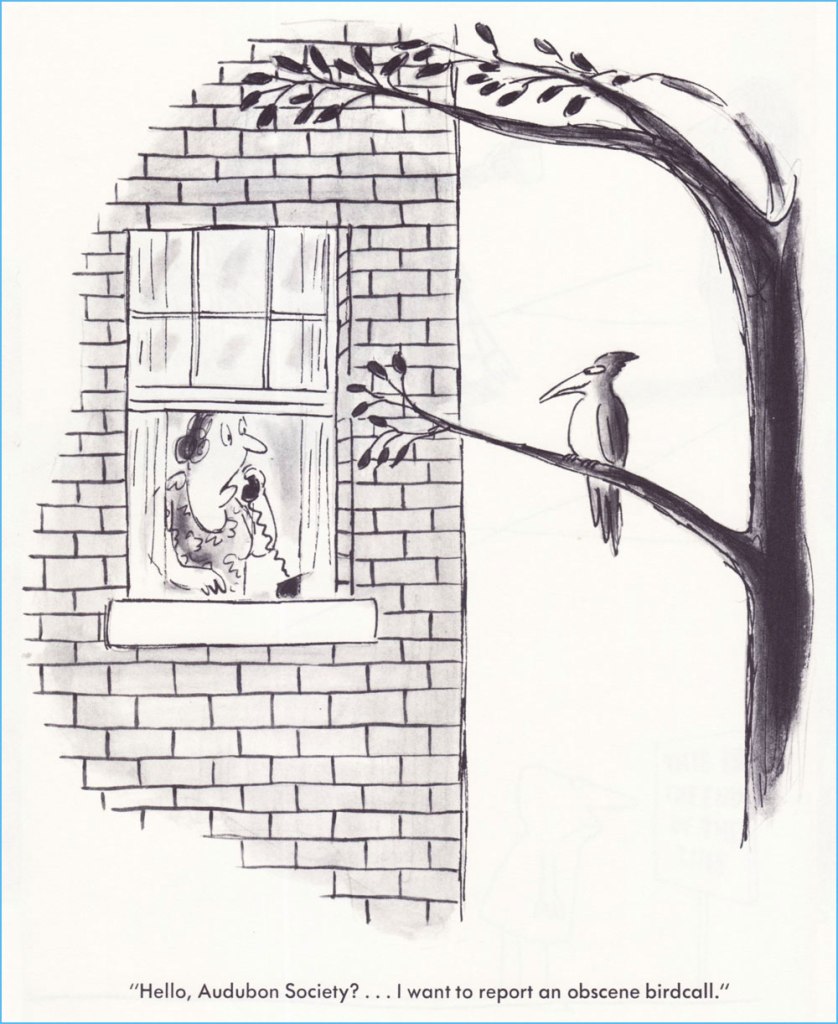
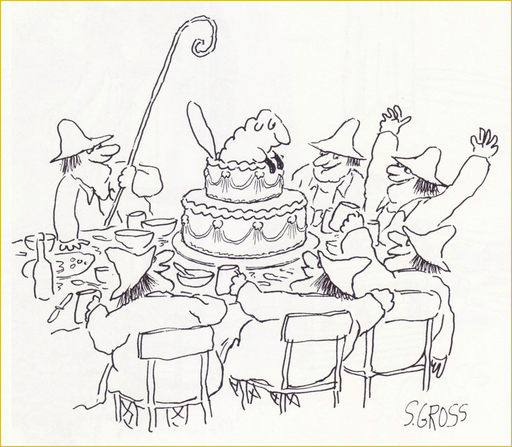
Originally published in Saturday Review.The only way this could have been funnier is if it had been published in the Audubon Society’s magazine… which did publish several of his cartoons — but not this one.Originally published in Saturday Review.One of the great perks of Gross’ range is that this cartoon can be viewed as totally cute and innocent or you’re-going-straight-to-hell filthy. It’s a fairly safe bet that this particular beach is in Florida. I was thinking that this one could have just as well been a Charles Addams cartoon… then recalled that Gross, early in his career, actually sold gag ideas to The New Yorker for Addams to illustrate. This one, interestingly, saw print in Ladies’ Home Journal.Our most recent entry appeared in the pages of The American Bystander no. 3 (Fall, 2016), where he held his own reserved nook, ‘Sam’s Spot‘. Bless ’em.
In closing, this fabulous anecdote from his National Lampoon colleague Larry “Ratso” Sloman:
« After five years, I left the Lampoon and a new executive editor took over. He called Sam into his office. “From now on, I want pencil sketches from all the artists before they do anything,” he told Sam.
“Pencils! Cartoonists don’t do no stinkin’ pencils. Rodrigues will tell you to go fuck yourself rather than show you a pencil,” Sam said. “Oh, and by the way, you can go fuck yourself.” His tenure as cartoon editor was finished. But the funny thing is, Sam was still selling cartoons to the Lampoon long after that editor had been penciled out of his own job. »
-RG
*From Gross’ first-rate 2011 Comics Journal interview, conducted by Richard Gehr: « His doorbell sports an old family name because he doesn’t want to be hassled by anyone who might have been offended by his 2008 book We Have Ways of Making You Laugh: 120 Funny Swastika Cartoons. »
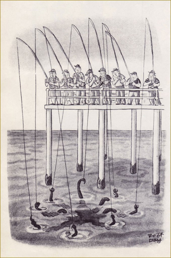
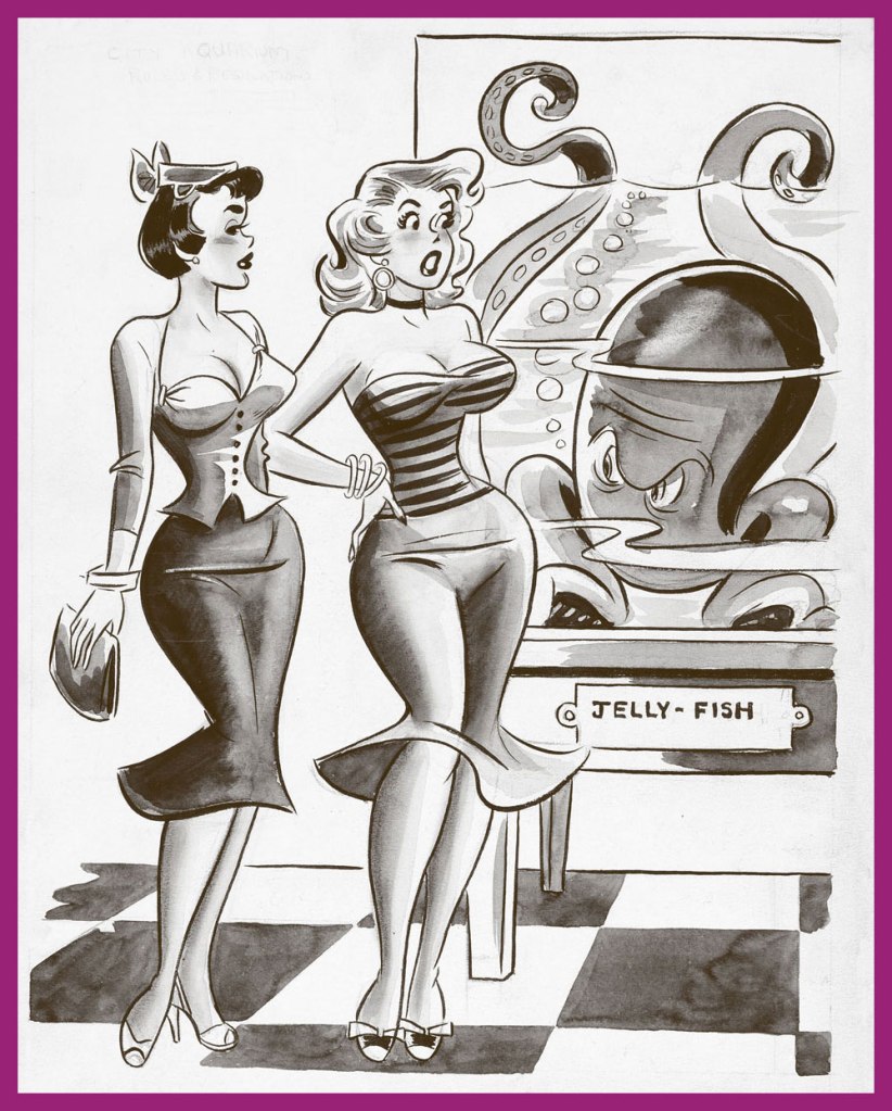
Today’s lovely crop comes to us courtesy of co-admin RG, who located these in various cartoon anthologies and scanned them. Lucky me!
A sly cartoon by the prolific Robert Day (1900-1985), a frequent contributor to The New Yorker. That octopus will have a hefty supper!
Dan DeCarlo’s pulchritudinous beauties visit the aquarium. Don’t forget to take a gander at RG’s Dan DeCarlo at Humorama (1956-63) post! Also, ‘jelly-fish’?! I am appalled. This cartoon had two captions, both equally lame – for example, ‘That reminds me, Jack is calling for me tonight…’ I don’t think DeCarlo was too interested in fleshing out the background, either.
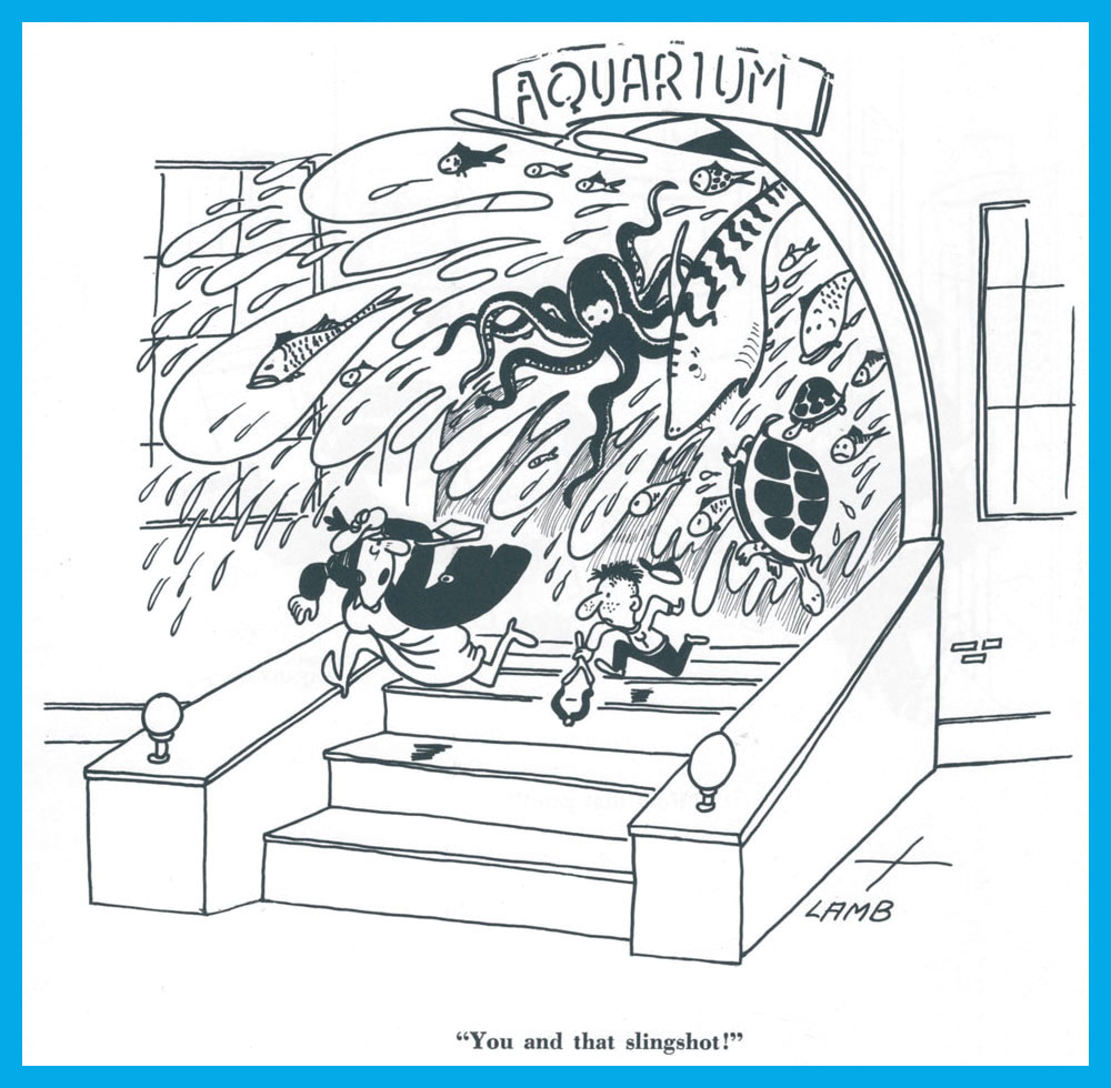
Another aquarium vignette (this time without shapely damsels, but with a turtle or two… or three..) by Clyde Lamb (1913-1966).
False eyelashes pay dividends in this cartoon by Frank Modell (1917-2016). He has contributed more than 1,400 cartoons to The New Yorker – « customarily, he said, “of angry men and sexy women and dogs”».
Actually, no. Before that, there arose the idea in art director Warren Kremer‘s ever-effervescent mind:
One of Kremer’s surviving preliminary sketches.
Then there was this one, more refined and with wonderful suggestions, instructions and notions addressed to the assigned cover artist, Lee Elias.
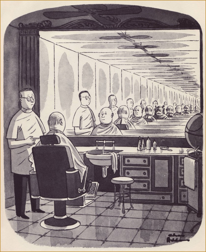
Ah, here we are. The final (in more ways than one!) version. This is Chamber of Chills Magazine no. 18 (July 1953, Harvey). Art by Lee Elias… but you know that’s not the entire process. Check out this earlier Hallowe’en post for more of that magical Kremer-Elias collaboration.
Then, one year on…
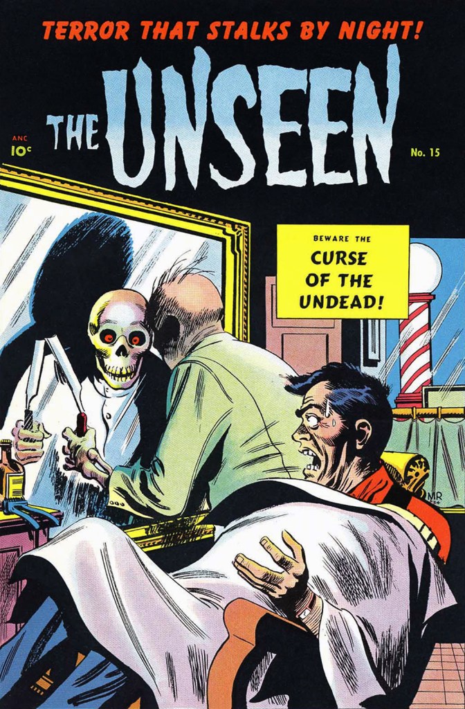
… appeared this cover entry by Québécois Joseph Michel Roy aka Mike Roy (inks likely provided by George Roussos). This is The Unseen no. 15 (July 1954, Pines), the series’ final issue. To give credit where it’s due, the death’s head reflection is a cute new wrinkle.
More than two decades down the road, Marvel, since they were already borrowing Harvey’s Chamber of Chills title (did they even ask? I wonder), figured they may as well reenact one of its classic covers.
Say, what’s this about the day’s first shave? … is there shaving after death? Hassles, hassles.
Though most would nowadays call upon electric shavers or disposable plastic razors, I presume that straight razors have made a comeback among the hipster set. Still, a niche is hardly universal.
This is Chamber of Chills no. 22 (May, 1976, Marvel). Pencils by Larry Lieber, raised on high by the masterly inks of Tom Palmer, who, not content with being one of the all-time finest ink slingers, was also an excellent colourist.
As a bonus, here’s one on the general topic by the immortal Chas Addams. It appeared in The New Yorker in 1957, then was reprinted later that year in his solo collection Nightcrawlers (Simon and Schuster). For more of that excellently-morbid Addams mirth, amble over to this earlier spotlight from our Hallowe’en Countdown’s initial edition.
Most modern reprints of Addams cartoons I’ve seen tend to be on the washed out, blurry side, so I’m grateful to have my ancient volumes of his work. Feast your weary peepers on this fine vintage!
« When I grow up I would like to be an artist in France. » — Keith Haring
The other day, while weighing the idea of producing this post, I asked my wife: “Is Sempé too obvious a choice?”, to which she wisely replied: “To whom?”. To add another few grammes of perspective, I’m reminded of how, a decade-or-so ago, I was helping out a friend by manning his business phones while he took a vacation. One caller identified herself as Mme Sempé. I immediately asked whether she was related to the cartoonist. She was (they’re second cousins), but rather shockingly, this was the first time anyone had ever brought up the subject with her. Okay, so not so obvious after all.
If you only know Jean-Jacques Sempé‘s work through his cover illustrations for The New Yorker, well, you’ve missed his finest. Sempé (born August 17, 1932, in Bordeaux, France; died August 11, 2022, just a few days short of his 90th birthday) was recruited in the late 70s, in the twilight of editor William Shawn‘s tenure (1952-87) with the magazine. To be quite frank, Sempé’s New Yorker work is his weakest, comprising almost invariably mawkish scenes of the dying arts: little girls practicing scales at grand pianos, ballet rehearsals and grand operas. And the work has only grown more anachronistic and sentimental with time; I’d say he’s the least compelling cover artist currently working for the magazine, with the exception of art director Françoise Mouly‘s little chouchou, the stiff and bland Adrian Tomine, he of the lifeless line and emetic palette. Ahem.
But there was a time…
In 1968, a decade-and-a-half into Sempé’s career, ever-lucid Belgian writer and historian Jacques Sternberg perceptively summed up the artist’s appeal:
« But Sempé’s humour has earned the favour of a very wide audience. Without a doubt because he’s able to observe with a playful — but rarely sadistic — eye the drawbacks and peculiarities of our daily lives, and that his reader feels — mistakenly — reassured by this vision.
Sempé has, in fact, a way with an impressive setting, with meticulous detail, of the mise en scène that sugarcoats the bitter pill and of the lyrical flight that dampens the ferocity of the content. The miracle occurs as if by magic: Sempé, who is rather scathing, seduces rather than worries his readers. »
A cartoon that first saw print in the pages of Ici Paris in 1958.
The signs say, from left to right: “They’re mocking us“; “Nomore demagoguery“; “Freedom First!“; “End the abuse“, “Down with…” and… “We have found this glove“.
From France Dimanche (1957). This one strikes close to home for me. Makes me think of the sort of barbarians always seeking to ‘improve upon’ nature. A passage from friendly gadfly and crime writer Carl Hiassen‘s brilliantly scathing polemic, Team Rodent: How Disney Devours the World (1998) comes to mind:
« Disney is so good at being good that it manifests an evil; so uniformly efficient and courteous, so dependably clean and conscientious, so unfailingly entertaining that it’s unreal, and therefore is an agent of pure wickedness. Imagine promoting a universe in which raw Nature doesn’t fit because it doesn’t measure up; isn’t safe enough, accessible enough, predictable enough, even beautiful enough for company standards. Disney isn’t in the business of exploiting Nature so much as striving to improve upon it, constantly fine-tuning God’s work.
Lakes, for instance. Florida’s heartland is dappled with lovely tree-lined lakes, but the waters are often tea-colored from cypress bark. For postcard purposes, tea-colored water was deemed unsuitable for Disney World’s centerpiece, Bay Lake, so in the early 1970s Team Rodent sprang into action—yanking out many of the cypresses, draining the lake, scraping out the bottom muck, replacing it with imported sand, then refilling the crater. All this was done to make the water bluish and therefore more inviting to tourists. For good measure, Disney even added beaches.» [ read it here ]
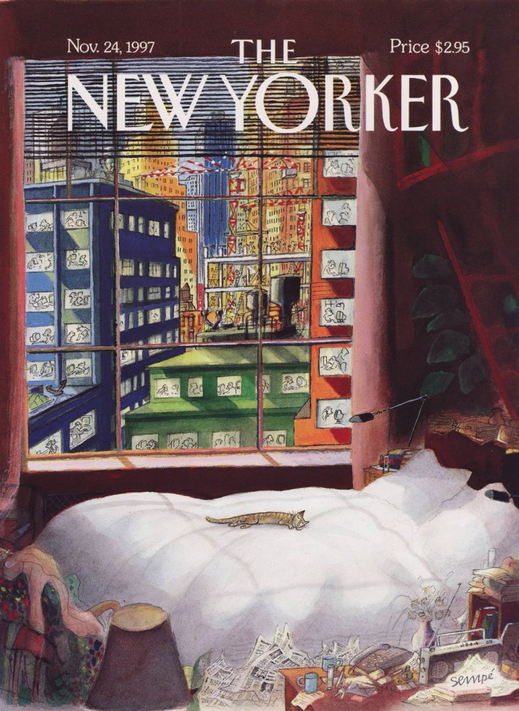
Naturally, I don’t dislike *all* of his New Yorker covers. This one, from the November 24, 1997 issue, is a peach.
« … his appreciation for city life was such that when I was a little girl and we would be going on walks, he would periodically draw my attention to the colorful and interesting patterns created by garbage strewn about on the streets, or by dilapidated storefronts with their torn-off signs. » — Gina Kovarsky on her father’s perspective
Funny how history works: for every world-famous New Yorker cartoonist, there’s another who’s just about been forgotten, yet is every bit the equal of his more celebrated colleague.
Anatol Kovarsky (born in Moscow in 1919, lived and thrived to the impressive age of 97) began working for the New Yorker in 1947, who published his cartoons and cover illustrations until 1969, when the man turned his full attention to painting.
This specific piece first saw print in The New Yorker in 1956, and was collected later that year as part of the classic Kovarsky’s World (Alfred A. Knopf).
« No other state of confusion is as interesting as yours. »
By the mid-1930s, Abner Dean (1910–1982), né Abner Epstein in New York City, had reached the pinnacle of his profession, and begun to make rewarding inroads into other pursuits and endeavours. Fruitfully and prolifically published in most of the top magazines of the era (and top era for magazines), such as The New Yorker, Life, Esquire, Coronet, Time, Newsweek, Collier’s, Look, Ladies’ Home Journal and so forth, he’d also scored in the advertising field (most notably through a fifteen-year association with Aetna Insurance).
Yet he was restless; he bristled at the limitations, conventions and formulae of the era’s gag cartooning world and had something grander in mind and up his sleeve. We’ll get to that.
But first, here’s a sampling of what Abner accomplished as a commercial illustrator and cartoonist early in his career.
The following four cartoons appeared in the pages of Esquire, for which Dean produced in excess of forty colour cartoons, and scads more in good old black and white (frequently with spot colour adornment) between 1934 and 1955.
Spot the influence? The girl is a dead ringer for one of Jack Cole‘s celebrated beauties.
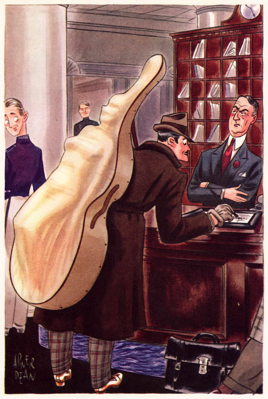
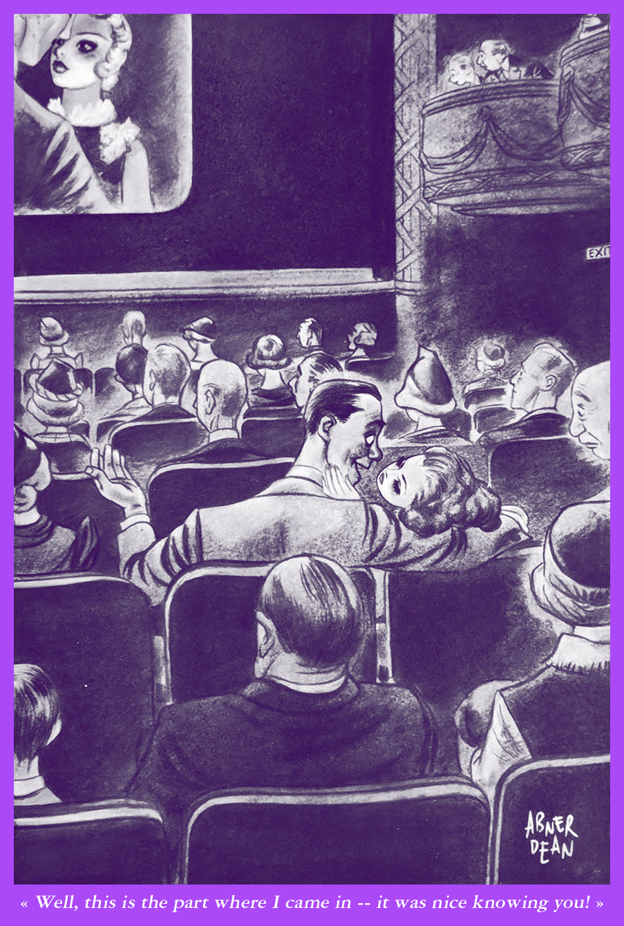
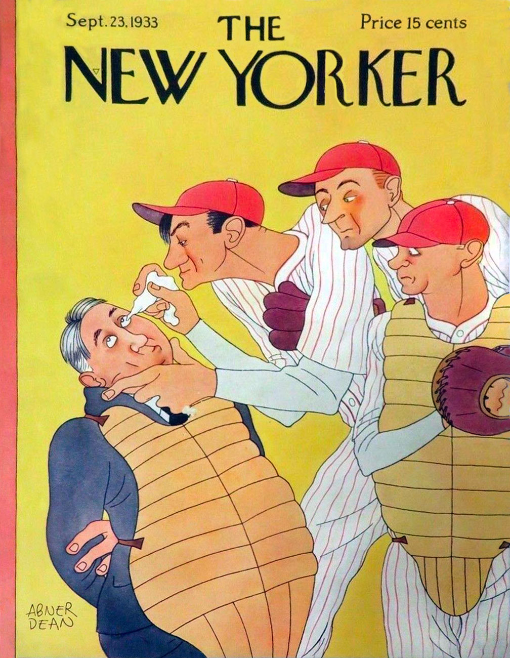
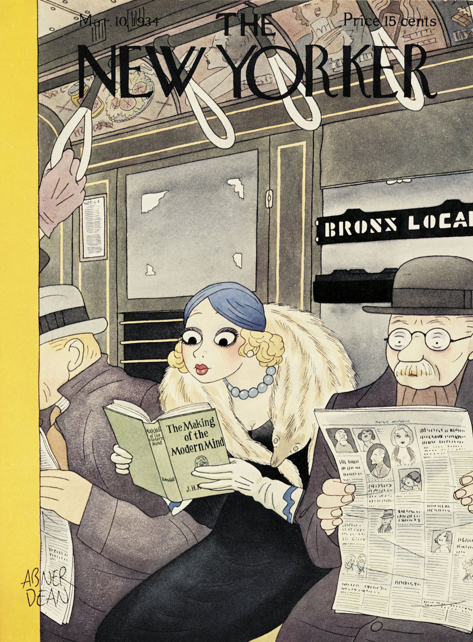
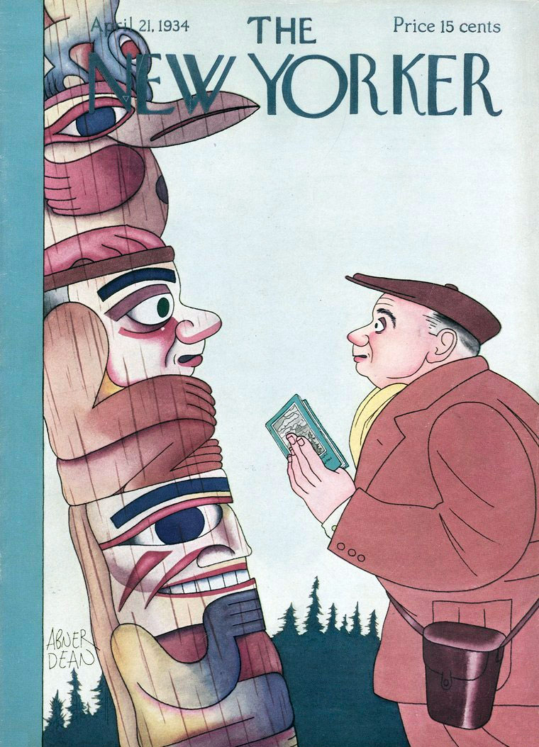
As Abner created five covers for The New Yorker (1933-35), it seemed absurd to leave any of them out, especially given their high calibre. Here they are, in order of their appearance.
Two examples of Dean’s illustrations for Aetna Insurance‘s long-running advertising and prevention campaign, for which Dean produced a whopping one hundred and ten drawings between 1940 and 1955. This one hails from 1946.
To better convey the tone and tenor of the campaign, I’ve transcribed some of its text. This entry is from 1955.
Our boy, wearing an appropriately skeptical expression, from the back cover of his Come As You Are (1955, Simon & Schuster).
Incidentally, what little remains publicly known about this once-famous man is the fruit of diligent research conducted by the eclectically erudite Ken Parille. As usual, we stand on the shoulders of giants. Thank you!