Bill Ward, Fool for Love

« We all know interspecies romance is weird. » — Tim Burton

It’s Bill Ward‘s birthday! No, not Black Sabbath’s Bill Ward — that’s on the 5th of May — save the date, as the suits say. It’s also Will Eisner’s anniversaire, but as he holds a category of his own, let’s let ol’ Bill have his turn, shall we?

Now, while most of the attention devoted to Ward (1919-1998) centres on his enormous output for Marvel founder (and Stan and Larry‘s uncle) Moe ‘Martin’ Goodman, I’m more intrigued by the brief period of his career when he truly seemed invested in his work, namely his passage at Quality Comics, where his craft rivalled that of such illustrious stablemates as Eisner, Jack Cole, Reed Crandall and Lou Fine.

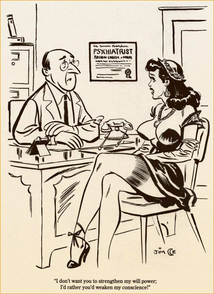
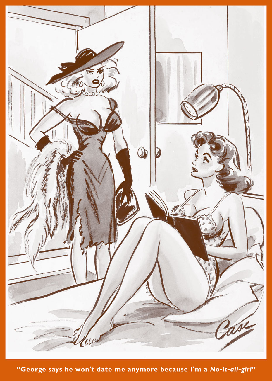
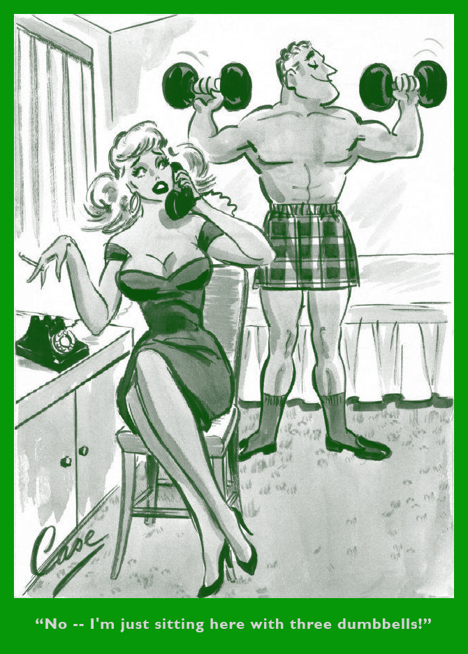
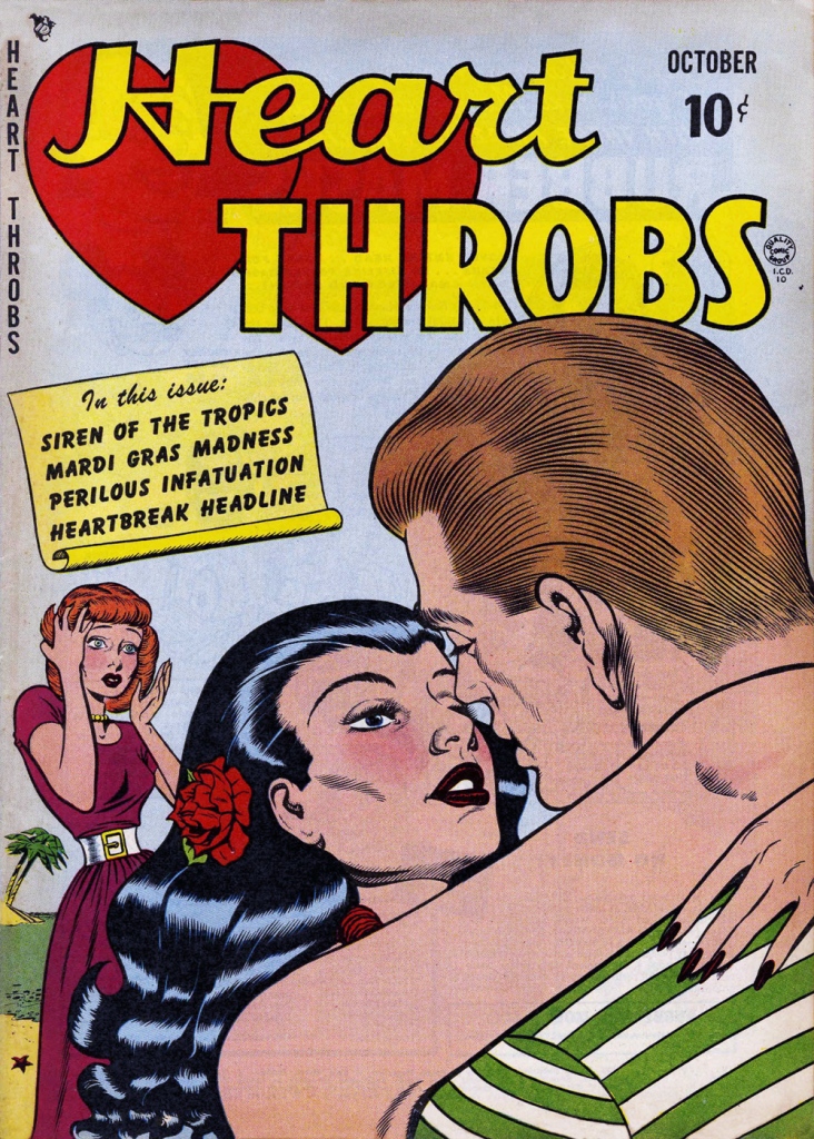
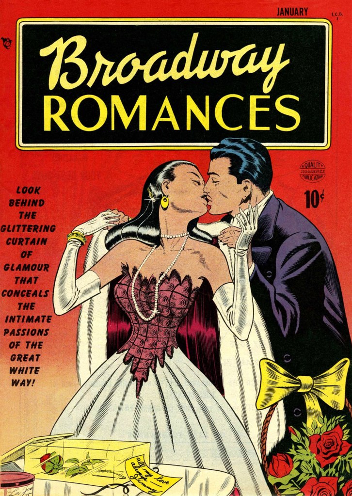
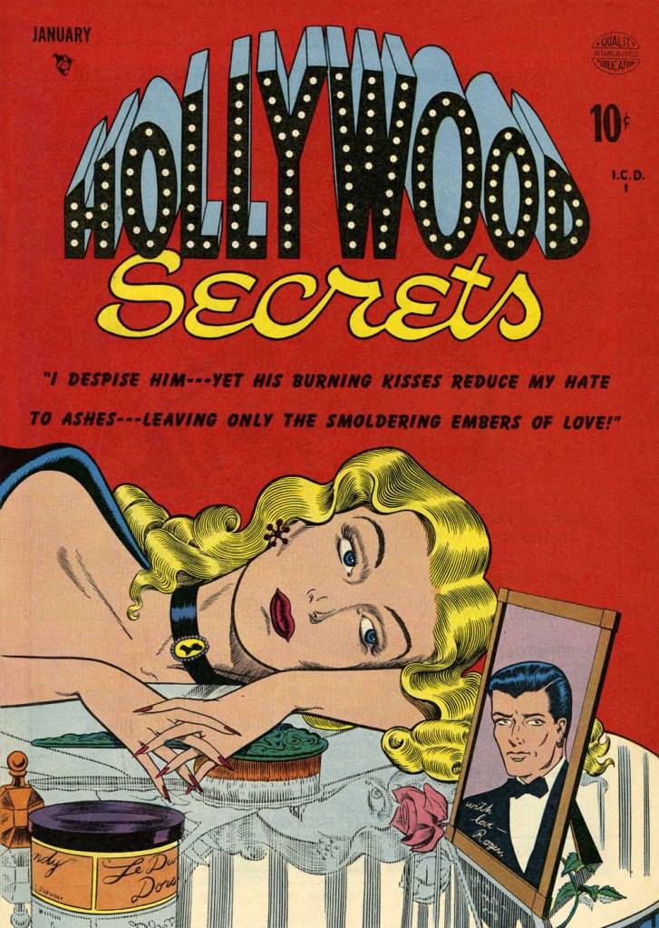
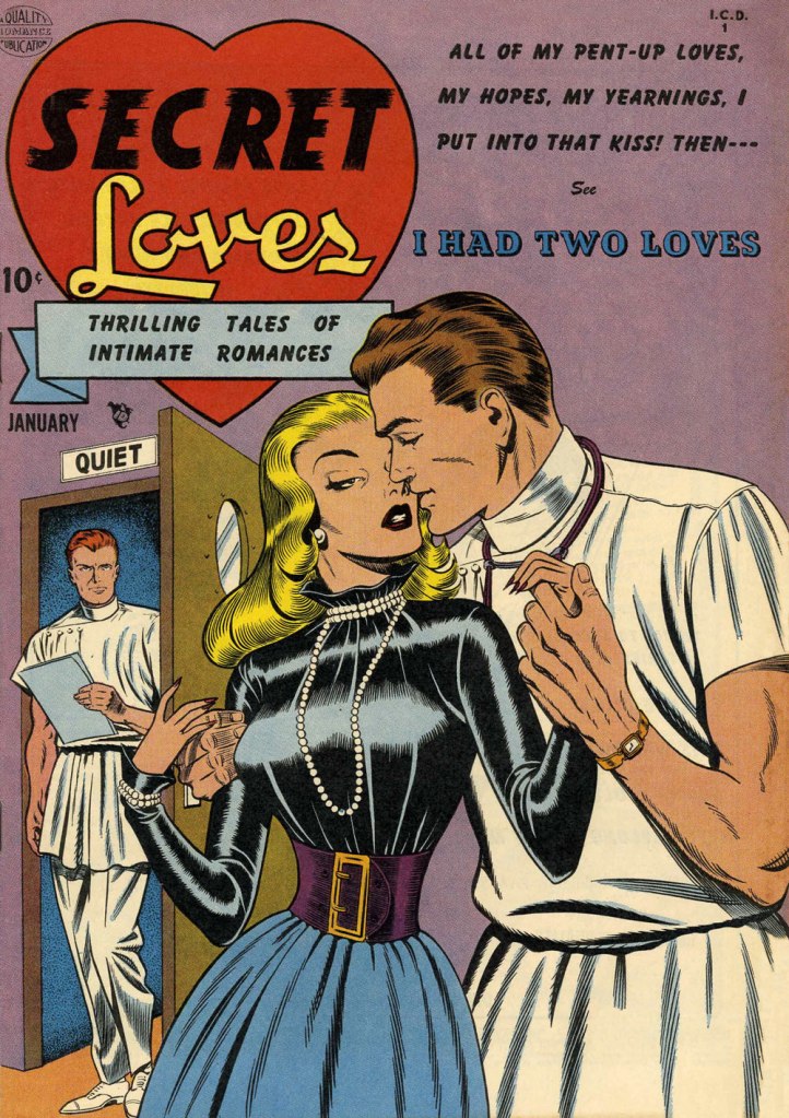
While he worked on such features as Blackhawk and Doll Man, Ward clearly preferred — was it ever in doubt? — depicting beautiful women dressed to the nines, a passion most readily indulged in romance comics, a genre then in its infancy, Joe Simon and Jack Kirby having just set it on its way with 1947’s Young Romance.

This is Heart Throbs no. 1 (Aug. 1949, Quality). Ever the fetishist, Bill never could resist a well-fitted pair of opera gloves.
This is Heart Throbs no. 2 (Oct. 1949, Quality). Quality’s flagship romance title, Heart Throbs lasted one hundred issues, 46 published by Quality, and an even hundred by DC (1956 to 1972) after they picked up what remained of the publisher’s assets, among them Blackhawk, Plastic Man, Doll Man, Uncle Sam, Phantom Lady, and some war (G.I. Combat) and romance titles.
This is Hollywood Secrets no. 1 (Nov. 1949, Quality). An unusual colour scheme!
This is Campus Loves no. 1 (Dec. 1949, Quality).
This is Flaming Love no. 1 (Dec. 1949, Quality). The gloating guy is the prototypical Ward creep.
This is Broadway Romances no. 1 (Jan. 1950, Quality). It’s so refreshing to see Ward devote the same level of attention to detail to background items as to the female figure and her accoutrements.
This is Hollywood Secrets no. 2 (Jan. 1950, Quality).
This is Love Letters no. 2 (Jan. 1950, Quality). Interesting how all these romance covers — the majority of Ward’s production in that genre — all came out within the span of a year or so.
This is Secret Loves no. 2 (Jan. 1950, Quality). Ward liked his women to have tiny, needle-like digits — I mean, just compare the lovers’ respective paws!
This is Torchy no. 5 (July 1950, Quality), Ward’s signature creature. With the years, as his women grew ever more buxom, his men became ever more grotesque — these are some of the archetypes, but noses got longer, legs got skinnier and shorter, bellies more bulging — until men and women in no way seemed to belong to the same species. While that device of exaggeration was a mainstay of « girlie » art, Ward took it further than just about anyone.

Over the years, things got more… pneumatic. And then some more.

One from an issue of Zip (1967, Marvel); that particular cartoon had probably been around the block a few times by then… it sure doesn’t scream ‘1967!’

Incidentally, the elaborate background textures found in Ward cartoons were achieved by a technique called rubbing, or frottage, « … a reproduction of the texture of a surface created by placing a piece of paper or similar material over the subject and then rubbing the paper with something to deposit marks, most commonly charcoal or pencil. » Not to be confused with the *other* kind of frottage, although, come to think of it, that’s also quite relevant to Ward cartoons.

One of Ward’s ‘Phone Girls’, she saw print in Snappy no. 24 (1958, Marvel)… and likely numerous times thereafter.

-RG

Hallowe’en Countdown VII, Day 2

« Master of puppets, I’m pulling your strings /
Twisting your mind and smashing your dreams /
Blinded by me, you can’t see a thing /
Just call my name ’cause I’ll hear you scream /
Master, master!
» — Metallica

I’ve never been a Jim Mooney (1919-2008) fan, though he’s undeniably had a long and respectable career as a penciller (Tommy Tomorrow, Supergirl, Dial H for Hero, Omega the Unknown) and inker (Spiderman, Thor… and countless others). I’ve always found his work a bit stodgy and lightweight.

As these things usually go, however, if you keep an open mind, you’re bound to come up with exceptions, and here’s one.

While Atlas’ pre-Code horror comics were generally saddled with indifferent or nonsensical writing, the artwork on offer was often surprisingly wild. I mean… they even got straight-laced Joe Sinnott to go downright weird on a couple of occasions.

Here’s a short story that’s compellingly sombre, sinister and paranoid, and Mooney perfectly conveys its oppressive mood.

The ending is daft… and at the same time, inspired lunacy that takes it to another level.
While I’m drawing from a 1974 reprint, here’s the cover from its original publication, Spellbound no. 13 (March 1953, Atlas); cover pencilled and inked by Carl Burgos, colours by Stan Goldberg.
Working in the Goodman Family salt mines (in this case, the Humorama line of ‘girlie’ digests, at ten bucks a cartoon, writing included), Mooney was probably more in his element, nimbly bridging the cartoonish and more academic semi-realism, not a common skill!

-RG

Helen Case: Girlie Cartoonist With a Twist

« At one time, I sold general cartoons to some of the men’s magazines, the girlies — until I went into a newsstand one day and looked at one. » — Betty Swords

If female cartoonists were fairly uncommon in the American mainstream magazine field for much of the twentieth century, they were doubly so within the so-called girlie mags.

« During the 1950s, Abe Goodman — brother of Marvel Comics publisher Moe ‘Martin’ Goodman — was the largest buyer of cartoons in the world. Publishing out of New York City under the Humorama banner, Goodman churned out scores of cheap digest-sized magazines boasting inventive titles like Romp, Stare and Joker that featured hackneyed jokes, cheesecake photos and the publications’ bread and butter, single panel pin-up cartoons.

These magazines were an unlikely proving ground for neophyte gag cartoonists as well as a welcomed alternative to the daily grind of comic book sweatshops. In the 1950s and 1960s, these digests featured the likes of Playboy’s Jack Cole, Archie’s Dan DeCarlo and glamour girl legend Bill Ward. »

While I can unreservedly recommend Alex Chun and Alex Covey’s The Pin-Up Art of Humorama (Fantagraphics, 2011), I’m frankly puzzled as to its wholesale snubbing of Helen Case, who might have brought a welcome bit of variety to the all-male revue. God knows some lesser lights did make the cut.

While feminist cartoonist Betty Swords would likely have dismissed Case’s protagonists the way she did Barbara Shermund‘s, as « gold diggers, dames — amateur prostitutes », Case’s cartoons (I’m afraid I don’t know whether she wrote and illustrated, or simply illustrated… at Humorama’s pauper’s rates, the former is somewhat preferable) provide a refreshing female perspective to the battle of the sexes. To quote Betty Swords again (from R.C. Harvey‘s excellent Insider Histories of Cartooning (2014, University Press of Mississippi): « I remember one editor who shuffled through my cartoons then tossed them on the desk and said, ‘You gal cartoonists are all alike — you don’t attack and hit hard enough! »

While scant information is available regarding Ms. Case (she appears to have lived in Kingston, New York in the early 1960s), at least online, much of her work survives, which surely has to count for something. We present some of the finer cuts, and if the gags aren’t transcendentally great, they are a brace o’ notches above the average knuckle-dragging drollery pervading the pages of Breezy, Snappy or Eyeful of Fun. Most of these gags were drawn and initially published (Humorama’s cheapskate policy was to print, reprint, and reprint again) between 1960 and 1964. Enjoy!

CasePlatonicACaseSecondHusbandACaseIdentitiesACaseNoItAllAHelenCaseDumbbellACaseFortunetellerACaseBathingSuitACaseBoysEarlyACaseNewRegulationsA

-RG