« We all know interspecies romance is weird. » — Tim Burton
It’s Bill Ward‘s birthday! No, not Black Sabbath’s Bill Ward — that’s on the 5th of May — save the date, as the suits say. It’s also Will Eisner’s anniversaire, but as he holds a category of his own, let’s let ol’ Bill have his turn, shall we?
Now, while most of the attention devoted to Ward (1919-1998) centres on his enormous output for Marvel founder (and Stan and Larry‘s uncle) Moe ‘Martin’ Goodman, I’m more intrigued by the brief period of his career when he truly seemed invested in his work, namely his passage at Quality Comics, where his craft rivalled that of such illustrious stablemates as Eisner, Jack Cole, Reed Crandall and Lou Fine.
While he worked on such features as Blackhawk and Doll Man, Ward clearly preferred — was it ever in doubt? — depicting beautiful women dressed to the nines, a passion most readily indulged in romance comics, a genre then in its infancy, Joe Simon and Jack Kirby having just set it on its way with 1947’s Young Romance.
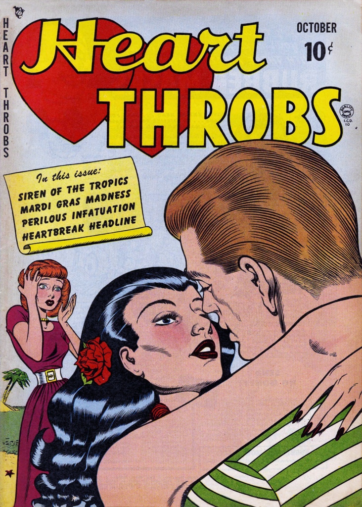
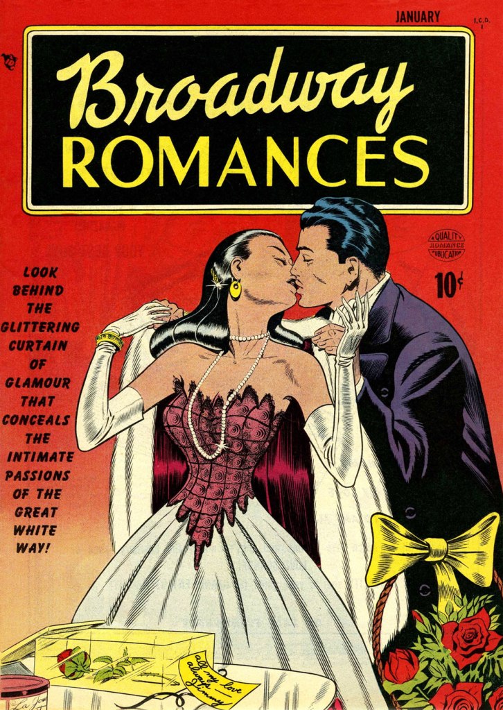
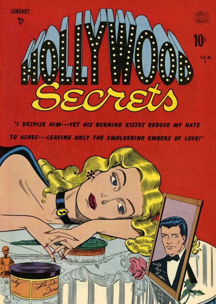
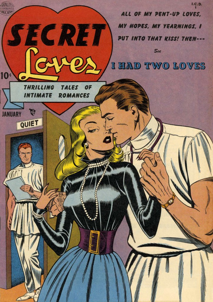
This is Heart Throbs no. 1 (Aug. 1949, Quality). Ever the fetishist, Bill never could resist a well-fitted pair of opera gloves.This is Heart Throbs no. 2 (Oct. 1949, Quality). Quality’s flagship romance title, Heart Throbs lasted one hundred issues, 46 published by Quality, and an even hundred by DC (1956 to 1972) after they picked up what remained of the publisher’s assets, among them Blackhawk, Plastic Man, Doll Man, Uncle Sam, Phantom Lady, and some war (G.I. Combat) and romance titles.This is Hollywood Secrets no. 1 (Nov. 1949, Quality). An unusual colour scheme!This is Campus Loves no. 1 (Dec. 1949, Quality).This is Flaming Love no. 1 (Dec. 1949, Quality). The gloating guy is the prototypical Ward creep.This is Broadway Romances no. 1 (Jan. 1950, Quality). It’s so refreshing to see Ward devote the same level of attention to detail to background items as to the female figure and her accoutrements.This is Hollywood Secrets no. 2 (Jan. 1950, Quality).This is Love Letters no. 2 (Jan. 1950, Quality). Interesting how all these romance covers — the majority of Ward’s production in that genre — all came out within the span of a year or so.This is Secret Loves no. 2 (Jan. 1950, Quality). Ward liked his women to have tiny, needle-like digits — I mean, just compare the lovers’ respective paws!This is Torchy no. 5 (July 1950, Quality), Ward’s signature creature. With the years, as his women grew ever more buxom, his men became ever more grotesque — these are some of the archetypes, but noses got longer, legs got skinnier and shorter, bellies more bulging — until men and women in no way seemed to belong to the same species. While that device of exaggeration was a mainstay of « girlie » art, Ward took it further than just about anyone.
Over the years, things got more… pneumatic. And then some more.
One from an issue of Zip (1967, Marvel); that particular cartoon had probably been around the block a few times by then… it sure doesn’t scream ‘1967!’
Incidentally, the elaborate background textures found in Ward cartoons were achieved by a technique called rubbing, or frottage, « … a reproduction of the texture of a surface created by placing a piece of paper or similar material over the subject and then rubbing the paper with something to deposit marks, most commonly charcoal or pencil. » Not to be confused with the *other* kind of frottage, although, come to think of it, that’s also quite relevant to Ward cartoons.
One of Ward’s ‘Phone Girls’, she saw print in Snappy no. 24 (1958, Marvel)… and likely numerous times thereafter.
« Ward’s beautiful buxotics operate in a strange separate universe, in which all women are gorgeous voluptoids, all men oafish, saucer-eyed drooling dupes. » — Chris ‘Coop‘ Cooper
Well, I certainly wasn’t planning to hog all the blogging this week, but there were birthdays and other hopefully mitigating factors. While today is the great Will Eisner‘s birthday, it’s likely to overshadow that of a fellow Golden Age toiler, one with an equally intriguing career, but with a trajectory quite divergent from Eisner’s own.
Bill Ward (1919 – 1998) was also born on this day, one hundred and three years ago. Ward started out in comics with the Jack Binder shop, turning out material for Fawcett’s line of characters (Captain Marvel and his family, Bulletman…); he soon found himself working for Quality Comics, most notably on Blackhawk (an Eisner co-creation, it should be noted). He inched closer to his true passion when assigned to Quality’s romance line.
Ward’s cover for Love Diary no. 1 (Sept. 1949, Quality). Artistically speaking, this is what a fully committed Ward can produce.
In the mid-50’s, when came the brutal, censorship-induced compression of the comic book industry, Ward smoothly shifted to producing girlie cartoons for Abe Goodman’s Humorama line, becoming its star and most prolific performer, thanks to his popularity and prodigious speed. He was aided in this by his choice of tool and technique: the conté crayon on newsprint. While everyone else was working on 8″ x 12″ illustration board, Ward was using a soft, beige paper of a size (18″ x 24′) and texture familiar to any art student who’s taken a life drawing class. With this type of stock, he could produce texture rubbings and achieve smooth, sensual sheens ideal for rendering highlights of hair and stockings. Said Ward: « It didn’t take me long to figure out that the quicker you could do the work… the more money you could make. » Over the course of a quarter-century, he wound up producing around 9,000 drawings for the Humorama line.
As Ward recalled of his early training in Binder’s studio, « [Binder] trained me to do layout, which is the most difficult part of art. » To wit, layout never counted among Ward’s strengths. A lot of his pinup work is undermined by poor staging, often grotesque proportions, and absolutely minimal attention to non-erotic detail.
A typical example of a Ward girlie cartoon produced using the conté crayon. This one first turned up in Comedy no. 51 (Jan. 1960, Marvel); in a typical work-for-hire arrangement, for a flat fee (in Ward’s case, 7 dollars a cartoon, topping out at the princely sum of $30 near the end of his 25-year run), Goodman retained all reprint rights (and reprint he did, liberally) and kept the original art, which he sold to collectors for several times its original cost, naturally. Nowadays, these pieces exchange hands for several thousand dollars.
Now, had I ever wondered what Ward’s pencils would look like, if inked by Bill Everett? I readily confess I hadn’t. But upon learning that such a momentous collision once occurred, my mind was set slightly reeling.
Another weathered fellow combatant in the trenches of the Golden Age, Everett (1917-73), unlike Ward, always gave his best, whatever the conditions. Right to the end, despite his rapidly declining health, Everett was, incredibly, producing top-flight work.
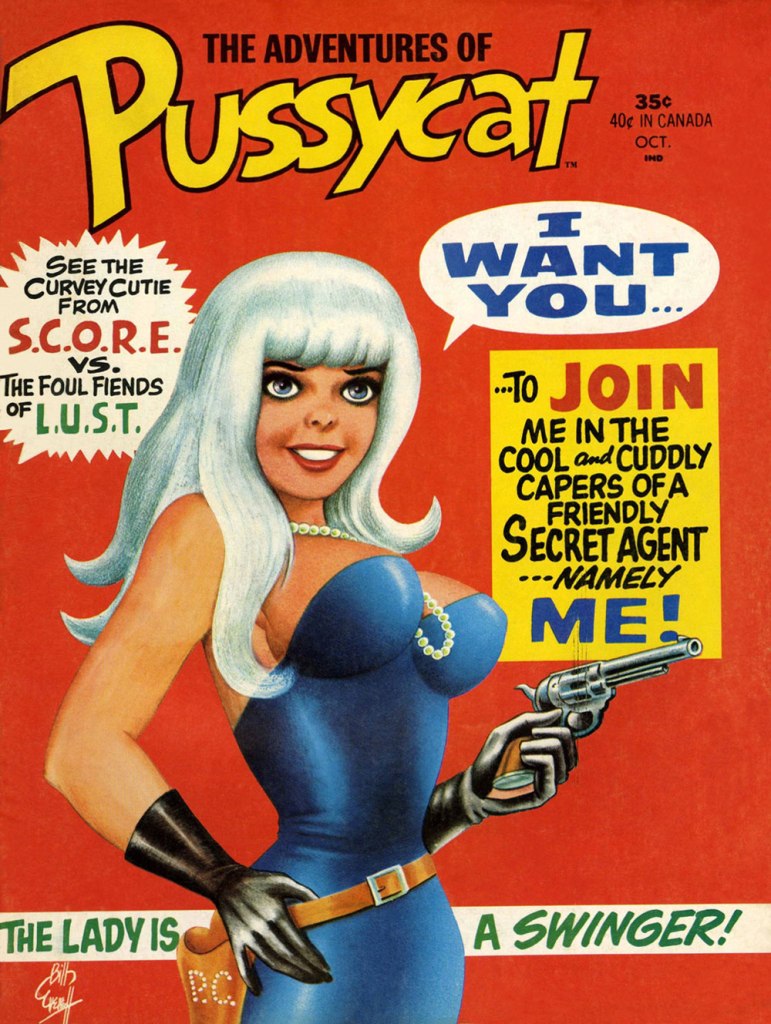
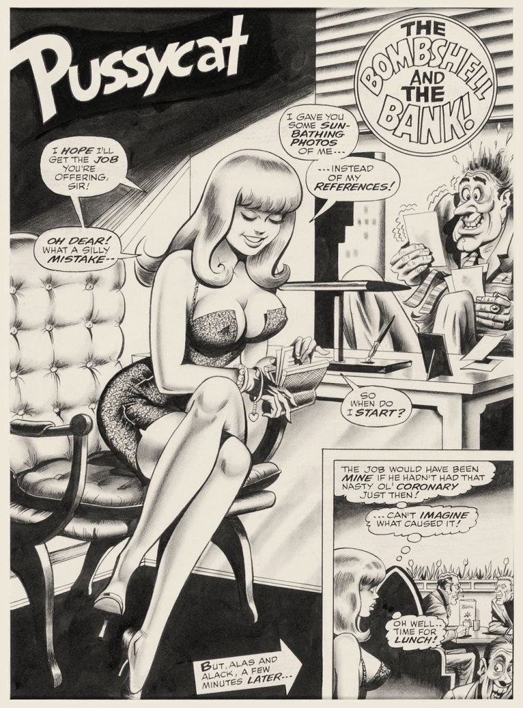
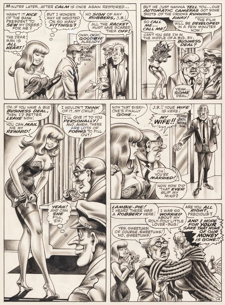
This is The Adventures of Pussycat no. 1 (Oct. 1968, Marvel). Cover by Bill Everett. Highly sought after today, this scarce, magazine-size one-shot is merely a reprint collection of some of Pussycat’s ‘adventures’ from various Goodman Playboy knockoffs, and one of a gazillion contrived acroynym-based attempts to cash in on the ubiquitous 007 craze of the 60’s. It does contain the first Pussycat tale, illustrated by Wally Wood, who would soon go on to his own entry in the super-spy stakes, Tower’s T.H.U.N.D.E.R. Agents. Concentrate on the artwork. The less said about the writing (was it Stan the Man or Larry the Lieber? We’ll likely never know), the better. As usual, any American attempt at French is mangled, even at a mere two words and two syllables (for the record, it should read either “C’est fini!” or “C’est la fin!“). Pensively squinting while adjusting his pince-nez, a ‘curator’ at Heritage Auctions made this uproarious whopper of a claim: « The figures of Pussycat look to be by Bill Everett and everything else is Bill Ward. » So you think Bill Ward drew everything… except the one thing he was interested in drawing? These folks don’t seem to know how comics are produced.“The Bombshell and the Bank!“, never reprinted, saw print in Male Annual no. 6 (1968).This is The Mighty Thor no. 171 (Dec. 1969, Marvel). Jack Kirby pencils, Bill Everett inks. Coming late in Kirby’s run, what a vigorous breath of fresh air after years of lazy erasures!
In the 60’s, Ward also provided covers for various soft-core novels, such as this one from Satellite Publications’ ‘After Hours’ imprint. He even wrote some of them, notably under the alias of ‘Bill Marshall’. His fellow Quality Comics alumnus Gil Fox also penned many of these potboilers under a staggering array of aliases.
This is Side Street (1966, After Hours). I’ve noticed over the years that certain artists of a more single-minded frame of mind can’t be bothered to devote much attention to anything but the object of their obsession. Such was the case with Bill Ward, and with the passing years, ever increasingly so. Exhibit A: has Ward ever seen an actual dog?Which reminded me of this classic, by another ‘can’t be bothered’ master of ‘Good Girl’ art, Alberto Joaquin Vargas Chavez (1896-1982). Another howler from the comedians at Heritage: « This early masterpiece, one of the greatest pin-ups the artist ever painted, was reproduced as a full-color double-page spread in Vargas, Taschen, 1990. Alberto Vargas thought so highly of this lot and the following two stunning paintings that he retained them in his personal collection. » I wouldn’t presume to criticise Vargas’ depiction of the female form, but on the other hand, this is Exhibit B: has Vargas ever seen an actual cat? Don’t worry, Alberto, you’re not alone in this affliction: neither has Neal Adams.
I’m reading a play by Anton Chekhov these days. What relevance does this have to comics? Let me explain. I don’t know about the so-called « mysterious Russian soul », but this particular play is histrionic. And the chief cause of drama, of course, is love. One woman tries to poison herself upon discovering her husband has a mistress and is preparing to run off with yet another man’s wife; others literally crawl around while trying to convince the rascal they’ve fallen in love with to condescend to granting them a small sign of affection; small children are threatened with deadly diseases; men launch into hair-tearing monologues, intermittently planning suicide or murder but never actually getting around to it; money is borrowed, and is immediately tossed in the air, friendships are shattered, insults are hurled and then profuse apologies proffered… and everybody, and I do mean everybody, goes hysterical.
Which brings us to Golden Age romance comics. Ha!
I’m not intending to suggest that *all* of them are ridiculously over the top. However, a lot of them are plotted like your average soaper – understandably, as these stories were written with a drama-hungry, lovelorn audience in mind. « Boy meets girl, everything goes well, they’re happy together » is not the kind of thing that moves copies.
Here’s a selection of covers I really like (for various reasons), depicting some common situations in a young woman’s life – like getting back-stabbed or pawed or pregnant while dreaming of some Perfect Love.
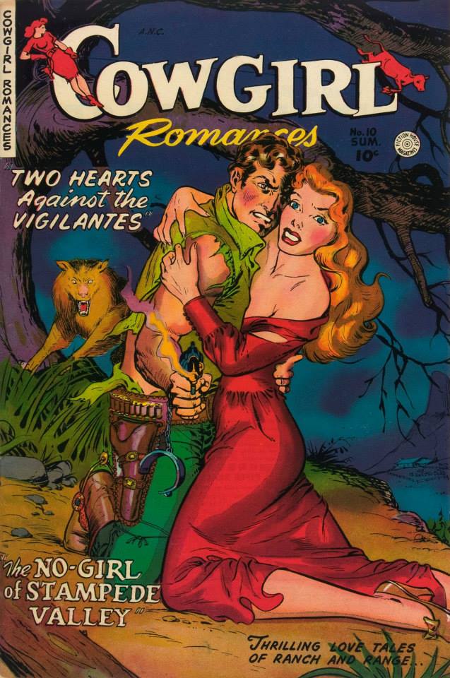
Some gals don’t merely have to contend with vigilantes, but also wolves (of the animal *and* human varieties).
Cowgirl Romances no. 10 (1950, Fiction House). Cowgirl Romances lasted for 12 issues, and usually featured strong heroines capable of defending themselves… although this one looks like she might need a bit of help. Read it here.
Oh, never mind – she doesn’t need help after all. It’s a refreshing change from women who stand by doing nothing while their loved one gets pummelled… or try to help and end up conking the wrong man.
Speaking of wolves, we have this cozy scene with distinctly creepy overtones. Anytime someone mentions an “experienced man”, run the other way.
A Moon, a Girl…Romance no. 11 (January-February 1950, EC). Cover by Al Feldstein.
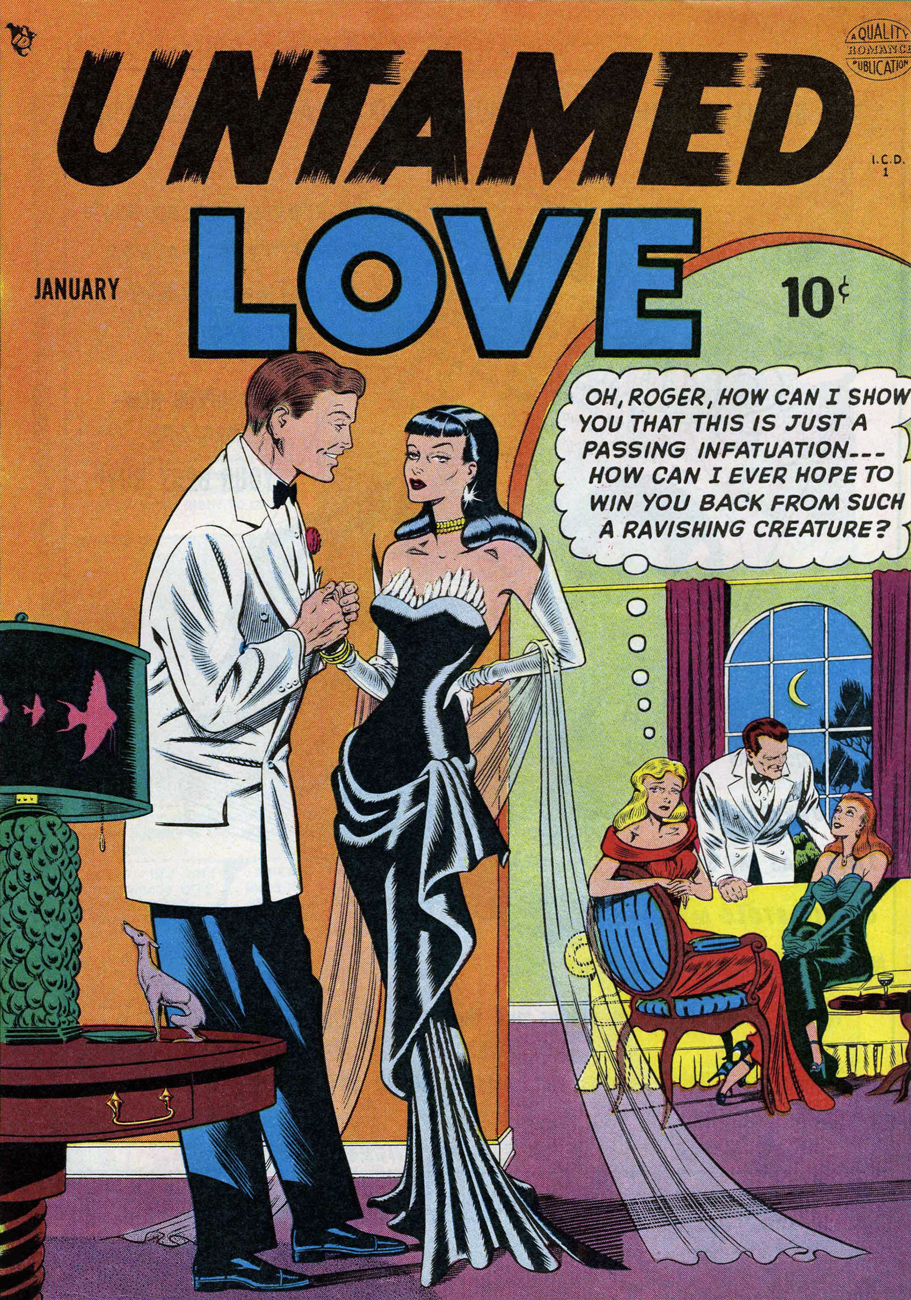
“Julie fought, but now she fought as much against her own hungry response as against his muscles. Try as she would, she could not keep herself from returning that kiss with all the fiery ardor of her wild loneliness.” Untamed Love is quite racy, as the title promises, and as much over-the-top as one could wish for. The cover story is about an evil seductress, but the rest of the tales all concern themselves with a love triangle of another kind, one in which a girl has to choose between two guys. This one’s for the ladies – it’s hunks galore!
Untamed Love no. 1 (January 1950, Quality Comics). Cover by Bill Ward. “Scary” comes to mind more than “ravishing”! Read the issue here.
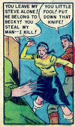
Here’s the “ravishing creature” in action, in case you’re interested:
Alaskan beauties don’t understand English grammar, but they dig the language of love! Panel from “The Wrong Road to Love”: “Julie falls in love with truck driver Steve, but he moves to Alaska to become a fisherman. She follows him there, only to discover local resident Becky considers Steve “her man.” Julie is consoled by Steve’s partner Hank. Steve and Becky run off, taking all the money Steve and Hank have earned. Julie decides to go home, but Hank says she can stay — as his wife.”
Another sentimental overload (though one would think that being at war was dramatic enough)? The redhead in the square on the right is in love with a gay man! (She was in love with a man’s fiancé, after all.) The girl at the dance is struggling to get away from a grabby asshole! (Unfortunately, all-too-common even today.) The girl in the green dress is faking it because she’s too polite to say no! (Ditto.)
Wartime Romances no. 10 (October 1952, cover by Matt Baker).
“They were like two jailers, my pa and my brother Bill! At 18, I hadn’t tasted the sweetness of courtin’! And I was hungry for it… bitter hungry…” Things quickly get out of hand in this issue of First Love – a young maiden meets a charming young man who kills her brother (by accident), after which she gets shot by her dad (also by accident). The story concludes with the two lovebirds reuniting while the father realizes that “his soul is black with sin“. Geez, the things some people have to go through to reach a happy ending in a comic story.
First Love Illustrated no. 34, 1953. Read the issue here.
This issue has plenty more “man-starved” maidens up for grabs…
Panel from “Bad Girl”, illustrated by John Prentice.
… and one memorable male character, Alan, “the gay, vital, gloriously-alive lover”.
Page from “My Heart Cried Out”, pencils by John Giunta, inks by Manny Stallman.
The next cover reminds us to never send our dates for refreshments (punch, you say? looks more like something out of a witch’s cauldron), for this is where femmes fatales lurk in hopes of snaring fresh prey.
My Own Romance no. 26 (January 1953, Marvel). The irresistible team-up of two comic-field professionals who would later become terrible Archie artists: Al Hartley (art) and Stan Goldberg (colours). Is that teacup floating in her hand or what?
Pictorial Romances no. 19 (May 1953, St. John). Cover by Matt Baker. Read the issue here. If I had to recommend only one issue out of today’s roster, it would be this one: there’s nice art, and the stories are actually detailed and interesting, and even boast a certain internal logic.
It’s important to know the difference in different tinned meats. Art by Matt Baker.
If you want a lover who doesn’t resist, put her in a trance, first, and then Miss Smith won’t be able to help but say “yes!”
Lovers no. 50 (June 1953, Atlas). This, again, is the handiwork of those two buffoons, Hartley and Goldberg. Look, she’s still holding the chloroform-dosed handkerchief he used to knock her out!
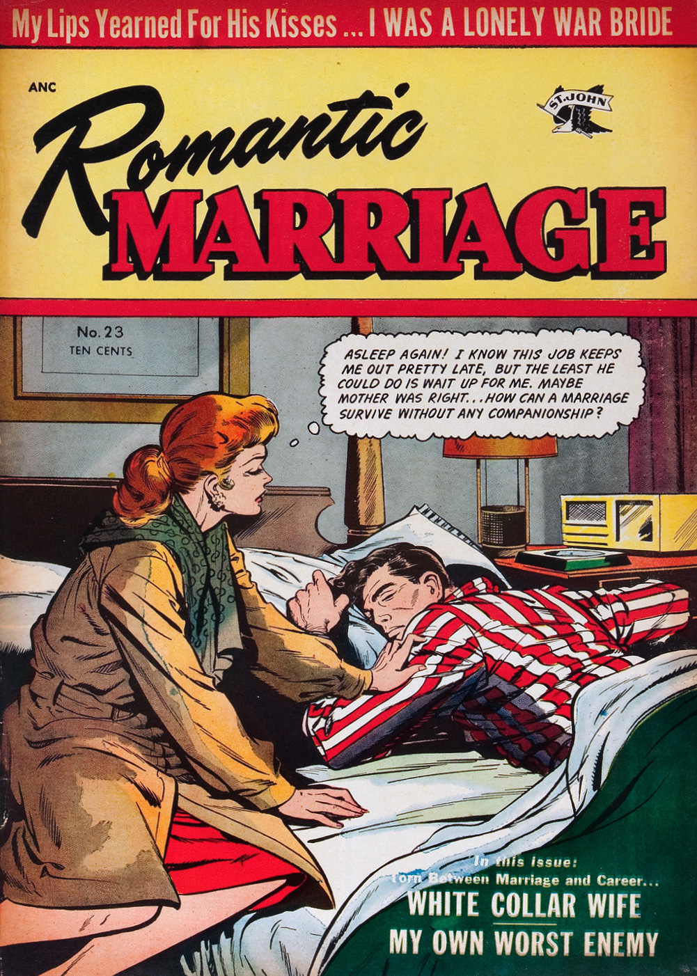
Romance comics love to pit a woman’s career against everything a female should strive for (i.e. marriage). Am I carping that romance comics weren’t very progressive in the 1950s? Ah, I wouldn’t be, if I didn’t know for a fact that Silver Age romance comics often don’t do that much better in that department.
Romantic Marriage no. 23 (July 1954, St. John), cover by Matt Baker. “Companionship”, eh? Read the issue here.
What do we have here? Despite what one would tend to think, this necklace was stolen, not given as a romantic offering. Such are true life secrets: kleptomania, clandestine children, and double-crossed partners.
True Life Secrets no. 25 (March 1955, Charlton). Read the issue here.
It’s boiling hot in this part of the world, so I’d like to concentrate on soothingly cool covers for this Tentacle Tuesday. If we end up taking a dip in refreshing waters in our quest for relief from balmy temperatures, so much the better. Today’s roster brings us fashionable dames and their splashy encounters with octopuses!
Here’s the Queen of Fashions (and right now, queen of tentacles), and for once the cover doesn’t focus on her outfit – I understand it’s hard to wriggle out of a swimsuit while an octopus is holding your leg.
Katy Keene was created by Bill Woggon, and introduced in Wilbur Comics no. 5 (1945). She was “America’s Queen of Pin-Ups and Fashions”, and readers were encouraged to submit drawings of outfits and other tralala such as designs for automobiles, boats, and whatever other method of transport Katy could glitter in. This is Katy Keene no. 60, July 1961, cover by Bill Woggon.
Mockery aside, I have nothing against Bill Woggon-era Katy – I like Woggon’s art, and the gentle humour of the stories is hard to dislike. After Katy Keene’s demise in 1961, she was eventually revived by Archie Comics in 1983. They should have let the dead rest in peace! Though several people were considered for the role of regular artist, that position went to John Lucas, whose style I abhor, recoil from and spit upon. I first saw his take on KK in those huge Archie digests you can get for pennies that reprint a bit of everything, giving readers a total pêle-mêle of different decades and different artists. I didn’t know who drew what at the time, but I quickly developed a preference for certain styles while finding others repellent… and John Lucas’ puerile art was top of my hated list, along with the half-arsed, anatomically asinine line-work of Al Hartley.
Next, we have another beauty queen, although this time the stuff is quite a bit more risqué. It’s not for nothing that cataloguing websites classify Torchy as “adult” material. As for the octopus, it has impeccable taste, having determined that there’s no need to decide between blonde or brunette when you can have both.
But Torchy, why are you wearing high-heel sandals in water? Modern Comics no. 97 (Quality Comics, May 1950). This is a page from « The Mermaid Gig », with scripted and art by Gill Fox. Fox took over from Bill Ward (Torchy Todd’s creator and writer) five years after her introduction, starting with Modern Comics #89 (1949). As far as replacement of Bill Ward, Fox did a truly excellent job, managing to preserve the mood and style of Ward’s stories. Read the mermaid tale (no more tentacles, sadly) here.
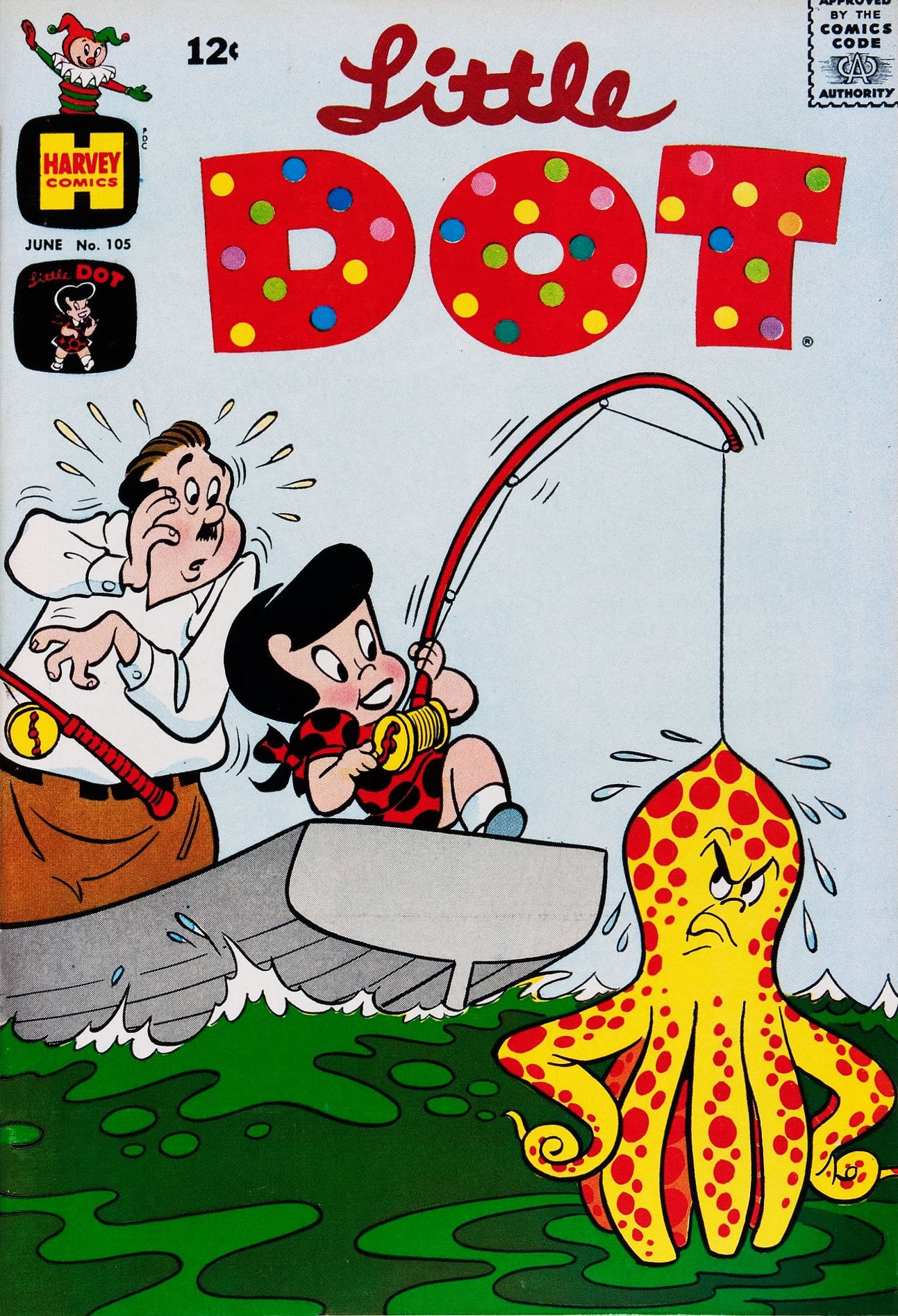
Sometimes octopuses catch little girls, but occasionally a feisty little girl captures an octopus. Little Dot is going to be a handful when she grows up… but of course she never will.
This polka-dotted octopus is a perfect catch for Little Dot in this soothingly green sea. Too bad the cephalopod fellow looks so disgruntled. He was probably in the middle of lunch or something. Little Dot no. 105 (June 1966); cover by Warren Kremer.
Those of you also inhabiting parts of the world where the weather has gone bananas (because it’s certainly hot enough for growing them in here), stay cool!