« Someone at Dell Comics decided it’d be swell to turn famous monsters into superheroes — an idea whose time never came. And just to make sure there were bad, they hired Tony Tallarico to draw them. » — — James Schumeister, with the sort of brickbat typically lobbed at Mr. Tallarico.
Last week, we lost, at the venerable age of eighty-eight, the controversial, much-maligned Tony Tallarico (Sept. 20, 1933 – Jan. 7, 2022). The case of Mr. Tallarico’s reputation is typical of mainstream US cartoonists who generally eschewed the superhero genre. His mistake, I suppose, is that he drew a handful of them, and in his own distinctive fashion to boot, thus sealing his doom in Fanboy court.
Yet there’s far more depth and variety to Tallarico’s career, and that’s should be remembered. Besides, those superhero comics were just light-hearted, unpretentious fun. Obviously not what the continuity-addicted True Believers craved.
Let’s take a tour of some of the highlights!
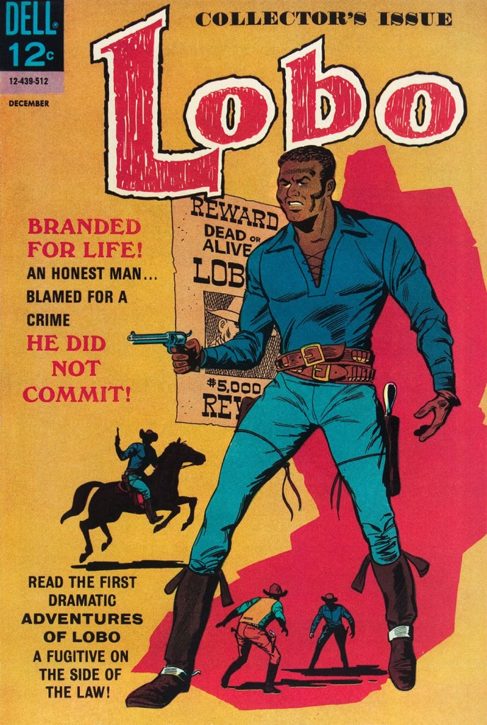
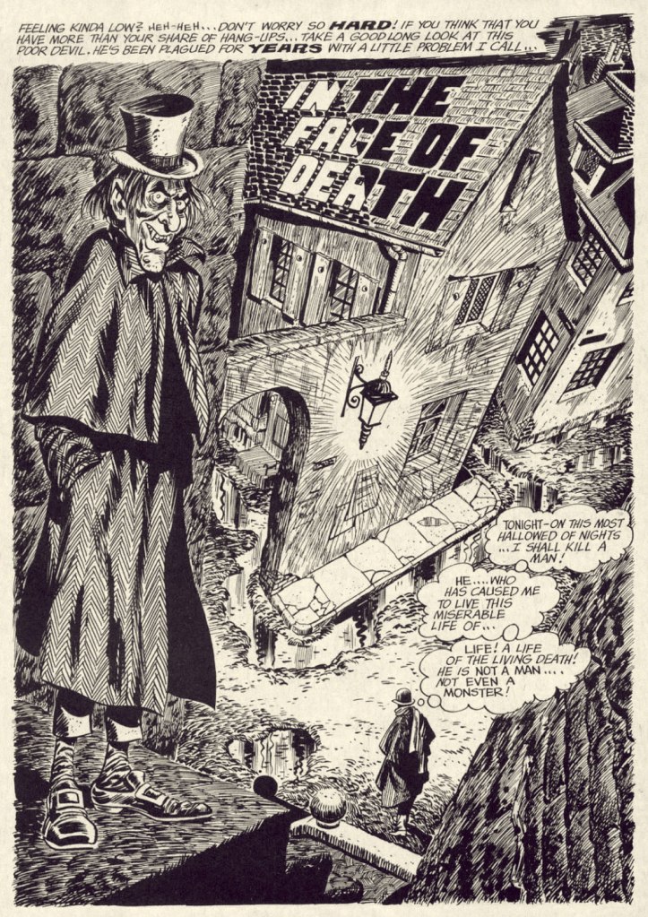
A page from Crazy Quilt, one of three stories Tallarico illustrated for my personal candidate for greatest horror comic book of all time, the unlikely one-shot Tales From the Tomb (Oct. 1962, Dell). Script and storyboard by John Stanley. Read the rest (complete with, fittingly, its analysis) of Crazy Quilthere. Arguably, if Tallarico’s going to be remembered in comics and general history, it may be for this once-obscure but significant mid-60s creation. This is Lobo no. 1 (Dec. 1965, Dell Comics). Tallarico and writer D.J. Arneson hold different views as to the character’s genesis, as Canadian researcher Jamie Coville discovered in 2016. To his credit, Coville simply let the former collaborators present their respective side of the story. Read the resulting interviews here! And do check out the début issue itself, along with Tom Brevoort’s analysis… right here.
As reported in Alter Ego no. 106 (Dec. 2011, TwoMorrows): « On May 20, 2005, Tony Tallarico received the Pioneer Award, given for his co-creation of the first African-American comic book hero, Lobo, a post-Civil War cowboy who appeared in two issues of his own Dell/Western title. The honor was given at a ceremony held at Temple University in Philadelphia, Pennsylvania. »
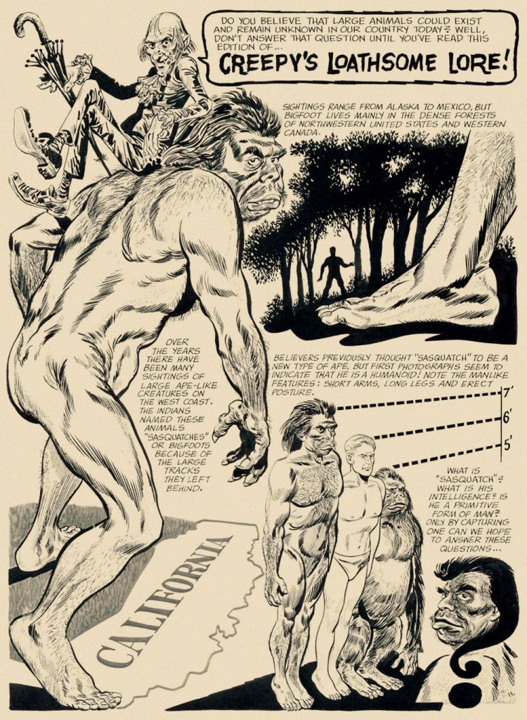
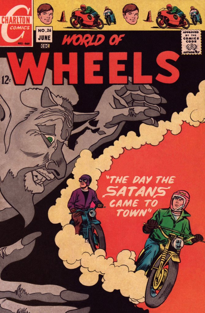
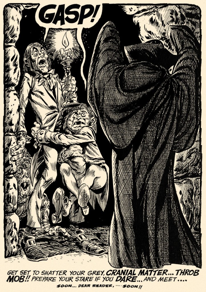
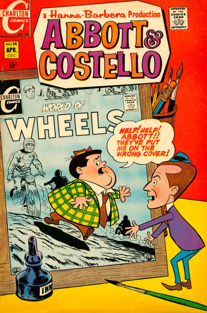
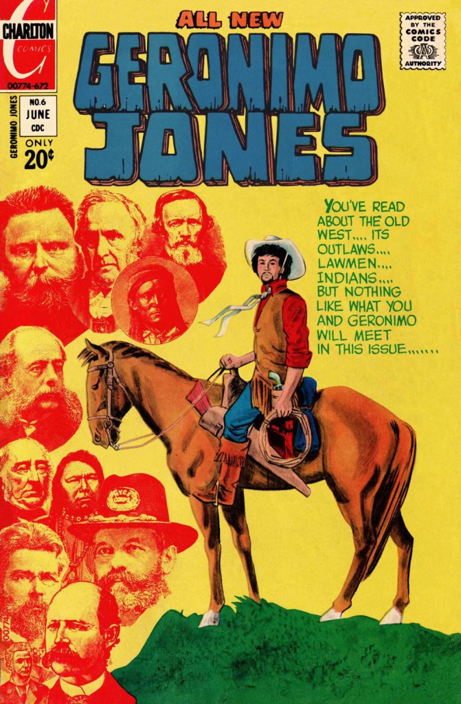
A Tallarico ad from Eerie no. 20 (March 1969, Warren); Tony enjoyed keeping things in the family, and so young “Danny Smith” was actually Tony’s wife’s nephew, Danny Grosso. My thanks to Tony’s daughter Nina for graciously divulging this bit of inside info! Cryptozoologists take note! Creepy no. 26 (April 1969, Warren); script by editor Bill Parente. I just adore Uncle Creepy’s pose (great use of props!), not to mention the question mark mullet. Should be the hit of the next tonsorial season!Joe Gill and Tallarico took over the handlebars of one of Charlton’s established hot-rodders, Ken King. Following the direction blazed by their predecessor, Jack Keller, King had become “the Most Hated Man on Wheels!” (in Drag-Strip Hotrodders no. 13, Jan. 1967, Charlton) after being unjustly accused of wrecking his best friend, Jerry Gerard, aka “The Nicest Guy in Racing” during a meet. The series’ unremittingly bleak portrayal of the racing scene is fascinating, and Gill and Tallarico wisely kept the pace. This is World of Wheels no. 26 (June 1969, Charlton); cover by Tallarico.An in-house ad from Eerie no. 23 (September 1969, Warren), technically Vampirella’s first published appearance. Art by “Tony Williamsune”, the collective nom de plume adopted by frequent collaborators Tallarico and William ‘Bill’ Fraccio. According to Tallarico, their collaboration was quite fluid: both contributed to layout, pencils and inks, but Tony was the extroverted go-getter, while Bill was the quiet one. A “Williamsune” splash from Creepy no. 31 (February 1970, Warren). Tallarico on his association with Fraccio: « I would pencil some, he would ink some, visa versa y’know one of those things. I was really the guy that went out and got the work. Bill never liked to do that. It would depend. If he was working on something else I would start a project too and do pencils. It was a fun time. » [ source ]This is Abbott & Costello no. 14 (April 1970, Charlton), featuring the beloved veteran comedians’ crossover with the aforementioned Ken King. The look of the series is based upon Hanna-Barbera‘s 1967-68 The Abbott and Costello Cartoon Show rather than on the duo’s classic movies and routines. Besides, Lou Costello having passed away in 1959, his part was voiced by Stan Irwin (with Bud Abbott as… Abbott). Preceding the advent of Jonah Hex by some months* in the Weird Western stakes, Geronimo Jones was a truly oddball oater series, in the best sense of the term. Created by Tallarico (script and inks) and José Delbo (pencils), Geronimo’s adventures ran for 9 issues (plus one that remains unpublished), from September, 1971 to January, 1973. Geronimo himself was essentially a young pacifist seeking his quiet place in the Old West, in the finest tradition. However, strange encounters and occurrences keep thwarting his laudable goal. And none is more outlandish and shocking than what he comes up against in this issue, cover warning and all. This is Geronimo Jones no. 6 (June 1972, Charlton). The GCD credits the cover to Delbo alone, but the use of collage and halftone wash are telltale Tallarico trademarks… not to mention his distinctive lettering. My guess therefore is: pencils by Delbo, layout, inks and collage by Tallarico.Tallarico and Fraccio did only a handful of stories in this wild, swirly style, including four for Charlton: The Curse of the Vampire in The Many Ghosts of Dr. Graves no. 44 (Jan. 1974, Charlton); this one, Come See Our Ghost… in Haunted no. 16 (June 1974, Charlton); The Reuger Formula in Haunted no. 24 (Nov. 1975) and A Solemn Oath! in Ghostly Tales no. 118 (Nov. 1975). Let me assure you that the sort of bold inking on display here, while deceptively simple in appearance, takes unerring confidence and skill to achieve. Bravissimo!
By the mid-70s, with his main comics accounts defunct or dormant (Dell, Treasure Chest, Charlton), Tallarico, ever the astute and tireless businessman (another rare trait among cartoonists) simply stepped up and diversified his efforts, branching out and creating a market for himself. « In the 70s the whole business went kaput. Luckily I was able to transfer over into doing children’s books. I’ve been doing children’s books ever since. My wife went though a count several months ago. It was over a thousand titles. That’s a lot of children’s books. »
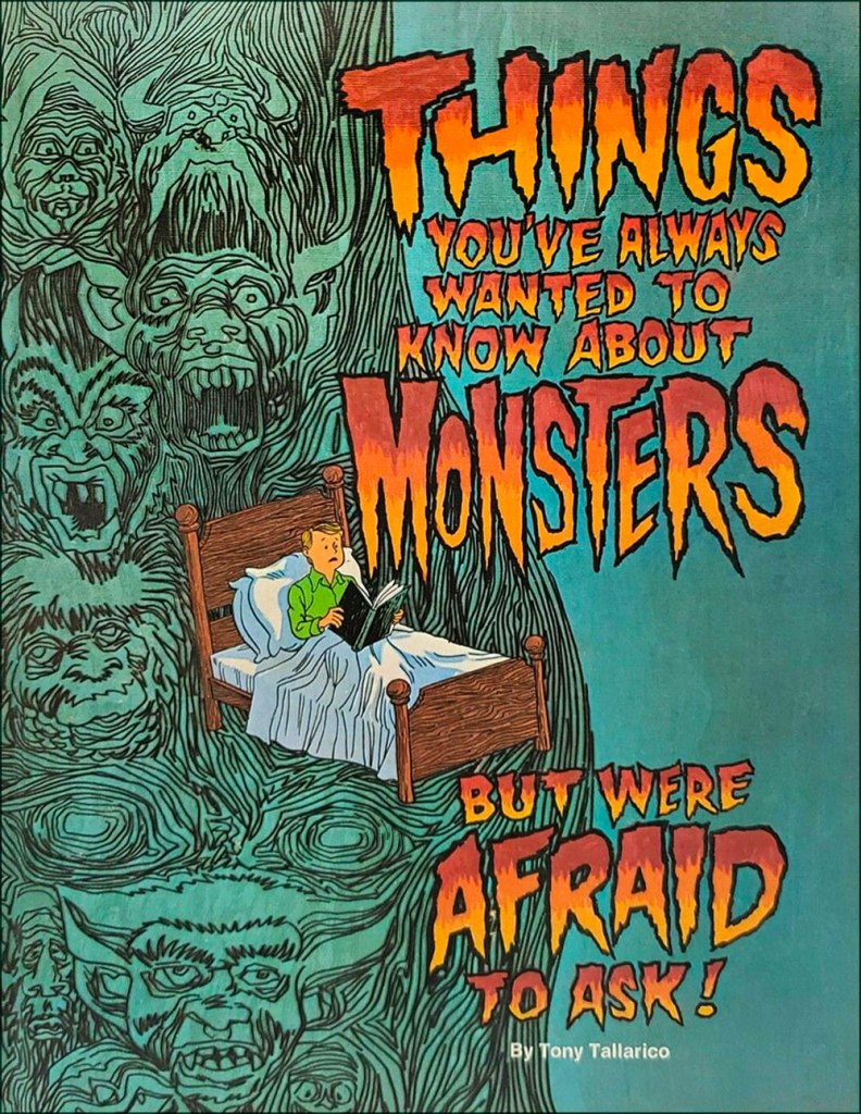
Here’s a lovely one: Things You’ve Always Wanted to Know About Monsters (1977, Grosset & Dunlap). From the author’s introduction: « My sincere thanks to the many motion picture studios who produced these great monster films. They have kept many a generation of fans ‘monsterized‘. My thanks to my parents, who did not forbid me to see these films when I was a boy. Instead, they brought out in me many of the questions that appear in this volume. They always stressed that monsters are another form of fictional entertainment. My thanks to my wife Elvira, and my daughter Nina**, who stood by while my son and I made a mess of the living room as we selected the many pictures that appear here. »
I should point out that I haven’t forgotten one of my favourite Tallarico projects, namely his charming work on the Bobby Sherman “Getting Together” comic book (7 issues, Feb.-Oct. 1972, Charlton)… it’s just that I’ve already addressed the topic: check out Let’s Hear It for Bobby Sherman!
I don’t know whether I’ll change anyone’s mind about Mr. Tallarico’s work, but I believe I can rest assured I gave it my best shot.
-RG
*Hex was introduced in All-Star Western no. 10 (Feb.-Mar. 1972, DC).
**My closest brush with the Tallaricos came in 2015 when I helped his daughter Nina identify and source some artwork she was selling on eBay for her dad. In my experience, a very nice lady. My sincere condolences to the bereaved family.
I was not a fan of Tony Tallarico’s work. If I opened a comic and saw it, I put that comic down. When his work (along with that of Jerry Grandenetti) began appearing in Jim Warren’s titles, I stopped buying them.
The pages above do nothing to make me want to alter my memories, except for one: the “swirly style on “Come See Our Ghost” is groovy! I checked out “A Solemn Oath” and that style is very effective over the course of the story.
PS: “The Reuger Formula” credits Tony Williamsune, another artist who leaves me unmoved.
Though I was too young to experience first-hand that period of Warren’s history for myself, I suppose I might have reacted differently. Though the post-Archie Goodwin era certainly was a fallow one for Warren, it signalled the arrival of Tom Sutton, whose work I greatly enjoyed. And well, Grandenetti being one of my very favourite cartoonists (incidentally, he’d been there since the earliest days of Creepy, first ghosting for Joe Orlando, then under his own byline), I would have been on board with his presence. And, though mine is a minority opinion, I prefer the writing in the post-Goodwin era. Archie may have been the nicest man in comics, but his writing was generally pedestrian and formulaic (lord, those ‘twist’ endings…) — though there are certainly exceptions (Goodwin and Ditko’s ‘Room With a View’ is a masterpiece). I suspect that most Warren fans really cared only about the artwork, anyway.
On the other hand, there was a lot worse than Tallarico to worry about, namely lots of reprints of too-recent material and the prevalence of such (imho) ‘Not Ready for Primetime Players’ as Dick Piscopo, Mike Royer, Billy Graham, William Barry, David Sinclair, John Fantucchio, Dave Cockrum, Frank Brunner and Jeff Jones… and that’s just a roster sampling from the early issues of Vampirella! At least the Spanish photo-tracers hadn’t taken over yet.
As for Tallarico, at least you liked one page (and my post!), which in my book constitutes progress. And I’m really happy you enjoyed ‘Oath’. Ten-year-old me was baffled yet fascinated by its daring style when I received that issue back in the day.
I thought that someone else had already blogged about ‘Come See Our Ghost…’, but I couldn’t find any trace of it at the time of my writing. I’m thinking I’ll feature it soon. Its groovy style aside, it’s a really cheeky piece of writing.
As for Mr. ‘Williamsune’, he’s simply the collective pseudonym that Tony (Tallarico) and William (Fraccio) went by when they worked in tandem. From what I’ve experienced in terms of good collaborative chemistry, I surmise that they challenged and pushed each other into interesting directions and dimensions.
Yes, the artwork in the early Warren non-comic book comic books (Creepy, Eerie, and Blazing Combat) was the thing! Goodwin’s stories were so-so but with those artists, there could have been empty word balloons and I would have bought every issue!
“Spanish photo-tracers” is funny—and apt.
I enjoy your posts as your taste in comics is so much more catholic than mine so you cover artists and titles I ignored or loathed (once upon a time). Discovering I was “wrong” about a Grandenetti or a Tallarico is almost as much fun as discovering I was equally incorrect in my dislike of Tommy James & the Shondells.
Well, Neal, I can’t say I recall any other time that my tastes have ever been deemed ‘catholic’ (though I do quite enjoy reading ‘Treasure Chest of Fun & Fact’!) 😉
Must be a matter of defining one’s terms: in my view, ‘catholic’ would entail deep abiding affection for the stylings of, to name but a few, Neal Adams, Jim Starlin, George Perez, Alex Ross, John Romitas Sr. and Jr., Berni Wrightson, Mike Grell, Paul Gulacy, Marshall Rogers, Richard Corben, Todd McFarlane, John Byrne, Gil Kane, John and Sal Buscema, Frank Miller… not exactly our personal Dream Team. ‘Catholic’ would mean liking Kirby and Ditko… but for the wrong reasons.
Favourite Tommy James and the Shondells track: “One Two Three and I Fell”, B-side to “Mony Mony”. Overall favourite Tommy James track: “Draggin’ the Line”. 😉
Sorry guys but, what the heck are you talking about? Unless I missed something, your “Catholic” discussion makes no sense to me.
As for Tony Tallarico, whose work I’m not familiar with, from the few samples I checked, it struck me as solid and versatile, but not catchy enough to be memorable.
Tom Sutton? He did some decent inkings on Gil Kane’s pencils but I’m definitely no fan of his art.
Oh, it’s nothing so complicated: something got lost in translation, I think. Neal was saying my tastes were ‘catholic’, which I thought to mean ‘orthodox’, conventional or mainstream. By catholic, I think he actually meant ‘broad-ranging’, which makes more sense (and is far more flattering). Sorry, Neal!
And Krackles, if you find Tallarico to be solid and versatile, my work his done. I don’t claim that he’s a grand master, but simply that he deserves more respect instead of being dismissed as one of the industry’s worst.
As for Sutton, you mean those early-70s issues of Warlock? Unreadable, pretentious tripe… but nice art. But you really need to dig deeper with Sutton. His best work was done in the horror and SF genres for Charlton, Warren, and Marvel’s black-and-white Planet of the Apes mag… definitely not in superheroics.
I’m with you on Tallarico and Sutton—which possibly means that, like me, you are not as catholic in your tastes and appreciation for comic books artists as Gasp65.
As for our host’s wide-ranging tastes, of the artists he lists above, my “deep” appreciation of/for extends only to Adams, Wrightson, Kane, J. Buscema, and Miller.
Of course, Kirby and Ditko are deities to whom young, wannabe comic book artists should make sacrifices late at night when their parents are asleep.
Keep on keepin’ on!
NEAL
PS: Here is a link to one of the few articles I have published about comic books (note the tentacles):
Thanks so much for sharing, Neal. That’s a fantastic article, moving and, dare I say it? — profound. I particularly appreciated the post-scripts. Any more pieces on related topics in the offing?
Hello. My husband very recently came across your article. I wanted to thank you for your condolences and for writing about my Dad.
If I may… “Eerie no. 20 correction: “Danny Smith” is not Tony’s son, he’s Tony’s wife’s nephew, Danny Grosso. Danny always loved my Dad.
Best to you, Nina (and thank you for your kind words.)
Ah, wonderful! I was really hoping that my homage to your dad would reach you somehow, Nina! As you’ve likely observed by now, both my wife (and co-admin) and I are certified Tallarico enthusiasts.
As for your correction, of course you may — and I greatly appreciate your setting the record straight… since I could only speculate, while you’ve first-hand knowledge of the specifics (I’ve updated the post to include this new detail).
Thank you so much for dropping by, and a tip of the hat to your husband for doing the legwork and passing the word!
OK, if you’re discussing the extent of your taste in comics, well, I believe I have quite a wide range myself: from classic Franco/Belgian to underground, from mainstream to experimental, from craftmanship to idiosyncratic.
All of the artists you both mentioned are more or less mainstream (which isn’t a criticism as far as I’m concerned).
In my youth, I did read some of Sutton’s work outside of the superheroes genre (to which he’s very ill suited, I agree) like “Planet of Apes” or his horror stories but, just like with the early work of Mike Ploog, it’s better to keep them as fond memories because it’s way too often a bit painful to revisit them.
Krackles, I think you misunderstand (à chacun son tour!) what I meant by my listing of artists. I was saying that someone with (what I took to mean) ‘catholic’ (that is to say, ‘mainstream or conventional’) tastes would be focusing on these popular favourites. Some of them I like, some I find wildly overrated, some I outright detest. And of course they’re all pretty mainstream: that’s my point.
As for Ploog, I’m no fan, but isn’t his early work his only decent work? By which I mean, in the main, the first five issues of Marvel’s Frankenstein, into which he clearly poured his heart and soul — not that I’m impressed or anything.
And if I recall correctly, you enjoy a good wallow in Ross Andru’s Spider-Man, but Sutton’s work is too painful to revisit? I can attest that our respective kilométrage varies wildly… let’s just leave it at that — that’s a pretty wide chasm to bridge!
I don’t mean to be offending to Sutton but his style simply doesn’t appeal to me and his craftmanship doesn’t favorably compare to Andru (and yes, we should leave it at that, some things should remain clouded in mystery).
I agree that Ploog early work had heart and soul but is too immature for me to enjoy it at the moment (mebbe later?) while I still love the early debuts of Barry Smith when he was aping Jack Kirby (probably more than his own current style).
John Buscema and Gil Kane are great, a cut above most other mainstream artists.
Adams is hit and miss but I’m forever in love with his short run on X-Men
Gene Colan is way to often forgotten and that’s shameful!
Kirby and Ditko belongs to a class of their own.
Oh, don’t worry — I’m not taking your dismissal of Sutton personally. Where would we be with such thin skins?
Andru, however, I see as the worst kind of hack. He wasn’t bad in his early days, but by the 1960s, he was just recycling the same go-to pose… to the death. You know the one: three-quarter angle, legs bent* (I should make a collage!)
In this, and it’s an astounding feat, he was even more rote and repetitive than ol’ Gil Kane. Worst of all were the late 1970s and early 1980s at DC, when he, inker Dick Giordano (and ace ‘art director’ Vince Colletta) created hundreds of dreadful, interchangeable, by-the-numbers covers. Some scars just don’t heal. And poses aside, I never dug his macrocephalic, hollow-eyed characters.
Never mind Ploog; neither of us is a fan, that’s evident! I still find Barry Smith’s early work rather amateurish, but not *entirely* devoid of charm. His Conan wasn’t bad.. (I know… faint praise!) Again, clearly something he poured himself into. And the less said about his pointless return to comics, the better. Much like his fellow ‘The Studio’ deities, he had to come crawling back to tawdry comics because no-one could be bothered to worship him in the ‘real’ art world.
I stand by my succinct estimation of John Buscema, written a few years ago on this blog: “Corner-cutting maestro and Marvel yes-man”. Certainly in a class with Gil Kane, that of talented artists not using said talent, cynically mercenary in Buscema’s case, high-minded but self-defeating in Kane’s, with largely the same results: massive œuvres of mind-numbing repetition.
I’ve stated my case on Adams, and I can’t look at his mannered, overwrought work without cringing.
With Colan, I’m totally on board . He did *so much* remarkable work for Marvel, both in colour and in black-and-white. In the 1970s especially, he was easily the most reliable component of the notoriously-leaky Marvel machine, not that he’s appreciated for it. While every other Marvel title went through a ceaseless (and often pointless) parade of short-lived creative “teams”, he was always on time and without any loss in quality (unless they stuck him with a bad inker, hardly his fault).
Kirby and Ditko, the pantheon, of course. But let’s not take that for granted and forget how many fanboys just *hate* their work.
And well, you certainly don’t need my permission to enjoy Andru’s Spider-Man. How strong the pull of nostalgia… 😉
What you can only see as a mere recycling of stock poses, I recognize as part of the process of refining and maturing a style AND the need to earn a decent living from its output. The same observation could be made for most, if not all, of his generation’s artists and it would be unfair to forget the context of an industry that has exploited artists so badly.
I remember reading an essay on Peanuts by Umberto Eco in which he showed how Shulz’s drawings could be reduced to a very basic system and a handful standard poses. I like to believe that, for you as for me, counting the much maligned number of Andru’s poses does not tell the whole story.
I’d love to see your collage of Andru’s iconic poses because I’m sure I’ll enjoy it very much (no sarcasm at all).
How many “iconic” poses have Kirby or Ditko recycled on a regular basis? Both man villipended as hack, can you believe it? How many poses of a guy throwing a punch or swinging on a web line can you really make unique and original?
Andru pulled it off with ease, he was believable, distinctive and therefore memorable.
He was a very solid craftsman with an excellent command of perspective which he used in unparalleled cinematic storytelling sequences. I also appreciate his good use of cartoonish expressiveness, yes, what you describe as hollow-eyed macrocephalic characters (very apt and funny description by the way).
In the late 70’s I think his eye problems got worse and this might further explain the angular distortion in his drawings. His art declined rapidly, as did Jack Kirby around the same time. Clearly, the same countless hours spent on the drawing board took a heavy toll on both men’s health. Add to the mix the probable friendly pressure of bean counters for interchangeable BUT bankable covers and you get a sad picture of the twilight of a great artist.
More on Kane and Buscema later, I hope (about whom we surprisingly both agree AND disagree at the same time)…
Krackles — you wrote: “What you can only see as a mere recycling of stock poses, I recognize as part of the process of refining and maturing a style AND the need to earn a decent living from its output. The same observation could be made for most, if not all, of his generation’s artists and it would be unfair to forget the context of an industry that has exploited artists so badly.”
Judging by the Kane interviews I’ve read, even he didn’t believe that ‘refining and maturing’ bit in the end. The ‘earning a living’ bit is irrelevant, given the level playing field: all working cartoonists have to deal with that. In fact, it works against the first part of your argument: Kane had to hack it out because he consistently lived above his means and was always scrounging for money.
Eco is right, of course: but Schulz’s economy served a different purpose, that of directness. Besides, it was largely a vehicle (albeit a most fitting one) for his writing, and he had plenty to express there. Compare that to Kane, who, when given total freedom with His Name Is… Savage!, showed us that all he wanted to do was an even more violent version of John Boorman’s Point Blank (starring Lee Marvin, Kane’s model for Savage). Much as I love Wally Wood, Witzend also betrayed the fact that most of that generation’s non-writing cartoonists, granted free rein, would just add tits ‘n’ ass (and/or gore) to the mainstream work they were so disillusioned with. Like birds that remain in their cage when the door is open.
As for the recycling of “iconic” (how I loathe that word!) poses, it’s really a question of range! Kirby, for one, had dozens of these at least. I’m reminded of being struck by a scene from an early issue of Challengers of the Unknown where Rocky, Red, Prof and Ace are running down a beach… and Kirby gave each one their own distinctive posture and body language. In short, Andru just doesn’t have that kind of range, though of course it’s unfair to compare anyone to Kirby… but you’re the one who pulled the trigger. 😉
True, poor Ditko did go through the motions terribly after a while. After the DC implosion and cancellation of Shade, he was just broken. He never really tried after that.
I don’t deny that Andru was a solid craftsman. I suppose a lot of what I dislike about his work, inevitable, work-grind-driven repetition aside, is that he was pretty consistently ill-served by his inkers. He only has himself to blame for Mike Esposito, of course. But Giordano was such a poor fit.
And you know, I suspect (it’s one of my pet theories) that he was one of the artists who suffered most when the comics industry switched to smaller original art pages in the late 1960s. This absurd cost-cutting move was made in order to fit more pages on a printing plate. Constrained to work at a smaller scale, many artists’ work deteriorated. Certainly, anyone with eye problems would have suffered. It’d be interesting to delve deeper into this. Ditko’s inking was never the same, and Herb Trimpe’s work lost something.
Now, coming back ’round to my point: I was just as surprised as anyone might be, back in 1981, when I took a peek at the Tabloid-sized “Superman and His Incredible Fortress of Solitude”. Getting past the dreadful Andru-Giordano cover, I found the insides to be really attractive! In Romeo Tanghal, Andru finally found himself with a sympathetic, compatible embellisher, one who evidently understood his line. And Andru, as in the case of 1976’s ‘Superman vs The Amazing Spider-Man’ — though without the crappy Giordano inks — must have been able to work in a larger format. See what you think: https://readcomiconline.li/Comic/DC-Special-Series/Issue-26?id=62934
I’ll wrap this up for now… this is turning into quite an epic forum discussion!
I found the photo of that cat while looking for something else entirely on the internet back in 2013. It’s not a doctored image but actually a photo of a kitten standing on its head:
I was immediately and utterly charmed and “stole” it. After I started using it on that site’s homepage, I went looking for the owner to beg permission to use it (and credit the photographer) but never found the original photo again.
Imagine hearing about a comic book collection from the ’50s and ’60s for sale in your neighborhood and you get the first crack at buying it. The collection has thousands of DCs, Marvels, Gold Keys, Charltons, Towers, end everything to make your heart go pitter-patter! And everyone has “5¢” in black, felt-tip pen ink written in the upper right corner of the front cover.
Then you wake up and realize it’s a bad dream, probably caused by an undigested bit of beef, a blot of mustard, a crumb of cheese, a fragment of underdone potato, or that damn article Neal wrote …
Sorry, but I was never an Andru fan, so Gasp65 would probably do what I would do with a collection of mint Andru comics: grade ’em, bag ’em, and sell ’em.
PS: While I am always suspicious of people who use coincidences as an explanation for a complicated action or event, I love the small ones that pop up almost daily.
While the three of us are conversing here on an article about a fairly obscure artist named Tallarico, I just sent birthday greetings to a Facebook friend whose last name is Talarico.
I’m sure we agree that coincidences are quite common and rarely cosmic — they just don’t get noticed all that often. Still, I do think that’s a rather nifty one. Happy birthday to your friend!
If it weren’t for small matters like the pandemic and oceans and continents separating us, I daresay it would be likely be fun to get together with you guys over a couple of pitchers for an evening of lively discussion!
The comments section here won’t allow me to place my replies exactly where they belong but I wanted to say that I L-O-V-E-D Barry Smith’s CONAN!
Here’s another anecdote: I had a table at one of Seuling’s shows in NYC in the early ’70s. Some kid was walking around with a stack of fifty near-mint CONANS (multiple copies of each of the first ten issues) asking $1 each but you had to buy them all.
I didn’t even hesitate to give the kid the money and quickly sold ten copies of CONAN #1 for $10 each! I don’t remember what I got for the others.
Well, if I moved to my original home state of Pennsylvania and you moved down to the Toronto area, we could get together for the occasional pint or ten and wish Krackles was there to hear us making fun of Ross Andru’s art.
I have recently come across your wonderful blog ‘Who’s Out There’ and this fascinating post on the great and much maligned Tony Tallarico.
At present we are working on a monster-sized book titled ‘The US Warren Artists”.
Which will include a feature on Tony Williamsune.
Would you be up for helping us out? We are looking for high quality scans of original art and covers of the comics they produced over the many years of their association.
Your name will be added to the list of contributors at the start of this epic volume and we will send you a complimentary copy on publication.
Best Wishes,
Peter
Peter Richardson
Editor in Chief
Illustratorsquarterly.com
I don’t remember how I missed the first issues of CREEPY in 1964; probably because the local stores placed them next to the movie monster magazines that I wasn’t paying any attention to then.
But by 1965 I was an avid fan of it and BLAZING COMBAT (and, later, EERIE). Discovering these Warren titles was one of the high points of my early years in comic book collecting. I didn’t know any other kid who was collecting comic books who had even heard of EC comics, so the Warren titles were, well, kind of shocking.
Plus I had to pull more weeds than ever to get my Father to up my allowance so I could pay that exorbitant 35¢ cover price!
Your project sounds like a fabulous endeavour, and I’ll be delighted to help you in any way I can. Messrs. Tallarico and Fraccio deserve every bit of appreciation they can get.
My apologies for the long delay in my response — I’ve been buried under an avalanche of work for a couple of months and am only now catching up with my correspondence. I should be quicker in the future!


I was not a fan of Tony Tallarico’s work. If I opened a comic and saw it, I put that comic down. When his work (along with that of Jerry Grandenetti) began appearing in Jim Warren’s titles, I stopped buying them.
The pages above do nothing to make me want to alter my memories, except for one: the “swirly style on “Come See Our Ghost” is groovy! I checked out “A Solemn Oath” and that style is very effective over the course of the story.
PS: “The Reuger Formula” credits Tony Williamsune, another artist who leaves me unmoved.
LikeLike
Hi Neal!
Though I was too young to experience first-hand that period of Warren’s history for myself, I suppose I might have reacted differently. Though the post-Archie Goodwin era certainly was a fallow one for Warren, it signalled the arrival of Tom Sutton, whose work I greatly enjoyed. And well, Grandenetti being one of my very favourite cartoonists (incidentally, he’d been there since the earliest days of Creepy, first ghosting for Joe Orlando, then under his own byline), I would have been on board with his presence. And, though mine is a minority opinion, I prefer the writing in the post-Goodwin era. Archie may have been the nicest man in comics, but his writing was generally pedestrian and formulaic (lord, those ‘twist’ endings…) — though there are certainly exceptions (Goodwin and Ditko’s ‘Room With a View’ is a masterpiece). I suspect that most Warren fans really cared only about the artwork, anyway.
On the other hand, there was a lot worse than Tallarico to worry about, namely lots of reprints of too-recent material and the prevalence of such (imho) ‘Not Ready for Primetime Players’ as Dick Piscopo, Mike Royer, Billy Graham, William Barry, David Sinclair, John Fantucchio, Dave Cockrum, Frank Brunner and Jeff Jones… and that’s just a roster sampling from the early issues of Vampirella! At least the Spanish photo-tracers hadn’t taken over yet.
As for Tallarico, at least you liked one page (and my post!), which in my book constitutes progress. And I’m really happy you enjoyed ‘Oath’. Ten-year-old me was baffled yet fascinated by its daring style when I received that issue back in the day.
I thought that someone else had already blogged about ‘Come See Our Ghost…’, but I couldn’t find any trace of it at the time of my writing. I’m thinking I’ll feature it soon. Its groovy style aside, it’s a really cheeky piece of writing.
As for Mr. ‘Williamsune’, he’s simply the collective pseudonym that Tony (Tallarico) and William (Fraccio) went by when they worked in tandem. From what I’ve experienced in terms of good collaborative chemistry, I surmise that they challenged and pushed each other into interesting directions and dimensions.
LikeLiked by 1 person
G
Yes, the artwork in the early Warren non-comic book comic books (Creepy, Eerie, and Blazing Combat) was the thing! Goodwin’s stories were so-so but with those artists, there could have been empty word balloons and I would have bought every issue!
“Spanish photo-tracers” is funny—and apt.
I enjoy your posts as your taste in comics is so much more catholic than mine so you cover artists and titles I ignored or loathed (once upon a time). Discovering I was “wrong” about a Grandenetti or a Tallarico is almost as much fun as discovering I was equally incorrect in my dislike of Tommy James & the Shondells.
Keep on keepin’ on …
N
LikeLike
Well, Neal, I can’t say I recall any other time that my tastes have ever been deemed ‘catholic’ (though I do quite enjoy reading ‘Treasure Chest of Fun & Fact’!) 😉
Must be a matter of defining one’s terms: in my view, ‘catholic’ would entail deep abiding affection for the stylings of, to name but a few, Neal Adams, Jim Starlin, George Perez, Alex Ross, John Romitas Sr. and Jr., Berni Wrightson, Mike Grell, Paul Gulacy, Marshall Rogers, Richard Corben, Todd McFarlane, John Byrne, Gil Kane, John and Sal Buscema, Frank Miller… not exactly our personal Dream Team. ‘Catholic’ would mean liking Kirby and Ditko… but for the wrong reasons.
Favourite Tommy James and the Shondells track: “One Two Three and I Fell”, B-side to “Mony Mony”. Overall favourite Tommy James track: “Draggin’ the Line”. 😉
LikeLiked by 1 person
Sorry guys but, what the heck are you talking about? Unless I missed something, your “Catholic” discussion makes no sense to me.
As for Tony Tallarico, whose work I’m not familiar with, from the few samples I checked, it struck me as solid and versatile, but not catchy enough to be memorable.
Tom Sutton? He did some decent inkings on Gil Kane’s pencils but I’m definitely no fan of his art.
LikeLiked by 1 person
Oh, it’s nothing so complicated: something got lost in translation, I think. Neal was saying my tastes were ‘catholic’, which I thought to mean ‘orthodox’, conventional or mainstream. By catholic, I think he actually meant ‘broad-ranging’, which makes more sense (and is far more flattering). Sorry, Neal!
And Krackles, if you find Tallarico to be solid and versatile, my work his done. I don’t claim that he’s a grand master, but simply that he deserves more respect instead of being dismissed as one of the industry’s worst.
As for Sutton, you mean those early-70s issues of Warlock? Unreadable, pretentious tripe… but nice art. But you really need to dig deeper with Sutton. His best work was done in the horror and SF genres for Charlton, Warren, and Marvel’s black-and-white Planet of the Apes mag… definitely not in superheroics.
LikeLiked by 1 person
KRACKLES
I’m with you on Tallarico and Sutton—which possibly means that, like me, you are not as catholic in your tastes and appreciation for comic books artists as Gasp65.
As for our host’s wide-ranging tastes, of the artists he lists above, my “deep” appreciation of/for extends only to Adams, Wrightson, Kane, J. Buscema, and Miller.
Of course, Kirby and Ditko are deities to whom young, wannabe comic book artists should make sacrifices late at night when their parents are asleep.
Keep on keepin’ on!
NEAL
PS: Here is a link to one of the few articles I have published about comic books (note the tentacles):
https://www.nealumphred.com/with-wally-wood/
LikeLike
Thanks so much for sharing, Neal. That’s a fantastic article, moving and, dare I say it? — profound. I particularly appreciated the post-scripts. Any more pieces on related topics in the offing?
LikeLiked by 1 person
GASP65
Regarding things I have published about comic books:
• Go to Neal Umphred Dot Com (https://www.nealumphred.com/).
• Click on “Categories” at the top of the homepage
• Click on “Comic Books.”
You will see a few more articles there.
Best,
NEAL
LikeLike
Thank you kindly, Neal. And man, that anecdote about the stupid record pricers is *glorious*! I won’t hesitate to dig further, I assure you.
LikeLiked by 1 person
Hello. My husband very recently came across your article. I wanted to thank you for your condolences and for writing about my Dad.
If I may… “Eerie no. 20 correction: “Danny Smith” is not Tony’s son, he’s Tony’s wife’s nephew, Danny Grosso. Danny always loved my Dad.
Best to you, Nina (and thank you for your kind words.)
LikeLiked by 1 person
Ah, wonderful! I was really hoping that my homage to your dad would reach you somehow, Nina! As you’ve likely observed by now, both my wife (and co-admin) and I are certified Tallarico enthusiasts.
As for your correction, of course you may — and I greatly appreciate your setting the record straight… since I could only speculate, while you’ve first-hand knowledge of the specifics (I’ve updated the post to include this new detail).
Thank you so much for dropping by, and a tip of the hat to your husband for doing the legwork and passing the word!
LikeLike
OK, if you’re discussing the extent of your taste in comics, well, I believe I have quite a wide range myself: from classic Franco/Belgian to underground, from mainstream to experimental, from craftmanship to idiosyncratic.
All of the artists you both mentioned are more or less mainstream (which isn’t a criticism as far as I’m concerned).
In my youth, I did read some of Sutton’s work outside of the superheroes genre (to which he’s very ill suited, I agree) like “Planet of Apes” or his horror stories but, just like with the early work of Mike Ploog, it’s better to keep them as fond memories because it’s way too often a bit painful to revisit them.
LikeLiked by 1 person
Krackles, I think you misunderstand (à chacun son tour!) what I meant by my listing of artists. I was saying that someone with (what I took to mean) ‘catholic’ (that is to say, ‘mainstream or conventional’) tastes would be focusing on these popular favourites. Some of them I like, some I find wildly overrated, some I outright detest. And of course they’re all pretty mainstream: that’s my point.
As for Ploog, I’m no fan, but isn’t his early work his only decent work? By which I mean, in the main, the first five issues of Marvel’s Frankenstein, into which he clearly poured his heart and soul — not that I’m impressed or anything.
And if I recall correctly, you enjoy a good wallow in Ross Andru’s Spider-Man, but Sutton’s work is too painful to revisit? I can attest that our respective kilométrage varies wildly… let’s just leave it at that — that’s a pretty wide chasm to bridge!
LikeLiked by 1 person
Gasp65,
I don’t mean to be offending to Sutton but his style simply doesn’t appeal to me and his craftmanship doesn’t favorably compare to Andru (and yes, we should leave it at that, some things should remain clouded in mystery).
I agree that Ploog early work had heart and soul but is too immature for me to enjoy it at the moment (mebbe later?) while I still love the early debuts of Barry Smith when he was aping Jack Kirby (probably more than his own current style).
John Buscema and Gil Kane are great, a cut above most other mainstream artists.
Adams is hit and miss but I’m forever in love with his short run on X-Men
Gene Colan is way to often forgotten and that’s shameful!
Kirby and Ditko belongs to a class of their own.
PS: Andru’s Spider-man is wonderful stuff!
LikeLiked by 1 person
Oh, don’t worry — I’m not taking your dismissal of Sutton personally. Where would we be with such thin skins?
Andru, however, I see as the worst kind of hack. He wasn’t bad in his early days, but by the 1960s, he was just recycling the same go-to pose… to the death. You know the one: three-quarter angle, legs bent* (I should make a collage!)
In this, and it’s an astounding feat, he was even more rote and repetitive than ol’ Gil Kane. Worst of all were the late 1970s and early 1980s at DC, when he, inker Dick Giordano (and ace ‘art director’ Vince Colletta) created hundreds of dreadful, interchangeable, by-the-numbers covers. Some scars just don’t heal. And poses aside, I never dug his macrocephalic, hollow-eyed characters.
Never mind Ploog; neither of us is a fan, that’s evident! I still find Barry Smith’s early work rather amateurish, but not *entirely* devoid of charm. His Conan wasn’t bad.. (I know… faint praise!) Again, clearly something he poured himself into. And the less said about his pointless return to comics, the better. Much like his fellow ‘The Studio’ deities, he had to come crawling back to tawdry comics because no-one could be bothered to worship him in the ‘real’ art world.
I stand by my succinct estimation of John Buscema, written a few years ago on this blog: “Corner-cutting maestro and Marvel yes-man”. Certainly in a class with Gil Kane, that of talented artists not using said talent, cynically mercenary in Buscema’s case, high-minded but self-defeating in Kane’s, with largely the same results: massive œuvres of mind-numbing repetition.
I’ve stated my case on Adams, and I can’t look at his mannered, overwrought work without cringing.
With Colan, I’m totally on board . He did *so much* remarkable work for Marvel, both in colour and in black-and-white. In the 1970s especially, he was easily the most reliable component of the notoriously-leaky Marvel machine, not that he’s appreciated for it. While every other Marvel title went through a ceaseless (and often pointless) parade of short-lived creative “teams”, he was always on time and without any loss in quality (unless they stuck him with a bad inker, hardly his fault).
Kirby and Ditko, the pantheon, of course. But let’s not take that for granted and forget how many fanboys just *hate* their work.
And well, you certainly don’t need my permission to enjoy Andru’s Spider-Man. How strong the pull of nostalgia… 😉
*The ‘classic’ Andru pose: https://tinyurl.com/2s3fbdex
LikeLike
Gasp65,
What you can only see as a mere recycling of stock poses, I recognize as part of the process of refining and maturing a style AND the need to earn a decent living from its output. The same observation could be made for most, if not all, of his generation’s artists and it would be unfair to forget the context of an industry that has exploited artists so badly.
I remember reading an essay on Peanuts by Umberto Eco in which he showed how Shulz’s drawings could be reduced to a very basic system and a handful standard poses. I like to believe that, for you as for me, counting the much maligned number of Andru’s poses does not tell the whole story.
I’d love to see your collage of Andru’s iconic poses because I’m sure I’ll enjoy it very much (no sarcasm at all).
How many “iconic” poses have Kirby or Ditko recycled on a regular basis? Both man villipended as hack, can you believe it? How many poses of a guy throwing a punch or swinging on a web line can you really make unique and original?
Andru pulled it off with ease, he was believable, distinctive and therefore memorable.
He was a very solid craftsman with an excellent command of perspective which he used in unparalleled cinematic storytelling sequences. I also appreciate his good use of cartoonish expressiveness, yes, what you describe as hollow-eyed macrocephalic characters (very apt and funny description by the way).
In the late 70’s I think his eye problems got worse and this might further explain the angular distortion in his drawings. His art declined rapidly, as did Jack Kirby around the same time. Clearly, the same countless hours spent on the drawing board took a heavy toll on both men’s health. Add to the mix the probable friendly pressure of bean counters for interchangeable BUT bankable covers and you get a sad picture of the twilight of a great artist.
More on Kane and Buscema later, I hope (about whom we surprisingly both agree AND disagree at the same time)…
LikeLiked by 1 person
Krackles — you wrote: “What you can only see as a mere recycling of stock poses, I recognize as part of the process of refining and maturing a style AND the need to earn a decent living from its output. The same observation could be made for most, if not all, of his generation’s artists and it would be unfair to forget the context of an industry that has exploited artists so badly.”
Judging by the Kane interviews I’ve read, even he didn’t believe that ‘refining and maturing’ bit in the end. The ‘earning a living’ bit is irrelevant, given the level playing field: all working cartoonists have to deal with that. In fact, it works against the first part of your argument: Kane had to hack it out because he consistently lived above his means and was always scrounging for money.
Eco is right, of course: but Schulz’s economy served a different purpose, that of directness. Besides, it was largely a vehicle (albeit a most fitting one) for his writing, and he had plenty to express there. Compare that to Kane, who, when given total freedom with His Name Is… Savage!, showed us that all he wanted to do was an even more violent version of John Boorman’s Point Blank (starring Lee Marvin, Kane’s model for Savage). Much as I love Wally Wood, Witzend also betrayed the fact that most of that generation’s non-writing cartoonists, granted free rein, would just add tits ‘n’ ass (and/or gore) to the mainstream work they were so disillusioned with. Like birds that remain in their cage when the door is open.
As for the recycling of “iconic” (how I loathe that word!) poses, it’s really a question of range! Kirby, for one, had dozens of these at least. I’m reminded of being struck by a scene from an early issue of Challengers of the Unknown where Rocky, Red, Prof and Ace are running down a beach… and Kirby gave each one their own distinctive posture and body language. In short, Andru just doesn’t have that kind of range, though of course it’s unfair to compare anyone to Kirby… but you’re the one who pulled the trigger. 😉
True, poor Ditko did go through the motions terribly after a while. After the DC implosion and cancellation of Shade, he was just broken. He never really tried after that.
I don’t deny that Andru was a solid craftsman. I suppose a lot of what I dislike about his work, inevitable, work-grind-driven repetition aside, is that he was pretty consistently ill-served by his inkers. He only has himself to blame for Mike Esposito, of course. But Giordano was such a poor fit.
And you know, I suspect (it’s one of my pet theories) that he was one of the artists who suffered most when the comics industry switched to smaller original art pages in the late 1960s. This absurd cost-cutting move was made in order to fit more pages on a printing plate. Constrained to work at a smaller scale, many artists’ work deteriorated. Certainly, anyone with eye problems would have suffered. It’d be interesting to delve deeper into this. Ditko’s inking was never the same, and Herb Trimpe’s work lost something.
Now, coming back ’round to my point: I was just as surprised as anyone might be, back in 1981, when I took a peek at the Tabloid-sized “Superman and His Incredible Fortress of Solitude”. Getting past the dreadful Andru-Giordano cover, I found the insides to be really attractive! In Romeo Tanghal, Andru finally found himself with a sympathetic, compatible embellisher, one who evidently understood his line. And Andru, as in the case of 1976’s ‘Superman vs The Amazing Spider-Man’ — though without the crappy Giordano inks — must have been able to work in a larger format. See what you think: https://readcomiconline.li/Comic/DC-Special-Series/Issue-26?id=62934
I’ll wrap this up for now… this is turning into quite an epic forum discussion!
LikeLiked by 1 person
Thanks, Neal, for sharing your very own Wallace Wood moment for whom we do share a common appreciation!
LikeLiked by 1 person
K
Glad you enjoyed it!
Here is my other Wally Wood piece: https://www.nealumphred.com/wally-wood-and-witzend
Best,
N
LikeLike
Hey Neal, you put a cat on your homepage?
Is it a (pretty) dirty catholic trick to attract more readers? 😛
LikeLiked by 1 person
K
I found the photo of that cat while looking for something else entirely on the internet back in 2013. It’s not a doctored image but actually a photo of a kitten standing on its head:
I was immediately and utterly charmed and “stole” it. After I started using it on that site’s homepage, I went looking for the owner to beg permission to use it (and credit the photographer) but never found the original photo again.
N
LikeLike
GASP65
Imagine hearing about a comic book collection from the ’50s and ’60s for sale in your neighborhood and you get the first crack at buying it. The collection has thousands of DCs, Marvels, Gold Keys, Charltons, Towers, end everything to make your heart go pitter-patter! And everyone has “5¢” in black, felt-tip pen ink written in the upper right corner of the front cover.
Then you wake up and realize it’s a bad dream, probably caused by an undigested bit of beef, a blot of mustard, a crumb of cheese, a fragment of underdone potato, or that damn article Neal wrote …
NEAL
LikeLike
Neal,
Just picture Gasp65 finding a mint collection of each and every comicbook Ross Andru ever drew?
That would make my day!
LikeLiked by 1 person
K
Sorry, but I was never an Andru fan, so Gasp65 would probably do what I would do with a collection of mint Andru comics: grade ’em, bag ’em, and sell ’em.
N
LikeLiked by 1 person
N,
Your uncatholic wisdom leaves me macrocephalicly hollow-eyed!
P.
LikeLiked by 1 person
Good or bad, as long as everyone is talking about Andru, that’s all that matters.
Believe me guys, you won’t stop hearing about it until you’ll end up praising Ross Andru.
Incidentally, I believe I figured out how to properly place my comment chronologically in this disjointed UI.
LikeLiked by 1 person
PS: While I am always suspicious of people who use coincidences as an explanation for a complicated action or event, I love the small ones that pop up almost daily.
While the three of us are conversing here on an article about a fairly obscure artist named Tallarico, I just sent birthday greetings to a Facebook friend whose last name is Talarico.
LikeLike
I’m sure we agree that coincidences are quite common and rarely cosmic — they just don’t get noticed all that often. Still, I do think that’s a rather nifty one. Happy birthday to your friend!
If it weren’t for small matters like the pandemic and oceans and continents separating us, I daresay it would be likely be fun to get together with you guys over a couple of pitchers for an evening of lively discussion!
Cul sec!
LikeLiked by 1 person
Indeed, Santé !
LikeLiked by 1 person
GASP65 and KRACKLES
The comments section here won’t allow me to place my replies exactly where they belong but I wanted to say that I L-O-V-E-D Barry Smith’s CONAN!
Here’s another anecdote: I had a table at one of Seuling’s shows in NYC in the early ’70s. Some kid was walking around with a stack of fifty near-mint CONANS (multiple copies of each of the first ten issues) asking $1 each but you had to buy them all.
I didn’t even hesitate to give the kid the money and quickly sold ten copies of CONAN #1 for $10 each! I don’t remember what I got for the others.
Those were the days …
NEAL
LikeLike
Neal,
It’s totally irrelevant in this thread (I can already picture Gasp65 doing his best hollow-eyed macrocephalic impression) so it’s absolutly necessary and this is just for you:
https://www.designboom.com/design/3d-cat-cross-shinjuku-vision-tokyo-07-07-2021/
Enjoy!
LikeLiked by 1 person
K
It must be very interesting doing acid and walking around Japan these days …
N
LikeLike
I assume you kept at least one copy of each issue for yourself and I hope you used that money wisely… Like buying loads of new comics 😉
LikeLiked by 1 person
GASP65
I am in the Seattle, Washington, area. Where are you that we are separated by oceans and continents?
NEAL
LikeLike
I meant the three of us: I’m across the border and the continent in Montréal, and Krackles is overseas, in France.
LikeLiked by 1 person
GASP65
Well, if I moved to my original home state of Pennsylvania and you moved down to the Toronto area, we could get together for the occasional pint or ten and wish Krackles was there to hear us making fun of Ross Andru’s art.
N
LikeLiked by 1 person
Can I just say that this conversation is really entertaining to watch from the sidelines?
LikeLiked by 2 people
REDSCRAPER
Can I just say that you’re no longer on the sidelines?
NEAL
LikeLiked by 2 people
K
I already had them all, purchased at newsstands (there being no comic shops at the time—at least in most of the US). And, yes, I bought more comics.
N
LikeLike
KRACKLES
Hah! My last comment ended up exactly where I wanted it! How did I do that?
NEAL
LikeLiked by 1 person
I have recently come across your wonderful blog ‘Who’s Out There’ and this fascinating post on the great and much maligned Tony Tallarico.
At present we are working on a monster-sized book titled ‘The US Warren Artists”.
Which will include a feature on Tony Williamsune.
Would you be up for helping us out? We are looking for high quality scans of original art and covers of the comics they produced over the many years of their association.
Your name will be added to the list of contributors at the start of this epic volume and we will send you a complimentary copy on publication.
Best Wishes,
Peter
Peter Richardson
Editor in Chief
Illustratorsquarterly.com
LikeLiked by 1 person
PETER
I look forward to seeing “The US Warren Artists.”
I don’t remember how I missed the first issues of CREEPY in 1964; probably because the local stores placed them next to the movie monster magazines that I wasn’t paying any attention to then.
But by 1965 I was an avid fan of it and BLAZING COMBAT (and, later, EERIE). Discovering these Warren titles was one of the high points of my early years in comic book collecting. I didn’t know any other kid who was collecting comic books who had even heard of EC comics, so the Warren titles were, well, kind of shocking.
Plus I had to pull more weeds than ever to get my Father to up my allowance so I could pay that exorbitant 35¢ cover price!
Keep on keepin’ on!
NEAL
LikeLike
Thank you for your kind words, Peter!
Your project sounds like a fabulous endeavour, and I’ll be delighted to help you in any way I can. Messrs. Tallarico and Fraccio deserve every bit of appreciation they can get.
My apologies for the long delay in my response — I’ve been buried under an avalanche of work for a couple of months and am only now catching up with my correspondence. I should be quicker in the future!
Best, Richard
LikeLike
Hi Richard—do you have an. email address you can send me?
LikeLike
Certainly — just use the Contact WOT? link, it’ll lead you straight to my inbox. Cheers!
LikeLiked by 1 person