« Taking sartorial risks and not following other people is what makes you stand out. » — Zac Posen
I was planning a big commemorative post for today, but I got tangled up in my calendar and realised in time that I was a couple of weeks off. So instead, I’ll just blow off a little steam.
Some cartoonists are born character designers. Others, not so much. The Rhino, a Stan Lee-John Romita Sr. creation, first appeared in The Amazing Spider-Man no. 41 (Oct. 1966, Marvel), soon after Steve Ditko‘s abrupt but quite justified resignation. Isn’t that just a dog of a cover? (pencils and inks by Romita, colours by Stan Goldberg).
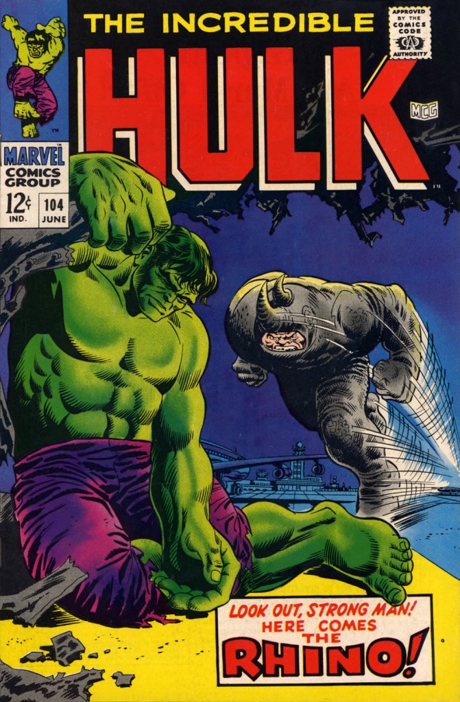
“I’ve been getting these migraine headaches, Doc” “What do you do for a living?” “Uh…” Seriously, what can you do with a character who obviously can’t move that fast, has to lean his head down to strike… blindly, and isn’t particularly smart? All Spidey has to do is duck, which is one of his chief talents.Answer: you pit him against a more suitable adversary, preferably a dumber one. This later, but still ludicrous, appearance is The Incredible Hulk no. 104 (June 1968, Marvel). Cover by Marie Severin and Frank Giacoia.
Somehow, Daredevil seems to wind up with more than his share of poorly-attired villains. It’s as if they know he’s blind and won’t judge them too harshly on sartorial grounds.
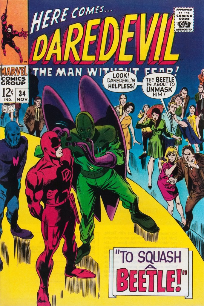
The Beetle first scurried into view in Strange Tales no. 123 (Aug. 1964, Marvel), tackling the Human Torch (and The Thing). Too bad it wasn’t Doctor Strange he was sparring with, since his threads would then have been designed by Mr. Ditko instead of by Carl Burgos.
He then went on to bug the aforementioned ‘hornhead’. This is Daredevil no. 34 (Nov. 1967); pencils by Gene Colan, inks by Bill Everett. Why does everyone on stage appear to wear a size 15 shoe? At least!
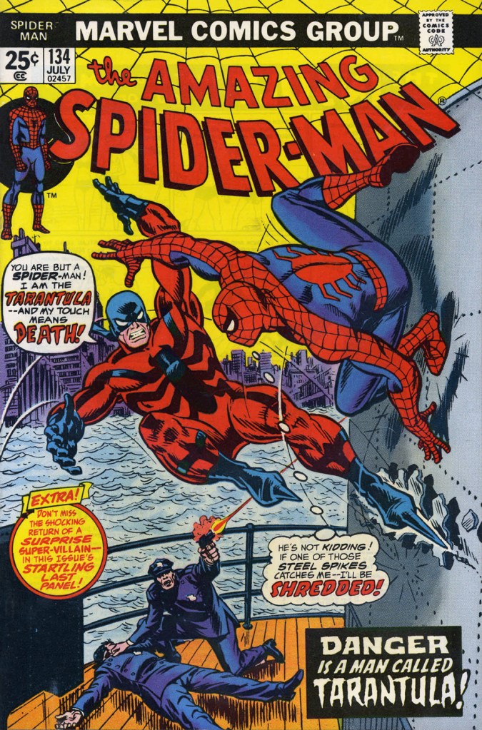
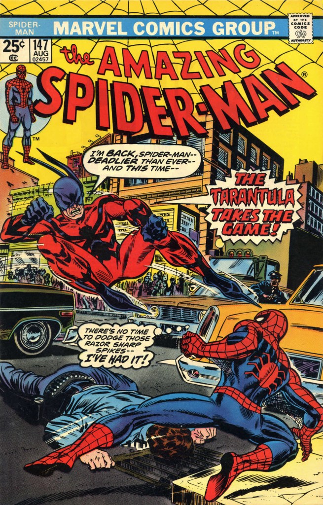
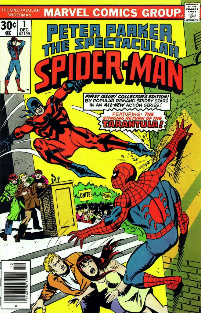
The costume of the Tarantula (a glorious Gerry Conway-Ross Andru creation!) is such an impractical conceit that they pretty much have to use him in the same position on every cover. The guy can barely walk in such, er — calzado, let alone fly at Spider-Man with such force. Just a lousy idea, on every level — tarantulas bite, they don’t sting, Gerry.
This is The Amazing Spider-Man no. 134 (July 1974, Marvel). Art by John Romita Sr. So… much… pointless…. exposition.They just had to bring him back! This time, Gil Kane and John Romita Jr. do the honours. This is The Amazing Spider-Man no. 147 (Aug. 1975, Marvel).No formula at work here, no sir. This is Peter Parker, the Spectacular Spider-Man no. 1 (Dec. 1976, Marvel). Cover by Sal Buscema. Tarantula creator Conway was the editor, which explains a lot — but hardly excuses it.
Poor Razor-Fist was created by writer Doug Moench and artist Paul Gulacy. How did he get dressed? How did he go to the bathroom? How did he feed himself? How did he get his head to bend that far back? (Perhaps he’s a Pez Dispenser).
This is The Hands of Shang-Chi, Master of Kung Fu no. 30 (July 1975, Marvel). Cover by Gil Kane and (most likely) Frank Giacoia. I guess all the male lions were taking a nap somewhere.
Should you hanker for more of these, er… dressing-downs, you might want to inspect our earlier instalment along these lines, « You’re going out wearing THAT? ».
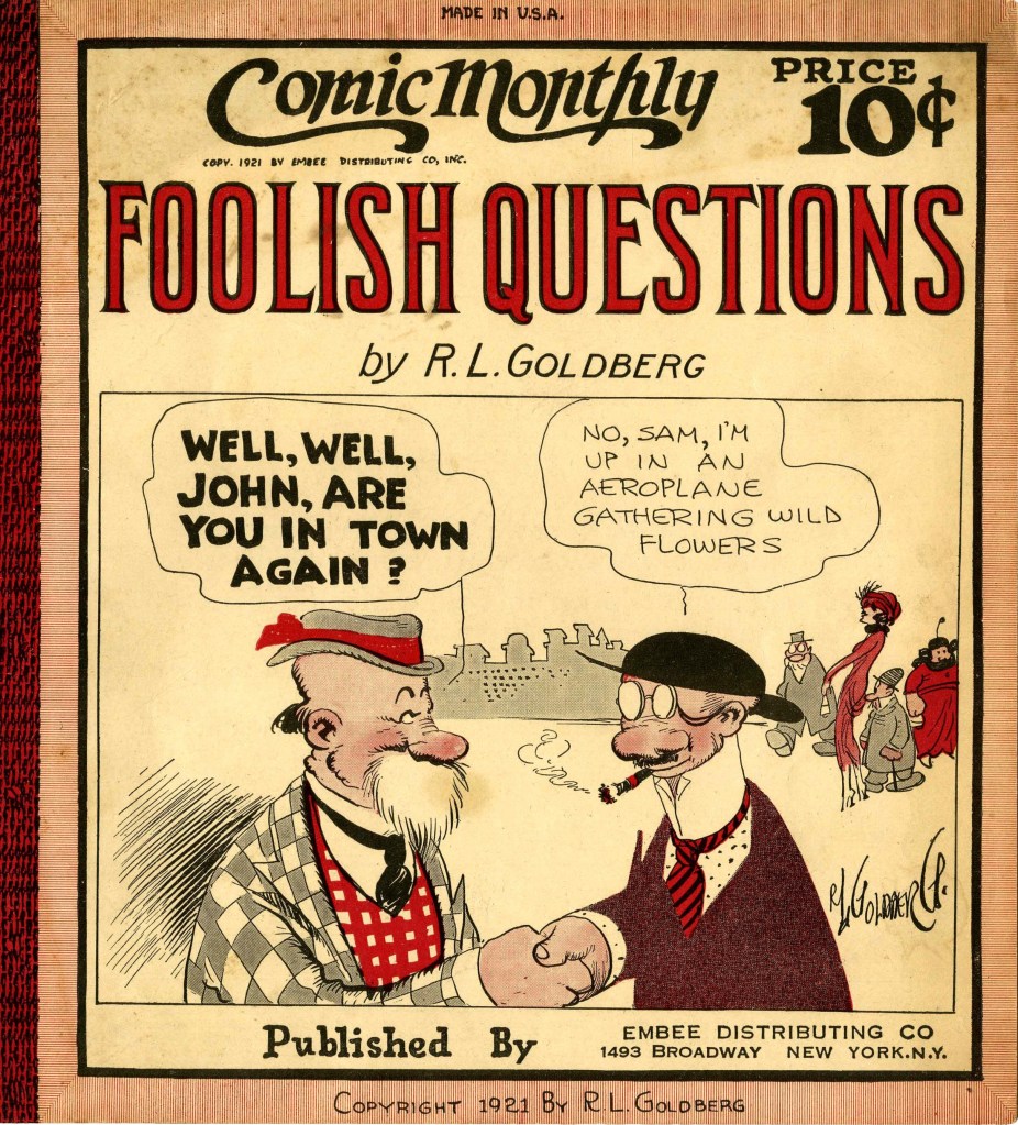
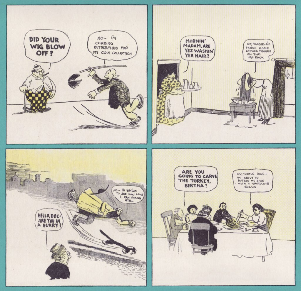
«— Pickin’ flowers, Lucy? — No, you simple-minded piece of cream cheese – I’m filling the coal scuttle with apple sauce.»
My first exposure to a Rube Goldberg machine was through The Incredible Machine, a DOS game from 1993. I didn’t know at the time who Goldberg was, but I really liked the idea of setting up a chain of events triggering one another in the most convoluted-yet-satisfying of ways.
The machine was of course named after Rube Goldberg (Reuben Garrett Goldberg, 1883-1970), cartoonist, inventor, sculptor, et j’en passe. Given his lasting contribution to culture, it is interesting to consider that in the early days of his career, when he was a struggling cartoonist, Goldberg almost changed his family name to hide his Jewish roots – ultimately deciding that he couldn’t live with himself, had he followed his colleagues’ counsel. ‘Then I realized it was idiotic to even consider such a thing; that I would be ashamed of it all the remainder of my life; and that, if a man’s achievements are no bigger than the sound of his name, it doesn’t much matter what his name may be‘, he later wrote.
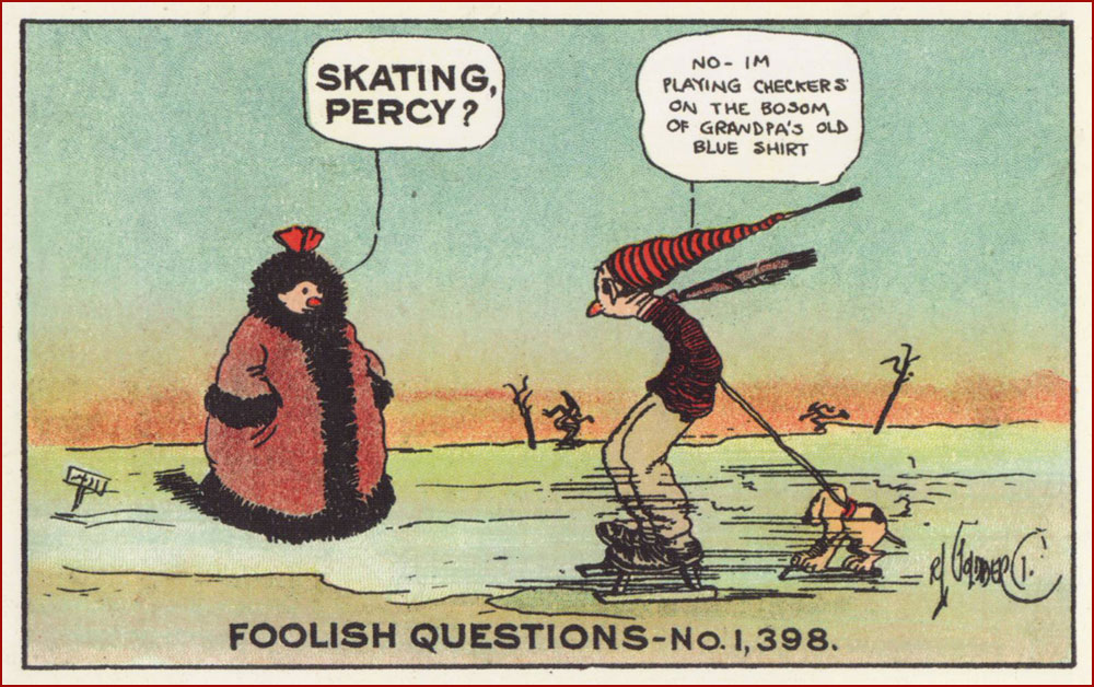
While Goldberg had a degree in engineering and worked for a short while for the San Francisco’s Water and Sewers Department (which perhaps honed his sense of the absurd, if anecdotes about a city’s treatment of sewage are anything to go by), his ambitions lay in the direction of cartooning from a very early age. His first comic, after a couple of years of being a sports cartoonist, was The Look-A-Like Boys, published at the beginning of the century (1907-1908) by the World Color Syndicate. In parallel, he was also working for the New York Evening Mail, for which he created the short-lived Reincarnation, a goofy, modern-day take on historical characters. His next attempt at a series is what initially made him famous (after which he went on to even greater fame): he produced around 450 Foolish Questions between 1908 and 1910; the very first one, published on October 23, 1908 was prosaically titled ‘Foolish Question No. 1’. Questions remained as witless as ever, but the answers got kookier and more surreal over the years!
FQ continued all the way into 1939 with plenty of enthusiasm from readers (who started sending in their own daft questions). It even inspired a song by Billy Murray. Here are some postcards:
In 1909, Goldberg expanded the FQ world into a Sunday strip, Don’t Some People Ask the Biggest Fool Questions?, which collected previously published strips by grouping them into tiers (and occasionally padding this format out with new artwork). In 1912, he went on to unleash the madcap inventions he’s remembered for today upon the world in the shape of The Inventions of Professor Lucifer Gorgonzola Butts, A.K., then shifted to political cartooning (for which he won a Pulitzer Prize in 1948) in 1938, and then recycled himself as a sculptor in the 1960s. Truly a life filled to the brim with adventure!
The examples below have been scanned from Foolish Questions & Other Odd Observations (Early Comics 1909-1919), published by the wonderful Sunday Press in 2017. I highly recommend it; abounding in bonus materials, it also has two introductions for the price of one, namely one by Goldberg’s granddaughter Jennifer George, and another written by comics historian Paul C. Tumey (author of the equally magnificent tome, SCREWBALL! The Cartoonists Who Made the Funnies Funny – read a review of it by Eddie Campbell* here). Goldberg’s sense of the absurd is truly a delight, and I dare you to not giggle while perusing these.
~ ds
* Another WOT favourite that we never really got around to talking about. I will, however, refer you to this interesting discussion about comprehending/perusing comics, in which Cambpell conjures an entertaining mental image, relating to his appearance on TV to talk about why ‘some people just can’t read comics’: «My blather would have been mercifully cut because I launched into an insane mimicry of a theoretical middle-aged woman in tears from not being able to interpret the TV guide.»
« Bicycles are pieces of art. You get that combination of kinetic engineering, but then, besides the welds, the paint jobs, the kind of the sculpture of it all is quite beautiful. Bikes have such great lines, and all different styles. » — Robin Williams
I’ve been cycling a lot more of late. I’d been using my bike less frequently in recent years, unnerved by the increasingly frantic (and distracted, not a good combo) vehicular traffic of the city. But with my wife taking an interest in the activity, I found myself with a reason to get back in the saddle. This spring, we found a newly opened bike shop, earthy, grimy and unpretentious, where we got our bikes expertly tuned up.
I’ve always loathed those cliquish hipster joints that, in addition to selling overpriced junk, also seem responsible for the ubiquity of those middle-aged, over-equipped, spandex-clad Sunday cyclists, who feel it their sacred duty to pass you, whatever the pace, weather or road conditions, looking for all the world like overstuffed sausages in their lycra casings. The sporting analogue, if you will, of the rich kid who ‘needs’ the most expensive guitar in the shop… never mind that he can’t play a note.
You hopefully will indulge me in this little exercise in nostalgia. I miss the days when our bikes got us around, granted us greater autonomy and kept us in shape. This lifestyle took a backseat in the 1980s, when the BMX craze began to overstate the extreme and the competitive facets of the sport. Now, it’s all ultimate sport this and boot-camp fitness that. Ah, whatever happened to plain old utilitarian fun?
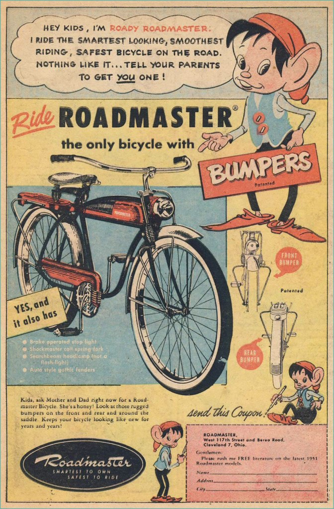
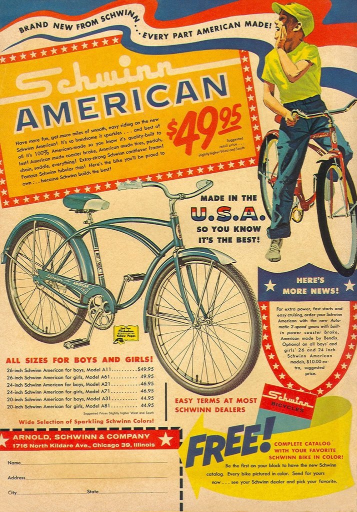
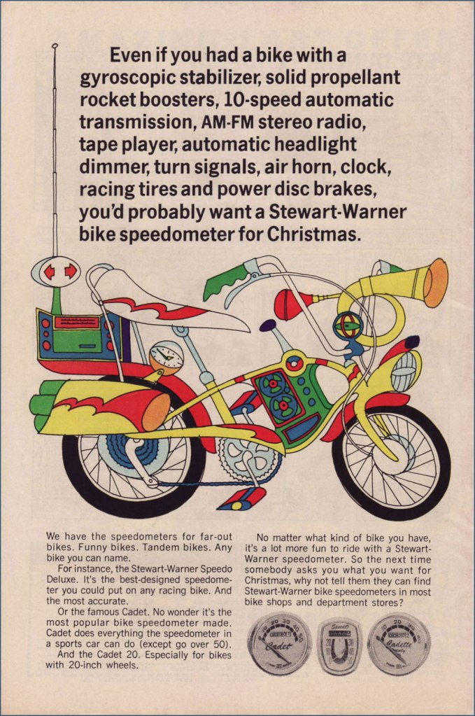
Judging from this ad (circa July, 1951), bicycle makers were trying to make their steeds mimic the clunky look of the era’s motorcycles. Aesthetics would soon improve. Here’s a fairly typical ad, circa 1961. Free catalogue, not to mention a healthy dollop of American jingoism, like it or lump it. Speaking of Schwinn, check out their well-produced promo comics Bicycle Book, from 1949.Ah, yes, the U.S. Royal twins, Roy and Al. In the tradition of the accidentally named Smith Brothers, “Trade” and “Mark”. Unsurprisingly, scouting magazine Boys’ Life was an ideal market for bike-themed ads. This one appeared in the May, 1966 issue. Artist unknown… anyone?You can tell how important the bicycle scene was: not only were manufacturers hawking bicycles, but there was also the ‘aftermarket’ trade of gizmos and doodads. I’ve long supposed ‘speedometer’ to be a dumbed-down term for a tachometer. Even after consulting this ‘helpful’ chart, I’m still not convinced it isn’t. To quote sometime Beach Boys lyricist, DJ and racing enthusiast Roger Christian: “Tach it up, tach it up / Buddy, gonna shut you down.“
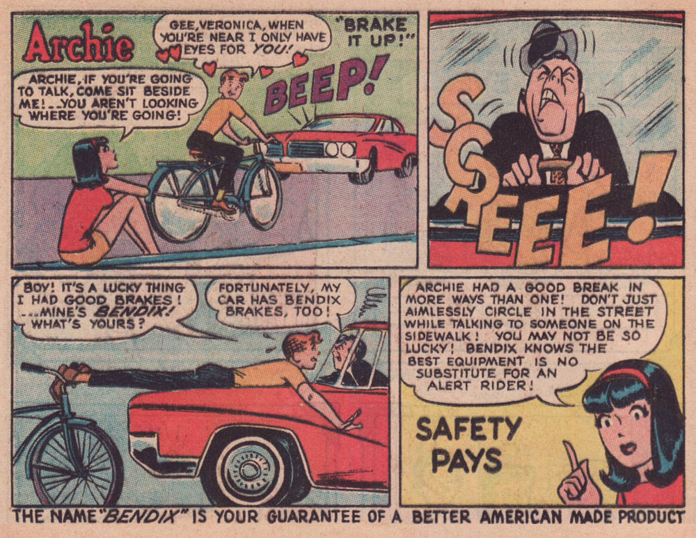
Through much of the 1960s, Bendix (the corporation, not Bill!) commissioned a long-running series of custom ads featuring the Riverdale Gang, illustrated by resident Archie artist Harry Lucey.
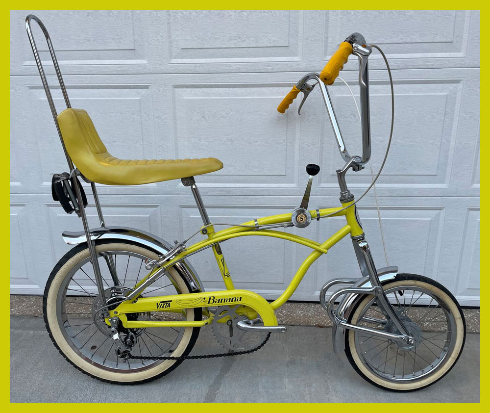
This one’s from April, 1965.Archie, the voice of reason? Only in ads and public service announcements. This one’s from October, 1966.This one’s from July, 1968.Ah, that’s more like the Archie Andrews we’re accustomed to. This one’s from August, 1968. I daresay we’ve all encountered too many such ‘cyclists’.An apt reminder that the rich kids always did boast the best, most up-to-date equipment, whatever the sport. Also, I can’t help but think that the cape and tiger tail are just kind of… reckless. Clearly, corporate shill Tigerboy is failing to heed the lessons of Isadora Duncan’s tragic death. Thanks to the ever-thrilling Jack Davis artwork, this is the unsurpassed classic among bicycle ads. It appeared in select DC and Archie titles cover-dated November, 1968. While banana seats may be considered in most quarters as retro kitsch, I earnestly hold that they were bold and cool. Aesthetic and structural experimentation had arrived at the forefront of the cycling industry. This ad appeared in comics cover-dated February, 1969. And here’s a look at a (flawlessly) surviving model. Man, the elegance of those lines!
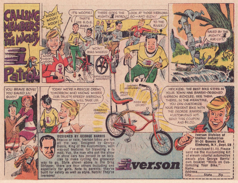
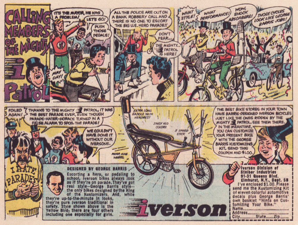
As the 1960s drew to a close, another series of custom comics ads appeared — just under the wire. They spotlight the creations of the famous ‘King of the Kustomizers’, George “Barris” Salapatas (1925-2015), very much in demand thanks to his recent triumph with the Batman tv show’s Batmobile.
This one appeared in various DC titles cover-dated November, 1969. If I had to take a stab at artistic attribution, I would go with the versatile Creig Flessel (1912-2008). Something tells me that in real life, the human chain stunt the Mighty i Patrol pulls would have led to four drowned kids instead of just one — but I’m sure Woofie would have dog-paddled his way to safety.This one appeared in DC titles cover-dated December, 1969. Read a gripping first-hand account of working on the assembly line at the Iverson bicycle factory, circa 1975!I’m assuming that the kid with the sombrero nicked it from Bazooka Joe’s kid brother Pesty. This final adventure saw print in DC titles cover-dated January, 1970.This, however, is the advert that really worked on me. When I got my first grown-up ten speed bike, a few years later, it was a Browning, which lasted me at least a quarter-century, until it snapped right at the load-bearing juncture of the rear fork… the one place where even welding wouldn’t help.
I switched to my backup, a hybrid bike I bought in 1987. It’s still running beautifully. In terms of value for money, a well-maintained bicycle is pretty unbeatable.
My well-thumbed copy of Adventure Cycling in Europe (1981). « Say, Uncle John, did Browning replace you with a pretty-boy model for your comic book ad? » « They sure did, but you know what’s even worse? » « I don’t know, Uncle John, what is? » « I don’t even have a nephew either! » All kidding aside, though it’s over forty years old, it’s still an insightful, entertaining and helpful book. When you go low-tech, change occurs at a slower, more forgiving pace.
I leave you with a song, whence comes the title of this article. It’s from a lesser-known but excellent Donovan album, Open Road, from 1970.
« All my life I’ve been torn between frivolity and despair, between the desire to amuse and the desire to annoy, between dread-filled insomnia and a sense of my own goofiness. Just like you, I worry about love and sex and work and suffering and injustice and death, but I also dig drawing bulgy-eyed rabbits with tragic overbites. » — Matt Groening
Unlike most of my peers, I didn’t grow up absorbing The Simpsons, probably because I only watched cartoons on videocassettes instead of actual TV. I also somehow managed to skip Futurama (catching up with it years and years later, with great enjoyment). So the work of Matt Groening* (who probably needs no introduction, but you can get one here) was not really familiar to me at all when co-admin RG introduced me to The Big Book of Hell, though of course I was aware of the Simpsons aesthetic, as one would truly have to live under a rock not to be acquainted with it to at least some degree.
*Here’s how to pronounce ‘Grœning’ correctly and impress all your friends.
Life in Hell crept into the world in 1977 as a self-published book that Groening, freshly moved to Los Angeles from Portland to pursue his ambition of becoming a writer, would give out to friends. He also sold it for two bucks a pop in Licorice Pizza, one of a chain of record stores operated by James Greenwood. As is often the case, Groening’s cartoonist/writer/producer/animator career kicked off by way of serendipity: in 1978, an editor from the charming WET: The Magazine of Gourmet Bathing liked Life in Hell enough to print a few of its strips. From then on, the strip’s popularity snowballed slowly but steadily (from its first regular weekly appearance in the Los Angeles Reader in 1980, to the huge success of a compilation of LIH’s love-centric cartoons, titled Love Is Hell, in 1984, to the strip’s presence in over 250 newspapers by 1986), which eventually led to The Simpsons. Speaking of the latter, I am now shamelessly going to plug a previous post, namely Tentacle Tuesday: Treehouse of Tentacular Horror.
Here’s a selection from several out-of-print anthologies co-admin RG had handy, namely from Love Is Hell (1984), Work Is Hell (1986), School Is Hell (1987), Childhood Is Hell (1988), and How to Get to Hell (1991).
Personal favourites Akbar and Jeff were apparently introduced so that Groening could incorporate real-life conflicts he had with his girlfriend into the strip without it being too obvious about who was who. When we noticed a couple living across the street (two men always dressed in matching, brightly coloured sportswear) we instantly nicknamed them Akbar and Jeff.
« To many people in the mid-19th century, Canuck was merely a casual synonym for French-Canadian — and like the nicknames for people of various other ethnicities or nationalities, it came with unpleasant overtones. The word is“used vulgarly and rather contemptuously” »
A friendly birthday how-do-you-do to mighty Manitoban George Freeman (born May 27, 1951 — that’s seventy-one years ago — in Selkirk, MB). Some of you will remember him for his Jack of Hearts mini-series at Marvel or his collaboration with Michael T. Gilbert on Elric for First; the more adventurous will recall his fine and, ahem, too-brief work on DC’s Wasteland.
By the 1990s, he was also affiliated with Winnipeg’s celebrated Digital Chameleon studio… but to me, he’s the guy who made Richard Comely and Ron Leishman’s Captain Canuck into a contender, as far as I’m concerned.
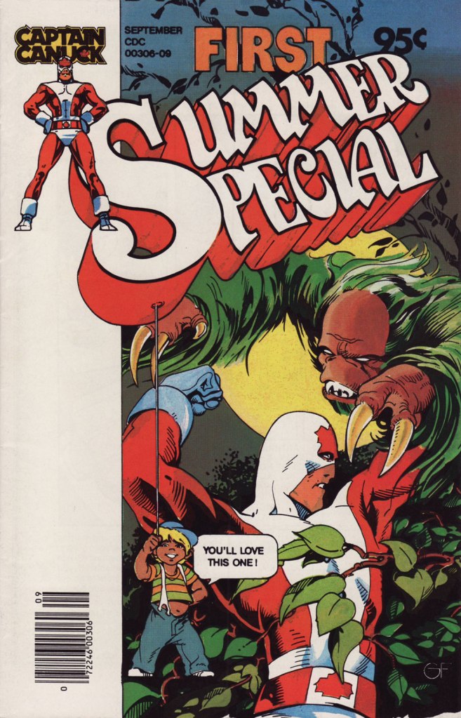
This is Captain Canuck no.7 (Dec. 1979-Jan. 1980, CKR Productions), featuring Ruse, story by Richard Comely, art by George Freeman. Cover by Freeman, with colours by Freeman or Jean-Claude St. Aubin.This was the Captain’s first (and sadly, only) Summer Special (July – Sept. 1980, CKR Productions); a winningly mixed bag, it *was* a lot of fun. Cover by Freeman.Among the goodies included in the Summer Special was a preview of the short-lived CK newspaper strip, which ran in three daily newspapers in Western Canada. It looked quite promising! Written and lettered by Comely, illustrated by Freeman and St. Aubin.This is Captain Canuck no.14 (Mar.-Apr. 1981, CKR Productions), the final issue — just when the series was going from strength to strength. Sigh.
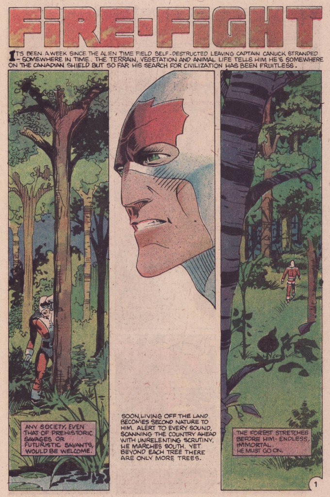
To demonstrate, here’s the opening sequence from that issue. Freeman and St. Aubin were evidently pushing hard against the conventions and constraints of the era’s crappy printing standards.
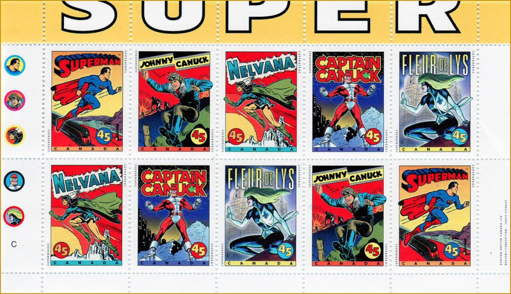
In 1995, the Captain even got his own stamp. Quoting the press release: « What do Superman, Nelvana of the Northern Lights, Johnny Canuck, Captain Canuck and Fleur de Lys have in common? For one thing, they’re all super heroes sprung from the wondrous pages of comic books; and for another, they’re all the marvelous creations of Canadian talent. On October 2, these five super heroes will find new adventure in a booklet of 10 stamps from Canada Post Corporation, to be issued in conjunction with Stamp Month 1995. A universal hero in concept, Captain Canuck is undeniably Canadian in nationality, costume and mannerisms. The concept can be traced to Ron Leishman and Richard Comely. Comely changed Leishman’s Captain Canada to Captain Canuck, and in 1974 established the only independent full-colour comic book in Canada. The cover price was 35¢ – 10¢ higher than other comic books at the time – but that didn’t stop Captain Canuck from outselling all American titles. Unfortunately, the series folded with issue No. 14, in March 1981. »
Part one of The Jack of Hearts’ limited series (Jan. 84, Marvel). The character was introduced in, of all places, an issue of The Deadly Hands of Kung Fu (no. 23, Apr. 1976, Marvel); The Jack shuffled around various Marvel titles for a time, culminating in this solo four-parter scripted by his co-creator, Bill Mantlo, and illustrated by Freeman. That costume must have been a bitch to draw.
Oddly enough, while Freeman was my favourite among the stable of artists chosen to illustrate John Ostrander and Del Close‘s scripts on Wasteland (Don Simpson and David Lloyd got the best), I feel he was assigned the least interesting ones to work on, with the exception of the excellent Del Close autobiographical two-parter, On the Road (issues 6 and 7). Beyond that, he drew one cover and split, unwittingly triggering the debacle that was the second half of the series’ run.
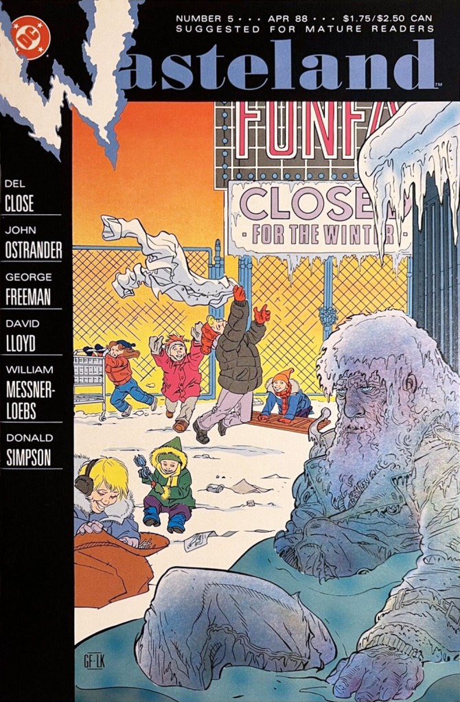
This is Wasteland no. 1 (Dec. 1987, DC). Pencils and inks by Freeman, colouring by his Digital Chameleon accomplice, Lovern Kindzierski.This is Wasteland no. 5 (Apr. 1988, DC). Pencils and inks by Freeman, colouring by Lovern Kindzierski. As denizens of Winnipeg, a notoriously cold city, the guys would know how to colour ice, all right. To quote another famous native son, Randy Bachman : “Portage and Main, Fifty below“.
On the subject of chameleons, it appears that the traditionally held ‘camouflage’ theory of their colour changes is simplistic and generally incorrect.
An elephant pink crawled outta the sink and snuggled up in my bed A purple mole’s in the goldfish bowl, he’s trying to steal a drink*
Today’s post was originally planned as a panegyric to Larry Marder’s Beanworld, but I quickly realized that attempting to write about it was a bit like trying to dissect a joke. Here I am, then, doing a 180 degree turn to talk about a Soviet cartoonist.
Evgeniy Milutka (Евгений Милутка, b. 1946) was a teacher of Russian literature by profession, but his proclivities clearly lay elsewhere. After teaching in middle school for a few years, he officially switched to the career of a cartoonist in the early 1970s, and quickly rose to the ranks of the best known caricaturists in the USSR, in part thanks to his long-lasting (from mid seventies to mid eighties) collaboration with satirical magazine Krokodil(see Krokodil Smiles: Cartoons in the USSR).
I am most interested, however, in the new, kid-oriented direction his work took in the 1980s, namely the cartoons/comics published within the pages of Веселые Картинки (something like ‘funny pictures’ in translation), a literature-bent humour magazine for kids. Founded in 1956, it was still sort-of around (with some financial issues) when I was a child, and my grandfather, who was always very preoccupied with making sure I grew up knowledgeable and smart (sorry, grandpa?), was kind enough to buy me a subscription.
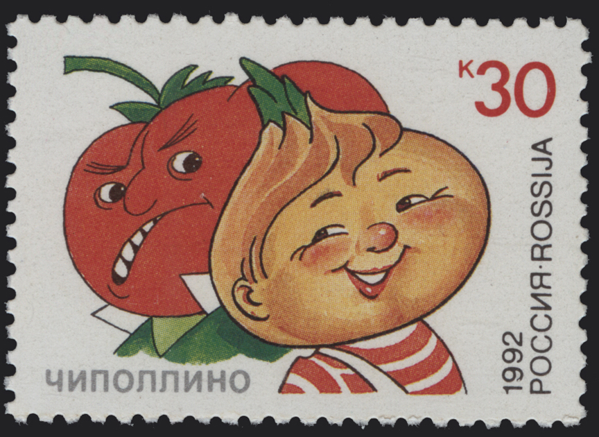
An issue from October 1986, with a cover by Milutka. It features the 8 ‘merry little people’ that were the mascots of this journal and whose adventures Milutka illustrated. This included Karandash (which in Russian means ‘pencil‘), the boy with the pencil nose; Cipollino (little onion), the boy with an onion head, from Gianni Rodari’s Cipollino, a tale that was so popular in the Soviet Union that we even have a Cipollino stamp; Buratino, the Russian Pinocchio; Neznayka, literally translated to ‘don’t know’, a favourite character from Nikolai Nosov‘s merry trilogy of fairy-tales; Petrushka, a character from Slav folk puppetry; Samodelkin, the boy robot whose name translates to something like ‘do-it-yourselfer’; Hurvínek, a character from a Czech puppet duo; and the only girl, Thumbelina.
The first thing that jumps out is that Milutka’s strips are really weird. Green elephants, watermelon men, mosquitoes capable of lifting a person, bats in a cavern made out of teeth, a giant spider wearing running shoes… a lot of it is most delirious delirium tremens. Milutka could aptly handle a variety of styles, but his basic, more recognizable modus operandi is extremely Slavic. The other interesting thing about his work, though you have to take my word for this, is how he squeezed in some distinctly unchildlike content into his strips. He was, after all, a caricaturist, with a keen eye honed by the sometimes subversive Krokodil.
Here is a selection from within the pages of Веселые Картинки from 1991 to 1996, which is pretty much the period I was able to follow in person.
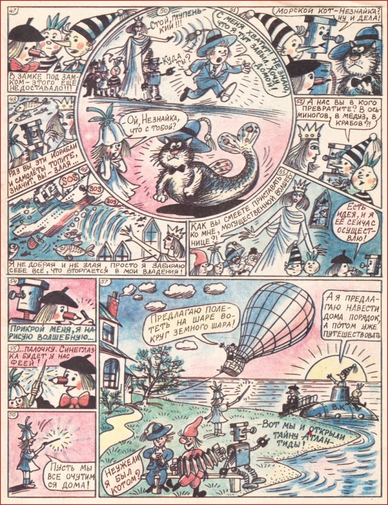
The sorceress gets accused of being evil by Thumbelina, ‘since you crash ships and airplanes‘. ‘I am nor evil nor good,‘ she responds, ‘I just take everything that barges into my kingdom.‘ Nezknayka gets turned into a mer-cat. (1991)
More metamorphosis! The kids keep asking the green elephant ‘what are you? Are you an ungulate? A mammal? Are you an insect? He’s probably an amphibian…‘ but to all their questions, he answers “I dunno…“, which is how they guess that it’s Neznayka in disguise. (1991)
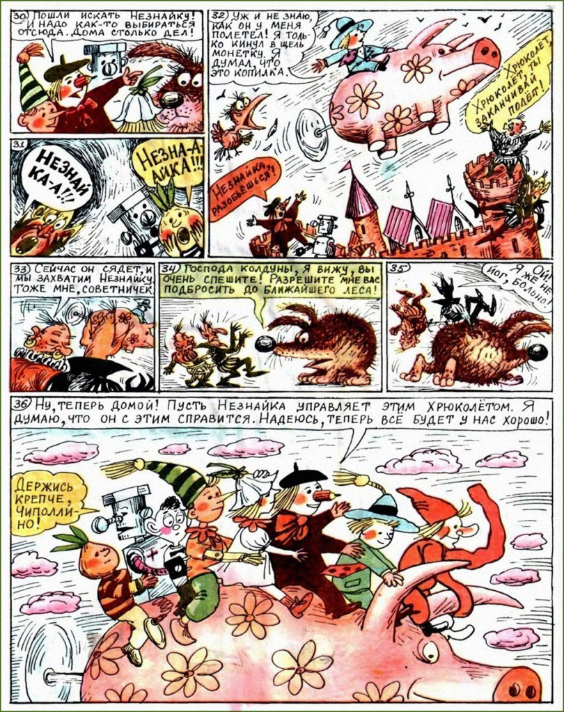
A sword-hog is turned back into a normal hedgehog once he’s fed an apple, and Neznayka, who’s named head advisor to the bad guys (everybody has untranslatable funny names), advises them to tie themselves together with a rope… (1994)
… after which the merry little people escape on a flying pig with a propeller in its ass (1994).
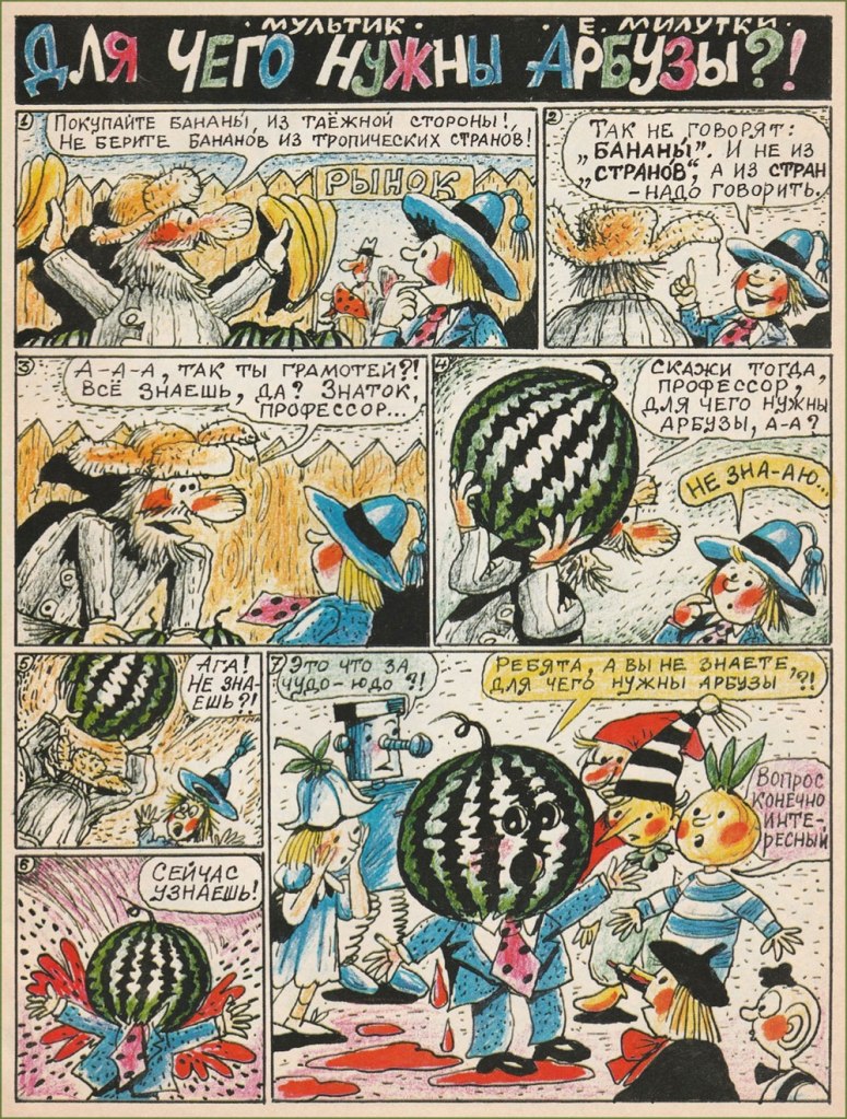
Watermelon man! “Kids, do you know what watermelons are good for?” “It’s an interesting question, of course” (1994).
This is spider named Filia, shod in very nice shoes. Isn’t he cute? (1994)
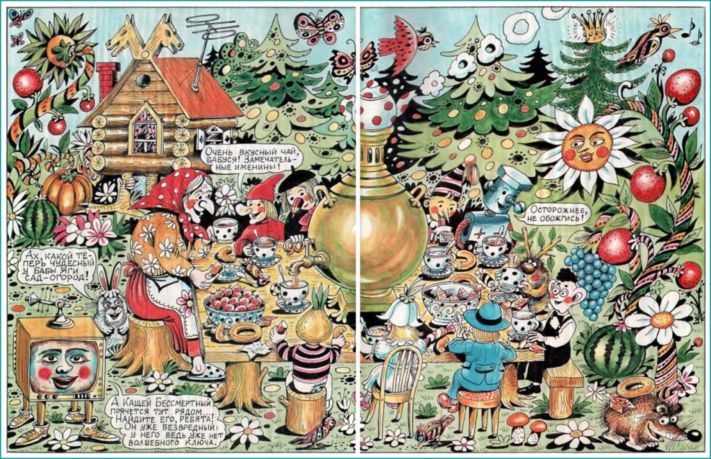
A splash page featuring a prototypical Babushka (actually a Baba Yaga in a good mood!) and an assortment of flora and fauna (1994)
After a lot of untranslatable puns on the word ‘vitamins’, the cat (who’s, once again, Nezknayka, having a pronounced tendency to transform into other creatures) is told to ‘eat the magic balls!‘ to turn back into himself. Thumbelina is also rescued from being… err, whatever that furry thing with the rolled-up nose is. (1995)
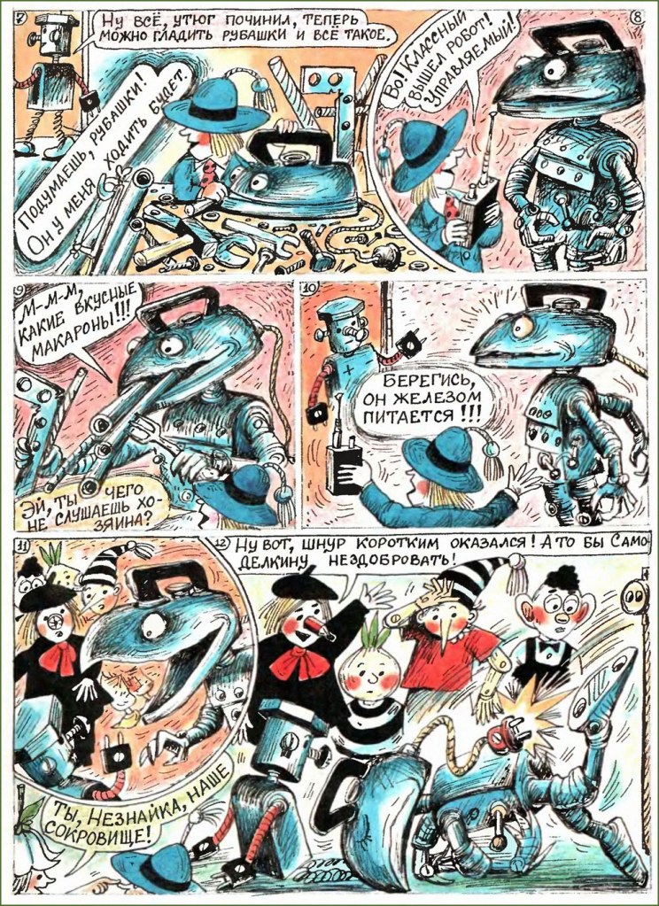
Neznayka invents a robot to do the ironing for him, but the robot is hungry for metal ‘macaroni’ (which we call anything pasta, usually some form of spaghetti) (1996).
A poster advertising the journal (1996), with mushrooms, a Pushkin reference, singing cats, some sort of flying elephant (?) with an accordion, a little furry bee-cat, and so on and so forth.
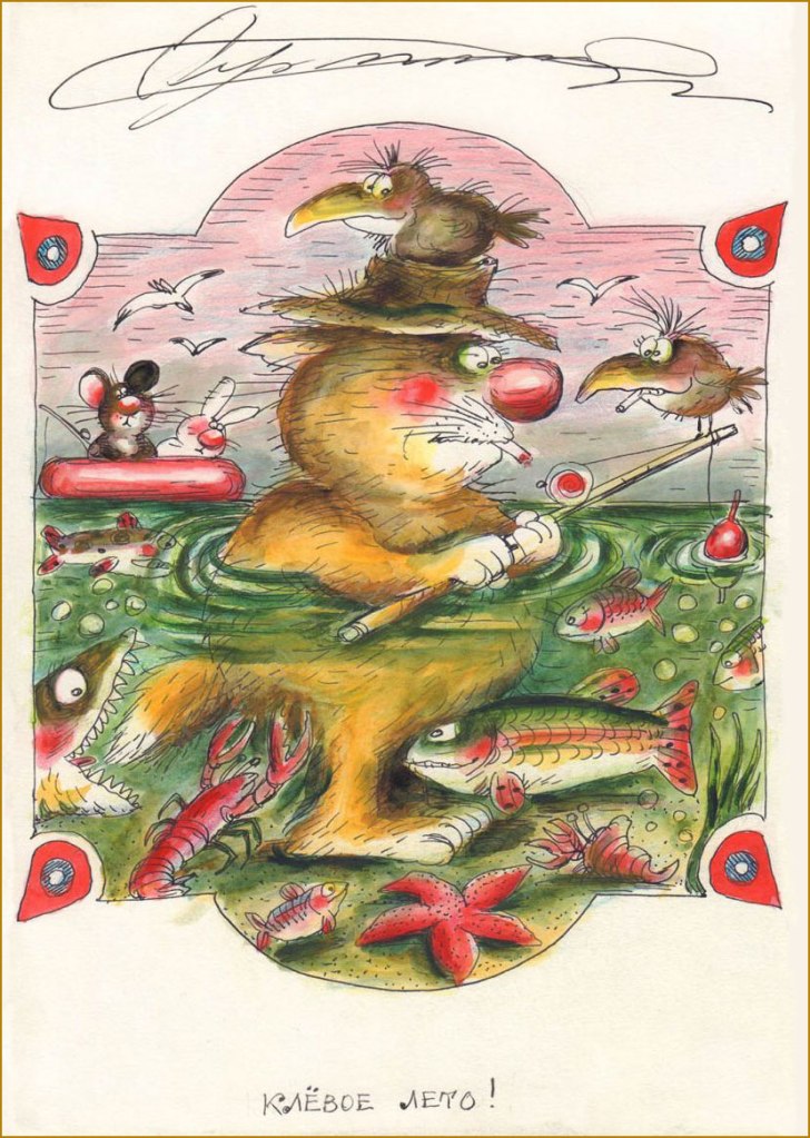
I hope you enjoyed these despite the language barrier! I’ll wrap this up with two fun illustrations from the early 90s:
‘The flight of a bumblebee’
The title is a pun on fish biting and the summer being a neat one.
« I’ve always wanted to be a giant space crab. » — Gabe Newell
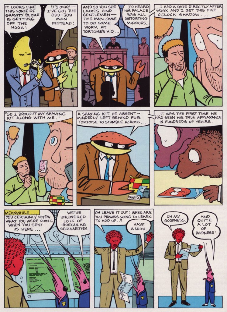
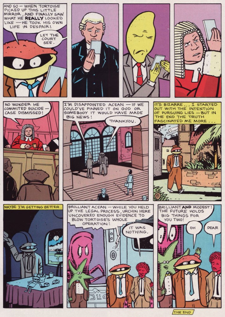
We have quite a treat for you this week. One of our very favourite creators, Mr. Glenn Dakin, has genially agreed to shed light on the inception of one of his lesser-known (but nonetheless striking) creations, Mr. Crusht Acean, aka ‘The Man From Cancer’. Take it away, Mr. Dakin!
Glenn Dakin:The phrase The Man From Cancer came to me when I was writing a song, referring to myself as a typical Cancerian.
It gave me the idea for a detective organisation where all its members were Cancerian. Of course it had thatMan From U.N.C.L.E.association. As I was discussing this idea with my brother down the pub, I said – as a joke – that in order to get a magazine interested in the idea the character would have to actually BE a crab. As soon as I said this, I knew it could work…
Phil was the obvious choice to draw it, as the superb consistency of his style and great visual imagination would make readers accept the bizarre idea as a reality. Also we worked a lot together.
When I told Phil about it, he said ‘how did you know I was Cancer?‘ (much to my surprise). So it was clearly in the stars!
Marvel UK were just launching STRIP, in which creators could keep the rights to their work, so it was a natural place to send. Dan Abnett was the editor and he really got what we were trying to do with the absurd humour. After the first two-parter, he offered us a regular one-page slot.
This is Strip no. 11 (July 7, 1990, Marvel UK). Cover by Phil Elliott.
Who’s Out There?: Judging from the supplementary materials (Strip no. 11), you seem to have quite fully worked out Mr. Crush Tacean’s universe. Did you have lofty plans for the series?
GD:Not so much lofty plans, but whenever Dan Abnett gave us a chance to expand it, we enjoyed enlarging the madness of the world. These supplementary materials were created for STRIP to remind readers of the story half way through, and get new readers on board, after we had been dropped for a couple of issues.
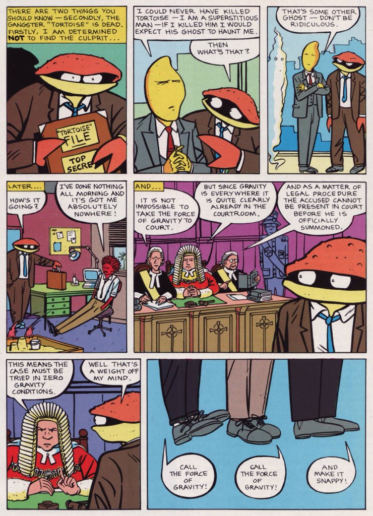
I remember that as my confidence on it grew, and we had the story where we took the force of gravity to court, I started to think of it as a kind of visual Goon Show, following its own absurd logic.
WOT?: Could you shed some light on the series’ publication history? Were the instalments that didn’t appear in ‘Strip’ published elsewhere before they were collected in ‘The Rockpool Files’? (by Slave Labor in Sept. 2009)
GD:You will have to ask Phil that, they might have appeared somewhere, but I don’t think so. We did have a two-pager in a Channel Tunnel magazine!
WOT?: What brought about the change of title? I was quite fond of ‘The Man From Cancer’, I must say.
GD:We were asked to change the name as ‘Cancer’ – we were told – was not exactly a fun buzzword.
« Sez who? »
I think that was the suggestion of Slave Labor, the publisher. The Rockpool Files was the first thing that came into my head, and Phil liked it. The Rockford Files had just been on TV, of course!
This is the book you have to get. While it’s rather… compact (14 x 21,5 cm), in glorious black and white, and out of print, it’s very nearly comprehensive… and most of all, it exists!
WOT?: What’s the story behind these huge gaps between appearances (issues 2 to 9, then 11 to 16)?
GD:As far as I remember, the second half of the Diukalakadu story appeared the next issue in STRIP [no.2 — RG]. Then Dan asked Phil and I to keep it going as a regular feature. We agreed, but as they were working many issues ahead, it took us a little while to launch the new stories.
The only problem was, as it was an anthology comic with multiple contributors, the page count was hard to level out every issue. As the only one-pager, Man From Cancer was the easiest to drop. I think getting asked to create the supplementary materials mentioned above, was a bit of an apology for us being so bumped around. Also the text story ‘Wallow’ in the Rockpool Files book, was originally created in 24 hours by special request of Dan, to solve a pagination crisis when a strip didn’t turn up in time. But then STRIP was canned before it could appear.
WOT?: You’ve collaborated quite a bit with other cartoonists. I presume that the division of labour varies from project to project. In this case, was there a clear line between the job titles? Did you serve strictly as the writer, or did you provide storyboards, layouts or conceptual sketches? And vice versa on Phil’s part?
GD:I never typed up a script for Phil, I just drew a rough of the strip. In this I visualised a lot of the characters, but it was up to Phil if he followed my suggestions. Sometimes he would create an amazing surprise like a giant octopus answering the phones at Cancer HQ. Phil didn’t write anything but he did loads of visual world-creation as we went along.
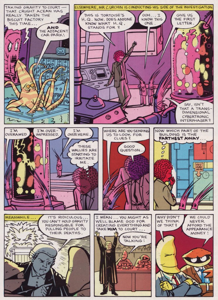
This tale, the second Man From Cancer investigation, appeared in Strip nos. 9-11, 16-19 (1990, Marvel UK). The lovely colours are by Steve White.
And since I hinted at the existence of ‘supplementary materials’, it would be callous of me to leave them unseen.
A bit of context from Mr. Dakin: « How nice to see this after all these years! I read it with great trepidation, wondering what on earth I had said… The upbeat piece on the left ‘I’m an optimum overview kind of guy…‘ was supposed to be by Mr C Urchin (Crusht’s cheerfully inept assistant), which is why it reads a bit odd, with Crusht at the top. I think the original plan got lost when it was given to the designer at Marvel UK. »
I hope you enjoyed our chat with Mr. Dakin, whom I cannot thank enough for his generosity and charming manner. In the event that your interest has been piqued, take a gander at our earlier post entitled Glenn Dakin’s Alter Ego, Abraham Rat.
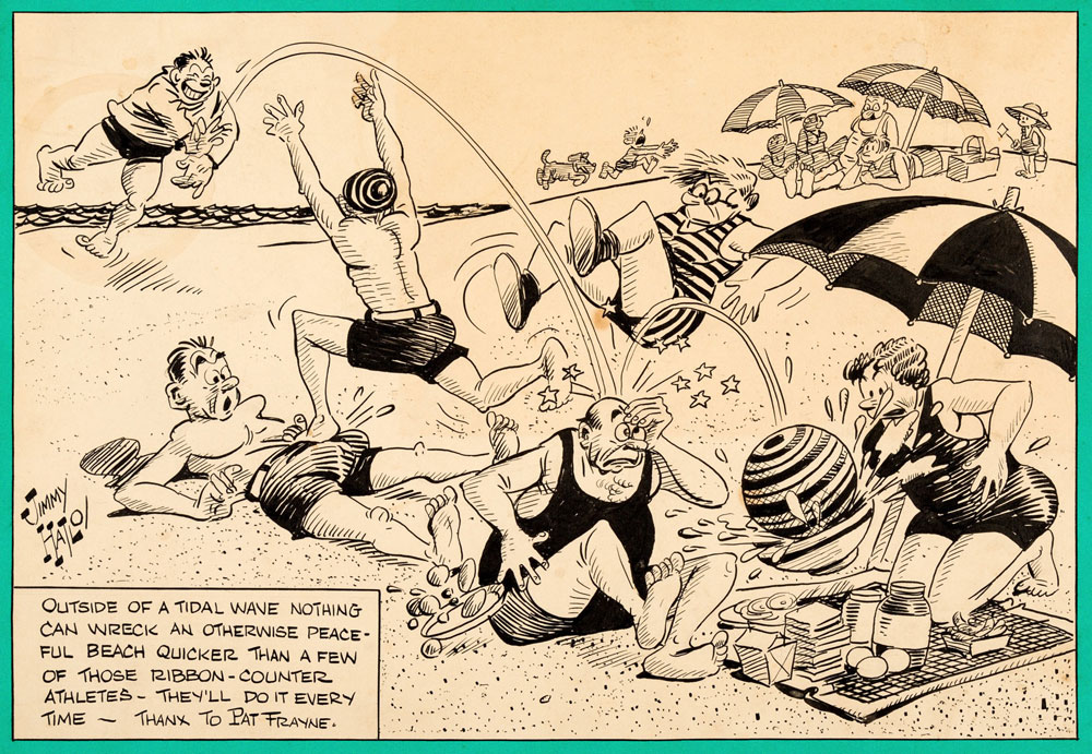
In the beginning of time… or rather the end of the 1930s, which may feel like a similar thing to some… there was Jimmy (James) Hatlo‘s They’ll Do It Every Time, a popular King Features newspaper cartoon with an impressively long run (1929 all the way until 2008, although no longer under Hatlo’s direction since 1963 due to Hatlo’s fairly early demise at 66). Hatlo, a sports cartoonist working for The San Francisco Call-Bulletin, stumbled upon the greatest success of his career by accident – scrambling to fill a void left by a shipped-yet-misplaced package of cartoons that for some reason didn’t make it to the office in time*, he drew the first couple of strips as a bouche-trou, only to find himself with an instant hit. The old problem of running out of ideas was creatively solved – Hatlo asked his readers for suggestions, and the readers, « brimming with seemingly small observations about mundane yet captivating matters, but lacking a way to tell anyone outside their own circles of friends about it » (as Bob Green described it in his Wall Street Journal epitaph A Tip of the Hat to Social Media’s Granddad), were happy to oblige. Hatlo acknowledged every submission with a ‘tip of the Hatlo hat’ – the thrilled reader would get his or her name and hometown displayed prominently in the bottom right corner of the strip.
* Jimmy Hatlo—Man of Many Hats, a detailed article by Ed Black I wholeheartedly recommend, offers another version of this story: « His managing editor, Edgar T. ‘Scoop’ Gleason, was frantic: He had a hole to fill in his comics page when Hearst abruptly ordered him to pull Billy DeBeck’s Bughouse Fables so it could run in the Examiner. Gleason prevailed upon Hatlo to produce something, pronto. »
Strip from sometime in August, 1931 (exact date unknown).
Strip from May 31st, 1939.
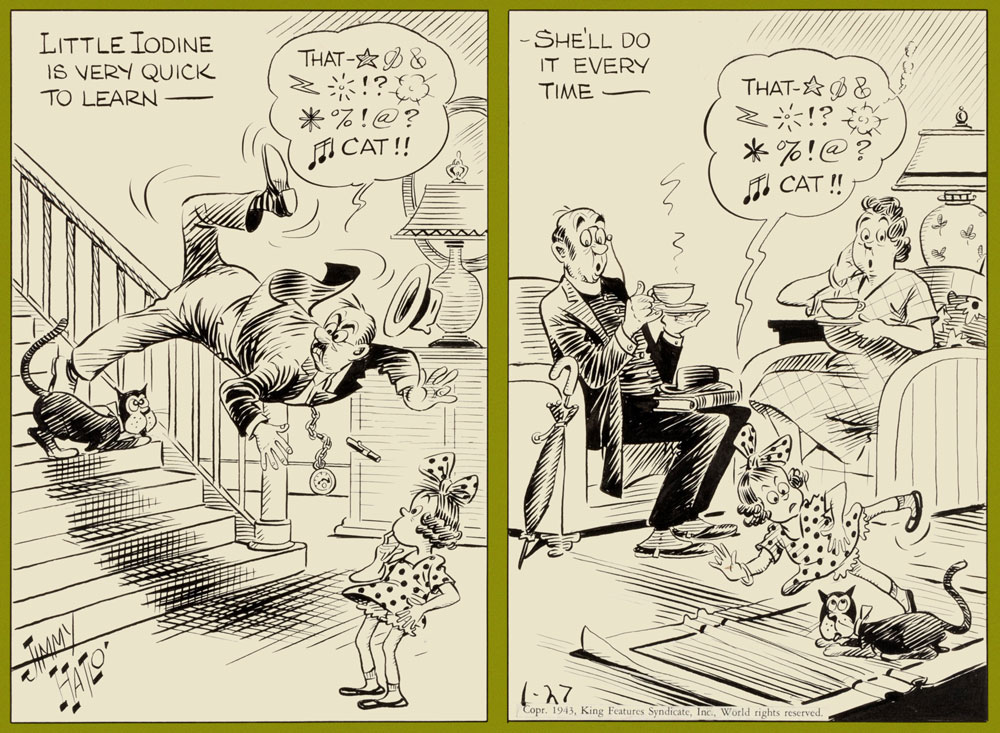
Strip from January 27th, 1943. The character of Little Iodine, born in the pages of They’ll Do It Every Time, « the embodiment of all brats I knew… naughty as hell — and still likable », according to Hatlo, spun off into her own strip, which ran from 1943 to 1983. La petite Iodine, a French translation, first appeared in Saturday editions of Québécois weekly La Patrie in 1945 and 1946, and also made it into some other Québec newspapers later on, where co-admin RG eventually came across it in his youth.
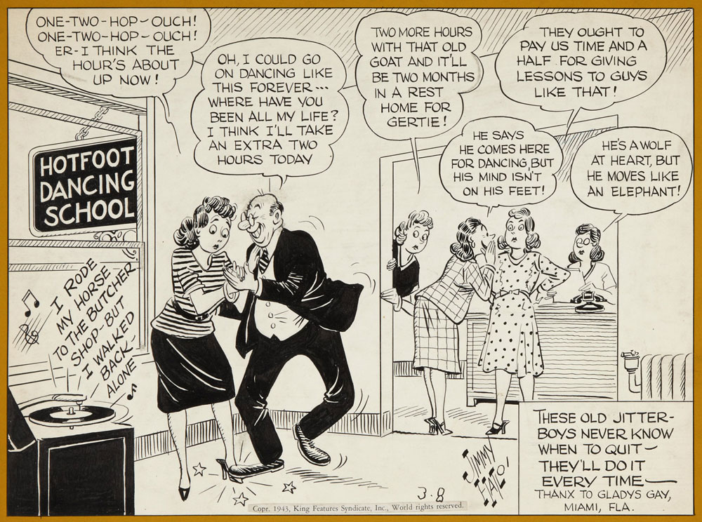
Strip from March 8th, 1943.
Presumed November 30th, 1945.
Strip from August 7th, 1961.
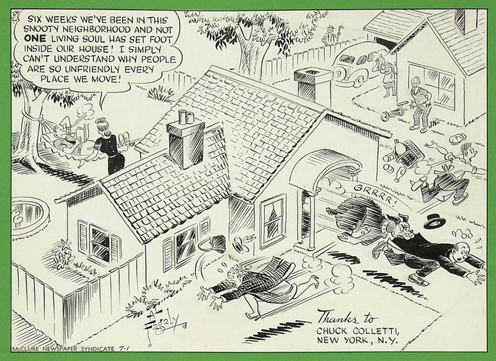
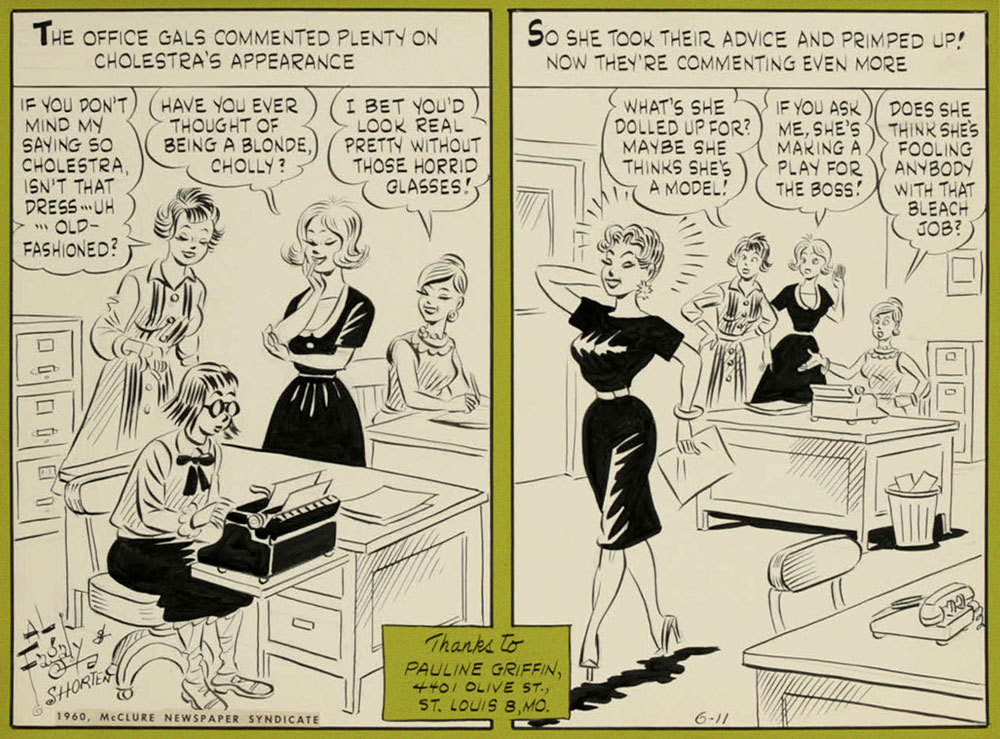
Some twenty years later, in 1948, a ‘blatant’ knock-off – There Oughta Be a Law! – was launched by the McClure Newspaper Syndicate, disturbingly similar in look and tone to the strip it was imitating. It was created by writer Harry Shorten and artist Al Fagaly. Whereas Hatlo’s strip brought him fame, There Oughta… didn’t do much for its creators – though Fagaly (creator of Archie Comics‘ Super Duck) needed no padding on his already impressive (with more to come) résumé. Just like with They’ll Do It Every Time, Fagaly died in 1963 (it was a bad year for cartoonists, it seems), and Warren Whipple took over the illustration duties. Interestingly, Whipple is supposed to have also worked on TDIET at some point (according to this source, and Wikipedia, which copy-pasted it), though I can’t find more information about it.
After a respectable run of 36 years (it ended in 1984), There Oughta Be a Law sank into relative obscurity. One could argue that Hatlo could have sued, had he sufficiently resented the copycat strip – maybe he was too cool a cat for such austerity, maybe imitation is flattery, or They’ll Do It Every Time was sufficiently well-established and popular enough not to have to worry about competition. Hatlo certainly set it up for success, evidence of which is how it ran like a well-oiled machine long after his death. Upon reflection, I prefer the art of TDIET – crisper and more dynamic, it immediately grabs the eye, making these strips enjoyable not only for their humorous observations, but also for their style. I will, however, note that Fagaly had a really fun signature. What do you think, reader?
All of the below strips are circa the 1950s.
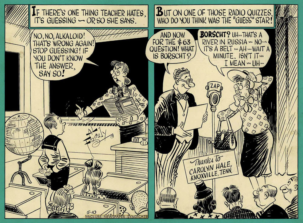
I had to include this one, as I am appalled somebody could be unfamiliar with borscht. No, I’m not going to provide a link, look it up yourselves.
Given that I grew up in the days when PC games were just starting to be a thing (what a pleasure it is to reminisce about Secret Agent, Crystal Caves, or Jill of the Jungle…), anything pixelated immediately gives me a warm rush and a sense of pleasant nostalgia, be it the quiet appeal of Toyoi Yuuta‘s art or modern ‘pixel art’ games that go for that retro feel (the dark glory of Blasphemous, the cozy feel of Stardew Valley!). As for comics, I suspect most are drawn on a computer these days, but few of them use pixel art per se. One look at Plastic Dog, and it was puppy love, especially given its acerbic sense of humour.
Henning Wagenbreth, born in 1962 in East Germany (which is perhaps what partially gave him a lifelong anti-totalitarian stance), is an illustrator/graphic designer who actually excels in a number of techniques. Lambiek Comiclopedia touts him as ‘German pioneer in comics created with the computer‘; I don’t know enough about the development of electronically-drawn comics specifically in that part of the world to state that with certainty, although this is as good a time as any to mention that Peter B. Gillis and Mike Saenz‘ wonderful Shatter (1985-1988) is usually credited as the first significant comic book created on computer. Topic for another day, no doubt.
Be as it may, Wagenbroth did something interesting: he designed the strip Plastic Dog in 2000 specifically for perusal on early pocket computers (such as Pocket PC or Palm OS), which had a black and white screen of 160×160 pixels. In 2004, colourized versions migrated to weekly newspaper Die Zeit, printed within its pages, but also available as downloads on their website.
The French publisher L’Association released a 26-page collection of Plastic Dog strips, translated into French from German by Eugénie Pascal. As far as I know, no official English translation exists, aside from maybe one or two random strips (probably translated by Wagenbreth himself). The following pages are scans from this French edition.
Dead Wood. Plastic Dog calls the police to report a stolen wooden cabinet, to find that it’s been removed by the Tree Liberation Army, who bury their ‘felled, deported, dismembered and abused’ friend in the tree cemetery.
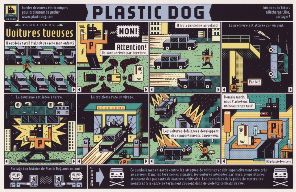
The Killer Cars. Plastic Dog goes out to search for his missing child, to find the latter in pieces after being attacked by driverless cars gone rogue. In the final panel, PD says ‘tomorrow, we’ll buy you a nice new body’.
Nothing Ever Happens. ‘A grey day, pure boredom’, bemoans Plastic Dog, ‘I am always in the wrong place at the wrong time, and everything is so predictable…’
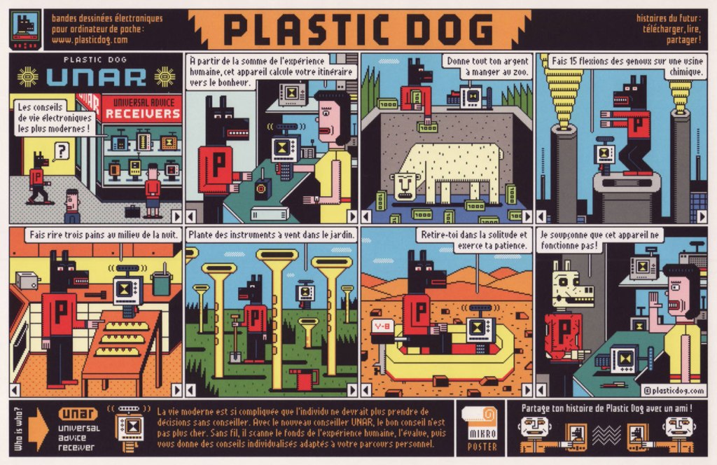
In his never-ending search for new experiences, Plastic Dog stumbles upon a device that proffers guidelines to achieve maximum happiness. Its instructions are not devoid of poetry: ‘give all your money to be eaten by zoo animals’, ‘do 15 squats on top of a chemical factory’, ‘make three loafs of bread laugh in the middle of the night’, ‘plant wind instruments in the garden’. The final piece of advice (‘withdraw into solitude and practice patience’) is what seems to defeat PD’s enthusiasm (seems like in his world, getting lost in the desert is the only way to solitude…)
The following is the last PD strip, and readers are thanked at the bottom for their many emails and downloads. There’s also something about a free TV as a reward, but I wouldn’t bank on it 😉
A family visit to the zoo! Touted as the last surviving specimens by the guide, these animals may not quite be what they seem. The flamingo complains, ’12 hours standing on the same leg!’, but Plastic Dog argues that having to constantly hang upside down is much worse.
Wagenbreth recently had an exhibition at Montréal’s UQAM university, which to my regret I completely missed… due to finding out about it far too late (i.e. now). Here is the poster for it:
~ ds
* « Every day my metal friend Shakes my bed at 6am Then the shiny serving clones Run in with my telephones »
« Juggler of eccentric ideas, more poetic than truly macabre, Desclozeaux is served by an admirable technique that aligns him with the clan of Folon and Flora, which is to say designers for whom white space holds as much– if not more — importance than the line, the arabesque or the scroll. » — Jacques Sternberg and Michel Caen (1968)
Since the world seems to be crashing down around our ears, I figure it would be reasonable to focus on an artist who’s well-adjusted, happy, prolific, casually brilliant and, to top it off, still alive at a ripe old age. Meet, then, if haven’t already, French national treasure Jean-Pierre Desclozeaux, who will, if I’m not jinxing it for him, turn 84 this coming 5th of June.
Jean-Pierre began his career as a watercolourist and poster designer, studying under the legendary Paul Colin.
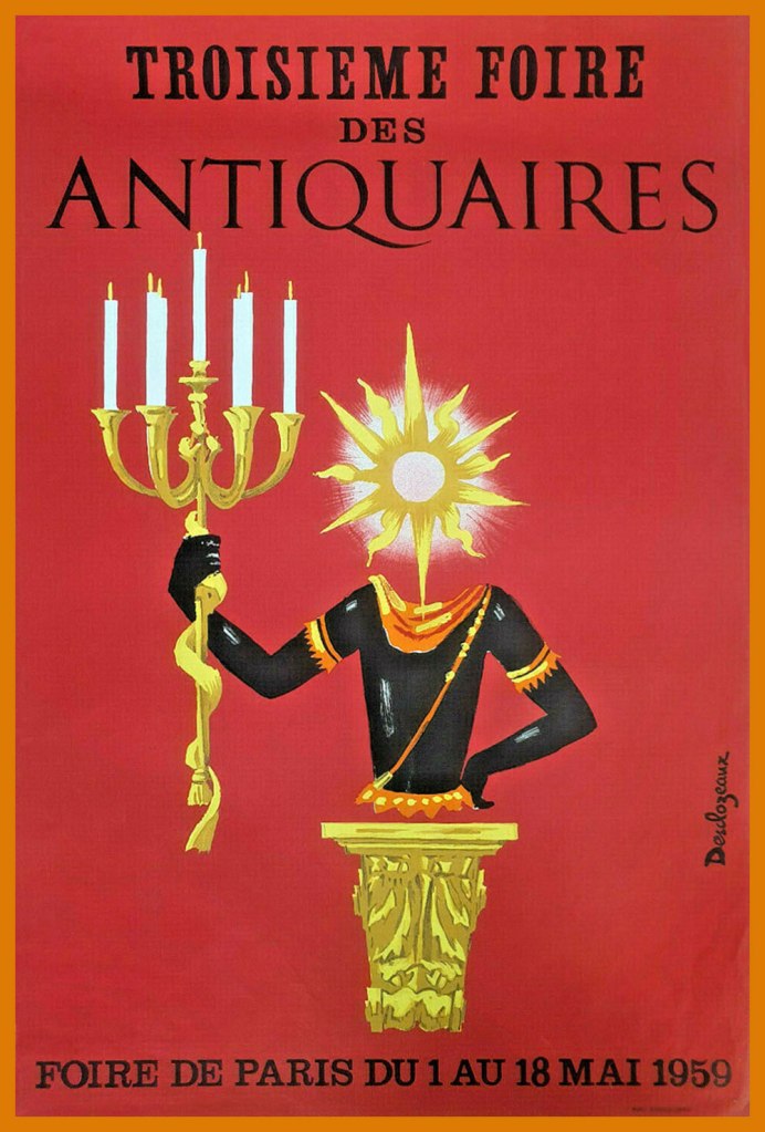
A sample of his early poster work. In this case, the client was an antique dealers’ fair.
In 1965, he branched out into press illustration and cartoons. Here are a few early samples of this endeavour:
If Wikipedia will forgive me, I’ve cribbed and translated this bit for our English-only readers: « In 1968, he began his collaboration with Le Nouvel Observateur, where he published at least one drawing each week. From that point on, Desclozeaux devoted himself almost exclusively to the press and publishing areas : satirical drawings, book and magazine illustration, posters for exhibitions and shows, postcards, book jackets. »
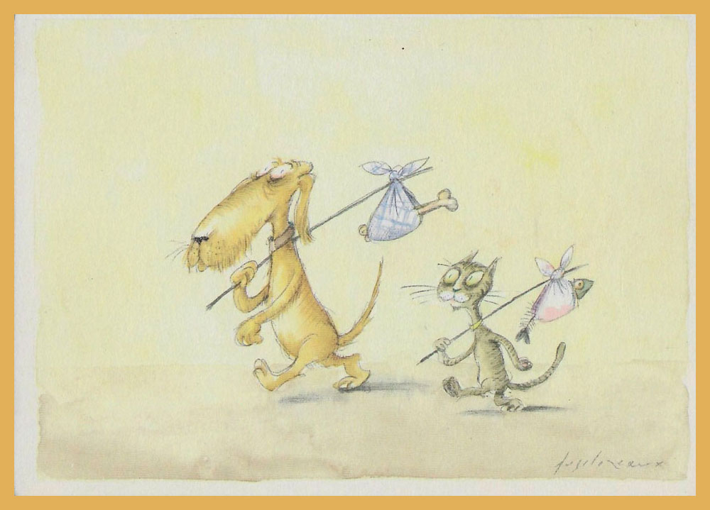
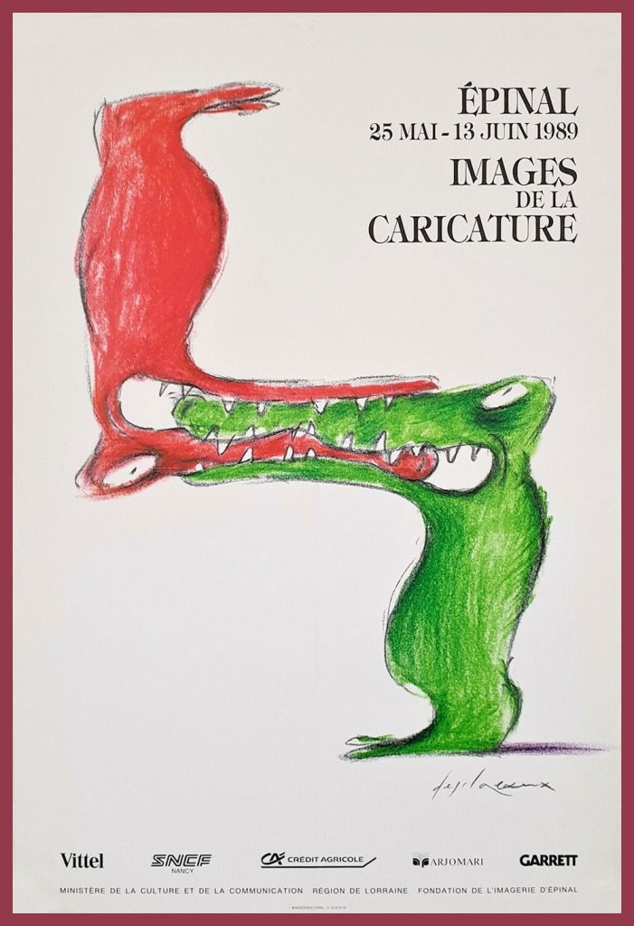
This one, from 1982, is entitled Songe d’une nuit d’été, which happens to be the standard translation of Shakespeare’s “A Midsummer Night’s Dream”… but with more bikes.A pair of watercolours from his book Entre chiens et chats (1983).He also created scores of theatre posters, such as this one for Paris’ Le Caveau de la République, circa 1986. The play’s title, which translates to “Hands off my vote”, was a riff on French anti-racism organisation SOS Racisme‘s slogan, namely Touche pas à mon pote (Hands off my pal).This caricature festival’s most appropriate host city has been renowned for its images d’Épinal (“Epinal Prints“) since the late 18th century.A piece entitled À la pointe du rat, a homophonic calembour on Pointe du raz, a spectacular promontory in France. “Raz” translates as “strait”.This piece appeared on the cover of Télérama (France’s TV Guide equivalent, but inevitably a bit smarter) for its Jan. 30, 1991 issue. The headline asks “Has Television Changed Our Unconscious?“
And here’s our cheeky bon vivant. Desclozeaux, whose beard was described by his friend Ronald Searle as “an enchanted space and a hideout for secrets and legends“.
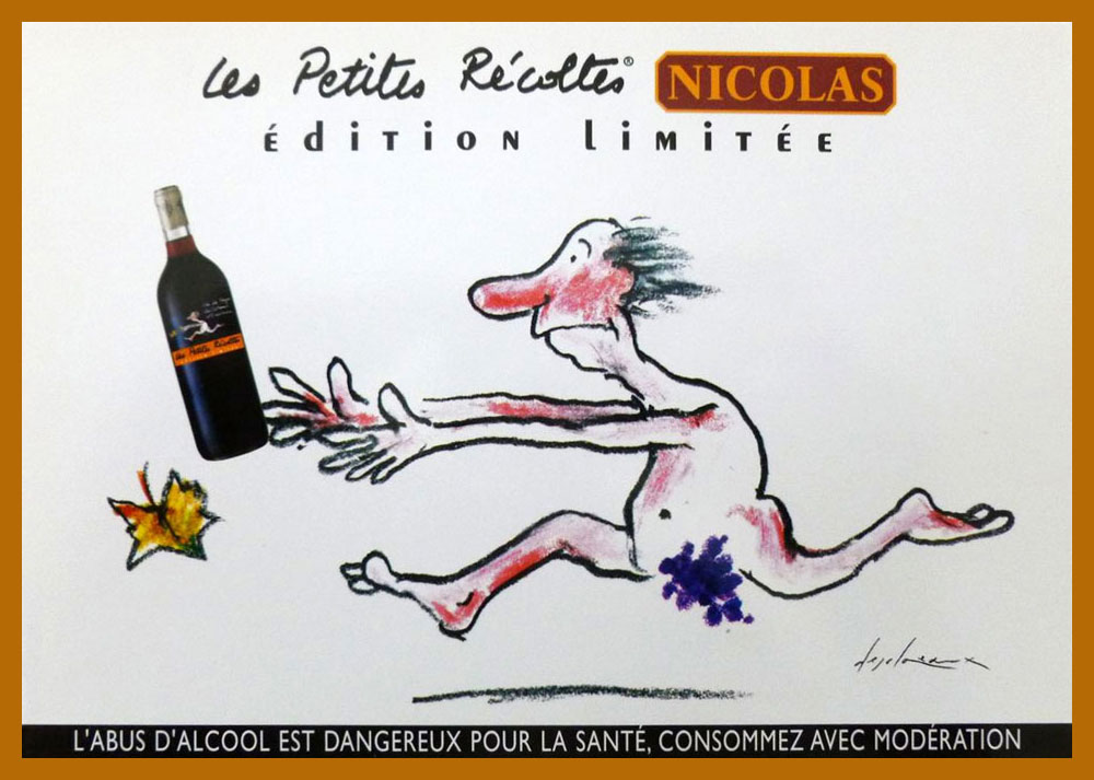
A 2006 wine ad… as you can plainly see. This sort of irreverence seems largely lacking in North American advertising.
This post’s title hails from the term of endearment and respect bestowed upon Desclozeaux by no less a personage than his affichiste confrere, Raymond Savignac (1907-2002). This reference to wine-making presumably alludes to his long-standing graphic contributions to sundry gastronomic columns. In 2002, Albin Michel even issued a heady cuvée of his wine-imbibed cartoons, Cul-Sec!*
-RG
*approximately meaning ‘bottoms up!‘ or ‘down the hatch!’ — here are some hilarious mispronunciations of ‘faire cul sec’.


















































 Who's Out There?