« Juggler of eccentric ideas, more poetic than truly macabre, Desclozeaux is served by an admirable technique that aligns him with the clan of Folon and Flora, which is to say designers for whom white space holds as much– if not more — importance than the line, the arabesque or the scroll. » — Jacques Sternberg and Michel Caen (1968)
Since the world seems to be crashing down around our ears, I figure it would be reasonable to focus on an artist who’s well-adjusted, happy, prolific, casually brilliant and, to top it off, still alive at a ripe old age. Meet, then, if haven’t already, French national treasure Jean-Pierre Desclozeaux, who will, if I’m not jinxing it for him, turn 84 this coming 5th of June.
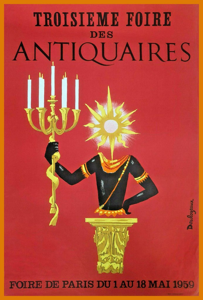
Jean-Pierre began his career as a watercolourist and poster designer, studying under the legendary Paul Colin.
In 1965, he branched out into press illustration and cartoons. Here are a few early samples of this endeavour:


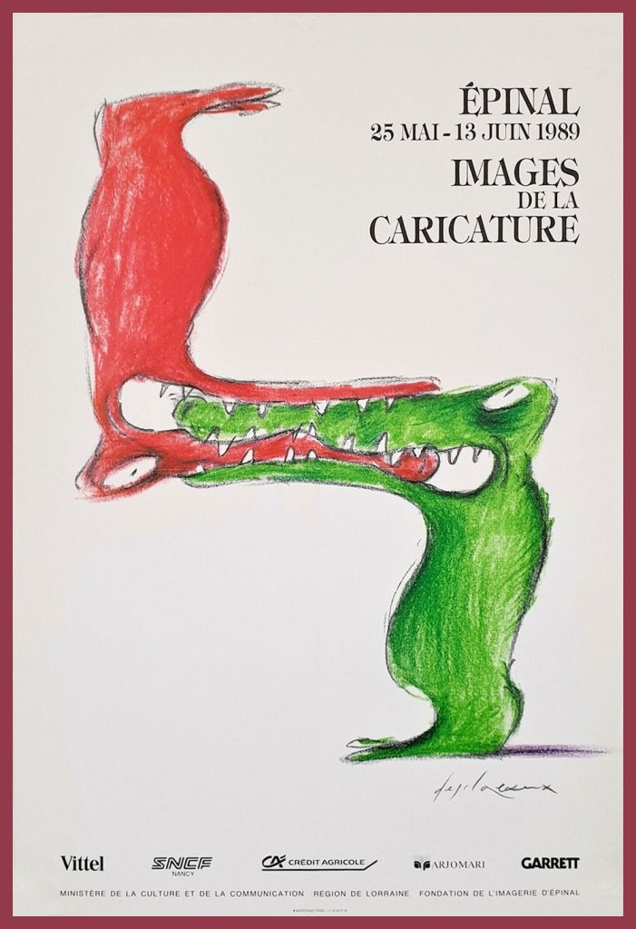
If Wikipedia will forgive me, I’ve cribbed and translated this bit for our English-only readers: « In 1968, he began his collaboration with Le Nouvel Observateur, where he published at least one drawing each week. From that point on, Desclozeaux devoted himself almost exclusively to the press and publishing areas : satirical drawings, book and magazine illustration, posters for exhibitions and shows, postcards, book jackets. »


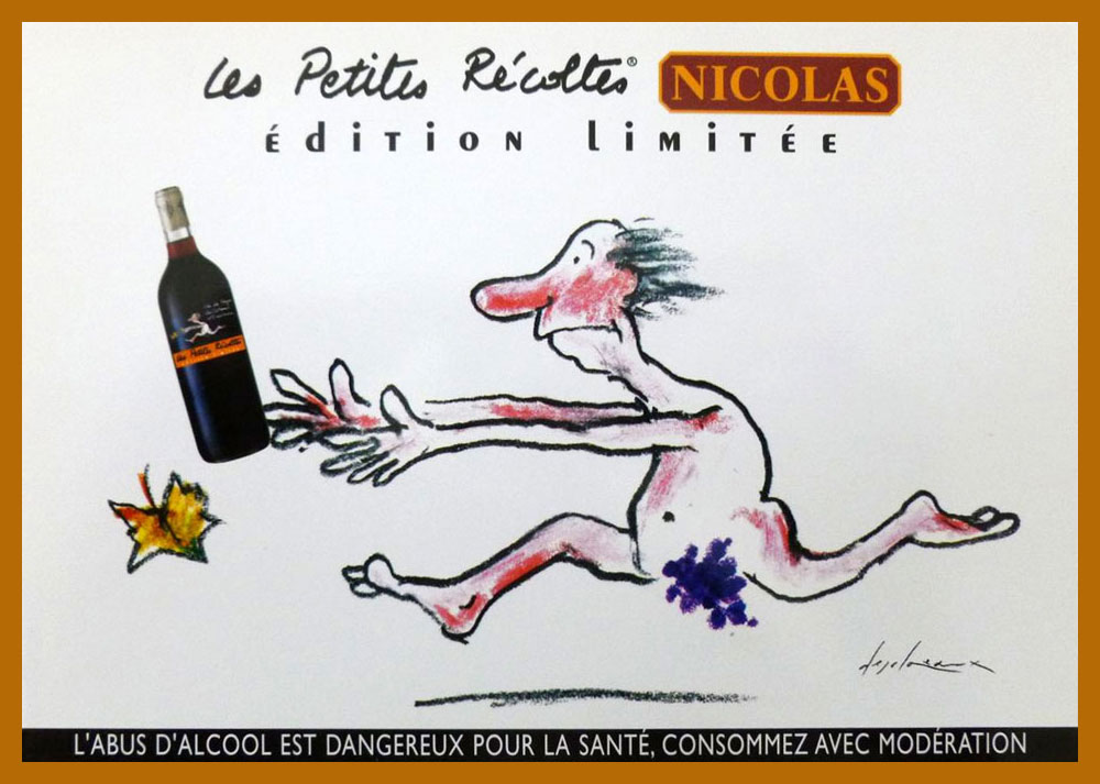
This post’s title hails from the term of endearment and respect bestowed upon Desclozeaux by no less a personage than his affichiste confrere, Raymond Savignac (1907-2002). This reference to wine-making presumably alludes to his long-standing graphic contributions to sundry gastronomic columns. In 2002, Albin Michel even issued a heady cuvée of his wine-imbibed cartoons, Cul-Sec!*
-RG
*approximately meaning ‘bottoms up!‘ or ‘down the hatch!’ — here are some hilarious mispronunciations of ‘faire cul sec’.

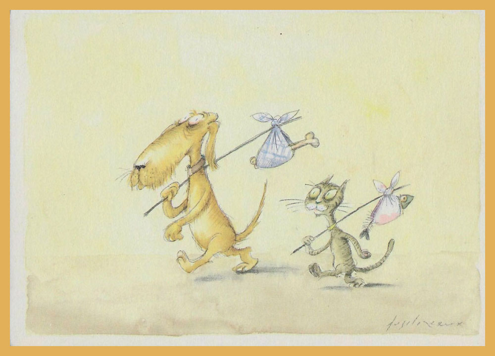
Wonderful, witty drawings. There are many interesting parallels to other artists like Jules Feiffer, but perhaps most of all to his compatriot, Sempe.
In their fast lines and whimsical humor, they’re a breath of fresh air artistically.
I really love the constellation forming a bike.
LikeLiked by 1 person
I’m so glad his work struck such a positive chord with you, sb! Generally, I’d argue Desclozeaux is closer to his *other* compatriot, Jean-Michel Folon… a touch more abstract than Sempé, but no less poetic.
But that ‘constellation’ picture? It’s as if he set out to channel Sempé. And succeeded magnificently.
Thanks again for your kind, insightful words!
LikeLike
When I opened this page, I scrolled down a bit to see if the art interested me enough to read the piece. The first three cartoons had me thinking that this looked like the type of cartoons that appeared in the underground press publications of the late ’60s and early ’70s. I wasn’t too far afield.
Our library does not have any of his books so I requested his CUL-SEC as an interlibrary loan. Ya never know ..
LikeLike