Grimm’s Ghost Stories (60 issues, 1972-1982, Gold Key/Whitman) is a title I’ve been, in my usual fashion, lazily collecting for decades. I’ve always found in the Gold Key ambiance a soothing respite from the obsessive continuity and slam bam histrionics of DC and (the chief offender) Marvel.
While writer Arnold Drake‘s numerous credits at DC (and, to a lesser degree, Marvel) are well documented, his passage at Western/Gold Key in the mid-to-late 1970s is unjustly shrouded in obscurity. Let’s just say he — along with his young colleague Freff — brought complexity, warmth and wit to the publisher’s frankly formulaic fare.
.
.
.
.
.
.
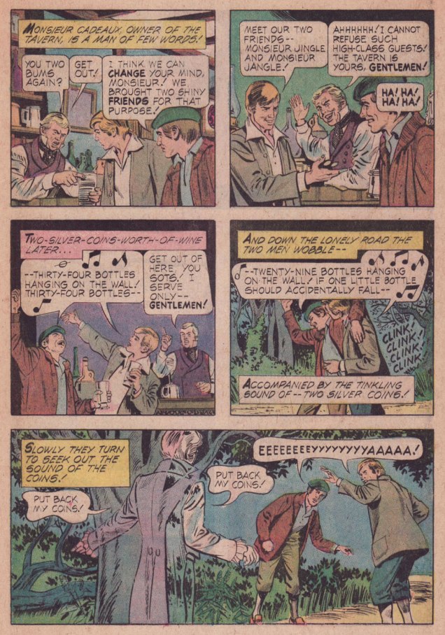
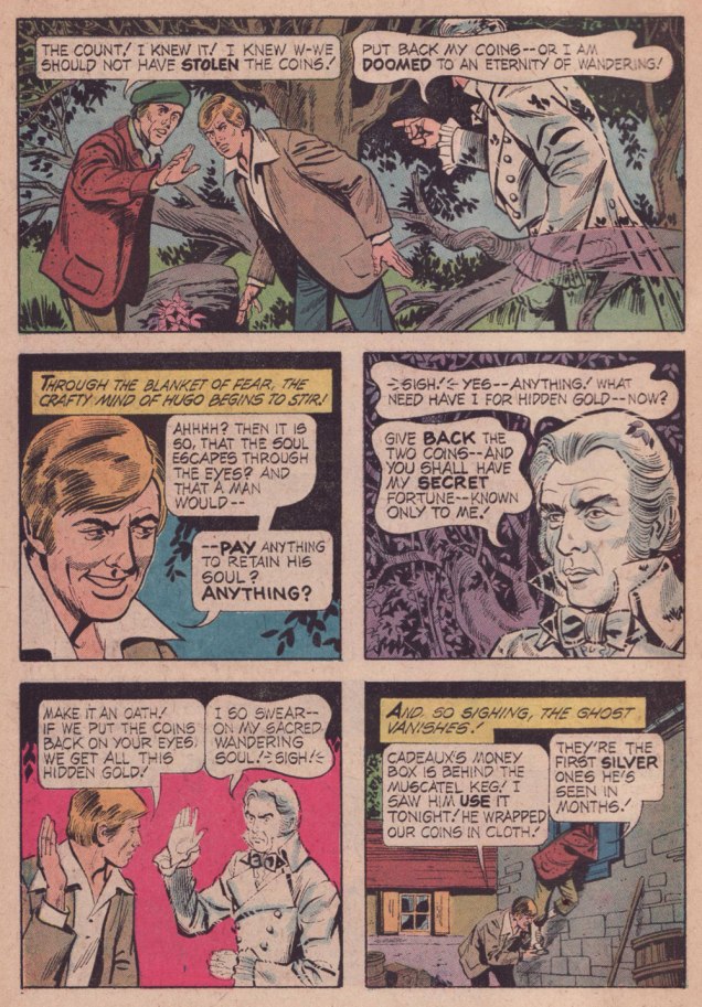
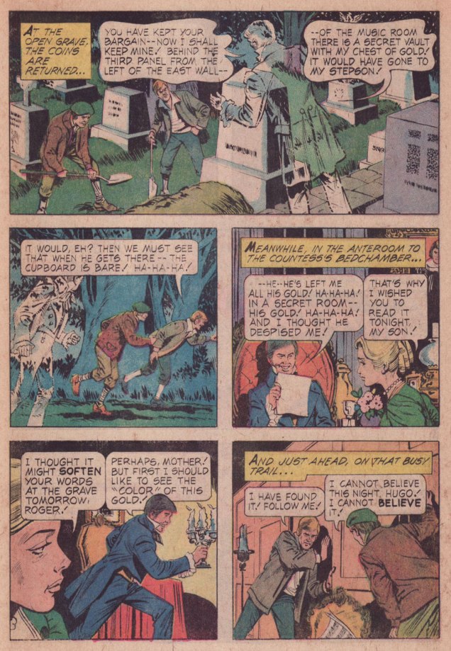
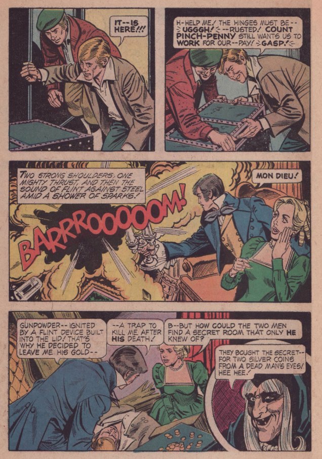
This isn’t the spookiest ghost story of them all, far from it, but that’s hardly the point, is it? Fun fact: the practice of putting coins on the deceased’s peepers was poetically called ‘Charon’s Obol‘.
I love the well-developed characters… despite the tale’s brevity. The willful stepson whose only sin is that of being a free thinker; the grave-robbers who can keep their wits about them in all circumstances; and the pragmatic miser’s spectre who’ll trade one act of revenge for another in a pinch.
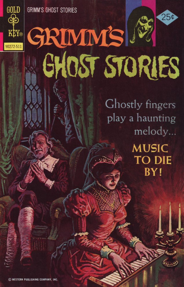
While ‘Silver’ wasn’t the cover-featured story, I wouldn’t pass up the chance to spotlight such a fine, understated Luis Domínguez painting. This is Grimm’s Ghost Stories no. 27 (Nov. 1975, Gold Key). For our gallery of this Argentine master’s finest, check out Luis Domínguez (1923-2020): A Farewell in Twelve Covers.
« The sacred is found boring by many who find the uncanny fascinating. » — Mason Cooley
I’ve expressed many a time my ambivalent affection for Golden Age Atlas horror comics: in short, despite their slapdash, often incoherent writing, they had a solid stable of artists (which makes the thin writing all the more disappointing); but most of all, they generally had eye-catching covers, splendidly coloured (easy a task to underestimate!) and blessed with a light touch absent on the insides.
Today, I’ve picked out my favourite covers from Uncanny Tales (fifty-six issues, 1952-57). Enjoy!
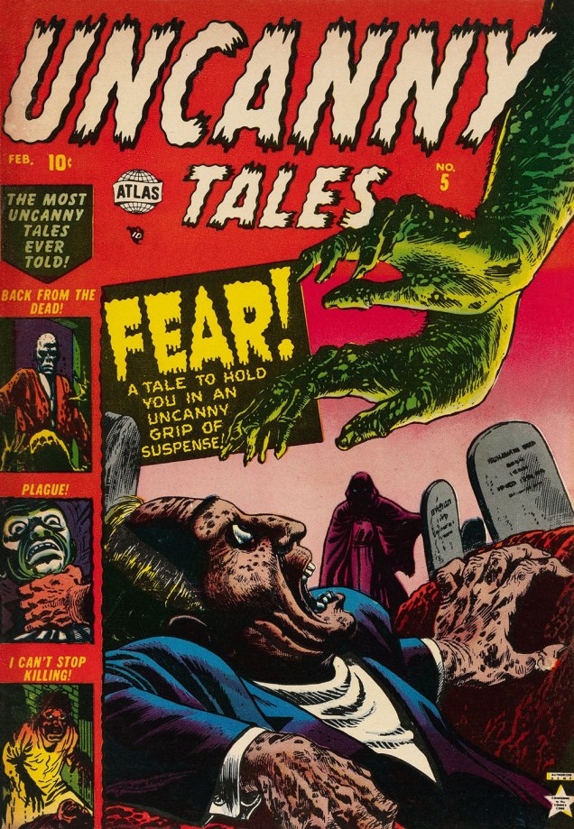
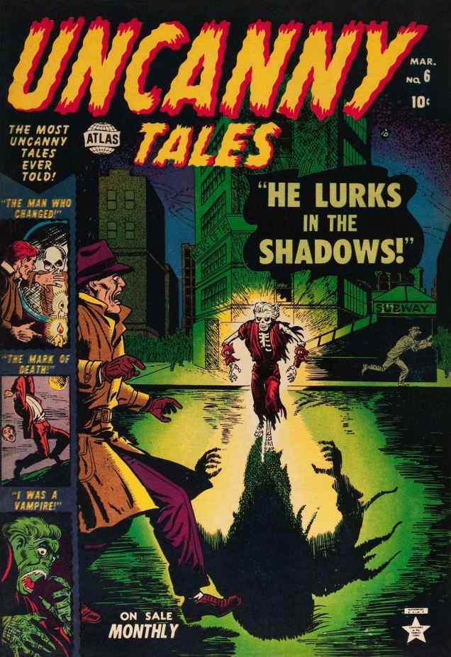
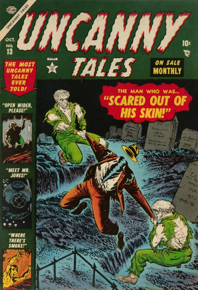
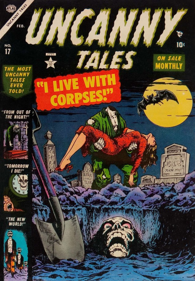
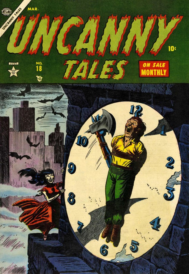
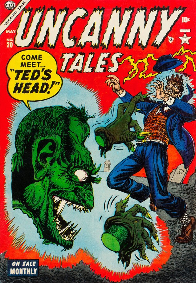
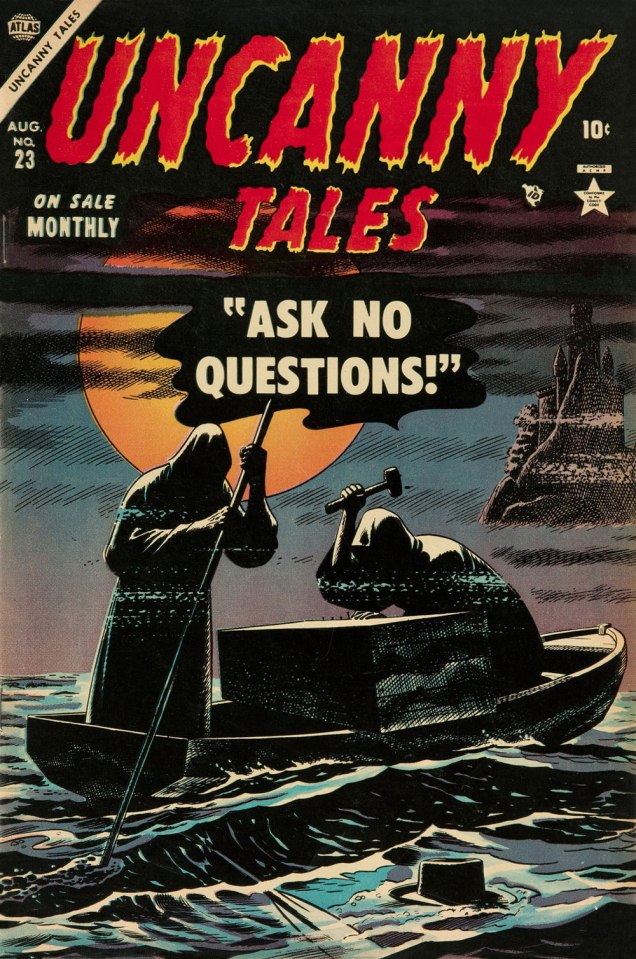
This is Uncanny Tales n. 5 (Feb. 1953, Atlas), cover art by Bill Everett, colours — consistently fine! — presumably by Stan Goldberg in all cases.This is Uncanny Tales n. 6 (Mar. 1953, Atlas), cover art by Bill Everett.This is Uncanny Tales n. 13 (Oct. 1953, Atlas), cover art likely a collaboration by Sol Brodsky and Carl Burgos.This is Uncanny Tales n. 17 (Feb. 1954, Atlas), cover art by Bill Everett.This is Uncanny Tales n. 18 (Mar. 1954, Atlas), cover art by Russ Heath. For a gallery of further Heath spookies, check out this entry from last year. This endearingly goofy one is Uncanny Tales n. 20 (May 1954, Atlas), with cover artist Robert Q. Sale giving it his best Joe Maneely imitation.Surely the leading candidate for “Most understated Marvel cover of the 1950s”… if not of all time. Stan must have been away from the office. This is Uncanny Tales no. 23 (Aug. 1953, Atlas); Art by Russ Heath. I’m understandably reminded of that old-timey jibe, « Walk East until your hat floats ».This is Uncanny Tales n. 27 (Dec. 1954, Atlas), cover art by Max ‘Carl Burgos‘ Finkelstein.And one post-Code entry, since it’s so outstanding. This is Uncanny Tales no. 48 (Oct. 1956, Atlas), Another subtle one by Russ Heath, but in a totally different register. Kudos!
« True friends stab you in the front! » — Oscar Wilde
First, the update: we’re off to Belgium for a much-needed vacation… which is frankly incompatible with our usual Hallowe’en Countdown.
Surely you can still get into the spirit of the season by revisiting any of the eight previous editions.
We’ll still try to post as often as possible, and I promise you that the topics all will honour the mischievous spirit of All Hallows’ Eve.
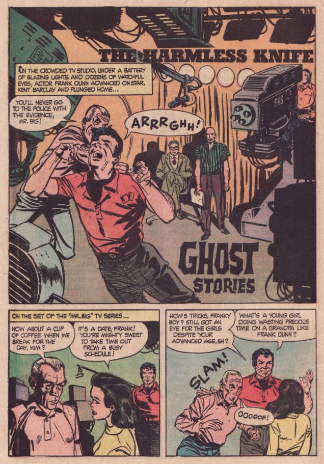
To wit: a few years ago, George, exalted founder of trefology… and assiduous friend of WOT?, asked me to track down — and hopefully feature — an elusive story he recalled from his callow youth. He described the plot, which rang a bell… at least that’s what I said at the time. Last month, he gently reminded me of my mission and, this time, I’m seeing it through.
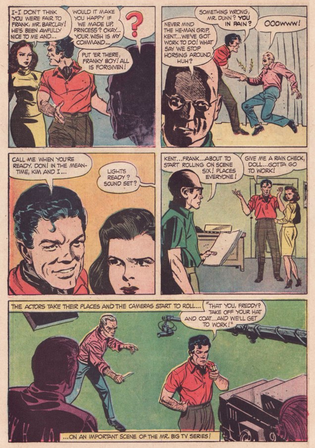
And so here’s The Harmless Knife from Ghost Stories no. 14 (June 1966, Dell), later reprinted in Ghost Stories no. 34 (Oct. 1972, Dell)… which is where George encountered it.
Here’s his reaction:
THAT’S IT! Ah, I remember it well.
I’m pretty sure I bought that comic at a little roadside grocery near Strawberry, CA. We usually spent most of the summer on the beach, and comic books were an essential part of my day.
My mom loved the area so much she eventually moved there (with all my comics in tow—so, in a manner of speaking, my Dell horror comic returned home).
As was generally the deplorable case with Dell, no credits. Therefore… writer unknown, but pencils and inks by Frank Springer (1929-2009).
.
.
.
.
.
Amusingly, I’d featured another story, A Room With a Dreadful Secret — from the very same issue! — a few years ago. Read it so I won’t have to repeat myself needlessly… thanks!
« I think people will believe anything about someone they haven’t seen for a while. » — Gabriel Kaplan
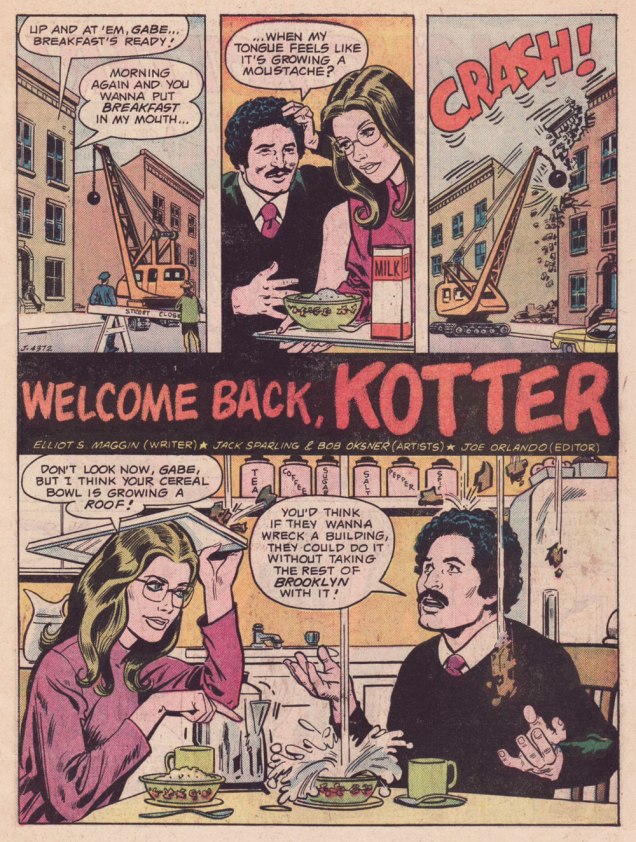
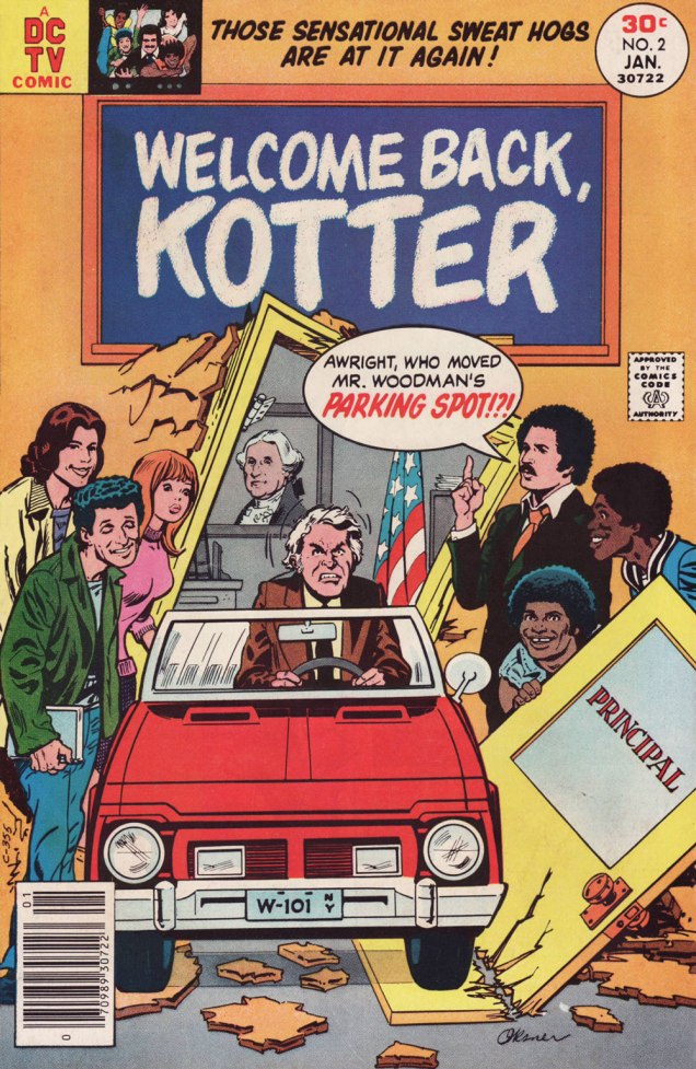
I’ve been meaning to do a Welcome Back, Kotter post for several years. But when I thought about it, I understood that hitching it to the show’s fiftieth anniversary made considerably more sense than, say, its forty-seventh. And while I adore William Johnston‘s sextet of tie-in novels, it would be quite a stretch for a comics blog to cover. Far closer to the mark lies Arnold Drake‘s trio of WBK storybooks, illustrated by Mel Crawford and Jack Sparling. But in the end, I bided my time and managed to get in touch with the scribe first assigned the Kotter Komic assignment, Elliot S! Maggin. And boy, am I glad I did. And so, fifty years to the day of the airing of its pilot episode*, let’s talk Kotter!
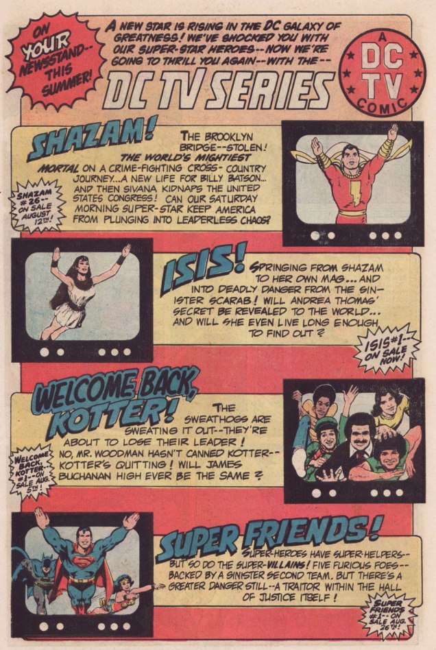
Remember the DC TV line? This ad ran in several DC titles over the summer of ’76.
WOT: First, a bit of context: correct me if I’m wrong, but in the early stages of your career writing comics, you always worked alongside editor Julius Schwartz. Then, in late ’75 or early ’76, something changed, and you began writing for other editors’ titles. What’s the story?
ES!M: Well, Julie was kind of proprietary about me for most of the time I was working with him.
WOT: A sideways sort of compliment.
ES!M: I guess. At some point, Dorothy Woolfolk was editing the Lois Lane book, and… he introduced me to her. She just came into his office for some reason. She said: « Oh, you know, you should write some stuff for me! » And he said « No, he’s very busy, go away! » And he chased her out of the office. And I’m thinking, « Oh, okay. That’s how we’re doing it. »
So I didn’t really go about… I didn’t really make friends with many of the other editors. I tried to make friends with Joe Orlando. You know, I’d have lunch with him once in a while, I guess.
This is Welcome Back, Kotter no. 1 (Nov. 1976, DC); cover by Bob Oksner.
ES!M: But around the time Kotter came out…
You know, people used to hang out outside of Julie’s office door, listening to us plot, because it was so loud. We would yell and scream at each other constantly. He was this Jewish boy from the Bronx, and I was this Jewish boy from Brooklyn, and once I got comfortable working with a guy thirty-five years older than me, we’d just fight all the time. And every once in a while, we’d get serious.
WOT: Serious fighting, or serious work?
ES!M: Yeah, yeah! The fighting was work.
WOT: Sometimes that line is dreadfully thin.
ES!M: I guess at that point, he got mad at me, and I didn’t get work for a couple of weeks. I went to Joe, and I said: « What ya got? », and he said he’s doing this Welcome Back, Kotter book, and I said « Great! I watch that show, that’s fun. » So I wrote the first issue, and that was fine.
Here’s a quartet of pages from the première issue. Pencils by Sparling and finishes (and surely likenesses) by Oksner.
.
.
Aw, Maggin’s Mr. Pevey would have made a great addition to the TV show’s cast.
ES!M: They called me down in Carmine‘s office, to watch episodes of the show. It had been on maybe six weeks at that point. Episodes I had already seen, but I liked hanging out in Carmine’s office, because it was big, and he had a lot of toys around. So they set up this video tape… thing, and I watched the shows again, and I wrote the second issue.
This is Welcome Back, Kotter no. 2 (Jan. 1977, DC); cover by Oksner.Art-wise, the second issue seemed comparatively rushed, and sans Oksner, likenesses pretty arbitrary. See what I mean? The GCD attributes the inks to Sparling, but I lean towards Frank Springer.
ES!M: I was living in an apartment complex on Long Island, and there were all these kids around… little kids. And I would work at home, mostly. So they would hang around with me, whenever they realized I was home. They would… shoot me through the window or… something. At some point, whenever I’d write a gag, I would…
WOT: … run it past them?
ES!M: Yeah! And they’d laugh, and run off and play some more. And I figured, as long as they laughed, it was okay. Because they were hearing the voice of Barbarino, or whoever. At some point Travolta would say, « Uh? », or « Duh », or « What d’you think? », something dull, that he delivered in a funny way. And the kids related what I wrote to what Travolta did on screen, so they were getting it. And at some point I realized that Joe [editor Orlando] didn’t watch the show.
WOT: Oops.
ES!M: And he would then object to my Barbarino bits, or Horshack bits, or whatever. So I told him « You’ve got to watch the show, you’ll get it! » But you know, after maybe… how many issues did I write, three, four?
WOT: Just two, I’m afraid. You wrote the first couple, then Tony Isabella did one, then Mark Evanier…
ES!M: I’m sure he (Evanier) watched the show — he watched everything.
WOT: He was even the show’s story editor for part of its second season. So… then Bob Toomey wrote four issues, Scott Edelman two, and there was a leftover story by Evanier that saw print in the WBK Collector’s Edition in 1978.
ES!M: But Joe did not. I mean, he didn’t have time, and he was madly in love with his wife, and he didn’t watch television at all (laughs). He wasn’t paying attention to the source material.
WOT: That happens. But it seems a pretty unfortunate blind spot for a book’s editor.
ES!M: I wrote two issues, and at some point, Joe said: « You can’t write! ». He said « No, you can’t write! » A blanket condemnation of everything I’d ever done.
WOT: Oooh.
ES!M: By that time, I’d made up with Julie, and I was writing more Superman stuff. After that, wherever any of my fights with Julie got serious, I’d go down the street to Marvel, and do something there. Then I would make up with Julie, and they’d never see me again… until I had another fight with Julie.
That was my experience writing Kotter.
And here’s what undoubtedly has to be the Guernica, if you will, of Kotter art: Bob Oksner‘s superlative cover for Limited Collectors’ Edition C-57, from 1978, DC’s final — and finest — WKB publication. Feel free to open it in another tab for a fuller view… I provided a larger image so you can fully take in the wealth of details.
WOT: In closing, how are you keeping busy these days?
ES!M: I just wrote a book called Lexcorp. A novel. Which you should probably plug.
WOT: Done!
ES!M: It’s a first-person story that Lex Luthor tells. And he identifies himself as an unreliable narrator, like… Huckleberry Finn. But it does tell the story of how he saves the world. Stuff like that.
I’m working on another book, working on a time travel story. And my ex-wife asked me to write an autobiography so my grandchildren know who I am.
I have all these people I know with Pulitzer Prizes; and at some point in the autobiography, I wrote: « I have about a dozen Pulitzers floating around through my life, and none of them are mine. This book is available for consideration. »
WOT: Mr. Maggin, thank you so much for taking the time to share these stories with us!
-RG
*the pilot episode, for some reason, was aired third, on September 23, 1975, while the show premiered on the 9th of September with ‘The Great Debate‘ (featuring a wonderfully smarmy James Woods).
« Truly the universe is full of ghosts, not sheeted churchyard spectres, but the inextinguishable elements of individual life, which having once been, can never die, though they blend and change, and change again for ever. » — H. Rider Haggard
Here at WOT?, we’re both Russell aficionados, but with some reservations. I think I needn’t delve into such details, when my partner ds already eloquently laid it out in her post Grains of Golden Sand: P. Craig Russell’s Fantasies… and I happen to fully agree with her reasoning.
What’s perhaps not been explicitly stated is Russell’s virtually infallible way with a cover, both in design and execution. As I keep emphasising, great — and consistently great at that — cover artists are pretty thin on the ground.
Someone at DC must have seen his gorgeous seven-issue run of covers for Elric Stormbringer*(1997, Dark Horse/Topps) and offered him the Spectre gig.
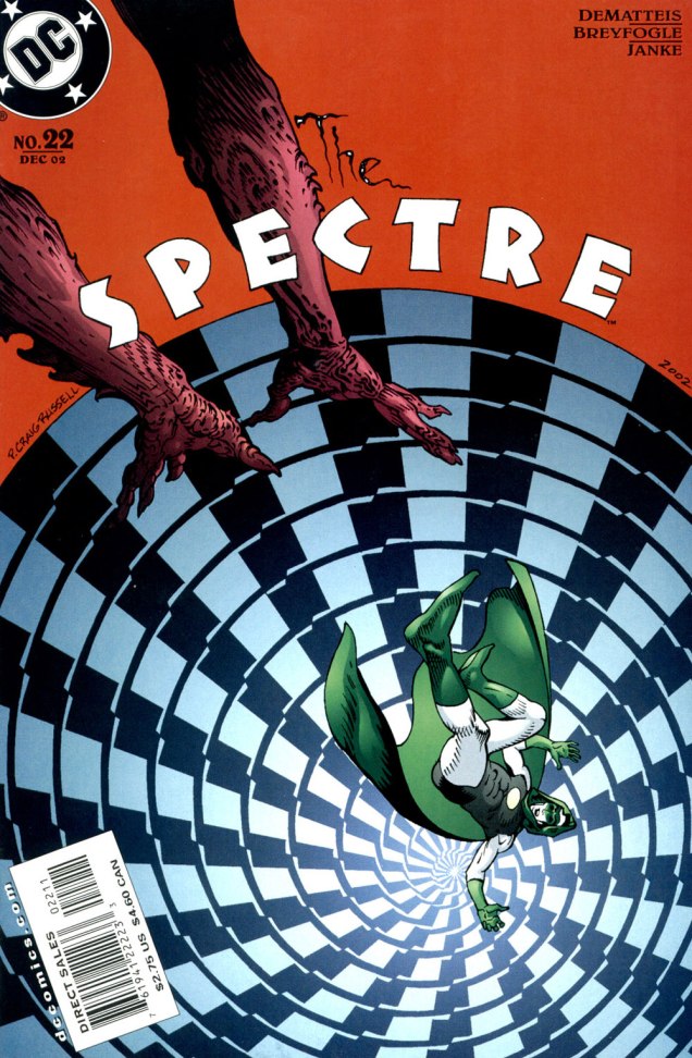
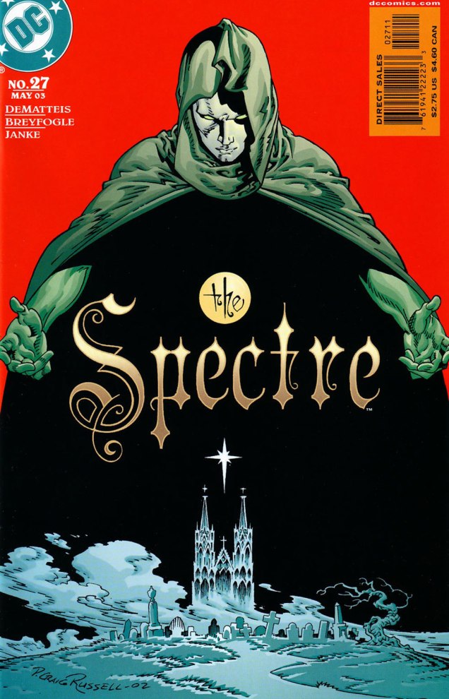
Hey, something from this century! This is The Spectre no. 19 (Sept. 2002, DC). A nice bit of Kirby tribute on Darkseid. In this case, and in fact throughout the Russell sequence, the expressive colours are the work of Lovern Kindzierski.This is The Spectre no. 20 (Oct. 2002, DC). It’s worth pointing out the added value of Russell being a consummate letterer/font designer. Without a logo set in stone (as is generally the case, usually at the insistence of the marketing department) the savvy artist benefits from the extra freedom of counting the title logo among the moving parts of his design. Cue the de rigueurWill Eisner/Abe Kanegson mention.This is The Spectre no. 21 (Nov. 2002, DC). When I showed her these, ds expressed some surprise at her failing to devote a Tentacle Tuesday Masters entry to Mr. Russell.This is The Spectre no. 22 (Dec. 2002, DC).This is The Spectre no. 23 (Jan. 2003, DC).This is The Spectre no. 24 (Feb. 2003, DC).This is The Spectre no. 25 (Mar. 2003, DC).This is The Spectre no. 26 (Apr. 2003, DC).This is The Spectre no. 27 (May 2003, DC). Thus ends the streak…. with the series.
It doesn’t hurt that The Spectre, the brainchild of Superman co-creator Jerry Siegel (1914-1996) and artist Bernard Baily (1916-1996), boasts one of the best-designed superhero costumes of all, virtually unchanged since his introduction, some eighty-five years ago. The exception in this case is the chest emblem, which I presume is meant to indicate that *this* Spectre is former Green Lantern Hal Jordan, instead of defunct flatfoot Jim Corrigan. A bit of a boneheaded notion, imho, and typical of the incessant rebooting and tinkering these poor legacy characters are subjected to by dishwater-dull ‘creatives’.
-RG
*The Elric series was also under consideration, but The Spectre’s nine-issue streak is numerically more impressive.
« Doubt is not a pleasant condition, but certainty is absurd. » — François-Marie Arouet
Going back to 1975: for a few years, I’d been buying Vaillant’s Pif poche (and sometimes its companion titles, Pifou, Arthur, Placid et Muzo, Totoche, and Gai-Luron… poche) as well. However, since the 1973 putsch by the raging primitives* and sundry bean counters, the publisher’s output had largely gone to seed.
I was still picking up, when faced with a dismal crop at the newsstand, the occasional ‘poche’, mostly for the games and puzzles, which comprised half of the editorial content. I was intrigued by an oddly-named stylist, one ‘Rik Cursat’ (unusual name for a Frenchman, I thought… still, nice of him to sign his work!), whose assured line and friendly absurdity had caught my eye.
A game page from Placid et Muzo Poche no. 80 (Aug. 1975, Éditions de Vaillant). Sometimes he used his initials, sometimes he signed in full. « Using all letters above the drawing, find the names of two fruits. » The answers: PÊCHE and CITRON. This one appeared in Pifou Poche no. 63 (Sept. 1975, Éditions de Vaillant). « Using all the letters above the drawing, put together the names of two animals. » The answers: CANE and CHIEN.
It was only decades later that I thought to dig a little deeper. To my delight, it turns out that Cursat had a long and prolific, award-festooned career. Given his international success, it’s a bit of a mystery why he would have slummed it in the (presumably) low-paying back pages of frankly disposable kids’ publications. My guess is that his output was continuous and downright profligate, but he was reluctant to let a good drawing go to waste.
Henri ‘Rik’ Cursat** (1928-2006) was born and died in France’s third-largest city, Lyon. Deeply attached to his hometown, he reportedly produced over the course of his career some 20,000 drawings for its various daily newspapers, especially Le Progrès de Lyon, in whose employ he remained for some thirty-two years.
And since his body of work was so gargantuan and diverse, I’ll keep my focus narrow, borrowing from Absurdement vôtre, a 1977 selection of his cartoons published in Éclats de rire, a gags ‘n’ gals rag not unlike the American ‘Humorama‘ digests. He was, in fact, Éclats’ editor-in-chief for nearly a decade. Yet somehow his own cartoons are anything but crass or lowbrow.
Cursat had some pet recurring themes. One was literal gallows humour.
.
« He’s a repeat offender! »« It’s the downstairs neighbour; he claims that our fish is bothering him! »« Garçon, I don’t have a knife! »« Watch out for his left hook! ». Hooks were another of Cursat’s pet motifs.
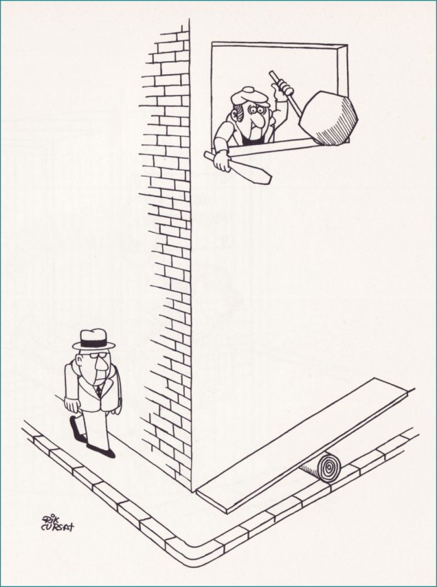
Another frequent theme was the mugger lying in wait just around the corner. Here’s a trio of variations:
.
.
.
.
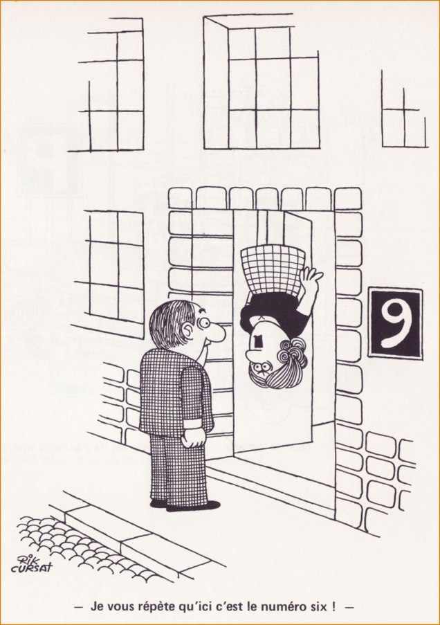
« Are you the architect? »« I keep telling you: this is number six! ». Another inspired riff on the same basic idea.
.
« Garçon, there isn’t a single fly in my soup! »Impishly looking at you, plotting a gag. The artist in the late 1970s.
« My collection of criminal creeps will get a real charge of hokey hassle of heroes! » — The Collector
Just last week, I read the bittersweet news that after half a century or so*, the evergreen, once-ubiquitous Archie Comics Digests are kaput… which brings us, in the usual roundabout fashion, to today’s post.
Though it’s been nearly three years since our big move, I expect to carry on practicing box archeology for a good long while, if not indefinitely. A couple of months ago, I dug out an Archie Digest I had picked up at my local newsstand back in 1981… and quite possibly never read. Until this year.
I’ve mentioned before that comics distribution was extremely spotty in my neck of the woods, so I often found myself glaring and wincing at the racks in desperation and taking home some ungainly specimen*. This was such a case, obviously.
This is Captain Hero Comics Digest Magazine no. 1 (1981, Archie). Stan Goldberg’s cover is unspectacular, but better than his usual. Earlier this week, I got a good chuckle out of someone stating online that Goldberg “could do a damn good Dan DeCarlo“. I’d have to agree: Goldberg, at his peak, was nearly on the level of DeCarlo at his worst. Think I’m kidding? Here’s an example.
The Riverdale-Gang-as-Superheroes of the mid-1960s, just another bit of trend chasing** by the Archie brass, has never elicited much beyond a shrug from me. It certainly was intended as a cynical, junky cash grab by the higher-ups, but… sometimes it rose above the brief.
Bart Beaty wrote, in his 12 Cent Archie (2015, Rutgers University Press), that « On the whole, while the Pureheart material is remembered — and collected in contemporary trade editions — for its novelty within the Archie universe, it is clear that the innovation was not a particular success. The combination of Archie sensibilities and superheroes paid few dividends. »
Well, innovation wouldn’t quite be the term I’d opt for, but while the Pureheart stories are as underwhelming as surmised, but since Jughead, Reggie (as Evilheart) and Betty (as Superteen) are more interesting characters than plain ol’ Arch, it is fitting that their exploits are more compelling.
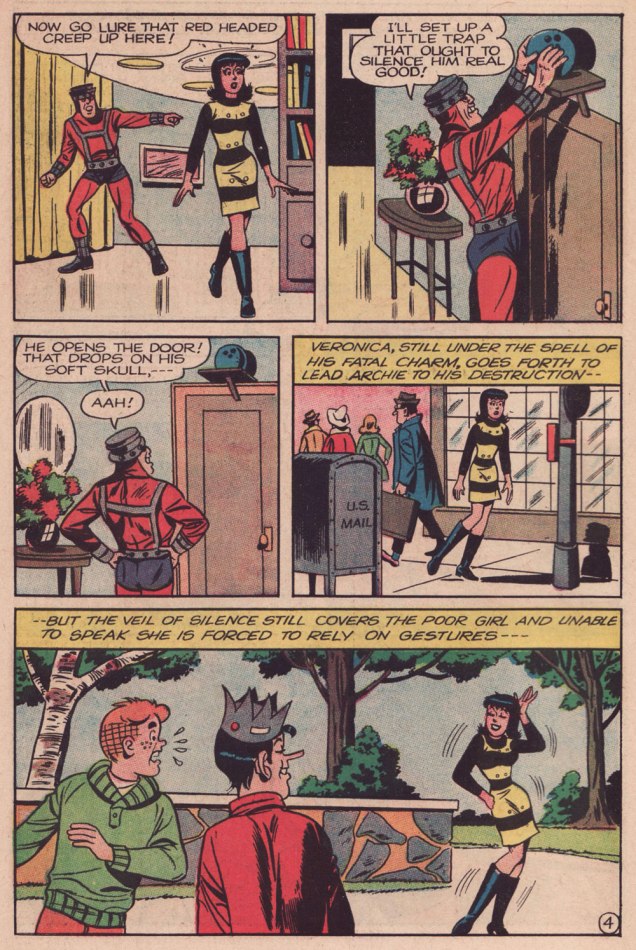
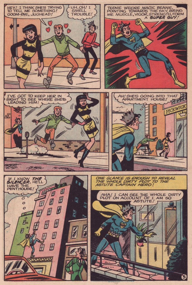
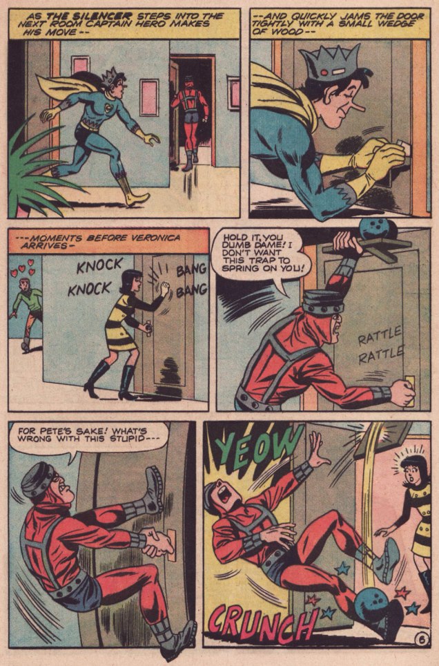
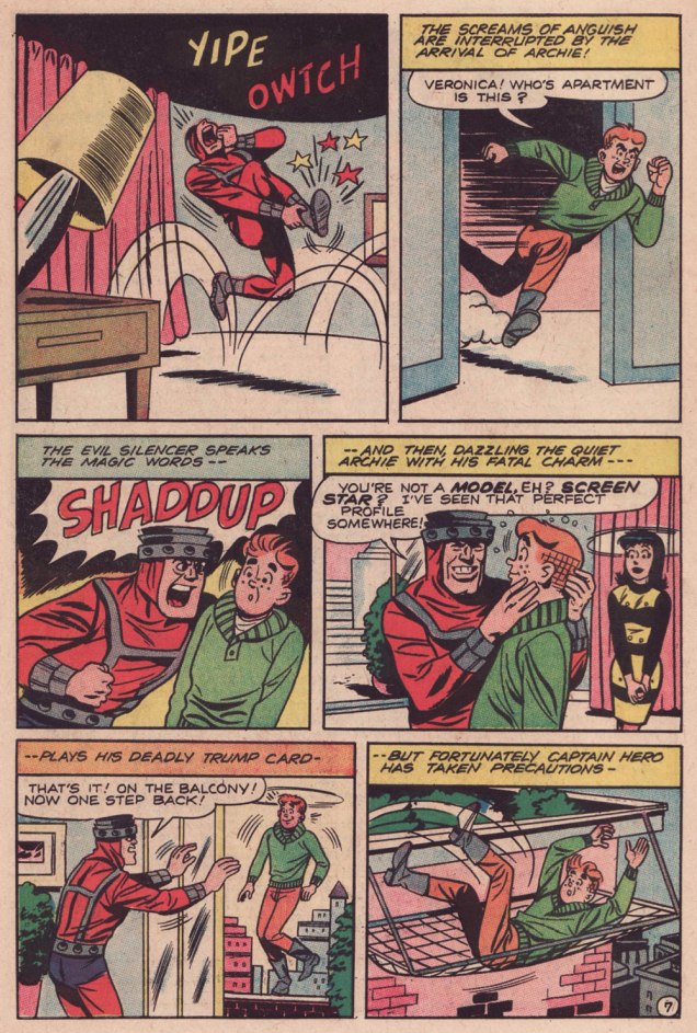
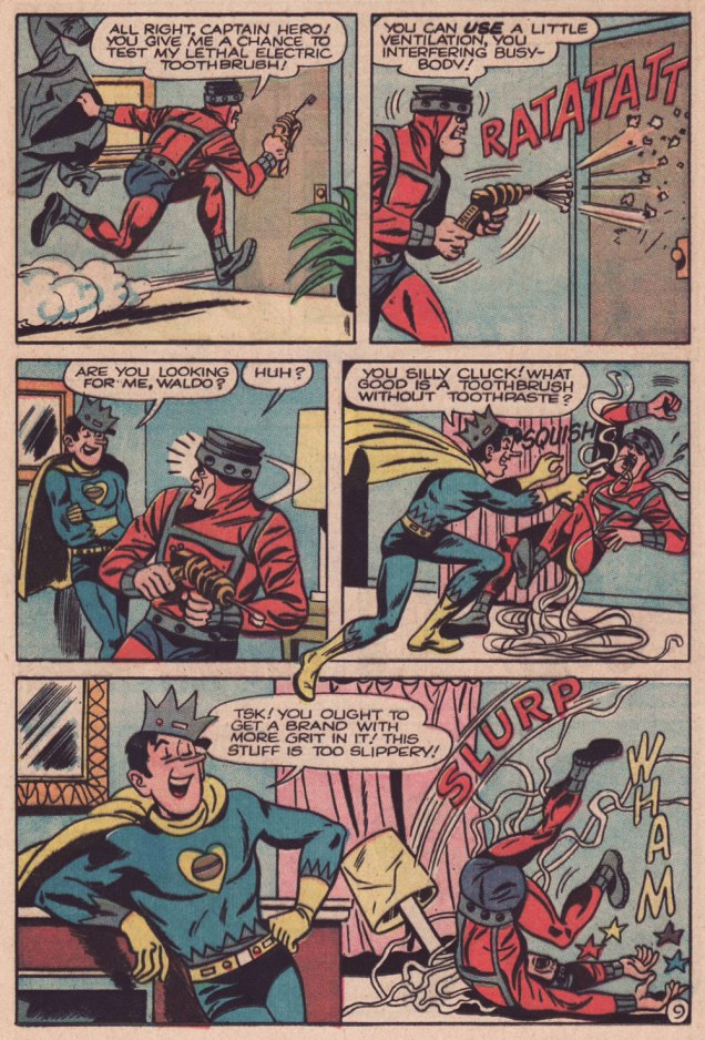
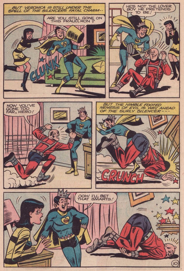
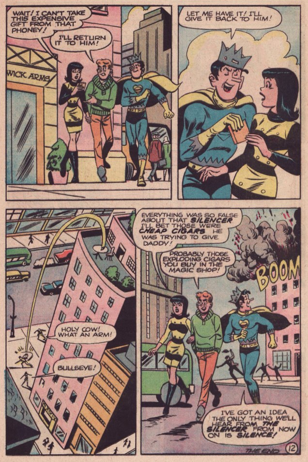
Here’s The Silencer Strikes, originally presented in Jughead as Captain Hero no. 5 (June 1967, Archie). The uncredited creators are presumably Frank Doyle, scripter; Bill Vigoda, pencils.
.
.
.
.
.
.
.
.
.
.
.
While Bill Vigoda (1920-1973) is hardly anyone’s favourite Archie artist, he does a creditable job here; he’s having more fun with this material than he did on the regular Jughead title, where he had the unenviable task of replacing (ha!) Samm Schwartz.
I certainly wasn’t going to use the digest for scanning, as the format’s production values weren’t much of a consideration: this was disposable entertainment, period. But I found an affordable — and in glorious condition — copy of the issue I wanted, and the printing didn’t let me down. My thanks to Keith for bringing it home!
**namely the rise of Marvel’s superheroes and the success of the campy Batman tv show, if you must know.
***Though they reaped the most bountiful rewards from the format, Archie were tardy — as usual — in adopting the digest: for instance, Gold Key had tried it out in 1968 with some Disney reprints, followed by collections of their mystery titles. DC had issued a one-shot Tarzan Digest in 1972. Marvel issued its own — slightly larger — digest in 1973, The Haunt of Horror, but it wasn’t comics, but a doomed attempt at reviving the moribund ‘Pulp’ format; finally, Archie entered the fray two months later, with Archie Comics Digest no. 1. Only Harvey lagged behind; unless I’m mistaken, it wasn’t until 1977 that some Richie Rich digests hit the glutted market.
« In man’s struggle against the world, bet on the world. » – Franz Kafka
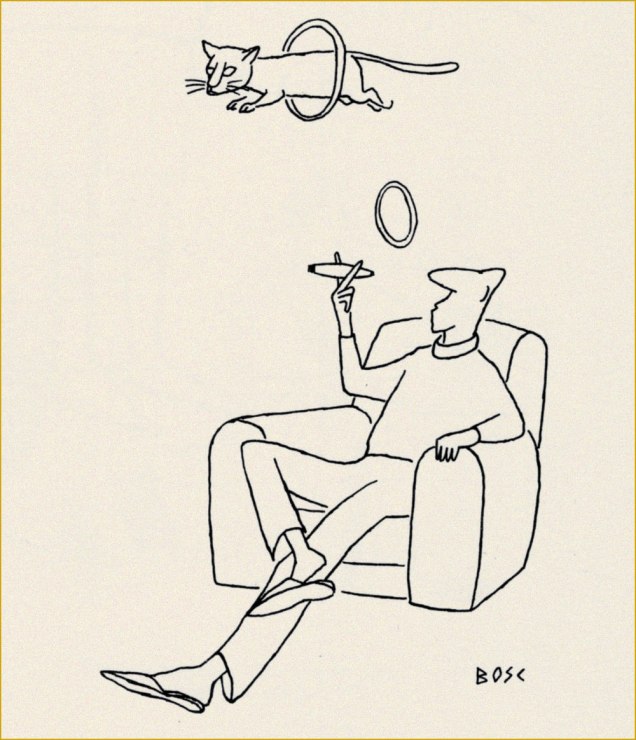
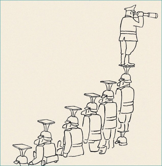
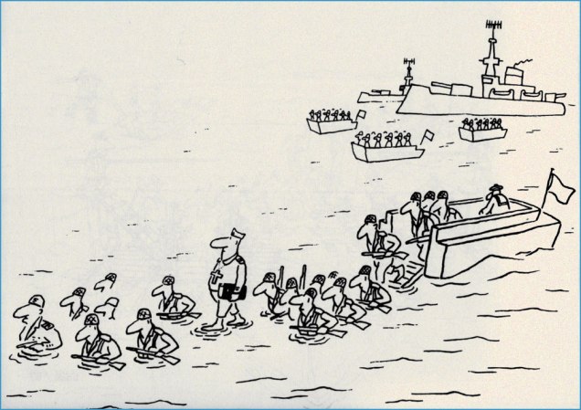
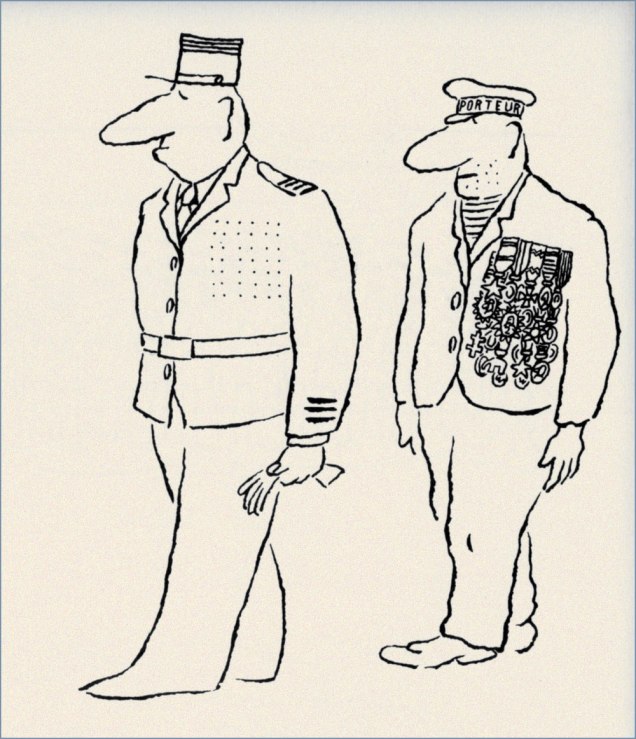
Time for another entry in our leisurely, unsystematic and subjective survey of Europe’s most significant panel cartoonists. Today, we examine the life and work of Jean-Maurice Bosc (1924-1973).
His is a familiar story: guy goes to war, comes home changed (likely suffering from what was once called ‘shell shock’, then ‘battle fatigue’, and nowadays ‘post-traumatic stress disorder’ — “burying the pain under jargon“, as George Carlin put it), can’t return to old routine in the family vineyard, tries other tacks, decides on drawing; looks for gainful employment, starting at the very top, miraculously gets in. Thrives for several years, producing well over 3000 drawings, seeing print in countless magazines all over the globe. Then it turns sour.
Originally published in Paris-Match, this one landed successfully in Best Cartoons From Abroad 1955 (Crown, 1955; Lawrence Lariar and Ben Roth, editors).Another Paris-Match cartoon, it was reprinted in Best Cartoons From Abroad 1958 (Crown, 1958; Lariar and Roth, editors). Sometimes gallantry just isn’t enough.
Jacques Sternberg wrote, in Les chefs-d’œuvre du dessin d’humour (1968, Éditions Planète):
« Returned in a highly weakened state from Over There, Bosc, resigned to forced rest, began to draw after falling in love with the drawings of Mose and Chaval. Over a few months, he produced hundreds of drawings, giving the humorous arts, without even realising it, a most singular starkness, a particular line that belongs quite exclusively to Bosc, though it’s been much and often mimicked since.
It was in 1952 that Bosc went up to Paris. Eight days later, a stroke of luck: he lands a whole page in Paris Match, which was to turn him into one of the magazine’s stars. »
Hierarchy explained in one picture.The Touring Club de France (1890-1983) was a French social club devoted to travel, founded by enthusiasts of the vélocipède. We are told to « Please leave this place as clean on leaving as you would like to find it on entering », although ‘en vous retirant‘ might be more faithfully translated as ‘upon pulling out‘.
« After spending three years mindlessly obeying orders, two of which in the Vietnamese jungle, Bosc was severely traumatized. “After what I’ve witnessed in Indo-China“, he wrote, “I could no longer eat or sleep, ever.” He later told his sister that he had shot dozens of fellow soldiers, saw gruesome fights and, while imprisoned, heard prisoners being tortured. She recalled that he could no longer stand loud noises and got furious whenever she wanted to kill a mere spider. Bosc became a lifelong opponent of war and militarism. »
Just in case anyone’s not yet familiar with the Venus de Milo…The feat of walking on water is actually not strictly associated with Christian myth: ninjas also reportedly do it. « Porteur », as you’ve surely surmised, means ‘porter’ or ‘carrier’.
Like most of his friends and colleagues, « … Bosc had lived through the Nazi occupation in World War II. After the Liberation, he felt disgusted by his country’s attempts to keep subjugating their overseas colonies to similar oppression and exploitation. President Charles de Gaulle was the sum of everything they hated: a conservative politician who didn’t agree with the growing sentiment of anti-colonialism, the sexual revolution and disregard for Church, army and family values. Bosc often ridiculed De Gaulle in his work. Once, the cartoonist was fined 3,000 francs, with a month’s probation, for daring to mock the army in a magazine. Bosc’s work revealed he had no respect for politicians. Interviewed by Paris Match in 1965, Bosc claimed that Alexander the Great was his “favorite great statesman, since he died at age 33.” » [ source ]
A stellar example of military logic.
This way, at least *everyone* gets to keep dry.
Here’s a video of a guy launching a hand grenade into a frozen lake. This one just might be Bosc’s single best-known cartoon. It goes: “My castle”; “My mill”; “My dog”; “My car”; “My farmer”; “My wheat”; “My bull”; “My wife”; “My guard”; “My pool”; “My garden”… “My ass!”.
I won’t gloss over the tragedy of his final years:
« Tragedy struck in 1968, when his good friend and colleague Chaval committed suicide. In June 1969, Bosc had a mental breakdown and was hospitalized. Suffering from an illness depigmenting his skin, he weakened more and more, often to the point of no longer being able to stand on his own two feet. He went in and out of clinics, even tried electroshock therapy, but nothing helped. As his health deteriorated, so did his mood. From 1970 on, he basically quit drawing cartoons. In 1973, the depressed cartoonist went to his garage and shot himself. He was 48 years old. »
Despite his having left us over half a century ago, Bosc is remarkably well-remembered. His Lambiek biography, written by Belgian cartoonist Kjell Knudde, is richly detailed and informative. His official website, hosted by Bosc’s devoted nieces and nephews, is a marvel of commemoration.
« The hardest tumble a man can make is to fall over his own bluff. » — Ambrose Bierce
Today, I’m going totally ‘mainstream’ on you for a change. Last week, I ventured into a movie theatre for the first time since 2019 (Knives Out was my last such outing) to see my first superhero film since 2012 (The Avengers was my last such outing). And so, while the new Superman epic wasn’t perfect, I found much to enjoy about it.
Among the ideas explored in the film was that baddie Lex ‘Elon’ Luthor, from carefully observing The Man of Steel over several years’ worth of skirmishes, had managed to analyse and codify his combat moves, in order to predict and counter them.
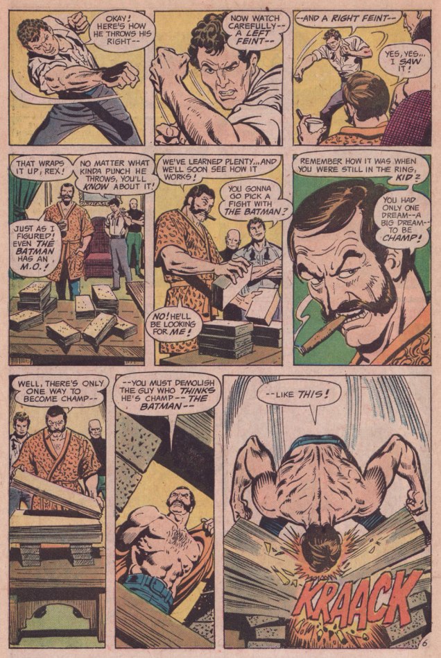
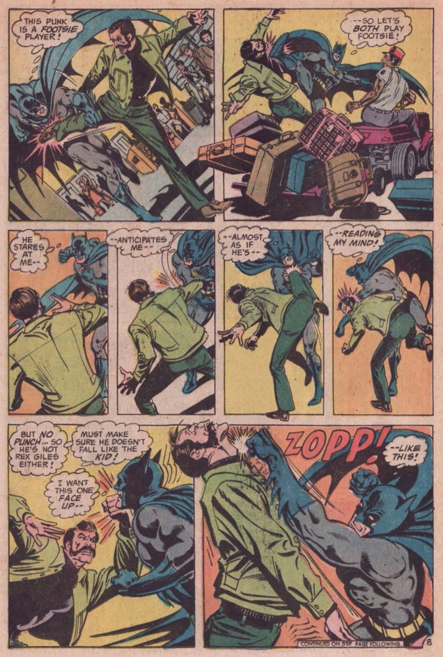
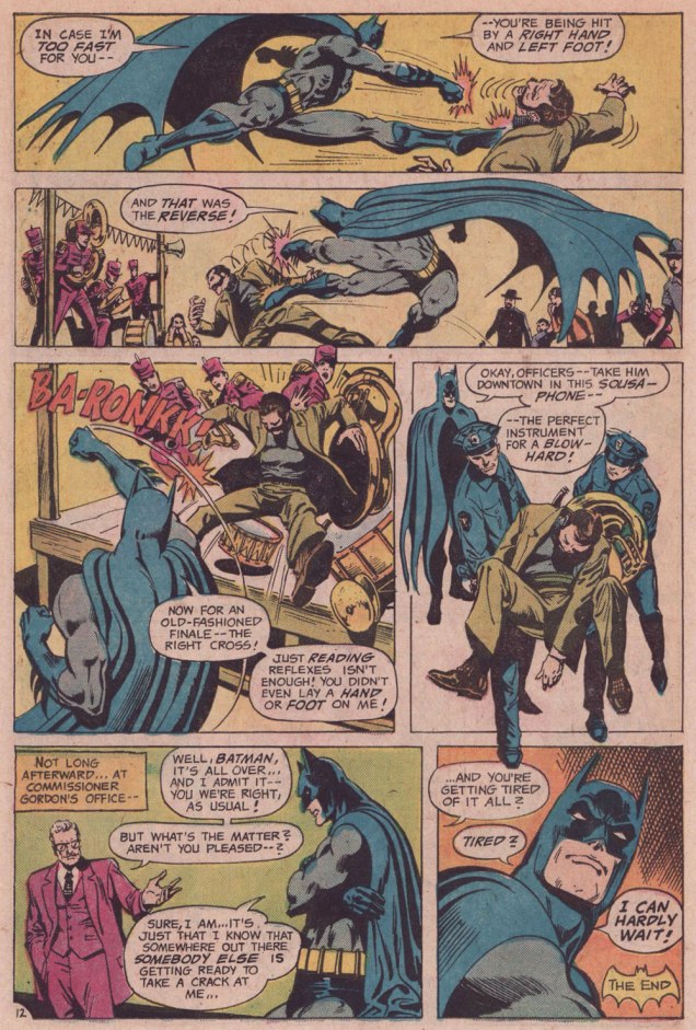
I was reminded of that angle serving as the basis of a favourite Batman story by my favourite Batman writer (and hardly anyone else’s, apparently), David Vern Reed (1914-1994). Despite its publication in a popular, long-running title, this tale is obscure to the point of never having been reprinted in English.
I’m terribly fond of the Schwartz-era Batman, especially the 1970s, because it’s relatively light on costumed supervillains, Batman acts like the detective — albeit a remarkably athletic one — he’s supposed to be, and the plots often hinge on ‘ordinary’ (though clever) criminals striving to outsmart Bats. A favourite example: Vern’s « The Underworld Olympics ’76! » (Batman 272-275, Feb.-May 1976) tetraptych. I think I can safely rule out childhood nostalgia: in my small town, distribution was quite spotty, so I never even *saw* those issues at the time, encountering them instead as an adult, decades on.
If I have a quibble about the art, it’s that Ernie Chan’s finishes mesh poorly with García-López’s usual rock-solid breakdowns. Perhaps it’s because Chan likes to have more to do; given that García-López, his own best inker, typically turns out pencil renderings that are utterly complete and tight as a drum, the job is quite unlike, say, Chan inking a Big John Buscema Conan job — as he so often did — wherein Chan has to do 80 percent of the work over Buscema’s sparse breakdowns, stock poses and rote shortcuts. In contrast, inking García-López essentially reduces the task to tracing over his flawless pencils, which can’t be all that stimulating, educational as it may be.
Speaking of Garcia-Lopez, a priceless anecdote: writer Andrew Helfer, a frequent collaborator, recalled, in his introduction to TwoMorrows’ Modern Masters Volume Five (2007): « … it was Jean Giraud, aka Mœbius, and he was staring at a drawing of Wonder Woman by José Luis García-López. « This García-López », he asked in a heavy French accent. « He uses models, no? » « No, » I answered, smiling. « Son of a bitch! » Mœbius hissed.
« We live in the age of the refugee, the age of the exile. » — Ariel Dorfman
The tale of Czechoslovakia is a fascinating but painful one — as anyone who’s read any Kundera at all surely knows — between the Nazi and Soviet occupations, Czechoslovakia suffered steadily and profoundly through most of the 20th century. For my part, I gained a sharper view of the situation from reading an in-depth 1969 article about Czech economist Ota Sik (1919-2004).
Meanwhile, our protagonist, painter-illustrator Miroslav Šašek (1916-1980) had fortunately already settled to Paris by the time things got too ticklish back home.
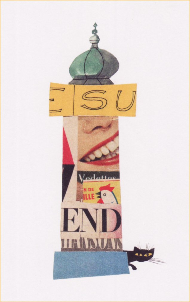
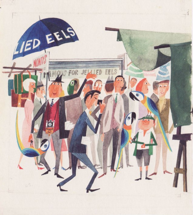
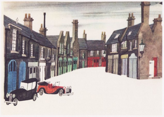
For several years, he’d been mulling over the idea of a ‘kiddies’ guide to Paris’, and in 1957, he was ready to shop it around. Venerable English publishing firm W.H. Allen (1835-1991) took a gamble, and Tintin’s home, the even more venerable Belgian maison Casterman (founded in 1780 and still around) signed on as well. Pictured here is an early German edition.Collage *and* a prudent black cat? Count me in. The closing piece (I haven’t seen them all and counted, but I’m told each book in the series comprised eighty illustrations) from This Is Paris / Paris. Here’s a handful of other drawings from the book.Original art from an interior ‘This Is London‘ illustration, second book in the series and published in 1959. Read it here! « London is full of interest. On Sunday morning you can go up to Petticoat Lane open-air market. » Good old British cuisine… after ninety-four years in business, Tubby Isaac’s Jellied Eel Stall closed for good in 2013. Jellied Eel made it to an impressive second place in Ranker’s List of Most Disgusting Meats, bested (ha!) only by Icelandic Rotten Shark Meat (fresh shark was nasty enough for me — holy ammonia, Batman!). You can still cast your votes for your favourites loathsome viands.The trusted old house of WH Smith is nowadays but a shell of its former glory.Illustration from This Is Rome (1960). Such masterful use of a) negative space and b) collage. For the record, SPQR stands for Senatus Populusque Romanus, which translates to “The Senate and People of Rome”. The acronym has lately been misappropriated by white supremacists. So many dog whistles fouling the air these days…Cover art from (just like it says) This Is Venice (1961). Those were better days: note the welcome absence of billionaires’ yachts.Illustration from This Is Edinburgh (1961). « The trip to Edinburgh was one of Šašek’s favourites — “I loved working on This Is Edinburgh, though I hated the weather there. In the middle of summer, it was cold and rainy. You needed a hot-water bottle in bed with you. Working conditions were good though because the nights are very short in Edinburgh. I worked from 4 a.m. to midnight and finished the book in two months.” » W.H. Allen employee Jeffrey Simmons, who worked with Šašek throughout the series, stated that « [ Šašek ] … always made the decision himself about which destination to tackle next. And I confess that sometimes they seemed quite perverse choices to me. They weren’t always chosen on a commercial basis, I don’t think. They were all successful, of course, but some much more so than others. ». I suspect that he was referring to his pick of the Scottish capital, who had a population of less than half a million at the time. But if it inspired him — and it clearly did — I wouldn’t call it perverse. This Is San Francisco (1962). « After the book’s publication in 1962, Šašek returned to receive the Key to the City. »Interior illustration from This Is San Francisco (1962). These elements likely wouldn’t have worked as a photograph, but the greater flexibility of illustration — more latitude in colour and contrast, the dropping out of extraneous visual components — make this composition sing (like the wires, presumably.)An incredible one from This Is Hong Kong (1965). « “Hong Kong was a hard book to do because of the language problem. It took me hours and hours to draw the characters of the alphabet. I tried to use a camera, but it didn’t work. Sometimes I could have screamed! Three times, ten times, twelve times over it took me to perfect one picture! » While some artists may have been satisfied with a generic representation of the Chinese characters, Šašek’s respect for his readers would not allow for any short cuts. He was acutely aware of the eagle eyes of children through the many letters he received from them. »Nearing the end of the line: a look at some original art from This Is Australia (1970), the penultimate book in a series of eighteen.A portrait of the artist mid-musing, dated 1961.
While the series, obviously a product of its time, receded in popularity over the years, it’s thankfully been undergoing a revival in this century. Such an invaluable time capsule deserves to be preserved for posterity, both on historical and artistic grounds.