« To prevent enabling oppression, we demand that black people be twice as good. To prevent verifying stereotypes, we pledge to never eat a slice a watermelon in front of white people.* » — Ta-Nehisi Coates
On a scorching day last week, we were at home digging into a particularly tasty watermelon.
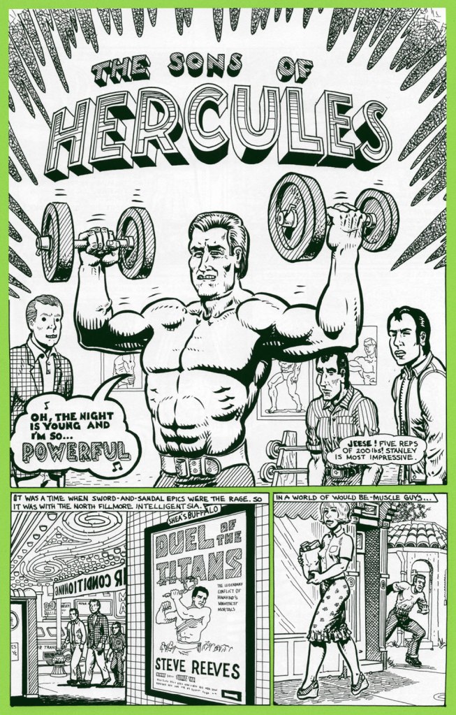
As neither of us grew up in the U.S. of A., the simple act of eating juicy pastèque has not been tainted, as it has for many, by racism and stereotypes. We’ve been allowed to appreciate the watermelon for itself, as a healthy, refreshing, tasty treat. A lightbulb came on as I recalled a relevant sequence in one of Spain Rodriguez‘s ‘Fred Toote’ stories, set in the 1950’s Buffalo of his youth — and so here it is:
And that’s not all: a few days later, a friend’s news feed presented me with a most insightful, eye-opening *and* heartbreaking tweet:
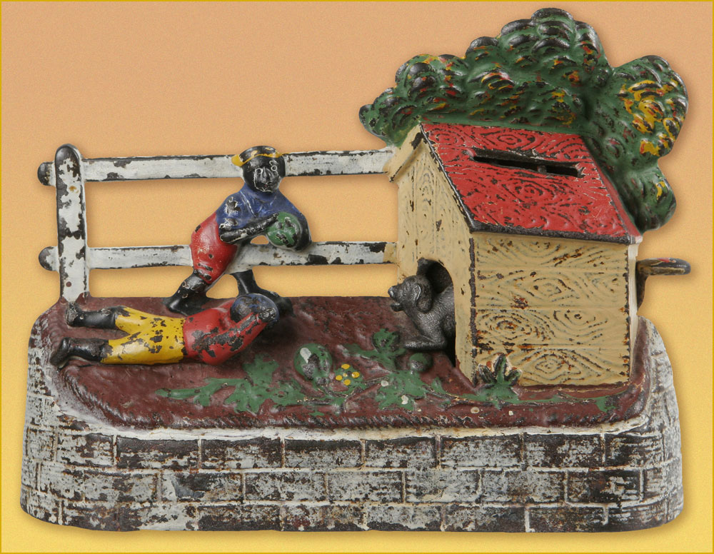
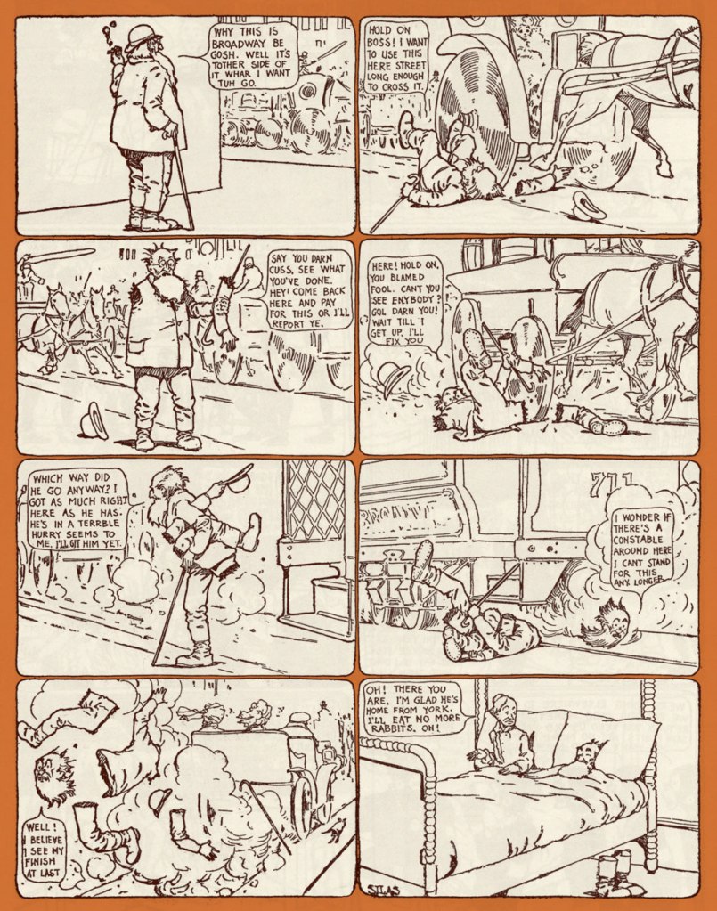
« It seems almost silly to say that watermelons have been racialized, but that is exactly what happened in this culture. » Here’s the full article, a fascinating summary of the issue from Dr. David Pilgrim of Ferris State University’s Jim Crow Museum of Racist Memorabilia, written in response to the rather hostile comment of “Judging from the pictures on your website, you seem to be saying to me that black people don’t like watermelons? Sometimes you liberals make me shake my head.“« Boys Stealing Watermelons Bank. Made by Kyser & Rex of Philadelphia, PA. circa 1894. When a lever is pressed and the coin deposited, a dog runs out to keep the boys from their prize. »Comics pioneer Gustave Verbek (1867-1937), known as Verbeek after he “moved to the United States, where an immigration officer misspelled his name“, tackles a familiar subject in his Upside-Downs strip of Aug. 7, 1904 . Don’t forget to read it upside down for the second half of the story! My warmest thanks to Sunday Press‘ Peter Maresca for providing me with this rare image.
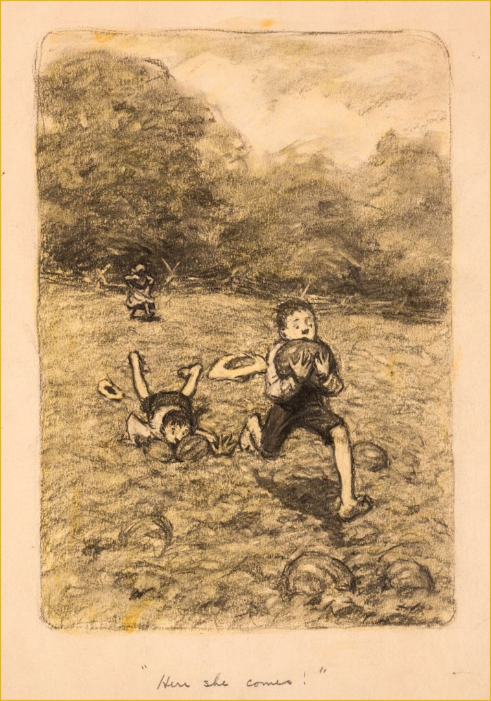
A piece in graphite on manila by James Ellsworth “Worth” Brehm (b. 1883 – d. 1928) illustrating one of Booth Tarkington‘s ‘Penrod’ novels, circa the 1910s. Seems like any and all scamps — of all races — would raid the watermelon patch, given half a chance.
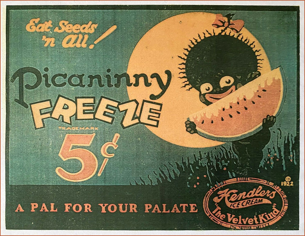
An ice cream advertising sign, circa 1922. If you’ll bear with me, here’s a longish, must-read quote from the indispensable Wicked Words by Hugh Rawson (1989, Crown Publishers, New York):
Pickaninny. A black child. Thus, from a book that was being sold in 1987 in order to raise money for the state of California’s observance of the bicentennial of the United States Constitution. ” If the pickaninnies ran naked it was generally from choice, and when the white boys had to put on shoes and go away to school they were likely to envy the freedom of their colored playmates” (Fred Albert Shannon, essay on slavery, 1934, in The Making of America, W. Clean Skousen, ed., 1985).
Pickaninny arose among slaves in the West Indies, where it was recorded as early as 1653. The original users based the term either on the Portuguese pequenino, little child, or its Spanish equivalent. They employed the term affectionately, of course, and, on the evidence of Captain Frederick Marryat, who was a sensitive recorder of language, applied it to little children generally, regardless of color, e.g. “And den, Mass Easy, you marry wife – hab pickaninny — lib like gentleman” (Mr. Midshipman Easy, 1836).
But no white person can get away with this today. The essential informality of the word makes it seem too condescending, too offensive, to most modern sensibilities. The California Bicentennial Commission, in fact, halted the sale of The Making of America, and issued a formal apology for having authorized it in the first place, after this use of pickaninny was called to their attention (along with other matters, the text also concluding that “slave owners were the worst victims of the system [of slavery].”
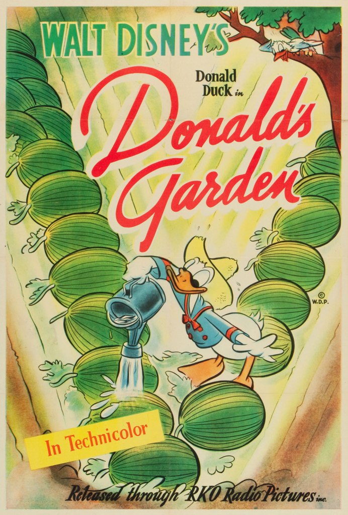
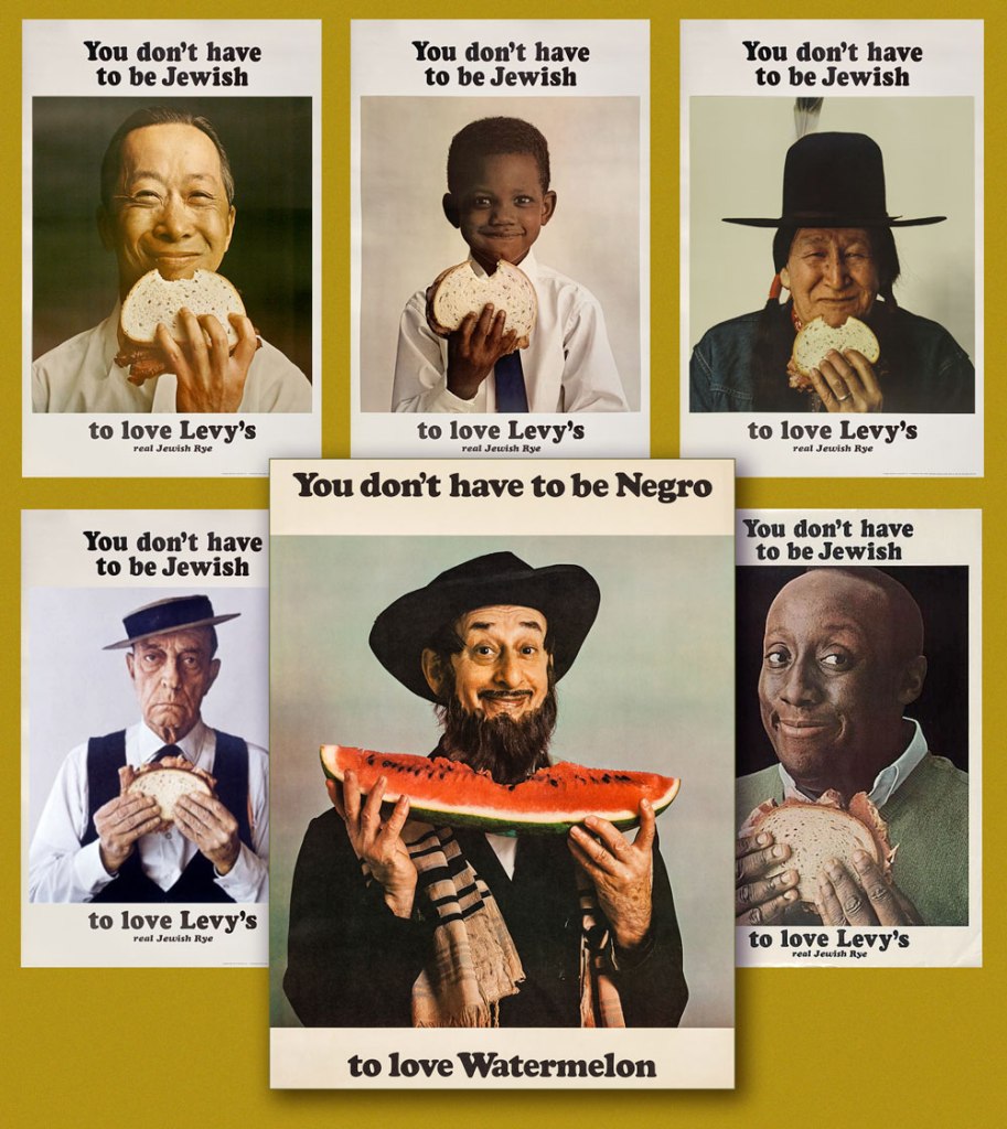
One Sheet poster from Donald’s Garden (RKO, 1942), written by Ralph Wright and directed by Dick Lundy. « During WWII, Americans were expected to help their country in the war effort by participating in “Victory Gardens.” This was a measure to conserve produce domestically so food could be shipped to the troops overseas. » Watch it here!This is Krazy Krow no. 2 (Fall 1945, Timely). Racist stereotype or not? It’s not always the case, as R.C. Harvey soberly argues in an excellent article on Walt Kelly‘s Pogo, Sometimes a Watermelon Is Just a Watermelon. Here’s a sample: Harvey — « This is ultimately a failure to understand what the watermelon stereotype actually entails. Surely you realize that there’s nothing intrinsically degrading in liking to eat watermelon. Watermelon was one of the props in a general stereotype of the African American as filled with infantile enthusiasm, easily distracted and reduced to paroxysms of delight at the rattling of dice, the smell of fried chicken, or the sight of a watermelon. This is not what’s happening in Kelly’s story at all. But then, Andrae hardly seems to have an idea of his own on this subject at all. Rather, he has a grab bag of received notions, incompletely understood and haphazardly applied. Watermelon equals racism, that is all you know and all you need to know. »A slice of Mal Eaton’s delightful Rocky Stoneaxe (né Peter Piltdown); undated, but since it bears the Stoneaxe name, it’s post-1953 and saw print in the pages of Boy’s Life Magazine. Eaton’s a local favourite, and my co-admin ds has twice written about his signature creation. First came Mal Eaton’s Peter Piltdown, then Tentacle Tuesday Masters: Mal Eaton — Peter Piltdown Goes Fishing!And now for something more progressive: called ‘the most successful Jewish ad campaign of all time’ (*explicitly* Jewish would be my caveat), the truly classic Levy’s rye bread campaign was launched in 1961 and lasted into the 1970s, spawning along the way countless imitations, parodies and ripostes, including, circa 1967, the You Don’t Have to be Negro to Love Watermelon seen here front and centre. Keen readers surely will have spotted the unmistakable deadpan mug of the rightly legendary Buster Keaton, bottom left.
According to a New York Times article, « Malcolm X liked the poster featuring the black child so much that he had himself photographed alongside it. »
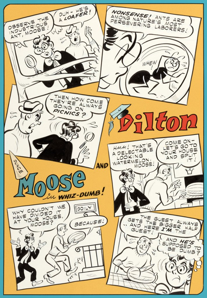
Given the right writer, I’ve always enjoyed the Dilton-Moose pairing more than the Moose-Midge combo. The boy genius and the dunce are genuine friends, while Midge only serves as a vehicle for Moose’s jealousy and as a way to land Reggie in traction. This one appeared in Archie’s Joke Book Magazine no. 46 (May 1960, Archie). Writer unknown, art by Joe Edwards (1921-2207).
A page from Little Audrey and Melvin no. 4 (November 1962, Harvey); kudos to Melvin — I can’t even get a proper boomerang to return to me, let alone a piece of rind used in its stead.
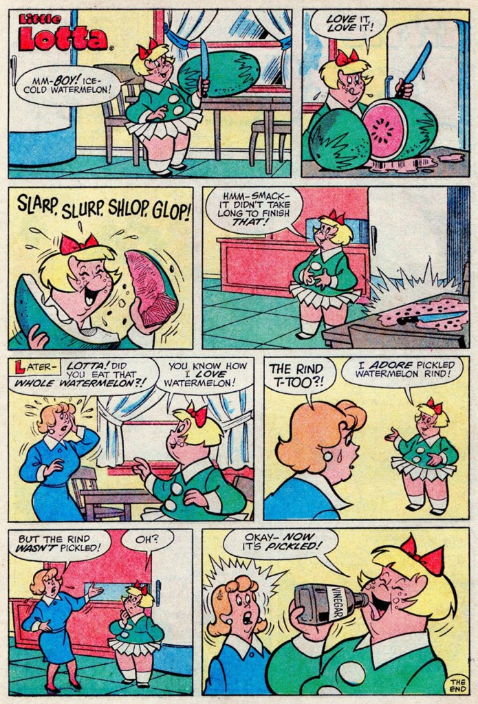
I suppose your stomach acids would have done the trick just as well, Lotta. A page from Little Lotta no. 65 (May 1966, Harvey).
A special watermelon sequence by the Lieber Bros, Stan & Larry, with inks by Mike Esposito (moonlighting as Mikey DeMeo); this is from The Parents of Peter Parker!, published in The Amazing Spider-Man Special no. 5 (Nov. 1968, Marvel).
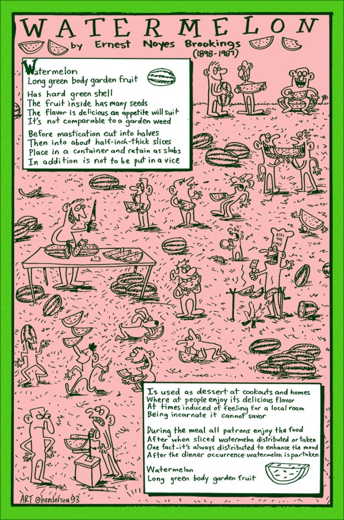
And finally, a collaboration between prankster and cultural scholar Sam Henderson and late-in-life eccentric poet Ernest Noyes Brookings; it appeared in Duplex Planet Illustrated no. 7 (March 1994, Fantagraphics), edited by David Greenberger. And if you’ve enjoyed the visual version, try the 1991 musical adaptation by Maestro Subgum & The Whole!
-RG
*He’s not even slightly exaggerating: the heinous stereotype just won’t die.
« Goodbye—if you hear of my being stood up against a Mexican stone wall and shot to rags, please know that I think that a pretty good way to depart this life. It beats old age, disease, or falling down the cellar stairs. To be a Gringo in Mexico — ah, that is euthanasia. » — Ambrose Bierce, writing to his niece in the fall of 1913.
There’s a profusion of biographical material out there on the topic of Ambrose Gwinnett Bierce (June 24, 1842- ??), but here’s a capsule version to get the preliminaries out of the way:
« Ambrose Bierce was an angry young man who got angrier as he grew older. His strong talent was directed always by bitterness and despair. His wonderful stories were weird, cynical, shocking. His life was restless, his temper outrageous, and his death violent. »
Bearce belongs to a select club of larger-than-life American literary figures (among which we might also encounter Messrs. Poe, Twain, Lovecraft, Hemingway, and perhaps Vonnegut), whose life and work inspired, and continues to inspire, countless adaptations in all media, imitations and parodies, appropriations. You know the drill: works by, works about, works starring the author as protagonist.
In addition to the expected adaptations of varying quality, Bierce’s own nebulous ending inspired both fiction (Gerald Kersh‘s 1957 short story ‘The Oxoxoco Bottle‘, in which the narrator discovers a manuscript, in Bierce’s hand, that recounts the extraordinary events that followed his disappearance) and speculative non-fiction, by which I mean Jake Silverstein‘s fascinating 2002 essay, The Devil and Ambrose Bierce: Well Met in Marfa, which you can read here).
Since there’s so much to take in, I’ll fall back on my usual coping strategy, keeping my focus narrow to avoid (further) losing it. We’re going to explore my two favourite editions of a defining Bierce work, The Devil’s Dictionary, first published in 1906 as The Cynic’s Word Book.
Abasement, n. A decent and customary mental attitude in the presence of wealth or power. Peculiarly appropriate in an employee when addressing an employer.Commerce, n. A kind of transaction in which A plunders from B the goods of C, and for compensation B picks the pocket of D of money belonging to E.Edible, adj. Good to eat, and wholesome to digest, as a worm to a toad, a toad to a snake, a snake to a pig, a pig to a man, and a man to a worm.Prescription, n. A physician’s guess at what will best prolong the situation with least harm to the patient.This lovely edition, featuring illustrations by Joseph Low (1911-2007) was published in 1958 by the Peter Pauper Press of Mount Vernon, NY. This, as it happens, was my introduction to the series, picked up at a long-gone bookstore during a 1992 visit to Victoria, BC, a city that last year finally broke with its proud, longstanding tradition (begun in 1894!) of dumping its raw sewage into the Pacific ocean, surely to the relief of most Seattlites.
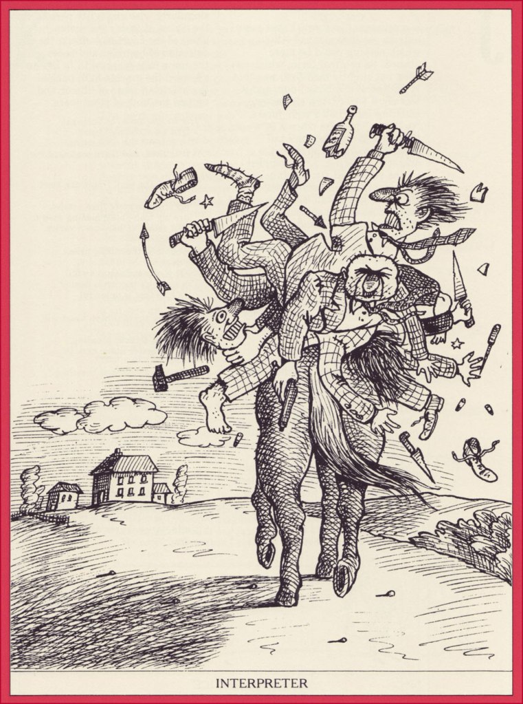
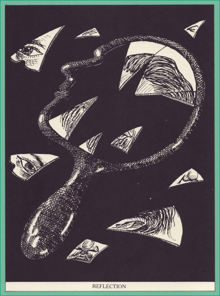
Then in 1979 came along a most handsome edition (Thomas Y. Crowell, Publishers) boasting a wealth of illustrations by Egyptian-born force of nature Jean-Claude Suarès (1942-2013).
Interpreter, n. One who enables two persons of different languages to understand each other by repeating to each what it would have been to the interpreter’s advantage to have said.Lawyer, n. One skilled in circumvention of the law.Longevity, n. Uncommon extension of the fear of death.
Medicine, n. A stone flung down the Bowery to kill a dog on Broadway.
Reflection, n. An action of the mind whereby we obtain a clearer view of our relation to the things of yesterday and are able to avoid the perils that we shall not again encounter.
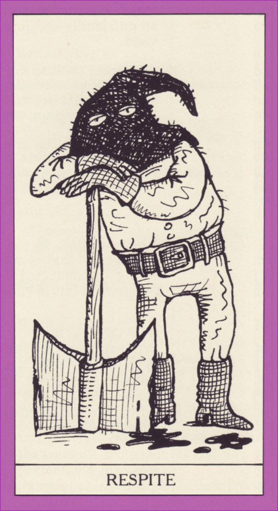
Respite, n. A suspension of hostilities against a sentenced assassin, to enable the Executive to determine whether the murder may not have been done by the prosecuting attorney. Any break in the continuity of a disagreeable expectation.
Witch, n. (1) An ugly and repulsive old woman, in a wicked league with the devil. (2) A beautiful and attractive young woman, in wickedness a league beyond the devil.
For the sake of comparison, here’s Mr. Low’s rendition of same:
.
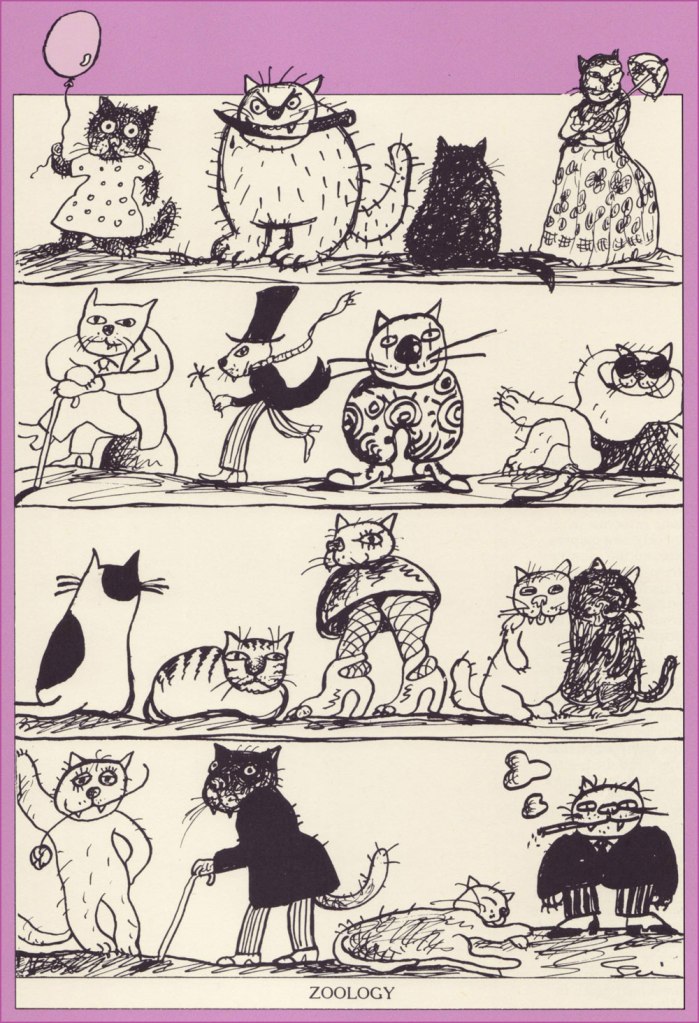
Zoology, n. The science and history of the animal kingdom, including its king, the House Fly (Musca maledicta). The father of zoology was Aristotle, as is universally conceded, but the name of its mother has not come down to us. Two of the science’s most illustrious expounders were Buffon and Oliver Goldsmith, from both of whom we learn (L’histoire générale des animaux and A History of Animated Nature) that the domestic cow sheds its horns every two years.
Happy 180th anniversary, Mr. Bierce, wherever you may roam!
« Taking sartorial risks and not following other people is what makes you stand out. » — Zac Posen
I was planning a big commemorative post for today, but I got tangled up in my calendar and realised in time that I was a couple of weeks off. So instead, I’ll just blow off a little steam.
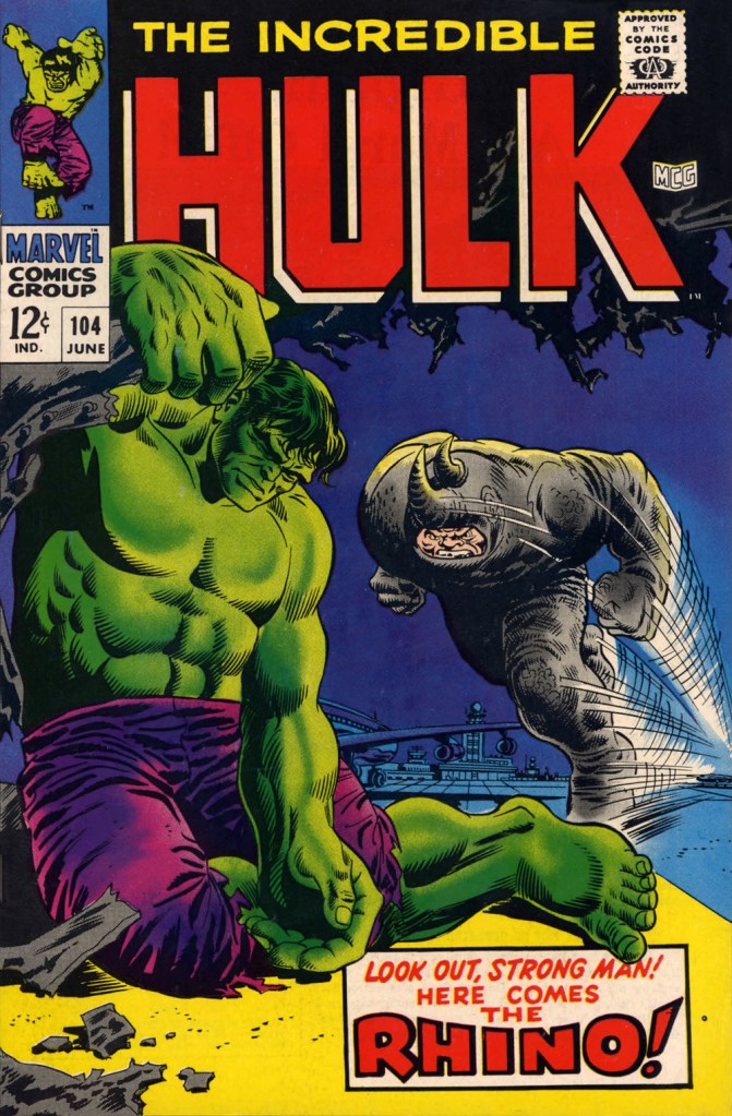
Some cartoonists are born character designers. Others, not so much. The Rhino, a Stan Lee-John Romita Sr. creation, first appeared in The Amazing Spider-Man no. 41 (Oct. 1966, Marvel), soon after Steve Ditko‘s abrupt but quite justified resignation. Isn’t that just a dog of a cover? (pencils and inks by Romita, colours by Stan Goldberg).
“I’ve been getting these migraine headaches, Doc” “What do you do for a living?” “Uh…” Seriously, what can you do with a character who obviously can’t move that fast, has to lean his head down to strike… blindly, and isn’t particularly smart? All Spidey has to do is duck, which is one of his chief talents.Answer: you pit him against a more suitable adversary, preferably a dumber one. This later, but still ludicrous, appearance is The Incredible Hulk no. 104 (June 1968, Marvel). Cover by Marie Severin and Frank Giacoia.
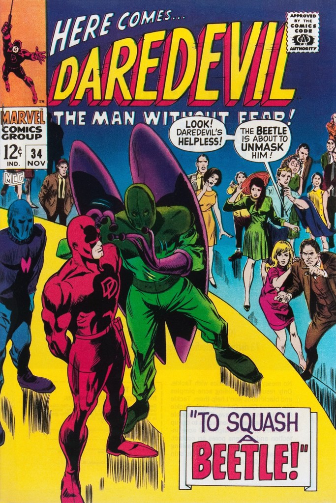
Somehow, Daredevil seems to wind up with more than his share of poorly-attired villains. It’s as if they know he’s blind and won’t judge them too harshly on sartorial grounds.
The Beetle first scurried into view in Strange Tales no. 123 (Aug. 1964, Marvel), tackling the Human Torch (and The Thing). Too bad it wasn’t Doctor Strange he was sparring with, since his threads would then have been designed by Mr. Ditko instead of by Carl Burgos.
He then went on to bug the aforementioned ‘hornhead’. This is Daredevil no. 34 (Nov. 1967); pencils by Gene Colan, inks by Bill Everett. Why does everyone on stage appear to wear a size 15 shoe? At least!
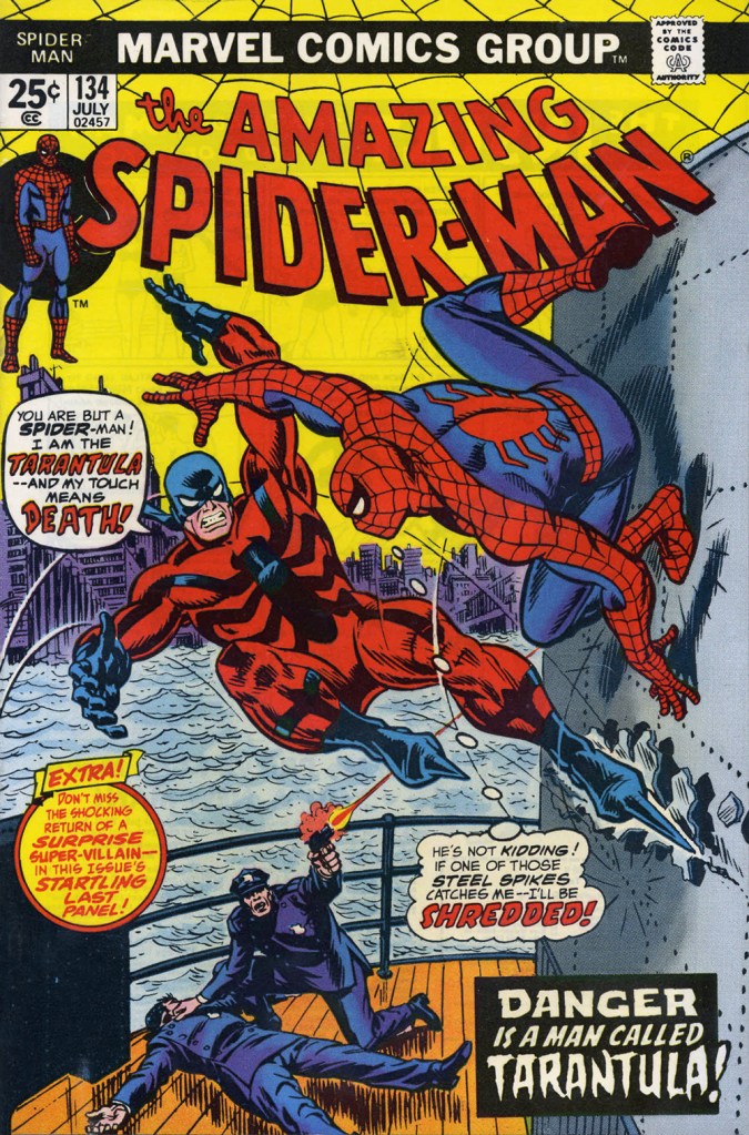
The costume of the Tarantula (a glorious Gerry Conway-Ross Andru creation!) is such an impractical conceit that they pretty much have to use him in the same position on every cover. The guy can barely walk in such, er — calzado, let alone fly at Spider-Man with such force. Just a lousy idea, on every level — tarantulas bite, they don’t sting, Gerry.
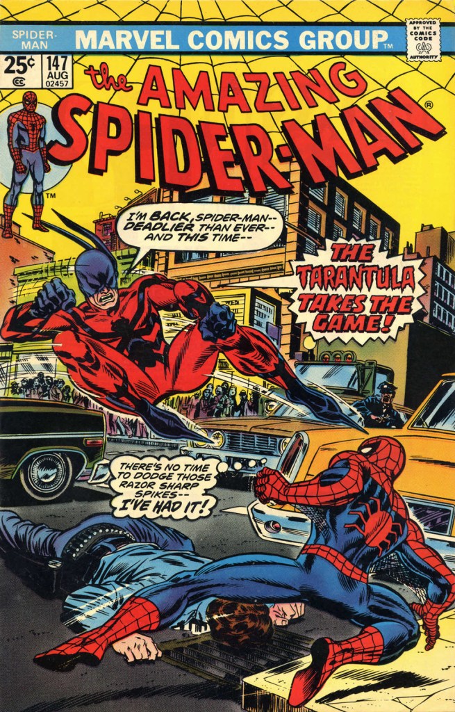
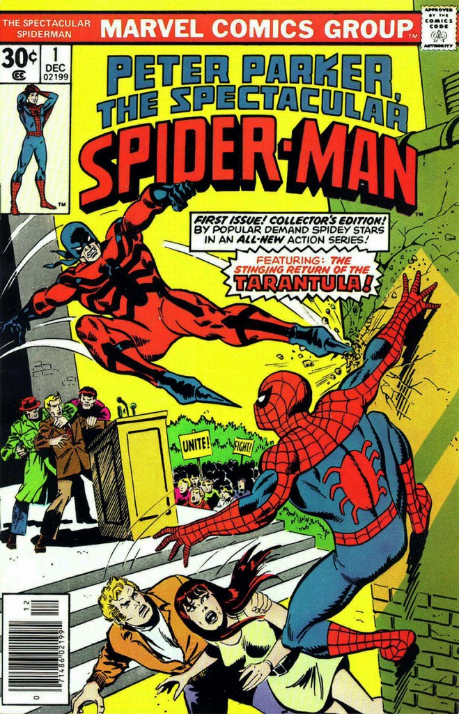
This is The Amazing Spider-Man no. 134 (July 1974, Marvel). Art by John Romita Sr. So… much… pointless…. exposition.They just had to bring him back! This time, Gil Kane and John Romita Jr. do the honours. This is The Amazing Spider-Man no. 147 (Aug. 1975, Marvel).No formula at work here, no sir. This is Peter Parker, the Spectacular Spider-Man no. 1 (Dec. 1976, Marvel). Cover by Sal Buscema. Tarantula creator Conway was the editor, which explains a lot — but hardly excuses it.
Poor Razor-Fist was created by writer Doug Moench and artist Paul Gulacy. How did he get dressed? How did he go to the bathroom? How did he feed himself? How did he get his head to bend that far back? (Perhaps he’s a Pez Dispenser).
This is The Hands of Shang-Chi, Master of Kung Fu no. 30 (July 1975, Marvel). Cover by Gil Kane and (most likely) Frank Giacoia. I guess all the male lions were taking a nap somewhere.
Should you hanker for more of these, er… dressing-downs, you might want to inspect our earlier instalment along these lines, « You’re going out wearing THAT? ».
« Bicycles are pieces of art. You get that combination of kinetic engineering, but then, besides the welds, the paint jobs, the kind of the sculpture of it all is quite beautiful. Bikes have such great lines, and all different styles. » — Robin Williams
I’ve been cycling a lot more of late. I’d been using my bike less frequently in recent years, unnerved by the increasingly frantic (and distracted, not a good combo) vehicular traffic of the city. But with my wife taking an interest in the activity, I found myself with a reason to get back in the saddle. This spring, we found a newly opened bike shop, earthy, grimy and unpretentious, where we got our bikes expertly tuned up.
I’ve always loathed those cliquish hipster joints that, in addition to selling overpriced junk, also seem responsible for the ubiquity of those middle-aged, over-equipped, spandex-clad Sunday cyclists, who feel it their sacred duty to pass you, whatever the pace, weather or road conditions, looking for all the world like overstuffed sausages in their lycra casings. The sporting analogue, if you will, of the rich kid who ‘needs’ the most expensive guitar in the shop… never mind that he can’t play a note.
You hopefully will indulge me in this little exercise in nostalgia. I miss the days when our bikes got us around, granted us greater autonomy and kept us in shape. This lifestyle took a backseat in the 1980s, when the BMX craze began to overstate the extreme and the competitive facets of the sport. Now, it’s all ultimate sport this and boot-camp fitness that. Ah, whatever happened to plain old utilitarian fun?
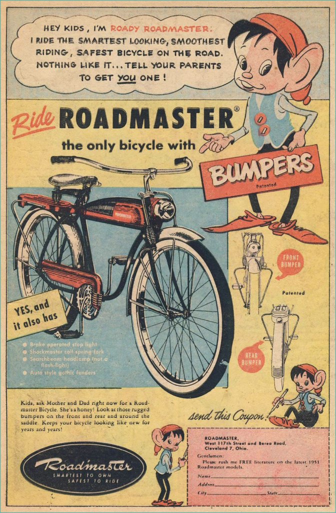
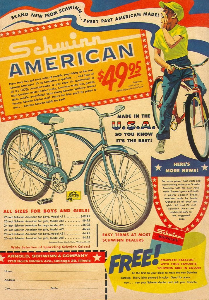
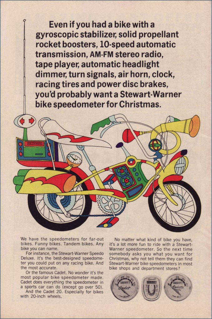
Judging from this ad (circa July, 1951), bicycle makers were trying to make their steeds mimic the clunky look of the era’s motorcycles. Aesthetics would soon improve. Here’s a fairly typical ad, circa 1961. Free catalogue, not to mention a healthy dollop of American jingoism, like it or lump it. Speaking of Schwinn, check out their well-produced promo comics Bicycle Book, from 1949.Ah, yes, the U.S. Royal twins, Roy and Al. In the tradition of the accidentally named Smith Brothers, “Trade” and “Mark”. Unsurprisingly, scouting magazine Boys’ Life was an ideal market for bike-themed ads. This one appeared in the May, 1966 issue. Artist unknown… anyone?You can tell how important the bicycle scene was: not only were manufacturers hawking bicycles, but there was also the ‘aftermarket’ trade of gizmos and doodads. I’ve long supposed ‘speedometer’ to be a dumbed-down term for a tachometer. Even after consulting this ‘helpful’ chart, I’m still not convinced it isn’t. To quote sometime Beach Boys lyricist, DJ and racing enthusiast Roger Christian: “Tach it up, tach it up / Buddy, gonna shut you down.“
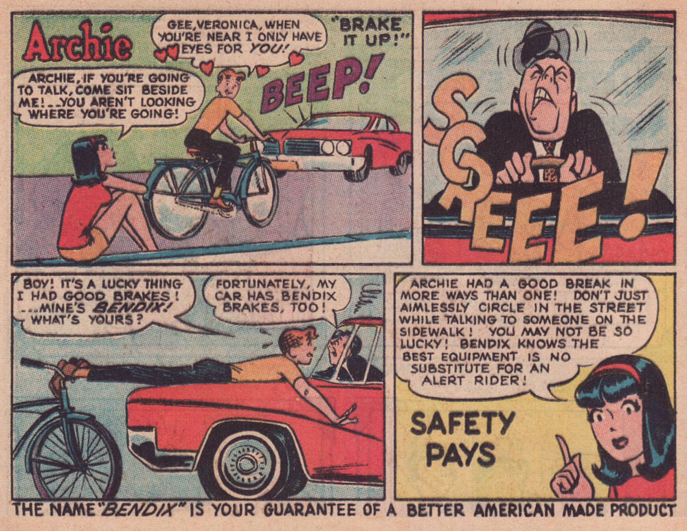
Through much of the 1960s, Bendix (the corporation, not Bill!) commissioned a long-running series of custom ads featuring the Riverdale Gang, illustrated by resident Archie artist Harry Lucey.
This one’s from April, 1965.Archie, the voice of reason? Only in ads and public service announcements. This one’s from October, 1966.This one’s from July, 1968.Ah, that’s more like the Archie Andrews we’re accustomed to. This one’s from August, 1968. I daresay we’ve all encountered too many such ‘cyclists’.An apt reminder that the rich kids always did boast the best, most up-to-date equipment, whatever the sport. Also, I can’t help but think that the cape and tiger tail are just kind of… reckless. Clearly, corporate shill Tigerboy is failing to heed the lessons of Isadora Duncan’s tragic death. Thanks to the ever-thrilling Jack Davis artwork, this is the unsurpassed classic among bicycle ads. It appeared in select DC and Archie titles cover-dated November, 1968. While banana seats may be considered in most quarters as retro kitsch, I earnestly hold that they were bold and cool. Aesthetic and structural experimentation had arrived at the forefront of the cycling industry. This ad appeared in comics cover-dated February, 1969. And here’s a look at a (flawlessly) surviving model. Man, the elegance of those lines!
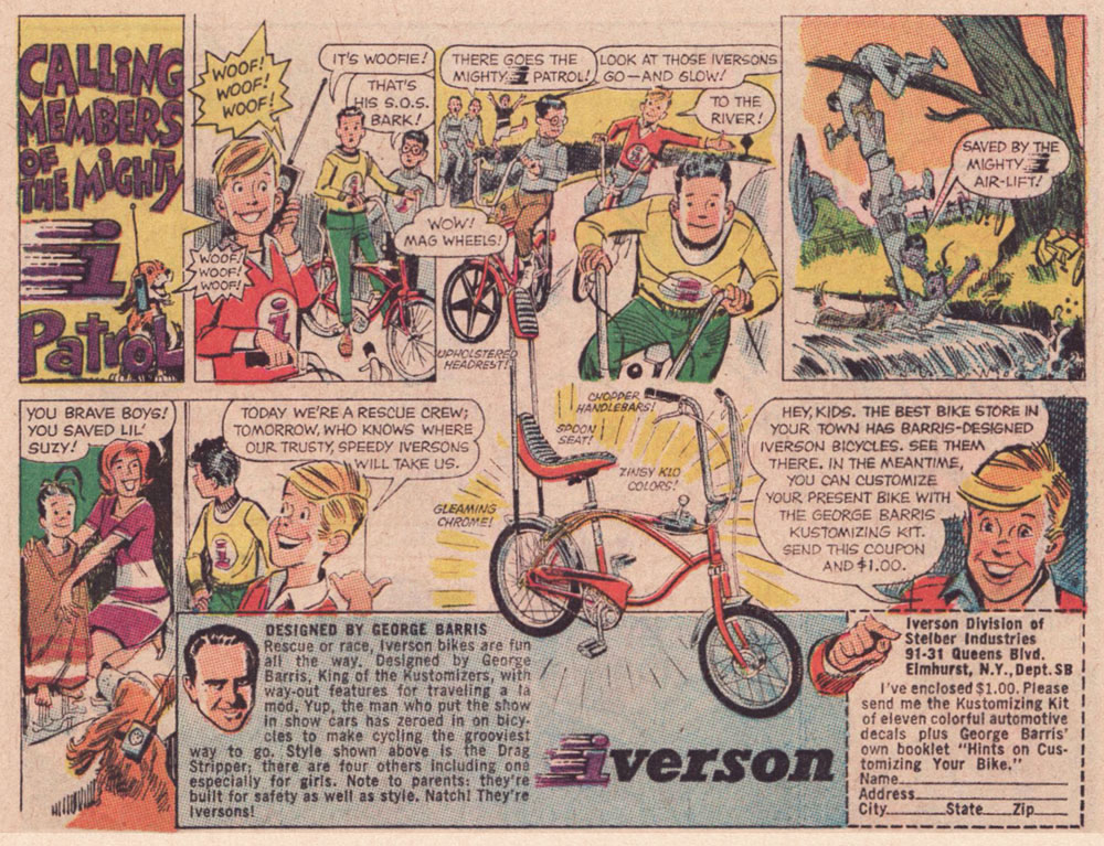
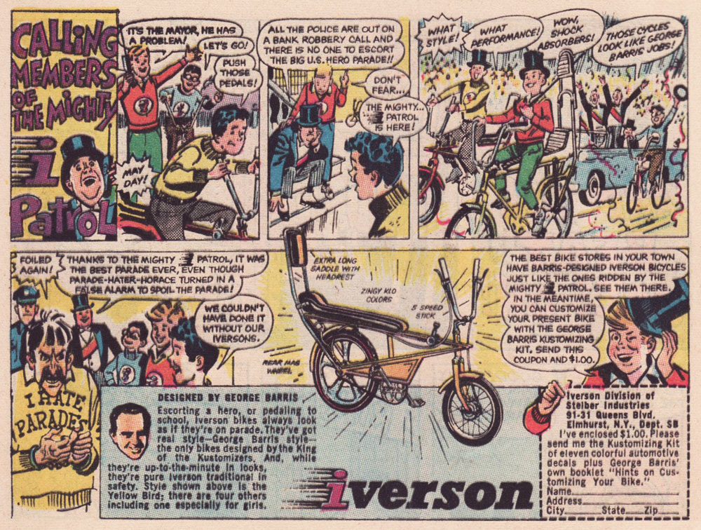
As the 1960s drew to a close, another series of custom comics ads appeared — just under the wire. They spotlight the creations of the famous ‘King of the Kustomizers’, George “Barris” Salapatas (1925-2015), very much in demand thanks to his recent triumph with the Batman tv show’s Batmobile.
This one appeared in various DC titles cover-dated November, 1969. If I had to take a stab at artistic attribution, I would go with the versatile Creig Flessel (1912-2008). Something tells me that in real life, the human chain stunt the Mighty i Patrol pulls would have led to four drowned kids instead of just one — but I’m sure Woofie would have dog-paddled his way to safety.This one appeared in DC titles cover-dated December, 1969. Read a gripping first-hand account of working on the assembly line at the Iverson bicycle factory, circa 1975!I’m assuming that the kid with the sombrero nicked it from Bazooka Joe’s kid brother Pesty. This final adventure saw print in DC titles cover-dated January, 1970.This, however, is the advert that really worked on me. When I got my first grown-up ten speed bike, a few years later, it was a Browning, which lasted me at least a quarter-century, until it snapped right at the load-bearing juncture of the rear fork… the one place where even welding wouldn’t help.
I switched to my backup, a hybrid bike I bought in 1987. It’s still running beautifully. In terms of value for money, a well-maintained bicycle is pretty unbeatable.
My well-thumbed copy of Adventure Cycling in Europe (1981). « Say, Uncle John, did Browning replace you with a pretty-boy model for your comic book ad? » « They sure did, but you know what’s even worse? » « I don’t know, Uncle John, what is? » « I don’t even have a nephew either! » All kidding aside, though it’s over forty years old, it’s still an insightful, entertaining and helpful book. When you go low-tech, change occurs at a slower, more forgiving pace.
I leave you with a song, whence comes the title of this article. It’s from a lesser-known but excellent Donovan album, Open Road, from 1970.
« To many people in the mid-19th century, Canuck was merely a casual synonym for French-Canadian — and like the nicknames for people of various other ethnicities or nationalities, it came with unpleasant overtones. The word is“used vulgarly and rather contemptuously” »
A friendly birthday how-do-you-do to mighty Manitoban George Freeman (born May 27, 1951 — that’s seventy-one years ago — in Selkirk, MB). Some of you will remember him for his Jack of Hearts mini-series at Marvel or his collaboration with Michael T. Gilbert on Elric for First; the more adventurous will recall his fine and, ahem, too-brief work on DC’s Wasteland.
By the 1990s, he was also affiliated with Winnipeg’s celebrated Digital Chameleon studio… but to me, he’s the guy who made Richard Comely and Ron Leishman’s Captain Canuck into a contender, as far as I’m concerned.
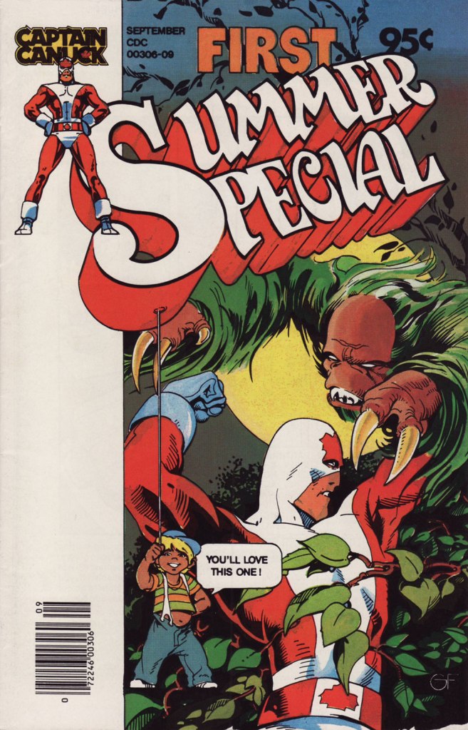
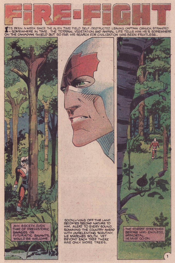
This is Captain Canuck no.7 (Dec. 1979-Jan. 1980, CKR Productions), featuring Ruse, story by Richard Comely, art by George Freeman. Cover by Freeman, with colours by Freeman or Jean-Claude St. Aubin.This was the Captain’s first (and sadly, only) Summer Special (July – Sept. 1980, CKR Productions); a winningly mixed bag, it *was* a lot of fun. Cover by Freeman.Among the goodies included in the Summer Special was a preview of the short-lived CK newspaper strip, which ran in three daily newspapers in Western Canada. It looked quite promising! Written and lettered by Comely, illustrated by Freeman and St. Aubin.This is Captain Canuck no.14 (Mar.-Apr. 1981, CKR Productions), the final issue — just when the series was going from strength to strength. Sigh.
To demonstrate, here’s the opening sequence from that issue. Freeman and St. Aubin were evidently pushing hard against the conventions and constraints of the era’s crappy printing standards.
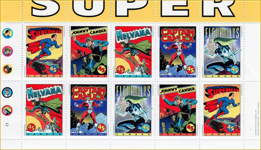
In 1995, the Captain even got his own stamp. Quoting the press release: « What do Superman, Nelvana of the Northern Lights, Johnny Canuck, Captain Canuck and Fleur de Lys have in common? For one thing, they’re all super heroes sprung from the wondrous pages of comic books; and for another, they’re all the marvelous creations of Canadian talent. On October 2, these five super heroes will find new adventure in a booklet of 10 stamps from Canada Post Corporation, to be issued in conjunction with Stamp Month 1995. A universal hero in concept, Captain Canuck is undeniably Canadian in nationality, costume and mannerisms. The concept can be traced to Ron Leishman and Richard Comely. Comely changed Leishman’s Captain Canada to Captain Canuck, and in 1974 established the only independent full-colour comic book in Canada. The cover price was 35¢ – 10¢ higher than other comic books at the time – but that didn’t stop Captain Canuck from outselling all American titles. Unfortunately, the series folded with issue No. 14, in March 1981. »
Part one of The Jack of Hearts’ limited series (Jan. 84, Marvel). The character was introduced in, of all places, an issue of The Deadly Hands of Kung Fu (no. 23, Apr. 1976, Marvel); The Jack shuffled around various Marvel titles for a time, culminating in this solo four-parter scripted by his co-creator, Bill Mantlo, and illustrated by Freeman. That costume must have been a bitch to draw.
Oddly enough, while Freeman was my favourite among the stable of artists chosen to illustrate John Ostrander and Del Close‘s scripts on Wasteland (Don Simpson and David Lloyd got the best), I feel he was assigned the least interesting ones to work on, with the exception of the excellent Del Close autobiographical two-parter, On the Road (issues 6 and 7). Beyond that, he drew one cover and split, unwittingly triggering the debacle that was the second half of the series’ run.
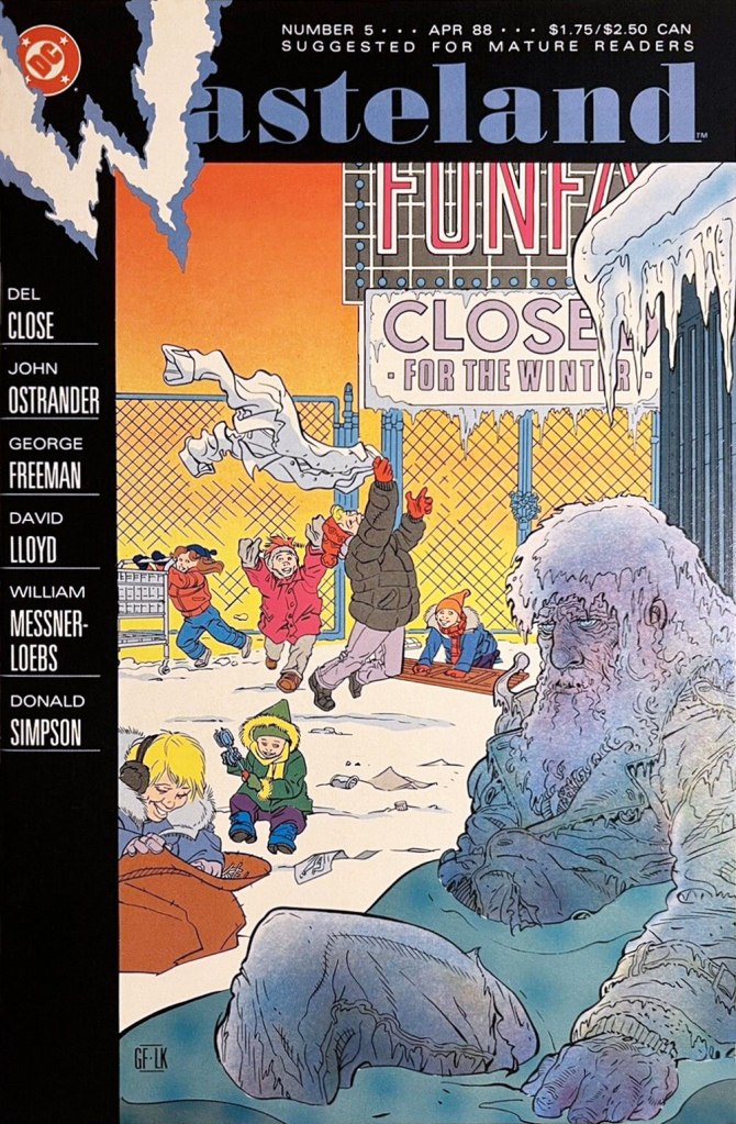
This is Wasteland no. 1 (Dec. 1987, DC). Pencils and inks by Freeman, colouring by his Digital Chameleon accomplice, Lovern Kindzierski.This is Wasteland no. 5 (Apr. 1988, DC). Pencils and inks by Freeman, colouring by Lovern Kindzierski. As denizens of Winnipeg, a notoriously cold city, the guys would know how to colour ice, all right. To quote another famous native son, Randy Bachman : “Portage and Main, Fifty below“.
On the subject of chameleons, it appears that the traditionally held ‘camouflage’ theory of their colour changes is simplistic and generally incorrect.
« I’ve always wanted to be a giant space crab. » — Gabe Newell
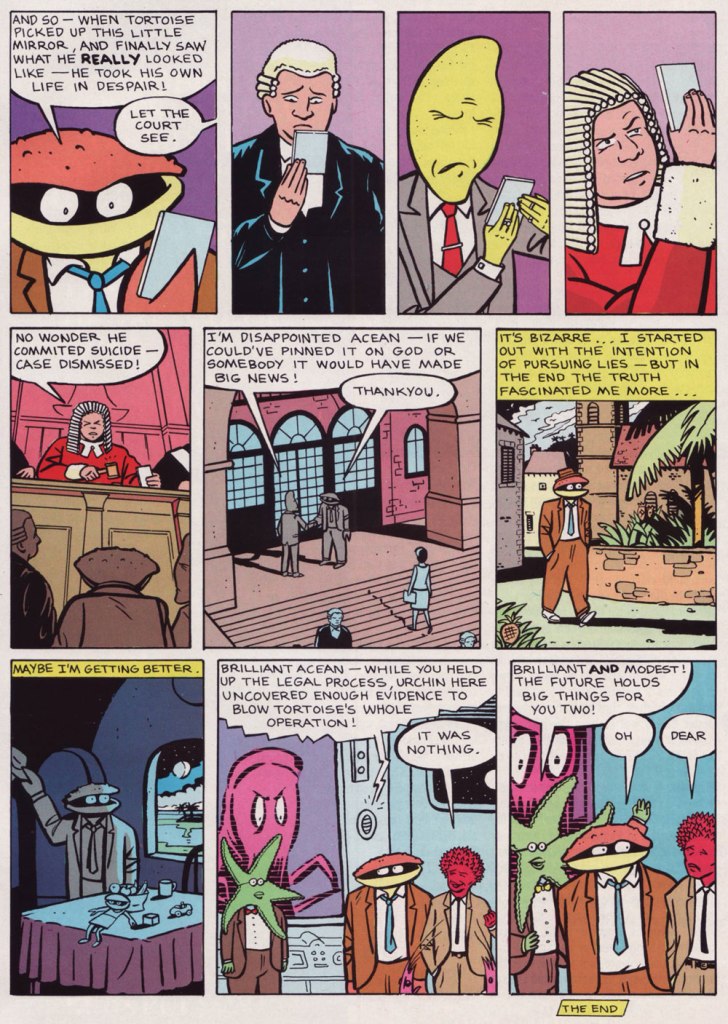
We have quite a treat for you this week. One of our very favourite creators, Mr. Glenn Dakin, has genially agreed to shed light on the inception of one of his lesser-known (but nonetheless striking) creations, Mr. Crusht Acean, aka ‘The Man From Cancer’. Take it away, Mr. Dakin!
Glenn Dakin:The phrase The Man From Cancer came to me when I was writing a song, referring to myself as a typical Cancerian.
It gave me the idea for a detective organisation where all its members were Cancerian. Of course it had thatMan From U.N.C.L.E.association. As I was discussing this idea with my brother down the pub, I said – as a joke – that in order to get a magazine interested in the idea the character would have to actually BE a crab. As soon as I said this, I knew it could work…
Phil was the obvious choice to draw it, as the superb consistency of his style and great visual imagination would make readers accept the bizarre idea as a reality. Also we worked a lot together.
When I told Phil about it, he said ‘how did you know I was Cancer?‘ (much to my surprise). So it was clearly in the stars!
Marvel UK were just launching STRIP, in which creators could keep the rights to their work, so it was a natural place to send. Dan Abnett was the editor and he really got what we were trying to do with the absurd humour. After the first two-parter, he offered us a regular one-page slot.
This is Strip no. 11 (July 7, 1990, Marvel UK). Cover by Phil Elliott.
Who’s Out There?: Judging from the supplementary materials (Strip no. 11), you seem to have quite fully worked out Mr. Crush Tacean’s universe. Did you have lofty plans for the series?
GD:Not so much lofty plans, but whenever Dan Abnett gave us a chance to expand it, we enjoyed enlarging the madness of the world. These supplementary materials were created for STRIP to remind readers of the story half way through, and get new readers on board, after we had been dropped for a couple of issues.
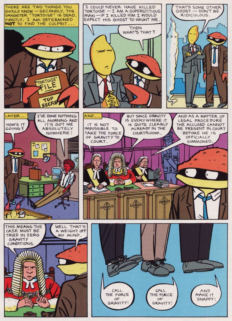
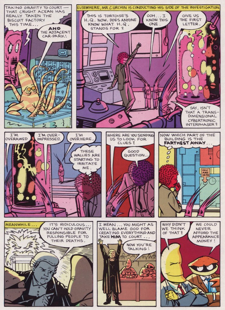
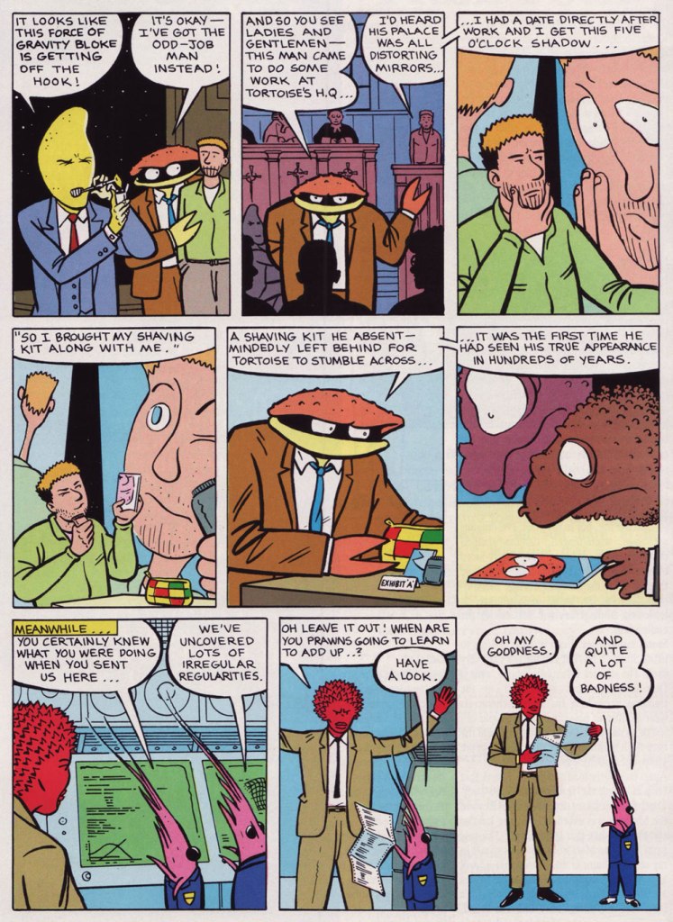
I remember that as my confidence on it grew, and we had the story where we took the force of gravity to court, I started to think of it as a kind of visual Goon Show, following its own absurd logic.
WOT?: Could you shed some light on the series’ publication history? Were the instalments that didn’t appear in ‘Strip’ published elsewhere before they were collected in ‘The Rockpool Files’? (by Slave Labor in Sept. 2009)
GD:You will have to ask Phil that, they might have appeared somewhere, but I don’t think so. We did have a two-pager in a Channel Tunnel magazine!
WOT?: What brought about the change of title? I was quite fond of ‘The Man From Cancer’, I must say.
GD:We were asked to change the name as ‘Cancer’ – we were told – was not exactly a fun buzzword.
« Sez who? »
I think that was the suggestion of Slave Labor, the publisher. The Rockpool Files was the first thing that came into my head, and Phil liked it. The Rockford Files had just been on TV, of course!
This is the book you have to get. While it’s rather… compact (14 x 21,5 cm), in glorious black and white, and out of print, it’s very nearly comprehensive… and most of all, it exists!
WOT?: What’s the story behind these huge gaps between appearances (issues 2 to 9, then 11 to 16)?
GD:As far as I remember, the second half of the Diukalakadu story appeared the next issue in STRIP [no.2 — RG]. Then Dan asked Phil and I to keep it going as a regular feature. We agreed, but as they were working many issues ahead, it took us a little while to launch the new stories.
The only problem was, as it was an anthology comic with multiple contributors, the page count was hard to level out every issue. As the only one-pager, Man From Cancer was the easiest to drop. I think getting asked to create the supplementary materials mentioned above, was a bit of an apology for us being so bumped around. Also the text story ‘Wallow’ in the Rockpool Files book, was originally created in 24 hours by special request of Dan, to solve a pagination crisis when a strip didn’t turn up in time. But then STRIP was canned before it could appear.
WOT?: You’ve collaborated quite a bit with other cartoonists. I presume that the division of labour varies from project to project. In this case, was there a clear line between the job titles? Did you serve strictly as the writer, or did you provide storyboards, layouts or conceptual sketches? And vice versa on Phil’s part?
GD:I never typed up a script for Phil, I just drew a rough of the strip. In this I visualised a lot of the characters, but it was up to Phil if he followed my suggestions. Sometimes he would create an amazing surprise like a giant octopus answering the phones at Cancer HQ. Phil didn’t write anything but he did loads of visual world-creation as we went along.
This tale, the second Man From Cancer investigation, appeared in Strip nos. 9-11, 16-19 (1990, Marvel UK). The lovely colours are by Steve White.
And since I hinted at the existence of ‘supplementary materials’, it would be callous of me to leave them unseen.
A bit of context from Mr. Dakin: « How nice to see this after all these years! I read it with great trepidation, wondering what on earth I had said… The upbeat piece on the left ‘I’m an optimum overview kind of guy…‘ was supposed to be by Mr C Urchin (Crusht’s cheerfully inept assistant), which is why it reads a bit odd, with Crusht at the top. I think the original plan got lost when it was given to the designer at Marvel UK. »
I hope you enjoyed our chat with Mr. Dakin, whom I cannot thank enough for his generosity and charming manner. In the event that your interest has been piqued, take a gander at our earlier post entitled Glenn Dakin’s Alter Ego, Abraham Rat.
« Juggler of eccentric ideas, more poetic than truly macabre, Desclozeaux is served by an admirable technique that aligns him with the clan of Folon and Flora, which is to say designers for whom white space holds as much– if not more — importance than the line, the arabesque or the scroll. » — Jacques Sternberg and Michel Caen (1968)
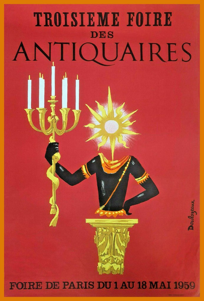
Since the world seems to be crashing down around our ears, I figure it would be reasonable to focus on an artist who’s well-adjusted, happy, prolific, casually brilliant and, to top it off, still alive at a ripe old age. Meet, then, if haven’t already, French national treasure Jean-Pierre Desclozeaux, who will, if I’m not jinxing it for him, turn 84 this coming 5th of June.
Jean-Pierre began his career as a watercolourist and poster designer, studying under the legendary Paul Colin.
A sample of his early poster work. In this case, the client was an antique dealers’ fair.
In 1965, he branched out into press illustration and cartoons. Here are a few early samples of this endeavour:
If Wikipedia will forgive me, I’ve cribbed and translated this bit for our English-only readers: « In 1968, he began his collaboration with Le Nouvel Observateur, where he published at least one drawing each week. From that point on, Desclozeaux devoted himself almost exclusively to the press and publishing areas : satirical drawings, book and magazine illustration, posters for exhibitions and shows, postcards, book jackets. »
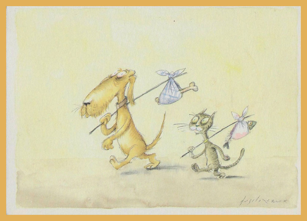
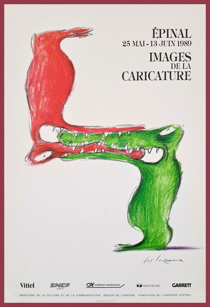
This one, from 1982, is entitled Songe d’une nuit d’été, which happens to be the standard translation of Shakespeare’s “A Midsummer Night’s Dream”… but with more bikes.A pair of watercolours from his book Entre chiens et chats (1983).He also created scores of theatre posters, such as this one for Paris’ Le Caveau de la République, circa 1986. The play’s title, which translates to “Hands off my vote”, was a riff on French anti-racism organisation SOS Racisme‘s slogan, namely Touche pas à mon pote (Hands off my pal).This caricature festival’s most appropriate host city has been renowned for its images d’Épinal (“Epinal Prints“) since the late 18th century.A piece entitled À la pointe du rat, a homophonic calembour on Pointe du raz, a spectacular promontory in France. “Raz” translates as “strait”.This piece appeared on the cover of Télérama (France’s TV Guide equivalent, but inevitably a bit smarter) for its Jan. 30, 1991 issue. The headline asks “Has Television Changed Our Unconscious?“
And here’s our cheeky bon vivant. Desclozeaux, whose beard was described by his friend Ronald Searle as “an enchanted space and a hideout for secrets and legends“.
A 2006 wine ad… as you can plainly see. This sort of irreverence seems largely lacking in North American advertising.
This post’s title hails from the term of endearment and respect bestowed upon Desclozeaux by no less a personage than his affichiste confrere, Raymond Savignac (1907-2002). This reference to wine-making presumably alludes to his long-standing graphic contributions to sundry gastronomic columns. In 2002, Albin Michel even issued a heady cuvée of his wine-imbibed cartoons, Cul-Sec!*
-RG
*approximately meaning ‘bottoms up!‘ or ‘down the hatch!’ — here are some hilarious mispronunciations of ‘faire cul sec’.
« Even as a youngster reading 2000 AD from its first issue in 1977, it was clear that Brian’s artwork was special. It was the perfect mixture of American-inspired dynamism, a British sense of the absurd, and avant-garde European SF imagery, rendered in meticulous, almost inhumanly perfect linework. It was a deeply seductive style… » — David Roach
As far as I can tell, everyone loves Brian Bolland‘s (b. 1951) work. It’s sophisticated in design yet direct, highly detailed yet clean as a whistle *and* neat as a pin, technically adept, varied but unfailingly his. As a sequential cartoonist, he can be a bit stiff, but as a cover artist, he’s pretty untouchable. For about a second and a half, I was tempted to spotlight his work in our Hot Streak! category, but that would have been absurd, such is Bolland’s high level of consistency and volume of work. So I’ll “merely” feature an even dozen of his Animal Man covers (out of a total of 64, 1988-1993).
After Alan Moore made an unexpected splash with his work on Swamp Thing, the folks at DC scrambled, in ‘have you got a sister?‘ fashion, to strip-mine the UK’s writerly talent pool. In came Grant Morrison, Neil Gaiman, Pete Milligan, Jamie Delano, Garth Ennis, Warren Ellis, and so on…
For the cockiest of these writers, the typical bravura move was to prove their commercial acumen by revamping the most obscure existing character they could think of* (typically, characters DC’s then-editors had never heard of); in Gaiman’s case, it was Sheldon Mayer’s Black Orchid**, and in Morrison’s, Animal Man. As minor characters (a lesson learned from Alan Moore’s Watchmen), these heroes could be subjected to numberless and unceasing torments and humiliations at the writer’s whim.
Created by writer Dave Wood and illustrator Carmine Infantino, Animal Man was introduced, sans costume at first, presumably as he was intended as a one-off, in DC’s long-running SF anthology Strange Adventures no. 180 (Sept. 1965). First known as A-Man, he gained his superhero togs in his third appearance, Strange Adventures no. 190 (July 1966). After a mere five appearances in SA, he virtually vanished… until the second ‘British Invasion‘.
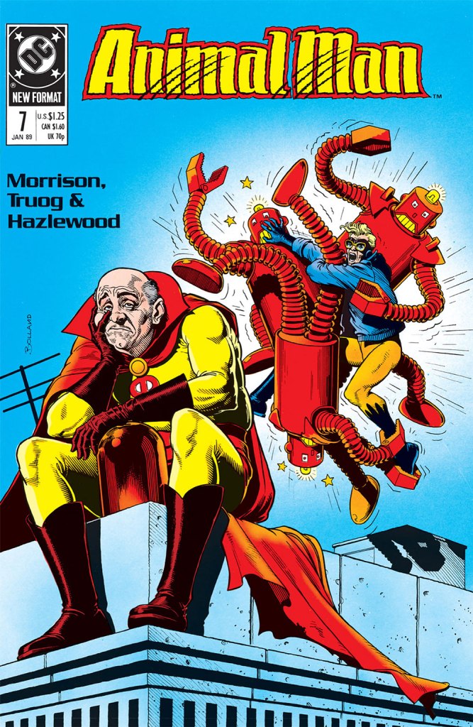
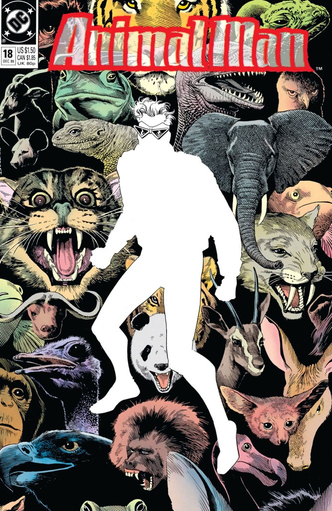
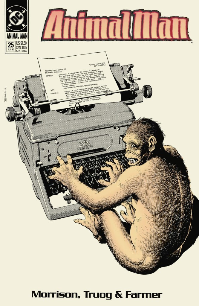
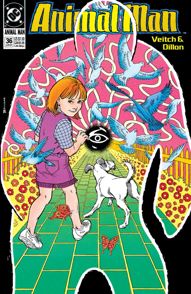
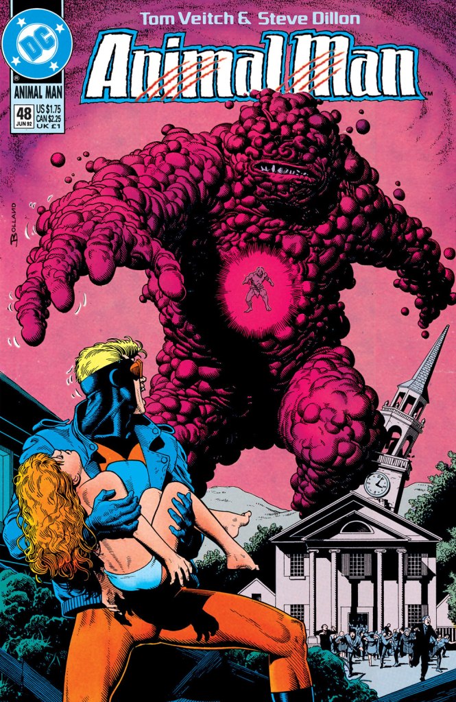
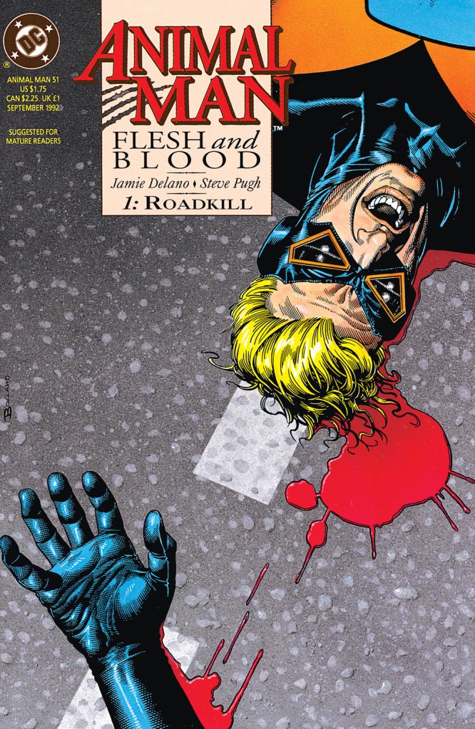
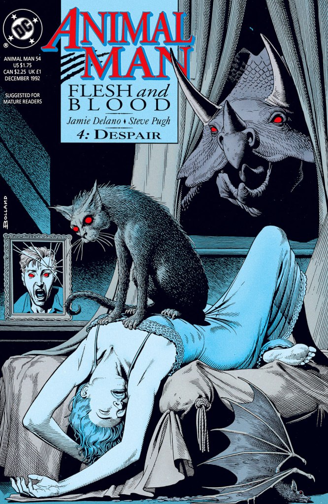
This is Animal Man no. 5 (Winter 1988, DC); logo by Todd Klein. In this celebrated issue, Grant Morrison mashes up the Bernie Krigstein segments of Harvey Kurtzman‘s Bringing Back Father! (Mad no. 17, Nov. 1954, EC) and Alan Moore and Don Simpson‘s In Pictopia! (Anything Goes! no. 6, Dec. 1986, Fantagraphics) then anoints the ointment onto a Wile E. Coyote/Jesus avatar. This is Animal Man no. 7 (Jan. 1989, DC). Bolland’s tonal versatility is a tremendous boon, his superpower, if you will. He brings to this cover a deft comic touch intended, but sadly lacking from the inside story. This is Animal Man no. 18 (Dec. 1989, DC), a clever reverse-emphasis homage to one of the great covers of the 1960s, Carmine Infantino (designer) and Neal Adams (penciller-inker)’s Strange Adventures no. 207 (Dec. 1967, DC), winner of the 1967 Alley Award for best cover of the year. This is Animal Man no. 24 (June 1990, DC). Bolland has a ball redrawing classic Silver Age covers… including issues of Brother Power the Geek, The Inferior Five and Swing With Scooter! The central figure is an old Justice Society foe, the Psycho-Pirate (Mark II in this case), created in 1965 by Gardner Fox and Murphy Anderson. The GCD notes: « Cover prominently features several of the key comics that established the concept of the multiverse (The Flash no. 123, Green Lantern no. 40, Justice League of America no. 21). » Oh, you thought *Marvel* had come up with the ‘Multiverse‘? It’s high time you met Hugh Everett. And while we’re on the subject, here’s a touching song his son wrote about him.This is Animal Man no. 25 (July 1990, DC), a sharp illustration of that old favourite, the Infinite monkey theorem. First writer switch! Morrison out, Milligan in. This is Animal Man no. 28 (Oct. 1990, DC). Back to front: the Notional Man (with the forceps), the Front Page, Animal Man, and Nowhere Man (as in…)A bold change of pace, this is Animal Man no. 36 (June 1991, DC). Milligan out, Veitch in. This is Animal Man no. 41 (Nov. 1991, DC). This is Animal Man no. 48 (June 1992, DC). At the centre of the gloopy pink monster hovers snappy dresser and fellow animal-powered justicer B’wana Beast. This is Animal Man no. 49 (July 1992, DC).Veitch out, Delano in, and a layout change to boot. This is Animal Man no. 51 (Sept. 1992, DC). By now, it’s pretty much a straight horror title.This is Animal Man no. 54 (Dec. 1992, DC), a striking homage to Henry Fuseli‘s immortal painting, The Nightmare.
-RG
*To be fair, their first eighty-five choices likely had proved unavailable.
**Mayer had asked that his 1970s creation, The Black Orchid, never be given an origin or have her mystery dispelled. Gaiman just aped what Mr. Moore had done (but brilliantly) with Swamp Thing… and made her a literal plant. Bah.
« RAREBIT n. A Welsh rabbit, in the speech of the humorless, who point out that it is not a rabbit. To whom it may be solemnly explained that the comestible known as toad-in-a-hole is really not a toad, and that ris-de-veau à la financière is not the smile of a calf prepared after the recipe of a she banker. » — Ambrose Bierce, The Devil’s Dictionary
It’s dicey to make a broad generalization about what people have heard of and what they haven’t, so I’ll just say that, for a comic strip more than a century old, likely Canadian Winsor McCay‘s Little Nemo in Slumberland is rather well remembered (and represented) in the greater culture.
The strip has inspired numberless adaptations and the cultural landscape is quite peppered with Nemo references, both overt and veiled.
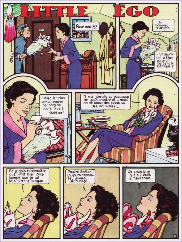
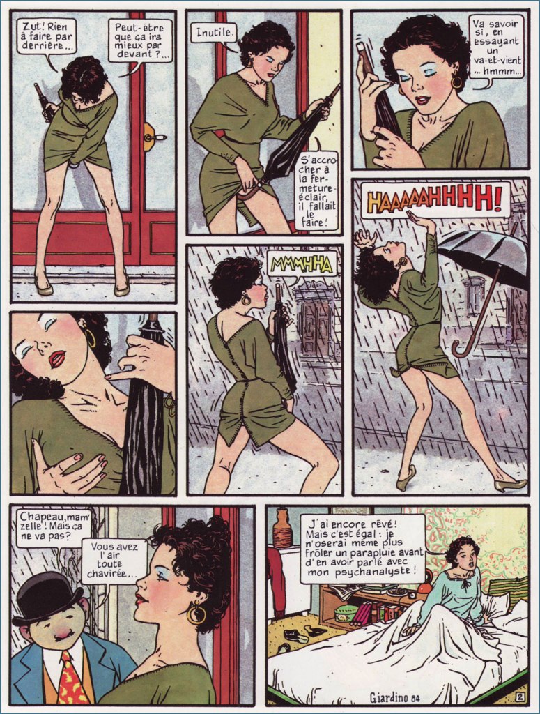
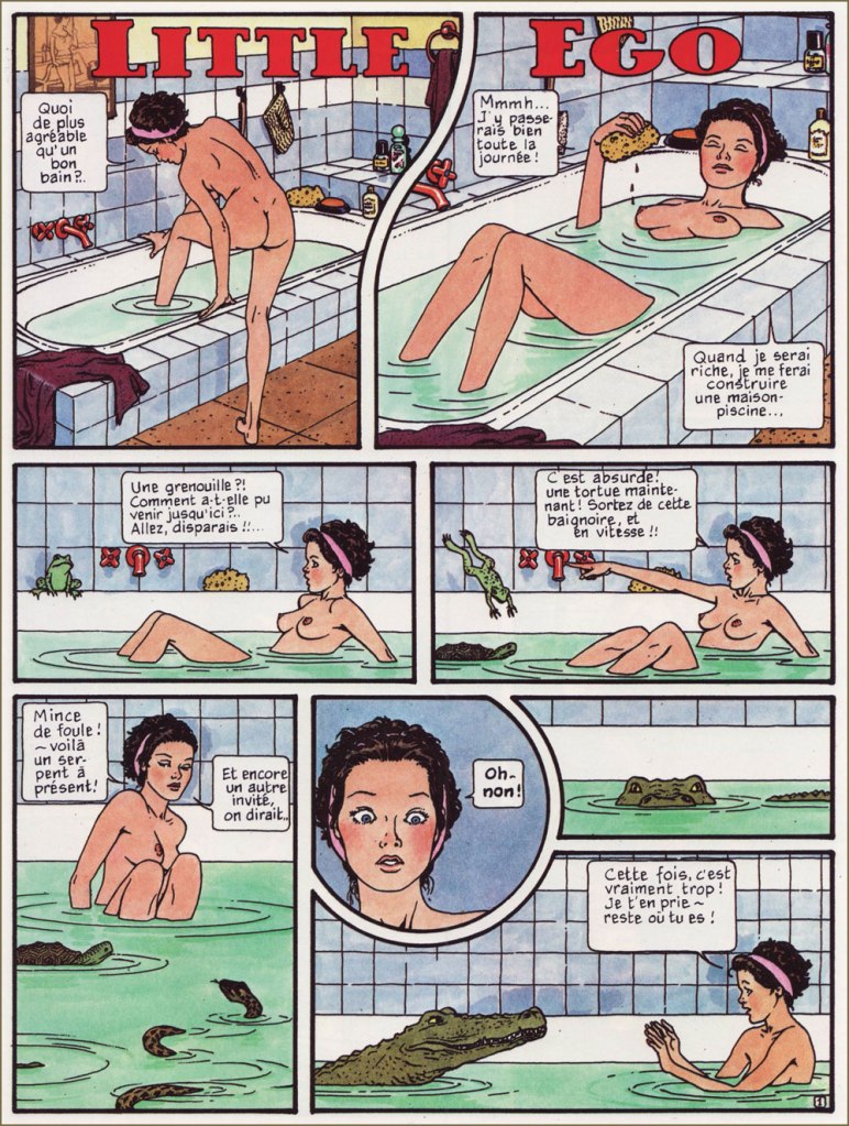
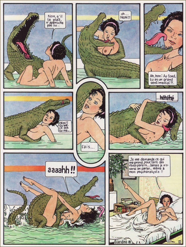
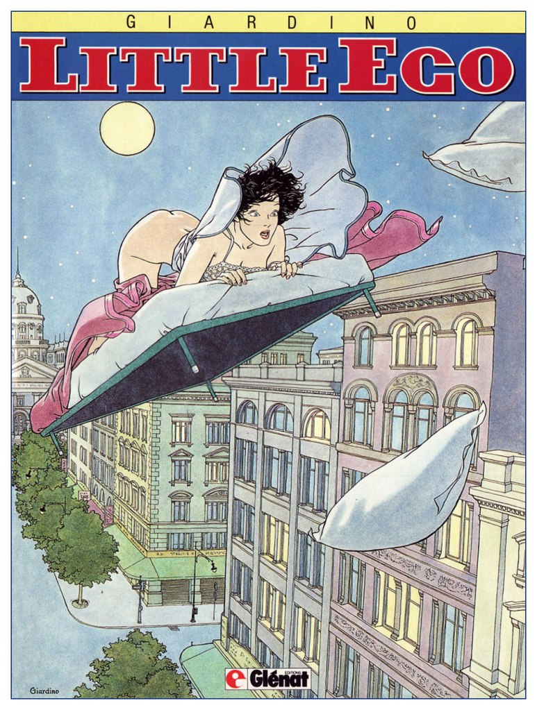
In the early 1980s, Italian cartoonist Vittorio Giardino (1946–) created a series of short pieces (first published in issues of Comic Art and Glamour International), intended as an erotic pastiche of McCay’s brainchild.
Here are the Little Ego pieces I value most.
I must admit I only enjoy the earlier, less grandiose ones, in no small part because they’re scarcely Nemo-like. Instead, they’re patterned after an earlier McCay creation, and my personal favourite, Dreams of the Rarebit Fiend (1904-25), which I’ve long treasured in its beloved and exemplary Dover collection.
« I wonder what’s come over me to have such dreams… I’ll never be able to speak of them… even to my shrink!! »Here’s the cover art of the original French collected edition (1989, Glénat).
To quote the late cartoonist and local favourite Richard Thompson:
« There are strips that are classics that I respond to on many levels without loving them (Little Nemo is one). I can enjoy such strips without really learning too much from them. »
I share Mr. Thompson’s ambivalent sentiment about Nemo. It’s an indisputable masterwork, mind-bogglingly accomplished, and best enjoyed in its original size.
See what I mean? An original-size Little Nemo showcase cleverly included in Graphis Magazine‘s Comics: The Art of the Comic Strip (1972, The Graphis Press, Zurich).
But its epic scale and themes fail to move me. I far prefer the quotidian-turning-absurd magic of the Rarebit Fiend.
At length, feeling perhaps constrained by the two-page format, Giardino moved on to a longer, sustained narrative full of aerial derring-do, treacherous desert vistas, opulent palaces, and lots and lots of rapes (a fumetti standard).Not my thing, thanks all the same.
I drew from the French edition of the strip since it’s the one I own, but also for its superior reproduction and as the English translation is rather flat and witless in comparison. [ see for yourself! ]
Here’s a tasty pair of sample Rarebit Fiend strips.
… and we return to Richard Thompson, who introduced his own ‘strip within a strip’ parody with Little Neuro within his Cul de sac (2004-2012).
Cul de sac’s March 26, 2008 daily, wherein Little Neuro is first touched upon. « Little Neuro is a parody/homage to the great fantasy strip Little Nemo in Slumberland. I thought up Little Neuro in the early ’80s, but I had to invent Petey before I knew what to do with it. »Cul de sac’s Sunday, September 6, 2009 strip. Thompson: « Obviously an excuse to draw a dragon. I don’t get many. »
« Trees cause more pollution than automobiles. » — Ronald Reagan
After some of the time-consuming epics we’ve been running lately, I’d been looking for a short piece to help me catch my breath; as it happens, I’d been saving a special piece for this day and occasion.
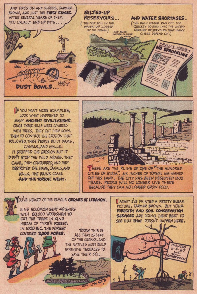
I’ve always much admired any well-done bit of scientific popularization, and given people’s abysmal ignorance, and even worse, their utter lack of curiosity on the subject of trees (among others!), this one stands out as increasingly timely and poignant. Just yesterday, I stumbled upon an alarming article from Smithsonian Magazine pointing out that the hard lessons of the Dust Bowl were either not learned or simply forgotten. So it goes…
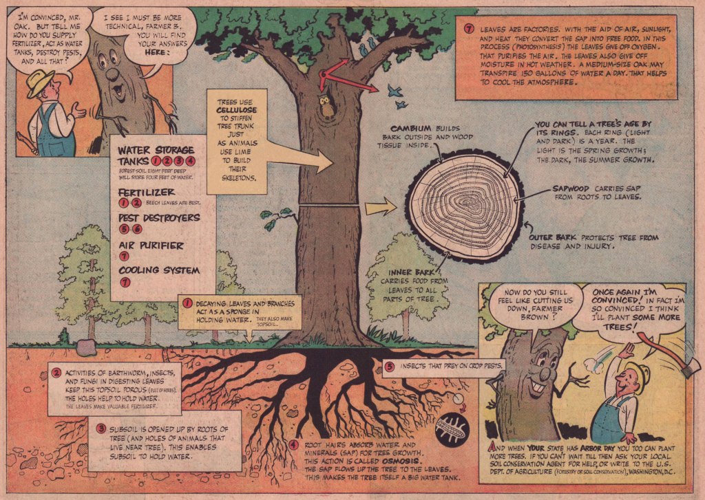
The strip was reprinted in TCOFAF vol. 23 no. 6 (Nov. 16, 1967) with improved colouring, so it’s the version you see here.
The title of this post quotes (with a slight spelling change) a once-famous poem by George Pope Morris (1802-1864), which goes:
Woodman, spare that tree! Touch not a single bough! In youth it sheltered me, And I’ll protect it now. ‘twas my forefather’s hand That placed it near his cot; There, woodman, let it stand, Thy axe shall harm it not!
That old familiar tree, Whose glory and renown Are spread o’er land and sea, And wouldst thou hew it down? Woodman, forbear thy stroke! Cut not its earthbound ties; 0 spare that aged oak, Now towering to the skies!
When but an idle boy I sought its grateful shade; In all their gushing joy Here too my sisters played. My mother kissed me here; My father pressed my hand. . . But let that old oak stand!
My heartstrings round thee cling Close as thy bark, old friend; Here shall the wild bird sing, And still thy branches bend. Old tree! the storm still brave; And, woodman, leave the spot . . . While I’ve a hand to save, Thy axe shall harm it not.
« Now why should I spare that tree, Kotter? What’s in it for me? »


