Manny Stallman’s The Raven and Mayven (the Poet)

« There’s no need for some of the language that’s been thrown at some of the artists and writers. These men are highly skilled craftsmen and deserve a lot of respect. » — editorial comment in T.H.U.N.D.E.R. Agents no. 14 (July, 1967, Tower)

This post has been inspired by sundry signs and omens I’ve encountered these past few days: first, a casual mention dropped by Bizarro ink stud Wayno on his blog; then a fond-but-hazy recollection by a graphic designer colleague… and so this week, the agents of T.H.U.N.D.E.R.* make the scene. Well, one of them does.

As with many other choice cultural items of the era, I was first tantalised by a little volume entitled Dynamo, Man of High Camp from the back pages of Famous Monsters of Filmland, devoted to its in-house Captain Company catalogue: Warren magazine back issues, rubber masks and hands, posters, LPs, Super 8 reels, paperbacks, novelties… a veritable trove of wonders. And unlike many a mail-order house, these goodies were the real deal, solid classics avidly sought after and treasured to this day.

Since much has been written about the history of Tower Comics (1965-1969), I’ll skip that part. Here’s the gist of it.

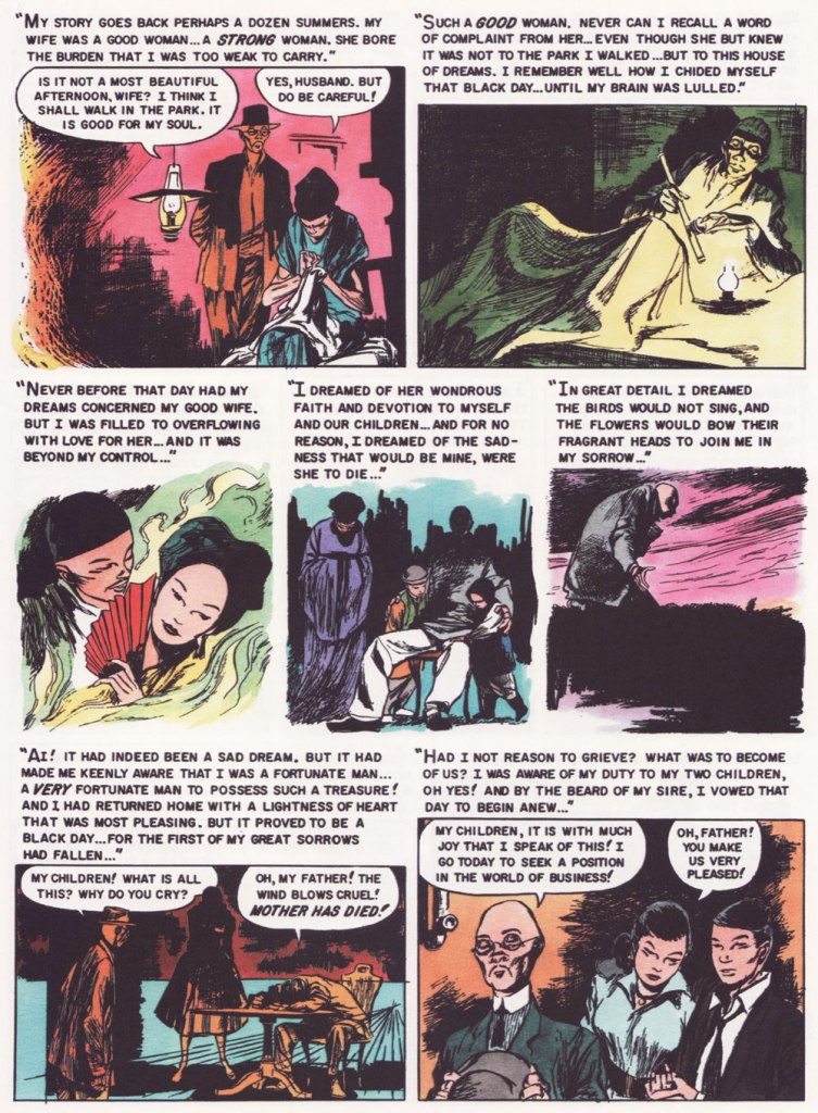
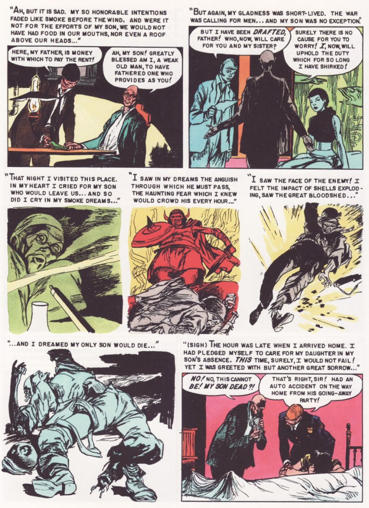
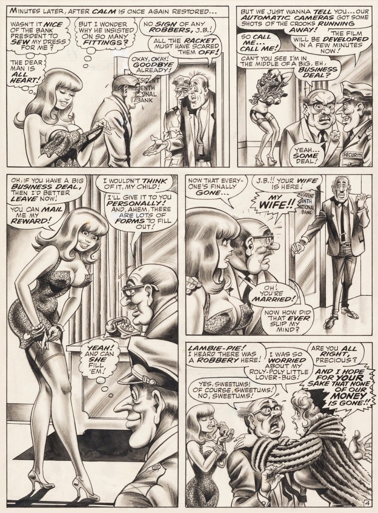
Of course, I adore the Wally Wood material, all the more the unfailingly delicious Steve Ditko-Wood combo. A fine surprise was George Tuska‘s nimble comedic touch on the misadventures of ‘Weed’. But my very favourite flavour in the T.H.U.N.D.E.R. cocktail is ‘Raven’ as written and illustrated by Manny Stallman (1927-97), a quintessentially eccentric delight.

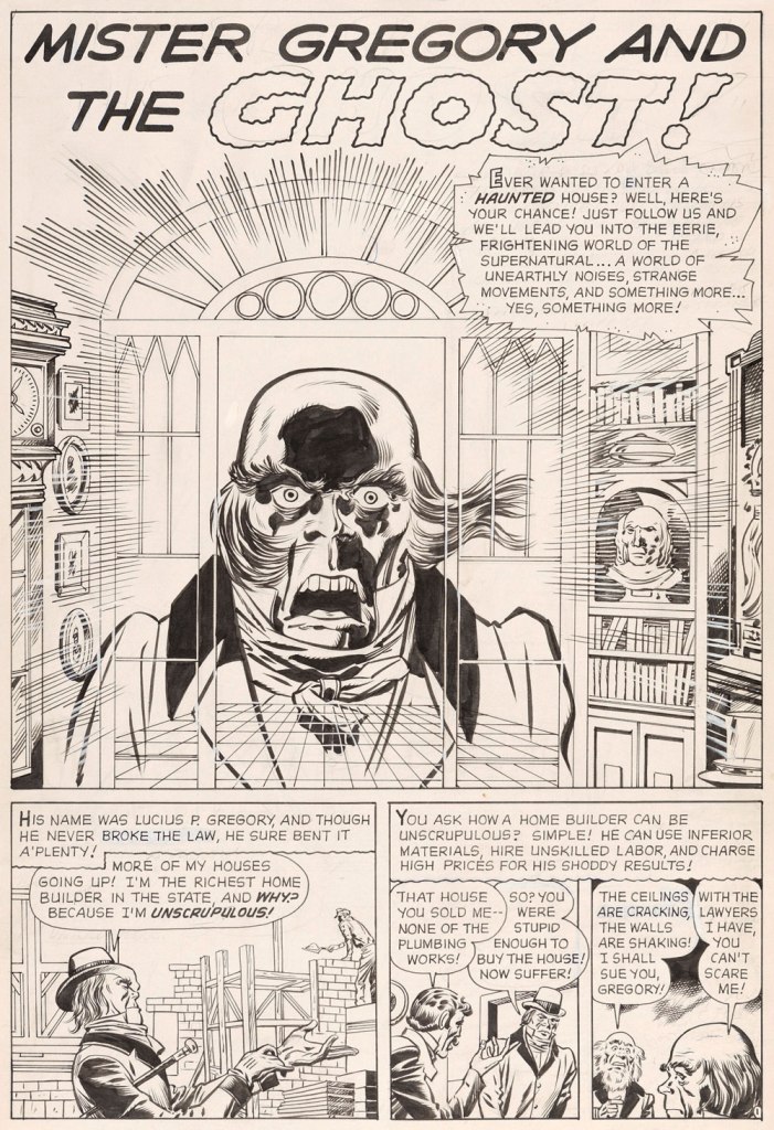
Introduced by Steve Skeates and George Tuska in Enter the Raven (T.H.U.N.D.E.R. Agents no. 8, Sept. 1966), the character’s sole point of interest was that he was a mercenary who, originally intending to betray T.H.U.N.D.E.R., had a change of heart.

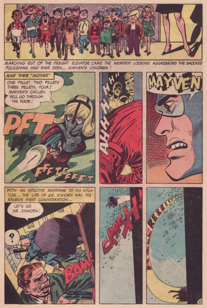
Along came Manny. He took over the character, redesigned him from stem to stern, and gave him a memorable arch-nemesis in Mayven, the Poet. But enough of this prattle, let’s have a look!

This is page two of Raven Battles Mayven the Poet (T.H.U.N.D.E.R. Agents no. 9, Oct. 1966, edited by Samm Schwartz), spotlighting Mayven’s signature weapon: explosive tots.
Stallman had no trouble with action: another page from Raven Battles Mayven the Poet.
Mayven, captured in the previous episode, wastes no time in making good — and memorable — her escape from the clink; the opening pages from Mayven Returns (T.H.U.N.D.E.R. Agents no. 10, Nov. 1966).
Bold, dynamic, sloppy in all the right places and the right ways. And I *love* that Raven makes an ungodly racket when he flies, itself a great source of visual interest.
A three-page sequence from the following episode, The Case of Jacob Einhorn (T.H.U.N.D.E.R. Agents no. 11, Mar. 1967), wherein ice-cold Mayven takes on the assignment to eliminate Mr. Einhorn, a fictive stand-in for legendary ‘Nazi hunter’ Simon Wiesenthal (1908-2005). I wouldn’t want to give too much away… read the whole shebang here!

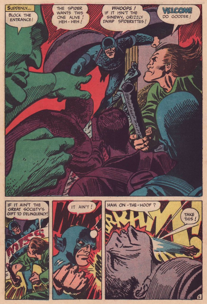
After a mere five Raven episodes, Stallman was gone. Judging from the letters columns, reader reaction had overwhelming been of this nature:

In issue #9 the art on the Raven was awful

You’re using a lot of grade D artists… as for whoever draws the Raven, his art is utterly atrocious.”

How about having Chic Stone draw Raven in addition to Lightning?

Here I’ll quote editor-historian Tom Brevoort, from his own appreciation of Stallman’s Raven:

« Unsurprisingly, many of the fans of the era hated Stallman’s work and mocked it openly in their letters and in fanzines. Comic book fans have often had very narrow boundaries for what they consider an appropriate style for a super hero strip. And Stallman was coloring way outside of those lines with his work. »

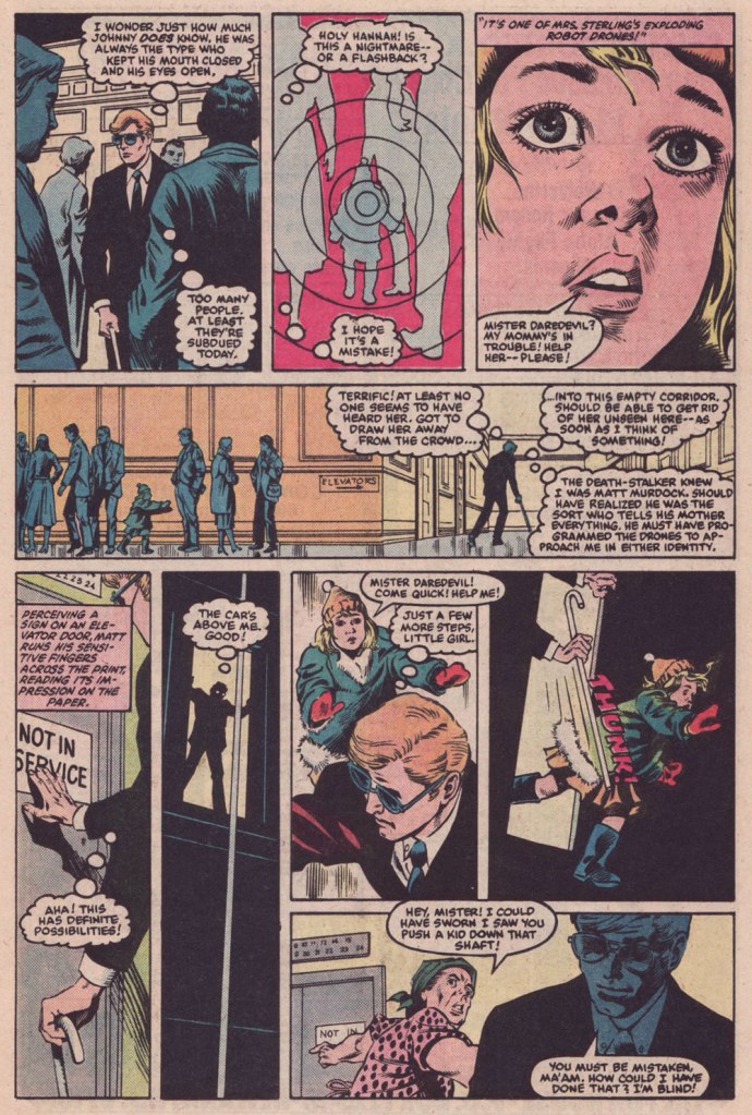
After an issue’s hiatus, the Raven returned, once more reimagined (minus the imagination) this time by Gil Kane. Just another run-of-the-mill flying dude. I’ve always held that Kane should never be allowed to ink himself, but he also makes an excellent case, in his sole Raven outing (and Raven’s final flight), that he shouldn’t be allowed to write, either. Here’s a sample:

The ending (sorry!) from Darkly Sees the Prophet (T.H.U.N.D.E.R. Agents no. 14, July 1967), story and art by Gil Kane. To be fair to Kane, he and Manny were close friends. Here are some of Gil’s recollections, as shared by Mark Evanier.

Ahem. All these walking child-shaped time bombs reminded me of a rather fine comic book from a couple of decades later.

This is Daredevil no. 209 (Aug. 1984, Marvel), cover by David Mazzucchelli.
This issue is a thrillingly relentless continuation of a thrillingly relentless (but in a different way) Winchester-mystery-house-of-murder tale, The Deadliest Night of My Life!, co-scripted by Harlan Ellison and his pal Arthur Byron Cover. Here, Byron Cover carries the ball, and offers us this darkly delicious sequence. Pencils by Mazzucchelli, inks by Danny Bulanadi.

It could all be coincidence, but I like to imagine that the exploding kids idea is a sharp hybrid of notions from two Mario Bava flicks from 1966: the murderous little girl from Operazione paura aka Kill, Baby… Kill, and the booby-trap beauties from Le spie vengono dal semifreddo aka Dr. Goldfoot and the Girl Bombs.

In closing, I’m happy to report that Mr. Stallman landed on his feet after his fall from the Tower. Honestly, the comics industry, and its fans, didn’t deserve the likes of him. He would go on to recount the Adventures of the Big Boy (published by the Bob’s Big Boy chain of restaurants) for a whopping seventeen years, among other fine assignments. And if ever there was a mensch, he surely was the one. Here’s a telling passage from his obituary:

« When a 1991 stroke caused cartoonist Manny Stallman’s right hand to intermittently go numb, he didn’t let it stop him. He simply took it upon himself to learn to draw with his left hand.

After making that switch, he had trouble drawing the tightly controlled figures he had created for years as a leading artist in what has been called the Golden Age of Comics. So he took advantage of the larger figures he could draw, transposing them onto a blackboard to help teach English and citizenship classes to Russian immigrants at the Albert L. Schultz Jewish Community Center in Palo Alto.

Despite additional health problems that included diabetes and congestive heart failure, he also led classes for Chinese immigrants and taught computer-aided drawing to disabled children. “Manny decided to stop focusing on what he had been able to do before his strokes,” says his wife, Jane Stallman.

“He decided to start ‘where I am‘ and do whatever he could with whatever capacity he had. His life goal was to make someone smile each day.” »

[ source ]

Thanks for the example and the inspiration, Mr. Stallman!

-RG

*an acronym for The Higher United Nations Defense Enforcement Reserves

Gérald Forton, Tall in the Saddle All the Way!

« Horse sense is the instinct that keeps horses from betting on men. » — Josephine Tey

While ‘academic’ realism has never been my thing in comics, I’ve always had a soft spot for Gérald Forton (Apr. 10, 1931 – Dec. 18 2021), who left us late last year, and who would be turning 91 today. He’s certainly my favourite Bob Morane artist (1962-67), but that’s not saying much, and besides, not his best work.

And just what is his best work? Ah, that’s easy: Teddy Ted. Just like his forebears, including his grandfather, the legendary Louis Forton (1879-1934), creator of Les Pieds Nickelés and Bibi Fricotin, grew up with an undying passion for horses. The Forton clan bred, raised, sold and raced horses, so it wasn’t a mere case of the banal and stereotypical European passion for the American ‘Far West’ and its Cowboys and Indians.

In 1964, Forton and ace scripter Roger Lécureux (Les pionniers de l’Espérance, Rahan) picked up the reins of a series launched by Jacques Kamb and Francisco Hidalgo and abandoned after three episodes. The new team revamped Teddy Ted, turning the protagonist from a boy to a man and instilling Lécureux’s humanist worldview* into the proceedings.

Teddy Ted and Forton reached their peak soon after the artist left Belgium, and the Bob Morane series, to raise horses in the South of France, a direct source of inspiration and documentation!

Without further ado, here’s my pick: Tim le lâche, from Pif Gadget no. 42 (Dec. 1969, Vaillant). It’s the tale of a craven back-shooting sneak against whom no-one has been able to garner any evidence, given the lack of survivors or witnesses. Given that Teddy’s close friend Pecos has been ambushed and taken out of commission by Craven Tim Galaways, Teddy and the town drunk (also its doctor!) set a dangerous trap with Teddy as bait and human target.

I’ve long had an aversion to ‘realistic’ European westerns, and that’s largely because of the absurd density of useless detail, the pages so busy and darkly-coloured as to buckle and collapse under the weight of the ink. Forton, by contrast, aside from being a master at spotting blacks, is just as bold in leaving white space where it’s needed, where the reader’s eye needs it. And here, unlike a lot of the technically-challenging genre strips (by which I mean, for instance, aviation, war or car racing, where one all-too-often encounters perfectly depicted machinery and stiff, generic human figures), Forton lavishes attention and care to every single thing, so we don’t wind up with beautiful horses and cardboard everything else. Which brings me around again to my point of Forton’s exceptionalism among the ‘realists’: the verisimilitude of his art is the result of observation, not soulless photo documentation.

After Teddy Ted was dropped from Pif Gadget, circa 1975, by its less-enlightened new management, Forton was picked to illustrate an adaptation of TV’s The Wild, Wild West (“Les mystères de l’Ouest”), which ironically made for the most realistic version of that colourful, but painfully stagey show, thanks to Forton’s excellence at capturing likenesses and conveying wide open spaces and details of period and setting.

By the early 1980s, Forton had moved to the US, where he tentatively freelanced in comic books, where he proved a poor fit. Though the French deemed him one of the most ‘American’ of Franco-Belgian cartoonists, he stood out like a sore thumb in the 1980’s mainstream, likely since his influences hailed not from comic books but rather comic strips, and those of an earlier generation at that (Alex Raymond, Frank Robbins, Milton Caniff… and his idol, Fred Harman).

He then heeded Horace Greeley’s legendary bit of advice and headed to California, bought himself a ranch in Apple Valley and, like many an overqualified but outmoded veteran cartoonist, toiled in mediocre animated shows.

Ah, but he still had plenty of life in him: moving to more fertile and rewarding soil, he smartly shifted to film storyboards (here are some samples!). Among his more notable credits: the original Toy Story, The Prince of Egypt, Coyote Ugly, Starship Troopers, Ali**

Retiring from the film industry at age 75, he then devoted his time to painting, playing the guitar, riding horses, and burnishing his œuvre for posterity by providing new artwork for reprint collections of his past works, in the midst of a resurgence in Europe.

Humble, active and alert to the very end, Forton finally and peacefully rode into the sunset, at the most venerable age of 90. For more Forton art, check out this lovingly assembled gallery.

-RG

*I’m inclined to draw parallels between Lécureux’s view of the West on Teddy Ted to Star Trek creator Gene Roddenberry‘s approach on Have Gun, Will Travel: compassion, but with a hard edge.

**wherein Will Smith doled out punches rather than slaps

Aloha, āhole: Dennis Eichhorn in Hawaii

« In Hawaii they say, “aloha.” That’s a nice one, It means both “hello” and “good-bye”, which just goes to show, if you spend enough time in the sun you don’t know whether you’re coming or going. » — George Carlin

By and large, the notorious 1990s trend of autobiographical (at times navel-gazing) comics was undermined by its practitioners’ dearth of meaningful life experience and insight. Obviously, there’s been plenty of notable exceptions, before and since: on the insight front, for one, Canadian David Collier is an undervalued master of the documentary form.

As for life experience, puissant Dennis P. Eichhorn (1945-2015) put all the pasty, effete cartoonists to shame with his spectacularly turbulent, bold-type life. A gifted writer and storyteller, well-versed in the comics medium, he galvanised the creativity of his many collaborators, a broad yet aptly-selected crew of graphic practitioners, many of whom he’d met in the course of his lengthy writing and editorial stint with Seattle’s fabled The Rocket weekly.

I initially assumed I’d run into trouble in settling on the one story to showcase, but nope… right away, I knew just the ticket… a ticket to the Big Island.

Monkey See, Monkey Do, written by Eichhorn and illustrated by Gene Fama, first saw print in Real Stuff no. 11 (Jan. 1993, Fantagraphics); there, it appeared in black and white, but was coloured, presumably by Fama himself, for Swifty Morales Press’ lovingly-done 2004 Real Stuff anthology.
The issue originally featured a Charles Burns cover coloured by Jim Woodring (another master of autobiography, en passant). Burns presumably wasn’t too keen on the original palette (whose murkiness, to be fair, rather overwhelmed his drawing), so he recoloured it himself for the anthology. This is the all-Burns version. Compare, if you will, to the Woodring rendition.
A candid shot of our fair young author on a visit to Seattle, circa 1992, with Mr. Eichhorn, along with a friendly member of the local ethylic intelligentsia, who successfully lobbied for inclusion in the shot. You decide who’s who.

-RG

p.s. It would be easy to assume that āhole is just a fancy way of saying ‘asshole’, but it isn’t *necessarily* so; to wit:

āholen. An endemic fish (Kuhlia sandvicensis) found in both fresh and salt water. The mature stage is āhole, the young stage āholehole. Because of the meaning of hole, to strip away, this fish was used for magic, as to chase away evil spirits and for love magic. It was also called a “sea pig” (puaʻa kai) and used ceremonially as a substitute for pig. Foreigners were sometimes called āhole because of the light skin of the fish. He āhole ka iʻa, hole ke aloha, āhole is the fish, love is restless [of āhole fish used in love magic]. [ source ]

K Is for Krigstein!

« Krigstein was a heartfelt sort of warm guy, but always in conflict. He was getting sick and tired of being embroiled and embattled. He fought hard to keep interested, but began getting cynical. » — Gil Kane, or Eli Katz if you prefer, fellow K-Man.

On any given day, K could easily stand for Kurtzman, Kliban, Kirby, Kubert, Kremer (or Krenkel, Kaz, Kupperman, Keller, Kim, Kuper, Kricfalusi, Kristiansen, Kiefer, Kirchner, Kinstler, Kamb, Kida…): what’s just another letter in everyday life is one of comics’ mightiest signifiers.

Over seven hundred posts in, why have we never featured Bernard Krigstein, despite the fact that both of us absolutely adore his work? Part of the reason is that so much of value and insight has already been written on the subject, and part of it is that he’s hard to write about, which makes the existing literature even more remarkable and worth treasuring. And yet, there’s still so much left to say!

Hell, since it’s his birthday (born on March 19, 1919, he would now be one hundred and three years old), I’ll give it a try.

I’m not quite certain what precisely was my proper introduction to Mr. Krigstein’s œuvre: it was either my encounter with the whimsical The Hypnotist! (written by Carl Wessler, originally published in Astonishing no. 47, March 1956, Atlas), as reprinted in Weird Wonder Tales no. 19 (Sept. 1976, Marvel), or with Pipe-dream, scripted by Johnny Craig and reprinted in Nostalgia Press’ Horror Comics of the 1950’s (1971, edited by Bhob Stewart, Ron Barlow and original publisher Bill Gaines… mine was the French-language edition). I enjoyed the first one just fine, but the latter blew my young mind, not that I was equipped to fully appreciate it. Kudos to the editors for including the tale, because it really stood out amidst the tried-and-true and somewhat formulaic EC classics. It had no heavy, easily digested moral, it was illustrated in a sketchy, vaporous, elastic style that bore no resemblance to its more conventional company, to say nothing of the writing.

Pipe-dream originally appeared in Vault of Horror no. 36 (Apr.-May 1954, EC); written by Johnny Craig (who was also editor). This version was recoloured from original Silverprints by Marie Severin for Greg Sadowski‘s rather sublime B. Krigstein Volume One (2002, Fantagraphics).

As it turns out, even the story’s colourist, a young Marie Severin, had some severe misgivings about it: as she noted many years later, « I can’t remember a thing about coloring ‘Pipe Dream‘ the first time. I rushed through it because I found it so depressing. The whole subject was so dingy to me. I was just a kid, you know — I didn’t want to know anything about dope. When I saw it again, it brought back all those negative feelings. I suppose I shielded myself from them by doing it quickly. Now that I’ve lived a while I can appreciate its beauty, and I’m better equipped to color it. »

To be fair, she had done her usual fine job on it.

Having come late to the EC stable, Krigstein didn’t get too many cover opportunities. This is his second, and final shot, Piracy no. 6 (Aug.- Sept. 1955, EC)… and, I daresay, a classic.
Krigstein sure could paint the elements evocatively: from the same year, an illustration from Herman Melville’s Moby Dick (Pocket Library Series no. 28, 1955).
A 1949 photo of the radiant artist, having just been awarded First prize in black and white graphics by the Brooklyn Society of Artists. I think that part of what makes me favourably disposed towards Krigstein is that he’s a dead ringer for my accountant, a most worthy fellow himself.

If one could find any fault in Greg Sadowski’s definitive two-volume Krigstein monograph, it’s that his research missed one crucial entry in his subject’s funnybook bibliography… the last, and longest one! Here’s hoping for an updated edition, some sweet day.

It took another hardy historian, England’s Paul Gravett, to uncover the fascinating, final piece of the puzzle. It turned up in Gravett’s The Mammoth Book of Best Crime Comics (2008, Running Press). A comic book spinoff of the television series based in turn upon Salvatore Albert Lombino‘s (aka Evan Hunter, Ed McBain, Hunt Collins, Curt Cannon, Richard Marsten, D.A. Addams and Ted Taine) 87th Precinct series, it appeared in the final year of Dell’s Four Color series. So here are a few extracts (as Mr. Gravett would surely call them) from Blind Man’s Bluff; scripter unknown, pencilled and inked by Krigstein, from Four Color no. 1309, June 1962, Dell). By all means, read the whole thing here!

Gravett says of the tale: « Illustrated by the EC Comics genius Bernie Krigstein, it was described by him as ” … the most fantastically absurd story that has ever been typed or presented to an artist… ” A painter himself at the time, Krigstein quit the series after rejecting the unknown writer’s second script and pursued his art career, sadly never to draw comics again. Despite his misgivings, his swansong has a bizarre fascination to it. »

Well, that about wraps it up. See what I mean about how much there is to say? All this blather, and I never even got around to introducing the villains of the piece, Kanigher and Lee.

-RG

Wyatt Earp, Ubiquitous Comic Book Marshall

« Fistfightin’ may not be your style, Marshall Earp! If you want to crawl, I’ll let ye off easy! »
« Crawl, Irish John? I’m going to tie a knot in your cauliflower ears! » — ‘Hired to Die’ (1965)

Happy one hundred and seventy-fourth birthday to Wyatt Berry Stapp Earp (March 19, 1848 – January 13, 1929), bison hunter, teamster, bouncer, saloon-keeper, gambler, brothel owner, pimp, miner, boxing referee, constable, city policeman, county sheriff, and, lest we forget, comic book hero… for several publishers at once!

This is Wyatt Earp no. 6 (Sept. 1956, Atlas); ultra-detailed cover by Bill Everett, colours by Stan Goldberg.
This is Wyatt Earp no. 9 (March 1957, Atlas); cover by John Severin, colours by Goldberg.
This is Wyatt Earp no. 11 (May 1957, Atlas); cover by John Severin, colours by Goldberg.
This is Wyatt Earp no. 15 (Feb. 1958, Atlas); cover by Joe Maneely, colours by Goldberg.
To cash in on the success of The Life and Legend of Wyatt Earp (1955-61) tv series, Dell also threw their Stetson into the ring. This is Hugh O’Brian, Famous Marshal Wyatt Earp (sheesh!) no. 13 (Dec. 1960-Feb. 1961, Dell), the final issue.

Mr. Earp had an especially notable run at Charlton (and by far the best title logo), with sixty-one issues of his very own title published between 1956 and 1967. And with Joe Gill scripts, so it’s solid stuff. This is Wyatt Earp, Frontier Marshal no. 61 (Dec. 1965, Charlton); cover by Pat Masulli and Rocco Mastroserio. I’d saved this one for this occasion, having withheld it from my M/M showcase The Masulli-Mastroserio Cover Deluge of ’65!

This is Wyatt Earp, Frontier Marshal no. 64 (July 1966, Charlton); cover by Mastroserio, lettering by Jon d’Agostino.
This is Wyatt Earp, Frontier Marshal no. 69 (June 1967, Charlton); cover by Mastroserio.
This is Wyatt Earp, Frontier Marshal no. 72 (Dec. 1967, Charlton), the fiery finale of *that* run. Another effective cover by Mr. Mastroserio, who passed away a few months later, aged a mere 40.
And here’s a shot of the real-life Mr. Earp. Don’t look so glum, hombre — it’s your birthday!

-RG

Why the Long face? The Lighter Side of Batman

« The best thing for rich people to do is become Batman. » — Karl Heinrich Marx*

So we’ve got another dour, dark, mumbly, violent, grim ‘n’ gritty Batman movie making the rounds. I’ll pass — I’m afraid that’s not my Batman of choice. But I’m certainly game to provide an alternative view.

This is World’s Finest no. 32 (Jan.-Feb. 1948, DC); cover art by Hamilton, Ontario’s Win Mortimer (1919-1998), just one in a long, memorable series of frequently goofy scenes featuring this heroic trio.
A cute one from John Gallagher (1926 – 2005), twice (1957, 1971) the winner of the National Cartoonists SocietyBest Gag Cartoonist‘ Award and elder brother of Heathcliff creator George Gately Gallagher. It was published in scouting monthly Boys’ Life‘s July, 1966 issue, smack dab in the heart of Batmania. We ran another bit of bat-drollery from John in an earlier post.
This is Mad Magazine no. 105 (Sept. 1966, EC); cover by Norman Mingo (1896-1980).
A pivotal page from ‘Alias the Bat-Hulk’ written by Bob Haney, pencilled by Mike Sekowsky and inked by Mike Esposito, from The Brave and the Bold no. 68 (Oct.-Nov. 1966, DC), edited by George Kashdan. We’re featured the issue’s fabulously batty cover in our earlier tribute to Mike Sekowsky. Bless you, gentlemen — you truly understood what fun meant and what comics should be.
Prolific Argentine cartoonist Vic Martin (in his homeland, he drew the strip “Salvador” for Medio Litro magazine) moved to the US in the early 1950s, crafting a respectable body of work in the comic book field, chiefly for Ziff-Davis, before migrating to men’s magazines and girlie digests. By the 1970, he’d found a home with Cracked Magazine (He handled the Hudd & Dini feature), while also freelancing for Sick and Crazy. Everything but Mad, really. This particular cartoon comes from the March, 1967 issue of Avant Publishing’s “Escapade”. As Pat Masulli is listed under “production” in the masthead, a Charlton connection is more than likely. And speaking of “Leapin’ lizards!“, Martin would later (1973-74) work on the Little Orphan Annie comic strip.
From Plop no. 9 (Jan.-Feb. 1975, DC); Writer unknown, art by Kurt Schaffenberger.
This one’s from Plop! no. 20 (Mar.-Apr. 1976), DC); idea by Don ‘Duck’ Edwing, art by Dave Manak.
Dan Piraro‘s May 21, 1995 Bizarro Sunday strip. Between Piraro and his canny accomplice, Wayno, there have been scores of excellent bat-japes over the years. I must confess that the term ‘bat-bat’ triggers other associations. « To the Man-Mobile! »
This is Pictures Within Pictures, a 1998 watercolour by Mitch O’Connell (not to be confused, of course, with this beloved, near-homonymous fella — yes, I can just hear Beavis and Butthead chortling). The piece is full of references to various Golden Age comics made infamous by Fredric Wertham‘s Seduction of the Innocent. For instance, er… Batman‘s speech balloon quotes from this particular comic book‘s opening splash. On a sobering note, let’s not forget that the 1950’s furore over comic books, as absurd as it may have seemed, still has relevance today.
In a more deadpan vein, here’s the opening splash of Chip Kidd and Tony Millionaire‘s madcap homage to the very earliest of Batman’s exploits, with nods a-plenty to the 1943 film serial. “The Bat-Man” originally appeared in Bizarro Comics (Aug. 2001, DC).
Another most decidedly dynamic duo, Eddie Campbell and Hunt Emerson, assembles to concoct an affectionate, thoughtful and yes, funny look at one of Batman’s most bizarre-yet-neglected members of the Bat’s rogues’ gallery, Lenny Fiasco, aka The Eraser, introduced in Batman no. 188 (Dec. 1966, DC) with The Eraser Who Tried to Rub Out Batman! This sequel, Who Erased the Eraser? also made its original appearance in Bizarro Comics (Aug. 2001, DC), edited by Joey Cavalieri.
Here’s one (June 12, 2014) from Pulitzer Prize-winning (1981) editorial cartoonist Mike Peters (b. 1943). It’s from his unevenly written but always gorgeous comic strip Mother Goose and Grimm (created in 1984 and still going strong in over 800 newspapers worldwide). Like his colleagues Piraro and Wayno, Mr. Peters can scarcely resist a good bat-gag, so this is just one in a crowd of many.
Everyone’s familiar with the famous playground song and staple of crooner Robert Goulet’s répertoire, right? The web is rife with visual adaptations, but this was my favourite, the work of Matthew S. Armstrong and available as a handsome t-shirt.

-RG

*the second-funniest Bat-related thing I encountered online this week is this attribution of a Batman (created in 1939) quote to Marx (1818-1883).

The funniest was the following deeply ironic quote from pathological liar and glory hog Bob Kane: « How can an article about me or the Batman be the true story when I am not consulted or interviewed? »

Odd Pairings: Bill Ward & Bill Everett

« Ward’s beautiful buxotics operate in a strange separate universe, in which all women are gorgeous voluptoids, all men oafish, saucer-eyed drooling dupes. » — Chris ‘Coop‘ Cooper

Well, I certainly wasn’t planning to hog all the blogging this week, but there were birthdays and other hopefully mitigating factors. While today is the great Will Eisner‘s birthday, it’s likely to overshadow that of a fellow Golden Age toiler, one with an equally intriguing career, but with a trajectory quite divergent from Eisner’s own.

Bill Ward (1919 – 1998) was also born on this day, one hundred and three years ago. Ward started out in comics with the Jack Binder shop, turning out material for Fawcett’s line of characters (Captain Marvel and his family, Bulletman…); he soon found himself working for Quality Comics, most notably on Blackhawk (an Eisner co-creation, it should be noted). He inched closer to his true passion when assigned to Quality’s romance line.

Ward’s cover for Love Diary no. 1 (Sept. 1949, Quality). Artistically speaking, this is what a fully committed Ward can produce.

In the mid-50’s, when came the brutal, censorship-induced compression of the comic book industry, Ward smoothly shifted to producing girlie cartoons for Abe Goodman’s Humorama line, becoming its star and most prolific performer, thanks to his popularity and prodigious speed. He was aided in this by his choice of tool and technique: the conté crayon on newsprint. While everyone else was working on 8″ x 12″ illustration board, Ward was using a soft, beige paper of a size (18″ x 24′) and texture familiar to any art student who’s taken a life drawing class. With this type of stock, he could produce texture rubbings and achieve smooth, sensual sheens ideal for rendering highlights of hair and stockings. Said Ward: « It didn’t take me long to figure out that the quicker you could do the work… the more money you could make. » Over the course of a quarter-century, he wound up producing around 9,000 drawings for the Humorama line.

As Ward recalled of his early training in Binder’s studio, « [Binder] trained me to do layout, which is the most difficult part of art. » To wit, layout never counted among Ward’s strengths. A lot of his pinup work is undermined by poor staging, often grotesque proportions, and absolutely minimal attention to non-erotic detail.

A typical example of a Ward girlie cartoon produced using the conté crayon. This one first turned up in Comedy no. 51 (Jan. 1960, Marvel); in a typical work-for-hire arrangement, for a flat fee (in Ward’s case, 7 dollars a cartoon, topping out at the princely sum of $30 near the end of his 25-year run), Goodman retained all reprint rights (and reprint he did, liberally) and kept the original art, which he sold to collectors for several times its original cost, naturally. Nowadays, these pieces exchange hands for several thousand dollars.

Now, had I ever wondered what Ward’s pencils would look like, if inked by Bill Everett? I readily confess I hadn’t. But upon learning that such a momentous collision once occurred, my mind was set slightly reeling.

Another weathered fellow combatant in the trenches of the Golden Age, Everett (1917-73), unlike Ward, always gave his best, whatever the conditions. Right to the end, despite his rapidly declining health, Everett was, incredibly, producing top-flight work.

This is The Adventures of Pussycat no. 1 (Oct. 1968, Marvel). Cover by Bill Everett. Highly sought after today, this scarce, magazine-size one-shot is merely a reprint collection of some of Pussycat’s ‘adventures’ from various Goodman Playboy knockoffs, and one of a gazillion contrived acroynym-based attempts to cash in on the ubiquitous 007 craze of the 60’s. It does contain the first Pussycat tale, illustrated by Wally Wood, who would soon go on to his own entry in the super-spy stakes, Tower’s T.H.U.N.D.E.R. Agents.
Concentrate on the artwork. The less said about the writing (was it Stan the Man or Larry the Lieber? We’ll likely never know), the better. As usual, any American attempt at French is mangled, even at a mere two words and two syllables (for the record, it should read either “C’est fini!” or “C’est la fin!“). Pensively squinting while adjusting his pince-nez, a ‘curator’ at Heritage Auctions made this uproarious whopper of a claim: « The figures of Pussycat look to be by Bill Everett and everything else is Bill Ward. » So you think Bill Ward drew everything… except the one thing he was interested in drawing? These folks don’t seem to know how comics are produced.
The Bombshell and the Bank!“, never reprinted, saw print in Male Annual no. 6 (1968).
This is The Mighty Thor no. 171 (Dec. 1969, Marvel). Jack Kirby pencils, Bill Everett inks. Coming late in Kirby’s run, what a vigorous breath of fresh air after years of lazy erasures!

In the 60’s, Ward also provided covers for various soft-core novels, such as this one from Satellite Publications’ ‘After Hours’ imprint. He even wrote some of them, notably under the alias of ‘Bill Marshall’. His fellow Quality Comics alumnus Gil Fox also penned many of these potboilers under a staggering array of aliases.

This is Side Street (1966, After Hours). I’ve noticed over the years that certain artists of a more single-minded frame of mind can’t be bothered to devote much attention to anything but the object of their obsession. Such was the case with Bill Ward, and with the passing years, ever increasingly so. Exhibit A: has Ward ever seen an actual dog?
Which reminded me of this classic, by another ‘can’t be bothered’ master of ‘Good Girl’ art, Alberto Joaquin Vargas Chavez (1896-1982). Another howler from the comedians at Heritage: « This early masterpiece, one of the greatest pin-ups the artist ever painted, was reproduced as a full-color double-page spread in Vargas, Taschen, 1990. Alberto Vargas thought so highly of this lot and the following two stunning paintings that he retained them in his personal collection. » I wouldn’t presume to criticise Vargas’ depiction of the female form, but on the other hand, this is Exhibit B: has Vargas ever seen an actual cat? Don’t worry, Alberto, you’re not alone in this affliction: neither has Neal Adams.

This, er… pussycat brings to mind botched attempts at taxidermy and/or artwork restoration.

-RG

Oh, the Places He’s Been: Happy Birthday, Dr. Seuss!

« Theodor Geisel spent his workdays ensconced in his private studio, the walls lined with sketches and drawings, in a bell-tower outside his La Jolla, California, house. Geisel was a much more quiet man than his jocular rhymes suggest. He rarely ventured out in public to meet his young readership, fretting that kids would expect a merry, outspoken, Cat in the Hat-like figure, and would be disappointed with his reserved personality. » — Susan Cain

Today, we honour Theodor Seuss Geisel (1904-1991), born one hundred and eighteen years ago and better known under his nom de plume of Dr. Seuss (one of several, such as Dr. Theophrastus Seuss, Dr. Theodophilus Seuss, Theo LeSieg, L. Pasteur, D.G. Rossetti, and Rosetta Stone. The man loved a good pseudonym.) And no, he wasn’t actually a doctor, though he contributed to more people’s well-being than most physicians could dream of. His alma mater, Dartmouth College, did bestow upon him an honorary doctorate, in 1956. Furthermore, it renamed, in 2012, its medical school (fourth oldest in the United States, founded in 1797) Geisel School of Medicine at Dartmouth in recognition of the good man’s financial contributions over the years. Cool, uh?

Moreover, « Geisel’s birthday, March 2, has been adopted as the annual date for National Read Across America day, an initiative on reading created by the National Education Association. »

It certainly did in my case — when I wanted to learn English as a kid, his books were the ones I reached for. Results!
Geisel’s cover for Judge‘s March, 1933 issue.
A sample of his 1930’s magazine work. Dang — now I can’t get that song out of my head.
And another. Teetotallers may not know (or they may know too well, hence the abstinence) that DT stands for the latin delirium tremens, or alcohol withdrawal-induced delirium. As for these beasts, you’ll have cause to worry if you should See Them Everywhere, and not merely aboard Goah’s Ark.
« Long before his success as Dr. Seuss, Theodore Geisel (Dartmouth Class of 1925), designed advertisements for Flit, Standard Oil Company’s wildly popular spray-pump insecticide which later contained DDT. Over the course of 17 years, Geisel’s humorous advertisements helped make Flit a household name throughout the 1930s and 1940s. At the time, liberal spraying of pesticides around people, animals, and crops was highly encouraged with little regard to potential environmental impacts. » [ source ]. This particular ad hails from 1930.
Given the scope of Geisel’s genius and the length of the ad campaign, there are many, many highlights.
More like ‘Bug Game Hunter’!
Over the years, these ads came in every format.
A 1941 poster for Flit. The casual, harum-scarum use of dangerous chemicals may seem quaint to our jaded modern eye, but it goes on, all right. Personally, I cringe when I encounter ads for Procter and Gamble’s Febreze, for instance. Seems a tad irresponsible to me, given the risks.
This is the opening installment of Hejji, Geisel’s very short-lived (April 7 to June 23, 1935, twelve episodes in all — read them all here) Sunday comic strip, the man’s sole entry into the syndicated comic strip arena, preceding by a couple of years the publication of his first book, And to Think That I Saw It on Mulberry Street (1937). Hejji was oh-so-briefly published by William Randolph Hearst’s King Features Syndicate. Fickle, fickle!

« In these pages Dr. Seuss was already introducing us to his wonderful talent for creating unusual and delightful creatures. Hejji and his master “The Mighty One” would meet many an odd creature like Bearded Bees, Wombats, and the great Pitzu bird. All of these would be encountered in the attempt to impress the object of “Mighty One’s love, “The Fair One”. Unfortunately, as the legend goes, Seuss was let go during great depression job cuts by William Randolph Hearst. Of course Seuss would later go on to create his extraordinary children’s books including Cat in the Hat, and The Grinch that stole Christmas. Hejji pages are some of the rarest and most sought-after on the comic-strip market. Printed exclusively as Tabs and only carried in a few newspapers, their rarity is as great as the popularity of their creator. As a result, each and every page carries the highest premium. » [ source ]

In 1982, Darmouth College commissioned none other than Everett Raymond Kinstler to paint this portrait (oil on canvas) of his esteemed colleague.

-RG

Salami Western: Benito Jacovitti’s Cocco Bill

« I’m a salami writer. I try to write good salami, but salami is salami. You can’t sell it as caviar. » — Stephen King

Farcical ‘Wild West’ comic strips may be a dime a dozen, but despite the undeniable hoariness of the premise, a number of them are inevitably outstanding. To name but a few, there’s been Maurice ‘Morris’ De Bevere‘s Lucky Luke (1946); Basil Wolverton‘s Bingbang Buster (1949); Harvey Kurtzman‘s Pot-Shot Pete (Sheriff of Yucca-Pucca Gulch) (1950); Jean-Claude Poirier‘s Horace, cheval de l’Ouest (1970); Jean ‘Cézard’ César‘s Billy Bonbon (1973); and today’s cowboy in the spotlight, Benito Jacovitti‘s Cocco Bill (1957).

Cocco Bill was introduced in the pages of Il Giorno dei Ragazzi (1957-68), “originally intended as the Italian version of the British children’s periodical Eagle“. After Il Giorno’s demise, Cocco Bill shifted his sagebrush shenanigans to the venerable Corriere dei Piccoli (1908-95).

This is 7 fois mouche (1975, JC Lattès, France), originally serialised in Corriere dei Piccoli as “Cocco Bill fa sette più”, 1968-69. In Italy, it was actually number twenty in the series.

With Wolverton, Jacovitti (1923 – 1997) shares an animist sort of predilection for cramming every square centimetre of the panel with absurdist details, facetious sound effects, recurring motifs and symbols and, naturally, gags. It’s a most noble cartooning tradition that runs the course of the medium’s history, from Bill Holman through Kurtzman and Will Elder (chicken fat!) and merrily endures to this day in Dan Piraro and Wayno‘s oft-sublime Bizarro.

Here’s a two-page ambush sequence that gives you a sense of how handy — and deadly — our protagonist is with a pair of irons.

The sign says: “Do not trample the cacti“.
The surviving bushwacker is put out of his misery by the gang’s second-in-command, the Chaplinesque Kruel; you know he’s a villain of substance because he rides a double horse. Pray note the lovely SALOOOOOOOOOOOOOOOOOOON sign with its behatted snake carvings.
Meet hired guns the Kuknass Brothers: Brown, White, Green, Black, Yellow, Blue and Red, of course. Like the idea, Quentin? Note the extra digits (the better to count with, panel five). It’s easy to imagine Jacovitti having some influence on Mad’s Don Martin
In the manner of many a pure-hearted cowboy, Cocco Bill’s brew of choice is alcohol-free; his poison is chamomile tea, a drink with numerous health benefits! With sugar and lemon, but hold the paprika, thank you! Note: Don’t Shoot the Piano Player!
This is Sur les rails (1975, JC Lattès, France), originally serialised in Corriere dei Piccoli as “Cocco Bill sulle rotaie”, 1969. In Italy, it was number twenty-one in the series.
The train meets the stagecoach, and how! A page from Sur les rails.

Last month, my co-admin ds reported, in the course of her spotlight on Massimo Mattioli, that Jacovitti is said to be the Italian cartoonist best known internationally. I have no idea how such popularity is measured, but I do enjoy the idea of a palmarès headed by cartoonists I love, for once. I do, however, suspect that the global reach of animation frequently contributes more to a cartoonist’s name recognition than does his printed work (think Guillermo Mordillo). Case in point: while Cocco Bill strips have been translated and reprinted in several countries, these efforts have been, more often than not, patchy and sporadic. On the other hand, the Cocco Bill TV series (2000-04) ran a healthy 104 episodes. And it looks great, which didn’t hurt. Check out the pilot episode, ‘Cocco Augh‘. For a creator, it’s assuredly a classier calling card than a bunch of sordid sex ‘comedies’.

I’d like to dedicate this post to the fond memory of a departed cartooning colleague, Patrick ‘Henriette Valium’ Henley (1959-2021), since Cocco Bill was, I’ve heard tell, his favourite bédé.

-RG

Treasured Stories: “Mister Gregory and the Ghost!” (1961)

« From the body of one guilty deed a thousand ghostly fears and haunting thoughts proceed. » — William Wordsworth

Today’s selection is an early, early favourite of mine. I first encountered it in French, in the pages of Capitaine America no. 8 (Aug. 1971, Les Éditions Héritage); back in those days, Québécois printer-packager Payette & Simms would reprint, in black and white, recent Marvel comics in their ‘Format Double’ package, a terrific deal at 25 cents: you got two issues’ worth, no ads, plus a bonus short story. P&S’ paper stock and printing were better than Marvel’s — but their lettering and translation work generally left much to be desired*.

In this case, despite the allure of the slickly sumptuous Gene Colan / Joe Sinnott artwork, the issue’s out-of-nowhere high point was (you guessed it!) a modest little story plucked from the predawn of the so-called ‘Marvel Age’, Mister Gregory and the Ghost!, from a pre-Thor issue of Journey Into Mystery (no. 75, Dec. 1961). Many may disagree with me on this one, but boy, those post-Kirby issues of Cap’n ‘merica just serve to demonstrate what happens without a perpetual motion plot engine like Jack Kirby to propel and guide the series: when you try to introduce new foils for the hero, you get bonehead non-ideas like biker gangs, a jealous scientist in the body of a gorilla, or in issue 123’s Suprema, the Deadliest of the Species!, a brother-and-sister hypnosis act who drive around a gadget-filled tanker truck that magnifies Suprema’s power by way of a *very* 70’s medallion her brother wears around his neck. Then Cap feels its vibrations (“Ping!”) through his shield, and … oh, I won’t spoil the thing’s idiotic charms any further for you: read it here.

This is Journey into Mystery no. 75 (Dec. 1961, Marvel); pencils by Jack Kirby, inks by Dick Ayers, colours by Stan Goldberg.

Ahem — back to Mister G and his Ghost. It’s not exactly a masterpiece of writing either (Larry Lieber?), but it presents Kirby at his moody, understated best. Upon seeing it in colour, I realised how providential my monochromatic encounter had been. While the story’s been reprinted a few times (in 1966, 1971, and in 2020 in a fancy and pricey hardcover omnibus), the printing’s always been pretty shoddy. As you’ll see.

But… it seems that most, if not all of the original art survives, so we’ll make the most of the situation and mix our sources as needed — hope the effect isn’t too jarring!

I find Kirby’s layout for this page to be especially ingenious and interesting.
I’ve used the recoloured reprint from Fear no. 4 (July, 1971, Marvel), which was an improvement over JIM75’s, albeit a slight one.

-RG

*here’s an example of Éditions Héritage’s lovely calligraphy, from this very story: