Topper the World, Ma: Bill Holman’s Spooky the Cat

« A black cat crossing in front of a person signifies that the animal is going somewhere. » — Jack Oakie

Oftentimes, tackling such a milestone as Bill Holman‘s Smokey Stover (1935-1972) comic strip is simply too daunting a task. Judging from the evidence (and evidence of absence), I’m not alone in being so cowed: despite the feature’s undeniable and pivotal importance, there hasn’t been a reprint collection solely devoted to it* since 1985, when San Diego Comic-Con founder Shel Dorf and Blackthorne Publishing issued a humble volume in their Comic-Strip Preserves series. Humble it was, but packed to the rafters with Holman’s delightfully surreal wit and screwball genius. A mere 72 pages in the comic book format, but hours of reading, thanks to the astounding density of their contents.

If one were to take Wikipedia at its word, one might loudly rejoice at Hermes Press’ 2012 release of Smokey Stover and Spooky the Cat: The Collected Sundays. But, as an Amazon reviewer archly quipped, circa 2017, « It’s difficult to write a review when the book has not been published. » The ensuing five years have not improved the panorama one bit.

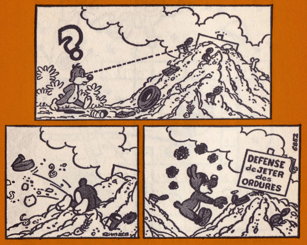
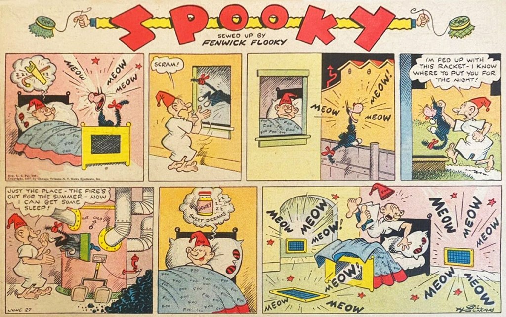
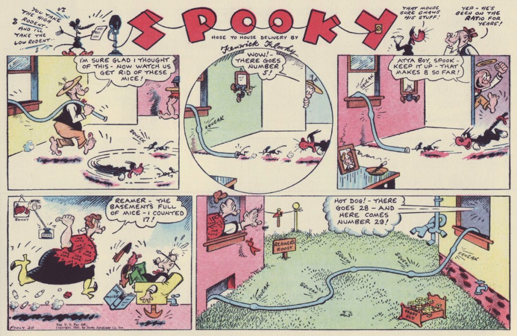
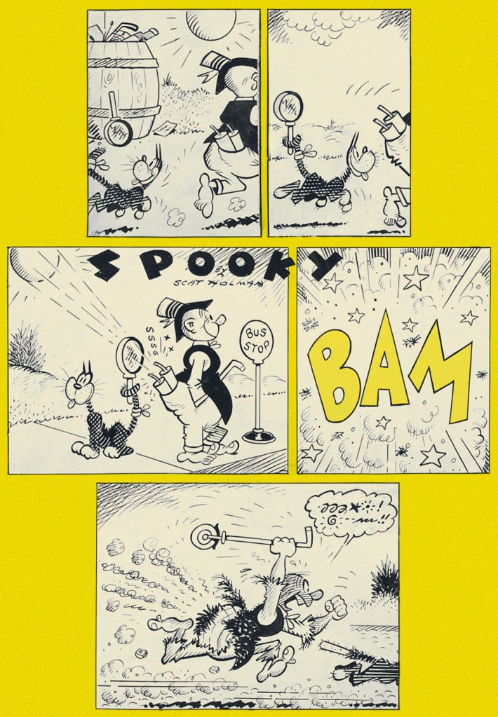
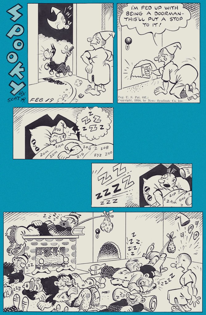
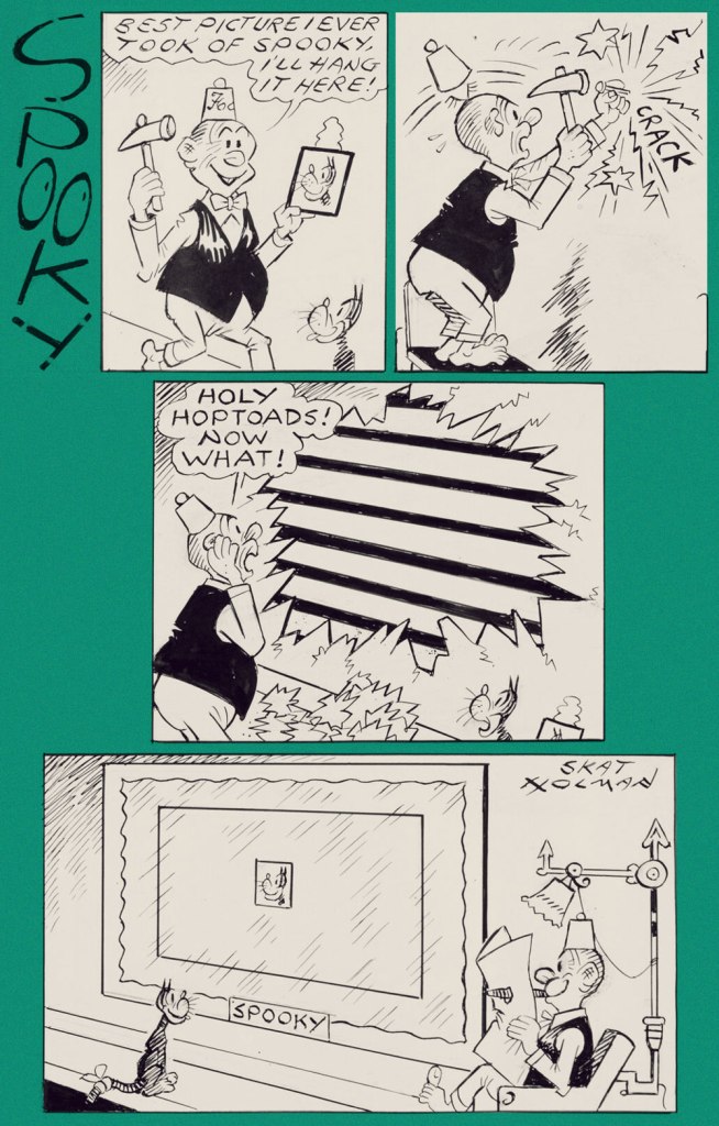
Well, I’m not going to explore Smokey Stover on this occasion… but will instead sneak a squint at its equally delightful ‘topper‘, Spooky the Cat. Since you rightly might ask:

« A topper in comic strip parlance is a small secondary strip seen along with a larger Sunday strip. In the 1920s and 1930s, leading cartoonists were given full pages in the Sunday comics sections, allowing them to add smaller strips and single-panel cartoons to their page. »

An ad from the syndicate promoting Smokey Stover (and its topper); it saw print in trade magazine Editor & Publisher’s August 21, 1937 issue.
From Sunday, June 27, 1937.
From Sunday, January 24, 1943.
From Sunday, Fooly, er, July 20, 1941.
From Sunday, July 4th (of course!), 1948.
From Sunday, September 12, 1948.
From Sunday, February 19, 1950. Ah, one of the classic cartooning archetypes: the hobo, complete with trusty polka-dot bindle and stick (which technically makes him a ‘bindlestiff’).
From Sunday, July 6, 1952. I could swear Holman meant to call the man Prof. Larynx, but then he wasn’t what you’d call a spelling whiz.
From Sunday, July 20, 1952. Incidentally, Spooky’s fez-sporting owner is Fenwick Flooky. There — now you’ve been introduced.
From Sunday, July 27, 1969. Gotta love a guy who’s kind to his animal companion, not to mention resourceful in doing so.
Sorry, date unknown! However, its original art was thus dedicated to a peer by the artist: “To my genius friend Alpo Q. Jaffee, fire-ever – Bill Holman ’76“.

The credibly devoted student of the comics would be ill-advised to underestimate the size of Holman’s footprint in the field: were they still around, it’s a cinch that Basil Wolverton, Jack Cole, Boody Rogers and Harvey Kurtzman would be quick to confirm Holman’s influence on their work. And that’s just some of his more-or-less contemporary peers.

Well, Kurtzman did in fact explicitly go on the record on that point, in the course of his introduction to the Blackthorne collection:

« Those outrageously outrageous and the nonsense words that appeared in no particular place for no particular reason. ‘Foo!’Notary Sojac.‘ Could it be that that’s what inspired me to ‘Potzrebie‘ and ‘furshlugginer‘? Was it Holman’s technique, those ‘tchochkas‘ in all corners of the panels? Picture portraits, with the portraits come to life, jumping out of their frames? Could that have been what inspired us to fill our MAD Magazine panels with those nonsensical details? Could that have been it?

I think so, Bill Holman. I think that you stamped my young, impressionable, brain with your indelible ink. So ‘Foo’ to you and many more ‘Notary Sojacs’, Bill Holman. You made me what I am today, I hope you’re satisfied. »

A clear Spooky prototype, down to the tail bandage, from Judge‘s January, 1935 issue.

-RG

*I may be too old-fashioned to quite take into account print-on-demand reprint collections, but let’s face it, sometimes that’s all you get.

Anton’s Spivs and Scoundrels, Baronesses and Beezers

« I was told a couple of bishops had given up Punch when I started drawing for them. » — Beryl Antonia Botterill Yeoman

Ever since I featured my very favourite of her cartoons, way back in October of 2019 — how different the world was then! — I’d intended to return to the topic of Australian-English cartoonist Beryl Antonia Botterill Yeoman (1907-1970) for a more sustained and substantial look… and now I have.

The Anton nom de plume has a rather storied history: at first — their professional collaboration began in 1937 — Beryl and her brother Harold were a two-headed cartoonist who signed ‘Anton’. In 1949, Harold dropped out of the partnership, owing to the rigorous demands of running an advertising agency, and thereafter Antonia and Anton were one and the same, a left-handed (not by birth or choice, having lost two fingers on her right in her teens), female cartoonist in a decidedly male-dominated field.

All of today’s selections first saw print prior to 1952 in the august pages of Punch (1841-2002); it’s entirely possible that Harold had a hand in some of them.

Ah, that reminds me of a certain song: « And tomorrow’s show will say / what they left out yesterday / And that gives me one good reason I should live. »

In case you’re puzzled, this one requires knowledge of a certain English nursery rhyme, which went:
Jack Sprat could eat no fat,
His wife could eat no lean;
And so betwixt them both,
They lick’d the platter clean.

Should you find yourself down Somerset way, drop by The Crown at Wells, a 15th century inn (featured in 2007 in Edgar Wright’s Hot Fuzz!) that houses Anton’s Bistrot, whose venerable walls are adorned with some choice Anton original art.

This must be the place — order us a couple of pints, won’t you?

-RG

Sayonara, Buzz-a-Rama!

« Auto racing began five minutes after the second car was built. » — Henry Ford

This post comes to you nearly seven days late, as I was sidelined rather abruptly by a nasty inner ear infection for the better part of last week.

I was inspired to write it by a mournful headline about the passing of an institution, Brooklyn, NY’s slot-racing emporium Buzz-a-Rama, founded in 1965… and now, with the death last year of its owner, Frank “Buzz” Perri, presumably closed for good. Here’s the story. And there’s even a documentary!

My own experience with slot-car racing was limited to miniature sets in boardwalk amusement parks, often powered by water pistols. Even then, it was clear that particular cars were better performers, and that there were preferable lanes. These were always occupied, seemingly on a permanent basis.

Slot-car racing knew its heyday in the 1960s and 1970s, and I suppose its slow twilight somewhat mirrored that of such classic, once-ubiquitous pastimes as model railroading and model building, though surely the latter’s glamorous sideline, airplane glue huffing, will always be popular with the kids.

And what about comics? We’ve got that covered, so bear with me. Today, we wave the checkered flag in salute to Jack Keller (June 16, 1922 – January 2, 2003), who enjoyed a long career in comics beginning in 1941 with Dell, followed by a stint assisting Lou Fine on The Spirit while Will Eisner was serving in the war, then some work with Fiction House. A pretty spiffy résumé already!

As a staff artist for Atlas, Keller added to his body of work and his versatility. In 1953, he took over Kid Colt, Outlaw, one of his longest stints — 1953-67! By the late 1950s, he was also freelancing for Charlton Comics.

Eventually, Charlton managing editor Dick Giordano offered Keller an exclusive contract, and so he had to pick between Marvel and Charlton… while the Derby, CN publisher offered a lower page rate than Marvel’s, it offered steadier, more plentiful work, as well as near-complete autonomy. No arbitrary, unpaid re-dos and revisions, and full credit for all of his work*. Quite significantly, Keller would be free to devote himself to his favourite genre, racetrack opera. Easy choice!

Here’s a perfectly à propos story starring Scot Jackson and the Rod Masters*, Keller creations introduced in Teenage Hotrodders no. 1 (April 1963, Charlton).

Now, now, Flip. There’s simply no call for such callous racial epithets, even if there’s a war on. Especially if there’s a war on, one might argue.
While they play but a small role in this particular tale, Motors McHorn and his cousin Wellington McHorn were worthy assets to any ensemble. The big lug was amusingly introduced in Hot Rod Racers no. 6 (Nov. 1965, Charlton) “I’m 6 feet 8 and weight 665 pounds — and my ma says I’m still growin’…
Over the years, Keller’s characters grew older and evolved. While it was a good thing for most of them, the superbly-named Shifty Gears became so bitter over years of (often self-inflicted) humiliation and defeat at the hands of Scot and the Rod Masters that he escalated from childish hi-jinks to near-homicidal sabotage. And in the series finale, The Passenger (Drag n’ Wheels no. 59, May 1973), Scot suffers a dreadful accident that lands his broken body (and spirit!) in the hospital for several weeks, and he struggles with severe depression and loss of confidence.

From the late 1950s to the early 1970s, Keller handled the bulk of the main stories in Charlton’s stable of hot rod titles: Hot Rods and Racing Cars, Teenage Hotrodders, Drag-Strip Hotrodders, Hot Rod Racers, Top Eliminator, Drag ’n’ Wheels, Grand Prix, World of Wheels, Surf ’n’ Wheels… crafting gripping and meticulously-researched gear-head sagas injected with just the right dose of hi-test humour for the win. Speed demons Clint Curtis, Rick Roberts, Scot Jackson, Ken King and The White Angels got the real deal when Keller chronicled their full-throttle antics. Curtis and Jackson even faced off in Match Race! (Hot Rod Racers no. 10, Sept. 1966, Charlton).

Finally, when Charlton dropped its last two hot rod titles in 1973 (HR&RC and Drag ’n’ Wheels), Keller called it a career, left comics and went off… to sell cars.

« The Street Racers », written, penciled, inked and lettered by Keller, originally appeared in Teenage Hotrodders no. 20 (Oct. 1966, Charlton); edited by Dick Giordano.

– RG

*if you think that sounds like a porn name, what about early Hot Rods and Racing Cars protagonist “Buster Camshaft, Screwball of the Hot Rods”?

**Here’s the sort of Mighty Marvel experience that befell none other than Wallace Wood (and as we know, he wasn’t alone in this: « I enjoyed working with Stan [Lee] on Daredevil but for one thing. I had to make up the whole story. He was being paid for writing, and I was being paid for drawing, but he didn’t have any ideas. I’d go in for a plotting session, and we’d just stare at each other until I came up with a storyline. I felt like I was writing the book but not being paid for writing. » [ source ]

(Fondly) Remembering Tony Tallarico

« Someone at Dell Comics decided it’d be swell to turn famous monsters into superheroes — an idea whose time never came. And just to make sure there were bad, they hired Tony Tallarico to draw them. » — — James Schumeister, with the sort of brickbat typically lobbed at Mr. Tallarico.

Last week, we lost, at the venerable age of eighty-eight, the controversial, much-maligned Tony Tallarico (Sept. 20, 1933 – Jan. 7, 2022). The case of Mr. Tallarico’s reputation is typical of mainstream US cartoonists who generally eschewed the superhero genre. His mistake, I suppose, is that he drew a handful of them, and in his own distinctive fashion to boot, thus sealing his doom in Fanboy court.

Yet there’s far more depth and variety to Tallarico’s career, and that’s should be remembered. Besides, those superhero comics were just light-hearted, unpretentious fun. Obviously not what the continuity-addicted True Believers craved.

Let’s take a tour of some of the highlights!

A page from Crazy Quilt, one of three stories Tallarico illustrated for my personal candidate for greatest horror comic book of all time, the unlikely one-shot Tales From the Tomb (Oct. 1962, Dell). Script and storyboard by John Stanley. Read the rest (complete with, fittingly, its analysis) of Crazy Quilt here.
Arguably, if Tallarico’s going to be remembered in comics and general history, it may be for this once-obscure but significant mid-60s creation. This is Lobo no. 1 (Dec. 1965, Dell Comics). Tallarico and writer D.J. Arneson hold different views as to the character’s genesis, as Canadian researcher Jamie Coville discovered in 2016. To his credit, Coville simply let the former collaborators present their respective side of the story. Read the resulting interviews here! And do check out the début issue itself, along with Tom Brevoort’s analysis… right here.

As reported in Alter Ego no. 106 (Dec. 2011, TwoMorrows): « On May 20, 2005, Tony Tallarico received the Pioneer Award, given for his co-creation of the first African-American comic book hero, Lobo, a post-Civil War cowboy who appeared in two issues of his own Dell/Western title. The honor was given at a ceremony held at Temple University in Philadelphia, Pennsylvania. »

A Tallarico ad from Eerie no. 20 (March 1969, Warren); Tony enjoyed keeping things in the family, and so young “Danny Smith” was actually Tony’s wife’s nephew, Danny Grosso. My thanks to Tony’s daughter Nina for graciously divulging this bit of inside info!
Cryptozoologists take note! Creepy no. 26 (April 1969, Warren); script by editor Bill Parente. I just adore Uncle Creepy’s pose (great use of props!), not to mention the question mark mullet. Should be the hit of the next tonsorial season!
Joe Gill and Tallarico took over the handlebars of one of Charlton’s established hot-rodders, Ken King. Following the direction blazed by their predecessor, Jack Keller, King had become “the Most Hated Man on Wheels!” (in Drag-Strip Hotrodders no. 13, Jan. 1967, Charlton) after being unjustly accused of wrecking his best friend, Jerry Gerard, aka “The Nicest Guy in Racing” during a meet. The series’ unremittingly bleak portrayal of the racing scene is fascinating, and Gill and Tallarico wisely kept the pace. This is World of Wheels no. 26 (June 1969, Charlton); cover by Tallarico.
An in-house ad from Eerie no. 23 (September 1969, Warren), technically Vampirella’s first published appearance. Art by “Tony Williamsune”, the collective nom de plume adopted by frequent collaborators Tallarico and William ‘Bill’ Fraccio. According to Tallarico, their collaboration was quite fluid: both contributed to layout, pencils and inks, but Tony was the extroverted go-getter, while Bill was the quiet one.
A “Williamsune” splash from Creepy no. 31 (February 1970, Warren). Tallarico on his association with Fraccio: « I would pencil some, he would ink some, visa versa y’know one of those things. I was really the guy that went out and got the work. Bill never liked to do that. It would depend. If he was working on something else I would start a project too and do pencils. It was a fun time. » [ source ]
This is Abbott & Costello no. 14 (April 1970, Charlton), featuring the beloved veteran comedians’ crossover with the aforementioned Ken King. The look of the series is based upon Hanna-Barbera‘s 1967-68 The Abbott and Costello Cartoon Show rather than on the duo’s classic movies and routines. Besides, Lou Costello having passed away in 1959, his part was voiced by Stan Irwin (with Bud Abbott as… Abbott).
Preceding the advent of Jonah Hex by some months* in the Weird Western stakes, Geronimo Jones was a truly oddball oater series, in the best sense of the term. Created by Tallarico (script and inks) and José Delbo (pencils), Geronimo’s adventures ran for 9 issues (plus one that remains unpublished), from September, 1971 to January, 1973. Geronimo himself was essentially a young pacifist seeking his quiet place in the Old West, in the finest tradition. However, strange encounters and occurrences keep thwarting his laudable goal. And none is more outlandish and shocking than what he comes up against in this issue, cover warning and all. This is Geronimo Jones no. 6 (June 1972, Charlton). The GCD credits the cover to Delbo alone, but the use of collage and halftone wash are telltale Tallarico trademarks… not to mention his distinctive lettering. My guess therefore is: pencils by Delbo, layout, inks and collage by Tallarico.
Tallarico and Fraccio did only a handful of stories in this wild, swirly style, including four for Charlton: The Curse of the Vampire in The Many Ghosts of Dr. Graves no. 44 (Jan. 1974, Charlton); this one, Come See Our Ghost… in Haunted no. 16 (June 1974, Charlton); The Reuger Formula in Haunted no. 24 (Nov. 1975) and A Solemn Oath! in Ghostly Tales no. 118 (Nov. 1975). Let me assure you that the sort of bold inking on display here, while deceptively simple in appearance, takes unerring confidence and skill to achieve. Bravissimo!

By the mid-70s, with his main comics accounts defunct or dormant (Dell, Treasure Chest, Charlton), Tallarico, ever the astute and tireless businessman (another rare trait among cartoonists) simply stepped up and diversified his efforts, branching out and creating a market for himself. « In the 70s the whole business went kaput. Luckily I was able to transfer over into doing children’s books. I’ve been doing children’s books ever since. My wife went though a count several months ago. It was over a thousand titles. That’s a lot of children’s books. »

Here’s a lovely one: Things You’ve Always Wanted to Know About Monsters (1977, Grosset & Dunlap). From the author’s introduction: « My sincere thanks to the many motion picture studios who produced these great monster films. They have kept many a generation of fans ‘monsterized‘. My thanks to my parents, who did not forbid me to see these films when I was a boy. Instead, they brought out in me many of the questions that appear in this volume. They always stressed that monsters are another form of fictional entertainment. My thanks to my wife Elvira, and my daughter Nina**, who stood by while my son and I made a mess of the living room as we selected the many pictures that appear here. »

I should point out that I haven’t forgotten one of my favourite Tallarico projects, namely his charming work on the Bobby ShermanGetting Together” comic book (7 issues, Feb.-Oct. 1972, Charlton)… it’s just that I’ve already addressed the topic: check out Let’s Hear It for Bobby Sherman!

And what of his 1965 collaboration with The Shadow’s Walter Gibson, Monsters? Got you covered on that one as well!

I don’t know whether I’ll change anyone’s mind about Mr. Tallarico’s work, but I believe I can rest assured I gave it my best shot.

-RG

*Hex was introduced in All-Star Western no. 10 (Feb.-Mar. 1972, DC).

**My closest brush with the Tallaricos came in 2015 when I helped his daughter Nina identify and source some artwork she was selling on eBay for her dad. In my experience, a very nice lady. My sincere condolences to the bereaved family.

Roland Topor’s Unvarnished Truth

« Topor is probably the greatest graphic mind of the twentieth century. » — Seymour Chwast

Well, that’s quite a lofty claim… but considering the source, one that must be seriously considered.

Are you familiar with Roland Topor‘s work? Perhaps you’ve seen Roman Polanski’s 1976 adaptation of Topor’s novel Le locataire chimérique (1964). Or seen the singular animated film La planète sauvage / The Fantastic Planet (1973). Maybe you’ve seen some of his arresting film poster art (The Tin Drum, Realm of the Senses… and more). Were you perhaps an early reader of France’s legendarily transgressive magazine, Hara-Kiri, journal bête et méchant? Or, at the other end of the scale, did you grow up with Groucha, Lola and the Gluons on his charmingly bizarre 1980’s kids’ show, Téléchat?

All the same, Topor (Jan. 7, 1938 – Apr. 16, 1997) — eighty-four years ago today — is one of those rare fellows (like, say, Shel Silverstein) who achieved great success at whatever they undertook… and without compromising their vision. Painter, actor, scenarist, playwright, director, affichiste, cartoonist, illustrator… he did it all, and he did it all well. I’m happy to say that his legacy seems safe, if his posthumous presence online and in galleries and minds is any indication. And I’ve rarely had so much trouble paring down my selections, so prolific and versatile and hard-hitting was he. Dig in!

This is a typical, if striking example of the sort of work Topor was producing in the early 1960s (largely for Hara-Kiri — some three hundred drawings in a five-year span), and one wasn’t sure if his draughtsmanship could keep pace with his ideas.
I like to call this one ‘La ruelle armée’.
A bit of Photomatonfumetti from Mr. Topor, circa the 1960s. To the right: nothing. To the left: nothing. Behind me: nothing. Before me: a moron!
Topor recycled the punch-in-the-kisser motif several times; it was first used for a Hara-Kiri promo poster in 1961.
A pair of excerpts from 1974’s L’Épikon. I love the concept: Topor graphically (and fancifully) elaborated upon some antique pornographic photos. « In Warsaw, a housekeeper, by piety sucked the church candles. By dint of polishing the tallow, she skinned her lips and blushed like a virgin. »
« A Las Vegas whore, who resided in a palace, resorted to a trick to tame phalluses: she illuminated her snatch. » Here’s more from L’Épikon.
La roue (the Wheel) — 1973.
Another bit of recycling: first created (I think!) for Revue Mépris n° 1 (1973, Éditions Kesselring), Topor donated this powerful piece to Amnesty International for its worthy promotional work, such as this 1977 print ad. « Is Freedom of Speech Lethal? ».
This sardonic piece appeared in the collection L’amour à voix haute (“Love Out Loud”); the English version was entitled Je t’aime: A Pillow Talk, and used it as its cover.
Les nouvelles en trois lignes I (The News in Three Lines) – 1975. Comics!
Le saut périlleux (the somersault) – 1980.
« Pain, according to Topor. »
« Leaving pain behind, according to Topor. » (1982)
I’m happy to say that, with the years, his work just kept evolving and, in some ways, improving. This poster was created to promote the 1984 edition of a drawing festival held every other year.

Well, even if you weren’t familiar with Mr. Topor’s œuvre per se, you must have seen its echoes across all media in the work of (just off the top of my head!) Bill Plympton, Brad Holland, Peter Kuper, Bernard Kliban, Jean-Claude Suares… and countless others.

-RG

A Fabulous, Furry Fungus Friday!

« No wonder psychedelics are threatening to an authoritarian religious hierarchy. You don’t need faith to benefit from a psychedelic experience, let alone a priest or even a shaman to interpret it. What you need is courage to drink the brew, eat the mushroom, or whatever it is, and then to pay attention, and make of it what you will. Suddenly, the tools for direct contact with the transcendent other (whether you call it God or something else) is taken from the hands of an anointed elite and given to the individual seeker. » — Dennis McKenna

Sensing that I’ve been neglecting Underground Comix in our coverage, I thought I’d close out the year with a thematic pairing of a favourite comestible with a beloved cartoonist (and his collaborators).

That’s a pretty fanciful mushroom patch there, boys. I doubt that mushrooms would grow much, if at all, in the blazing prairie sun… let alone that neatly. Artistic licence, then! This is The Fabulous Furry Freak Brothers no. 5 (May 1977, Rip Off Press). Cover by Gilbert Shelton and Dave Sheridan.
An old girlfriend of mine once echoed Fat Freddy’s bonehead sentiment: “Ew… mushrooms grow in shit!“, presumably unaware of the role manure has always played in agriculture. She went on to marry a succession of Frenchmen, and given their nation’s appreciation of fungi, I hope she was smart enough to not express out loud that bit of… wisdom.

By the way, Phineas is right, as usual. Here’s more info on the relationship between mushrooms and cow flop, and an ‘easy guide to picking‘…

One Pizza With Mushrooms to Go! first saw print in The Fabulous Furry Freak Brothers no. 4 (November 1975, Rip Off Press). This is Shelton and Sheridan’s original cover art, which fetched a handsome 43,000 dollars and change when it was auctioned off in 2016.
Ah, roommates. One again, Fat Freddy undoes Phineas’ careful efforts. This reminder of the importance of sterilisation in mushroom cultivation comes courtesy of Messrs. Shelton and Paul Mavrides. It appeared in The Fabulous Furry Freak Brothers no. 12 (1992, Rip Off Press).
Talk about a roomful of cartooning genius. Meet Mavrides and Shelton and feel your senses reel!

Honestly, it’s been, for many of us, the kind of year when mutant psychedelic fungus overrunning one’s city would come as a pretty good bit of news. Let’s hope for something even better for 2022!

For more Gilbert Shelton on WOT?, just follow this link!

-RG

In Bob Montana’s Riverdale for the Holidays!

« Everything that happened to Archie happened to me in school, except that Archie always seemed to get out of it. » — Bob Montana

Despite the hundreds, if not thousands, of variably-abled hands that have toiled in the Archie Comics salt mines, the most important set of mitts devoted to the task was also the very first.

Archie creator Bob Montana* (1920-1975) knew what he was doing from the git-go. After all, he rubbed shoulders with the characters’ real-life counterparts from the Class of 1940: according to a 1989 Associated Press story, his buddy ‘Skinny’ Linehan became Jughead, football hero Arnold Daggett became Big Moose Mason; principal Earl MacLeod gave us Mr. Weatherbee and school librarian Elizabeth Tuck inspired Miss Grundy… and so on.

Montana was also that rare cog in the Archie machine: an autonomous writer-artist. This served him well in the newspaper strip world: he débuted the Archie feature in 1946 and remained in charge, dailies and Sundays, until his 1975 passing. I do prefer Samm Schwartz’s Jughead, but Montana drew the definitive version of every single other member of the Riverdale ensemble. In particular, as you’ll witness, Betty and Veronica were never slinkier.

The Sunday, December 22, 1946 strip.
The Sunday, December 21, 1947 strip.
The Sunday, December 19, 1948 strip.
The Sunday, December 26, 1948 strip.
The Sunday, December 25, 1949 strip.

And a bonus New Year’s-themed one for the road!

The Sunday, December 28, 1947 strip.

And with this… Merry Christmas, everyone!

-RG

*On the Archie plantation, as with the Harvey gulag, we can safely dismiss the founders’ specious and strident claims of having created their cash cows. In this case, Archie “creator” John Goldwater‘s original mandate to Montana was essentially to riff on popular radio show The Aldrich Family (1939-1953).

Haven’t You Heard? Santa Claus Is a Killer!

« Like everyone in his right mind, I feared Santa Claus. » — Annie Dillard

’twas 1982, and DC’s mystery anthology titles were dead or dying (the last one standing, The House of Mystery, had but a year or so left to go), and The Unexpected, published since 1956, was a mere two issues away from cancellation. Latter-day editor Dave Manak had done a fine job with the means at his disposal, wisely engaging Joe Kubert (1926-2012) to grace close to ten issues with his ever-elegant artwork.

This is perhaps the finest of the lot, a wistful, old-fashioned cover that dispenses with most of the clichéd Holiday iconography.

This is The Unexpected no. 220 (March 1982, DC). Pencils and inks by Joe Kubert with extra-fine lettering by Gaspar Saladino (1927-2016), truly a key element of the cover’s visual appeal.
Drive carefully, darling!” Is that woman worried about *everything*? Talk about fretful. Insurance agents must adore her. From the Fairhaven and Bon Marché allusions, one may presume that the events are set in the state of Washington.
To give credit where credit is due, the unexplained bit with Santa’s hand on the phone is the story’s subtlest touch. He’s the one who phoned in the tip — anonymously, one presumes. Santa does not abide off-brand competition.

The issue’s lead, Holiday-themed story, boasts gorgeous art by powerful and versatile Puerto Rican cartoonist Ernie Colón (1931-2019), and it’s unusually well-coloured for the era (not to be confused with well-printed!), in that the shadings convey projected light and ambiance, not merely the prevalent, simplistic colour-by-numbers approach.

The writing, on the other hand…

Santa Is a Killer! is an artless hodge-podge of tropes, a kiddie rehash of Johnny Craig’s timeless “… and All Through the House” (Vault of Horror no. 35, Feb. 1954, EC), dressed up with the done-to-death-and-then-some “That — wasn’t *you*? Then — it must have been the –*choke* — real ghost / Satan / Santa Claus / Carlos Santana / Tooth Fairy / Larry “Bud” Melman!) “twist”. Did I mention that I love the art?

Since we strive to avoid repetition, and as my partner-in-mischief ds has already featured this legendary cover in her How do you like *your* Christmas? post, here instead is the original 1954 Silverprint proof, a colour guide for the printer’s edification and coloured by hand, presumably by EC’s resident chromatic conjuress, Marie Severin (1929-2018). Cover art by Johnny Craig.
It’s a little-known fact that VoH35’s dear, doomed wife’s peignoir was later snapped up for a pittance at an estate sale by a young rake by the name of Danny Rand. Soon, with a few minor alterations, he had himself a nifty (and silky!) crime-fighting ensemble. Just don’t ask ‘is that a ladies’ nightgown you’re wearing?‘ if you don’t want your features rearranged. This is Iron Fist no. 8 (Oct. 1976, Marvel). Cover art by John ‘Booster Cogburn‘ Byrne and Dan Adkins. And though « The Canadian Government has apologized for Bryan Adams on several occasions » (and presumably for Céline Dion and Justin Bieber also), I say it’s high time Canuck honchos proffered their excuses as to cuddly Mr. Byrne.
To give you some idea of how prevalent the ‘Santa as homicidal maniac’ notion was by the 1970s, here’s another semi-famous instance: this is Creepy no. 59 (Jan. 1974, Warren); cover by Spain’s Manuel Sanjulián (b. 1941). A year later, writer-director Bob Clark (Porky’s, A Christmas Story) would unleash his influential Black Christmas.

Bonuses:
The film adaptation of Craig’s “… and All Through the House“, starring Joan Collins, from Tales From the Crypt (1972, Amicus), directed by Freddie Francis;

The television adaptation, from Tales From the Crypt (season one, episode two, 1989), directed by Robert Zemeckis.

-RG

Just a Working Class Dog: Pif le chien

« The working class is revolutionary or it is nothing. » — Karl Marx

Pif le chien was introduced to the world on March 26, 1948, in the French Communist daily L’Humanité. His strip was intended to replace that of Felix the Cat, who was deemed too bourgeois, what with his magic bag and invisible means of financial support. On the other paw, Pif, early on, was even a stray, homeless and starving. In time, he was taken in by a humble working-class family (as late as 1957, it was the outhouse and public baths), and that’s when the elements clicked into place.

This is Les rois du rire no. 7 (Jan. 1969, Vaillant), a rotating anthology title gathering, in this case, two-pager Pif strips from the pages of Vaillant. Cover art by Pif’s creator, José Cabrero Arnal (1909-1982).

While I greatly admire and enjoy the work of Pif pater José Cabrero Arnal — and trust me, his is a story worth the telling: fought the Fascists in Spain, spent four years in a Nazi Stalag in Austria before being liberated by the Soviets, never quite recovered from the ordeal of his captivity, and remained fragile for the rest of his days. Consequently, in 1953, he handed Pif’s leash over to the truly indefatigable Roger Masmonteil (1924-2010).

Of Masmonteil (who signed R. Mas.), historian Hervé Cultru writes, in his Vaillant, 1942-1969 : La Véritable histoire d’un journal mythique (2006, Vaillant Collector):

« The problem is that, once he got his finger caught in the gears of the freelancing engine, he couldn’t just yank it out! Because giving life to the Césarin family is practically a vocation: one must provide the daily strip, six a week. Over thirty years, Masmonteil, aka Mas, crafted over eleven thousand of them. There are also the Sunday strips, the pages for Vaillant, solo Pifou stories, Léo, created for Pif Gadget. It never ceased. By his career’s end, he had racked up some 45,000 gags or so. »

« Unlucky me, I’ve smashed the vase! » « Out of sight, out of mind! » « Bleh! What a revolting aroma! » « I’m found out! »
« When the sea is too far, one makes do with a little corner of the Seine! » « I’m the back-float king ! » “Sur mer” (“On-Sea” would be the English equivalent) is a popular suffix to denote a town or resort’s coastal location. The Seine’s toxicity borders on the legendary, but things have actually improved in recent decades.
I love a good pantomime gag. And every look is a sideway glance, which makes it even more special.
« It’s in these things that they buried their pharaohs! » « That’s solid stuff! » « COME IN ». What most impresses me here is the final panel, with its expert use of a tiny space to convey depth, distance and setting. That’s the cartoonist’s art!
« Quit your music! It bothers tonton! ».
« And a-one! » « Brr! Doesn’t it cause him pain when you remove the hook? » « Not at all… it’s designed not to hurt… » « Next! » « Quiet! It’s designed not to! » Up yours, René Descartes!
A slice (ouch!) of politico-historical guillotine humour.
A dollop of social criticism. The sign says, naturally, « No Littering ».
Pif’s archenemy, Hercule, at work. « Who’s going to get a good soaking? The Pif, that’s who! » « Failed! »

I’m inclined to admire Mas for the same reasons I hold Nancy’s Ernie Bushmiller in the highest regard: the uncanny ability to find humour in any and every place or situation, to distill and express it in a pared-down visual language made all the more potent by its universal simplicity. But it’s hard work, even if geniuses make it look easy. As Hervé Cultru explains, in Mas’ case:

« … Pif gets the last word in: at night, he haunts Mas’ dreams. The point at which he’s about to doze off is actually one of intense creativity. He constantly keeps a notepad and pencil at his bedside, to jot down ideas straight away, because if he neglects this precaution, all is forgotten by morning. »

An ad from L’Humanité, circa the late 1950s.
Our cast: Tante ‘Tata’ Agathe and Oncle César ‘Tonton’ Césarin, Doudou, Pif, Hercule, and Pif’s son, Pifou. This is my copy of Album Vaillant no. 8 — 4th series (comprising issues 952 to 960, August to October 1963), its rather fragile spine helpfully reinforced by a previous proprietor. I long wondered why on earth the French call wrestling ‘catch’. Turns out it’s their shorthand version of the forgotten 19th century appellation of the sport as ‘catch-as-catch-can‘.

In April 1967, Mas walks away from the Pif feature in Vaillant (four pages a week!), maintaining the daily in l’Humanité and Pifou’s solo strip. Pif returns briefly to Arnal, who still can’t handle the workload; Pif then passes into other, and decidedly far lesser hands.

Mr. Cultru, again:

« In 1968, the team takes umbrage with the repetitive and by far too ‘domestic’ character of the adventures. It feels that the working class household, typical of certain post-war values, that serves as a setting, has become obsolete, if not grotesque, and that it no longer fits the social context of the times. »

So they methodically excised everything that made Mas’ Pif special, and turned him into another Mickey Mouse, which is to say the familiar mascot or standard-bearer of a company, but one whose adventures nobody reads or truly gives a hoot about. Oh well — you still had a good run, Pif!

-RG

Luis Domínguez (1923-2020): A Farewell in Twelve Covers

« Painting is the art of hollowing a surface. » — Georges Seurat

If you’ll forgive me the venial but gauche sin of quoting myself… three years ago, I posited:

« Luís Ángel Domínguez, reportedly born ninety-five years ago to the day… and still among the living… as far as we know. I like to envision him warmly surrounded by several generations of loved ones and well-wishers, an impish gleam in his eye. »

I found it sadly infuriating that such an important and accomplished artist’s latter-day whereabouts and circumstances were so shrouded in mystery… and largely, it would seem, indifference. The usual story: he didn’t really do superheroes.

Neither Lambiek nor the Grand Comics Database have anything to add on the subject, but a spot of digging turned up that he indeed was still alive until recently, though purportedly afflicted with Alzheimer’s in his waning years. Then I found what may well be his… very basic obituary, placing his date of birth exactly one month off (unsurprisingly, since accounts have long varied) and his date of death as July 1st, 2020, in Miami, FL. Unless something more definitive comes along, it’ll have to do.

I think we can all agree that ninety-six years is a pretty good run, even with the doleful decline near the end. Let’s look back on what’s surely his peak decade in comics, the 1970s. My picks have nothing to do with ‘key’ issues, character débuts or popular crossovers. I’ve judged these on artistic merit, keeping the pernicious influence of nostalgia at arm’s length.

First, a little biographical background! This helpful piece appeared in the pages of Eerie no. 44 (Dec. 1972, Warren), which also boasted a Domínguez cover… albeit reproduced too small.
The folks at Warren were apparently first in North America to recognise and call upon señor Domínguez’s masterly painting skills. This is Famous Monsters no. 93 (Oct. 1972, Warren).
My personal favourite of his too-few Warren covers, this is Eerie no. 43 (Nov. 1972, Warren).
While Luís had been steadily working on the insides of Gold Key comics since 1967, it wasn’t until 1974 that they gave him a crack at a cover. That was either this one, Space Family Robinson no. 40, or Boris Karloff Tales of Mystery no. 55, both cover-dated July, 1974… (incidentally, the GCD misattributes to him several of his colleague George Wilson‘s paintings).
DC hardly ever used painted covers, but they did keep Domínguez busy as a cover artist. I assure you, this ambitiously-muted cover must have been a printer’s nightmare. This is The Phantom Stranger no. 32 (Sept. 1974, DC), a great issue that features Arnold Drake and (returning to the Stranger after a 27-issue absence!) Bill Draut‘s It Takes a Witch! and a gorgeous Michael FleisherNestor Redondo Black Orchid backup.
This is House of Secrets no. 125 (Nov. 1974, DC). For once, Domínguez also illustrates the cover-featured story, E. Nelson Bridwell‘s Catch as Cats Can!
Then of course, Marvel soon after got in on the act. This is Dracula Lives no. 9 (Nov. 1974, Marvel). I would have picked the even better previous issue, but I’ve already featured it, so you get to enjoy both!
The printed version of this piece, featured as the cover of UFO Flying Saucers no. 5 (Feb. 1975, Gold Key) pales in comparison with the surviving original art, so that was an easy choice.
This issue’s original art also survived, and seeing both versions is most instructive as an insight into production manager Jack Adler’s methods. This is House of Mystery no. 235 (Sept. 1975, DC), and the original can be viewed here. As an aside, this issue’s The Spawn of the Devil, written by Maxene Fabe and drawn by Ramona Fradon, is the only DC horror story I ever found scary. Perhaps editor Joe Orlando should have hired women more often!
Another one whose printed version fails on the reproduction front, this is Mighty Samson no. 31 (Mar. 1976, Gold Key), the title’s final issue. Let’s again rejoice at the original art’s survival!
This is Boris Karloff Tales of Mystery no. 94 (Sept. 1979, Gold Key); I hold that Dominguez’ three finest consecutive covers came near the end of Gold Key’s Karloff anthology and, wouldn’t you know it? … we have already featured the other two. You’ll find issue 92 here, and issue 93 (and its original art) in one of ds’ posts, which also showcases another top-flight contender, which I couldn’t use for reason of… tentacles, Dagar the Invincible no. 11.
This is The Comics Journal no. 56 (Fantagraphics, May 1980). According to masthead notes, « Luís Dominguez’s painting was originally scheduled for the fourth issue of DC’s Digest Comic, “Jonah Hex and Other Western Tales“, but the title was cancelled with no. 3. » The magazine’s larger size certainly affords us a better view of this richly detailed scene.
And as bonus, this mysterious, undated, possibly unpublished cover painting to Edgar Allan Poe‘s famous tale. Acrylic on board, 36 x 50 cm (14″ x 20″). The corners confirm that Domínguez worked from dark to light (which largely accounts for his marvellously luminous colours) and faint lines (on this and other works) indicate that he used a grid to scale up his preliminary sketches accurately.

For more Domínguez delights, just click on this link and explore away! I daresay that I only managed to keep it to an even dozen (difficult!) choices because we’ve already spotlighted many of his finest covers.

-RG