« Painting is the art of hollowing a surface. » — Georges Seurat
If you’ll forgive me the venial but gauche sin of quoting myself… three years ago, I posited:
« Luís Ángel Domínguez, reportedly born ninety-five years ago to the day… and still among the living… as far as we know. I like to envision him warmly surrounded by several generations of loved ones and well-wishers, an impish gleam in his eye. »
I found it sadly infuriating that such an important and accomplished artist’s latter-day whereabouts and circumstances were so shrouded in mystery… and largely, it would seem, indifference. The usual story: he didn’t really do superheroes.
Neither Lambiek nor the Grand Comics Database have anything to add on the subject, but a spot of digging turned up that he indeed was still alive until recently, though purportedly afflicted with Alzheimer’s in his waning years. Then I found what may well be his… very basic obituary, placing his date of birth exactly one month off (unsurprisingly, since accounts have long varied) and his date of death as July 1st, 2020, in Miami, FL. Unless something more definitive comes along, it’ll have to do.
I think we can all agree that ninety-six years is a pretty good run, even with the doleful decline near the end. Let’s look back on what’s surely his peak decade in comics, the 1970s. My picks have nothing to do with ‘key’ issues, character débuts or popular crossovers. I’ve judged these on artistic merit, keeping the pernicious influence of nostalgia at arm’s length.
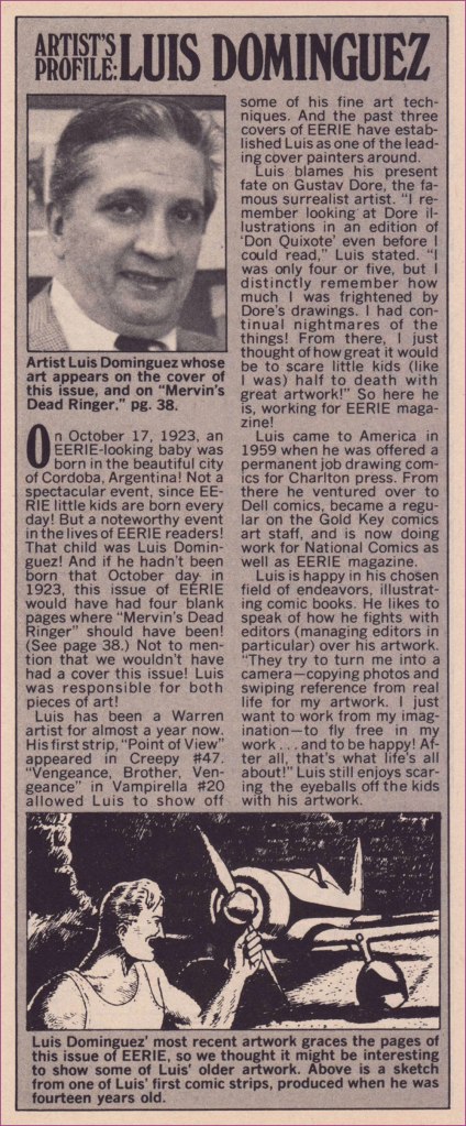
First, a little biographical background! This helpful piece appeared in the pages of Eerie no. 44 (Dec. 1972, Warren), which also boasted a Domínguez cover… albeit reproduced too small.
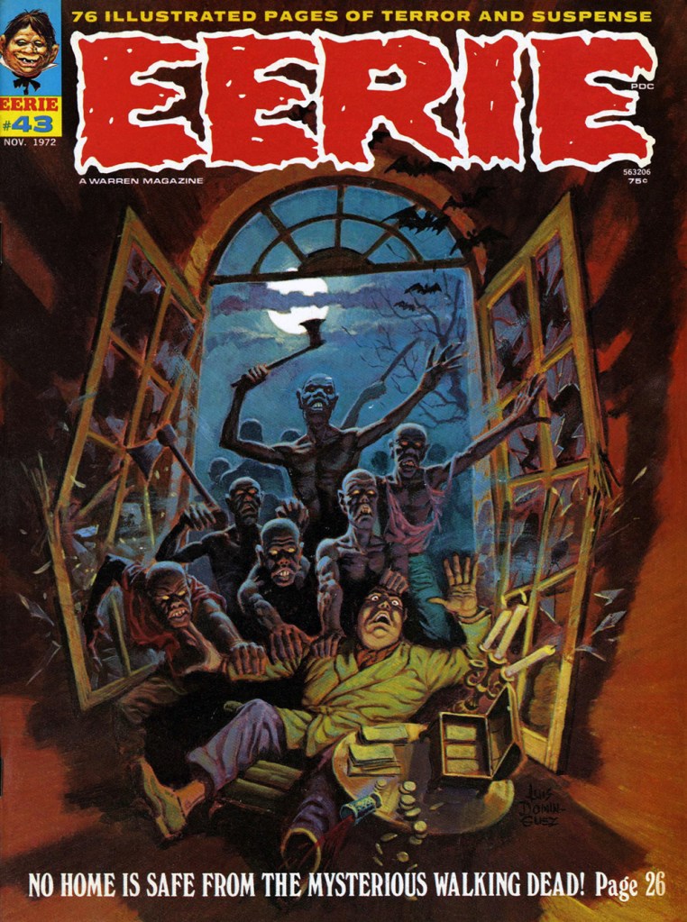
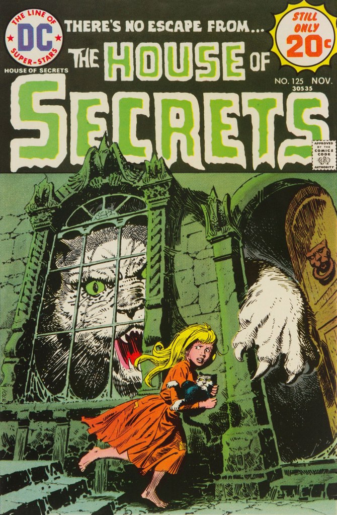
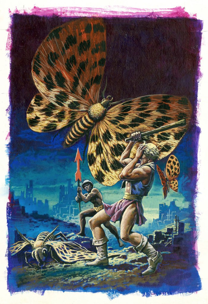
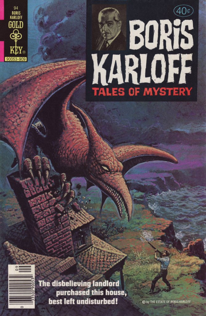
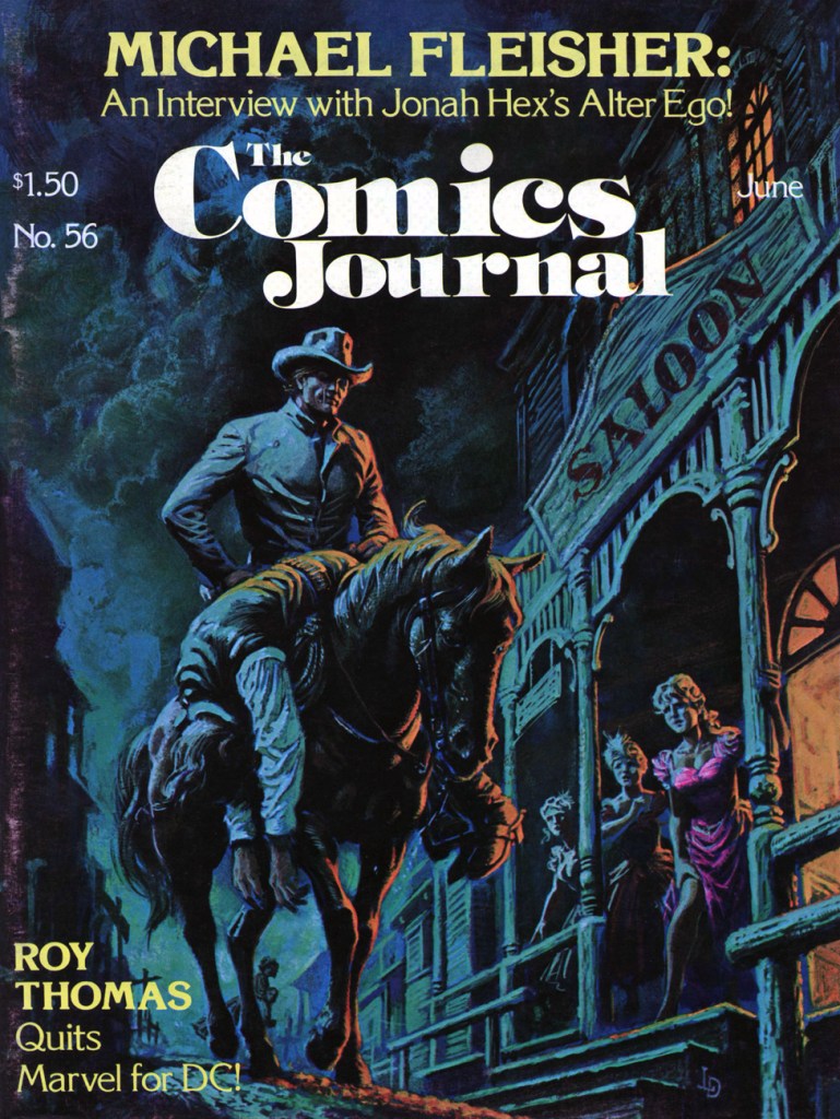
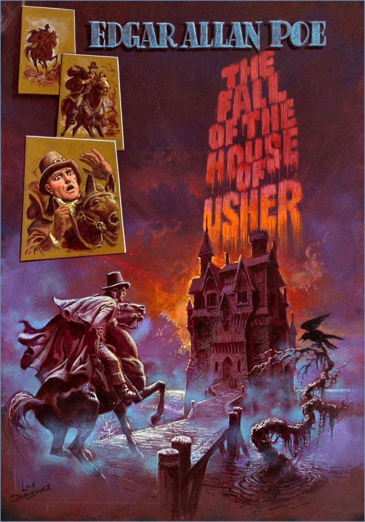
The folks at Warren were apparently first in North America to recognise and call upon señor Domínguez’s masterly painting skills. This is Famous Monsters no. 93 (Oct. 1972, Warren).My personal favourite of his too-few Warren covers, this is Eerie no. 43 (Nov. 1972, Warren).While Luís had been steadily working on the insides of Gold Key comics since 1967, it wasn’t until 1974 that they gave him a crack at a cover. That was either this one, Space Family Robinson no. 40, or Boris Karloff Tales of Mystery no. 55, both cover-dated July, 1974… (incidentally, the GCD misattributes to him several of his colleague George Wilson‘s paintings).DC hardly ever used painted covers, but they did keep Domínguez busy as a cover artist. I assure you, this ambitiously-muted cover must have been a printer’s nightmare. This is The Phantom Stranger no. 32 (Sept. 1974, DC), a great issue that features Arnold Drake and (returning to the Stranger after a 27-issue absence!) Bill Draut‘s It Takes a Witch! and a gorgeous Michael Fleisher–Nestor RedondoBlack Orchid backup.This is House of Secrets no. 125 (Nov. 1974, DC). For once, Domínguez also illustrates the cover-featured story, E. Nelson Bridwell‘s Catch as Cats Can!Then of course, Marvel soon after got in on the act. This is Dracula Lives no. 9 (Nov. 1974, Marvel). I would have picked the even better previous issue, but I’ve already featured it, so you get to enjoy both!The printed version of this piece, featured as the cover of UFO Flying Saucers no. 5 (Feb. 1975, Gold Key) pales in comparison with the surviving original art, so that was an easy choice.This issue’s original art also survived, and seeing both versions is most instructive as an insight into production manager Jack Adler’s methods. This is House of Mystery no. 235 (Sept. 1975, DC), and the original can be viewed here. As an aside, this issue’s The Spawn of the Devil, written by Maxene Fabe and drawn by Ramona Fradon, is the only DC horror story I ever found scary. Perhaps editor Joe Orlando should have hired women more often!Another one whose printed version fails on the reproduction front, this is Mighty Samson no. 31 (Mar. 1976, Gold Key), the title’s final issue. Let’s again rejoice at the original art’s survival!This is Boris Karloff Tales of Mystery no. 94 (Sept. 1979, Gold Key); I hold that Dominguez’ three finest consecutive covers came near the end of Gold Key’s Karloff anthology and, wouldn’t you know it? … we have already featured the other two. You’ll find issue 92 here, and issue 93 (and its original art) in one of ds’ posts, which also showcases another top-flight contender, which I couldn’t use for reason of… tentacles, Dagar the Invincible no. 11. This is The Comics Journal no. 56 (Fantagraphics, May 1980). According to masthead notes, « Luís Dominguez’s painting was originally scheduled for the fourth issue of DC’s Digest Comic, “Jonah Hex and Other Western Tales“, but the title was cancelled with no. 3. » The magazine’s larger size certainly affords us a better view of this richly detailed scene.And as bonus, this mysterious, undated, possibly unpublished cover painting to Edgar Allan Poe‘s famous tale. Acrylic on board, 36 x 50 cm (14″ x 20″). The corners confirm that Domínguez worked from dark to light (which largely accounts for his marvellously luminous colours) and faint lines (on this and other works) indicate that he used a grid to scale up his preliminary sketches accurately.
For more Domínguez delights, just click on this link and explore away! I daresay that I only managed to keep it to an even dozen (difficult!) choices because we’ve already spotlighted many of his finest covers.
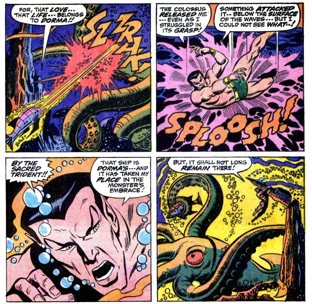
«Then suddenly, like some gigantic serpent out of the deep, a huge, quivering tentacle tose from out of the sea — a sight from any seaman’s maddest, most impossible nightmare –! »
Today we pay another visit to Subbie (or Subby), which every bit as horrible an abbreviation as ‘hubby’ for ‘husband’. We’ve gone over his history in a previous post (see Tentacle Tuesday: Prince Namor, the Sub-Mariner), so now we can concentrate on Action! Adventure!! Excitement!!! What’s on his charged schedule, you might ask? Why, a quick tussle with some Soviet submarines, a few pompous (I’m sorry, I meant ‘dramatic and exciting’) speeches, a plunge intro ‘wintry, unplumbed depths’, a lengthy trip to memory lane, and an epic fight with an unliving cyborg!
My favourite, naturally, are the Soviet submarines.
Sub-Mariner no. 35 (August 1954, Atlas), cover by Sol Brodsky. The insides of this issue actually don’t have tentacles, but do have pretty much everything else – it’s a fun, wacky read.
Moving forward by a little more than 15 years, we get embroiled in a slightly different kind of evil…
Sub-Mariner no. 27 (July 1970, Marvel), cover pencilled by Sal Buscema and inked by Mike Esposito.
When Wakes the Kraken! was scripted by Roy Thomas, pencilled by Sal Buscema and inked by Mike Esposito. Aside from a lot of dialogue (check out the ‘ay, woman… but the time has come for battle… not words!‘), this story also has a lot of plump, high-quality tentacles.
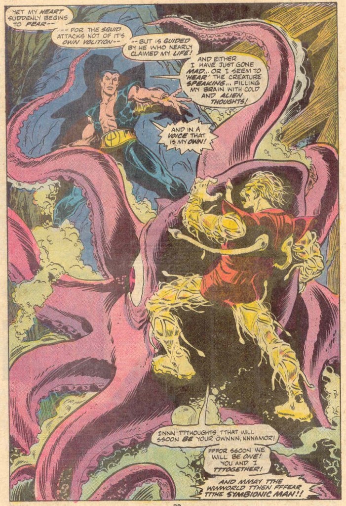
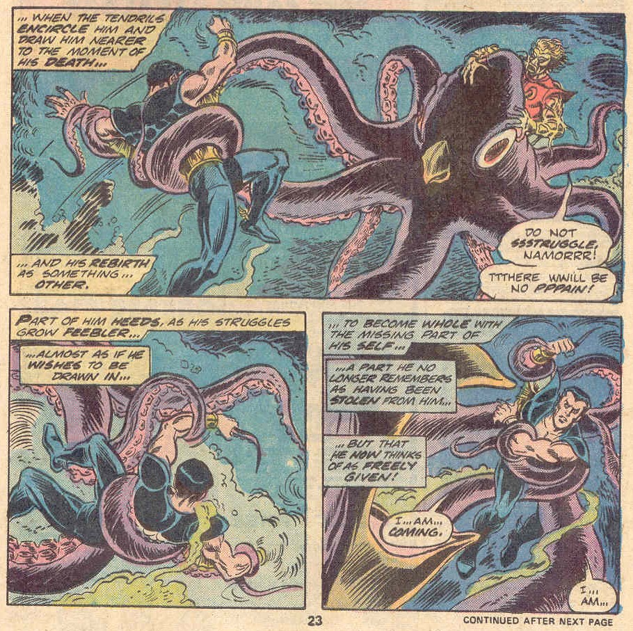
This cover is fun, given that the Symbiotic Man appears to have tentacles on the soles of his feet and the ends of his hair as well. Did somebody actually demand that Namor should fight alone? I was under the impression that Marvel readers were more into ‘the more the merrier’ type of fun.
Marvel Spotlight no. 27 (April 1976). Cover pencilled by Gil Kane (Tentacle Tuesday dabbler!) and inked by Frank Giacoia.
The cover story is titled Death Is the Symbionic Man!, scripted by Bill Mantlo and illustrated by Jim Mooney. Note the typo in ‘its’ in the second speech bubble.
The octopus appears to be having serious doubts about his presence in this fight. “Aw, do I hafta?”
What’s the point of having a super cool symbiotic-cyborg creature if it needs an octopus do its dirty work? This beaked octopus would do well in Tentacle Tuesday: Notes on Anatomy.
Actually, no. Before that, there arose the idea in art director Warren Kremer‘s ever-effervescent mind:
One of Kremer’s surviving preliminary sketches.
Then there was this one, more refined and with wonderful suggestions, instructions and notions addressed to the assigned cover artist, Lee Elias.
Ah, here we are. The final (in more ways than one!) version. This is Chamber of Chills Magazine no. 18 (July 1953, Harvey). Art by Lee Elias… but you know that’s not the entire process. Check out this earlier Hallowe’en post for more of that magical Kremer-Elias collaboration.
Then, one year on…
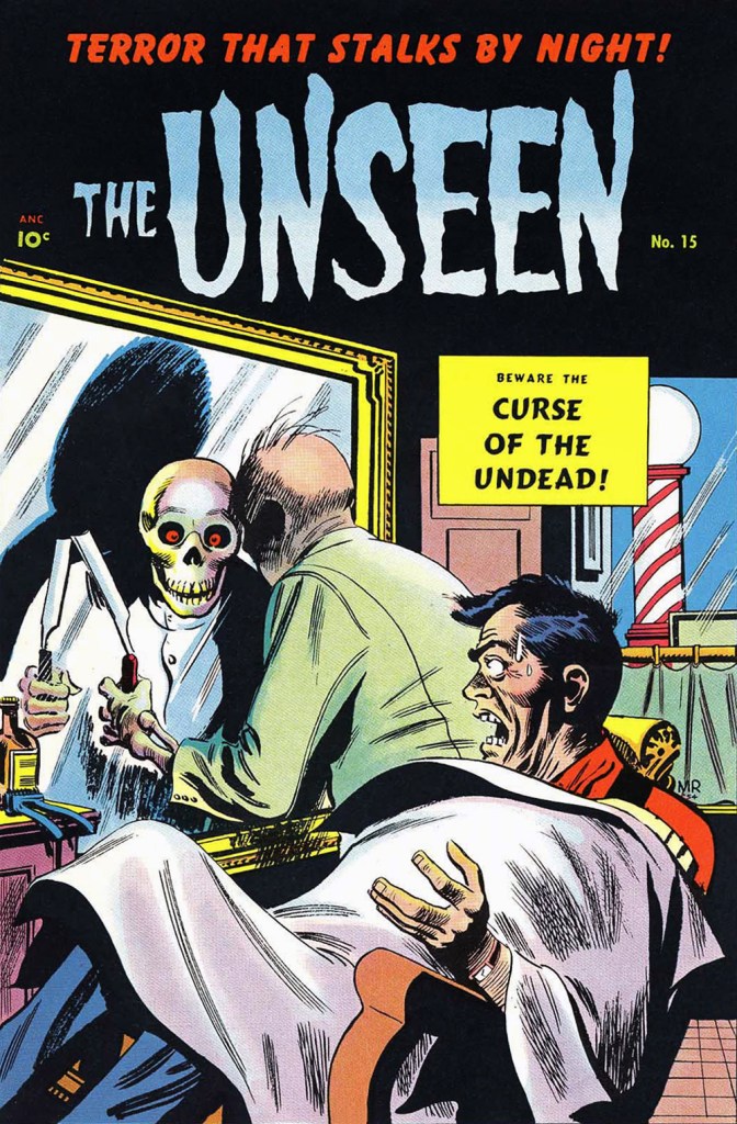
… appeared this cover entry by Québécois Joseph Michel Roy aka Mike Roy (inks likely provided by George Roussos). This is The Unseen no. 15 (July 1954, Pines), the series’ final issue. To give credit where it’s due, the death’s head reflection is a cute new wrinkle.
More than two decades down the road, Marvel, since they were already borrowing Harvey’s Chamber of Chills title (did they even ask? I wonder), figured they may as well reenact one of its classic covers.
Say, what’s this about the day’s first shave? … is there shaving after death? Hassles, hassles.
Though most would nowadays call upon electric shavers or disposable plastic razors, I presume that straight razors have made a comeback among the hipster set. Still, a niche is hardly universal.
This is Chamber of Chills no. 22 (May, 1976, Marvel). Pencils by Larry Lieber, raised on high by the masterly inks of Tom Palmer, who, not content with being one of the all-time finest ink slingers, was also an excellent colourist.
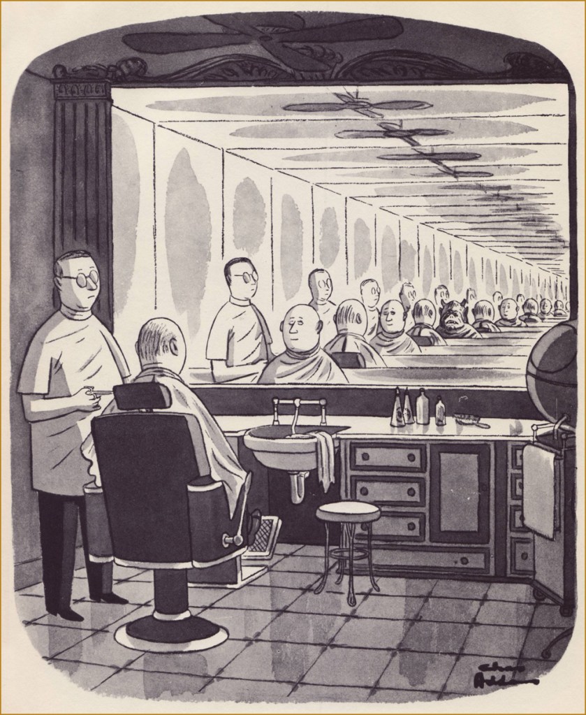
As a bonus, here’s one on the general topic by the immortal Chas Addams. It appeared in The New Yorker in 1957, then was reprinted later that year in his solo collection Nightcrawlers (Simon and Schuster). For more of that excellently-morbid Addams mirth, amble over to this earlier spotlight from our Hallowe’en Countdown’s initial edition.
Most modern reprints of Addams cartoons I’ve seen tend to be on the washed out, blurry side, so I’m grateful to have my ancient volumes of his work. Feast your weary peepers on this fine vintage!
« Drinking your own blood is the paradigm of recycling. » — Gary Busey
Say, isn’t there something… sorta quaint about that cover?
In the 1970s, while DC and Charlton consistently provided all-new material*, Marvel quickly switched to an all-reprint formula (the better to save money whilst flooding the market, my dear!), sometimes even on the covers, with some amusingly inappropriate updates at times.
This is Dead of Night no. 2 (Feb. 1974). Alterations by unknown hands. Only one issue of this title would feature new material: its eleventh and final issue (introducing The Scarecrow); this number, however, reprints pre- and post-code Atlas stories from 54-56.
This is Marvel Tales no. 125 (July 1954, Atlas); cover art by Harry Anderson. The milky semi-transparency is a nice touch.
Okay, here are another pair of before and afters:
This is Tales to Astonish no. 34 (Aug. 1962, Marvel). Cover pencils by Jack Kirby, inks by Dick Ayers. Hardly a classic, not to mention that it lazily recycles the story’s opening splash. It’s also a textbook demonstration of what I dislike about Marvel colouring in the Silver Age: I’m guessing it was company policy to leave the backgrounds mostly in grey to make the characters ‘pop out’. A sound commercial policy, perhaps, but artistically, it seems pretty stale to me.
This is Monsters on the Prowl no. 29 (Aug. 1974, Marvel). A classic instance of John Romita‘s alteration-happy art direction. Making the protagonist a woman and adding a witness are both dishonest touches, for what it’s worth. On the plus side, I do like the lightning bolt (good use of existing space!), and the colouring is a marked improvement. Edited by Rascally Roy Thomas.
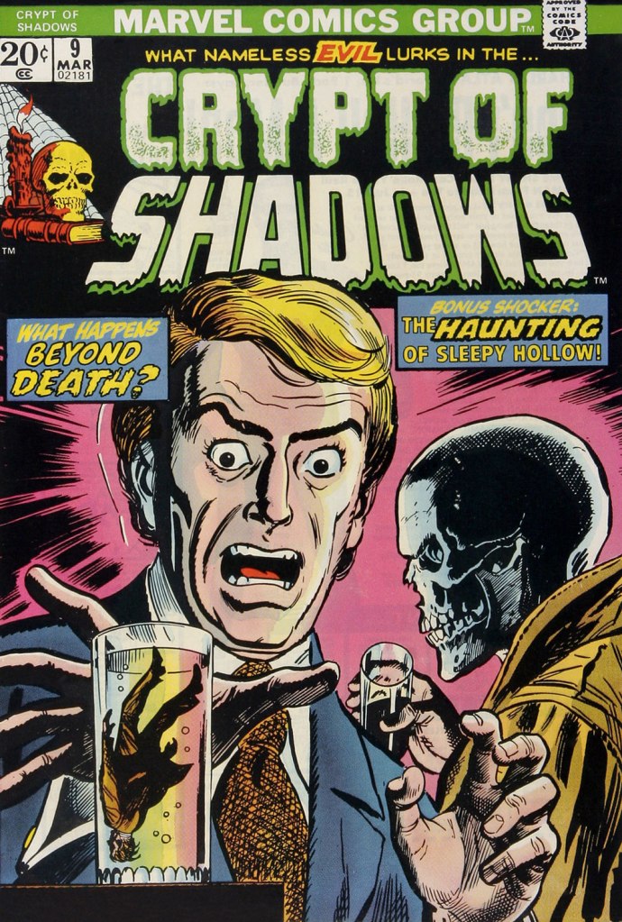
This is Mystic no. 30 (May, 1954, Atlas); colours by Stan Goldberg. A striking cover by Russ Heath…
… is, if not ruined, then at the very least diminished by clumsy and pointless updates, including the removal of Heath’s signature (although upon seeing the ‘improvements’ perpetrated upon his work, he might have opted for the comics equivalent of an ‘Alan Smithee‘ or ‘Cordwainer Bird‘ credit). This is Crypt of Shadows no. 9 (Mar. 1974, Marvel). Alterations, once more, by unknown, guilty hands. Also edited by Roy Thomas (just so you know who’s responsible).
-RG
*and if and when they didn’t, they’d tell you! Not so with Marvel. As for Gold Key, they would just pretend the material was ‘reprinted by popular demand’.
« La matière en était gélatineuse et peu consistante; elle se décomposa, au bout de quelques heures, en un liquide rose et gluant, d’une odeur insupportable.* » — Jean Ray, Dans les marais du Fenn
Aw, good old muck monsters…
Perhaps the first to emerge, at least in the English language, was Theodore Sturgeon’s “It”, published in Unknown’s August, 1940 issue, whose title page warned: “IT wasn’t vicious, IT was simply curious — and very horribly deadly!“
But IT was preceded, by some years, by Raymond Marie de Kremer alias Jean Ray’s superb Dans les marais du Fenn (« In the Fenn Marshes »), first published in the Belgian literary magazine L’ami du livre’s issue of November 1st, 1923! A handful of Ray stories (often published under his alternate nom de plume, “John Flanders”) were published in US pulps, including the legendary Weird Tales, but “Dans les marais…” appears to have somehow, to this day, remained untranslated to English.
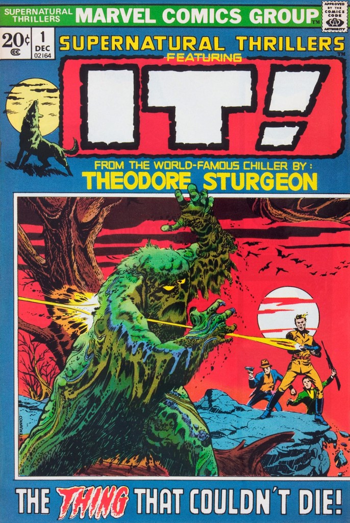
This is Supernatural Thrillers no. 1 (December, 1972, Marvel), an adaptation by Roy Thomas, Marie Severin and Frank Giacoia. Cover by Jimmy “Profa” Steranko.
The opening — and best — page from Marvel’s IT adaptation, which fails, imho, because Rascally Roy, overly attached to the original text, doesn’t let the visuals breathe. The mediocre results, at once too pedantically faithful and well off the mark, are no substitute for Sturgeon’s original.
IT originally saw print in this issue of Street & Smith’s Unknown, which had, just one month earlier, abandoned its striking painted covers for this money-saving but comparatively stodgy, ‘dignified’, Reader’s Digest-style design. It looks like there’s a page missing — the best one!
And they were soon at it again. How did they manage to convince themselves that this was going to succeed as an adaptation? This is Worlds Unknown no. 6 (Apr. 1974, Marvel). Pencils by Gil Kane and inks by Ernie Chan, with extensive alterations by John “Heavy Hand” Romita. This has been bestowed the impressive (if true) honour of being called The Lyingest Cover in Marvel Comics History.
-RG
*« Its matter was gelatinous and insubstantial; it decomposed, within a few hours, into a viscous pink liquid of unbearable odour. »
« She’s a haunted house / and her windows are broken. » — Scott Walker, “Big Louise” (1969)
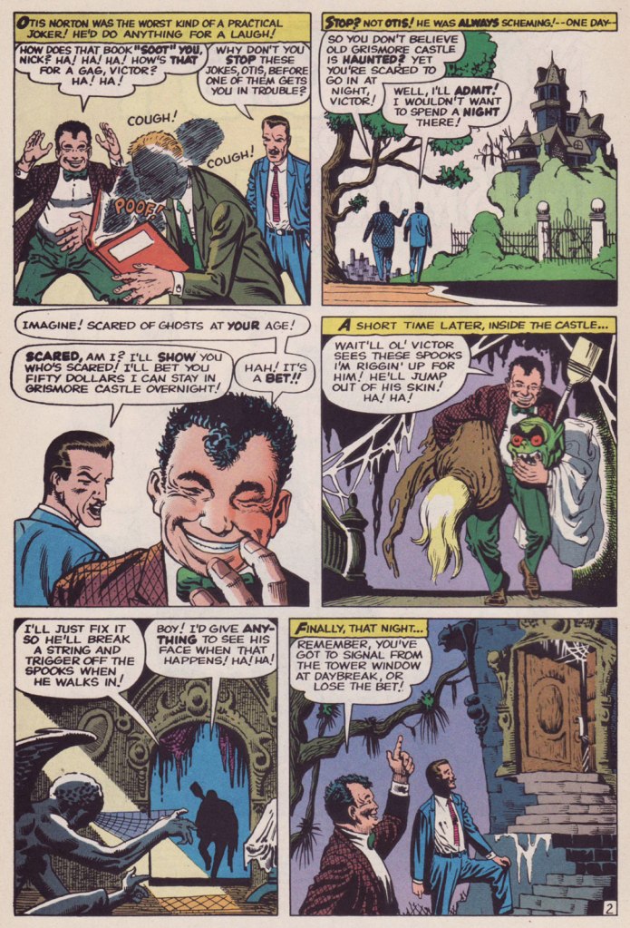
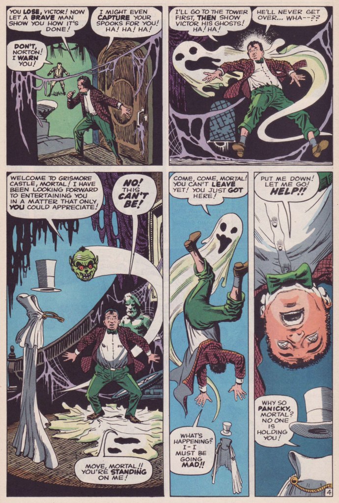
I’ve been wanting to share one of the all-time most beautiful art jobs Steve Ditko ever wittled, 1960’s The Ghost of Grismore Castle! (published in Strange Tales no. 79), but I don’t have that book. I do, however, own a 70’s reprint of it, in Vault of Evil no. 14 (October 1974), but the colouring and reproduction were so bland and washed-out that I knew that justice wouldn’t be done to this meritorious piece.
Then it hit me: I *had* seen a lovingly reconstructed presentation of the tale — has it nearly been… 30 years ago? Yikes!
It was reprinted with brio in the redoubtable Mort Todd‘s Curse of the Weird (no. 2, January 1994), a flawlessly-assembled anthology title he somehow conned Marvel into publishing in the early 90s.
So my gratitude goes out to Mr. Todd and, once more, my admiration to Mr. Ditko.
« We shot it from the original stats I dug out of the Marvel vault, rather than reprint VoE #14, and lovingly recolored it! Thanks for noticing! »
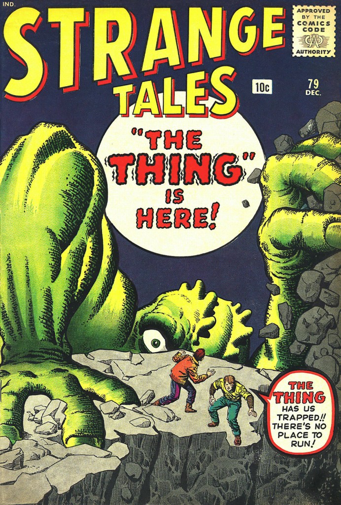
Oh, and as bonus, here’s the cover, one of those absurdly lush Kirby-Ditko collaborations. As usual with Marvel, all captions are de trop.
This is Strange Tales no. 79 (Dec. 1960, Marvel), pencils by Jack Kirby, inks by Steve Ditko. And duh, *obviously*, “The Thing” is here, Stan. Show, don’t tell.
The very 70’s update. This is Vault of Evil no. 14 (Oct. 1974, Marvel); cover pencils by Larry Lieber, inks by Frank Giacoia.
I was startled to discover that after several years of WOT blogging, we still have no post dedicated to Sergio Aragonés. Perhaps this is in part because his art is ubiquitous – throughout his long career, he has contributed manifold pages to various DC publications, created an enduring barbarian parody, scripted and drawn (mostly solo but also in collaboration) an impressive number of mini-series published by Fantagraphics, Dark Horse and Bongo Comics, produced various comic-con paraphernalia, etc. And this is not to mention his lasting contributions to Mad Magazine (which I did discuss, though not at length, in A MAD dash… inside) – something in the magnitude of twelve thousand gags spread over 57 years and 491 issues of Mad.
A sequence from A Mad Look at Sharks from Mad no. 180 (January 1976, EC).
He’s also a charming, universally-liked man whose bigger-than-life persona has ensured that his participation in anything is always surrounded by fun anecdotes. It is my great pleasure to share this abridged compendium of Aragonés tentacles, of which there are many, as he enthusiastically added them into doodles and margins with great glee (and, as we know, « he has quite literally drawn more cartoons on napkins in restaurants than most cartoonists draw in their entire careers *», so just imagine how many tentacles are scattered throughout his work).
Room 13 one-pager, scripted (and edited) by Joe Orlando. This was published in House of Mystery no. 190 (Jan-Feb 1971, DC).
Incredibly, we still haven’t written a post dedicated to the great Plop! (this post is starting to sound like a to-do-in-the-nearest-future list), though Hallowe’en Countdown III, Day 30 did include a story from number 1. Plop!, “The New Magazine of Weird Humor!“, certainly included a lot of cephalopods in its 24 issues and I will doubtlessly get around them one of these days. In the meantime, here’s a very appropriate page from Plop! no. 16:
This closing page of Plop! no. 16 (September 1975, DC) was scripted by Steve Skeates.
Galloping forward through some twenty years, we briefly land at Marvel, namely these two pages from Groo the Wanderer no. 98 (February 1993, Marvel), co-plotted and scripted by Mark Evanier.
Sergio Aragonés Funnies, published between 2011 and 2014 by Bongo Comics, boast 12 issues of really enjoyable, remarkably varied material. For those who may think that Aragonés is one-trick pony who can only do ‘silly’ humour, this series offers many auto-biographical stories, some of them surprisingly poignant and heart-felt. Not to say that it’s not devoid of humour – the more serious stuff (including social criticism in the form of animal parables) is nestled among pages of slap-stick humour and imaginative goofiness, from one-pagers to longer stories that take most of an issue to develop. Aragonés also shares some background on his approach to stories, allowing us to peek into his imagination and possibly answer that hackneyed question that plagues all manner of writers, ‘where do you get your ideas from?’ If an anthology of Funnies is ever published, I’ll happily purchase it.
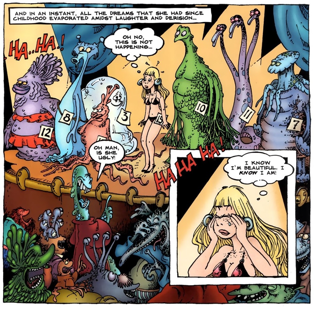
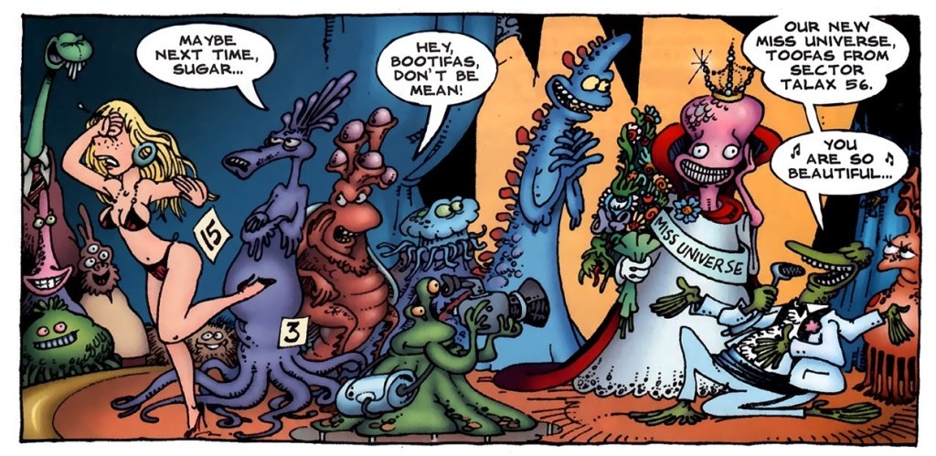
Excerpts from Kira and the Beauty Contest, published in Sergio Aragonés Funnies no. 2 (August 2011, Bongo Comics):
Panels from Sergio’s Inferno, published in Sergio Aragonés Funnies no. 3 (September 2011, Bongo Comics):
Finally, a panel from the back cover of Sergio Aragonés Funnies no. 10 (October 2013, Bongo Comics). Nevermind what the joke is, I just really like that octopus (as well as his other sea friends).
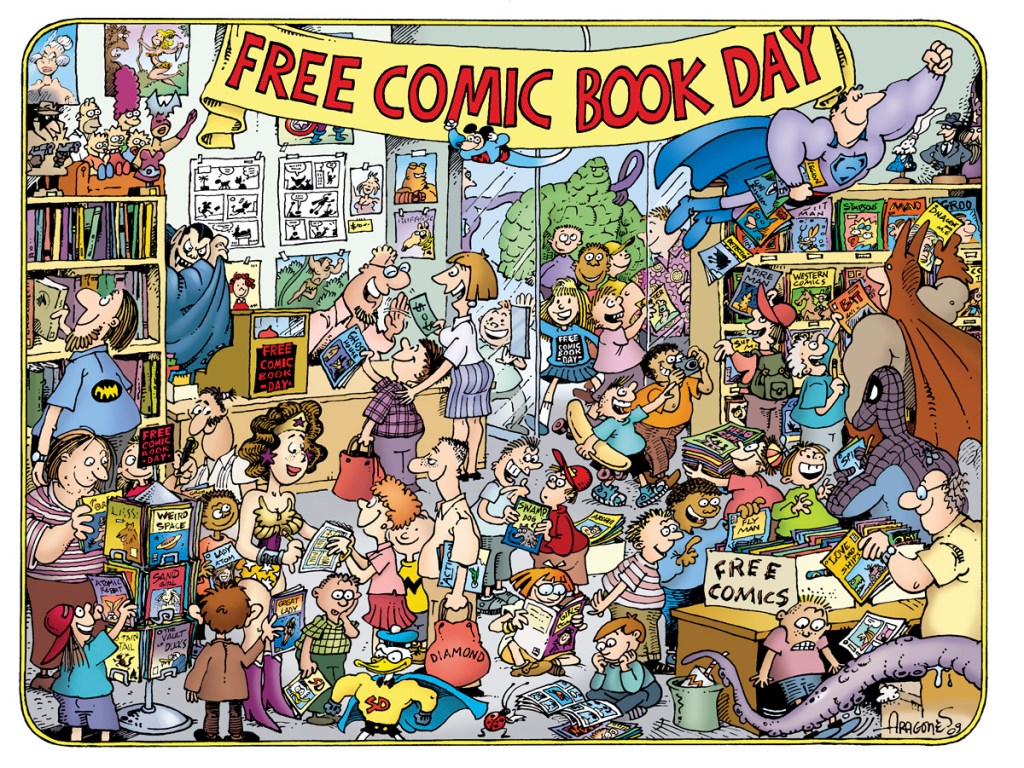
I mentioned materials related to Comic-Cons, so I would be amiss to not include at least one image of something vaguely related!
This design was created for the ‘Free Comic Book Day Commemorative Artist T-shirt’ in 2010.
I’ll end this post with a classic Aragonés anecdote, as told by Mark Evanier. This happened while these two were participating in filming The Half-Hour Comedy Hour television show for NBC in 1983, on which the model Jayne Kennedy was a guest. [source]
« This was one of the most beautiful women in the world. And she wore this dress that was very revealing, so much so the censors wouldn’t let us put her on the air in it without adding some material. So we’re all talking to her, the writers and whoever, just in awe of this woman. And Sergio comes walking in looking like a homeless person, carrying his portfolio. And Jayne sees him and she shouts, ‘Sergio!’ and she runs over and starts kissing him passionately.
They’d worked together before, it turned out. But Johnny Carson comes walking out into the hallway and he thinks Jayne Kennedy is being sexually assaulted by a homeless person in the NBC hallways. He came over to make sure she was okay. She said it was fine, that she knew him, and I said, ‘It’s okay, he’s a cartoonist.’
So Johnny gives that classic look and he says, ‘I knew I should have taken up drawing.’ »
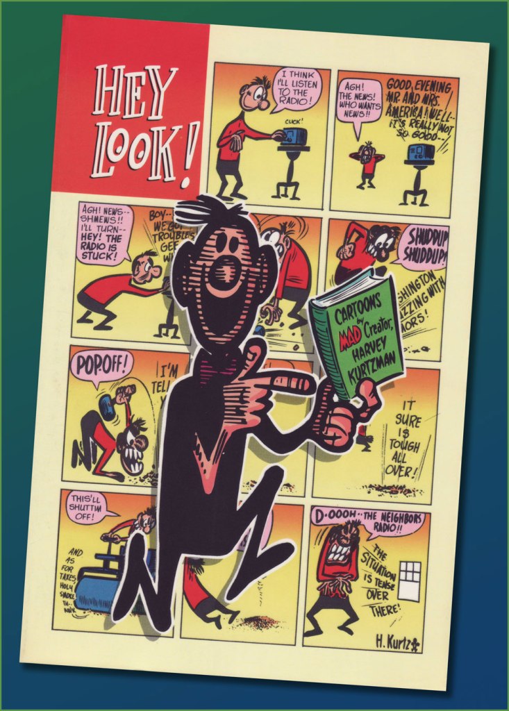
« Hey, Look! is essential reading for any cartoonist. » — the late and much-missed Patrick Dean, who truly knew what he was talking about.
Sometimes I think of a post topic and dismiss it with a ‘nah, too obvious’… but on some of my brighter days, I run the idea past my wife, who provides a welcome reality check: ‘Obvious to whom?‘, she asks. Well, there’s been a collected edition… which has been out of print for most of the nearly thirty years since it hit the stands. Fair enough.
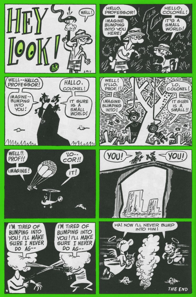
As I’ve been lately foraging through the crumbling back pages of Golden Age humour comics (see my previous post), it would be negligently immoral for me to pass over one of the crown jewels of the genre, the era and the medium.
One* of the redeeming features of Marvel’s overwhelmingly crass Dynamite (magazine) rip-off, Pizzazz, was its reprinting of a handful of Harvey Kurtzman‘s majestic Hey Look! strips. Of course, it made perfect economic sense: grab some already (and barely)-paid-for, all-but-forgotten ‘filler’ from the 1940s, slap some new colour on ‘em, and wham! One less egg to fry.
Here’s the collection in question. Published in 1992 by the venerable Kitchen Sink Press, it has yet to be improved upon. In addition to all the Hey Look! strips, it includes an unsurprisingly excellent introduction by the erudite John Benson, and further sweetens the pot with Kurtzman’s other Timely features of the era, namely Genius, Egghead Doodle and Potshot Pete. The latter is particularly worth a look-see.
The earliest Hey Look! strips are cute and of some historical significance, but rather scattershot and tentative. Here’s roughly where Kurtzman starts to really, and consistently, cook. Originally published in Gay Comics no. 33 (Aug. 1948, Timely).
Mr. Kurtzman was ahead of the game, anticipating the superhero genre’s dark turn of the mid-80s and beyond, and pointing out its inherent fascism. Already a bit too close too home at the time of its creation, this piece languished in limbo until its publication in 1966 in a limited-edition portfolio.
Originally published in Nellie the Nurse no. 16 (Dec. 1948, Timely).
Originally published in Hedy Divine no. 30 (Dec. 1948, Timely).
Originally published in Joker no. 35 (Jan. 1949, Timely).
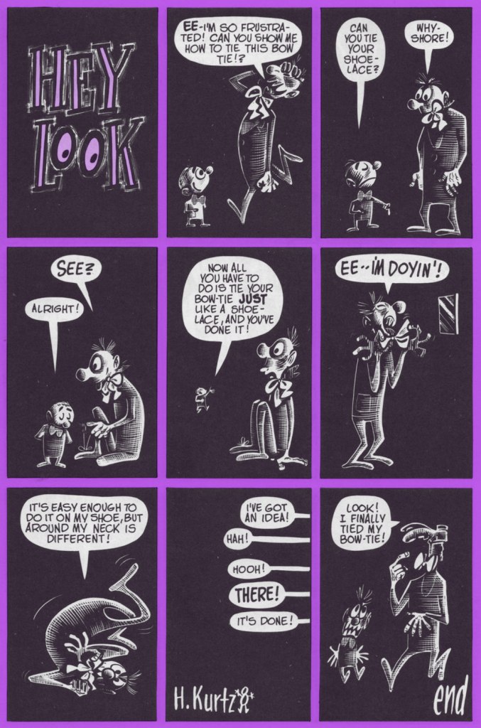
Originally published in Millie no. 16 (Feb. 1949, Timely). Always experimenting: dig here Kurtzman’s elegant use of the scratchboard technique.
Originally published in Nellie the Nurse no. 19 (Apr. 1949, Timely). With the miniaturisation of electronics, and cameras in particular, there’s (of course) been an opposing movement toward huge telephoto lenses. Read into it what you will.
I was, and remain, especially fond of this one, originally published in Gay Comics no. 37 (Apr., 1949) and reprinted in Pizzazz 15 (Dec. 1978)… the one with the Battlestar Galactica cover. ‘Cabazziz’ is made up, but Podunk has roots.
Originally published in Patsy Walker no. 22 (May 1949, Timely). Incidentally, generic ‘teen’ humour character Patsy Walker has since (circa 1976) been refashioned and recycled, in the tried-and-true ‘waste not, want not’ Marvel manner, into a superheroine, Hellcat. Sheesh.
« Don’t change your tack when the timbers crack On the dark and the rolling sea… » *
I am relatively indifferent to tales of adventure, but the siren song of the ocean sometimes prompts me to venture into reading tales about ruthless pirates or valorous seafarers and the perilous voyages they undertake on ships big and small, magnificent or modest. Who hasn’t felt a thrill at spotting a handsome vessel on the water, even if that water is but a canal running through the city? The other point of interest of this discussion is that where there’s an ocean and a ship upon it, there is a (preferably) giant octopus somewhere nearby, only waiting to shred the ship’s hull to smithereens and voraciously gobble up its shipmates.
Here is a modestly-sized yet utilitarian boat with a handsome octopus in tow. Maybe he just wanted to climb on deck to rest a while, like this otter?
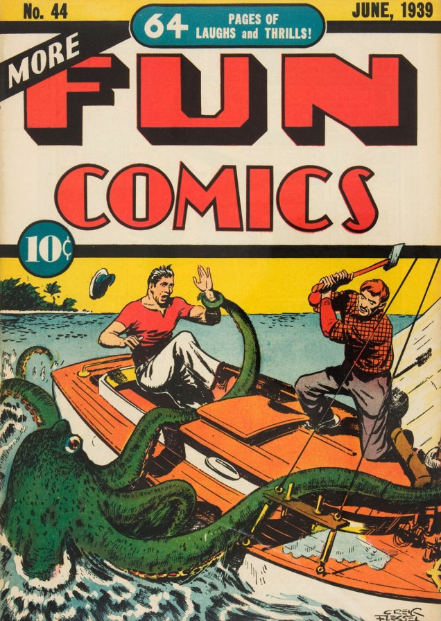
More Fun Comics no. 44 (June 1939). Cover by Creig Flessel.
A similar boat (I don’t know whether it’s my profound lack of knowledge of boats that makes it seem that way) was attacked by a bigger, scarier – downright malevolent! – octopus some twenty years later. See Kyle “Ace” Morgan, Matthew “Red” Ryan, Leslie “Rocky” Davis and Walter Mark “Prof” Haley scramble for safety while an enraged octopus seeks to devour them! Oh, sorry, I’m being melodramatic.
Challengers of the Unknown no. 77 (Dec. 1970 – Jan. 1971, DC). Pencilled by Jack Kirby, inked by Jack and Rosalind (Roz) Kirby.
This cover has actually been recycled from Showcase no. 12 (Jan.-Feb. 1958, DC), where the background was yellow and the water a more normal shade of blue-white. I do like how the octopus stands out against a black background, however (and the multi-coloured water really sets off his beady, evilly-glowing green eyes!)
Of course these encounters also take place within the stories, as opposed to on the cover.
Page from The Outcasts of the Seven Seas, scripted by Bob Haney, pencilled by Howard Purcell, and inked by Sheldon Moldoff, was published in Sea Devils no. 23 (May-June 1965).
Time to move underwater, a very natural setting for an octopus attack. Here we have a submarine tenderly wrapped in tentacles:
Page from The Human Torch in the Clutches of the Puppet Master!, (over)scripted by Stan Lee, pencilled by Dick Ayers and inked by George Roussos. This story was published in Strange Tales no. 116 (Jan. 1964, Marvel).
Last but not least, I’ve kept this neat little submarine until the end:
Voyage to the Deep (IDW Publishing, 2019), a collection of Dell Comics’ short-lived, four-issue series published from 1962 to 1964 and illustrated by Sam Glanzman. Note the introduction by WOT favourite Stephen Bissette!
Glanzman is also a favourite of ours, though we haven’t talked about him much (yet). In case you’re wondering what the insides of one of those issues looked like – good, they looked really good! Note the octopus proudly perched in the middle of the page.
Page from Voyage to the Deep no. 1 (September-November 1962, Dell). Art by Sam Glanzman.
« Jerry Grandenetti started out ghosting The Spirit, and nobody… NOBODY… captured the spirit of The Spirit better. Not content to stay in Will Eisner’s shadow forever, he forged his own unique style leading to a highly successful comics career lasting decades. » — Michael T. Gilbert
Since my very first encounter with his work, Jerry Grandenetti (1926-2010; born ninety-five years ago today, another Thursday April 15th) has endured as one of my true artistic heroes. But he’s not celebrated much at all.
Though he’s worked extensively on The Spirit, he’s treated as a bit of a footnote in the Eisner hagiography. His DC war work is well-regarded, but he’s inevitably overshadowed by the Joe Kubert – Russ Heath – John Severin trinity. Besides, by and large, the war comics audience doesn’t overlap much with the spandex long johns crowd. Grandenetti has only very occasionally and timidly dipped a toe into the super-heroics fray, and he was far too unusual for overwhelming mainstream acclaim.
In fact, aside from the couple of converts I’ve made over the years, I can only think of three fellow torch-bearing aficionados: Michael T. Gilbert (who digs best the early, Eisner-employed Jerry); Stephen R. Bissette (who favours the spooky 60s and 70s work); and Don Mangus, who’s most into the DC war stuff. I daresay I enjoy it all, but my taste is most closely aligned with Mr. Bissette’s on this particular point. Let’s sample a bit of everything, insofar as it’s feasible to sum up a career spread out over five decades… in a dozen-or-so images.
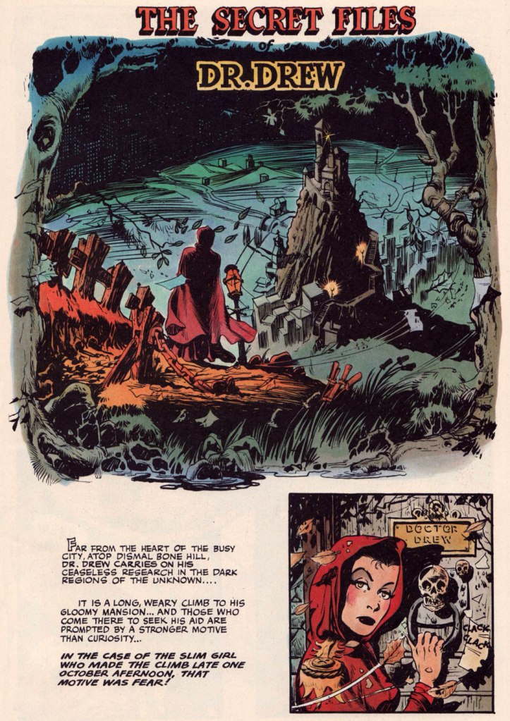
Opening splash from The Secret Files of Dr. Drew: Sabina the Sorceress, written by Marilyn Mercer and lettered by Abe Kanegson, from Rangers Comics no. 56 (Dec. 1950, Fiction House); this version hails from a reprint (Mr. Monster’s Super Duper Special no. 2, Aug. 1986, Eclipse) using the surviving original art; it was recoloured by Steve Oliff.
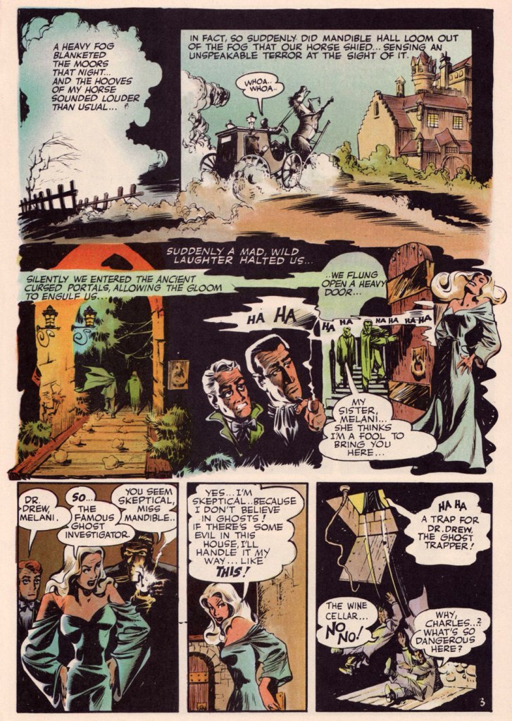
Page 3 from The Secret Files of Dr. Drew: Curse of the Mandibles!, written by Marilyn Mercer and lettered by Abe Kanegson, from Rangers Comics no. 55 (Oct. 1950, Fiction House); this version hails from a reprint (Doc Stearn… Mr. Monster no. 4, Dec. 1985, Eclipse) using the surviving original art; it was most tastefully recoloured by Steve Oliff.
In 1954, the powers-that-be at National Periodical Publications (you know, DC) gave Grandenetti some latitude to experiment with their War covers. Grandenetti produced an arresting hybrid of painted and line art. The process involved a grey wash painting that was photostatted, with flat colour laid over the resulting image. The first few attempts yielded striking, but nearly monochromatic results. A bit farther down the pike, the production department got more assured in its technical exploration.
This is G.I. Combat no. 77 (Oct. 1959, DC); wash tones and colouring by Jack Adler, who recalled, in a 1970s interview: « It was suggested that we start doing washes for covers, and we were talking about doing it for so damned long, but nobody attempted it. I think Grandenetti did the first one, an army cover with someone floating in the water. I think that was the first wash cover that was done. That one ended up looking like a full color painting. »
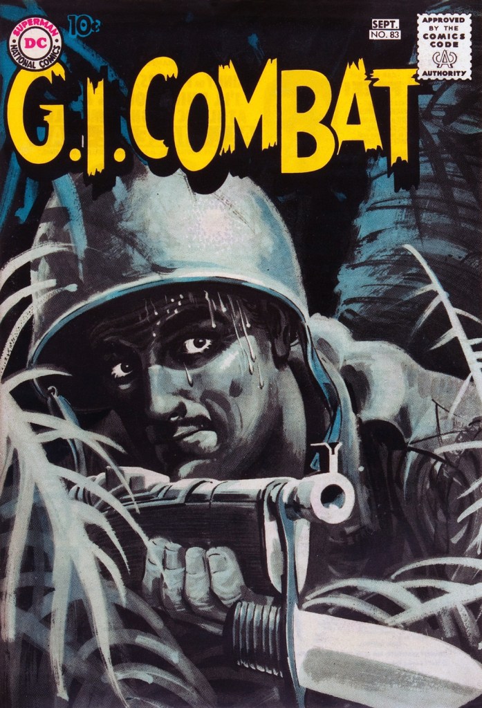
This is G.I. Combat no. 83 (Aug.- Sept. 1960, DC); wash tones and colouring by Jack Adler. In 1995, Robert Kanigher, Grandenetti’s editor on the DC war books and a frequent collaborator, recalled: « Jerry liked to experiment and I had to sit on him to get him to stop it. Especially in his covers, which were outstanding, when I forced him to draw as realistically as possible. »
Original art from The Wrath of Warlord Krang!, smothered in dialogue and exposition by Stan Lee, from Tales to Astonish no. 86 (Dec. 1966, Marvel); inks by Bill Everett. Namor‘s constant random shouts of ‘Imperius Rex!‘ make him sound like a sitcom character with Tourette’s. As far as I’m concerned, it’s possibly been the most annoyingly asinine slogan in comics since Stan stole ‘Excelsior!‘ from Jean Shepherd.
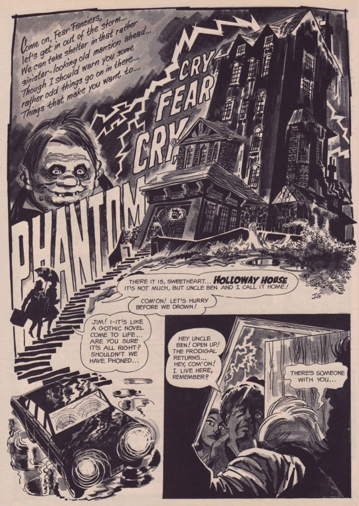
The opening splash from Cry Fear, Cry Phantom, written by Archie Goodwin, from Eerie no. 7 (Jan. 1967, Warren). In the mid-60s, presumably tiring of being pigeonholed as a war artist at DC, Grandenetti made the publishers’ rounds, doing a bit of work for Tower, Gold Key, Charlton, Marvel, Cracked (check it out here) and most memorably Warren where, after ghosting a few stories for Joe Orlando, he unleashed his innovative expressionistic style.
DC was generally hesitant to entrust its more established properties to the more “out there” artists. In the cases of Grandenetti and Carmine Infantino, the solution was to match them with the weirdness-dampening inks of straight-arrow artist Murphy Anderson. And you know what? It did wonders for both pencillers and inker.
This is The Spectre no. 6, October, 1968. A tale told by Gardner Fox (and likely heavily revised by hands-on editor Julius Schwartz, a man who loved alliterative titling) and superbly illustrated by the Grandenetti-Anderson team. Steve Ditko aside, Jerry Grandenetti had no peer in the obscure art of depicting eldritch dimensions (you’ll see!)
Page 13 from Pilgrims of Peril! written by Gardner Fox, from The Spectre no. 6 (Sept.- Oct. 1968, DC); inked by Murphy Anderson. Dig the salute to a trio of real-life spooky writers, all of whom editor Julius Schwartz knew well, having even served as Lovecraft’s literary agent late in the man’s life. By the tail end of the 1960s, Lovecraft’s work was finally making some commercial inroads, thanks largely to Arkham House co-publisher Derleth‘s unflagging diligence.
Page 22 from Pilgrims of Peril! written by Gardner Fox, from The Spectre no. 6 (Sept.- Oct. 1968, DC); inked by Murphy Anderson.
Page 2 from Men Call Me the Phantom Stranger, written by Mike Friedrich, from Showcase no. 80 (Feb. 1969, DC); inks by Bill Draut. This story reintroduced an obscure character from the early 50s, which Grandenetti had drawn a couple of times during his six-issue run. The Phantom Stranger has remained active ever since, but most writers (save Alan Moore, wouldn’t you know it?) don’t really know what to do with him. This, however, is my very favourite PS appearance. Draut, a slightly old-fashioned penciller by this time was, as a slick inker, a wonderful fit for Grandenetti’s confidently loopy layouts.
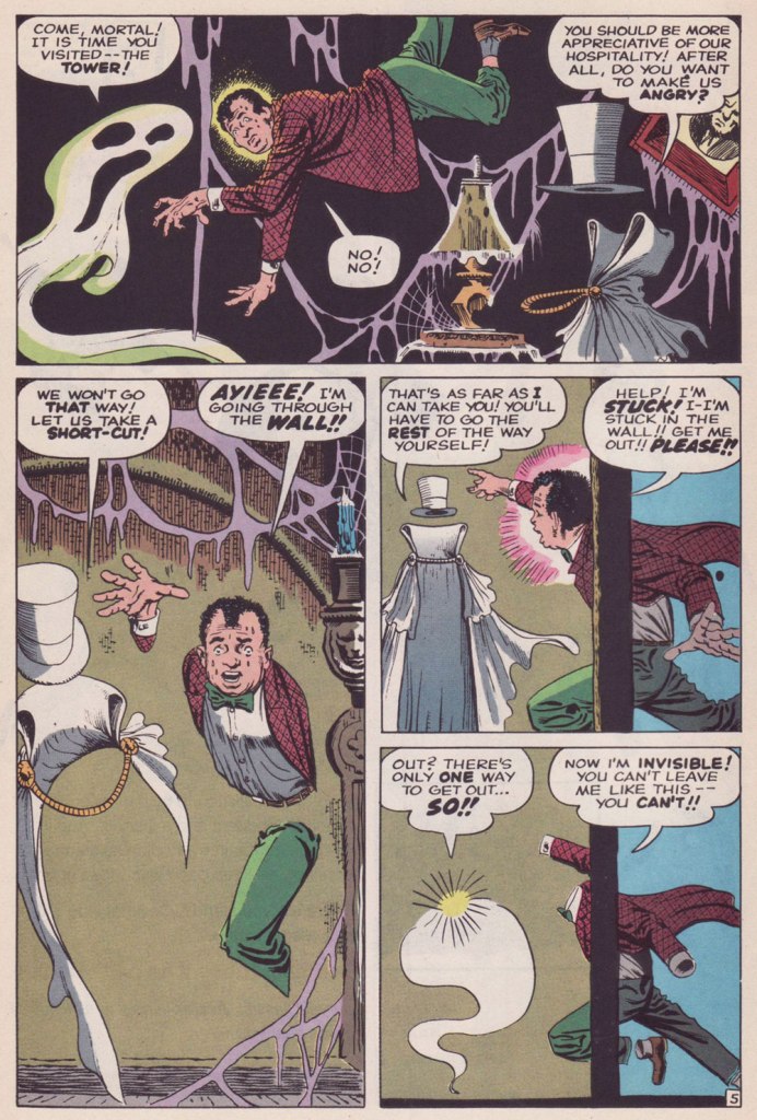
Page 3 from The Haunting!, written by Jack Oleck, from House of Mystery no. 183 ((Nov.-Dec. 1969, DC). Grandenetti pencils and inks: undiluted!
Page 2 from Eyes of the Cat, written by Robert Kanigher, from House of Mystery no. 189 (Nov.-Dec. 1970, DC); inks by Jerry’s fellow Will Eisner ghost Wallace Wood. The inspired combination of Grandenetti’s adventurous layouts and the velvety unctuousness of Wood’s finishes are a match made in heaven, but one Woody wasn’t fond of. Oh well.
So there you are. Just the tiniest tip of the iceberg. Happy birthday, Mr. Grandenetti!


