« From time to time a sputtering doodle-bug shatters the torpor of the overcast sky. One second, sometimes two … at most three … of silence. Visualizing that fat cigar with shark fins as it stops dead, sways, idiotically tips over, then goes into a vertical dive. And explodes. Usually it’s an entire building that’s destroyed. » — Jacques Yonnet
Perhaps the title gave the game away, but we’re back with part three to wrap up (in style!) our talk with Cary Burkett on his and Jerry Grandenetti‘s (and Ric Estrada‘s) Dateline: Frontline (1977-1981).
Who’s Out There: How hands-on an editor was Paul Levitz?
CB: Paul was more hands-on at the beginning. We would have a plot conference and he would toss out suggestions and sometimes specific directions. But Paul was a very smart guy, and he had a way of figuring out how to best to work with individual writers. With me, it usually worked better to plant a seed and let it develop rather than to nail things down too tightly. I didn’t think fast in a plot conference setting, I was too intimidated by Paul’s creativity and confidence. I think Paul figured this out and found ways to drop a little guidance in that I could take time to mull over on my own.
Paul was also extremely busy, not just an Editor but the Editorial Coordinator for the whole line of DC comics, and that is a whopping responsibility. So as things progressed, he was less hands-on. I like to think he began to trust the material I was giving him.
WOT: Was there much distance between the précis Mr. Levitz assigned you to do and the scenario you handed in?
CB: I don’t think so.
WOT: Dateline: Frontline is clearly a bit of a ‘pill in the hamburger’, that is to say, instructive, eye-opening material. Was this ‘Trojan Horse’ approach considered and deliberate? (Surely it wasn’t just intended as pure entertainment!)
CB: In a way, it was deliberate, although not carefully considered or planned out. The trajectory was set by Paul when he passed on to me the book The First Casualty as background guidance. The tone of that book and all the eye-opening material in it definitely influenced the approach to the series. The very idea that the main character would be a war correspondent, not a soldier or fighter, meant that these stories would have a different kind of focus. That concept came from Paul, along with the title of the series.
Of course, in comics, you could do a series with a war correspondent where the protagonist becomes a fighter, a behind-the-lines de-facto special forces soldier. If this had been a Jack Kirby strip in the ‘60’s, the correspondent would probably be thrown into situations every issue where he had to fight his way out to save threatened soldiers from some Nazi ambush. You know what I mean.
So we knew we weren’t going for pure entertainment, sure. And the more research I did, the more interested I became in the reality of what happened in the war, and the more I wanted to portray that. And since it was just a 6-page, irregular backup series, we could go in that direction.
WOT: If you were to write this series today, what, if anything, would you do differently? What effect might the intervening years and the current political climate have, for instance?
CB: Too much to think about. But I will say this, I think to try to tie the series to any current political issue would tend to push it into something contrived to fit the agenda. In a way, then, it would become a kind of political propaganda, the very opposite of what the series grapples with.
That’s part of why I wasn’t so interested in setting it during the Vietnam War back in 1976 or ’77. Today, it could be put in that setting without triggering a firestorm of controversy which might drown out what the series is trying to show.
My point is that the issue of seeking truth in a time of war is not limited to any time or place. By attaching the theme to a current political hot button issue, it becomes weaker, not stronger. It becomes more limited, not broader. And it’s more difficult to hear.
My preference would be to see the series deal with the questions outside of the current political setting, and hopefully along the way to see in some way how they apply today.
Maybe that is the ‘Trojan Horse’ method you mentioned.
WOT: I’d say you nailed it.
WOT: Were you writing and planning much in advance? Are there any contemplated, but unpublished, plotlines you’d care to share?
CB: I wasn’t planning specifically very far in advance. I was never sure which set of stories might be the last. But I had a vague outline in my head that I would progress through the major events of the war, choosing specific ones for Clifford to be present reporting. They would be chosen for their historical significance but also to advance general themes of the conflict between reporting the truth and trying to win a World War.
The final series of stories, I think, would have been centered on events in Hiroshima and Nagasaki, and somehow Clifford would have found a way to write a story about it which revealed some of the horrible details … which of course, would never have seen the light of day. Even now, thinking about this, some lines of dialogue closing out the series kind of come to my mind.
I see Clifford, exhausted and disappointed, having given his all to get this incredible story, bitter and at the breaking point. Like it happens to all of us sometimes, the fact that he can’t publish this story seems to him to be an event that sums up his whole life as a failure. He questions why he made such a herculean effort to get the story, why he ever even bothered to try. All his previous failures to get the truth out come back to accuse him.
Maybe it’s his old mentor, the older reporter who tried to ground him a few times, who has the last word. And those words would be about the truth, and the value of searching for it no matter the outcome. And that the truth itself will stand even if only one person knows it. And the old reporter, cynical as he might have seemed at times, would be shown to have his own ideals which have sustained him through the same battles that Clifford has fought.
Yeah, maybe it sounds a bit corny out of the context of the story. But I think I’d go there. I might even have the old reporter say something like, “Truth may seem to be the first casualty in a war. But Truth can never really die, right? Someday people will know the truth about what happened.”
HA! I never expected a story idea for Dateline:Frontline would pop into my head like that after all these years. Seems like this would be a good closing question for this interview. I appreciate you bringing it up, and thanks for giving me a chance to reminisce.
WOT: And thank you for doing it so thoughtfully and graciously.

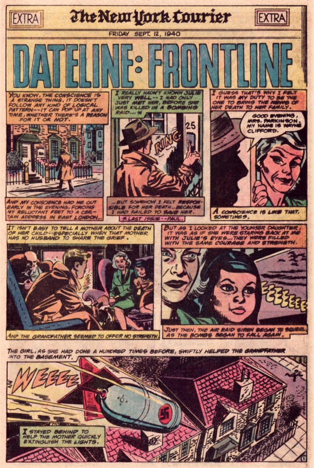
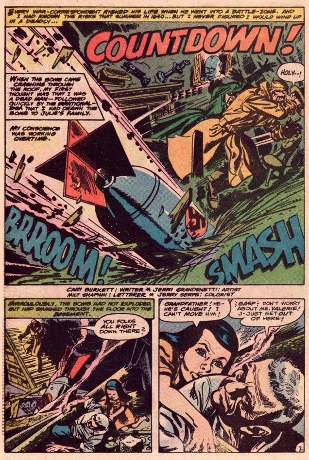
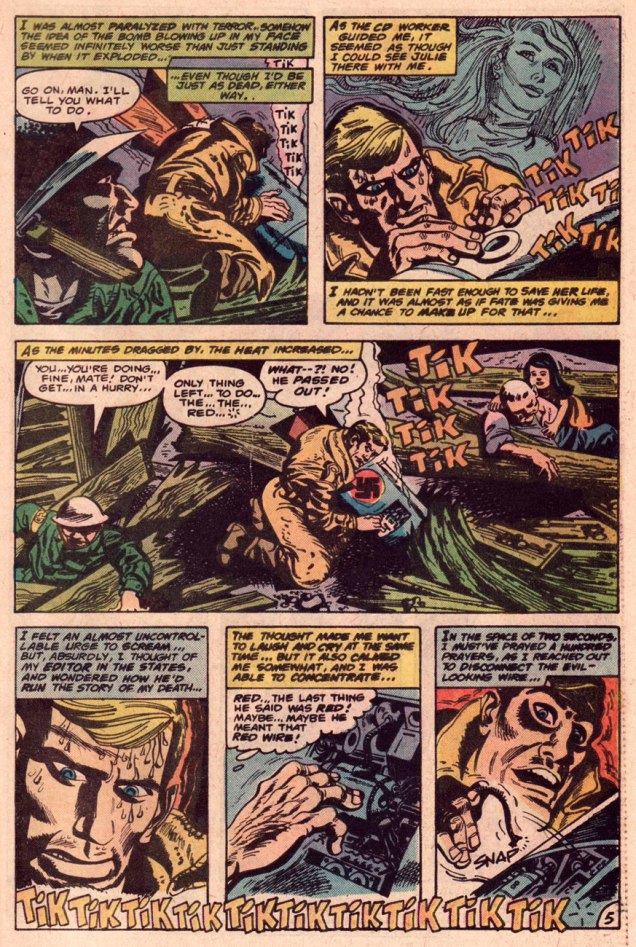
And now, to see our readers off with a story, here, as promised last time, is the concluding episode of Dateline:Frontline’s London trilogy.


And as a parting bonus, a vintage in-house biography of young Mr. Burkett!

-RG