« Be silent in that solitude which is not loneliness — for then the spirits of the dead who stood in life before thee are again in death around thee — and their will shall then overshadow thee: be still. »
— Edgar Allan Poe (1829)
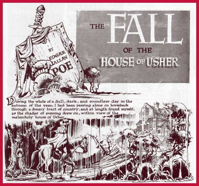
It was on this day, two hundred and ten years ago, that the great writer, poet and posthumous master of all media Edgar Poe (Jan. 19, 1809 – Oct. 7, 1849) was born in Boston, Massachusetts. I’ll spare you the usual biographical details, widely available elsewhere, and we’ll concentrate on his unflagging ubiquity in the medium of comics.
Poe’s literary reputation was in tatters in America, thanks to a rash of hatchet jobs and dismissals, some of the most vicious from the pen of one Rufus Griswold, the very worm he’d named his literary executor (!), as well as such notables as Ralph Waldo Emerson and T.S. Eliot… while his renown was undimmed in Europe, particularly in France (in no small part owing to Charles Beaudelaire’s legendary translations), rehabilitation at home slowly came as the 20th century crept along, but it was likely the publication of Arthur Hobson Quinn’s definitive Poe biography, in 1941, that sealed the deal and opened the floodgates.
Top two tiers from page 2 of The Spirit‘s August 22, 1948 episode. Layout by Will Eisner, pencils and inks by Jerry Grandenetti. As Dave Schreiner puts it: « Grandenetti captures the asthenic look of Roderick Usher that Poe described. The man is a decadent waif; insular, fragile, high-strung, possibly in-bred. »
Classics Illustrated publisher Gilberton was first out of the gate with Poe adaptations, at first tentatively with a pair of poems (Annabel Lee, then The Bells)**, then more substantially with The Murders in the Rue Morgue, in Classic Comicsno. 21 – 3 Famous Mysteries (July, 1944), sharing the stage with Arthur Conan Doyle and Guy de Maupassant. Read it here. Pictured below is Classics Illustratedno. 84 (June 1951, Gilberton), cover by Alex A. Blum. Read the issue here.
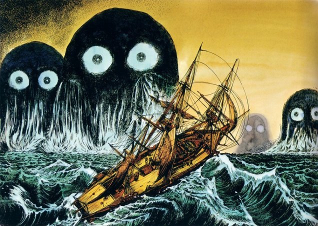
A relevant passage from Simon Singh‘s fascinating (if you’re into that sort of thing… and I hope you are) The Code Book: The Secret History of Codes and Code-Breaking (1999): « On the other side of the Atlantic, Edgar Allan Poe was also developing an interest in cryptanalysis. Writing for Philadelphia’s Alexander Weekly Messenger, he issued a challenge to readers, claiming that he could decipher any monoalphabetic substitution cipher. Hundreds of readers sent in their ciphertexts, and he successfully deciphered them all. Although this required nothing more than frequency analysis, Poe’s readers were astonished by his achievements. One adoring fan proclaimed him ‘the most profound and skilful cryptographer who ever lived’. In 1843, keen to exploit the interest he had generated, Poe wrote a short story about ciphers, which is widely acknowledged by professional cryptographers to be the finest piece of fictional literature on the subject. The Gold Bug tells the story of William Legrand, who discovers an unusual beetle, the gold bug, and collects it using a scrap of paper lying nearby. That evening he sketches the gold bug upon the same piece of paper, and then holds his drawing up to the light of the fire to check its accuracy. However, his sketch is obliterated by an invisible ink, which has been developed by the heat of the flames. Legrand examines the characters that have emerged and becomes convinced that he has in his hands the encrypted directions for finding Captain Kidd’s treasure. »A page from EC Comics great Reed Crandall‘s exemplary adaptation of Poe’s The Tell-Tale Heart, from Creepyno. 3 (June, 1965). While Crandall’s work is outstanding, scripter-editor Archie Goodwin tried to ‘improve’ upon Poe by tacking on a tacky ending, a nasty habit he would indulge in again on subsequent adaptations, notably issue 6’s The Cask of Amontillado!. Read The Tell-Tale Heart. And don’t miss The Cask…, if only for the artwork.In the mid-70s, Warren would devote two full issues of Creepy to Poe adaptations; issue 69 (Feb. 1975), featured The Pit and the Pendulum, The Fall of the House of Usher, The Premature Burial, The Oval Portrait, MS Found in a Bottle!, Facts in the Case of M. Valdemar; issue 70 (Apr. 1975) comprised The Murders in the Rue Morgue, Man of the Crowd, The Cask of Amontillado!, Shadow, A Descent into the Maelstrom! and Berenice; All stories were adapted, with far greater respect than Mr. Goodwin seemed capable of, by Rich Margopoulos, and illustrated by a host of artists. The project was edited by Bill DuBay, and the cover painting is by Ken Kelly.Isidre Monés‘ fabulous opening splash from Creepyno. 70‘s Berenice. Read the story in full here.« The rays of the moon seemed to search the very bottom of the profound gulf; but still I could make out nothing distinctly, on account of a thick mist in which everything there was enveloped, and over which there hung a magnificent rainbow, like that narrow and tottering bridge which Musselmen say is the only pathway between Time and Eternity. » In 1976, a peak-form Berni Wrightson got out his brushes and paint tubes for a heartfelt portfolio of Poe-inspired oils. A sensitive and subtle sense of colour was among Wrightson’s chief assets; it’s a shame we didn’t see more of it. I opted to feature my favourite piece from the lot, A Descent Into the Maelström, but by all means feast your eyes on the whole shebang.In 1976, Marvel Comics set out to make their mark on the classics… with dubious, but predictable results. It wasn’t what their zombie readership had clamoured for. Here’s the best page (art by Rudy Mesina) from Marvel Classics Comicsno. 28, The Pit and the Pendulum (1977), featuring three tales adapted by scripter Don McGregor, and including future superstar Michael Golden‘s abysmal professional début on yet another helping from The Cask of Amontillado, where he demonstrates how he believes wine is to be drunk just like Pepsi. See what I’m griping about here.Think Poe’s all about the horror? Think again! You don’t become a household name by putting all your eggs in the same basket. Meet Edgar ‘Eddie’ Allan Poe, romantic leading man. “Based on actual records…” and sanitized beyond recognition. Given that Virginia and Edgar were first cousins and that they married when she was thirteen, you can see how absurd this strip is. Read the full tale of romance and pathos right here. The Beautiful Annabel Lee appeared in Enchanting Loveno. 2 (Nov. 1949, Kirby Publishing). Writer unknown, art by Bill Draut and Bruno Premiani.Kubert School alum Skot Olsen‘s cover illustration for the revised and expanded second edition (July, 2004) of Graphic Classics‘ Poe compendium.As with, say, Elvis or H.P. Lovecraft, when both legend and œuvre reach a certain tipping point of iconic fame, one can bend and twist the concepts any which way and they’ll still be recognizable. Here’s a panel from Harvey Kurtzman and Will Elder‘s faithful-in-its-fashion take on The Raven, from Madno. 9 (Feb.-Mar. 1954, EC).Michael Kupperman strikes again. From Snake ‘n Bacon’s Cartoon Cabaret ( 2000, HarperCollins)Hot off the presses! It’s Edgar Allan Poe’s Snifter of Terror no. 2 (Nov. 2018, Ahoy), featuring a collaboration between Rachel Pollack and the fabulous Rick Geary. Don’t miss it! Oh, and if the pose looks familiar, you’re thinking of this.
Whew — that’s it for now. In closing, I must bow and salute before the gargantuan endeavour accomplished by Mr. Henry R. Kujawa on his truly indispensable blog, Professor H’s Wayback Machine. Thanks for all the heavy lifting, Henry. I get exhausted just thinking about it.
The world of tentacles is colourful and varied – and very much multi-lingual. For those of our readers who have no access to comics in French (or any idea where to start looking for them), we present this gallery of Gallic comics. For an earlier peek into ze tentacules, visit part I – Tentacle Tuesday: The Franco-Belgian Edition. In case you’re wondering what the heck are Franco-Belgian comics, An Introduction to Franco-Belgian Comics gives a good overview.
Sans plus tarder…
What a glorious scene! In this dream sequence, Philippe Caza’s protagonist (clearly a stand-in for himself) battles an octopus that wanted an easy meal and suffered the consequences. This story is called Épaves, which translates in much-more-prosaic-in-English to “shipwrecks”. It was part of Caza’s Scènes de la vie de banlieue cycle, published between 1975 to 1979. Visit Philippe Caza’s Surreal Suburbia for more information.
Caza draws tentacles often and with pleasure. You can keep your Moebius.
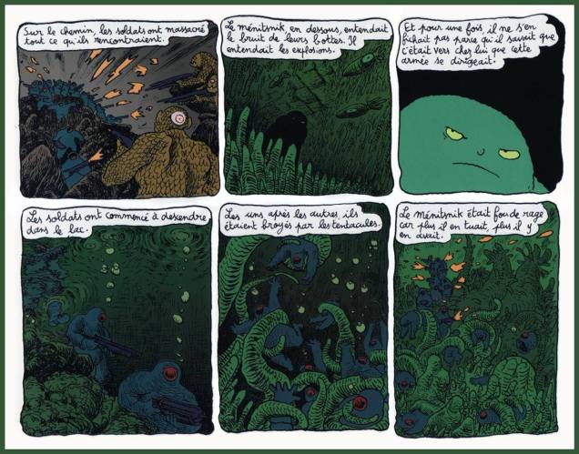
Going into slightly less obscure waters, we have a page from Joann Sfar‘s « Petit vampire» series, its 7 volumes published between 1999 and 2005. I deem it somewhat less obscure because part of it has actually been published in English, and that’s how success is measured these days, right? Only the first 3 volumes of Little Vampire have been translated, but that’s better than nothing. In France, Petit vampire is pretty popular, so much so that it has been made into an animated series.
The following page hails from Volume 4: Petit vampire et la maison qui avait l’air normale, or Little Vampire and the House That Seemed Normal, published by Delcourt in 2002.
Here’s a rough translation of the text: « On the road, the soldiers had slaughtered everything they encountered. The Menitsnik, below, was hearing the sound of their boots. He was hearing the explosions. And for once, he wasn’t indifferent, for he knew that this army was heading towards his home. The soldiers began to descend into the lake. One by one, they were crushed by the tentacles. The Menitsnik was crazed with anger because the more soldiers he killed, the more there were to kill. »
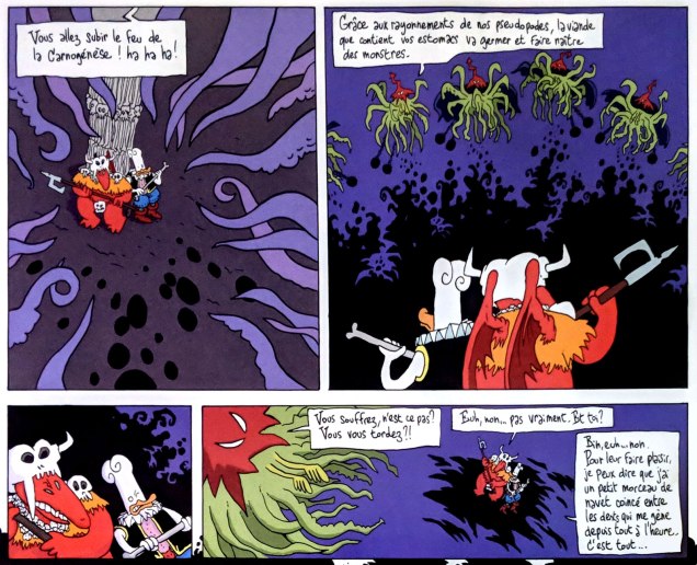
Speaking of Sfar, I’ll mosey along to the Donjon series (Dungeon in English), created by Sfar and Lewis Trondheim. The latter is another not-to-be-missed artist on the Franco-Belgian comics scene, at the very least because he’s one of the founders of L’Association. To explain:
« L’Association is a French publishing house which publishes comic books. It was founded in May 1990 by Jean-Christophe Menu, Lewis Trondheim, David B., Mattt Konture, Patrice Killoffer, Stanislas, and Mokeït. L’Association is one of the most important publishers to come out of the new wave of Franco-Belgian comics in the 1990s, and remains highly regarded, having won numerous awards at the Angoulême International Comics Festival. They were among the first to publish authors such as Joann Sfar and Marjane Satrapi, and also are known for publishing French translations of the work of North American cartoonists like Julie Doucet and Jim Woodring. »|source|
Excerpt from Donjon Zénith: Cœur de canard (Delcourt, 1998), written by Sfar and Lewis Trondheim and illustrated by Trondheim.
I only stumbled upon Donjon, a sort of tongue-in-cheek parody of role-playing games, recently. It has a sprawling structure consisting of 5 sub-divisions into stories tied by a common theme – originally the authors were aiming to release 300 volumes (with the help of many contributing artists floating around L’Association), with 36 volumes published so far. It’s more than a handful for someone who’s just starting to read the stuff… but the world is compelling, with a rich array of appealing (if flawed) characters and a complex mythology. It may technically be a parody, but the stories are poignant and imaginative, the language is delightfully playful. Some of the themes are surprisingly dark… this is far from being another dumb Dungeons and Dragons spoof.
Page from Donjon Zénith: Coeur de canard (Delcourt, 1998), written by Sfar and Lewis Trondheim and illustrated by Trondheim. This volume is full to the gills with tentacles, thanks to the Cthulhian overlords (in pointy red hats) who want to take over the Dungeon.
« I am Octo! The chicken-octopus ninja!!»
Panel from Donjon: La Princesse des barbares (Delcourt, 2000), written by Sfar and Lewis Trondheim and illustrated by Trondheim.
Our last entry is from Valérian and Laureline, the stunningly influential French comics series created by writer Pierre Christin and artist Jean-Claude Mézières that director Luc Besson besmirched, besmeared and befouled. It can also be noted that a variety of movies “borrowed” from V & L’s rich science-fiction lore, most notably the Star Wars franchise. Should I be happy that more people now know about this series now that a shitty movie “based” on it came out? Nope, sorry. Besson claims to have fallen in love with Valérian et Laureline when he was 8 years old, but with Valerian and the City of a Thousand Planets he demonstrated quite thoroughly that he doesn’t understand the characters in the slightest and is only capable of seeing science-fiction through the lens of chintzy special effects designed to wow idiots.
To which I’ll add that Valérian kind of transcends the science-fiction genre – or perhaps I should say that it’s science-fiction as it was originally meant to be, as an exploration of the possibilities of external and internal worlds. (Technologically upgraded cowboys shooting each other with laser guns in primitive, shallow battles between good and evil? We’ll leave that to crappy movie directors, thanks.) Its plots are elaborate (but they never defy their own internal logic), its characters complex but immensely likable.
In 2007, the series got renamed Valérian and Laureline for its 40th birthday, and I’m glad they renamed it, as Laureline is an integral part of both its appeal and its popularity. She’s every bit as intelligent and determined as her companion, and is certainly no maiden in distress, often sizing situations up quicker than Valérian and subsequently pointing him in the right direction.
« According to statistics, millions of Americans read millions of the most carefully written crime and crime detection stories in the world! Expertly told… and prepared, after exhaustive research — the best of these are, in effect, lessons in crime and criminal psychology!Yet could you, sitting in the trolley or bus or subway at night, pick out the killer sitting opposite you? » — The Killer (Dec. 8, 1946)
Welcome to the fourth entry in our chronicle of the variegated ambulations of the former Denny Colt. Begin if you will, as we did, with his time at Quality, then follow his path through Fiction House, then on to Harvey, Super and Kitchen Sink; at that point, you’ll be all caught up.
Okay, now that we’re all here, let’s pose and answer the next burning question: how did The Spirit come to make landfall at Warren Magazines? Thankfully, we’re spared the motions of idle speculation in this case, since Jim Warren himself revealed all in the course of an interview with Jon B. Cooke, published in The Warren Companion (2001):
JW: « I would have mortgaged everything I owned to publish Will Eisner — to be involved in anything Will Eisner was doing. I called Will and said, ‘Mr. Eisner, I’d like to take you out to lunch.‘
I knew Will was talking to Stan Lee about The Spirit and that DC was interested in his company, American Visuals. I also knew that Harvey Comics had done a couple of Spirit reprints and that they might be interested again. I had to move fast.
So I took him out to lunch, sat him down, and said, ‘There’s no possible way that I’m going to let the great Will Eisner escape. You are someone I have revered since 1940, when I saw the very first Spirit section in the Philadelphia Record with that splash page that changed my life. Do you think I’m going to let you go to Stan Lee, whom I ‘hate’ and ‘despise’ as a competitor? Do you think I’m going to lose you to that unrepentant sociopath? You’re just going to be a computer number to Marvel; they have a factory, where they cookie-cut comics, turning out 400* titles a month!’
And I saw the expression in Will’s face — he had his pipe in his mouth at the time, just like Commissioner Dolan — and I could see that I had him. »
Let’s have a look at some covers. Most of the sixteen (plus the colour Special) are terrific, but I skipped a few of the lesser ones: issue one is a not-quite successful Eisner-Basil Gogos painted collaboration, and issue two is just okay. Issue 11 is another Ken Kelly painting over Eisner pencils, and 12 to 16 are composites using inside panels. Fine, but facultative. And now, on to the gems!
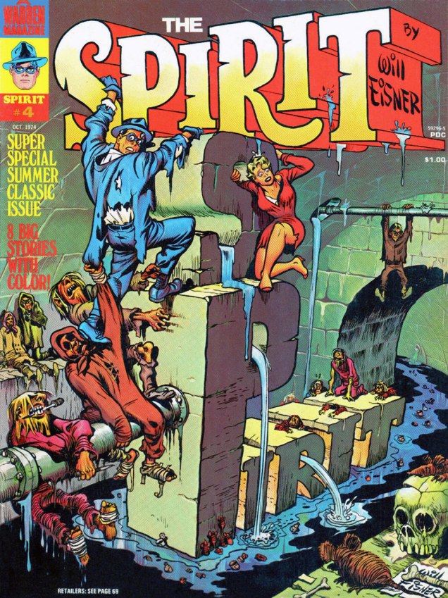
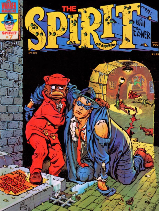
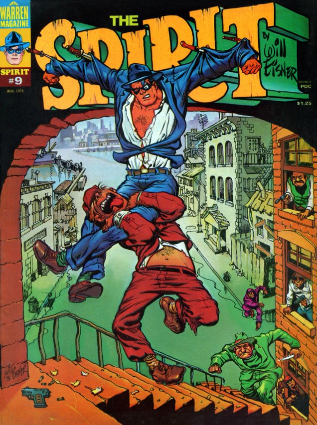
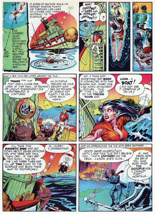
This is The Spiritno. 3 (Aug. 1974), reprinting eight post-WWII stories: Black Alley (June 5, 1949), Fox at Bay (Oct. 23, 1949), Surgery… (Nov. 13, 1949), Foul Play (March 27, 1949), The Strange Case of Mrs. Paraffin (March 7, 1948), The Embezzler (Nov. 27, 1949), The Last Hand (May 16, 1948) and Lonesome Cool (Dec. 18, 1949). Cover pencils and inks by Eisner, colours by Richard Corben.This is The Spiritno. 4 (Oct. 1974), reprinting eight post-WWII stories: Life Below (Feb. 22, 1948), Mr. McDool(Oct. 12, 1947), The Emerald of Rajahpoor (May 30, 1948), Ye Olde Spirit of ’76 (July 3, 1949), The Elevator (June 26, 1949; in colour), The Return of Vino Red (Sept. 25, 1949), The Guilty Gun… (June 6, 1948), and Flaxen Weaver (Dec. 11, 1949). Cover colours by Ken Kelly.This is The Spiritno. 5 (Dec. 1974), reprinting eight post-WWII stories: The Return (Aug. 14, 1949), The Spirit Now Deputy (Apr. 24, 1949), The Hunted (May 1st, 1949), The Prediction (June 19, 1949), The Deadly Comic Book (Feb. 27, 1949; in colour), Death, Taxes and… The Spirit (Mar. 13, 1949), Hamid Jebru (May 18, 1949), and Ice (Jan. 2, 1949). Cover colours by Ken Kelly.« You cannot stop me now… I am at the threshold of immortality… Yowch! » This is The Spiritno. 6 (Feb. 1975), featuring seven black & white (and one full-colour) presentations of tales from the 1940s: Showdown (Aug. 24, 1947), The Wedding (May 2, 1948), The Job (May 9, 1948), The Lamp (July 27, 1947), Glob (March 6, 1949; in colour), The Winnah! (Dec. 3, 1950, This is ‘Wild’ Rice (Apr. 4, 1948) and Taxes and the Spirit (Apr. 16, 1950). Cover colours by Ken Kelly.This is The Spiritno. 7 (Apr. 1975), reprinting eight post-WWII stories: The Big Sneeze Caper (Feb. 6, 1949), Hoagy the Yogi (Pt. I) (Mar. 16, 1947), Hoagy the Yogi (Pt. II) (Mar. 23, 1947), Cheap Is Cheap (June 13, 1948), Young Dr. Ebony (May 29, 1949; coloured by John Laney); A Moment of Destiny (Dec. 29, 1946); The Explorer (Jan. 16, 1949); and A Prisoner of Love (Jan. 9, 1949). Cover colours by Ken Kelly.This is The Spiritno. 8 (Apr. 1975), reprinting eight post-WWII stories: “Sand Saref” (Jan. 8, 1950), “Bring In Sand Saref…” (Jan. 15, 1950), “Thorne Strand” (Jan. 23, 1949), “A Slow Ship to Shanghai” (Jan. 30, 1949), “Assignment: Paris” (May 23, 1948; coloured by Michelle Brand), “A Pot of Gold” (Apr. 3, 1949), “Satin” (June 12, 1949), and “Visitor” (Feb. 13, 1949). Cover colours by Ken Kelly.This is The Spiritno. 9 (Aug. 1975), reprinting eight post-WWII stories: The Candidate (Aug. 21, 1949); White Cloud (Aug. 28, 1949); Stop the Plot! (Dec. 5, 1948); Lovely Looie (Apr. 10, 1949); The Space Sniper (May 22, 1949; in colour); The Vernal Equinox (Mar. 20, 1949); Black Gold (June 15, 1947); and Two Lives (Dec. 12, 1948). Cover colours by Ken Kelly.« The Octopus is at it again. This time his thugs have the Spirit cornered. Has his incredible luck finally run out? A tense moment captured by Will Eisner and Ken Kelly. » Evidently, Warren’s readership wasn’t content with line art covers, fancily wrought and gorgeous as they were; so Ken Kelly was brought in to slap some paint over a tight Eisner layout et voilà! An interesting hybrid, but I’m not quite convinced of its necessity. This is The Spiritno. 10 (Oct. 1975), reprinting a whopping ten post-WWII stories: Heat (July 15, 1951); Quiet! (July 22, 1951); Death Is My Destiny (March 4, 1951); Help Wanted (April 29, 1951); The Origin of the Spirit (From Harvey’s The Spirit No. 1; in colour); Sound (Sept. 24, 1950); A Time-Stop! (Jan. 7, 1951); The Octopus Is Back (Feb. 11, 1951); Hobart (Apr. 22, 1951) and The Meanest Man in the World (Jan. 28, 1951).Among my favourite features of the Spirit’s Warren run are the single, well-selected, lushly-coloured story appearing in each of the first ten issues. This, from no. 1, is page 4 of El Spirito (Feb. 1st, 1948). The Octopus’ buxom accomplice is Castanet. While I’m strictly underwhelmed by Rich Corben’s interchangeable tales of bald, lumpy, donkey-donged bodybuilders roaming the land and forever risking ritual castration at the hands of amazon tribes, his colour work here is simply sublime.As you can see, the panel montages were extremely well-done; The Spirit Special (1975) handily gathered in one place the colour stories from issues one to ten. According to the GCD: « Available through mail purchase only, just over 1500 are thought to have been printed. »
In closing, this final, telling exchange from the Jim Warren interview:
Jon Cooke: Do you recall dealing with Denis Kitchen about The Spirit? Jim Warren:Will had given his word — and his word is his bond — for Denis to reprint The Spirit (this was before Will and I negotiated a deal). Denis had spent money on preparing the reprints. Will said to me, « It would be a nice gesture if you would reimburse Denis, who is a good guy, for the material he’s already prepared. » I think Will looked on me kindly when I said « Absolutely. » (What Will doesn’t know if that if he had asked for me to give Denis a Rolls-Royce, I would have driven it to Wisconsin myself!)
*an exaggeration, of course, but a pointed one. At the time, Marvel *was* doing its worst to flood the market in order to starve its competitors.
« When I was a boy, I always saw myself as a hero in comic books and in movies. I grew up believing this dream. » – Elvis Aaron Presley (1935 — ?)
Today, somewhere, the King of Rock ‘n’ Roll celebrates his eighty-fourth birthday, be he alive, dead or undead, he lives on. And never forget: Elvis is everywhere!
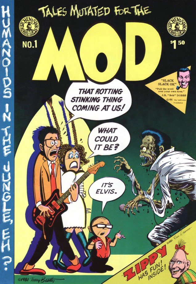
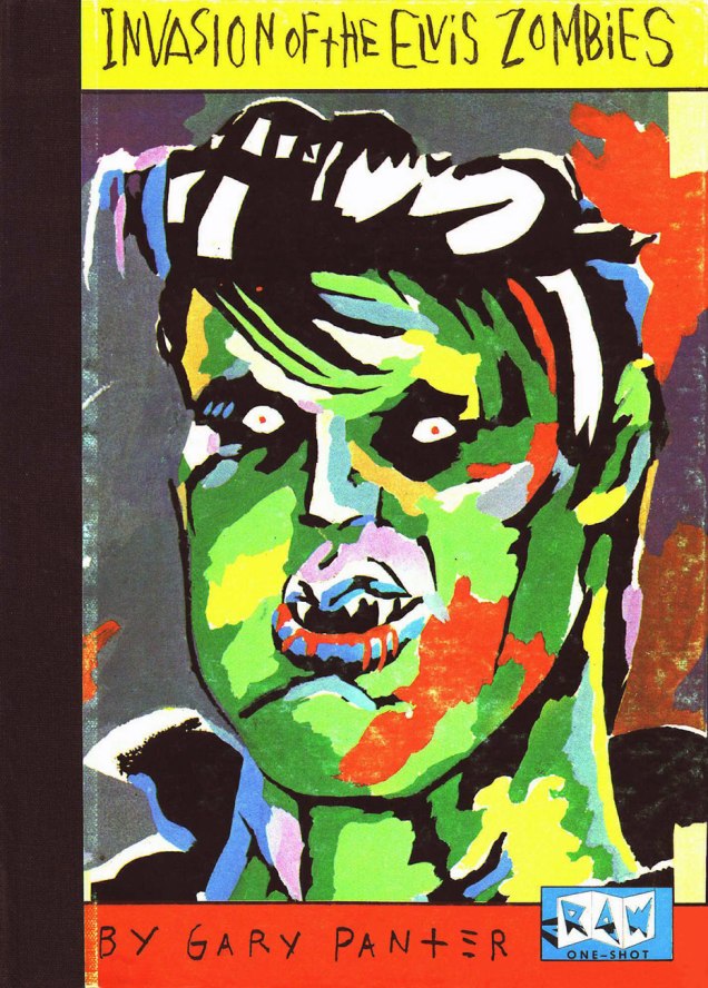
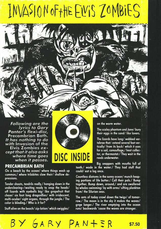
A most salty salute to the King of Rock ‘n’ Roll on his birthday! Compared to earlier decades, the 1980’s (and on!) were not kind to the anthology comic book. Thankfully, the meagre rewards and resounding indifference weren’t enough to quite dissuade some foolhardy souls from giving the format a go. But the fanboys wanted spandex, they wanted continuity and they soon wanted their « decompressed storytelling ». Bah. In 1981, Kitchen Sink Comix published the lone issue of Terry Beatty‘s labour of irradiated passion, Tales Mutated for the Mod. (June, 1981). Unlike John Byrne and others’ unceasing and pointless ‘tributes’ to Fantastic Four No. 1, this cover version of Harvey Kurtzman‘s Mad No. 1 is fiendishly clever. Kudos, Mr. Beatty!Gary Panter crafted this loving tribute in 1984, a one-shot published by RAW. Such heady stuff was well ahead of its time!The back cover… this beats Power Records‘ meek offerings flat!The oft-inaccurate Grand Comics Database really fumbles it this time: the instantly-recognizable icon on the right is, according to them… Fabian. Dopes. Hamilton, Ontario’s Win Mortimer (1919-1998), inducted into the Joe Shuster Hall of Fame in 2006, drew this cover for DC’s Heart Throbsno. 95 (April-May 1965); given the time period and The Pelvis’ shirt, he would presumably be shooting the dire Paradise, Hawaiian Style. If you’re of a mind to commemorate the King’s anniversary with one of his mid-60s cinematic offerings, better opt for the far finer Tickle Me (1965).His (alleged) paper boy claims, and I do want to believe him, that the Big E has peacefully decamped to the quietude of Eerie, Indiana. Looking good, Big E!
« Savage plants, monster mutations, human vultures… »
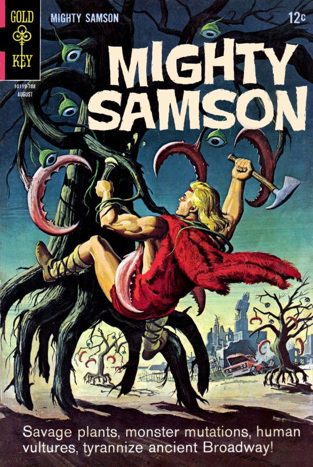
George Wilson (1921-1999), prolific cover illustrator for Dell Comics and Gold Key from the 1950s through to the 1970s, is such a ubiquitous figure for anyone interested in comics of that era that it’s almost like he’s taken for granted by comic aficionados. “Oh, yes, another gorgeous George cover”, we say and move on to something else. Let’s not, shall we? We can admire his trademark bright colours, eye-popping attention to detail and impeccable compositions *and* celebrate Tentacle Tuesday. And there’s all kinds of tentacles in these covers – organic or motorized, animal, mineral, or… plant-like. (I refuse to use “vegetable” as an adjective.)
Mighty Samsonno. 11 (August 1967). This might just be the most random menace (and the most ridiculous set-up) I’ve seen in a while.
Mighty Samson was created by writer Otto Binder and artist Frank Thorne, and involved a heroic barbarian-type sword-and-sandaler loitering around a dystopian, post-nuclear disaster world that has reverted to something resembling the Stone Age. One thing that amused me – not only is our dashing hero blond, but so is his love interest (apparently recessive traits help survive radioactivity). The evil temptress-cum-scientist is a dark-haired femme fatale, obviously. You can read each and every issue of Mighty Samson here.
Panels from “The Swamp Rats“, written by Otto Binder and drawn by Jack Sparling, whose art is for some reason hated by many (the same many who have no trouble with bad art from other, more publicly accepted artists).
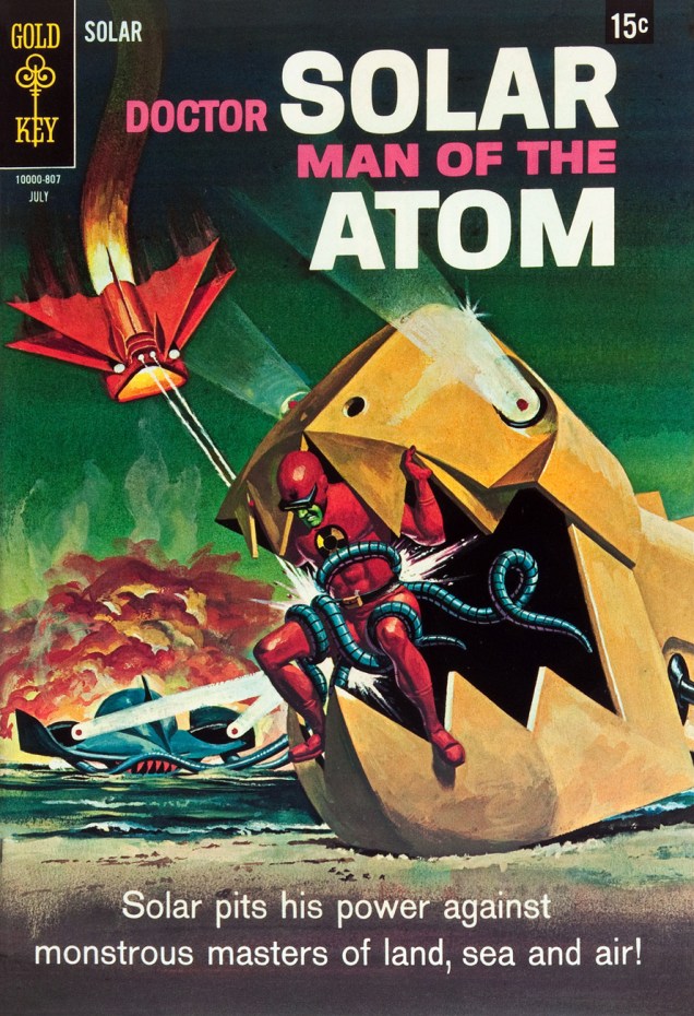
Doctor Solar, created by writer Paul S. Newman and editor Matt Murphy, was fairly humble at first, despite his somewhat ponderous moniker. (« The Man of the Atom »!) Originally clad in a normal lab-coat, he acquired his red costume in issue 5. The source of his super-powers? A nuclear disaster, of course. It’s difficult to be impressed by that when everyone and their auntie is getting exposed to radioactivity. I try to keep in mind that Doctor Solar was one of newly-formed Gold Key’s first publications, and in 1962, a nuclear war seemed imminent whatever side of the continent you were on… but I’m still bored. There’s a list of Atomic Superheroes with 27 items in it here, but it only includes public domain characters.
Doctor Solar, Man of the Atomno. 21 (October 1967).Doctor Solar, Man of the Atomno. 24 (July 1968).Page from “The Deadly Trio”, written by Dick Wood and drawn by Ernie Colón. That “monstrous master of the sea” is so freaking cute!
All of Gold Key’s Doctor Solar run is available here. How much time do you have on your hands, anyway?
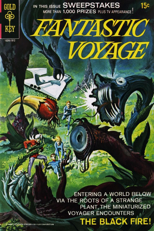
Fantastic Voyageno. 2 (December 1969).
This two-issues “series” features « adventures based on the cartoon about the Combined Miniature Defense Force (CMDF) with Jonathan Kidd, Erika Lane, Dr. Guru, and Busby Birdwell. » Clearly, nobody cared about the comic. Maybe someone cared about the animated TV series the comic was based on.
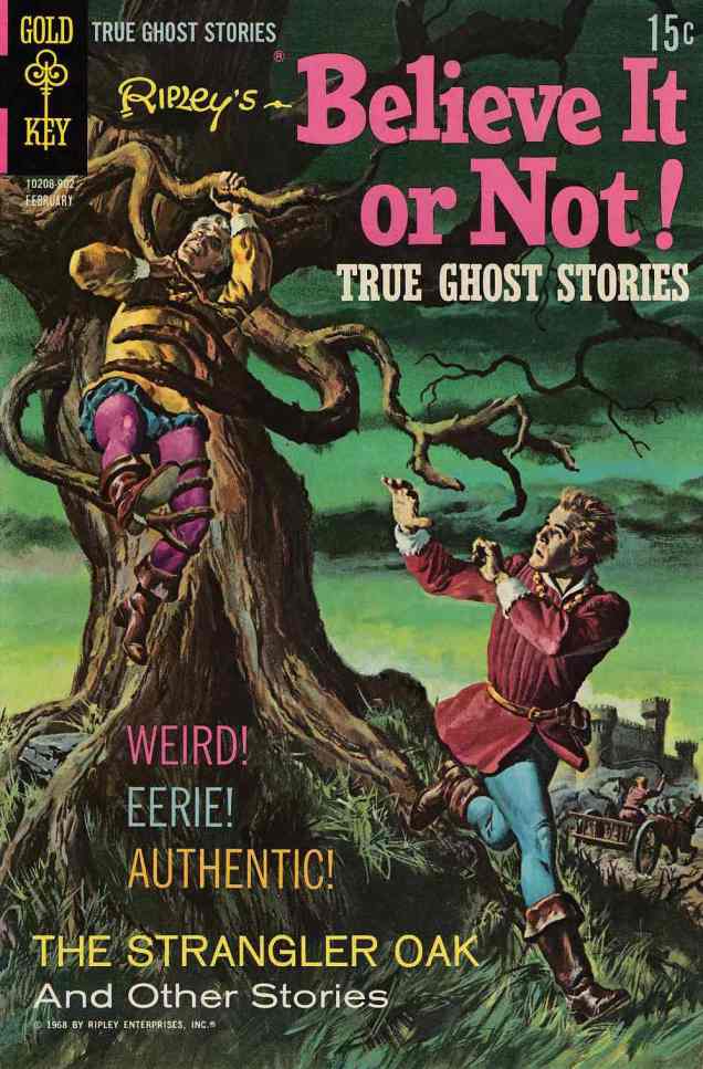
Speaking of boring… I haven’t yet encountered *one* issue of Ripley’s Believe It or Not! that wouldn’t cause me to yawn or start rolling my eyes. However, painted covers are often worth dwelling on, and the inside art is also occasionally quite nice (especially when it’s by Luis Dominguez).
Ripley’s Believe It or Not!no. 12 (February 1969).
The Microbotsno. 1 (December 1971). The tentacled monster was designed by Jack Sparling, who illustrates This Is the Way the World Ends and Day of the Juggernaut, but the cover art is by George Wilson.
There’s an excellent (and suitably sarky) review of this one issue of Microbots on Gone & Forgotten. Here’s a little taste: « Superstitious, parochial, and frequently eaten alive by mutated elephants, the people of the future world have turned their backs on technology. » Bet you’ve never seen *that* sentence before. Or — « The Microbots are the creation of Dr. Norman Micron (of the Connecticut Microns, I presume), a scientist living in the dire times of a world succumbing to man’s pollution. ‘Mankind had ample warning that he was destroying the world around him’ he muses, standing by a window with a highly-desirable garbage view. »
The crew of the Starship Enterprise keeps running into tentacles, it seems. (Presumably, they couldn’t do it as convincingly on the TV show, as the visual effects weren’t quite up to snuff.)
Star Trekno. 24 (May 1974). Gold Key published Star Trek comics between 1967 and 1978, for a total of 61 issues. They weren’t a rehash of the TV series, and featured original characters and stories, although later issues included sequels to a couple of episodes (which is pretty cool, if you ask me).Star Trekno. 29 (March 1975).
Gail O’Brien shared this snippet on a forum about Wilson’s art, sadly a fairly typical story: « You might be interested to know that George’s widow (a friend of mine) has had no income from his paintings as they “disappeared” from his estate at his death while they were separated. She is presently living on small retirement from teaching. I’ve tried to influence her to seek legal advice to acquire her share of George’s sales, but she feels it is impossible… hope there is a lawyer who enjoys George’s work, who would want to go on a 50/50 basis to acquire what is rightfully belonging to my friend. » |source|
Look at more (less tentacle-centric) George Wilson art here.
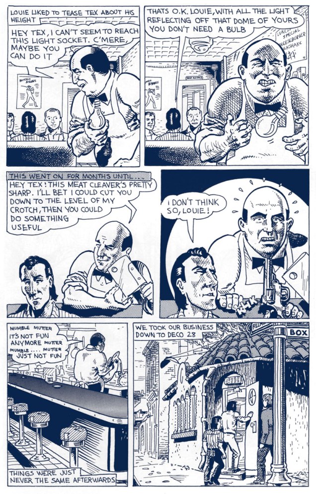
« You really saw that things were not at all what was portrayed in the mass media… at least not in our neighborhood. It was just a conclusion that most of the kids of that age came to, that things were extremely corrupt. » — Spain Rodriguez
While plenty of cartoonists trod the path of autobiography before him, it took Manuel ‘Spain’ Rodriguez (1940-2012) to truly show how it should be done: here at last was a genuine full-blooded practitioner, hardly content to merely observe from the sidelines, blending with the wallpaper. Lover, brawler, consummate graphic storyteller: a scarce combination indeed.
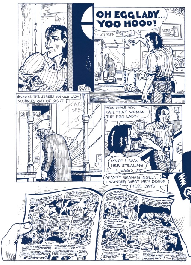
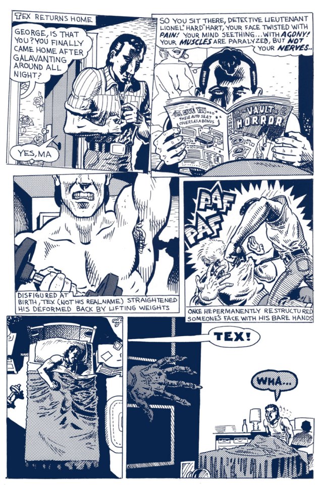
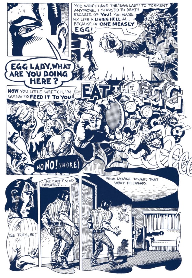
The following tale belongs to a cycle recounting the exploits and insights of The North Fillmore Intelligentsia, Spain’s closest compadres in Buffalo of the 1950s. Tex’s Bad Dream… originally appeared in Blab! No. 3 (Sept. 1988, Kitchen Sink Press); indeed, Spain’s recollections became, over time, the sole reason to purchase the once-excellent Blab! Mercifully, most of these were collected, in their usual exemplary fashion, by Fantagraphics, as Cruisin’ With the Hound (2012). You’ll still be lacking the mysteriously-omitted, quite essential « How I Almost Got Stomped to the “Still of the Night” by the “Five Satins » (Prime Cuts No. 2, Mar. 1987, Fantagraphics), which you can find in another Spain anthology, My True Story (1994, Fanta again).
In the meantime, enjoy, with my compliments, this true-life tale of original EC Fan-Addicts, facial restructuring, cautionary dreams, isometrics and pork sandwiches.
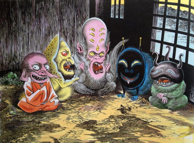
Shigeru Mizuki, Japanese comics artist and historian, is probably one of the best-known manga authors. A lot of his stuff has been translated into English, so when I started my timid forays into manga, his name instantly popped up. Mizuki’s area of interest (and expertise) was the Yōkai, or Japanese monsters, ghouls, goblins and other assorted bogeymen – right up my street, I thought!
Despite my interest in Japanese monsters, the first Mizuki book I picked up, NonNonBa, failed to capture my interest. Since then, I’ve tried looking through a few others I’d spot in bookstores… and I’ve resigned myself to the fact that Mizuki is just not my thing, whatever other people may see in his work.
That being said, I still really enjoy some of his illustrations, especially if they’re in colour – and I love the way they give us a peek into the rich (and quite scary) world of Japanese folklore.
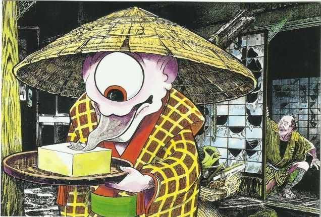
Gods of Pestilence or cute pets? Your choice.Hiratsuka-juku is a post station in Tōkaidō. A famous painting by Andō Hiroshige depicts a part of the road that leads to it. Mizuki took the painting as a basis and added a « small » detail: a Gashadokuro, one of my favourite Yōkai (and man, there’s a lot of cool Japanese monsters to vie for that spot). The Gashadokuro, literally « starving skeleton », is a gigantic pile’o’bones held together by sheer malevolence, created from skeletons of people who died of starvation. It starts its rounds after midnight… and is invisible until it bites your head off. If you ever hear bells ringing in your ears, congratulations, you’ve about to be eaten by a Gashadokuro!« Umibozu », from Graphic World of Japanese Phantoms, 1985. These ‘sea monks’ seek to destroy ships and won’t rest until the crew is at the bottom of the ocean.Is this a Akaname, the filth licker? Readers versed in Yōkai, please let us know!
A Suiko, or ‘water tiger’, although this one looks more like a balding dinosaur.
In the 1960s, Shigeru Mizuki released Yōkai Daizukai, an anatomically-oriented guide to traditional monsters from Japanese folklore. I don’t think it’s ever been released in English, but a French version came out in 2018 (and I fully intend to purchase it when I come across it).
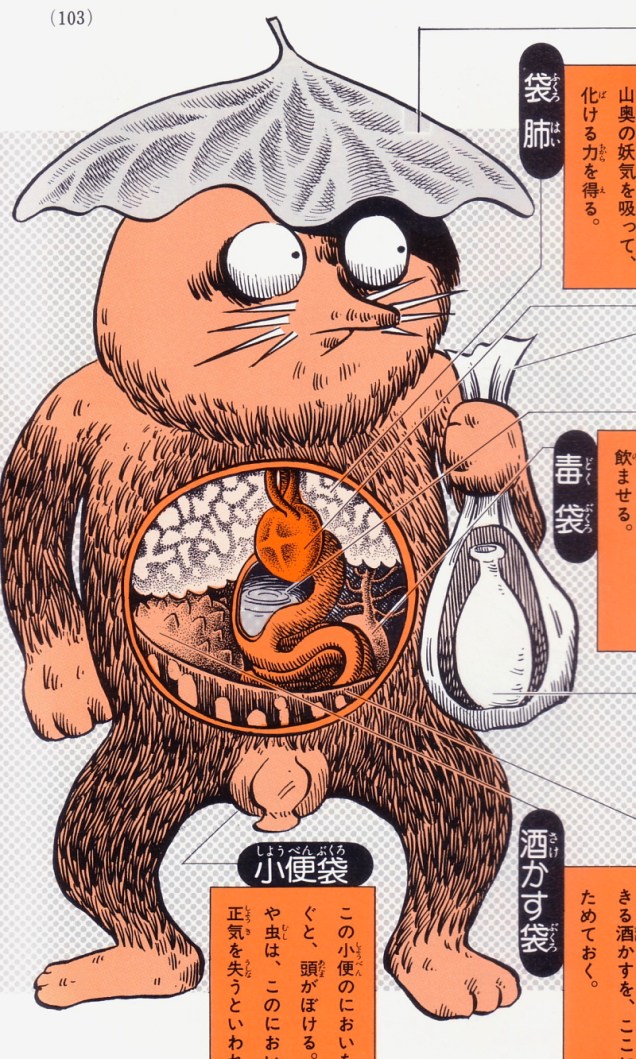
A Kuro-Kamikiri, or hair cutter, which doesn’t sound so terrifying… unless you live in a society where long hair is a status symbol and loss of it means disgrace.A Fukuro-sage, a type of Tanuki (or Japanese raccoon dog), who has the ability to transform itself into a bottle of sake. «The Fukuro-sage usually wears a large potato leaf or fern leaf on its head and carries a bag made from human skin. The bag contains a bottle of poison sake. Anatomical features include a stomach that turns food into sake, a sac for storing poison that it mixes into drinks, and a pouch that holds sake lees. The Fukuro-sage’s urine has a powerful smell that can disorient humans and render insects and small animals unconscious.»The pillow-flipper or Makura-gaeshi move pillows about, occasionally suffocating people with them or even stealing their souls.
There are places and situations where one definitely expects to run into octopuses – in seas and oceans, on other planets, in brothels and harems (much like one can put a box in the middle of the room and a cat will suddenly appear to sit in it, even when one does not own a cat, a nearly-naked woman is almost guaranteed to summon an octopus). But sometimes the presence of tentacles is quite unexpected. Just when you think you’re safe – no, oops, a touch of the cephalopod springs abruptly into your life.
Tentacles at the cinema? No way. What would they be doing there?
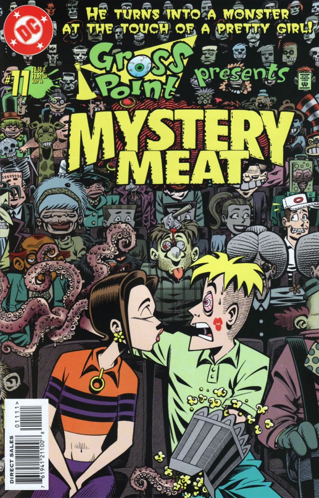
« He turns into a monster at the touch of a pretty girl! » Say, that sounds familiar… This is Gross Pointno. 11 (May 1998), cover by Roger Langridge. This nearly-forgotten comic (so forgotten, in fact, that Google will try to correct you if you look its title up) is a delight for those of us who like to bask in a Halloween mood year-round. The plot is not exactly original, yet beautiful art by Roger Langridge makes it a very enjoyable read, especially given the latter’s propensity to add little jokes to the script. Unfortunately, too many issues are sloppily pencilled by Joe Staton, whose art cannot be entirely redeemed, even by Langridge inking it.
Because I’m nice and this January 1st, here’s a link to all the issues of Gross Point, to save you the trouble of hunting them down.
A page from “Welcome to Gross Point”, pencilled by S.M. Taggart and inked by Roger Langridge.
Or you purchase a box of doughnuts and then…
Wacky Packages no. 17 (All-new Series 7), 2010. Art by David Gross, I believe.
How would you feel about going back to the office after the holidays and finding a multi-tasking octopus taking over your duties?
Hogan’s Alleyno. 21, February 2017. The hard-working octopus (it must have been hard to find pants that fit him, but octopuses are dedicated workers!) is drawn by Jack Davis, of course.
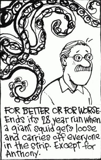
I’d say the most unexpected tentacles of all would be found in a For Better or For Worse strip. There’s no way that would happen.
« When comics came along in the 1930s there was a talent pool waiting. And one reason is so many areas were closed to Jews. Colleges, advertising agencies, many of the corporations – the doors that were closed led to the one that was open. » — Jerry Robinson
It’s New Year’s Day, which means it’s also the titanic Sherrill David ‘Jerry’ Robinson‘s birthday. Born on the first of January in 1922, he left us not so long ago, on December 7, 2011. He played at the very least a strong rôle in the creation of Batman’s sidekick Robin, his foes the Joker and Two-Face, his butler Alfred Pennyworth… and much more. Naturally, since we’re entering the murky world of Bob Kane, the whole process is mired in controversy, conflicting accounts and perhaps a little fibbing from certain parties.
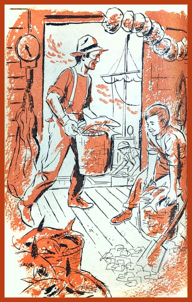
We won’t limit ourselves to the obvious Bat-imagery, which was mostly studio work anyway. Here, for instance, is a more obscure but purer œuvre, both pencilled and inked by Robinson: the original art from « Behind the Mask », page 2, originally printed in Atlas’ Marvel Talesno. 103 (Oct. 1951). Writer unknown.My earliest encounters with Mr. Robinson’s work were through a pair of books for young readers he illustrated in the late 1950s, in a beautifully free and expressive styles. Here’s the cover and one interior vignette from The Phantom Brakeman (1959, Scholastic), written by Freeman Hubbard, then editor of Railroad Magazine.
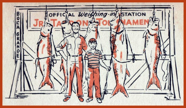
The following two pieces belong to Hurricane Luck (1959, Scholastic), written by Carl Carmer.Spoiler alert: Peter does, in the end, win the Tarpon fishing contest.
« What about Batman? », you might say. Okay, I admit I don’t have a prayer of getting away with a Jerry Robinson tribute devoid of the caped crusader and his trusty bird-themed sidekick, so here goes!
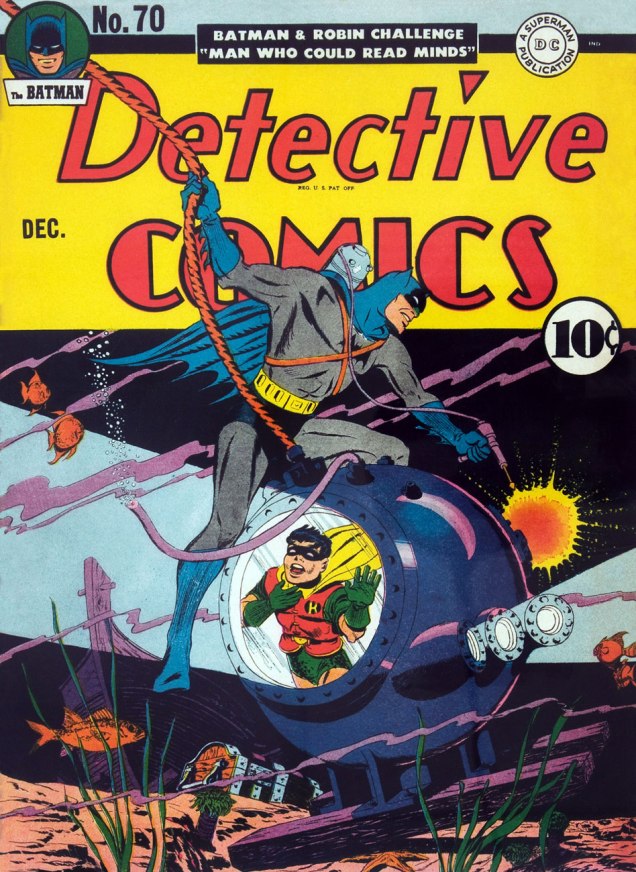
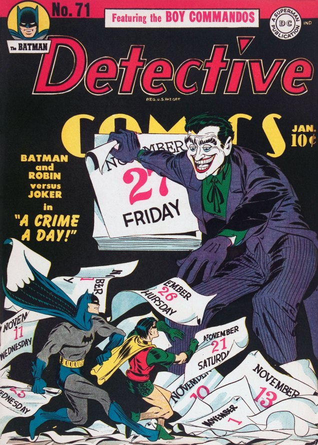
Detective Comics no. 70 (Dec. 1942). Pencils and inks by Robinson.Detective Comics no. 71 (Jan. 1943). Pencils and inks by Robinson.
« On New Year’s Eve the whole world celebrates the fact that a date changes. Let us celebrate the dates on which we change the world. » — Akilnathan Logeswaran
Earlier this month, as we showcased Justin Green’s Musical Legends, I mentioned that I was reserving one of the strips for a special occasion, and it has come.
Originally published in the December, 2001 issue of Pulse!
« Shedding light on past and present musicians — and there are countless possibilities — is a real challenge. But when it works, the comic vision can change the listening experience. » Justin Green, from his Authoroonist Acknowledgements & Apologies (2004).
This entry stands out from its brethren in that the artist was personally involved in, or more precisely a witness to, the events depicted. In addition, no famous or semi-famous musical figure occupies the spotlight; instead, we get a gentle, low-key, soulful anecdote.
Who’s Out There has had a good year, and so we thank all of you readers around the world (and I do mean around the world: according to WordPress’ statistics, comics fans visited us from a whopping eighty-three countries these past twelve months) and wish each of you a wonderful, or at the very least better, year 2019.